Communicating Optimization Results
By Drake Bailey
MBA, College of William and Mary, 2010 B.S. Economics, United States Military Academy, 2006
And Daniel Skempton
M.Sc (Eng.) Product Design & Management, University of Liverpool, 1998 B.Eng (Hons) Electrical Engineering & Electronics, University of Liverpool, 1997
Submitted to the Engineering Systems Division in Partial Fulfillment of the Requirements for the Degree of
Master of Engineering in Logistics
at theMassachusetts Institute of Technology
June 2013© 2013 Drake Bailey and Daniel Skempton All rights reserved.
hereby grant to MIT permission to reproduce and to distribute publicly paper and electronic copies of this document in whole or in part.
Signature of Author... Master of Engineering ir Signature of Author... Master of Engineering ir C ertified by ... .. . .. . .. . . ...
[Logistics Program, Engineering Systems Division May 10, 2013
. ... .. .. ... . . .. .... iLogistics Program, Enginee n 1:10
a , 013
s arch Director Center for Tra spo ti and Logistics T sis Supervisor
Accepted by... ... V.-. ... . . . . . . ... . . . Prof. Yossi Sheffi Elisha Gray 1I Professor of Engineering Systems, MIT Director, MIT Center for Transportation and Logistics Professor, Civil and Environmental Engineering, MIT
ARCHVES
*R
R8ES
Communicating Optimization Results
By Drake Bailey
And Daniel Skempton
Submitted to the Engineering Systems Division in Partial Fulfillment of the Requirements for the Degree of
Master of Engineering in Logistics
ABSTRACT
With global supply chains becoming increasingly complex, leading companies are embracing optimization software tools to help them structure and coordinate their supply chains. With an array of choices available, many organizations opt for one of the numerous off-the-shelf products. Others choose instead to create their own bespoke optimization tools. While this custom approach affords greater versatility than a commercially available product, it also
presents significant challenges to both the creators and users of the tool in terms of complexity. It can often be time-consuming and difficult for the users of the tool to understand and verify the results that are generated. If a decision-maker has difficulty understanding or trusting the output of a model, then the value of the tool is seriously diminished. This paper examines the challenges between the creators, or operational research engineers, and the end-users when deploying and executing complex optimization software in supply chain management. We examine the field of optimization modeling, communication methods involved, and relevant data visualization techniques. Then, we survey a group of users from our sponsoring company to gain insight to their experience using their tool. The general responses and associated crosstab analysis reveals that training and visualization are areas that have potential to improve the user's understanding of the tool, which in turn would lead to better communication between the end-users and the experts who build and maintain the tool. Finally, we present a section on current, cutting edge visualization techniques that can be adapted to influence the way a user visualizes the
optimization results.
Thesis Supervisor: Dr. Edgar Blanco
TABLE OF CONTENTS
A B S T R A C T ... 2
LIST OF FIGURES ... 5
LIST OF EXHIBITS... 6
1. INTRODUCTION ... 7
1.1. The Nature of the Problem ... 10
1.2. Research Objective ... 13
2. LITERATURE REVIEW ... 14
2.1. Optimization M odeling ... 14
2.2. Communication of Optimization M odeling ... 16
2.3. Data Visualization...18
3. RESEARCH M ETHODS ... 26
3.1. Initial Interviews...26
3.2. Optimization M odeling Education... 26
3.3. Literature Review Approach...27
3.4. Survey of Users...27 4. DATA ANALYSIS...29 4.1. Survey Results...29 4.1.1. User Training...31 4.1.2. M odel Complexity...32 4.1.3. M odel Effectiveness...33 4.1.4. M odel Visualization...35
4.1.5. Rem edy M ethods...35
4.1.6. Crosstab Analysis...36 4.1.6.1. Training...37 4.1.6.2. Data Visualization...39 4.1.7. Open Comments...41 4.1.8. Key Insights ... 44 4.2. Interview Analysis...45 5. OBSERVATION S ... 46 5.1. User Training...46
5.2. Incorporating Data Visualization with Optim ization M odeling ... 47
5.2.1. The case for Data Visualization ... 47
5.2.2. Proposed visualization tool evaluation fram ework ... 54
5.2.3. Visualization examples ... 59
5.2.4. Considerations for Com pany X ... 70
6. CON CLU SION ... 72
7. A PPEN D IX ... 73
LIST OF FIGURES
Figure 1 : C asual L oop D iagram ... 8
Figure 2 : Sam ple Survey Q uestions...28
Figure 3 : Sample Open Text Survey Questions... 28
Figure 4: Question 1 Results (Background Information)... 29
Figure 5 : Question 2 Results (Background Information)... 30
Figure 6: Question 3 Results (Background Information)...30
Figure 7: Question 4 Results (Training Background)... 31
Figure 8 : Q uestion 5 R esults (Training) ... 32
Figure 9 : Q uestion 6 Results (Com plexity) ... 33
Figure 10 : Q uestion 7 (Effectiveness) ... 34
Figure 11: Question 8 Results (Visualization)... 35
Figure 12 : Question 9 Results (Remedy M ethods)... 36
Figure 13 : Crosstab 1 (User time and training adequacy)... 37
Figure 14 : Crosstab 2 (Last trained and training adequacy) ... 38
Figure 15 : Crosstab 3 (Simple to use and results displayed effectively) ... 39
Figure 16 : Crosstab 4 (Adjusting priorities and displaying necessary information)... 40
Figure 17 : Crosstab 5 (Displaying outputs and inputs difficult to understand) ... 41
Figure 18 : Data visualization of worldwide router connections in 2007 (Harrison, C., 2007)...48
Figure 19 : Data visualization of European Union router connections in 2007 (Harrison, C., 2007)...49
Figure 20 : Data visualization of United States router connections in 2007 (Harrison, C., 2007)...50
Figure 21: A star's data gathered from the Keplar telescope (planethunters.org, 2012)...51
Figure 22 : Highlighted "transient dips" from Keplar telescope (planethunters.org, 2012) ... 52
Figure 23 : Screenshot of Jer Thorpe's "Just landed" visualization (Thorpe, 2009) ... 53
Figure 24 : Data visualization tool classification (derived from Pidd's approach) ... 55
Figure 25 : Example of Mapping & Planning visualization tool (Sourcemap, 2013)...59
Figure 26 : Examples of a visual & interactive data analysis tool (Tableau, 2013)...60
Figure 27: Second example of a visual & data analysis tool (Tableau, 2013)...60
Figure 28 : Example of a visualization framework using Google Chart Tools (Google, 2012) ... 61
Figure 29 : Visualization framework -air traffic routes (Quadrigram.com, 2013) ... 61
Figure 30 : Visualization framework -world population growth (Quadrigram.com, 2013) ... 62
Figure 31 : Visualization framework -Asia population growth (Quadrigram, 2013) ... 62
Figure 32 : Visualization framework -popularity of US presidents (Quadrigram.com, 2013) ... 63
Figure 33 : Example of Library built visualization view (Yadev, 2013)... 65
Figure 34 : Example of a Library built visualization -mental illness view (Yadev, 2013)...66
Figure 35 : Example of a Library built visualization - legally acquired view (Yadev, 2013)...66
Figure 36 : Example of a Library built visualization -summary level detail (Yadev, 2013) ... 67
Figure 37 : Example of a Library built visualization -gender of the shooter (Yadev, 2013)...67
Figure 38 : Examples of a library built visualization -year of incident (Yadev, 2013)...68
Figure 40: Examples of a 3D animated visualization mapping air routes (Belmonte, 2011) ... 69
LIST OF EXHIBITS
1. INTRODUCTION
With global supply chains becoming increasingly complex, leading companies are embracing optimization software tools to help them structure and coordinate their supply chains. While many organizations choose off-the-shelf products, others, such as our sponsor, Company X, build their own bespoke optimization Solver tools to manage their specific needs. The purpose of the tool, whether off-the-shelf or custom built, is to fulfill demand while optimizing factory and inventory costs (raw materials, work-in-process, and finished goods) worldwide. With a multitude of sites and potentially thousands of products and customers stretched around the globe, companies recognize that these tools are vital to ensuring their competitiveness.
To build a bespoke optimization tool, companies typically employ a staff of operations research engineers (OREs) and software developers. OREs are extremely skilled in the application of optimization methods; some are found in universities and others are brought in from industry to blend experience with optimization modeling theory. Company X began the process of developing its own supply chain optimization tool in 2005. Prior to this endeavor, their supply chain planning was executed primarily through the use of spreadsheets. When it transitioned from spreadsheets to an optimization tool, Company X employed a prominent operations research expert from a leading university. After the OR expert formed his team of engineers and developers, an optimization tool was produced and deployed to the company's supply chain planners.
Figure 1 below further explores the dynamics associated with the introduction and deployment of bespoke optimization tools within large organizations. The diagram is
intentionally simple and is included here to illustrate the key dynamics associated with
organization optimization model use, namely adoption and desertion.
Potential Uses
Complexity
Model
Scope
Adoption
I
Desertion
Business
Perceived
value created
utility of the
Usability
model
Figure 1 : Casual Loop Diagram
When companies deploy optimization models, they typically begin with a pilot project
and a tightly focused model that is designed to address a very specific challenge. With this in
mind, the above causal loop diagram essentially starts with the "model scope " parameter.
Following counter-clockwise from the model scope, we see an arrow that is connected to the
"potential
uses " parameter. As the scope of the model expands over time, the amount of
potential uses for the model also expands. Consequently, an increase in the potential uses of the
model has a positive impact on the overall business value that the model creates. When the
model usage becomes clearly associated with tangible business value, word-of-mouth quickly
spreads among the constituent stakeholders in the company, leading to a larger fan-base of model
advocates and resulting in an increase in the overall perceived utility of the model inside the
company. These new converts soon evangelize the benefits of the model, which in turn leads to
an increase in the model's scope. By returning to the model scope parameter, we have closed the
first of the two loops reflected on the diagram. In this case, the loop is to the left and is labeled as
the "adoption " loop. Using Systems Thinking nomenclature, we have just described a
reinforcing loop that represents a virtuous cycle of model adoption within the organization. With the inclusion of only the reinforcing loop, the diagram is missing a key element. In order to accurately convey the simple dynamics, we need to include a balancing loop. In this case, our balancing loop is to the right hand side, and is labeled as the "desertion loop, " and reflects the counter scenario to model adoption. Following clockwise from the model scope, we see an arrow that is connected to the "complexity " parameter. This indicates that as model scope increases, so too does the overall complexity of the model. As the complexity of the model increases, it leads to a reduction in the model's overall usability. When the usability of the model diminishes, negative word-of-mouth ensues leading to a reduction in the perceived utility of the model. As the perceived utility of the tool is reduced, the credence that managers place on the tool is lessened and over time the model's scope will be decreased. By returning to the model scope parameter, we have now closed the balancing "desertion " loop.
These two counterbalancing conditions reflect a dichotomy that must be carefully managed. The initial wave of enthusiasm that accompanies the introduction of a new and useful tool is soon forgotten if the complexity of the tool reaches the level at which it hinders the user's ability to derive meaningful results.
In general, Company X, a semiconductor chip maker, has groups of decentralized production, assembly, and testing planners placed at sites all over the world. In total, there are around 60 planners and 20 sites across their global supply chain. Planners use the optimization tools created by the OREs to build their work plan on a monthly basis. Their work plan consists
of how many wafers, which is the raw material for semiconductors, to fabricate, die, assemble, or test for an associated time period. Accomplishing this task requires that the planners possess an adequate understanding of the tool. If they do not understand the tool's results, and why those results occurred, then the perceived usefulness of the tool within the organization will be
severely diminished.
Due to the inherent complexity and the vast amount of data that it handles, Company X's optimization tool had to be separated into various smaller applications that were tailored to each site's specific function. Starting at the semiconductor's raw material, the wafer, the first tool used is the fabrication solver, which optimizes the number of wafer production starts across the globe at each site. Based on a six week lead time from fabrication to customer, the model
incorporates information from many different areas to optimize the company's global production capacity. This tool, called the Solver, is used by 38 of the planners. Due to time constraints and its scalability, we focused our study on this tool. Thus, you will see the term Solver used in almost all of our writing that pertains to Company X's optimization model.
1.1. The Nature of the Problem
Planners are typically employed after completing a period of undergraduate study in a related discipline. While the OREs who created the tools are experts in the creation of
optimization models, the planners are focused on supporting the plant managers with optimal production numbers. Planners are not typically familiar with the inner workings of the Solver
application. For example, when using the Solver, the only decision a planner needs to consider is what priority to choose. The priority settings, which can be 1, 2, or 3, allow the planner to place emphasis on the type of wafer to produce during the month. A number one represents the
highest priority and a three is the lowest. The Solver incorporates the inputted priorities when optimizing the wafer starts.
After the planner has set the wafer priorities, the Solver tool is run. After the run has completed the planner views, interprets, and executes the results at his or her site. Should anything out of the ordinary happen during the solve run, or if the planners have any questions about the results, planners will initially speak with a senior planner within their group. The senior planner will work with them to answer their questions or help them address the issue. If this approach does not address the issue, the senior planner escalates the matter to the operations research engineers.
This process lies at the heart of the problem that we are investigating. Senior planners, called super-users, will work with the OREs to conduct root cause analysis on the issue with the
Solver tool's results. The escalation process starts with an electronic issue or remedy ticket, which is called a POOL ticket at Company X, and involves phone calls, emails, and instant messaging to work through the issue.
To complete the root cause analysis, OREs use advanced techniques and knowledge to decipher what happened within the tool, and why it found the result that it did. To put the complexity of the tool in perspective, we observed one instance of the Solver which had approximately 1.2 million decision variables and 1.6 million constraints to factor in while calculating the outputs. The OREs are tasked with determining where the problem happened within this complex structure. After the OREs have found the answer, they need to explain it to the users, who in turn need to be able to understand what is being explained to them. A
non-intuitive results to the planners. OREs struggle with the explanation as the concepts are very complicated and the planners don't always grasp the broader perspective of the optimal results since they often focus on the impact of the results to their site. Planners frequently have difficulty understanding the complicated technical jargon that is used by the OREs when discussing optimization models, making it difficult to receive the information and either disseminate or execute at their site.
Adding to the problem is that the Solver requires version updates every 18-24 months to reflect the evolving needs of Company X's supply chain. Planners receive training on the version updates and gradually adjust to the tool's updated interface. Training is usually in the form of PowerPoint slides that explain user interface updates or instruction by the senior planner at the site. Again, OREs must transfer the information to the planning community at a complexity level appropriate to their role. This is a difficult challenge at the Company X, and a common barrier at many companies using optimization modeling for production planning.
With this communication barrier in mind, we are studying how the experts effectively manage deploying complex optimization tools in a decentralized planning environment. Our approach includes interviews, an extensive literature review, and a survey of the users of the tool. Incorporating the results, we aim to provide Company X with ways to improve their connection between the OREs and planners. Since the problem is applicable across many industries and disciplines, the results will not only be applicable to Company X, but can be used by other
companies to manage their communication between experts and business users of complex optimization tools.
1.2. Research Objective
By exploring the dynamics of the communication barrier between Company X's supply chain experts and its planners, we have set the following research objectives:
e Produce insightful thoughts on new areas for improvement by conducting detailed interviews and surveys.
* Develop new communication methods for Company X to use when approaching root cause analysis.
* Introduce training ideas to teach planners how to effectively use priorities when running the Company X Solver.
* Identify and recommend innovative approaches to visualizing the results of the Company X Solver.
Accomplishing these objectives will provide Company X with different avenues to attack the communication problem. One accomplished objective will likely not be a panacea, but we believe a combination of the four objectives will provide a foundation for an industry-leading solution to a common problem.
2. LITERATURE REVIEW
We conducted a review of the material related to communicating and visualizing complex optimization models. We found the majority of the sources focus on using visualization to assist in solving complex optimization problems. Our topic is focused on the visualization and
communication of the optimization results after the solve process has completed, so many of these sources were not relevant. Independently, there are plenty of sources available on optimization modeling, communication, and visualization of data, but very few focus on combinations of the topics.
This chapter begins with a basic introduction to optimization modeling; then, we present relevant material for communication and visualization.
2.1. Optimization Modeling
We begin the literature review process by first developing an understanding of what is meant by "Optimization Modeling." Carraway (2010) defines an optimization model as "a model that uses mathematical programming to find an optimal quantity." According to Sterman (1991), optimization models represent a special category of computer models, and he describes them as "normative or prescriptive" (i.e. conveying the single "best" solution). Sterman then contrasts them with simulation models whose purpose is descriptive as opposed to prescriptive and therefore to accurately reflect the behavior of a real system. The component parts of an optimization model are generally an objective function, many decision variables and many constraints. After these components have been defined, the model is then run to provide the optimal solution for the given constraints. Sterman (1991) illustrates the practical use of a simple
optimization model by referring to a hypothetical example of a traveling salesman who needs to travel to a number of cities in the mathematically shortest possible time.
Carraway (2010) further divides optimization models into three categories: non-linear, linear and integer programming.
Bertsekas (1999) defines non-linear programming as "the process of solving a system of equalities and inequalities, collectively termed constraints, over a set of unknown real variables, along with an objective function to be maximized or minimized, where some of the constraints or the objective functions are nonlinear." Non-linear optimizations are generally solved through the use of calculus, and are typically more difficult to solve than equivalently structured linear optimizations (Carraway 2010).
Linear programming is similar to non-linear programming, except that the constraints and the objective function are all linear. While it is possible to solve linear programming models using non-linear techniques, the simplex method is far more efficient and more commonly used
(Carraway 2010). The simplex method was introduced by George Dantzig in 1947 as an iterative approach that solves a series of linear equations as it performs each step, and stops when either the optimum is reached, or the solution proves infeasible.
Integer programming is similar to both linear and non-linear programming, except that some or all of the constraints and the objective function are set to be integers. The most common approach for solving integer programming models is called "Branch and Bound" (Carraway,
2010), (A. H. Land and A. G. Doig, 1960). The Branch and Bound method is predicated on the
systematic enumeration of all candidate solutions, where large subsets of fruitless candidates are discarded in bulk, through the use of upper and lower estimated bounds of the quantity being optimized.
Carraway (2010) presents three commonly encountered business decisions to provide context for the utility of optimization modeling techniques. They are optimal order quantity, product mix planning, and facility location. By referring to these differing cases, Carraway illustrates that optimization models are prevalent across different functions of the industry.
Sterman (1991) contrasted the benefits and drawbacks that computer models offer over mental models. Factors in favor of the use of computer models include that the results are explicit and open for all to critique and review, they are logical, and that they are able to
interrelate many factors simultaneously. Sterman also indicates several potential flaws to the use of computer models. These include:
Complexity: Models are often so complicated that the user has no confidence in the consistency or correctness of the results that have been generated.
Incompleteness: Models are not designed to deal with factors that are difficult to model or were left because they are outside of the expertise of the specialists who built the model.
Opaqueness: Models are often so complicated that nobody can examine their assumptions; to the users they are black-boxes.
Carraway (2010) expands upon the theme of incompleteness when he indicates an optimization model's inability to handle uncertainty in the decision-making environment. It is important to note that neither author implies the drawbacks are reasons to not use optimization models; rather they caution that the models are not a panacea.
2.2. Communication of Optimization Modeling
From the user's perspective, models generate two forms of communication that are important to consider: communication with the model and communication with the model's developers. Little (1970) expressed that models should contain simple communication methods
so the user feels comfortable incorporating outputs into his or her decision. Internally, the model must be robust, covering all parameters involved in a conclusive output. Externally, the
language and inputs presented to the user should fit his or her operational understanding of optimization modeling.
Little (1970) continues to say that exposing parameters and constant numbers with little relevance to the user's decision is excessive and that it is best to keep the interface as simple and understandable as possible. However, displaying reference values for comparison of inputs and outputs will assist the user in decision-making (Little, 1970). Users can interpret how past inputs affected outputs critical to their system by viewing these reference values.
According to Little, the model's runtime is an important factor. For effective
communication, models should produce timely outputs and allow the user to easily change inputs (Little, 1970). Users executing the model daily or weekly are negatively affected by models that run for long periods of time before producing the output. However, users interfacing with the model on an annual basis, or even quarterly, do not require outputs as quickly (Little, 1970).
Day and Kovacs (1996) explain the idea of an "intermediary" or someone who interprets a complex model and bridges gaps between the users and their source of information, the model. Usually an expert in the field and likely one of the developers of the model, the intermediary must match his or her communication medium and explanation detail to the user's level of understanding. Otherwise, a useful, yet complicated model quickly becomes useless due to ineffective communication from the intermediary.
Unless co-located, intermediaries and users commonly communicate by some form of electronic message (Day & Kovacs, 1996). Electronic interaction could be in the form of e-mail,
instant messaging, or forum-based. Depending on the level of the user and his or her personality, electronic communication may not be the best approach. It can lead to breakdowns and
misunderstandings. Electronic communication places a limit on the user's understanding, affects the tone of the conversation, and creates misperceptions about an intermediaries' personality
(Day & Kovacs, 1996).
Little (1970) explored another aspect of the communication between developers and users. He referenced two prior works, Mathes (1969) and Pounds (1969), while explaining the different approaches that managers and scientists use when faced with a problem. Managers want action and results, whereas scientists need to learn all about the topic at hand. In the end, managers will take action but may never consider all the facts of the problem, while scientists may never act, but will understand everything about the issue. With this in mind, developers of the model can enhance its use by building ways for the model to highlight differences between observed and intended results (Little, 1970). Users or managers should be able to see where they can make decisions due to aberrations in expected results so that they can adjust the results in a timely manner. A developer or scientist would like to learn about why the model chose that output, independent of the time incurred, while users are more concerned with fixing the result in an efficient manner. According to Little (1970), creators should use this difference in problem-solving approach when developing the model.
2.3. Data Visualization
While the usefulness of optimization modeling has been well documented and has led to its adoption across a wide range of applications, the complexity and communication challenges pose a difficulty for many organizations. Data visualization techniques have been playing an
Visualization techniques leverage interactive computer graphics to provide clearer insight into complicated models than traditional data-driven techniques.
Visualization relies on cognitive psychology and graphic design to provide theoretical and empirical guidance (Jones, 1996). Jones adds that there are no hard and fast rules when it comes to conveying optimization results graphically. He also writes at length about the different formats that can be employed to represent optimization results visually; after reviewing the work of Greenburg and Murphy, Jones concluded that no one approach would suit all applications. Jones instead suggests that combinations of different formats tailored to particular users and tasks are most likely to be successful. Some of the approaches mentioned by Jones included animated sensitivity analysis and dynamic queries.
When the human brain performs the task of visual perception, its purpose is to filter out only the pertinent information, so that effective and efficient decisions can be made (Conway, 2012). This data processing action performed by our brains is so well developed that it occurs
subconsciously. Conway goes on to state that different regions of a human's visual field are prioritized differently by the brain. He expands upon this by pointing out that the act of reading text is actually a very complex process that begins with the reader scanning the text using the
fovea region (a small depression in the retina where vision is most acute) of his or her eye. The brain then processes this information into something pertinent and usable. Conway points out that the human visual system is actually a collection of several sub-systems, each of which has a specific task. For example, one subsystem is dedicated to color perception, one to form and another to the perception of motion and depth. In his work with "information dashboard design," Stephen Few (2006) also investigates human data processing, and applies it to data visualization. Few points out that monitoring is "most efficiently done with our eyes, " pointing out that human
eyes possess seventy percent of the sense receptors that we have in our bodies. Few's work is examined in more detail toward the end of this literature review.
Alberto Cairo (2013) presents the view that visualization should be "seen as a
technology." He goes on to justify this assertion by indicating that technologies exist to achieve specific goals as well as enhance and extend ourselves, and that we use visualization techniques for the same reasons. Cairo goes on to acknowledge that data visualization is an emerging discipline that brings together a variety of fields as diverse as cartography, statistics, graphic-design, journalism, and computer science. If data visualization is a technology, then it must always be conducted with a purpose. Cairo recommends that a viewer ask the following questions when examining a piece of visually presented data:
- "What does the designer want me to do with the graphic?"
- "What shape should my data have?"
By examining these aspects, the presenter can reduce the likelihood of the data-consumer reaching erroneous conclusions. Cairo illustrates this point by mentioning the dangers of comparing datasets in absolute terms, for example, violent crime statistics in Detroit with those in a town in rural New York State. Since Detroit has a comparatively large population, it would be inaccurate to use an absolute variable such as total number of victims. Instead, it would be far more accurate to use a derived statistic instead, such as victims per 100,000 people (Cairo 2013). Cairo presents this information to illustrate that there are often multiple ways to convey information visually, and that the goal of the presenter should always be to think first about the types of questions that the reader needs to have answered by the graphic. When making
the presentation it should always be with a functional purpose in mind. Cairo acknowledges that appropriate graphic form selection is difficult, and that while no absolute rules exist, it is good design practice to first try and understand how the users are most likely to leverage the tool.
In his article describing how the Procter & Gamble Company conveys information to decision-makers, Harvard Business School's Tom Davenport argues that common platforms and approaches for data visualization are more important than the creativeness of the tool itself (Davenport, 2013). He goes on to explain that by establishing a common "visual language for
data, " managers can dramatically expand the scope for data driven decision-making within their
companies. Instead of simply pursuing the latest, "cool" new visualization tools, Davenport advocates the pragmatic use of data visualization to help senior managers quickly understand their businesses, so they can make better and more informed decisions.
In his book, "The visual display of quantitative information," Edward Tufte shares significant insight on how data practitioners should display their findings in visual form to facilitate ease of interpretation and analysis. Tufte introduces the concepts of "graphical
integrity," "data-ink ratio," "data density," "chart-junk," and "small multiples" (Tufte, 1983).
"Graphical integrity" refers to the need for visual representations to accurately convey
the data that they represent. Tufte demonstrates this through a variety of graphs that exaggerate or distort the data being presented. He then presents a calculation he refers to as the "lie factor," which comes from the ratio of the effect shown in the graphic and the effect shown in the data. In the ideal case, these values equal one-another and the "lie factor" is equal to one. However, should the "lie factor" be greater than or less than one then the graph has exaggerated or underestimated the effect respectively (Tufte, 1983).
The term "Data-ink ratio " describes the relative amount of ink in a graphic that is used to convey data. According to Tufte, data graphic creators should aim to maximize the amount of the ink that is used in the graphic for data conveyance purposes. He then presents a calculation he refers to as the "data-ink ratio," which equals one minus the percentage of the ink in the graphic that is not used to convey data. Therefore, by this measure, the closer the "data-ink ratio" is to one, the better the graphic. Later, Tufte uses the term "data density " to refer to the amount of the overall visual display that actually conveys data. He advocates the use of higher data
density in graphical displays (Tufte, 1983).
The term "Chart-junk" is used by Tufte to describe the elements in data display graphics that are not needed in order to understand the data that is being presented. He then proceeds to criticize the tendency of graphical designers to overuse visual effects when presenting data in chart form. Overuse of display features such as 3D can lead to an accidental distortion of the information being presented. By categorizing visual elements that are not key to data conveyance as chart-junk, Tufte aims to minimize its usage (Tufte, 1983).
Another technique that Tufte mentions is the use of "small multiples. " This is a
technique where a series of small, similar charts are conveyed side-by-side in a larger graphical display. Representing the data in this manner allows for the layering of information and for comparisons to be quickly and easily made between the different elements of data that are being presented (Tufte, 1983).
Drawing upon Edward Tufte's insights to displaying quantitative information, Stephen Few expands Tufte's work to the area of information dashboard design. Few points out that while significant advances have been made fields such as Data-Warehousing (DW) and Business
Intelligence (BI), relatively little progress has been made regarding our ability to effectively use that data. He goes on to implore BI vendors to focus on "engaging interaction with human perception and intelligence," and suggests they do this by "building interfaces, visual displays, and methods of interaction that fit seamlessly with human ability" (Few, 2006).
To emphasize this point, Few highlights that while the use of computerized
"dashboards " to convey visually represented information is relatively common in industry, most
of these efforts are ineffective at presenting information in a way that is simple to understand at a glance. He attributes this to a failure of communication caused by inadequate focus on design
(Few, 2006). In his article entitled "Dashboard Confusion," that appeared in the March 20, 2004 issue of Intelligent Enterprise magazine, Few included the following definition of the term "dashboard":
"A dashboard is a visual display of the most important information needed to achieve one or
more objectives; consolidated and arranged on a single screen so the information can be
monitored at a glance" (Few, 2004).
Few emphasizes that the purpose of a dashboard is to communicate information and that it does not exist simply for show. Few originally stated "13 common mistakes in dashboard design" (Few, 2006), but subsequently shortened this list to the most prevalent in "6 common mistakes in dashboard design." The 6 mistakes are listed below (Few, 2012):
1) Exceeding the boundaries of a single screen. 2) Supplying inadequate context for the data.
3) Choosing inappropriate display media.
4) Ineffectively highlighting what's important.
6) Misusing or overusing color.
Few advocates for "eloquence through simplicity, " firmly believing that less is more when it comes to data visualization. He goes on to describe a process called "visual monitoring," which refers to a sequence of steps that should be factored into the design of any dashboard. During this process, a user should be able to visually scan the dashboard, understand what he or she is seeing and be able to readily identify which aspects warrant further investigation. The user then examines those areas in more detail to determine if any action is necessary. Finally, should the user require additional "supporting detail" to aid their decision making, they should be able to easily and intuitively access this additional detail from within the dashboard itself. Few also suggests that where appropriate, the dashboard should facilitate automated responses and he gives the example of the system automatically generating alerts to system experts whose action may be necessary.
He goes on to emphasize the importance of getting the "visual orientation " of dashboards right. Since information displayed in this manner is intended to be quickly
understood, it necessarily means that a high "speed ofperception " is required when viewing this content. "Speed ofperception " can be enhanced through the use of effective graphical display techniques. Few then contrasts the relatively slow, serial process of reading text with the far quicker, parallel process of interpreting well-structured data graphics (Few, 2006).
At the time of writing, there is a myriad of available tools that can be leveraged for information visualization. We examine these tools in further detail in the observations section, and we also broadly classify them into four main categories, "Libraries & API's, " "Frameworks
& Communities," "Visual & interactive data analysis tools," and "Mapping & planning
tools available from vendors will evolve and adapt over time. However, fundamental design principles such as "eloquence through simplicity" (Few, 2006), maximizing the "data-ink ratio," avoiding "chart junk," increasing "data density," and layering information (Tufte, 1983) are less likely to change; although, they may well be expanded upon as new communication mechanisms and technologies come to the fore.
3. RESEARCH METHODS
We began our research by conducting initial interviews at our sponsor company's supply chain optimization headquarters. Next, we conducted an extensive literature review and built smaller, representative models for our own understanding. Finally, we conducted a survey of users followed by closing interviews. Combining our interviews, education, and survey findings, we developed the key insights and observations that form the foundation of this thesis.
3.1. Initial Interviews
At the beginning of this study, we met with the team of operations research engineers that created Company X's optimization model. We spent two days at their location, learning about the evolution of the model, how it is deployed at Company X, and the myriad of mathematical layers that underpin its outputs. Though a large part of the interviews was spent learning about the how the model works, we also spent time reviewing the processes between experts and the users of the model (Anonymous ORE, 2012).
3.2. Optimization Modeling Education
After reviewing the material gained from the experts at Company X and reflecting on their answers to our questions, we proceeded with an extensive review of optimization modeling. We also formed our own foundation of optimization modeling through research and building of our own simplified models for educational purposes. Combining the literature review with our
own models proved to be an insightful learning approach that helped us understand how quickly the model's outputs can grow in complexity. We started our models with the simple case of one product and one machine that had a known demand over the course of one year. We found the optimal solution through minimizing costs, given the inputs assumed. In our second model, we
introduced TAKT time (the maximum time per unit allowed to produce a product in order to meet demand) to the machines and another product to the scenario. In our final models, we optimized multi-product, multi-machine scenarios. This lengthy endeavor was critical to our understanding of how quickly the tool can become too complex for the average user to understand why a result occurred.
3.3. Literature Review Approach
Next, we reviewed literature on relevant topics such as communication, data
visualization, and cognitive approaches to problems. These topics provided us with information that led to the development of a survey that was used to ascertain the user's thoughts on the model. Further, it helped us develop potential solutions for Company X's experts. Also, when researching current data visualization techniques, we were able review the current software.
3.4. Survey of Users
After completing our literature review, we surveyed the users with the questions listed in Exhibit 1. These questions were developed with the following themes from our literature review: Understanding the Company X Supply Chain, Complexity, Effectiveness, Training and Experience, Visualization, and Communication. Each question was designed to attain
knowledge on how the users interact with the tool, the training they have received, how effective the tool is, and how the experts can improve the tool or its processes. Also, we introduced open
comment questions at the end of the survey to allow users to explain anything not covered previously. Figure 2 below depicts an example of two of the sections, Effectiveness and
7. Please rate the following questions on Effectiveness.
strongly disagree disagree
The Solver make my job easier
I am not comfortable with
the accuracy of the solver's outputs.
If I have a question about
the outputs/results, it is difficult to get an answer. I am encouraged to submit
suggestions for
improvement regarding the
Solver.
8. Please rate the following questions on Visualization.
strongly disagree disagree
The solver displays only necessary information for my role as a planner.
The outputs/results of the
solver are not displayed
effectively. neither disagree nor agree neither disagree nor agree agree agree strongly agree strongly agree N/A N/A
Figure 2: Sample Survey Questions
10. (Optional) What, If any, are your challenges with the Solver?
11. (Optional) If you have any comments regarding the Solver, please add them below.
12. (Optional) We would like to contact Solver users for a brief follow-up phone Interview. If you can assist with this request, please fill out the fields below.
Name: Job Title:
Email address:
Figure 3 : Sample Open Text Survey Questions
After developing the survey, we used a sample of users, two super-users with extensive experience, to ensure our questions were focused and explained correctly. We also had them take the survey to understand how long it might take and what the results would look like. Pre-examining the results allowed us to setup our questions in the best manner for the research. Finally, we administered the survey by emailing 38 users of the Solver.
4. DATA ANALYSIS
Of the 38 eligible planners, we received 26 responses, yielding a 68% response rate. First, we will present the general and crosstab survey data analysis. Then, we will provide further qualitative analysis from information received during interviews.
4.1. Survey Results
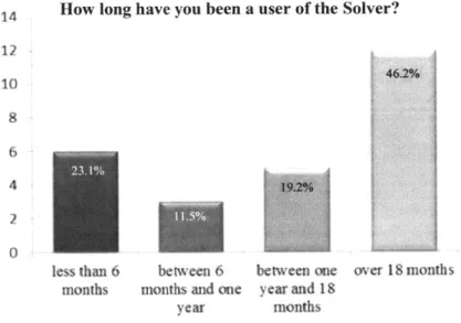
Questions 1-3 in Figures 4-6 were designed to develop the background of the users. Below, Figure 4 reveals that over 60% of the users have at least one year with the Solver. The takeaway is that we have an experienced group of users that should provide for better data and
analysis.
14 How long have you been a user of the Solver?
12
1046.2% 0
4
2f
less than 6 between 6 between one over 18 months months months and one year and 18
year months
Figure 4 : Question 1 Results (Background Information)
Below, Figure 5 reveals the average time spent per week on the Solver. Surprisingly, the majority of the users spend very little time with the Solver, given its importance in planning the
overall capacity for the company. Nearly 70% of the planners use the tool less than five hours per week.
How many hours per week (on averaqe) do you spend usinq the Solver? 14 12 10 8 6 4 2 11.5% 0
less than two between two between five between ten more than hours and five hours and ten hours and twenty twenty hours
hours
Figure 5 : Question 2 Results (Background Information)
Figure 6 helped us understand at what level the users perceived their understanding of Company X's supply chain and their location's role within that context. We are curious whether users feel that they can see the big picture when using the solver. Looking at the data,
overwhelmingly, planners agree that they understand the supply chain and more importantly, they strongly agree that they understand their location's role. Only one user, or 3.8%, indicated that they do not understand Company X's supply chain, but they also responded that they understand their location's role.
Please rate the following questions on your understanding of Company X's Supply Chain: I have a good understanding of I have a good understanding of my Company X's global supply chain. 18 location's role in Company X's supply
16 16 chain. 14 14 12 12 10 10 8 8 6 6 4 4 2 3.8% 2 00
N/A strongly agree neither disagree strongly N/A strongly agree neither disagree strongly
agree disagree disagree agree disagree disagree
nor agree nor agree
4.1.1. User Training
After collecting general background information, we now focus on the topics that we introduced in the Literature Review and Methods sections. First, we asked questions about training received as a user. Appropriate training and experience with the Solver are catalysts for increasing communication effectiveness. Figure 7 asked when the users last received training. Almost 70% of the users received training within the last year. Only one user indicated that they never received training, while 27% were trained over one year ago. The results are positive overall, but ideally you want everyone to have completed initial training before using the solver. Furthermore, with an increasingly complex model, maintaining a minimum of annual training could be a realistic goal.
When did you last receive training on the Solver?
8 7 6269% 5 4 3
I have never within the last between one between six more than one receive training month and six months months and year ago
ago one year ago
Figure 7 : Question 4 Results (Training Background)
The following questions about training and experience asked the user about adequacy of training and preference for additional instruction or experience. Interestingly, almost 70% believe that the training was adequate, while 85% believe that additional training and experience would be helpful. Given that 15% disagree with the training adequacy and 3.8% strongly
disagree, while the majority wants more training and experience, this is an opportunity for improvement.
Please rate the following questions on Training and Experience:
The training I have had on the Solver was adequate. Additional training about the Solver would be helpful.
18 16 12 14 12 10 10 8 8 6 4 15.4%4 7.7% 2 7.7% 7.7% 2 3.8% 3.8% 38%0
NA strongl agree neither disagree strongly NA strongly agree neither disagree strongly
agree disagree disagree agree disagree disagree
nor agree nor agree
Additional experience with the Solver would be helpful.
12 10 8 6 4 2 7.7% 7.7% 3.8%
N'A strongly agree neither disagree strongly
agree disagree disagree
nor agree
Figure 8 : Question 5 Results (Training)
4.1.2. Model Complexity
The next topic, complexity, asked four questions about how users perceived the simplicity of the model, its inputs and outputs, and how priority inputs affected the solver's outcome. 45% of the users expressed that the Solver was not simple to use, while only 31% felt that it is simple. 7.7% strongly agreed that it was not simple vs. 3.8% that felt it was. Next, 50% of users indicated that the solver's inputs are difficult to understand (11.5% strongly agreed vs. 0% strongly disagreed). While the first two questions revealed complexity in the tool, the third
question about priority understanding indicates that over half of users are comfortable with how changes in priorities affect the Solver's outcome. The final question on outputs shows that users are equally split three ways: users agree that outputs are difficult to understand, neither disagree nor agree, and disagree that outputs are difficult. From this section, we see that there are opportunities to reduce the complexity of the inputs and outputs with respect to the user. However, we were pleasantly surprised that many users are comfortable with the effects of changing priorities.
Please rate the following questions on Complexity:
The Solver is simple to use.
N/A strongly agree agree neither disagree nor agree disagree
,7
strongly disagree 12 10 8 6 4 2 0The Solver's inputs/priorities are difficult to understand. N/A strongly agree agree neither disagree nor agree disagree strongly disagree 10 When I adjust inputs/ properties, 9 I understand how they will affect
the output.
N/A strongly
agree
The Solver's outputs/results are difficult to understand.
*192% 2
3.8%
0
agree neither disagree strongly N/A strongly
disagree nor disagree agree
agree
Figure 9 Question 6 Results (Complexity)
agree
S 34.6%
neither disagree strongly
disagree nor disagree
aaree
4.1.3. Model Effectiveness
Effectiveness is the next topic that we introduced. Four questions were used to analyze the user's perception of Solver's effectiveness. The first question asked if the Solver makes the
12 10 8 6 4 2 0 16 14 12 10 8 2 0
planner's job easier. While a few users were neutral, they overwhelmingly showed that the tool improves their job. Next, we looked at the how the users perceived the accuracy of the outputs. The answers to this question provide insight into the level of trust between the user and the model. Again, almost 70% indicated they are comfortable with the outputs. Only 15.4% were uncomfortable with the tool's accuracy. The trust is much higher than we expected. Our third and fourth questions were meant to gauge the user's perception of the how effective the remedy and process improvement systems function. Both sets of answers reveal that the majority feels the remedy system is working (over 50%) and process improvements are encouraged (over
45%). Our takeaway from this section is that the majority of planners are comfortable with the
accuracy and processes surrounding the Solver.
Please rate the following questions 16
The Solver makes my job easier. 14 12 10 8 4 2 0
N:A strongly agree neither disagree strongly agree disagree disagree
If I have a question about the outputs/results it is difficult to get an
answer.
-NA strongly agree neither agree disagree
nor agree
12
10
on Effectiveness:
I am not comfortable with the accuracy of the Solver's outputs.
N A strongly agree neither disagree strongly
agree disagree disagree
nor agree
I am encouraged to submit suggestions for improvement
regarding the Solver.
0
disagree strongly N/A strongly agree neither disagree strongly
disagree agree disagree disagree
nor agree 18 16 14 12 10 8 6 4 2 0 12 10 8 6 4 2 0
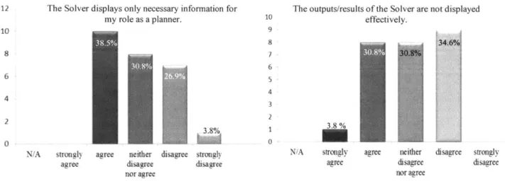
4.1.4. Model Visualization
The final section of questions deals with Visualization of the optimization results. We used the first question to see whether the tool presents excessive information that is not relevant to the planner. Users are split fairly evenly, with 38.5% agreeing with the amount displayed, 30.8% neutral, and 30.7% indicating the tool displays too much information. The second question develops the first by asking if the displayed information is effective. We are trying to understand if users would better understand the outputs when presented in a different way. Again, users are evenly split. One problem with this question is that it doesn't provide an alternative visualization for the planners to make a relative decision.
Please rate the following questions on Visualization:
12 The Solver displays only necessary information for The outputs/results of the Solver are not displayed my role as a planner. 10 effectively.
10 9 385%8 3469 88 2 2 3.8% 13 0
N/A strongly agree neither disagree strongly N/A strongly agree neither disagree strongly
agree disagree disagree agree disagree disagree
nor agree nor agree
Figure 11 : Question 8 Results (Visualization)
4.1.5. Remedy Methods
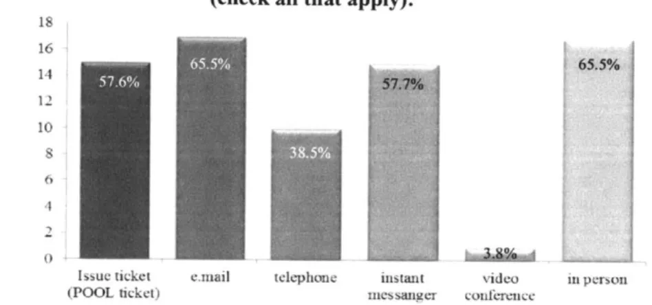
Next, we looked at the various tools that planners use to communicate with others when getting help with the Solver. Respondents were able to check all that apply. Figure 12 reveals that POOL tickets, email, instant messenger, and in-person are the dominant communication mediums. Telephone is relevant, but not at the level of the others. Video conferencing is rarely
used. The interesting finding is that many people do in fact speak in-person about the issues. Speaking in-person is a major contributor to communication effectiveness. Our hypothesis was that most of the communication is conducted electronically, which is proven wrong with these results. Over 65% of users speak in-person about their issues with the tool.
When I contact someone to help with Solver, I use the following methods (check all that apply):
18 16 61.5% 14 12 10 4
Issue ticket email telephone instant video in person
(POOL ticket) inessanger conference
Figure 12 : Question 9 Results (Remedy Methods)
4.1.6. Crosstab Analysis
After analyzing the general responses, we looked at the crosstab responses to see how certain answers correlated with others. After searching through all combinations of answers, we selected five crosstab responses as the most important. As uncovered in the general responses, two themes were also found important in the crosstab analysis; training and visualization are catalysts for increasing communication and understanding.
4.1.6.1. Training
Figure 13 below presents the crosstab responses for user time and training adequacy. The responses tell us that new users do not feel that the Solver training was adequate while
experienced users feel the opposite. We believe that this could be interpreted in two ways. The obvious first response is that the training is not adequate for new users of the tool. But, the company also has its most experienced users contradicting their answers. So, the training could become more valuable as it is mixed with experience. Thus, we will infer that the training has to be robust initially, but mixing it appropriately with experience is the key ingredient to success.
Alongside the responses in Figure 13, users responded similarly when asked about the
last time they received training. Figure 14 depicts the crosstab of last received training and
perceived training adequacy. Here, the users who received training within the last month were
also the ones who were most likely to view the training they had received as inadequate.
When id you last receive training on the Solve?
within between between six more the one and months and than last six months one year ago one
month ago year
ago
me training I have had on the strongly
kover was adequate. 20.0% 0.0% 0.0% 0.0%
disagree (1) (0) (0) (0) 60.0% 0.0% 12.5% 0.0% (3) (0) (1) (0) neither dagree 0.0% 16.7% 12.5% 14.3% nor (0) (1) (1) (1) agree agree 20.0% 83.3% 62.5% 85.7% (1)(5) (5) (6) strongly 0.0% 0.0% 12.5% 0.0% agree (0) (0) (1) (0)
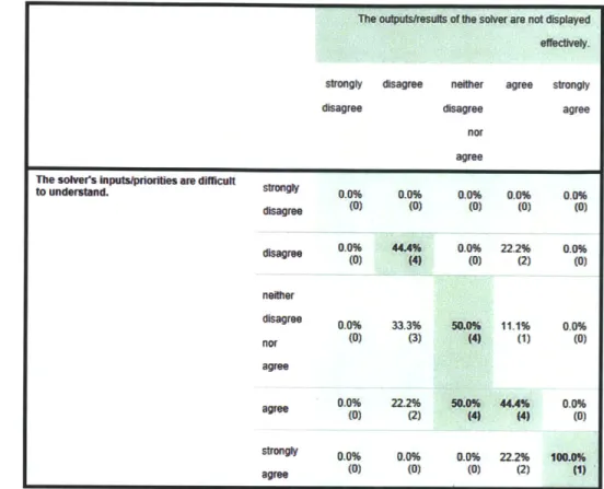
4.1.6.2. Data Visualization
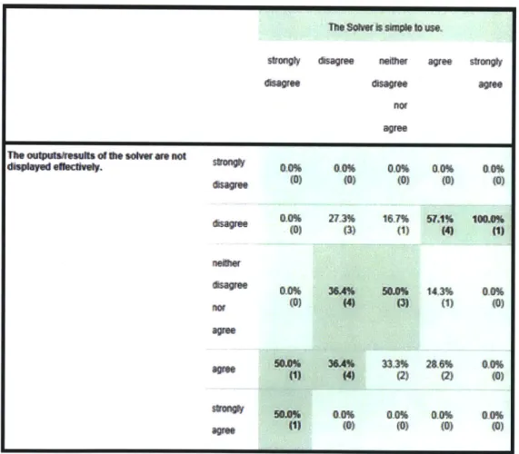
The crosstab analysis also revealed further details about the value of potentially incorporating data visualization techniques to facilitate greater understanding of the complex optimization tool. Figure 15 depicts the crosstab of simple to use and output results displayed effectively. The answers depict the notion that displaying results effectively affects the
perception of how simple the tool is to use. The users who agree that the solver's results are not displayed effectively were more likely to respond that the tool was not simple to use.
Conversely, the users who believe the tool is simple to use are more likely to disagree that the outputs are not displayed effectively.
Thesoiwerisskameouse
strongly sagree neither agree trong*y
asagre
asagree
genot agree
Theoulpaisssusthe soler. mce no
dWspaye ellectings. 0,0% Oft 0.0% 0,1% 40%
(0) (0) (0) (0) (0) 00% 273% 161% 57.1% IOUsf (0) ( (1) (1) (1) ame S03% X^ 33.3% 24.6% 00% () (2) (2) (0) s&% 0-0% 0.0% 0.0% 0-0% agree 1) (0) (0) (0) (0)
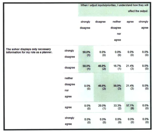
Next, we examined how the users' perception of understanding priority inputs was
affected by their answers to visualization questions. Figure 16 displays the crosstab of adjusting
priorities and displaying necessary information. This crosstab reveals that users who think extra
information is displayed were more likely to answer that they didn't understand how inputs or
priorities affect outputs. Alternatively, users who felt that only necessary information was
displayed were likely to answer that they understood how inputs affected outputs.
When I a4ust inputspriorilis, I understand how they wil
ae ftle oulput
strongly disagree neither agree strongly
disagree disagree agree nor
agree
The solver displays only necessary
information for my role as a planner. 50.0% 0.0% 0.0% 0.0% 0.0%
agree (1) (0) (0) (0) (0) 50.0% 40.0% 16.7% 21.4% 0.0% isagree (1) (2) (1) (3) (0) neiher disagree 00% 40.0% 50.0% 21.4% 0.0% nor (0) (2) (3) (3) (0) agree 0.0% 20.0% 33.3% 57.1% 0.0% (0) (1) (2) (8) (0) songly 0.0% 0.0% 0.0% 0.0% 0.0% age (0) (0) (0) (0) (0)
Figure 16 Crosstab 4 (Adjusting priorities and displaying necessary information)