CellVisualizer:
Exploring Hierarchical,
Multi-Dimensional Data with Applications to
High-Throughput Microscopy
by
InHan Kang
Submitted to the Department of Electrical Engineering and
Computer Science
in partial fulfillment of the requirements for the degree of
Master of Engineering in Electrical Engineering and Computer Science
at the
MASSACHUSETTS INSTITUTE OF TECHNOLOGY
September 2006
@
Massachusetts Institute of Technology 2006. All rights reserved.
--'-7
Author ...
.
..
...
l...
Department of i trical' En gineering *an~d
Computer Science
August 11, 2006
C ertified by
...
..
...
.
...
.-
.. . . . . .
Polina Golland
Assistant Professor, Department of Electrical Engineering and
/
Computer Science
Thess Supervisor
A ccepted by ...
...
. ... . . ... . .Arthur C. Smith
Chairman, Department Committee on Graduate Students
ARCHiVES
ASSACHUM m OF TECHNOLOGYINSTITUTEROCT
S
CellVisualizer: Exploring Hierarchical, Multi-Dimensional
Data with Applications to High-Throughput Microscopy
by
InHan Kang
Submitted to the Department of Electrical Engineering and Computer Science
on August 11, 2006, in partial fulfillment of the requirements for the degree of
Master of Engineering in Electrical Engineering and Computer Science
Abstract
In this thesis, we present a system for visualizing hierarchical, multi-dimensional, memory-intensive datasets. Specifically, we designed an interactive system to visual-ize data collected by high-throughput microscopy and processed by CellProfiler, an open-source system jointly developed by researchers at MIT CSAIL and the White-head Institute.
A typical high-throughput microscopy experiment produces thousands of images, with thousands of objects in each image. CellProfiler then measures hundreds of features for each cell, nuclei, and cytoplasm. In contrast to previously demonstrated visual-ization software, our system visualizes datasets that are on the order of hundreds of gigabytes, datasets too large to store in physical memory. We also implement tools to link the dataset to available resources such as online genetic databases and the actual images acquired by the microscope. Finally, we demonstrate how the system was used to highlight interesting genes for more detailed analysis in real biological studies.
Thesis Supervisor: Polina Golland
Title: Assistant Professor, Department of Electrical Engineering and Computer Sci-ence
Acknowledgments
Firstly, I would like to thank my advisor, Professor Polina Golland, for her guidance and support throughout this project. Her words of advice, generous funding, and help throughout this project helped ensure both this paper and this system would be completed to the best of my abilities. I also would like to thank Ray Jones for his advice and ideas and Anne Carpenter for her understanding and willingness to work with me through every step. Next, I would also like to thank Dr. David Sabatini and the rest of the members in the Sabatini Lab for giving me the opportunity to be part of the CellProfiler team. I would also like to thank Adam Papallo of the Sabatini Lab for taking the time to edit my thesis, to learn the system, and to take on the responsibility of furthering this project in the future. Finally, I want to thank my friends and family who have been by my side for the past year and a half as I worked on this project.
Contents
1 Introduction
1.1 Applications of Visualization Software . . . .
1.1.1 Validation of Images . . . .
1.1.2 Validation of Segmentation Algorithms . . . .
1.1.3 Excluding Artifacts . . . .
1.1.4 Verifying and Determining Gene Functionality
1.2 Challenges of High-Throughput Data Visualization .
1.3 The CellVisualizer System . . . .
1.4 Roadm ap . . . . 12 . . . . 1 3 . . . . 1 3 . . . . 14 . . . . 15 . . . . 1 5 . . . . 16 . . . . 17 . . . . 1 7 2 Background: High-Throughput Microscopy Analysis 2.1 Image Microscopy: Gathering the images . . . . 2.2 CellProfiler: Quantifying the image results . . . . 2.2.1 The Data in Detail . . . . 2.3 Visualization Requirements . . . . 19 19 20 21 22 3 Background: Common Multi-Dimensional Visualization Techniques and Software Systems 24 3.1 High-Dimensional Visualization . . . . 24
3.2 Available Tools . . . . 25
3.2.1 Commercially Available Tools . . . . 25
4 The CellVisualizer System
4.1 Overview . . . . 4.2 Available Plots . . . . 4.3 Brushing . . . . 4.4 Displaying Detailed Information . . .
4.4.1 Linking To Images . . . .
4.4.2 Linking To Web Databases .
4.4.3 Retrieving All Measurements
4.4.4 Plotting Per Object Plots .
4.5 System Architecture Overview . . . .
4.6 Database Layer . . . . 4.7 Internal Data Structures . . . .
4.7.1 The Data Model . . . .
4.7.2 Data Strategy . . . .
4.7.3 Plots . . . .
4.7.4 Brushing . . . .
4.8 Performance Considerations . . . . .
4.8.1 In-Memory Database . . . . .
4.8.2 Memory Constraints on Plots
4.9 Summary . . . .
5 Example Extension - Cell Classification
5.1 Cell Classifier . . . .
5.1.1 Linking From Plots in CellVisualizer . . . .
6 Case Studies
6.1 Finding Genes that Regulate Mitosis . . . .
6.1.1 Quality Control . . . .
6.1.2 Plotting Measurements of Interest . .
6.1.3 Finding Interesting Genes . . . ... .
6.1.4 Getting More Detailed Information .
7 30 30 31 32 34 35 36 37 37 37 37 39 39 42 43 44 44 44 45 46 48 48 49 53 53 53 54 55 56 . . . . . . . . . . . . . . . . . . . .
6.2 Comparing Two Different Knockdown Experiments . . . . 59
6.2.1 Grouping Replicate Slides . . . . 60
6.2.2 Plotting Measurements of Interest . . . . 60
7 Discussion 62
7.1 Other Applications . . . . 62
7.2 Future Work. . . . . 63
List of Figures
1-1 Image Analysis Sequence . . . .
1-2 Image Distortation . . . . 1-3 Scatterplot with/without errors 2-1 Microscopy Image Gathering . .
2-2 Fly203 database schema . . . .
3-1 Analysis using Excel . . . . 3-2 GGobi Plots . . . . 4-1 4-2 4-3 4-4 4-5 4-6 4-7 4-8 4-9
Types of Plots Available in CellVisualizer Brushing in CellVisualizer . . . .
Show Detailed Information Menu . . . .
Image Collection Architecture . . . . Simplified System Diagram . . . . Group Tables UI . . . . Data Retrieval Strategies . . . .
Class Hierarchy of Display Models . . . .
Class Hierarchy of Display Models . . . .
5-1 Cell Classifier 5-2 Using 2-D Hist
. . . . 4 9
ograms & Classifiers Together . . . . 51
54 55 6-1 Quality Control: Checking for artifacts . . . 6-2 Cell Area vs. Nuclei Area . . . . . . . . 13 . . . . 14 . . . . 15 . . . . . 20 . . . . . 22 26 29 . . . . 3 3 . . . . 3 4 . . . . 3 5 . . . , . . . 3 6 . . . . 3 8 . . . . 4 1 . . . . 4 2 . . . . 4 3 . . . . 4 4
6-3 Finding Interesting Genes . . . . 56
6-4 Finding Interesting Genes . . . . 57
6-5 Linked Images and Web Information . . . . 58
6-6 Per Object Plots . . . . 59
6-7 Grouped Experiments . . . . 60
List of Tables
4.1 Example Data Model Object . . . . 40
Chapter 1
Introduction
Biologists have been analyzing cells using microscopes to study cellular function for centuries. Recent advances in automated microscopes have enabled biologists to ac-quire thousands of high-resolution images, each representing a different gene knockout experiment, in a relatively short amount of time. With the development of creative new delivery techniques, full genome-scale RNAi-based screens can be performed in a few days [15]. As shown in Figure 1-1, these high-throughput microscopy screens require software to both analyze the images and visualization tools to explore the results. CellProfiler, developed through the collaborative efforts between The White-head Institute for Biomedical Research and MIT Computer Science and Artificial Intelligence Laboratory (CSAIL), is an example of a system designed to quantify the information captured in microscopy images [2]. CellProfiler examines each image and stores the measurements in a database.
However, a bottleneck exists once the measurements are stored in a database. Currently, there is no effective way to extract meaningful information from these measurements. There is no system in place to visualize this information nor a way to interface these measurements to other outside resources. Interactive, user-friendly, visualization software is necessary to make these measurements meaningful and useful to biologists for exploratory analysis of high-throughput data. Since this software is intended for the average biologist to use, it is important that the system be available on both the Windows and the Macintosh platforms and be functional on a personal
Figure 1-1: Biologists acquire thousands of images using a high-throughput
mi-croscope. CellProfiler performs quantitative measurement based on the images.
CellVisualizer is then used to interactively explore and analyze the data. computer with typical amounts of memory.
1.1
Applications of Visualization Software
Visualization of image and cell measurements from high-throughput experiments is important for many reasons such as validating that the images were taken correctly
-the image may be corrupted for a variety of reasons, validating that the image
seg-mentation algorithms work as expected, excluding errors due to incorrectly measured objects, verifying results for known controls, and allowing users to interactively ex-plore the data, leading to the discovery of previously unknown gene functions, as well as unexpected relationships in the data.
1.1.1
Validation of Images
The preparation of samples and the acquisition of images is an automated process. The image data is often corrupted because of errors in these steps. Common errors include the presence of fibers or, as shown in Figure 1-2, blobs of dye in the image.
13 High-Throughput Microscope M4A
CellVisualizer
CellProfiler
Measurements Aea Peneter ntensity22.4 15.9 52 25.4 17.2 58 18.6 14 70 20.5 15.4 65
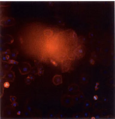
Figure 1-2: CellVisualizer allows scientists to check whether the measurements are correct or due to errors in the sample preparation or imaging process. Here is an example where a blob of dye occludes much of the image.
Such abnormalities distort the measurements in the image because they tend to be much bigger and brighter than the cells being measured. Abnormalities in an image not only occludes legitimate cells but typically also cause the segmentation algorithm to fail, thereby producing incorrect measurements.
1.1.2
Validation of Segmentation Algorithms
Cell measurement data can also be inaccurate because the segmentation algorithm may have performed poorly. Since automatic segmentation of cells remains a dif-ficult problem [9], the users need to validate that interesting points in the dataset correspond to actual cells in images and not to errors in a complex segmentation algorithm. As before, a visualization tool that links to external resources, such as images showing the cells outlined by the segmentation algorithm, provides a much higher level of confidence in the quality of measurements.
fit Plot Seari 9hwYWO SewetPoloto OeFY Spot D*a 80.0001 S 0.0001 00.000 S 30.00] 20.00 15.00 .000 01 0.00 0.10 0.10 _020 020 0,30 4k miag.Iogjy.ctlj8lntoo
Pie Plet Swch Show Tro Selec Pots awdy
12.000] U spot Do"a 11.00 S 10.000 6 .000 5 .000 4.7000 6 0.02 004 0.0 6 0.0 0 6 0BS 09 0.10 0.1 0.12 0.13 0.14 4 oS ao0ooernft*ckJeaJed SelMom
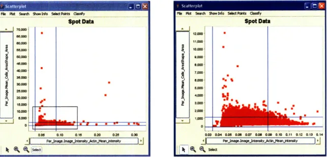
Figure 1-3: Scatterplots of the same experiment including and excluding errors such as blobs of dye. We determine which datapoints have errors by opening images that were measured to have significantly high actin intensity (x-axis) or large cell size (y-axis) and checking to see if these images have any abnormalities. The blue lines indicate which data points are above or below two standard deviations from the mean.
1.1.3
Excluding Artifacts
Since it is nearly impossible to produce a completely error-free dataset, it is important to recognize and exclude errors when examining the data. It is possible that errors in a handful of samples do not necessarily compromise the integrity of the entire experiment. Allowing the users to identify and exclude errors and concentrate on the data that has not been corrupted is crucial to the data discovery process. Figure 1-3 shows how we exclude images which are likely to be corrupted by artifacts since the actin intensity in these images is abnormally high. The blue lines indicate
1.1.4
Verifying and Determining Gene Functionality
Ultimately, a visualization tool facilitates the data-exploration process for biologists. The end goal of this process would be to either verify known gene functionality or find interesting, previously unknown, gene functionalities. As we illustrate in the later chapters, CellVisualizer facilitates this process by providing tools for interactive browsing of the dataset.
1.2
Challenges of High-Throughput Data
Visual-ization
The visualization and exploration of high-throughput microscopy data is a challenging problem because datasets tend to be large and because the natural relationships within these dataset must be captured.
The datasets are often tens of gigabytes, well outside the range of what can be stored in physical memory of a typical computer. Further, it is beyond the human capacity to synthesize and interpret such large amounts of data. A robust
visualiza-tion system would balance a user's requirements of speed and completeness -allowing
users to visualize the entire dataset, albeit slowly, if required, and also allowing users quick access to various summaries of the data.
The natural relationships within the dataset also make data visualization a chal-lenging problem. The dataset that is being analyzed has two levels of hierarchical data - "Per Image" data and "Per Object" data. The "Per Image" data stores mea-surements and information common to a particular image, such as the total intensity of the image, the mean cell area averaged across all cells in the image, and the gene that corresponds to the image. The "Per Object" data stores measurements for each object (i.e. cell) that was measured in each image, such as the area of each cell or the intensity of the staining in each nucleus.
Moreover, biologists often run the experiments under nearly identical situations, changing just one variable, such as which gene was co-knocked down. For example, microscopy experiments can be done where the TOR gene is knocked down in the first set of images and the PTEN gene is knocked down in the second set of images.
Since all other conditions are the same, it is worthwhile to consider the differences in gene expression between the TOR knockdown experiment and the PTEN knockdown experiment. In this case, the database would have two sets (TOR and PTEN) of two levels ("Per Image" and "Per Object") of hierarchical data.
1.3
The CellVisualizer System
CellVisualizer is designed to be a complementary tool to CellProfiler and thus pri-marily addresses the concerns of CellProfiler users. Still, the design was carefully considered to be applicable to other problems that involve two levels of related, hi-erarchical data. For example, it would be possible to use CellVisualizer to analyze datasets of baseball players, on both the "Team" and "Player" level. CellVisual-izer provides users with interactive visualization functionality necessary to quickly and effectively explore data. Standard visualization tools are provided, including histograms, scatter plots, and parallel coordinates.
In addition to the standard tools, CellVisualizer tightly integrates solutions for the particular exploration approaches relevant to high-throughput microscopy data. Users can build plots both on the image level and on the object (cell/nucleus) level. Users can also plot measurements from different experiments, images, or cells on the same figure to quickly compare results from these plots. When a user clicks on a data point, the point is highlighted in every open plot. Relevant statistics of that data point, the corresponding image, as well as gene information from a website of the data point is shown on demand. Specific cell sampling techniques are available to identify interesting genes.
We also designed CellVisualizer to be usable on any desktop, be it a Windows, Macintosh, or Linux machine, with typical amounts of memory. CellVisualizer man-ages the numerous constraints in plotting massive dataset on the order of several tens of gigabytes. Users can store several highly used columns in the "in-memory" database while still having access, albeit more slowly, to the rest of the data in the database.
1.4
Roadmap
Chapter 2 begins with an overview of the problem and the requirements of a system designed to analyze high-throughput microscopy data. Chapter 3 discusses common
multi-dimensional visualization techniques and existing visualization software. Chap-ter 4 describes our system, CellVisualizer, and its architecture in detail, especially in the context of the previous chapters. Chapter 5 discusses possible extensions to CellVisualizer, including a classification learner that has been incorporated into the system. Chapter 6 presents case-studies of our system in use, and demonstrates how CellVisualizer enables validation and discovery of important gene functions. Finally, chapter 7 presents a discussion of the work.
Chapter 2
Background: High-Throughput
Microscopy Analysis
To fully understand the visualization problem addressed in this work, it is important to understand the dataset produced in high throughput microscopy experiments. This chapter provides an overview of how these experiments are conducted and how we would like to analyze the resulting image data.
2.1
Image Microscopy: Gathering the images
Using powerful RNA interference (RNAi) techniques developed in the past few years, we are able to perform full genome-wide RNAi-based screens using both Drosophila (fruit fly) and human cells. Figure 2.1 details one such procedure for preparing samples and gathering images from microscopy experiments.
dsRNAs synthesized and purified, and concentration normalized in 96-well plates
dsRNAs transferred to
384-well plates
dsRNA
pts Microa ayer dsRNAs printed onto glass sides with
microarrayer
Microarrays seeded Figure 2-1: Schematic of
proce-With cl dure for the fabrication, cell seed-ing, and assaying of Drosophila
Detection assays, RNAi cell microarrays.[15] This C"aing an process allows biologists to
per-IsI"phenotypes form full genome wide screens
rel-Top Side atively quickly.
View view
This process is very powerful because we can print arrays that allow testing thou-sands of gene knockdowns, even up to the full genome. We print these arrays by synthesizing and purifying thousands of RNAi reagents, each carefully designed to knockdown one particular gene. These reagents are then placed in different wells of multiwell plates, or spots in a cell microarray. The microscope typically takes 1-6
images within each well, capturing hundreds of cells. Examining these images by
eye, or exploring cell measurement data acquired from the images can reveal how a
particular gene-presence or gene-knockdown affected cells.
2.2
CellProfiler: Quantifying the image results
CellProfiler is cell image analysis software developed jointly by the Sabatini Lab at the Whitehead Institute and Polina Golland's laboratory at MIT CSAIL [2]. CellProfiler reads each image taken by the microscopy imager and measures various features for each cell and/or sub-compartment (such as nuclei and cytoplasm), including the area, location, shape, intensity, texture, and interesting measurements published in
the literature [2]. As CellProfiler is designed to measure many properties of cellular objects, the number of measurements the system stores typically numbers in the hundreds.
In addition to the individual measurements for each cellular object in the images, there are measurements and information for each captured image. Such "Per Image" information includes unique gene and website identifiers for each image, the location of the actual image files that produced the measurements, and certain numerical values measured by CellProfiler, such as the average intensity of the DNA staining across the image.
2.2.1
The Data in Detail
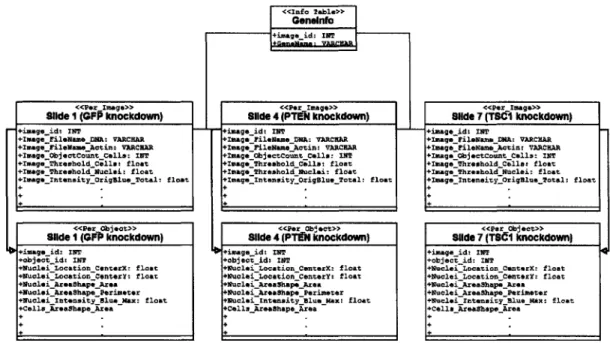
As mentioned in Chapter 1, multiple slides are often imaged under nearly identical conditions while manipulating parameters on the image set level, such as knocking down different genes in the entire image set. That is, one particular gene is knocked down in all images of an image set in addition to specific genes being knocked down in each image. In such an experiment, there is a set of slides corresponding to each gene knockdown, and the conditions in image n of one set of slides is identical (ex-cept for the gene knockdown) to the conditions in image n of another set of slides. Furthermore, to ensure the integrity and reproducibility of the data, the knockdowns are often replicated several times. For example, in a recent experiment at the White-head, image sets 1-3 knocked down the GFP protein, negative control image sets 4-6 knocked down the PTEN protein, image sets 7-9 the TSC1 protein, and image sets 10-12 the TSC2 protein. This type of experiment elucidates how the knockdown of one gene affects cellular phenotypes compared to the knockdown of another gene.
This type of experiment creates one "Per Image" table and one "Per Object" table for each gene knockdown image set in the database. In the example described above, there are 12 distinct "Per Image" and 12 distinct "Per Object" tables. The database structure is identical in each of the "Per Image" and "Per Object" tables. A partial schema of one such experiment is shown in Figure 2-2. It is important to note that the number of rows is identical in each of the "Per Image" tables -each row
Geneinfo" +image _id: TNT
<<Per Image>> <<Per Image>> <<Pr Image>
Slide I (GFP knockdown) Slide 4 (PTEII knockdown) Slide 7 (TSCI knockdown)
+image_id: TNT +imageid: inT '+image id: 1NT
+ImageFileName DNA: VARCUAR +ImagaFileName DNA: VARCAR +ImageFileName ENA: VARCHAR
+ImageFileNameActin: vARCnA +ImagsFileNameActin: VARCHAR +ImageFileNameActin: VARCHAX
+ImageObjectCount_Calls: INT +ImageObjectCount Cells: TNT +ImageObjectCount Calls: TNT
+ImageThresholdCella: float +Image_Threshold_Cells: float +ImageThreshold Calls: float
+IMageThresholdNuclei: float +ImageThreshold_Nuclei: float +ImageThresholdNuclei: float
+ImageIntensityOrigBlueTotal: float +Image_IntensityOriglueTotal: float +ImageIntensityOrigBlue Total: float
<<Per object>> <<Per Object>> <<Per Object>>
Slide I (GF) knockdown) Slide 4 (PTHE knockdown) Slide 7 (TSC1 knockdown)
t image id.- INT i id:. 1ST timageid: 1TT4
tobjeotid: INT tobjectId: TNT tobjectid: TNT
+Nuclei LocationCenterx: float +NucleiLocationCenterX: float +Nuclei_LocationCeonterX: float
+Nuclei Location CeonterY: float +Nuclei LocationCenterY: float +Nuclei Location CenterY: float
+Nuclei AreaShapeArea +Nuclei Areashape_Area +NucleiAreaShapeArea
+Nuclei_AreaShapePerimeter +NucloiAreaShape_Perimeter +NucleiAreaShapePerimeter
+NucleiIntensityBlueMax: float +Nuclei_IntensityBlue Max: float +Nuclei IntensityBlueMax: float
+Cells_AreaShape_Area +CellsAreaShapeArea +CellsAreaShapeArea
Figure 2-2: Partial schema of the Fly203 database.
captures measurements for a particular image and each image set captures the same experimental conditions and thus the same number of images. On the other hand, the number of rows in each "Per Object" table varies for each image set because the number of rows depends on how many objects were recognized in each image within the image set.
Finally, to appreciate the magnitude of the dataset that the visualization system must handle, let's examine a sample dataset. The NIRHT dataset is made up of 43,000 images, with an average about 200 cellular objects for each image. In total, CellProfiler stored 468 measurements for each of these 7,500,000 objects. Since each of these measurements is stored as a float (4-bytes) in a database, the dataset we are measuring is over 14 gigabytes.
2.3
Visualization Requirements
The most fundamental requirement of any data visualization and exploration tool is the ability to plot the data in a variety of different ways. Histograms and scatterplots are among the most basic and useful ways to plot data. Additionally, since every
measurement in a "Per Image" table is produced from a single image and every measurement in a "Per Object" table is produced from a single cellular object, it is important to link each of the measurements back to the image or object that it came from.
Linking to Images
One of the most important requirements for a visualization system designed for high-throughput microscopy experiments is the ability to view the actual images that were acquired by the imager. It is typical in these experiments for multiple images to
be collected - one image may correspond to nuclei staining, another image to cell
staining, and yet another image to an additional protein of interest. After analyzing and extracting measurements from these images, CellProfiler stores the path and filenames in the "Per Image" table of the database. It is necessary to be able to retrieve these images and confirm by eye the results of segmentation and measurement steps performed by CellProfiler.
In addition to storing the path and filename information for the images, CellPro-filer also stores where in each image every object it measures is located in the "Per Object" tables. This information can be used to locate a specific cell/nucleus in the dataset.
Linking to Internet Resources
It is also important to leverage the power of the Internet by linking experiments to available gene databases and look up known information about each gene. For example, FlyBase is a comprehensive database for information on the genetics and molecular biology of Drosophila[6]. Similar databases exist on the Internet for other genomes.
Chapter 3
Background: Common
Multi-Dimensional Visualization
Techniques and Software Systems
There has been a lot of research in the visualization of multi-dimensional datasets. The challenge is to present multiple dimensions on a computer screen, a two-dimensional surface, in a way that is easily comprehensible. This challenge becomes even more difficult when dealing with massive datasets, as in the case of some high-throughput experiments, because the computer screen is limited by the number of pixels avail-able. In this chapter, we discuss existing techniques for displaying and exploring multi-dimensional datasets and some available software systems.
3.1
High-Dimensional Visualization
In this section we discuss two methods for displaying and exploring multi-dimensional data on a two-dimensional computer screen: brushing and parallel coordinates.
Brushing
First described by researchers Richard A. Brewer and William S. Cleveland at Bell Laboratories[1], brushing is the ability to allow the user to move a region (a brush)
around the data display to highlight groups of data points. When multiple plots of the same dataset are open at the same time, the brushing of points in one plot highlights the corresponding subset of points in all the other plots. This technique allows the user to more easily understand data and see relationships across multiple dimensions when the data has a large number of attributes or items, when the data spans multiple tables or data types, or when it is natural to analyze different parts of the data using different views. We extend the concept of brushing in CellVisualizer so when users highlight a point that corresponds to one particular image, all points that correspond to similar experimental conditions would also be highlighted regardless of what table the data comes from.
Multi-Dimensional Plots
There have been a lot of developments over the past twenty years in viewing multiple dimensions on a 2-dimensional output. One common approach is to use color/shape to visualization additional dimensions in a simple two-dimensional scatterplot. However,
other techniques must be used to visualize more than 3 or 4 dimensions. The most notable is parallel coordinates, proposed by Inselberg in 1981, where all axes are parallel to another and equally spaced apart [7]. By drawing axes parallel to each other, one can represent multi-dimensional points. CellVisualizer users are able to visualize several dimensions at the same time using the parallel coordinates.
3.2
Available Tools
As part of this work, we researched currently available software systems to determine the viability of their use in the exploration of high-throughput microscopy data.
3.2.1
Commercially Available Tools
The simplest way to analyze the data is to export the measurements into an Excel spreadsheet. Excel's charting tools allow users to graph histograms and scatterplots of the measurements. Users can also generate hyperlinks using Excel. By copying and
pasting gene information to a separate column, gene information can be hyperlinked from a spreadsheet to known gene databases available on the Internet.
Al A " l
adin~ m uwO; nauialcl cot um am enwmAlm mase -eIm cal sm esbal .4
3 12 1%1 760 i13 601 214 07602103. 103 4 m 131 742 1.104160167 217 16037030 . . 51062 U4 741 1. 14920373 -214 0 96412631 1025 1102 42 7I12 70 14.102 294 7 CI-ICO ti inid 16 .102 Cd2 s.02 3712d 1.102 41 d Mbshiidin dubimdhmCG19 22.02 34 7 an ,mamG 24.102 7100 8 00 - - d. So SM0 39Ws2 928 7 btlwaeboein dthmd tlC0 i6 w e 23 ~ 27.102 24 6 40 301,0 274 0 200 400 160 m 1
10-2iur 12 3eea03 r th Whitehea intal xlrdtedt sn xe
2.02 530 7 3
31.02 &Mr .
SW* 7Ur 10
spreadsheets.
Although Excel is a very powerful data analysis tool, there are several limitations when using it for interactive data visualization. Users cannot truly interact with
their data - it takes a long of time to generate the graphs. Changing axes, gating
(selecting on a particular subset of the original dataset), and finding information about a selected point is tedious and time-consuming. Another shortcoming in the current version of Excel are the limits on the number of rows and columns we can view. Finally, hierarchical data is not linked. "Per Image" information cannot be presented alongside "Per Object" data because it is not possible for Excel to know the links between the information. One way to bypass this particular limitation in Excel is to import all the data into an Microsoft Access database, create links, and then copy the generated datapoints back into Excel and plot this information. Again, it is easy to see why such a process is not conducive to interactive data exploration.
yet there are several critical shortcomings when analyzing our data. Spotfire has the ability to visualize information stored on a database but its mechanism for doing this is to load all the data into memory. Since the amount of memory on a typical computer is typically less than 2 GB, it is impossible to import our entire NIRHT dataset into memory. Exceptionally large datasets (1,000,000 records or more) are cumbersome, because they take a long time to load, require a lot of memory, and do not respond instantly to queries [5]. One option that Spotfire users have is to sample the database [5]. This solution partially suffices for some of our exploratory purposes since we are usually looking for general trends in the dataset as opposed to a single outlier cell out of the 7 different million cells. Unfortunately, there are times when we would like to
consider the entire dataset, such as when we want to know how many objects match a particular phenotype in each image. Another disadvantage of Spotfire is that there is no way to represent the inherently hierarchical nature of our dataset. Like Excel, it
does not allow us to link the top-level "Per Image" information to the lower-level "Per Object" information. Since Spotfire provides the ability to aggregate information in a dataset, one workaround would be to redundantly copy all the top-level data for all the entries in the lower-level. While possibly useful in smaller datasets, this approach is inadequate because the amount of redundant information being copied will multiple hundreds of gigabytes worth of information. The final limitation of SpotFire is the cost. A one year Spotfire license costs thousands of dollars; the power of having free, open-source software to compute quantitative measurements, such as CellProfiler, is
diminished if it costs thousands of dollars to view the results.
Other commercially available tools include software that come bundled with robotic microscopes, e.g., Cellomics [3]. There are two main problems with such software. Annual licensing fees costs tens of thousands of dollars. Bundled software often only works for images produced by the corresponding imager. Not only does this limit the type of experiments we can run to those that conform to the specifications of the imager, but it also does not allow us to leverage new analysis tools, such as CellProfiler.
3.2.2
Publicly Available Tools
There are several publicly available tools for visualizing multi-dimensional data; GGobi and VisDB are two such tools. The capabilities of these systems tend to be limited and lack functionalities essential for viewing and analyzing high-throughput microscopy data.
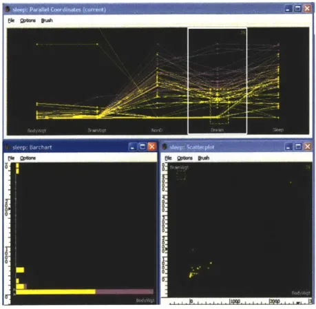
GGobi is the most well-known open source multi-dimensional data visualization system available. GGobi supports several types of plots: scatterplots, parallel coordi-nate plots, scatterplot matrices, and time-series plots [14], as shown in Figure 3-2. It also supports interactivity between several plots by providing "brushing" capabilities. Though GGobi provides the basic tools for viewing any general multi-dimensional data, it doesn't have some of the functionality helpful for the exploration of biological data. There is no way to extract and display the hierarchical nature of the data, nor to compare experiments of the same gene against each other, nor to group the data in a meaningful way. GGobi does not provide interaction with images or available gene databases. In addition, GGobi has the same memory limitations as SpotFire; data must be loaded completely into the memory before it is visualized. Since users cannot predict ahead of time which measurements will be useful when exploring the data, confining the users to the limitations of system memory inhibits flexibility.
VisDB [10] represents a class of freely available research tools. Such tools have been developed more to serve as experimental tools to help computer scientists eval-uate the effectiveness of certain visualization techniques rather than to serve the end-user. Typically they have limitations such as highly specific data formats or
particular platforms. VisDB, for example, works only on Linux/HP. Though useful in benchmarking of visualization analysis, such tools have limited practical use for researchers interested mainly in data exploration.
To summarize, though there exists both open-source and commercial software that allow users to visualize multi-dimensional data, the available systems do not pro-vide all the functionality necessary to adequately explore the datasets produced by
0
o 0
Figure 3-2: GGobi is an open-source multi-dimensional visualization tool. Scatter-plots, bar charts, and parallel coordinates are some of the types of charts that can be plotted. It also includes interactive capabilities such as brushing.
CellProfiler.
29
Chapter 4
The CellVisualizer System
This chapter discusses the details of the CellVisualizer system and explains the design choices for the internal structures and the user interface.
4.1
Overview
The CellVisualizer system is designed to plot two levels of hierarchical data. In high-throughput microscopy screens, the two levels of data are "Per Image" measurements and "Per Object" measurements.
All the "Per Image" measurements are stored as columns in a "Per Image" table; each row in the "Per Image" table corresponds to one particular image. Each row is uniquely identified by its ImageNumber. In addition to the ImageNumber and the measurements, each row also contains auxiliary information such as where the images taken by the microscope reside in the file system.
The "Per Object" table contains all the data for individual cellular objects. The unique identifier in the "Per Object" table is the ImageNumber/ObjectNumber pair. As in the "Per Image" table, the columns in the "Per Object" table hold the mea-surements and each row corresponds to one cellular object.
High-throughput microscopy screens are often replicated several times to ensure the integrity of the data. As explained in section 2.2.1, experimental conditions may also be altered slightly to test how cells react when one factor changes; one particular
gene, such as PTEN, may be knocked down in every single image in that screen. In these cases, there would be several "Per Image" and "Per Object" tables, one "Per Image" and one "Per Object" table for each screen. Since experimental conditions are unchanged (except for the gene that is knocked down everywhere), the gene that is knocked down in image n in one screen would be the same gene knocked down in image n in every other screen.
Programming Language
CellVisualizer is intended to be a software tool used to visualize high-throughput mi-croscopy data. Since scientists interested in high-throughput data use both Windows and Macintosh, CellVisualizer is designed with cross-platform operability in mind. To achieve this goal, CellVisualizer is written in Java.
4.2
Available Plots
Users can plot four different types of plots using CellVisualizer: histograms, scat-terplots, 2-D color histograms, and parallel coordinates. Since there are hundreds of possible measurements to plot and these plots are only capable of displaying a handful of these measurements at one time, users must select which measurements they are interested in viewing when selecting a particular plot.
Histograms
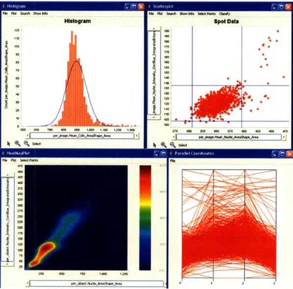
Histograms are useful for viewing the distribution of one particular measurement. In Figure 4-1, we show a histogram of all the measurement "Mean-Cell-AreaShapeArea" in the "Per Image" table. The blue line indicates what a gaussian normal distribution looks like for the histogram. We can see that this measurement seems to be normally distributed across all the different images in the experiment.
Scatterplots
Scatterplots are useful for viewing two measurements against each other. One lim-itation of scatterplots is that the data points occlude each other when the dataset becomes too large. Scatterplots are most useful for "Per Image" plots where the number of datapoints is in the other of thousands. We plot the Average Nuclei Area against the Average Nuclei DNA intensity in Figure 4-1.
2-D Histograms
When there is a large number (on the order of hundreds of thousands or more) of data points, 2-D color histograms are the best plot to view two measurements against each other. In this case, every pixel represents a "bin" and the number of objects in the "bin" is indicated by the color of the bin. 2-D histograms are useful for plotting "Per Object" measurements because each table contains millions of "Per Object" measurements. In Figure 4-1, we plot the Nucleus Area against Nucleus DNA Intensity for every single object in the dataset.
Parallel Coordinates
As discussed in section 3.1, parallel coordinates is one technique for displaying mul-tiple dimensions on a flat surface. In Figure 4-1, we plot Average Cell Intensity, Average Cell Size, Average Nuclei Size, and Average Nuclei Intensity against each other.
4.3
Brushing
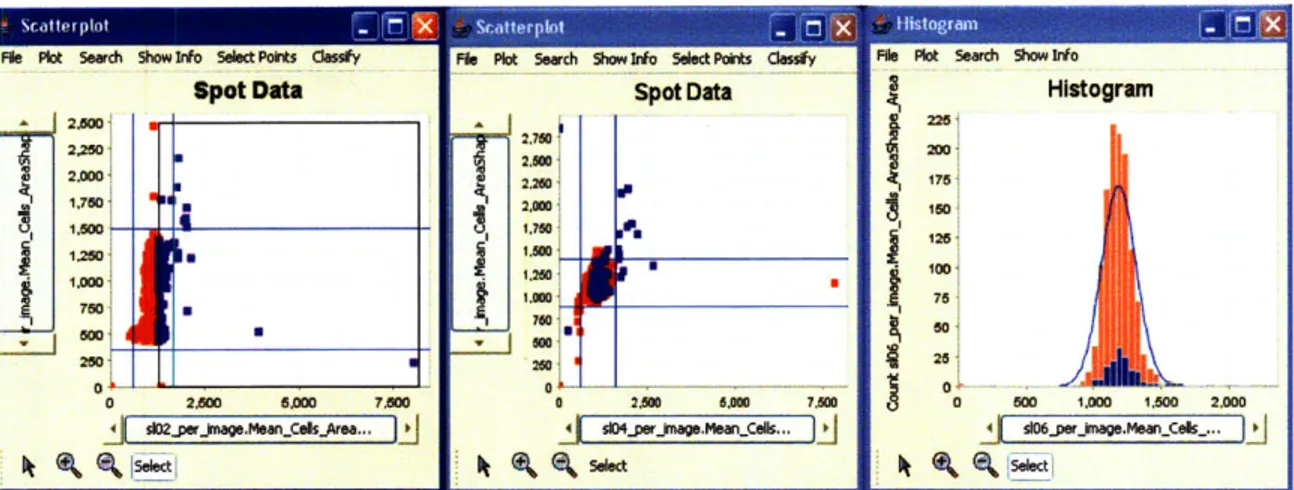
Brushing in CellVisualizer incorporates the idea that the gene knocked down in image n in one table is the same gene knocked down in image n in every other "Per Image" table. Therefore, when a user highlights a points in one particular plot, CellVisualizer highlights all the corresponding points in every other plot, regardless of what table the data comes from. In Figure 4-2, though the data comes from 5 different tables (the
I-, Ir -I 'u
120, S100: 00' ~70, ~50 ~301 20 500 000 700 90010 1 00010IA0 k6J05Ikl~A590f 460 ISO 120 25jU. W So"d~ go Wo Sdt Abt O tfy
spot Data 10 -I 160 7 175 170, IM 100, ISO, 145-140- 3 13a 120 5 Ila, 110 275 n00 M2 no0 M 4W0 45 -50 455
I-I
___I
i, I P.mFigure 4-1: There are four types of plots available in CellVisualizer: histograms (top left), scatterplots (top right), 2-D histograms (bottom left), and parallel coordinates (bottom right).
scatterplot on the left plots average cell area per image in slide 2 against average cell area in slide 3, the scatterplot in the middle plots average cell area in slide 4 against average cell area in slide 5, and the histogram on the right plots the distribution of average cell area per image in slide 6), highlighting points in one plot highlights all the corresponding points in all the other plots.
File Plkt Seach Show Inf Select Pofts dess~y spot Data 2.500 2O0Ol 2.260 1 I. 6 'Poll_
I
0 250 6=50 7.1500Fi9 Plot Seach Shmow 50 eetPoit Caeoly
Spot Data 2.M6 1~2M6 226M 2.566 17v1 a mc 2601 0 -4 o104.5erJsge.MearlCll...
V-1t
o
1 1n
X
Nf~tt,
in
M
X
r '
Fil Plt Seach gvow to HIstogram 260 17n61 16 76 6 a 160 1.M6I0 2.000
Figure 4-2: Highlighting certain points in one plot highlights the corresponding points in all the other plots. In this example, we highlighted all points with big average cell size in slide 02 and the corresponding points in the scatterplot in the middle and the histogram on the right are also highlighted.
4.4
Displaying Detailed Information
An important feature of CellVisualizer is not only the ability to plot the data, but also to view images and other detailed information once the user discovers interesting phenomena in the plots. This section describes how the system links the plots to images and other information.
The user may request different types of detailed information about a particular point. Currently, the user can select data points and request the images from which the data points came, information about the gene that produced the data points from a web database, all the measurements recorded for the image/object that produced the data point, and if the data points are from "Per Image" measurement, a "Per Object" plot of measurements for all the objects in the images that produced the
"Per Image" points.
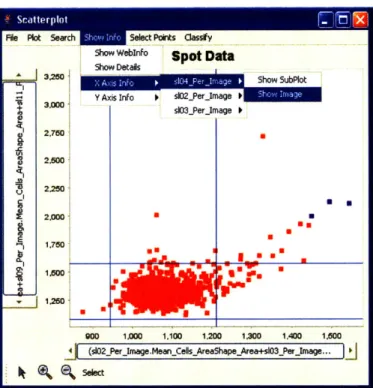
In the menu bar for each plot, we display the different detailed information avail-able, as shown in Figure 4-3. Each plot stores information about which tables and measurements it has plotted and thus can link back to the tables to extract detailed information.
0OW 1.=co M,1 1.200 1.300 1400 1.500 (s02_Perjmage.MeanCellsAreaShape-Area+s03_Perkmage...
Figure 4-3: Access to detailed information relevant to a displayed plot.
4.4.1
Linking To Images
The "ShowImage" object is capable of displaying 3 grayscale images and overlaying them to create one RGB image. The GUI also provides users the ability to toggle the 3-channels on and off and the ability to locate single or multiple cells within the image. In order to display an image, the image files must first be retrieved from the database. As Figure 4-4 shows, the CellVisualizer system handles the retrieval and displaying of images on three distinct levels.
The first level is responsible for retrieving the image file stream from the remote file server. Currently, the CellVisualizer system retrieves a file stream from images on the local file system and images on the Internet. It can also remotely connect to Samba file servers and retrieve file streams with the help of the Java CIFS open source client library [4]. We have also integrated SSH2 connections to CellVisualizer by integrating the open source JSCH library [8]. Currently, input streams to SSH2 connections are established by copying a remote file to a temporary local directory and opening a stream to the local file. By isolating the fetching of the file streams from
ImageCollection to nagpReder knageffle
+fetchtmage (tabe Stig mgzm-n,+e~ awn m () Bu fail d +q::1ring): I!1! 1 ea
ing and displaying image files.
the rest of the system, the system can be easily extended to use other file-fetching protocols.
The second level is responsible for decoding the image from the input stream. CellVisualizer currently has two image readers. The JAI reader uses the Java
Ad-vanced Imaging library which supports BMP, GIF, JPEG, PNG, PNM, and TIFF files. In addition, we wrote a custom DIB reader for the Cellomics proprietary file format.
The third level of image handling in the CellVisualizer system is responsible for managing the images that have already been retrieved and decoded. Images typically take some time to retrieve, decode, and load into memory, from about half a second if the image is on the local hard drive to about five seconds per image if the image needs to be fetched via a SSH2 connection. Therefore, once the image is loaded into memory, we cache for future use. This level also supports basic image manipulation capabilities including turning on and off the red, green, and blue channels and displaying smaller portions of images showing individual cells. The Java Advanced Imaging library is used to give users additional useful imaging functions such as the ability to control the brightness and the contrast levels of an image.
4.4.2
Linking To Web Databases
CellVisualizer launches webpages by using Ostermiller Utils, an open source library for common programming tasks including opening a browser from an application on Windows, Unix, and Macintosh. Gene information for a particular point is usually stored in the database in one of two ways. Gene information may be stored directly
in each of the "Per Image" tables or there may be a separate "Gene Info" table to which "Per Image" and "Per Object" tables can link. The online gene databases are then queried to retrieve available information on the gene of interest.
4.4.3
Retrieving All Measurements
We also make it easy for users to query every measurement for any particular point. Users can select using a mouse or type in genes of interest and open a table which displays all the values in the database for that point.
4.4.4
Plotting Per Object Plots
Another useful function that CellVisualizer provides is the ability to easily plot "Per Object" data from selected points in "Per Image" plots. For example, we may notice that the average cell size may be large for a particular gene and that we are interested in whether the distribution of the cell size in this gene is different from all the other genes. We can easily select points of interest in the "Per Image" plot and ask for a "Per Object" subplot to display the data that correspond to the selected gene in the "Per Image" plot.
4.5
System Architecture Overview
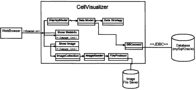
The CellVisualizer system must retrieve data from a database, display data in multiple plots, retrieve images from a file server, and even open an external web browser. Achieving all these goals in a robust way requires the system to be extensible and modular. Figure 4-5 shows a high-level diagram of how different parts of the system interact with each other. The following sections describe each component in detail.
4.6
Database Layer
CellVisualizer accesses the data from a database through the database layer. Al-though the JDBC (Java Database Connectivity) API provides cross-Database
Man-CeH Visualizer
DjaplayModid Data Model note Wtaw
WebBrowser -XMUb)
Show Wwe "98nfof
DBConnect <<JD6C>> Database
+imaqe:in) """ (mySql/Orac e)
ImageCoNection tmageRader FileProtocol
Image File Server
Figure 4-5: High-level diagram of CellVisualizer. The database stores measurements while the image file server stores the original images taken by the microscope. agement System (DBMS) connectivity to a wide range of SQL databases and access to other tabular data sources, such as spreadsheets or flat files, it fails to provide an
important capability - creating temporary tables. We implemented our own database
layer on top of the JDBC layer to address this deficiency. This layer hides the actual connection to the JDBC database from the rest of the system to ensure that it is easy to extend the database support beyond the currently supported mySQL and Oracle databases.
Properties Files
CellVisualizer needs to know various properties about the database in order for the system to be fully functional. For example, it needs to know what column is the unique identifier in the "Per Image" tables, which columns correspond to the path/file names that specify the location of the red/green/blue images, and which column specifies the gene name. Since these column names may be different depending on the type of experiment and preference of the users, instead of hard-coding these variables into the system or forcing users to enter these values everytime they ran the system, the user creates "properties" files which specify the experimental database and are loaded
into CellVisualizer.
4.7
Internal Data Structures
The CellVisualizer system uses the model-view-controller pattern, originally articu-lated in the Smalltalk-80 user interface[ 11], to separate the user-interface/visualization front-end from the other parts of the application. This design decision allows the sys-tem to be easily extended. We would only need'to create a new view-controller object if a new visualization display is needed. Similarly, we would only need to create a new model object if we wanted to support a vastly different data source.
4.7.1
The Data Model
The "data model" serves as the model for the model-view-controller abstraction and contains information about tables, columns, ranges, and other criteria that can be used to construct a SQL statement to query data from the database. All information requested by the user, whether it is data to be displayed in plots or gene identifiers used to link to an external web browser, is retrieved using a "data model" object.
The attributes of the "data model" include a string that specifies the type of data (Per-Image, PerObject, Aggregated PerObject), a list of TableColumn objects (to be described further below), a list of all tables referenced (such as in columns and where clauses), a list of column aggregators (e.g. avg, max, min, count), a list of where clauses, and parameters that specify whether to order the results and whether to limit the number of results. Each "data model" also contains a "data strategy" object, which is discussed in the next section.
Table 4.1 shows an example data model that may be used to query the dataset for a scatterplot. The data returned would be the slide02 and slide03 nuclei area mea-surements where the corresponding gene knockout in slide07 produced a large nuclei area (greater than 20). This "data model" produces the following SQL statement: SELECT (S102_PerImage.MeanNucleiArea / S103_PerImage.MeanNucleiArea),
Table 4.1: Example Data Model Object
Attribute Example Values
Type of Data Per-Image data
Data Strategy PerImage strategy
TableColumn [Sl02-Per-Image.MeanNuclei-Area/S03-Per-Image.MeanNuclei-Area]
[S02-Per-Image.MeanCell.Area/Sl03-PerImage.MeanCell-Area]
Tables S102YPer-Image, S103-PerImage, S107YPerImage
Where Clauses S107-PerImage.MeanNucleiLArea > 20,
S102YPer.Image.imagenumber = Sl03YPermage.imagenumber
Sl02_PerImage.imagenumber = Sl07-PerImage.imagenumber
Order By Limit .
FROM S102_PerImage, Slide03_PerImage, S107_PerImage WHERE S107_PerImage.NucleiArea > 20 AND
S102_PerImage.imagenumber = S103_PerImage.imagenumber AND S102_PerImage.imagenumber = S107_PerImage.imagenumber
The TableColumn Object
As indicated in the previous section, CellVisualizer not only has the ability to plot simple "Per-Image" plots from columns in the database, but also allows the user to type mathematical expressions (e.g.
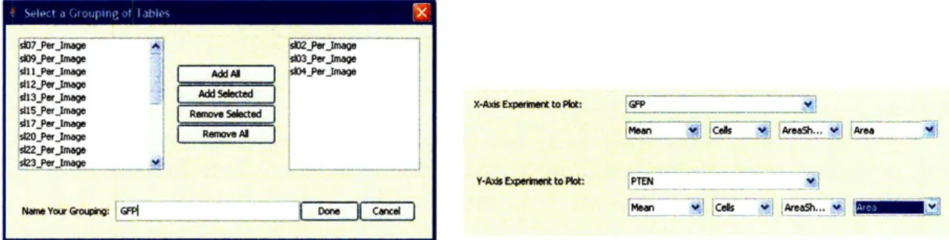
S102_PerImage. MeanCell_Area / S103_Per_ Image. MeanCell_Area) as columns to query a plot. As shown in Figure 4-6, the interface allows the user to select certain tables as groups, and then to select columns from these tables. When the user selects a grouped table, the system averages the values in the selected column across the tables in the group.
Once the user types or selects the column expression to query, TableColumn object is created and stored in the data model. The TableColumn object has two attributes: the column expression stored as a string and a list of tables that the expression references. In order to parse any arbitrary mathematical expression a user may input, we wrote a parser that identifies the variables in the expression, which in our case should be in table.column format. We then add the table, associated with each such
Figuyrjeg46e o oneine th~mjaeCelsulzrntraeaosusstoab gup
a l e, tJmage is fta erbs mage
Es ig Tabde LNk
:9l5l2_erjmage
E13_er Image dAdd STialo nb
ISesr mad dgRemov sttts -Atoh ExperkWe tolasth d
siblerjmege Remove egClly,_ h atai
417 Per Iage ,s923PerJmoage
r-Ae Expelk to Plott tt PTsN
Naoe Your GrOUmGPN oe Cne en oS:At~
Figure 4-6: For convenience, the CellVisualizer interface allows users to label groups of tables and then select columns from these tables to plot. CellVisualizer assumes the user is requesting the averages of the values in the columns. This feature allows the users to label replicates together and compare different groups of replicates. variable, to the list of tables.
Ensuring Table Links
Every time the data model is changed, either by adding/removing TableColumn ob-jects or adding/removing statements to the where clause, the data model is respon-sible for ensuring the integrity of all the necessary table links. Specifically, the data model must make sure that all the tables that are referenced in the SQL statement are linked to each other as necesssary.
Currently, the system handles this by assuming that there is a common column name that all "Per-Image" and "Per-ODbject" tables are linked by - e.g.
"ImageNum-ber". Notice that it doesn't make any sense for 2 different "Per Object" tables to be linked to each other because the objects measured in each image of a "Per Object" table have no underlying association with the objects in another "Per Object" table. Moreover, the user can also enter an additional table and specify how this table is linked to the data tables. By parsing every expression that is added to the data model, the data model knows from which tables it requests data from, and adds the corresponding links.
BasicDatastrategy ImageFromObjectStrategy
GroupedimageStrategy PerimageStrategy PerObjectStrategy
Figure 4-7: UML diagram of the data strategies currently implemented in the CellVi-sualizer system. Not all methods of the "Data Strategy" interface have been shown.
4.7.2 Data Strategy
In addition to all the data model attributes mentioned above, each data model has a "Data Strategy" object which specifies how the data model should retrieve the data from the database. We designed "Data Strategy" objects because we are interested in presenting the data in multiple ways. More specifically, we may want to plot the "Per Image" or the "Per Object" measurements of one particular experiment or we may be interested in plotting the averages, standard deviation, or other aggregations of the "Per Object" measurements. Other plots of interest would be measurements that group several "Per Image" tables together; for example, in the Fly203 database mentioned in Chapter 2, it would be useful to group and plot all the GFP knockout measurements versus all the PTEN measurements.
The "Data Strategy" interface defines methods for plotting the data and for select-ing/brushing/highlighting subsets of the data. We created a class that implements the "Data Strategy" interface for each distinct way to plot data; the class struc-ture is shown in Figure 4-7. If the system needs to be extended because there is a need to retrieve the data from the database in a different way, one would only have to implement the "Data Strategy" interface to ensure that all other components of CellVisualizer works as expected.
<<interface>>
DataStrategy
+getData (imodel: InfoModel) +getStreamData (imodel: InfoModel)
+computeResultsOf IDs (imodel: InfoModel, uniqueIDs:Liet<Integer>) +computeResultsOfGate (imodel: InfoModel, rangeList: List<Range>)
DlsplayModel DisplayModelUstener
+generaterigure ( +highlight1Dz (unique1Da:Lizt)
+getMinNumOfCo19( : int
+getMaxNumOfCol0: .int
- -- AbstractDsplayModel
-TableView) AbstactPltView
|Histogram| AbsVractXYlP-10 Fpa ra N e IC o-ord|
tScaterplot HeatMapPlot
Figure 4-8: UML diagram showing the class hierarchy of display model objects.
4.7.3
Plots
CellVisualizer currently has four different types of plots: histograms, scatterplots, 2-dimensional histograms, and parallel coordinates. In addition to these plots, users can also choose to view the data in a table. The system is designed to allow pro-grammers to add new types of plots. Figure 4-8 shows the current class hierarchy diagram of plots. Adding a new plot simply requires the programmer to implement the DisplayModel and DisplayModelListener interfaces. Plots use "data models" to get the data from the database. Users specify the "data model" for a particular plot through a graphical user interface and further alter or create new "data models" by interacting with open plots.
While we have used the word "plot" here to describe the entire figure that is drawn, including the labels and axes, it is worthwhile to note that the drawing of the actual charts (the bars in histograms and the points in scatterplots, for example) is encapsulated within each class. This design allows us to both separate CellVi-sualizer functionality from the charting functionality and to use different charting implementations if necessary.
43