Database Updates Using Interactive Pan and Zoom
Visualizations
by
Peter Griggs
B.S., Massachusetts Institute of Technology (2019)
Submitted to the Department of Electrical Engineering and Computer
Science
in partial fulfillment of the requirements for the degree of
Master of Engineering in Electrical Engineering and Computer Science
at the
MASSACHUSETTS INSTITUTE OF TECHNOLOGY
February 2021
© Massachusetts Institute of Technology 2021. All rights reserved.
Author . . . .
Department of Electrical Engineering and Computer Science
January 15, 2021
Certified by. . . .
Dr. Michael Stonebraker
Professor
Thesis Supervisor
Accepted by . . . .
Katrina LaCurts
Chair, Master of Engineering Thesis Committee
Database Updates Using Interactive Pan and Zoom
Visualizations
by
Peter Griggs
Submitted to the Department of Electrical Engineering and Computer Science on January 15, 2021, in partial fulfillment of the
requirements for the degree of
Master of Engineering in Electrical Engineering and Computer Science
Abstract
As datasets continue to get larger, there is a great need for visualization systems that scale well while maintaining interactivity. Kyrix [1] is a system that helps developers create scalable pan and zoom visualizations. It combines visualization paradigms for good performance like data tiling and prefetching with a database backend that creates spatial indexes for faster querying.
This thesis modifies Kyrix to support direct manipulation of datasets through a data visualization. We add bindings to the Kyrix specification that allow the developer to enable updates in a visualization. The user can then interact with the visualization and update the data in order to test a hypotheses, add new data, or fix a data error. We showcase this functionality by implementing three different types of Kyrix visualizations: an NBA timeline visualization, an election forecasting visualization, and a scatter plot visualization of NBA game scores. We report the update performance statistics for each of the demo visualizations and provide an evaluation of changes to the Kyrix specification language.
Thesis Supervisor: Dr. Michael Stonebraker Title: Professor
Acknowledgments
I am very grateful to all of the people who helped me learn and grow during my time at MIT. I would like to thank Professor Mike Stonebraker for supervising me while I worked on the Kyrix project, for sponsoring me as a research assistant, and for helping me learn about database research. I also would like to thank Wenbo Tao, who gave me advice and supported me when I faced difficulties with my initial Meng thesis project. Since I started on the Kyrix project as an undergraduate nearly 2 years ago, Wenbo has generously provided helpful guidance and mentorship. Another person vital to the success of my Meng was Adam Sah. Without him, I would not have the topic of my thesis. I would like to thank Adam for his advice and support throughout my Meng. Also, I would like to thank my collaborators at Megagon Labs, Çağatay Demiralp and Sajjadur Raman, who mentored me in my summer research project. Finally, I would like to thank all of the other people who gave me advice about research, careers, and life in general. This includes the other researchers involved in the Kyrix project: Elkindi Rezig, Leilani Battle, Remco Chang, Lei Cao, and many others.
Contents
1 Introduction 8
2 Background 10
2.1 Kyrix Architecture . . . 10
2.2 Kyrix Specification . . . 11
2.2.1 Canvases and Layers . . . 11
2.2.2 Jumps . . . 12 2.2.3 Transforms . . . 14 2.2.4 Rendering Functions . . . 15 2.2.5 Placement Functions . . . 16 3 Implementation 17 3.1 Update API . . . 17
3.2 Update User Interface . . . 18
3.3 Database Updates . . . 20
3.4 Example 1: NBA Timeline Visualization . . . 21
3.5 Example 2: Election Forecasting Visualization . . . 25
3.6 Example 3: Scatterplot Visualization . . . 30
4 Evaluation 35 4.1 Performance . . . 35
5 Related Work 39 5.1 Visual Query Interfaces . . . 39 5.2 Visualization Specifications . . . 40
6 Conclusion 41
6.1 Limitations . . . 41 6.2 Future Work . . . 42
List of Figures
2-1 Kyrix Architecture (From [2]) . . . 10
2-2 NBA Timeline Layers . . . 11
2-3 NBA Vis Logo and Timeline Canvases . . . 13
2-4 NBA Vis Logo Jump . . . 14
2-5 NBA Vis Logo Transform . . . 15
2-6 NBA Vis Logo Placement Functions . . . 16
3-1 Front-end Update Code . . . 19
3-2 Kyrix Update Menu . . . 20
3-3 NBA Timeline Layer Before Drag . . . 24
3-4 NBA Timeline Layer After Drag . . . 24
3-5 NBA Timeline Update Query . . . 25
3-6 State Level Canvas . . . 26
3-7 County Level Canvas . . . 27
3-8 Election Vis Update Workflow . . . 29
3-9 Scatterplot Before Update . . . 32
3-10 Scatterplot After Update . . . 32
3-11 SSV Update Query . . . 34
4-1 Visualization Performance Graphs . . . 37
4-2 Election Update Performance Breakdown . . . 37
A-1 Timeline Layer Transform . . . 44
A-3 State Transform . . . 46
A-4 County Layer Specification . . . 46
A-5 County Transform . . . 47
Chapter 1
Introduction
Details-on-demand is an effective method for interacting with datasets. This behavior is characterized by zooming and filtering on specific pieces of data in order to narrow down a relevant subset of the data. [3]. In more concrete terms, an example of this is zooming into a region in Google Maps and searching a specific type of place like a restaurant to further narrow down the results. Popular data exploration tools like Yahoo Finance [4] and Google Maps [5] as well as web data visualization libraries like D3.js [6], Vega [7], and Vega-Lite [8] support details-on-demand interactions.
Scaling details-on-demand interactions like pan and zoom while providing real-time results poses more challenges when a dataset contains many millions of data points. Prior work has shown that when interacting with a visualization, there is a limit of roughly 500 ms until the user starts to lose attention [9]. With millions of rows of data, naively filtering the whole dataset on each interaction can be too slow (>500 ms). To solve this, some visualization systems divide a coordinate space into tiles and precompute the tiles to reduce overhead [10] [5]. ImMens [11] uses data tiling, but goes a step further by precomputing aggregates of the dataset, which improves performance and reduces visual clutter. In addition to data tiling, Forecache [12] uses a technique called prefetching that fetches data tiles out of user view in the direction that they are scrolling. This technique allows the visualization to maintain interactivity even when it must continuously fetch data tiles. Systems like Forecache and Google Maps scale well to larger datasets, but are optimized to a specific type of data. This makes
it difficult for developers to use these techniques to visualize different types of data. They likely would have to re-implement all of the database indexing, data tiling, and prefetching that make user interactions scalable on large datasets. Kyrix [1] provides a general framework for specifying pan and zoom visualizations that enable data tiling and prefetching. Given a data source with bounding box information, Kyrix indexes the data into spatial data in a canvas coordinate system. Then, Kyrix can perform optimizations like data prefetching.
Kyrix visualizations are created by uploading a visualization specification to the system. They are static in that the visualization doesn’t change unless the database tables change and the developer re-compiles the specification. However, there are some cases in which a developer might want to allow a user to update the data in a visualization. For example, an application might visualize hospital data that changes daily. Normally, the end user would ask the developer to upload the new data to the database or request a special purpose data uploading tool. This is a process that is not only inconvenient for the user but also causes them to miss out on valuable information from the visualization. What if the user wanted to see how the visualization changes when they edit certain values? This kind of interaction is only possible with online updates that are driven by the user through the visualization. Additionally, hard-coded data uploading tools are not extensible to multiple types of visualizations. The purpose of this thesis is to modify Kyrix to support data updates that are driven by user interactions. We aim to use Kyrix’s visualization abstractions to simplify complex database queries into user friendly interactions. Rather than running hand-written queries in the database shell, they can use more intuitive interactions like drag and drop and visual widgets.
The rest of this thesis details how we support this behavior by implementing front-end interactions, generating database update queries, and modifying the Kyrix visualization specification.
Chapter 2
Background
2.1
Kyrix Architecture
At a high level, Kyrix works by incrementally fetching data stored in a database server and rendering it into an svg visualization (see Fig.2-1). The developer first uploads a visualization specification, which contains information about how the source data is selected, and JavaScript rendering functions for the visualizations themselves. The Kyrix compiler checks this specification to ensure it is valid, then transforms the data by converting it into a coordinate system that Kyrix can map onto the browser’s viewport. The backend server stores the transformed data in the database and builds spatial indexes on that data to achieve fast queries. When the frontend client loads, it requests all of the objects that intersect with a bounding box around the viewport. Then once the user pans or jumps in the visualization, the frontend will request new data tiles and calculate a new viewport bounding box.
Figure 2-2: NBA Timeline Layers
2.2
Kyrix Specification
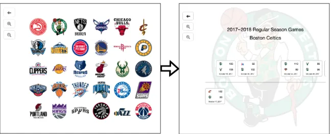
In order to create a Kyrix visualization, a developer provides a JavaScript specifica-tion, which is compiled by Kyrix into a resulting visualization and database tables. The Kyrix specification uses several abstractions to describe a pan and zoom visu-alization. In this section, we use the NBA timeline visualization, which is shown in Fig.2-2, to explain each of the abstractions and their definitions. This visualization presents team and game data from the 2017-2018 NBA season. The timeline visual-ization consists of two canvases: (1) a top level canvas that renders a static grid of team logo images and (2) a bottom level canvas that renders a dynamic timeline of games played by the selected team. In Fig.2-2, canvas (1) is on the left and (2) is on the right.
2.2.1
Canvases and Layers
A Canvas is the foundational building block of a Kyrix visualization. It is a visualiza-tion space of a given width and height that contains one or more layers. For example, Fig.2-3 declares the top level logo layer using the constructors Canvas("teamlogo", 1000, 1000) where "teamlogo" is the name of the canvas and 1000 is its width and height. A layer is a visualization object placed in a canvas that uses a rendering function to render visualization objects and a transform function to select data from
the database server. Layers can be either static or dynamic. A static layer is one in which the user cannot pan and fetch new data, and is primarily used to render images and legends. On the other hand, a dynamic layer allows the user to pan around a visualization and continuously fetch new data that intersects with the viewport. For instance, the "teamLogoLayer" layer that displays static images of the teams logos in the top canvas of the nba visualization is static (see Fig.2-3). The "timelineLayer" layer that displays a team’s games in a timeline visualization is dynamic because it allows the user to pan between games earlier in the season and later in the season (see Fig.2-3). A layer is specified by creating a Layer object with the constructors Layer(transforms.teamTimelineTransform, false), where the first argument is a transform function and the second argument is a boolean variable determining whether the layer is static.
2.2.2
Jumps
A jump specifies a directional relationship between a source canvas and a destination canvas. In the simplest case, a jump could simply mean zooming into a scatterplot by a factor of two, for example. This type of jump is called a "literal zoom", mean-ing that jumpmean-ing from one canvas to the next is just geometrically scalmean-ing usmean-ing the same coordinate system. However, the NBA visualization uses a type of jump called a "semantic zoom", which is used when moving from one canvas to the next can-vas involves changing coordinate systems. In Fig.2-4, the kyrix specification for the NBA visualization shows that there is a semantic zoom between teamLogoCanvas and teamTimelineCanvas. The semantic zoom makes sense in this case because the team logo canvas visualizes entirely different data than the timeline visualization. Addi-tionally, a jump specifies several options besides the canvases and type of jump. The selector function in a jump filters which objects can be used to jump to the desti-nation canvas. The jump from the logo canvas is enabled for all team logos, so the selector function returns true. The viewport function determines what coordinates the jump should go to after transitioning between canvases. The viewport function in Fig.2-4 returns [0,0], so this jump will go to the starting coordinates of the timeline,
Figure 2-3: NBA Vis Logo and Timeline Canvases
1 var p = new Project("nba", "../../../config.txt"); 2 p.addRenderingParams(renderers.renderingParams); 3
4 // ================== Canvas teamlogo =================== 5 var teamLogoCanvas = new Canvas("teamlogo", 1000, 1000); 6 p.addCanvas(teamLogoCanvas);
7
8 // logo layer (static)
9 var teamLogoLayer = new Layer(transforms.teamLogoTransform, true); 10 teamLogoCanvas.addLayer(teamLogoLayer);
11 teamLogoLayer.addRenderingFunc(renderers.teamLogoRendering); 12
13 // ================== Canvas team timeline =================== 14 var width = 1000 * 16;
15 var height = 1000; 16
17 // construct a new canvas
18 var teamTimelineCanvas = new Canvas("teamtimeline", width, height); 19 p.addCanvas(teamTimelineCanvas);
20
21 // pannable timeline layer (dynamic)
22 var timelineLayer = new Layer(transforms.teamTimelineTransform, false); 23 teamTimelineCanvas.addLayer(timelineLayer);
24 timelineLayer.addPlacement(placements.teamTimelinePlacement); 25 timelineLayer.addRenderingFunc(renderers.teamTimelineRendering); 26
27 // static background layer
28 var timelineBkgLayer = new Layer(transforms.teamTimelineStaticTransform, true); 29 teamTimelineCanvas.addLayer(timelineBkgLayer);
Figure 2-4: NBA Vis Logo Jump
1 // ================== teamlogo -> teamtimeline =================== 2 var selector = function() { return true; };
3 var newViewport = function() { return {constant: [0, 0]}; }; 4 var newPredicate = function(row) {
5 var pred0 = {
6 OR: [{"==": ["home_team", row.abbr]}, {"==": ["away_team", row.abbr]}]
7 };
8 var pred1 = {"==": ["abbr", row.abbr]}; 9 return {layer0: pred0, layer1: pred1}; 10 };
11 var jumpName = function(row) {
12 return "2017~2018 Regular Season Games of\n" + row.city + " " + row.name; 13 };
14 p.addJump(
15 new Jump(teamLogoCanvas, teamTimelineCanvas, "semantic_zoom", {
16 selector: selector, 17 viewport: newViewport, 18 predicates: newPredicate, 19 name: jumpName 20 }) 21 );
scrolled all the way to the left. Finally, the predicate function returns predicates for filtering data in the layers used in the jump. In Fig.2-4, pred0 uses the selected team to filter games where the team played as the home or away team.
2.2.3
Transforms
A Transform specifies the source of the data used to render a layer. The Transform object is initialized with a database name and a query used as the input to the transform function. For example, in Fig.2-5, the teamLogoTransform object selects all of the rows and columns from the teams table in the nba database. The transform function is a JavaScript function that performs data transformations on the provided input columns from the select query. It is primarily used to calculate attributes like the coordinates of objects in the visualization. When the Kyrix server indexes data, it runs the developer provided transform function in a Javascript engine called Nashorn [13]. This engine lets the Kyrix server, which uses the Java runtime, execute
Figure 2-5: NBA Vis Logo Transform
1 var teamLogoTransform = new Transform( 2 "select * from teams;",
3 "nba",
4 function(row) {
5 var id = parseInt(row[0]);
6 var y = Math.floor(id / 6);
7 var x = id - y * 6;
8 var ret = [];
9 ret.push(row[0]);
10 ret.push((x * 2 + 1) * 80); // x coordinate of logos
11 ret.push((y * 2 + 1) * 80 + 100); // y coordinate of logos
12 for (var i = 1; i <= 4; i++) {
13 ret.push(row[i]); // raw data attributes
14 }
15 return ret;
16 },
17 ["id", "x", "y", "team_id", "city", "name", "abbr"],
18 true
19 );
JavaScript code written by the developer and capture its output. Then, it uses the resulting data to populate the Kyrix index tables. In Fig.2-5, we see that the teamLogoTransform calculates coordinates for the team logo objects in its transform function and copies the rest of the column values. The return value of a transform function is an array of attributes that are associated with the visualization objects in the layer. After the transform function, the Transform object is passed a columnNames argument, which is an array of attribute names that matches the outputs of the transform function. In Fig.2-5, we see that the columnNames argument is passed with attributes "x" and "y", which don’t exist in the teams table but are computed in the transform function.
2.2.4
Rendering Functions
A Rendering Function is a JavaScript function that is passed into a layer and used to render the visualization objects. This function is run on the front-end and uses D3.js [6] to bind a layer’s data to the svg. For instance, in Fig.2-3, the teamLogoLayer uses the rendering function teamLogoRendering. This function binds the transform
Figure 2-6: NBA Vis Logo Placement Functions 1 var teamTimelinePlacement = { 2 centroid_x: "col:x", 3 centroid_y: "col:y", 4 width: "con:160", 5 height: "con:130" 6 };
data for that layer to the svg, defines attributes like xy coordinates, width, height, and renders the images of team logos.
2.2.5
Placement Functions
To improve performance, Kyrix only fetches objects that are located near the user’s viewport and prefetches objects when a user pans around the visualization. In or-der to achieve this, Kyrix needs to know the bounding boxes of the objects. The developer must specify a Placement Function for each dynamic layer, which pro-vides the centroid of the bounding box and the dimensions. The values given can either be constants or column names. For instance, in Fig.2-6, we see that the teamTimelinePlacement function uses the x and y columns to determine the lo-cation of the game visualization objects seen in the NBA timeline layer (see Fig.2-2). Kyrix uses these locations to optimize fetching new data when the user pans left or right and quickly render games.
Chapter 3
Implementation
3.1
Update API
Kyrix requires a JavaScript specification defining the Canvases, Layers, Jumps, etc. for a visualization app (see “Background" for more details). Kyrix layers are not up-datable by default. If a developer wishes to allow updates for attributes of a layer’s transform then they may specify this by using the setAllowUpdates() function on a layer in the kyrix specification (see A-4). This function enables the allowUpdates flag in a Layer object, which tells the front-end to attach an update handler to the visu-alization objects for that layer. Since transforms typically contain static data like an id column, attributes default to being read-only. In a typical Layer (see Fig.A-3), an array of string column names is passed into the Transform constructor along with the transform function. However, for update-enabled layers (see Fig.A-5), the Kyrix com-piler allows the column names to be passed as an object where each key is the string column name and each value is a JavaScript function used to update other attributes. This is necessary because an object’s attributes are often related. For example, in a time-series visualization where x and y represent time and cost respectively, chang-ing the y value of a data point will change the cost attribute as well. We refer to this function as an update function or reverse function. The function object that is passed into a Transform is stored as Transform.reverseFunctions. If the function value for a key is null, then the attribute is stored in Transform.columnNames, but
is a read-only attribute. If the function is specified with the correct arguments and return type, then it will be stored as a string in Transform.reverseFunctions and the attribute will allow updates.
There are several classes of Kyrix visualizations that are hierarchical by nature. For example, a Kyrix scatterplot is hierarchical because it consists of multiple canvases that use the same base data. Each canvas descending from the top of the hierarchy contain the same data, but are larger in size to support rescaling while zooming. Another example is a geographic map visualization, because it aggregates data from canvases below the highest level region. In these cases, any update to the lower level canvas should trigger changes in the canvases above it. Since each layer has its own independent Kyrix index table, the server needs to keep track of its dependency graph outside of the database. A layer can specify a dependency with another layer using the addDependency function. A layer that has one or more dependencies will traverse the dependency graph and re-run the transforms for those layers.
3.2
Update User Interface
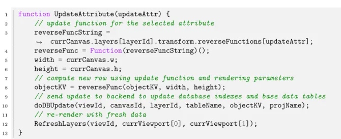
Similar to how Kyrix fetches new data from the database when a user pans or zooms around a visualization, updates are driven by front-end interaction. The jump option menu is a UI menu that appears when a user clicks on a visualization object. Normally, it renders buttons that the user can click on to zoom into canvases that are connected to the current canvas by a jump. If the selected object is in a layer that allows updates, the update option will appear alongside zoom options or by itself if the canvas is at the bottom level of the visualization (see Fig. 3-2). When the user clicks on the UPDATE ATTRIBUTES option in the jump menu, the update menu appears with input fields for each of the updatable attributes. Each attribute is pre-filled with its value from the most recent call to the Kyrix server, which the user can directly manipulate. The user can only modify one attribute at a time, because two attributes may depend on each other. For example, let’s consider a case where attribute a depends on b and b depends on a. If we run the update function to calculate the new row, we will
Figure 3-1: Front-end Update Code
1 function UpdateAttribute(updateAttr) {
2 // update function for the selected attribute
3 reverseFuncString =
currCanvas.layers[layerId].transform.reverseFunctions[updateAttr];
˓→
4 reverseFunc = Function(reverseFuncString)();
5 width = currCanvas.w;
6 height = currCanvas.h;
7 // compute new row using update function and rendering parameters
8 objectKV = reverseFunc(objectKV, width, height);
9 // send update to backend to update database indexes and base data tables
10 doDBUpdate(viewId, canvasId, layerId, tableName, objectKV, projName);
11 // re-render with fresh data
12 RefreshLayers(viewId, currViewport[0], currViewport[1]); 13 }
end up with potentially conflicting values of a and b from the reverse function. To avoid this undefined behavior, when the user clicks on the “Save" button for a given attribute, Kyrix will use the most recent version of the data and change only the value of the selected attribute. Next, the reverse function for the modified attribute is run in the front-end. The output of the JavaScript reverse function is used as the updated row in the current layer’s index table (see Fig.3-1 for pseudocode).
The update menu is general in that it can be used to update any data attribute in the object’s transform. One caveat to enabling updates for an attribute is that the attribute specified in the columnNames of a Transform object has to match the database column name.
The other type of interaction for updating an object is drag and drop (example in Fig.3-3). If a layer is updatable and has an update function specified for the x or y attribute, Kyrix will attach a drag event handler to the layer’s visualization objects. When the drag starts and is in progress, the drag event handler stores the change in x (dx) and change in y (dy). Then, once the user drops the object and triggers the drag end event, dx and dy are added to the x and y attributes and their update functions are run (Fig. 3-1). Normally, the frontend only runs one update function at a time so that their results don’t conflict. However, when using drag and drop it is necessary to support update functions for both x and y. For instance, x and y represent 2
Figure 3-2: Kyrix Update Menu
independent variables in a scatter plot. Since the two variables are independent, they must have reverse functions that don’t overwrite each other’s attributes. If a layer that enables drag and drop specifies reverse functions for both x and y, Kyrix assumes that the functions don’t conflict.
When the UpdateAttribute function is called, the frontend sends an update request to the Kyrix server. If the update request is successful, the dynamic layers in the visualization are refreshed, meaning that objects using stale data are deleted and re-rendered.
3.3
Database Updates
The Kyrix server’s Update Handler listens on API endpoint \update for update requests from the frontend. To update the selected visualization object’s attributes in the database, the update handler will first update the Kyrix index table for that layer using specified key columns to filter the target row(s). When it runs the transform function for a layer, the Kyrix server creates and populates an index table, which it uses when fetching new data. For example, bbox_nba_teamtimelinelayer0 is the index table for the dynamic timeline layer in the NBA timeline visualization (Fig.2-2). These tables contain the location and bounding box dimensions for each visualization object in a layer. In addition, they store all of the data attributes of an object as text columns. Once the update handler finishes updating the index table for the
layer, it queries the project database to find the data types for each valid attribute that is mapped to the base data table. It then updates the base data table that the layer’s index table is derived from. This is necessary because the index table is destroyed and re-populated each time the visualization is re-indexed. If the update handler didn’t update the base data table as well, the updates would only be stored as long as the application was not restarted. In the simple case where each layer is completely independent, we only need two update queries. However, there are several cases where the relationships between layers are not so simple. One common example is in a Kyrix scatterplot where multiple canvases have layers with identical data but different scaled spatial coordinates, representing the zoom level of the canvas in the visualization. In this example, we must update rows with the same id in each canvas representing a zoom level. This is important to maintain consistency, so a user doesn’t see a point’s data change as they zoom into the scatterplot. Another case in which we must update dependent layers is when one layer aggregates data from the layers beneath it. Geographic visualizations are an example of this because it is standard for a region to visualize aggregated data from subregions it contains. If a layer has dependencies, they are updated recursively in a directional dependency graph.
3.4
Example 1: NBA Timeline Visualization
As described in the "Background" section, the NBA timeline visualization is a visu-alization of all games during the 2017-2018 season. Figure 2-2 shows that the top level canvas of the visualization renders a grid of logo images representing all of the teams. The user can click on a team logo to jump to the bottom level canvas of the visualization, which renders a timeline of a team’s games over the season. The user can then pan to see games along the course of the season. By enabling updates in this visualization, Kyrix adds the functionality of being able to schedule games. This would be useful to a user who is in charge of determining the schedule for a team and who might need to re-schedule games. Additionally, due to Kyrix’s extensible specification language, this functionality can be extended to other applications with
timestamped data like calendars or time-series graphs.
The specification for the canvases and layers of this Kyrix application is shown in Fig. 2-3. The teamLogoCanvas canvas is defined as an 1000 by 1000 canvas that has a single static layer teamLogoLayer, which renders the static logo images. The teamTimelineCanvas canvas is defined as a 16000 by 1000 canvas with two layers. Its primary layer is the dynamic timeline layer of a team’s games, timelineLayer, which lets the user pan along the x axis to change the date range of games in the viewport. The canvas is very wide to support placing game objects so that they don’t overlap. The second layer, timelineBkgLayer, is a static layer that renders the team logo in the background of the timeline. The team logo canvas is connected to the timeline canvas by a semantic zoom shown in Fig.2-4. This jump specifies that the predicate for selecting games is: home_team == row.abbr OR away_team == row.abbr. This means that when the user jumps from a team’s logo, the team timeline layer is rendered with game data filtered by the selected team. Additionally, the new viewport after the jump is [0,0], meaning that the user jumps to the far left of the timeline (the beginning of the season).
The transform query in Fig.A-1 shows the columns from the games table used by the timeline visualization. In the game table, game_id is a text column that uniquely identifies a game. The year, month, and day columns are integers used to compute the game date in the transform function. The transform function in Fig.A-1 uses d3.scaleTime() to interpolate the x coordinate of the game object in the canvas space according to its date. The transform function also uses the date columns to calculate the y coordinate by simply alternating between a y value above the center of the timeline and a y value below the center of the timeline. This placement is fairly arbitrary but helps to relieve some visual cluttering. The home_team and away_team columns are text abbreviations of the team names used to populate the game objects. For example, in Fig.3-3, the game object renders the Atlanta Hawks team logo above the Boston Celtics logo because home_team=’ATL’. Finally, the home_score and away_score columns are integers that represent the points scored by the home team and away team, respectively. Since the teamTimelineTransform
is an updatable transform, the columnNames attribute is specified using an object rather than an array of attribute names. In Fig.A-1’s provided columnNames, x is the only column that has a non-identity update function. This function simply reverses the interpolation done by the forward transform in that it calculates the date from the x coordinate. It is simple to implement this in D3.js [6] by switching the domain and range of the scaling function and using d3.scaleLinear() instead of d3.scaleTime().
Once the update functions are provided in the Transform object, the developer has to enable updates through the Layer API. The only change the developer has to make
to the Canvas and Layer specification in Fig.2-3 is to call timelineLayer.setAllowUpdates(). This sets the flag in the Layer object that tells the Kyrix front-end to attach update
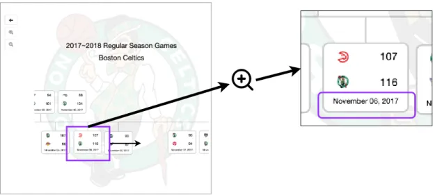
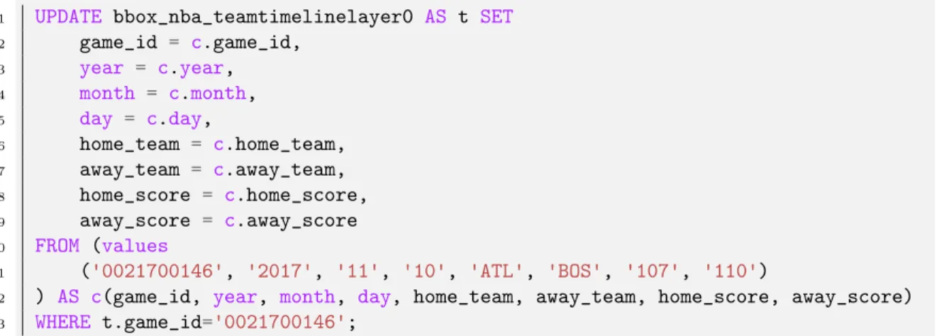
handlers to each of the visualization objects for that layer. Since the specification provides an update function for the x column, the Kyrix front-end will attach a drag event listener to the visualization objects in timelineLayer. When the object is dropped horizontally a distance greater than a constant threshold (currently set to 50 in screen coordinates), the drag listener runs the update function for x and sends the update request to the Kyrix server. Fig.3-3 shows an example of a game object before it is updated. The original game is scheduled on November 06, 2017. Fig.3-4 shows the result of a user dragging and dropping the selected game to the right. As we can see in Fig.3-4, the rendered date is changed as a result of running the update function for the new x value. The new date for the game is November 10, 2017, which makes sense because games are placed along the x axis in ascending order based on date. When the updated attributes for the selected object are sent to the Kyrix server, they are translated by the update request handler into SQL UPDATE queries. Figure 3-5 shows the update query generated by the drag and drop update in the NBA timeline. This query updates the Kyrix index table for the timeline layer, which is why all of its values are strings. An analogous update query is run on the base data table to update the data used in the transform. In this example, game_id is the key column, or the column that the update handler uses to filter the rows.
Figure 3-3: NBA Timeline Layer Before Drag
Figure 3-5: NBA Timeline Update Query
1 UPDATE bbox_nba_teamtimelinelayer0 AS t SET
2 game_id = c.game_id, 3 year = c.year, 4 month = c.month, 5 day = c.day, 6 home_team = c.home_team, 7 away_team = c.away_team, 8 home_score = c.home_score, 9 away_score = c.away_score 10 FROM (values 11 ('0021700146', '2017', '11', '10', 'ATL', 'BOS', '107', '110')
12 ) AS c(game_id, year, month, day, home_team, away_team, home_score, away_score) 13 WHERE t.game_id='0021700146';
3.5
Example 2: Election Forecasting Visualization
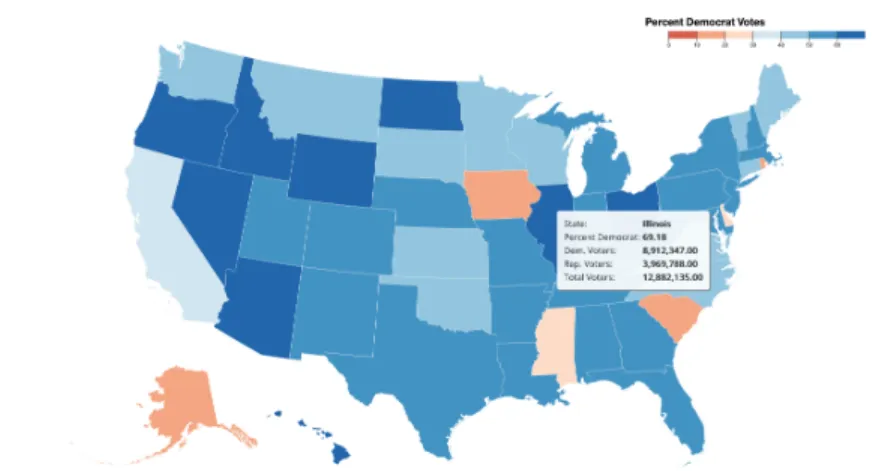
This visualization has a top level canvas and a bottom level canvas, which visualize states and counties, respectively. The top level canvas shows the percentage of voters voting for a political party (Fig.3-6). The states with a higher republican party vote share are more red and the states with a higher democratic party vote share are more blue. The user can see specific statistics by mousing over the state and can zoom into a state by jumping to the county level canvas. The bottom level canvas, which represents vote share at the county level, visualizes it in the same way as the state level canvas and lets the user pan around to see counties in multiple states at the same time (Fig.3-7).
This visualization is inherently hierarchical because state level data is an aggrega-tion of county level data. Using the Kyrix API to specify a hierarchical relaaggrega-tionship between the layers in the two canvases is simple and coordinates updates to the ta-bles used by the layers in the visualization. Fig.A-2 is the Kyrix specification for the election visualization, but is less verbose than a typical Kyrix specification because it uses the USMap template. This template pre-defines the state canvas, county canvas, and renderers for region boundaries. The developer provides a JSON object to initial-ize the template which contains relevant environment variables like the data source and map color scheme. For example, in Fig.A-2, the arguments object specifies that
Figure 3-6: State Level Canvas
the project database is election, the source tables for the state and county canvases are state and county respectively, and the column used to color the regions is rate. Additionally, the arguments object specifies the range and step for the data column, which are used to calculate the color scale and map legend. In this case, the range of rate is [0,100] because it represents the percent of voters. The other fields in the arguments object specify the legend title and attribute name in the tooltip. When the user mouses over a state or county region, the tooltip displays data including: the state or county name, the percentage of democrat voters, the number of demo-crat voters, the number of republican voters, and the number of total voters. The distribution of voters is randomly generated in the dataset used for this visualization, but the overall number of voters in each region is based on open source population data [14].
The transform queries for the state and county layer show the columns in the base table used by the election visualization (see Fig.A-5 and Fig.A-3). In the county table, which is the source table for the county canvas, name is the text column storing the name of the county (i.e. "Middlesex County"). The columns state_id and county_id are integer columns where state_id is unique across all states and county_id is unique only within the same state. Additionally, dem_votes, rep_votes, and total_votes are all integer columns such that dem_votes + rep_votes = total _votes. Columns dem_votes and rep_votes represent the number of votes for the Democratic Party
Figure 3-7: County Level Canvas
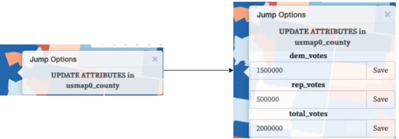
and the Republican Party, respectively. Column total_votes is an estimate of the total amount of voters in a region using the population. Column rate is the ratio of democratic party votes to total votes and is used as the county color in the Kyrix visualization. Note that a small value (0.01) is added to the denominator to calculate rate to prevent division by zero in case total_votes is 0 for some row. Finally, column geomstr is a text column which contains a GeoJSON string representing the geometry of the county. This column is used in the rendering function of the USMap template and in calculating the placement of the counties. The county canvas has two layers: the main layer which renders the map of counties and the legend layer seen at the top right (see Fig.3-7). The main county layer uses countyMapTransform as its source of data. The transform function in countyMapTransform is defined elsewhere in the USMap template and copies every attribute from the countyQuery into the visualization object except for bbox_x, bbox_y, bbox_w, bbox_h, which are calculated using the dimensions of the canvas and the geomstr of a region. Since the main county layer is updatable, we pass an object of update functions into the Transform rather than an array of attribute names. Attributes that are not updatable such as bbox_x are mapped to null values. However, the user can update dem_votes and rep_votes according to the simple invariant: dem_votes + rep_votes = total _votes. As explained in earlier in this section, JavaScript update functions are provided as part of the Transform object specification and run in the front-end when an attribute
is changed from the update menu or dragged. In this case, dem_votes and rep_votes are inverses, so changing one affects the other.
The transform for the main layer in the state canvas is different from a typical transform in that its data source is not a single table but instead a join between the county and state tables. This is how Kyrix allows hierarchical layers, which must specify some shared columns. In this case, we join on the integer column state_id, so that each state aggregates the counties in that state. Text column name and integer column state_id are not modified by the Kyrix visualization, so they are simply copied from the state table. Integer columns total_dem_votes and total_rep_votes are SUM aggregates of the county table’s dem_votes and rep_votes columns, respectively. In the visualization, this means that the number of state votes for each party is just the sum of the votes for that party in each county. Column rate is the ratio of democratic party votes to total votes and is used as the background color for each state. Like in the county canvas transform, we add an epsilon to total votes when calculating rate so that we never divide by zero. Finally, the text column geomstr contains a GeoJSON string which is used to render the boundary of the state. The query for the state transform uses an inner select statement because it has to use the aggregated dem_votes and rep_votes values to calculate the rate column.
As explained in "Background", when a transform is processed, a new table is cre-ated in the Kyrix database for that specific canvas and layer using the data returned by the transform function. In order for an update to propagate from a layer’s source table to the layer that depends on it, the developer must specify a dependency be-tween those layers. For example, Fig.A-4 shows a dependency bebe-tween the main layer in the county canvas and the main layer in the state canvas. This is specified by calling countyBoundaryLayer.addTransformDependency(stateBoundaryLayer). When this function is called, it triggers an update to the state layer index table after the county layer changes, causing that layer to re-run its transform. Additionally, calling countyBoundaryLayer.allowUpdates() sets a flag on the layer to enable updates from the Kyrix interface.
visual-Figure 3-8: Election Vis Update Workflow
ization. View 1 (top-left) shows what the user sees when they mouse over Utah in the state canvas. The tooltip shows the rate column (displayed as “Percent Democrat") is 51.53%. View 2 (bottom-left) shows a part of the county canvas, which the user can see when they zoom into Utah. Specifically, it shows what appears when the user mouses over Salt Lake County. The user can then modify the number of voters for a particular party in that county, which initially has 600, 000 Democratic Party voters and 428, 721 Republican Party voters. Let’s say that the user wants to see how the visualization changes if 300, 000 more of the total voters vote for the Democratic Party. They can edit attributes that allow updates through the update menu, seen in View 3 (center). Once the update is run for that layer, the new data is reflected in the county canvas in View 4 (bottom-right). Since a dependency is specified between the main county layer transform and the main state layer transform, the update is propagated to the state canvas and can be seen when the user zooms out again in View 5 (top-right). We can see that the rate column changed from 51.53% to 61.87% after updating the county.
3.6
Example 3: Scatterplot Visualization
Scalable Scatterplot Visualizations (SSV ) is a visualization template that is integrated with Kyrix. SSVs provide a more lightweight JSON-based specification language to create scatterplots [15]. Rather than manually connecting up many canvases at differ-ent scales, a user just has to specify an SSV JSON object and add it to the project. Also, SSVs use hierarchical clustering to reduce visual clutter at each level. Even if there are millions of data points, the top level will only show a small number of the clusters’ representatives. As the user zooms in, more objects within the visible clusters will appear. Figure A-6 shows the specification for the SSV in Fig.3-9 that renders games from the NBA season dataset. The home_score and away_score in-teger columns are used as the x and y axes, respectively. In addition to providing columns for the x and y axes, the specification must include an extent, or valid range, for these columns. These values are just calculated by taking the min and max of the game scores for each column over the entire dataset. In an SSV, the z field is used to sample data points in a cluster. For this particular SSV, the agg_rank column is chosen as the z field. This field is calculated by adding the ranks of the home team and away team that play in that game. The order given is "asc", meaning that Kyrix will sort the game objects by agg_rank in ascending order so the game where the best teams play each other is most likely to be sampled. Note that the y axis in the example SSV in Fig.3-9 decreases from the origin as opposed to the x axis which increases from the origin. This means that games where the home team won by a large margin are in the top right of the scatterplot and games where the away team won by a large margin are in the bottom left.
Since SSV is a template for a scatterplot, it has the same type of transform function for each visualization. This transform function is defined within Kyrix and is run when compiling an SSV specification to prepare the data.
ssv_x(level,x) =(︂ (𝑊 − 𝑏𝑏𝑜𝑥𝑊 ) * (𝑥 − 𝑙𝑜𝑋) (ℎ𝑖𝑋 − 𝑙𝑜𝑋) + 𝑏𝑏𝑜𝑥𝑊 2.0 )︂ * 𝑍𝑙𝑒𝑣𝑒𝑙 (3.1) ssv_y(level, y) =(︂ (𝐻 − 𝑏𝑏𝑜𝑥𝐻) * (𝑦 − 𝑙𝑜𝑌 ) (ℎ𝑖𝑌 − 𝑙𝑜𝑌 ) + 𝑏𝑏𝑜𝑥𝐻 2.0 )︂ * 𝑍𝑙𝑒𝑣𝑒𝑙 (3.2)
The equation for calculating SSV coordinates is the same for all SSVs, but depends on several variables. Consider the equation for ssv_x, which is very similar to ssv_y. The level parameter represents the zoom level, where 0 is the top level. The other parameter (x ) is the value of the x field for that data point. In Fig.3-9, x, or the home score, would be 129 for the selected game. The W variable is the width of the top level canvas, which defaults to 1000. The bboxW variable is the width of the game object bounding box, given in the SSV specification. In Fig.A-6, this is specified as 162. The SSV specification lists the extent of x, which is used as loX and hiX to calculate the canvas coordinates. Finally, Z is the zoom factor in the SSV, which defaults to 2. The variables for ssv_y are analogous, except they use the y value and the specified heights. Each level of the SSV transforms its data into cartesian coordinates using the equations for ssv_x and ssv_y. Then, they are clustered, sampled, and inserted into Kyrix index tables and the frontend can fetch SSV data.
Similar to the NBA timeline visualization, Kyrix attaches a drag handler to each object that lets the user drag and drop an object somewhere else on the screen. However, in this visualization, both x and y have update functions that are computed when an object is dropped in a different location. For example, after the user drags the game object that initially has home_score=129, away_score=83, it updates to home_score=130, away_score=91.
Figure 3-9: Scatterplot Before Update
X(level, ssv_x) =(︂ 𝑠𝑠𝑣_𝑥 𝑍𝑙𝑒𝑣𝑒𝑙 − 𝑏𝑏𝑜𝑥𝑊 2.0 )︂ *(︂ ℎ𝑖𝑋 − 𝑙𝑜𝑋 𝑊 − 𝑏𝑏𝑜𝑥𝑊 )︂ + 𝑙𝑜𝑋 (3.3) Y(level, ssv_y) = (︂ 𝑠𝑠𝑣_𝑦 𝑍𝑙𝑒𝑣𝑒𝑙 − 𝑏𝑏𝑜𝑥𝐻 2.0 )︂ *(︂ ℎ𝑖𝑌 − 𝑙𝑜𝑌 𝐻 − 𝑏𝑏𝑜𝑥𝐻 )︂ + 𝑙𝑜𝑌 (3.4)
Equation 3.3 and 3.4 represent the update function logic for reversing the new x and y coordinates, respectively. These equations are just rearrangements of 3.1 and 3.2. When the frontend sends an update request to the Kyrix server for a layer in the SSV, Kyrix cannot simply update just that layer’s tables. Since canvases in the SSV represent different zoom levels, a game object might appear in several other canvases. SSVs use sampling, so an object will appear in all zoom levels below it, but not necessarily be in zoom levels above it. For example, in Fig.3-10, a user moves an object in the top level canvas. Figure 3-11 shows the corresponding update query in the top level canvas (level 0). However, to maintain zoom consistency, the update handler generates update queries for each canvas below the updated object (9 in total). When updating the layers below, the update handler must recalculate the object’s ssv coordinates using equations 3.1 and 3.2.
Figure 3-11: SSV Update Query
1 UPDATE bbox_ssv_custom_ssv0_level0layer1 AS t SET 2 year = c.year, 3 home_score = c.home_score, 4 away_score = c.away_score, 5 maxy = c.maxy, 6 maxx = c.maxx, 7 agg_rank = c.agg_rank, 8 away_team = c.away_team, 9 month = c.month, 10 miny = c.miny, 11 cx = c.cx, 12 minx = c.minx, 13 cy = c.cy, 14 home_team = c.home_team, 15 day = c.day, 16 game_id = c.game_id 17 FROM (values 18 ('2018', '130', '91', 274.83, 947.62, '16', 'PHX', '2', 142.83, 19 866.62, 785.62, 208.83, 'GSW', '12', '0021700846')
20 ) AS c(year, home_score, away_score, maxy, maxx, agg_rank, away_team, month,
21 miny, cx, minx, cy, home_team, day, game_id)
22 WHERE
Chapter 4
Evaluation
4.1
Performance
To evaluate update performance, we measure the latency of update requests for the NBA timeline visualization, election visualization, and SSV (scatterplot) visualiza-tion. We collected 100 update requests for each visualization by initiating the updates through the frontend and measuring the running time of the update request handler. Figure 4-1(a), Figure 4-1(b), and Figure 4-1(c) are histograms visualizing the distri-bution of update request length. Figure 4-1(d) shows the average and median update request length for each visualization.
The NBA timeline visualization is the visualization with the lowest latency of the three. The team timeline layer is independent from all other layers in the NBA timeline visualization, so it only has to update the Kyrix index table and base data table for the timeline layer. Performing essentially one update should be very quick, which explains why the average update time for this visualization is only 58 ms.
The SSV (scatterplot) visualization takes longer than the timeline visualization, but is still relatively fast. In the worst case, updating the SSV causes the server to run 10 update queries on different tables. This happens when the layer in the top level canvas is updated. At the same time, updates in lower level layers cause fewer layers to be updated as a result of sampling. On average, this visualization takes 177 ms to update an object after moving it.
Both of the previous visualizations have an average update time that allows the update to run while maintaining interactivity. However, the election heatmap visu-alization has a shockingly long update time. On average, it takes 4900 ms or almost 5 seconds to update this visualization.
To better understand why this visualization’s updates are slow, Figure 4-2 breaks down the longest steps in the hierarchical update. As discussed in the "Implementa-tion" section, the election map visualizes the percentage of Democrat and Republican voters in each county. The state canvas aggregates data from counties in that state to calculate its own voter percentages. When a user updates the county layer, the update function is run and the resulting attributes are sent to the update handler for that layer. However, the update handler must also re-run the transforms for both the canvas layer and the state layer. This is necessary because the percentages are computed in the transform queries for these layers. In Fig.4-2, the slowest step is the "Setup Transform Sandbox" step. This step involves initializing Nashorn [13], which is a JavaScript engine that lets the Java runtime execute JavaScript code and capture its output. A sandbox is typically used to run untrusted code in an isolated environ-ment to avoid unwanted bugs like memory leaks. Since Nashorn executes a JavaScript runtime alongside the Java runtime, we refer to this engine as a sandbox. However, our main goal is not security, so we do not use Nashorn to prevent unwanted bugs. In the Kyrix server, Nashorn is used to run developer provided transform functions and capture their outputs. Since D3.js [6] is provided as a dependency to the transform function, its source code is loaded into the sandbox. This is likely a reason the setup step is much longer than any of the other steps. Interestingly, it takes far more time (831 ms on average) to re-run the county transform than the state transform (9 ms on average). One way to fix the performance issue of running JavaScript in the Kyrix server is to move all of the transform code into the database layer. PLV8 [16] is a JavaScript engine that can be run inside of Postgres, which could be much faster for re-running transforms than Nashorn.
Figure 4-1: Visualization Performance Graphs
(a) NBA Timeline Visualization (b) Election Heatmap Visualization
(c) Scatterplot Visualization (d) Visualization Performance Statistics
4.2
Specification
To enable updates, we changed the Kyrix specification. The core specification of canvases and layers did not change significantly. In order to allow updates on a layer, the user simply has to call layer.setAllowUpdates(). Also, specifying a data
depen-dency between layers only requires the user to call layer.addTransformDependepen-dency(depLayer). However, supporting updates for a layer also requires the user to add code to the
Transform object. For example, the timeline layer transform in Fig.A-1 increases by 23 lines of code from adding an update functions object. The county layer transform in Fig.A-5 grows by roughly 20 lines of code by adding an update functions object. There is a tradeoff between expressivity and ease of use here in that our approach al-lows for powerful functionality at the cost of a more complicated specification. These changes in specification might not be palatable for someone just learning how to use Kyrix, but could be useful to developers experienced with Kyrix.
Chapter 5
Related Work
5.1
Visual Query Interfaces
Kyrix itself is a tool for developers to create scalable pan and zoom visualizations, similar in spirit to systems like Forecache [12] and Google Maps [5]. However, the scope of the work in this thesis is more closely related to visual query interfaces. Visual Query Interfaces are systems that map user interaction to database queries, and range from direct query building interfaces to exploration based interfaces like Tableau [17] [18]. In Kyrix, visual updates are front-end interactions that get translated into SQL UPDATE queries, which is more abstract than a direct query building interface. Qetch [19] is a system that converts human drawn sketches into selection queries of time series data. This is similar in that it involves converting user interactions into queries, but focuses on a specific data type while Kyrix does not. Zhang et. al [20] generates interactive widgets that map to SQL queries by analyzing query logs. This system is somewhat similar to Kyrix’s updates in that it converts the user inputs from a frontend "widget" into a SQL query, but different in that it doesn’t map to update queries nor does it support details-on-demand operations. Spotfire [21] is probably the most similar to Kyrix updates. This system uses interaction from sliders and widgets to create queries that can be used to explore the data. Additionally, Spotfire uses the idea of details on demand to show more data when a user clicks into some object in the visualization. Kyrix is somewhat similar to these systems in the goal
of generating SQL queries through interactions, but is different because the pan and zoom abstractions Kyrix is built on gives Kyrix more ability to represent complex update patterns as interactive behaviors.
5.2
Visualization Specifications
We also enhance the Kyrix specification to support updates, which is related to sys-tems that specify visualizations. Syssys-tems like Polaris [22] (Tableau [17]) tightly couple visualization specification with interactions.
Chapter 6
Conclusion
Kyrix is a tool for creating scalable pan and zoom visualizations that allows developers to specify an interactive javascript visualization and scale it to millions or even billions of data points. This thesis explains how Kyrix supports real-time database updates through interactions with data visualizations. To showcase this functionality, we presented 3 demos implemented using Kyrix updates: an NBA timeline visualization, an election heatmap visualization, and a scalable scatter plot visualization. The ability to support several different types of visualizations shows that the approach taken is flexible. After analyzing the update performance of these visualizations, we show that 2 of the visualizations are able to update online with very low latency. The other visualization is relatively slow, but we explain how that can be fixed or handled asynchronously.
6.1
Limitations
Though this approach to enabling real-time database updates is promising, there are limitations to our results which should be addressed in the future. For instance, object placements aren’t recomputed so objects can overlap and partially block each other’s data from being visible. When Kyrix initially places objects, it can avoid overlap. However, Kyrix currently has no such logic for intelligently reordering objects as they are being updated on screen. Another limitation is the lack of interactive feedback.
Showing the user results while dragging an object, for example, would benefit the user experience.
6.2
Future Work
One important feature to add is interactive feedback, or in-flight updates, as the user interacts with the visualization. For example, the user should be able to drag an object around the scatter plot and see the xy values change before dropping the object in its new location. Improving latency for update functions and transform functions is imperative so the user ideally doesn’t have to wait longer than 500 ms. If certain updates are estimated to take longer than 500 ms, they should asynchronously update while allowing the user to check progress and use other parts of the visualization.
Appendix A
Kyrix Visualization Specifications
This appendix contains code snippets of Kyrix visualization specifica-tions for the example visualizaspecifica-tions. Figure A-1 shows the full timeline layer transform for the NBA timeline visualization. This is referenced in Example 1 in the "Implementation" section. Figure A-2 is the JSON spec-ification for the Kyrix USMap template used in Example 2. Figure A-3 shows a snippet of the state layer transform for the election visualization in Example 2. Figure A-4 and A-5 are both snippets of the canvas layer specification for the election visualization in Example 2. Figure A-6 is the JSON specification for the Kyrix SSV template used in Example 3.
Figure A-1: Timeline Layer Transform
1 var teamTimelineTransform = new Transform(
2 "select game_id, year, month, day, home_team, away_team, home_score, away_score, 1 from games;", "nba",
˓→
3 function(row, width, height, renderParams) {
4 var ret = [];
5 // id attribute
6 ret.push(row[0]);
7 var curDate = new Date(row[1], row[2] - 1, row[3]); 8 // x attribute
9 ret.push(d3
10 .scaleTime()
11 .domain([new Date(2017, 9, 17), new Date(2018, 3, 11)])
12 .range([82, width - 82])(curDate)
13 );
14 // y attribute
15 var beginDate = new Date(2000, 0, 1);
16 var oneDay = 24 * 60 * 60 * 1000;
17 var daysPassed = Math.round(
18 Math.abs((curDate.getTime() - beginDate.getTime()) / oneDay)
19 );
20 ret.push( daysPassed % 2 == 0
21 ? renderParams.timelineUpperY
22 : renderParams.timelineLowerY
23 );
24 for (var i = 1; i <= 8; i++) ret.push(row[i]);
25 return ret;
26 },
27 {
28 "game_id": function (oldRow, width, height) { return oldRow; }, 29 "x": function (oldRow, width, height) {
30 let reverseDate = d3
31 .scaleLinear()
32 .domain([82, width-82])
33 .range([new Date(2017, 9, 17), new Date(2018, 3,
11)])(oldRow["x"]);
˓→
34 let month = reverseDate.getUTCMonth() + 1;
35 let day = reverseDate.getUTCDate();
36 let year = reverseDate.getUTCFullYear();
37 let newAttrs = {"month": month, "day": day, "year": year};
38 let newRow = Object.assign(oldRow, newAttrs);
39 return newRow;
40 },
41 "y": function (oldRow, width, height) { return oldRow; }, 42 "year": function (oldRow, width, height) { return oldRow; }, 43 "month": function (oldRow, width, height) { return oldRow; }, 44 "day": function (oldRow, width, height) { return oldRow; }, 45 "home_team": function (oldRow, width, height) { return oldRow; }, 46 "away_team": function (oldRow, width, height) { return oldRow; }, 47 "home_score": function (oldRow, width, height) { return oldRow; }, 48 "away_score": function (oldRow, width, height) { return oldRow; }, 49 "timeline": function (oldRow, width, height) { return oldRow; },
50 },
Figure A-2: Election Visualization Spec
1 // construct project
2 var p = new Project("election", "../../../config.txt"); 3 4 // specify args 5 var args = { 6 db: "election", 7 state: { 8 table: "state", 9 column: "rate", 10 range: [0, 100], 11 step: 10, 12 }, 13 county: { 14 table: "county", 15 column: "rate", 16 range: [0, 100], 17 step: 10, 18 }, 19 colorScheme: "schemeRdBu", 20 zoomType: "jump",
21 legendTitle: "Percent Democrat Votes", 22 tooltipAlias: "Percent Democrat", 23 };
24
25 // build project
26 var USMapProject = new USMap(args); 27 p.addUSMap(USMapProject);
28
Figure A-3: State Transform
1 const stateQuery = `SELECT cs.name, cs.state_id, cs.total_dem_votes, cs.total_rep_votes, cs.total_votes, (cs.total_dem_votes /
(cs.total_votes+0.01)) as rate, cs.geomstr ˓→
˓→
2 FROM (SELECT s.name, s.state_id, s.total_votes, SUM(c.dem_votes) as total_dem_votes, SUM(c.rep_votes) as total_rep_votes, s.geomstr ˓→
3 FROM state s LEFT JOIN county c on c.state_id = s.state_id 4 GROUP BY s.name, s.state_id, s.total_votes, s.geomstr) as cs;`; 5
6 var stateMapTransform = new Transform(
7 stateQuery,
8 usmap.db,
9 usmap.getUSMapTransformFunc("stateMapTransform"),
10 ["bbox_x", "bbox_y", "name", "state_id", "dem_votes", "rep_votes", "total_votes", "rate", "geomstr"],
˓→
11 true
12 );
Figure A-4: County Layer Specification
1 var countyBoundaryLayer = new Layer(countyMapTransform, false); 2 countyBoundaryLayer.addTransformDependency(stateBoundaryLayer); 3 countyMapCanvas.addLayer(countyBoundaryLayer); 4 countyBoundaryLayer.addPlacement({ 5 centroid_x: "col:bbox_x", 6 centroid_y: "col:bbox_y", 7 width: "col:bbox_w", 8 height: "col:bbox_h" 9 }); 10 countyBoundaryLayer.addRenderingFunc( 11 usmap.getUSMapRenderer("countyMapRendering") 12 ); 13 countyBoundaryLayer.addTooltip(
14 ["name", "rate", "dem_votes", "rep_votes", "total_votes"],
15 ["County", usmap.tooltipAlias, "Dem. Voters", "Rep. Voters", "Total Voters"] 16 );
17 countyBoundaryLayer.setUSMapId(this.usmaps.length - 1 + "_" + 1); 18 countyBoundaryLayer.setAllowUpdates();
Figure A-5: County Transform
1 const countyQuery = "SELECT name, state_id, county_id, dem_votes, rep_votes, total_votes, (dem_votes / (total_votes+0.01)) as rate, geomstr FROM county;";
˓→ ˓→ 2
3 var countyMapTransform = new Transform(
4 countyQuery, 5 usmap.db, 6 usmap.getUSMapTransformFunc("countyMapTransform"), 7 { 8 "bbox_x": null, 9 "bbox_y": null, 10 "bbox_w": null, 11 "bbox_h": null, 12 "name": null, 13 "state_id": null, 14 "county_id": null,
15 "dem_votes": function (oldRow, width, height) {
16 let newRow = oldRow;
17 newRow["rep_votes"] = oldRow["total_votes"] - oldRow["dem_votes"]; 18 return newRow;
19 },
20 "rep_votes": function (oldRow, width, height) {
21 let newRow = oldRow;
22 newRow["dem_votes"] = oldRow["total_votes"] - oldRow["rep_votes"]; 23 return newRow;
24 },
25 "total_votes": function (oldRow, width, height) { 26 return oldRow; 27 }, 28 "rate": null, 29 "geomstr": null, 30 }, 31 true 32 );
Figure A-6: SSV Specification
1 // construct a project
2 var p = new Project("ssv_custom", "../../../config.txt"); 3 p.addRenderingParams(renderers.renderingParams);
4 p.addStyles("../nba/nba.css"); 5 // set up ssv
6 var query =
7 "select game_id, year, month, day, team1.abbr as home_team, team2.abbr as away_team, home_score, away_score, team1.rank + team2.rank as agg_rank "
+
˓→ ˓→
8 "from games, teams as team1, teams as team2 " +
9 "where games.home_team = team1.abbr and games.away_team = team2.abbr "; 10 var ssv = { 11 data: { 12 db: "nba", 13 query: query 14 }, 15 layout: { 16 x: { 17 field: "home_score", 18 extent: [69, 149] 19 }, 20 y: { 21 field: "away_score", 22 extent: [69, 148] 23 }, 24 z: { 25 field: "agg_rank", 26 order: "asc" 27 } 28 }, 29 marks: { 30 cluster: { 31 mode: "custom", 32 custom: renderers.teamTimelineRendering, 33 config: { 34 clusterCount: true, 35 bboxW: 162, 36 bboxH: 132 37 } 38 } 39 }, 40 config: { 41 axis: true 42 } 43 }; 44 p.addSSV(new SSV(ssv)); 45 p.saveProject();
Bibliography
[1] Wenbo Tao, Xiaoyu Liu, Yedi Wang, Leilani Battle, Çağatay Demiralp, Remco Chang, and Michael Stonebraker. Kyrix: Interactive pan/zoom visualizations at scale. In Computer Graphics Forum, volume 38, pages 529–540. Wiley Online Library, 2019.
[2] W Tao, X Liu, C Demiralp, R Chang, and M Stonebraker. Kyrix: Innovative visual data exploration at scale. 9th Biennial Conference on Innovative Data Systems Research (CIDR ’19), 2019.
[3] B. Shneiderman. The eyes have it: a task by data type taxonomy for information visualizations. In Proceedings 1996 IEEE Symposium on Visual Languages, pages 336–343, 1996.
[4] Yahoo finance. https://finance.yahoo.com/. [5] Google maps. https://www.google.com/maps.
[6] Michael Bostock, Vadim Ogievetsky, and Jeffrey Heer. D3: Data-driven docu-ments. IEEE Trans. Visualization & Comp. Graphics (Proc. InfoVis), 2011. [7] Arvind Satyanarayan, Kanit Wongsuphasawat, and Jeffrey Heer. Declarative
interaction design for data visualization. In ACM User Interface Software & Technology (UIST), 2014.
[8] Arvind Satyanarayan, Dominik Moritz, Kanit Wongsuphasawat, and Jeffrey Heer. Vega-lite: A grammar of interactive graphics. IEEE Trans. Visualiza-tion & Comp. Graphics (Proc. InfoVis), 2017.
[9] Zhicheng Liu and Jeffrey Heer. The effects of interactive latency on exploratory visual analysis. IEEE transactions on visualization and computer graphics, 20(12):2122–2131, 2014.
[10] D. Cheng, P. Schretlen, N. Kronenfeld, N. Bozowsky, and W. Wright. Tile based visual analytics for twitter big data exploratory analysis. In 2013 IEEE International Conference on Big Data, pages 2–4, 2013.
[11] Zhicheng Liu, Biye Jiang, and Jeffrey Heer. immens: Real-time visual querying of big data. Computer Graphics Forum (Proc. EuroVis), 32, 2013.
[12] Leilani Battle, Remco Chang, and Michael Stonebraker. Dynamic prefetching of data tiles for interactive visualization. In Proceedings of the 2016 International Conference on Management of Data, SIGMOD ’16, page 1363–1375, New York, NY, USA, 2016. Association for Computing Machinery.
[13] Nashorn. https://docs.oracle.com/javase/10/nashorn.
[14] United States Census Bureau. County Population Totals:
2010-2019. https://www.census.gov/data/tables/time-series/demo/popest/
2010s-counties-total.html, 2020. [Online; accessed December-31-2020].
[15] Wenbo Tao, Xinli Hou, Adam Sah, Leilani Battle, Remco Chang, and M. Stone-braker. Kyrix-s: Authoring scalable scatterplot visualizations of big data. IEEE transactions on visualization and computer graphics, PP, 2020.
[16] Plv8. https://plv8.github.io/. [17] Tableau. https://www.tableau.com/.
[18] Sneha Gathani, Peter Lim, and Leilani Battle. Debugging database queries: A survey of tools, techniques, and users. In Proceedings of the 2020 CHI Conference on Human Factors in Computing Systems, CHI ’20, New York, NY, USA, 2020. ACM.
[19] Miro Mannino and Azza Abouzied. Expressive time series querying with hand-drawn scale-free sketches. In Proceedings of the 2018 CHI Conference on Human Factors in Computing Systems, CHI ’18, page 1–13, New York, NY, USA, 2018. Association for Computing Machinery.
[20] Qianrui Zhang, Haoci Zhang, Thibault Sellam, and Eugene Wu. Mining precision interfaces from query logs. SIGMOD ’19, page 988–1005, New York, NY, USA, 2019. Association for Computing Machinery.
[21] Christopher Ahlberg. Spotfire: An information exploration environment. SIG-MOD Rec., 25(4):25–29, December 1996.
[22] Chris Stolte, Diane Tang, and P. Hanrahan. Polaris: A system for query, analysis, and visualization of multidimensional relational databases. Visualization and Computer Graphics, IEEE Transactions on, 8:52–65, 02 2002.
![Figure 2-1: Kyrix Architecture (From [2])](https://thumb-eu.123doks.com/thumbv2/123doknet/14540822.535398/10.918.279.589.900.1033/figure-kyrix-architecture-from.webp)