An Approach to Strategic Capacity Planning Using Information Visualization
by Robert J. Kelly
B.S. Electrical Engineering, Bucknell University, 1992
Submitted to the Sloan School of Management and the Department of Electrical Engineering and Computer Science In Partial Fulfillment of the Requirements for the Degrees of
Master of Business Administration and
Master of Science in Electrical Engineering
In conjunction with the Leaders for Manufacturing Program at the Massachusetts Institute of Technology
June 2002
0 Massachusetts Institute of Technology, 2002. All rights reserved.
Signature of Author
'MV1' Sfoan'Sch6fof Management Department of Electrical Engineering and Computer Science May 10, 2002 Certified by
Jim Hines
Senior Lecturer, Sloan School of Management
Thesis Advisor
Certified by
Duane S. Boning Associate Professor, Electrical Engineering and Computer Science
Thesis Advisor
Accepted by
Margaret C. Andrews
Director of Master's Prograi, Sloa.S9hool 9fManagement
Accepted by
Arthur C. Smith Chair, Committee on Graduate Students MASSACHUSETTS INSTITUTE Electrical Engineering and Computer Science
An Approach to Strategic Capacity Planning Using Information Visualization
by
Robert J. Kelly
Submitted to the Sloan School of Management and the Department of Electrical Engineering and Computer Science on May 10, 2002 in Partial Fulfillment of the Requirements for the Degrees of Master of Business Administration and Master of Science in Electrical Engineering
Abstract
The strategic capacity planning function must be a core competency for firms in capital-intensive, long equipment lead-time industries such as the semiconductor industry. Major investment decisions are made years in advance of forecasted demand, and involve a complex array of product design and manufacturing parameters. The high stakes and breadth of uncertainty require a well-orchestrated, comprehensive process of data analysis and management judgment that is the strategic capacity planning process.
The exploration and presentation of demand and capacity data are integral to the capacity planning process. The exploration activities are executed in a sequential, task-oriented
manner involving manual data transcription and organization. The presentation of data is typically limited to standard graphing techniques such as line and bar graphs. Hence, the opportunity exists for alternative visualization tools to improve the information work of foraging for data, thinking about data, and acting on data.
This research effort involves the use of two distinct information visualization tools to augment the strategic capacity planning process. The What-If Visualization Tool is an Excel-based capacity calculator that facilitates the real-time, interactive manipulation of factors that
affect capacity. This tool simplifies the current scenario exploration process and encourages active involvement in discovery. The Treemap display tool is a Java-based display
methodology that vividly and concisely conveys highly detailed, hierarchical information in a two-dimensional map. This tool enhances the decision-making forums through its insightful,
novel approach to data display.
We first examine the current literature supporting the information visualization field, and discuss the advantages to be derived from the proposed software tools given these constructs. Next is a description of the two visualization tools, including their designs, functionalities,
and user interfaces. Finally, we illustrate the relevant advantages and shortcomings of these tools in the strategic capacity planning environment.
Thesis Advisor: Jim Hines
Title: Senior Lecturer, Sloan School of Management Thesis Advisor: Duane Boning
ACKNOWLEDGEMENTS
No words can express my gratitude to my wife, Theresa, and our twin girls, Kendall and Reiley. They have been my staunchest supporters, unfailingly loving even in the most difficult of circumstances. They are dearest to my heart.
I would like to thank Intel Corporation and the Leaders for Manufacturing (LFM)
Program for granting me the privilege to develop intellectually, socially, and professionally in such a unique program at the Massachusetts Institute of Technology. Many thanks also to my LFM and Sloan peers, who challenged me to work diligently, solicit divergent viewpoints, and test unchartered waters.
I am greatly indebted to Dave Fanger, who encouraged me to think differently and
welcome new insights. Dave's responsiveness and interest in my thesis work made the effort an enjoyable experience, and has altered the lens through which I see the world for the better. As Proust noted:
"The real voyage of discovery consists not in seeking new landscapes but in having new eyes."
Many thanks to the Strategic Capacity Planning group for the terrific internship
experience, and the privilege of working with such talented and accommodating individuals. Thanks to Dan McKeon and Brian Kelly, for their encouragement over the course of the internship. Special thanks to Jeff Zino, for his patient tutelage and personal friendship during the internship experience. I could not have completed the project without his assistance. Thanks also to Nick Rose, who met every request for data, and was a good friend throughout.
I am grateful for the understanding and patience of my thesis advisors, Duane Boning and
Jim Hines. Their help and encouragement provided me the fuel I needed in the final stretch. Special thanks to Duane for offering assistance and advice when I needed it the most.
Special thanks to Ben Shneiderman. Ben's generosity, patience, and genuine desire for advancing the field of information visualization have been a welcome breath of fresh air for my thesis work. Many thanks also to Bob Eberlein for his quick response to technical
questions.
Finally, I would like to thank my parents, Robert and MaryAnn Kelly, for their love and support.
TABLE OF CONTENTS
INTRODUCTION ... 11
1.1 B A CK G ROUN D ... 11
1.1.1 Industry Background and Challenges ... 11
1.1.2 Strategic Capacity Planning Overview ... 12
1.1.3 Strategic Capacity Planning at Intel Corporation... 14
1.2 M OTIVATION FOR THIS W ORK ... 16
1.3 APPROACH AND METHODOLOGY ... 17
1.3.1 W hat-If Visualization Tool ... 17
1.3.2 Presenting Detailed, Hierarchical Data with Treemaps... 18
1.4 THESIS STRUCTURE ... 20
2 INFORMATION VISUALIZATION AS A FIELD OF STUDY...21
2.1 ORIGINS OF INFORMATION VISUALIZATION...21
2.2 VISUALIZATION AS A MEANS TO IMPROVE COGNITION ... 22
2.3 TRANSFORMING DATA INTO VISUAL INFORMATION ... 26
2.4 U SABILITY CONSIDERATIONS ... 29
2.5 TREEMAPS: A DATA VISUALIZATION METHODOLOGY...32
2.5.1 Treem ap O verview ... 32
2.5.2 D isplay of H igh-D ensity D ata... 35
2.5.3 Squarification A lgorithm ... 36
3 THE WHAT-IF VISUALIZATION TOOL...39
3.1 FRAMEWORK FOR THE WHAT-IF VISUALIZATION TOOL ... 39
3.1.1 Limitations of the Current What-If Process ... 40
3.1.2 Concept for the What-If Visualization Tool (WVT)... 43
3.2 W SPW CALCULATION M ODEL ... 45
3.2.1 Semiconductor Manufacturing Supply Chain Overview ... 45
3.2.2 Incorporating Inventory Strategies into the Model...49
3.3 WVT EARLY DESIGN DECISIONS: INTERACTIVE VENSIM ... 51
3.3.1 Interactive WSPW Model Using Vensim 5.0 ... 52
3.3.2 Data Proliferation and Effect on Model Interactivity ... 54
3.3.3 Interactive Model Insights and Subsequent Approach... 57
3.4 WVT ARCHITECTURE: EXCEL-BASED MODEL ... 57
3.4.1 Illustration of WVT Interoperab ility... 59
3.5 WVT STRUCTURE AND FUNCTIONALITY... 62
3.5.1 W VT User Interface ... 62
3.5.2 Spreadsheet Calculations ... 65
3.5.3 Dynam ic Scenario Exploration ... 67
3.6 C HAPTER SUM M ARY... 68
4 DATA VISUALIZATION WITH TREEMAP 3.0 ... 69
4.1 HUMAN INTERACTION MODEL - TREEMAP 3.0... 69
4.2 THE TREEM AP D ATA M ACRO ... 72
5 RESULTS AND ANALY SIS... 75
5.1 W HAT-IF VISUALIZATION TOOL ... 75
5.1.1 W VT D ata Validation ... 75
5.1.2 W VT Usability Characteristics... 77
5.1.3 Relationship D etection with the W VT... 79
5.2 TREEMAP DISPLAYS ... 80
5.2.1 Emergence of a Dom inant Design... 81
5.2.2 Automating Treemap Generation... 82
5.3 SUMMARY ... 83
6 CONCLUSIONS AND RECOMMENDATIONS...85
6.1 SUMMARY OF FINDINGS ... 85
LIST OF FIGURES
Figure 1: L R P Process... 15
Figure 2: Semiconductor Capital Spending... 16
Figure 3: Treemap Display -Product Data Sized by WSPW and Organized by Fab ... 19
Figure 4: The B asic B oxplot... 25
Figure 5: H um an Interaction M odel... 27
Figure 6: Interactive M apping ... 29
Figure 7: S-R Compatibility Example - Stovetop Configurations...30
Figure 8: Comparison of List and Tree Structures in Hierarchical Data Display ... 32
Figure 9: Treem ap Representation ... 33
Figure 10: Treemap Display versus Pie Chart - 156 Data Elements Depicted ... 36
Figure 11: Squarification Algorithm Sequence...38
Figure 12: What-If Scenario Categorical Analysis ... 41
Figure 13: Current What-If Process -Human Interaction Framework...42
Figure 14: What-If Visualization Tool -Human Interaction Framework ... 44
Figure 15: Semiconductor Manufacturing -Throughput time and Yield Effects ... 46
Figure 16: Die Yield as a Function of Process Maturity ... 48
Figure 17: Semiconductor Supply Chain - Inventory Points...50
Figure 18: WSPW Model in Vensim 5.0 - Control Panel ... 52
Figure 19: WSPW Model in Vensim 5.0 - Model Structure ... 53
Figure 20: W V T A rchitecture ... 58
Figure 21: Sample VBA Code for WVT Interoperability Example...61
Figure 23: WVT User Interface -Cycle Quarter Selection Dialog ... 64
Figure 24: WVT User Interface -Field Population...65
Figure 25: Sample Spreadsheet Calculation Segment...66
Figure 26: Sample VBA Code for Parameters and Variable Population ... 66
Figure 27: W VT Dynam ic Exploration... 67
Figure 28: Treem ap 3.0 U ser Interface... 69
Figure 29: Treemap 3.0 -Dynamic Query Capability...70
Figure 30: Demonstration of Zoom Feature of Treemap 3.0 (base display Fig. 28)...71
Figure 31: Treemap Display - Size by WSPW...73
Figure 32: Treemap Display - Size by Unit Demand ... 74
Figure 33: Demonstration of S-R Compatibility -WVT Example ... 78
Figure 34: WVT -Nonlinear Relationship Depiction ... 79
LIST OF TABLES
Table 1: Sample W hat-If Scenario Descriptions ... 40
Table 2: Illustration of Subscripted Arrays -Die Size by Product/Process ... 55
Table 3: Expanding Die Size Vector Length Using Offset Variable ... 56
Table 4: Sample Database Table: ProductDieSize ... 59
Table 5: Query Output for WVT Interoperability Example ... 60
Table 6: Paired Comparison of WVT/LRP WSPW Calculations ... 76
I INTRODUCTION
Strategic capacity planning is a critical competency of capital-intensive firms,
particularly those in high-growth, high-clockspeed' industries where capital is needed for both the expansion and the refurbishment of the installed base. The semiconductor2 industry is one
such industry, and the background and challenges in this industry are introduced. The
strategic capacity problem is then considered, with specific emphasis on the role the Strategic Capacity Planning (SCP) group fulfills within Intel. Most importantly, the motivation and goals for this work - to improve the visualization of complex strategic capacity data and scenarios - is offered. Finally, the organization of this thesis is presented.
1.1 BACKGROUND
1.1.1 Industry Background and Challenges
Growth in the semiconductor industry has been driven largely by decreases in device cost, increases in wafer4 processing capacity, and innovation in design and process technologies. In addition to demand growth, the transition to next-generation process technologies historically has required a 70/30 ratio of new to old equipment [10]. Hence, these advances have precipitated progressively higher demand for fabrication facilities and sophisticated manufacturing tools - tools that typically require significant capital expenditures
and long procurement lead times. Because capacity planning is at the top of the plant
planning hierarchy, choices about how much and what type of capacity to install have a strong influence on the firm's bottom line [12]. Excess capacity results in a higher allocated fixed
cost, while insufficient capacity can lead to lost revenue and relinquished market share. As a result, successful companies in this industry are often differentiated by the effectiveness of their strategic capacity planning processes.
Clockspeed: a term used to describe the rate of change undertaken by a firm (e.g. process innovation) [9]. 2 Semiconductor: a solid crystalline material with electrical conductivity between metals and insulators. ' Device: a semiconductor product, such as a microprocessor, manufactured on wafers.
Since the early 1970's the industry has been marching to the beat of Moore's Law', the seminal insight that the number of transistors2 on a square area of silicon would double every
18 months, and that device cost would decrease proportionally. This has been accomplished
with incredible advances in technology, particularly in the lithography tools that transfer the circuit pattern to the underlying silicon wafer. These tools have broken critical dimension barriers time and again, yielding a minimum feature size today on the order of tens of nanometers (one-billionth of a meter). Such enabling technologies command a steep price tag, often in the tens of millions of dollars apiece, and require firm purchase commitments two years in advance. Indeed, the total cost of a wafer fabrication facility has risen to over $2 billion.
The industry has recognized that continued economic health depends upon better management of capital investment, including capital planning, procurement, and utilization. One strategy pursued to cope with the high fixed costs is to seek economies of scale through partnerships with other manufacturers. A manifestation of this focus has been the recent rise to prominence of semiconductor foundries, or contract manufacturers. While foundries now account for 16% of global chip production, Dataquest predicts that they will process 40% of total output by 2010 [8]. These firms ideally maximize equipment utilization by pooling demand requirements from their various customers. While this strategy may be optimal for some small-volume producers, firms such as Intel Corporation for which manufacturing is a core competency must rely upon the long-range planning process. Indeed, just as Fine [9] posits that supply chain design is the "meta" competency of the firm, creating the support framework for other competencies, long range planning, and specifically strategic capacity planning, may arguably be the "meta-meta" competency of the semiconductor manufacturing firm.
1.1.2 Strategic Capacity Planning Overview
The structure of a mature manufacturing enterprise at any given point in time reflects the accumulation of a series of prior resource allocation decisions. Decisions regarding which markets to pursue and which to abandon, which products to emphasize and which to phase
Gordon Moore, co-founder of Intel, made his memorable observation in a speech in 1965.
out, and which technologies to develop all work to shape the firm's physical assets, human capital, technological capabilities, and overall competitiveness [11]. The goal of strategic capacity planning then is to determine aggregate production quantities and the level of resources required to achieve these production goals. As Charles F. Kettering noted: "My concern is with the future since I plan to spend the rest of my life there" [17]. Aggregate forecasts are important for two reasons. First, the aggregate forecasts are used in the strategic analysis of fixed commitments and requirements for new manufacturing and distribution facilities, new supply contracts or vendor agreements, and commitments to process and product technologies. Second, detailed forecasts can be derived in a sequential manner from the aggregate forecast by breaking it down based on market segmentation and manufacturing allocation strategies [22].
Macro planning begins with the forecast of demand. Demand forecasting is complex and multifaceted, not a simple matter of single prediction. Forecasts cover multiple time periods, multiple products, and in the semiconductor industry, often multiple manufacturing processes. As the aggregate planning methodology typically requires the assumption that demand is deterministic, demand forecasts are generally wrong. There is certain to be a random component of the demand that cannot be predicted exactly in advance. These uncertainties need to be taken under consideration, and indeed are addressed through both quantitative and qualitative forecasting methodologies. As mentioned above, competitive leverage can hinge on the firm's aptitude for maximizing information for, and minimizing the time required in, forecasting processes [22].
Quantitative forecasting methods are based on the assumption that the future can be approximated using mathematical forecasting techniques such as causal modeling or time-series modeling [12]. A causal model will attempt to identify what independent variables affect the dependent variable. For instance, a causal demand model may consider the effect of market share, market penetration, and GDP on forecasted demand. A time-series model, on the other hand, uses past results to predict the future. For instance, a best-fit regression line may be derived using historical demand for a certain product. The line could then be extrapolated to estimate future demand.
Qualitative forecasting methods attempt to develop likely future scenarios by using the expertise of people, rather than predictive mathematical models [12]. A scenario evaluation process is typically employed to provide a context for thinking clearly about the impossibly complex array of factors that affect any long range planning decision. It gives decision
makers a common language for discussing these factors, and usually takes the form of a "what if' story, each identified uniquely [23]. For instance, a semiconductor firm may ask: "What will be the impact on our demand if the corporate IT personal computer upgrade period extends from 4 to 5 years? How will our capacity be impacted if process technology 'Y' has significantly lower manufacturing yields than anticipated?" In a scenario process, decision makers invent and then consider, in depth, several varied stories of plausible futures for their impact on the long-range plan and strategic capacity requirements. Hence, scenarios are "scripts" about the way the world might turn out tomorrow, scripts that can aid in the recognition and adaptation to changing aspects of the present environment that could affect the future balance between capacity needs and capacity availability [23].
1.1.3 Strategic Capacity Planning at Intel Corporation
The strategic capacity planning function at Intel Corporation is an integral element in the long-range planning process. Each quarter the Intel capacity plan for all fabrication, sort, assembly, and test facilities over the 5-year horizon, and the demand forecasts for the full range of Intel's logic and flash memory products, are reviewed as part of the long range planning (LRP) process. The chief objective of this planning effort from a high level is to assess the degree of difference (gap) between prior quarter's planned production capacities and the current quarter's predicted capacity requirements, over the LRP horizon, and to make information-based decisions on changes to the roadmap. Figure 1 represents this general process flow.
The quarterly process begins, as shown in Figure 1, with revised component demand forecasts from the various Intel divisions. One such component family is Intel's flagship Pentium 4 @ processor. In addition, forecasts for the manufacturing parameters are gathered in order to determine the quantity and timing of silicon wafers needed to meet a given unit demand. This demand requirement is expressed in wafer starts per week (WSPW). The gap between predicted wafer starts per week requirements and the current capacity plan (also
expressed in wafer starts per week) represents the primary driving force of the LRP decision-making process. If these decisions are made without a coherent guiding philosophy or rigorous data analysis and discussion, the future "structure" of the firm could be
compromised. Consequently, the LRP process is buttressed with an interdependent array of systems, procedures, and decision-making forums designed to address this tension in the plan and to make resource allocation decisions estimated to be of maximum benefit to the firm.
Demand Product ParamtersWafer Starts Mfg Proces Required + Parameters r Currents Mfg Site Capacity Parameters Plan Adjusted Capacity Plan Figure 1: LRP Process
The end result of the LRP process is a published roadmap that details the factory network's production plan by component, fabrication/sort facility, process technology, assembly package platform, and assembly/test site. Investment decisions are then executed based on the revised roadmap, completing the LRP process loop for the respective quarter. The quarterly review frequency enables quick response to variation in demand forecasts, technology readiness, manufacturing parameters, and factory capacity. The five-year horizon
facilitates planning for a variety of long-lead time requirements, including technology
development, factory space positioning, headcount deployment, equipment procurement, and supplier/customer requirements. Indeed, equipment lead times can range from a few months to over two years, while new factory construction can take several years from plan to factory startup. To understand the importance of this planning process to Intel, one need only review
the relative amount of investment Intel makes in capital purchases annually, as exhibited in Figure 2.
Top 20 Semi Capital Spenders
8 7 6 .o 5 .2000 = 4 M 32001 2 0
Source: VLSI Research, Dataquest Figure 2: Semiconductor Capital Spending
A central strategic capacity-planning (SCP) group drives the capacity planning process within the organization. This group is the conduit through which demand information from the product divisions and manufacturing parameters from the various factories are translated into
WSPW
requirements. The primary responsibilities of SCP are to coordinate the LRP process, provide analytical and decision-support expertise (including what-if analyses), generate graphical representations of data to aid decision makers, manage the central LRP database, and to publish and document the LRP. Hence, SCP does not make the capacity decisions, rather influences them through its documented procedures and methodologies. For a more comprehensive discussion of the SCP team structure and business process, refer to Page [19].1.2 MoTIvATIoN FOR THIS WORK
The effectiveness of the LRP process depends not only on the quality of the data (e.g. demand forecasts, parameters forecasts, etc.), but also on the depth and clarity of the data exploration and presentation. Mountains of data will serve no purpose unless the
analysis and visual depictions of information are two key approaches used by the SCP group to accomplish this end. The what-if scenarios generated as part of the "qualitative" analysis of the strategic capacity planning process require that data be accessed, manipulated, and transformed into some sort of visual representation of the data - for instance, a temporal graph. The numerous steps required to transform the data into information has the effect of limiting the range of scenarios explored. Similarly, the need to effectively convey detailed information to a decision-making forum suggests that improved display methodologies would prove beneficial. Hence, there exists an opportunity to develop alternative information visualization techniques. The underlying hypothesis is that fresh visual tools can be used to communicate an idea, as well as to discover the idea itself.
This work is inspired by the author's belief that alternative visualization tools can be used in the strategic capacity planning process to improve the "information work", or the activities of foraging for data, thinking about data, and acting on data. The purpose of visualization is insight, not pictures. The main goals of this insight are discovery, decision-making, and explanation. Information visualization is useful to the extent that it improves our ability to perform these and other cognitive activities [6].
Finally, the scope of this effort is aligned with the vision of the SCP team, as evidenced in two of its management objectives [25]:
"Develop leading edge software solutions that enable high quality information analysis" "Provide information, not just data, to stakeholders"
1.3
APPROACH AND METHODOLOGYThe goal of this project has been to develop a set of alternative computer visualization tools to aid SCP analysts and their stakeholders in the exploration and presentation of data. Two distinct areas are identified for information visualization tool deployment: the what-if analysis process, and the visual presentation of detailed, hierarchical data.
1.3.1 What-If Visualization Tool
The bulk of data exploration is contained within the what-if scenario analyses, tens of which are completed each quarter. As the base case forecasts are point estimates, what-if
analyses are a critical component of the qualitative forecasting approach. These analyses require the use of a non-graphical relational database tool for translating the product
parameters into WSPW requirements, as described in Section 1.1.3. Data is then exported to Excel' for graphical presentation. This has the effect of limiting the range of scenarios explored.
The idea of an interactive, dynamic, and easy-to-use software tool enabling flexible interaction to this circuitous process has considerable appeal. The system could be powerful enough to be of real benefit to the user, yet require a minimum amount of the user's time to specify the conditions and interpret the answer. If such a system is feasible, then it seems reasonable that it might have some utility.
Thus, the first goal of this effort was to see if it is possible to create a functional, visual display system. An interactive visualization tool has been developed to facilitate the
extraction of a data set from the central database, and the manipulation of the data using dynamic sliders. This tool uses Visual Basic for Applications in an Excel environment, thus providing for a high degree of automation, while leveraging the spreadsheet and graphical capabilities of Excel. This tool is not a simulation model in the sense that it does not involve random variables (as with Monte Carlo simulation) or complex feedback processes (as with system dynamics). Rather, it is a simple deterministic model that emulates the formulaic structure of the WSPW database. Hence, the user can expect to receive results similar to those of the WSPW engine.
1.3.2 Presenting Detailed, Hierarchical Data with Treemaps
Equally important is the ability to effectively convey the long-range plan information to decision makers. Given the hundreds of components, tens of processes, and tens of factories, this information is by nature both hierarchical and dense. For instance, one may wish to view the WSPW requirements for each product in the entire factory network, organized by factory or division. Such a display could lead to instant insights regarding product routing strategies. This would be difficult to accomplish using standard graphical methodologies. Treemaps, a recent display innovation, efficiently exhibit both data attributes and data hierarchy in a mosaic-type two-dimensional area. These plots have the ability to reveal hierarchy and
detail complexity in a single view. Treemap 3.01, a Java application developed by the University of Maryland, is used in this research effort to depict various data sources from the long-range plan. Figure 3, for example, conveys WSPW information for a collection of products organized by factory. The area of the respective rectangles represents the
contribution of each component relative to the total WSPW requirements. Consequently, the secondary thrust of this thesis is to obtain some evidence on where in the capacity planning process such a display medium might be used, and on what classes of problems the tool could help solve.
Application: Treemap 3.0 (Univ. of Maryland)
tll
Figure 3: Treemap Display -Product Data Sized by WSPW and Organized by Fab
1.4 THESIS STRUCTURE
This thesis is organized into six chapters.
Chapter One argues the case that effective strategic capacity planning must be a core competency of capital-intensive semiconductor firms such as Intel Corporation. The capacity planning problem is introduced, and a proposal for the inclusion of two unique information visualization tools is offered.
Chapter Two considers the emerging field of information visualization from a historical and theoretical perspective, introducing models and guidelines for the effective deployment of such tools. Additionally, this chapter provides background information for the treemap data display technique.
Chapter Three introduces the What-If Visualization Tool (VVT) in the context of the frameworks of the second chapter. This chapter discusses the VVT in detail, including the choice of model platform, the tool architecture, structure, mathematical underpinnings, and user interface components.
Chapter Four reveals some of the key features of Treemap 3.0 from a usability
perspective, and work done to improve the utility of the tool vis-d-vis the human interaction model.
Chapter Five presents results and analysis of the What-If Visualization and Treemap display tools. This chapter discusses some of the assumptions and approximations used within the WVT, and highlights the results obtained both from the perspective of numerical accuracy and usability. Moreover, this chapter illustrates the representative use of treemap displays in the decision-making process.
Chapter Six highlights some key observations and learnings acquired from the approach taken in this thesis, and suggests recommendations for future work.
2 INFORMATION VISUALIZATION AS A FIELD OF STUDY
Effective information visualization techniques are becoming increasingly important in a world paradoxically characterized by abundance of data and scarcity of decision-making time.
In order to elucidate this field of study, the emergence and subsequent evolution of
information visualization are introduced. The advantages of information visualization -namely, as a means to improve cognition and to transform data into information - are disclosed using lead practitioner models and constructs. Usability considerations are then illustrated as an essential set of guidelines for information visualization tool design. Finally, the treemap display methodology is presented, focusing on the motivation, capabilities, and general underpinnings of the treemap display technique.
2.1 ORIGINS OF INFORMATION VISUALIZATION
Information visualization is a burgeoning field of study that is perhaps best described by its cognoscenti. Ware defines information visualization as a graphical representation of data
or concepts, and the process of constructing a visual image in the mind [36]. Spence posits that information visualization is the process of forming a mental model of data, thereby
gaining insight into that data [28]. Finally, Card, Mackinlay, and Shneiderman define
information visualization as the use of computer-supported, interactive, visual representations of data to amplify cognition - cognition being the acquisition or use of knowledge [6].
Using the first two definitions in the prior paragraph, one would certainly conclude that the field of information visualization has been in practice for quite some time. In fact, one
could argue that this field is rooted in the original capabilities of man to express oneself via paintings and other sketches. Yet according to Tufte, it was not until the late 1700's that
statistical graphics - time-series, scatter plots, and multivariate displays to name a few - were invented, long after such mathematical triumphs as calculus and probability theory [31].
William Playfair (1759-1823), a Scottish political economist, seems to have been among the
earliest to use abstract visual properties such as line and area to represent data visually. The
first known time-series using economic data was published in his book, "The Commercial and
and microscope have enabled us to see things in new ways, visual representations such as maps and time-series plots have also enabled us to view things differently.
The definition proposed by Card et al. differs from the prior two in that it specifically uses the modifier "computer-supported". Indeed, the 1990s represent perhaps the genesis of the modern field of information visualization, as the power and ubiquity of the personal computer enabled the creation and use of powerful tools for data retrieval and display. This suggests that information visualization has been an active research topic for just over a decade [16]. In a sense, the confluence of innovative computer technologies and the explosive rise in
available data fueled the need for improved visualization tools. Indeed, a major challenge facing software designers is organizing and presenting the huge masses of data generated from many sources. As Sterman suggests, data presentation and visualization will remain a critical arena for future software development [30].
2.2 VISUALIZATION AS A MEANS TO IMPROVE COGNITION A basic tenet of information visualization is that it allows one to gain a more complete,
rapid understanding of the underlying data that is being explored or presented. Mackinlay states that visualization is about using computer graphics to think about more cases, more variables, and more relations [16]. Card et al. state that information visualization is useful to the extent that it enhances our ability to engage in the activities of discovery, decision-making, and explanation [6]. Certainly, it is possible to design systems based on the aural or tactile senses; however, vision by far has the greatest bandwidth to process information. The power of visualization then is its ability to amplify cognition, creating an alternative, high-speed conduit for deriving new knowledge and insights about the world.
Card et al. propose six prime ways in which visualizations amplify cognition [6]. These are listed below and elaborated upon in subsequent paragraphs.
1. Increasing users' memory and processing resources 2. Reducing the search effort
3. Using visual representations to support pattern detection
4. Enabling the construction of perceptual inferences
6. Allowing for manipulation of the display medium
1. Increasing users' memory and processing resources
One could argue that visualization techniques could increase human memory and processing resources by transferring memory storage requirements from the user to the visualization tool. Working memory, also called short-term memory, is the temporary buffer where we hold concepts, recent percepts, and plans for action [36]. Working memory is very
limited, with a decay rate for visual stimuli on the order of 200 milliseconds [7]. A user
scanning through a data table for instance may need to identify or "mark" data elements in
order to later translate the data into information. Visual representations can shift the burden
from the user by providing visual markers (e.g. ticks on a line graph) and by revealing
structural relationships among the components (e.g. a map) [36].
Another salient benefit derived from data visualization is the sheer quantity of information that can be presented and interpreted. A topographical map, for instance, can convey
distance, relative spatial arrangement, and contour - all within a two-dimensional space. Think of a regular map, and how it enables much better route planning than would be possible with a set of poorly remembered facts about cities and their relative locations [36].
Techniques have also been developed to display highly dimensional, structured data within a single view. The old adage that a "picture is worth a thousand words" is apropos, as a user would need, for example, to activate a greater amount of working memory to study a data
table versus a graphical representation of the data.
2. Reducing the search effort
Data grouping, data organization and data retrieval can enhance the search effort. A stacked column graph, for instance, conveys both aggregate levels as well as the relative constituent values. Range bars can be added to line graphs to give a sense for the variability around the expected values. Color and texture can be used to bring the attention of the user to a particular object or area of the screen. A common data grouping technique is the Venn diagram, which shows interrelatedness and hierarchy of information. Data retrievals could be
enhanced, for example, through user interfaces. In typical database retrievals, the user must
and the knowledge of the conceptual aspects (e.g. data tables and their relationships) [7]. A potential enhancement is to use a "menu" selection or some other graphical interface as a front end to the database.
3. Using visual representations to support pattern detection
Recognizing and recalling patterns in a visual display is much simpler than recalling actual data. For example, when asked to draw a sine wave from memory, one may indeed not know the values for each integral degree value from 0 to 360 degrees. However, one would probably recall the general oscillatory shape of a sine wave, as well as some typical values such that the sine of zero degree is zero, and the sine of ninety degrees is one. From that information alone, the individual could construct a reasonable approximation to an actual sine wave. This example demonstrates memory recall of visual patterns. Separately, we could ask how one perceives or detects patterns in the first place.
Ware refers to a set of Gestalt "laws" which may shed some light on how we detect patterns [36]. Some of these laws are listed in bullet form below:
* Proximity: The tendency to group objects in close proximity together.
" Similarity: The tendency to group similar objects together. " Closure: The tendency to view a closed contour as an object
" Continuity: The tendency to construct visual entities out of smooth, continuous elements
These laws perhaps can explain the effectiveness of the Venn diagram. In a Venn diagram, we interpret the region within a closed contour as defining a set of elements. Multiple closed contours are used to delineate the overlapping relationships among the different sets [36]. The perceptual factors of closure and continuity can help explain the effectiveness of this diagram.
4. Enabling the construction of perceptual inferences
Visualizations can aid in the rapid formation of inferences from the data. The basic boxplot exemplifies the ability of an abstract object to effectively convey information about
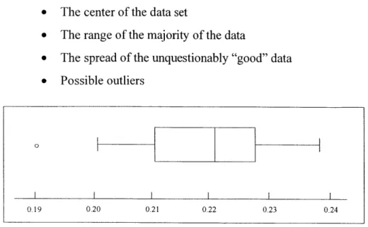
the underlying data. As an illustration, the boxplot in Figure 4 below provides the following information about the data set it comprises [35]:
* The center of the data set
* The range of the majority of the data
* The spread of the unquestionably "good" data * Possible outliers
0
0.19 0.20 0.21 0.22 0.23 0.24
Figure 4: The Basic Boxplot'
The boxplot above allows one to gauge the relative centering and spread of the data set. The median, represented as the line drawn within the box, represents the middle value of the data set - it is a measure of "centering" of the data. The outer sides of the box represent the inner 50% of the data set - 25% on either side of the median. The vertical lines marking the end of the "whiskers" represent the "inner fences", or adjacents. The adjacents represent the most extreme data values considered unquestionably good from a statistical perspective. Thus, so far we have displayed the typical value (the median), the range of the "bulk" of the data (the box defined by the quartiles), and the bounds for the statistically good data (the whiskers) [35]. Finally, the small circle represents an outlier - a data point that falls beyond the limits for statistically "good" data. In sum, the boxplot facilitates a quick understanding of the relative nature of the data set.
5. Improving the perceptual monitoring process
Perceptual monitoring describes the notion of a user responding to events displayed in a graphic visualization. Perceptual monitoring techniques are integral to supervisory control
systems. Supervisory control is a term used for complex semiautonomous systems that are only indirectly controlled by human operators [36]. Examples include aircraft and power
station monitoring systems. A key goal of supervisory control systems is to create effective
ways for a computer to gain the attention of a human, using motion, color, notification
messages, and even sound. It is equally important to use information visualization techniques
to convey the pattern of events, as can be exhibited through the use of temporal graphs. One
such example is the run chart used to track the behavior of a parameter (typically a quality
parameter) over time.
6. Allowing for manipulation of the display medium
A mere rearrangement of how the data is displayed can lead to a surprising degree of
additional insight. As we often do not know what to expect of the data when graphing, we
frequently find ourselves formulating new questions about the data [28]. Following
inspection of a graph, a user may then decide upon further rearrangement or the addition or
removal of certain data. Bertin states:
"A graphic is no longer 'drawn' once and for all: it is 'constructed' and reconstructed
(manipulated) until all the relationships which lie within it have been perceived." [3]
Pivot tables, often found in spreadsheet programs like Excel, allow the user to "pivot" the
dimensions of the table - for example, to transpose column headings to row positions or vice
versa. Brushing is an interactive technique that enables subsets of the data elements to be
interactively displayed in a "pop-up" mode. Panning is the smooth movement of a viewing frame over a two-dimensional image of greater size, while zooming is the increasing
magnification of a decreasing fraction (or vice versa) of a two-dimensional image given a
viewing frame of constant size [28]. These techniques and others can be used to allow
patterns in the data to reveal themselves.
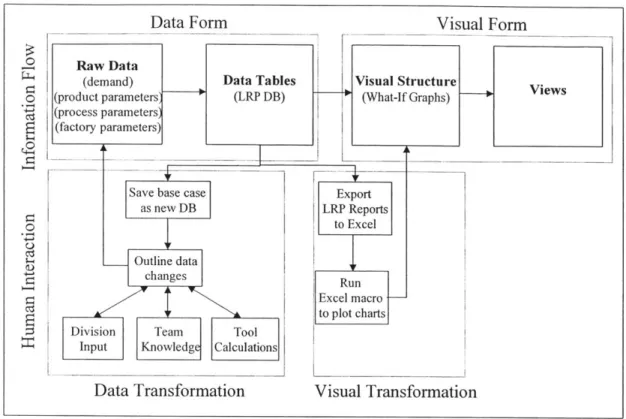
2.3 TRANSFORMING DATA INTO VISUAL INFORMATION
Card et al. state that visual aids serve two related though distinct purposes: (1)
communicating an idea, and (2) using graphical means to discover the idea itself [6]. An
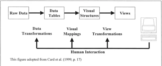
work in general, which can be thought of as three main activities: (1) foraging for data, (2) thinking about data, and (3) acting on data [16]. Indeed, Card et al. describe visualization as the "mapping of data to visual form that supports human interaction in a workspace for visual sense making" [6]. As discussed above, interactivity is not a requisite for effective visual representations. Spence affirms this viewpoint in stating that the design of visualizations is a craft activity, the success of which depends on the designer's understanding of the task for which the tool is intended [28]. Nevertheless, interactivity can offer enormous value in visualization design. The human interaction model proposed by Card et al. and exhibited in Figure 5 presents a good framework for discussion.
RawDat
M
Data VisualVesRaw DataTables r Structures P Viw
Data Visual View
Transformations Mappings Transformations
t
f
t
J
Human Interaction
This figure adopted from Card et al. (1999, p. 17)
Figure 5: Human Interaction Model
The human interaction model depicts the flow of raw data into data tables, visual structures, and views. In many ways, this is analogous to the sequential concept of
transforming data first into information then into knowledge. Where passive visualization displays rely solely on pattern recognition to do the task, active controls involve the user in developing hypotheses and refining them through an augmented visualization process. The purpose of visualization is to elicit from the user a response of the form "ah-ha" indicating that sudden insight has been obtained to some effect, insight that could lead to enhanced
understanding or a new idea [28].
Raw data is typically transformed into some sort of structure, a relational data set for instance, in order to facilitate the creation of visual structures. The goal of a data warehouse for example is to structure information for aggregation and preprocessing. Robertson,
Mackinlay, and Card state that almost all information to be displayed on a computer can be classified as unstructured, linear, or hierarchical [21]. An example of a linear structure for data is a temporal line graph, while hierarchical data includes such things as file structures or organizational charts. In a relational database, data is stored in tables, which are composed of rows and columns. Tables of independent data can be linked, or "related", to one another through common "keys". The issue with relational databases is that they require an understanding of data structure and query syntax. Hence, a separate user interface can be employed, such as a graphic-oriented environment where the user can connect the inputs and outputs of objects representing the data. Additionally, Shneiderman demonstrates the use of dynamic queries as a visual alternative to SQL for querying databases [6].
Proceeding from data tables, or structured data, to visual structures is the essence of creating visualizations. The user can interact through the visual mapping process. Often data must be selected prior to display. The pivot table discussed above is a good example as it allows the user to click and drag variables for display. In other cases, data may need to be transformed. Interactive data mapping is the process of adjusting the function that maps the data variables to display variables. The interaction may impose a simple scaling function, or a non-linear transformation such as logarithmic or square root. Figure 6 depicts a simple
"slider" tool for performing such a transformation function [36]. Finally, view
transformations enable the user to manipulate the display medium. As described in Section 2.2 above, panning, zooming, and brushing are some of the techniques employed that empower the user to "walk" through the visualization.
In conclusion, Ware argues that one way of describing the effectiveness of an information visualization tool is the length of time needed to acquire useful information [36]. The cost of knowledge depends on the utility of the user interface, which may include a visualization coupled with a user interface. Given a responsive, well-designed tool, people can obtain information far more rapidly and accurately than otherwise. Thus far, we have discussed the benefits to be derived from information visualization tools. The following section briefly highlights some important concepts to be considered when designing a graphical user interface.
Transforming function Data range
selection
This figure adopted from Ware (2000, p. 363)
Figure 6: Interactive Mapping
2.4 USABILITY CONSIDERATIONS
Thus far, we have discussed the potential of visualization techniques to increase the "cognitive power" of individuals to transfer data into information and knowledge. As these visualizations are typically generated on a computer, it is critical that the user interface be designed correctly. This is especially important when designing information visualization tools that are either interactive, allowing the user to manipulate the display, or dynamic, where continuous movement of a control causes continuous rearrangement. If the interface is not properly designed, there is a risk that the visualization tool can pose a hindrance, or even worse, lead the user toward incorrect decisions and actions. The intent of this section is not to provide a detailed analysis of user interface design, but to bring attention to this topic as a critical element in information visualization design, and to briefly discuss a few of the general concepts contained therein. These concepts illustrated below are (1) metaphors, (2) S-R
compatibility, and (3) affordances and constraints.
The idea behind using metaphors in interface design is to invoke something familiar and typically concrete to help users understand the functioning of a particular interface. Computer interfaces incorporate many metaphors in order to make the computer more usable [7]. One of the most prevalent and successful metaphors has been the desktop metaphor in computer operating systems. We are all familiar with how to manipulate the items on a desktop, using the mouse or keyboard as a "pen", and selecting one's files from the "file cabinets", typically
icons that resemble a folder for instance. Other interface metaphors gaining increasing
acceptance include objects that resemble buttons, scrollbars, and menu displays. Eberts states that the main use of the metaphor is to get novices accustomed to the system so that they can use it, interact with it, and learn more about how it works [7]. In general, the interface should
be designed to enhance exploratory behavior, and include logic to ensure that errors are either preventable or recoverable. An extension of this idea is to strive for what Rutkowski refers to as the "principal of transparency" [36]. When transparency is achieved, the user is able to immerse oneself in the visualization task. The tools themselves seem to disappear. Thus, metaphors can aid the user in forming accurate mental models of the data being visualized.
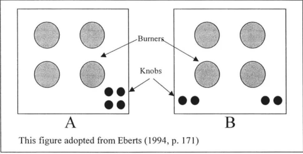
Stimulus and response (S-R) compatibility refers to the effectiveness of a display in conveying the connection between spatially separate objects. Eberts illustrates this concept with a familiar example [7]. Consider a stovetop, complete with four burners and their respective control knobs. Figure 7 depicts two configurations, one with a good S-R compatibility (A), and the other with a poor S-R compatibility (B).
Burner
0
hi KnobsA
B
This figure adopted from Eberts (1994, p. 171)
Figure 7: S-R Compatibility Example - Stovetop Configurations
In A, both the burners and knobs are laid out in a square. It is easy to deduce that the top left knob corresponds to the top left burner and so forth. This configuration represents high S-R
compatibility. In B, on the other hand, the knobs are laid out in a line from left to right. Though it is easy to infer that the left pair corresponds to the left two burners, it is not clear how the two knobs relate to the front and rear burners. Labeling would be required to ensure accuracy. Consequently, configuration A would be less error prone than B, and would require
less time for the user to process the response given the stimulus [7]. S-R compatibility plays an important role in creating effective user interfaces for information visualization.
Affordances and constraints refer to particular characteristics of objects that appeal to human perception. Generally, affordances "invite" the user to perform an action, while constraints "limit" the possibilities for action. Gibson describes affordances as the "perceived possibilities for action" of an object [36]. Norman, in his book "The Psychology of Everyday Things", defines affordances as "the perceived and actual properties of the thing, primarily those fundamental properties that determine just how the thing could possibly be used" [18]. For instance, we perceive surfaces for walking, knobs for turning, handles for pulling, space for navigating, tools for manipulating, and so on. Thus, to design a good user interface, we must use appropriate affordances to simplify the user's task. Two examples of such
affordances in computer interfaces are buttons and scroll bars. Buttons are typically depicted in such a manner that they appear to have a raised surface, so that, like buttons in the real world, they can be depressed (using a mouse click as opposed to a finger). The scroll bar object contains a "box" and directional arrows on either end of a bar. The box in the scroll bar indicates something that can either be grabbed or moved using the arrow objects [7].
Constraints are the antithesis of affordances. Norman states that the world naturally restricts the allowed behavior of objects, such as the way objects can be manipulated [18].
One such example is the modern electrical plug, which is typically designed with one larger blade so that the polarity of the plugged connection is consistent. One popular computer interface constraint is the menu display [7]. With the menu display, the user does not type in
a value but must select from a predetermined list. This eliminates misspelling errors among others. Another example is the concept of "graying out" objects or text that are not functional at a particular time. Finally, the interface can be designed to query the user upon certain actions such that the user has to verify they wish to perform a certain action.
In sum, affordances can be used in an interface to increase the accessibility and ease of use, while constraints can be used to reduce certain types of errors [7]. Nevertheless, these techniques, for all their benefits, can lead to increased screen clutter or reduced flexibility. Thus, a designer must use a balanced approach, always considering the intended goal of the application.
2.5 TREEMAPS: A DATA VISUALIZATION METHODOLOGY
2.5.1 Treemap Overview
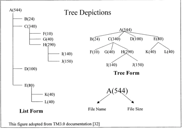
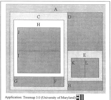
Treemaps comprise a class of visualization techniques that was pioneered in the early 1990's by Ben Shneiderman at the University of Maryland. Shneiderman was motivated by what seemed at the time a latent need - the ability to display the directory tree structure of a computer's hard disk in graphical form. The central idea was to display the structure as well as the file size so that one could easily infer where disk space was being consumed [27]. Figure 8 represents both the listing structure from using the well-known DOS command <TREE> as well as the tree diagram representation, using an arbitrary directory.
B(24) C(340) F(10) G(40) H(290) D(100) E(80) K(40) L(40) 1(140) -J(150)
This figure adopted from TM3.0 documentation [32]
A(544) B(24) C(340) D(100) E(80) F(10) G(40) K(40) L(40) 1(140) J(150) Tree Form
A(5 4)
File Name File Size
Figure 8: Comparison of List and Tree Structures in Hierarchical Data Display
The advantages of the tree form diagram are immediately obvious. As the diagram exhibits, the number of display lines needed to represent the list form hierarchy is directly proportional to the number of nodes in the hierarchy. In this instance, 12 lines are required to display files A through L. The tree form method displays the same information in 4 lines, and
A(544)
Tree Depictions
is arguably more effective in conveying the structure of the data. Nevertheless, the tree diagrams are themselves limited.
The two prime limitations of the tree diagrams are (1) their inefficient use of display space and (2) the lack of content information. Though superior to the list form, a typical tree diagram makes use of only 50% of the available display space, the remaining space being
used as the background or "white space" [6]. For a small data set such as that in Figure 8, this does not pose a problem. However, for large trees this traditional node and link approach would be limited by the available display space. Another issue with tree diagrams is their use of textual information - in the case of Figure 8, file size. As Shneiderman notes, global views
of large tree diagrams require the nodes to be rendered so small as to obscure the visual cues designating node content [6]. These deficiencies prompted the development of a novel space-filling approach that maps the full hierarchy onto a rectangular region. Hence, the term "treemap" describes the notion of turning a tree display into a two-dimensional planar map
[27].
A visualization of a treemap representation of the structure in Figure 8 would increase
our understanding of the definition proposed above. This is revealed in Figure 9, using a Java application developed by the University of Maryland.
Application: Treemap 3.0 (University of Maryland)
The treemap above depicts both the structure and the size of the attributes displayed. For instance, note that elements B, C, D, and E belong to parent A. Subdividing further, we note that K and L comprise E, while F, G, and H make up C. Finally, H is comprised of J and I.
The frames, or shaded and labeled enclosures, can be viewed as file folders, while the self-contained rectangles represent the individual files. The frames are used to delineate the sub-node structure through containment, while the size of the rectangles represent, in this instance, file size. Stated another way, the treemap is comprised of a number of closed-contour regions within a larger closed contour - thus representing conceptual containment. What immediately stand out are the relative size of folder C as a whole, as well as the individual files D, J, and I.
The procedure is simple. Beginning with a designated root node one draws a rectangle
-usually, in order to make effective use of the screen, it will be almost the same size as the display. Within the parent rectangle are smaller rectangles, one for each subordinate node of the node under consideration [28]. For instance, in Figure 9, files J and I are subordinates of folder H, which in itself is a subordinate of folder C, and so on. This construction is repeated until all nodes are drawn. Once derived, individual rectangles can be encoded by color to denote some attribute, such as file size or days since creation [28].
Color can be used to code information or to display an additional attribute of the rectangular objects. For example, color may be used for labeling an object as in nominal information coding. When we wish to make it simple for someone to classify visual objects into separate categories for instance, giving the objects distinctive colors is often the best solution [36]. Alternately, color could be used to represent an additional variable. A color range could be selected to represent a separate variable, where the saturation or color contrast depicts the size of the variable. New-York-based Smartmoney.com has incorporated a treemap display tool where stocks are represented by colored rectangles, and color represents financial indicators such as the percent increase (green scale) or decrease (red scale) of the particular stock for that day [37].
In sum, treemaps represent both the hierarchical structure and qualitative information contained within a data set using a two-dimensional rectangular space. The example in Figure
9, however, only contains a handful of data elements. The real power of treemaps, in the
author's opinion, is their ability to represent a large amount of data in a relatively small space, or its high data-density capabilities. Hence, a key enabling technology of treemaps is its
underlying algorithm for laying out the rectangles. The squarification algorithm is perhaps the most effective method for such displays.
2.5.2 Display of High-Density Data
Tree drawing algorithms have been geared toward efficient and aesthetic methods to display objects representing the data. The slice and dice algorithm of the original treemap used parallel lines to divide a rectangle representing an item into smaller rectangles
representing its children. For each level of the hierarchy, the parallel lines were alternated between vertical and horizontal [26]. The issue with the slice and dice approach is that as the
data set grows, or as the relative size of particular rectangles becomes very small, there is a tendency for the rectangles to become razor thin. The net effect is that these rectangular data
elements become difficult to identify, label, and compare in size [26].
Alternative layout mechanisms have been developed to cope with the drawbacks of the original slice and dice approach. Perhaps the most widely proliferated layout algorithm in use is the aptly named "squarification" approach. The aim of the squarification algorithm is to create low aspect ratio rectangles as opposed to thin elongated rectangles, where aspect ratio is defined as the following:
max(height / width, width / height) (1)
Some salient advantages of the low-aspect ratios are the following [4]:
" Square items are easier to identify, label, and point at (i.e., with a mouse pointer)
* Comparison of the size of rectangles is easier when their aspect ratios are similar * Display space is used more efficiently. That is, the proportion of the border width to
rectangular width/length is better for the low-aspect ratio rectangles versus the elongated.
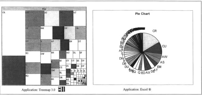
Figure 10 demonstrates the visual superiority of the treemap display versus a typical display
-a pie ch-art in this inst-ance. The pie ch-art represent-ation is -an-alogous to the slice -and dice approach; only here we use a circular region in lieu of a rectangular region.
CR A T Pie Chart CR CU AT AW b'NBJ |E VDTB AS W+:*Z E Y DU EM Q EOAX~e
Application: Treemap 3.0
J
Application: Excel ®Figure 10: Treemap Display versus Pie Chart -156 Data Elements Depicted
Both the treemap and the pie chart were created using an identical, non-hierarchical data set containing 156 elements. For clarity of presentation, the data range for the pie chart was sorted in descending order, while the squarification algorithm performs its own sorting sequence. The advantages of the treemap as outlined in bullet format above are readily observable. The squarification algorithm utilized in the treemap display yields rectangles that are easy to identify and label, while the pie slices are too thin to be labeled, and quickly become indistinguishable. The squarified elements can also be selected more effectively in a computing environment where the treemap application allows mouse-over display, view navigation, zooming, or other enhanced functionalities. Finally, the treemap display affords relative size comparisons and data organization due to an apparent arrangement of elements in descending order from top-left to bottom-right. As the squarification algorithm is a key enabler of the treemap display methodology, the next section draws upon a simple example in order to illustrate its generic functioning.
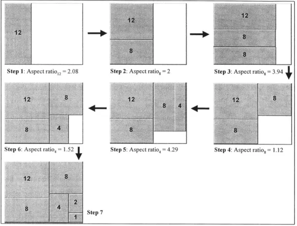
2.5.3 Squarification Algorithm
The treemap is constructed via recursive subdivision of the initial rectangle into sub nodes (typically frames) and finally into the "leaf' attributes. Initially, treemaps were subdivided in such a manner that thin, elongated rectangles were the result [4]. This