A Dialogue of Forms:
Letters and Digital Font DesignDebra Anne Adams A. B. Degree Vassar College
May 1978 Submitted to the Department of Architecture
in partial fulfillment of the requirements of the Degree MASTER OF SCIENCE IN VISUAL STUDIES at the Massachusetts Institute of Technology
September 1986
Massachusetts Institute of Technology 1986
Signature of Author ebraAnne
Certified by
Adams
/,Peparient of Architecture 8 1986
fi4poper
Associate Professor of Visual Studies Thesis Supervisor Accepted by VASSACHUSET S NSTjThTE
AUG 2 9 1986
Nicholas Negroponte ChairmanDepartmental Committee for Graduate Students .w -
17-A Dialogue of Forms:
Letters and Digital Font DesignDebra A Adams
Submitted to the Department of Architecture on August 8 1986 in partial fulfillment of the requirements of the Degree of
MASTER OF SCIENCE IN VISUAL STUDIES
at the Massachusetts Institute of Technology
ABSTRACT
A Dialogue of Forms is an investigation of typeface design tools and processes. The aim of this investigation is to develop techniques of deriving letterforms automatically from a subset of letters called the control characters. The control characters are representative
letters that contain the primary structural elements, design attributes, and proportional rela-tionships that characterize a typeface. Design information derived from the control characters
is used to constrain the design of other letterforms. The lower case letters o, h, v, and p are the control characters studied in this investigation.
The control characters are interactively created and edited by the designer, and stored as sets of primitive parts. These parts are used as building blocks to construct other letters automatically. Knowledge about letterform structure and font design consistency is represented and used to manage the derivation process. Generated designs may be edited by the designer and changes to parts can be propagated.
Automatic letterform derivation can aid the designer by reducing time consuming labor. As a visualization tool, it provides a fast and efficient means of evaluating a design idea.
Thesis Supervisor Muriel Cooper
TABLE OF CONTENTS
2 Abstract
5 Introduction
9 Typeface Design ONE
18 Letterform Structure and Design TWO
32 Type and Technology THREE
43 Digital Font Generation FO U R
59 Letterform Derivation FIV E
73 Project Description S I X
79 Software Design and Implementation S EVE N
100 Conclusion
104 Reference Bibliography
121 Appendix
INTRODUCTION
Reduced to simplicity, typeface is a speci-fic set of design ideas used to clothe a basic letterform. It is this set ol design ideas which is totally aesthetic or artistic.
Mergenthaler Linotype Company
The task of the typeface designer is to conceive a design idea and apply it consistently to all characters in a font or font family. Conceptually, this process is structured and systematic. Letterforms are visually related in weight, shape, spacing, and alignment. Drawn in consistent fashion, key design elements repeat and blend. ( See Figure ia) 'Thus it is not a question of de-signing a group of beautiful letters, but rather dede-signing a beautiful group of letters." [ Mergenthaler Linotype Company 1971 ] ( See Figure ib)
A Dialogue of Forms is an investigation of the process and practice of
creating typeface designs. The aim of this investigation is to examine tech-niques of automating the generation of letterforms. It is hypothesized that let-ters can be automatically derived from a subset of forms called the control characters. The control characters contain the primary structural elements, design attributes, and proportional relationships that characterize a typeface. Typically they are the first letters created by the designer "since their design
acryJ35
cedg bp
hmnuKN
Figure iaharmony
harmony
Figure ibINTRODUCTION
would suggest how the remaining letters and characters should be drawn." [Mergenthaler Linotype Company 19711 (See Figure ic)
The concept of automatic letterform derivation differs from current font generation systems in the following fundamental way. Current systems require the user to create each individual character shape, character shape primitive, or structural representation in a font. No software exists to auto-mate this process. Batch techniques are primarily applied to the generation of alternate font sizes, weights, and resolutions. To create these additional ranges, one or more complete fonts must be designed and input by the user.
The idea presented here is that the designer can create a subset of let-ters and the system can be used to automatically generate preliminary designs of the remaining characters. With the use of interactive tools, shape modifica-tions can be incorporated and automatically filtered throughout a font. The de-signer continues to work back and forth among letters to define subtle typogra-phic details and to create a unique design pattern.
Thus the system proposed in this thesis is not intended to remove the
designer from the creative process. As Donald Knuth writes: " ... an enormous amount of subtlety lies behind the seemingly simple letter shapes that we see
0 h p v
c n I b q d yw
e umr i f g a x z
j
t s kINTRODUCTION
every day, and the designers of high-quality typefaces have done their work so well that we don't notice the underlying complexity." [ Knuth 1986 ] Type de-sign requires extensive skill in letter drawing, expertise in the area of print-ing, an understanding of the reading process, and an artisitc sensitivity to form. No formalized body of rules exists, to date, that can be applied to the systematic production of high-quality, finished typefaces. However, automa-tic processes can provide the artist with a fast and efficient means of evalua-ting a design idea and can reduce time-consuming labor.
As a preliminary study, this thesis paper functions as both a survey and an analysis. Chapter One is devoted to a discussion of the type design pro-cess and the functional role of consistency and constrast in reading. Chapter Two describes letterform structure and design relationships. The impact of printing materials and processes on design and style is introduced in Chapter Three. This is followed by a description of digital font generation and a review of current design systems and research work related to this thesis in Chapter
Four. Chapter Five describes the role of the control characters in the deriva-tion process and general techniques used by designers to create a set of
INTRODUCTION
software project that accompanies this paper is introduced. This software was developed to illustrate the derivation concept and to test procedures and repre-sentations useful to automatically generating consistent letter designs and to propagating changes to letter contours. The software design and implementa-tion is described in detail in Chapter Seven. The concluding chapter contains a brief software analysis and recommendations for future research.
This investigation is limited to a study of lower case, or miniscule, letters in sans serif typefaces in general and in Helvetica in particular. Helve-tica was chosen because it is a highly regularized sans serif design and its let-ters are conventional forms. Miniscule letlet-ters were chosen because they are more differentiated in design than upper case, or majuscule, forms. Upper and lower case letters can be derived according to similar design principles. The control characters used are o, h, v, and p.
TYPEFACE DESIGN
It may be easy to think of one letter, but to
think of its twenty-five relations which with it form the alphabet and so to mark around them that they will combine in com-plete harmony and rhythm with each other
and with all - that is the difficult thing, the successful doing of which constitutes
design.
Frederick W. Goudy
The type designer is concerned with the perceptual requirements of the reader. As such, the designer must develop a precise and microscopic knowledge of the visual effects of letter shapes, massed together, and seen at small sizes. For legible results, letterforms must be identifiable and familiar, clearly contrasted in structure, even in weight and spacing, and harmonious in style.
The 'certainty of decipherment' is an impor-tant element in true legibility; and in rela-tion to typography it bears the message that legibility, or ease of reading, is increased
by letters that are clearly distinguished
from each other and decreased by letters that look too much like each other. [ McLean 1980 ]
Contrasts in letterform structure create variations in word shape when letters are combined. ( See Figure 1 a) During the reading process, word
word shape
I-
r
Figure 1a
TYPEFACE DESIGN
shape patterns are perceived. Javal, in 1878, concluded that distinguishing letter features predominate along the upper portion of a line of text. [ Spencer
1968
1
( See Figure lb) Twenty five years later, Messmer postulated that words composed primarily of a variety of contrasting shapes are more legible than those composed of structurally similar forms. [ Spencer 1968 ] In 1940, Tinker differentiated between total word shape and total word structure. The total word structure consists of both the word outline and the pattern produced by its internal configuration of light and dark values. [ Spencer 1968 ]Whereas contrasts in letterform structure facilitate word identifica-tion and recogniidentifica-tion, consistencies in style and design ease the flow of reading. "Where the text letters are uniform, the reader is free to give his attention to the sense of the words." [ Johnston 1977 ] Letters are designed to combine and to produce an even impression and tone on the page when set next to one another. ( See Figure 1c ) No single distinguishing letter feature should domi-nate or attract the eye. Visual harmony preserves clarity of form.
These typeface designs involve a consider-able amount of talent and creative product not only to create a pleasing and effective design of a single letter of type, but also to provide a consistent pattern of design which
.LFurL 1bL.L , Li. UiJi.U FL Lii. 5
Figure l b
NEWS NO.9
The history of writing is the history of the human race, since in it are bound severally and together, the developm ent of thought, of expression, of art, of intercommunication and of mechanic al invention. It has been said that the invention of writing is more important
PALADIUM
The history of writing is, in a way, the hist ory of the human race. since in it are bound up, severally and together, the development of thought. of expression, of art. of interco mmunication, and of mechanical invention Indeed, it has been said that the invention of writing is more important than all the victor
AVANTGARDE GOTHIC MEDIUM CONDENSED
The history of writing is, itoa way, t.e history of the human race, since in it are bound up, severa
Ily and together, the deveiopmnent of thought, of expression, of Wi, of tntercommunication, and of mechanical invention Indeed, i has been no
id that the invention of writing is more important than all the victories ever won or constitutions
Figure 1c
TYPEFACE DESIGN
will enable the various letters to be fitted together in all of the hundreds of thousands of permutations and combinations of twenty six lower case letters, twenty six capital letters as well as all of the additional sym-bols, punctuation marks and numbers nec-essary to complete the family of print. [ Mergenthaler Linotype Company 1971]
The task of the designer, then, is to blend the visual contrasts between letters without impairing their legibility. This is achieved through regularity and repetition in design. Letterforms are consistently created in weight, spa-cing, and alignment. Design features such as the curve axis and stroke endings are structured and repeat. Regularities exist on several levels from general similarities in shape and structure to subtle curve relationships and size pro-portions. Subregions of each letter image are designed to interact.
The difference between the look of one type and the look of another is the differ-ence between thousands of tiny repeating details that have been carefully orchestrat-ed or arrangorchestrat-ed and combinorchestrat-ed by the type-face designer.
[
Mergenthaler LinotypeCompany 1971]
When sufficiently varied and sufficiently uniform, letters create an integrated texture and a rhythmic pattern of values.
TYPEFACE DESIGN ONE The Design Process
While formal, written rules exist in calligraphy books for hand draw-ing consistent alphabets with a brush or pen, no such codified knowledge can be
found in the literature on printed forms. ( See Figure 1d ) Writers on type
de-sign refer to the "harmony", "family likeness" , and "unity" of letters in vague fashion, seemingly unable or unwilling to explicity describe their processes and principles of design.
To the accomplished letterer, there may be guidelines but there are no rules. The over-riding consideration is that the result be harmonious and pleasing within the context of the alphabets intended function. Such a result comes about through subjective judgements rather than through mathemat-ical precision. [ Mergenthaler Linotype
Company 1971 ]
The lack of explicit rule description in type design compared to that found in calligraphy can be explained, in part, by differences in the formation and technical production of hand written and type drawn alphabets. Brush and pen letterforms are composed of a series of individual lines, called strokes, drawn by sequential movements of the writing tool in the plane of the writing surface. ( See Figure 1e ) Each stroke primitive is defined by a distinct hand
Figure 1d
G
d:
g.
d
3
Figure 1e(Q &
TYPEFACE DESIGN
motion. The pattern and shape of hand movements, called the ductus by Bigelow
[
Bigelow 1983
],
describes the underlying letterform structure and sequence
1
of stroke composition.
Repeating stroke primitives are consistent in character due to uniform Figure 1 f
movements of the writing tool. ( See Figure 1f ) In printed fonts, these visual
consistencies are maintained. However, type drawn letterforms contain subtle variations in contour curvature not found in hand written letters. Whereas brush and pen stroke contours and characteristics are constrained by the movement and use of the writing tool, its angle with respect to the horizontal, its flexibility, and its shape and size, type drawn contours vary independently.
Each edge is modifiable and unique. ( See Figure 1g ) Thus, printed stroke con- Figure 1g
sistencies in weight, shape, and proportion are created by manipulating contour edge features to accomodate the eye. They are consistencies of visual appear-ance and not of actual physical dimensions. ( See Figure 1 h)
Designers know, for instance, that there are visual interactions between the ele-ments of a character shape that affect the way it is perceived; they know also what the nature of these interactions are, and that they are governed by certain rules.
But they cannot formulate these rules 13 Figure 1h
TYPEFACE DESIGN
otherwise than by making shapes that take the effects of the interactions into account.
[ Southall 1985 ]
Through a lengthy process of iterative testing and proofing, the type designer draws letter shapes and "changes them until they look correct."
[ Southall 1985 ] Optical properties of weight, shape, fit, and alignment are
modified and refined in relation to one another. As visual contrasts are
recon-ciled, design influences overlap and become interwoven. (See Figure 1i )
Typeface texture and rhythm slowly evolve in the context of words and control strings. "The type designer thinks with images, not about them." [ Bigelow
1982 ]
Frederick Goudy, describing his design process in the book Tvooloaia, writes:
For myself, I usually begin a new type with some definite thought of it's final appear-ance, though it may be no more than the shape or position of the dot of the lowercase i, a peculiar movement or swell of a curve, or the shape or proportion of a single capi-tal. From such humble beginnings I progress step by step, working back and forth from one letter to another as new subtleties arise, new ideas to incorporate, which may suggest themselves as the forms develop,
7
1
Figure 1i
TYPEFACE DESIGN
until finally the whole alphabet seems in
harmony - each letter the kin of every
other and of all. [ Goudy 1977 ]
The typeface designer learns through apprenticeship and practice. His know-ledge is craft knowknow-ledge; "it has become part of the intuitive understanding of the person concerned" [ Southall 1985 ] and cannot necessarily be stated in explicit form.
Traditional lettering artists draw large filled outline contours with pen or pencil on paper or transparent film and build and edit shapes by cutting and pasting pieces of letters together and reworking letter contours. As each character is rendered it is placed in a word or control string to judge its width
relationships and to determine its spacing parameters. ( See Figure 1j) Set in
words and phrases, its integration and rhythm with other letters are viewed, compared, and studied. Its design may cause a change in another letterform or set of letters. These changes are made by redrawing the selected characters, incorporating the editing changes, and again proofing and marking letters for correction. ( See Figure 1k ) To accurately judge a design, small scale proofs are made or the designer stands back and views the letters through a reducing glass. This process can continue for as long as two years until the character
HAHHHOHRHaHbHeHgHhHiHmHnHoHrHsHuHv OAOHOOOROaObOeOgOhOiOmOnOoOrOsOuOv RARHRORRRaRbReRgRhRiRmRnRoRrRsRuRv aAaHaOaRaaabaeagahaiamanaoarasauav bAbHbObRbabbbebgbhbibmbnbobrbsbubv eAeHeOeReaebeeegeheiemeneoereseuev SASHSOSRgagbgeSgghgigmSngogrgsgugv hAhHhOhRhahbhehghhhihmhnhohrhshuhv iAiHiOiRialbieigihiiiminioirisiuiv mAmHmOmRmambmemgmhmimmmnmomrmsmumv nAnHnOnRnanbnengnhninmnnnonmsnunv oAoHoOoRoaoboeogohoiomonooorosouov rArHrOrRrarbrergrhrirmmrorrrsrurv sAsHsOsRsasbsesgshsismsnsosrsssusv uAuHuOuRuaubueuguhuiumunuourusuuuv vAvHvOvRvavbvevgvhvivmvnvovrvsvuvv Figure 1j S ~ w'.~46 ~ */4 ~ C-*j~)~C~ 4rC
,,~Jk1j7
/ '4%'-. h~-c 444k -15 Figure 1k ONETYPEFACE DESIGN
set is complete.
In order to appreciate the magnitude of the problem, consider the variability of letter-forms that is reflected in a single super-family of typeface designs. For each mod-ern design one of each of three opposing features must be specified: whether the type is roman or italic, whether it is normal weight or boldface and whether it is serif or san-serif...Taken together, the three fea-tures generate eight typeface designs. Fur-thermore, each type alphabet typically in-cludes characters in 16 different sizes. The total number of glyphs, or individual bit
maps, necessary to accomodate a single character for a minimum superfamily of type is therefore 128; the number of glyphs
necessary for a complete superfamily, which may include 128 letterforms, is
1282, or more than 16,000. [ Bigelow 1983 ]
During the initial rendering process, the designer creates a set of con-trol characters or key letterforms used to define the visual attributes of a typeface. These attributes include the width, height, and alignment relation-ships, the curve axis, the letter spacing or set width, and the stroke weights and stroke endings. Design information contained in the control characters is mapped from letterform to letterform. Through this sequence of mappings
ONE
TYPEFACE DESIGN
visual relationships are structured and stylistic consistencies emerge. "It is as though you have to take the qualities of a given 'a' and, so to speak, hold them loosely in the hand as you see how they slip into variants of themselves
as you carry them over to another letter." [ Hofstadter 1985 ]
In order to provide a framework for discussing the role of the control characters in the design process, Chapter Two will be used to define the char-acteristics of letterforms and their design relationships.
LETTERFORM STRUCTURE AND DESIGN
In the "Statement of Mergenthaler Linotype Company in Support of the Registerability of the Claim of Copyright in Original Typeface Design", the fol-lowing definition for "typeface" is given.
As used herein, the term 'typeface' shall mean sets of designs of a) letters and alpha-bets as such with their accessories such as accents and punctuation marks, and b)
nu-merals and other figurative signs such as conventional signs, symbols and scientific signs, which are intended to provide means for composing texts by any graphic tech-nique. [ Mergenthaler Linotype Company
1971
1
A "font" is defined by Mergenthaler as:
The type font is merely the assortment of a typeface in a particular size or style for a particular purpose. In any given font, there are usually seventy to ninety or more char-acters. [ Mergenthaler Linotype Company
1971 ]
The focus of this investigation is on the relationships that exist among letter-forms within a type font. In other words, we are interested in what the letters in each horizontal row in Figure 2a have in common and not in what the letters in each vertical column have in common.
Within a typeface, each letter, numeral, and sign has a characteristic 18
a b
abC
def...
a
fb--a
b
ab
de...
Figure 2a TWOLETTERFORM STRUCTURE AND DESIGN
visual structure and a set of part primitives that distinguish its identity as a
unique element of the alphabet. The type designer does not invent new
conven-tional letter structures; he uses those that already exist. "The basic forms of
letters are fixed; that is, they have become classic." [ Goudy 1977 ] Repro-duced in Figure 2b are conventional forms of the miniscule alphabet. These letters are from the typeface Helvetica.
The structure of a letterform constrains its part configuration, or the spatial relationships among its parts, and their joining characteristics. Within the miniscule alphabet, certain part configurations are valid. For example, the two bowls of a capital B are situated to the right of the stem and horizontally
aligned in relation to it. ( See Figure 2c ) Therefore, sets of rules can be defined to describe the relative positions of each part and their types of
link-age. The attributes of each letterform define the horizontal position, orienta-tion, alignment, size, and shape geometry of its part configuration.
Reproduced in Figure 2d are the parts of each letterform, commonly called strokes. As mentioned in Chapter One, the term "strokes" derives from
pen lettering and refers to the set of discrete lines drawn with the writing tool to form each letter. In printed fonts, stroke shapes are defined by sets of
a b c d e f g h i
j
k
I
m
n o
p q
r s t u v w x
y
z
Figure 2b F.ue Figure 2c TWOLETTERFORM STRUCTURE AND DESIGN
Eol
19,
dC1c
s.,CI DeliI
a | lIi i
I( I
I
I
C
))
C*
rSFi
irV
X
d
V
Z
Figure 2dLETTERFORM STRUCTURE AND DESIGN
contour edges hand drawn by the designer or engraved in metal. Parts function as integrated elements within each letter. Depending on the typeface, context, or use, their boundaries may be redefined. Although no standard nomenclature exists for naming the parts of letters, the system developed by Philip Gaskell for labelling the parts of serif letter designs utilizes conventional terms. ( See Figure 2e )
Each part has a characteristic set of visual attributes that define its horizontal position, orientation, vertical alignment, shape and size within each letter. The shape boundaries and attributes of a part are constrained by the position, length, direction, curvature, and joining relationships of its contour edges. There are two general part shape types: straight and curved. Straight strokes vary in length, thickness, direction, and slope. Curved strokes vary in length, thickness, direction, and curvature.
Parts that share common shape attributes are visually related and
they may be grouped into the part primitive classes illustrated in Figure 2f .
Within each class, subclasses of parts can be defined such as the ascender stem subclass or the crossbar subclass. Parts within each subclass share identical or nearly identical sets of shape attributes. They are consistently designed
LETTERFORM STRUCTURE AND DESIGN
MINUSCULES
bulkous shoulder terminal " j- tr
stemn
bowl Nqewl- hooke'dnkd counsr tertminal
upper serif
bowl--- - stemn
counter lower serf
bowl upper counter
h n ~ -eqr link tail lower counter dot -sen] - stem terminal tail upr left uppe shoulde righti -shoulder
kit stm iV -right stem
lower kf p I
sar \ - lower right middle lower seri
stem middle serif
upper serif \ I stem counter spur stroke (with upper and I,
lower parts) co unter
terminal
uppe serif houldern
"lnf t stem ihtte
lower ejt lowter right
serf sey
upper stem serif
tem- uppr diagonal
-lower diagonajl
lower stein loweer diagonal
serif sen]
upper seif shoulder
left stem --right stem
lower le lower right ser serif
stroke (with
upper, middle and bulbous
lower parts) ---'terminal
pointed trminal shoulder . terrmno ,stem senf dot upper serif -stem lower serif upper serif J-stem lower serif bowl
(with upper, lower, left, and right parts)
counter upper serif counter ite" __R lowrer serf shoulder ! -tarminal spur serif
upper 'iji upper right
serif / serif
stroke (with 4 -- sItem lt and
lower parts) lower serif
upper left upper right
serif serif upper left to upper right to
lower right lower kft diagonal diagonal
lower lift lower right serif serif bowl ,spur
counter
4- stem lower serifstroke (with upper, middle, and lower parts)
-upper sheared
terminal lower sheared
terminal
left serf rght serif
left diagonal''right diagonal
left serif rght serif ';
left -- -rgit diagonal
diagonal h t-tail serminal upper shoulder
r
-terminal lower'enfupper and left
sheared terminals
riht
stem- sheared terminal hooked terminal
middle .h
5e serif rig
first, second, third, and fourth diagonals
upper serif upper am 7 ows
loer attn lower senf
Figure 2e TWO
LETTERFORM STRUCTURE AND DESIGN 23 Figure 2f (continued)
aI
d
it
fi
hi
i i
rri
n
pqr0t
VW V TWOLETTERFORM STRUCTURE AND DESIGN 24 Figure 2f
c00lb
eq% 10 cl cl cl 10 Ar *% 400 #, k Jo ( 4) " ' r%rM%
.,w001
c
t
%00 TWOLETTERFORM STRUCTURE AND DESIGN
throughout a typeface. However, although they may appear visually consis-tent, repeating part instances often differ in their physical geometry due to the visual interactions within and among letterforms. Therefore, each repeating part instance can be inherently nonuniform in character.
Although differentiated, sets of letterforms share parts in common. Within the miniscule alphabet, four general types of letterforms can be dis-cerned. They are those composed primarily of (1) vertical strokes, (2) curved strokes, (3) vertical and curved strokes, and (4) oblique strokes. ( See Figure
2g ) These are referred to as the square letters, the round letters, the square and round letters and the oblique letters respectively. Their basic shapes re-peat throughtout a typeface design.
The control characters are representative letterforms from each let-ter shape category. They contain the primary design features and proportional relationships that repeat throughout a typeface. Thus the set of control char-acters is used to establish the design harmonies within and among each cate-gory of letters. The primary proportions that characterize a typeface are the letter height to width ratio, the character height to stroke thickness ratio, the letter width ratios, the ascender, xheight, and descender height ratios, and the
i I f
j
r t
squareh
n
u roundc
e o
s
square/rounda b
dgpq
obliquekvwxyz
Figure 2g TWOLETTERFORM STRUCTURE AND DESIGN
thick to thin stroke weight ratio. The following discussion will be used to in-troduce letter design relationships.
Width Relationships
The o is the primary letter in a typeface. Its round width determines the width rhythm of the remaining letters, and its width to height ratio deter-mines the major size proportions. Except for m and w, the o and the round let-ters are generally the widest letlet-ters in the miniscule alphabet of a proportion-ally spaced font. ( In sans serif cases this is not always the case. ) To appear optically related in width, square letters are more narrow than the rounds. The width of the square and round letters lies between these two. The oblique letters generally appear similar or identical to the square letters in width. The single stroke letters are the most narrow. ( See Figure 2h ) The width rela-tionships illustrated in Figure 2i are based on classical proportions derived from the Trajan Column inscription in Rome. The width of the square majus-cules on the Trajan Column is roughly 4/5 the circular round width.
m
w
Figure 2ho
h
v
p
Figure 2i TWOLETTERFORM STRUCTURE AND DESIGN Height Relationships
The heights of the letters in a typeface are proportionally related to one another. Due to the nature of visual perception and optical illusion, round, square, and diagonal letters of the same geometric height appear unequal. Therefore, the height of the round letters is slightly extended above or below the square heights, and the oblique letters dip slightly lower at their apex to compensate for these visual effects. ( See Figure 2j)
Alignment Relationships
Letters are optically aligned along an imaginary horizontal line called the baseline. There are three other primary alignments in the miniscule alpha-bet. From top to bottom they are the ascender alignment height, the xheight or meanline, and the descender depth. Because of their actual height differences, square, round, and diagonal character alignments differ. Consequently, it is possible to imagine four or more secondary alignment lines for the round and diagonal letters. ( See Figure 2k) In addition, the arches in letters such as h, n, or m may have their own alignment value.
The h is used to determine the square ascender and baseline alignment 27
III
o
Figure 2j.. . ....
p
...
Figure 2k ascender xheight baseline descender TWOLETTERFORM STRUCTURE AND DESIGN
and the ascender height, the p is used to establish the descender depth and the descender square alignment, the x determines the square xheight and align-ment, and the v defines the diagonal alignment height. The o determines the round height and alignment and the square to round height and alignment propor-tions.
These alignment heights are proportionally related to one another. Typefaces can have a small xheight in relation to the ascenders and descenders or a large xheight. This can have an impact on the legibility of a typeface. At small sizes, the xheight is generally enlarged.
Letterspacing/Set Width
The set width includes the body width of a letter and the spaces de-signed to its left and right, called the left and right sidebearings. The
sidebear-ings are adjusted to determine character fit. ( See Figure 21) Character fits throughout a typeface are designed to appear optically equal in area. These areas are proportionally related in size to the area enclosed by the positive
shape of each letterform, or the counterform. ( See Figure 2m )
To illustrate, Figure 2n shows spacing between squares and circles
ABCDEFGHIJKLMNOPQRSTVWXYZ abcdefghijklmnopqrstuvwxyz Figure 21 Figure 2m 28 Figure 2n TWO
LETTERFORM STRUCTURE AND DESIGN
which are geometrically equal. These areas appear uneven to the eye. Proper adjustment situates the squares further apart to compensate and to appear optically equal to the space between the circles. When letters are substituted for these shapes, as in Figure 2o, the spacing problem can become more com-plicated, depending on the configuration of square, round, and diagonal strokes in relation to one another. When the letterspacing is narrow, the white areas between letters dominate and attract the eye. Under "normal" reading con-ditions, counter and letterspace areas appear equal.
As the weight of a typeface increases, the body size increases, the counterspace areas decrease, and the fit between characters becomes tighter.
( See Figure 2p ) The set width of a letter is also influenced by the presence or
lack of serifs, and their length, shape, and positioning on a letterform.
Certain character combinations need to be individually adjusted. This is called kerning. In Figure 2q, the intercharacter spacing between T and 'y' appears too wide and must be reduced by overlapping the side bearings.
Stroke Thickness
Stroke thicknesses are consistently maintained throughout a typeface. 29
Letterspacing
Letterspacing
Letterspacing
Figure 2oH
H
Figure 2p Figure 2q TWOLETTERFORM STRUCTURE AND DESIGN
However, in order to appear optically equal, they actually differ in their phy-sical dimensions. Variations depend primarily on the stroke type and slope. Horizontal straight strokes are thinner in width than vertical straight strokes. Similarly, diagonal stroke weights lie between the horizontal and vertical and vary according to their degree of slope. Curved strokes are the thickest and gradate from thick to thin along an axis of curvature. ( See Figure 2r) The curve axis may be oblique or vertical. The degree of thick to thin stroke con-trast in a typeface varies and is a significant design feature which can add texture to a design. ( See Figure 2s )
Further modifications in stroke weight depend on the density or
com-plexity of a letter ( an 'm' with three straight strokes in close proximity will
appear too dense or black unless its stroke weights are slightly reduced), its legibility ( often the top of the crotch of the 'n' in indented or thinned to accen-tuate its form), and the spatial location of the strokes in relation to one another
( the curve weight and axis on the bowl of 'p' and b', for instance, may differ
due to the visual interaction produced by the location and alignment of the straight stems in relation to the bowls ). ( See Figure 2t )
The degree of greyness, or visual weight, of a typeface is a function
I
Im\\\
OI\
Figure 2r Figure 2sMm
Figure 2t TWOLETTERFORM STRUCTURE AND DESIGN
of the stroke thickness and its relationship to letterform size. Stroke weights merge with counterspace areas to create the image weight of each letter. Character height and width affect the overall black to white ratio. Tall letters will appear visually thinner than short letters of the same stroke thickness and wide letters will appear less heavy than narrow characters. ( See Figure 2u)
Stroke Endings
Serif designs differ in length, shape, degree of contrast, placement, and alignment. Top and bottom serifs often differ in appearance. Serifs con-tribute to the texture and pattern of a typeface design. ( See Figure 2v )
Sh
kkk
kkk
h h h
h h h
h h h
h h h
hh
h
Figure 2u Figure 2v TWOTYPE AND TECHNOLOGY
AI technical requirements must be
consid-ered and regarded even at the drawing stage. A printing face is the sum of a series
of factors which must be fused into harmon-ious unity if a useful type is to result. To be so designed, a type demands of its de-signer the knowledge of historical coherence in type development, artistic perception, and an inclusive insight into the technique of typecasting.
Hermann Zapf
In addition to the requirements of legibility, each typeface design must be adapted to the materials and technical processes of printing and type
found-ing in order to be reproduced faithfully and consistently. This relationship be-tween design and technology has altered the design characteristics and propor-tions of letterforms over time. "The first printers did not realize that the printed form had its own kind of laws and was capable of making its own kind of
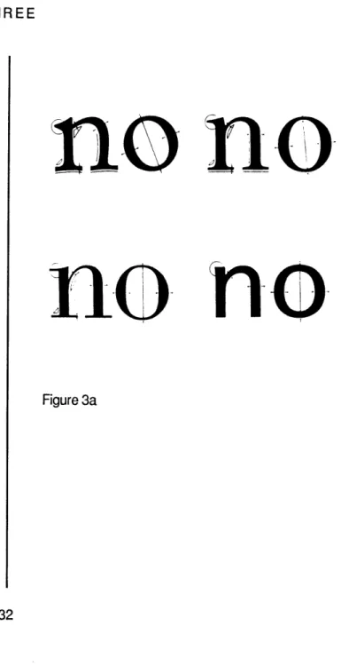
impact." [ Bigelow 1983 ] As type design moved from its imitative phase into innovation, written letter shapes were reinterpreted as typographic forms. "Proportion, width, weight, and construction were altered independently of the
underlying topology of the letter, rather than being partially determined by it as they were in the ductal letter." [ Bigelow 1983 ] ( See Figure 3a)
no no
no
Figure 3a THREE
TYPE AND TECHNOLOGY
Reproduced in Figure 3b ( next page ) are typefaces that illustrate significant design changes that have occured over the past 500 years. Oldstyle typefaces exhibit the round letters, oblique curve axis, minimal thick and thin stroke constrast, and concave serifs characteristic of manuscript forms. Transitional faces, such as Baskerville, contain a greater degree of thick to thin stroke contrast, shorter and less concave serifs, and the curve stress varies from oblique to vertical. Baskerville's designs were influenced by the
introduction of smoother papers. [ Ruggles ( in preparation ]) Copperplate
engravings had a significant impact on the design of Modern typefaces. Thin strokes became hairlines and serifs were slightly bracketed or not bracketed at all. The rise of commercial printing during the Industrial Revolution created a demand for typeface designs that could be used for display purposes, periodi-cals, and newspapers. In the early 1800's, square serif monoline faces were designed. Although many weights and widths of square serif typefaces were eventually produced, the original letterforms were very bold in weight, with minimal contrast in stroke thickness and little serif bracketing. During the ninteenth century, an abundance of decorative, embellished faces were created.
( not shown ) Sans serif types appeared in the 1800's and were revived in the 33
TYPE AND TECHNOLOGY THREE
24 point Centaur (Foundry) Oldstyle
ABCDEFGHIJKLMNOPQRSTUVWXYZ&
abcdefghijklmnopqrstuvwxyz
1234567890$
24 point Baskerville (Foundry) Transitional
ABCDEFGHIJKLMNOPQRSTUVWXYZ&
abcdefghijklmnopqrstuvwxyz
1234567890$
24 point Bodoni Trueface (Ludlow) Modern
ABCDEFGHIJKLMNOPQRSTUVWXYZ&
abcdefghijklmnnopqrstuvwxyz
1234567890
18 point Clarendon Bold (Foundry) Slab Serif
ABCDEFGHIJKLMNOPQRSTUVWXYZ&
abcdefghijklmnopqrstuvwxyz
1234567890$
24 point Futura Medium (Foundry) Sans Serif
ABCDEFGHIJKLMNOPQRSTUVWXYZ&
abcdefghijklmnopqrstuvwxyz
TYPE AND TECHNOLOGY
1920's and 30's in geometric form by the Bauhaus designers. These simplified letterforms represented an innovative break from the traditions of roman type.
In the late 1900's, the concept of a typeface "family" composed of several variations of a single design was introduced. Reproduced in Figure 3c is the Univers design program developed by Adrienne Frutiger.
Type Founding and Print Technology
Early printed roman typefaces modelled the letter structures, propor-tions, and patterns of design found in humanist scripts of the ninth and tenth centuries and their inscriptional origins. Each letterform was engraved, at actual size, on the end of a steel rod called a punch. The punch was used to strike a copper matrix from which a three dimensional rectangular block of
metal type was cast in an adjustable mold. The block of type contained a raised letter image, in reverse, on its face. ( See Figure 3d ) To print a page of text, the pieces were hand composed or set next to one another, prepared with ink, and impressed on paper.
The invention of the adjustable mold by Gutenberg in the mid 1400's made it possible to create uniform and easily replicable pieces of metal type
u v rs unvers un-ivers univers uies svr
--univers univers u rs unve
univers Figure 3c
K
Figure 3dKV111
THREE oe=J
TYPE AND TECHNOLOGY
that could be fit together accurately. Each piece had a constant height and thickness, but was variable in width. Letter designs were constrained within the rectangular face and carefully positioned to achieve optically even letter spacing and proper vertical alignment. Unevenly spaced character combinations
were kerned or cast together on a single block of type. ( See Figure 3e )
These early typeface designs were crude and irregular forms. The paper used to print text from type had a thick, spongy quality and was "dam-pened before use to soften its fibers so that the printing ink would adhere to it." [ Ruggles (in preparation) ] ( See Figure 3f )
Hand-made paper of long fibre, used damp and with an elastic back, gave an impression in which the breadth of the actual lines form-ing the face of the type was uniformly wi-dened, and consequently the hairlines and serifs were broadened out of proportion to the main-strokes, the external corners at the same time becoming rounded. [ Legros and Grant 1916 quoted in Ruggles (in prep-aration) ]
Typeface designs were modified to compensate for the effects of ink on paper. In addition to the requirements of the printing process, the punchcutter and designer had to learn the subtle alterations of letter shape and proportion
fi
fi
AY
AY
Figure 3eRQEN
baegn
Figure 3f THREETYPE AND TECHNOLOGY
that were necessary for proper legibility and consistency over a range of point sizes. ( A point is a standard unit of type measurement used to calculate the height of letterforms. There are roughly 72 points to the inch.)
A sense of scale and the adaptation of letters to the various sizes of type so as to make them all as comfortable to the eye as possi-ble is a very important part of the letter-cutter's art. It is a mistake to think that a range of types from great to small can all be made from one set of drawings. I said that before he can begin cutting a letter, a punch-cutter must have the whole fount in his mind's eye; but in fact he must do more. He must conceive a fount that is susceptible of a production in all the various sizes in which type is needed. [ Carter 1954
quoted in Johnson (in preparation) ]
Letter designs were not simply scaled versions of one another. Ascender, de-scender, and xheight size relationships, letter widths and shapes, and stroke thicknesses within each font were altered to appear visually consistent. ( See Figure 3g ) Although some punchcutters worked from scaled drawings, the eye was considered to be the best judge of correct form and proportion.
In 1885, Lynn Boyd Benton issued a U.S. patent for the pantograph machine. This invention ushered in the "era of type manufacture." [ Southall
RQEN baegnov
RQEN baegnov
RQEN baegnov
RQEN baegnov
Figure 3g THREETYPE AND TECHNOLOGY
1985 ] Although the pantograph was initially used to cut matrices, it was later
applied to the cutting of punches. [ Ruggles ( in preparation ) ] Mechanical
punchcutting was used to mass produce identical type matrices that were re-quired, in large quantities, for the success of hotmetal typecasting systems.
The punchcutting machine was a pantograph with a sharp cutting tool on one end used to cut steel punches by tracing and reducing large metal pat-terms of letterforms. ( See Figure 3h ) The metal patterns were created from large scale drawings produced from an existing typeface or print of type, or from an original ink or pencil design. [ Warde 1935 ] Measurements in tenths of thousandths of an inch were marked on the drawings and used to translate
"...every detail...into terms of the size of the matrix which is to be struck." Figure 3h
[Warde 1935 ]
The mechanical punchcutting system caused a significant change in type design practice. The emphasis shifted from making to drawing. [ Southall
1985]
In hand-cutting the punch can be called the original work of art in the whole process of making type. It is that single and unique ob-ject by which one can obtain as many as
500 matrices, each matrix being capable of 38
TYPE AND TECHNOLOGY
forming millions of types. But in machine-cutting the unique object is the drawing, from which any number of patterns can be made, each pattern serving for any number of punches of the letter. [ Warde 1935 ]
The need for large scale drawings forced the designer to have to previsualize or anticipate the final appearance of letters scaled down to text size. "In passing to machine production they must, for clear comprehension, first realize that here the thinking-out part of the work is seperate from, and altogether
precedent to, any actual making... " [ Warde 1935 ]
The success of typecasting systems was also dependent upon the in-troduction of self-spacing type by Benton in the 1830's. Self spacing type is a method of tabular composition based on a unit system that divides the horizon-tal width of the em square into even increments. (An em square is a unit of type measurement equal to the square of a given point size of type. An eighteen point em square is eighteen points by eighteen points. ( See Figure 3i) ) Stan-dard units sizes were eighteen, thirty-six, and fifty-four units to-the-em. The width of each character was calculated to be a certain number of units wide. For example, single stroke characters such as I may be six units wide while M may be eighteen units wide. (See Figure 3j) Self-spacing type was used to
-1em_ - 18 units -to the em Figure 3i
NI
Figure 3j THREETYPE AND TECHNOLOGY
mechanize the counting of line length and escapement in the Monotype type-casting system.
The Linotype machine, invented by Ottmar Mergenthaler in 1884, cast entire lines of type at once. Text content was input by the operator with a keyboard. With each keystroke, a brass matrix mold of the indicated letter was released and positioned in place until an entire line of matrices was formed. When each matrix was properly spaced, the line was cast in molten lead. To accurately justify a line of text, small wedges were inserted between the matrices to force their separation. ( See Figure 3k ) A counter was used to measure character widths to determine the available space per line. Each matrix contained two molds to store letters from two different fonts. ( See
Figure 31) The characters in these fonts had to be identical or nearly identi-cal in width. This resulted in width distortions in italic letterforms when
ro-man and italic faces were paired. Conventional italic forms were narrower than those designed for the Linotype machine.
In the Monotype machine, developed by Tolbert Lanson in 1887, indivi-dual pieces of type were cast to compose a line of text. A perforated paper tape was used to drive the typecaster. In contrast to the Linotype system, the
Figure 3k
~t1
Figure 31
TYPE AND TECHNOLOGY
typecaster required the use of letterforms designed according to a prespecified width unit system. ( See Figure 3m ) Consequently traditional letter widths and proportions were altered to accomodate the new technology.
With the advent of photocomposition in the 1950's, typeface design was no longer restricted to the rectangular block of metal type. Drawn letters were photographically reduced and stored on a transparent film strip. The neg-ative film masters were exposed to photosensitive paper or film. Three or four sizes of film masters were typically created by the designer. Alternate character sizes and letter spacing could be created by photographic distortion with the use of a lens system. Therefore deliberate variations in character weight, slope, width, and height could be made from the original set of designs. This flexibility in type manipulation made possible by phototypesetting led to greater typographic freedom and creativity.
In addition, the unit system was refined in second generation
photo-typesetters. [ Ruggles ( in preparation ) ] Unit widths became significantly
smaller in size, or higher in resolution, and thus the designer could vary letter widths more freely and make subtle adjustments in spacing. To counteract the effects of light exposure on different parts of the character image, stroke
Unit ow A B C D R F G H I K L M N 0 Row * 2 jf a!: ;J-jiI:: | 2 7 3 C r se ) ( ra t v Z 3 a 4 t * b g ? z c e z S t ? 4 S S 9 7 5 3 1 0 9 7 5 3 1 0 3 c 1 c 86425-S 86421 6 x k y d h a x J g o a P F L T 7 a Afu . S v y p u n Q B o E is 9 D I t P f fi q k b h d V Y G R 9 U Io M A J S T ff I Z I ff X U N 10 2 it 0 L C Fw a L P F q mZQG 1 18 12 E & Q V C B T O E A w P T R B 12 U13 D A Y ffl ffi m e Y U G R E w V 13
18 14 K NH ihiX DN K Hm & b X U'4
Y4 s & %% V2 WM- M W%EE s U Git ValneflonJ A 9CDK 9F G HI IK LUMNG0 Ro Figure 3m THREE
TYPE AND TECHNOLOGY
weight proportions and dense areas, such as join features, were modified. Third generation phototypesetters incorporate the use of CRT tech-nology and digital methods of storing and processing character data. Character
images are scan converted onto the CRT screen on the fly. These images
con-sist of discrete small units composed on a raster grid. As the linear scaling of type became an accepted practice, fewer original sizes were designed, although this technique has not been universally approved of by designers and producers of type. Before the development of digital methods of design and font conver-sion, typeface designs for CRT phototypesetters were drawn by hand.
DIGITAL FONT GENERATION
With the advent of digital typesetting and the expanded need for digital typeface designs, several systems have been developed to merge the font gen-eration process with computer technology. These systems are used primarily for analog to digital font conversion and font design modification. Analog to di-gital font conversion is the process of translating existing analog letterform images into digital outline or bitmap format. Outline format represents char-acter shape information as a series of curve control points, connected by straight lines and curve segments that define the contour boundaries of each letter shape. (See Figure 4a) Bitmap descriptions are composed of discrete point pixel coordinates that are either run length encoded or stored as an array
of on and off pixels. ( See Figure 4b )
Analog source images are scan converted or manually transformed into numerical data. Manual outline processes require the user to mark dis-crete curve control points along the contour edge of each letter image. ( See
Figure 4c ) Control points are entered and edited by specifying coordinates interactively with a puck or through a programmed listing of coordinate data.
Outline representations of high order continuity are resolution inde-pendent. The curve forms typically used are bezier curves, conic sections, or
Figure 4a
ef ef
ef ef
Figure 4b Figure 4c FOUR 43DIGITAL FONT GENERATION
hermite curves. They can be scaled, rotated, translated, and output to varia-ble resolution devices by altering stroke writing patterns. Bitmap fonts, on the other hand, are resolution dependent and must be created, edited, and stored
individually at each desired point size and aspect ratio. Due to the nature of sampled systems, scan conversion algorithms result in quantization error and
illegibility, particularly at low resolutions, under twenty lines to the em
square. ( See Figure 4d on next page ) Low resolution bitmaps are designed by hand on paper or with the use of an electronic grid.
The Ikarus system, designed by Peter Karow of URW, incorporates au-tomatic scan conversion correction processing. Inconsistencies in stroke weight, character height, alignment and curve symmetry are normalized and justified without designer intervention. ( See Figure 4e ) Once adjusted, bitmap designs can be modified with several batch programs. ( See Figure 4f) Character heights and widths can be altered independently to expand and dense characters, and letters can be automatically italicized, shaded, con-toured, and rounded. Interpolations can be performed to create intermediate weights of a typeface.
Although reducing time and labor by fifty percent over pen and pencil
-1K Figure 4e
Hamburgefons
Hamburgefons
Hamburgefons
Hamburgefons
Hamburgefons
RRRRR
RRRRRR
Figure 4f FOURDIGITAL FONT GENERATION
Font: 008) Version: 4.1
Century 702 Schoolbook(TM)
Bitstream ABE V.128
Set Up Display
Modifying Actions Menu Object Menu
16 point 72.289Hx2.±9' for real
ABCDEFGHIJKLIIfOPQRSTUV(YZ&abcdefghi jkl nnopq rstuvuxyzfifll234567890L$f*/-.,:; "'",,71 /() qqHr "'. --q' p3ilfif~ '~"~ -''$''q LOWERCASE-P BS# "143 " Bmap# 112 Old# HIL .. ....... .I/.. ..... .. ....... ... .. .... ...... ...I. ...... . . 416 t 16
*1
abed fgh
ij
kim
r n op Irstuvwxyz
fll
fro1
f-1
(
(
;-*. Packages AS; Fonts: CPT6; Mode: LISP; Syntax: Zetalisp; Baset 10 (abeidef-font "0083
ishape-table () ;abea*helvetica-shape-table* tdefault-shape-table () ;abej*helvetica-Shape-table*l
:independent-parameters abe: *century- independent-Paraimeters-a) (defconst *century-independent-Parameters-a*
'(sbaseline (p -hbb) ;;;;;font independent
sEn (P H-WM)
;;;;;;;; LIPDOWH I IM1
round sq function for headspace/footspace... on the round char (square fixr self)
(- (square footspace) (fix (- (larger,normally no. sq. ft. sp.)(smaller,normally no. sq. ft.))
:round sq function for round/square ht... on the round char (square fixr self) (+ (square ht.) (fix (- (round ht.)(square ht.))
ZMICS (LISP) 0083-sid.1isp )bitstrean>sids>fonts 0: (34) Font: A (CPT6) [More below]
width 9
07/11/86 17:04:58 david USER: [0] NFILE serving EUCLID, and MINSKY
Figure 4d
DIGITAL FONT GENERATION
correction techniques [ Flowers 1984 ], batch produced bitmaps require
ex-tensive editing. Faces designed originally for photocomposition are not directly usable. Each character in a digital font must be tailored to the specific require-ments of digital output devices. Consequently, skilled lettering artists must
edit each letter of each typeface.
An alternate method of correcting bitmap characters is to use the PM Digital Spiral developed by Purdy and MacIntosh. The PM Digital Spiral is an
extremely high resolution spiral form or template that can be uncurled and placed along the edge of a bitmap character. A series of curve lengths, angles, and starting points is created and used to correct dropout and smooth aliasing errors. ( See Figure 4g )
The Camex Letter Input Processor, adapted for use at Bitstream, Inc., was developed in response to the need for real-time editing and graphic
inter-action. Outline editing tools include functions to select, insert, delete, move, and constrain individual points graphically. By forming point groups, curve segments and letter parts can be copied, moved, scaled, and rotated to
recre-ate repeating elements, build structurally relrecre-ated letters, and compare similar
or identical letterform features. ( See Figure 4h )
Figure 4g
DIGITAL FONT GENERATION
2. 3.
Figure 4h: to create an m from an n 1. begin with n
2. condense the arch of the n 3. copy new arch and position it 4. erase the n 5. the completed m -m;1 -se
01
FOURDIGITAL FONT GENERATION
The outline images from the Camex LIP are input to a Symbolics 3600 Lisp machine where significant design features of letters, referred to as zones, are interactively marked, measured, and named and individual scan lines are adjusted for accurate bitmap reproduction. The zones create an underlying pattern of horizontal and vertical dimensions referred to as a plaid. To auto-matically generate a series of bitmap fonts, zone values within each letter are constrained to the design features of the control characters in each font. ( See Figure 4i)
Typeface Design Systems
Adopting terminology defined by Southall in "Designing new typefaces with Metafont", analog to digital font conversion systems are drafting systems and can be differentiated from systems developed for use in digital typeface design. Drafting systems are used to input and convert already existing type-faces or letter drawings into digital form. Design systems are used to create new typeface images. Generally they provide tools that simulate the use of traditional pen and paper techniques such as sketching and drawing, cutting and
pasting, copying, and proofing in an interactive and visual environment intend- 41
DIGITAL FONT GENERATION orita 0083 Version. 4.1 Fonts 0082 Versions 4.1 Century 702 Schoolbook(TM) Bitstream AB lop Level Higili it Rgrid rt Repixe I Tables
E
V.128 Plaid Functions Size/Res Redistribute Refilter Magnify Sample Regrid Bogus Many Fonts Char Sides Grab Variables16 point 72.U1201.289V for real
ABCDEF GHIJKL MOPQRSTUVW(YZ&abcdefghijkl nnopq
r stuvwxyzflfll234567890ES4f*2./- .,: ; * "' ", .?I /()
[]*o1:s -AAaga61<><a i''^"~ *'"DtddI!'
LOWERCASE-P BS# "14 " Bmap# 112 Old# NIL
.
:..1
4 10.
8
... .. ... .. .... ...rn
___ ...:~... ::... ....V...
......... ........................ ... 4l t ... ... .... . ... ... ... ._ _ ... . ... *I ... .. .... . . . .. ... .. ... ... .. .. .. ... .. ... ... ... ... . ... .. .. ... ... .. ..abcdefghij
klmnopqrstuvwxyz
fiflfffiffl A eCeoBijijdB-l
:*RF (Co 1. SELF 0-0RF) IFIGURE REOlO STROKE
:ORF (CO .75 (tiz :SELF) O-ors)
I*N (CO 1. SELF 1-INS) ;FIOGI.E STRRIHT STROKE
slNS (CO 1. (tiz :SELF) LN-t.S)
:*PV (co .75 self 1074 -.pel) ;PUNCTURTION period stroke
,.PW (co 1.0 self H-HSS)
:*hc (fixr (tiz uself)) ;option for non-linears
atiC (FIXR (tz :SELF))
:phC (FIXR (tiz :SELF))
af44C (fixr (Tiz self))
i;;;;;teittr above to line is true or below to line is... .one er d'other I attiC (FIXR (f :SELF))
I Phc (FIXR (F :SELF))
I NMC (fix (f Iself))
ZMACS (LISP) 0083-sid.lisp >bitstrean>sids>fonts 0: (34) Font: A (CPT6) * (More above and bel
width 8
07/11/86 17:3e:19 david USER: [Q] NFILE serving EUCLID. and MINSKY
Figure 4i
FOUR
DIGITAL FONT GENERATION
ed to support the fluidity of the creative process. Three design systems will be reviewed here. This discussion will focus on the unique features of each.
ELF is an interactive graphics system developed for typeface design that supports all stages of the design process, from sketch creation to final proofed image generation. Work on ELF began in 1979 by Kindersley and Wise-man at the University of Cambridge. Character images are drawn with a light-pen on the display surface and translated by the system into a series of line segments or filled trapezoidal shapes. As the designer modifies images, an in-ternal model of geometrical manipulations is stored and a textual log file is cre-ated that contains the sequence of actions performed by the user during each design session. The log file can be replayed or edited to recreate a series of design modifications on viewed images. ELF includes unique techniques for man-ipulating character spacing based on area computations performed on each let-ter image to delet-termine its optical cenlet-ter. As the designer edits a letlet-terform feature, the optical center can be recomputed and the "intrinsic width" of each letter recalculated. Character images are automatically updated as the de-signer proceeds.
IMP, a computer aided design system developed by Carter and