Data Collection and Graph Generation Using Touchscreen
Technology
by
John Pope
S.B., Massachusetts Institute of Technology (2010)
Submitted to the Department of Electrical Engineering and Computer Science in Partial Fulfillment of the Requirements for the Degree of
Master of Engineering in Electrical Engineering and Computer Science
M
at the MASSACHUSETTS INSTITUTE OF TECHNOLOGY September 2010
0 Massachusetts Institute of Technology 2010. All rights reserved.
ASSACHUSETTS INSTITUTE OF TECNO LOGY
DEC 16 2010
LI BRARIESARCHIVES
AuthorDepartment of Electrical Engineering and Computer Science August 20, 2010
Certified by__-I
Kimberle Koile, Ph.D.
Research Scientist, M.I.T. Thesis Supervisor
a I r- --. Accepted by_
'u ' Christopher J. Terman, Ph.D.
Chairman, Department Committee on Graduate Theses
/ / 1
4"--)
Data Collection and Graph Generation Using Touchscreen Technology by
John Pope Submitted to the
Department of Electrical Engineering and Computer Science August 20, 2010
In Partial Fulfillment of the Requirements for the Degree of Master of Engineering in Electrical Engineering and Computer Science
ABSTRACT
This thesis describes the design and implementation of the TouchGraph system, whose goal is to help students develop graphing skills by allowing them to record their own data and access the data of their classmates using touchscreen
technology. Using these data, students will be able to practice organizing data by creating and labeling their own graphs, such as in the popular graphing software program TinkerPlots. In order to allow students to focus on interpretation of the data, the system can automatically generate the graphs, leaving the student to focus on noticing trends and patterns in the data. Once these graphs are created, they can be sent to the instructor via a classroom interaction system such as Classroom Learning Partner. This thesis describes the system, examples of its use, the design decisions that were made, user reactions, and future work.
Thesis Supervisor: Kimberle Koile, Ph.D.
Acknowledgements
First, I would like to thank Kimberle Koile for being such a dedicated, supportive and patient advisor. I am immensely grateful for all of her invaluable guidance and encouragement throughout this work.
I would also like to thank Andee Rubin, at TERC, for all of her valuable input and advice during the development of this project and the writing of this thesis.
List of
Figures
Figure 1: Student interface...15
Figure 2: Empty Interface...-- ... . ---...17
Figure 3: Changing axis variable from count to length ... 19
Figure 4: Graph View with zooming ... 20
Figure 5: Graph View with coloring ... 21
Figure 6: Enlarged po int...---.---.---...23
Figure 7: Teacher interface in Review Mode... 25
Figure 8: Teacher interface in Control Mode... 26
Figure 9: Teacher interface in Student Mode... 27
Figure 11: A segmented control ... 32
Figure 12 : A picker...---.---... . . ---... 32
Figure 13: Sectioned interface ... 35
Figure 14: Student-Teacher Dialogue... 36
Figure 15: O verlapping Points... ... 38
Figure 16: H ighlighted D ata ...--- ...---.. 39
List of Tables
Table 1: Data type details... Error! Bookmark not defined.
Table of Contents 1 INTRO D U CTIO N ...--...---. . ---... 9 1.1 PRO BLEM ...--... . - - - - -- - - -- - --...-- - - - 9 1.2 SCENARIO ...---... 11 2 RELATED W O RK ... 13 2.1 TINKERPLOTS...- ---. --... --... --... 13
2.2 CLASSROOM LEARNING PARTNER (CLP)... 14
3 W ALKTH RO U G H O F FU NCTIO NALITY ... 15
3.1 STUDENT INTERFACE...- . --.--... 15
3. 1. 1 D ata Types...----...16
3. 1.2 Entering, Subm itting, & Receiving Data... 16
3. 1.3 A utom atic G raphs...18
3. 1.4 M anual G raphs ... 21
3. 1.5 D ata Table... ...---..---..22
3.1.6 Subm itting Graphs ... 23
3. 1.7 M essages ...---...-.. ----.23 3.2 TEACHER INTERFACE ...- -...24 3.2. 1 M anaging Students ... 24 3.2.2 Class Control...-25 3.2.3 Student View ...--- 26 4 D ESIG N ISSU ES ... 28 4.1 PHYSICAL CONSTRAINTS ... ... 28 6
4. 1. 1 Size...- - - - --...---...29 4.1.2 Battery Liffe ...-.. -....---...29 4. 1.3 Processing Capacity ...---. . ---...30 4.2 USER INTERFACE... ---... 30 4.2. 1 iPa d Components ... ... .- - - - ..---.31 4.2.2 Custom Keyboards...---.---...-32 4.2.3 M ultitouch Gestures...-...---... 33
4.2.4 Screen Real Estate ...----...---.... ---... 34
4.3 GRAPH VIEW...--...----..---... 37
4.3. 1 Overlapping Points ...---...--.. ---...38
4.3.2 Screen Setup & Alignment ... 39
4.3.3 Count ...---...---... 40
4.3.4 Changing Axes...---...41
4.3.5 Coloring...--... ---...- 41
4.4 COMMUNICATION ...----..---..----...---... 42
4.4.1 W ireless Comm unication...-43
4.4.2 Data Encapsulation...----..-..---... 43
4.4.3 Data Collection...-... ---...44
5 USER REACTIO NS ...- ...--...---... 46
6 CO NTRIBUTIO NS AND FUTURE W O RK... 47
1 Introduction
1.1 Problem
The effective use of representations in mathematics and science education has been recognized as critical as we enter the new millennium. In their newest standards, Principles and Standards for School Mathematics, the National Council of Teachers of Mathematics has Representation as one of their process standards which "highlight ways of acquiring and using content knowledge" [6]. Even though all types of representations are being encouraged in the teaching and learning of
mathematics and science, graphical representations play a special role.
Generation and interpretation of graphs is a critical skill that students must have, especially if they are to be mathematically and scientifically literate. Graphs can summarize very complex information or relationships very effectively. Although graphs are explicitly taught in mathematics classrooms as an end in themselves, many subject areas such as science or social studies utilize graphs to represent and interpret relationships. So being able to interpret or construct graphical
representations is a crucial skill for every student whether or not they plan to pursue science or mathematics-related careers.
Many researchers, however, have detected that students lack graphing skills. Brasell and Rowe [21 studied high school physics students' graphing skills and concluded that "[students] do not understand the fundamental properties and functions of graphs in representing relationships among variables. Their facility
with graphs was generally superficial, grounded on a few, simplistic algorithms such as plotting data points". Janvier mentions the problems that students have in interpreting graphs [1,41. He argues that global meanings of graphs and
interpretation of graphs are left out of mathematics classrooms, while more rote activities, such as reading data and constructing and reading certain points on graphs, are emphasized.
This thesis describes the design and implementation of the TouchGraph system, which will help students to develop these skills by allowing them to record their own data and access the data of their classmates using touchscreen technology.
Using these data, students will be able to practice organizing data by creating and labeling their own graphs. In order to allow students to focus on interpretation of the data, the system can automatically generate the graphs, leaving the student to focus on noticing trends and patterns in the data. Once these graphs are created, they can be sent to the instructor via a classroom interaction system such as Classroom Learning Partner (CLP), which is being developed by Kimberle Koile's research group at MIT [17,18,19,201. Using such a system, the teacher can provide feedback to the students or share the student's work with the rest of the class and use that work as the focus of class discussion.
1.2 Scenario
The goal of the TouchGraph system is to allow a class of students to: (a) share individually-collected data easily; (b) construct hand-drawn graphs of data that can be easily shared with the instructor; (c) generate graphs automatically given various axis and labeling parameters. We envision the system being used as in the
following scenario.
A 5th grade science class has been conducting an in-class crayfish growth experiment in which each student has a crayfish to raise and study. Today, students measure their crayfish's width, length, and weight and using their
iPads, they enter their crayfish's data. The crayfish's name and sex are also recorded.
Each student's data, once it is submitted, is available to the teacher. When enough data is collected, the teacher instructs each student to "checkout" the class' data onto their own tablets. Now the data of the entire class is available on each student's iPad.
The teacher disables the graphing functionality and keeps the manual graphing functionality operational on each student's iPad. These actions allow the students to see the data, but not generate graphs automatically. Now the teacher asks them to fill in the graph for length vs. height using the class data. The students manually place points on the graph where they believe the classroom data indicates. Once complete, they label the axes and send the
graph to the teacher. The teacher browses through the graphs as she receives them and sends messages to students. James has made a serious error, and with the message from his teacher he can discreetly correct it.
Now, the teacher enables graphing mode on the students' machines and asks the students to produce the same graph. James does so and can then compare his manually created graph with the automatically generated graph. Each student is then asked to determine whether there is any relationship between length and weight of crayfish. Meagan examines her graphs and notices a relationship between the two variables. She writes a message to the teacher saying, "The longer the crayfish is, the more it weighs." The teacher gets a
number of messages like this one; she responds to the group of messages with a single message that says, "Great observation!" She also notices that other
students have not found the relationship or have sent in an incorrect
relationship. She sends a message to those students, prompting, "What happens to the weight as the crayfish gets longer?" The rest of the students consider the
question and send their answers to the teacher.
Next, students are asked to explore relationships between the sex and size of the crayfish. Phillip thinks that he case use color to represent sex as a third variable on his length vs. width graph: He colors points that represent males red and those that represent females purple. He has difficulty seeing the pattern, so he changes the graph so that it is only organized by weight. He can now clearly see that the male crayfish are much larger than the majority of the
female crayfish. He notes this on the graph by circling the region with the largest crayfish and writing a note explaining that almost all of them are males. He sends this labeled graph to the teacher who returns an approving message.
2 Related Work
2.1 Tinkerplots
TinkerPlots is exploratory data analysis software designed for use by students in grades 4-8. It was designed by Clifford Konold and Craig Miller at the University of Massachusetts Amherst and is published by Key Curriculum Press. The program allows users to enter their own data or to import data from other applications or the Web.
Using TinkerPlots, students can make a large variety of graphs, including those specified for middle school in NCTM's Principles and Standards for School
Mathematics. Rather than making graphs directly using commands, however,
students construct graphs by progressively using basic operations including "stack," "order," and "separate" to organize cases that represent data Responding to these operations, case icons animate into different screen positions, thus creating graphs representing the data. This interface was based on observations of people
organizing "data cards" on a table in order to make graphs that answer specific questions.
TinkerPlots served as an example of a simple, yet powerful graphing program that guided development of TouchGraph,
2.2 Classroom Learning Partner (CLP)
Classroom Learning Partner (CLP) is a tablet-pc-based classroom interaction system,
developed by Kimberle Koile's research group at MIT. It provided an example of the kind of classroom interaction we sought for TouchGraph.
As described in "INK-12: Teaching and Learning Using Interactive Ink Inscriptions in K-1 2", Dr. Koile's funded proposal to NSF, submitted January, 2010:
CEP is built on top of a wireless presentation system called Classroom Presenter [21,22], and like Classroom Presenter, it embodies a "presentation slide"
metaphor for classroom interaction: A teacher creates a lesson as a series of slides. In the classroom, the teacher and students all have tablets on which the
lesson is running; the lesson is also projected publicly on a screen at the front of the classroom. The teacher can annotate a displayed slide by using the tablet's
stylus to create "digital ink", which, by way of a wireless network, is then visible on the students' and public screens. Just as the teacher can send "digital ink" to students, students can send "digital ink" to the teacher. CEP uses this communication channel as a way for students to send the teacher handwritten "digital ink" answers to in-class exercises. The teacher then can select some, or all, of those answers to display anonymously on the public screen and discuss with the class.
3 Walkthrough of functionality
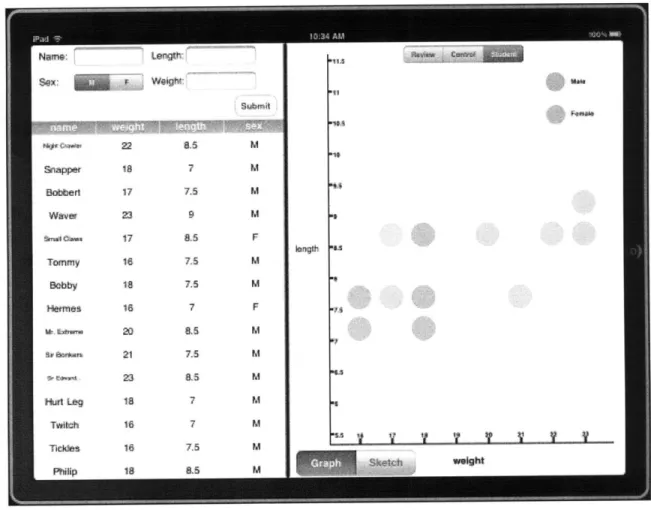
3.1 Student Interface
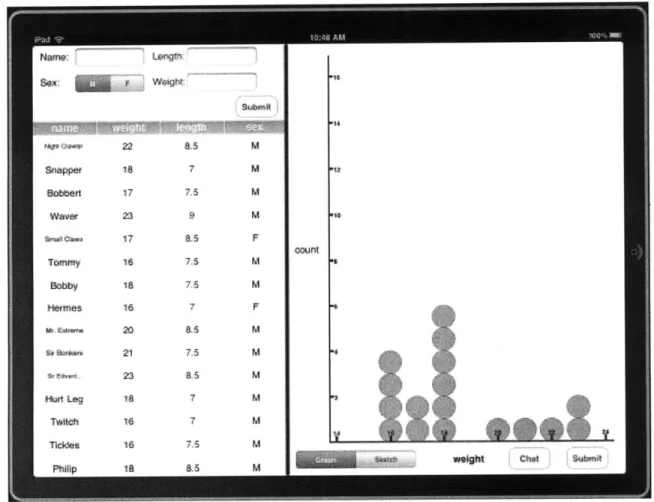
Shown below is a screen of the interface a student sees when using TouchGraph. The left side of the screen is divided into the Data Entry Window (above), where students are able to enter the data collected during the activity, and the Data Table (below), where the students are able to see the data collected by the entire class. The right side of the screen is the Graph View, where a student is able to generate graphs.
3.1.1 Data Types
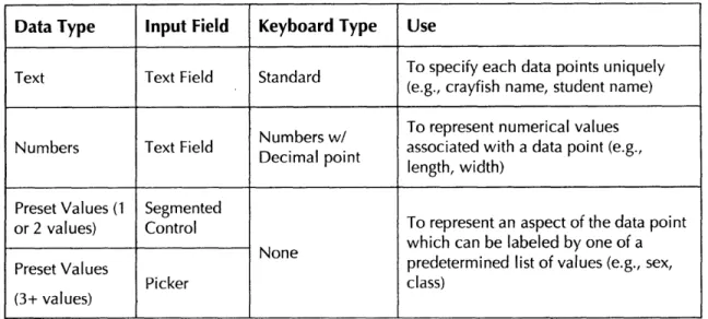
Before students can use TouchGraph as part of an activity, it must first be setup by the teacher. This process involves specifying the data that will be collected by the class. There are three choices for data types the students can record: text, numbers, and preset discrete values. Each data type will have a unique means of input. The details of each data type are explained in Table 1 below.
Table 1: Data type details
Data Type Input Field Keyboard Type Use
Text Text Field Standard To specify each data points uniquely (e.g., crayfish name, student name) Numbers w/ To represent numerical values
Numbers Text Field Decimal point associated with a data point (e.g., length, width)
Preset Values (1 Segmented To represent an aspect of the data point or 2 values) Control
None which can be labeled by one of a
Preset Values predetermined list of values (e.g., sex,
Picker class)
(3+ values)
3.1.2 Entering, Submitting, & Receiving Data
When a student opens TouchGraph, he is presented with an empty Graph View, an empty Data Table, and a Data Entry Window.
Figure 2: Empty Interface
The Data Entry Window is laid out according to the data types specified by the
teacher beforehand.
The student is immediately able to start recording data in the Data Entry Window. Once each input field contains a valid value, the "Submit" button becomes active and the student can submit his data. The value for each field is packaged and sent wirelessly to the teacher's iPad, where it is accumulated with the data from other students.
Once the teacher is ready, her iPad begins to wirelessly broadcast the class data. Once the student receives the data transmission from the teacher, the Data Table is populated with the class' data. If the teacher has allowed automatic graphing, then an automatically generated graph, referred to as an auto graph, is displayed in the Graph View. Otherwise, an empty graph, referred to as a manual graph, is
generated which the student can use to manually insert data points.
3.1.3 Automatic Graphs
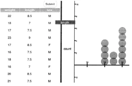
When presented with an automatically generated graph, TouchGraph allows a student to manipulate the Graph View to explore the data set. In order to fully investigate the relationships between the data, students may need to change the variable assigned to each axis. When a student double-taps on an axis it cycles through the various choices that are allowed for that axis. The x-axis can represent any of the variables from the class data set. The y-axis can only represent numbers
or count [see Section 4.4.3]. An axis can also be changed by dragging the column
$~ MT d 22 8,5 M 1s 7 M 23 9M 17 8.5 F count 16 7.5 M 18 7.5 M 16 7 F 20 8.5 M 21 7.5 M
Figure 3: Changing axis variable from count to length
A student also can manipulate a graph by panning and zooming. Panning requires a student to place her finger on the Graph View and to move it in any direction. This action causes the entire graph to move with the finger and allows students to view parts of the graph that were previously hidden. Zooming requires a student to place two fingers on the Graph View. When the student brings her fingers closer together, the scale of the axes decreases, zooming out from the graph. When she moves her fingers farther apart, the scale of the axes increases, zooming into the graph. This allows the student to view a graph with greater or lesser detail.
Figure 4: Graph View with zooming
A student also has the capability to use the graph to explore the class data. When a student touches any of the data points in an automatically created graph, the
corresponding entry in the Data Table is highlighted. If there is more than one data point at a given location in the graph, then each entry that corresponds to the point on the graph is highlighted.
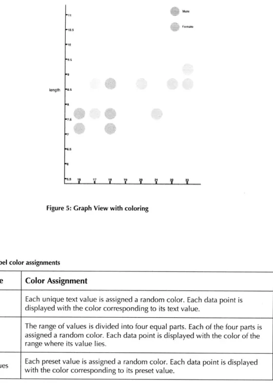
Finally, a student can manipulate the graph by labeling data points. This process is initiated when a student drags a column header to the body of the Graph View. The corresponding variable of data is used to color each data point. Color assignments are described in Table 2. If there are five or fewer color assignments for a variable, then a legend is generated describing the values associated with each color.
'I- V ~ V
Figure 5: Graph View with coloring
Table 2: Label color assignments
Data Type Color Assignment
Text Each unique text value is assigned a random color. Each data point is displayed with the color corresponding to its text value.
The range of values is divided into four equal parts. Each of the four parts is Numbers assigned a random color. Each data point is displayed with the color of the
range where its value lies.
Preset Values Each preset value is assigned a random color. Each data point is displayed with the color corresponding to its preset value.
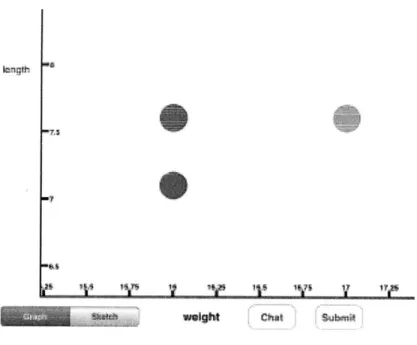
3.1.4 Manual Graphs
If the student is presented with a manual graph, he is expected to use the class data to generate a graph on his own. Similar to the automatic graph, an axis of the
manual graph can be changed by dragging a variable onto the axis or double-tapping the axis. Panning and zooming also behave similarly.
The student is able to place data points anywhere on the graph by double-tapping at the location in Graph View where the data point should appear. A data point can be removed by pressing and holding a finger on the point. There is no functionality available for the student to use different colors to label various data
points.
3.1.5 Data Table
The Data Table provides students with the opportunity to study and analyze the class' raw data. A student can hide and unhide a variable of the data by double-tapping on the column header. This allows the student to focus on a particular variable of the data without being distracted by the larger data set.
If the activity involves an automatic graph, a student can tap on any entry in the Data Table and the corresponding point in the automatic graph will enlarge. Thus allowing the student to make a connection between the raw data and their
Figure 6: Enlarged point
3.1.6 Submitting Graphs
Once a student has completed her graph, she can submit it to the teacher. When
the student presses the "Submit Graph" button, her choice of axes values, and her
zoom and pan specifications are sent to the teacher's iPad, where the graph is recreated. The teacher then can view the graph and select it for class discussion.
3.1.7 Messages
At any stage of the activity, the student can open a line of communication with the teacher. When the student presses the "Chat" button, a small message window
pops up, allowing dialogue between the teacher and student. When the student would like to return to work, she closes the message window. The entire dialogue
is saved and can be reviewed by pressing the "Chat" button. So if a student needs to refer to an instruction from the teacher at a later time, it will always be available.
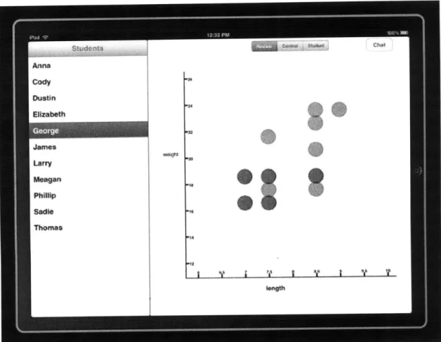
3.2 Teacher Interface
3.2.1 Managing Students
A teacher using TouchGraph has the difficult responsibility of managing the submissions for and interacting with an entire class of students. The teacher accomplishes these tasks with Review Mode. This mode allows the teacher to check the graph submissions for and the dialogues with each student. When a submission or message is received from a student, that student's icon is highlighted, alerting the teacher that her attention is required. In the figure below, the teacher is reviewing George's graph.
Figure 7: Teacher interface in Review Mode
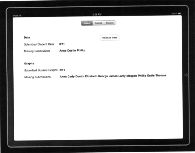
3.2.2 Class Control
The flow of an activity using TouchGraph needs to be regulated so that events occur at the proper time and students have the proper information. The Control Mode gives the teacher the tools necessary to gain a general view of the current state of the activity: This mode gives the teacher a summary of how many students have submitted data sets and graphs. With this information, the teacher can decide when to release the class data set to the entire class. This mode also allows for the
teacher to send out general messages to each student. The figure below shows how many students have submitted their data and graphs for a particular activity.
Figure 8: Teacher interface in Control Mode
3.2.3 Student View
In order to troubleshoot an issue that students are having or to provide a demonstration, it is helpful to be able to access the Student Interface from the Teacher Interface. Student Mode displays an interface that is nearly identical to the
Student Interface. Below is an example of the Student View. Using this, a teacher is able to see exactly what the students in the class are seeing.
4 Design Issues
Using TouchGraph, we want students to be able to explore and gain intuition about graphical relationships. In order to achieve this aim, it is critical that the student has a pleasant experience with the software so that he wants to continue
using it and learning with it.
A delicate balance between simplicity and complexity needed be struck, and considerations about this balance went into almost every design decision. The temptation is to include any feature that you can think of just in case the user might need it. This approach may leave a system unnecessarily complex, leading to more bugs and a decrease in usability. The following sections discuss how this balance was struck in various aspects of the system's design.
4.1
Physical
Constraints
The most common computer found in schools is a desktop machine. These computers are fast, lack power constraints, and have large screens, but a major downside it that they are not portable. They force a student to come to a desk, leaving his activity behind to do so. We chose a portable computer, the iPad, as our platform so that a student can use TouchGraph wherever he happens to be, allowing graphing to be easily integrated into classroom activities. This portability allows a great deal of flexibility in use, but places several constraints on various aspects of the system's design.
4.1.1 Size
The small size of the iPad makes it an ideal platform for TouchGraph. At 9.7" and 1.5 lbs, the device is small enough to be easily handled by students, especially those in elementary school. They can bring the iPad when they are taking initial
measurements, using TouchGraph as a data recorder. If the teacher permits, they can also see the real-time accumulation of class data as they are making their measurements, helping them to gain perspective about the larger data set. This high degree of integration should allow students to better associate the final data set with its physical origins, thus making it easier to connect the abstract graphical representation and data analysis to the real world.
Though the small size allows the iPad to be easily carried, it also makes for a less spacious canvas on which to design the user interface. With many desktop monitor screens boasting more than twice the diameter of the iPad's screen, the inclusion and placement of each visual component on the screen was carefully deliberated.
4.1.2 Battery Life
When compared to desktops and laptops, the battery life of the iPad is considerably shorter. This issue leads to a number of constraints in our software design. If these devices are to be used throughout the day, by multiple classes, it will be
burdensome to require the teacher to recharge the entire class' iPads throughout the day. If the devices remain plugged in while the students are using them, then
the benefits of portability are lost. Therefore, it was important that the system be designed to conserve battery life.
The majority of the TouchGraph's battery life savings come from the selection of the communications protocols and the design of the transmission system. The two options for sending data were: Wi-Fi (802.11) and Bluetooth 2.1. A given data transfer with Wi-Fi should consume less than half the power as the same transfer with Bluetooth. Overall power saving can be seen with Bluetooth, however, if the
amount of data and the amount of time the connection is active are both kept at a minimum. We are able to successfully minimize both of these parameters in TouchGraph, so we chose to use Bluetooth for the communication protocol. (See Section 4.4 for more discussion of the tradeoffs.)
4.1.3 Processing Capacity
The A4 processor used in the iPad is designed to keep power consumption low and is thus considerably slower than the processors found in most modern laptops and desktops. So in order to maintain smooth and responsive feedback from the system, it was critical to keep all necessary computations simple and visual effects to a minimum.
4.2 User Interface
Apple's designers and engineers put a great deal of time into designing the components and specification that work well with the constraints discussed in
Section 4.1. TouchGraph utilizes these tools to create a user interface that is clean and intuitive to use, allowing students to pick up the application and quickly familiarize themselves with its capabilities and functions for exploring the world of
graphical manipulation.
4.2.1 iPad Components
All of Apple's portable touchscreen devices-i Pod Touch, iPhone, iPad-use a similar toolbox of interface components. Each component is carefully designed or adapted to fill a particular user need while staying within the size constraints of the device. Using these components allows us to capitalize on both their well thought out design and the familiarity that many people already have with the look and feel of Apple products. There were two unique iPad components that worked
particularly well for TouchGraph: the segmented control and the picker.
The segmented control is a horizontal collection of segments, each of which shows an item. Each segment looks like a button and remains "pressed" even after the student lifts his finger. It is particularly useful because all of the possible choices are visible and remain visible. Segmented Controls are used in TouchGraph to switch between modes in the Teacher Interface and to input a value which can only take on of two or three discrete values. An example is shown in Figure 11 below.
Control
i
Student
Figure 10: A segmented control
The picker is a compact way to present a long list of preset values to a student. A student can flick or drag to spin the wheel until it displays the desired value beneath the clear selection bar that stretches across the middle of the picker.
Pickers are used in TouchGraph to input a value that can only take one of four or more discrete values. Below is an example.
Figure 11: A picker
4.2.2 Custom Keyboards
Desktop and laptop computers use standard keyboards to input a wide range of data. The same keyboard is used to enter names, dates, numbers, etc. This situation can lead to input errors, e.g., when a number is expected, but a letter is entered, or
a date is entered in an incorrect format. These errors can be identified once they have been entered and evaluated, but the iPad offers a valuable alternative in the form of custom keyboards. Each input field can have its own specialized keyboard that fits its input type. In TouchGraph, when a numerical value is expected, the keyboard that is displayed only contains numbers and the decimal point. This feature prevents the possibility of a large number of errors that can occur when a student is forced to use a full keyboard that contains many more invalid input keys than valid ones.
4.2.3 Multitouch Gestures
Navigating a graph involves panning and zooming. Panning allows a student to bring relevant data points into view, while pushing irrelevant data out of view. Zooming allows students to change their scope, looking at the data in a larger or smaller context. Both of these functions can be completed using a single touch input device, e.g., stylus or mouse, but a multitouch interface provides a more intuitive feel. Panning is accomplished by dragging the graph with a single finger. This motion is similar to the physical act of dragging an object along with your finger. Zooming in or out is accomplished by bringing two fingers closer together or further apart. This motion also mirrors the physical act of squeezing or stretching an object. Not only are these gestures closely related to physical analogues, but they are increasingly used in interfaces that young students come across, e.g.,
iPods, trackpads, touchscreen PCs. Therefore we expect that these gestures will
allow students to quickly and intuitively begin to explore the graphs that they have created.
4.2.4 Screen Real Estate
The small screen size of the iPad required the graphical user interface to be carefully designed. In order to avoid a clutter of menus and submenus, all of the functionality needed to be visible or easily accessible from any part of the interface. To accomplish this goal, the interface was divided into a Data Section, containing the Data Table and Data Entry Window, and Graph View. This is shown below.
Figure 12: Sectioned interface
The student needed to be able to access both at the same time in order to compare the graphs to the data, but the student might also want to focus on either the data or the graph in isolation. The slider bar was the design solution chosen. The bar allows the student to choose what proportion of the screen should be dedicated to each section. She can first devote all of her screen space to manipulating and interpreting the graph. Then when she needs to access the data, she can quickly expand the data section, causing the graph to automatically reduce its size and prominence on the screen.
The messaging system is also designed to minimize its visible footprint. Since the primary use of the system is to collect data and create and analyze graphs, almost all of the screen space is devoted to these functions. Sending messages between teacher and student is a secondary functionality so it is accomplished using almost
no permanent screen space at all. By keeping the entire student-teacher dialogue in a popup interface, there is no space used besides the button that calls the interface.
Figure 13: Student-Teacher Dialogue
When a student wants to communicate with the teacher, he presses the "Chat" button and the dialogue box appears. Once the message has been sent, the
dialogue box disappears. When he receives his response, the dialogue box appears automatically and remains until it is dismissed. If a student wants to access the conversation at another time, he simply presses the "Chat" button again.
This design style is drastically different than the style used in TinkerPlots. Since it is used on larger screened devices, TinkerPlots tends to prefer persistent visibility of all views. Various data and graphs can be generated, but the default behavior is to tile these views to prevent any of them from covering each other. A similar style was initially attempted with this system, but space constraints made it an
impractical solution.
4.3 Graph View
The goal of TouchGraph is to allow students to comfortably and confidently
explore graphing concepts. Therefore, the layout and navigation of the Graph View is critical for properly engaging the student.
4.3.1 Overlapping Points
Data points are represented by translucent colored circles. When there are multiple data points with overlapping coordinates, it can be difficult to differentiate them. The darker two points below represent several superimposed overlapping points.
Figure 14: Overlapping Points
Because the points are translucent, stacked points are darker than single points. It is difficult, however, to accurately quantify the number of points given only the hue of the point. More information can be learned if a data point is touched. Once selected, the corresponding data from that point and any points beneath it are highlighted in the data section of the interface.
Siapper 187 M Bobbert 17 7.5 M Wvr 23 9 M sma ina17 8.5 F Bobby 18 7.5 M Hermes 18 7 F W E4zwM 2 85 M
Figure 15: Highlighted Data
4.3.2 Screen Setup & Alignment
When the student is panning and zooming through the graph view, it is very easy to "lose" the data. Once this occurs, students can spend a great deal of time trying to reorient themselves, often becoming frustrated in the process. To remove this issue, a re-centering function was created. Whenever called, the graph view sets the proper parameters to allow the entire dataset to be visible on the screen, re-centering the data. This function is called whenever a graph is first generated, when the axes are changed, and can be called manually by the user.
4.3.3 Count
We wanted to ensure that students would be able to gain some intuition about the TouchGraph's functionality as soon as they opened the application. To facilitate this aim, the system is designed to automatically create an initial graph once data has been received. We chose the initial graph to be count vs. the first data column. Count is a concept that allows students to create bar graphs. A column of data is taken and a count of how many of each value present is taken. Then a graph is generated with the data values on the x-axis and the count on the y-axis, effectively creating a vertical bar graph. Most students have had more experience with bar graphs than with scatter plots, so this graph is a gentle introduction to the graphing interface as a whole.
cunt.
Figure 16: Count graphs are similar to bar graphs
This initial graph also serves to display the count graph functionality that the students can use at some later time. Once the initial graph has been generated, students can venture forth and generate more complicated graphs, placing data on both axes.
4.3.4 Changing Axes
Changing the variable represented by each axis in a graph changes the meaning of the graph and allows the student to make different conclusions about the data. Since this functionality is so important to the system, we wanted to ensure that there were multiple means of accomplishing it. TInkerPlots allows students to change the axes variables by dragging the appropriate title from the data section to the corresponding axis. We implemented this functionality as well and found that
having a student make a physical connection between the data and the graph with a finger was a powerful way to connect these concepts for the students.
In addition, we gave the students another way to change axes variables. By tapping on an axis, a student can cycle through each choice of axis variable. This operation allows a student to quickly cycle through and inspect multiple graphs. Seeing all of the options in quick succession allows a student to compare each of the graphs and may help him choose which graph would be most appropriate for a given situation.
4.3.5 Coloring
Standard two-dimensional graphing allows students to make connections between two corresponding sets of data. The ability to add particular colors to data points allows students to make connections between three corresponding sets of data, opening a new rich set of inferences. Implementing coloring effectively, however, proved challenging.
In TinkerPlots, a student can add colors to any graph. If the colored variable has a continuous range of values, then a color is chosen for each range, and each data point in the graph is given the appropriate color. If the colored variable has discrete values, then a color is chosen for each value, and each data point in the graph is given the appropriate color. In each case, a legend is made to tell the student which color corresponds to which values.
In TouchGraph, we were able to implement coloring with continuous range and a small number of discrete values, but we ran into an issue with coloring a large
number of discrete values. When more than five discrete values needed to be colored, it proved difficult to produce a legend that did not use a significant amount of screen space. More than ten values proved nearly impossible to fit on the screen. As a result, coloring was restricted to discrete variables with less than
five values. In future work, we will investigate how often this limit poses a problem in classes.
4.4 Communication
One of the major strengths of the CEP system is that it allows the teacher to manage the classroom by accepting submissions from students and transmitting data back to them wirelessly in real-time. We implemented some of this functionality with TouchGraph to allow for dynamic classroom experiences.
4.4.1 Wireless Communication
The need to conserve power considerations led to us to design a system that
utilized Bluetooth. Though limited in range and slower than Wi-Fi, we were able to design the system to utilize Bluetooth effectively. Wi-Fi on average consumes 500
mW, as compared the Bluetooth which consumes 60 mW. The average data transfer rate for Wi-Fi, however, is much faster than Bluetooth, 20 Mbps and 1
Mbps, respectively. So a given data transfer with Wi-Fi should consume less than half the power as the same transfer with Bluetooth. Overall power saving can be seen with Bluetooth, however, if the amount of data and the amount of time the connection is active are both kept at a minimum. Therefore whenever considering which data to send, the sparsest set possible is always chosen. With this aim in mind, the parameters of the graph are sent from the student to the teacher instead of an image of the graph, which would be a much larger file to transmit. Also, the Bluetooth connection is kept in a low-power mode the majority of the time, only becoming active to send data and to intermittently listen for data from the teacher. (See Section 4.4.3 for further discussion.)
4.4.2 Data Encapsulation
An important design decision had to be made concerning how to encapsulate and send a graph from the student to the teacher. The information that is sent must give
the teacher a clear idea of whether the student has correctly constructed and interpreted the graph. Initially the plan was to send a screenshot image of the graph. These data, however, consumed too much bandwidth to send with the necessary frequency. Then we decided to send the data that defined the graph. For an automatic graph, the axes and labels define a graph. For a manual graph, the data points, axes, and labels define a graph. This arrangement allows for much smaller packets to be sent, which significantly decreases the data transmission load and thus increases battery life. It also allows teachers a greater ability to analyze
student results: Now the teacher has the ability to navigate an entire student graph, not just the portion visible on the screen. She can also easily quantify how many students sent a particular graph, allowing her to quickly gauge how well the class understands the assignment.
4.4.3 Data Collection
The need to conserve power considerations led to us to design a system that
utilizes Bluetooth. Though limited in range and slower than Wi-Fi, we were able to design the system to utilize Bluetooth effectively.
For the purposes of the prototype, we assumed that the system would be used in a medium-sized classroom of approximately 25 students. Testing showed the iPad Bluetooth capable of transmitting reliably within these size constraints. There were no lost transmissions, but transmission times varied with similar data.
One of the first communication decisions was whether to broadly transmit data from every iPad to every other iPad, or to collect and transmit data from one central source.
The main benefit of the broad transmission of data is the creation of a robust system. If a single iPad malfunctions, the activity can continue for the remainder of the class. The main weakness of this implementation is the need for each iPad to constantly send and receive data. In a classroom of 25 students, each student who
needed to send data would have to ensure that 25 other iPads received these data. This scheme would require many more transmission attempts than sending it to a single iPad. Also, all of the iPads in the class would either have to be constantly listening for transmissions from other iPads, or have to be synchronized so that every iPad transmitted and received data during the same periods of time. This first possibility would put a great deal of strain on the iPad batteries. The second
possibility would involve implementing a complex timing protocol that would have to stay synchronized across an entire class of iPads. Since the main benefit of the broad transmission strategy was to create a robust system, basing it on such a complex subsystem would be counterproductive.
Another option was to send all of the data to the teacher's machine, as CEP does.' The iPad would constantly listen for transmissions from student iPads and for when
1 CLP also sends the data to a central server that stores the student submissions in a
database. See the Future Work section for discussion of a central server for TouchGraph.
data needed to be sent to the class. Also the teacher iPad would transmit for long enough that the student iPads which were intermittently "sleeping" to conserve power would be certain to have received the data. This scheme places a great deal of strain on the teacher computer's battery, but it allows the student iPads to conserve power. So if activities were planned throughout the day, only a single iPad would need to be charged or swapped out between classes instead of an entire class' iPads.
5 User Reactions
We were able to demonstrate the prototype to teachers and students to receive feedback about the design. This input will be helpful in designing future versions of
the system. Users generally enjoyed their interaction with the TouchGraph system. The use of the touch screen to manipulate graphs was intuitive and fun. The iPad was light and easy to use and carry.
In the Teacher interface, the most common concern was that there was not
sufficient feedback when events occur. Currently, there are no notifications when a student submits data or a graph if the Teacher interface is not in Control Mode. This restriction meant that the teacher had to regularly switch modes to monitor
submissions. A persistent portion of the screen that was devoted to notifications was suggested.
In the Student interface, users really wanted to be able to draw and make notations of the graphs. In order to describe a trend, it is much easier to circle a set of points than it is to describe it in a message. This ability would allow for much richer communication between the teacher and student, such as we've seen in classroom trials using CLP. Users also wanted more analytical tools in the Student interface. The most common request was for a way to display the mean and standard
deviation of a data set on the graph. This capability would make it easier to draw conclusions about trends in the data.
6 Contributions and Future Work
This thesis project successfully demonstrated the feasibility of designing and implementing a system that allows students to input raw data and create and view a graph that can then be manipulated. We were able to take advantage of the iPad's touchscreen affordance to create a data collection and graph generation program that we believe, based on user reaction, could be used in K-1 2
classrooms. Future work includes deployment in classrooms to gauge teacher and student reaction and to test our design decisions, e.g., the choice of Bluetooth instead of Wi-Fi. Future implementation work falls into three categories: data display, UI for data entry, and classroom server architecture.
Data Points. There are a number of ways that the issue of data points obscured by other data points could be addressed. Points that overlap can be slightly shifted so
that the outlines of each can be clearly differentiated. The main issue with this solution is that it may not work well for a large number of overlapping points. Another option is to label any overlapping points with a number representing the number of data points located at that point. This scheme, however, could add quite a bit of visual noise to the screen.
Sketching. There is great value in having students qualitatively assess their data. A
teacher might ask students to draw trend lines on an automatic graph or on an empty manual graph from the class data. This activity would require TouchGraph to allow strokes to be recorded and illustrated, allowing a student to sketch on a graph. This functionality would also allow for students a richer set of tools to
"show" their observations to their teacher. Presently, students must either write their observation in a message, or call the teacher over to show him in person. This ability also would allow teachers to make quick notations on student graphs, which
could then be sent to the students to help them along in their exploration.
Dedicated Classroom Server. In the current design, the teacher's iPad serves as the
dedicated classroom server for receiving, storing, and sending all data sets in an activity. This requirement puts a serious strain on the battery of this device. If multiple activities were conducted in a day, this iPad would most likely need to be recharged. This requirement could be an inconvenience, reducing the mobility of the teacher during the activity. Using a separate computer with Bluetooth as a classroom server would remove this problem. The teacher's iPad could use the
same power saving techniques that the student iPads use while the laptop can be plugged in and constantly transmitting and receiving data.
References
[1] Bdl, A., & Janvier, C. (1981). The interpretation of graphs representing
situations. For the Learning of Mathematics, 2(1), 34-42.
[2] Brasell, H. M., & Rowe, M. B. (1993). Graphing skills among high school
students. School Science and Mathematics, 93(2), p. 63-70.
[3] Dudgale, S. (1993). Functions and graphs-Perspectives on students thinking.
In T. A. Romberg, E. Fennema, & T. P. Carpenter (Eds.) Integrating research
on the graphical representation of functions (pp. 101-130). Hillsdale, NJ:
Erlbaum.
[4] Janvier, C. (1981). Use of situations in mathematics education. Educational
Studies in Mathematics, 12, 1 13- 122.
[5] Mokros, J. R., & Tinker, R. F. (1987). The impact of microcomputer-based
labs on children's ability to interpret graphs. journal of Research in Science
Teaching, 24(4), 369-383
[6] NCTM (2009). Principles and standards for school mathematics. Reston, VA:
Author.
[71 Oakes, J. M. (1997). Discovery through graphing. The Science Teacher 64(1), 33-35.
[8] Sivasubramaniam, P. (1999). Computers and graphing skills in the light of
learning theories. [Available online at
'http://www.edweb.co.uk/bcme/proceedings/research/sivasubramanium.htm]
[9] Konold, C., & Higgins, T. [. (2003). Reasoning about data. In J. Kilpatrick, G.
Martin & D. Schifter (Eds.), A research companion to NCTM's Standards (pp. 193-215). Reston, VA: NCTM.
[10] Konold, C., & Miller, C. (2004). TinkerPlotsTM Dynamic Data Exploration
(Version 1.0). Emeryville, CA: Key Curriculum Press.
[11] Friel, S. N., Curcio, F. R., & Bright, G. W. (2001). Making sense of graphs: Critical factors influencing comprehension and instructional
implications. Journal for Research in Mathematics Education, 32(2), 124-158.
data: critical barriers to classroom implementation. Educational Psychologist,
27(3), 337-364.
[13] Marshall, J., Makar, K., & Kazak, S. (2002). Young urban students'
conceptions of data uses, representation, and analysis. In D. S. Mewborn, P.
Sztajn, D. Y. White, H. G. Wiegel, R. L. Bryant, K. Nooney (Eds), Proceedings of the Twenty-fourth Annual Meeting of the North American Chapter of the International Group for the Psychology of Mathematics Education
(PME-NA24), Athens GA (USA), Vol. 3, pp. 1293-1304. Columbus, OH: ERIC
Clearinghouse, Mathematics and Environment Education.
[141 Rubin, A., Hammerman, J., & Konold, C. (2006). Exploring informal
inference with interactive visualization software. In Rossman, A. & Chance, B. (Eds.), Working Cooperatively in Statistics Education: Proceedings of the Seventh International Conference on Teaching Statistics (ICOTS-7), Salvador, Brazil. Voorburg, The Netherlands: International Statistical Institute.
[15] Pfannkuch, M., Budgett, S. & Parsonage, R. (2004). Comparison of data plots: Building a pedagogical framework. Paper presented at the Tenth Meeting of the International Congress on Mathematics Education, Copenhagen,
Denmark.
[16] Rubin, A., & Hammerman, J. K. (2006). Understanding data through new software representations. In G. Burrill (Ed.), Thinking and Reasoning with
Data and Chance-2006 NCTM Yearbook. Reston, VA: National Council of Teachers of Mathematics.
[171 Koile, K., Chevalier, K., Low, C., Pal, S., Rogal, A., Singer, D., Sorensen, J., Tay, K.S., and Wu, K. (2007a). "Supporting Pen-Based Classroom Interaction:
New Findings and Functionality for Classroom Learning Partner."
Proceedings of the First International Workshop on Pen-Based Learning Technologies 2007.
<http://projects.csail.mit.edu/clp/publications/documents/KoileP[T2007.pdf>
[181 Koile, K., Chevalier, K., Rbeiz., M., Rogal, A., Singer, D., Sorensen, J., Smith, A., Tay, K.S., and Wu, K. (2007b). "Supporting Feedback and Assessment of
Digital Ink Answers to In-Class Exercises." Proceedings of the Nineteenth
Conference of Innovative Applications of Al 2007.
<http://projects.csail.mit.edu/cip/publications/documents/KoilelAA107.pdf>
[191 Koile, K. and Singer, D.A. (2006a). "Improving Learning in CS1 via Tablet-PC-Based In-Class Assessment." Proceedings of ICER 2006. Canterbury, UK: University of Kent.
<http://projects.csail.mit.edu/clp/publications/documents/KoileSingerlCER06.
pdf>
[201 Koile, K. and Singer, D. (2006b) Development of a Tablet-PC-based System
to Increase Instructor-Student Classroom Interactions and Student Learning. In The Impact of Pen-based Technology on Education; Vignettes,
Evaluations, and Future Directions. Berque, D., Gray,
J.,
and Reed, R. (editors). Purdue University Press, 2006. 7; published proceedings of the First Workshop on the Impact of Pen-based Technology in Education (WIPTE 2006)[21] Anderson, R., Anderson, R. Davis, P., Linnell, N., Prince, C., Razmov, V. and Videon, F. (2007). "Classroom Presenter: Enhancing Interactive Education with Digital Ink." Computer. Los Alamitos, CA: IEEE Computer Society. 40 (9), 56-61. <http://cIassroompresenter.cs.washington.edu/>
[22] Anderson, R., Anderson, R., Simon, B., Wolfman, S., VanDeGrift, T., and Yasuhara, K. (2004). "Experiences with a Tablet-pc-based Lecture
Presentation System in Computer Science courses." Proceedings of the 35th
SIGCSE Technical Symposium on Computer Science Education. Norfolk, VA: