HAL Id: halshs-02797549
https://halshs.archives-ouvertes.fr/halshs-02797549
Preprint submitted on 5 Jun 2020
HAL is a multi-disciplinary open access archive for the deposit and dissemination of sci-entific research documents, whether they are pub-lished or not. The documents may come from teaching and research institutions in France or abroad, or from public or private research centers.
L’archive ouverte pluridisciplinaire HAL, est destinée au dépôt et à la diffusion de documents scientifiques de niveau recherche, publiés ou non, émanant des établissements d’enseignement et de recherche français ou étrangers, des laboratoires publics ou privés.
House Price Cycles, Wealth Inequality and Portfolio
Reshuffling
Clara Toledano
To cite this version:
Clara Toledano. House Price Cycles, Wealth Inequality and Portfolio Reshuffling. 2017. �halshs-02797549�
World Inequality Lab Working papers n°2017/19
"House Price Cycles, Wealth Inequality and Portfolio Reshuffling"
Clara Martínez Toledano
Keywords : Wealth distribution; wealth concentration; Spain; inequality;
Preliminary version
Housing Bubbles, Offshore Assets
and Wealth Inequality in Spain
∗
Clara Martínez-Toledano
†Paris School of Economics
December 2017
Abstract
This paper combines different sources (tax records, national accounts, wealth surveys) and the capitalization method in order to deliver consistent, unified wealth distribution series for Spain over the 1984-2013 period, with detailed breakdowns by age over the 1999-2013 sub-period. Wealth concentration has been quite stable over this period for the middle 40% and bottom 50%, with shares ranging between 5-10% and 30-40%. Since the end of the nineties Spain has experienced a moderate rise in wealth inequality, with significant fluctuations due to asset price movements. Housing concentration rose during the years prior to the burst of the bubble, due to the larger increase in secondary dwelling acquisitions (quantity effect) by upper wealth groups, and decreased afterwards. The housing bubble had, however, a neu-tral impact on wealth inequality. Rich individuals substituted financial for housing assets during the boom, and compensated for the decrease in real estate prices during the bust by selling some of their dwellings and accumulating more financial assets. Even though housing reduces the levels of wealth inequality over the period, the bulk in secondary residence, to-gether with offshore assets, large capital gains and different rates of return and savings rates across groups have contributed to keeping the same high levels of wealth concentration of the 1980s in the late 2000s.
Keywords: Wealth Inequality, Housing, Offshore Assets, Spain JEL Classification: D3, N3, R2
∗
I want to specially thank Facundo Alvaredo and Thomas Piketty for their constant and excellent supervi-sion. I am also very grateful to Miguel Artola, Cristina Barceló, Olympia Bover, Paul Dutronc, Luis Estévez, Gabrielle Fack, Bertrand Garbinti, Jonathan Goupille, José Montalbán, Jorge Onrubia, Daniel Waldenström and Gabriel Zucman for their helpful comments, as well as participants at the 5th Conference on Household Finance and Consumption held at the ECB, the 2016 Spring Meeting of Young Economists in Lisbon, the LAGV 2016 International Conference in Public Economics in Aix-en-Provence and seminars at Paris School of Economics and Bank of Spain. I acknowledge financial support from Fundación Ramón Areces and Bank of Spain at different stages of the project.
†
1
Introduction
Both the evolution and determinants of wealth inequality are currently at the center of the academic and political sphere. This is largely due to the debate generated by Thomas Piketty’s prominent book, Capital in the Twenty-First Century (Piketty(2014)), in which he warns that the tendency of returns on capital to exceed the rate of economic growth threatens to generate extreme inequalities. Moreover, he also emphasizes the importance of analyzing empirically the historical evolution of wealth distributions. Research on wealth inequality has, however, a long tradition which dates back to the late 19th century and beginning of the 20th century, in which a number of authors started to study wealth among the living using mainly French and British inheritance data.1 Nonetheless, it is only after the first half of the 20th century that academics started to construct long run homogeneous historical series on top wealth shares (Lampman
(1962) for the US,Atkinson and Harrison(1978) for the UK,Piketty et al.(2006) for France and
Roine and Waldenström (2009) for Sweden).
There exist five main methods and/or sources to analyze wealth inequality. The first is the estate multiplier method, that provides a snapshot of the wealth distribution at the time of death using estate tax records data. The main difficulty is how to generalize from decedents to the full population. The second possible approach is to use surveys of household finances. Contrary to the estate multiplier method, one advantage of using survey data is that it allows to characterize the middle and bottom of the wealth distribution. Nevertheless, even though most of these surveys oversample wealthy households, concentration at the top tends to be underestimated because of misreporting or top coding. The third available source are wealth tax returns. Wealth tax data cover very well the top of the distribution, but three main limitations remain. First, there are very few countries in the world which have a wealth tax (i.e. Spain, France, Norway, Uruguay, etc.). Second, only very wealthy individuals are subject to the tax, making it impossible to analyze the middle and bottom of the distribution. Third, many assets are exempted from this tax, so that it is not possible to have a whole picture of the wealth distribution. The fourth is the capitalization method, which consists of applying a capitalization factor to the capital income distribution to arrive to the wealth distribution. The main advantages of the capitalization technique are that it is based on income data, which are much easier to obtain than wealth data, and that the top is very well covered. The main limitation is, as in the case of the wealth tax, that there are also some assets whose generated income is not subject to the tax. Finally, one
1
can also analyze the upper part of the distribution using lists of high-wealth individuals, such as the annual Forbes 400 list. The drawback in this case is that named lists are limited to a very small group of top wealth-holders and have non-systematic coverage.
Despite the immense literature on the analysis of wealth distributions, two important gaps remain. First, there is still no consensus on the method of analysis that should be adopted, since there are conflicting results depending on which of the techniques or sources are used. For instance, Saez and Zucman (2016) find that wealth considerably increased at the top 0.1% in the US over the last two decades using the income capitalization method, contrary to the results obtained by Kopczuk and Saez (2004) using the estate multiplier method. Second, due to data limitations, empirical evidence on the determinants of wealth concentration is still scarce. There is some evidence that the surge in top incomes and offshore wealth (Saez and Zucman (2016),
Alstadsæter et al. (2017)), and the increase in saving and rates of return inequality (Garbinti et al. (2017), Saez and Zucman (2016)) have pushed toward wealth concentration in the last two decades. However, it is still unclear which are the distributional effects of specific economic phenomena, such as housing bubbles.
The aim of this research is to analyze wealth inequality in Spain using a mixed survey-capitalization method from 1984 up to 2013, with a particular focus on the years of the housing boom and bust. By analyzing Spain I will contribute to the literature of wealth inequality in five ways. First, Spain experienced a unprecedented increase in aggregate wealth due to a boom in housing between 2000 and 2008. Hence, it is interesting to analyze the distributional effects of this economic phenomenon which have not been deeply studied so far. Second, Spain has high-quality personal income tax micro-files with detailed income for each tax unit and income category over the period 1984-2013, as well as publicly available administrative aggregate data on personal wealth held by Spanish residents abroad. Thus, they allow to provide a careful estimation of the evolution and composition of Spanish wealth shares from bottom to the top, with breakdowns by age for the 1999-2013 sub-period and a correction for offshore assets. To my knowledge, the few studies that have analyzed wealth concentration in Spain using administrative data have only focused on the top 1%, have never corrected for offshore assets, and survey data (Survey of Household Finances, Bank of Spain) are only available for four waves since 2002. Third, I go one step forward previous distributional studies and further decompose wealth accumulation by asset type. This new asset-specific decomposition allows me to quantify not only the relative importance of each channel (income, saving rate and rate of return inequality), but also the role
played by each asset to explain the channels that drive the observed dynamics of the distribution of wealth. Fourth, using the steady-state formula developed by Garbinti et al. (2017) I carry simulations to better understand which are the key forces (unequal labor incomes, unequal rates of return and/or unequal saving rates) behind long term wealth inequality dynamics in Spain. Fifth, Spain is one of the few countries in the world that has a wealth tax and for which micro-files from wealth tax records are available. Thus, from the methodological point of view, it is interesting to test the capitalization method by first comparing the wealth shares using the income capitalization method with the shares using wealth tax returns and by second calculating the distribution of the rates of return.
The starting point of the mixed capitalization-survey approach used in this work involves the application of a capitalization factor to the distribution of capital income to arrive to an estimate of the wealth distribution. Capitalization factors are computed for each asset in such a way as to map the total flow of taxable income to total wealth recorded in Financial and Non-financial accounts. When combining taxable incomes and aggregate capitalization factors, it is assumed that within each asset class capitalization factors are the same for each individual. By using this methodology, I am able to obtain wealth distribution series consistent with official financial and non-financial household accounts. In Spain, as in most of countries, not all assets generate taxable income. We account for them by allocating them on the basis of how they are distributed, in such a way as to match the distribution of these assets in the Survey of Household Finances developed by the Bank of Spain. The assets which we account for are main owner-occupied housing, life insurance, investment and pension funds.
The wealth distribution in Spain has been analyzed in the past using three different data sources. Firstly,Alvaredo and Saez (2009) use wealth tax returns to construct long run series of wealth concentration for the period 1982 to 2007. The progressive wealth tax has high exemption levels and only the top 2% or 3% wealthiest individuals file wealth tax returns. Thus, they limit their analysis of wealth concentration to the top 1% and above. They find that top wealth concentration decreases at the top 1% from 19% in 1982 to 16% in 1992 and then increases to almost 20% in 2007. However, in contrast to the top 1%, they obtain that the 0.1% falls substantially from over 7% in 1982 to 5.6% in 2007. Durán-Cabré and Esteller-Moré(2010) also use wealth tax returns to analyze the distribution of wealth at the top and obtain similar results. Their approach complements theirs by offering a more precise treatment of the correction of fiscal underassessment and tax fraud in real estate, which is the main asset in Spaniards’ portfolios.
Secondly, Azpitarte (2010) and Bover (2010) use the 2002 Survey of Household Finances developed by the Bank of Spain in order to analyze the distribution of wealth at the top. This analysis can be carried out because the survey is constructed doing an oversampling of wealthy households. Azpitarte (2010) presents results for the top 10-5%, 5-1% and 1%. Bover (2010) provides shares for the top 50%, top 10%, top 5% and top 1%. Their estimates for the top 1% are very similar, 13.6% and 13.2%, respectively. However, they are much lower than the results of Alvaredo and Saez (2009) using wealth tax returns, who obtain that the top 1% holds 20% of total wealth. The OECD has also published recently a report in which they analyze wealth inequality across countries (OECD(2015)) using household survey data. They find that the top 1% holds 15.2% in 2011 and that wealth inequality in Spain is lower relative to the average of other 16 OECD countries.
Finally,Alvaredo and Artola(2017) use inheritance tax statistics to estimate the concentra-tion of personal wealth at death in Spain between 1901 and 1958. They compare their results with the estimates among the living of Alvaredo and Saez (2009) for the period between 1982 and 2007. They find that concentration of wealth at the top 1% of the distribution was approx-imately three times larger during the first half of the 20th century than at the end of the same century. Unfortunately, there are no inheritance data available for the current decades. Hence, it is quite relevant to use the capitalization method instead.
My findings show that wealth concentration has been quite stable over this period for the middle 40% and bottom 50%, with shares ranging between 5-10% and 30-40%. Since the end of the nineties Spain has experienced a moderate rise in wealth concentration, with significant fluctuations due to asset price movements. Housing concentration rose during the years prior to the burst of the bubble, due to the larger increase in secondary dwelling acquisitions (quantity effect) by upper wealth groups, and decreased afterwards. The housing bubble had, however, a neutral impact on wealth inequality. Rich individuals substituted financial for housing assets during the boom, and compensated for the decrease in real estate prices during the bust by selling some of their dwellings and accumulating more financial assets. Even though housing reduces the levels of wealth inequality, the bulk in secondary residence, together with offshore assets, large capital gains and different rates of return and savings rates across groups have contributed to keeping the same high levels of wealth concentration of the 1980s in the late 2000s. Simulations using the steady-state formula ofGarbinti et al.(2017) confirm the findings of France that small changes in key parameters can have large effects on steady-state wealth concentration.
The trends and levels in the wealth shares are very similar to the ones obtained byAlvaredo and Saez (2009) using wealth tax returns. Moreover, I test the assumption underlying the capitalization technique, that within each asset class capitalization factors are the same for each individual and I find using the wealth tax micro-files, that rates of return for deposits and fixed-income securities are flat along the distribution. Hence, the mixed capitalization-survey approach seems to be quite a consistent method to analyze the full wealth distribution in Spain over time. The layout of the paper is as follows. Section 2 discusses the wealth concept and data used, together with an analysis of the aggregate trends in wealth in the last three decades in Spain. In Section 3 I formalize and explain the procedure used in order to obtain wealth shares from income tax and survey data. Results for the period 1984-2013, derived from using the mixed survey- capitalization method, are presented in Section 4, as well as a comparison with the trends in other countries. In Section 5 I examine the impact of the housing bubble on wealth inequality. A new asset-specific decomposition of wealth accumulation and some simulation exercises are presented in Section 6 in order to better understand the key drivers of the dynamics of wealth inequality in Spain. In Section 7 I correct the wealth distribution series for offshore assets. In Section 8 I compare my results with other sources and I test the capitalization method. Finally, Section 9 concludes. All Figures and Tables to which the text refers to are included in the appendix at the end of the paper. An Excel file ("Data Appendix") includes the complete set of results.
2
Wealth: Concept, Data and Aggregate Trends
This section describes the wealth concept used and the trends in the evolution of aggregate wealth over the period of analysis (1984-2013). Complete methodological details of the Spanish specific data sources and computations are presented in the online data appendix.
2.1 Wealth Concept and Data Sources
The wealth concept used is based upon national income categories and it is restricted to net household wealth, that is, the current market value of all financial and non-financial assets owned by the household sector net of all debts. For net financial wealth, that is, for both financial assets and liabilities, the latest (ESA 2010, Bank of Spain) and previous (ESA 95, Bank of Spain) Financial Accounts are used for the period 1996-2013 and 1984-1995, respectively.
Financial Accounts report wealth quarterly and I use mid-year values.
Households’ financial assets include equities (stocks, investment funds and financial deriva-tives), debt assets, cash, deposits, life insurance and pensions. Households’ financial liabilities are composed of loans and other debts. It is important to mention that pension wealth excludes Social Security pensions, since they are promises of future government transfers. As it is stated in Saez and Zucman (2016), including them in wealth would thus call for including the present value of future health care benefits, future government education spending for one’s children, etc., net of future taxes. Hence, it would not be clear where to stop.
My wealth concept only considers the household sector (code S14, according to the System of National Accounts (SNA)) and excludes non-profit institutions serving households (NPISH, code S15). There are three reasons which explain this decision. First, due to lack of data, non-profit wealth is not easy attributable to individuals. Second, income from NPISH is not reported in personal income tax returns. Third, non-profit financial wealth amounts to around only 1% of household financial wealth between 1996 and 2014 in Spain. Hence, it is a negligible part of wealth and excluding it should not alter the results.
Spanish Financial Accounts report financial wealth for the household and NPISH sector and also for both households and NPISH isolated as separate sectors. However, the level of disaggre-gation of the Balance Sheets in the latter case is lower than in the case in which households and NPISH are considered as one single sector. For instance, whereas the Balance Sheet of the sector of households and NPISH distinguishes among wealth held in investment funds and wealth held in stocks, the Balance Sheet of the household sector only provides an aggregate value with the sum of wealth held in these two assets. In order to have one value for household wealth held in investment funds and one value for household wealth held in stocks, I assume that they are proportional to the values of households’ investment funds and stocks in the Balance Sheet of households and NPISH.
For non-financial wealth, it is not possible to rely on Non-financial Accounts based on the System of National Accounts. Even though there are some countries that have these accounts, such as France and United Kingdom, no institution has constructed these type of statistics for Spain yet. I need to use other statistics instead. My definition of household non-financial wealth consists of housing and unincorporated business assets and I rely on the series elaborated in
Artola et al. (2017). Housing wealth is derived based on residential units and average surface from census data on the one hand, and average market prices from property appraisals, on the
other hand.2 Unincorporated business assets have been constructed using the four waves of the
Survey of Household Finances (2002, 2005, 2008, 2011) elaborated by the Bank of Spain and extrapolated backwards using the series of non-financial assets held by non-financial corporations also constructed by the Bank of Spain.3
I exclude collectibles since they amount to only 1% of total household wealth and they are not subject to the personal income tax. Furthermore, consumer durables, which amount to approximately 10% of total household wealth, are also excluded, because they are not included in the definition of wealth by the System of National Accounts.4
2.2 Aggregate Wealth Stylized Facts (1984-2013)
Understanding how wealth has evolved in aggregate terms is crucial in order to later interpret the dynamics in the wealth distribution series.
From a historical perspective, the ratio of personal wealth to national income has followed a U-shaped evolution over the past century, a pattern also seen in other advanced economies (Artola et al. (2017); Piketty and Zucman (2014)). However, this process was initially delayed with respect to leading European countries. This finding is consistent with a long post-Civil war economic stagnation and the larger importance of agriculture in Spain. During my period of analysis, from 1984 onwards, I distinguish three stylized facts on the evolution of the level and composition of the stock of wealth in Spain.
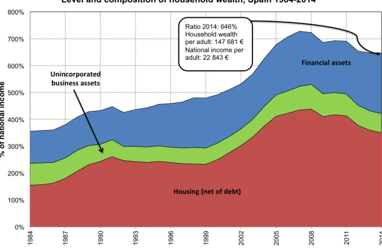
The first stylized fact is that the household wealth to national income ratio has almost doubled during that period of time. Household wealth amounted to around 380% in the late eighties and it grew up to around 470% in the mid-nineties. From 1995 onwards, it started to increase more rapidly reaching the peak of 728% of national income in 2007. After the burst of the crisis in 2008, it dropped and it has been decreasing since then. In 2014, the household wealth to national income ratio amounted to 646%, a level which is similar to the wealth to national income ratio of years 2004 and 2005, but much higher than the household wealth to national income ratios of the eighties and nineties (Figure A.1).
The second stylized fact determines the existence of temporal differences not only in the growth of total net wealth (as it was pointed out in the first stylized fact), but also in the growth
2
Net housing wealth is the result of deducting mortgage loans from household real estate wealth. Note that mortgage debts are approximated by total household liabilities.
3
A detailed explanation of the sources and methodology used in order to construct these two series can be found in data appendix ofArtola et al.(2017).
4
The shares of both collectibles and consumer durables over total household wealth are obtained using the Survey of Household Finances developed by the Bank of Spain.
of its components. In the late eighties the growth in net housing was more than double the growth in financial assets. During the nineties this trend reversed and financial assets started to rise faster due mainly to the dot-com bubble. After the stock market crash of 2000, housing prices increased rapidly surpassing financial assets. The value of dwellings reached the peak in 2008, after which the housing bubble burst and the drop in housing wealth was larger than in financial assets (Figures A.1and A.2).
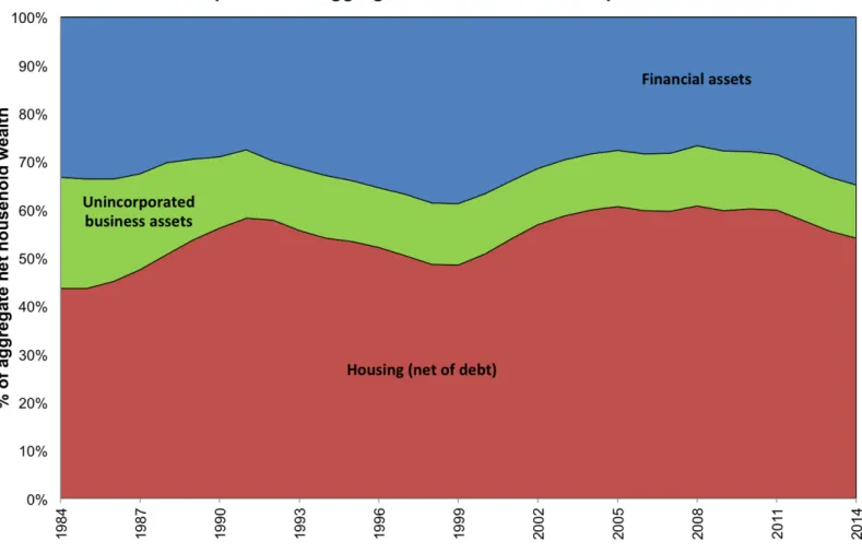
The third and last stylized fact points out the increase in the importance of net housing in the asset portfolio of households. Even though dwellings are during the whole period the most important asset held by households, always representing more than 40% of total household net wealth, the composition of household wealth has not evolved homogeneously over time and it has lost importance in times when financial assets significantly increase (i.e. dot-com bubble). The increase in the fraction of housing in the total portfolio of households has also been exacerbated by the steady decrease in the fraction of unincorporated business assets (from 23% in 1984 up to 11% in 2014), due mainly to the reduction in the importance of agriculture (Figure A.2).
3
The Mixed Capitalization-Survey Approach (1984-2013)
The main goal of this article is to construct wealth shares by allocating the total household wealth depicted in FigureA.1to the various groups of the distribution. For that, it is needed to proceed with the following three steps. First, I start by calculating the distribution of taxable capital income at the individual level. Second, the taxable capital income is capitalized. Third, I account for wealth that does not generate taxable income. This is a mixed method and not the pure capitalization technique, because the survey method is used in order to account for both wealth at bottom of the distribution and assets that do not generate taxable income.
3.1 The Distribution of Taxable Capital Income
The starting point is the taxable capital income reported on personal income tax returns. I use micro-files of personal income tax returns constructed by the Spanish Institute of Fiscal Studies (Instituto de Estudios Fiscales (IEF)) in collaboration with the State Agency of Fiscal Administration (Agencia Estatal de Administración Tributaria (AEAT)). They have three dif-ferent types of files: two personal income tax panels that range from 1982-1998 and 1999-2012, respectively, and personal income tax samples for 2002-2013. I use the first income tax panel
for 1984-19985, the second panel for 1999-2011 and all income tax samples for 2002-2013. The
micro-files provide information for a large sample of taxpayers6, with detailed income categories and an oversampling of the top. The income categories I use are interest, dividends, effective and imputed housing rents, as well as the profits of sole proprietorships.7 The micro-files are drawn from 15 of the 17 autonomous communities of Spain, in addition to the two autonomous cities, Ceuta and Melilla. Two autonomous regions, Basque Country and Navarra, are excluded, as they do not belong to the Common Fiscal Regime (Régimen Fiscal Común), because they manage their income taxes directly. Combined these two regions represent about 6% and 8% of Spain in terms of population and gross domestic product, respectively.8
The distribution of taxable income is derived excluding capital gains. There are two reasons for that. First, realized capital gains are not an annual flow of income. Second, they are a very volatile component of income, with large aggregate variations from year to year depending on stock price variations. Hence, the wealth distribution series could be distorted by including them.
The unit of analysis used is the adult individual (aged 20 or above), rather than the tax unit. Splitting the data into individual units has on the one hand the advantage of increasing comparability as across units since individuals in a couple with income for example at the 90th percentile are not as well off as an individual with the same level of income. On the other hand, it is also more advantageous for making international comparisons, given that in some countries individual filing is possible (i.e. Spain, Italy) and in others (i.e. France, US) not. Since in personal income tax returns the reporting unit is the tax unit, I need to transform it into an individual unit. A tax unit in Spain is defined as a married couple (with or without dependent children aged less than 18 or aged more than 18 if they are disabled) living together, or a single adult (with or without dependent children aged less than 18 or aged more than 18 if they are disabled). Hence, only the units for which the tax return has been jointly made by a married couple need to be transformed. For each of these units I split the joint tax returns into two separate individual returns and assign half of the jointly reported capital income to each
5
Even though the first panel is available since 1982, I decided to start using it from 1984 since I found some inconsistencies between the files for 1982 and 1983 and subsequent years.
6
Personal income tax samples are more exhaustive (i.e. 2,161,647 tax units in 2013) than the panels (i.e. 390,613 tax units in 1999).
7
Note that imputed housing rents exclude main residence from the period 1999-2013. I explain the way in which I account for main residence in the following subsection. Moreover, profits of sole proprietorships are considered as a mixed income, so that I assume as it is commonly done in the literature that 70% of profits are labor income and 30% capital income.
8
These figures have been obtained using Regional National Accounts and the Census of Population of the Spanish Statistics Institute (Instituto Nacional de Estadística (INE)).
member of the couple.9 For 2011, for instance, this operation converts 19.38 million tax units
into 23.07 million individual units in the population aged 20 or above, that is, approximately 19% of units are converted.10
One limitation of using personal income tax returns in order to construct income shares in the Spanish case is that not all individuals are obliged to file. There exist some labour income and capital income thresholds under which individuals are exempted from filing. In 2013, for instance, the labour income threshold when receiving labour income from one single source was 22,000 euros and 11,200 when receiving it from two or more sources. The capital income threshold was 1,600 euros for interest, dividends and/or capital gains and 1,000 for imputed rental income and/or Treasury bills.11Approximately one third of the population is exempted from filing.12 I
account for the missing adults using the Spanish Population Census for the period 1984-2013 by comparing the population totals by age and gender of the micro-files with the population totals of the Census excluding País Vasco and Navarra and I then create new observations for all the missing individuals. By construction, my series perfectly match the Census population series by gender and age.13 These new individuals, although being the poorest since they do not have to file the personal income tax, earn some labour and also some capital income in the form of interest from checking accounts or deposits. Hence, we need to account for this missing income, otherwise we would be overestimating the amount of wealth held my the middle and the top of the distribution. For that, I rely on the Survey of Household Finances for the period 1999-2013 and on the Household Budget Continuous Survey for the period 1984-1998. Appendix C explains in detail the imputation method followed using the two surveys. The imputations are quite robust since as it is shown in Figure A.16, the bottom 50% wealth share with the SHF is almost identical to the one using the capitalization method.
Finally, before capitalizing the capital income shares, it is important to check that income is distributed in a coherent way and that there are no significant breaks across years due to, for instance, tax reforms or the use of different data sources. If already the income data are not
9Since business income from self-employment is a mixed income, only the part corresponding to capital income
is split among the couple.
10
Given the incentives of the tax code to file separately whenever both individuals in the couple receive income, there are more married couples filing individually the further we move up in the income distribution. SeeAEAT
(2013) for a more detailed explanation in Spanish of how personal income tax filing works in Spain.
11SeeAEAT(2013) for a more detailed explanation in Spanish of how personal income tax filing works in Spain. 12
This figure has been obtained comparing the total number of personal income tax filers with the population totals of the Spanish Population Census.
13
The oldest personal income tax panel that I use for the period 1984-1998 does not include information about age nor gender. Hence, for this period of time I simply adjust the the micro-files to match the Census population totals excluding País Vasco and Navarra but without taking age and gender into consideration.
coherently distributed, neither the wealth distribution estimates will be. In appendix C, I explain in detail the particular aspects of the reforms which could potentially affect my methodology and how I deal with them in order to ensure consistency in the series across the whole period of analysis.
3.2 The Income Capitalization Method
In the second step of the analysis the investment income approach is used. In essence, this method involves the application of a capitalization factor to the distribution of taxable capital income to arrive to an estimate of the wealth distribution.
3.2.1 A formal setting
The income capitalization method used in this paper may be set out formally as follows. An individual i with wealth w invests an amount aij in assets of type j, where j is an index of the asset classification (j = 1, .., J ). If the return obtained by the individual on asset type j is rj14, his investment income by asset type is:
yij = rj∗ aij (1)
and his total investment income:
yi = J X
j=1
rj∗ aij (2)
Rearranging equation (1), the wealth for each individual by asset type is, thus, the following:
aij = yij/rj (3)
By rearranging equation (2), the total wealth for each individual is:
wi= J X
j=1
yij∗ rj (4)
In the next subsection, this formal setting is applied to the Spanish case in order to obtain the wealth distribution series.
14
Note that the capitalization method relies on the assumption that the rate of return is constant for each asset type, that is, it does not vary at the individual level.
3.2.2 How the Capitalization Technique Works for the Spanish Case
There are five categories of capital income in personal income tax data: effective and imputed (excluding main residence) rental income, business income from self-employment, interest and dividends. Tax return income for each category is weighted in order to match aggregate national income from National Accounts. I then map each income category (e.g. business income from self-employment) to a wealth category in the Financial Accounts from the Bank of Spain (e.g. business assets from self-employment).15
As it was mentioned in Section 3.1, income tax data exclude the regions of País Vasco and Navarra. Therefore, before mapping the taxable income to each wealth category, income and wealth in National Accounts need to be adjusted excluding the amounts corresponding to these two regions. Ideally, if one would know the amount of wealth and income in each category by region, one could simply discount the wealth and income corresponding to País Vasco and Navarra. Unfortunately, neither the Bank of Spain nor the National Statistics Institute have constructed Regional National Accounts with disaggregated information by asset type yet, so another methodology needs to be used. I assume that income and wealth in each category are proportional to total gross domestic product and housing wealth excluding these two regions, respectively.16
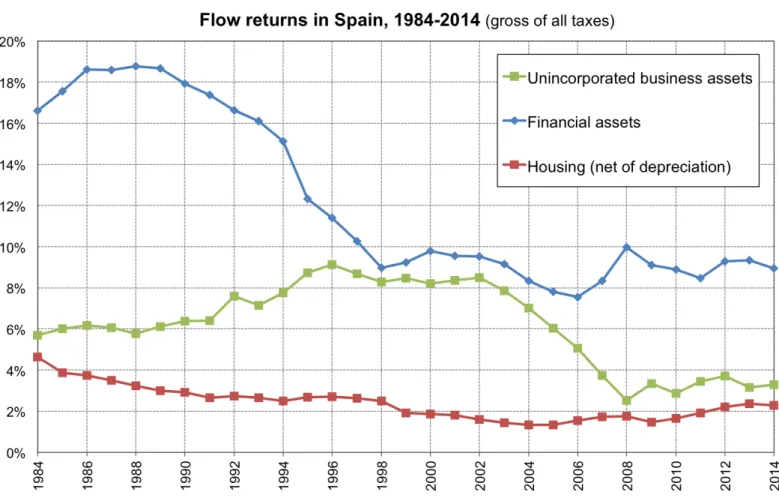
Once income and wealth have been adjusted accordingly, a capitalization factor is computed for each category as the ratio of aggregate wealth to tax return income, every year since 1984. This procedure ensures consistency with the Bank of Spain aggregate wealth data by construc-tion. In 2013, for instance, there are about 19.4 billion euros of business income and 612.8 billion euros of business assets from self-employees generating taxable income. Hence, the rate of return on taxable business assets is 3.2% and the capitalization factor is equal to 31.6. As it is shown in FigureA.3, rates of return (and thus capitalization factors) vary across asset types, being for instance higher for financial assets than for business assets.17
15
Capital gains are excluded from the analysis. The reason is that they are not an annual flow of income and consequently, they experience large aggregate variations from year to year depending on stock price variations. By including them, the trends in the wealth distribution series could be biased since we observe large variations in capital gains from year to year.
16
Total gross domestic product in Spain excluding País Vasco and Navarra accounts for approximately 92% of total gross domestic product. This figure is obtained using Regional National Accounts constructed by the National Statistics Institute. The share of housing wealth excluding País Vasco and Navarra amounts to approximately 92% of total housing wealth. This figure has been obtained using a study elaborated by the financial institution La Caixa (Caixa Catalunya(2004)), in which they provide the value of housing wealth by region.
17
The rate of return on housing using National Accounts is very low for international standards, particularly during the most recent period (2002-2013). This can be explained by the fact that the differences in growth between housing wealth and housing rental income were much larger in Spain than in the rest of advanced economies. One potential explanation are the large differences in demand for renting (low) versus buying (high)
The capitalization method is well suited to estimating the Spanish wealth distribution because the Spanish income tax code is designed so that a large part of capital income flows are taxable. However, as it has been already mentioned, tax returns do not include all income categories. In Section 3.3, I carefully account for the assets that do not generate taxable income.
3.3 Accounting for Wealth that Does not Generate Taxable Income
The third and last step consists of dealing with the assets that do not generate taxable income. In Spain, there are four assets whose generated income is not subject to the personal income tax: Main owner-occupied housing18, life insurance, investment and pension funds. Although these assets account for a large part of total household wealth, namely 32.8% for main residence and 8.1% for life insurance, investment and pension funds in 2013, the fact that they do not generate taxable income does not constitute a non-solvable problem for one main reason: Spain has a high quality Survey of Household Finances (SHF).
As it was mentioned in Section 3.1, this survey provides a representative picture of the structure of household incomes, assets and debts at the household level and does an oversampling at the top. This is achieved on the basis of the wealth tax through a blind system of collaboration between the National Statistics Institute and the State Agency of Fiscal Administration which preserves stringent tax confidentiality. The distribution of wealth is heavily skewed and some types of assets are held by only a small fraction of the population. Therefore, unless one is prepared to collect very large samples, oversampling is important to achieve representativeness of the population and of aggregate wealth and also, to enable the study of financial behavior at the top of the wealth distribution. Hence, this survey is extremely suitable for this analysis and it allows to allocate all the previous assets on the basis of how they are distributed, in such a way as to match the distribution of wealth for each of these assets in the survey. Appendix C explains in detail the imputation method using the survey.
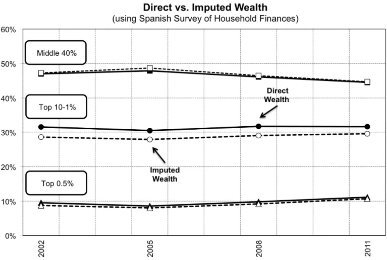
In order to make sure that the imputations are correctly done, I conducted sensitivity tests and applied several alternative imputation methods for tax-exempt assets and I find that the overall impact on wealth distribution series is extremely small. Furthermore, I also calculate wealth shares with and without conducting my imputation method using the four waves of the
dwellings in Spain, which have led to a larger increase in housing versus rental prices. In fact, the home-ownership ratio is approximately 80% at present (Census of dwellings, INE, 2011). Nonetheless, one cannot fully disregard the existence of some type of measurement error in the construction of the rental income and/or housing wealth series.
18
This is the case from 1999 onwards, since until 1998 imputed rents from main residence were subject to the personal income tax. Hence, we only need to impute main residence for the period 1999-2013.
wealth survey and I obtain very similar results (FigureA.4).
4
Trends in the Distribution of Wealth (1984-2013)
4.1 Wealth Inequality Series
This section presents the benchmark unified series for wealth distribution in Spain over the period 1984-2013 and the breakdowns by asset category (1984-2013) and age (1999-2013).
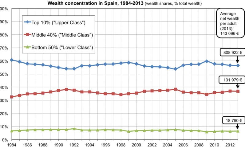
The wealth levels, thresholds and shares for 2013 are reported on TableB.1. In 2013, average net wealth per adult in Spain was about 150,000 euros. Average wealth within the bottom 50% of the distribution was slightly less than 20,000 euros, i.e. about 13% of the overall average, so that their wealth share was close to 7%. Average wealth within the next 40% of the distribution was slightly more than 135,000 euros, so that their wealth share was close to 37%. Finally, average wealth within the top 10% was about 0.85 million euros (i.e. about 5.6 times average wealth), so that their wealth share was about 56%.
FigureA.5displays the wealth distribution in Spain decomposed into three groups: top 10%, middle 40% and bottom 50%. The wealth share going to the bottom 50% has always been very small ranging from 6 to 9%, the middle 40% has concentrated between 32% and 39% of total net wealth and the top 10% between 53% and 61% over the period of analysis. Looking at the dynamics, the top 10% wealth share drops from the mid-eighties until beginning of the 1990s, at the expense of the increase in both the middle 40% and the bottom 50% of the distribution. The top 10% wealth share increases during the nineties, decreases until the mid-2000s and increases again until the burst of the housing bubble in 2008, after which it decreases and stabilizes at a similar level to the mid-nineties.
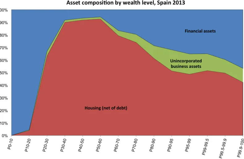
Despite the documented substantial changes in the level and composition of aggregate house-hold wealth during this period due mainly to movements in relative asset prices (see Section II), changes in overall wealth inequality have been moderate. Nonetheless, the contradictory movements in relative asset prices have an important impact on the composition of the different wealth groups, because they own very different asset portfolios. As it is shown on Figure A.6, the bottom 50% of the distribution own mostly financial assets in the form of deposits in 2013, whereas housing assets are the main form of wealth for the middle of the distribution. As we move toward the top 10% and the top 1% of the distribution, financial assets (other than de-posits) gradually become the dominant form of wealth. The same general pattern applies for the
period 1984-2012, except that unincorporated assets have lost importance over time, due mainly to the reduction in agricultural activity among self-employees.
By decomposing by asset categories the evolution of the wealth shares going to the bottom 50%, middle 40%, top 10% and top 1%, the impact of asset price movements on wealth shares, particularly the impact of the 2000 stock market boom and the 2007 housing bubble burst, are clearly captured (Figures A.7and A.8). One particularity of the Spanish case is that housing is a very important asset of the portfolio of households even at the top of the distribution. This has been the case during the whole period of analysis, but it has become more striking in the last fifteen years due to the increase in the value of dwellings. For instance, whereas in Spain the top 10% and 1% of the wealth distribution own 26% and 8% of total net wealth in housing, respectively, in France these figures are 19% and 5%, respectively (Garbinti et al.(2017)).
Moving to the analysis by age, I find that average wealth is always very small at age 20 (less than 10% of average adult wealth), then rises sharply with age until age 60-65 reaching 160-180% of average adult wealth, and moderately decreases (around 150%-120% of average adult wealth) at ages above 65 (Figure A.9). Contrary to the pure life-cycle model with no bequest (the standard Modigliani triangle), average wealth does not seem to sharply decline at high ages and it remains at very high levels, which means that old-age individuals die with substantial wealth and transmit it to their offspring. This age-wealth profile has changed over the 1999-2013 period. Old individuals (+60) are better-off and the young (20-39) worse-off after the economic crisis, since the average wealth for the old relative to total average wealth is larger in 2013 than in 2001. This is consistent with the large increase in youth unemployment (Scarpetta et al.(2010)) after the burst of the bubble and at the same time the stability in Social Security pension payments. When decomposing the wealth distribution series by age, I find that wealth inequality is more pronounced for the young (20-39) than for the old (+60) and middle-old (40-59), for which wealth inequality is almost as large than for the population taken as a whole (Figure A.9).
4.2 International Comparison
In order to have an idea about the level of wealth concentration in a country, it is always very interesting to make comparisons across nations. Saez and Zucman (2016) estimate the distribution of wealth in the US using the income capitalization method. They find that wealth concentration has followed a U-shaped evolution over the past 100 years. It was high in the beginning of the twentieth century, fell from 1929 to 1978, and has continuously increased since
then. Their series of wealth shares reveal that the rise in wealth inequality is almost entirely due to the rise of the top 0.1% share.
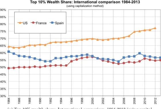
When comparing the top 10% and top 1% wealth share in Spain versus the US, I observe that concentration in Spain is lower than in the US over the whole period, but that these these differences have increased in the last two decades due to the huge rise in wealth concentration in the US (Figure A.10). On the contrary, the levels of wealth inequality in Spain are quite similar to the ones observed in France and Sweden. Spain had a larger top 10% and top 1% during the eighties, but since the nineties Spain has converged to the levels of the rest of European countries. Even though all series I compare use the capitalization method, comparisons should be made carefully since there are important methodological differences across countries.
5
The Impact of the Housing Bubble on Wealth Inequality
In the past fifteen years Spain has experienced a dramatic business cycle with a large housing based boom followed by a bust and consequently, a large rise in unemployment and significant effects on public finances. The high level of disaggregation of the wealth distribution series allows a good understanding of the impact of the housing bubble on wealth inequality. To my knowledge, this is the first academic paper analyzing the effect of this economic phenomenon on wealth inequality with such a high level of disaggregation.
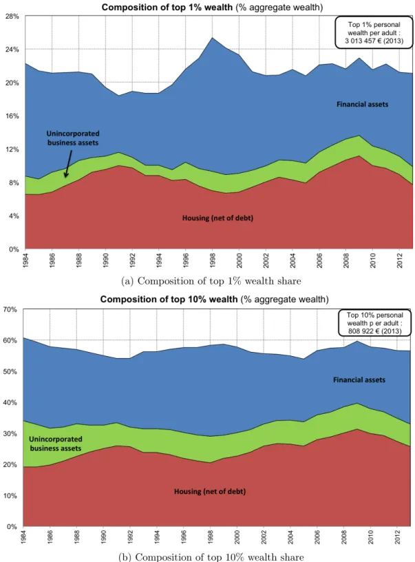
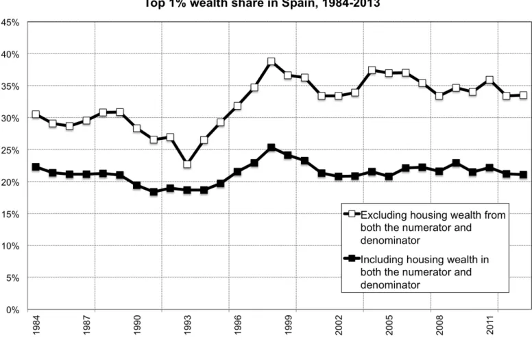
In Spain, as in the rest of developed countries, housing wealth has contributed to smoothing wealth inequality in the long-run. As it is shown on Figure A.11, wealth concentration at the top 1% is approximately 10% lower including housing wealth over the period 1984-2013. The reason is that the bottom 90% of the distribution has a larger share of housing out of their total portfolio of assets. However, despite the huge boom and bust in housing wealth during the 2000s, the two series on FigureA.11 show similar trends and total wealth concentration at the top 1% is nearly constant. In other words, the housing bubble had a neutral effect on wealth inequality. In order to understand this puzzling result, I first look at the composition of net housing wealth over time. FigureA.12 shows that the fraction of total net housing owned by the top 1% increased considerably between 2005 and 2009, the years in which housing prices skyrocketed, at the expense of the decrease in housing concentration of the middle 40%. The 10-1% wealth group also increased its share but very moderately. From 2010 onwards housing concentration started to decrease again reaching in 2013 a similar level to the one observed in 2004. This is
the case using capitalized (panel (a)) or survey shares (panel (b)).
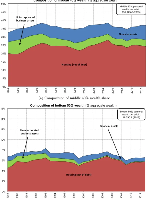
As it is shown on both panels of Figure A.13, the fraction of main residence owned by the middle 40% and the top 1% stays almost unchanged during the whole boom and bust period. However, the composition of secondary housing evolves in a similar manner to the composition of total net housing wealth, with the top 1% rising its concentration between 2005 and 2009 and decreasing it afterwards, at the expense of the opposite evolution of the middle 40% (FigureA.14). Hence, the observed changes in housing concentration during the 2000s are due to secondary housing.
The observed rise in secondary housing inequality can be due to a quantity effect, that is, rich individuals acquiring relative more secondary dwellings than poor individuals, or to a price effect, namely properties of rich individuals experiencing relative larger increases in prices than the ones of poorer individuals. In order to understand which of the two effects plays a larger role, I have calculated the distribution of home-ownership ratios by occupation status (quantity effect) and the distribution of housing prices (price effect).
FigureA.15displays the home-ownership ratio of the middle 40% by occupation status (main residence, secondary owner-occupied housing and secondary tenant-occupied housing). In this wealth group, 95% of individuals own or partly own at least one dwelling and nearly three quarters of individuals had only a main residence in 1999. The fraction of only main residence owners fell during this period of time up to less than 70%, since some of them acquired secondary housing, mainly secondary owner-occupied housing. For the top 1% the fraction of only main residence owners is much smaller in 1999 (20%), since most individuals within the top 1% own at least two dwellings. The fraction of individuals owning secondary housing has increased much more than for the middle 40% and most individuals have moved from accumulating one or two dwellings to three or more. After 2009, the distribution of home-ownership ratios stabilized.
Figure A.16 depicts the p90-99 and p99 to p50-90 housing price ratios for the period 1999-2013. The distribution of housing prices has been calculated by assigning to each individual in the distribution of capitalized wealth shares, the average housing price in the municipality in which they declare having their main residence. The series of housing prices used is elaborated by the Ministry of Public Works and it is based on property appraisals. The two ratios stayed constant between 2005 and 2009, which are the years in which housing concentration at the top increases and slightly increased afterwards. Overall, these findings are supportive evidence that the increase in housing concentration during the housing bubble is mainly due to a quantity
effect.
Why if housing concentration increased at the top during the bubble and decreased after-wards, total wealth concentration has almost stayed unchanged? One plausible explanation is that individuals at the top 1% substituted financial for housing assets during the boom and started to accumulate more financial assets during the bust in order to compensate for the losses in housing due to the fall in prices. Figure A.12 shows how the fraction of total financial assets held by the top 1% decreased during the boom years. This is consistent with the idea that wealthy individuals can better diversify their portfolios and invest more in risky assets when their prices are increasing and disinvest more when bad times arrive in order to acquire other assets.19 In the next section I present more evidence on the substitution of assets by the rich
when presenting the asset-specific decomposition of wealth accumulation.
6
An Asset-Specific Decomposition of Wealth Accumulation: Model
and Simulations
In order to understand which are the underlying forces driving the dynamics of wealth inequal-ity in Spain, I decompose the wealth distribution series using the following transition equation:
Wt+1g = (1 + qgt)[Wtg+ sgt(YLgt+ rgtWtg)], (5)
where Wtg stands for the average real wealth of wealth group g at time t, YLg
t is the average
real labor income of wealth group g at time t, rgt the average rate of return of group g at time t, qgt the average rate of real capital gains of wealth group g at time t20and sgt the synthetic saving rate of wealth group g at time t. The saving rate is synthetic because the identity of individuals in wealth group g changes over time due to wealth mobility.
I follow the same approach ofGarbinti et al.(2017) andSaez and Zucman(2016) and calculate the synthetic savings rates that can account for the evolution of average wealth of each group g as a residual from the previous transition equation. This is straightforward since I observe variables Wtg, Wt+1g , YLg
t, r
g t and q
g
t in my 1984-2013 wealth distribution series. Hence, the three forces that can affect the dynamics of wealth inequality are income, saving rate and rate of return inequality.
19
Guiso et al.(2002) provide a good review of the literature on household portfolios.
20Real capital gains are defined as the excess of average asset price inflation, given average portfolio composition
In this paper, I go one step forward and further decompose the previous transition equation into three asset components: net housing, business assets and financial assets.21 The transition equation is as follows: Wt+1g = WH,t+1g + WB,t+1g + WF,t+1g , (6) where WH,t+1g = (1 + qgt)[WH,tg + sgH,t(YLg t + r g tW H,g t )] (7) WB,t+1g = (1 + qtg)[WB,tg + sgB,t(YLg t+ r g tW B,g t )] (8) WF,t+1g = (1 + qtg)[WF,tg + sgF,t(YLg t+ r g tW F,g t )] (9)
This new asset-specific decomposition allows me to quantify not only the relative importance of each channel (income, saving rate and rate of return inequality), but also the role played by each asset to explain the channels that drive the observed dynamics of the distribution of wealth. In Spain, this is quite relevant because as it has previously been mentioned, housing has played a relative more important role in explaining the dynamics of wealth inequality over time than in other countries.
The top panel of FigureA.19depicts synthetic saving rates for the top 10%, middle 40% and bottom 50% over the period 1986-2012. Consistent with the high levels of concentration that we observe during this period in Spain, there is a high level of stratification between the top 10% who save on average 39% of their income and the middle 40% and bottom 50% who save 13% and 3% of their income on average. These figures are similar to the ones obtained for France and the US (Garbinti et al. (2017), Saez and Zucman (2016)). All three groups used to save more between mid 1980s and mid 1990s than from that date onwards. Nonetheless, the fall in the savings rate for the bottom 50% has been larger on average than for the middle 40 % and top 10%. Whereas the bottom 50% had average savings rates of 5% and 1% between 1986-1996 and 1997-2012, respectively, the middle 40% and top 10% had savings rates of 17% and 56% between 1986-1996 and of 10% and 27% between 1997-2012.
21Artola et al.(2017) do a similar decomposition for analyzing the dynamics of aggregate wealth in Spain but
Analyzing more deeply the evolution of savings rates, two main facts are worth noting. First, there is a sharp decline in the savings rate for the top 10% between 1996 and 2001. As one can see on Figure A.20, rich individuals started to sell their financial assets and to accumulate housing assets (Figure A.19, panel (b)). This is most likely due to the sharp fall in interest rates that happened during the second half of the nineties (Sinn and Wollmershäuser (2012)). Second, the housing bubble increased the stratification in saving rates between the rich and the poor during the boom years and decreased during the bust. The top panel of Figure A.19
shows how during the years prior to the burst of the bubble the savings rate increased for the top 10%, since they were accumulating more housing and decreased for the middle 40% and bottom 50%, who were also accumulating housing but by getting highly indebted (see bottom panel of Figure A.19). After the burst of the bubble the top 10% sold some of their housing assets and started to accumulate more financial assets in order to compensate for the decrease in housing prices. Nonetheless, the total saving rate for the top 10% decreased during these years, probably because they had to consume a larger fraction of their income. The middle 40% instead started to save more in order to repay the housing mortgages, so that the stratification in saving rates across the two wealth groups was reduced. Hence, the fact that rich individuals continued investing during the bust by substituting housing assets for financial assets and that at the same time the middle 40% increased its saving contributed to neutralizing wealth concentration during this tumultuous period of housing price swings.
Figure A.21 displays the evolution of flow rates of return (including capital gains) for the different wealth groups over the 1984-2013 period. The further up one moves along the distri-bution, the higher are the rates of return. This is consistent with the large portfolio differences that were previously documented, that is, top wealth groups own more financial assets like equity with higher rates of return than for instance housing (Figure A.3).
In line withGarbinti et al.(2017), this wealth accumulation decomposition allows to do simple simulations in order to illustrate some of the key forces at play. One simple simulation exercise is to analyze the structural impact of capital gains and savings, i.e stripped of large short run fluctuations, on top wealth concentration. Panel (a) of FigureA.22reports the simulated top 1% wealth shares when replacing either the time varying rates of real capital gains or both the time varying rates of real capital gains and the time varying saving rates by their averages over the period 1984-2012. The simulated series fixing both capital gains and savings rates is smoother than the observed series but they are both quite similar. On the contrary, the simulated series
fixing only capital gains shows lower levels of concentration in the 1980s and a gradual increase in inequality from the 1990s onwards. Hence, capital gains contributed to keeping the same high levels of wealth concentration of the 1980s in the late 2000s. The importance of capital gains in explaining the historical evolution of aggregate wealth in Spain has already been highlighted in Artola et al.(2017), in which they find that capital gains explain half of the total growth of national wealth over the period 1900-2010.
Panel (b) of Figure A.22 reports the simulated top 1% wealth shares when replacing either the time varying rates of real capital gains or both the time varying rates of real capital gains and the time varying saving rates by their averages over the period 1984-1998. The top 1% share would have decreased a lot more by 2012. In other words, the housing bubble of the 2000s contributed to keeping the same high levels of wealth concentration, since concentration at the top 1% over the 1999-2012 period would have been substantially lower had housing prices not increased so fast relative to other asset prices.
Finally, I use the synthetic saving rates and the rates of return by wealth group in order to simulate steady-state trajectories for the top wealth shares in coming decades. In order to do so I use the steady-state formula derived in Garbinti et al.(2017). They assume that the relative capital gain channel disappears, that is, that all asset prices rise at the same rate in the long-run and manipulate transition equation (5) to obtain the following steady-state equation:
shgw = (1 + s prg− sr g − sgrg ) sp ssh g Y L, (10)
where shgw and shgY L stand for the share of wealth and labor income, respectively, held by wealth group g, g is the economy’s growth rate, s the average saving rate and r the aggregate rate of return.22
Differences across savings rates and rates of return across wealth groups can generate impor-tant multiplicative effects, which can lead to very different levels of steady-state wealth concen-tration. In order to illustrate the strength of these multiplicative effects, I use these estimates of sg and rg by wealth group in order to simulate steady-state trajectories for the top wealth shares in coming decades.
Figure A.23 reports the top 10% wealth share assuming that the same inequality of saving rates that we observe on average over the 1984-2012 period (namely 39.5% for the top 10% wealth group, and 10.1% for the bottom 90%) will persist in the following decades, together with
the same inequality of rates of return and the same inequality of labor income. The top 10% wealth share under this scenario would converge toward a similar level to that observed in the mid-eighties, approximately 60% of total wealth. If I instead assume that the same inequality of saving rates that we observe on average over the 1984-1998 period (namely 55.9% for the top 10% wealth group, and 13.6% for the bottom 90%) would have persisted over the period 1999-2012 and during the following decades, together with the same inequality of rates of return and the same inequality of labor income, the top 10% wealth share would have risen reaching a steady-state level of wealth concentration higher than the one we had over the 1984-2012 period (approximately 66%).
Finally, assuming that the same inequality of saving rates that we observe on average over the 1999-2012 period (namely 21.9% for the top 6.2% wealth group, and 13.6% for the bottom 90%) would have persisted during the following decades, together with the same inequality of rates of return and the same inequality of labor income, the top 10% wealth share would have decreased up to a steady-state level of wealth concentration of nearly 53%. Hence, as it was shown byGarbinti et al.(2017) for France, small changes in the key parameters can significantly change the steady-state wealth concentration levels.
7
Offshore Assets and Wealth Inequality
In Spain, as in most countries, official financial data fail to capture a large part of the wealth held by households abroad such as the portfolios of equities, bonds, and mutual fund shares held by Spanish persons through offshore financial institutions in tax havens (Banco de España (2011)). Zucman (2013) estimates that around 8% of households’ financial wealth is held through tax havens, three-quarters of which goes unrecorded. Moreover, he also provides evidence that the share of offshore wealth has increased considerably since the 1970s. This fraction is even larger for Spain. According to Zucman(2015), wealth held by Spanish residents in tax havens amounted to approximately 80 billion euros in 2012, which accounts for more than 9% of household’s net financial wealth. Furthermore,Alstadsæter et al. (2017) find using micro-data leaked from offshore financial institutions and population-wide wealth records in Norway, Sweden, and Denmark, that the probability to disclose evading taxes rises steeply with wealth. Hence, by not incorporating offshore wealth in our wealth distribution series, both total assets and wealth concentration would be substantially underestimated.
In order to adjust the wealth distribution series for offshore assets I useArtola et al. (2017) historical series on offshore wealth. They rely on two main data sources: Zucman(2013,2014), whose series mainly come from the Swiss National Bank (SNB) statistics, and the unique infor-mation provided by the 720 tax-form. Since 2012, Spanish residents holding more than 50,000 euros abroad are obliged to file this form specifying the type of asset (real estate, stocks, in-vestment funds, deposits, etc.), value, and country of location. This new form aims to reduce evasion by imposing large fines in case taxpayers are caught not reporting or misreporting their wealth. In an attempt to increase future revenue and reduce further evasion, the Tax Agency also introduced a tax amnesty in 2012.
Artola et al.(2017) calculate separately reported assets, that is, claims held abroad by Span-ish residents and declared to the SpanSpan-ish tax authorities, from unreported offshore wealth. Given that the Spanish Tax Agency cross-checks across all taxes reported income and wealth by taxpay-ers, income generated by reported assets in the wealth tax and 720 tax-form should be included in personal income taxes. Hence, I will only correct the series for unreported offshore assets.
Artola et al. (2017) derive the series of unreported financial offshore wealth by first comparing total wealth held in Switzerland by Spanish residents with assets declared in this country in the 720 tax-form. In 2012, the comparison shows that 23% of offshore wealth was reported to tax authorities (Figure A.24). This figure is consistent with Zucman (2013) estimate that around three quarters of offshore wealth held abroad goes unrecorded. According to the 720 tax-form, Switzerland concentrated in 2012 24% of total offshore wealth held by Spanish residents in tax havens. They extrapolate this series by applying the fraction of unreported assets observed in Switzerland to the rest of tax havens that appear in the 720-tax form.23
The series ranges between 1999 and 2014, since the statistics on total offshore held in Switzer-land are only available for this period of time. They extrapolate the series backwards using the total amount of offshore wealth that flourished in the 1991 Spanish tax amnesty (10,367 million euros) and the proportion of European financial wealth held in offshore havens estimated by
Zucman (2014) for the years prior to 1991.24
Offshore assets increased rapidly during the eighties, nineties and beginning of the 2000s and stabilized after 2007, a period in which Spanish tax authorities have become stricter with tax
23
Note that the series of offshore assets excludes deposits, since they are already included in Financial Accounts. Real assets are also not included since most of them are declared to be in non-tax havens and I am only focusing on offshore wealth held in tax havens.
24
For a more detailed explanation of how the series of unreported and reported offshore assets are constructed, read the appendix inArtola et al.(2017).
evasion by introducing the 720 tax-form and implementing a tax amnesty in 2012 (FigureA.25, panel (a)). Unreported offshore wealth amounted to 149,520 million euros in 2012, which rep-resents 8.6% of personal financial wealth.25 Investment funds represent 50% of total unreported offshore assets, followed by stocks with 30%, and deposits and life insurance with 18% and 2%, respectively (Figure A.25, panel (b)).
I correct the wealth distribution series by assigning proportionally to the top 1% the annual estimate of unreported offshore wealth. This is consistent with an official document of the Spanish Tax Agency (Ministerio de Hacienda y Administraciones Públicas (2016)) stating that the majority of reported foreign assets by Spanish residents are held by top wealtholders and that these assets represent 12% and 31% of the total wealth tax base in 2007 and 2015, respectively.26
Furthermore, Alstadsæter et al. (2017) also find that the top 1% in Scandinavian countries accumulates almost all the disclosed assets of tax amnesties.
Wealth concentration is larger during the 2000s than in the eighties, contrary to what it is observed when offshore assets are not taken into account (See FigureA.26). The top 1% wealth share average over 2000-13 is 23.6%, versus 21.3% when disregarding offshore wealth. This increase is quite remarkable, taking into account that during that period of time the country experienced a housing boom and both non-financial and financial assets held in Spain grew considerably as it was discussed in section II. In line with Alstadsæter et al.(2017), this finding also suggests that the historical decline in wealth inequality over the twentieth century that happened in Spain and the rest of analyzed countries (Alvaredo and Artola (2017), Piketty
(2014)), may be much less spectacular in actual facts than suggested by tax data.
8
Reconciliation and Test of the Capitalization Method with Other
Sources
8.1 Comparison with Other Sources
8.1.1 Wealth Tax
The wealth tax in Spain was introduced for the first time in 1978 as by law 50/1977. Initially, it was meant to be "transitory" and "exceptional". The tax rate was relatively small, with a
25
This figure is larger than the estimate of 80,000 million euros inZucman(2015). Note that Zucman’s estimate is an extrapolation using Swiss National Banks statistics, but thatArtola et al. (2017) use administrative data on reported wealth held by Spanish residents abroad.
26
Note that according toAlvaredo and Saez(2009) Spanish wealth tax filers belong approximately to the top 1% of the wealth distribution.
maximum of 2%. The aim of the Spanish wealth tax was basically to complement the Spanish personal income tax, which had limited redistributive goals. Tax filing was done on an individual basis, with the exception of married couples under joint tenancy. Since 1988, married couples can file individually.
In 1992, a major reform by the Law 19/1991 put an end to the transitory an exceptional character of the tax. It established a strictly individual filing and introduced changes in some of the included components as well as in their valuation rules. In year 2008, the tax was not abolished but a bonus of 100% was introduced by law 4/2008. Nevertheless, the economic crisis and the lack of funds of the Spanish Inland Revenue, reactivated the wealth tax from exercise 2011 (payable in 2012) up to 2015 (payable in 2016).
Alvaredo and Saez (2009) use wealth tax returns and the Pareto interpolation method to construct long run series of wealth concentration for the period 1982 to 2007. The progressive wealth tax has high exemption levels and only the top 2% or 3% wealthiest individuals file wealth tax returns. Thus, they limit their analysis of wealth concentration to the top 1% and above. This is a general limitation of using wealth tax data, the middle and bottom of the distribution can not be analyzed. They find that top wealth concentration decreases at the top 1% from 19% in 1982 to 16% in 1992 and then increases to almost 20% in 2007. However, in contrast to the top 1%, they obtain that the 0.1% falls substantially from over 7% in 1982 to 5.6% in 2007.
Durán-Cabré and Esteller-Moré (2010) also use wealth tax returns to analyze the distribution of wealth at the top and obtain similar results to them. Their approach complements theirs by offering a more precise treatment of the correction of fiscal underassessment and tax fraud in real estate, which is the main asset in Spaniards’ portfolios.
Results using wealth tax data and the capitalization method are quite similar, specially for the top 0.1% and 0.01% (Figure A.27). In line with the trends observed in Alvaredo and Saez
(2009), my estimates also reveal a fall in concentration at the top 1% during the eighties and an increase in concentration during the nineties. Concentration is larger using capitalized income shares rather than wealth taxes at times in which asset prices significantly grow, such as the years previous to the burst of the dot-com bubble.
There are several conceptual and methodological differences across the two methods which might explain these differences. First, Alvaredo and Saez (2009) use financial wealth from both households and non-profit institutions serving households in their wealth denominator, rather than only financial household wealth. Second, they exclude pensions and business assets from