Special Issue on Data Literacy: Articles
DataBasic: Design Principles, Tools and Activities
for Data Literacy Learners
The growing number of tools for data novices are not designed with the goal of learning in mind. This paper proposes a set of pedagogical design principles for tool development to support data literacy learners. We document their use in the creation of three digital tools and activities that help learners build data literacy, showing design decisions driven by our pedagogy. Sketches students created during the activities reflect their adeptness with key data literacy skills. Based on early results, we suggest that tool designers and educators should orient their work from the outset around strong pedagogical principles.
Introduction
There is a large and growing body of literature arguing that working with data is a key modern skill. The position of "data scientist" is rapidly becoming a necessary and respected role in the corporate world (Patil 2012). Data-driven journalism is widely regarded as a core new proficiency for the news industry (Howard 2014, Hewett 2015). A growing movement to make data-driven decisions in government is spurring calls for greater engagement and education with the public (Gurstein 2011, Philip 2013).
Responding to this, there are many efforts underway to build data literacy among the general public and among specific communities. Popular press has argued for broad data literacy
D’Ignazio, C., Bhargava, R. (2016). DataBasic: design principles, tools and activities for Data Literacy Learners. The Journal of Community Informatics, 12(3), 83—107.
Date submitted: 2015-12-30. Date accepted: 2016-06-15.
Copyright (C), 2016 (the authors as stated). Licensed under the Creative Commons Attribution-NonCommercial-ShareAlike 2.5. Available at: www.ci-journal.net/index.php/ciej/article/view/1294 .
Catherine D’Ignazio
Emerson College, United States Corresponding Author.Rahul Bhargava
MIT Media Lab/Center for Civic Media, United Stateseducation (Harris 2012, Maycotte 2014). Workshops for nonprofits and activists throughout the world are introducing tools and documenting best practices that can help use data to advocate for social change (Tygel 2015, Tactical Tech 2014).
However, there is a lack of consistent and appropriate approaches for helping novices learn to "speak data". Some approach the topic from a math- and statistics-centric point of view, aligning themselves with core curricular standards in public education systems (Maine 2015). Some build custom tools to support intentionally designed activities based on strong pedagogical imperatives (Williams 2015). Still others have brought together diverse communities of interested parties to build documentation, trainings, and other shared resources in an effort to grow the "movement" (Gray 2012).
What is Data Literacy?
These approaches share some basic tenets of "data literacy". Their historical roots are found in the fields of mathematics, data mining, statistics, graphic design, and information visualization (Fry 2004). Early academic efforts to define data literacy were linked to previous traditions in information literacy and statistical literacy (Schield 2004, Hunt 2004). Current approaches share a hierarchical definition often involving themes such as identifying, understanding, operating on, and using data. However, while some focus on understanding and operating on the data, others focus on putting the data into action to support a reasoned argument (Deahl 2014).
Building on these existing descriptions, we adopt a multi-faceted definition of data literacy. For our purposes, data literacy includes the ability to read, work with, analyze and argue with data as part of a larger inquiry process. Reading data involves understanding what data is, and what aspects of the world it represents. Working with data involves acquiring, cleaning, and managing it. Analyzing data involves filtering, sorting, aggregating, comparing, and performing other such analytic operations on it. Arguing with data involves using data to support a larger narrative intended to communicate some message to a particular audience. We will return to this four-part definition throughout this paper.
Building Data Literacy
This paper documents DataBasic, a suite of three web-based tools and accompanying hands-on activities that we created for students, journalists, nhands-on-profit organizatihands-ons and community activists to help build their data literacy. As of January 2016, these tools are free and available online at http://databasic.io. We first assert that most data tools for novices are designed for users, not learners, and privilege the production of quick visuals at the expense of supporting a learning process. We then propose an alternate set of design criteria guided by strong pedagogical goals. After summarizing each tool and its accompanying activity, we discuss the learning goals and the design and implementation decisions we made to build learners' data literacy. This integrates qualitative and quantitative measures from observation and use in our classroom and workshop settings. We then discuss our initial findings with our target users and present some ideas for future work.
Existing Approaches
There have been a wide variety of approaches to building data literacy. Some tool-designers in the computer science field have focused on developing technologies that center around building the mappings needed to translate numbers into representative visuals (Huron 2014, Lee 2015). Others have situated data collection and evidence-based argument in real local issues that connect to the learners' lived experience (Tygel 2015, Williams 2015). Arts-based activities have been used as an introduction to information in an attempt to bring a playful approach to working with data (Bhargava 2015). Still others use a role-based team-building approach to build the multi-disciplinary teams needed to work with and argue with data (School 2015).
Within this context there has been, and continues to be, a proliferation of tools created to assist novices in gathering, working with, and visualizing data. These tools have been carefully cataloged and reviewed (Tactical Tech 2014, Othman 2015) and include examples like CartoDB, GoogleMaps, plot.ly, RAW, and Timeline.js, but there has been little discussion of why and when to use these tools in appropriate ways for the learners that do not yet "speak data".
Most of these tools have some form of online documentation or tutorials to help novice users. More robust tools like CartoDB and DataWrapper have whole areas of their website, dubbed 1 2
“academies”, where users can go to engage with a variety of tutorials at different levels. While well-designed in many cases, these tutorials separate the learning process from the tool itself. This may be necessary for flexible tools that do many things, but it is not ideal for the beginning learner who may need a more scaffolded and immediately present entry point to learning how to work with geographic, temporal or numeric data.
Additionally, these tools currently focus on outputs (spreadsheets, visualizations, etc), and not on helping novices learn. Visualizations, which garner so much popular media and social media attention, are the outputs of a process. These flashy pictures attract the bulk of the attention, which has led tool designers to prioritize features that quickly create strong visuals, at the expense of tools that scaffold a process for learners.
Defining the Tool Space
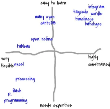
To support the argument that tools have not focused on learning experiences, we propose evaluating this tool space on axes of learnability and flexibility as a useful exercise. An easy-to-learn tool is designed to be easy to use for novices that do not have any experience with it. A hard-to-learn tool takes significant effort and commitment on the part of the learner to master it. A flexible tool allows the user to create many types of outputs. An inflexible tool is well-suited for creating just one type of output.
Figure 1 maps out a selection of tools in this space with learn-ability on the vertical axis and flexibility on the horizontal axis. Our informal analysis suggests that tool designers have focused on easy-to-learn tools that do just one thing (i.e. the upper right quadrant). These
http://academy.cartodb.com/
1
http://academy.datawrapper.de/
tools that are easy to learn could be mistaken for tools that focus on learners, but they are not one and the same. To tease out the differences, we must analyze the pedagogical underpinnings of the tools in this upper-right quadrant.
Figure 1: Informally mapping out some data tools to compare learn-ability and flexibility
Figure 1 maps out a selection of tools in this space with learn-ability on the vertical axis and flexibility on the horizontal axis. Our informal analysis suggests that tool designers have focused on easy-to-learn tools that do just one thing (i.e. the upper right quadrant). These tools that are easy to learn could be mistaken for tools that focus on learners, but they are not one and the same. To tease out the differences, we must analyze the pedagogical underpinnings of the tools in this upper-right quadrant.
Pedagogical Approaches
We propose that the pedagogical approach to building tools for data literacy learners should pull from the rich histories of traditional literacy education and designing computational tools for learning.
Traditional approaches to building reading and writing abilities have many models for building literacy. Since our definition of data literacy includes a call to reason and argue with data, we follow in the footsteps of traditional literacy models that focus on connecting literacy to argument and action. Here Paulo Freire's approach to contextualizing literacy in the issues, settings, and topics that matter to the learner is highly relevant (Freire 1968). This empowerment-focused pedagogy transfers well to the domain of designing activities to build data literacy (Tygel & Kirsch 2015). Drawing inspiration from elements of Freire's popular education, an educational approach emphasizing critical thinking and consciousness, we suggest that data literacy tools need to be introduced with activities that are inclusive, use data that are relevant to the learner, and be open to creating unexpected outputs. While the tools in
the upper right quadrant are easy to learn, they don't have these activities built in; they are blank slates for the most part.
In the domain of designing computational tools for learning, the discourse is quite varied in regards to approaches and how to tailor designs for learning experiences. In this field we find inspiration in Seymour Papert's approach to building "microworlds", suggesting that key metaphors in learning tools be resonant with learners and that constraints be carefully selected to provide a rich-enough, but not too-rich, environment (Papert 1980). Applications of this pedagogy tend to support incremental learning, allowing novices to explore more complex aspects of the topic or tool as they increase their ability (Dasgupta 2012, Huron 2014), and hold up the concept of teacher as facilitator, guiding learners as they explore new topic areas to construct meaningful artifacts (Deahl 2014). Here again, the tools in the upper-right quadrant fail to pass this litmus test. Infogr.am and Wordle, for example, do little to relate to the user's context and have no prescribed facilitator role in their use.
With this pedagogical history in mind, we argue that a tool that is easy to learn is not necessarily designed to support rich learning. Unless the tool and its accompanying activities implement these principles in some way, they are missing an opportunity to help the user grow their data literacy. Many of the tools in the easy-to-learn/highly-constrained quadrant introduce themselves as "magic", explicitly hiding the mental models and software operations that they run through to produce their outputs. This pedagogy suggests the tool should be designed to make these operations more transparent, so the learner can begin to understand the concepts, language and processes of the field.
Our Design Principles
How do data tools go about implementing this pedagogical approach? Synthesizing these rich pedagogical traditions, we propose that data literacy tools and activities that support learners must be focused, guided, inviting, and expandable.
A focused tool strives to do one thing well. These tools sit in the previously mentioned easily learnable and relatively constrained upper-right quadrant of our tool space. Focused tools do not provide many types of options, and thus can provide a low entry point for data literacy learners. They create a small playground that is rich enough for the learner to play within, but not so rich that they get lost.
A guided tool is introduced with strong activities to get the learner started. Blank-slate websites require novice users to imagine usage scenarios. Guided tools combat this by introducing themselves with an activity that holds the learner's hand as they get started. These tools might immediately present an on-ramp for learners via example data and example outputs.
An inviting tool is introduced in a way that is appealing to the learner. This might involve using data on a topic that is relevant or meaningful to them, or simply using humor and playfulness to invite the learner to experiment. Inviting tools make conscious decisions about visual design, user interface and copywriting to offer a consistent, appealing, and non-intimidating invitation to the learner. Inviting activities use familiar materials to produce playful outputs that attract interest and excitement from learners.
An expandable tool is appropriate for the learner's abilities, but also offers them paths to deeper learning. They overcome a single-minded focus by including call-outs and capabilities that allow the learner an opportunity and pathway to learn more about how the tool works. Expandable tools recognize that they are steps along the path to building stronger data literacy for the learner, and help bridge from previous work to next steps.
We propose these design principles as a set of strong criteria to use when designing new tools and activities for data literacy learners.
DataBasic: Tools & Activities for Learners
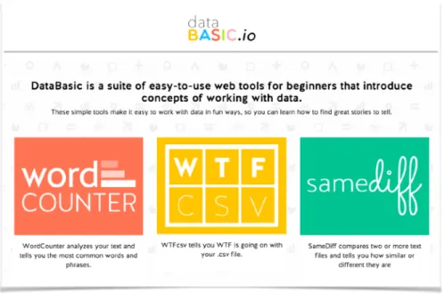
To demonstrate and evaluate these design principles in action, we created DataBasic - a suite of three digital tools, with accompanying participatory activities, for data literacy learners in academic and workshop settings (figure 2). DataBasic is available online at http:// databasic.io. These three tools emerged from our work teaching data to novices in formal and informal settings. We identified two specific gaps where learners' interests were not being served. First, we found a lack of tools to support summarizing spreadsheet data quickly in the service of finding stories in the data. Second, we found few ways to introduce the basic concepts and approaches of quantitative analysis of large documents (ie. simple text mining). The academic courses we tested this tool in, along with others that teach data journalism (Willis 2015), almost always introduce these two topics in ways that seemed overly-complicated to us, and to our students. We created the DataBasic tools to solve this by helping people understand what is in their spreadsheets and get started working with unstructured text data in quantitative ways.
Figure 2: The databasic.io homepage
Despite the previously mentioned breadth of new tools for data novices, few exist for basic quantitative text analysis. To perform a simple task such as counting the most frequent words and phrases in a text corpus, students are usually required to learn a programming language and use 3rd party software libraries (Bird 2009)!
Similarly, getting a quick overview of the types and ranges of data in a spreadsheet file takes far too many steps. Introducing programming in R Studio to simply run its helpful summary()
command would be described by most as overkill. Building a pivot table overview for every column in MS Excel takes too long.
With these problems identified we set about building 3 web-based tools, and accompanying activities informed by our design principles and pedagogical approach. We prototyped these tools with student and professional audiences in academic and workshop settings. Our target audiences include high school and college students, journalists, staff at non-profit organizations, community activists, and artists. The three tools we created are:
• WordCounter: tells you the most used words and phrases in a document • WTFcsv: gives you a quick overview of a csv file you upload
• SameDiff: lets you compare two documents to see how they are similar and different
This section briefly introduces each tool, and its accompanying activity.
WordCounter
Figure 3: The WordCounter homepage. A simple tool to introduce quantitative text analysis.
WordCounter (figure 3) is a simple web application in which users can paste a block of text or upload a plain text file. The back-end server uses open source libraries to count the words, bigrams (two-word phrases) and trigrams (three-word phrases) in the uploaded text . After 3
submitting their corpus, the user sees tables listing the most frequently used words, bigrams, and trigrams along with an option to download a CSV file (figure 4). WordCounter can operate on sample data we have included, text the learner pastes in, a file the learner uploads, or text from a website URL the learner pastes in. It includes two advanced options - toggles for case sensitivity and the removal of common words ("stopwords").
WordCounter utilizes algorithms implemented in the NLTK Python package (http://www.nltk.org/) and the
3
Figure 4: The WordCounter results page showing the most common words, bigrams, and trigrams in Beyoncé's lyrics.
To introduce the idea of quantitative text analysis to students in a hands-on way we created an activity to sketch a data story based on the lyrics of popular American musicians. This builds on prior work analyzing music lyrics as data (Wattenberg 2002, Hemphill 2014). We used online archives to create lyrical corpora for a variety of popular musical artists (Beyoncé, Katy Perry, Elvis Presley, etc.) and provide them to learners in a dropdown menu on the homepage. Working in groups of three, learners have twenty minutes to decide which lyrics to run through WordCounter in order to find a "story" to tell with the results. In our courses, this builds on prior sessions that address exploratory data analysis as a story-finding process. Each team uses crayons and large pads of paper to create a sketch of a visual presentation of their story to share with peers for feedback. The visual outputs resemble those seen in Wolf 2015. In our courses, the class then spends 10-15 minutes discussing the stories and using them as a jumping off point for further discussion of text mining and text analysis concepts.
WTFcsv
Figure 5: The WTFcsv homepage. A simple tool to summarize the values in each column of a comma-separated-values file.
WTFcsv (figure 5) is a website that lets users analyze a comma-separated-values (CSV) file to look for potential questions to ask it while searching for data-driven stories to tell. The simple server analyzes each column and returns a graphical and textual overview of each. The columns are parsed by a heavily modified version of the open-source csvkit library for Python and marked as textual, temporal, or numeric. Based on this identification, an 4
appropriate visual overview for each column is displayed on a card; one for each column (figure 6). Temporal data is shown as a line-chart histogram on a time-series axis. Numeric data is shown as a histogram, with buckets created linearly. Text data is shown as a bar chart if there are only a few types, or a word cloud if there are many entries (ie. free text). This builds on existing literature showing the histogram to be the best graphical display for novices to get an overview of a range of data (Zubiaga 2015). Each card can be flipped from this graphical view to a text one via an icon. This text overview includes aggregate information such as the most common value for text columns, or minimum, maximum, average, etc. for numeric columns.
Image 6: The WTFcsv results page showing a summary of three columns in a spreadsheets of UFO sightings in Massachusetts, USA.
The accompanying activity for WTFcsv focuses on brainstorming questions that are prompted by looking at data. This activity builds on the Tactical Technology Collective's notion of "asking your data some questions" (Tactical Tech 2014). Learners are prompted to break into small groups and select one of the sample sets of data to investigate. They are asked to brainstorm questions that they might want to ask the data. For instance, looking at results for a dataset of UFO sightings, they might wonder if larger cities have more sightings of UFOs. To answer that question they would need to find population data by city, which they might be able to acquire from the US census website. After 10 minutes of brainstorming questions and sources for connected data, learners are asked to select one as the most interesting one to share back to the group. The debrief conversation focuses on how rich questions often involve multiple data sources, the variety of questions that can come from one data set, and how important it is to brainstorm off the screen.
The csvkit package can be found at https://github.com/onyxfish/csvkit.
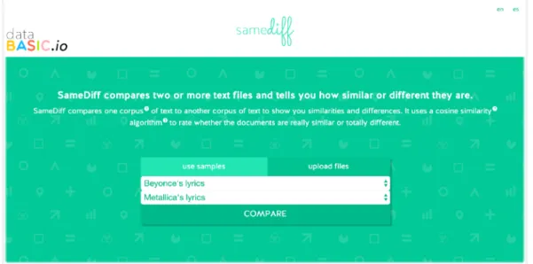
SameDiff
SameDiff (figure 7) builds on top of WordCounter by offering a simple interface to compare two documents. The results page (figure 8) shows the words in common and the words unique to each, and includes algorithmic scoring of how similar they are. This "comparative" word cloud interface builds on prior work trying to adapt word clouds for comparison tasks (Coppersmith 2014). The center column shows a word cloud for all the words both documents share. Rolling over any individual word loads a tooltip indicating the absolute number of uses in each document. The left column shows a word cloud for just the words in the first document, while the right column shows a word cloud for just the words in the second document. The introductory text includes a measure of their similarity, computed using an implementation of the cosine similarity algorithm . This algorithm is one of many 5
standard techniques for automated comparison of documents in text-mining applications (Huang 2008).
Figure 7: The SameDiff homepage. A simple tool to quantitatively compare two text documents or corpora.
Figure 8: The SameDiff results page showing the shared and unique words used in Beyoncé and Metallica's lyrics. The tooltip shown above "baby", displayed on rollover,
indicates how many times it is used in each corpus.
We use the cosine similarity implementation from the open source SciPy libary for Python (http://
5
The activity that accompanies SameDiff is a playful invitation to create lyrics for an imaginary song that would be created by a duet between two artists. After introducing the SameDiff tool, learners are invited to make small groups and try various comparisons between the included sample data (lyrics from ten popular American musicians). Groups are given ten minutes to look at the similarities and differences and write out the lyrics to a song the two artists might write together. This speculative invitation is in fact a standard exercise introduced to computer scientists first learning about algorithmic analysis of text documents (often using similarity measurements and techniques like TF-IDF). We introduce these techniques in the post-activity discussion.
Discussion: Design Principles
On one hand, we can evaluate these tools on how strongly they uphold and implement our design principles. Each tool in the DataBasic suite shares a set of features inspired by these principles. Decisions in the software, graphic design, and activity design design reflect this. These tools are very focused. Each performs one function that can be explained in a short sentence and summarized even more succinctly in the action-oriented names we chose. The only options available to users relate to picking a source for the data (see figures 3, 5 and 7). The exception is WordCounter, which includes two checkboxes that reflect common options used in text analysis. The hands-on activities reflect this focus. They are centered around a strong prompt that reflects the main function of the tool. Placing these strong and opinionated constraints within the tool and the activity lets us create a less-intimidating cognitive playground for the learner to play within.
These tools are highly guided. Each includes fun sample data as the default data to operate on (including popular music lyrics and lists of UFO sightings). Learners can do something quickly from the homepage of each tool, without scrolling and with only a single click. Short introductory videos on the homepage of each tool describe when and why to use the tool. The results page shown after submitting input includes a "What do I do next?" section with dynamic data-connected questions to guide the learner's analysis (figure 9). Each tool includes a ready-to-print activity guide to help a facilitator or teacher guide a group of learners through the activity. All this scaffolding attempts to hold the learner's' hand as they enter this new field of questions, processes, and vocabulary.
Figure 9 (double): The "What do I do next" sections from WordCounter and WTFcsv, showing dynamic questions being generated based on the input data. These prompts attempt to
guide the learner in how to start using the tools.
These tools are very inviting to learners. The short, humorous introductory videos feature real people, working on the screen and off (figure 10). The creators of the tool (us) introduce it and explain its purpose before cutting to video of people participating in the activity and then short testimonials from practitioners in various field talking about why the tool and activity are useful to them. The copy-text on the websites is written in non-technical terms. The bright, playful graphic design, logos, and names strives to make them seem less like standard blue-and-grey data tools (ie. Excel, Tableau, OpenRefine, etc). The hands-on activities paired with each tool provide an off-the-screen, participatory, and playful way to experience the core concepts being introduced. These features offer a strong invitation to novices in the field of working with data, at the same time introducing them to some of the fundamental concepts; there is no blank canvas.
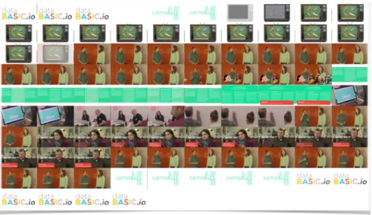
Figure 10: Visual storyboard for the introductory video featured on the SameDiff homepage.
The tools are highly expandable. The various import options ensure that data from many widely used sources can be input – Word documents, Google Sheets, Excel spreadsheets, etc. They can plug into an existing workflow and data-analysis pipeline. We include technical jargon, but define it with rollover tooltips so learners don't get lost if they switch to more complex professional tools. These definitions are included in each downloadable activity
guide as well. The download options ensure that the results can be taken to more complicated tools for more extended analysis. The "What do I do next?" section includes ideas for next steps that could be taken outside of the tool. For instance, WTFcsv includes prompts to think about what other data sets could be connected to answer questions. These all attempt to create a low entry-point for the learner, at the same time as maintaining a higher ceiling for what they can do by taking the results to other tools they might want to become familiar with.
Discussion: Building Data Literacy
A more involved analysis and evaluation of our tools comes from assessing how they do, or do not, build data literacy in practice. We have used WordCounter in three different data storytelling courses at the college level. We also piloted all three tools - WordCounter, SameDiff and WTFcsv - and their accompanying activities in two workshops with learners who represented a mix of undergraduate students and adult learners from non-profit organizations, news organizations and community advocacy groups. In this section we discuss our high-level results and then connect our learning goals for each tool to our four-part definition of data literacy and critically assess whether the tools are supporting learners in the data literacy process. Since the field of data literacy studies is emerging, there is not shared understanding about the best methods for evaluating whether and how specific tools and experiences work to foster it. We see evaluation and assessment as an important space for further research. In this paper we rely on traditional instruments like pre- and post-surveys, observation and analysis of generated artifacts to critically assess DataBasic.
Methods
We evaluated DataBasic’s three tools and their accompanying activities at a workshop in November 2015 at the MIT Media Lab. Twenty-five people (n=25) attended. They represented a mix of undergraduate students and adult learners from non-profit and community organizations (11), news organizations (11), educational institutions (9) and technology (4) . Participants ranged in age from 20 to 65 with the majority falling into the 6
20-35 range and were fairly balanced in gender with 11 male, 11 female and 3 unspecified. 7
Participants spent a total of two hours at the workshop with roughly 30 minutes devoted to doing facilitated activities with each tool.
We administered a and post-survey immediately before and after the workshop. The pre-survey asked people about their demographics and industry as well as how comfortable they felt analyzing text data and data in a table (rated on a Likert scale). The pre-survey also asked people to volunteer up to five tools that they had used in the past and to rate them as “easy”, “medium” or “hard”. The post-survey again asked people how comfortable they felt analyzing text data and data in a table. We also included questions about each Databasic tool, asking participants to rate the tool’s difficulty and usefulness and included a freeform text field to capture suggestions and feedback for each tool.
Participants could mark more than one category.
6
The breakdown was as follows 20-35 (11 people), 35-50 (7 people), 50-65 (5), 65+ (2).
Results
Our high-level evaluation of the three tools supports the idea that learners increased their comfort level with analyzing text data. While the majority came in uncertain about their ability to work with text as data , more than half of participants left feeling at least slightly 8
more comfortable with their abilities (figure 11). Based on current research that shows that self-efficacy is a key factor in learning (Zimmerman 2000), we assert that building non-technical learners' self-efficacy is an important building block towards building the ability to read, understand data and analyze data. The DataBasic workshop experience accomplished this.
Figure 1: The majority of attendees to the workshop felt more comfortable analyzing text after the event (n=25). The question "How comfortable do you feel right now analyzing text
data?" was asked prior to and immediately after the workshop.
Moreover, after the workshop, the majority of the participants characterized each tool as "easy" (82% thought WordCounter was easy, 60% thought WTFcsv was easy, and 60% thought SameDiff was easy) and thought the tools would be "useful for their work" (79% thought WordCounter was useful, 72% thought WTFcsv was useful and 69% thought SameDiff was useful). This gives us reason to believe that learners will be motivated to continue using the tools and building their data literacy after their one-time workshop experience.
WordCounter - Text as Data
We designed the WordCounter interface and activity to focus on multiple parts of our definition of data literacy. This centered around three specific learning goals for the "sketch a story" activity:
• increased ability to analyze and reason about text data • understanding that one can find many stories in one dataset
Measured on a Likert scale of 1-5 where 1 was "Totally lost" and 5 was "I'm an expert".
• increased ability to quickly communicate a data-driven story to others
Each learning goal motivated specific design decisions in the tool, and tied to specific pieces of our definition of data literacy.
To help read and understand data, we used familiar concepts and visual forms to reduce discomfort and intimidation in novices learning that text can be analyzed quantitatively. The primary focus and name of the tool itself, "WordCounter", are examples of building on a simple and explainable concept - counting words. This is our most basic attempt to create a low entry point to the topic of quantitative text analysis. Additionally, the first output people see on the WordCounter results page is a word cloud based on single word frequency. While word clouds are derided by many, for a number of valid reasons (Viégas & Wattenberg 2008, Harris 2011), we have found word clouds to be a very familiar visualization technique for our audiences. Our use of this familiar form is a deliberate attempt to "grease the path" to learning more about quantitative text analysis. These types of decisions address the first part of our definition of data literacy - the ability to read and understand data.
We observed the multitude of tools our audiences were using to work with data and decided to plug into their existing workflows. On surveying learners in our second workshop, the majority (68%) had some passing familiarity with tools like MS Excel and GoogleMaps and a few had used tools that they characterized as "harder" like MySQL, MS Access, and Tableau. In order to support learners continuing to use tools that make sense for them, WordCounter supports input via a file upload, pasting in text, or parsing content from a webpage url. The results can be downloaded as a CSV file for use in Excel, Tableau or easily imported into other database applications. We built these features to build learners' ability to work with data.
Addressing the limitations of word clouds gives us an opportunity to scaffold analysis of the text corpus. One recurring criticism of word clouds is that they remove any sense of context for how the word is used (Harris 2011, Wattenberg 2008), making it difficult to interpret and understand the usage of that word. For example, Elvis' use of "love" is missing a lot of context that is filled in when you see that he mostly used "love" to say "I love you", "in love with" and "love with you". To build learner's understanding of this, and their ability to reason about it, we include tables of word frequency, bigram frequency, and trigram frequency underneath the word cloud. This analytical next step is reinforced by the "What do I do next" text, which asks dynamic questions including the most common word and how many times it is used in the top bigrams and trigrams. One participant commented on this specifically, stating that "the additional context available here is very useful," supporting the idea that we have addressed the described limitations in word clouds to better support analysis of the data. These features are examples of how we try to build the ability to analyze data.
To work on arguing with data, we created the "sketch a story" prompt. It reminds participants that telling a data-driven story should be an iterative and fun process. In the workshop setting we invariably end up with two groups that create very different stories from the same sample lyrics, providing a rich opportunity to comment on the multitude of stories one can find in any dataset. The sharing of the sketches various groups made, and the feedback they receive from others, is the prime example of how we built WordCounter to help learners argue with data.
Figure 11: Student comparison of the lyrics of Paul Simon and Kanye West. Notably, they converge on "La la la".
Figure 12: Student measurement of how often various artists mention themselves.
Analyzing the sketches created by learners shows that they develop a strong ability to argue with data. Figures 11 and 12 shows typical sketches created by participants. In figure 11 a group of undergraduate students chose to compare the lyrics of Paul Simon and Kanye West, finding that they both used the terms "I'm" and "la la la". Many students chose to compare the lyrics of two or more artists and represent the overlap in familiar visuals (this example uses a Venn diagram). This visual accompanied their story that while these two artists, from different genres and generations, didn't use many common words, they did share the habit of singing "la la la"! Figure 12 showcases an example of a more complex story, using the data to dig into a meta-level question of which artists talks about themselves the most. This question is tied to larger themes and critiques of pop-culture, using the text data to support an argument that these popular musicians are obsessed with themselves. When presenting this drawing, the group that made it explained that they began with a hypothesis that rap artists (like Jay-Z and Kayne West) were more narcissistic, but discovered that pop artists weren't really that different (represented by Katy Perry). This process of forming a hypothesis, collecting data about it, analyzing that data to test the hypothesis, and using the analysis to construct an argument for others, is precisely the kind of data literacy we want to develop.
We find that WordCounter effectively builds learners' data literacy through the mechanisms described above. However, our initial tests with the audiences we are targeting have revealed a number of opportunities for improvement. Specifically, many struggled to see the difference between WordCounter and existing word cloud generators, stating it is "limited in functionality", "similar to just [a] word cloud creator", and that "there are already some programs that can create word clouds". However, that does not mean that the meta-level learning goals aren't happening, just that they aren't being described by the participants when asked to talk about what makes WordCounter different from other tools. We need to do further work to assess how participants reflect on WordCounter as a learning tool. There is an additional limitation related to the sample data we included. In the first workshop we ran, we observed some learners struggling to relate to the set of artists we included in the sample data. With this in mind, for the second workshop, we created a more diverse set of sample lyric files along multiple axes including genre, decade, gender, and ethnicity.
WTFcsv - Summarizing a Spreadsheet
WTFcsv, and its accompanying "Question Asking" activity, were designed to build data literacy in a variety of ways. The specific learning goals we designed the activity around include:
• understanding that data has many types, including numbers, text and data • increased ability to form hypotheses about, and find stories, in metadata • understanding that one can find many stories in one dataset
• understanding that datasets can be combined to answer more complicated questions
These learning goals are "baked into" the tool and activity in a number of ways in order to build data literacy among learners that use it. One learner described it quite succinctly, stating that "it helps you from the beginning to understand the possibilities of your spreadsheet". Understanding the "possibilities" is the key first step for finding a story to tell in your data. Providing a quick summary of each column in a spreadsheet gives learners the high-level overview they need to understand the data in front of them. The first step we see many data "experts" do when opening a spreadsheet is exploring the data by summarizing the columns (via a pivot table or the summary() function in R). The high-level overview gives a sense of what is included in the data, and how the values are distributed. The visualizations WTFcsv picks to depict the columns facilitate visual exploration of the dataset, as demonstrated in existing literature studying user behaviour in systems that generate heuristic-based visualizations automatically (Wongsuphasawat 2016). We represent each column in standard visual forms (line graphs, bar charts, histograms and word clouds) in order to build the learner's ability to read data. Moreover, we chose to use fun sample data sets like "UFO Sightings" in order to engage and pique the curiosity of learners as well as reduce apprehension. Learners responded well to these choices. One commented that WTFcsv is "different because usually there are just text and numbers, not lots of images and graphs and the ability to look at them all right away". Another stated it is "similar to Excel/R but easier to quickly generate summary graphs".
WTFcsv also includes information about the missing values in the dataset. Each card can be clicked on to flip it over from visual to text display. This text display includes a sentence such as "There are 44 rows of missing data" - describing the number of rows of missing data. This is critical for scaffolding the learner's understanding of "messy" vs. "clean" data. Our activity guide reinforces this for third party facilitators, reminding them to raise this as a topic of discussion in the share-back session after the activity is run. Knowing that the majority of data analysis time is spent in wrangling messy data (Lohr 2014), we included this introduction to the realities of incomplete datasets in order to build the learner's ability to work with data. The text card for each column includes a variety of aggregate information about the values in the column to scaffold understanding of basic numeric statistical operations. The mean, median, max, min and standard deviation are all computed and shown on the text side of the card (each with a rollover defining it succinctly). These descriptive statistics are fairly standard and common ways to understand and compare data. We include them here to build the learner's ability to analyze data. One learner called them a "shallow dive", demonstrating a strong understanding of our breadth-over-depth approach.
The "Asking Questions" activity is designed to introduce the iterative process of exploring and generating hypotheses about a dataset. The worksheet that accompanies the activity prompts the learner to share back the question they want to ask, any other datasets they need to answer it, and how they might go about getting those datasets. This models the standard approach "experts" take - bouncing back and forth between exploring data and testing hypotheses. This is an introduction to the first step in arguing with data. One learner commented that the visual cards "gave me ideas on how to visualize the available data" - suggesting that WTFcsv and the "asking questions" prompt are building a bridge between the spreadsheet and telling a visual story with the data. Another said that they left with "a huge mental leap in confidence about asking questions of data" - demonstrating that one of our learning goals was accomplished.
Figure 13: One group using WTFcsv wondered whether UFO sightings are correlated with common commercial flight patterns.
Learners in the workshop had the choice to generate questions about sample datasets cataloging survivors of the Titanic crash or UFO sightings in Massachusetts. Figure 13 is typical of a group's output. When looking at the locations of sightings, this group wondered whether people were actually just seeing commercial aircraft in the sky. The first thing they wanted to test was whether sighting locations seemed to be along commercial flight patterns. In order to test that initial idea, they would need to get flight pattern data from the Federal Aviation Administration's website. Other groups wondered whether age or class of travel affected whether passengers survived the Titanic disaster, how UFO sightings in MA compared with other states, and why UFO sightings seemed to spike after the year 2000. Generating questions (rather than hard and fast answers) is the important focus of this exercise. Because their task remains in the speculative realm, groups can feel free to think creatively about possible hypotheses to test and how they would test them. The other important learning goal this activity addresses is around the "incompleteness" of most data sets to answer the most meaningful questions. Typically, the "story" is not going to be found in a single data set but must be pieced together. And to find a story, you might need to do some basic digging into the provenance and collection practices of the original data set. This came up in a productive way in one group's output.
Figure 14: Another group had basic questions around where the data was from and whether it was correct, raising issues of data verification.
This group wondered the very basic question of whether the Titanic data was "correct" (figure 14). This provoked a good deal of discussion in the room around data sources, verification
methods for data and how data analysts and storytellers need to do due diligence on the data sets that they come by, often using very analog, reportorial methods such as calling people up on the phone. For example, another group raised the question, "What is the 'parch' column?" in the Titanic dataset. That answer can only be found through further background research. This discussion reinforced our learning goals around generating hypotheses from about data - learners began to recognize that data sets are not necessarily "complete" on their own but rather need to be combined with background research and other data in order to develop reasonable hypotheses.
The initial workshops we held did reveal some failings in WTFcsv and the "asking questions" activity. One consistent problem was the need to clarify that we did not want workshop participants to try and answer the questions they were asking, just to brainstorm them. While remaining in the speculative realm was intentional, the activity does create a strong desire to answer questions without providing time to answer them. More concretely, one participant provided feedback that they had "less control over the data" since learners were instructed to use one of the two sample data sets. Combined together, these two items suggest that perhaps the playground we have created is too small. Designing the constraints for these tools and activities is far more art than science, and we look forward to iterating on them quickly based on these types of feedback. One area for further reflection is around the choice of data sets. These data sets may need to shift and change based on the context and audience where we are conducting the workshop. And the "defaults" in the tool may need to be revisited for learner relevance. Perhaps we can return to our pedagogical inspirations and find sample data that is more relevant, meaningful, and impactful to the lives of the learners. Moreover, maybe the learners themselves could propose meaningful data sets, a further incorporation of Freire's popular education model as detailed by Tygel & Kirsch (2015).
SameDiff - Comparing Text Documents
SameDiff and its related activity to "Write your own data-driven lyrics" were designed to build on the introductory quantitative text mining in WordCounter and build incrementally on all aspects of our definition of data literacy. Our specific learning goals for SameDiff's activity are:
• Understanding that comparing two things is one powerful way to find stories in data • Awareness of what kind of questions you can/should ask text data
• Increased ability to analyze text data
• Understanding that algorithmic analysis can reveal interesting information about your data
These learning goals are integrated into the design of the tool and the accompanying activity in a number of ways in order to build data literacy. Similar to WordCounter, SameDiff seeks to make learners aware that text can be analyzed as quantitative data. As one learner said after the workshop, "It allows you to easily compare two sets of texts. When I think of data, my mind leaps to numbers but this reveals the data in words." This is supported by the comparative word clouds that SameDiff outputs (figure 8), which are slightly more sophisticated versions of the basic word cloud in WordCounter.
The main interaction with the tool's output is comparative - which is to say that the learner scans the three word clouds to try to see which words are shared and which words are unique to one document or the other. She can hover her mouse over any single word to see the actual count/s (figure 8). These actions, combined with the basic understanding that text can be data, support reading the data and understanding what aspects of the world it represents.
SameDiff also introduces algorithmic manipulation and summary of text data in a lightweight way. At the top of the output page it gives a narrative as well as a numeric assessment of how similar the two documents are such as "These two documents are very similar. They have a cosine similarity score of 0.89." This extends the visual comparison that the user is performing by adding a more definitive analytic summary of how similar or not the documents are. It also introduces the idea that algorithms can summarize data, which aids participants in learning what methods are available to them to analyze data. The "What do I do next?" prompt at the bottom of the page builds on this by asking questions that change dynamically with the content of the documents and lead the user into further analysis of their data. For example, when comparing Iron Maiden and Aretha Franklin, the prompt asks, "Is it meaningful that "love" and "don't" are the most used words appearing in both documents? Why does Aretha Franklin's lyrics use "la" so much, but it doesn't even appear in Iron Maiden's lyrics?"
The activity for SameDiff asks learners to choose two musical artists from the sample data provided and generate a song that would be written in a hypothetical collaboration between the two. This prompt is asking learners to engage their analytic capabilities but also building their capacity to argue with data and present it in meaningful and engaging ways to their audience. We ask participants to sketch their new data-driven song on a piece of paper and give them extra points if they sing it when they present it to the group. This activity also builds out the idea that "arguing with data" need not prescribe a particular format such as a chart or two-dimensional graph but could encompass a performance, artistic output or creative action as well.
Figure 15: Learners' color-coded lyrics to a new song based on a collaboration between Iron Maiden and Katy Perry. Iron Maiden's lyrics are blue, Perry's are red. The words they share
Figure 15 shows a typical output from the SameDiff activity in which one group wrote a song for the hypothetical collaboration between Katy Perry and Iron Maiden. For this activity learners need to notice which words are shared and which words are unique to each artist. The additional contextual knowledge of pop culture that learners bring to the workshop makes the collaborations particularly humorous and there is a lot of laughing as people present their hypothetical songs.
While the SameDiff activity led to the most laughter and delight of the three workshop activities, we have also struggled the most in matching our learning goals to the activity itself. While the activity is fun, we are not sure that it is adequately introducing and reinforcing the ideas around algorithmic summary and the comparison of text analytics. Our open questions include, "Should we focus more on introducing the concepts of algorithmic techniques for summarizing data and have them engage in some algorithmic analysis?" "Should we focus on the text comparison outputs more strongly?" and "Should we choose data sets and outputs that feel more relevant to learners' work environments?" For the current activity, learners can choose words that either differ or overlap from the two artists, which does not reinforce the idea that you can glean different insights from comparison.
One participant commented afterwards that "I don't know that these are helpful tools for teaching independent thought or asking good questions." This forces the question of whether the activity and tool are in fact too scripting. As mentioned previously, designing the constraints for these activities is tricky; a fact made more difficult by the variety of audiences we are trying to work with. Our pedagogical framework drives us to hold the learner's hand so they can gain confidence, but not dictate every step of their process. Learners may need differing levels of simple, confidence-building exercises in order to increase their comfort and self-efficacy, however we do not want to prevent them from pursuing more advanced questions or feeling that we are "talking down" to them. This participant clearly felt we had gone too far down the overly prescriptive, "rote learning" path. We look forward to iterating on the activities and tools in order to seek out this critical balance of constraints, capabilities, relevance, and fun. As another participant noted, "I felt inclined to do it after the fun exercise"; clearly the participatory activities are inviting and have a strong impact.
Conclusion
The proliferation of data tools created in response to the growing demand from novices to work with data is missing an opportunity to better support data literacy learners. Building data literacy requires tool builders to think about their audience as learners rather than users. We urge designers and educators to approach their tools and activities with learners in mind, rather than focusing on the outputs that the tools create. In this paper we have introduced four design principles that can help make data tools more learner-centered. These include creating tools that are focused, guided, inviting, and expandable. The three DataBasic tools we have described represent our initial attempt to model what these principles look like in action and how they support our definition of data literacy.
For educators, these design principles offer a set of criteria for evaluating tools to use in classrooms or other instructional settings. For tool designers, these design principles offer a template for features that should be included and excluded from the simplest versions of your
tools. This pedagogical re-alignment is fundamental to helping build a stronger support system for data literacy learners.
We look forward to iterating on the theory, process, and implementation documented in this paper. Our future work will involve refining these three tools, and continuing to look for more gaps in the evolving set of tools available to data literacy learners. We have no doubt that the DataBasic suite of tools will grow.
Acknowledgments
The funding for this work was provided through a Prototype Grant from the Knight Foundation and conducted with the support of the Emerson Engagement Lab and the MIT Center for Civic Media.
References
Bhargava, R. (2015). Data Therapy Blog. Retrieved from https://datatherapy.wordpress.com/
Bird, S., Klein, E., & Loper, E. (2009). Natural Language Processing with Python. Beijing, Cambridge Mass.: O’Reilly Media.
Calzada Prado, J., & Marzal, M. Á. (2013). Incorporating Data Literacy into Information Literacy Programs: Core Competencies and Contents. Libri, 63(2). https://doi.org/10.1515/ libri-2013-0010
Coppersmith, G., & Kelly, E. (2014). Dynamic Wordclouds and Vennclouds for Exploratory Data Analysis. In Proceedings of the Workshop on Interactive Language Learning, Visualization,
and Interfaces (pp. 22–29). Baltimore, Maryland, USA,: Association for Computational
Linguistics.
Dasgupta, S. (2012). Learning with Data: A toolkit to democratize the computational exploration of
data. Massachusetts Institute of Technology.
Deahl, E. S. (2014). Better the Data You Know: Developing Youth Data Literacy in Schools and
Informal Learning Environments.
Freire, P. (1968). Pedagogy of the Oppressed.
Fry, B. J. (2004). Computational information design. Massachusetts Institute of Technology.
Gray, J., Chambers, L., & Bounegru, L. (2012). The Data Journalism Handbook. O’Reilly Media, Inc. Gurstein, M. B. (2011). Open data: Empowering the empowered or effective data use for everyone?
First Monday, 16(2).
Harris, J. (2011, October). Word clouds considered harmful. http://www.niemanlab.org/2011/10/word-clouds-considered-harmful/
Harris, J. (2012, September). Data Is Useless Without the Skills to Analyze It. https://hbr.org/2012/09/ data-is-useless-without-the-skills
Hemphill, T. (2014). Rap Research Lab. http://rrlstudentresearch.tumblr.com
Hewett, J. (2015). Learning to teach data journalism: Innovation, influence and constraints.
Howard, A. (2014). The Art and Science of Data Driven Journalism. New York: Tow Center for Digital Journalism, Columbia University.
Huang, A. (2008). Similarity measures for text document clustering. In Proceedings of the sixth new
zealand computer science research student conference (NZCSRSC2008), Christchurch, New Zealand (pp. 49–56).
Hunt, K. (2004). The Challenges of Integrating Data Literacy into the Curriculum in an Undergraduate Institution. IASSIST Quarterly, (Summer/Fall).
Huron, S., Carpendale, S., Thudt, A., Tang, A., & Mauerer, M. (2014). Constructive visualization. In
Proceedings of the 2014 conference on Designing interactive systems (pp. 433–442). ACM. Information Design. (2000). Cambridge, Mass: The MIT Press.
Krajcik, J., & Blumenfield, P. (2006). Project-Based Learning. In The Cambridge Handbook of the
Learning Sciences. Cambridge University Press.
Lee, B., Henry Riche, N., Isenberg, P., & Carpendale, S. (2015). More than Telling a Story: A Closer Look at the Process of Transforming Data into Visually Shared Stories. IEEE Computer
Graphics and Applications, 35(5), 84–90.
Lohr, S. (2014, August 17). For Big-Data Scientists, “Janitor Work” Is Key Hurdle to Insights. The
New York Times.
Maine Data Literacy Project. (2015). http://participatoryscience.org/project/maine-data-literacy-project
Mandinach, E. B., & Gummer, E. S. (2012). Navigating the landscape of data literacy: It IS complex. WestEd/Education Northwest.
Maycotte, H. O. (2014, October). Data Literacy -- What It Is And Why None of Us Have It.
Forbes.com
Means, B., Chen, E., DeBarger, A., & Padilla, C. (2011). Teachers’ Ability to Use Data to Inform Instruction: Challenges and Supports. Office of Planning, Evaluation and Policy Development,
US Department of Education.
Othman, D., Craig, H., & Debigare, A. (2014). NetStories. http://www.netstories.org/
Papert, S. (1980). Mindstorms: children, computers, and powerful ideas. New York: Basic Books. Patil, T. H. D. J. (2012, October). Data Scientist: The Sexiest Job of the 21st Century. HBR.org
Philip, T. M., Schuler-Brown, S., & Way, W. (2013). A Framework for Learning About Big Data with Mobile Technologies for Democratic Participation: Possibilities, Limitations, and Unanticipated Obstacles. Technology, Knowledge and Learning, 18(3), 103–120. https:// doi.org/10.1007/s10758-013-9202-4
Piaget, J. (1952). The origins of intelligence in children (Vol. 8, No. 5). New York: International Universities Press.
Schield, M. (2004). Information literacy, statistical literacy and data literacy. IASSIST Quarterly,
28(2/3), 6–11.
School of Data: Data Expeditions. (2015). http://schoolofdata.org/data-expeditions/
Schutt, R. (2013). Taking a Chance in the Classroom: Embracing the Ambiguity and Potential of Data Science. CHANCE, 26(4), 46–51. https://doi.org/10.1080/09332480.2013.868757
Tygel, A., Campos, M. L., & Alvear, C. A. de. (2015). Teaching Open Data for Social Movements: a Research Strategy. The Journal of Community Informatics, 11(3).
Tygel, A., & Kirsch, R. (2015). Contributions of Paulo Freire for a critical data literacy. Proceedings of
Web Science 2015 Workshop on Data Literacy.
Viégas, F. B., & Wattenberg, M. (2008). Timelines tag clouds and the case for vernacular visualization.
Interactions, 15(4), 49–52.
Visualizing Information for Advocacy. (2014) (Second). The Netherlands: Tactical Technology
Collective.
Vygotsky, L. (1980). Mind in society: The development of higher psychological processes. Harvard university press.
Wattenberg, M. (2002). Arc diagrams: Visualizing structure in strings. In Information Visualization,
2002. INFOVIS 2002. IEEE Symposium on (pp. 110–116). IEEE.
Wattenberg, M., & Viégas, F. B. (2008). The word tree, an interactive visual concordance.
Visualization and Computer Graphics, IEEE Transactions on, 14(6), 1221–1228.
Williams, S., Deahl, E., Rubel, L., & Lim, V. (2015). City Digits: Local Lotto: Developing Youth Data Literacy by Investigating the Lottery. Journal of Digital and Media Literacy.
Wongsuphasawat, K., Moritz, D., Anand, A., Mackinlay, J., Howe, B., & Heer, J. (2016). Voyager: Exploratory analysis via faceted browsing of visualization recommendations. Visualization
and Computer Graphics, IEEE Transactions on, 22(1), 649–658.
Zimmerman, B. J. (2000). Self-Efficacy: An Essential Motive to Learn. Contemporary Educational
Psychology, 25(1), 82–91. https://doi.org/10.1006/ceps.1999.1016
Zubiaga, A., & Mac Namee, B. (2015). Knowing What You Don’t Know: Choosing the Right Chart to Show Data Distributions to Non-Expert Users. Presented at the Data Literacy Workshop at WebScience 2015, Oxford, UK.