Data Visualization and Optimization Methods for
Placing Entities Within Urban Areas
MAS SACJESOF TrECHNOLOGY
by
/
JUL
15
2014
Pranav Ramkrishnan
LIBjRARIES
S.B., Massachusetts Institute of Technology (2013)
Submitted to the Department of Electrical Engineering and Computer
Science
in partial fulfillment of the requirements for the degree of
Master of Engineering in Electrical Engineering and Computer Science
at the
MASSACHUSETTS INSTITUTE OF TECHNOLOGY
June 2014
@
Massachusetts Institute of Technology 2014. All rights reserved.
Signature redacted
A uthor ...
...
Department f Ele
al Engineering and Computer Science
May 23, 2014
Signature redacted
C ertified by ...
...
Dr. Sepandar D. Kamvar
Associate Professor
Thesis Supervisor
Signature redacted
A ccepted by
...
...
Dr. Albert R. Meyer
Chairman, Masters of Engineering Thesis Committee
Data Visualization and Optimization Methods for Placing
Entities Within Urban Areas
by
Pranav Ramkrishnan
Submitted to the Department of Electrical Engineering and Computer Science on May 23, 2014, in partial fulfillment of the
requirements for the degree of
Master of Engineering in Electrical Engineering and Computer Science
Abstract
In the first part of this thesis, I present a portfolio of web-based visualizations that illustrate different data-driven ideas about urban environments. These visualizations are intended to provide the user with unique perspectives about cities and the way they function. I detail the conceptualization, data aspects, and implementation of each of these map visualizations. In the second part of this thesis, I describe an interesting optimization problem of placing entities such as trees or shops within a city. The location of these placements needs to conform to certain constraints enforced by spatial distributions of variables such as population, income, travel times, etc. I then present a heuristic-based optimization strategy, that combines some aspects of Gradient-ascent and Simulated Annealing, to address this problem and attempt to generalize this approach to finding the optimal placements of any entity within a given city. I present some initial results of my optimization algorithm and discuss ways in which it can be further improved.
Thesis Supervisor: Dr. Sepandar D. Kamvar Title: Associate Professor
Acknowledgments
I would first and foremost like to thank my parents, Padma Ramkrishnan and Ramkr-ishnan Venkat, as well as my sister Aparna, for their uncompromising love and support over the years, especially through my time at MIT. This journey would be incomplete without them.
I would like to thank my thesis supervisor, Professor Sepandar Kamvar, for his guid-ance and mentorship over the past year. I sincerely appreciate the time he took to work through this project, develop ideas, and provide me with insights throughout the year. I would also express gratitude to him for the opportunity to work with a group of extremely talented individuals in the Social Computing Group.
My colleagues Yonatan Cohen, Wesam Manassra, Salman Ahmed, Kimberly Smith, and Jia Zhang, from lab who have been not only great friends, but also advisors for me as I worked on this thesis. Their opinions and perspectives were instrumental in shaping this work. I would like to thank them for all their support and encouragement.
Finally, I would like to thank all my professors and mentors I have had over the past five years at MIT. By sharing their wisdom and time, they have helped make me the person I am today. I will treasure every bit of wisdom I have learned from them and use them as sources of inspiration moving forward.
Contents
1 Introduction 15 2 Street Greenery 17 2.1 Introduction . . . . 17 2.2 Motivation . . . . 17 2.3 Data . . . . 18 2.3.1 Query Locations . . . . 18 2.3.2 API Parameters . . . . 19 2.3.3 Image Processing . . . . 202.4 Design and Visualization . . . . 21
2.4.1 Concept and Design . . . . 22
2.4.2 Implementation . . . . 22
2.5 Challenges and Improvements . . . . 24
2.5.1 Data Processing . . . . 24
3 Bicycle Crashes 27 3.1 M otivation . . . . 27
3.2 Data . . . . 28
3.3 Design and Visualization . . . . 28
3.3.1 Concept and Design . . . . 28
3.3.2 Implementation . . . . 29
4 Footfall Density 33
4.1 Motivation . . . . 33
4.2 D ata . . . . 34
4.3 Design and Visualization . . . . 35
4.3.1 Concept and Design . . . . 35
4.3.2 Implementation . . . . 35
4.4 Challenges and Improvements . . . . 36
5 Public-Private Transportation Efficiency 39 5.1 Motivation . . . . 39
5.2 D ata . . . . 40
5.3 Design and Visualization . . . . 41
5.3.1 Concept and Design . . . . 41
5.3.2 Implementation . . . . 41
5.4 Challenges and Improvements . . . . 42
6 Sky Prints 43 6.1 Motivation . . . . 43
6.2 Data . .... ... . . ... . . .. . . . .. .. . . 44
6.3 Design and Visualization . . . . 45
6.3.1 Concept and Design . . . . 45
6.4 Challenges and Improvements . . . . 46
7 Best Modes of Travel 49 7.1 Motivation . . . . 49
7.2 D ata . . . . 50
7.3 Design and Visualization . . . . 50
7.3.1 Concept and Design . . . . 51
7.4 Challenges and Improvements . . . . 51
9 User Response 10 Building Tools 10.1 Introduction . . . . 10.2 Motivation . . . . 10.3 Problem definition... 11 Heuristic-Based Optimization 11.1 Introduction . . . . 11.2 Algorithm . . . . 11.2.1 Overview . . . . 11.3 Objective Function... 11.3.1 Gaussian Smoothing 11.3.2 Boundary Conditions 11.4 Data and Implementation . 11.5 Results . . . . 11.5.1 Convergence... 11.5.2 Time . . . . 11.5.3 Robustness... 11.6 Future Steps . . . . A Figures 55 57 57 57 58 59 59 60 61 61 62 63 63 63 64 65 65 66 69
. . . .
. . . .
. . . .
List of Figures
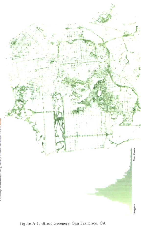
A-1 Street Greenery. San Francisco, CA . . . . 70
A-2 Interactivity - Street Greenery. San Francisco, CA . . . . 71
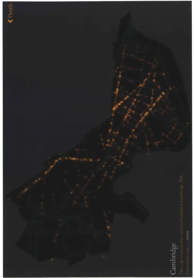
A-3 Bicycle Crashes. Cambridge, MA . . . . 72
A-4 Interactivity - Bicycle Crashes. Cambridge, MA . . . . 73
A-5 Footfall Density. Manhattan, NYC . . . . 74
A-6 Interactivity - Footfall Density. Cambridge, MA . . . . 75
A-7 Public-Private Transportation Efficiency. Cambridge, MA . . . . 76
A-8 Sky Prints - Stereographic. Cambridge, MA . . . . 77
A-9 Sky Prints - Boundary. Cambridge, MA . . . . 78
A-10 Sky Prints. Cambridge, MA . . . . 79
A-11 Sky Prints - Our City. Cambridge, MA . . . . 80
A-12 Sky Prints - I've Been Here Before. Cambridge, MA . . . . 80
List of Tables
2.1 HSV Boundary for Color Detection . . . . 21 9.1 U ser A nalytics . . . . 56
Chapter 1
Introduction
Cities are some of the most dynamic and complex organisms in existence. They are an amalgamation of individuals along with their stories, hopes, and expectations. These individuals, by means of their relationships and interactions, form communi-ties, which interrelate with one another to form the living essence of a city. Since 2010, the majority of the world's population lives in urban areas. Yet only a few individuals and organizations control how cities are planned and designed. As cities become increasingly powerful hubs of culture and commerce, there is a need for a more inclusive planning process - in which every individual and community in the city contributes.
The ubiquity of personal technology provides a realistic opportunity for the cre-ation of this new style of city planning. The success of this inclusive approach would require two vital components: awareness and action. My goal in this thesis is to help develop such a planning process. More specifically, my thesis goals are two-fold: firstly, I wish to create data-driven visualizations that give individuals interesting insights about their urban environments; secondly, I intend to present software tools that can help identify possible areas of change in a city.
The first part of this thesis deals with awareness. Individuals must have a thor-ough understanding of their environments, so that they can effectively contribute to city planning. In order to convey information and spread awareness the information channel must be effective and visually appealing. For these reasons, I use maps to
convey information about a city to the individual. In this part of my thesis, I describe the process of creating a portfolio of unique data-driven map visualizations. Each map is an interactive web-based visualization that aims to give the individual a different perspective on their urban environment. Furthermore, maps have been story-telling instruments of a city in the past, and I wish to infuse some data-driven ideas to this notion of story-telling. These map visualizations are part of the YouAreHerel project started by the Social Computing Group. This project aims to release maps that share unique insights about cities. I share the process of design, implementation, and analysis of maps I created for this project.
The second part of this thesis deals with action. I attempt to leverage certain computer science techniques, such as optimization algorithms, to tackle the problem of understanding which locations in a city are optimal for placing a new entity, such as a tree or a coffee shop or a bike rack. This problem was motivated by the recently launched elementary school network in Cambridge , MA by the Social Computing Group. In order to extend this network, it was important to understand where to place the next school. In this thesis, I attempt to extend the scope of this problem and make it more generalized so that it can be used to find optimal placement of any entity in a city.
I strongly believe that as cities continue to flourish, the task of city planning should, and will, fall into the hands of every individual resident of the city. Through this portfolio of map visualizations and the optimization tools, I hope to assist in the development of this new process of planning.
1
Chapter 2
Street Greenery
2.1
Introduction
Each of the following chapters describe a different map I created as part of the YouAre-Here portfolio. In each chapter, I present an unique concept for a map and talk through the motivation behind it, the means of collecting data, and finally the de-sign and implementation process. Most of the back-end for these maps was written in Python, and the front-end visualization was created predominantly by using D31 library or HTML Canvas manipulation in JavaScript.
2.2
Motivation
This set of maps (fig. A-1) depicts how naturally green streets and roads are within
the urban landscape. The aim is to use these visualizations to portray not only which streets have a higher density of foliage; but more importantly, highlight street regions of lesser amounts so that such regions can be treated accordingly. Through this series of maps, the viewer should be able to understand where the 'green lungs' of a city are located. In most cities, street greenery generally tends to decrease towards the 'downtown' areas where tall buildings, bridges, and pavements leave very little space for trees. If cities are to be more livable, then they must also be "breathable."
Here street greenery, greenness, green density, and green values are used inter-changeably and refer to natural shades of greens from trees, plants, shrubs, and lawns. In the following sections, I describe the entire process of creating these maps from initial data collection and verification stages to the design approach used to visualize and create these maps. Finally I conclude with a discussion of certain chal-lenges faced during the process and end with a discussion of future steps that can be taken to address these challenges.
2.3
Data
I primarily used Google Streetview to download images of street sides. This ensured that this set of maps was scalable given that Google's Streetview services provide coverage to most cities in the US. The Street View API would enable scaling of these maps to any city that had Streetview services - a significantly large number of cities. More specifically, I used Google's Streetview Image API as it conveniently provides images given location, camera pitch, field-of-view and heading parameters. I use the Street View API to take images of the left and right sidewalk. This specificity provides enough granularity to analyze greenery variations along a single street. In this section I first discuss the method of selecting locations to query, and then describe simple image processing steps to extract the "greenness" from Street View images.
2.3.1
Query Locations
Recall that the aim in these maps is to present how green streets are in a particular city. My first intuition was to construct a rectangular grid of points that had sufficient density to show variation within a short street section. However, this strategy was not effective because it did not take into consideration the street geometry, an important
aspect in understanding how to take images of just the sidewalk.
As an alternative, I decided to find all street intersections in the city and used these points and coordinate geomotry techniques to interpolate between two consecutive intersections to find remaining points on the streets segment. Henceforth, a street
segment refers to the part of the street between two consecutive points on the streets. These points may or may not be intersections as certain streets have a lot of smaller segments to account for curvature.
I used the publicly available street centerline GIS2 files distributed via respective city GIS repositories, which can be found on the city planning or open data websites for most US cities. This particular GIS file is available for most cities in the US because it is often tied to census blocks for the cities. After extracting each street segment, I extract a list of query points to be used as parameters with the Street
View API.
If a segment was less than a certain threshold chosen based on the segment distance distribution within the particular city, I downloaded Street View images only at each of these intersections. If the segment was larger than the threshold, I split the segment into two smaller segments and queried at end points. Once I had extracted green values for the end points, I simply interpolated values along the entire street. While this approach ensures that the number of queries made for each map is reasonable, it does however hamper the accuracy of the visualization. I chose the threshold distance for splitting street segments in order to strike a reasonable trade-off between the number of query points and the accuracy. In practice, these threshold distances were between 100 and 300 feet for the 5 cities. Note that this process is repeated for both left and right sides of the street.
2.3.2
API Parameters
Since the Street View camera captures a complete 360-degree of the region, it is possible to selectively extract a snippet out of the complete panorama. In other words, it is possible to deconstruct the panorama into not only the individual images that comprise it but also find any frame within the 360-degree panorama. The Street View Image API allows such extraction by accepting the following parameters:
2
Geographic Information System format: This format is widely used for analyzing visualizing and studying data that show.
* Heading determines the direction the camera is intended to face. To get the camera to face the sides of the street, I use the two end points to compute the street bearing and then use this bearing to compute the angles that correspond to each sides. Given that we are querying at end points of segments, I apply an appropriate offset so that the heading is able to capture not only the near (immediate) sidewalk but some portion of the sidewalk along the length of the segment.
" Field-of-View (FOV) sets the extent of the image captured. This parameter also controls the zoom of the image - the higher the FOV, the smaller the zoom, and vice-versa. In order to capture as much of the street as possible, I set the FOV parameter to be 80% of the maximum value (120 degrees) after a process of trial-and-error to maximize the sidewalk concentration (ignoring as much sky and roads as possible) of the image.
" Pitch determines yaw, or how the camera is pointed vertically. Pitch values range from -10 to 10, where positive values point the camera vertically up. I used a pitch of -3 to account for high positioning of the Street View camera atop the car. At this slightly downward pointing pitch, I was able capture the entire height of the street side.
" Size is used to control the dimensions of the downloaded image. When it comes to selecting the right size, the tradeoff made is between accuracy and time efficiency. A larger image has better definition and is better suited for image processing methods. However, since I had to process around 100,000 to 200,000 images for each city, I chose to download smaller images.
2.3.3
Image Processing
In this section I describe how the greenness value is extracted for each Street View image. I chose to use the cylindrical Hue Saturation Value (HSV) color coordinate system. The primary reason for using the HSV space is to capture 'perceived
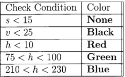
lumi-Table 2.1: HSV Boundary for Color Detection
Check Condition Color
s < 15 None
v < 25 Black
h < 10 Red
75 < h < 100 Green
210 < h < 230 Blue
nance'. The HSV color space is better suited to be determine how green an image is perceived to be. For the purposes of this particular visualization, the perception or green was more important.
For each pixel in the image I extract RGB values and use these to convert to HSV values. Then I apply certain thresholds on each H,S, and V values in order to determine the perceived green color of the street segment. These thresholds were obtained through a trial-and-error process based on a training set of images obtained for each city from different parts of the city (downtown area as well suburbs). Table 2.1 shows thresholds were used to evaluate each pixel color (they were implemented sequentially in the code).
The majority of images downloaded from the Street View API had sidewalks in poor light conditions, often hindered by shadows from buildings and cars. Further-more, ambient lighting was oftentimes poor due to weather (overcast days), cloudy settings, and tall buildings. As a result, adjustments were made to these thresholds to account for such background conditions. These thresholds are more tolerant to detecting green pixels under these "darker" conditions.
2.4
Design and Visualization
The following sections deal with concept design and front-end implementation of the map visualization.
2.4.1
Concept and Design
While presenting street greenery values, one of my main motivations was to present the user with the ability to get a macro and micro level intuition of greenery. The macro level view, which deals with the city at large is useful in glancing at which regions are greener than others. It is useful to say that Kendall Square is less green than Harvard Square. However, from user patterns noted form previous YouAreHere visualizations, I also wanted the user to get a micro level view that dealt with the individual street segment. This micro level view was achieved in two ways. Firstly by computing street-wise averages of green values and plotting histogram of street segments based on their average green values. Secondly, when users clicked on a particular street segment, all other street segments in the city with similar (within 2%) average values were highlighted. The principle behind this design decision was to give users not only a more refined and localized perspective but also make a comparison of their local area with other areas within the city.
Also, users could click on a bar, as seen in fig. A, of the histogram and all
segments associated with that bar's average value would be highlighted. Given the qualitative nature of this particular visualization, it was important to give users a sense of reference to understand varying levels of street greenery and this feature to click on segments to view similar segments was effective in providing such a reference frame.
2.4.2
Implementation
Street Greenery maps were created to be web-based interactive visualizations, hence were coded primarily in Javascript/HTML5. Recall that greenery values are com-puted for the endpoints for each segment and then imcom-puted within the segment itself. This produces a really large number of points to render on a single page. These maps were made for Cambridge, MA, Atlanta, San Francisco, Washington DC, and Port-land, OR with each different webpage dedicated to each city. The number of points to render for these cities ranged from about 40,000 to 80,000 - each had to be rendered
as a circle. Most other YouAreHere visualizations I created relied on using D3 as the primary means for rendering. However, the D3 creates new SVG components, adding these to the DOM for each entity. Creating 80,000 new SVG components places an extremely high load on the GPU and, during development, this load often led to the browser window crashing.
As an alternative strategy, I decided to visualize circles as simple circles on a HTML canvas and used a pre-computed projection function to translate latitude longitude values to screen coordinates. However, the drawback of using only a HTML Canvas is that mouse interactions cannot be localized. In other words, it would be difficult identify segments users hover over or click. Since this interaction was an integral part of the interaction, I decided to employ both strategies for these visualizations. I use D3 to draw lines along segments between endpoints so that it is easy to hover and click on streets (SVG line provides localized interactions). The circles depicting the green values are drawn on the HTML Canvas - however in a batched manner. In other words, I first batch all points in sets of 1000 and then render each batch individually. This form of rendering eases load on the GPU as the rendering is more spread over time, and as a result this does not hinder the visualization. The obvious drawback of this batching is that the visualization is created in parts, and not in its entirety. But once all points are loaded (users can know this because the histogram only appears after all points are loaded) the visualization is stable as well as interactive. The time to start rendering for cities all cities was nearly instantaneous (rendering first set of 1000 points), and the complete time to finish rendering the entire maps for cities with larger amounts of data was about 8-9 seconds in total 3.
3
Tested using Chrome's developer tools console. These numbers were recorded while using Chrome Version 34, but were consistent when test on other major browsers (IE, Firefox and Safari)
2.5
Challenges and Improvements
In general, these maps were well received by viewers. The visualization was features in various online blogs and press such as the Architect, Boston Globe etc. The majority response was largely positive, and people noted that the visualization provided an effective way of understanding street-wise green values. In this section, I attempt to find ways in which this visualization can be improved and made more useful and appealing.
2.5.1
Data Processing
In its current form, these maps can only be reproduced for cities that have Google Street view coverage. During the early stages of ideation, we wanted to have these maps scalable across cities in the US and Google's Street View provided a suitable means of scaling. As Google constantly tries to increase its Street view coverage, it is reasonable to say that this limitation is not really mission critical. However, there are also some other ways of gathering images of street sidewalks: crowdsourcing. If this same map could be created by crowd-sourced images taken by residents of their portion of the sidewalk, it would have a lot more impact [6]
Image processing is another aspect that could be improved upon. Currently green values for a particular image are extracted by using set thresholds in the HSV space. This processing step is conducive to introduce machine-learning techniques to make smarter decisions in selecting these thresholds. A smarter algorithm will also be able to better at picking context-specific threshold. This will be very useful in two aspects: 1) Sidewalks in downtown areas are more likely to be covered by shadows as compared to sidewalks in less dense areas. A smarter approach would be to vary thresholds based on localized differences. 2) It is difficult to determine the width of the street, and hence using a fixed zoom level (by controlling the field of view parameter) may not provide an accurate image to calculate the percentage of green pixels. Extracting a single image or the sidewalk from the Street View API often produces random artifacts (see image). These artifacts are a result of computing the
single image frame from the 360 degree panorama.
To conclude while there are opportunities to make the data collection process more robust for these greenery maps, the current system of using Google's Street View Image API provides a suitable and scalable estimate to understanding street-greenery.
Chapter 3
Bicycle Crashes
3.1
Motivation
This series of visualizations, Figure A, was amongst the earliest in the YouAreHere series and was created to the biking culture within a city. For the biking culture to thrive, there must be adequate infrastructure to provide safe and convenient biking options to individuals.
There are numerous advantages to biking. Along with the environmental and health benefits, having more bicyclists on the streets makes for a more lively and social atmosphere. After extended discussions with urban planners, bike share advocates, and the local Police Department (Cambridge PD) a clear need to better understand and bicycle related incidents emerged. With the growing popularity of bike share programs such has Hubway in Boston and Cambridge, and Citi Bike in New York City there has also been a lot of focus on improving the infrastructure to ensure safety of bicyclists. Some recent measures undertaken in Cambridge include building dedicated bike paths along major streets and having better signals at intersections.
The main aim of these visualizations was to highlights regions of high bicycle crash'incidence. These visualizations serve as a tool to understand which streets need urgent bicycle infrastructure upgrades. The target audiences of these maps are
'The word 'crash' and 'accident' here are used interchangeably. Only accidents in which there has been at least one recorded injury to a bicyclist have been visualized.
individuals, who should be made aware of risk to bicyclists at different area, and city councils so that they can understand where the largest impact can be made by improving biking paths. This map series was recreated for 11 cities across the US. In the following chapter I detail the process of creation for these maps.
3.2
Data
The primary sources of data for these maps were datasets collected by the local Police Department about reported traffic incidences involving bicyclists. By engaging the local authorities in this visualization I was able to build partnerships that could help translate these visualizations to change on the ground. For each city, crash data had to be parsed and geo-located. For most cities, each accident had either cross streets references or an associated street address. These address components had to be converted to a latitude and longitude coordinate system using the Google Maps Geolocation API for visualization purposes. Finally, the data was converted to a GeoJSON form, a specific format of a JSON file that is well suited for geographic visualizations, especially D3.
3.3
Design and Visualization
The following sections deal with concept design and front-end implementation of the map visualization.
3.3.1
Concept and Design
The idea motivating these bicycle crash maps was to communicate information on three increasing levels: the individual accident level, the street level and citywide
level.
On the individual accident level, a point on the map denotes the exact location of the accident, and hovering over the point reveals both the address at the location and a street view snippet,Figure A, which shows a snapshot of the vicinity of the
accident. By allowing the viewer to grasp a single accident form at a local level, the map allows users, both bicyclists and non-bicyclists to engage with the data and make connections from their own experience especially through the street view. Furthermore, this granularity can be used to identify precise changes that need to be made to a few areas that have a higher incidence of bicycle accidents.
The street-level perspective provides insights on street segments that have a high concentration of accidents. In order to further elucidate street segments, I created clusters of accident points that were close to each other and on the same street. This clustering process is described in more detail in the next section. Clustering brings streets with high crash incidence to attention. The visualization also provides a bar graph that ranks each street by the number of accidents that have occurred on each street. To keep the map in the foreground and the main focus of the visualization, both the street view snippet and the street-wise bar chart were placed in a 'pull out? drawer. This design principle ensured that the user could first engage with the map and then ?draw out? more information about the underlying data.
Finally, the city-wide perspective was designed to facilitate region by region com-parison of bicycle accidents. This perspective focuses both on individuals who can be made more aware of regions of high risk, and city council to elucidate which regions are in most need of infrastructure changes.
3.3.2
Implementation
After text-parsing datasets received form police departments, I created clusters based on an average-link agglomerative clustering strategy. First I tallied each accident by streets (both streets of an intersection were taken into consideration - i.e. if an accident occurred at Massachusetts Avenue and Vassar Street, then the same accident was counted for both streets). The pseudo-code below explains the average-link clustering algorithm implemented. Note that each street has a list of accidents, and each accident has a latitude and longitude attribute.
The threshold in the above algorithm 1 was selected experimentally, with the objective to make the most realistic street clusters.
Algorithm 1 Street Clustering
1: procedure INTIALIZE
2: for street in streets do
3: westMost <- point with lowest latitude
4: eastMost <- point with highest latitude
5: bearing <- geographic-bearing(westMost, eastMost)
6:
7: if bearing > 75 then
8: sortedStreet <- sort street by longitude (north-south)
9: else
10: sortedStreet <- sort street by latitude (west-east)
11: return makeCluster(sortedStreet)
12: procedure MAKECLUSTER
13: clusters +- []
14: for each accident do
15:
16: for each cluster do
17: clusterAverage <- average point in cluster
18:
19: if distance(clusterAverage, accident) < threshold then:
20: cluster <- clusterU accident
21: else
22: newCluster <- [accident]
These web-based maps were rendered using D3 and Javascript, in which two con-centric circles depicted each accident. The larger circle was given a lower opacity than the inner circle in order to create a 'blurring' effect when many accidents were visualized in the same region. This effect was designed to create a spatial distribu-tion of accidents as opposed to simply visualizing independent accident circles. The brightness of each location also indicated the number of accidents that had taken place at that location.
3.4
Challenges and Improvements
These maps were successful in engaging bicycle enthusiasts from different cities in conversation over blogging sites and news media. Much of the qualitative feedback was positive and users found the maps to be indicative of ?most dangerous? streets to bike on. While the true impact of these maps , actual improvement to bike lanes, can only be measured in the long term, the ensuing discussion is a positive indicator. These maps were shared on major online blogs such as Gizmodo, where they generated a lot of discussion on topics related to biking and infrastructural changes in respective cities.
Technically, these maps were straightforward to conceptualize and implement, however a more challenging problems remains in the validation of data. Even though data was extracted from police reports of accidents, these reports may not include all accidents as some may not have been reported. In some cities, police only record bicycle accidents in which bicycles collide with a motor vehicle, while in other cities bicycles are treated the same as motor vehicles making data extraction a colluded process.
Even though this visualization helps to show the outcome of bicycle-related inci-dences on streets, it does not necessarily show which streets have poor biking con-ditions. In other words, a street with high standards of bike safety may also have a high bicycle traffic rate, thus leading to a high number of bicycle accidents. The current visualization would portray such a street as one which is unsafe to bike on.
To address such issues, the visualization could take advantage of information layering by showing not only where accidents have occurred by also correlating these accidents with the state of current bicycle infrastructure.
Chapter 4
Footfall Density
4.1
Motivation
According to Christopher Alexander, author of A Pattern Language: Towns, Build-ings, Constructions (1977), a renowned architect and thinker, an important charac-teristic of a healthy city is its 'walkability'. In his book, Alexander discusses that different parts of the city must be accessible to its residents by foot. To this extent, he describes certain features that will enhance a city's pedestrian traffic - building wider sidewalks and providing a safe and clean space for pedestrians.
This motivated a series of maps, Figure A, called the Footfall Density maps. Through these maps, I aim to visualize streets that have high pedestrian density and correlate these with the width of sidewalks on these streets. By enhancing sidewalks not only is there more effective use of public space, but streets also becomes more conducive for pedestrians making them more social and livelier.
Footfall density maps visualize walking paths taken from each block to a predefined destination. Each path is overlaid on top of each other and this allows streets that have higher pedestrian traffic flow to be highlights. For the current visualization, I assume that it is most straightforward to assume that people in a city must walk to the nearest public transit stop. Therefore, walking routes each residential block are calculated to the nearest public transit station. These paths are then visualized after accounting for the population distribution and altering visual attributes to portray
higher flow of people on paths leading from denser residential blocks. In this chapter, I describe the process of obtaining these pedestrian routes and population information, creating the visualization itself, and finally discussion some challenges and how these maps can be taken forward.
4.2
Data
There are two main data components in this visualization - walking routes and population blocks. The latter was easier to find and standardize. Most major cities in the US have GIS data repositories and population blocks are often found easily within these repositories. Population blocks are often stored as ESRI shapefiles or GeoJSON files containing a polygon boundaries for the block, the population at the last US CENSUS year, the area of the block and the average height of buildings, and other such block based information.
I used the Google Maps Directions Service API to get walking paths from the centroid of each block to the closest public transit station. The REST API requires an origin and destination as latitude-longitude coordinates, as well as a travel mode that is set to 'walking' (this API used differently for transportation maps described in different chapters in my thesis). In addition to these parameters, the API also allows the user to specify the type of path desired - shortest path, or via certain waypoints or paths that optimize for certain other features. Assuming that most people are likely to travel to their nearest public transit station by the shortest and most optimal path time-wise, I chose to find the shortest possible path from the origin (block centroid) to the destination (latitude-longitude coordinates of the nearest public transit station). The result of each API call is an XML document providing information about the specific route to a 'step' granularity, where a step is a single directions instruction. For example, 'take left at Massachusetts Avenue onto Vassar Street'. Initially, I only extracted start and end points at each step to visualize the routes, but soon ran into issues when trying to visualize roads that had a significant curvature. After more inspection of the XML document, I found a hashed version of a long string of latitude
longitude coordinates that defined the precise path for each step at a much higher resolution. I overcame this by decoding this hash by implementing a small procedure specified in the developer manual of the Google Maps Directions API. This method not only gave me the precise path, accounting for street curvature, but it was also a very efficient process as it only relied on string extraction and decoding as opposed to a tag search through the XML document for each route step.
4.3
Design and Visualization
The following sections deal with concept design and front-end implementation of the map visualization.
4.3.1
Concept and Design
Before describing the conceptualization and implementation it is useful to clarify some definitions: A path consists of several segments, which comprises of a start coordinate and end coordinate (both latitude-longitude pairs).
Each path was visualized as a collection of connected lines between two consec-utive coordinates. Each route or path was designed to be visualized as fluid flowing lines. I wanted to make an analogy between all routes to a single destination and a river system, where there are main arterial flows and contributing tributaries that eventually comprise of the entire river system. This could be useful to easily identify streets with major pedestrian traffic flow.
4.3.2
Implementation
Initially, I began by visualizing all steps within each path. However, I soon ran into performance issues as the number of lines was very large. As an alternative, I chose to implement a more efficient method by pre-processing. First I converted each float tuple of latitude and longitudes into a string and hashed each string by creating a Python dictionary, keeping the count of each string as the value. Then
I only visualized the keys of the hash table, or unique segments and set the stroke-width and opacity of each segment according to its value. This meant that segments that occurred more frequently across different paths would be visualized with a higher thickness and opacity. The stroke-width and opacity attributes are controlled to bring out the flow like effect of the lines.
This visualization also provides users with some basic interactivity. Hovering over a public transit station, Figure A, highlights all paths connected to it, providing an easy way to study paths to a single destination. Users can also hover over individual paths so that the name of the street is displayed - this provides a sense of reference for users.
4.4
Challenges and Improvements
It is difficult to validate whether walking routes returned by Google Maps Directions API actually reflect true routes taken by residents on a daily basis. Often times, individuals might not take the shortest path or they might not be aware of certain paths and hence may not follow the same paths returned by Google Maps. For instance, if someone goes out of his or her way to buy coffee at a favorite coffee shop before commuting to work, then their path to the transit station will differ considerably from that returned by the API. By relying purely on Google Maps Directions API, one cannot capture these subtle yet important nuances. For major streets such as Massachusetts Avenue in Cambridge, this may not be a large issue as paths returned by the API and paths in reality may actually align, however this discrepancy could be wider for smaller streets or allies. An ideal scenario would be to use a mobile application to collect walking routes and visualize these routes. Applications such as RunKeeper or Moves are used to track running routes, therefore walking routes could be a natural extension. However, this process would involve the challenge of convincing people to use such applications on a daily basis at all times while they walk around the city.
location directly gives streets in the local vicinity more preference. Therefore, these maps cannot be used to compare one street against another or one region of the city to another. Furthermore, since routes are queried from residential blocks to the nearest public transit station, these routes may reflect walking patterns of predominantly the working, community population within the city. In reality, there are a lot more groups or people that comprise pedestrian traffic such as tourists, school-going students, etc. It can be argued that a more useful visualization would be one that allows users to compare patterns across these different user groups or allows destinations to be dynamically set.
Finally, only a few cities have access to information about sidewalk such width and current conditions. I began by leveraging services such as Google Earth or Street view to find proxy indicators of sidewalk attributes, but soon realized that data from these services is very difficult to process for this specific purpose. Often times, sidewalks are hidden from views, and not all streets have a clearly designated sidewalk. Above all, it was very difficult to differentiate between the road and the sidewalk from either view given they are both of similar color and texture. On the whole, these maps provide a useful tool in capturing footfall or pedestrian density to predetermined destinations (public transit stations in this case) and can be used as a tool to study sidewalk usage and consequently used to identify streets that need sidewalk upgrades.
Chapter 5
Public-Private Transportation
Efficiency
5.1
Motivation
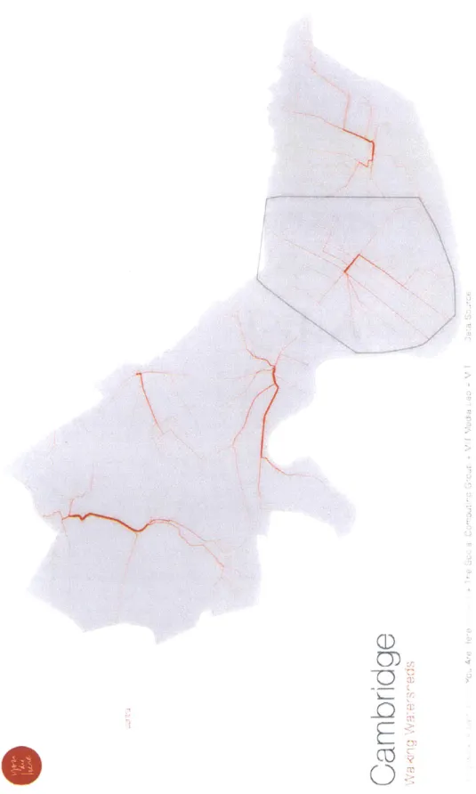
This is first in a series, Figure A, of visualizations about transportation efficiency as part of the YouAreHere project. One of the most important characteristics of a thriv-ing and healthy city is the efficiency of its public transportation system - efficiency not only time and cost constraints but more importantly in accessibility. An efficient public transportation system incentivizes people to walk, bike and disincentives motor vehicle traffic. Numerous studies have linked public transportation efficiency to the development of the city. The aim of this visualization is to provide a tool for better understanding public transit time-efficiency in a given city.
In these maps, I compare travel time efficiency of two main modes of travel within a city: public transportation and private transportation. Even though these maps can be easily extended to include and compare other modes of transportation, for purposes of this visualization and discussion I consider private transportation only comprises with driving (either a private car or a taxi). Public transportation includes either transit trains or buses. These maps are intended to allow users to compare how one mode performs against the other from a given place in a city to the rest of the city. Through these visualizations, I hope to highlight areas that are underserved
by the public transportation grid and hope to convince city-planning authorities to provide better access to these regions in the long run.
5.2
Data
The primary data in these maps are transportation times for the public transit system and driving times within the city. The Google Maps Directions Service API provides travel times from a set origin to destination using a specified mode of transportation. The Directions Service API has a stringent rate limit on the number of queries that can be made within a given time period, and each public transit query is equivalent to 4 individual queries because the result factors in walking, bus travel, and train travel times for a single transit query. Since I wanted to allow users to find travel efficiencies from any given point within the city, this produces O(N2) queries where N
is the number of points the user can select. Finding travel times between such a large number of points by each mode of transportation became a very challenging task especially considering strict rate limits enforced by the Google Directions Services API and large value of N. I attempted to evade this challenge by employing two different strategies: limiting the number of points and using an alternate source for querying transit travel times.
Initially, I used building blocks as the basis for querying. In other words, N was the number of buildings in a city. However, this number was too large to support
N2
queries from the Google Directions Services API. Therefore, I created groups of blocks called block groups that were a cluster of blocks in the vicinity. For some cities such groups already existed as part of CENSUS GIS data, however for other cities, these block groups had to be created by forming a convex hull around a small number of closely located building polygons. The use of block groups decreased the number of query points yet did not hamper the resolution of the map significantly. The resolution was rich enough so that the primary message of transportation efficiency was still being conveyed.
directions, I instead screen-scrapped the MBTA 1 website for finding travel times using the transit system for Cambridge and Boston. While this exercise was successful in getting travel times, it was not scalable across cities and accurate enough (times could only be found in human readable forms). This was not accurate enough for purposes of evaluation. In the end, I reverted back to using the Google Directions Services API for public transit travel times, and implemented a scheduler module in Python that managed the number of queries sent and received in order to remain within the rate limits. While this was a lot slower, once the scheduler was completed all the information was available. For driving time values, I add a random number between 300 and 600 (seconds) in order to account for the time consumed while parking.
5.3
Design and Visualization
The following sections deal with concept design and front-end implementation of the map visualization.
5.3.1
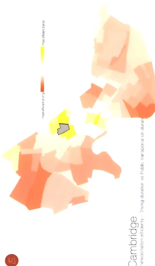
Concept and Design
The primary interactivity in these maps was to allow the user to click on any block group and then re-color remain blocks with the suitable color and opacity to reflect the different efficiencies of the two modes. The map makes use of two color scales, red and yellow, in order to show relative efficiencies - the more red the more driving is efficient and vice versa. The white regions (apart from the clicked block itself) are areas where driving and public transit are very similar in time efficiency terms.
5.3.2
Implementation
As noted in the data section, I query travel times between all blocks (centroids of each block). The main challenge in implementing this map was to convert travel times to efficiency ratios and assign a color accordingly. First I add the randomness to model
time taken for drivers to find parking. Next, I take the ratio of the time taken for driving to the time taken for public transit. If this ratio is high, then driving takes more time than public transit and is therefore less efficient than public transit, and vice versa. This is followed by a similar scheme for selecting color scales: if the ratio is less than one, then transit takes more time and hence I assign the respective block a color from the white to red scale based on the value of the ratio. If the ratio is greater than one, it is assigned a shade accordingly from the yellow scale.
5.4
Challenges and Improvements
It would be even more useful to implement such a map at a finer granularity than that of block groups. By allowing users to click on their exact address and find effi-ciencies from their address to all other points in the city, this map could provide more personalized information allowing users to make better transport choices everyday.
There are different efficiencies that can be visualized, such as cost of travel, en-ergy spent while traveling etc. While these can be approximated from the time and distance traveled, visualizing different efficiencies can provide a much more holistic picture about transport efficiency within a city. These map can also be extended to include comparisons between two other modes of transportation. However this will require more pre-processing and querying from Google?s Directions Services API.
In using the Google Directions Services API, I assume that drivers will follow along routes returned by Google. This may not be an accurate enough assumption given that many drivers, especially taxi drivers, may follow more familiar routes. While, I assume that most drivers may end up selecting the shortest path, the time taken for the journey (variable measured in these visualizations) may be significantly affected by the choice of path.
Chapter 6
Sky Prints
6.1
Motivation
One of the most important indicators of good health of a city is the amount of sunlight that falls through to the street-level. Studies have shown that incidence of various respiratory and general health patterns are well correlated with the amount of sunlight a city receives. Socially speaking, many public spaces generally tend to be open spaces that have adequate amounts of sunlight and fresh air. Consider cities such as Manhattan and Sao Paolo which are densely congested and, the former more specifically has plenty of high rises that obstruct sunlight from reaching lower levels. There are differences in sunlight exposure within a particular city as well. Intuitively, downtown areas are less likely to have as much sunlight exposure compared to suburban areas at the fringe of a city. Through these maps I want to explore sunlight exposure at different points of the city.
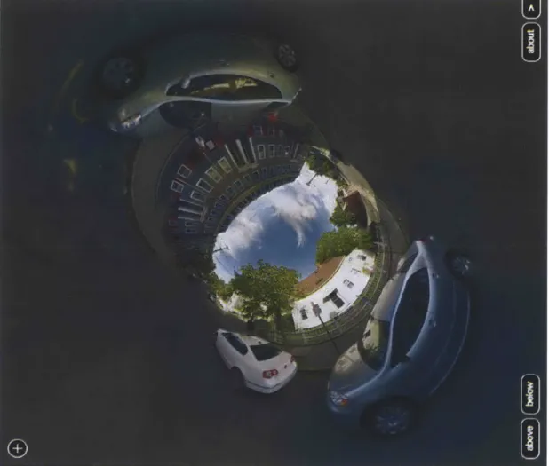
A 'sky print' refers to the boundary of the sky when one looks up from a street, Figure ??, . In other words, imagine standing on a street side and looking vertical up into the sky - this view is referred to as the sky print of that location. I am interested in measuring two important variables by studying sky prints: 1) the amount of sky visible through the sky print at a given location, and 2) the composition of the sky print boundary. In particular, I am interested in understanding whether the sky print boundary is natural (trees) or un-natural (buildings, houses, etc). While it is not clear
what simple corrective steps can be taken if an area is found to have poor sunlight, these maps are meant to initiate conversation and awareness of the varying levels of sunlight exposure in the city. The following sections the process of creating sky prints and then publishing them in a manner in which such awareness can be fostered.
6.2
Data
For these maps, I describe both the data and implementation aspects together as they are closely tied to each other. Sky prints were created from using images obtained through Google?s Street View API. The camera mounted atop Google's street view car, captures multiple images that are then blended into a spherical panorama. The idea of using Street View was inspired by Ryan Alexander's project[7] on creating stereographic projections, Figure A, from Street View Panoramas. Given that street view panoramas are spherical, I use simple M6bius transformations[1] to convert spherical panoramas into flat images.
After creating a flat image of the sky (refer to images associated with this chapter), I implement simple image processing techniques to identify regions that are associated with the sky. This is achieved by combination of pixel value tracking to determine a sky pixel by measuring whether the Blue value of the pixel was more dominant that Red and Green values, and edge detection to find the boundary of the sky print. Note that the algorithm and threshold values for pixel values account for the clouds and different shades of blue in the sky. The edge detection algorithm first relies a process similar to Canny's edge detection algorithmcit[3] by taking the intensity gradient of the stereographic street view image to highlight prominent edges. This is followed by a radial traversal from the center to find the 'main' sky print boundary. Finally, a histogram of gradients (HOG)[5] is created for segments of the sky prints boundary (between corners), and these histograms are used to classify natural or manmade.
6.3
Design and Visualization
The following sections deal with concept design and front-end implementation of the map visualization.
6.3.1
Concept and Design
Sky prints are an abstract concept to be visualized. While they convey a simple idea, areas with more or less exposure to sunlight, the final representation of information is not as intuitive. Therefore, I decided to design and present sky prints as four separate pieces of information. Each piece is referred to as a movement henceforth, and is designed as 4 separate interactive web pages. However each of the 4 movements are intended to be viewed together in sequence and not alone.
1. Introduction
This movement, Figure A, allows the user to get familiar with the sky prints concept. The slow animation transitions back and forth between the complete street view stereograph to sky print by itself so that there is a frame of reference for the users. For purposes of this visualization, I created a grid of coordinate points that covered the city in order to present enough variation to emphasize areas with lack of adequate exposure to sunlight.
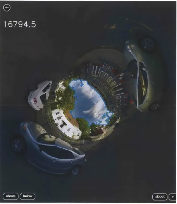
2. Look up!
This movement is true to its name as it allows the user to click on a grid point and then presents the user with the sky print for that particular point. The user is also presented with a regular street view image before the sky print in order to compare the effect of sunlight exposure. This movement also presents the user with a grid of sky print boundaries so that the user can compare and contrast between sky prints.
3. Natural Sky
In this movement, Figure A, the user is presented with detailed information about each sky print. Namely, each sky print is abstracted into an image of
blue circle within a square. The size of the circle depicts the amount of sky seen through the sky print. The color of the square outside the circle ranges from a shade of brown to a shade of blue and depicts whether the boundary of the sky print is natural (more green) or un-natural (more brown). This movement initially presents the user with the same grid of sky prints as the previous movement. But once the user hovers over each sky print, the image ?flips? to the image of the circle and square. Not only does this maintain familiarity with the concept, but also allows the user to engage with sky prints in a new way in order to gather further insight.
4. I've Been Here Before
As discussed in previous sections, a vital lesson learnt from user studies during early prototyping stages of these maps was that users wanted a way to compare their area of residence or work to another area they are familiar with in the city. This last movement, Figure A, was designed with the purpose of providing users with a chance to compare sky prints from two different regions of the city.
6.4
Challenges and Improvements
These sky prints provide a new perspective on understanding sunlight exposure at the street level and provide a means to begin discussion on improving ambient light in cities. Given that the focus of this series of visualization was introducing a new concept, sky prints were only queries for a certain number of points within the city. A natural extension to these maps would be to extend the scope of these maps and allow users to create a sky print for any point of the city.
A significant challenge faced in the implementation of these visualizations was to distinguish whether a sky print boundary was natural or man-made. The cur-rent technique was useful to find boundaries that had a sharp contrast between sky and buildings, but it was less effective to detect less defined edges such as the fo-liage of a tress against the sky. A more robust approach would be to use learning based approach that utilizes additional localized features to improve edge detection
Chapter
7
Best Modes of Travel
7.1
Motivation
This series of visualizations is very similar to the public v/s private transportation efficiency maps, except they allow the individual user to compare between various modes of transport and highlights the best mode of travel between two points in the city.
A city is a complex accumulation of myriad of different individuals and their lifestyles. As a result, the city has grown to adapt and accommodate various modes of transportation methods that help people in cities carry out their lifestyles. From walking, driving private cars, taxis, bicycles to more shared options such as public buses, trams or trains. Choice of transport is an important point in understanding how a city can better serves the needs of its residents. The primary motivation of this set of visualizations is to study and analyze which areas in the city are more accessible by the different modes of travel. By highlighting which modes are best for certain parts of the city, I hope that residents can make better transportation choices in their daily lives.
The focus in these visualizations, Figure A, is on the following modes of trans-portation: driving, walking, bicycling, and public transportation that include both transits and buses. These four modes are present in most major American cities and hence allow these visualizations to scale easily.