Chorus: End User Programming of Social
Applications
by
Jodie Lian Chen
OFtE-NOLOGY
AUG
4 2017
LIBRARIES
Submitted to the Department of Electrical Engineering and Computer
Science
in partial fulfillment of the requirements for the degree of
Bachelor of Science in Computer Science and Engineering
Ok- ' C
at the
MASSACHUSETTS INSTITUTE OF TECHNOLOGY
February 2017
@
Massachusetts Institute of Technology 2017. All rights reserved.
AuthorSignature
redacted
Author
...S
g a u e r d c d
Department of Electrical Engineering and Computer Science
February 3, 2017
Certified by...
Accepted by
Signature redacted
Daniel Jackson
Professor
Thesis Supervisor
Signature redacted
...Dr.hiistopher Terman
Chairman, Department Committee on Graduate Theses
Chorus: End User Programming of Social Applications
by
Jodie Lian Chen
Submitted to the Department of Electrical Engineering and Computer Science on February 3, 2017, in partial fulfillment of the
requirements for the degree of
Bachelor of Science in Computer Science and Engineering
Abstract
Chorus is an end-user programming tool for building mobile social applications, much in the spirit of HyperCard1 but reimagined for modern cloud-based applications on smart phones. Chorus innovates in two dimensions: first, by supporting collaboration via "social datatypes" that define a shared structured document; second, by providing a simple user interfaces on smartphones that support interacting with and designing these documents. This thesis reports on the design challenges encountered in building these two user interfaces and the solutions that were explored. The primary contri-butions of this research are: 1) techniques for visualizing and navigating a complex hierarchical document on a phone, and 2) supporting WYSIWYG design of a complex data artifact within the UI constraints of a phone. Qualitative user testing was used to guide and evaluate the design decisions, indicating both successes and problems requiring further work.
Thesis Supervisor: Daniel Jackson Title: Professor
1Hypercard is a visual programming language that allowed people to build Macintosh applications
Acknowledgments
I would like to express gratitude to Jonathan Edwards, Professor Daniel Jackson, and
Contents
1 Introduction 13
1.1 The Parts of the Chorus Application . . . . 14
1.1.1 C lient . . . . 14 1.1.2 Collaborative Documents . . . . 15 1.1.3 D esigner . . . . 16 1.2 Summary of Contributions . . . . 16 1.3 O utline . . . . 18 2 Related Work 19 2.1 Visual Programming . . . . 19 2.2 WYSIWYG Designers . . . . 20
3 Chorus Collaborative Document 23 3.1 Com ponents . . . . 23
3.1.1 List of Social Datatypes . . . . 25
3.2 Document UI Contributions . . . . 26
3.2.1 Displaying Tree Structured Documents . . . . 27
3.2.2 Displaying Social datatypes . . . . 27
3.2.3 Embedding Lists . . . . 29
4 Chorus Designer 31 4.1 D esigner Parts . . . . 31
4.2 Designer UI Contributions . . . . 34
4.2.1 Metamodel Designer . . . . 34
4.2.2 Embedding and Breadcrumbs . . . . 36
4.2.3 Designer Location. . . . . 37 4.2.4 WYSIWYG . . . . 38 4.2.5 Redesign . . . . 38 4.2.6 Minimap . . . . 38 5 Implementation 43 5.1 Page Transitions . . . . 45 5.2 Captive Browser . . . . 45 6 Results 47 6.1 User Testing Setup . . . . 47
6.2 Document User Test . . . . 48
6.2.1 Document Test Subject One . . . . 48
6.3 Designer User Test . . . . 49
6.3.1 Designer Test Subject One . . . . 50
6.3.2 Designer Test Subject Two . . . . 51
6.3.3 Designer Test Subject Three . . . . 52
7 Conclusion 55 A User Testing Script 59 A.1 Introduction . . . . 59
A.2 Document Testing . . . . 59
A.3 Designer Testing . . . . 60
B List of States 63
List of Figures
1-1 Screenshots from the various parts of the Chorus application . . . . . 14
2-1 An example of the programming GUI from the Hypercard application.
Image taken from http: //basalgangster .macgui. com/RetroMacComputing/
TheLongView/Entries/2010/10/23_HyperCard.html ... . 20
2-2 Pictures of Airtable's mobile application. The screen on the right shows
a data table in Airtable and the screen on the right shows the screen seen when editing a data table. Image taken from http: //airtable .com 21
2-3 Pictures of Notion's document and editor. Users can drag and drop various structural components from the right side into the document.
Image taken from http://notion.so . . . . 22
3-1 Docum ent tree . . . . 24
3-2 Old document UI featuring interaction between Jodie's document and
Jonathan's . . . . 25 3-3 The displayed document UI as the document tree is traversed. .... 28
4-1 The initial converted document (left) and metamodel designer (right) 32
4-2 Old designer with code editor. . . . . 35
4-3 A screenshot taken prior to the redesign in Section 4.5.2 that showcases embedding (on the right hand pane) and vertical breadcrumbs. ... 37
4-4 Mockups of potential designer locations and interactions done in Adobe Illustrator. . . . . 39
4-5 WYSIWYG designer. Left side shows in-place-editing of labels and
right side shows drag-and-drop interaction to add in new fields. . . . 40
4-6 The minimap on the right side consolidates notifications on states and helps navigation . . . . 41
5-1 Data flow in our implementation of Chorus. . . . . 44
5-2 Captive browser in the redesigned (Section 4.2.5) document UI . . . . 46
List of Tables
4.1 Metamodel vs. WYSIWYG ... . 36
Chapter 1
Introduction
Chorus intends to simplify the workflow of planning social gatherings and organizing groups. Planning today's social events requires people to constantly copy and paste information from one application to another. Imagine trying to organize a meetup
--
the organizer would have to use a subset emails, forms, spreadsheets, chat chan-nels, polls, etc. to get all of the data needed to successfully make this event happen. Chorus reinvents the social planning workflow and the notion of needing a separate application for each step of data gathering. Instead of copy and pasting between many standalone applications, Chorus provides a central "collaborative document," which looks and functions as a mobile application and aggregates the features of the different applications mentioned above. For example, documents may allow users to perform actions such as filling out forms, writing group messages, and voting in polls.By both collecting and storing data in one central location, Chorus streamlines the
workflow. Chorus also brings customizability to the end users, the people who orga-nize social events. Using the Chorus designer, end users can create unique, standalone applications that incorporate only the relevant social features. Users can also edit their document and add in new features as they are needed.
We have built a standalone desktop application as a prototype that mimics a mobile application UI. We decided to focus on a mobile UI, because most online social interactions are now mediated by phones. The prototype offers users the ability to work on a collaborative document together and also to create and customize their own
are 1-1: Screenshots from the various Darts of the Chorus application
Westside Book Club suggestions
Emily -Jul 3, 2016, 2:41 PM
title
War and Peace
link -link to Amazor
https://www.google.com/search?q=Wi
O comme s
0 Alex -Jul 3, 2016, 2:42 PM
Too short!
^ ~ (0 G0
Westeide Book C string10 fild that holds 0oar more
______________ Characters of tex
etoggest
link
Emily -Jul 3, 21 awablink
title number
RR a osmat value
War and Peace
yea/no
k - link ta Aneson a ro tol
https://www.google. fomcontainer that my held
,
commentschoice
Alex -Jul 3, 2016, '
Too short!
-messages
lst to which sem oay odd etries, ordered by creation thme
^Ln submissions
collaborative document. User tests were performed to assess usability and pinpoint misconceptions about the UI.
1.1
The Parts of the Chorus Application
The Chorus user application consists of three parts: the Chorus client, the shared collaborative documents, and the Chorus designer. Potential users either create col-laborative documents with the designer for their social group and they can also use the document to communicate with their social group. Screenshots of each can be seen in Figure 1.1.
1.1.1
Client
The Chorus client aggregates all the different collaborative documents a user is sub-scribed to. From the client, users have the ability to access a document they are subscribed to or create a new collaborative document.
14
Chorus Guessing game Westside Book Club UI gallery Hackathon TodoMVC
1.1.2
Collaborative Documents
The collaborative document allows users to interact with each other. Users make edits to the collaborative document and may publish their changes for other users to see or may cancel their changes. Chorus collaborative documents are based on two concepts: a statically typed tree with data stored at the nodes; and social datatypes, which are the nodes of the tree. The tree structure of Chorus documents is explored more in depth in Section 3.1.
Social Datatypes
By studying the types of interactions that users perform in social settings, we were
able to extract the social interaction patterns performed and distill them into a collec-tion of social datatypes. These social datatypes, also referred to as "components," are " social" as they specialize in implementing common conversational patterns. They can be stringed together to support the functionality of chat messages, comment threads, polls, and more. A list of components may be found in Section 3.1.1.
Social datatypes are able to function because of states such as error, new, todo, etc. These states, described further in detail in Appendix Two, provide notifications, task tracking, and other standard capabilities that facilitate social collaboration and interaction. States can indicate if a change was recently made by a user or if a certain component is waiting for a specific user's input. The states also come into play for the enforcing type matching. If a user's input does not match the datatype in the document's structure, for example a string when a number is expected (i.e. when collecting phone numbers), the components will produce an error state for users and users will also not be able to publish their changes. Published changes to any of the datatypes sends notifications to other users subscribed to the document, helping facilitate conversation. Notifications of changes or required inputs between partici-pants drive a collaborative workflow. Enforced types also help mediate structured conversations.
1.1.3
Designer
The Chorus designer allows users to create the collaborative documents. Users decide which components to add into their document. When adding in components, users are essentially adding in new nodes to the tree structure and deciding what type of data the node stores and whether the node is the parent of a subtree. Since the nodes are social datatypes, the patterns of interaction described in the previous section are built into the document. Additionally, users can manipulate both the structure and the display of the document. This corresponds to moving subtrees and their parent to another level in the tree and how many levels of the tree can be displayed on a single page in the document, respectively.
1.2
Summary of Contributions
The main research done is the creation of the UI for the Chorus document and de-signer. Prior to my research, there already existed a backend for collaborative docu-ments. Content is stored in a tree structure and can be accessed and modified through API calls. However, there was no way for our intended user base to interact with the calls. Creating a successful UI for both allowed us test the validity of our ideas and to better assess the needs of potential users and potential shortcomings of our ap-plication. We successfully designed a UI for both the collaborative document and designer and implemented a prototype Electron application. The prototype succeeds in meeting the goals we set out - the document UI allows users to edit documents and the designer UI allows users to edit the structure of documents. The following list is a brief summary of the contributions made:
" The complexity and variety of datatypes involved in Chorus documents could
easily lead to a heavily menu-driven interface, which is suboptimal on a phone. Much work was put into avoiding menus and encoding all actions into taps on content items or a bottom icon bar.
" How is a complex hierarchical document to be visualized and navigated on a 16
phone? Different ways of visualizing and traversing the document were explored, finally settling upon a statically indented outline where some nodes of the tree are displayed indented on the same page as their container, but other nodes require a page traversal, leaving behind a stack of breadcrumbs at the top of the screen. The static grouping into pages is established by the document designer.
9 How is the user informed of changes that may be scattered throughout the
document? Further, some of the social datatypes assign tasks to users to supply certain information - how are those users to be informed of their tasks and given a way to keep track of them? We settled on a representation for changes and tasks using marginal colored bars. We extended this mechanism to also indicate tentative (uncommitted) changes and errors with additional bar colors.
e How are the above notifications tracked across a hierarchical document? We
adopted two solutions. First, notifications aggregate hierarchically, so contain-ers show whether any of their contents have changed or contain tasks or errors, etc. Second, to obtain a global view we implemented a "minimap" that shows a birds-eye view of the entire document revealing the hierarchical structure and the attached notifications as well as the location of the current page view. * It can be as important to see the history of a social interaction as its current
state. We developed a "timeline" which shows the history of changes by person and allows going back to that time to see the previous state of the document and what exactly that user changed.
* Database and program design is typically done with textual languages. How can Chorus documents be designed on a phone with a small screen and limited support for typing? This was perhaps the central challenge of this research. We first explored the idea of a "meta-document" that encoded the design of a Chorus document using just the standard datatypes available in Chorus documents. The seductive appeal of this approach is not having to add any new datatypes
or UI affordances. But testing indicated a crucial flaw: having to see a document from two views, the end-user view and the meta-view, led to disorientation. We attempted to ameliorate this disorientation by synchronizing the two views on the wider screen of a tablet, but this was not completely effective. We ended up adopting a hybrid approach, where designing is done "WYSIWYG" in the context of the end-user view of the document, but by expanding one item at a time in-place to reveal all its designable attributes.
1.3
Outline
The order of topics presented in this work are as follows:
Chapter two in this work describe related projects that we looked to for inspiration. Chapter three provides background for the end user parts of Chorus and contri-butions made to the collaborative document UI.
Chapter four describes the background of the Chorus designer and the design decisions made regarding the designer UI.
Chapter five details the implementation details of the application.
Chapter six describes results from user testing and changes made to the application in response to the results.
18
Chapter 2
Related Work
We drew inspiration from many similar projects along our many iterations. As the vision for our project shifted, we found similar, successful applications that we could draw insight from. First we focused on visual programming languages. Later, as we moved away from the simplified programming aspect, we focused on "What You See is What You Get" (WYSIWYG) designer-like applications. This was in an effort to increase learnability of the application, as graphical user interfaces (GUI) are often easier to understand and more familiar to users.
2.1
Visual Programming
At first, we intended Chorus to be a means to an end for nonprogrammers to create simple mobile applications with an easy to learn programming language. We wanted the programming to have the same barrier of entry similar to that of spreadsheets or Hypercard, as in people would be able to "program" using the application without actually needing to know any programming.
At its inception, Chorus was meant to be a modern day Hypercard [8]. Hyper-Card allowed for easy prototyping due to an easy to learn GUI (Figure 2-1) and also came with a simple programming language, HyperTalk, targeted towards beginners. HyperTalk would allow programmers to specify changes to the UI when certain in-teractions were performed. Inspired by HyperCard, the first iteration of Chorus also
--1
Figure 2-1: An example of the programming GUI from the Hypercard application.
Image taken from http://basalgangster.macgui.
com/RetroMacComputing/The-LongView/Entries/2010/10/23_HyperCard.html 4 File Edit So Tools Objects
Icon B Button Name:
Card button number 9 Stgle:
Card button ID: 12
*
transparent0 Show name 0 opaque
.. . ] Ruto hillte 0 rectangle
o shadow
I
round rectStk 0 check bon
LinkTo 0 radio button
Script... Ca OK cncel
had a programming language that helped specify the structure of UI components for the document. From Hypercard, we also took away the idea of a consistent UI. Each component has its own consistent UI so users do not have to develop the UI, decreasing the barrier of entry in learning how to use Chorus.
The Chorus code is based on Subtext
[2],
another visual programming language. Subtext simplifies programming into a form that bears resemblance to spreadsheets. This concept enhances the idea of copying and pasting reused code.2.2
WYSIWYG Designers
After successfully prototyping a programming language based designer, we wanted to assess the usability improvements of a GUI based designer. GUI based editors are easier to learn to use than a new programming language as they offer more user familiarity. From both Airtable [7] and Notion [51, we gleaned ideas for how to integrate the designer options into the collaborative documents.
Airtable, a collaborative database management application, makes it easy to edit data tables. Airtable shares many similarities to Chorus as Chorus is supposed to primarily organize and collect structured data. To edit data table types and content, Airtable's mobile application provides an intuitive UI (Figure 2-2). Users click on the
Figure 2-2: Pictures of Airtable's mobile application. The screen on the right shows a data table in Airtable and the screen on the right shows the screen seen when editing a data table. Image taken from http://airtable. com
< Test launch of PythonX...
-VAn view W
kfte o her hd a 6
a I s doI
N-EdveU
Muic rr0 "~pg
3r
We just concluded a successful launch ofW I w the PythonX Rocket, which was carrying a
test weight of over 2,400 pounds.
ow coleu"M + Loarn about record links X
row they want to edit and the application opens a differently styled screen with a card for each editing option. Airtable's editor provided inspiration for how to integrate the designer into the document UI.
Notion also shares many similarities with Chorus. Notion is a collaborative data management and editing platform that offers many of the capabilities of a document and wiki editing platform. Users add in and fill out structured datatypes that offer the functionality of work applications such as documents and wikis (Figure 2-3). Users can drag and drop structured content components, such as videos or code fragments and then fill them out with the appropriate contents. Studying the UI of Notion gave us inspiration for how to transition from the designer into a WYSIWYG editor.
Figure 2-3: Pictures of Notion's document and editor. Users can drag and drop various structural components from the right side into the document. Image taken from http: //notion. so
0, empmry wt
Prototype in FramerJS
Pinchable layers can be scaled and rotated with two UsE Multl
fingers. By default, both of these properties are enabled. You can also define custom scale ranges,
by defining minimum and maximum values. To
pinch layers within Framer Studio, hold the alt key while moving your cursor. The minimal distance
between two pointers before the gesture is T Pa tie
recognised. Set to O by default.
The Screen object contains the size of the current device screen. The size changes when switchingto
a different device. You can also change the v
background color and the perspective of the device
screen. f ide
Code
SCaour a co
For PO~s. (kiti Oics.O and io
Chapter 3
Chorus Collaborative Document
Through our many iterations, we were able to distill down the core requirements we had for the document UI. In designing the UI for the Chorus document, we were challenged with the task of displaying the tree-structured data in an easily digestible manner. We also wanted to make adding to and editing the content of the document intuitive to users. Navigating through the levels of the tree and editing the nodes should feel like going through any mobile application. The next two sections give background on the parts of the Chorus document and the contributions made in designing the UI respectively.
3.1
Components
As mentioned previously, the shared collaborative document supports many different functionalities. The various document functionalities we support can be distilled down to the social datatypes defined below. Each component consists of two parts: a label and the components contents. The components below are similar to Lego blocks that can be combined together to create more complex components. This is enabled
by the structure of a Chorus document, which is treated as a statically typed tree
structure.
The tree structure is similar to a file system tree. Directories can contain files or other directories, and those other directories may contain more files or directories.
Figure 3-1: Document tree
suggestions (list)
(frm)
titic link commnts
(string) (string) (list)
(string)
Users explore the contents of the file system tree by traversing up or down the file system tree. Similarly, users explore collaborative documents by traversing up and down the document tree. In the collaborative document we define, this tree structure is created because components can be combined together by certain types of con-tainer components (lists and forms, which are defined below). In that case, the latter component becomes the parent of the other in the tree.
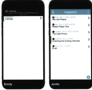
An example document used in demonstrations is a book club. Figure 3-2 shows an example of the document UI for the "Westside Book Club" prior to when we started work on the designer UI. A list is a collection of elements of a certain format. In the Westside Book Club document, there is a list of forms called "suggestions." Each form in suggestions has "title," "link," and "comments" fields. Forms are components that consist of fields to fill out. "Title" is a string atom, "link" is a link atom, and "comments" is a list of strings. Atoms are basic units of data. The document tree can be seen in Figure 3-1 and the traversal of the tree can be seen in Figure 3-3. In this document, users submit suggestions that consist of a book title and a link. Users can comment on book suggestions
Figure 3-2 also demonstrates the new notification UI when one user publishes changes to a collaborative document. Notifications are displayed as bars on the left side of each part. In Figure 3-2, the green bar represents a change in a part of the collaborative document. Since "suggestions" is a parent of the atom that was changed, there is a green bar on the left side of the tile for "suggestions." Figure 3-3 shows
Figure 3-2: Old document UI featuring interaction between Jodie's document and Jonathan's W& and Pe L;; I aW1 Crokr1 31, ft P~Cw re r
I
each page as the user navigates through the document.
3.1.1
List of Social Datatypes
"
Lists (Submissions and Messages)There are two types of lists with names "submissions" and "messages." Submis-sions and messages represent "conversations" where multiple users contribute in a structured way. They are lists of elements of the same type. Users may add entries into submissions or messages, and each entry of a submissions or messages is associated with a creation time and the user who created it. While messages do not request document subscribers to add in an entry, submissions remind users to add in an entry.
* Poll
"Polls" allow users to vote from several options. Polls are a special type of submission list that allows only one entry per user and aggregates all the entries into results of the poll. Polls allow users to vote on one of the options and also change their vote. Polls do not display voting results until a user has voted.
e Form
"Forms" are similar to physical forms and corrrespond to objects or records in standard programming languages. Fields are statically named, and each field may be any one of the components listed in this section. The fields in a form may be optional, possibly containing no value..
" Choice
A "choice" has the same functionality as a drop-down menu or a multiselect.
Users make a choice from a set of statically named fields. It is essentially a form that allows users to make a selection from the fields available and correspond to disjoint union types in functional programming languages.
" Atom
"Atoms" are basic units of data. There are many different types of atoms such as Numbers, Units (checked/unchecked), Strings, Links (URLs), and Booleans
(represented as yes/no). They can be writable or not writable.
As the name atom implies, atoms are indivisible. This means that that they cannot contain other components other than their basic unit of data. Thus, atoms are always the leaves of the Transcript document tree as they do not contain children. They are often contained in other components - there can be messages with string atoms as entries, a form with number fields, etc.
3.2
Document UI Contributions
When initially designing the document UI, the Chorus designer was largely untouched
- users were expected to create a document through a typed language. Thus, creating a document UI made Chorus similar to Hypercard in that it involved a simplified programming language and took away the need to design the UI from the user.
3.2.1
Displaying Tree Structured Documents
The first challenge we were faced with was how to convert navigating a tree structure into navigating a mobile UI. The most logical decision was to render each group of parent and children (two layers of the tree) as a page of the application. The parent would be the container of the page and display a summary of its contents, the children, of the parent. Clicking on a child summary when on the parent page would navigate to another page, using a horizontal scrolling animation, in which the child would be the container of the new page and a summary of its contents would be shown. We decided that each page should display summaries of the children instead of the children themselves because a child that is a parent of a subtree would too many layers and content on one page. Doing this preserved context as the parent and children would be rendered on the same page. Additionally, it allowed for navigation down the tree. A back button was used to navigate back up to the previous layer of the tree. Since atoms act as leaves of the document tree, atoms cannot be clicked to move down a layer. This design, shown in Figure 3-3, largely satisfied our needs, and it was slightly modified later to accommodate problems creating the designer UI brought up. These modifications are elaborated on in "Embedding and Breadcrumbs."
3.2.2
Displaying Social datatypes
In designing our navigation, we decided that each social datatype, apart from atoms, would have displays as both a container and a summary. This is because in the document tree, all components aside from atoms can have children. Thus, we had to design the displays for the datatypes as both containers and as summaries. Each datatype has two main pieces of information to display - its label and its content.
When a component is the container of the page, its content is already displayed, so we opted to make the label of the component into the header for the page. This helps provide context for the location inside the document. We expected each container to contain multiple child summaries, so we wanted component summaries to maintain a
Figure 3-3: The displayed document UI as the document tree is traversed.
1 wnk CMeU
Suitosl"
Got)
I
til ink wUUMMU
(OuiT
a;d Peace Vw LinIle Prnce01
Te LU Prin Ptpjjwww amazon conV1JtI-rancs-Aam 1 antry 3 (swriag (suing) (suing 282
0
1S 1 *-heft Vn-sense of conformity with each other but still remain separable. To maintain separation between component summaries, each part is bordered and represented as a tile in the UI. To maintain uniformity, each tile displays the component label and a summary of its contents. The summaries of content are different for each social datatype and serve to pinpoint the important data of each. For example, in Figure 3-3-1, on the suggestions page, the heading of the page is "suggestions" and the users can see the contents of the first field in each form, the children of "suggestions," in the tiles.
3.2.3
Embedding Lists
As we created different Chorus applications, we noticed that many documents had a lot of levels in the document tree, making it hard to navigate. A lot of the problems seemed to be centered around list components. Viewing a list entry would often require a user to navigate through three separate levels - the container of the list, the list, and then finally the entry itself. After considering several of the applications of a list structure, we realized that in most cases, showing summaries of the list entries inside the container of the list offered no setbacks and made it easier to navigate and view the desired information. Thus, we decided to collapse list structures. When a list is contained in a form, summaries of the list entries are viewable in the form. Instead of going through three levels to view list entries, users now only have to go through two levels, condensing the height of the document tree and making it easier to navigate.
Chapter 4
Chorus Designer
For the designer UI, we were tasked with even more problems to solve. We had to explore where we wanted the designer feature to be accessible from - trying out both a desktop application and as built into the mobile application. We also wanted to make a UI that was distinguishable from the normal document UI, but familiar enough so that document users do not have a large barrier of entry. Lastly, designing the UI also came with the task of gluing together the disjoint options users had in changing both the cosmetics and structure of the document.
Defining the requirements for the designer UI took many meetings and iterations. After showcasing our UI at workshop demos or presentations, we were able to receive helpful feedback on usability, which in turn affected our ideas for what we expected our application to be. Initially, we were focused on the idea of simplifying programming with a simple language, but decided to shift the focus to the user experience. For example, the designer portion of the application was just a text editor on the side and has now evolved into a WYSIWYG editor. The next two sections describe the actions that that can be taken in the designer and the contributions we made chronologically.
4.1
Designer Parts
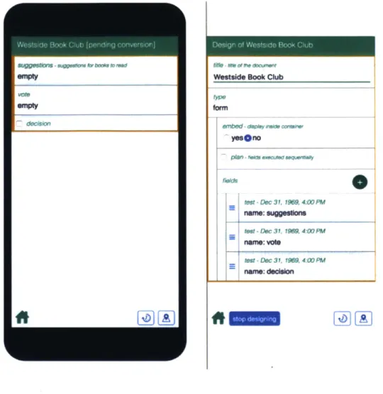
The API for the designer is implemented so that an API call generates a "design doc-ument" and "converted docdoc-ument" from the backend representation of a collaborative
Figure 4-1: The initial converted document (left) and metamodel designer (right)
fin e - - me au or 0*
Wetaside Book Club
form embed - y aumkw ywsono test -Dec 31. 1969. 4.00 PR name: suggesors tIMt -Dec 31. 19M 4. PM name: vote teSt -Dec 31. 198 4:0 PM name: dedalon
document. From there, the design document has an additional set of API calls that allows users to perform various actions that affect the display and structure of the collaborative document. The converted document is the updated collaborative docu-ment - all the structural and display changes are present in the converted document before the changes are published by the user. When changes made using the design document API are saved, the converted document become the new collaborative doc-ument. Figure 4-1 is an example of the old metamodel designer where the pane on the right side is a visual representation of the design document and the phone on the left side displays the converted document. Interactions with the fields in the design document alter the displayed converted document on the left side. For example, using the drag handles on the left side of the tiles in "fields" to reorder the items in the list
will reorder the corresponding tiles in the converted document.
The designer API allows changes to be made to both the structure of the document as well as the display. The following section lists the changes the design document supports.
4.1.1
List of Designer Actions
* Adding a Field
New fields may be added to form, choice, and poll components as they can contain multiple children of a different type. Attempting to insert a new field into any other component will not work. The root of the document tree is always a form.
* Removing a Part
Any component may be removed from the document. Removing a parent of a subtree will also remove all nodes of the subtree. In the case where list components, like submissions or messages, are a parent of a subtree, removing a field from the subtree removes the field from all the entries inside the list component.
* Moving a Part
Any component can be moved down a level of the tree with two methods. A component may be wrapped in a form, in which case the component becomes a field in a form. A component may also be wrapped in a list, in which case entries in the list will be of the component.
* Renaming a Part
Each component consists of a title and stores data. For components other than the entries of lists, the title may be changed.
The type of a component may be changed to compatible types, i.e. from a messages to submissions or from one atom to another.
e New Page
Each page in the Chorus document can display multiple layers of the document tree, a design decision explained in the Contributions Chapter. By default, each page in the Chorus document corresponds to two layers of the document tree structure. Each page displays the parent and summaries of all its children. Users have the option to choose whether the children's children are also displayed together, in which case each the children's children's summaries are displayed. Since atoms do not contain any children, atoms are always displayed on the same page as their parent.
* Required
Making a field required lets the document know to put an error state on the field if the field is empty.
4.2
Designer UI Contributions
After creating a working UI for the document, we decided to move on from creating a document with a typed language to creating one with an application. Figure 4-2 is a screenshot from our designer before transitioning away from a programming language. The pane on the right contains code that describes the documents displayed on the left side. We explored multiple ideas for how the designer could be implemented, from a separate "metadocument" to embedding the "metadocument" and finally moving to a WYSIWYG model for the designer. Along the way, we made several changes to the document UI as well to better cater to the needs of the designer.
4.2.1
Metamodel Designer
We played around with the idea of using a "metadocument" for the design, which will also be referred to as a "design document." The design document would be rendered
Figure 4-2: Old designer with code editor.
Westside Book Club Ui17
suggestions: dialog {
title: string,
link: link,
3W*M >e 3em** > Comments:
3 > m4 c ts:@all, notask>
dialog(string)
vote: poll(oneof suggestions)
side by side with the collaborative document to help give context to the part being de-signed. With this approach, we intended the designer to be a collaborative document itself. Each component in the collaborative document being designed is associated with multiple, hardcoded components in the design document. For example, a form in the collaborative document may be associated with a choice for its type (allowing the user to change it from a form to another component), a list of forms for its fields (adding an entry into a list adds a new field to the form, and will also allow the user to change the type for the field), and so on. The design document is a metamodel of a collaborative document as it contains data and a hard-coded structure based on the collaborative document that is currently being designed. Changes to data in the design document change the design of the collaborative document. This is shown in Figure 4-1.
Since the design document is a hardcoded collaborative document, no extra code is needed to render it. The added benefit of this approach is there are no additional affordances needed to make this easy-to-use for the user because the designer shares a UI with the collaborative document. However, since each component of the col-laborative document is associated with multiple components in the metamodel of the document, this multiplicatively increases the layers of the tree, making it harder
Table 4.1: Metamodel vs. WYSIWYG
Pros/Cons Meta-model WYSIWYG
No New Affordances yes no
Familiarity from Previous Applications no yes
Less UI Code yes no
for users to navigate. There also exists a disconnect in how actions in the design document affect the collaborative document because the changes do not occur in the same space. Unfortunately, after prototyping the metamodel designer, we realized the negatives of its complexity outweighed the benefits of UI familiarity.
4.2.2
Embedding and Breadcrumbs
The design of each component in the document is represented as many multiple nested components in the document's metamodel. Only two levels of the tree are shown in our document display, which led to many usability problems. There were many levels to drill down to, making it easy to get lost inside the document. Additionally, the multiple components in the document's metamodel that correspond to the design of one component are on separate pages, making it impossible to design all parts of the component at once.
To fix this problem, we came up with the idea of embedding. Instead of each page only showing the parent and its children, each component has an embed option.
If a component is embedded, then its contents are shown on the same page as its
parent. This allows many levels of the tree be shown at once and the option of showing multiple levels of one subtree under a node and only one level of another. Only non-embedded components will be the parent in a page.
To give more navigational context and allowing users to traverse back more than one level of the tree at once, we implemented vertical breadcrumbs. These manifest as titles of cards stacked on top of each other - clicking one of the titles brings the user back to the page with the title. This replaced the horizontal sliding animation we had earlier. To prevent the breadcrumbs from taking up too much vertical space, the maximum number of breadcrumbs that can be shown is four. Only non-embedded
Figure 4-3: A screenshot taken prior to the redesign in Section 4.5.2 that showcases embedding (on the right hand pane) and vertical breadcrumbs.
I @MY- W. adsaedla"d
NOW N
fWe
Wdasdwasdoepnea
ft
-a~LaiJCCCCMCCCCC Up ana &W I~ld a0ein a .m.ow"
components will show up in the breadcrumbs.
4.2.3
Designer Location
One of the biggest criticisms in usability we received from presenting the metamodel designer was that there was too big a disconnect between the component being de-signed and the designer itself. The disconnect was largely due to the document and designer being rendered in separate mobile-phone sized spaces. This led to us exper-imenting with a mobile designer embedded inside the document. We created several mockups, shown in Figure 4-4, and prototyped the two most promising ideas: a design panel on a new page and a design panel under the component being designed. After playing around with both options, we concluded that an embedded design panel felt the most natural. Since document design changes are not expected to be the bulk of the interactions in the Chorus application, we opted to add in a button that toggles the user between "design mode" and non-design mode instead of having designer op-tions always-on. Thus, to make design changes, users toggle the design button in the
document button bar and then go through the design panel. During this prototyping, the metamodel was largely simplified as users no longer needed navigate through the design document and several metamodel tiles were condensed into buttons. As we moved away from the metamodel designer, we no longer had to display very complex structures, allowing the document UI to evolve into a cleaner, more "document" look. Moreover, the integrated designer no longer required the whole vertical length of the phone screen, making the design panel feasible.
4.2.4
WYSIWYG
While integrating the designer into the document solved some usability problems, there was still room for improvement. For example, to modify the label of a compo-nent, users had to do so through an input in the design panel as opposed to directly modifying the label itself. To improve usability, we found options in the panel that could be translated to user interactions. Drag-and-drop actions were implemented and replaced buttons for moving components around and adding in new components. Component labels were changed to offer editing in place. The type of the component was also added as a smaller label to each component.
4.2.5
Redesign
Inspired by Notion's minimal UI and the desire to make the Chorus document more reminiscent of other collaborative workspaces like Google Documents, we decided to redesign the Chorus document to be more minimal and textual. Doing so brings more focus to the contents within the document.
4.2.6
Minimap
Due to the highly nested nature of Chorus documents, we wanted to create a way for users to easily traverse the document without having to go page by page. Thus, a Sublime Text Editor inspired minimap came to be. In the minimap, each component in the document is represented as a box that looks like a tile (Figure 4-6). Tiles in the
Figure 4-4: Mockups of potential designer locations and interactions done in Adobe Illustrator.
*A
m pern mwwum poewmauk
Ieb '~i -.ciatwk
W1 k I e Cu
649-o
Eoly - J3~k241PU
A --A- T2P
0-Smv food for tmoghf'
uswdp.
0
m
-o -aweinsa enemmmme ma~m mes -!jm
Figure 4-5: WYSIWYG designer. Left side shows in-place-editing of labels and right side shows drag-and-drop interaction to add in new fields.
Westside Book Club [preview] b ilaonsl
2 entries -War and Peace, Ready
Mayer One
I
^ aA
e
Westsade Book Club preview)
Aex -Jul S, 2:42 PM *
t itle *
Ready Player One
new-field link + noaao https;Iwww.google.comlarch?q-Re 0 comments + * a @ A
minimap are colored gray when they are not in display on the current page. Embedded components in the minimap are shown by indenting the tiles. When clicking on a box in the minimap, the user is taken to the component that is represented by the box. This feature is especially useful in conjunction with component states - component states show up in the minimap as colored bars by the boxes. For example, a newly edited component will have a blue bar next to it on the minimap. This means that a user can quickly find and navigate through the document to the newly edited component through the minimap by seeking out colored tiles on the minimap.
Figure 4-6: The minimap on the right side consolidates notifications on states and helps navigation
Wostside Meek Club
suggestions
4 entries -War and Peace, Ready Player One,...
vote n decision
Chapter 5
Implementation
Our technical approach to Chorus consisted of multiple decisions. We decided to implement our desktop application as a single page Electron application in order to rerender the display of content easily. The rerendering of the UI happens with changes to the document structure. When a user interacts with the Chorus document or de-signer, the user will changes the document state or the design document state, which alters the structure of the collaborative document. The UI needs to rerender the changed data in the design document and the changed structure of the collaborative document. Thus, in order to rerender the display of the content easily, we wanted the
UI framework to automatically manage all the Document Object Model (DOM)
up-dates when the underlying data changes. Single page applications load a single HTML page and do not require constant reloading of the page or communication with the server, making the application more responsive. An additional benefit of implement-ing the web application as a simplement-ingle page application is that the web application can be run offline for presentations during conferences and workshops.
The UI was built with React.js, a Javascript library for building user interfaces, as a layer on top of a collaborative document model. React best fits the structure of and the flow of data in the design document. As mentioned previously, the structure of the design and collaborative documents are based on statically typed trees. We considered routing based frameworks where the state of an application is represented
Figure 5-1: Data flow in our implementation of Chorus. Server unidirectional data flow Collaborative Document Action
React (Virtual DOM)
DOM
display on screen depends on the location of the user in the tree of the document and there are many possible trees, a routing based framework did not make sense conceptually as each document tree would have its own unique set of URLs.
Additionally, the flow of data from the user's design document to the structure of the collaborative document stored on the server and then to the client's copy of the collaborative document to the DOM closely mimics a unidirectional data flow. This mimics the Flux application architecture, which eschews MVC in favor of a unidirectional data flow (Figure 5-1). Flux application architecture and unidirectional data flow complement React's declarative style and makes it easier to track changes [4]. Our model closely follows this pattern, solidifying our choice in React.
Choosing to use React also has additional benefits. Its automatic UI rerendering is very useful for displaying the underlying document as there is no extra processing needed to be done on our end. React is essentially a virtual DOM and is faster than other Javascript frameworks. When the underlying data changes, it efficiently recalculates the differences in the DOM to avoid rerendering every node, making it faster at rerendering applications than other frameworks [10]. We also plan to eventually port our application to the mobile platform. React Native, which allows developers to write native mobile application with React, will greatly help simplify
Table 5.1: React vs Other Routing Based JS Frameworks vs Multi Page Applications
Requirements React Other Frameworks Multi Page App
No Server Required yes yes no
Good Offline Capability yes yes no
Less Dependence on Document Structure yes no yes
Unidirectional Data Flow yes no no
Easily Port to Mobile Application yes no no
this process. A summary of the pros and cons are listed in Table 5.1. The next two sections describe interesting React implementations.
5.1
Page Transitions
Prior to reorganizing the layout of the document into vertical breadcrumbs, opening a new page in the document would result in a horizontal sliding animation from the old page to the new page. The horizontal sliding animation was added to make the prototype more realistic for demos and presentations. Though it sounds simple, the sliding animation required a few workarounds because we were rerendering pages with React. When a user clicks to open a new page, the backend puts forth the data of the new page and the data of the previous page is lost. There is no way for React to render the previous page for the transition as there is no data from the previous page to render. To combat this, on a page transition before the render of the new data, we translate the React components currently on the page to the HyperText Markup Language (HTML) tags viewable on the Document Object Model (DOM) and save the translated React components. Thus, when simulating the sliding movement, we can render both the previous page, by inserting the saved HTML components, and the new page, with React.
5.2
Captive Browser
One of the features of the Chorus document is a captive browser. Clicking a link component opens up a browser within the application. Initially, to simulate this for
Figure 5-2: Captive browser in the redesigned (Section 4.2.5) document UI
https:ltwwwgogle.cam/sarci /X Google War and Peace X
f
*!Ji Priew*sE
4.1)5- Goodreads
Wa d Peas Is a nose by the Aul
&AIhor Leo Tob , w Adi Is ngsed a
Pcvr,aeE, al Pof ld Etwelsu ea na I
Tbliop Suet Wery actlevmerfta
Onqnally p.b hed: ISM
demos and presentations, we created a React iframe component and turned browser web security off in order to load contents from foreign pages. However, turning off web security is not optimal so we looked toward other solutions. We turned to Electron, a framework that allows desktop applications to be made using HTML and Javascript. Not only did Electron let us make Chorus a standalone application, but it also has a built in webview tag, which embeds guest content. Unlike an iframe, webviews run asynchronously from the app that embeds it, nullifying the security issues that iframes have. The captive browser in Chorus is made up of a React webview component and an input. Navigating to a site updates the input box with the URL of the site. Changing the contents in the input and pressing enter also points the webview to the URL entered.
Chapter 6
Results
6.1
User Testing Setup
To assess the learnability and user experience of the collaborative document UI and the designer UI, we performed two sets of user testing using the thinking aloud pro-tocol (n = 1 for the collaborative document and n = 3 for designer). The thinking aloud protocol is a usability method that gives test subjects a set of representative tasks to perform and asks them to voice out loud what is going on inside their head as they perform them. It is a commonly used study that is useful for pinpointing mis-conceptions in the UI that potential users have. The protocol is also known for being robust, so mistakes in conducting the user tests do not greatly impact the validity of the results.
The thinking aloud protocol was chosen for how well it fit our goals from the user test as well as for its cost efficiency. Our goals for user testing the Uls for the collaborative document and the designer were to get a robust sense of large missteps in both designer and document Uls and general areas to improve. As such, the downsides of a thinking aloud study were not a impactful. In the next sections of the chapter, we summarize the conclusions drawn from each user test. The script for both user tests can be found in the Appendix One.
From both of our document user test and designer user tests, we learned that the conceptual idea of Chorus was easy for users to pick up. At the end of each test, all
the subjects could answer the conceptual questions correctly. We also learned that most of the UI problems were discoverability related. Subjects were clicking around the UI a lot, but still had trouble realizing that something could be clicked or that other actions, like dragging, could also be performed.
6.2
Document User Test
A user test on the Chorus document UI was performed to address severe problem
areas in the UI before moving to testing the designer UI. The subject was asked to perform tasks that assessed the learnability of the various buttons in the UI, modifying document contents, and the navigation in the document.
6.2.1
Document Test Subject One
A thinking aloud study was done on a female, nonprogrammer by a neutral third
party. Throughout the study, the neutral third party asked the participant to perform certain tasks in the Chorus application, and in between tasks, asked general questions to assess the participants understanding of the user interface.
From watching the participant interact with the product, we were able to make several observations about the problem areas in the user interface.
The structural representation of the model was unclear. The participant had trouble navigating between pages. They discovered the minimap, but were unable to connect the boxes in the minimap to tiles in the UI. There might have been too many boxes in the minimap to understand the relation between the two. Additionally, there was some confusion in navigating between pages. It was unclear at first on how to open up a new page, and even more confusing in how to navigate back up the document. To alleviate this, we added an upward pointing caret icon in the breadcrumbs to make it more obvious that they can be clicked to navigate through the document. For designer testing, we disabled the minimap and timeline features as they are advanced user features that are meant to be enabled through an additional menu.
We also found the colors were not helpful indicators of the status of the document. The participant did not really pay attention to them during the tasks. After the study was finished, the user did not notice the correct meaning behind any of the colors. The colored bars need to be more obvious, and there might be too many colors for users to understand. This can be ameliorated in the future by some sort of onboarding process - it was not changed for the designer UI testing as it was irrelevant to the tasks we asked the users to perform.
Some icons were not obvious enough in their meaning. The buttons were somewhat unclear in their meaning. Reusing the checkmark icon for multiple purposes resulted in the participant not understanding the "commit" button. The minimap and timeline buttons were changed to be hidden as they are more complicated user interactions that offer additional actions that may confuse non power users. To combat the confusion, the checkmark icon is explained in the onboarding screencast for the designer testing. The flow of interactions was hard to understand. The autofill for the link caused a little bit of confusion at first. Additionally, the "multi action then commit" model was also a little confusing for the participant - the reason is more likely because of the icon confusion though. The interactions may be improved if the color usage were better. However, this was not addressed for the designer testing.
6.3
Designer User Test
In the designer user tests, users were given a brief introduction video to watch, which explains how to create a simple document that consists of a list of forms. Users were then asked to perform a set of representative tasks: adding in a new field, changing component type, moving components, and changing options. With each test iteration, we were able to make improvements to the UI that decreased the time required to complete the set of tasks. While task completion time is affected by how much attention subjects paid to the introduction video, nevertheless, the continued improvement on task completion time and conceptual understanding through each iteration show that our changes were successful. Since each test subject was able to