A 3-Dimensional Tangible Mapping and Data
Visualization Interface for MIT Campus
by
Dishaan Ahuja
S.B., Massachusetts Institute of Technology (2015)
Submitted to the Department of Electrical Engineering and Computer
Science
in partial fulfillment of the requirements for the degree of
Master of Engineering in Computer Science and Engineering
at the
MASSACHUSETTS INSTITUTE OF TECHNOLOGY
June 2016
c
○
Massachusetts Institute of Technology 2016. All rights reserved.
Author . . . .
Department of Electrical Engineering and Computer Science
May 20, 2016
Certified by. . . .
Federico Casalegno
Associate Professor of the Practice - Thesis Supervisor
May 20, 2016
Accepted by . . . .
Christopher J. Terman
Chairman, Department Committee on Graduate Theses
A 3-Dimensional Tangible Mapping and Data Visualization
Interface for MIT Campus
by
Dishaan Ahuja
Submitted to the Department of Electrical Engineering and Computer Science on May 20, 2016, in partial fulfillment of the
requirements for the degree of
Master of Engineering in Computer Science and Engineering
Abstract
In this thesis, I describe the design and development of a tangible mapping, discovery and data visualization interface for MIT’s campus. The interface is intended for eventual placement in MIT’s Atlas Center - a reinvented and consolidated service center for employees, students, and visitors that is due to open in 2017. The interface consists of a large touchscreen placed flat on a table, with translucent and touch-sensitive 3D-printed MIT buildings laid out on top of the touchscreen. Users can interact with the interface by touching or long-pressing the buildings, or by interacting directly with the data presented on the touchscreen. Users are able to view a large amount of location-based information about MIT campus, including upcoming events, shuttle times, directions for indoor and outdoor navigation on campus, and various live social feeds, ranging from Twitter to the beloved free-food mailing list. Users can also send much of this information to their mobile device by scanning a QR code. The main contribution of this research is a tangible, extensible and aesthetically pleasing map of MIT’s campus, which will be used for data visualization and discovery by the employees and visitors of MIT’s Atlas Center.
Thesis Supervisor: Federico Casalegno Title: Associate Professor of the Practice
Acknowledgments
Several people made significant contributions to the successful design and develop-ment of the interface described in this thesis.
I would like to thank Tiffany Lu, Research Assistant at the Mobile Experience Lab, for her collaboration in the ideation, design, testing, and coding phases, particularly the front-end implementation.
I would also like to thank Ananya Mukherjee, a designer at the Mobile Experience Lab, for her contributions to the aesthetic appearance and overall design and structure of the interface.
I would like to thank Guillermo Bernal, former researcher at the Mobile Experience Lab, for his advice, instruction, and help in the 3D modeling and fabrication portions of the project. Additionally, I would like to thank Will Walker at Formlabs for his help 3D printing buildings according to our needs, while we waited for the Mobile Experience Lab Formlabs printer to be delivered.
I would like to thank Oliver Thomas at the MIT Information Services and Technol-ogy Department for his help in identifying possible APIs, data sources, and existing MIT building models, as well as for providing feature advice and technical help with various aspects of the software.
Finally, I would like to thank Professor Federico Casalegno for the opportunity to work on the project, as well as for his direction and feedback throughout the development process.
Contents
1 Introduction 13
1.1 Background . . . 13
1.2 Motivations for Development of Interface . . . 14
1.3 User Scenarios . . . 15 1.4 Related Work . . . 16 1.4.1 Changing Places . . . 16 1.4.2 LuminoCity . . . 17 1.4.3 PERCH Horizontal . . . 17 2 Description of Features 19 2.1 Interactive Mode . . . 19 2.2 Ambient Mode . . . 24 3 Description of System 27 3.1 Touchscreen . . . 27 3.2 Buildings . . . 28
3.2.1 Making Solid Models . . . 29
3.2.2 Making Holes for Conductive Inserts . . . 31
3.2.3 Mesh Conversion and Export . . . 33
3.2.4 3D Printing . . . 33
3.2.5 Building Choice . . . 36
3.3 Web Application . . . 36
3.3.2 Server . . . 39 3.3.3 Front-End . . . 40 4 Future Work 43 4.1 Software . . . 43 4.2 Hardware . . . 44 5 Contributions 45 Bibliography 46
List of Figures
2-1 Sample cards displaying available information for Building 10 . . . 20
2-2 Browsing events and sending event details to a smartphone . . . 20
2-3 Browsing shuttle times and viewing details on a smartphone . . . 21
2-4 Browsing headlines and reading articles on a smartphone . . . 21
2-5 Directions from Atlas Center to Building 10 . . . 22
2-6 Dashboard buttons . . . 22
2-7 Dashboard (bottom of screen) with free food toggled on . . . 23
2-8 Users can tap on an icon to display details . . . 23
2-9 Real-time shuttle location display and update . . . 25
2-10 Example visualization of campus Wi-Fi activity . . . 25
3-1 SketchUp model of MIT Building 10 . . . 28
3-2 Unprintable handrail for stairs is thickened for printing . . . 29
3-3 Surfaces are added to make the building base coplanar for capping . . 30
3-4 Solid model created by capping a hollow building; red surface forms cap 30 3-5 Solid model of Building 5 without holes for inserts . . . 31
3-6 Solid model of Building 5 with holes for inserts . . . 32
3-7 Model of Building 5 insert . . . 32
3-8 Early printed prototype of Building 5 . . . 33
3-9 Final 3D printed version of Building 7 . . . 34
3-10 Building 7 lit up upon selection by user . . . 35
3-12 OpenStreetMap walkways example, editor allows addition and modifi-cation of paths . . . 38
Chapter 1
Introduction
In this chapter, I discuss the background of the Atlas Center project and the mo-tivation behind the development and inclusion of a 3D tangible mapping and data visualization interface in the Atlas Center. I also include a survey of related work that inspired various elements of the interface.
In Chapter 2, I describe in detail each of the features included in the interface. In Chapter 3, I describe the design of the overall system, including choice of touchscreen, 3D modeling of MIT buildings, and development of a web application composed of a server that queries a set of APIs, and a front-end that responds to user interaction. In Chapter 4, I discuss future work in terms of feature additions and also fabrication and hardware work necessary to deploy the interface in the Atlas Center. Finally, I conclude in Chapter 5 by summarizing the contributions of this research.
1.1 Background
MIT is known across the world as an Institute that fosters innovation and embraces modernity. This diverse Institute welcomes over two thousand newcomers every year, from students to researchers to administrative staff. These new members of the MIT community have a range of different tasks to undertake to orient themselves to their new school or workplace. These can include learning routes around campus, submitting forms, and getting parking or transportation passes. Currently, MIT has
a service center to service some of these needs, with other auxiliary offices to handle others. There is an existing effort to integrate these various services into a modern service center, which will be called ‘The Atlas Center’. The vision of the project is to create a modern space for students, employees, and visitors to accomplish their tasks efficiently and enjoyably, while also showcasing MIT’s campus, culture, and community [1].
A large part of the effort to modernize the service center centers on the technology used. The goal of technology integration in the Atlas Center is not only to allow users to accomplish their tasks conveniently, but to also create an enjoyable and informative experience. One of the key pieces of technology planned for the space, and developed during the course of this research, is an interactive tabletop 3D map of the MIT campus. This device aims to allow visitors to the Atlas Center to perform various specific functions, as well as visualize MIT’s campus, events, academics, and community in a user-friendly and fun way.
1.2 Motivations for Development of Interface
The current MIT service center mainly offers four services: ID card services, parking and transportation services, I9 services, and TechCash related services. The new Atlas Center is planned to have over nineteen services, which would make it a one-stop shop for MIT students, employees, and affiliates [1]. These visitors may use the tangible map as a means to obtain information about campus, events, transportation and so on. They may also use the tangible map as a means of entertainment while waiting, or after accomplishing their tasks. The motivation behind the development of the device is to meet these user needs, thus contributing to the larger goal of the Atlas Center being a modern and enjoyable space that helps its users accomplish their tasks efficiently while connecting them to their larger community.
The interface includes tangible elements because both preliminary user tests and literature in the field of human-computer interaction have found that users can more effectively manipulate and visualize data using a tangible interface than a traditional
GUI.
Users involved in testing early prototypes of the interface repeatedly indicated that the merger of the tangible aspects of the interface (the 3D buildings) and the visualization of data on a touchscreen below the tangible elements worked best to get their desired tasks accomplished. Prototypes that involved largely a regular GUI, or featured a separation between the tangible aspects and the visualizations were not very well-rated in comparison. Users felt it was easier to visualize data such as directions between buildings given the presence of 3D buildings.
A review of human-computer interaction literature confirms the conclusions from in-house user studies. For example, Jacob et al of the Tangible Media Group at the MIT Media Laboratory found that humans perform much better in the task of organizing, grouping, manipulating, and visualizing information when using a tangible interface, versus when using sticky notes or a regular non-tangible graphical user interface [2]. Similar projects and products have also been developed with significant success. These are discussed in Section 1.4.
1.3 User Scenarios
The main users of the service center will be students, faculty/staff, new hires, and MIT affiliates (visiting students and researchers, conference participants, and so on). Based on the profiles of the users visiting the service center, various scenarios were developed in an attempt to enumerate the various use cases of this tangible map. These are:
1. A student/employee/visitor wants to locate or route himself to a classroom.
2. A student/employee/visitor wants to become familiar with MIT buildings and routes.
3. A student/employee/visitor wants to explore various events on MIT campus currently ongoing or planned for the future.
4. A student/employee/visitor wants to locate accessible entrances, routes, and facilities.
5. A student/employee/visitor wants to go on a campus tour, or wants to take visiting friends on a campus tour.
6. A student/employee/visitor wants to locate various different food options, from dining halls to innovative and new restaurants around campus.
7. A student/employee/visitor wants to explore research labs and displays featured in the news.
These scenarios are not a comprehensive list of features of the interface, but rather represent a first draft of the user needs. The interface as developed includes several additional features, and is also modular so that new features and visualizations can be added without significant technical effort. These features are described in detail in Chapter 2.
1.4 Related Work
Various other tangible interfaces that currently exist were studied in order to draw inspiration for the tangible map, and their advantages and disadvantages were ana-lyzed.
1.4.1 Changing Places
One such tangible interface was developed by the ‘Changing Places’ group at the MIT Media Lab. The interface consists of “‘LEGO-tized,’ 3-dimensional representations of existing urban areas," which users can physically configure [3]. Various real-time data visualizations are displayed via projection mapping onto this physical interface as users perform these changes and reconfigurations. Visualized data can include traffic, walkability, lighting, and so on. This interface has the advantage of being very modular - allowing for easy change, moving, and modification. As the MIT campus
scales up and adds new buildings, similar modularity will be useful for a tangible map developed for the MIT campus. However, the layered projection mapping technology used for the visualizations seems to show best results in a darker room, which means it is not the best choice for a tangible map that will be used in the Atlas Center, which will be a light-filled space.
1.4.2 LuminoCity
Another similar interface, called LuminoCity, was developed by Zachary J. Weber and Vijay Gadepally at MIT Lincoln Laboratory [4]. This is a 3D printed model of the MIT campus, with a touchscreen input below the buildings. Users interact with the model using the touchscreen to visualize various data from Twitter geotagged at the MIT campus. The visualization is then displayed over the 3D model using projection. The tangible map for the Atlas Center is similarly manufactured using 3D printing using various building models and data supplied by the Facilities department. This allows for easy addition of new buildings, as well as easy replacement of any buildings as needed. Once again, projection is not used for data visualization in the interface developed during this research, as tests confirmed that this does not work as desired in a brightly lit environment such as the new Atlas Center.
1.4.3 PERCH Horizontal
A final significant source of inspiration was the product ‘PERCH Horizontal’, a device meant for product displays that projects media onto a white table, and can sense interactions with objects placed on the table [5]. The important take-away from this product is the combination of the interactivity with the display - users do not have to switch between a screen and a tangible model. This allows for more seamless interaction, as the results of user input are available immediately without looking somewhere else. This principle guided the development of the final interface described in the following sections.
Chapter 2
Description of Features
This chapter provides a review of the interactions and data visualizations that the in-terface currently supports. Users interact with the inin-terface by tapping on a building or on the touchscreen, and the desired information is displayed next to the relevant building. After some period of inactivity, the interface switches to “ambient mode," which is essentially a slideshow of a selection of available information (such as up-coming events, current shuttle bus locations, and recently posted free food).
2.1 Interactive Mode
The simplest available interaction to the user is tapping on a building. This selects the building, and brings up the following information about the building:
∙ The building number, name and school or department associated with the build-ing
∙ Nearest shuttle stop to the building, along with predictions for shuttles headed to that stop
∙ Upcoming events in the building, if any
∙ News articles and recent research associated with the building/department ∙ Important people associated with the building, along with a short bio
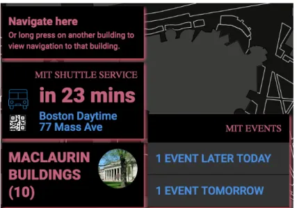
Figure 2-1: Sample cards displaying available information for Building 10
At this point, users can browse available events, and upon finding an event of interest, add it to their personal calendar by scanning the QR code shown upon tapping on the event using a smartphone. Users can similarly navigate to shuttle prediction data on their phone by scanning the provided QR code. Since the interface is not designed for reading long articles, users are only able to see news headlines and short summaries on the touchscreen, but they can scan the associated QR code to pull up the desired article on their smartphones. Example cards for events, shuttles, and news are pictured in the following figures.
(a) Expanded list of events (b) QR Code for an event
(a) Shuttle information card (b) QR Code for shuttle information
Figure 2-3: Browsing shuttle times and viewing details on a smartphone
(a) Card showing news headlines (b) QR Code for news article
Figure 2-4: Browsing headlines and reading articles on a smartphone
Users also have several options for navigating between buildings. Users can long-press a building while no other building is selected to query for directions from the Atlas Center (the default start location since this is where the interface will be placed). Users can tap on a building to select it, then long-press another building to get directions between the two buildings. Users can also select a building and tap on the ‘Navigate’ button that appears alongside the building information in order to get
directions from the Atlas Center to that building. The directions provided represent the shortest path between buildings, including indoor walkways, outdoor footpaths, and roads. The directions are drawn on the touchscreen as a thick blue line between the start and end point. Since the buildings are translucent, this has the effect of lighting up blue the buildings that the shortest path goes through. Example directions from the Atlas Center to Building 10 are pictured below.
Figure 2-5: Directions from Atlas Center to Building 10
Additionally, there is a dashboard permanently present on the screen consisting of four toggle buttons, as pictured in Figure 2-6. Tapping on the associated toggle button shows or hides icons corresponding to art pieces and installations, bike racks, restrooms, and recently posted free food. Users can tap on an icon for more details. For instance, tapping on an icon corresponding to art brings up information about the name of the piece and the artist. Free food icons vary by the type of food available, and tapping on these brings up information about the exact location and text of the free-food email the information was scraped from.
Figure 2-7: Dashboard (bottom of screen) with free food toggled on
2.2 Ambient Mode
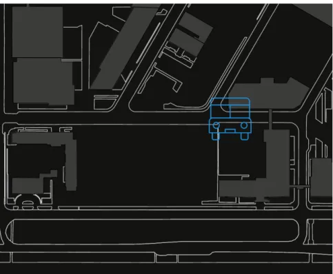
After a period of inactivity, the interface automatically begins to display randomly selected information on the screen, in order to encourage discovery and exploration of the interface and MIT campus by users who are simply waiting in the vicinity and may not be looking for specific information. First, a selection of up to six random upcoming events are shown next to the appropriate buildings on the map. Next, recent free food is displayed, similarly to if a user had tapped on the dashboard toggle button. After this, the current locations of all running shuttle buses on campus are shown. Next, one type of data visualization is shown. Currently available visualizations include wi-fi activity on campus and footpath trafwi-fic at different times of day. Different types of visualizations can be added with minimal technical modification - the visualizations can be designed using a language such as Processing, and can be easily displayed over the map using a standard canvas element. This cycle loops indefinitely until a user either taps the map background, a building, or any of the icons displayed during ambient mode. Tapping a displayed icon brings up the same information as it would in interactive mode. The following pictures contain examples of real-time shuttle location display and Wi-Fi activity visualization.
In addition to the ambient mode slideshow feature, there is a permanently present auto-scrolling Twitter feed at the top right of the screen consisting of various tweets and pictures from MIT-associated accounts.
Figure 2-9: Real-time shuttle location display and update
Chapter 3
Description of System
The interface consists of various components. A map outline of MIT’s campus is displayed on a large, table-top touchscreen. Translucent 3D printed buildings are placed at appropriate locations on the touchscreen. The buildings have conductive inserts (also 3D printed), allowing users to interact with the interface by tapping or long-pressing a building - this is registered as a tap or long-press on the touchscreen. The translucence of the building allows for a highlighted, lit-up effect when a building is selected (achieved by changing the pixels under the building to a white color).
The software component of the interface is a web application. It consists of a server which is responsible for aggregating, processing, and storing data from various APIs and data sources, as well as a front-end which is responsible for responding to user interaction by querying and displaying the desired information. There is a mobile component to this interface as well; users can scan QR codes displayed next to select information in order to send the information to their smartphones or tablets. Each of these components is described in detail in this chapter.
3.1 Touchscreen
Various sizes of touchscreens were considered. The final selection was a 55-inch multi-touch display from 3M (model number C5567PW). This is a multi-touchscreen that uses capacitive technology for touch detection, as opposed to infrared technology. This is
important since the latter would register a touch whenever a building is placed on the screen. The desired behavior is for the screen to register a touch only upon the user tapping either the screen or a building placed on it. For this reason, a touchscreen that uses capacitive technology was used for this interface.
It is possible that the final screen used in the Atlas center will be larger, based on the architectural constraints present at the time.
3.2 Buildings
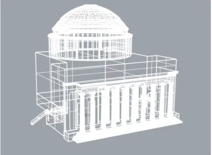
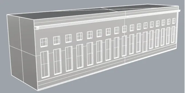
Models for all buildings on campus were provided by the MIT Department of Facili-ties in the form of SketchUp (.skp) files. An example of a SketchUp model is pictured in Figure 3-1 below. This was the starting point for all building modeling and mod-ifications performed. Several steps were involved in preparing these models for 3D printing. The models were first modified to be capped solids, as opposed to a hollow set of surfaces. Next, holes were bored into the models in order to accomodate the conductive inserts. The models were then exported as printable stereolithography (.stl) files. Rhino 5 software was used for all modeling.
3.2.1 Making Solid Models
The files provided by Facilities were not designed for 3D printing, but rather to serve as highly accurate models of the campus buildings. There are several problems with this.
First, there were several surfaces, such as handrails for stairs, that were too thin to be properly printed. These surfaces were thickened using the OffsetSrf and ExtrudeSrf tools in Rhino. An example surface before and after this operation is pictured in Figure 3-2 below.
(a) Stairs handrail before (b) Stairs handrail after
Figure 3-2: Unprintable handrail for stairs is thickened for printing
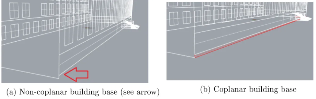
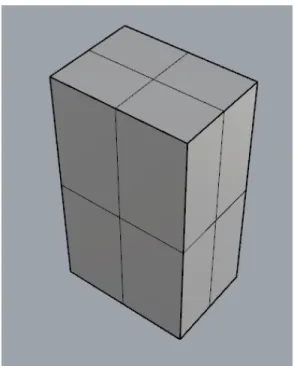
Second, many buildings had bottoms that were not coplanar. This is because in real-life, one side of the building may have a higher base than the other side due to small elevation changes. However, this is undesirable for the 3D printed buildings placed on a completely flat touchscreen. Depending on the specific building model, several strategies were used to mitigate this issue. The desired plane for the building bottom was found, and existing surfaces were either trimmed or supplemented by newly drawn surfaces to all end on the same plane. Some surfaces were also redrawn when necessary. An example building before and after this operation is pictured in Figure 3-3.
(a) Non-coplanar building base (see arrow) (b) Coplanar building base
Figure 3-3: Surfaces are added to make the building base coplanar for capping
Third, the building models as provided were hollow, while solid and watertight models are necessary for 3D printing. The bottoms of the buildings were capped either using the Cap command in Rhino, or by manually drawing surfaces corresponding to the bottoms of the buildings. The end result of this operation, pictured in Figure 3-4, is a solid model that is suitable for 3D printing.
3.2.2 Making Holes for Conductive Inserts
In order to make the buildings touch-sensitive, holes were bored into the building models using Rhino, and conductive inserts were developed and printed for these holes. The top of the insert slightly protrudes from the building, while the bottom touches the touchscreen. Touching the top of the insert registers as a touch on the touchscreen.
To bore holes into the buildings, the 2D shape of the hole was drawn on the roof of the buildings. This drawn surface was extruded (using ExtrudeSrf) and capped (using Cap), to create a solid object representing the chunk of the building to remove in order to create a hole. The hole was created using the Boolean2Objects command in Rhino. The solid insert model was saved separately for printing. The result of this operation is a building model with one or more holes in it where a conductive insert would be inserted, as well as a model of the conductive insert itself. An example result of a solid building without holes is pictured in Figure 3-5, and an example of the same building with holes is pictured in Figure 3-6. An example model of a conductive insert that fits the holes in Figure 3-6 is pictured in Figure 3-7.
Figure 3-6: Solid model of Building 5 with holes for inserts
3.2.3 Mesh Conversion and Export
The building model produced in the previous step consists of surfaces. Using the Mesh command in Rhino, a mesh was created from the collection of surfaces. Similarly, a mesh was created from the surfaces comprising the conductive insert. Both were exported as print-ready stereolithography (.stl) files.
3.2.4 3D Printing
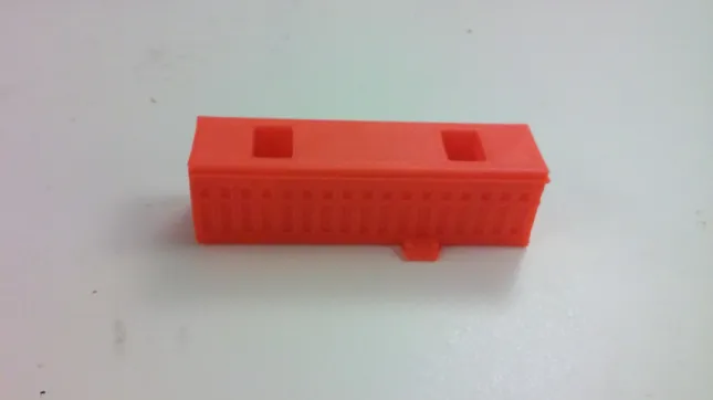
The buildings were first printed in-house using a Type A Machines Series 1 Pro printer, in order to prototype different scales and hole shapes/sizes. Cura software was used to read in the previously generated .stl models and convert these into instructions for the 3D printer in the form of a .gcode file. This type of file contains instructions for additive printing layer-by-layer, as well as settings such as temperature of the printer head and printer bed which were chosen based on the type of filament used. An early prototype is pictured in Figure 3-8 below.
Figure 3-8: Early printed prototype of Building 5
After repeated prototyping of each building, a configuration of building holes was found that allowed for convenient tapping and was aesthetically pleasing. A
reasonable scale for the buildings and the campus map was also decided at this point. In order to have the buildings be large enough for convenient user interaction, the edges of campus were truncated. This is because a 55-inch screen was used, and including the entire campus on a screen of that size would have resulted in each building/building footprint being too small for convenient user interaction. These remaining buildings can be added back with minimal effort, if it should turn out that the architecture of the Atlas center can accomodate a larger screen.
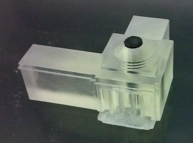
The final buildings used in the interface were printed using a Formlabs 2 printer, using Formlabs clear resin at a resolution of 50 microns. After sanding and applying clear-coat, these buildings are translucent enough to be “lit up" using the pixels underneath. Figure 3-9 below shows the final printed version of Building 7, and Figure 3-10 shows the building lit up as it is selected by a user.
Figure 3-10: Building 7 lit up upon selection by user
Due to natural expansion and contraction phenomenon, the conductive inserts were slightly adjusted in size in Rhino. The actual hole sizes for the printed buildings were determined using a caliper, and these were used to resize the conductive inserts. Once this was complete, the conductive inserts were printed using Proto-pasta Con-ductive PLA filament. An example conCon-ductive insert (before being inserted into a building) is pictured in Figure 3-11 below.
3.2.5 Building Choice
Only a selection of buildings have been 3D printed so far, corresponding to the central cluster on campus (including buildings 3, 4, 5, 7, 10, the student center, Kresge, and the chapel). Additional buildings can be printed and added as desired by following the process described in the preceeding sections.
3.3 Web Application
The interface is powered by a web application. Users interact with the front-end of the application by tapping or long-pressing the touchscreen, or any building on the touchscreen. The front-end makes a call to the server, which aggregates the informa-tion requested and returns it for display. In the background, the server periodically queries the different APIs and data sources, updating the database with information as necessary.
3.3.1 APIs and Data Sources
The vast majority of data used in the interface is retrieved automatically and periodi-cally from various APIs, some maintained by MIT. The server calls the APIs using the request module provided by npm, and processes the JSON response appropriately for saving in the database.
Events: The MIT Calendars API is used as a source for upcoming events on cam-pus [6]. The events are specifically retrieved from the calendar named events_calendar. The JSON response includes information about all events on or before May 4, 2016. For each event, information provided includes unique ID, type, organizer(s), ticket information, start and end times, description, and any other information included by the individual who posted the event to MIT’s Events Calendar.
Shuttles: The MIT Shuttles API, which is a layer on top of the NextBus API, provides information about the various shuttle routes and stops that serve the MIT community [7]. Some of the information provided is static, such as route names, IDs,
and stop location coordinates. This information is stored in the database. Other information must be queried and computed from the API in real-time when the user interacts with the interface, for example, current locations of vehicles and next shuttle to arrive at a stop. While this information is not stored, the URL corresponding to the endpoint providing the information is stored. This can be queried as necessary to get up-to-date data.
Food: There are several sources of information about available food on campus. The MIT Dining API provides information about dining venues on campus that are associated with MIT [8]. This includes all undergraduate dining halls as well as other retail venues that occupy space in an MIT building. The information retrieved from this API includes name, location, hours of operation, menus (if available), and accepted forms of payment. Additionally, the Factual API is used to retrieve dining venues unaffiliated with MIT but in close proximity to campus [9]. Similar information about the venues is retrieved from this API. Finally, the MIT free-food mailing list is scraped for information about free food available on campus. The data scraped includes at a minimum the location, but usually also the kind of food available - this depends on the specific email sent to the mailing list. These data sources combine to produce a comprehensive list of dining options at and near MIT.
Buildings: The MIT Places API provides basic information about all MIT build-ings, including name, number, coordinates of location, street address, and important places within the building [10]. This information is saved in the database.
Navigation: There is no MIT-provided API for on-campus navigation that in-cludes routes through internal building walkways and campus footpaths. One possible source for this information is MIT Department of Facilities GIS data; however, this is not anticipated to be available for consumption beyond internal Facilities use in the near future. Thus, OpenStreetMap was chosen as the source of campus walkways and footpath information [11]. An important feature of OpenStreetMap is the ability for anyone to add and edit roads, walkways and footpaths to the map. The currently open walkways and footpaths have been added to OpenStreetMap, and can be edited by any member of the general public to correct inaccuracies or to add to incomplete
information. Given all of this information, the open-source routing engine Valhalla is used to calculate directions between buildings, or more generally between any two coordinates corresponding to locations requested by the user [12]. The directions returned make use of public roads as well as indoor walkways and outdoor footpaths on MIT campus.
Figure 3-12: OpenStreetMap walkways example, editor allows addition and modifi-cation of paths
News: MIT’s News API provides a list of recent news articles related to MIT’s campus, academics and research [13]. These articles, including headline, publication date and content are retrieved from the News API and saved in the database.
Social Media: Posts to social media such as Twitter and Instagram by verified MIT accounts are retrieved using their respective APIs, and displayed in a real-time stream to the user.
Hardcoded Data: Some information, such as real-time activity at the various wi-fi endpoints on campus, is not available for use by applications in real-time. For this specific case, historic data over a three-week period is chosen to be hardcoded. Other hardcoded information for which there is no reliable automated data source yet include important people at MIT, award recipients and so on. The information is hardcoded to demonstrate how these features and visualizations would work. Due
to the modularity of the application, the backend data source can be changed if a new one becomes available, without any modifications required in the display and interface interaction logic.
3.3.2 Server
The web application runs an Express server on a node.js framework. The infor-mation retrieved from the various APIs and data sources is stored in a MongoDB database. Various third-party npm packages are used for tasks such as URL parsing, asynchronous operations, and API requests.
There are several different schemas in the database corresponding to information retrieved from APIs and data sources that needs to be saved for easy display when queried later. There are schemas for buildings, events, free food, dining halls, retail food venues, shuttle routes and stops, news and people. Information that is relevant to each kind of object is stored, with some common elements such as location (either in coordinates or building and/or room number).
When the server is first started, it sends requests to each of the APIs detailed in the previous section. It populates or updates the database with all retrieved information. The server sets up recurring calls to the APIs using the CronJob module provided by npm. This module allows scheduling of tasks (as functions to be executed) at specified times and frequencies.
The frequency of update for each cron job depends on the specific kind of infor-mation and how likely it is to change in the near future. For example, the Places API is queried for new information about buildings only once in a month, as the build-ings do not change location, and new buildbuild-ings are not added very often. The same applies to retail food venues. MIT dining hall information is updated once a week, because that is the frequency of menu change. Shuttle routes and stops are updated every month, but the specific fields within the schema corresponding to whether a particular route is active is updated every twenty minutes, which is the same as the frequency of update on the API side. Events are updated once every hour. Free food is updated every five minutes. Each time an update is performed, any newly available
information is added to the database after any necessary parsing, where it is ready for aggregation and delivery to the front-end.
One of the requirements of this interface is that a user should be able to see all relevent details (nearest food, shuttle service, etc) for a building all at once upon tap-ping the building. In order to serve requests for an aggregation of building information with minimal lag, the server updates the building objects stored in the database with references to the other types of objects. For example, the server saves the IDs of the three nearest shuttle stops to a building in each building object upon initalization and data update. The objects corresponding to these references can be easily and quickly be recovered and provided to the front-end upon request. This reduces the amount of computation that needs to be done on each request, with minimal extra data storage requirements.
The Express Router was used to set up endpoints (URIs) that the web appli-cation front-end could call in order to request data from the server. The front-end can request aggregate information by building number or coordinate, request ran-dom, upcoming or building-specific events, request directions between buildings or coordinates, request free food by recency or dining venues by location, and generally speaking request any piece of information aggregated and saved by the server, based on parameters provided by the front-end. All existing endpoints only respond to GET requests. Users are not allowed to add, modify or delete any information on the server using POST, PUT or DELETE requests, whether making requests using the front-end, or a tool such as cURL.
3.3.3 Front-End
The front-end of the web application is responsible for detecting when a user is inter-acting with the interface (such as by tapping or long-pressing a building and tapping, long-pressing, or swiping the touchscreen). The front-end includes listeners for these actions that determine the user’s intent (e.g. see more information about an event, or navigate to a certain building). Next, the front-end sends a request to the server with parameters corresponding to the user’s request; the response contains the desired
information in JSON format. This information is displayed to the user in a format suitable for the type of information.
Various user interface elements are used to present information to users. Textual information is typically supplied in the form of cards, as pictured in the figures in Chapter 2. These were modeled after the cards shown to the user by the Google Now Android application, which uses web and search history to display blocks of relevant information. For example, one block of cards could show weather at home and work, while another block of cards could show scores for a user’s favorite sports teams. Blocks of cards can be expanded by tapping the accordion.
Similarly, users of this tangible interface are presented with groups of cards that represent available information about a selected building. For example, one group of cards could display upcoming events in or near the building, while another group could display news stories associated with labs or academic departments present in the building. Users can tap on the cards to see more information (such as a QR code), or swipe to expand the group of cards. This type of interface was chosen because our information display needs were similar to those of the Google Now application, and because many users are already familiar with Google Now and similar card-like interfaces. This reduces the amont of time users will have to spend on familiarizing themselves with the interface; the majority of time can be spent getting familiar with the touch-sensitive buildings and the specific functionality, rather than how to interact with the touchscreen web application UI.
Generally speaking, the front-end determines the placement of cards based on the closest screen space that does not have 3D buildings placed on it, and is large enough to fit all the cards to be displayed. As mentioned before, not all MIT buildings have been 3D printed and placed on the touchscreen; rather, clusters of important buildings are 3D printed, while other buildings are displayed on the touchscreen in silhouette. The front-end places cards over the 2D silhouettes if needed, but not under the 3D buildings, because this would make it impossible for users to interact with cards that are visible through a building, but not touchable. If this is not a viable option, the MIT map background also includes the Charles River and portions of Cambridge (due
to the unique shape of campus displayed on a rectangular screen). When cards do not fit right next to the building, they are instead displayed in these areas, with an animation to direct users’ gaze toward the cards.
The base map used as the background of the interface was provided by MIT’s Department of Facilities as a .dwg file, which is a proprietary file format used to store design data. The provided file was edited using Adobe Illustrator to label each building with an ID that can be used later to identify the specific building the user tapped. Some layers of unnecessary detail were removed, and the colors were modified to match and complement our color choice for the rest of the interface. The modified campus base map was exported as an SVG file. The web application front-end interacted with the SVG file (e.g. to display cards at a specific location or to read touches) using a combination of standard JavaScript, jQuery, CSS and the SVG library RaphaelJS for drawing. Visualizations such as the on-campus wi-fi activity animation were not drawn using SVG due to slowdown and lag, but were rather drawn on a transparent canvas overlaid on the base map. The visualizations were developed using the Processing library, and the ProcessingJS library was used to display the visualizations on the canvas.
Three kinds of information are not displayed using cards. The first is any informa-tion displayed using the dashboard at the bottom of the screen (bike racks, restrooms, free food and art installations). This information is displayed using small, circular icons that appear next to the relevant building or outdoor locations. The second is navigation information, which is displayed by drawing a thick blue line from origin to destination, which can be seen easily and provides a light-up effect under a translu-cent 3D building. Finally, an autoscrolling feed of tweets and pictures from a selection of official MIT accounts is displayed in a box in the top-right corner. These elements of the interface are pictured in the feature discussion in Chapter 2.
Chapter 4
Future Work
The tangible map in its current state includes all basic features envisioned in the beginning, but there is still room for further development and addition of features before deployment in the Atlas Center, which is currently planned for early 2017.
4.1 Software
Many basic features included can be enhanced. For example, the interface currently supports only shortest-path navigation. However, it is desirable for the interface to vary these directions based on other factors besides time. If the weather is cold and snowy outside, users will appreciate a route that stays indoors and in tunnels as much as possible, as long as it is not unreasonably longer than the shortest route. Similarly, if it is sunny and warm outside, it makes sense to provide users with a route that uses outdoor paths as much as possible. It is also desirable to allow a user to switch between these based on personal preferences. It is also possible to integrate navigation with the Shuttles module, in order to better inform users of their options for getting to a location. This means that users could be directed to walk some distance, then take a shuttle if that is quicker than walking the entire way. These feature additions represent a more robust and comprehensive solution for navigation on campus.
There is also room for addition of features and data visualizations. Two visualiza-tions are included as examples (wi-fi activity which uses historical data and footpath
traffic which currently uses dummy data). New visualizations can be developed using a standard library, such as Processing, and overlaid on the interface as an HTML canvas element. The addition of new features is also very open-ended - any sort of location-based data that can be sourced from an API or other data source can be aggregated, processed and stored by the server, and displayed using the standard cards or icons on the front-end. Another improvement would be the development of a front-end interface to create and display data visualizations on the map, without having to manually edit server and front-end code. Users could then submit their own visualizations for inclusion, thus making the tangible map a more social and inclusive experience.
Several improvements to MIT’s web APIs are also planned. Some of the planned features include a more structured way to input locations for events, and location and department-based tagging of news articles provided by the News API. This removes the need for parsing event locations in data returned by the Events API, and for manually tagging news articles with their associated locations and departments.
4.2 Hardware
Additionally, there are several physical improvements necessary to bring the tangible map to a deployable state. The touchscreen that forms the base of the map currently sits on a tabletop. When deployed, it would be desirable to build a custom stand for the touchscreen, both for aesthetics and stability. An appropriate adhesive needs to be selected in order to prevent the 3D buildings from being able to move around on the touchscreen. The chosen adhesive must not cause the buildings to be permanently attached, and must not interfere with the conductive inserts that are needed for touch sensitivity. A final decision also needs to be made on the size of the tangible map based on the amount of space available in the Atlas Center. This may necessitate rescaling and reprinting the 3D buildings, which is a trivial task given the print-ready models of buildings prepared as part of this research.
Chapter 5
Contributions
In the course of this research, I designed and developed a tangible mapping and data visualization interface for the MIT Campus. I developed a back-end system that aggregates information from a range of APIs and data sources, processes the infor-mation, stores it in a database, and updates it periodically in an automated fashion. I developed an on-campus navigation module that is able to route users through build-ings and off-road walkways. I developed a scraper for the MIT free-food mailing list that can automatically deduce the location and type of free food based on emails sent to the mailing list. I developed 3D print-ready, touch-sensitive models of MIT building based on models provided by the MIT Department of Facilities. These mod-els were prototyped and printed finally using a Formlabs 2 printer. I also developed various features for the front-end of the interface, including ambient mode informa-tion displays and a mechanism to incorporate visualizainforma-tions developed in a standard library such as Processing into the tangible map.
All of these components combine to produce an aesthetically pleasing, functional, and easy to use tangible mapping and data visualization interface that is the product of this research project.
Bibliography
[1] MIT Design Lab. Imagining the MIT Atlas Center, 2015.
[2] Robert J. K. Jacob, Hiroshi Ishii, Gian Pangaro, and James Patten. A tangible interface for organizing information using a grid. In Proceedings of the SIGCHI Conference on Human Factors in Computing Systems, CHI ’02, pages 339–346, New York, NY, USA, 2002. ACM.
[3] Changing Places at MIT Media Lab. CityScope Urban Simulation, 2016. [4] Zachary Weber and Vijay Gadepally. Using 3D Printing to Visualize Social
Media Big Data. CoRR, abs/1409.7724, 2014.
[5] PERCH Interactive. PERCH Horizontal. http://www.perchinteractive.com/perchhorizontal/. [6] MIT. MIT Calendars API. http://m.mit.edu/docs/modules/calendars/index.html.
[7] MIT. MIT Shuttles API. http://m.mit.edu/docs/modules/shuttles/index.html. [8] MIT. MIT Dining API. http://m.mit.edu/docs/modules/dining/index.html. [9] Factual. Factual API Documentation. http://developer.factual.com/.
[10] MIT. MIT Places API. http://m.mit.edu/apis/maps/places/.
[11] OpenStreetMap Foundation. OpenStreetMap. https://www.openstreetmap.org. [12] Valhalla. Open Source Routing Engine and Libraries sponsored by Mapzen.
https://github.com/valhalla.