READ THESE TERMS AND CONDITIONS CAREFULLY BEFORE USING THIS WEBSITE. https://nrc-publications.canada.ca/eng/copyright
Questions? Contact the NRC Publications Archive team at
[email protected]. If you wish to email the authors directly, please see the first page of the publication for their contact information.
NRC Publications Archive
Archives des publications du CNRC
This publication could be one of several versions: author’s original, accepted manuscript or the publisher’s version. / La version de cette publication peut être l’une des suivantes : la version prépublication de l’auteur, la version acceptée du manuscrit ou la version de l’éditeur.
Access and use of this website and the material on it are subject to the Terms and Conditions set forth at
Lighting quality evaluations using images on a high dynamic range
display
Newsham, G. R.; Seetzen, H.; Veitch, J. A.; Chaudhuri, A.; Whitehead, L. A.
https://publications-cnrc.canada.ca/fra/droits
L’accès à ce site Web et l’utilisation de son contenu sont assujettis aux conditions présentées dans le site LISEZ CES CONDITIONS ATTENTIVEMENT AVANT D’UTILISER CE SITE WEB.
NRC Publications Record / Notice d'Archives des publications de CNRC:
https://nrc-publications.canada.ca/eng/view/object/?id=c714727f-d173-4ecf-b332-c12f1f7a5e9b https://publications-cnrc.canada.ca/fra/voir/objet/?id=c714727f-d173-4ecf-b332-c12f1f7a5e9b
Lighting quality evaluations using images on a high dynamic range display
Newsham, G.R.; Seetzen, H.; Veitch, J.A.; Chaudhuri, A.; Whitehead, L.A.
NRCC-38458
A version of this document is published in / Une version de ce document se trouve dans Proceedings of the ARCC/EAAE Conference on Architectural Research, Montreal, May 22-25,
2002, pp. 1-9
Lighting Quality Evaluations using Images on a High Dynamic Range Display Guy R. Newsham (National Research Council Canada)
Helge Seetzen (University of British Columbia)
Jennifer A. Veitch (National Research Council Canada) Avi Chaudhuri (McGill University)
Lorne A. Whitehead (University of British Columbia)
Presented at: ARCC/EAAE 2002 International Conference on Architectural Research (Montreal, May, 2002).
Abstract
Limited research comparing participant ratings of luminous environments to ratings of images of those environments indicates that images can be a reasonable surrogate for the real space, particularly on ratings related to aesthetics. However, the realism of such images when presented on computer screens is potentially limited by conventional display technologies that cannot reproduce the full range of luminances in real spaces. In this pilot experiment we used a new, high dynamic range (HDR) computer monitor capable of
producing screen luminances and contrasts comparable to those in a real space. Fifty-four participants viewed three images of a conventional office in two display modes: HDR monitor and conventional monitor. Participants rated each image for room appearance, environmental satisfaction and realism. These ratings were also compared to similar ratings made by participants in an earlier experiment (reported in 1998) who occupied the real spaces depicted in the images. Results indicate that computer screen images are perceived in a similar way as real luminous environments. HDR images are perceived differently than images on a conventional monitor: they are rated as brighter and less attractive, as expected. Given their more authentic luminances, HDR images should be perceived as more similar to the real space, but our results neither support nor refute this. Introduction
The traditional method of exploring preferred luminous conditions involves participants evaluating full-scale physical mock-ups of spaces lit in different ways. While high in
external validity (the fit between the experimental condition and a real world setting), these studies are expensive, especially if manipulation of the lighting design is desired. This is not only a drawback for the researcher: Lighting manufacturers and designers who wish to present design solutions to their clients are often required to create expensive physical mock-ups.
Partly as a response to this, there has been some interest in other, cheaper presentation methods, such as scale models, photographs, or renderings from computer simulation packages. Researchers in areas such as forestry and architecture [e.g. Daniel & Meitner, 2000; Danford & Willems, 1975] have established that images can be a reasonable surrogate for the real space, particularly on ratings related to aesthetics. The limited research in lighting on this topic concurs with this, when representing the real space with photographs [Hendrick et al., 1977], or with detailed simulations [Eissa & Mahdavi, 2001].
Nevertheless, there are significant challenges if we are to make progress in this direction. Ashdown [1996] detailed some of these challenges, and described some of the image processing tools that might be used to increase the realism of images displayed on computer screens. One reason why this processing is necessary is the limited range of luminances and luminance contrasts that can be produced by conventional display technologies. In the experiment described in this paper, we used a new high dynamic range (HDR) computer monitor to display images. Conventional computer displays produce only 256 brightness levels (8-bit), the HDR display optically combines two 8-bit devices to yield over 16,000 brightness levels, with a luminance range comparable to those seen in a real luminous environment.
Method and Procedure
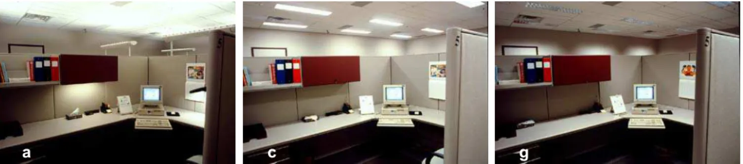
Participants viewed images of an open-plan office lit in different ways. The three images used are shown in Figure 1, and were chosen to reflect a wide variety of non-daylit office luminous conditions. The photographs were taken of real lighting installations in a full-scale mock-up office, which was used for a previously published study of office lighting quality [Veitch & Newsham, 1998]. The original slide images were scanned to digital images of 345 x 230 resolution, and were enlarged to 1280 x 1024 for display. The original resolution is regrettably low, perhaps low enough to bias results, but these images were all that were available in the archive of Veitch & Newsham’s work, and we felt that the ability to compare ratings to those expressed in Veitch & Newsham outweighed the disadvantages. The images are labelled “a”, “c”, and “g”, consistent with the designations given to these lighting designs in Veitch & Newsham. Table 1 describes the lighting designs and provides
photometric measurements made in the real space.
Participants viewed images on the 17” (diagonal) screen of the HDR display device, as depicted in Figure 2. Luminance measurements made in the real space were used to
calibrate the image on the HDR display, up to a maximum luminance value of 1800 cd/m2.
In conventional display mode the luminance range was compressed to that of a
conventional colour monitor with a maximum luminance of 100 cd/m2.
Participants began by viewing four example images, two in HDR mode and two in
conventional mode. Participants then viewed the three images shown in Figure 1 in each of the two display modes. Images were presented in random order, and there were no known visual or auditory cues indicating which display mode was in use. While viewing each image participants provided ratings of room appearance, environmental satisfaction and realism. After rating one image, participants were asked to look away from the display at a side wall while the image was changed. The whole procedure took about 30 minutes. Room appearance and realism ratings were made using 15 bipolar adjective pairs (bright - dim, uniform - non-uniform, interesting - monotonous, pleasant - unpleasant, comfortable - uncomfortable, stimulating - subdued, radiant - gloomy, tense - relaxing, dramatic - diffuse, spacious - cramped, glaring - not-glaring, friendly - hostile, simple - complex, formal -
casual, realistic - unrealistic). Adjective pairs were printed on paper separated by a line 100 mm long on which participants made a pencil stroke to indicate their rating. The mark was converted to a score of 0 – 100 by measuring its location on the line.
Satisfaction ratings were made on a variety of scales. For environmental satisfaction, participants indicated their level of agreement with the following statements on a 5-point scale from Strongly Disagree to Strongly Agree (scored 0 – 4): I could work efficiently in this workplace; All things considered, I would be very satisfied with this workplace; The physical
2
layout of this workspace is well-suited to office work; Compared to offices where I have worked I like this workspace. They then answered: Overall, how satisfied would you be with the lighting of this workspace? on a 5-point scale from Very Satisfied to Not at All Satisfied (scored 0 – 4). Next they answered: How much would the glare bother you? on a 5-point scale from Not at All to Extremely (scored 0 – 4). Finally, as a rating of environmental features, participants used a 7-point scale from Extremely Poor to Excellent (scored 0 – 6) to respond to the following questions: How would you rate the quality of light for office work?; How would you rate the quantity of light for office work? These scales were derived from previous research [Veitch & Newsham, 1998].
Fifty-four students from the Department of Psychology at McGill University were recruited to participate. Participants were aged 18 – 26, and approximately ¾ were female.
Our hypotheses were that the HDR images would be perceived as significantly brighter than conventional images, and that the higher luminance contrast of HDR images would lead to lower levels of satisfaction. Furthermore, we expected the ratings made by observers in a real space would more closely resemble the ratings of an HDR image of that space than the ratings of a conventional image of that space.
Results
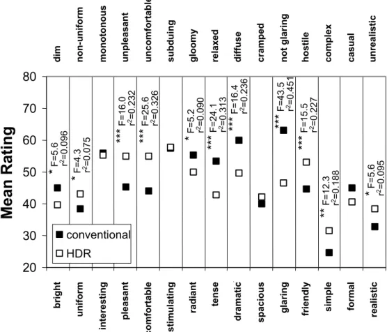
The experimental design is 2 (display type) x 3 (lighting design) within-subjects. Our primary interest is whether the images on the two display types are perceived differently. We analysed the data initially using multivariate analysis of variance (MANOVA). Two separate MANOVA’s were run on two sets of related variables: the room appearance & realism ratings; and, the satisfaction ratings. The results of the MANOVA on the room appearance and realism ratings are shown in Figure 3, for the main effect of display type. The graph compares mean ratings for each of the 15 adjective pairs. Images displayed on the HDR, particularly lighting designs “a” and “c”, have substantially higher luminances and luminance ratios, and this is manifest in Figure 3. The offices shown in the HDR are rated as significantly brighter and more glaring that the offices shown on the conventional display. Higher luminances and luminance ratios are also the most likely explanation for the HDR display being rated as significantly more radiant and more dramatic.
Samuelson et al. [1999] suggested that spaces with higher luminance gradients would be less satisfactory. Certainly, lighting designs “a” and “c” exhibit large areas with luminance ratios in excess of 10:1, the maximum recommended for office spaces by the IESNA [2000]. Figure 3 shows that offices on the HDR display were rated as significantly less pleasant, less comfortable, more tense and more hostile. Interestingly, despite rendering the image with authentic luminances, the HDR display is rated as significantly less realistic. We suggest this is because participants were still aware they were viewing a computer screen. Because no other computer screen they had previously experienced was capable of
delivering more than 100 cd/m2, the HDR display, delivering up to 2000 cd/m2, was judged
to be an “unrealistic” display. There was also no significant difference on the spacious-cramped or formal-casual items. We think these concepts require presence in a real 3-d space to have any meaning, and so discrimination on differing 2-d displays is unlikely. For the MANOVA on satisfaction ratings, a composite environmental satisfaction score was constructed for each participant from the mean of their response to the four environmental satisfaction questions. Similarly, a composite rating of environmental features for lighting score was constructed for each participant from the mean of their response to the two rating of environmental features questions. The results of the MANOVA on the satisfaction
ratings, shown in Figure 4, support the above findings. Glare was rated as significantly more bothersome (GLAREBO in Figure 4) for the images on the HDR display, as expected. The composite measures of environmental satisfaction (ENVSAT) and environmental
features (REFLITE), as well as the single item on overall satisfactions with lighting (SATLITE), were all significantly worse for the HDR display.
We also conducted MANOVAs on the effect of display type for each of the lighting designs. We do not have space to go into detail, but we can report that, as expected, there were many more significant univariate effects for the lighting designs with higher luminances (“a” and “c”) than for the lower luminance design (“g”). MANOVAs on the effect of display type contrasting designs “a” and “c” taken together vs. design “g” confirmed this observation.
The contrast on room appearance and realism ratings was significant (Wilks’ Λ=0.367,
F(15,39)=4.5, p<0.001,r2ave=0.075), as was the contrast on satisfaction ratings (Wilks’ Λ=0.777, F(4,50)=3.6, p<0.05,r2ave=0.058).
We suspected that the results might be confounded by familiarity with the lighting designs used. It is very likely that design “c” would be far more familiar to the participants that design “g”, and, particularly, design “a”. To test this we conducted MANOVAs on the main effect of lighting design, contrasting design “c” vs. designs “a” and “g” taken together. The
contrast on room appearance and realism ratings was significant (Wilks’ Λ=0.095,
F(15,39)=24.7, p<0.001,r2ave=0.306), as was the contrast on satisfaction ratings (Wilks’ Λ=0.34, F(4,50)=24.3, p<0.001,r2ave=0.266). Design “c” is rated as significantly more
realistic, and the effect is large (F1,53=56.7, p<0.001, r2=0.517; mean “c”=24.4, mean
“a”&”g”=41.3). A variety of other univariate effects (not detailed here due to space limitations) indicate design “c” is rated significantly brighter and more glaring, but also significantly more satisfactory. These seemingly contradictory results suggest that in any future tests of the effect of display type careful attention should be taken in selecting images that are not biased by experience.
The value of viewing lit scenes on a computer display is predicated on the assumption that people perceive the scenes in a similar way as they perceive a real scene. The images we used for this experiment were taken in a mock-up office space that had been previously used for a human factors study of lighting quality [Veitch & Newsham, 1998]. In that study 96 participants experienced the three lighting designs (between-subjects) for a day, doing simulated office tasks and completing a variety of questionnaires, including room
appearance and satisfaction ratings very similar to the ones used in this experiment. Direct comparison of ratings between this study and Veitch & Newsham is tempting but, on
reflection, we believe misleading. Participants in Veitch & Newsham made their ratings while working at a computer screen, and therefore with a very different field of view, which included potential reflected glare. They had also experienced the space for much longer. Finally, their ratings were potentially affected by more than the light distributions shown in the photograph. For example, design “c” employed magnetic ballasts, which operate at a lower frequency that is associated with disrupted visual processes in comparison to the electronic ballasts used in designs '"a" and "g".
Rather than comparing absolute ratings, we instead compared the correlations between items using factor analysis, a statistical technique that seeks to reduce a large matrix of ratings to a smaller number of underlying factors. If different methods of viewing a lit scene have similar factor structures then we can have some confidence that the scene is being interpreted in a similar way. We performed three separate factor analyses, on the ratings
4
from the conventional display, the ratings from the HDR display, and the ratings for these three scenes from Veitch & Newsham [1998]. In this study each participant saw three lighting designs on each display. To reduce the effect of within-subject variance, a
composite score on each room appearance rating was constructed for each participant for each of the two display types. This composite score was the mean of the responses to the three images presented on each display. We used only the 13 room appearance items that were common between this experiment and Veitch & Newsham. We employed principal components analysis with varimax rotation, and forced a three factor solution (as in Veitch & Newsham); the results are shown in Table 2. The results show clearly that the factor
structures from all three analyses are very similar. The spacious-cramped and formal-casual items do not load consistently on the three factors, but that can be expected as explained above. Of the remaining 11 items, nine load on the same three factors in almost identical fashion in the three analyses.
Conclusions
This study can only be considered a pilot study with many limitations. Nevertheless, we found interesting results that justify further study. Images displayed on a computer screen in both conventional mode, and in high dynamic range (HDR) mode with realistic
luminances, were perceived in a similar way as the same real luminous environments. This supports the proposition that images are a reasonable surrogate for experiencing the real space in some circumstances. Our results also demonstrate that HDR images are
perceived differently than conventional images; they are viewed as brighter and less attractive, as expected. HDR images should be perceived as more similar to the real space, but our results can neither support nor refute this.
Any future study should employ higher resolution and higher quality images than we had at our disposal. A future study should also compare the real space and its image from similar points of view. Finally, studied lighting designs should be equally familiar to participants. Acknowledgements
This work was partially supported by a Strategic Grant from the Natural Sciences and Engineering Research Council of Canada. The authors thank Alexandra Pelley and Donna Pelley for their assistance with data entry, as well as Harry Turner (NRC) for providing the original photographs of the space.
References
Ashdown, I. 1996. “Luminance gradients: photometric analysis and perceptual reproduction,” Journal of the Illuminating Engineering Society, Winter, pp. 69-82. Danford, S.; Willems, E.P. 1975. “Subjective responses to architectural displays,” Environment and Behavior 7(4), pp. 486-516.
Daniel, T.C.; Meitner, M.M. 2000. “Representational validity of landscape visualizations: the effects of graphic realism on perceived scenic beauty of forest vistas,” Journal of
Environmental Psychology 21, pp. 61-72.
Eissa, H.; Mahdavi, A. 2001. “Subjective evaluation of architectural lighting via
computationally rendered images,” Proceedings of IESNA Annual Conference (Ottawa), pp. 547-558.
Hendrick, C.; Martyniuk, O.; Spencer, T.J.; Flynn, J.E. 1977. “Procedures for investigating the effect of light on impression: simulation of a real space by slides,” Environment and Behavior 9 (4), pp. 491-510.
IESNA. 2000. Lighting Handbook, 9th Edition (Ed: Rea, M.S.). Illuminating Engineering Society of North America, New York.
Samuelson, C. E.; Ashdown, I.; Kan, P.; Kotlicki, A.; Whitehead, L. A. 1999. “A proposed lighting quality metric based on spatial frequency analysis,” Proceedings of IESNA Annual Conference (New Orleans), pp. 51-61.
Veitch, J.A.; Newsham, G.R. 1998. “Lighting quality and energy-efficiency effects on task performance, mood, health, satisfaction and comfort”. Journal of the Illuminating
Engineering Society, Winter, pp. 107 - 129.
6
Table 1. The lighting designs depicted in the images viewed by participants, and photometric measurements for the designs in the real office space.
Design Luminaires Luminance (cd/m2)
PUB DTR DTL PRU CMX a Furniture-mounted indirect + undershelf
task light + angle-arm desk light
110 45 75 30 400
c Prismatic lens 23 70 75 55 2800
g Parabolic louvre 10 60 65 35 160
PUB = partition under binder bin (maroon cupboard) - in Design “a” this is illuminated by a linear task light DTR = desktop right, near bottom right corner of mousepad - in Design “a” partly illuminated by desk light
DTL = desktop left, near document holder PFR = partition behind computer, to the right of the corner, about 2/3 up
CMX = ceiling max, in Design “a” this is illuminated ceiling tile, in Designs “c” and “g” this is on the fixture
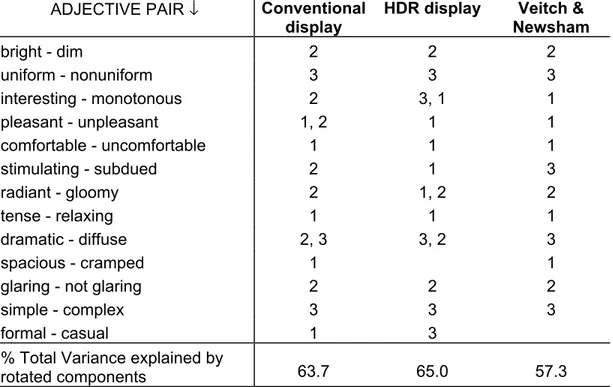
Table 2. Results of factor analysis on semantic differential appearance ratings for images on the conventional display, images on the HDR display, and data from Veitch & Newsham [1998]. Items with the same number in the table loaded on the same factor, based on a rotated factor loading of ≥0.5. Where an item loads on two factors, the one with
the higher loading is listed first. Only the 13 items in common between this study and Veitch & Newsham are included.
ADJECTIVE PAIR ↓ Conventional display
HDR display Veitch &
Newsham bright - dim 2 2 2 uniform - nonuniform 3 3 3 interesting - monotonous 2 3, 1 1 pleasant - unpleasant 1, 2 1 1 comfortable - uncomfortable 1 1 1 stimulating - subdued 2 1 3 radiant - gloomy 2 1, 2 2 tense - relaxing 1 1 1 dramatic - diffuse 2, 3 3, 2 3 spacious - cramped 1 1
glaring - not glaring 2 2 2
simple - complex 3 3 3
formal - casual 1 3
% Total Variance explained by
g
a c
Figure 1. The three images viewed by participants.
HDR Display Device 13” Viewing port-hole 20” Image Display Participant’s Head “Blinkers” Black box 48”
Figure 2. Display set-up, side view (apparatus was 14.5” wide). An example of a displayed image (with black box removed), is shown above.
8
* F=5 .6 .. . r 2=0 .0 96 bri-d im un i-no n int-mon ple-un p com-unc sti-sub ra d-gl o ten-rel dra -dif spa-cra gla -not fri-hos sim-com for-cas brig ht di m un if or m interestin g plea san t c o mforta ble stimu lating ra diant tense d ram atic sp ac io u s gl arin g friendly simp le formal no n-un iform mono tono us u n p leas an t un co mfo rta bl e s ubd uin g gl oomy re la xed diffuse cramp e d no t gl arin g ho sti le co mp lex ca su al 20 30 40 50 60 70 80
Mean Rating
conventional HDR realistic un realistic * F= 4. 3 .. . r 2=0 .0 75 *** F = 16.0 …... r 2=0 .2 32 *** F= 25 .6 …... r 2=0. 3 2 6 * F= 5. 2 .. . r 2= 0 .090 *** F= 24 .1 …... r 2=0. 3 1 3 *** F= 1 6 .4 …... r 2= 0 .236 *** F= 43.5 …... r 2=0 .4 51 *** F= 15.5 …... r 2=0 .2 27 ** F= 12 .3 …. r 2=0 .1 88 * F= 5. 6 r 2= 0 .095Figure 3. The effect of display type on room appearance and realism ratings. Overall MANOVA was significant, Wilks’ Λ=0.364, F(15,39)=4.5, p<0.001,r2ave=0.162.
Asterisks on the graph indicate significant univariate effects: * p<0.05; ** p<0.01; *** p<0.001. F-values (df 1,53) and fraction of variance explained (r2) are also shown.
0 1 2 3 4
envsat satlite glarebo reflite
Mea
n
R
a
tin
g
conventional HDR***
F=15.5 …. .. r 2=0 .226 0 1 2 3 4 5 6**
F=11.4 …. r 2=0. 1 77***
F=31.7 …. .. r 2 =0 .367**
F=10.2 …. r 2=0.161 (+) (-) (-) (+)Figure 4. The effect of display type on satisfaction ratings. A “(+)” following the rating label indicates that a higher rating is desirable, a “(-)” indicates a lower rating is desirable. Overall MANOVA was significant, Wilks’ Λ=0.590, F(4,50)=8.7,
p<0.001,r2ave=0.235. Asterisks on the graph indicate significant univariate effects: *