Characterizing Transit System Performance Using Smart Card Data
byLauren Tarte
B.S. Civil Engineering University of Washington, 2010Submitted to the Department of Civil and Environmental Engineering in partial fulfillment of the requirements for the degree of:
Master of Science in Transportation at the
MASSACHUSETTS INSTITUTE OF TECHNOLOGY June 2015
ARCHIVES
MASSACHUSETT S W NST ITE OF TECHNOLOLGYJUL 02 2015
LIBRARIES
@ 2015 Massachusetts Institute of Technology. All Rights Reserved.Author:... Certified by: ...
S ig n
Certified by: ... R Accepted by. ...Signature redacted
6epartment of Civil a Environmental Eng
ature redacted
... ineering May 21, 2015 ... ... Nigel H.M. Wilson Professor of Civil and Environmental Engineering Thesis SupervisorSignature redacted
.00,
I-John P. Attanucci esearch As oci of Civil and Environmental Engineering
IT1 esis Supervisor
Signature redacted
...
w
HeidTi NepfDonald and Martha Harleman Professor of Civil and Environmental Engineering Chair, Departmental Committee for Graduate Students
Characterizing Transit System Performance Using Smart Card Data
byLauren Tarte
Submitted to the Department of Civil and Environmental Engineering on May 21, 2015 in partial fulfillment of the requirements for the degree of
Master of Science in Transportation
Abstract
Although automated data collection systems have been in existence long enough to be the subject of extensive research, they continue to transform both the agency and customer side of public transportation. Transit system performance is defined along three dimensions: the supply of trains or buses; the demand from passengers; and the product of the two, service performance. This research takes a broad view of these dimensions, and explores several means of measuring each one, ways in which they interact, and how this information can be valuable for a transit agency. This thesis focuses specifically on the London Underground, but the intent is that the types of analysis described
herein can be applied to any rail transit system with similar data resources.
The research has three parts. First, a methodology is developed to estimate passenger volumes on the portion of a line between two adjacent stations within a defined time interval. This approach can be implemented using data from either smart card or entry and exit gates. It relies upon the outputs of London's Rolling Origin Destination Survey to infer passenger route choice. The second component identifies the possible causes of poor service performance in terms of both supply and demand, and defines a framework for examining supply and demand data to identify which causes are contributors. This research suggests that a better understanding of capacity constraints can be gained by jointly analyzing AVL-based capacity measures, AFC-based demand measures, and AFC journey times as a measure of service performance.
Finally, this thesis explores the possibility of using smart card data in real time to estimate system state. This metric is defined as passenger accumulation, a measure of the number of passengers on a given portion of a line in real time. Building from the approach developed in the first section, this work designs a method to determine accumulation in real time at detailed levels of spatial granularity. The accumulation metric is then compared to Transport for London's existing tools to assess whether accumulation can provide value as a real-time indicator of system state. Based on this analysis and current data availability constraints it cannot be concluded that passenger
accumulation provides a reliable indicator of real-time system state.
Thesis Supervisor: Nigel H.M. Wilson
Title: Professor of Civil and Environmental Engineering Thesis Supervisor: John P. Attanucci
ACKNOWLEDGEMENTS
I am indebted to Nigel Wilson and John Attanucci for their mentorship through this process. Your guidance and insight has made this thesis infinitely better, and I have grown immensely for it.
I am also grateful to the Analytics, Insight, and Transport Planning groups at Transport for London for all their advice on the direction of this research and their answers to my many, many questions. Thank you to the Transit Lab graduates of 2014, who set an example in perseverance and always assured me that my doubts, fears, and struggles were a part of the process.
To Transit Lab and Friends - your friendship, support, and nerdy discussions about transportation in our free time have been an invaluable part of my MIT experience. I cannot express my gratitude for all the times you've been there for me, especially in these last few weeks. Thank you for the hugs, hard drives, and cookies, and for letting me draft you as unpaid consultants on this thesis.
Thank you to Emily and Becca for all the things.
I cannot thank my parents enough for supporting me through the first round of my education and again through this second one. Thank you for listening to me wax didactic to an extent that only parents can, and for always telling me that I could do it and never telling me how to do it. Thank you to Mollie for your encouragement and for the endless cat pictures. And thank you to the rest of my
indescribably amazing family.
TABLE OF CONTENTS
1
NINTR ODUCTION ... 13 1.1 M otivation ... 13 1.2 Objectives...13 1.3 Research Approach ... 15 1.4 Thesis Organization ... 15 2 LITERATURE REVIEW ... ... ... ... .... ... 172.1 M easuring supply and dem and variability ... 17
2.2 Understanding service perform ance... 17
2.3 Applications of sm art card data ... 20
3 DIM ENSIONS OF TRANSIT SYSTEM PERFORM ANCE ... 21
3.1 M easures of transit system perform ance... 21
3.2 Current TfL use of baselines...23
3.3 Available data sources ... 26
3.3.1 Oyster ... 26
3.3.2 NetM IS...28
3.3.3 Gate counts...28
3.3.4 RODS ... 28
3.3.5 CuPID...29
3.4 Data sets used in this thesis ... 30
3.5 Determ ining passenger flow ... 31
3.5.1 Flow as a m easure of dem and ... 31
3.5.2 Detailed flow m ethodology... 32
3.5.3 Exam ple flows on the Victoria Line ... 36
4 ANALYZING THE RELATIONSHIPS BETWEEN PERFORMANCE DIMENSIONS ... 41
4.1 Drivers of service perform ance ... 41
4.2 Identifying contributing causes of delay ... 42
4.2.1 Indicators of high dem and ... 43
4.2.2 Indicators of low supply...43
4.3 Fram ework for analyzing system dim ensions ... 44
4.4 Exam ple Analyses...48
4.5 Sum m arry ... 58
5 A REAL-TIM E M EASURE OF SYSTEM STATE... 61
5.1 Previous research on real-tim e applications of AFC data... 61
5.2 Expanding the passenger accum ulation m etric ... 64
5.2.1 Developing an im proved m ethodology... 64
5.2.2 Applications of the proposed m ethodology ... 67
5.3 Current TfL tools for indicating system state... 73
5.4 Evaluation of passenger accum ulation as a real-tim e indicator... 76
6 CONCLUSION ... 83
6 .2 Reco m m e ndations ... 8 5 6 .3 Futu re rese arch ... 8 6
APPENDIX A: UNDERGROUND STATION CODES ... 89
APPENDIX B: TERMS USED IN THIS THESIS ... 92
APPENDIX C: TFL PERFORMANCE METRICS ... 9... 93
APPENDIX D: PICCADILLY SEGMENTS (FREEMARK)...94 B IB LIO G R A P HY ... 9 5
LIST OF FIGURES
Figure 3-1. Weekly demand compared to the previous year ... 23
Figure 3-2. Journeys per week compared to prior years ... 23
Figure 3-3. Daily journeys and revenue compared to prior yeae ... 24
Figure 3-4. Jubilee Line performance scorecard ... 25
Figure 3-5. Com ponents of journey tim e ... 27
Figure 3-6. Differences between recorded and actual journey times ... 30
Figure 3-7. Link flows on the Victoria Line (southbound 07:00 - 10:00)... 36
Figure 3-8. Link flows on the Victoria Line (southbound 08:30 - 08:45)... 36
Figure 3-9. Link flows on the Victoria Line (northbound 07:00 - 10:00)... 37
Figure 3-10. Link flows on the Victoria Line (northbound 08:30 - 08:45) ... 37
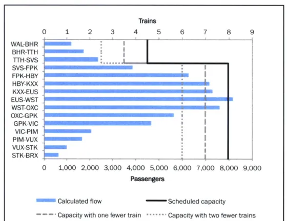
Figure 3-11. Link flows and capacity on the Victoria Line (southbound 08:30 - 08:45) ... 38
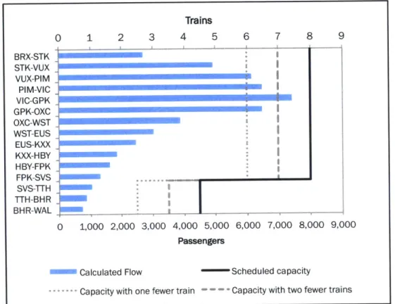
Figure 3-12. Link flows and capacity on the Victoria Line (northbound 08:30 - 08:45)...39
Figure 4-1. Piccadilly Line from east terminus to Central London...45
Figure 4-2. Frequency at selected stations (Piccadilly Line, westbound, 9 Dec 2013)...49
Figure 4-3. Standard deviation of headways (Piccadilly Line, westbound, 9 Dec 2013)...50
Figure 4-4. Distribution of headways (Piccadilly Line, westbound, 9 Dec 2013)...51
Figure 4-5. Distribution of journey times (Piccadilly Line, westbound) ... 52
Figure 4-6. Typical and individual journey times (Piccadilly, BGR-HOL, 9 Dec 2013)...52
Figure 4-7. Typical and individual journey times (Piccadilly, CRD-HOL, 9 Dec 2013)...53
Figure 4-8. Median link flows (Piccadilly Line, westbound)...54
Figu re 4 -9 . Flow by links ... 5 5 Figure 4-10 . Flow by tim e of day ... 55
Figure 4-11. Frequency of trains (Piccadilly Line, westbound, 27 Nov 2013)...55
Figure 4-12. Standard deviation of headways (Piccadilly, westbound, 27 Nov 2013)...56
Figure 4 -13 . Flow by links ... 5 6 Figure 4-14 . Flow by tim e of day ... 56
Figure 4-15. Typical and individual journey times (Piccadilly Line, BGR-HOL, 27 Nov 2013)... 57
Figure 4-16. Typical and individual journey times (Piccadilly Line, CAL-HOL, 27 Nov 2013)...57
Figure 4-17. Comparing flow to capacity (Piccadilly Line, westbound, KXX-RSQ, 27 Nov 2013)...58
Figure 5-1. Absolute passenger accumulation on the Piccadilly Line between Acton Town and King's C ro s s ... 6 2 Figure 5-2. Excess passenger accumulation for the previous example...63
Figure 5-3. Passenger accumulation by interval size (Victoria Line, southbound, 1 Nov 2013)...66
Figure 5-4. Passenger accumulation by segment (Victoria Line, southbound, 1 Nov 2013)...67
Figure 5-5. Passenger accumulation by segment (Victoria Line, northbound, 1 Nov 2013)...68
Figure 5-6. Passenger accumulation by link (Victoria Line, southbound, 1 Nov 2013)...69
Figure 5-7. Passenger accumulation across days (Victoria Line, southbound, Central segment)...70
Figure 5-8. Distribution of passenger accumulation (Victoria Line, northbound)... 71
Figure 5-9. Distribution of passenger accumulation (Victoria Line, northbound, Central segment)....71
Figure 5-10. Real-time passenger accumulation (Victoria Line, northbound, 31 Oct 2013) ... 72
Figure 5-11. Heartbeat frequency graph (Victoria Line, northbound at Oxford Circus, 31 Oct 2013).74 Figure 5-12. Heartbeat lateness graph (Victoria Line, northbound at Oxford Circus, 31 Oct 2013) ... 74
Figure 5-13. Heartbeat waterfall diagram (Victoria Line, northbound, 31 Oct 2013) ... 75
Figure 5-14. TrackerNet (Piccadilly Line)... 76
Figure 5-15. Real-time passenger accumulation (Victoria Line, southbound, 5 Nov 2013)...77
Figure 5-16. Disruptions on the Victoria Line (5 Nov 2013)... 77
Figure 5-17. Real-time passenger accumulation (Victoria Line, southbound, Brixton segment, 5 Nov 2 0 1 3 ) ... 7 8 Figure 5-18. Headways at Oxford Circus (Victoria Line, southbound, 5 Nov 2013)...79
Figure 5-19. Frequency at Oxford Circus (Victoria Line, southbound, 5 Nov 2013) ... 79
LIST OF TABLES
Table 3-1. Sample station-to-station travel times (minutes)...33
Table 3-2. Sample station-specific time windows... 33
Table 3-3. Sample RODS station movement records ... 34
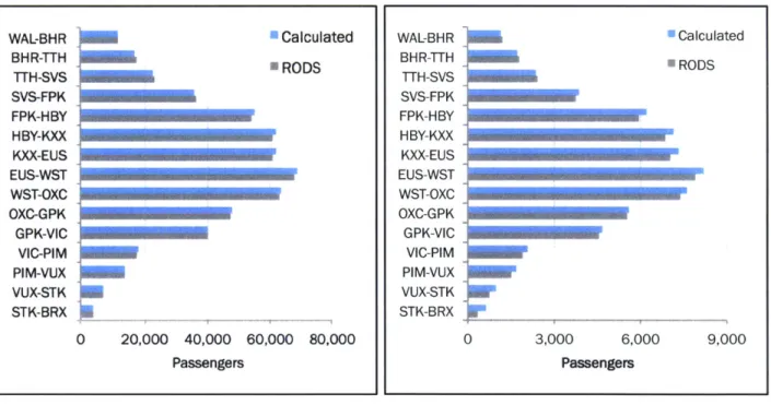
Table 3-4. Comparison of calculated and RODS flow values (Victoria southbound 07:00 - 10:00)....37
Table 3-5. Scheduled and actual service on the Victoria Line (14 Nov 2013)... 40
Table 4-1. Mapping indicators to causes of delay ... 44
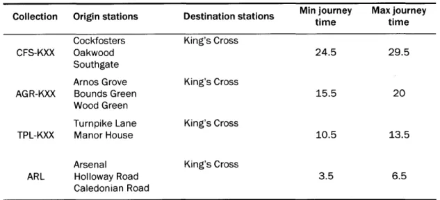
Table 4-2. Origin-Destination collections including peak load point ... 46
Table 4-3. Origin-Destination collections excluding peak load point... 47
Table 4-4. Disruptions logged in CuPID (9 Dec 2013) ... 49
1
INTRODUCTION
Though no longer new, automated data collection systems continue to transform both the business and user side of public transportation. Previous research has described how this data may be leveraged to study the control environment (Ravichandran, 2012; Carrel, 2009) and to measure operational characteristics such as reliability (Frumin, 2010; Uniman, 2009) and disruption impacts (Freemark, 2013). This research takes a broader view, and rather than focusing on a particular function of a transit system, explores several key characteristics of a system, how they influence one another, and how this information can be valuable for a transit agency. This thesis focuses specifically on the London Underground, but the intent is that the types of analysis described here can be applied to any rail transit system with similar data resources.
1.1 Motivation
This research developed out of the abundance of data generated by automated data collection systems, and a desire to apply this data in a way that both improves the quality of passengers' experiences and facilitates transit agencies' planning and operational tasks. Taking a data-driven approach can identify opportunities where service can be improved without the cost of infrastructure upgrades. Transport for London already excels at incorporating analytics into their business processes, yet there remain areas that are unexplored. In particular, the enormous volumes of data produced from smart card systems such as the Oyster card provide unparalleled information about how passengers move through the system. Examining farecard data in conjunction with data about train movements from automatic vehicle location systems provides opportunities to draw inferences about the way these two aspects of the system - passengers and trains - act and interact.
This plethora of data provides a window into the dynamics of a transit system and its environment. A system's performance is described along three dimensions: the supply of trains, demand from users,
and finally the relationship between the two, service performance.1 This thesis aims to enhance the
understanding of each of these dimensions and the relationships between them. Such information has the potential to inform service planning, performance management, operational strategies, and travel demand management tactics on scales ranging from long-term to real-time.
1.2 Objectives
The overarching goal of this thesis is to provide insight into the three dimensions of rapid transit system performance. By enhancing the understanding of how these dimensions vary and interact,
1 The distinction between the terms "system performance" and "service performance" is clarified in Appendix B.
this research aims to improve an agency's ability to proactively and reactively respond to conditions. This thesis has three specific components:
1. Develop a method for estimating typical demand at disaggregate spatial and temporal levels. This objective stems from the concept of quantifying transit system performance as experienced by passengers. A new method of estimating demand with great spatial and temporal precision can supplement an agency's existing analyses. The results of this methodology should, in turn, allow a transit agency to answer questions such as the following:
How do conditions change across spatial and temporal parameters? How do conditions vary within the same spatial and temporal context?
A methodology for defining demand can be used to estimate demand both on a particular day and across many days, providing a baseline for service across the network. Specific instances, such as a day or a peak period on a particular line, can then be compared to this baseline to determine how they vary from expectations.
A systematic, objective method of defining typical demand is useful both in ex-post and real-time contexts. Demand is already analyzed retrospectively on a regular basis, and would benefit from a precise baseline. Assessing how "normal" a particular day or time period was can help in evaluating the effects of a specific event or operational strategy. In real-time, conditions that are trending towards atypical may be a precursor to events that require mitigation.
2. Develop a framework for analyzing the relationships between the three dimensions of transit system performance.
While it is beneficial to analyze supply and demand independently, there is further value in examining how these two elements together contribute to service performance. This is a complex relationship, and difficult to capture, as supply and demand affect each other as well as producing service performance. This research proposes methods of exploring this relationship by linking explicit measures of supply and demand to measures of service performance. Variations in these dimensions (by endogenous or exogenous factors) are assessed for their impact on service performance. This research aims to demonstrate techniques that can be used to analyze the three dimensions in order to study how changes in supply and demand affect service performance. An improved understanding of this relationship has the potential to inform current travel demand management strategies, such as gate closures, passenger notifications, and service reductions or increases during planned events. Some of these strategies can also be applied in a short-term operational context. This research can suggest how to apply practices such as gate closures, passenger notifications, and service cuts during unplanned disruptions.
3. Explore the application of automatic fare collection data as a real-time indicator of system state. The third part of this research centers on using Oyster data to describe service in real time.
Passenger accumulation is a metric that uses Oyster data to determine the number of users in the system as a proxy for service performance (Freemark, 2013). Accumulation is compared against expected levels in order to evaluate system state.
Passenger accumulation as a real-time indicator is intended to help operational staff anticipate and respond to unusual conditions. For example, above average levels may prompt station staff to close gates in order to manage demand. The metric could also be used to inform passenger notifications.
1.3 Research Approach
The first component of this thesis concerns understanding existing practices to measure demand, supply, and service performance, and developing a new method for estimating demand. This approach takes its inspiration from past work and uses the same data sources as a previous effort, but approaches the solution in a unique way. The intent is to develop a method that can be applied across a range of spatial and temporal contexts, and that can describe demand at varying levels of granularity. The analyses presented in subsequent chapters build upon the methodology developed here.
The second part of this research establishes a framework for analyzing the relationships between dimensions. An ideal framework is first described, using normalized measures of each dimension. The relative values of these measures are then studied across shifts in temporal and spatial parameters. A limited version of this framework is then applied as an example.
The third part of this research explores the passenger accumulation metric. There are two components of this effort:
a. Expand the original methodology of the passenger accumulation metric to remove some of the previous limiting assumptions.
b. Evaluate whether this tool can provide better information - that is, quicker, more accurate,
or more disaggregate - than what is currently available.
The first item involves developing a more complex, but more precise version of passenger accumulation than was originally designed. The second phase of this objective is addressed by analyzing, in retrospect, Oyster data as if it were in real time, and comparing it to the information provided by existing tools.
1.4 Thesis Organization
This thesis begins with a review of the existing literature in Chapter 2. Past research on measuring supply and demand is discussed, as is related work on the topics of service reliability and farecard-based performance measures. This section explores the advantages of prior approaches to these topics and identifies gaps in existing research.
Chapter 3 addresses the first objective of this research. It begins by explaining several prominent London Underground data sources, which are used throughout this thesis. The chapter then describes the development of the method for estimating demand and applies it to one London Underground line as an example.
While Chapter 3 observes each aspect of transit system performance individually, Chapter 4 focuses on the interactions between the dimensions. The analysis presented in this chapter explores the
interaction betwen supply and demand and their joint effect on service performance. Particular emphasis is placed on identifying the contributors to poor service performance, and whether these are primarily supply- or demand-based under various circumstances.
Chapter 5 explores an application of the automatic fare collection data used in the first two parts of this research. This chapter first extends the passenger accumulation metric beyond its original definition to more accurately represent system state. The second part of this chapter then evaluates passenger accumulation's usefulness as a real-time indicator for the London Underground, by comparing it with tools that are already available.
Finally, Chapter 6 provides a summary of this study and its main conclusions. This chapter revisits this research's potential applications at Transport for London, and notes the requirements necessary for such an implementation to be valuable to the agency. This thesis closes with an outline of areas that may benefit from further research.
2
1
LITERATURE REVIEW
This chapter reviews past work that is relevant to this thesis. It describes how the literature informs the direction of this thesis, and identifies gaps in the existing understanding of system performance that this research addresses. Section 2.1 describes work on measuring the variability in supply and demand. Section 2.2 describes the wealth of research into the factors that influence service performance and how this dimension can be measured. Section 2.3 describes several innovative methods of applying smart card data.
2.1 Measuring supply and demand variability
Van der Hurk et al. (2012) develop a method of predicting passenger volumes in the context of disruption management. The objective of this effort is to estimate passenger flows that will be affected by a disruption in order to inform response strategies. Their approach uses smart card data from the Netherlands Railways and applies an autoregressive integrated moving average model to predict demand in real time.
Morency et al. (2007) use smart card data to measure the variability of transit use in Gatineau, Qu6bec. This approach examines the amount of spatial variation by measuring the number of unique bus stops each passenger used. A k-means clustering algorithm is applied to identify the times of day during which passengers take the most trips. Results are presented both for all users and segmented by card type.
2.2 Understanding service performance
Abkowitz et al. (1978) define reliability as "the invariability of service attributes which influence the decisions of travelers and transportation providers." This definition discerns two types of reliability: the reliability of service provided by a transit agency and the reliability of service received from the passenger's perspective. This thesis considers reliability of service provided as a supply-side measure, and the reliability of service as experienced by passengers as a service performance measure. Abkowitz et al. note that the former is most often defined as schedule adherence, and TfL follows this trend in its reliance upon train lateness (as will be discussed in Section 5.3). Abkowitz et al. recommend using measures of compactness to describe reliability rather than deviation from a scheduled value. This study emphasizes the need for reliability measures to reflect aspects of service that are important to passengers. The authors identify several factors that should be considered in the context of passenger-centric performance: passenger waiting time, in-vehicle time, the variability of total journey time, and seat availability.
One of the many further efforts on reliability is that of Uniman (2009). He characterizes performance by quantifying the extent to which individual travel times deviate from their typical values. This measure expands on the approach originally developed by Chan (2007). He defines this metric (shown in Equation 2-1) as the reliability buffer time (RBT), and describes it as "the amount of time passengers are required to allocate in order to complete a journey on-time with high probability."
RBTOD,T,P = (Nth - tMth)OD,T,P Equation 2-1
Where RBTOD,T,P = Reliability Buffer Time
tNth = the Nth percentile travel time, where N is an upper percentile
tMth = the Mth percentile travel time, where M the median
and each of these variables is specific to a given OD pair in time interval T over sample period P Using travel times derived from AFC data, Uniman applies the metric to the London Underground
with values of N = 95th percentile, T = the three-hour AM peak, and P = 20 weekdays. He further
explores a method to spatially aggregate the RBT measure to assess service performance for an entire line. He finds the RBT for every within-line OD pair (that is, both the origin and the destination
are within the line of interest), and calculates the line-level RBT as an average of the OD-level RBTs
weighted by the volume of passengers on each OD pair.
The RBT metric describes reliability from the passenger perspective by depicting a simple concept that influences passengers' expectation of service. As a performance measure that is both passenger-centric and uses units of time, it can be easily used to quantify the benefits or costs to passengers of service changes. However, it has several drawbacks due to its nature as an aggregate measure. RBT evaluates service performance for the typical passenger, and not at the individual level. It is meant to be a long-term descriptor of service quality, and is not intended to evaluate reliability on a single day (or similarly limited sample period). In addition, RBT is relative to the scheduled headway, and so cannot be compared across lines (or across periods with different service levels on the same line).
Ehrlich (2010) defined a variant of RBT that uses AVL data instead of AFC, and Schil (2012) expanded this metric further. Both focused on an AVL-based version of RBT in order to apply the concept to buses, where exits do not require fare transactions. Wood (2015) applies this metric to the rail system in Hong Kong operated by MTR. He defines the AVL-based RBT as the Platform-to-Platform RBT (PPRBT), and notes that a chief advantage of the AVL approach is that it removes the effects of behavioral variation among passengers, such as walking speed, different access and egress distances, and in-station activities. Wood advances this metric by using a train loading model,
based on an OD matrix and route choice data, to incorporate the impacts of denied boardings.
Another passenger-centric measure of service performance is Excess Journey Time (EJT), the difference between a passenger's scheduled and actual journey time. The operating untis of TfL use EJT as a performance metric (see Section 3.2), with actual journey times derived from AVL data, a series of models, surveys, and other sources, but does not use AFC data in their estimation. Frumin (2010) explores the concept of EJT in depth, and develops a method for calculating EJT at the
individual passenger level using AFC data and applies it to the London Overground. Frumin explains
perspectives" in that it measures passengers' experiences relative to an expectation, and the degree to which the operator's meets service delivery standards (the schedule). He notes that, like any application that relies upon AFC results, Oyster-based EJT is limited in its application to those OD pairs where the path taken by passengers is either known or can be reasonably inferred by an assignment model. Furthermore, EJT values are limited in their temporal applicability, as they cannot be compared across different timetables (which are usually updated annually in London).
Freemark (2013) proposes using journey time variability to assess the impacts of disruptions. He measures the percent variation in Oyster travel times of trips that begin and end within a defined segment of a line as shown in Equation 2-2.
m
M [Z=0 (t- T)iT)] /m Equation 2-2
Where v = Relative variability for trips t in line section
m = number of minutes during the representative sample period
n = number of sample trips
t= actual journey time for trip
j
T= normal journey time for trip
j
(characteristic of the OD pair of the trip)Freemark's analysis identifies times and areas (though not specific locations) where service performance was impacted. He also demonstrates how these effects change on different parts of the line over time, suggesting a means for tracking the propagation of delays through the system. By integrating the journey time variability v over the time interval during which it is above a predefined threshold, he quantifies distinct impacts on service performance.
While Freemark's variability measure is intended to evaluate supply-side events, it also captures demand-driven effects due to its use of AFC data. The author compares journey time variability impacts with supply and service performance measures used by TfL, and notes that while there is some compatibility, his measure identifies additional instances of poor service performance. These
impacts are likely due to demand-side influences and interactions between demand and supply. A notable limitation of Freemark's analysis is the baseline he uses to determine "normal" journey
times. He selects five weekdays with low Excess Platform Wait Time2 scores (one of TfL's many
service quality measures). Not only is this a small sample size, but using only a single indicator is a simplistic means of characterizing a complex dimension of service. Freemark also developed the original work on the passenger accumulation metric, as will be discussed in Section 5.1.
Similar to the concept of RBT, which focuses on the additional time that passengers must allow for as an element of total travel time, Furth & Muller (2006) explore the concept of budgeted wait time. They argue that mean passenger wait time (explained in Section 3.1), frequently used by agencies to quantify service performance, underestimates the disutility to passengers of poor service reliability. They propose measuring the amount of time passengers plan to spend waiting on platform above
the mean wait time as a reliability (and therefore a service performance) metric. The budgeted wait time is defined as the difference between the 95th percentile wait time and the mean wait time. The authors go on to develop a cost function to estimate the impact of unreliability on passengers, providing agencies with a means to directly quantify the benefits to passengers of investments that improve reliability.
2.3 Applications of smart card data
Smart card data offers a particularly powerful tool for analysis, as the sheer volume of data collected yields a greater number of observations across space and time than any other source (Agard, Morency, & Tr6panier, 2006; Bagchi & White, 2005). Pelletier et al. (2011) conduct a broad review of the benefits of smart cards in public transportation. They divide the possible uses of smart card data into three arenas: strategic, comprised of long-term planning and customer behavior characterization; tactical, involving schedule adjustments and longitudinal ridership patterns; and operational, which encompasses ridership statistics and performance indicators.
Smart card data can provide detailed ridership statistics across spatiotemporal parameters at a very disaggregate level. Precise load profiles can be generated, allowing for heavy schedule customization (Pelletier, Tr6panier, & Morency, 2011). Passenger boardings and alightings also yield detailed origin-destination matrices (Chan, 2007), and allow for a more detailed study of interchanges. Understanding when and where passengers choose to transfer can help agencies make long-term planning decisions regarding their network structure and schedule to best meet their customers' needs (Hoffman, Wilson, & White, 2009; Gordon, 2012).
Digges la Touche (2015) develops a method for determining delays in real time for the purposes of
improving passenger communications, and applies it to both the London Underground and to MTR's system in Hong Kong. Her method assigns individual journeys a delayed status if the journey time is more than a given number of minutes (the delay threshold) above the average journey time for that OD pair. Because delays are determined as a relative difference between the individual journey time and the OD pair average, journeys can be aggregated spatially. Three types of delays are identified: station entrance delays, based on all journeys entering at a station, station exit delays, and line delays (though only same-line entry and exits are included for all three types). If the number of delayed journeys at a given exit time is above a predefined minimum, the line or station is categorized as delayed. This research presents a novel method of identifying delays. However, as the approach is entirely reliant on journey time, the information it provides about system conditions has a slight time delay. Journey times are not available until after a passenger has exited, yet they describe conditions while the passenger was traveling. To be precise, "real-time" journey time data in this study describes very recent conditions, rather than current ones.
3
DIMENSIONS OF TRANSIT SYSTEM
PERFORMANCE
This chapter addresses the first objective of this research: understanding the dimensions of transit system performance and developing a methodology for estimating demand. This methodology establishes a means of creating baselines for demand against which an individual case (a particular day, week, or time period) can be compared, providing a valuable first step for many types of analyses.
Section 3.1 describes the dimensions of transit system performance and the measures available to capture them. The current practices at TfL relating to baselines are covered in 3.2. Sources of automatically collected data and the nuances of TfL's systems are discussed in 3.3, and Section 3.4 enumerates the specific data sets that are used throughout this thesis. Section 3.5 explains the
method used to estimate passenger flow, one critical measure of demand.
3.1 Measures of transit system performance
This thesis explores transit system performance across three dimensions: the demand from passengers, the supply of trains, and service performance. Service performance is the result of the interaction between the first two dimensions; that is, it is a measure of how well the supply serves the demand.
Each of these dimensions can be gauged using a variety of metrics. Demand can be measured by the number of entries and exits at a station, the number of journeys made on an origin-destination (OD) pair, or the flow (number of passengers in a given time interval) on a particular section of a line. Measures of supply describe train movements. Service can be broken down into two characteristics: speed and capacity. Running times express how fast (or slow) service was between two stations. Capacity can be expressed as frequency (trains per hour) or its inverse, the headways between consecutive trains at a station.
Service performance measures are those attributes that are a function of both demand and capacity. There is some overlap between measures of supply and measures of service performance. While speed is primarily a supply measure, it can also be considered a service performance metric as high levels of demand can affect running times.
An important aspect of service performance is regularity. Regularity can be expressed as wait time. Wait time is related to supply measures, as it is derived from headway data, but, like speed, can be influenced by high demand. Another measure of performance is journey time, which includes both speed (as in-vehicle time) and wait time at the stop or platform. Consequently, both the supply and demand characteristics affect journey time, through the speed and wait time components.
TfL calculates wait time (referred to as Platform Wait Time, or PWT)3 using the standard formula for expected wait time on high-frequency transit service, shown in Equation 3-1 (Transport for London, 2010; Osuna & Newell, 1972).
E[w] = _Hi2 _ H2 + UH2 Equation 3-1
2 - Zi Hi 2 - pY
Where E[w] = Average wait time PH = average headway
Hi = Observed train headway i oH = standard deviation of headways
This definition of wait time assumes that passengers board the first train that arrives, and that passengers do not time their arrival to catch a specific train; that is, arrivals are random and independent of the train schedule (Osuna & Newell, 1972). The first assumption is true when capacity is not limiting, but is violated when denied boardings occur. In practice, the second assumption is considered valid when headways are 10 minutes or less (Welding, 1957; Frumin, 2010; Transport for London, 2010).
The London Underground relies on a suite of performance metrics to track service quality. Many of
these, such as Excess Journey Time4, the percentage of scheduled kilometers run, and the Reliability
Index5, are based on train movement data. Thus, these metrics can be categorized as measures of
both supply (in that they are derived solely from supply-side data) and service performance (in that they describe the resulting quality of service).
In recent years, there has been a trend towards using more passenger-centric measures of performance, as discussed in Section 2.2. One such measure is passenger journey time, as calculated from AFC (Oyster) data. AFC-based journey time is one simple measure of a trip's quality from the passenger perspective, and it provides detailed spatial and temporal data about trips at the
individual passenger level.
The level of crowding is another measure that represents the passenger's experience; however crowding measures are difficult to estimate accurately. LU estimates crowding penalties from
general demand levels and supply-side data as part of the Journey Time Metric6 (Transport for
London, 2012b). When crowding is extreme enough that it results in denied boardings, the effects manifest in longer journey times, but AFC data does not capture situations in which crowding levels are high but not severe enough to cause denied boardings. Better measures of crowding would be based on comparing passenger loads on individual trains to capacity. Current research is focused on estimating passenger loads on trains through passenger-to-train assignment models (Zhu, 2014; Paul, 2010), and this approach may provide richer measures of crowding in the future.
3 See Appendix C for more information on the terms "wait time" and "Platform Wait Time."
4 See Appendix C for the definition of Excess Journey Time (EJT).
5 See Appendix C for the definition of the Reliability Index.
3.2 Current TfL use of baselines
TfL often compares demand figures from Oyster data against past data for comparable periods. For example, weekly demand may be compared against the previous week or the same week the previous year (see Figure 3-1) or years (see Figure 3-2).
Headlines
LU journeys up 3.8% an the equivalent week In 2013; bus journeys up 2.4%; rail journeys up 16.6%.
Last week, was probably the busiest week on London Underground for 2014 so far, and the busiest week since the middle of lest December, with over 26.9 million passenger journeys made - probably* as official igures wil be confirmed Itaer. This increase in demand doesn't appear to be driven by any particular event or station; just continued growth.
The number of journeys on London Overground are much higher when compared last year this due to the severe disruption and ine mmpensions caused by a deraed freight train at Camden Road
.Weekly Flash Stats
" Est. Total Underground passenger journeys: 26.9m (+0.3m on last weak)
" Eat. Total Bus passenger journeys: 48.Om (4.2n on last we*k)
e Eat. Total Rail passenger journeys: 5.6m (+0.03r on last week)
Figure 3-1. Weekly demand compared to the previous year (Transport for London, 2014b).
Underground journeys by week
3000.000 .000000 .000,000 000.000 -2011 20-W.O 2012 -2013 1.000.000 - 2014 16.000.000 14000.000 12.000.000 10,000000P
Figure 3-2. Journeys per week compared to prior years (Transport for London, 2014b)
TfL also produces reports that tally daily journeys and fare revenue (see Figure 3-3). Demand may be totaled at the daily, weekly, or period7 levels and compared against the same point in time the previous week, period, or year. These reports are used to measure overall trends, reevaluate forecasts, and track progress against budget. Reports also note both planned and unplanned events (such as sporting events or major disruptions) that may impact demand. For example, Figure 3-1 mentions a freight derailment that occurred the preceding year, making the current year's growth figures look artificially high.
4,100 -Daily Underground Journeys (000s)
3,900 --- rr5f ~ Daily Underground
journeys
were3,700 _--- --
4.Om in Period 9, slightly up from
3,500 --- - - ---- --- ---- - -- --- -
3.9m in Period 8.
3,300 -- - - - --- ---- - --- ---3,100 - ---T3r--- ---2,900 ---a o--- ---2,700 . 9 11 13 2 4 6 8 10 12 1 3 5 7 9 2012/13 2013/14 2014/15 Underground Journeys:% change Percent change year-on-year
20
15 ---
Underground journeys per day were
up 4.4% year-on-year in Period 9.
10 ---- - ---5 ---0 -5 --- ---10 9 11 13 2 4 6 8 10 12 1 3 5 7 9 2012/13 2013/14 2014/15Daily Underground Revenue (Em)
Current
7.0 --- ---
Daily Underground revenue stood
6.5 --- --- ----at
E7.2min Period 9, up from
E7.1m
in Period 8.
6.0 --- -- --- - ---- -- -- -- - ---ago 5.5 --- ---5.0 --- ---4.5 1 . . . . . . .1 9 11 13 2 4 6 8 10 12 1 3 5 7 9 2012/13 2013/14 2014/15 Underground Revenue:% change Percent change year-on-year
12
Underground revenue per day was
9 --- ---up 6.6% year-on-year in Period 9,
Revenue
up from growth of 6.0% in Period 8.
6 -- - --- - - -- -
-3 --- --- --- ---
Revenue per journey was up 2.1%
Revenue per journey
year-on-year in Period 9, up from
1.2% growth in Period 8.
-3 . . . . . . .
9 11 13 2 4 6 8 10 12 1 3 5 7 9 2012/13 2013/14 2014/15
Many of these comparisons are limited in terms of insight provided by the use of small samples as the baseline. Comparing a single Tuesday to the Tuesday of the same week in the previous year may not be helpful if either day is not representative. This thesis aims to fill this gap by exploring methods to determine baselines from a wider sample of data.
On the supply side, TfL's ex-post analyses of operations focus primarily on the effects of disruptions. Performance metrics, as explained in Section 3.1, often describe both the supply and service performance dimensions. On the operations side, performance is often communicated using scorecards all the way from the system level down to the station level. Figure 3-4 is an example of a line-level scorecard.8 These performance metrics are mainly based on AVL data. Scorecards, and many other supply-side analyses, compare service to the average over the previous operational period. Scorecards also look at overall trends and the average of all periods in the current financial year.
1-
07-Multcbei
ReDoftStrategic Aspect Measure Unit Actual Target Trend YTO YT) Var Excess Journey Tine -Trains Dec MkI P 1.31
*
1.50 1.31*
0.19 LCH Total (Al Staff, Customer LCH P 202.500*
237,923 202,500*
35,423 Assets, Ofter)LOWt Tit e knries no. P 1 2 * 1 1
Mar Customer Injunes no. P 0
*
1 0 1~%
of schieduled kms operated % P 99.0*
984 990*
06Rkdyuex% P 69 75 69
*
61iMeets or Beats Target -Trend Improvki
jelow Target with Tdawance :rend worsening
ails to Meet Target s hrend : Level
1tive
Number ('.0) No Acaltarget for t measure has been set
Figure 3-4. Jubilee Line performance scorecard (Transport for London, 2014d)
Measures are also often compared against delivery targets. These goals may be set by a variety of means. Targets that are set at the network level, such as LCH and EJT (shown in Figure 3-4), are based on performance forecasts that are developed as part of long-range planning. The exact value may be adjusted within the projected range by LU management, who balance the drive for continuous improvement against the need for realistic goals. Executive commitments, such as the mayor's directive to cut Lost Customer Hours by 30%,9 may also steer target-setting. High-level objectives trickle down to individual lines, and further down to their operational subcomponents. Simpler targets are often based on the previous year's performance, and may take into account
8 See Appendix C for definitions of all the measures in Figure 3-4.
9 As part of his reelection campaign in 2012, Mayor Boris Johnson promised a 30% reduction in tube delays by the end of 2015. TfL measures this goal through Lost Customer Hours accumulated by the
subjective input on what is a realistic goal for a particular part of the system (for example, a line known to have poor reliability will have lower reliability targets).
As on the demand side, these approaches offer an opportunity to examine supply measures using a larger sample size as the baseline. There is no assurance that the previous period is representative, and not all performance reports make mention of unique events (such as severe disruptions) that may affect the current (or previous) period's metrics. The current suite of performance metrics is also limited in the level of detail provided, as most metrics cannot be disaggregated temporally or spatially. Some are available only for the four-week operational period, or across the whole day, and may not be calculated for an area more narrowly defined than an entire line. This research aims to supplement current retrospective supply analyses by examining service at a more disaggregate level, in order to provide greater flexibility in the spatial and temporal scope at which supply is studied. Furthermore, evaluating service performance using AFC data provides a different view than the existing AVL-centric methods. Comparing demand and supply conditions to systematically derived baselines and evaluating their relationship to service performance can provide a different understanding of the system, as will be explored in Chapter 4.
3.3 Available data sources
This analysis focuses on Transport for London and the London Underground system, and is reliant upon TfL's automated data collection systems. While AFC and AVL data is widely available at transit agencies throughout the world, each system brings its own nuances that influence analyses on which they are based. This section describes the specific TfL data sources that are used in this thesis. 3.3.1 Oyster
The Oyster card is Transport for London's smart card and the source of the agency's AFC data. Oyster cards were introduced in 2003, and are used on an array of modes across the London transportation network, including the London Underground, London Overground, DLR, buses, and on some National Rail services. Approximately 80% of all journeys made in the TfL network use an Oyster card (Transport for London, 2012c). Oyster penetration rates are lower at National Rail termini and stations frequented by tourists. Passengers without Oyster cards pay using magnetic tickets, which do not store transaction data and thus cannot be used to extract information about individual journeys.
Cards store transactions, and thus a journey on the (closed-system) rail services involves both an entry transaction, or tap-in, and an exit transaction, or tap out. A complete journey is formed by joining one card's tap-in to a subsequent tap-out, thus providing information about the card user's origin station and start time, destination station, and end time. (Certain other data, such as the card type and payment details, is also available, but is not used in this research.) Transactions are recorded to the second, allowing for precise calculation of journey times.
AFC journey times represent several components of a passenger's journey, not merely the time spent on a train. Oyster journeys are comprised of access, egress, platform wait, and in-vehicle travel time (see Figure 3-5). Journeys that involve transfers also include interchange time and additional phases of platform wait and in-vehicle time (not shown below). Because Oyster measures the time from
faregate to faregate, it excludes the portions of access and egress times that fall outside the gates. At most stations, this lost time is relatively small, though some journeys may involve longer
pre-gateline access times due to time spent purchasing tickets, or, in congested situations, queuing for
gates.
While access, egress, and (in journeys that use multiple lines) interchange times vary across
passengers, they are relatively constant for a large sample, and are largely unaffected by the level of
supply. Platform wait time and on-train time, meanwhile, depend upon the speed, frequency, and
regularity of trains, and are the primary source of variation in journey times.
Oyster Tap-in Oyster Tap-Out
V
Oyster Journey Time
.... ... ...$ .. r r T... n e...
Acs Platform Wait On-Train Time
{
Street Entrance Street Exit
Figure 3-5. Components of journey time (Chan, 2007)
One important nuance of smart card data is that journey times vary not only with the characteristics of the trip, but also with characteristics of the user. A passenger who greatly dislikes crowded trains may take a different route, or choose not to board the first train that arrives, resulting in a longer travel time than a passenger who values speed above all else. Additionally, tourists, as unfamiliar users, may take an inefficient path through the system or become lost during their journeys. These
all affect journey time, a key measure of service performance in this thesis (Wood (2015) provides a
more in depth discussion of cross-passenger journey time variation and strategies to control for this
variation). While no evaluation of performance based solely on journey time is perfect, use of a
median for a sufficiently large sample ensures a reasonably accurate representation of performance
for most passengers (Lam & Small, 2001). This is especially true if analyzing the AM peak period, when tourists are a small percentage of all users.
Further information on Oyster and TfL payment mechanisms is provided in Gordon (2012), Uniman (2009) and Chan (2007).
In December 2012, TfL began accepting contactless bank cards as an alternative means of fare payment on buses. TfL expanded the use of contactless cards to include the Underground,
Overground, DLR, most National Rail services in London, and Croydon Tramlink in September 2014.
Contactless payment cards (including debit, credit, and prepaid cards) function like an Oyster card
using pay-as-you-go (Transport for London, 2014f). Like Oyster, the time, station, and a user ID are
recorded for every tap in and tap out, allowing journey time to be determined for each trip. In March 2015, contactless payments accounted for 14% of all pay-as-you-go journeys, which equates to about one million taps per day (Transport for London, 2015).
While it is currently possible to query Oyster data is available in real time, the underlying system was
transactions at station readers, and the availability of data in the central system. Thus, when conducting analysis in real-time or near real-time, most, but not all of the latest transactions will be visible.
3.3.2 NetMIS
Train movement data for the London Underground is available through NetMIS, the Network Management Information System and London Underground's source for automatic vehicle location (AVL) data. Each NetMIS record represents a train's appearance at a station, and includes the line, station, direction, arrival time, departure time, destination, and identifiers for the trip and lead car. From this data, it is possible to derive the headways and dwell times at a station, running time between stations, and the progress of a train along a line.
The quality of NetMIS data varies widely. Whereas newer lines, such as the Jubilee, have relatively good NetMIS data, lines with older signaling infrastructure, such as the Piccadilly, have frequent gaps. On lines with poor NetMIS quality, many records are missing values for one or more fields. Occasionally, there will be no record of a train at a particular station, though it appears at the preceding and following stations. The trip and/or lead car identifier fields are among the most common missing data, though they will often repopulate - with a different value - at a later station. Recent research has explored a new method to reduce holes in the data by identifying trips made by the same train and rejoining them, which may facilitate the use of NetMIS data in future analyses (Babany, 2014).
For a more detailed description of NetMIS and the train tracking system that generates the data, see Hickey (2011).
3.3.3 Gate counts
The turnstiles at LU stations provide counts of all passengers using the system. While gate counts, unlike Oyster, include passengers who pay with magnetic tickets, there is no way to link entry and exits for individual passengers. A handful of stations are either ungated, or allow for a behind-the-gate interchange between Underground and National Rail services. When behind-the-gateline data either cannot be collected automatically or is unreliable, manual counts either supplement or replace automatic data at these locations (Transport for London, 2013). More information on gateline data, particularly regarding procedures at stations that are not fully gated, can be found in Chan (2007) and Gordillo (2006).
3.3.4 RODS
The Rolling Origin and Destination Survey (RODS) is an annual survey conducted on passenger travel patterns. Around 20 stations are surveyed each November, when demand is at its annual high point (Transport for London, 2012c; Transport for London, 2014c). Passengers are asked to complete and return a survey asking about the time and length of their journey, origin and destination, route, trip purpose, and frequency of travel, as well as some basic demographic characteristics. These responses are then scaled up to represent the whole network using gateline entry and exit totals, Oyster origin-destination figures, and the trip frequency data reported in the survey. Each year's results are added to the cumulative database, dating back to 1998. For stations that have been surveyed multiple times, each year's results are weighted according to their age.
Many different types of information are available as output of RODS. The outputs include details on journey times and distances, summaries of the number of interchanges passengers make, route choice information, and a "true" origin-destination matrix based on the postcodes of users' ultimate starting and ending locations (rather than the locations at which they enter and leave the LU system). Most results are available at a variety of spatial and temporal granularities. One of the most useful outputs is the detailed interchange volumes at each station; a category of information that can't be captured from Oyster. Chan (2007) discusses in detail how OD matrices and reliability measures based on RODS differ from those developed using Oyster data.
The final outputs of RODS are used in many applications. These include train service planning, aiding in decision-making on major infrastructure upgrades, identifying historical demand trends and forecasting, and as an input to network performance measures such as Lost Customer Hours (Transport for London, 2012c; Transport for London, 2012a).
RODS provides several kinds of information that are not available elsewhere, and this thesis is reliant upon its data on interchanges at stations in order to infer passenger flows. However, RODS does have several weaknesses that should be noted when applying it in any analysis. While RODS is largely accepted as accurately describing general trends, it may not be appropriate for describing passenger movements in a specific context (such as single day or time period).
Perhaps most importantly, the original surveys that make up the RODS database represent only a very small sample of all users of the LU network. RODS surveys are handed out to a sample of all riders at selected stations, and of the surveys distributed, response rates are typically in the range of 20-30% (Chan, 2007). Thus, the process of extrapolating RODS survey responses into a representation of all passengers in the network often involves large expansion factors. For outputs that are highly specific in geographic and temporal scope (for example, the number of passengers traveling on one OD pair in a 15-minute interval), the results may be based on a single response. Secondly, the rolling data collection process means that some stations may not have been surveyed for several years. Thus, using RODS to estimate passengers' travel paths entails relying upon data that may be outdated. In addition, the exit totals that RODS provides at stations may not always be correct. The expansion process ensures that RODS station entries match the actuals from gateline data, but does not do the same for exits (Chan, 2007). RODS is also limited by the fact that it cannot account for seasonal variation in travel patterns.
Despite these limitations, RODS is still a key data source for this research and many other applications. While Oyster and gateline counts can give general information on how demand fluctuates over the year, no other source provides the same level of detail on route choice as RODS. Moreover, solving the interchange problem is not the primary goal of this effort. The intent is to develop an overall methodology for which route choice is an input, and for this purpose RODS is an acceptable data source. In the future, new technologies - such as data from mobile phones - may provide more extensive information on passenger movements. These data could then replace RODS as an input to the analyses conducted in this thesis.
3.3.5 CuPID
The Contract Performance Information Database (CuPID) is a tool used by TfL to record all identifiable disruptions to service. A myriad of details are recorded; including the time and location
that the disruption occurred, a narrative of the original event that caused the disruption and the resulting effects to service, the duration (measured as the start time until the time at which all trains are back on schedule). Every effort is made to identify the root cause if it is not immediately clear. TfL's official procedure is log all disruptions that last two minutes or longer.
3.4 Data sets used in this thesis
The most heavily used data in this thesis are Oyster records from the autumn of 2013. Due to the immense size of Oyster data, TfL's current policy is to store only eight weeks of data at a time. This research uses a 100% sample from October 20 to December 14, 2013, providing 40 weekdays for analysis. Bus journeys and non-travel transactions (such as topping up) are excluded, as are a variety of invalid transactions; including incomplete journeys, journeys that begin and end at the same station, journeys with a travel time of zero minutes, and certain staff passes. This time period conveniently encompasses the month of November, when RODS (the survey) is conducted.
An important limitation of the Oyster dataset is that at the time it was collected, recorded Oyster
transaction times were truncated to the minute.10 Thus, the journey time calculated from an entry
and exit pair has a margin of error of 59 seconds (see Figure 3-6).
Entry Exit
06:00 06:20
20 min
Shortest Possible Latest Possible Entry Earliest Possible Exit
Journey Time 06:00:59 06:20:00
19 min 01 sec
Longest Possible Earliest Possible Entry Latest Possible Exit
Journey Time 06:00:00 06:20:59
20 min 59 sec
Figure 3-6. Differences between recorded and actual journey times (Chan, 2007)
AVL data is the most easily available of all the data used in this research. AVL data can be pulled for nearly any date range in recent years, for any station. AVL data is primarily used in conjunction with Oyster data for the corresponding dates and time periods.
Gate counts are used from the five weeks spanning November 4 - December 6, 2013. Gate counts are not available by individual day, but as weekday and weekend averages across this span of time. These values include National Rail passengers at most stations with shared gates. Nine stations use
10 As noted in Section 3.3.1, Oyster times are now recorded to the second. TfL began logging Oyster
transactions to the second in early 2014, in preparation for the introduction of contactless payment cards on the Underground.