HAL Id: hal-01411067
https://hal.inria.fr/hal-01411067
Submitted on 7 Dec 2016HAL is a multi-disciplinary open access
archive for the deposit and dissemination of sci-entific research documents, whether they are pub-lished or not. The documents may come from teaching and research institutions in France or abroad, or from public or private research centers.
L’archive ouverte pluridisciplinaire HAL, est destinée au dépôt et à la diffusion de documents scientifiques de niveau recherche, publiés ou non, émanant des établissements d’enseignement et de recherche français ou étrangers, des laboratoires publics ou privés.
Visualizing Network Application Traffic to Diagnose
Poor Application Performance at End-Hosts
Adhir Chakravarti
To cite this version:
Adhir Chakravarti. Visualizing Network Application Traffic to Diagnose Poor Application Perfor-mance at End-Hosts: A report submitted in partial fulfillment for the degree of Master of Computer Science in the Faculty: Master 2 Reseaux University Pierre et Marie Curie (UPMC). Networking and Internet Architecture [cs.NI]. 2016. �hal-01411067�
End-Hosts
Adhir Chakravarti
A report submitted in partial fulfillment for the
degree of Master of Computer Science
in the
Faculty: Master 2 Reseaux
University Pierre et Marie Curie (UPMC)
Supervisor: Renata Cruz Teixeira
Abstract
With the introduction of new and innovative applications and networked services comes additional complexity that not only confounds end-users but also experts such as network and system administrators. HostView an end-host network, application and system data collection utility was created with the aim of being able to correlate connected application performance with the user’s perception of performance and ultimately predict their satisfaction / dissatisfaction. In order to improve HostView, field trials with home users need to be conducted; to provide home users with appropriate incentive an interactive and user-friendly User-Interface (UI) for HostView needs to be created.
This report describes the design, creation and implementation of HostView User-interface with user data visualization and the mechanisms responsible for it. The first version of the HostView UI is meant to be the keystone in enriching HostView sufficiently for it to provide value in the form of providing Internet application usage habits to potentially indicate causes for observed performance degradations. Having access to a relational database that collects HostView data, using the standard web development toolkit, i.e HTML, CSS, JavaScript and a plotting library such as D3.js, I set out to understand the HostView dataset and to create a means of showing the data as graphic visualizations that are relevant to the interests of the home Internet user. We hope this UI will enable us to conduct a second field trial with home users in order to refine HostView towards being a standard utility in the home user’s toolkit.
Acknowledgements
Foremost, I would like to thank my teacher and Internship advisor Professor Renata Cruz Teixeira, Sr Researcher at Inria team MUSE and part of the Master-2 Reseaux faculty at UPMC. She provided great instruction and support when I attended her course entitled "Network Metrology" in the winter 2015 semester at UPMC. The course enforced my knowledge of Network technologies in the Internet and laid the foundations of measurement and analysis techniques that would come in handy during my internship and will continue doing so even in my career ahead as a Network Engineer.
I would also like to thank Anna-Kaisa Pietilainen, post-doc fellow under Prof. Renata Cruz Teixeira. Together with Prof. Teixeira, Anna believed in my abilities and that I was the right person to take on this internship topic to provide expected results by progressing the project in the right direction. Together with Prof Teixeira, she played a major role in continuously mentoring me throughout the 6 month internship and helped me overcome mental road-blocks that prevented me from realizing the extent of technical possibilities in terms of visualizing network application data. Furthermore, she provided valuable feedback and guidance in the preparation of this report.
Lastly, I would like to acknowledge the support received from my academic advisor Prof. Timur Friedman and my fellow master-2 students and the PhD students that shared the same office room with me at the LINCS. They provided a friendly and pleasant atmosphere in which I could learn and grow.
1 Abstract 3
2 Internship Proposal 7
3 Company Profile 9
3.1 Inria . . . 9
3.2 Team MUSE . . . 9
3.3 Work Environment: LINCS . . . 10
4 Introduction 11 5 HostView Data-Collection 13 5.1 Network and Application Data . . . 13
5.2 Location Data . . . 13
5.3 User Feedback . . . 14
5.4 System level data . . . 14
6 HostView Architecture and Data Visualization 15 6.1 Data Prototyping . . . 15
6.1.1 PostgreSQL . . . 15
6.1.2 JavaScript and Python . . . 16
6.2 Data Visualization Tools . . . 17
6.2.1 Plotting library . . . 18
6.2.2 Graphing library . . . 18
7 HostView User-Interface 19 7.1 Dashboard . . . 19
7.1.1 Applications used in the last week . . . 20
7.1.2 Logged-on versus Active Usage . . . 20
7.1.3 Networks Connected to in the last week . . . 20
7.1.4 Traffic Volume by Application . . . 21
7.2 Detailed Views . . . 21
7.2.2 Device Usage . . . 22 7.2.3 Networks Connections . . . 23 7.2.4 Traffic Statistics . . . 24 8 Conclusion 27 8.1 Skills Acquired . . . 27 9 List of Acronyms 29 Bibliography 31 6
Internship Proposal
Topic: Visualizing network application traffic to diagnose poor application performance at end-hosts.
Duration: 4 to 6 months
Hosting team: MUSE, Inria Paris-Rocquencourt (https://team.inria.fr/muse/)
Mentors: Renata Teixeira, Senior Researcher, Inria (head of MUSE team) Vassilis Christophides, Senior Researcher, Inria
Keywords: Internet measurements, network diagnosis, network traffic, data analysis, data visualiza-tion.
Description: As our lives become more dependent on Internet access, it is easy to understand peo-ple’s frustration when their Internet experience is not up to their expectation — for example, when their download is too slow, when their voice-over-IP call is choppy, or when the movie they have paid for keeps stalling. Most Internet users are not tech-savvy and hence cannot fix performance problems and anomalous network behavior by themselves. The complexity of most Internet applications makes it hard even for networking experts to fully diagnose and fix problems. The goal of the MUSE team at Inria is to improve user online experience by building personalized networking technology that guides network performance and diagnosis based on user quality of experience. To conduct this research, MUSE has developed an end-host based data collection tool, called HostView [10]. HostView not only collects network, application and machine level performance data, but also gathers feedback directly from users. We have used data collected with HostView to predict user dissatisfaction with network performance (i.e., given only network performance data as input, can we predict whether the user is dissatisfied or not?) [8]. We have developed a new version of HostView [5] with a number of improvements to track user activity and to the questionnaires to get feedback from users, but the existing tool offers little incentives for users to install.
The goal of this internship is to enrich HostView with an interface where users can visualize their data to help diagnose poor network performance. Our hope is that this new diagnosis support will be an incentive for users to deploy HostView. The HostView dataset contains a lot of information about the
applications running on the user’s machine, application performance over time, and system performance. The visualization of HostView data should allow users to see when traffic volumes and performance of a given application have changed, which may indicate a problem, for instance. The student will start by characterizing application performance over time per different network environments using the HostView datasets. We will select examples when users say performance was poor and use the existing dataset to diagnose the possible causes. This analysis will rely both on statistical methods and domain knowledge. The analysis will help identify the metrics that help diagnose the cause of different problems and the most effective visualization. We hope to test the visualization with a small set of end-users running HostView during the internship to test different the effectiveness of different visualization and diagnosis approaches. The student should develop scientific skills on Internet measurements and data visualization and mining as well as scientific writing and presentation. If the student is interested, there is a possibility of staying for the doctoral studies after the internship.
Desirable skills:
- Comfortable communicating in English - Knowledge of network traffic measurements - Knowledge of data analysis techniques - Knowledge of matlab or gnu R
Company Profile
3.1
Inria
Inria, the French National Institute for computer science and applied mathematics began its history more than forty years ago. Comprised of graduates from some of the best universities across the world, research is organised in project teams of researchers that share a similar background to focus on specific scientific projects. Together with its partner organizations, both in industry and academia, Inria aims to provide an appropriate and effective response to the application challenges of the digital age; it is the source of many innovations that create jobs and the results of research have a beneficiary effect on companies of all sizes in fields as diverse as healthcare, transportation, energy, communications, security and privacy protection, smart cities and factories [3].
3.2
Team MUSE
Within the Networks and Telecommunications department of Inria is a research team called ’MUSE’ which stands for ’Measuring Networks to Enhance User Experience’. Headquartered at LINCS (Laboratory of Information, Networking and Communication Sciences) in Paris, their research is in the area of network measurements; with a focus in developing new algorithms and systems to improve end-user experience on-line. Their aim is to address the following real-world issues affecting the Internet users of today.
The first is to abstract some of the complexity of today’s technology from the home Internet user point of view. Most Internet users are not tech-savvy and hence cannot fix performance problems and anomalous network behavior by themselves. Users are unable to determine whether they are getting the Internet performance that they are paying their providers for. MUSE aims to address this issue by creating tools and applications that can provide information to educate users about the level of performance in their network.
Secondly, there is far too much content available at any moment on the Internet leaving Internet-users with the laborious task of having to sort through hundreds and thousands of choices. The proliferation of user-generated content (produced anywhere with mobile devices and immediately published in social media) along with the vast amount of information produced by traditional media (e.g., newspapers, television, radio) poses new challenges in achieving an effective, near real-time information awareness and personalization. MUSE tries to address this by researching innovative tools and strategies to enable
users to have access to novel filtering and recommendation tools for helping them to decide which articles to read or which movie to watch [6].
The team is comprised of Renata Cruz Teixeira, the head of team MUSE and Sr. Researcher specializing in measurement, analysis, and management of data networks [4], Vassilis Christophides, Sr. Researcher specializing in Databases-Web Information Systems, Big Data Processing and Personal Information Systems [7] as well as Anna-Kaisa Pietilainen, post doctorate fellow under Professor Teixeira. The team is also composed of PhD students Sara El Aouad, Diego da Hora and Giuseppe Scavo that are responsible for publishing current research with regards to the above presented real-world issues [4]. Lastly, there are three Master-2 students Maximilian Bachl, Michele Pittoni and myself that are working on our individual but related topics for our internship. Our weekly team meetings on Wednesday morning and reading group on Friday morning allow us to present our progress and get constructive feedback from the more experienced members of the team; the reading group where we present recent papers in our field of research allow for new insights to be presented to the team.
3.3
Work Environment: LINCS
Our office is at the LINCS, the Laboratory of Information, Networking and Communication Sciences at 23 Avenue d’Italie in the 13th arrondissement of Paris. The LINCS was created on October 28th, 2010, by three French institutions of higher education and research: Inria, Institut Telecom and UPMC. Later Alcatel-Lucent joined in February 2011 and SystemX in October 2013 as strategic partners. The LINCS is dedicated to research and innovation in the domains of future information and communication networks, systems and services [13].
We are very fortunate to work in close proximity with some of the best researchers in the fields of information and communication networks, systems and services; our room, a space with 12 office desks has PhD students from Institute Telecom, Nokia and Orange which facilitates the sharing of information and ideas. Additionally, we have a weekly seminar organized every Wednesday at 2 pm that allows researchers to present their innovative efforts to like minded colleagues and computer scientists keen to get exposed to a new / different areas of research.
Introduction
The world we live in today involves ubiquitous use of connected technologies that allow us to send, receive and share information over the Internet. Whether it is for email, browsing, streaming video and audio, IM/VoIP, on-line gaming etc., our dependence on the Internet is only going to grow. With continuously evolving technical standards and innovative new applications, even network / system administrators struggle to understand the complexity of the processes that take place behind what is visible in the user-interface of applications. The average non-technical Internet user is even more bewildered when they encounter performance degradations; they are at a loss to understand the reason(s) applications fail to meet their expectations of performance which can be very frustrating. There can be numerous reasons why downloads are slow, the VoIP call is choppy or the movie they rented on-line keeps stalling while streaming. In an ideal scenario, end-host operating systems would be able to detect, diagnose and possibly repair the causes for performance degradations. The complexity of most connected applications makes it hard for even the experts in the field to accurately diagnose and resolve issues.
Additionally, the perception of expected performance varies across users depending on their person-alities and even for the same user depending on their mood and expectations from time to time. For example, users are more likely to expect better performance from networks, applications and systems at the workplace than at home or at a coffee shop with free wireless Internet. Secondly, the quality of experience (QoE) is linked to a specific application; for example, increase in network latency may have no effect on streaming video, but it could have a very noticeable impact on a remote log-in session. This implies, that in order to understand network performance, we need to take into account not only applications but other factors such as the end-user and the various parameters of the environment (system, end-host, network, etc.) [10].
Fortunately, the boffins at Inria’s team MUSE have developed a possible solution to address this problem; introducing HostView, an end-host data collection tool that collects network, application and system level performance data in addition to prompting and gathering explicit feedback about performance from users regarding various applications based on their usage of them. This data collected with HostView can be used to predict user dissatisfaction with network / application performance as well as to track user activity. Certainly, to be able to accurately correlate a user’s perception of performance with the application, system and network environment their device resides in, the data has to be collected on the end-host itself [11]. Furthermore, HostView is non-intrusive; it gathers data in the background without impacting performance of the end device [5]. The first deployment of HostView was conducted between
November 2010 and February 2011 with 40 users using a mix of Linux and MAC OS. The users mostly computing experts, were chosen from among 14 different countries in Europe, North / South America, the Middle-East and Asia. Users were offered two incentives to participate in the study: the ability to view their network usage summaries as well as 50 USD amazon gift card [11].
Still, HostView was lacking a user-friendly interface that would offer users’ enough of an incentive to install it on their end-hosts. The topic of this internship "Visualizing network application traffic to diagnose poor application performance at end-hosts" gives us a clue about the improvements to HostView that would offer the required incentive for end-users’ to install it on their devices. The HostView dataset contains detailed information about applications running in the foreground as well as the background, application, system and network performance over time. This report documents the process as well as the tools used to accomplish the task of enriching HostView with a user-friendly interface that can display visualizations of user network, application and system data in a comprehensible way that allows the user to understand and possibly even diagnose the reason for poor performance.
Section 5 presents the HostView dataset and data collection parameters. Section 6 presents the methods and tools used to understand and formulate the data in a comprehensible format, followed by the tools and approach used to create the visualizations of user data. Section 7 presents the work-in-progress HostView user interface. Section 8 presents the conclusions we can draw from the current stage of HostView development and possible future steps.
HostView Data-Collection
HostView uses passive measurements because active measurements although appealing would not reflect performance of any particular application and the fact that active measurements may occur at a time when the system is under little to no load. Hence, HostView uses passive measurements with various mechanisms to hide sensitive information for privacy reasons. Also, users have the option to pause data collection when carrying out sensitive tasks.
All of the data that is collected, is first logged in the end-device in a SQLite database and periodi-cally uploaded to a back-end database server where it is parsed and logged to a PostgreSQL database disconnected from the Internet for security and privacy reasons. The next few sections present the various parameters that constitute the HostView dataset.
5.1
Network and Application Data
From a network standpoint, HostView does a packet capture using libpcap on each active interface to record IP and TCP/UDP headers; Unlike IP/TCP/UDP packets where only the headers are recorded, DNS packets are fully recorded in a pcap file in order to recreate hostname to IP address mappings offline. Captures are started or stopped when network interfaces go up or down. Continuous metrics are recorded periodically at various specific time intervals depending on the metric. For example, the open-sockets-to-process mapping which uses a combination of port inspection to obtain the application protocol and the gt toolkit to obtain the application name occurs periodically with a timeout of 60 seconds. This means that HostView polls for open sockets every 60 seconds, if it doesn’t detect anything, it waits a period of 60 seconds and polls again. A survey conducted by researchers confirmed that using only packet headers with anonymized local IP addresses would be acceptable to most users [10].
An application look-up module periodically logs all applications in the foreground and background; in some cases, the application is interchangeable with the process executable. However, in cases when applications are delivered as web-services such as Facebook.com, Google.com or Netflix.com, the top level domain name of the destination is considered the application [9].
5.2
Location Data
When HostView detects changes in the Network interface or IP address, it logs the network interface, hash of the wireless SSID, BSSID of the access point as well as the Autonomous System number to identify
the Internet service provider, city and country to which the user is connected to [9].
5.3
User Feedback
In addition to passively gathering data about the user environment, HostView also asks the user for explicit feedback in the form of questionnaires that are collected in two different ways. First, using the widely adopted ESM approach in the HCI community i.e., triggering the questionnaire based on system measurements over a range of performance levels. Second, the user has access to an "I am annoyed" button which they can click to launch the questionnaire when they are unsatisfied with performance. The questionnaire itself consists of a combination of multiple choice and open ended questions in order to balance quantitative / qualitative feedback. The ESM triggered questionnaire asks which of the applications used in the previous 5 minutes experienced problems, with choices for possible reasons or a free-form text box [10].
5.4
System level data
Currently, HostView only collects CPU load, memory usage per process as well as Input-Ouput (IO) activity (which input devices are actively in use) by process at timeout intervals of 1 second. [5].
HostView Architecture and Data
Visualization
As briefly mentioned before, HostView runs in the background, collecting data using passive measurements to a SQLite database on the end device. In addition to background data collection, HostView also collects explicit user feedback which is collected by means of prompts when HostView detects changes in the configuration, periodically over a range of performance levels or when the user uses the "I am annoyed" button. As depicted in figure 6.1, this data is then sent at regular intervals (usually at night) to a web service on the back-end server that parses the data and writes it to the PostgreSQL database. The packet capture files (pcap) are also sent along with the other data and the same web-service runs tcptrace to analyse the pcap files and parses the results which are written to the same database.
When users wish to view their activity, they would need to navigate to the HostView UI hosted on Inria’s web-server and log in with their user ID and password. The following is the process as seen in figure 6.2:
1) Once logged in and upon selecting their device that is identified by its host-name, the JavaScript script files responsible for creating the visualizations are downloaded by the user’s browser. Visualizations on the dashboard / landing page are created based on data from a pre-defined time range of the last 7 days. 2) When the user changes the time range using the calendar tool in HostView UI, an AJAX request is generated.
3) This AJAX request in-turn causes the web server to use its REST interface to send a SQL query to the back-end database server.
4) The back-end database server responds with the results of the query in JSON format.
5) The data in JSON format is sent to the user’s browser where it is used by the JavaScript graphing libraries (part of the downloaded script files) to create data visualizations.
6.1
Data Prototyping
6.1.1 PostgreSQL
In order to pull data that is meaningful and relevant to display as a visualization to end users, a database language like SQL (PostgreSQL in this case) must be used to manipulate and format the raw data into a readable / comprehensible format. Armed with basic knowledge of SQL queries, it took many attempts
(a) Data Upload
(b) Questionnaire
Figure 6.1: HostView Data Collection
to go from creating simple queries that pull data from one table to creating SQL queries that were not only complex in terms of pulling and simultaneously manipulating the format of data from multiple tables at once, but also efficient in terms of execution. Furthermore, although postgreSQL aims to match the SQL standards more closely than other relational databases such as the popular MySQL database, options for community support are limited and retrieving the data in the desired format (JSON) proved more challenging using PostgreSQL. So, we chose to use comparatively less complex queries in PostgreSQL and leave the data manipulation and formatting to be accomplished using JavaScript.
6.1.2 JavaScript and Python
Python was used in the initial stages of the internship due to my familiarity with the syntax, rules and its abilities to manipulate data structures. Python allowed me to easily connect to the local SQLite database, run SQL queries and learn how to manipulate the SQL query results into JSON objects which were 16
used as input for data visualization. But, since JSON is the native format of objects in JavaScript, it made more sense to use JavaScript to formulate the SQL retrieved data into JSON objects. I familiarized myself with the rules/syntax and best practices of JavaScript and began creating demo graphs using the graphing libraries mentioned in sub-section 6.2.2. The visualization would change depending on the data provided as input; i.e the JSON objects that were translated into visualizations were dependant on the data pulled from the back-end database through SQL queries. Still, the data format would remain the same for visualizations that used the same graphing / plotting library. For example, visualizations on the dashboard / user landing page which were built using NVD3 used a different format of JSON objects as input as opposed to the detailed visualizations which used D3.js. Even among the detailed charts, the format of the JSON objects was not the same because the data that we aimed to visualize was different and we wanted to make it easy to understand.
6.2
Data Visualization Tools
Because HostView stored all the end-host data to a database server that is not connected to the Internet at a centralized location, a web-server with access to the back-end database would be the location for the HostView UI to reside in. For this reason, standard web-development toolkit consisting of HTML, CSS, JavaScript, jQuery and AJAX was needed in order to build the web interface for users to navigate in and query the database to display their data in the form of visualizations, that we hope are easy to understand, even for non-technical users.
6.2.1 Plotting library
D3.js is a well-established industry standard JavaScript library when it comes to building web-based graphical visualizations by manipulating SVG elements using HTML, SVG and CSS; however, it can be challenging to work with because of the sheer amount of code required and its intimidating, non-intuitive syntax to produce each SVG element [2]. For this reason, we decided to use D3 for the more detailed charts mentioned ahead. For the Dashboard / user-landing-page, we chose to use a graphing library that is built on top of D3.js that already contains the framework for building certain types of charts such as bar, pie, area, scatter, line etc.
6.2.2 Graphing library
Since most Internet users are not exactly academics with a background in statistics, it was important to create visualizations that were easy to understand and perhaps able to provide insight into the reason for perceived performance degradations. There are numerous web-based graphing libraries that are built on top of D3; we had a number of options to go through and choose from. Some were more optimized for certain types of charts rather than for all types. The ones we considered included MetricsGraphics.js [1] which is optimized for creating line charts and time-series due to its ability to support thousands of data points, D3pie.js [12] for creating beautiful, crisp and colorful pie and donut charts, Plotly.js [15] and NVD3.js [14] for robustness and a variety of easy to create charts. Of these, the graphing library that had the most aesthetic appeal, performance and was versatile enough to create most charts we needed was NVD3 (named so because it uses D3.js). Furthermore, because it translated instructions from its own format into those that could be interpreted by D3.js, we could accomplish charts in half the amount of lines of code than if we were to use D3.js directly.
HostView User-Interface
The challenge in creating a successful user interface for HostView was mostly dependent on the charts that present the data to the user. It should be easy enough to understand for someone without a university education, yet informative enough to provide value in the form of an incentive for the user to install HostView on their end-devices and be intriguing enough to make them want to view their activity and understand their habits of computing.
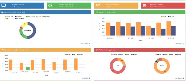
Figure 7.1: HostView UI Dashboard
7.1
Dashboard
Figure 7.1 shows the main dashboard, the user landing page which greets the user upon logging on and selecting their device. The dashboard displays a summary of the last 7 days (by default) of user activity; which in this case is data collected by HostView from my laptop PC at LINCS. This page is of paramount importance to us as the developer, because its presentation is essential in arousing curiosity in the user’s
mind; the user must feel the need to take a look at everything displayed on the dashboard and perhaps drill down further into the detailed views. The dashboard is organized in the following manner.
Under the title "Dashboard" it mentions the last day HostView collected data from the user end-device along with the total amount of data (in units of time) collected till the previously mentioned date. Next, the 4 colored rectangles namely ’Favorite Application’, ’Average Usage per Day’, ’Most Used Network’ and ’Most Traffic Generated’ provide a summary of the four charts below; each representing the chart with the same color. They change based on the metrics presented in the charts below. The user should get a quick summary of their activities of the previous week when viewing the four boxes without the need to look at anything else. The four charts that correspond to the summary rectangles are:
7.1.1 Applications used in the last week
This donut chart displays the top 8 applications that were used in the last 7 days. The criteria for ranking the applications is the amount of time spent by the user in interacting with an application. Interaction here refers to the application being in the foreground and the user interacting with it using an input device such as a mouse, keyboard, microphone etc. In addition, to improve the user experience, custom tool-tips display the application name and its duration when the mouse pointer hovers over slices of the donut chart. The tool-tips display the application name and the duration in a human readable format of days, hours, minutes and seconds. For example a duration of 7000 seconds would be displayed as 1 hour 56 minutes and 40.02 seconds. An additional interactive element is the label in the center of the donut chart which displays the application name when the mouse pointer hovers over the respective donut slice. In this example, Google Chrome happened to be the most used application.
7.1.2 Logged-on versus Active Usage
This grouped bar chart represents a comparison of 2 different series of information, one which represents the amount of time a user was logged on to their device versus the other which represents the amount of time they were actively interacting with the various applications on their device. The X axis shows the days of the week (last 7 days based on the time interval chosen by the dashboard) and the Y axis represents time. The Y axis scale changes to hours, minutes or seconds depending on the values in the data. Since this graph was built using NVD3 as well, it has the same custom tool-tip that displays the name of the series as well as the time duration in the same human readable format mentioned above. In this case, we can see that although the device was logged into for approximately 8 hours a day, the user actively used it for an average duration of 5 hours a day in the last 7 days.
7.1.3 Networks Connected to in the last week
This grouped bar chart also displays a comparison of different series of information; each series corre-sponding to a particular wireless network ID, in addition to a series which represents the time spent while not connected to any wireless network. The chart compares the amount of time the device was connected to the various wireless networks per day, during the last 7 days. Just like the ’logged-on versus active usage’ graph, the X axis represents days, the Y axis represents time (scale changes based on data) and it has the same kind of NVD3 based custom tool-tips to display the duration in a human readable format. In this example, the wireless network with an SSID of ’Lincs’ was used between 5-8 hours on a daily basis. 20
7.1.4 Traffic Volume by Application
This donut chart uses two separate donuts to categorize applications based on the direction of transmission (sent or received). The top 8 applications that transmitted the most traffic from the device are displayed on the left versus the top 8 applications that received the most traffic on the device are displayed on the right. It uses the same NVD3 custom tool-tips as the other charts on the dashboard that displays the application name as well as the amount of traffic sent or received. In this instance, vpnagent.exe which corresponds to ’Cisco Anyconnect VPN Agent’ is responsible for sending the most traffic wheres Chrome.exe which corresponds to Google Chrome takes the title for receiving the most traffic. We understand, that these names aren’t as descriptive as we would like (in terms of identifying applications) and this is something that will be resolved by implementing a change to one of the database tables of the HostView dataset, which is in the pipeline.
7.2
Detailed Views
Each of the 4 charts has a link entitled "view details" on the bottom right side which navigates to a separate page with a detailed view of the same metric category i.e. for example, the first chart from the top left showing application usage will present a more in-depth view of application interaction when navigating to the view details link.
The detailed views of the 4 charts presented above is as follows:
7.2.1 Application Interaction
The histogram in figure 7.2 shows a periodic time-series with interval (bin) size based on time range chosen, of user interactivity with the chosen application (drop-down list) in hours or minutes per periodic interval. The periodic intervals or time-bins are sized automatically based on an algorithm that takes into account the time interval specified by the user using the calender on the top right of the graph. For example, if the time range chosen is a single day, the bin size would be 1 hour; for one week, the bin size would be 2 hours, a two-week time range would correspond to a bin size of 5 hours and so on. The applications in the drop-down list are all the applications that were used in the foreground during the specified time interval. The list had to be filtered down using a threshold to contain only those applications that were used for more than 2 minutes per day in order to exclude applications such as pop-ups that prompt for updates that were recorded along with frequently used applications in the HostView database. Since this chart was built using D3.js, it uses a different JavaScript library to generate the custom tool-tips which display the duration and time interval of a specific time-bin in a human readable format when the bars are hovered over with the mouse pointer. In this example, we can see that Google Chrome usage peaks between 12 noon and 18:00 hours in the time interval of March 15 - 31, 2016.
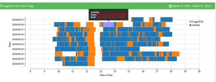
Figure 7.3: Device Usage
7.2.2 Device Usage
The bar chart in figure 7.3 is a time-series view of the comparison between the duration of time that the device was logged into versus the duration of time the device was being actively used by the user. The X axis represents the hours of the day and the Y axis represents days of the week from the selected time interval. The final version of the X axis is still under debate; there is the option where we use a fixed scale from 0 to 23 hours or whether we use a dynamic scale that is based on the timestamps in the data. Using a fixed scale might be easier to read when changing the time range using the calendar, but using a dynamic 22
start-time and end-time and the length of the bars represents the duration. The gaps between the orange bars indicate the user being logged out of the device or the screen being locked. In this example, we notice a trend showing the device being logged out of, approximately between 12:30 and 13:00. Incidentally, this happened to be the time I was taking a lunch break during that time period. The blue bars overlaid on top of the orange bars indicate periods of application interactivity whether that is with the operating system or applications running in the foreground. Hovering over the bars with the mouse causes highlighting of the the respective bar (orange or blue) and displays the same custom D3 tool-tips as those in the ’application interaction’ chart that display the duration as well as the series (logged-on - orange, activity - blue) in a human readable format.
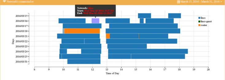
Figure 7.4: Network Connections
7.2.3 Networks Connections
Similar to the Device Usage bar chart, the bar chart in figure 7.4 depicts a time-series view of the wireless networks connected to in the selected time interval using the calendar on the top right. The X axis represents the hours of the day and the Y axis represents days of the week from the selected time interval. The same dilemma regarding the scale of the X axis as mentioned in the ’Device Usage’ section above (whether to use a fixed or a dynamic scale) affects this bar chart because they both share the same underlying structure and were built using D3.js. The edges of the bar indicate the start-time and end-time and the length of the bars represents the duration of time corresponding to the X axis. Unlike the previous bar chart though, there is no overlapping of bars here because each end-host can only be actively connected to one wireless network at a time.
12:30 and 13:00 can be seen here also. Instances where there is a gap between two corresponding colored bars could indicate a disconnection and reconnection event, pointing to a possible problem with the network connection. Hovering over the bars with the mouse causes highlighting of the the respective bar (orange or blue) and displays the same custom D3 tool-tips as those in the ’application interaction’ chart that display the duration as well as the series which represents each separate wireless network in a human readable format. In this example, we can see that the wireless network of SSID ’lincs’ is the most used wireless network having been used almost the entire day in the selected time interval.
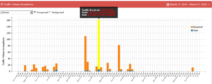
Figure 7.5: Traffic Statistics
7.2.4 Traffic Statistics
The Histogram in figure 7.5 shows a time-series comparison of application traffic in the sent and received directions as a stacked bar chart of the application selected in the drop-down list. The applications in the drop-down list are those that created TCP / UDP connections and subsequently were logged in the HostView Database. The list is filtered down based on threshold aggregate traffic volume to reduce the number of applications in the list to only those that sent and received a certain percentage of the total traffic generated in the selected time range of the calendar. The list of applications changes based on the selected time interval in the top right corner because different application flows are logged at different times. Interactive switches allow the user to toggle between foreground and background applications. The drop-down list is populated based on the selected radio button; selecting the foreground button populates the drop-down list with only those applications that sent or received traffic (above the threshold) and were being interacted with in the foreground and likewise when the background button is selected.
The X axis represents intervals of time / bins that are sized automatically (based on selected time range) just like the ’Application Interaction’ chart. The Y axis here represents traffic volume in units of data size - bytes, kilobytes, megabytes and so on. Like the previously mentioned D3 charts, hovering over the bars with the mouse causes highlighting of the the respective bar (orange or blue) and displays a 24
the time-series of traffic generated by Google Chrome in both directions, with traffic in the download direction significantly outweighing traffic in the upload direction.
Conclusion
As mentioned before, the first field trial of HostView consisted of 40 home users, primarily computer experts that used a variety of different applications [11]. But with the deployment of the first version of our HostView UI, we hope to launch a second field trial with at least the same number of home users from multiple countries, preferably in a variety of different network environments and professions to be able to test our user interface in order to prove its aesthetic appeal which arouses curiosity, its ease-of-use for users of any technical level, its responsiveness to interaction, its ability to be informative to home users and its robustness to data of varying scales such as time intervals of days, weeks, months and even years.
The first step is to integrate the HostView UI on the Inria web-server with live / up-to-date data being retrieved by querying the back-end PostgreSQL database. Next, we can proceed to conducting the second field trial and evaluate valuable feedback from users which will be incorporated towards further refining the next version of the HostView UI. We hope that it provides sufficient incentive for home users to want to view their network and application usage activities to understand their Internet application usage habits. We aim to make it a valuable utility in the arsenal of every home Internet user.
8.1
Skills Acquired
In terms of the skills acquired, I can proudly say that this Internship allowed me to learn a whole different side of Internet technology than I had previously been exposed to. Not only was I able to create better SQL queries and improve my understanding of relational database concepts, but I was able to acquire an intermediate level of knowledge in terms of web-development using HTML, CSS, JavaScript and jQuery. Being able to create smooth and beautiful visualizations using the native code format of D3.js which usually scares most web-developers is an accomplishment in itself. Furthermore, working with different types of network, application and system datasets has allowed me to improve my data analysis skills. Our weekly presentations, have enabled me to practice being able to present complex topics in a simple and clear manner. Lastly, our reading group every Friday where we present and share recent published papers in our areas of research has sharpened my critical thinking skills.
List of Acronyms
AJAX Asynchronous JavaScript and XML BSSID Basic Service Set Identifier
CSS Cascading Style Sheets DNS Domain Name Service ESM Experience Sampling Method HCI Human Computer Interaction HTML Hyper-text Markup Language ID Identification
IP Internet Protocol IM Instant Message IO Input-Output
JSON JavaScript Object Notation
LINCS Laboratory ofInformation, Networking and Communication Sciences MUSE Measuring Networks to Enhance User Experience
OS Operating System PCAP Packet Capture File QoE Quality of Experience QoS Quality of Service
REST Representational state transfer SSID Service Set Identifier
SQL Structured Query Language SVG Scalable Vector Graphics TCP Transport Control Protocol UDP User Datagram Protocol UI User Interface
UPMC University Pierre et Marie Curie USD United States Dollars
VoIP Voice-over-IP
[1] A. Almossawi and H. Ulmer. Metrics Graphics. http://metricsgraphicsjs.org/. [2] M. Bostock. D3.js. https://d3js.org/.
[3] Inria. Organisation in Brief. https://www.inria.fr/en/institute/ inria-in-brief/inria-in-a-few-words.
[4] Inria. Renata Cruz Teixeira Homepage. https://who.rocq.inria.fr/Renata. Teixeira/.
[5] Inria. Team MUSE: HostView. https://muse.inria.fr/EMD/Home.html. [6] Inria. Team MUSE: Presentation. https://team.inria.fr/muse/.
[7] Inria. Vassilis Christophides Homepage. https://who.rocq.inria.fr/Vassilis. Christophides/.
[8] D. Joumblatt, J. Chandrashekar, B. Kveton, N. Taft, and R. Teixeira. Predicting user dissatisfaction with internet application performance at end-hosts. In INFOCOM, 2013 Proceedings IEEE, pages 235–239. IEEE, 2013.
[9] D. Joumblatt, O. Goga, R. Teixeira, J. Chandrashekar, and N. Taft. Characterizing end-host application performance across multiple networking environments. In INFOCOM, 2012 Proceedings IEEE, pages 2536–2540. IEEE, 2012.
[10] D. Joumblatt, R. Teixeira, J. Chandrashekar, and N. Taft. Hostview: Annotating end-host perfor-mance measurements with user feedback. ACM SIGMETRICS Perforperfor-mance Evaluation Review, 38(3):43–48, 2011.
[11] D. Joumblatt, R. Teixeira, J. Chandrashekar, and N. Taft. Performance of networked applications: the challenges in capturing the user’s perception. In Proceedings of the first ACM SIGCOMM workshop on Measurements up the stack, pages 37–42. ACM, 2011.
[12] B. Keen. D3Pie. http://d3pie.org/#about.
[13] Lincs. Lincs: About us. https://www.lincs.fr/about-us/. Accessed: 2016-08-12. [14] N. Partners. NVD3.js. http://nvd3.org/.
[15] Plotly. Plotly.js. https://plot.ly/javascript/.