HAL Id: hal-01806107
https://hal.archives-ouvertes.fr/hal-01806107
Submitted on 1 Jun 2018
HAL is a multi-disciplinary open access
archive for the deposit and dissemination of
sci-entific research documents, whether they are
pub-lished or not. The documents may come from
L’archive ouverte pluridisciplinaire HAL, est
destinée au dépôt et à la diffusion de documents
scientifiques de niveau recherche, publiés ou non,
émanant des établissements d’enseignement et de
EUROVIS 2018
R. S. Laramee, G. E. Marai, and M. Sedlmair (Guest Editors)
(2018), Number 3 STAR – State of The Art Report
State of the Art of Sports Data Visualization
C. Perin1,2, R. Vuillemot3, C. D. Stolper4, J. T. Stasko5, J. Wood1, and S. Carpendale2
1Department of Computer Science, City, University of London, UK 2Department of Computer Science, University of Calgary, Canada
3École Centrale de Lyon, Université de Lyon, France
4Department of Mathematics and Computer Science, Southwestern University, USA 5School of Interactive Computing, Georgia Institute of Technology, USA
Abstract
In this report, we organize and reflect on recent advances and challenges in the field of sports data visualization. The exponentially-growing body of visualization research based on sports data is a prime indication of the importance and timeliness of this report. Sports data visualization research encompasses the breadth of visualization tasks and goals: exploring the design of new visualization techniques; adapting existing visualizations to a novel domain; and conducting design studies and evaluations in close collaboration with experts, including practitioners, enthusiasts, and journalists. Frequently this research has impact beyond sports in both academia and in industry because it is i) grounded in realistic, highly heterogeneous data, ii) applied to real-world problems, and iii) designed in close collaboration with domain experts. In this report, we analyze current research contributions through the lens of three categories of sports data: box score data (data containing statistical summaries of a sport event such as a game), tracking data (data about in-game actions and trajectories), and meta-data (data about the sport and its participants but not necessarily a given game). We conclude this report with a high-level discussion of sports visualization research informed by our analysis—identifying critical research gaps and valuable opportunities for the visualization community. More information is available at the STAR’s website:https://sportsdataviz.github.io/.
1. Introduction
Sports have a long tradition of data collection and reporting. In the eighth century BCE, spectators recorded the results of the Ancient Olympic Games. In the 1870s, Henry Chadwick introduced the baseball scorecard for collecting statistical information about baseball games beyond simply team runs scored that is still in use (with some minor adjustments) today [Dic97].
There is ample evidence that successful analysis of sports data can result in better performances of a team [Lew04,MW12,
Win12] and can have notable positive economic impact [OJK13].
Scouts use data to find talented players; trainers to improve player performances; analysts to find even the slightest edge over their rivals. Journalists report on sports using data meticulously maintained by warehousers such as the Elias Sports Bureau, STATS LLC, and Opta. Their reporting in the past decade has included the design of intricate and informative infographics of this data. Fans follow their favorite teams and players using statistics, once using newspaper box scores and now utilizing free sources such as the Sports Reference family of sites [Spo16a] and Fangraphs [Fan16]. Beyond the realm of professional sports, individuals actively participate in a recreational facet of sports data by collecting statistics on their own activities to track, maintain, and improve their performance.
Sports visualization offers new approaches to exploring, making sense of, and communicating sports data. As visualizations can be more accessible and more meaningful than traditional statistical analysis [Ber15,JSS∗14], the number of visualizations of sports data has grown rapidly over the past decades. Print and online media companies, including The New York Times (e.g., [QW14,
AQ16,AQ14,Tim07,DQ14,QR16a]), present sports data using
infographics and interactive visualizations. Dedicated blogs such as FiveThirtyEight have become extremely popular for their analyses of sports events, players, and economics using visualizations. Television broadcast and betting websites increasingly use statistics and graphics to evaluate and predict sports events.
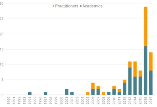
In visualization research, there has been a similarly growing interest in sports data over the past 20 years. The increasing numbers of publications related to the field at leading conferences such as IEEE VIS, EuroVis, and ACM CHI demonstrate this interest. The MIT Sloan Sports Analytics Conference has been gathering professionals and academics since 2007. In 2013, the first workshop on sports data visualization was organized at the IEEE VIS Conference [BCC∗13]. In 2016, an IEEE Computer Graphics & Applications special issue was dedicated to sports visualization [BS16]. Figure1shows the distribution, by year, of published research articles on sports visualization we gathered.
c
Figure 1: The 98 sports data visualization articles from both academics and practitioners we collected, grouped by year. This chart emphasizes the recent growth in research surrounding sports data.
While many academic papers, including other state of the art reports, include sports visualizations, sports as an application domain has not yet been the subject of a review from a visualization perspective. Visualization of team sports has recently been surveyed [GH17], however, this previous survey focuses solely on team sports and takes a fully spatio-temporal lens to looking at visualizations used in this context. Our paper differs in both aspects as we integrate both team sports and individual sports and discuss box-score data and meta-data in addition to (spatio-temporal) tracking data.
Existing sports visualization research stems from passionate, often distributed, communities working on sports data analysis and communication. With the increasing interest in sports visualization from both sports practitioners and visualization researchers, there is a need to document and analyze these efforts. In our review we identify three types of sports data that are used in sports visualizations: box score data (data containing statistical summaries of a sport event such as a game), tracking data (data about in-game actions and trajectories), and meta-data (data about the sport and its participants but not necessarily a given game). Using these three data types, we structure our collection of 98 works from both academics and practitioners in the space and lay out the opportunities and challenges for the future of this fascinating subfield.
We start by describing the methodology and scope of our review in section 2. Then, in section 3, we introduce box-score data, tracking data and meta-data, the three types of sports data we extracted from analyzing the literature in sports data visualization. Sections4,5, and6then organize the literature using these three types of sports data. Finally, we reflect on our review to discuss both core and under-explored topics in sports data visualization, unveiling challenges for the area of sports visualization in particular but also for information visualization in general.
sport or player. The duplicates that resulted from merging these personal collections were important as these were cues of particular relevance of the contribution, sport, or event.
The second step was to expand the collection in order to remove biases on favorite sports and expand the scope of sports and events. We primarily used Google Scholar, the ACM DL Library, and IEEEXplore in this phase. We used keywords such as sports visualization and sports data visualization to search for recent papers that we did not know of and to reach other communities.
We further reviewed hundreds of infographics as they are a significant driver of advances in sports visualization. This review made it possible to contrast the work in the research community and the work from sports practitioners. For selecting these newspaper and blog articles among the thousands that exist, we decided to go for broadness and diversity and include any new visualization that seemed to offer a new perspective on sports data visualization. We also searched on the Web for non-research sports visualization that already had a citation entry. Google Images was also helpful for filtering out non-visual entries.
A third step was collection completion. As we identified authoritative sources of publications and newspapers (e.g. New York Times sports infographics), as well as the most prolific sports data sources and tracking technologies, we visited websites to browse complete collections of articles in conferences or tagged articles on newspapers websites (e.g. data-visualization on FiveFirthyEight and olympics on FlowingData).
The fourth and final step was to reduce the collection. In this step, we discarded fringe articles and infographics whose contribution was below average, such as by: not making a strong contribution to sports data analysis; not providing a novel lens on sports data (e.g., simply using standard charts and not providing any particular insight); or not describing the underlying process enough to understand the data or the context sufficiently. We also discarded academic papers without a visual contribution (e.g., data mining and algorithmic papers that are related to sports data but do not contribute to visualization research). We also discarded papers that are about a generic visualization technique and use a sport as an example scenario (e.g., [JSSS16]).
This process resulted in 281 initial papers and articles, out of which we selected 98 for review in this report.
year 2016 Bes16 2015 Woo15 2013 Won13 2013 CF13 2016 PBV16 2014 PVF14 2006 CS06 1994 Tur94 1997 JB97 2014 PYHZ14 2013 OJK13 2013 PVF13b 2013 PVF13a 2016 SJL*16 2011 RSB11 2016 SJB*16 2014 JSS*14 2016 AAB*16 2015 SHJ*15 2016 SSN*16 2014 DKVS14 2013 MB13 2007 PM07 2013 CM13 2012 Gol12 2012 MCHD12 2016 CLX*16 2016 BEA16 2016 HZ16 2013 Dem13 2002 BJM02 2001 POJC01 2014 STS*14 2015 LCN15 2010 CMHD10 2016 KYY*16 2013 WWM13 2001 MWA*01 2016 BBW16 2012 PSBS12 2012 LCP*12 2016 CPG*16 2010 DWA10 2014 BLC*14 2016 VP16 2015 FMBG15 2007 TSLR07 2009 STL09 2012 DMS12 2015 VP15 2006 PM06 2017 SJS*17 2016 LOC*16 2016 Met16 2017 CEGH17 2017 AAB*17 2017 GH17 2015 CLP*15 2018 SJL*18 2017 MLM*17 2017 SAMS*17 2016 LTB16 2018 WLS*18 2014 QW14 2015 Lov15 2016 Won16 2006 CW06 2007 Tim07 2011 CQW11 2016 AQ16 2013 LSS13 2014 AQ14 2016 Con16 2014 DQ14 2016 QR16 2008 CNW08 2006 Sus06 2016 Art16 2010 RCW10 2013 ySSS13 2016 Mor16a 2016 BC16 2016 The16 2016 Spo16b 2014 Ais14 2016 Sil16 2014 Jos14 2005 Fry05 2016 Mor16b 2016 MLBG16 2015 NFL15
A
C
ADEMICS
PRA
C
TITIONERS
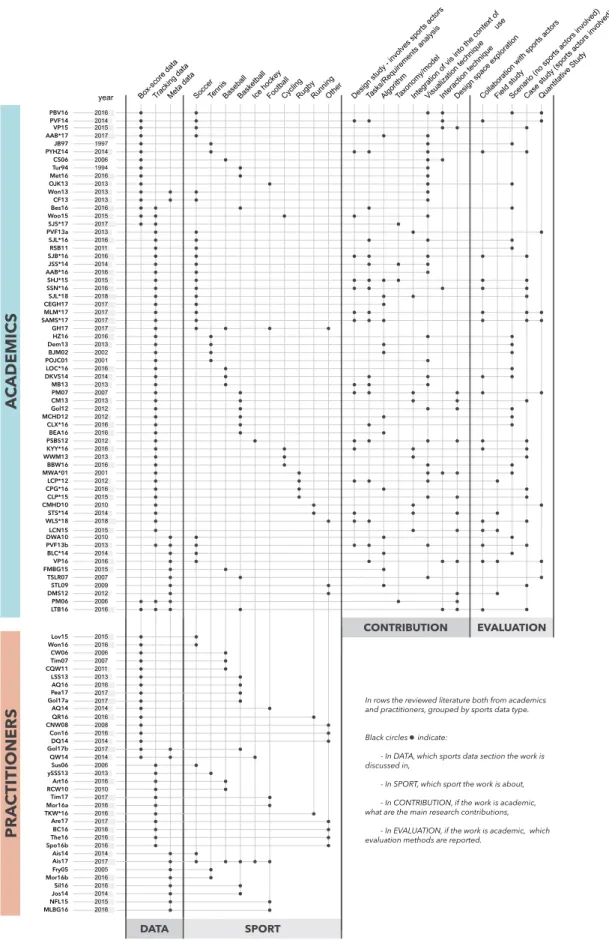
DATA SPORT CONTRIBUTION EVALUATIONBox-score dataTracking dataMeta data SoccerTennisBaseballBasketballIce hockeyFootballCyclingRugbyRunningOther Design study - involves sports actorsTasks/Requirements analysisAlgorithmTaxonomy/modelIntegration of vis into the context of
useVisualization techniqueInteraction techniqueDesign space explorationCollaboration with sports actors Field studyScenario (no sports actors involved)Case study (sports actors involved)Quantitative Study
In rows the reviewed literature both from academics and practitioners, grouped by sports data type. Black circles indicate:
- In DATA, which sports data section the work is discussed in,
- In SPORT, which sport the work is about, - In CONTRIBUTION, if the work is academic, what are the main research contributions,
- In EVALUATION, if the work is academic, which evaluation methods are reported.
Gol17b 2017 Pea17 2017 Gol17a 2017 Tim17 2017 Are17 2017 TKW*16 2016 Ais17 2017
research papers we reviewed in terms of contribution type and evaluation method. These descriptors make it possible to grasp the breadth and depth of contributions that emerge from sports data visualization, as well as extract the various strategies for conducting research in this area.
Figure 2 presents a summary of the 98 articles and research papers we analyzed in terms of the aforementioned descriptors.
3. Types of Sports Data
As explained in the previous section, we structure our survey based on the three types of sports data we derived from related papers analysis: box-score data, tracking data and meta-data.
One could apply almost any visualization to the sports domain, and many visualization types (e.g., node-link diagrams, time series line plots, and heatmaps) have been applied to sports. What makes sports a unique domain of interest is the variety and specificity of the data it generates. Thus, to discriminate the techniques used to visualize sports data, we look into the types of data that are visualized. In particular, while trajectory information and meta-data are often of a similar nature across sports, box-score meta-data are highly sport-specific. The combination of these three types of sports data results in a rich and wide space of sports visualization.
We note ahead of time that these three data types are not perfectly orthogonal—the line between these data types is not always completely clear. For example, some professional sports leagues now use tracking data to compute box-score data and meta-data usually requires box-score and/or tracking data to be put in perspective. Manually collected event data with additional qualitative descriptors (e.g. location and speed of a shot on goal) could fit into either box-score data or the tracking data categories. The height of a baseball player or soccer goalie, which we consider to be meta-data, could also be considered tracking data as height can affect the size of the batters’ box or the free space on goal. However, most data falls squarely into one of the three categories.
3.1. Box-Score Data
Sports have a long and constant tradition of recording critical observations. Spectators have been tracking the history of sports dating to very early competitions, such as the Ancient Olympic Games in 776 BCE. Since then, game results and details have been
Figure 3: Example of scorecard notation that captures events (e.g. errors, hits) in baseball. By Synaptidude at English Wikipedia [Public domain], via Wikimedia Commons.
tracked by sport officials, journalists, and fans, using scorecards (see Figure3). Such scorecards capture the structure of the game as discrete events such as substitutions, hits, and fouls by players over the course of the game.
The term box-score designates the statistical summary of a game. Although this term was originally used in baseball, it has been adopted by many sports including basketball and hockey. We use the term to describe any discrete data referencing in-game events. This can include both summary statistics (3 hits, 1 walk, 1 strikeout) as well as finer-grained event data (goal in the 83rd minute). We mentioned that the line between categories can be blurry. We tended to not consider any discrete data that had a spatio-temporal aspect to it (such as where on a court a tennis shot landed) as box-score data and instead categorized them as tracking data. Note that despite advances in technology, as of today most of these events and statistics are still generated by humans in sometimes quite tedious processes.
3.2. Tracking Data
Recent development in tracking and sensing technologies now enable collecting and analyzing new classes of data beyond the traditional box-score.
This tracking data contrasts with the box-score approach as the volume, variety, and precision grow exponentially and at cheaper costs. Most tracking data is collected by utilizing machine vision
EventPlayer
EventPlayerAction
+outcome (0/1) +xEventPlayerPosition +y
Pass Offensive Defensive Error
errorTypeID: 000: bad control 001: dispossessed 003: loose ball +errorTypeID defensiveTypeID: 000: tackle (0/1) 001: aerial (0/1) 002: interception 003: dribbled 004: touched the ball 005: clearance 006: ball out of field 007: blocked cross 008: blocked shot 009: corner given +defensiveTypeID +offensiveTypeID offensiveTypeID: 000: dribble (0/1) 001: aerial (0/1) 002: good skill Shot +passType1ID +passType2ID +passType3ID +bodyPartID +isOffside (0/1) passType1ID: 000: short 001: long 002: cross 003: switch of play 004: through bodyPartID: 000: right foot 001: left foot 002: right leg 003: left leg 004: head 005: chest 006: shoulder 007: back 008: right back heel 009: left back heel +shotType1ID +shotType2ID +shotType3ID +shotType4ID +shotOriginX +shotOriginY +shotDestinationY +shotDestinationZ +bodyPartID +isOwnGoal (0/1) +strength [0,1] passType2ID: 000: on air 001: on ground passType3ID: 000: back 001: corner 002: free kick 003: throw in shotType1ID: 000: free kick 001: penalty 002: direct corner 003: from corner 004: from free kick 005: from throw in 006: from GK release 007: from pass 008: from personal action 009: from cross 010: from scramble shotType2ID: 000: volley 001: overhead 002: half volley 003: diving head shotType3ID: 000: saved 001: post 002: missed 003: goal 004: post and goal 005: GK touch and goal 006: deflected 007: deflected and goal
shotType4ID: 000: rising 001: dipping 002: with bounces
+time
Figure 4: Taxonomy of detailed soccer data used to collect and structure spatio-temporal events [PVF13a], based on Opta’s data scheme. Image courtesy of the authors, used with permission.
to gather precise spatio-temporal information about the players and equipment in real-time during the course of play. A variety of multi-camera tracking systems such as Hawk-Eye, K2 Panoramic Video system, Sportvision RACEf/x [Spo16b], PITCHfx/Statcast, SportVU, SportsCode, Catapult Sports’ OptimEye S5 [Cat18], and Dartfish collect this form of data. (See [DKVS14] for a comprehensive list and comparison). A common underlying motivation for sports visualization research is to make use of the unprecedentedly detailed datasets generated by these technologies. Figure4demonstrates the complexity of the data with a taxonomy of soccer tracking data provided by one of the major sports data collection companies [PVF13a].
3.3. Meta-Data
Box-score and tracking data capture specific matches and events in those matches. Beyond this, there is additional data that surrounds sports that can add context to these events. Such data might concern rules, stadium capacities, physical characteristics of players, kit colors, team badges, and sponsor information to name a few. The data may also come from less sports-exclusive domains such as social media activity during a game.
Meta-data can also generate meta-data, for example correlations between box-score and tracking data or factors such as stadium formats (see Figure5), players’ diets, or weather conditions.
4. Visualization by type: Box-Score Data
We start our review with box-score data. 26 / 98 articles in our review focus solely on this type of sports data. The popularity of box-score data, in particular among practitioners, can be explained by its cheap and technology-independent means of acquisition. Although box-score data is often simple and small-scale, it is diverse and results in a wide variety of visualization approaches.
From an information visualization perspective, this type of data is different from for example, spatial data, as it is usually more abstract and strictly follows rules that define the types of events and occurrences recorded during a sports events. Sports rules are indeed the backbone of sports data, since tracking and meta-data (as defined in this paper) may be considered, in a sense, independent from the sport itself. Rules are, on the whole, stable over time but do occasionally change slightly—often driven by needs from media, TV broadcasting, and advertising—such as MLB’s changes in 2015 [MLB15] to increase the pace of baseball games.
We separate the visualization of box-score data into two main categories: time-evolving championship tables and rankings relate to the explicit importance of time in sports and scores, goals, and pointsrelate to the general sports rules.
4.1. Time-Evolving Championship Tables and Rankings Sport competitions can span over long periods of time. Typically, team sports such as soccer, football, ice hockey, and basketball are played in championships, or leagues, every year. Teams play against each other two times or more over the course of several months. In some leagues this is either the entire competition (e.g., for European soccer championships) or the first phase of the competition (e.g., for the NBA and the NHL). The results of these games build standing tables, which determine who wins the competition, who is demoted to a minor league, and/or who progresses to a highly anticipated playoff stage.
Ranking (or standing) tables have been the standard way of representing and analyzing championships. They typically consist of vertical lists of teams’ names and indicators of success such as wins and losses, points earned for victories, and/or the number of goals scored and conceded. The teams are ordered by rank, which is a derived index usually based on their number of points or ratio of wins to games played.
Figure 5: Visual comparison of baseball stadium dimensions [Lou15] is an example of using meta-data to understand the influence of a baseball game’s environment on teams’ play. Image courtesy of the author, used with permission.
Allowing to navigate in the time dimension of tables. Because standard ranking tables do not convey the time-evolving aspect of championships [PVF14], existing work has looked into ways of combining the well-established and widely used ranking tables with visualizations that convey the changes over time.
In a series of works, Perin and Vuillemot [PVF14,VP15] explored new interaction techniques for navigating into the temporal dimension of ranking tables. Based on an analysis of tasks that soccer journalists and enthusiasts seek to perform, they proposed a way of interacting with the rank domain (such as the number of points of a team at a given time) to explore the time domain. They also proposed integrating a line chart visualization into the table and offered a way of transitioning between the two views [PVF14]. The authors further refined the technique to make it possible to navigate into ranking tables at different points in time by navigating directly along the trajectory of the rank of a team [VP15].
Showing relative gaps. Ranking tables have historically laid out all teams of a championship on a linear scale, i.e. with rows (teams) being simply ordered by rank. Showing rankings that evolve over
Figure 6: The second half of the 2013–2014 Spanish Liga, visualized using GapChart [PBV16]. At each matchday, the lines representing the teams do not overlap. Teams that have the same number of points at a given time are shown with no white space between them. Thin gray lines indicate 3-point differences between two consecutively ranked teams. Image courtesy of the authors, used with permission.
time with a line graph then results in either a rank chart—where the y axis is an ordinal axis that conveys rank—or a score chart— where the y axis is a quantitative axis that conveys the result of the score function used to determine the rankings [PBV16].
While rank charts do not convey the magnitude of the gaps (or score differences) between teams, score charts convey these scores but result in overplotting and overlapping lines. A way of tackling this issue is to change the mapping on the y axis to convey not the rank or score of each team over time but the relative distances that separate the teams. This is particularly important when looking at championship data as the gaps between teams has more importance than the absolute score a team has. This technique facilitates: more accurate predicting of the final championship rankings; reflection on the full course of the competition; and comparison between the variability of different leagues. Both gap charts [PV13,PBV16] (see Figure6) and Standings Tracer [Won16] (see Figure7) take the approach of conveying the relative score differences between teams over time (note that their formulae for determining the mapping on the y axis differ slightly). Both techniques also feature a focus interaction to select a team and explore that team within the broader context of a season (see Figure8).
Figure 7: Standings Tracer [Won16] showing the relative points of all teams in a championship over time. Image courtesy of the author, used with permission.
Figure 8: Standings Tracer’s [Won16] focus interaction. Selecting a team shows details about each game the team played during the championship. Color indicates the outcome of the game (win, loss, draw) and vertical lines connect the focus team’s line graph to their opponent for each match day. This creates a fishbone of the team that shows the “gaps” between the focus team and each of its opponents. Image courtesy of the author, used with permission.
4.2. Scores, Goals, and Points
Whether or not sports are framed within competitions, they obey specific rules. In many sports, teams or players participating in a game or competition need to score points to win each game (e.g., score goals in soccer, score points in tennis). Within a competition, points may be attributed according to their performance towards the competition (e.g., three points for a victory in most soccer championships and points given to each participant in a decathlon after each of ten events).
Contextualizing by overplotting. Many visualizations are dedicated to record-breaking points and scores. For example, Stephen Curry’s 3-point record was put in context in one of The New York Times’ infographics [AQ16]. This line chart shows one line for each of the 752 players who finished in the top-20 in 3-point attempts at the end of each season between 1980 and 2016. This visualization clearly shows how Stephen Curry is an outlier compared to the rest of the players, as he goes “off the charts”. A similar and at least as famous infographic shows Barry Bonds’s progress towards breaking the career home run record [CW06].
Many infographics from online newspapers create comparisons of players and teams by using multiple line charts. This is the case with The New York Times’ Peyton Manning’s touchdown passes record [AQ14]; Paths to the Top of the Home Run Charts [Tim07]; comparison of baseball players who reached 3000 hits in their career [CQW11] or of NBA players in terms of number of points scored during playoffs [Pea17]; and with the comparison of NBA players performances in terms of points, rebounds, and assists per game over the season [Gol17a]. One notable example of this technique is Five Thirty Eight’s sumo project [Con16], showing the history of sumo from 1761 to 2017, using overplotting of line graphs with color coding and annotations. The density of information in those visualizations creates a baseline that usually gathers the majority of players from which a select few top performers visually stand out.
Other visualizations besides line charts make use of overplotting, such as scatterplots. For example, by overplotting all swimming world records over time [Are17] one can explore how swimming world records evolved across history, paces of change, and outliers. The Berlin 2016 marathon visualization [TKW∗16] is another example that shows all the runners participating in the race on a single map. It is also possible to establish a goal and see where in the pack of runners one would need to be to achieve that goal.
Visualizing all statistics. In the visualization community, some complex exploratory tools support the analysis of scores, goals, and points in sports. SportsVis’s baseline bar display [CS06] makes it possible to explore the performance of baseball teams or players over the course of one season. NBAVis [LSS13] consists of a scatterplot with multiple dimensions such as team, rebounds, assists, points, and blocks to explore NBA data. With Buckets [Bes16] and BKViz [LTB16], it is possible to explore the points a basketball team scored against each other team in the league, among many other facets of the data. Chung et al.’s knowledge-based ranking system features multiple coordinated views to explore the multiple facets of rugby games [CPG∗16]. These approaches result in powerful tools in which many dimensions can be explored simultaneously—as opposed to more static infographics—but at the cost of being more complex to use.
Laying out in context. Often, sports visualizations that show scores, goals, or points show these values within the broader context of sport events (e. g., full games). For example, some sports like tennis have their scoring structured hierarchically. A tennis match consists of several sets, each set consists of several games, and each game consists of several points. The outcome of a game (who wins and who loses) follows this hierarchy, and the player who scored the most points is not guaranteed to win the match. To convey the bigger picture in which points are scored, treemaps have been used for visualizing this natural hierarchy [JB97].
As another example, Chris Love used Tableau to show all the shots on goal for all games of a Premier League’s championship day [Lov15] (see Figure10). The visualization shows a bar chart where the x axis represents time and each bar represents a 5 minute interval. The y axis—the length of each bar—encodes the shots on goal. This visualization conveys the dynamics of each game by showing important events (shots and goals) in the context of the timeline of the game.
Figure 9: A History of Sumo [Con16] is a stylized interactive visualization that presents the history of sumo using storytelling and exploration capabilities. Image courtesy of the author, used with permission.
Showing relative differences rather than absolute values. In sports such as skiing, running, and racing, time is what matters most. The New York Times showed how close to winning participants were for each final of alpine skiing [Bou47], bobsled, luge, speed skating, and skeleton for the 2014 Winter Olympics [DQ14]. Instead of showing the absolute times of participants, they show the time difference relative to the winner. Relative times are particularly important in such sports where differences are often matters of milliseconds. For such short intervals, a sonification approach was used in the 2010 Winter Olympics to grasp the scale of infinitesimal differences between finish times [Ama10].
The New York Times also created an image showing all fastest men in the world by year, since 1896, with their position on the track at the time of the current world record [QR16a]. By representing each data point with a sprinter, the image looks like a photograph from the top of the track and the differences in performances are easily apparent to the reader.
Figure 10: Small multiples of football games putting the shots and goals in the context of soccer game timelines [Lov15] (cropped). Image courtesy of the author, used with permission.
Figure 11: Relative time differences between each cyclist participating in the race and the top performer at that moment [Woo15]. Red lines encode cyclists who did not finish the race. Image courtesy of the author, used with permission.
In the context of golf, multiple Slope Graphs [Tuf01] have been used to show Tiger Woods’s difference in performance compared to the rest of the world’s top golfers in non-major and major tournaments [CNW08]. Once again, what matters is the relative difference between Woods and the other players rather than absolute numbers of strokes.
In the context of cyclist group racing, Wood created graphs (such as the one shown in Figure 11) showing the relative difference between each cyclist and the top performer at each point in time of the race [Woo15].
5. Visualization by type: Tracking Data
Sports tracking data is a natural evolution of box-score data that has become increasingly available due to recent advances in sensor and video motion detection technologies [GH17]. The majority
Figure 12: Shot distribution and density in CourtVision [Gol12]. Sweet spots usually are below the hoop or behind the 3-point line. Image courtesy of the author, used with permission.
of the articles we collected (55 / 98) make use of tracking data, for example to track player positions on a field, ball speed, and path after a shot. Tracking data usually consists of series of spatio-temporal events at a very fine grain of detail, with multiple dimensions such as player identities and type of action. The data scales with the number of games or players or by adding more sensors and cameras.
Because the data is spatio-temporal, it is not necessarily directly governed by the rules of the game. This is the primary difference as compared with box-score data which are summaries of events dictated by sports rules. Notably, new box-score data metrics— e. g., “Contested Points” and “Expected Goals”—can be derived from tracking data like shot attempts, player movements without the ball, or ball trajectories that did not result in a score change.
The richness and density of tracking data raises other challenges than the ones of box-score data, often involving some combination of algorithms, data mining, and visualization. In this section we separate general work in visualization of events and trajectories (often adopting a third-person perspective on the data) from work dedicated to representing the data from the players’ point of view (often adopting a first-person perspective on the data).
5.1. Events and Trajectories
Event density map. The most straightforward way to plot raw tracking data is as events on a dot map, such as hit balls on a baseball pitch [DKVS14,MB13,LOC∗16]. Although simple, dot maps provide enough details to characterize players’ abilities and are a natural representations of ball trajectory origins or targets. Interestingly, they are commonly used as a visual signature characterizing a player or a team [Bes16] for complex play analysis [DKVS14].
Variations of density maps include using spatial binning [Gol12] to generate discretized heat maps using a preset color scale. The field is partitioned into regular areas which are each assigned a color according to the number of events that occurred in that area.
While these aggregations approximate otherwise accurate data (e.g. shots), they have been used to identify players’ roles and teams’ systems. For instance, “spray charts” [DKVS14] show where balls have been hit to—creating spatial groupings of hits that highlights areas of the field where events happen frequently.
Other variants of density maps include radial heatmaps to show ice hockey shots [PSBS12]. Density maps are often decorated with landmarks from the field of play—such as formalized line schemes—to provide scale and contextualize the data within the game’s rules. In some cases, landmarks visually emerge on their own due to data distribution. In CourtVision [Gol12], the 3-point line appears due to the lack of shots just inside it (see Figure12).
Events representation. Despite events having strong ties with their (x, y) position, they are often best represented with position in the display encoding task-dependent attributes. For example, baseball hit analysis has found that the combination of ball exit velocity and launch angle determines whether a hit will likely be a home run [Art16] (see Figure13). A connected scatterplot by time allows the visualization’s user to easily detect increases in average kick distance and field-goal percentage of kickers in American Football [Mor16a] (see Figure14). GameFlow provides a grouping of events over time [CLX∗16] to reveal patterns and similarities in sequences and sub-sequences. Events can also be locally grouped, such as using a K-means algorithm to group Rodger Federer’s similar tennis shots [Dem13]. Passes can be represented as a network such as for the 2012 NFL championship [Gol13]. Cycling time trials have been represented using a matrix to visually compare time series [BBW16].
Trajectories. Trajectories result from the connection of discrete spatio-temporal events of the same entity. For instance, they might represent the spatio-temporal movement of players, balls, or other equipment during a game.
Trajectories are the second most frequent way of plotting raw tracking data and conveying the temporal and sequential structure of events [POJC01,MCHD12,SSN∗16,JSS∗14]. In their raw format, players’ trajectories resemble random scribble. However,
Figure 13: A sweet spot appears when coloring ball hits by scoring value, which reveals the right trade off between ball velocity and angle. From Five Thirty Eight [Art16]. Image courtesy of the author, used with permission.
some specific events are already recognizable, such as corner kicks in soccer [Sus06]. T-patterns [BJM02] aim at enhancing the presentation of spatial events by grouping them as zones. Interesting patterns are frequent connections of zones by the same player. Shorter trajectories (trails) also aim at reducing visual clutter, and are used in sports when entities are simultaneously moving such as during boat races [BC16], soccer games [AAB∗16] (see Figure15), or swimming races [CM16]. Trajectories are often used as visual signatures of phases of play [MLM∗17,PVF13b]. These small multiples can represent segmented and abstracted sports events, such as football catches [Tim17], which then act as small visual summaries of particular game events.
Trails can convey movement in motion charts [MMZ17], and further be used as visual signatures of teams tactics [SJL∗16]. Based on these trajectories, it is possible to compute and visualize new data such as players’ “interaction spaces”—“duel areas”
Figure 14: A connected scatterplot shows trends over time. In this case, it emphasizes that kickers are taking longer attempts than ever. From Five Thirty Eight [Mor16a]. Image courtesy of the author, used with permission.
Figure 15: Soccer pressure is illustrated by trails showing the pressure zone of the defense against the opponents [AAB∗16]. Image courtesy of the authors, used with permission.
between players of two opposite teams [SJB∗16] (see Figure16) and pressure against adversaries [AAB∗16,SJL∗18,AAB∗17]. It also makes it possible to classify the types of passes that soccer players make during a game [CEGH17].
A particular use of trajectories is for movement deconstruction, following a step-by-step analysis of complex sequences of actions such as those of a basketball rebound [MCHD12]. In a similar fashion, trails can emphasize a single movement. During the
Figure 16: Each circle represents a player. The radius of a circle represents the player’s “interaction space”, and the color of the circle encodes the team of the player. Hatching patterns show the potential “duel areas” of several players [SJB∗16]. Image courtesy of the authors, used with permission.
Figure 17: A penalty shooter’s point of view is reconstructed in 3D, showing her favorite target areas around the goalkeeper [RSB11]. Image courtesy of the authors, used with permission.
2016 Olympics, Simone Biles’s complex and fast-paced gymnastic movements [The16] were highlighted using a trails overlay atop the original video footage enabling visual persistence of multiple parts of her body during her routine.
Finally, one of the challenges with spatio-temporal trajectories within a bounded area such as a pitch is that representing an entire game or even just a subset of a game quickly results in overplotting, or ‘spaghetti’ representations. Tackling this issue is a hot topic in sports visualization, in particular, but also in visualizing spatio-temporal trajectories in general. For example, using different
levels of spatio-temporal abstraction to simplify smoothing the trajectories [SAMS∗17] (see Figure18).
Detailed events with context. Besides space and time data, complex descriptors such as the ones listed in Figure4provide hundreds of ways a ball can be kicked or a player can behave with it. SoccerStories [PVF13b] (see Figure19) represents complex multivariate records of each time the ball is kicked. While most visualizations apply the same representation to an entire dataset, their approach is to simplify such data using visual aggregation, where different visualizations are used piece-wise. Visualizations are organized on a spatial layout, and are centered where actions from the subsets spatially occur.
Real-time. As tracking technologies offer a real-time data feed, player position tracking can be broadcasted and analyzed live. Both Matchpad [LCP∗12] and the exploration of the design space of glyphs in rubgy [CLP∗15] summarize players’ events in a compact display using glyphs to track and categorize plays. Both approaches provide a more effective sequence of events than the more standard textual play-by-play sequences of game events. In particular, it requires less attention when monitoring and provides compact game summaries. Major League Baseball Advanced Media’s Gameday technology [MLB17] allows fans to see the trajectory and type of each pitch in real-time, and recent work augments the video stream of a soccer game with visualizations to convey the dynamics of the game [SJL∗18].
5.2. Players’ Point of View
First-person. While trajectories offer a bird’s eye view on players, changing the point of view to the players’ one allows viewers to understand the difficulty of a shot or a hit. A first-person point of view—such as a soccer goalkeeper’s [RSB11], a baseball hitter [RCW10], or a baseball catcher [MLB17]—changes the camera and perspective on the data to orient the viewer to the way players experience the event. Events appear either as animated playback to re-create an actual play or as static heat maps with shot distributions such as tennis ball trajectories [ySS13]. First-person points of view usually include 3D objects such as a goalkeeper [RSB11] or a batter’s silhouette and stadium features [MLB17] to suggest a more realistic environment.
Embedded tracking and visualization. Short feedback loops are important during any learning process. Several efforts have been made to provide those to players during training routines. Kaplan et al. display pedal pressure on training bikes [KYY∗16] to optimize effort and prevent injuries. Treadmill screens can also provide real-time feedback to runners [CMHD10]. The use of small, portable devices such as wrist-bands to detect activity in basketball [BEA16] also provides individual feedback. Equipment can also be used as a ubiquitous mechanism to broadcast game-related data, such as heart rate data on a bicycle helmet [WWM13]. Most of these visualizations display data as numbers using no encoding. Besides performance indicators, traditional events such as scores on a display on a basketball hoop [CM13] or win/loss on jerseys [PM07] have been shown to provide better competition and engagement among players. GPS systems in racing cars [Spo16b] now collect speed, acceleration, time behind leader, amongst other
Figure 19: SoccerStories [PVF13b] is the spatial connection of charts for the visual decomposition of a soccer phase. Image courtesy of the authors, used with permission.
data that together provide monitoring data for mechanical assistants to anticipate repairs and prevent accidents.
6. Visualization by Type: Meta-Data
Sports meta-data provides content and context details for the two sports data types, box-score and tracking data. Meta-data can be closely related to the sport event. This includes the physical characteristics of players or the dimensions of the grounds. Meta-data can also be loosely related to the main sport activity. This includes Tweets or TV programs, which provide a proxy for sport activities. Sports meta-data does not have a particular data type, but has to be related to other data, which could include player identities, time, or location.
Meta-data goes beyond just providing context: it is often the object of research itself as it provides interesting data structures (e. g., trees, graphs) that require new visualizations and interactions. Meta-data can also be seen as an empty shell, similar to an empty box score paper, that is filled with observed or predicted data.
22 / 98 articles we collected visualize meta-data, making this
type of sports data the least represented among of the three. However, because meta-data is also very diverse, visualizations of meta-data vary a lot. We structure our discussion of sports meta-data along three categories. First we discuss the visualization of sports, players and games characteristics such as physical landmarks on a pitch; then the visualization of players and teams performancesuch as team tactics; and then the visualization of competition structureand the thoroughly studied visualization of tournament brackets, in particular.
6.1. Sports, Players, and Game Characteristics
Meta-data plays an important role to convey a sport’s identity and rules. Such information is needed to understand the importance of some events. For example, during a soccer game a foul in the penalty area has the risk of resulting in a penalty shot for the other team. Thus, such visual cues such as the boundaries of a field that players experience in reality are often replicated within the visualizations using the same codes.
Sport recognition. As we previously discussed, event data alone is sometimes enough to distinguish the sport itself. For example, this is the case for shots around a basketball hoop [Gol12]. The background pitch with recognizable landmarks is probably the most common way to tell which sport has been picked if this cannot simply be inferred. Additional landmarks can be added, such as those specific to sport events like a trophy showing for the UEFA Champion’s League [Won13] or the FIFA World Cup [VP16].
Players and Teams Differentiation. Differentiating teams and players is crucial. In sports with two opponents, a differential color scheme can be used to differentiate entities. When multiple teams or players are involved, teams’ semantic colors [Won13,PVF14] are used. These semantic colors originate from commonly associated colors (like the blues of Chelsea in soccer) or as representative colors from the badges that are teams’ symbols [SM14]. Meta-data can also be used to critically discuss a sport in the context of more general topics. For example, showing the nationality of athletes for major sports league in North America and Europe over time shows how the sports have evolved throughout history [Ais17].
over time, and not all events are of equal interest, or value. An important body of research, especially in computer vision, uses video footage to detect potentially interesting sequences or errors. These algorithms are based on action detection [HBC09]—which is classic tracking data—but also using other individuals than players such as the referee of a game [CVS16]. Twitter can also be a proxy to quantify excitement during soccer games [Won13]. Peaks on social media usually reflect important events such as shots or missed shots. Using the volume of tweets over time has been used to plot sentiment changes in Tweets [HHEM∗16] or to create physical data sculptures to convey the popular response to Olympic Games in The Emoto exhibit [DMS12].
6.2. Players’ and Teams’ Performance
Meta-data may augment sports data with details that are not captured by collected data and that can be used to create performance indicators.
Player performances. A player’s physical abilities can be a predictor of performance for individual sports. However, team sports require additional skills such as synchronization, communication, and anticipation. The plus-minus indicator quantifies the positive or negative intervention on a field by visualizing the change of score when a player is in the game or not [Jos14]. Such indicator is helpful but requires alignment with other data sources such as game recaps to identify if the player is actually involved or not in the score change. A team’s performance versus adversaries can be represented as temporal glyphs in a soccer matrix [CF13], which is a permutation of all possible games showing both results and progress of a championship.
It is sometimes necessary to add an additional entity that was not directly involved in a game as baseline for comparison. For example, using an ordinary, non-professional human [NFL15] or animal for speed scale. While this scale anchoring mechanism is recommended to grasp magnitudes variations and complex units [CVG13], especially by using physical objects from a similar domain, in sport it can be confusing to scale one sport using elements from another. For example, basketball landmarks have been used for scale to compare men’s long jump medalists [QR16b]. This results in a confusing visualization as it makes it look like basketball shots are plotted and compared when this is not the case. Another type of baseline is referring to world-class sportsmen and sportswomen such as Stephen Curry [AQ16], Simone Biles [The16], Mariano Rivera [RCW10], or Tony Parker [Gol14] as ceilings or outliers for performance indicator values.
Team tactics and affinities. Each team has its own fashion of play. The most famous case is the Brazilian men’s national soccer team with high-skilled players who, without playing a particular system, have a unique and enjoyable play signature. Many efforts have been devoted to identifying team styles [BLC∗14] and spatial structures [FMBG15] using non-play events such as coach decisions, changes during games, and inter-individual patterns such as positioning or marking. Networks of passes [DWA10] also provide indicators on the team’s structure while also showing success probability. Affinities between players is an important
Figure 20: Breakthrough champions are getting older. From Five Thirty Eight [Mor16b]. Image courtesy of the authors, used with permission.
characteristic inside teams. However, these affinities may not only stem from the team they are evolving, for example when players evolve with their national team for international competitions but with their club for the majority of their playing time [Ais14]. Further connections between teams’ popularity and spectators can be deduced from which games are televised in prime time in which locations [Gol15].
Expected performance. Meta-data include predictors of someone’s ability to perform well at a given sport. Several visualizations show how NFL teams perform in terms of draft picking. Some compare the position in the draft (the earlier picked, the most successful the player is expected to be) and actual (subjective) career success estimation [MLBG16]. Others provide means of discussing successes and failures using storytelling strategies [Gol17b].
Players’ age is a powerful predictor of within what range players will display their full abilities. Figure20shows the age of tennis tournament winners in relation with expected performances for a given age [Mor16b]. Salary is also an indicator of the magnitude of expectation for a given team at a given time, as one might expect the market value of a player or team to be proportional to their or its current or potential performance [Fry05]. Surprisingly, although betting is an important activity around sports, we did not find any sports data visualization making use of betting picks to visually track a player or a team outcome.
6.3. Competition Structure
Tournament trees describe competitions and are the second-most widely used competition structure behind rankings. A tournament
Figure 21: AdaptiviTree [TSLR07] for visualizing prediction correctness on top of a tournament bracket using colored bars. Image courtesy of the authors, used with permission.
(not a tournament tree) may start with a first phase, which is a mini-championship where small numbers of teams play against each other in a preliminary phase. In a tournament tree, or knock-out phase, two teams face each other at each stage of the tournament and only the winner progresses to the next stage.
Typical examples of tournament trees are tennis tournaments and NBA playoffs. Note that while in tennis tournaments, players play only one game to determine who progresses to the next stage, other formats exist. For example, in the NBA playoffs, teams face each other several times until one of the two teams wins a pre-determined number of games. In the European Champions’ League, teams face twice—one home game and one away game for each team—and a set of rules determines which team progresses to the next stage.
Visualizing the tree structure of tournaments. Tournament trees have historically been represented graphically in their simplest form and printed on paper. While the structure is not space-efficient, it makes it possible to show both the individual games and the different stages of the tournament in one visualization. This enables tracking the path of a specific player or team.
designed to convey additional information on top of the tournament bracket. Specifically, in the context of online pick’em games, people predict the outcomes of games. AdaptiviTree shows the correctness of the predictions with colored bars on top of a tournament bracket.
Five Thirty Eight published an interactive visualization of tournament brackets and forecast [Sil16] that shows the round-by-round probabilities of teams to win the 2016 NCAA men’s basketball tournament (see Figure23).
Making tournament predictions has also been investigated from an input perspective. Vuillemot and Perin [VP16] explored the direct manipulation of tournament brackets to support people making their predictions using a visualization interface (see Figure 24). Instead of specifying with text or standard widgets which team progresses to the next stage of the tournament, users directly drag and drop teams to any stage of the tournament bracket. The visualization also shows all the possible paths for each team in the bracket.
7. Discussion and Perspectives
In addition to coding for the sports and data types, we identified the types of contribution and the evaluation methods of research papers. This provided a starting point for identifying emerging trends. Further, we discuss points that are raised by our review of the literature through the dual lens of sports data and research contributions and evaluations. We go on to emphasize challenges of sports data visualization, limitations in existing research, and opportunities for future work for sports data visualization in particular and for visualization in general.
7.1. Contributions and Evaluations
The research contribution columns of Figure 2 lists the types of research contributions we found in the research papers, based on the IEEE Infovis 2017 paper types [IEE17]. The evaluation columns of Figure 2lists all the evaluation methods we found when reviewing the research literature. Note that the contribution and evaluation categories are not mutually exclusive, as a research paper in sports data visualization usually makes several contributions and can contain several evaluation methods.
Figure 22: All the games of the UEFA Champion’s League visualized using the tree structure of the tournament. Individual games encode Twitter data to convey the excitement at each time [Won13]. Image courtesy of the author, used with permission.
Figure 23: 2016 March Madness Predictions [Sil16] showing the probability of teams to win the 2016 NCAA men’s basketball tournament. Probabilities are represented using the stroke width of the path that connects one team to the trophy. Image courtesy of the authors, used with permission.
community is its wide variety. Data varies across sports, may be incomplete and uncertain, and can come in few values or consist of billions of data points. Tasks that sports experts seek to perform are not straightforward and often require tailored designs that do not generalize to other sports or even other contexts within a same sport. As a result, with few exceptions (e.g., [PBV16,TSLR07,
PYHZ14]), most of the research papers we surveyed do not
contribute a new generic technique but instead a tailored adaptation of an existing one. The most frequent visualization technique extensions we found were of node-link graphs (e.g., [PVF13b]), heatmaps (e.g., [PSBS12,Gol12,Bes16,AAB∗16,MB13]), small
Figure 24: Tournament brackets are meta-data that can be used to support an intuitive prediction-making process, by dragging and dropping teams according to their expected performance in the competition [VP16]. Image courtesy of the authors, used with permission.
multiples and glyphs (e.g., [HZ16, LCP∗12, CPG∗16, CF13,
PYHZ14], treemaps (e.g., [JB97,CS06, Tur94], arc diagrams
(e.g., [OJK13]), parallel coordinates (e.g., [OJK13,CPG∗16], and line charts (e.g., [Woo15,PBV16,Won16]). For the same reasons, sports data visualization is also propitious to the design of new interaction techniques. There has, for example, been work on sketch and pattern recognition for querying spatio-temporal trajectories [SSN∗16,MWA∗01] and interaction
actors to conduct case studies, to quantitative in-lab studies, to ad-hoc scenarios that illustrate the value of a technique or algorithm.
In our review, the most common method for evaluating visualization and interaction techniques is by conducting case studies that involve sports collaborators (e.g., [PVF13b,PYHZ14,
PSBS12,PM07,SJB∗16,WLS∗18,SAMS∗17]). This is usually
made possible when the research project involved sports collaborators from the beginning. This type of process results in a design study [SMM12] where typically sports professionals and visualization researchers work together to understand a problem and propose a possible visualization solution. Exploring the problem space often involves a tasks and requirements analysis to better understand what the coaches, supporters, journalists, or analysts seek to achieve. Design studies and tasks and requirements analyses are an important part of sports visualization research. These contributions bring new knowledge to the field of visualization as they provide a deep understanding of a domain. This new knowledge then serves as a basis for the visualization community to explore further research directions.
Though sometimes directly applying an existing visualization technique or a slight variation of it is enough to address some needs, the solution space can be much bigger. In this case, exploring the design space of the particular problem or solution is a generative approach that expands the knowledge in the field (e.g., [CLP∗15]). This is particularly true when it comes to less explored areas of visualization research. For example, when designing visualizations that integrate into the context of use, researchers have explored design spaces in the context of situated sports data collection and visualization (e.g., [PM07,CM13,KYY∗16,WWM13]) and of the creation of physical artifacts representing sports data (e.g., [STS∗14,LCN15]). Design space explorations can involve a wide variety of evaluation methods, including field studies [VP15,
STS∗14,LCN15,DMS12], scenarios [Gol12, MWA∗01], case
studies [PSBS12,VP15,CM13], and quantitative studies [PM07,
VP16].
Visualization techniques are the most frequent contributions, yet there are other, equally important, facets to sports data visualization. These include algorithms, which can help with gathering new tracking data (e.g. [BEA16]), computing new meta-data (e.g., [FMBG15,DWA10]), and more generally compute new derived data by aggregating existing data (e.g., [AAB∗16,BJM02,
is used for analytical purposes, people typically seek to gain a better understanding of the data and its characteristics, learn about the phenomena modeled by the data, and gain insights about events captured through the data. Ultimately, knowledge gained from the data may be put to use for future decision-making and modifying performance. Narrative uses of visualization revolve around presenting data in a manner that is more easily understood and communicated. An ideal narrative visualization quickly allows the viewer to interpret the different cases and variables within a data set to see how they relate and to comprehend potential bigger picture messages. We find that visualizations of sports data are used widely for both these high-level purposes, though perhaps more commonly for communication and presentation.
Sports data visualizations used for analytical purposes focus on understanding an individual’s or a team’s performance. If the consumer of a visualization is a third-party analyst, then the investigator may be seeking to learn why an individual is successful in their sport or why a team has been losing so frequently. In some cases, the analyst may have specific hypotheses about performance and it may be possible to check them via statistical methods or data mining. However, the analyst may not harbor any initial suspicions about the data and may simply be seeking to explore it to discover unexpected insights. If the consumer of a visualization is an athlete or performer themself, then it is likely that the person is seeking to improve their performance and ultimately win more.
For example, consider visualizations of teams’ shot patterns in basketball [Gol12]. Visualizations can demonstrate teams’ tendencies and where the team is successful in shooting. Similarly, in American football, in any particular situation a team has hundreds of different plays to choose from and call. Very likely, teams follow patterns and have “favorite” plays to call in specific situations of field position and game score. Visualizations could communicate tendencies and patterns in these play selections. In tennis, what type of shot does a player typically hit given different styles of opponent shots? In soccer, what style of build-up and attack is more likely to lead to fruitful offensive possessions and, ultimately, goals? Where on the field do these attacks originate and flow and which players are involved [PVF13b,AAB∗16]?
Visualizations used in these ways are potentially beneficial in scouting situations. A sports actor may be seeking to understand an opponent’s tendencies and behaviors in order to develop their own strategies for competing against those tendencies. Alternately,
a performer may be self-scouting, that is, learning about their own behaviors and performance to optimize chances of success, move away from actions leading to failures, or to counter developing patterns that may be identified by opponents and used against them. Sports data visualizations used for narrative purposes leverage the tremendous popularity of sports today. Billions of people worldwide likely have at least a passing interest in some sport, be it as a participant or spectator. Fans want to know why particular individuals and teams are successful, or, even more simply, they may seek to stay abreast of standings and performance. Statistics have played a huge role for this purpose in the past, but today’s information consumer is more sophisticated. Effective visualizations can communicate nuances of performance data that cannot be conveyed easily by statistics.
One common narrative sports visualization is the presentation of standings. Depicting teams’ positions in soccer leagues or tables [PBV16,VP16,Won16], bike racers positions at all the moments of a race [BW14,Woo15], or basketball teams’ progress through a bracket [Sil16] all have been explored using different visualization techniques. Visualization seems particularly well-suited to communicating geographic-relevant aspects of sports data that are so common. Two- and three-dimensional diagrams correspond to the playing fields, pitches, courts, tracks, and courses that are pervasive in sports. Such visualizations are easy for consumers to interpret and understand, making the translation from data to representation especially meaningful.
7.3. Combining Data Types
In performing this first, detailed review of current work in sports data visualization, we arrived at a classification via the data type itself. This stresses the fact that most work considers only one type of data, with only a few exceptions including more than one type of data. This is true for academic work as much as for practitioner work.
One major difference that we observed between practitioner and academic work is that while practitioners make use of box-score, tracking, and meta-data in comparable proportions, academics focus much more on tracking data (see Figure1).
A possible explanation is that research is driven by newly available sources of data. Another explanation could be that box-score data and meta-data are perceived as being more ‘solved’ issues than tracking data. There is, however, evidence from the works we reviewed that plenty of research on task analyses as well new visualization and interaction techniques has yet to conducted for both box-score and meta-data. Further, work combining all three data types is nearly non-existent, making this a promising avenue for the future of sports visualization.
Of particular note is the absence of box-score and tracking data being combined in a single visualization in our collection. There is, for instance, no work on time evolving detailed events (such as shots attempts in soccer) or how particular detailed events influenced the outcome of a game and even the winner of a tournament. Changes in rules, personal, and/or league-membership can also make it difficult to compare information at
this intersection. The velocity of the data and the many possibilities result in keeping this area under-explored. Again, this is not specific to sports (e. g., in economics countries can split, merge, or disappear) but it does arise in this context.
7.4. Data Quality and Data Volume
A common theme in sports visualization research is that sports data visualization suffers from many of the same challenges as any other domain-focused visualization research. One of the ways that this manifests itself is in the quality of the data available. Box-score data is the gold standard as they officially track wins, losses, and records in both professional and recreational leagues, and therefore the data can be relied upon to be relatively accurate. Similarly, sensor-derived tracking data can be considered accurate within the limits the manufacturer specifies. In some cases this tracking data is now used to derive box-score data. There are still many challenges related to the accuracy of box-score data that still involves subjective interpretation and to the accuracy of tracking data that is collected from multiple, heterogeneous sources that is sometimes difficult to combine.
One challenge beyond accuracy is in the wealth of data beyond these two categories. We mentioned that tracking data produces more accurate and higher-volume data at a lower cost than box-score data. This is true for sensor-based tracking data (the majority of tracking data) in the long run; however, these sensor systems have a large upfront cost in purchasing and installing the systems. Therefore, high-quality tracking data usually only exists for the highest levels of professional sports. Recreational leagues and lower-level professional leagues can buy access to the data on the high-level leagues, but often do not have access to this same data for their own athletes [LM16]. For example, as Pileggi et al. [PSBS12] discuss, not all tracking data is sensor-derived. They dealt with a tracking dataset that was derived from human inspection, rather than from camera-based sensors. Thus, rather than the inches or centimeter accuracy provided by camera-based sensors, accuracy was at the foot granularity. Similarly, accurate meta-data, such as stadium capacities or player weights, is sometimes harder to acquire or will be at a coarser granularity than desired.
If and when tracking data is collected, there are still the challenges that come from visualizing large volumes of data. The work by the annual LDAV Symposium has worked to address the challenges of visualizing massive data sets. These challenges include accessing the data efficiently in a database, the additional costs of preprocessing that are ignored with smaller data sets, and handling noise in the sensor readings. Sports visualization can be a useful testbed for these techniques as they are researched and developed.
7.5. Missing Benchmark Datasets
A standard approach to demonstrating a research community has reached a certain level of structure and gains in maturity are reference data sets for comparison. For example, the Iris or Cars data sets are often included with novel, general-purpose visualization tools. These otherwise simple data sets have obvious
Figure 25: Stylized and annotated cycling elevation map [Woo15]. Image courtesy of the author, used with permission.
characteristics a novel visualization should be able to communicate and that experts know to look for.
With sports data, we have observed little use of similar datasets across projects, besides by the same authors. It seems there is a constant quest for most recent data. For instance, a ranking of 2012 soccer teams in the UK does not draw the same attention as a ranking of 2018 teams. By using the most recent data, viewers are more likely to contexualize the data with recent events and better understand the visualization, rather than depending on memory recall or additional resources. There is also a race for richer, more complex data, which make retro-comparison nearly impossible as both new attributes and higher detail usually cannot be acquired for older datasets.
One root cause of this is that “Sports” is a multi-billion dollar industry. While sports fans sometimes like to enjoy attending games as a hobby, the amount of money in play means that gaining a competitive advantage over rival teams or athletes can be significantly financially beneficial. Conversely, giving away a competitive advantage to a rival is financially detrimental. This has some notable benefits, such as a better “product on the pitch” for the fans and improved tracking technologies for teams. Unfortunately, this same competition discourages creation of open data sets or sharing of research findings, two cornerstones of academic research. We have seen this already with high costs for accessing relatively cheaply-obtained tracking data and limitations on sharing that data. One exciting possibility, however, is to explore new visualizations and algorithmic approaches to sports analytics using
e-sports data [May]. E-sports also gather millions of enthusiasts and e-sports data shares the same characteristics as physical sports. The main difference is that e-sports data is more complete, more accurate, and easier to collect than sports data. This makes e-sports not only a domain with a bright future for visualization and visual analytics, but also a potential solution for bypassing the challenge of benchmark datasets in sports, at least temporarily.
7.6. Beyond Competition
An often forgotten facet of sports is their enjoyable nature. Sports are commonly practiced outside a competitive environment for physical and mental wellness.
In the context of cycling events, Wood [Woo15] created stylized and annotated elevation maps like the one shown in Figure25. These maps not only display the data objectively, they also become artwork that reflect a personal experience. The annotations reinforce this connection between the cyclist’s personal experience of the race and the raw tracking data. In a personal context, Wood highlights the need for both personal and synoptic visualization design. Sports records are beaten every year as technology and scientific advances progress; an individual performance is often either emphasized or de-emphasized by the teammates of the individual and the level of the opponents; geographic location plays a crucial role in major sports events (e.g., who is hosting the world cup will usually be among the favorites to win the title). Designing visualizations that are simultaneously relatable to individuals while still providing context around the individual—

![Figure 4: Taxonomy of detailed soccer data used to collect and structure spatio-temporal events [PVF13a], based on Opta’s data scheme.](https://thumb-eu.123doks.com/thumbv2/123doknet/14437234.516253/6.892.82.834.124.426/figure-taxonomy-detailed-soccer-collect-structure-spatio-temporal.webp)
![Figure 5: Visual comparison of baseball stadium dimensions [Lou15] is an example of using meta-data to understand the influence of a baseball game’s environment on teams’ play](https://thumb-eu.123doks.com/thumbv2/123doknet/14437234.516253/7.892.472.828.130.472/figure-comparison-baseball-dimensions-understand-influence-baseball-environment.webp)
![Figure 7: Standings Tracer [Won16] showing the relative points of all teams in a championship over time](https://thumb-eu.123doks.com/thumbv2/123doknet/14437234.516253/8.892.78.434.129.301/figure-standings-tracer-showing-relative-points-teams-championship.webp)
![Figure 10: Small multiples of football games putting the shots and goals in the context of soccer game timelines [Lov15] (cropped).](https://thumb-eu.123doks.com/thumbv2/123doknet/14437234.516253/9.892.82.436.227.643/figure-small-multiples-football-putting-context-timelines-cropped.webp)
![Figure 12: Shot distribution and density in CourtVision [Gol12]. Sweet spots usually are below the hoop or behind the 3-point line](https://thumb-eu.123doks.com/thumbv2/123doknet/14437234.516253/10.892.86.825.128.368/figure-shot-distribution-density-courtvision-sweet-spots-usually.webp)
![Figure 15: Soccer pressure is illustrated by trails showing the pressure zone of the defense against the opponents [AAB ∗ 16].](https://thumb-eu.123doks.com/thumbv2/123doknet/14437234.516253/11.892.477.827.601.830/figure-soccer-pressure-illustrated-showing-pressure-defense-opponents.webp)

