Befekadu Mezgebu Temere
Responsive Web Application Using Bootstrap
and Foundation
Comparing Bootstrap and Foundation Frontend Frameworks
Helsinki Metropolia University of Applied Sciences Bachelor of Engineering
Programme Information Technology Thesis
Author(s) Title
Number of Pages Date
Befekadu Mezgebu Temere
Responsive Web Application Using Bootstrap and Foundation 38 pages + 3 appendices
01 June 2017
Degree Bachelor of Engineering
Degree Programme Information Technology
Specialisation option Web development, Networking
Instructor(s) Patric Ausderau, Senior Lecturer
The main purpose of this paper was to study the responsive web application designing method using Bootstrap and Foundation frontend frameworks. Moreover, the two frame-works were compared to choose the more productive and efficient one. As a result, a website for Daniel Mengistu law office was built and launched using the chosen framework.
Even if there are frameworks with high quality typography, forms, buttons, and other inter-face components, Bootstrap and Foundation are popular frontend frameworks. They are written in HTML, CSS, LESS, SASS and JavaScript which makes designing a user interface simple. Moreover, online tools and parameters were used to measure the project website’s loading speed, cross-browser compatibility, community, customization and other theoretical features.
The outcome of the analysis and tests was that Bootstrap was best suited for this specific project and the planned goal for the thesis was achieved. However, the outcome does not dictate that Bootstrap is always better than Foundation. But it will help to give programmers a better insight about the two frameworks to make informed decisions. Furthermore, it is recommended that programmers conduct research before deciding the right frontend frame-work for themselves and compare other frameframe-works such as React and Angular as well.
Keywords HTML, CSS, JavaScript, Bootstrap, Foundation, Frameworks, Frontend, Responsive
Contents
1 Introduction 1
2 Frontend Responsive Web Design Technologies 2
2.1 HTML5 2
2.2 CSS3 4
2.2.1 CSS Frameworks 5
2.2.2 CSS Preprocessor 6
2.3 JavaScript and JQuery 9
2.4 Twitter Bootstrap 10
2.5 Zurb Foundation 11
2.6 Bootstrap Versus Foundation 13
3 Design Methods and Tools used in the Project 16
3.1 Designing phase and requirement specification 16 3.2 Software installation and development process 18
3.3 Project file structures 19
4 Test Results 21
4.1 User Interfaces 21
4.2 Performance optimization of the project websites 22
4.3 Community and support 24
4.4 Google trend and Builtwith trend 25
4.5 Cross browser Testing 28
4.6 Webpage loading speed 29
4.6.1 Pingdom 29
4.6.2 GTmetrix 30
4.6.3 Google Page Speed Insights 31
5 Discussion 33
6 Conclusion 35
References 36
Appendices
Appendix I. Bootstrap Website HTML code Appendix II. Foundation Website HTML code
Abbreviations and Terms
API Application program interface
Ajax Asynchronous JavaScript and XML
CERN European Organization for Nuclear Research
CLI Command Line Interface
CSS Cascading Style Sheets
DOM Document Object Model
ES6 ECMAScript 6
GPU Graphics Processing Unit
HTML Hypertext Markup Language
IE Internet Explorer
IETF Internet Engineering Task Force
JS JavaScript
LESS Write Less Do More Stylesheet Language
Mac Mackintosh
MB Megabyte
ms milliseconds
px pixel
SASS Syntactically Awesome Stylesheets
UI User Interface
URL Uniform Resource Locator
W3C World Wide Web Consortium
WHATWG Web Hypertext Application Technology Working Group
1
Introduction
Nowadays, web development is much simplified because of the emergence of different frontend frameworks. In the last few years, dozens of frontend frameworks have become available for web developers and to mention a few Bootstrap, Foundation and Semantic User Interface (UI) are some of them. This thesis will focus mainly on two frontend frame-works, which are Bootstrap and Foundation. They are Hypertext Markup Language (HTML), Cascading Style Sheets (CSS) and JavaScript frontend frameworks, which are retailed to develop responsive websites.
Responsive website design is about building a website with a grid-based layout, resiza-ble images and media queries. Responsive design frameworks began to emerge by in-corporating those principles mostly on CSS and JavaScript. Many of these frameworks are open-source and quickly customizable. The most popular ones today are Bootstrap and Foundation and those will be the focus of this thesis.
The specific purpose of this thesis is to use Bootstrap and Foundation frontend frame-works in a website thus resulting in responsive behaviour on various computing devices. In order to achieve this, a practical project work was carried out to build the website of Daniel Mengistu Law office. The project utilized HTML5, CSS3, JavaScript, JQuery and the two front end frameworks mentioned above, and by using these frameworks two separate websites were built. At the end, the website with the most efficient performance was implemented and launched as the official website of the client.
To illustrate, the client website is called Daniel Mengistu law office and it is a legal prac-tice firm founded in Addis Ababa, Ethiopia and it offers specialized legal services for both local and international clients. In this project, as informed by the client, the design of the website to be created is expected to look clear and be user-friendly. In addition, it has to be responsive as most of the local clients of the firm are using the phone to browse the web. Furthermore, the website loading speed is expected to be fast and cross-browser compatible.
2
Frontend Responsive Web Design Technologies
Frontend frameworks make the web development process efficien. Front end frame-works contain templates written in HTML, CSS, Stylesheet Language (LESS), Syntacti-cally Awesome Stylesheets (SASS) and JavaScript that make designing a user interface easier. [1]
2.1 HTML5
HTML is the structure of the website. It is also being called the World Wide Web's mark-up language. HTML is used for structure and presenting content of the world wide web. An HTML document can provide information for browsers such as what style to use and where to get it. CSS is a stylesheet language that describes the presentation of an HTML document. [2]
The first HTML4 emendation took place in 1997. However, after that the world’s internet traffic has increased by several hundred-folds, and constant HTML updates have be-come essential. Furthermore, websites like YouTube have gone mainstream and watch-ing TV or listenwatch-ing to music online has become the norm and most web browsers have started to rely on plugins and other resource hogging elements. As a result, the upgrad-ing of HTML4 to HTML5 took place which established a proper handlupgrad-ing for new con-tents. [3]
The last version of HTML5 was released in 2008. In mid-2012, a new editing team was introduced at the World Wide Web Consortium (W3C) to take care of creating an HTML5 recommendation and prepare a Working Draft for the next HTML version. [2] In October 2014 HTML5 was devised with two things in mind. The first one was the importance of cascading interactive elements in websites and web applications and the second one was the need for audio and video tags due to the increased number of people accessing audio and video services through the web by using mobile phones. Furthermore, the emergence of HTML5 increased the performance and decreased the battery drain. [3]
The Web Hypertext Application Technology Working Group (WHATWG) continued work-ing on a livwork-ing Standard for HTML. This resulted in constant maintenance of the specifi-cation and improving the features of HTML5. [2]
With these improvements, browsers that support HTML5 now have better support for vector graphics which are commonly used for images other than photographs. Vector graphics can be resized without losing any quality making and their usage is increasingly popular in modern websites that are designed to be displayed correctly on everything from phone all the way to TV screen. Moreover, the improved HTML5 also offers better support for things like drag and drop and online documents. Besides these, the improved HTML5 has video editing which is increasingly important for emergence of more features on a web browser such as photo sharing and online file storage. [3] HTML DOM structure is shown in figure 1.
Figure 1 Document Object Model(DOM). Copied from w3school (2017) [4].
As illustrated in figure 1, HTML is the language of the web and it has a specific syntax and rules. The browser turns the HTML tag in to elements that form a tree. This is be-cause HTML is utilizing Document Object Model (DOM) which is a standard convention for representing and interacting with elements in HTML. In addition, HTML5 semantic elements describe for browsers and developers the meaning of the elements. HTML5 semantic elements are shown in figure 2.
Figure 2 HTML5 Semantic Elements. Reprinted from W3schools (2017) [5].
As figure 2 illustrates, the new semantic elements of HTML5 has six elements. The top of the semantic is the header of the document followed by the navigation. Below the navigation, there are sections, articles and aside parts. Finally, the bottom part of the document is footer. Moreover, the HTML5 semantic is supported by all modern browsers and the semantic element explains its meaning for the browser, developer and accessi-bility users.
2.2 CSS3
CSS is the language which controls the presentation of HTML and its latest version is CSS3, which is completely backward-compatible with the earlier versions of the CSS. [6] Moreover, currently the CSS4 module is under development [7]. It helps to give a differ-ent design to the HTML presdiffer-entation and to change the colours, layout and fonts of the application. In addition, CSS is the style of the website and it allows using a specific syntax and rules to change how the element looks like in the page, the size of the font, colour, background, border, positions and so forth. [2] The CSS Box model is shown in figure 3.
Figure 3 CSS Box Model. Copied from W3school (2017) [8].
As shown in figure 3, it depicts the diagrammatic representation of the CSS stylesheet. In other words, it is the way of representing HTML by different stylesheet and it is called CSS Box Model. Hence, it gives different styles to all HTML content such as padding, border and margin.
CSS has two essential tools that enable web developers to save time in building web-sites. These are CSS Framework and CSS preprocessors. These tools which are vital for CSS are explained in detail below.
2.2.1 CSS Frameworks
CSS frameworks are a collection of CSS classes that make page layout easy to imple-ment. A framework is a package composed of structured files and folders code. In addi-tion, it simplifies and supports the website design process and it is a base to start building a website. [9]
Choosing the right CSS framework consists of different criteria. Among these, the first one is the speed of the installation of the frameworks. Some are easy and fast to install and use, but others take time to install and configure. The second one is that easiness of learning about the specific framework. Some frameworks are complicated and difficult to handle but others are easy and straight forward. The third criterium for choosing the
right CSS framework is easiness in configuration options and integrability with other sys-tems. The last criterium is the availability of long term support for the specific framework. It is better to rely on those frameworks that have continued updates and support. [9] 2.2.2 CSS Preprocessor
Developers use CSS preprocessors to build CSS faster. In addition, preprocessing is a method of extending the feature set of CSSs by first writing the style sheets in a prepro-cesses language. Following that, it compiles the code to pure CSS syntax using a com-puter compiler. A compiler is a comcom-puter program that transforms source code written in a programming language into another computer language, byte code. There are two types of CSS preprocessors: SASS and LESS. [10]
SASS stands for Syntactically Awesome Style sheets which is an extension of CSS. It adds nested rules, variables, mixins, operators, selector inheritance and more. Further-more, it is translated to a well-formatted, standard CSS using the command line tool or web-framework plugin. [10]
On the other hand, LESS stands for Write Less Do More (LESS) language. LESS pro-vides the following mechanism: variables, nesting, mixins, operators and functions. LESS is convertible to standard CSS through JavaScript or using an application. [10]
Variables in SASS and LESS are very important features of CSS. Web developers define variables using the $ sign in case of SASS where as they use @ in the later case. Nev-ertheless, values are assigned using colon (:) in both applications. A screenshot of SASS and LESS variable application is shown in figure 4. [11]
As illustrated in figure 4, in both SASS and LESS the font-size variable is defined once and used throughout the document. [11]
On other hand, mixins is another important feature of CSS. Mixins are a category of definitions compiled which is depending on some parameters or static rules. Moreover, mixins are able to write CSS arrows or background gradients and other parameters. [11]
Figure 5 How to use SASS(left) and LESS(right) mixins. Copied from htmlmag (2014) [11].
Screenshot of SASS and LESS mixins application are illustrated in figure 5. It is a set of definitions that compiles according to some parameters or static rules written on a cross-browser background. In both cases the border is defined in the CSS document. [11]
Nesting gives a structural and visual hierarchy in HTML. In addition, it improves the read-ability as well. This is because CSS is deficient in defining visual hierarchy in a process of working in child selectors. [11] Screenshots of SASS and LESS nesting application are illustrated in figure 6.
Figure 6 How to use SASS(left) and LESS(right) nesting. Copied from htmlmag (2014) [11].
As can be seen in figure 6, SASS and LESS have similar nesting. The main purpose of nesting is to oversize selectors and to improve readability. This is possible because nest-ing gives more visual hierarchical features for the HTML. [11]
2.3 JavaScript and JQuery
JavaScript was created in May 1995 by Brendan Eich in just 10 days. JavaScript used to be called Mocha, named by Marc Andreessen, the founder of Netscape. Then the name changed again to LiveScript in September 1995. Moreover, in the same year when the trademark was registered, the current name, JavaScript, was finally adopted. [12]
Concerning its use, JavaScript is the interactive and functionality component of the web-site. Furthermore, it is an untyped language, unlike many other languages. Many JavaS-cript commands are known as event handlers, which means they can be embedded right into existing HTML commands. Regarding the function of JavaScript, it changes HTML content, attributes and CSS style. Besides, it hides and shows the HTML elements. [12]
Moreover, JavaScript runs where it is found in the HTML and stored in two ways: inter-nally or exterinter-nally. [8] Interinter-nally, JavaScript can be written either inside the head or body tag of an HTML document using <script> </script> tags. On the other hand, ex-ternally, JavaScript can be written in a separate document and saved as .js file. After that, the file extension should be included in the HTML document. [12]
JQuery is a fast and concise JavaScript library that simplifies an HTML document. Some of the functionalities of JQuery are traversing, event handling, animating and Ajax inter-action. In addition, it goes much simpler with an easy-to-use Application Program Inter-face (API) that works across a multitude of browsers for rapid web development. Fur-thermore, it is a lightweight JavaScript library that simplifies programming with JavaS-cript. [13]
2.4 Twitter Bootstrap
Bootstrap was created by Twitter developers, Mark Otto and Jacob Thornton. It was ini-tially released to the public in 2011 as an open source framework. It was also called as Twitter Blueprint. Now Bootstrap is a well-known open-source frontend framework in the world. It is used in the Twitter website. A screenshot of the original Twitter Blueprint is shown in figure 7. [14]
Figure 7 Twiitter Blueprint in 2011. Reprinted from Chris Aniszczyk (2013) [15].
Bootstrap is a powerful frontend development framework that includes HTML, CSS and JS components. Moreover, it is used for building mobile first responsive websites of all size and complexity. Mobile first means web applications created with smaller screen sizes in mind first and then tweaked for larger screen sizes. In addition, it has ready to use responsive themes and templates as a starting point for any web project. [14]
In addition to that, the Bootstrap framework is upgraded constantly by the Bootstrap community. The current stable release of Bootstrap is version 3.3.7. However, Bootstrap 4 is in alpha version. Bootstrap is a constantly upgraded framework to use SASS as its CSS preprocessor. [14]
Bootstrap uses a 12-column responsive grid system and features, dozens of compo-nents, styles and JavaScript plugins. In addition, it has a basic global display, typography
and link styles. Moreover; by using the customizer Bootstrap can be suited for a specific web project by adjusting variables, components, JavaScript plugins and more. It is pos-sible to expand Bootstrap by using a wealth of resources, including themes and inter-faces and building tools. [14]
Bootstrap takes the one framework, every device approach. It can easily and efficiently scale websites and applications with a single code base. That means anything from phones to tablets and to desktops with CSS media queries. By using Bootstrap, exten-sive and beautiful documentation for common HTML elements can be found. In addition, dozens of custom HTML and CSS components and jQuery plugins are also found. [14]
2.5 Zurb Foundation
Foundation is created by the web design company Zurb. It is a web design company with over 15 years of experience in the web design industry. Foundation is an advanced en-terprise framework. In addition, it is used as a frontend framework in websites like eBay, Facebook, and Firefox-Mozilla. [16]
Moreover, Foundation is used for building website frontends as well as user interfaces for web and mobile applications. More specifically, this means features like menus, but-tons and lists. Foundation uses a mobile first design which is similar to a twitter bootstrap design pattern. Moreover, it gives faster user interface and user experience develop-ment, with no need to create all of HTML, CSS classes and styling from scratch. In ad-dition, the style button also just pops in the class name and Foundation gives smarter and cleaner code. Further, it is very semantic which means it uses all the appropriate naming conventions and then the web elements are laid out nicely. [16]
Foundation is mobile first and runs on a SASS CSS pre-processor. The focus to build optimized websites is never lost with the use of Foundation. Some of the key features that Foundation came up with were for building lightning fast websites with data-inter-change, Fastclick.js, Off Canvas Navigation and Graphics Processing Unit (GPU) Accel-eration. The Foundation custom download table is presented in figure 8.
Figure 8 Foundation Custom download table. Copied from Zurb Foundation (1998) [17].
Currently the latest stable Foundation framework is Foundation 6. This framework gives 40-50% code reduction compared to the previous version. [16] In addition, it has Custom download options as illustrated in figure 8.
2.6 Bootstrap Versus Foundation
To mention similar and a few different features of the two frameworks, SASS and mixins are used both by Bootstrap and Foundation and also both of them use the grid system. Moreover, reboot.css1 is used to reset Bootstrap and normalize.css2 is used for
Founda-tion. In addition, the 12 columns fluid for both frameworks have the maximum width of 75em. [9] The overall theoretical summary of Bootstrap 4 and Foundation 6 frontend frameworks is illustrated in detail in table 1.
1 Collection of element specific CSS changes in a single file. [14]
Table 1 Summary and overview of Bootstrap 43 versus Foundation 64. Modified from Vermilion design and Digital (2015) [18].
3 https://v4-alpha.getbootstrap.com/ 4 http://foundation.zurb.com/sites
As illustrated in table 1, Bootstrap and Foundation moved from pixels (px) to rem and then to em. Px is a static size measurement unit used for scaling of objects in a screen. The accustomed size unit was used by designers for several years due to its translata-bility. Furthermore, it is easy to resize the photo directly from photoshop to design. On the other hand, Rems are methods of setting font-sizes depending on the font-size of the root HTML tag. It helps to scale up or down the entire project only by changing the root font-size. Finally, em is used to perform in a similar way with rems till nesting comes. [14]
Both rem and em are flexible and scalable units translated by browser into px. In addition, em and rem are scalable units used for different screen sizes during responsive web application design. Moreover, the main difference between them is that in rem when the browser translates it to px, the root font size is multiplied by the number in the rem unit. However, in case of em, when the browser changes or translates it to px, the value is multiplication of the font sizes of the elements. [14]
3
Design Methods and Tools used in the Project
3.1 Designing phase and requirement specification
The web designing phases in this project were wireframing, layout and spacing, naviga-tion, colours, fonts, icons, imagery and others. Wireframing is basically a visual guide for client presentation of the website and in this project the wireframe was created by Mi-crosoft PowerPoint. The resources used for web font in this project were taken from Google fonts5 where there are tons of free and easy to use web fonts. In addition, colours
used in the web designing process of this project were also taken from Flat UI colours6
and Adobe UI color-wheel7. Moreover, icons used in this web design project were taken
from Iconicons8 and from Fortawesome9. Further, most of the images used in this project
were taken from thestocks10 where all free categorized images for web design can be
found in one place.
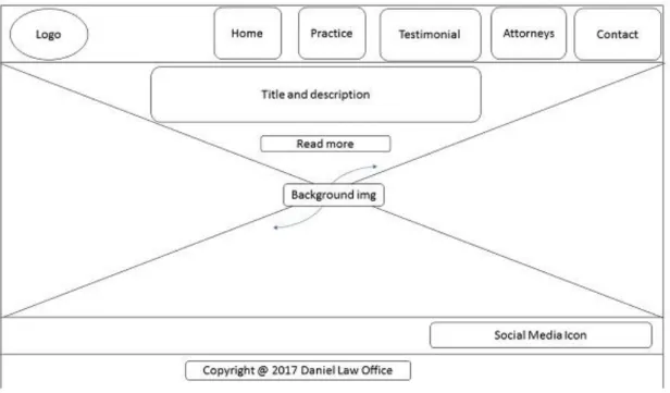
As wireframing is a visual guide for client presentation of the website which allows defin-ing the information hierarchy of a web design. Further, it helps the client to see how the website looks at the end. A screenshot of the wireframing of this project website is de-picted in figure 9 and the wireframing shown was drawn by using Microsoft PowerPoint.
5https://www.google.com/fonts 6 http://flatuicolors.com/ 7 https://color.adobe.com/create/color-wheel/ 8 http://ionicons.com/ 9 https://fortawesome.github.io/Font-Awesome/ 10 http://thestocks.im/
Figure 9 Screenshot of wireframe of the project websites with important components.
According to the wireframe design illustrated in figure 9, the websites will be built using the two frameworks having the following sections according to the wireframe: header, body and footer. The header will be on the top of the page which further will contain a navigation bar with navigation buttons and a logo. There will be a navigation bar which contains 5 navigation items such as home, practice, testimonial, attorneys and contacts. On the body of the page, there is going to be the title and description of the website with a background image. In addition, at the footer section, there will be social media and copyright icons.
Furthermore, the requirements or important things considered during the designing of this project were responsiveness and cross browser compatibility. In addition, customi-zability of the two frontend frameworks was considered. Moreover, the website loading speed of the project websites was also taken into account.
3.2 Software installation and development process
During the development process Windows 10 operating system, Windows 10 Command Line Interface (CLI), bracket editor and Google Chrome browser with its developer tool were used as a development environment. The different software, which are vital for the development of the project, were downloaded and installed to set up the development environment.
Once the programming phase started, the standard text processing application or code editor was downloaded and installed. Bracket editor was used in this project from a selection of code editors available online because it is an open source code editor with helpful features. Among these features, the first one is it has many extensions available to install which makes the web design process easy. The second one is that this editor has nice features built in colour highlighters like HTML, CSS and JS syntax while working out a long document. And the last one is that it manages multiple open documents in tabs. As a result, it is easily possible to work on several files at the same time which is an important feature in a web design process.
After describing the required features and preparing the development environment was completed, the next thing was downloading the latest Bootstrap 4 and Foundation 6 frameworks from the official websites of the respective frameworks. The download pack-age contains everything in the framework including typography, grid, HTML elements, CSS components, CSS preprocessors and JQuery plugins. After that, important fonts were downloaded and saved in the same folder with the images and contents of the project folder.
Regarding browsers, any web browsing applications were possible including for example Chrome, Safari, Firefox or Explorer. However, the web browser used for this project was Google Chrome. Google Chrome contains developers’ tools and helpful Chrome exten-sions and other features for a web design process [14].
To conclude, as discussed in chapter 1, the website built in this project is for Daniel Mengistu Law office. The requirement specifications for the website were provided by the company. As a result, the contents of the website are included in the same project folder.
3.3 Project file structures
Both Bootstrap and Foundation have default file structures. The default file structures are not mandatory but it is important to follow the common practice. In this project, the common bootstrap and foundation file structures were used. In figure 10, the file struc-tures of the two frameworks are presented. They have almost similar listings with minor differences.
As shown in figure 10, both Foundation 6 and Bootstrap 4 consist of SASS CSS prepro-cessor. However, Bootstrap 3 dwells LESS stylesheets [11]. Bootstrap is a freely down-loadable framework containing HTML, CSS and JavaScript. The downloaded folder com-posed of directories and files with minified CSS versions of them is also included as depicted in figure 10.
In addition, Bootstrap allows us to download the full package or the customized one. As a result, the customized one is downloaded according to the elements that are needed in any specific project. In the same way, Foundation has a customized download option. The customized download option, by decreasing the download size, improves the down-load speed of the website. However, in this project the full package Foundation and Bootstrap download was performed, as illustrated in the above directories and files. In addition, grouping JS and CSS together with minified versions were included in the download. All the folders and source codes for both Bootstrap11 and Foundation12
web-sites can also be accessed from the GitHub.
To conclude, the process of setting up everything for developing the websites was started by creating good folder structures where the files are kept in a very organized way. Following that, the real coding process was commenced by using bracket editor. After that, the project website sections were built step by step for both frameworks. The sections built in the project were “Header”, “Areas of practice”, “Testimonials”, “Attor-neys”, “Contact” and “Footer”.
11 https://github.com/Befekadu-Mezgebu/Bootstrap-project-1 12 https://github.com/Befekadu-Mezgebu/Foundation-Project-1
4
Test Results
The website designed for Daniel Mengistu Law office is a mobile first responsive design and the application user interface was designed by HTML5, CSS3, JavaScript, Bootstrap and Foundation frameworks. In this project only the frontend of the website was devel-oped. In addition, the requirement set for the project in chapter 3 was applied during the development.
4.1 User Interfaces
The web application built was responsive to different screen sizes. Figure 11 presents the desktop view of the Bootstrap and Foundation websites consecutively. The mobile versions of the websites are available in Appendix III. As illustrated in figure 11, it shows the final desktop version of the real responsive websites and the websites built were working flawlessly.
Figure 11 Screenshots of the desktop versions of the Bootstrap (top) Foundation (bottom) Websites homep-age.
The website contains a header, a navigation bar, content and a footer. The navigation bar contains links to Home, Areas of Practice, Testimonials, Attorneys and Contact pages of the website. Moreover, on each page the content of the website contains title, description and background image for the website.
4.2 Performance optimization of the project websites
Enhancing page speed is the most important thing in a web development process. Web-site speed has real impact on user engagement because many users do not want to wait for slow websites to load. The two most basic techniques for speeding up websites are optimizing heavy images and minifying CSS and jQuery code. [1] Both the Bootstrap and Foundation websites had gone through the performance optimization techniques before they were tested. As a result, this step was performed before the implementations of the websites.
All the images in the project folders were optimized by reducing the file sizes of the im-ages using online image compressor tools. From different compressor tools available
online, Optimizilla13 and Tinypng14 are used in this project. Tinypng is used for the
Boot-strap website image optimization and Optimizilla for the Foundation website image. A screenshot of sample images optimized by using Tinypng is presented in figure 12.
Figure 12 Screenshot of the optimized image of the Bootstrap website using Tinypng. Generated from Ti-nypng (2017) [19].
As can be seen in Figure 12, the size of the images of the Bootstrap website were mini-mized and the total optimization found using this tool was 65% or 2 MB of the total size. In the same way, the image sizes of the Foundation website were compressed using the same tools.
The other optimization technique used was minify CSS jQuery files. This basically re-duced the size of the CSS and jQuery files by removing unneeded white spaces and
13 http://optimizilla.com/
optimizing the codes. The online tools used for this technique were minifycss15 and
min-ifyjavascript16.
4.3 Community and support
GitHub stars, GitHub watch, GitHub Forks and Stack Overflow search results were used to measure the community and support of the frameworks. Table 2 compares the popu-larity of the two frontend frameworks. The GitHub activity of the two frameworks is used for this purpose.
Table 2 Bootstrap versus Foundation GitHub activity. Data collected from GitHub (2017) [20; 21]. GitHub activity Bootstrap
</> Foundation </> Number of watches Number of stars
Number of forks or download
6,839 109,379 50,282 1,497 25,253 5,539
Both Bootstrap and Foundation frameworks are active on Github. As illustrated in table 2, Bootstrap has 4 times more stars than Foundation framework. In addition, Bootstrap has got twice the number of forks or downloads compared to the Foundation framework. Furthermore, Bootstrap has got about 5 times more watches than Foundation. The latest stack overflow activity results of Bootstrap 4 and Foundations 6 are shown in figure 13.
15 http://www.minifycss.com/ZMVbZ/css-compressor/ 16 http://www.minifyjavascript.com/LLcpZ/
Figure 13 Screenshots of Stack overflow activities of Bootstrap (top) and Foundation (bottom) frameworks. Data collected from StackOverFlow (2017) [21;22].
As shown in Figure 13, the search results for Bootstrap 4 was about 3 times more than the Foundation 6 framework. This indicates Bootstrap is definitely more popular, hence naturally it has more support and references available. That means people can get sup-port and help in an easier way.
4.4 Google trend and Builtwith trend
Interest over time graph for Bootstrap 4 versus Foundation 6 is illustrated in figure 14. The graph is a Google trend graph and the numbers represent the search interest results of the two frameworks. Moreover, the search interest is relative to the highest point on the chart for the given region and time.
Figure 14 Interest over time google trend graph for Bootstrap 4 versus Foundation 6. Generated from Google Trends (2017) [23].
As figure 14 illustrates, a value of 100 is the peak popularity for the term. A value of 50 means that the term is half as popular. Likewise, a score of 0 means the term was less than 1% as popular as the peak. Accordingly, the popularity of Bootstrap 4 versus Foun-dation 6 worldwide during April 24-30, 2016 was 44/11. This means the Google search interest result relative to the highest point in the chart of Bootstrap 4 for the given region and time was about 4 times the Foundation 6 result. In addition, during April 16-22, 2017, it was 59/8. This also means the Google search interest result relative to the highest point on the chart for the given region and time of Bootstrap 4 was about 7 times the Foundation 6 result. Moreover, figure 15 shows a BuiltWith trend graph which is a usage statistics online measuring tool.
Figure 15 Builtwith trend of Twitter Bootstrap (top) versus Foundation (down) Usage Statistics.Generated from Builtwith Trend (2017) [24; 25].
As illustrated in figure 15, 13.2% of the top 100,000 which is approximately around 1,320 websites out of 10,000 were using Bootstrap to power their websites. However, 3.9% of the top 100,000 which is also approximately around 393 websites out of 10,000 were using Foundation Framework. This means Bootstrap has got about 3 times more users compared to Foundation users to power their websites. In addition, as illustrated in figure 15, the statistics goes in similar way for the two frameworks when it comes to the total
coverage of the frameworks. Hence, Bootstrap usage out of the entire internet usage was 3.5% (which is around 12,804,808) and Foundation 0.1% (which is around 237,981). 4.5 Cross browser Testing
There are a lot of different common browser compatibility testing tools. Among these are CrossBrowserTesting, Browsershots and Browserling to mention a few. However, in this project the CrossBrowserTesting17 online tool was used. The outcomes of cross browser
testing using the CrossBrowserTesting tool for both websites are shown in figure16.
Figure 16 Screenshots of Cross browser testing of the Bootstrap website (top) versus Foundation website (bottom). Generated from CrossBrowserTesting (2017) [26].
17 https://crossbrowsertesting.com/
Bootstrap and Foundation provide browser support for browsers like Google Chrome, Firefox, Opera, Safari, IE. However, Foundation does not support IE8 which is the older browser but Bootstrap 3 supports it. (9) [9] To illustrate more, the Bootstrap website was tested using Mackintosh (Mac) 10.11 computer with Safari 9 browsers. However, the Foundation website was tested using Mac 10.11 computer with Opera 44 browsers. 4.6 Webpage loading speed
Webpage loading speed is the most important parameter of website performance meas-ure [26]. The webpage speed of the project websites got checked using different online testing tools. Webpage speed means measuring the amount of time it takes from the location of the client until the website loads and on the other hand, measuring the amount of time it takes to download the source code of a web page.
Page load time shows the time it took for the page to be fully loaded, including external resources such as images and scripts. In technical terms, it's the window on load event. Performance grade is the grade the webpage gets according to the Yslow test. In this thesis three websites loading speed tools were used and they were Pingdom, GTmetrix, Page Speed Insights consecutively.
4.6.1 Pingdom
The website speed test using Pingdom18 is to analyse the load speed of the websites.
This was performed by entering a URL to test the load time of that page and then by analysing it and finding the bottlenecks. The performance rates for both Bootstrap and Foundation websites are illustrated in figure 17.
18 https://tools.pingdom.com/
Figure 17 Screenshots of Pingdom Website Speed Test results for the Bootstrap website (top) versus Foun-dation website (bottom). Generated from Pingdom (2017) [27].
As figure 17 shows, the performance rate for both Bootstrap and Foundation websites were grade “B” on a grading system from “A” to “F” grading. The full-page loading time of the Foundation website was higher than the Bootstrap website in this test by 5 milli-seconds (ms). However, the relative speed in both cases is so fast that it would be point-less to qualify one as loading faster than the other in this case.
4.6.2 GTmetrix
GTmetrix19 was developed by GT.net. This tool is for managed hosting customers to
easily determine the performance of their sites. This tool gives also actionable insights on how to optimize the website speed. The GTmetrix Website speed test results for both Bootstrap and Foundation are illustrated in figure 18.
Figure 18 Screenshot of GTmetrix Website speed test results for both Bootrstrap (left) and Foundation (right) websites. Generated from GTmetrix (2017) [26].
19 https://gtmetrix.com/
As can be seen in figure 18, the GTmetrix speed test showed the PageSpeed score for the Bootstrap website is 2% lower compared to the Foundation website. The Bootstrap website has also a lower fully loaded time than that of Foundation. In addition, the total page size of the Foundation website is higher than the Bootstrap website by 1.23MB. 4.6.3 Google Page Speed Insights
Google PageSpeed Insights20 was the third tool used to analyse the speed of the two
websites. As a result, it helps to optimize websites using the websites best practices. Web performance tools at Google are browser extensions and APIs for Insights, Pag-eSpeed Service, and optimization libraries.
Page Speed Insights tests the page loading of a web in both mobile and desktop ver-sions. It checks the URL twice, once as a mobile user and then as desktop user. This tool evaluates the filling of a website, then engenders comments for the web to perform better. The comparison for Google PageSpeed Insight results of the Bootstrap and Foun-dation websites are shown in table 3.
Table 3 Comparison for Google PageSpeed Insight results of the Bootstrap (left) and Foundation (right) websites. Data gathered from Google PageSpeed Insights (2017) [27].
Bootstrap website Foundation website
Mobile Desktop Mobile Desktop
54/ 100 55 / 100 50 / 100 54 / 100
7 passed rules 6 passed rules 5 passed rules 4 passed rules
Finally, Google’s PageSpeedInsight testing tool results were analysed according to table 3. The Page Speed result for both mobile and desktop is from a score of 0 - 100. A score of 85 and above indicates that the page is performing excellently. According to table 3, the Bootstrap website got a higher Page Speed score than the Foundation website on both mobile and desktop devices. Besides, the Bootstrap website got higher passed
rules count than the Foundation website. As a result, there were fewer issues to fix and to improve scores for the Page Speeds of the Bootstrap framework.
5
Discussion
In this chapter, the significance of results found in the previous chapter of the project will be evaluated and discussed in detail. Also, the results of the project will be placed in the context of the theoretical background discussed in chapter 2 of this thesis.
As it has been discussed in the theoretical section of this paper, the two frameworks provide similar features with slight differences. Let us see summarized highlights of the most important points about the two frontend frameworks.
Both frameworks are open source HTML, CSS and JavaScript frontend frameworks and they operate with a SASS CSS preprocessor except in the case of Bootstrap 3. In addi-tion, both are mobile first and 12 column grid responsive design frameworks. Moreover, both have optional flexible box support, ES6 JavaScript components and plugins. Both frameworks have pre-styled ad ready user interface components.
In addition, Bootstrap and Foundation help to build the user interface faster for web and mobile applications. This means for example menus, buttons and lists for user experi-ence development. There is no need to create all of HTML, CSS classes and styling from scratch. The style button just pops in the class name. As explained in chapter 2, both frameworks have many similar features and as a result it can be said that both frame-works do essentially the same thing in different ways.
According to the result of this research, among the categories that favour one framework over the other, it was the community and support where Bootstrap clearly got the upper hand. To mention some relevant facts from the results chapter, Bootstrap framework got 4 times more stars and 5 times more watches than the Foundation framework in GitHub. In addition, Bootstrap got 3 times more search results in StackOverflow than Foundation. As a result, Bootstrap got a huge following of designers and developers which means users are more likely to get support if there are any issues related to the framework.
Moreover, browser support and performance results were very good for both Bootstrap and Foundation websites with desktop and mobile platforms. The only exception was that Foundation does not support IE 8. Because IE 8 is an older version of IE, it might restrict the availability of support. However, only Bootstrap version 3.3.6 can support this older browser.
The website loading speed of the two project websites was tested by using three online testing tools. As a result, this enabled getting reliable test results. The full-page loading time of the Foundation website (358 ms) was found higher than the Bootstrap website (353 ms) in the Pingdom speed test. That means the Bootstrap website is loading faster than the Foundation website. In addition, it was found that the Bootstrap website had got lower fully loaded time (2.1 seconds) and total page size (1.3 Megabytes (MB)) com-pared to the Foundation website (2.4 seconds, 2.54 MB) using the GTmetrix online speed test tool. In this case, as well, the Bootstrap website was faster than the Founda-tion counterpart.
Finally, the Bootstrap website got a higher Page Speed score than the Foundation web-site in both mobile and desktop devices according to the PageSpeedInsights online speed test tool results. To mention a couple relevant facts from the results chapter, the Bootstrap website got a higher passed rules count (7) than the Foundation website (5) on mobile. As a result, this means lesser things to fix in order to get improved results of the Page Speed scores. Moreover, Bootstrap performed better in the website speed test results (Mobile 54% efficiency, Desktop 55% efficiency) than Foundation (Mobile 50% efficiency, Desktop 54% efficiency).
To conclude, based on the discussion above and on the results gained in the previous chapter, Bootstrap was the best candidate for the purposes of this project. Accordingly, the website was built using the Bootstrap frontend framework and launched as an official website for the client.
6
Conclusion
Frontend frameworks help to simplify designing process in powerful ways. Essentially, a frontend framework contains templates written in HTML, CSS, LESS, SASS and JavaS-cript that make designing a user interface much simpler. Bootstrap and Foundation are popular front-end frameworks. [1]
As a result, both save development time, are mobile first designs and are responsive applications for web application. The project web development process focused only on the frontend part of the website. The technologies used are HTML5, CSS3, jQuery and JavaScript where Bootstrap and Foundation frontend frameworks were implemented for responsiveness and interactivity of the website.
In this project, two responsive websites using Bootstrap and Foundation frameworks were built. Then different online website performance testing tools and parameters were used to choose the right front end framework for the project. The online testing tools and parameters used to measure the performance of the websites were loading speed and cross browser compatibility test. Moreover, the other parameters used for comparison were popularity & community, customization and other theoretical features.
At the end of the project, the better frontend framework for the project needed to be chosen. As a result, based on the test and theoretical discussion done in this thesis, the Bootstrap framework won over Foundation for the specific purposes of the project.
However, based on the result of this research it does not necessarily mean that Bootstrap is better than Foundation. The result of the research was such because the research was based on the specific purpose of the project and personal preference. Moreover, this thesis will help to give programmers a better insight about the two frontend frame-works and enable them to make an informed decision. Their decision should be based on their project at hand, personal preferences and comfort level. At the end, it is recom-mended that programmers will need to conduct research before deciding the right frontend framework for themselves. In addition, it is also recommended for programmers to compare other frontend frameworks such as React and Angular as well.
References
1. CODY ARSENAULT . Top 10 Front-End Frameworks of 2016. Keycdn.com, Web
News & Insights . [Online] [Cited: 06 October 2016.]
https://www.keycdn.com/blog/front-end-frameworks/.
2. World Wide Web Consortium,W3C. HTML & CSS. [Online] [Cited: 10 April 2017.] https://www.w3.org/standards/webdesign/htmlcss.
3. West, Matt. HTML5 Foundation . s.l. : John Wiley &Sons,Incorporated , 2012.
4. w3schools.com. The HTML DOM (Document Object Model). [Online] [Cited: 15 April 2017.] https://www.w3schools.com/js/js_htmldom.asp.
5. —. HTML5 Semantic Elements. [Online] [Cited: 12 April 2017.] https://www.w3schools.com/html/html5_semantic_elements.asp.
6. W3School. W3.CSS Tutorial. [Online] [Cited: 02 April 2017.] https://www.w3schools.com/w3css/.
7. W3C. CSS current work and how to participate . [Online] [Cited: 05 May 2017.] https://www.w3.org/Style/CSS/current-work.
8. w3schools.com. CSS Box Model. [Online] [Cited: 11 April 2017.] https://www.w3schools.com/css/css_boxmodel.asp.
9. Keycdn.com . Bootstrap vs Foundation – Top 2 CSS Frameworks. Web News &
Insights. [Online] [Cited: 06 May 2017.]
https://www.keycdn.com/blog/bootstrap-vs-foundation/.
10. MINDSCAPE. What is LESS & SASS. [Online] [Cited: 2017 April 05.] http://www.mindscapehq.com/products/web-workbench/what-is-sass.
11. HTML MAG. An Introduction to CSS Pre-Processors. [Online] 21 May 2014. [Cited: 04 May 2017.] from https://htmlmag.com/article/an-introduction-to-css-preprocessors-sass-less-stylus.
12. The World Wide Web Consortium(W3C). A Short History of JavaScript. w3c.org.
[Online] [Cited: 01 April 2017.]
https://www.w3.org/community/webed/wiki/A_Short_History_of_JavaScript.
13. jQuery. jquery.com. [Online] jQuery project, 2005. [Cited: 10 April 2017.] http://jquery.com/.
14. Cochran, David. Twitter Bootstrap Web Development How-To. Birmingham : Packt Publishing Ltd, 2012.
15. Aniszczyk, Chris. blog.twitter.com . [Online] 19 August 2013. [Cited: 19 April 2017.] https://blog.twitter.com/2013/bootstrap-30.
16. Patterson, Andrew D. Getting Started with Zurb Foundation 4. Birmingham : Packt Publishing Ltd., 2013.
17. Zurb. Foundation. [Online] ZURB product design company, 1998. [Cited: 20 April 2017.] http://foundation.zurb.com/.
18. vermilion Design and Digital . Vermilion.com . [Online] vermilion Design and Digital , 7 December 2015. [Cited: 1 April 2017.] https://www.vermilion.com/responsive-comparison/.
19. Bootstrap GitHub Community. twbs/bootstrap. [Online] [Cited: 2017 April 11.] https://github.com/Befekadu-Mezgebu/bootstrap.
20. Foundation-sites Github community . zurb/foundation-sites. [Online] [Cited: 11 April 2017.] https://github.com/Befekadu-Mezgebu/foundation-sites.
21. StackOverflow. Bootstrap 4 search results . [Online] [Cited: 11 April 2017.] https://stackoverflow.com/search?q=bootstrap+4.
22. —. Foundation 6 search results . [Online] [Cited: 11 April 2017.] https://stackoverflow.com/search?q=Foundation+6.
23. Google Trends. Bootstrap 4 versus Foundation 6. [Online] [Cited: 01 April 2017.] https://trends.google.com/trends/explore?q=Bootstrap%204,Foundation%206.
24. Builtwith Trend . Twitter Bootstrap Usage Statistics . [Online] [Cited: 1 April 2017.] https://trends.builtwith.com/docinfo/Twitter-Bootstrap.
25. —. Foundation Usage Statistics . [Online] [Cited: 1 April 2017.] https://trends.builtwith.com/framework/Foundation.
26. GT.net . GTMetrix. [Online] GT.net, 1996. [Cited: 15 April 2017.] https://gtmetrix.com/.
27. Pingdom . Pingdom Website Speed Test . [Online] [Cited: 5 April 2017.] https://tools.pingdom.com/.
28. Google . PageSpeed Insights . [Online] [Cited: 7 April 2017.] https://developers.google.com/speed/pagespeed/insights/.
29. Google. Google Trends. [Online] Google Technology Company, 4 September 1998. [Cited: 15 April 2017.] https://trends.google.com/trends/.
30. tinypng. tinypng.com. [Online] Voormedia. [Cited: 11 April 2017.] https://tinypng.com/.
31. CrossBrowser Testing.com LLC. CrossBrowser Testing. [Online] [Cited: 15 April 2017.] https://app.crossbrowsertesting.com/livetests/.
32. World Wide Web Consortium,W3C. What is the Document Object Model. [Online] [Cited: 10 April 2017.] (https://www.w3.org/TR/DOM-Level-2-Core/introduction.html).
33. Twitter Bootstrap. Bootstrap. [Online] 2010. [Cited: 22 April 2017.] http://getbootstrap.com/.
![Figure 1 Document Object Model(DOM). Copied from w3school (2017) [4].](https://thumb-eu.123doks.com/thumbv2/123doknet/12791518.362321/7.892.170.810.388.754/figure-document-object-model-dom-copied-w-school.webp)
![Figure 2 HTML5 Semantic Elements. Reprinted from W3schools (2017) [5].](https://thumb-eu.123doks.com/thumbv2/123doknet/12791518.362321/8.892.362.564.113.337/figure-html-semantic-elements-reprinted-w-schools.webp)
![Figure 3 CSS Box Model. Copied from W3school (2017) [8].](https://thumb-eu.123doks.com/thumbv2/123doknet/12791518.362321/9.892.168.809.104.387/figure-css-box-model-copied-w-school.webp)
![Figure 4 How to use SASS(left) and LESS(right) variables. Copied from htmlmag (2014) [11]](https://thumb-eu.123doks.com/thumbv2/123doknet/12791518.362321/10.892.171.826.857.1064/figure-use-sass-left-right-variables-copied-htmlmag.webp)
![Figure 5 How to use SASS(left) and LESS(right) mixins. Copied from htmlmag (2014) [11]](https://thumb-eu.123doks.com/thumbv2/123doknet/12791518.362321/11.892.170.810.337.639/figure-use-sass-left-right-mixins-copied-htmlmag.webp)
![Figure 6 How to use SASS(left) and LESS(right) nesting. Copied from htmlmag (2014) [11]](https://thumb-eu.123doks.com/thumbv2/123doknet/12791518.362321/12.892.174.811.106.587/figure-use-sass-left-right-nesting-copied-htmlmag.webp)
![Figure 7 Twiitter Blueprint in 2011. Reprinted from Chris Aniszczyk (2013) [15].](https://thumb-eu.123doks.com/thumbv2/123doknet/12791518.362321/14.892.170.809.331.666/figure-twiitter-blueprint-reprinted-chris-aniszczyk.webp)
![Figure 8 Foundation Custom download table. Copied from Zurb Foundation (1998) [17].](https://thumb-eu.123doks.com/thumbv2/123doknet/12791518.362321/16.892.163.808.118.932/figure-foundation-custom-download-table-copied-zurb-foundation.webp)
![Table 1 Summary and overview of Bootstrap 4 3 versus Foundation 6 4 . Modified from Vermilion design and Digital (2015) [18]](https://thumb-eu.123doks.com/thumbv2/123doknet/12791518.362321/18.892.183.789.155.923/table-summary-overview-bootstrap-foundation-modified-vermilion-digital.webp)