HAL Id: hal-01668659
https://hal.archives-ouvertes.fr/hal-01668659
Submitted on 20 Dec 2017
HAL is a multi-disciplinary open access archive for the deposit and dissemination of sci-entific research documents, whether they are pub-lished or not. The documents may come from teaching and research institutions in France or abroad, or from public or private research centers.
L’archive ouverte pluridisciplinaire HAL, est destinée au dépôt et à la diffusion de documents scientifiques de niveau recherche, publiés ou non, émanant des établissements d’enseignement et de recherche français ou étrangers, des laboratoires publics ou privés.
Copyright
The World Bank’s Changing Face: The Photographs of
the World Bank Reports, 1955–2009
Sebastian Grevsmühl
To cite this version:
Sebastian Grevsmühl. The World Bank’s Changing Face: The Photographs of the World Bank Re-ports, 1955–2009. [Research Report] Centre Alexandre Koyré - CRHST; CNRS; EHESS. 2012. �hal-01668659�
The World Bank’s Changing Face: The Photographs of the World
Bank Reports, 1955–2009
Sebastian Vincent Grevsmühl, Centre Alexandre Koyré, EHESS/CNRS, Paris, May 2012.
This report was funded by the GATSEG project, Le gouvernement et l'administration des techno-sciences à l'échelle globale, ANR project 2009-2011, directed by Dominque Pestre.
The report was deposited in HAL, please use the HAL reference for citation.
Introduction
Throughout its history, the World Bank evolved from a comparatively small developing bank into a global key player in world economics and governance. This development was in no means homogenous and even less uncontroversial, yet at many occasions, critics and supporters alike resorted to what should become an important publication in the ever growing landscape of institutional reports: the World Bank annual report. As a major publication of the Bank, accounting publicly for its credits, loans, general activities and objectives, the World Bank reports (WBRs) may be identified as a valuable source in drawing a big picture of the historical institutional development of this major funding organisation throughout the second half of the twentieth century. The reports reflect also the Bank’s growing power and influence within an increasing globalised world. However, as any communication medium, the WBRs prove also to be far from what one may identify as a “neutral” communication channel and even further away from an “objective” interface with the public. They are rather an image which the World Bank desires to build up in the public and which it would like to attribute to itself. The annual reports are therefore in no way simple communication products, but rather highly complex and problematic objects, mobilizing a large diversity of visual media, such as graphs, photographs, charts, maps and tables. Besides the graphs and charts, photography (first black and white, then in colour) may be identified as the privileged medium of the WBRs, constituting their main iconographical element.
In this case study, we propose therefore to analyse in a quantitative and qualitative way the fabrication of the World Bank’s public image with the help of the photographs employed. In other words, to narrow the huge range of possible methodologies and objects of analysis down, we contended to limit our analysis to the large panoply of photographic material offered by the WBRs. We are indeed aware that the photographs represent only one of many
and the possibility of directing the attention of the reader to specific parts and portions of any graph, or the possibility of effectively hiding certain variables. This is for example the case of simple area charts where some elements may be hidden behind other values due to the overlapping nature of the chart. This type of chart is therefore only used in order to provide a general overview of especially peak values when dealing with many variables on a long time-scale. A detailed analysis necessitates a smaller time interval, allowing for the use for example of clustered column charts where all values appear next to each other. The most common chart employed in this study is however the stacked area chart which displays the trend of the contribution of each value over a certain time span.
The structure of our analysis
Our analysis sets out in a first part with a quantitative outline of the major formal characteristics of the WBRs, namely the report size and the number of photographs included, the geographical locations of the regions depicted, as well as the photographic perspective adopted by the photographer and/or designer in the actual layout of the report. In an already more thematic perspective (the geographical location counts strictly speaking also to this perspective), the gender of the persons depicted (if applicable), as well as different human categories are determined (worker, farmer, doctor, etc.).
In a second quantitative approach, all the major themes are explored which make up the thematic structure of the WBR photographs. For this purpose, the photographs were roughly classified into different thematic domains (which prove in some cases to be overlapping), namely infrastructure/energy/communication, agriculture, education, medical issues, environmental issues and animal themes.
However tentative, we try to refrain in the first two mainly quantitative parts from any other reflections which impose themselves from the simple knowledge of the WBRs, the WB history and broader geopolitical, institutional and scientific developments. In other words, relatively few comments should be found in the first two sections regarding elements which may not be developed with the help of statistical argumentations gained from the quantitative report analysis. The third and last part goes therefore beyond that rule and attempts a summary and qualitative interpretation of the knowledge gained from the foregoing analysis. A general historical periodisation is finally attempted in order to make out the majors developments of the Bank.
1. Quantitative Outline
1.1. Quantitative Report Size and Iconographical Elements Evolution Report Size Evolution
0 50 100 150 200 250 300 350 400 450 1946 1949 1952 1955 1958 1961 1964 1967 1970 1973 1976 1979 1982 1985 1988 1991 1994 1997 2000 2003 2006 2009 Report Years
Total number of pages Number of graphs/maps w/o tables
Number of photographs w/o front cover Number of pages of volume 1
Figure 1 : Graph showing the historical evolution of the total number of pages of the WBRs, as well as the number of photographs and charts, graphs and maps included in the reports.
Iconographical Elements 10 20 30 40 50 60 70 80 90 100 110 120 N u m b e r o f El e m e n ts
Our first figure shows the evolution of the report size together with the number of photographs as well as charts, graphs and maps one may find in the reports. Firstly, we would like to point out that the upper graph of figure 1 of the total number of pages reflects basically three major changes. In the year 2000, at a historical peak of a total of 362 pages, the annual report was divided into two volumes, probably for easier handling, printing and distribution. This was done only once before, namely in 1955, precisely at the same moment when black and white photographs (dark blue line) were introduced for the first time. Significant efforts have been involved since the year 2000 to reduce the report size to a more readable size. This includes for example the publishing of the second volume as accompanying CD-ROM. Between 2000 and 2004, the printed first volume of the report was held below a total of 200 pages (dotted line). Between 2005 and 2009, with the new involvement of the design studio Gensler Studio 585 (as indicated on the credits page), another major change in layout permitted to reduce the size of both volumes together to less than 200 pages, with the first volume of around almost constant 65 pages. This was achieved by eliminating the chapter “thematic perspective” which was an important element of former reports, but which was now partly included into the chapter on “regional perspective”. The rough drop in 2008 of the total number of pages to a “total” of 65 pages is due to the fact that the second electronic volume of the report could unfortunately not be accessed for this study to be included (only the total number of volume 1 could be included). The very last steep rise in the total number of pages in 2009 reflects the inclusion of the electronic volume 2 content, which includes a power point presentation, accounting therefore also for a steep rise of the number of graphs and maps (see the red line).
Turning in a second step to the evolution of the number of photographs, depicted in finer detail in figure 2, we may observe that photographs were introduced as late as 1955 (in the tenth annual report) – graphs only two years earlier, in 1953. The number of graphs and maps in each report, compared to the number of photographs, shows a more or less close correlation especially for the period between the mid-1960s and the mid-1990s. Despite a rapidly growing report size in terms of total page size numbers, their numbers (graphs /maps and photos) have however not increased as importantly. Only since 1997, graph and map figures and those of photographs have risen in a substantial way. Photographs are generally limited to the descriptive part of projects, regions and WB strategy, a par of the report which forms volume 1 since WBR2000. The accounting part, listing loan numbers and amount, eligible regions list etc. take throughout the WBR evolution more and more space. Starting from the late 1960s, with loan activities rising dramatically, this part, which became the second volume since 2000, became an increasingly important, non-photographic part of the report.
Thirdly, when considering the graphs together, we may identify three main periods. The first period stretches from the introduction of photography to the WBRs in 1955 to the mid-1960s. Photographs are in this first period the dominant iconographical element, with an average of 13 photographs per report, compared to approximately 7 photographs per report during the following period. At the same time, during the second period, running from the mid-1960s to the mid-1990s, there is a rather constant growth of total page numbers, yet the numbers of graphs and photos stay in this first period almost at the same level. From an iconographical
perspective, this is a fairly constant period, where photographs on the one hand, and maps and charts on the other are in a relative equilibrium. Compared with total page numbers, the iconographical elements play therefore a decreasing overall role. The third period starts in the second half of the 1990s and stretches to the end of the enquiry period considered in this analysis. More specifically, since the year 2000, one can observe in this last period the stepwise convergence of the number of report pages and of pictorial elements. For the reports issued between 2004 and 2007 (and probably also 2008, if the second volume would have been at hand), almost every second page contains a graph, map or photograph, compared for example to approximately every thirteenth page in 1985 and every eighth page in 1955. From an iconographical perspective, this last period is also an inversion of the first period: graph and map totals have taken over the lead in comparison with total photograph numbers.
Were one to name these three, rather distinct periods, we would suggest naming the first period (1955-1965) the photographic period due to the iconographical dominance of photographs. The long, second period could be labelled the mixed period, with an equilibrium of graphical and photographic elements, yet an overall iconographic decline tendency due to an important increase in total page size number. The last period may be labelled the convergence or full iconographic period, where all iconographical elements are fully developed and largely present in the reports.
1.2. Quantitative Geographical Evolution
Photographs According to World Regions (1)
0 10 20 30 40 50 60 1955 1958 1961 1964 1967 1970 1973 1976 1979 1982 1985 1988 1991 1994 1997 2000 2003 2006 2009 Report Years
No country specified (excl. insitutional) Sub-Saharan Africa
Latin America & Caribbean South Asia
East-Asia & Pacific Europe & Central Asia
Middle East & North Africa
Figure 3 : Stacked area chart showing the total number of photographs per report year as a sum of different world regions.
Photographs According to World Regions (2)
0 5 10 15 20 25 30 35 1955 1958 1961 1964 1967 1970 1973 1976 1979 1982 1985 1988 1991 1994 1997 2000 2003 2006 2009 Report Years
No country specified (excl. insitutional) Sub-Saharan Africa
Latin America & Caribbean South Asia
East-Asia & Pacific Europe & Central Asia
Middle East & North Africa
Figure 4 : Simple area chart showing the number of photographs of a specific geographical category per report year, with the Middle East in the foreground and no country specification in the background.
The World Bank fostered obviously at different moments in history interest in different regions. The photographs in the reports reflect at least partly some of those regional decisions and strategies. Figure 3, the stacked area chart in which all regions are visible, shows three distinct periods, especially from a European perspective. The first period runs from 1955, the introduction of photographs in the WBRs, to the mid-1960s. Europe, and not so much central Asia, played a central role in these first reports, because it was a region of key interest as we will argue in the qualitative analysis in the third part of our report. Yet, one can also see that Europe was at the time already in “competition” with other regions, most notably the Sub-Saharan countries and especially Latin America, which were right from the beginning dominantly depicted regions. The Middle East was during this first period only of sporadic interest.
During a second and rather long period, which runs roughly from the 1960s to the mid-1990s, Europe played only a minor role, whereas other regions became increasingly important for the World Bank. According to the peaks of the simple area chart in figure 4 – this information is not easily discernible in the stacked area chart of figure 3 – Sub-Saharan Africa became in this second period one of the most dominantly depicted regions, especially between 1973 and 1984. A similar analysis counts for the Middle East, which is only since the mid-1970s continually integrated into the reports, with exception of the 1983 and 1984 WBRs. Whereas the overall amount of photographs attributed to specific regions remained astonishingly constant between 1968 and 1994, with also more or less constant regional distributions, things changed rather radically after the special issue of 1995 (celebrating the first fifty years of the WB), which is therefore not considered here (all geographic values were set to zero).
The last period runs therefore from 1996 to 2009, where one may observe a rapid increase in the total number of photographs. Europe and Central Asia have become once again a permanent photographic subject since 1996, whereas the new focus was oriented not to central Europe as during the first period, but rather countries in Central Asia, outside of the European Union. The vast majority of identifiable photos can be located either in Latin America (especially between 1997 and 2005) and Sub-Saharan Africa (especially between 1998 and 2005), the two major iconographical geographic regions of the last WBRs. To a slightly lesser degree, South Asia also became an importantly depicted region, especially between 1998 and 2006. The last period shows also that many photos could only be attributed without any ambiguity to specific regions due to the actual report structure, which maintained a classification by region. However, a vast amount of photographs could not be identified, since captions were mostly missing. With an average of over 21 unidentified photographs since 2002, a major, yet consistent layout change is reflected in that number.
1.3. The Photographic Perspective Photographic Perspective 0 5 10 15 20 25 30 1955 1958 1961 1964 1967 1970 1973 1976 1979 1982 1985 1988 1991 1994 1997 2000 2003 2006 2009 Report Years
landscape / macroscopic views between landscape / human scale
human scale close-up
Figure 5 : Graph showing the differentiation of WBR photographs according to four perspectival themes. As a last strictly formal element, the photographic perspective was analysed according to four categories: landscape perspective and macroscopic views involving the depiction of vast areas paralleled often by an absence of any discernible person; the mixed scale perspectives showing already more detail; the human scale perspective, allowing for the representation of persons and objects at a human scale; and finally the close-up perspective, showing the most details, with an emphasis often on one person or a certain object.
In a very general way, one can say that throughout the WBR history, the human scale and the close-up perspective a more or less correlated and the same observation counts for the landscape perspective and the mixed scale perspective. Also in the perspectival category, three main periods, covering roughly the same time intervals as before, may be identified. The first period covers the years between 1955 and 1965. As figure 5 shows, it may be identified as what we would like to call the landscape period. A vast majority of the photographs (62 of a total of 109) are associated to this type of perspective, since the themes explored are mostly of large-scale nature, such as dams, ports, roads and canals (as the quantitative analysis of the themes will show later). Close-up pictures are practically absent in this period. After 1965, in the second, long period between the mid-1960s and the mid-1990s, the landscape perspective plays only an inferior role. This period may be labelled the human scale period, since almost half of all the photos (94 of a total 218) are of this type of perspective. With approximately fifty photographs each, the mixed scale and the close-up perspectives may be considered as
equally important in the second period. The last period between 1996 and 2009 is vastly dominated by the close-up perspective, with almost half of all the photos fitting in this category (203 of a total of 447). Also the human scale perspective is dominant (154 of a total of 447) in the last period, whereas the mixed-scale and landscape perspectives (57 and 33 of a total of 447) are rather marginal. Therefore, we would like to suggest labelling the last period the close-up period.
1.4. General Gender Issues
Before turning to more detailed human categorisations, which imply however mostly occupational activities, we would like to draw the attention to more general gender observations. The WBR photographs were classified for this purpose in sole male, sole female and mixed gender categories in order to get a feeling how gender is represented throughout WBR history. Gender 0 10 20 30 40 50 60 1955 1959 1963 1967 1971 1975 1979 1983 1987 1991 1995 1999 2003 2007 Report Years To ta l N um be r of P ho tos
sole male mixed gender sole female
Gender 0 5 10 15 20 25 1955 1959 1963 1967 1971 1975 1979 1983 1987 1991 1995 1999 2003 2007 Report Years N um be r of P ho tos
sole male mixed gender sole female
Figure 7 : Graph of statistical evolution of mal, female and mixed gender photographs.
Both, the area chart in figure 6 and the graph in figure 7 show an almost exclusive dominance of male representations until to the end of the 1960s and the beginning of the 1970s. Especially the area chart shows well how both, mixed gender and sole female photographs started thereafter to be mobilised as well, despite a general sole male dominance until the end of the 1990s. It is safe to say that since the end of the 1990s – the cumulative area chart shows this well – mixed gender and the sole female theme together have become largely predominant over sole male photographs. A closer look at the statistics reveals that between 1995 and 2009, of a total of 391 photographs, 147 photographs could be classified as representing mixed gender, compared to 142 sole male photographs and 102 photographs showing only female gender.
If one would attempt a gender periodisation, the first period might be said to run slightly longer than our usual first period introduced already above. Here, only a t the very end of the 1960s, female and mixed gender representations start to become commonplace and to show up in sufficient numbers to have an overall impact. It is therefore safe to say that the first period between 1955 and the end of the 1960s is a male dominated period, allowing only for very few female subjects being depicted. For the reports between 1955 and 1969, of a total of 68 photographs, 51 are sole male depictions, whereas 13 are mixed gender and only 4 sole female representations. The second period running from the end of the 1960s to the mid-1990s is a period of gradual convergence of sole male photographs on the one hand, and female and male gender representations on the other. The third period between 1995 and 2009 is a dominantly mixed gender period, where gender representations have found the most significant equilibrium, despite a lasting sole male importance.
One may also add that as products of their time, the World Bank Reports are also gendered in the sense that it was literally unimaginable in the 1950s and 1960s to include female representations in the official Bank statement. The predominant themes of this first period excluded any female relevance – namely massive, large-scale projects such as dams and the construction of highway infrastructure – since the only subjects depicted were male construction workers. The clear underrepresentation of the female gender reflects of course a more deeper and general neglect in the West of many gender issues before the so-called “sexual revolution” in the late 1960s.
Comparison: Female Literacy, Adult Education and Gender Representations 0 2 4 6 8 10 12 14 1955 1959 1963 1967 1971 1975 1979 1983 1987 1991 1995 1999 2003 2007 Report Years N u m b er o f Ph o to s
women education / female literacy adults (education) / students sole female
Figure 8 : Graph depicting comparison between sole female photographs, adult education representations and the female literacy theme.
If one compares the education category “female literacy” with both, the human category “student” and the gender category “sole female,” one may observe that education, and especially female literacy became only briefly in the 1980s, and on a larger scale after the end of the 1990s, important elements of the WBRs. Indeed, by the mid-1980s, increasing female literacy especially in Africa and Asia became a key goal for the WB which is reflected in some photographs (see especially WBR 1984). WBR 1984 for example acknowledges that the
end of the 1990s in the female and education categories. The same may be said for the medical and health issues which have also seen a large increase since the end of the 1990s. They were closely associated to the struggle improving the situation of women and their children in developing countries.
1.5. The Human / Social Category
The area chart in figure 8 is certainly difficult to read due to the very high number of variables depicted. Several general tendencies can however be made out. The reader may also be assured already at this point that several issues only briefly mentioned here, will play again a major role in the thematic analysis of the WBR photographs. First, one can see in figure 9 that workers are throughout the WBR history a major social category and with a total of 190 photographs, they make up more than a third of all the depictions of this report category (the category total is 580 photographs). Farmers and fishermen are the second important social category, with 103 photographs throughout the reports. This means that together, workers and farmers form more than half of all the photographs in this category. Civilians, depicted here in grey, represent the third important theme with a total of 89 depictions. Their individual occurrences follow however different evolutions.
Workers, especially the first two group sizes were until the mid-1960s the only dominant theme. Only after 1965 one can speak of a real, meaning a statistically significant diversification. For instance, farmers started from 1965 on to become a commonly depicted social category and especially during the 1970s, they were a very important theme. Whereas during the first period one could find a total of 30 photographs representing workers and only 7 photographs showing farmers or fishermen, the farmer and fisher ratio increased importantly during the second period, with 79 “worker” depictions and 46 photographs of farmers and fishers. Primary education, which was no issue in the first period, started to become during the late 1960s an element of iconographical attention, with photographs showing pupils at school. Civilians started only in the early 1980s to play an iconographical role. Their number increased drastically in the third and last period between the mid-1990s and the end of the enquiry period in 2009. Here we find also adult education and health related issues, such as doctors with children in hospitals or child vaccinations. Children seem to be in general during this last period an important pictorial element.
Human / Social Category 0 5 10 15 20 25 30 35 40 45 50 1946 1950 1954 1958 1962 1966 1970 1974 1978 1982 1986 1990 1994 1998 2002 2006 Report Years T o ta l o cc u re n ce s
workers (group size 1-5) workers (6-15) workers (16+)
farmers / fishermen (size 1-5) farmers / fishermen (6-15) farmers / fishermen (16+) pupils (+teacher) (1-5) pupils (+teacher) (6-15) pupils (+teacher) (16+) baby / young child / kids mother / father +child(ren) doctor(s) +child(ren) politicians / bankers civilians (no other function) scientist(s) / technical staff adults (education) / students WB/EDI teacher (+particip.)
Figure 9 : Stacked area chart showing distribution of photographs according to different human and social categories.
With theses indications at hand, the first period from 1955 to 1965 may be qualified as the worker period. The second period stretching from 1966 to 1995 is a period where farmers and fishermen gain a lot in importance (46 photographs show farmers and fishermen, 79 workers). To acknowledge this fact, we would like to refer to this period as the worker and farmer period, although workers still have statistically speaking the overhand. The last period from 1995 onwards shows a strong diversification (as already the second period), yet civilians have taken here an important role. We would like to refer to this last period therefore as the period of civil society.
Illustrative Elements 0 1 2 3 4 5 6 7 8 1985 1987 1989 1991 1993 1995 1997 1999 2001 2003 2005 2007 2009 Report Years To ta l nu m be r of ph ot os
smile pictures (adult or mix) smile pictures (only children)
illustr. purpose / posing (no other categ.)
Figure 10 : Stacked area chart of illustrative human elements, 1985-2009.
We added figure 10 in order to quantify also photographs that show human subjects not primarily according to a social category, but rather for the purpose of demonstration of contentedness. These “smile” pictures are completely absent of any early report and they have become an important iconographical element only rather recently, during the last twelve years or so. They confirm the general tendency of this period towards full iconographical reports, with many illustrative elements, known normally only of other publication media, such as advertising brochures. The dominance of the close-up perspective, with a more “equal gender” approach and often civilians involved, as well as the absence of geographical indications, confirms the illustrative purpose of those photographs.
2. The Thematic Distribution
For this study, the WBR photographs were roughly classified into six different thematic domains, namely infrastructure/energy/communication, agriculture, education, medical issues, environmental issues and animal themes. Due to the high number of variables (especially in the first case), charts were mostly privileged above graphs for clearer visibility and better information extraction.
2.1. Infrastructure, Energy and Communication Related Themes
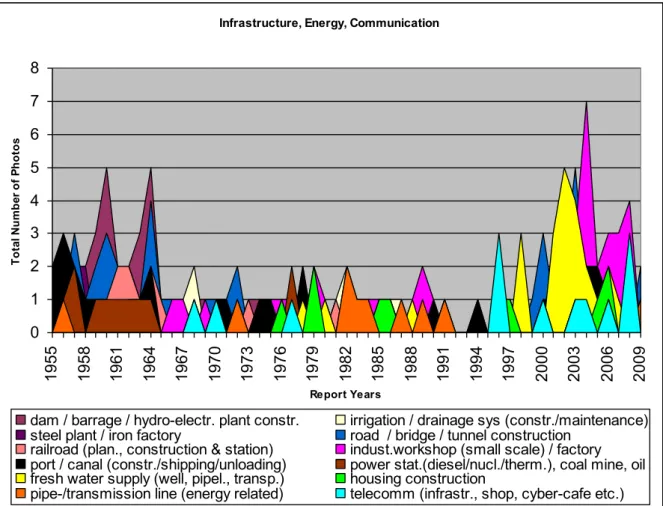
Infrastructure, Energy, Communication
0 1 2 3 4 5 6 7 8 1955 1958 1961 1964 1967 1970 1973 1976 1979 1982 1985 1988 1991 1994 1997 2000 2003 2006 2009 Report Years Tot al N um be r of P hot os
dam / barrage / hydro-electr. plant constr. irrigation / drainage sys (constr./maintenance) steel plant / iron factory road / bridge / tunnel construction
railroad (plan., construction & station) indust.workshop (small scale) / factory port / canal (constr./shipping/unloading) power stat.(diesel/nucl./therm.), coal mine, oil fresh water supply (well, pipel., transp.) housing construction
pipe-/transmission line (energy related) telecomm (infrastr., shop, cyber-cafe etc.) Figure 11 : Simple area chart of evolution of different fundamental infrastructural sectors, with dams and barrages in the background and the telecommunication sector in the foreground, allowing easily grasping peaks and dominant themes with the inconvenience of hiding small and similar values.
Infrastructure, Energy, Communication 0 2 4 6 8 10 12 14 16 18 1955 1958 1961 1964 1967 1970 1973 1976 1979 1982 1985 1988 1991 1994 1997 2000 2003 2006 2009 Report Years Tot al N um be r of P hot os
dam / barrage / hydro-electr. plant constr. irrigation / drainage sys (constr./maintenance) steel plant / iron factory road / bridge / tunnel construction
railroad (plan., construction & station) indust.workshop (small scale) / factory port / canal (constr./shipping/unloading) power stat.(diesel/nucl./therm.), coal mine, oil fresh water supply (well, pipel., transp.) housing construction
pipe-/transmission line (energy related) telecomm (infrastr., shop, cyber-cafe etc.) Figure 12 : Stacked area chart of the same categories as in figure 11, with each contribution now visible throughout the chart.
Both, figures 11 and 12 reveal again three rather distinct periods, covering approximately 1955 to 1965, 1966 to 1995, and 1996 to 2009. Peak contributions lie here clearly within the first and last periods, yet when considering the average, one may observe that every period includes approximately 100 photographs (97, 98 and 105) in this category, yet their thematic distribution is however strikingly different. The first period includes (with only one exception) solely photographs that may be attributed to the first 8 themes (dam, irrigation/drainage etc., until power station). This implicates that one can identify this period as a major, large-scale industrial and infrastructural project, with dams and barrages, roads, bridges and tunnels, as well as ports and canals as dominant photographic themes. Housing, telecommunication and fresh water supply are no issues yet.
The second period between 1966 and 1995 shows an overall more evenly distributed picture. The dominance of large-scale industrial infrastructural projects is partly succeeded by other themes, such as small-scale industrial workshops, which make up now the by far largest single-theme contribution with over one fifth of all photographs in this category and period (21 photos of a total of 98). The water issue, almost completely absent from the first period, has become also a highly dominant theme, with depictions showing irrigation and drainage systems (16 photos), as well as fresh-water supply sources (9 photos), such as wells and water transportation in rural areas. Some new themes, completely absent from the first period, are
housing and telecommunication, even though contributions rest still punctual. The second period reflects in this sense a diversification, but also a reduction in the size and scale of the projects, rendering the themes more compatible to direct human comprehension and interaction. As we will see later, many of these themes may also be related to other categories, such as the medical category, since especially water questions have also a profound impact on public health, hygiene and disease control. For the time being, this second period may be called for our convenience the diversification and down-scaling period.
The peaks of the simple area chart of figure 11 show well that the major obsession of the last period between 1995 and 2009 are fresh-water issues (21 photos of a total of 105), as well as industrial workshops (27 photos of a total of 105). Road repairs and constructions, as well as port scenes, such as the unloading of boats, are the third and forth major theme (17 and 14 photos), followed finally by telecommunication depictions (10 photos). It seems that this last period is characterised by an emphasis on local economies, such as small factories, where different industrial goods are produced, as well as the installation of a better coverage of fresh water access and sanitation facilities in a certain number of WB countries. One may call therefore this last period the sanitation and local economies period.
2.2. Agricultural Issues Agricultural Issues 0 2 4 6 8 10 12 1955 1958 1961 1964 1967 1970 1973 1976 1979 1982 1985 1988 1991 1994 1997 2000 2003 2006 2009 Report Years N u m b er o f Ph o to s
cotton/tea/fibre/lumber/palm/coff. plant harvest/plantation (fruit, veg, tea)
agricultural machine lumber transport & chopping
corn/rice prepar./grow./seed./milling) warehouse / storage (coffee, etc.)
second period, which may be placed once again roughly between the 1960s to the mid-1990s. Photographs in this time period are closely bound to harvest and alimentary themes, most notably the growing, seeding or preparation of corn, rice, tea, vegetables or fruit. These two themes make up more than half of all the photographs in this category and period (34 of 59). Since 1995, there is a growing interest in depicting different life situations within different (mostly rural) communities. The two themes “village life” and “market life” are therefore predominant in this last period, with over half of all the photos of this period contributing to either one of the two themes (9 and 29 photographs of a total of 73).One must add that the only form of economic exchange that is depicted in the reports are almost exclusively typical market situations. In the most recent reports however, other forms were sometimes added, such as traders at stock exchange (WBR2007), clients in a bank (WBR2009) or money exchange business (WBR2009)
The first period until the mid-1960s may therefore be called from a quantitative point of view the non-agricultural period. The second period running from the mid-1960s to the mid-1990s is the alimentation and plantation period, conveying one basic message or question: how to feed the world. The third period may be labelled the market period, with a growing emphasis on its economic meaning.
2.3. Evolution of Educational Depictions
Education Sector 0 1 2 3 4 5 6 7 8 9 1955 1958 1961 1964 1967 1970 1973 1976 1979 1982 1985 1988 1991 1994 1997 2000 2003 2006 2009 Report Years N um be r of P ho tos
learning / teaching at school agricul. / industr. education (mostl. non-formal)
women education / female literacy WB / EDI teaching (in field or US)
Figure 14 : Simple area chart of photographs that may be attributed to the educational sector.
Compared to other categories, the education sector is a rather simple category. The 1950s and the first half of the 1960s don’t contain any school related images, but only WB related education projects which aim at agricultural or industrial non-formal education or field
teaching of policy makers. Only since the late 1960s, educational environments in a traditional sense (like schools) have become an important pictorial element. Therefore, only with the beginning of this second period from the mid-1960s to the mid-1990s, one may speak of a statistically significant educational category. Since 1997, one can observe an important increase of the number of educational activities and one can observe that the school has become in the third period between 1997 and the end of the enquiry period one of the favourite photo motives of the WBRs. Female literacy, which shows important peaks in 2001 and 2002, is the second important theme of this last period, although it has played already during the second period at three other occasions an important role, most significantly in 1990.
It is fair to say that our first period (covering 1955-1965) is in other words a non-educational period, whereas the second period (1966-1995) represents in average a primary education period. The third period (1996-2009) may finally be qualified as a broader, education and female literacy period.
2.4. Medical and Health Issues
Medical and Health Issues
0 1 2 3 4 5 6 7 8 1970 1972 1974 1976 1978 1980 1982 1984 1986 1988 1990 1992 1994 1996 1998 2000 2002 2004 2006 2008 Report Years N um be r of P ho tos
birth control / motherhood public health (clinic, doctor, ambulance...) infection prevention (water, HIV, vaccinat.,...)
Figure 15 : Simple area chart showing the distribution of medical and public health issues.
The area chart in figure 15 is a striking example of a category which started relatively late to become an important iconographical element. Our usual periodisation doesn’t seem
To put it in other words, public health issues play only since the 1970s a role, disease prevention campaigns only since the 1990s. In a more general sense, one may observe since the year 2000 a dramatic amplification of all health issues. Birth control together with the importance of motherhood, which play statistically already the leading role before the year 2000 with 7 occurrences, take up a recurring role in five consecutive reports of the new millennium. The pre-1970 period may therefore be called the non-medical period, followed by the birth control period, which could be limited, strictly speaking, to the period covering 1972 to 1981, since one can observe a diversification of themes at the end of the 1980s and the beginning of the 1990s. The last period, which starts around the late 1990s, may be called the prevention period.
2.5. Environmental Issues Environmental Issues 0 0,5 1 1,5 2 2,5 3 3,5 1985 1986 1987 1988 1989 1990 1991 1992 1993 1994 1995 1996 1997 1998 1999 2000 2001 2002 2003 2004 2005 2006 2007 2008 2009 Report Years Nu m be r of P ho to s
deforestation soil erosion (control/as risk) natural disaster impact (hurr./earthquake)
overpopulation / slums / refugee camps envir. aw areness comm. (icons etc.) sustainability / recycling etc. / environ. plan
Environmental Issues 0 0,5 1 1,5 2 2,5 3 3,5 4 4,5 1985 1986 1987 1988 1989 1990 1991 1992 1993 1994 1995 1996 1997 1998 1999 2000 2001 2002 2003 2004 2005 2006 2007 2008 2009 Report Years Nu m be r of P ho to s
deforestation soil erosion (control/as risk) natural disaster impact (hurr./earthquake)
overpopulation / slums / refugee camps envir. aw areness comm. (icons etc.) sustainability / recycling etc. / environ. plan
Figure 17 : Stacked area chart of environmental issues in WBRs 1985-2009
Just as the medical and health issue chart, the two environmental charts of figures 16 and 17 are relatively simple and contain a total of solely 24 photographs. In general one can say that environmental issues don’t play any role before 1985 and that since 1999, one can observe an important increase in environmental issues. It is difficult to introduce a periodisation to this category, since it covers only a relatively small time-span and sample size. There are however two dominant themes which may be pointed out and which cover the years 1993 to 2009: natural disaster impact and sustainability.
2.6. Animal Themes
One of the last categories analysed for this report are animal depictions, as shown in figure 18. This is insofar an ambiguous category, since many themes may be related to other categories, such as fishing to agricultural or environmental themes, or animal health instruction to the medical sector. We decided however to count these photographs apart in order to obtain an idea about the representation of “nature” in the WBRs. All animal
Animal Themes 0 1 2 3 1955 1958 1961 1964 1967 1970 1973 1976 1979 1982 1985 1988 1991 1994 1997 2000 2003 2006 2009 Report Years To ta l N um be r of P ho tos
cattle animal health instruction & control poultry farm fishing (vessel, cargo)
fishing small-scale (boats, net repair, selling)
Figure 18 : Stacked area chart of animal themes in WBRs 1955-2009.
2.7. Miscellaneous Category
The miscellaneous category of figure 19 confirms finally some earlier observations. For example, in the human elements category, we labelled the last period covering 1995 to 2009, due to the large increase of “civilian” involvement, the “civil society period”. Indeed, figure 19 shows this very well, explicit references to civil society and the build-up of participatory processes may be found only in this last period. The so-called “market life period”, identified as the time-span running again from 1995 to 2009 in the agricultural category and embracing also as the only category economy related depictions, may be correlated with elements such as microcredit, pension reform or poverty reduction. The publicity and illustration effect was already noted in figure 9 as part of the human category. Here again, the rising number of photographic depictions employed for purely illustrative purposes confirms the tendency of the last fifteen years or so of our enquiry period, that the photographs in the reports play a increasingly illustrative role, better known from other publication media such as advertising brochures. As largest contributor to the miscellaneous category, the “publicity effect” in the reports of the last period can not be neglected.
Miscellaneous 0 2 4 6 8 10 12 14 1985 1987 1989 1991 1993 1995 1997 1999 2001 2003 2005 2007 2009 Report Years Tot al num be r of phot os
Urban life / street scence
other: micorcredit, pension reform, tourism Publicity (smiling, etc.)/ illustration effect participatory process / civil soc.
poverty reduction
Figure 19 : Stacked area chart of photographs depicting miscellaneous themes, not directly applicable to other categories.
3. Summary and qualitative Analysis 3.1. Periodisation summary 1st period, roughly 1955-1965 2nd period, roughly 1966-1995 3rd period, roughly 1996-2009 Iconography and
Page Size Total
photographic period mixed period, decline in importance
convergence, full iconographic period
World Region Europe and some
investments in South
Sub-Saharan region dominant
Sub-Saharan region and Latin America dominant, yet most photos unlabelled
Perspective landscape period human scale period close-up period
Gender male dominated
period
gradual gender convergence
mixed gender period
Human / Social categorisation
worker period worker and farmer / fishermen period civil society Infrastructure / Energy / Comm. large-scale industrial / infrastructure period diversification and down-scaling
sanitation and local economies Agriculture non-agricultural period alimentation and plantation period market period
Education non-education period primary education
period
education and female literacy period
Medical Issues Non-medical period birth control period prevention period
Environmental Issues non-environmental period first degradation issues sustainability and natural disaster period
Animal Themes (cattle period) (cattle period) fishing period
Miscellaneous n/a n/a confirms some
elements of 3rd period, most notably
“publicity effect” Table 1 : Periodisation as attempted during quantitative analysis
3.2. The Role of Photography in the Word Bank Reports
With all these diverse elements at hand, we are now able to identify not only some general tendencies and elements of certain periods, but also some major reasons why certain iconographical themes appear, or do not appear, at specific time intervals. The World Bank was created in 1944 at the Bretton Woods conference to finance the reconstruction of Europe and to help developing countries (which were at the time still rather small in number). Photographs of the reports issued between 1955 and 1965 reflect particularly well the nature of this large-scale industrial and infrastructural project. The photographs document so to speak the “grandiose” nature of those projects, most notably via the choice of landscape perspective, often realised with an oblique, bird’s eye view on the represented object, such as dams, hydro-electric plants, ports, canals and power stations, often in the absence of any human being. One may understand now clearer the reason why perspective was introduced as a formal element: it followed the assumption that certain photographic motives and themes demand specific perspectival choices. With only male workers represented, this first period is also clearly gendered in the medium of photography, namely by male dominance, reflecting in a broader sense the rejection of any gender considerations before their radical rehabilitation during the so-called “sexual revolution” of the late 1960s.
Photograph numbers in the mentioned infrastructure categories drop almost immediately after 1965, which is a clear indication for profounder changes taking place within the Bank. Indeed, the first period reflects in a sense an important period of the Cold War, during which the United States as true world power excel at dominating some parts of Europe and developing countries of the South. In a general way, with no access to private funding alternatives, the South had no other choice as to follow closely the lead indicated by the West. The reconstruction of Europe (and the funding of anti-communist allies), mostly visible in its gradual, but effective recovery after the Second World War, is accompanied by the WB by large-scale project funding in the energy and infrastructure sector. The complete absence of certain themes, such as medical issues and environmental issues, and the relative absence of agricultural and certainly educational questions (only seven photographs were counted in these two categories altogether), reinforces the majestic nature of the infrastructural reconstruction period, with its black and white focus on massive cement and concrete structures. Agricultural issues enter the reports so to speak (besides some plantation photographs) through the backdoor, via the representation of massive irrigation systems and canals, which form also an important part of this infrastructural period. The 1950s and 1960s see basically two-thirds of the WB borrowings going into the energy and transportation sector, a domain which is traditionally considered in Bank circles as safe and rather profitable. The agricultural and social domains on the other hand are in this early phase of the Bank’s
domains considered beforehand as unprofitable or risky funding. Whereas infrastructural funding decreases dramatically in comparing the 1960s to the 1970s (64% to 34%), other sectors take up in importance: agricultural funding doubles during the same time frame (13 % to 28%) and social projects (like water access and education) triple in funding volume (4% to 13%). The overall funding increases also rather dramatically, especially during the 1970s and 1980s, a fact which is well reflected in the steady growth of total page numbers of the WBRs. Some of these developments are of course also reflected in the medium of photography, where one can observe a diversification of the themes depicted and we called this therefore for the infrastructure category the “diversification and down-scaling period.” Other categories are however also involved. Primary education for example is throughout the 1970s an iconic motive of the reports – a period which in this sense we have rightly labelled the “primary education period.” The same may be said for yet other categories. Infrastructural projects do not only loose their initial importance, they are also diversified and down-scaled, meaning that individual, smaller, less “grandiose” projects are considered for funding. This is once again (at least partly) reflected by the perspectival renderings of most photographs which are for the vast majority taken at a more human level with a reduced framing. The move from the landscape perspective to the human scale reflects here in a sense the fundamental policy change within the Bank, pushed forward by McNamara, in funding more socially oriented projects. Landscape photographs are simply not considered useful in accounting for claimed “benefits” of, for example, the so-called “green revolution,” which started to take up in importance especially in the late 1960s. Most photographs try to communicate a human dimension of this important agricultural transformation, showing individual farmers in plantations and fields rather than vast landscape modifications. When consulting figure 13 showing the distribution of agricultural issues, one sees that the harvest and plantation of tea and fruit and the preparation, growing and seeding of rice or corn are indeed the most important themes of what we called “the alimentation and plantation period.” The “green revolution” is also accompanied by photographic themes exploring infrastructural developments, such as irrigation systems or field instructions on new agricultural techniques and methods (see figure 14). The second period may therefore be considered also on an iconographical level the Bank’s “golden age” of agriculture, a sector in which funding would however be dramatically reduced towards the end of the 1990s.
After McNamara’s resignation in 1981, structural adjustments programs become the key strategy of the WB under the new president Clausen who instigates ultra-liberalist strategies. In brief, structural adjustments aim at imposing the so-called “free market” on borrowing countries. When not complying with orthodox liberalisation rules, such as the denationalisation of different sectors, countries may not receive money or be sanctioned by the Bank. The structural adjustments prove, however, to be by and large ineffective and they are officially abandoned by the end of the 1990s. This part of the WB history is however very difficult to relate to any iconographical tradition in particular. Other visual themes, which start at the beginning of the 1990s to take up in importance, are environmental issues and health questions which are indeed both accompanied by WB thematic reports, issued between 1992 and 1994.
With the nomination of the Australian economist James Wolfensohn as new WB president in 1995, a new era starts at the World Bank. Under Wolfensohn’s leadership, all the major development questions are attacked in some way or another, ranging from the fight against poverty to the risk of climate change and the battle against major epidemics and pandemics. When considering the actual WBRs more closely, one can observe that major changes in layout accompanied Wolfensohn’s presidency. The annual report was divided into two volumes, its overall size reduced and the iconographical part augmented therefore rather dramatically (especially when considering only the first volume) and new media were mobilised in the dissemination of information. We believe that legitimacy is a major issue which can account for these changes.
Indeed, the changes can be interpreted as an answer to a major crisis in legitimacy which the Bank was experiencing especially towards the end of the 1990s. The Bank’s structural adjustment programs were considered in general a severe failure. The media strategy consisted so to speak in engaging contestation by building up a less austere and certainly a very much friendlier and positive image in order to rebuild confidence. If the reports of the new century have one basic message, it should probably read: things are going well and people are happy! The high number of “illustrative photographs” is tangible proof of this shift towards a new strategy which we labelled the “creation of contentedness.” Indeed, their use is normally known only in the case of other publication media, such as for example advertising brochures. The increasing number of photographs showing for Western eyes rather “exotic” people (very often children and in close-up perspective) smiling, like on can see for example on the cover page of WBR1999, is a clear indication for the use of photography with the aim of establishing an affective link with reader. Children are particularly helpful in achieving this, as big publicity campaigns of call for donations, showing for example the iconic starving child, have proven many times. In the WBRs, the use of “smile” photography allows in a similar sense to sell the Bank’s funding programs as not only largely beneficial to the local population, but also as highly effective, creating a large number of satisfied and content people, no matter which developing region one looks at in the world. The deliberate absence of captions, another important characteristic of the last period, allowing for no precise geographic location or thematic categorisation, renders those photographs clearly more global and universal. They are in other words the visual analogue to the stereotype, a category of visualisation which Uwe Pörksen has aptly labelled the “visiotype.”
The World Bank had to seek for this specific purpose the help of publicity professionals, as the credits pages of the reports indicate. Starting from WBR2000, the design coordination and layout was no longer in the hands of the in-house “Graphic Design Unit“ (as is still the case in WBR1999), but exclusively in those of professionals in global branding and design. This new,
increased use of graphics and charts, seeking compression of knowledge in abbreviated visual form and reflecting a general development to a now highly visual communication medium. Finally, what makes the reports of the last period also unique is the fact that the strategy of the creation of contentedness is reinforced by the photographic presence of other themes which would be in other contexts quite simply alarming for the reader. Severe environmental issues and natural disasters, pandemics such as AIDS and the seemingly ever enduring fight against poverty are all common photographic subjects of the last reports, hardly themes that would normally help rising the spirit of the reader. Yet in this new context, the convergence of apparently highly contradicting visual themes seems only to reinforce the global message of contentedness.
Yet one must not forget that with the outsourcing of the report design, the WBRs underwent also a fundamental normalising process. That is the reason why today, the WBRs seem to fit so well into the broader landscape of institutional annual reports, be it of the Pan-America Health Organization or of CHF International. Publication media can of course help only to a restricted degree in steering against losses of legitimacy. The future will show if the Bank is also willing to undergo fundamental structural changes to overcome its crisis.