What is Bootstrap?
Bootstrap is a free front-end framework for faster and easier web development
Bootstrap includes HTML and CSS based design templates for typography, forms, buttons, tables, navigation, modals, image carousels and many other, as well as optional JavaScript plugins Bootstrap also gives you the ability to easily create responsive designs What is Responsive Web Design?
Responsive web design is about creating web sites which automatically adjust themselves to look good on all devices, from small phones to large desktops.
Bootstrap 3 vs. Bootstrap 4
Bootstrap 4 is the newest version of Bootstrap; with new components, faster stylesheet and more responsiveness.
Bootstrap 4 supports the latest, stable releases of all major browsers and platforms. However, Internet Explorer 9 and down is not supported.
If you require IE8-9 support, use Bootstrap 3. It is the most stable version of Bootstrap, and it is still supported by the team for critical bugfixes and documentation changes. However, no new features will be added to it. Droppped icon support: Bootstrap 4 does not support BS3 Glyphicons. Use Font-Awesome or other icon libraries instead.
Why Use Bootstrap?
Advantages of Bootstrap: Easy to use: Anybody with just basic knowledge of HTML and CSS can start using Bootstrap
Responsive features: Bootstrap's responsive CSS adjusts to phones, tablets, and desktops
Mobile-first approach: In Bootstrap, mobile-first styles are part of the core framework
Browser compatibility: Bootstrap 4 is compatible with all modern browsers (Chrome, Firefox, Internet Explorer 10+, Edge, Safari, and Opera)
Where to Get Bootstrap 4?
You can:
Include Bootstrap 4 from a CDN
Download Bootstrap 4 from getbootstrap.com
Bootstrap 4 CDN
If you don't want to download and host Bootstrap 4 yourself, you can include it from a CDN (Content Delivery Network).
MaxCDN provides CDN support for Bootstrap's CSS and JavaScript. You must also include jQuery:
MaxCDN:
<!-- Latest compiled and minified CSS -->
<link rel="stylesheet"href="https://maxcdn.bootstrapcdn.com/bootstra p/4.1.3/css/bootstrap.min.css"> <!-- jQuery library --> <script src="https://ajax.googleapis.com/ajax/libs/jquery/3.3.1/jque ry.min.js"></script> <!-- Popper JS --> <script src="https://cdnjs.cloudflare.com/ajax/libs/popper.js/1.14.3 /umd/popper.min.js"></script>
<!-- Latest compiled JavaScript -->
<script src="https://maxcdn.bootstrapcdn.com/bootstrap/4.1.3/js/boot strap.min.js"></script>
One advantage of using the Bootstrap 4 CDN:
Many users already have downloaded Bootstrap 4 from MaxCDN when visiting another site. As a result, it will be loaded from cache when they visit your site, which leads to faster loading time. Also, most CDN's will make sure that once a user requests a file from it, it will be served from the server closest to them, which also leads to faster loading time. jQuery and Popper?
Bootstrap 4 use jQuery and Popper.js for JavaScript components (like modals, tooltips, popovers etc). However, if you just use the CSS part of Bootstrap, you don't need them.
Downloading Bootstrap 4
If you want to download and host Bootstrap 4 yourself, go to https://getbootstrap.com/, and follow the instructions there.
Create First Web Page With Bootstrap 4
1. Add the HTML5 doctypeBootstrap 4 uses HTML elements and CSS properties that require the HTML5 doctype.
Always include the HTML5 doctype at the beginning of the page, along with the lang attribute and the correct character set:
<!DOCTYPE html> <html lang="en"> <head>
<meta charset="utf-8"> </head>
</html>
2. Bootstrap 4 is mobile-first
Bootstrap 4 is designed to be responsive to mobile devices. Mobile-first styles are part of the core framework.
To ensure proper rendering and touch zooming, add the following <meta> tag
inside the <head> element:
<meta name="viewport" content="width=device-width, initial-scale=1"> The width=device-width part sets the width of the page to follow the
screen-width of the device (which will vary depending on the device).
The initial-scale=1 part sets the initial zoom level when the page is first
loaded by the browser. 3. Containers
Bootstrap 4 also requires a containing element to wrap site contents. There are two container classes to choose from:
1. The .container class provides a responsive fixed width container
2. The .container-fluid class provides a full width container, spanning
the entire width of the viewport .container
.container-fluid
Two Basic Bootstrap 4 Pages
The following example shows the code for a basic Bootstrap 4 page (with a responsive fixed width container):
Container Example
<!DOCTYPE html><html lang="en"> <head>
<title>Bootstrap 4 Example</title> <meta charset="utf-8">
<meta name="viewport" content="width=device-width, initial-scale=1">
<link rel="stylesheet"href="https://maxcdn.bootstrapcdn.com/bootst rap/4.1.3/css/bootstrap.min.css"> <script src="https://ajax.googleapis.com/ajax/libs/jquery/3.3.1/jq uery.min.js"></script> <scriptsrc="https://cdnjs.cloudflare.com/ajax/libs/popper.js/1.14. 3/umd/popper.min.js"></script> <script src="https://maxcdn.bootstrapcdn.com/bootstrap/4.1.3/js/bo otstrap.min.js"></script> </head> <body>
<div class="container">
<h1>My First Bootstrap Page</h1> <p>This is some text.</p> </div>
</body> </html>
The following example shows the code for a basic Bootstrap 4 page (with a full width container):
Container Fluid Example
<!DOCTYPE html><html lang="en"> <head>
<title>Bootstrap 4 Example</title> <meta charset="utf-8">
<meta name="viewport" content="width=device-width, initial-scale=1">
rap/4.1.3/css/bootstrap.min.css"> <script src="https://ajax.googleapis.com/ajax/libs/jquery/3.3.1/jq uery.min.js"></script> <scriptsrc="https://cdnjs.cloudflare.com/ajax/libs/popper.js/1.14. 3/umd/popper.min.js"></script> <script src="https://maxcdn.bootstrapcdn.com/bootstrap/4.1.3/js/bo otstrap.min.js"></script> </head> <body>
<div class="container-fluid"> <h1>My First Bootstrap Page</h1> <p>This is some text.</p> </div>
</body> </html>
Bootstrap 4 Grids
Bootstrap 4 Grid System
Bootstrap's grid system is built with flexbox and allows up to 12 columns across the page.
If you do not want to use all 12 columns individually, you can group the columns together to create wider columns:
span 1 span 1 span 1 span 1 span 1 span 1 span 1 span 1 span 1 span 1 span 1 span 1
span 4 span 4 span 4
span 4 span 8
span 6 span 6
span 12
The grid system is responsive, and the columns will re-arrange automatically depending on the screen size.
Make sure that the sum adds up to 12 or fewer (it is not required that you use all 12 available columns).
Grid Classes
The Bootstrap 4 grid system has five classes:
.col- (extra small devices - screen width less than 576px)
.col-sm- (small devices - screen width equal to or greater than 576px)
.col-md- (medium devices - screen width equal to or greater than
768px)
.col-lg- (large devices - screen width equal to or greater than 992px)
.col-xl- (xlarge devices - screen width equal to or greater than
1200px)
The classes above can be combined to create more dynamic and flexible layouts.
Tip: Each class scales up, so if you wish to set the same widths for sm and md,
you only need to specify sm.
Basic Structure of a Bootstrap 4 Grid
The following is a basic structure of a Bootstrap 4 grid:<!-- Control the column width, and how they should appear on different devices -->
<div class="row">
<div class="col-*-*"></div> <div class="col-*-*"></div> </div>
<div class="row">
<div class="col-*-*"></div> <div class="col-*-*"></div> <div class="col-*-*"></div> </div>
<!-- Or let Bootstrap automatically handle the layout --> <div class="row">
<div class="col"></div> <div class="col"></div> <div class="col"></div> </div>
First example: create a row (<div class="row">). Then, add the desired
number of columns (tags with appropriate .col-*-* classes). The first star (*)
represents the responsiveness: sm, md, lg or xl, while the second star represents a number, which should add up to 12 for each row.
Second example: instead of adding a number to each col, let bootstrap handle
to each col. three cols = 33.33% width to each col. four cols = 25% width, etc. You can also use .col-sm|md|lg|xl to make the columns responsive.
Below we have collected some examples of basic Bootstrap 4 grid layouts.
Three Equal Columns
.col .col .col
The following example shows how to create three equal-width columns, on all devices and screen widths:
Example
<div class="row"><div class="col">.col</div> <div class="col">.col</div> <div class="col">.col</div> </div>
Responsive Columns
.col-sm-3 .col-sm-3 .col-sm-3 .col-sm-3The following example shows how to create four equal-width columns starting at tablets and scaling to extra large desktops. On mobile phones or screens that are less than 576px wide, the columns will automatically stack on top of each other:
Example
<div class="row"><div class="col-sm-3">.col-sm-3</div> <div class="col-sm-3">.col-sm-3</div> <div class="col-sm-3">.col-sm-3</div> <div class="col-sm-3">.col-sm-3</div> </div>
Two Unequal Responsive Columns
.col-sm-4.col-sm-8
The following example shows how to get two various-width columns starting at tablets and scaling to large extra desktops:
Example
<div class="row"><div class="col-sm-4">.col-sm-4</div> <div class="col-sm-8">.col-sm-8</div> </div>
Tip: You will learn more about Bootstrap 4 grids later in this tutorial.
Bootstrap 4 Text/Typography
Bootstrap 4 Default Settings
Bootstrap 4 uses a default font-size of 16px, and its line-height is 1.5.
The default font-family is "Helvetica Neue", Helvetica, Arial, sans-serif.
In addition, all <p> elements have margin-top: 0 and margin-bottom: 1rem (16px by default).
<h1> - <h6>
Bootstrap 4 styles HTML headings (<h1> to <h6>) with a bolder font-weight
and an increased font-size:
Example
h1 Bootstrap heading
(2.5rem = 40px)h2 Bootstrap heading
(2rem = 32px)h3 Bootstrap heading
(1.75rem = 28px)h4 Bootstrap heading
(1.5rem = 24px)h5 Bootstrap heading (1.25rem = 20px)
h6 Bootstrap heading (1rem = 16px)Display Headings
Display headings are used to stand out more than normal headings (larger font-size and lighter font-weight), and there are four classes to choose from: .display-1, .display-2, .display-3, .display-4
Example
Display 1
Display 2
Display 3
Display 4
<small>
In Bootstrap 4 the HTML <small> element is used to create a lighter,
secondary text in any heading:
Example
h1 heading
secondary text
h2 heading
secondary text
h3 heading
secondary text
h4 heading
secondary text
h5 heading
secondary text h6 heading secondary text<mark>
Bootstrap 4 will style the HTML <mark> element with a yellow background color
and some padding:
Example
Use the mark element to highlight text.
<abbr>
Bootstrap 4 will style the HTML <abbr> element with a dotted border bottom:
Example
The WHO was founded in 1948.
<blockquote>
Add the .blockquote class to a <blockquote> when quoting blocks of content
from another source:
Example
For 50 years, WWF has been protecting the future of nature. The world's leading conservation organization, WWF works in 100 countries and is supported by 1.2 million members in the United States and close to 5 million globally.
From WWF's website
<dl>
Bootstrap 4 will style the HTML <dl> element in the following way:
Example
Coffee
- black hot drink
Milk
- white cold drink
<code>
Example
The following HTML elements: span, section, and div defines a section in a
document.
<kbd>
Bootstrap 4 will style the HTML <kbd> element in the following way:
Example
Use ctrl + p to open the Print dialog box.
<pre>
Bootstrap 4 will style the HTML <pre> element in the following way:
Example
Text in a pre element
is displayed in a fixed-width font, and it preserves
both spaces and line breaks.
More Typography Classes
The Bootstrap 4 classes below can be added to style HTML elements further:
Class Description
.font-weight-bold Bold text .font-italic Italic text
.font-weight-light
Light weight text
.font-weight-normal
Normal text
.small Indicates smaller text (set to 85% of the size of the
parent)
.text-left Indicates left-aligned text
.text-*-left Indicates left-aligned text on small, medium, large or
xlarge screens
.text-center Indicates center-aligned text
.text-*-center Indicates center-aligned text on small, medium, large
or xlarge screens
.text-right Indicates right-aligned text
.text-*-right Indicates right-aligned text on small, medium, large or
xlarge screens
.text-justify Indicates justified text .text-monospace Monospaced text .text-nowrap Indicates no wrap text .text-lowercase Indicates lowercased text .text-uppercase Indicates uppercased text .text-capitalize Indicates capitalized text
.initialism Displays the text inside an <abbr> element in a slightly
smaller font size
.list-unstyled Removes the default list-style and left margin on list
items (works on both <ul> and <ol>). This class only
applies to immediate children list items (to remove the default list-style from any nested lists, apply this class to any nested lists as well)
.list-inline Places all list items on a single line (used together
with .list-inline-item on each <li> elements) .pre-scrollable Makes a <pre> element scrollable
Bootstrap 4 Colors
Text Colors
Bootstrap 4 has some contextual classes that can be used to provide "meaning through colors".
The classes for text colors are: .text-muted, .text-primary, .text-success, .text-info, .text-warning, .text-danger,
.text-secondary, .text-white, .text-dark, .text-body (default body color/often
black) and .text-light:
Example
This text is muted. This text is important. This text indicates success.This text represents some information. This text represents a warning.
This text represents danger. Secondary text.
Dark grey text. Body text. Light grey text.
Contextual text classes can also be used on links, which will add a darker hover color:
You can also add 50% opacity for black or white text with the .text-black-50 or .text-white-50 classes:
Example
Black text with 50% opacity on white background White text with 50% opacity on black background
Background Colors
The classes for background colors are: .bg-primary, .bg-success, .bg-info, .bg-warning, .bg-danger, .bg-secondary, .bg-dark and .bg-light.
Note that background colors do not set the text color, so in some cases you'll want to use them together with a .text-* class.
Example
This text is important. This text indicates success.
This text represents some information. This text represents a warning.
This text represents danger. Secondary background color. Dark grey background color. Light grey background color.
Bootstrap 4 Tables
Bootstrap 4 Basic Table
A basic Bootstrap 4 table has a light padding and horizontal dividers. The .table class adds basic styling to a table:
Example
Firstname Lastname Email
John Doe [email protected]
Mary Moe [email protected]
Striped Rows
The .table-striped class adds zebra-stripes to a table:
Example
Firstname Lastname Email
John Doe [email protected]
Mary Moe [email protected]
July Dooley [email protected]
Bordered Table
The .table-bordered class adds borders on all sides of the table and cells:
Example
Firstname Lastname Email
John Doe [email protected]
Mary Moe [email protected]
July Dooley [email protected]
Hover Rows
The .table-hover class adds a hover effect (grey background color) on table
rows:
Example
Firstname Lastname Email
John Doe [email protected]
Mary Moe [email protected]
July Dooley [email protected]
Black/Dark Table
Example
Firstname Lastname Email
John Doe [email protected]
Mary Moe [email protected]
July Dooley [email protected]
Dark Striped Table
Combine .table-dark and .table-striped to create a dark, striped table:
Example
Firstname Lastname Email
John Doe [email protected]
Mary Moe [email protected]
July Dooley [email protected]
Hoverable Dark Table
The .table-hover class adds a hover effect (grey background color) on table
rows:
Example
Firstname Lastname Email
John Doe [email protected]
Mary Moe [email protected]
July Dooley [email protected]
Borderless Table
The .table-borderless class removes borders from the table:
Firstname Lastname Email
John Doe [email protected]
Mary Moe [email protected]
Contextual Classes
Contextual classes can be used to color the whole table (<table>), the table
rows (<tr>) or table cells (<td>).
Example
Firstname Lastname Email
Default Defaultson [email protected]
Primary Joe [email protected]
Success Doe [email protected]
Danger Moe [email protected]
Info Dooley [email protected]
Warning Refs [email protected]
Active Activeson [email protected]
Secondary Secondson [email protected]
Light Angie [email protected]
Dark Bo [email protected]
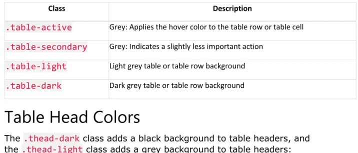
The contextual classes that can be used are:
Class Description
.table-primary Blue: Indicates an important action
.table-success Green: Indicates a successful or positive action
.table-danger Red: Indicates a dangerous or potentially negative action
.table-info Light blue: Indicates a neutral informative change or action
Class Description
.table-active Grey: Applies the hover color to the table row or table cell
.table-secondary Grey: Indicates a slightly less important action
.table-light Light grey table or table row background
.table-dark Dark grey table or table row background
Table Head Colors
The .thead-dark class adds a black background to table headers, and
the .thead-light class adds a grey background to table headers:
Example
Firstname Lastname Email
John Doe [email protected]
Mary Moe [email protected]
July Dooley [email protected]
Firstname Lastname Email
John Doe [email protected]
Mary Moe [email protected]
July Dooley [email protected]
Small table
The .table-sm class makes the table smaller by cutting cell padding in half:
Example
Firstname Lastname Email
John Doe [email protected]
Mary Moe [email protected]
Responsive Tables
The .table-responsive class creates a responsive table: an horizontal
scrollbar is added to the table on screens that are less than 992px wide (if needed). When viewing on anything larger than 992px wide, there is no difference:
Example
<div class="table-responsive"> <table class="table">
... </table> </div>
You can also decide when the table should get a scrollbar, depending on screen width:
Class Screen width
.table-responsive-sm < 576px .table-responsive-md < 768px .table-responsive-lg < 992px .table-responsive-xl < 1200px
Example
<div class="table-responsive-sm"> <table class="table">
... </table> </div>
Bootstrap 4 Images
Bootstrap 4 Image Shapes
Rounded Corners:Circle:
Rounded Corners
The .rounded class adds rounded corners to an image:
Example
<img src="cinqueterre.jpg" class="rounded" alt="Cinque Terre">
Circle
The .rounded-circle class shapes the image to a circle:
Example
<img src="cinqueterre.jpg" class="rounded-circle" alt="Cinque Terre">
Thumbnail
The .img-thumbnail class shapes the image to a thumbnail (bordered):
Example
<img src="cinqueterre.jpg" class="img-thumbnail" alt="Cinque Terre">
Aligning Images
Float an image to the right with the .float-right class or to the left
Example
<img src="paris.jpg" class="float-left"> <img src="paris.jpg" class="float-right">
Centered Image
Center an image by adding the utility classes .mx-auto (margin:auto)
and .d-block (display:block) to the image:
Example
Responsive Images
Images come in all sizes. So do screens. Responsive images automatically adjust to fit the size of the screen.
Create responsive images by adding an .img-fluid class to the <img> tag.
The image will then scale nicely to the parent element.
The .img-fluid class applies max-width: 100%; and height: auto; to the
image:
Example
<img class="img-fluid" src="img_chania.jpg" alt="Chania">
Bootstrap 4 Jumbotron
Bootstrap 4 Jumbotron
A jumbotron indicates a big grey box for calling extra attention to some special content or information.
Tip: Inside a jumbotron you can put nearly any valid HTML, including other Bootstrap elements/classes.
Bootstrap Tutorial
Bootstrap is the most popular HTML, CSS, and JS framework for developing responsive, mobile-first projects on the web.
Use a <div> element with class .jumbotron to create a jumbotron:
Example
<div class="jumbotron">
<h1>Bootstrap Tutorial</h1>
<p>Bootstrap is the most popular HTML, CSS...</p> </div>
Full-width Jumbotron
If you want a full-width jumbotron without rounded borders, add the .jumbotron-fluid class and a .container or .container-fluid inside of
Example
<div class="jumbotron jumbotron-fluid"> <div class="container">
<h1>Bootstrap Tutorial</h1>
<p>Bootstrap is the most popular HTML, CSS...</p> </div>
</div>
Bootstrap 4 Alerts
Bootstrap 4 Alerts
Bootstrap 4 provides an easy way to create predefined alert messages:
×Success! This alert box indicates a successful or positive action.
×
Info! This alert box indicates a neutral informative change or action.×
Warning! This alert box indicates a warning that might need attention.×
Danger! This alert box indicates a dangerous or potentially negativeaction.
×
Primary! This alert box indicates an important action.×Secondary! This alert box indicates a less important action.
×Dark! Dark grey alert box.
×
Light! Light grey alert box.Alerts are created with the .alert class, followed by one of the contextual
classes .alert-success, .alert-info, .alert-warning,
.alert-danger, .alert-primary, .alert-secondary, .alert-lightor .alert-dark:
Example
<div class="alert alert-success">
<strong>Success!</strong> Indicates a successful or positive action. </div>
Alert Links
Add the alert-link class to any links inside the alert box to create
Success! You should read this message. Info! You should read this message.
Warning! You should read this message.
Danger! You should read this message.
Primary! You should read this message.
Secondary! You should read this message.
Dark! You should read this message.
Light! You should read this message.
Example
<div class="alert alert-success">
<strong>Success!</strong> You should <a href="#" class="alert-link">read this message</a>.
</div>
Closing Alerts
×Click on the "x" symbol to the right to close me.
To close the alert message, add a .alert-dismissible class to the alert
container. Then add class="close" and data-dismiss="alert" to a link or
a button element (when you click on this the alert box will disappear).
Example
<div class="alert alert-success alert-dismissible">
<button type="button" class="close" data-dismiss="alert">×</button> <strong>Success!</strong> Indicates a successful or positive action. </div>
Tip: × (×) is an HTML entity that is the preferred icon for close buttons, rather than the letter "x".
Animated Alerts
×Click on the "x" symbol to the right to close me. I will "fade" out. The .fade and .show classes adds a fading effect when closing the alert
message: