HAL Id: halshs-02798001
https://halshs.archives-ouvertes.fr/halshs-02798001
Preprint submitted on 5 Jun 2020
HAL is a multi-disciplinary open access
archive for the deposit and dissemination of sci-entific research documents, whether they are pub-lished or not. The documents may come from teaching and research institutions in France or abroad, or from public or private research centers.
L’archive ouverte pluridisciplinaire HAL, est destinée au dépôt et à la diffusion de documents scientifiques de niveau recherche, publiés ou non, émanant des établissements d’enseignement et de recherche français ou étrangers, des laboratoires publics ou privés.
Applying Generalized Pareto Curves to Inequality
Analysis
Thomas Blanchet, Bertrand Garbinti, Jonathan Goupille-Lebret, Clara
Martinez-Toledano
To cite this version:
Thomas Blanchet, Bertrand Garbinti, Jonathan Goupille-Lebret, Clara Martinez-Toledano. Applying Generalized Pareto Curves to Inequality Analysis. 2018. �halshs-02798001�
World Inequality Lab Working papers n°2018/3
"Applying Generalized Pareto Curves to Inequality Analysis"
Thomas Blanchet, Bertrand Garbinti, Jonathan Goupille-Lebret, Clara
Martínez-Toledano
Keywords : Generalized Pareto Curves; top incomes; inequality;
Applying Generalized Pareto Curves to Inequality Analysis
ByTHOMAS BLANCHET,BERTRAND GARBINTI,JONATHAN GOUPILLE-LEBRET AND CLARA
MARTÍNEZ-TOLEDANO*
*Blanchet: Paris School of Economics, 48 boulevard Jourdan, 75014 Paris (e-mail: [email protected]); Garbinti: Banque de France, 31 rue Croix des Petits Champs, 750001 Paris, and CREST (email: [email protected]); Goupille-Lebret: Paris School of Economics, 48 boulevard Jourdan, 75014 Paris, and INSEAD (e-mail: [email protected]); Martínez-Toledano: Paris School of Economics, 48 boulevard Jourdan, 75014 Paris (e-mail: [email protected]). We are thankful to Thomas Piketty and Emmanuel Saez for fruitful discussions and helpful comments. This paper presents the authors’ views and should not be interpreted as reflecting those of their institutions.
Ever since Pareto’s (1896) work, it has been known that the top tail of income and wealth distributions is well approximated by a power law. As a first order approximation, this regularity has proved to be remarkably consistent over time and between countries. In particular, economists have used it in empirical work to exploit tabulated fiscal data (Kuznets, 1953; Atkinson and Harrison, 1978; Piketty and Saez, 2003; Piketty, 2003).
There are, however, some deviations from this idealized model. This is true both at the bottom and at the top of the distribution. By taking these deviations into account, we can improve both the quality of empirical work and our understanding of how income and wealth concentrations change over time and between countries. This article illustrates that
point. Real distributions of income and wealth may be seen as having Pareto coefficients that
depend on the rank 𝑝∈[0,1] in the
distribution. By letting these coefficients vary, we allow for more flexibility and precision while still keeping the Pareto model as a baseline. We first show how this framework can be used to better estimate distributions from data available in tabulated format, a common issue with administrative tax data. We then describe some stylized facts about these coefficients for income and wealth distributions.
I. Generalized Pareto Curves: Theory and Applications
A. Theory
A variable is said to follow a Pareto distribution if its cumulative distribution function is written, 𝐹(𝑥) = 1 − (𝜇/𝑥) , for 𝑥 > 𝜇 > 0. A property that characterizes the Pareto distribution, sometimes known as van der Wijk’s law, is that the average income of individuals above any income threshold, divided by that threshold, is constant and
equal to the inverted Pareto coefficient 𝑏 = 𝛼/(𝛼 − 1). The share of the top 100 × (1 − 𝑝)% (for instance, the share of the top 10 percent, which corresponds to 𝑝 = 0.9) is then an increasing function of 𝑏, equal to (1 −
𝑝) / , so that 𝑏 may be viewed as a
concentration indicator.
In practice, the Pareto model never holds exactly, not even at the top. Indeed, it imposes the tight constraint that inequality is the same within all top income groups: the full distribution is the same (up to a scaling factor) as the distribution within the top 10 percent, 1 percent or 0.1 percent, which is not necessarily the case. This property is occasionally refered to as the “fractal” nature of inequality. To relax this constraint, Blanchet, Fournier and Piketty (2017) formalize a “local” concept of Pareto coefficient 𝑏(𝑝) defined as the ratio between the average income or wealth above rank 𝑝, and the 𝑝-th quantile. It can be written:
𝑏(𝑝) =𝔼[𝑋|𝑋 > 𝑄(𝑝)]
𝑄(𝑝) (1)
where 𝑄 is the quantile function. For a strict Pareto law, 𝑏(𝑝) is constant, but otherwise, it will vary. We call the curve 𝑝 ↦ 𝑏(𝑝) the “generalized Pareto curve”. It characterizes the distribution (up to a constant) in a manner
that emphasizes the way inequality evolves when we look further up the distribution. At the limit, 𝑏(𝑝) = 1 defines a situation where all individuals above rank 𝑝 have the same income or wealth, so that there is no inequality above 𝑝. A higher 𝑏(𝑝) corresponds to higher levels of inequality.
Hence, a nonconstant 𝑏(𝑝) indicates deviations from the “fractal” nature of inequality: when it is increasing with 𝑝, it means that income is getting more concentrated the further we move up in the income distribution, so that, say, the share of the top 0.1 percent within the top 1 percent is larger than the share of the top 1 percent within the top 10 percent.
B. Applications
For logistical and/or privacy reasons, administrative tax data are often not available as microdata but as tabulations. These tabulations take the form of several thresholds for which we have both the number of individuals above the threshold, and the income owned by these individuals. Hence, it is possible to calculate 𝑏(𝑝) for a finite number of values of 𝑝. Earlier work exploiting such data would then often calculate income thresholds and income shares of interest under the assumption that 𝑏(𝑝) is constant within
tabulation thresholds (e.g. Piketty and Saez, 2003; Piketty, 2003).
A new and better solution relies on generalized Pareto interpolation, as developed by Blanchet, Fournier, and Piketty (2017). It has already been applied through numerous recent works related to the DINA project.
Instead of assuming a piecewise constant Pareto curve, which leads to highly irregular and potentially inconsistent distributions of income or wealth, the generalized Pareto interpolation method uses an appropriately constrained spline approximation of a simple transformation 𝑏(𝑝) to find the “most regular” Pareto curve that satisfies the information in the tabulated data.
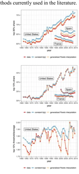
A simple example can show how generalized Pareto interpolation can improve the precision of estimates in empirical inequality research. Take countries, like France, Spain and the United States, for which we have detailed, quasi-exhaustive microdata. We use these data to create tabulations with arbitrary thresholds, and then estimate shares with a different threshold. When predicting the top 10 percent share based on the top 30 percent and 1 percent, both methods work quite well but the new one is better, as Figure 1 shows. The results are even more pronounced if we use a lower point in the distribution, like the top 30 percent. Blanchet,
Fournier and Piketty (2017) compare the method using much more data and show that it performs substantially better than all the other methods currently used in the literature.
Figure 1. Comparison of interpolation methods
Note: Fiscal income. Top 10 percent estimated based on the top 30 percent and the top 1 percent. Top 30 percent estimated from the top
50 percent and 10 percent.
Sources: France: Garbinti, Goupille-Lebret and Piketty (2017); Spain: Martinez-Toledano (2017); United States: Piketty, Saez and Zucman
(2018)
Surveys can also be a useful point of comparison. Take a large (50 million) sample representing the French income distribution. We can estimate by a Monte-Carlo approach
the typical error of the estimate of the top 10 percent income share using large random subsamples of size 50,000. The average error on the top 10 percent income share is 0.34 percentage points, about three times as large as the average error on the top 10 percent share in Figure 1. The difference would be even bigger for smaller top income groups. This points to the importance of using administrative data for analyzing the top of the distribution, even when they take the form of tabulations.
The generalized Pareto interpolation can be extended in several directions: in particular, it is possible to adapt it to situations in which only thresholds or only shares are known. Because it always leads to a well-defined probability distribution, it is also easier to use
generalized Pareto interpolation in
conjunction with other statistical methods. II. Stylized facts about Pareto curves What may Pareto coefficients bring to inequality analysis? First, we show that studying jointly the evolution of Pareto coefficients and top shares can improve the
understanding of inequality dynamics.
Second, we present how Pareto curves may help to better analyze wealth and income concentration along the distribution.
A. Analyzing top income shares using Pareto and gamma coefficients
In Equation (1), we write the top 10 percent income share as the product of three elements: the share of the population in the top 10 percent (0.1), the top 10 percent Pareto coefficient b(p90) and the 𝛾 coefficient 𝛾(𝑝90), which is the ratio of the top 10 percent income threshold over the average income of the overall population.
Top 10% share = 0.1 ∙ b(p90) ∙ 𝛾(𝑝90) (2)
This simple decomposition allows to disentangle the variations of top 10 percent income shares over time into two different dynamics. Changes in Pareto coefficients b(p) reflect a change in income concentration within the top 10 percent. These changes have to be explained by factors specific to the very top of the distribution (superstars effect, rent extraction, etc.). In contrast, changes in 𝛾 coefficients denote a differential evolution between the top 10 percent income threshold and the average income. These changes have to be explained by factors playing on inequality within the bottom 90 percent (race between skill and education, minimum wage, job polarization, etc.). Figure 2 reports the evolution of top 10 percent income shares
PANEL A.TOP 10 PERCENT SHARE PANEL B.PARETO AND GAMMA COEFFICIENTS.
FIGURE 2. EVOLUTION OF TOP 1 PERCENT SHARE,PARETO AND GAMMA COEFFICIENTS FOR THE US AND FRANCE,1965-2014. Note: Pretax national income (before taxes and transfers, except pensions and unemployment insurance). Equal-split-adult series. Sources: United States: Piketty, Saez, and Zucman (2018); France: Garbinti, Goupille-Lebret, and Piketty (2017).
(Panel A), and the evolution of top 10 percent Pareto and γ coefficients (Panel B) for France and the United States over the period 1965-2014. Panel A shows that French and United States top 10 percent income shares were similar in level and declining over the period 1965-1975. In the United States, starting from the mid-1970s, the top 10 percent income share stopped declining and rose continuously from 34 to 47 percent in 2014. In contrast, in France, the top 10 percent income share continued to decrease up to the early-1980s and then raised at a much more modest pace from 29 to 33 percent in 2014.
Panel B allows to better understand the different dynamics in each country. In the United States, since the mid-1980s, the income of all the top 10 percent richest individuals increased more rapidly than the average income (both Pareto and 𝛾
coefficients increased). However, the rise has been much more pronounced for the very top incomes (steep increase of the Pareto coefficients), leading to an increasing income concentration within the top 10 percent. In France, the moderate increase of the top 10 percent income share since the mid-1980s was the result of two antagonistic forces. On one hand, the income of the poorest individuals in the top 10 percent increased at a slower pace than the average income (𝛾 coefficient decreased). On the other hand, the income of the richest individuals in the top 10 percent increased much more rapidly than both the average income and income from the bottom part of the top 10 percent (Pareto coefficient increased). The conjunction of these two factors led to a polarization of the top 10 percent income group in France.
PANEL A.PRETAX INCOME PANEL B.WEALTH AND PRETAX INCOME
FIGURE 3.PARETO COEFFICIENTS FOR THE WEALTH AND PRETAX-INCOME DISTRIBUTIONS,FRANCE & THE UNITED STATES,2000-2014 Note: Pareto coefficients averaged over the period 2000-2014. Pretax national income (before taxes and transfers, except pensions and unemployment insurance). Equal-split-adult series for wealth and pretax national income.
Sources: United States: Piketty, Saez, and Zucman (2018) and Saez and Zucman (2016); France: Garbinti, Goupille-Lebret, and Piketty (2016 and 2017); Spain: Martínez-Toledano (2017), China: Piketty, Yang, and Zucman (2017).
B. The changing slope of Pareto curves Figure 3 presents the evolution of the Pareto coefficients b(p) for the upper part of the distribution of wealth and pretax income.
Panel A shows that income concentration first decreases with p. The definition of b(p) makes this decreasing part easy to interpret: the income of the poorest is very small relative to the average income of people richer than them. However, as we move up in the distribution, individuals’ incomes start to represent a larger fraction of the average income above them. Indeed, the average income above the poorest individuals is driven by high income held by the richest individuals. The slopes of b(p) change around percentiles p80-p90 and then rise until the top of the distribution, which shows that within
the top income earners there is also an important intra-group inequality due to the very top earners for whom income, and particularly capital income, is highly concentrated. Within the top 10 percent earners, income concentration is rather comparable between France, Spain and China, while it is much larger in the United States. Panel B offers a comparison between wealth and income concentration for France and the United States. While income concentration increases at the top, wealth concentration is still decreasing until a fairly stable part. It reflects the fact that the different top wealth groups face similar levels of wealth concentration. In other words, inequality between the middle class on one hand and the wealthy on the other hand is more pronounced
than inequality within the wealthy. It is also striking to notice that the large gap between income and wealth concentration dramatically narrows as we go higher in the distribution: very top incomes mainly consist of capital income whose level of concentration is close to that of wealth.
III. Conclusion
In this paper, we have explained and shown the usefulness of generalized Pareto curves to
characterize, visualize and estimate
distributions of income or wealth. We have also presented the interest of interpreting the inverted Pareto coefficients. We hope the interpolation method presented here will help
future researches to improve our
understanding of the dynamics of inequality. REFERENCES
Atkinson, A.B., Harrison, A.J., 1978. Distribution of personal wealth in Britain. Cambridge University Press.
Blanchet, T., Fournier, J., Piketty, T., 2017. Generalized Pareto Curves: Theory and Applications, WID.world Working Paper. Garbinti, B., Goupille-Lebret, J., Piketty, T.,
2017. Income Inequality in France,
1900-2014: Evidence from Distributional
National Accounts (DINA), WID.world Working Paper.
Garbinti, B., Goupille-Lebret, J., Piketty, T., 2016. Accounting for Wealth Inequality
Dynamics: Methods, Estimates and
Simulations for France (1800-2014), WID.world Working Paper.
Kuznets, S., 1953. Shares of Upper Income Groups in Income and Savings. NBER. Martínez-Toledano, C., 2017. Housing
Bubbles, Offshore Assets and Wealth Inequality in Spain 1984-2014, WID.world Working Paper.
Pareto, V., 1896. Écrits sur la courbe de la répartition de la richesse.
Piketty, T., 2003. Income Inequality in France, 1901–1998. J. Polit. Econ. 111, 1004–1042. Piketty, T., Saez, E., 2003. Income Inequality in the United States, 1913–1998. Q. J. Econ. CXVIII.
Piketty, T., Saez, E., Zucman, G., 2018. Distributional National Accounts: Methods and Estimates for the United States, Quarterly Journal of Economics.
Piketty, T., Yang, L., Zucman, G., 2017. Capital Accumulation, Private Property and Rising Inequality in China, 1978- 2015, WID.world Working Paper.
Saez, E., Zucman E, 2016. Wealth Inequality in the United States since Evidence from Capitalized Income Tax Data”, Quarterly Journal of Economics, vol.131, no 2, 2016, p.519-578.