HAL Id: hal-02507321
https://hal.archives-ouvertes.fr/hal-02507321
Submitted on 13 Mar 2020HAL is a multi-disciplinary open access archive for the deposit and dissemination of sci-entific research documents, whether they are pub-lished or not. The documents may come from teaching and research institutions in France or abroad, or from public or private research centers.
L’archive ouverte pluridisciplinaire HAL, est destinée au dépôt et à la diffusion de documents scientifiques de niveau recherche, publiés ou non, émanant des établissements d’enseignement et de recherche français ou étrangers, des laboratoires publics ou privés.
Design and survey of lighting and color ambiance for a
suitable elderly’s environment
Estelle Guerry, Georges Zissis, Céline Caumon, Laurent Canale, Elodie
Bécheras
To cite this version:
Estelle Guerry, Georges Zissis, Céline Caumon, Laurent Canale, Elodie Bécheras. Design and survey of lighting and color ambiance for a suitable elderly’s environment. Light & Engineering, Znack Publishing House, 2020, 28 (1), pp.79-89. �10.33383/2019-003�. �hal-02507321�
DESIGN AND SURVEY OF LIGHTING AND COLOR AMBIANCE FOR A SUITABLE ELDERLY'S ENVIRONMENT
Estelle Guerrya*, Georges Zissisb, Céline Caumonc, Laurent Canaled, Elodie Bécherase
a,b,d France, Toulouse university, LAPLACE, UMR5213 (CNRS, INPT, UPS) c,e France, Toulouse university, LARA SEPPIA, EA 4154 (UT2J)
*Corresponding author: [email protected]
ABSTRACT
In the context of an aging population, it is important today to take into account the needs of our seniors to help them better live their aging. The design of color and lighting ambiance contributes in the practice of their daily activities in their living environment. This study postulates a protocol of good practices in terms of color and lighting to design a visual environment adapted to the needs of these users. The protocol is based on a combination of chromatic and lighting expertise. Chromatic color matching based on Natural Color System tools is combined with a photometric survey to characterize the visual environment. These data make it possible to establish a protocol used to design new chromatic ranges applied to new environments or to evaluate the applicability of the existing ranges.
Keywords: Color/lighting design, Experimentation, Evaluation, Visual environment
I - INTRODUCTION
Demographic changes, affecting France like most developed countries in the world, are marked by an aging population. Projections [1] indicate that the number of people over sixty is expected to double by 2050, representing 22% of the population. According to the same projections, there will be approximately two billion people aged more than sixty years.
In France, projections of the National Institute of Statistics and Economic Studies [2] indicate that the over sixty will represent 33% of the population by 2060, with the sharp increase in this population group resulting from the "baby boomer" phenomenon [3]. This significant increase will be observed until 2035 and will continue thereafter but at a much slower pace. Therefore, the problems surrounding aging will be major issues in the future and currently require our attention. For many reasons, aging can be accompanied by multiple and various pathologies, thus affecting the quality of life [4][5]. The elderly may experience feelings of insecurity or frustration with daily activities that may become complicated to implement. Cognitive and visual pathologies, and their inherent symptoms, play an important role in the emergence of difficulties.
Indeed, cognitive pathologies will generate a spatial and temporal disorientation [6][7]. The feeling of insecurity, discomfort, and/or loss of autonomy is then underpinned, especially if problems caused by visual pathologies add to those due to cognitive pathologies. Pathologies such as glaucoma, cataracts, macular degeneration (AMD), and other vision disorders lead to a decrease in the quality of their visual field, their accommodation, their visual acuity, and their perception of contrast. Overall, their perception of the environment is impaired [8][9][10]. Therefore, it is important to adapt the environment of the elderly to these various pathologies and their potential consequences on the habits of the elderly concerned. In fact, being disoriented, no longer recognizing space, or not identifying obstacles can be conditions that accentuate the risk of falls, incapacity, or the fear of not being able to move as before. However, it is possible to prevent or eliminate these situations, especially by changing the visual environment, whether it concerns an existing or a future living environment [11]. Studies by Kutas [12], O’Connor [13] and Yamagishi [14] demonstrate the importance of lighting and colors. Their results show that we can improve the visual performance of the elderly through quality lighting and also give them comfort, both physical and psychological. The results also indicate a need to adapt devices, because the requirements are different for the elderly, particularly those related to aging of the visual system. By reconciling the quality and quantity of light, level of contrast, and chromatic schemes thought by and for the elderly, we obtain light and color ambiance suitable to their needs and desires.
II - DESIGN
The design of these chromatic schemes (Fig.1.) is inspired by the work of Frederic Tate [15], Margaret Calkins [16], Linda Adler [17], Maurice Déribéré [18], and Argos Company [19]. The study by Tate suggests a preference of the elderly for light colors, some of which are predominantly preferred, in the order green, blue, red, pink, and orange. It also refutes the preconceived ideas that favor monochromatic sets and shows instead that it is necessary to combine colors. The study by Calkins suggests that it is best to avoid combining color shades that are too similar because it is difficult to distinguish between them while establishing certain preferences common with Tate's study. It also demonstrates that it is beneficial to combine light and dark colors for better discrimination. The study by Adler supports the above findings by showing a preference for light colors and also suggests that a combination of light and dark colors offers an opportunity for better discrimination, owing to their contrast. In his book, Déribéré presents the most appropriate luminance indices to use for designing harmonious and visually comfortable chromatic ranges, and the Argos company’s guide presents the optimal levels of contrast, calculated between two colors and their luminance
indices, to design environments especially adapted to visual impairments of the elderly. The results thus take into account both the needs of the elderly, associated with the visual pathologies mentioned earlier, and their chromatic preferences. So, we hypothesize the preferences as follows:
1 - Light shades should be used for large areas such as ceilings, walls, and floors. Dark colors should be favored for small surfaces such as joinery elements in order to offer an optimal contrast between different elements constituting the space.
2 - The ranges must be based on a trichromatic model, so as not to produce a visual information overload while avoiding creating a visual monotony.
3 - Attention should be paid not to multiply the shades of greens or blues, and especially light blues within the same range, taking into consideration the yellowing of the eye lens in the elderly, which disturbs the reading of colors.
4 - Nevertheless, studies have shown that green, and preferably light green, is a popular color. This is also the case for light blue, red, and shades of pink and orange.
5 – However, yellow should not be a major color constituent in the chromatic ranges because it would result in an absence of contrast with lighter spatial elements owing to a vision that may already be yellowed.
6 - Thus, each color comprising the chromatic ranges must correspond to particular luminance index, ranging between 0.6 and 0.75 for light colors, between 0.15 and 0.30 for dark colors, and 0.9 for the color used for the ceiling.
7 - The value of this contrast, considering here the contrast of luminance, between two juxtaposed colors, must be equal to 70% to allow an optimal visual discrimination.
Luminance index Corresponding architectural elements
Luminance index equal to 0.9 Represents the ceiling
Luminance index between 0.15 and 0.30 Represents the door frame Luminance index between 0.6 and 0.75 Represents the wall
Luminance index between 0.6 and 0.75 Represents the floor Fig.1. Criteria 1; 6; 7 for creating a chromatic scheme
Experimentation
We proceed with an experimental and empirical construction method [20], without first match Natural Color System (NCS) color range to existing surface color in the environment. The design of the chromatic ranges combines chromatic knowledge and scientific assessments to allow identification of the most appropriate combinations. The first phase of optical experimentation is carried out using the NCS index 1950 Original and NCS box color samples to produce visually satisfying color combinations. Natural color system (NCS) is a color classification and referencing system based on human visual perception. It is now used for common inter-industrial communication through intuitive and universal coding. Each selected color is then measured using a portable integrating sphere spectrophotometer (CM 2300d Konica Minolta), using illuminant D65, corresponding to daylight at noon and having a color temperature of 6500 K. The results are expressed in L*a*b color model, which allows us to identify the luminance index of individual colors. These luminance indices allow us, if necessary, to modify our color selection so that it responds to the luminance indices mentioned in the Fig.1 above. The contrast values are then calculated according to equation (1) [19], and colors will be selected again until chromatic ranges with contrast values corresponding to the preset settings are obtained.
(1)
In this equation, L1 and L2 correspond to luminance indices of two juxtaposed colors within the range. L1 represents the luminance index of the lightest color and L2 represents the darkest color. It is this ratio between L1 and L2 that makes it possible to obtain the value of contrast. The design of these chromatic ranges is carried out in four phases, meeting the seven criteria previously stated. We begin by determining the organization of colors in relation to each other (criterion 1). We then select the colors that will generate the preferred chromatic environment (criteria 2; 3; 4; 5). The choice of these colors is refined by adjusting their saturation and brightness with regard to their luminance index (criterion 6). Finally, the contrast calculations make it possible to quantitatively finalize the decision process (criterion 7).
Proposed chromatic ranges
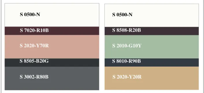
The chromatic ranges presented in Fig.2 are the result of multiple combinations done to meet the chromatic requirements and different luminance indices and contrast values. The two
examples have been produced by combining the seven criteria that make up the repository presented above, and they show that it is possible to design different ambiances using colors with a high luminance index. Such colors allow for greater visual discrimination than colors with lower luminance indices. In both ranges in Fig.2, the same color is used for the ceiling because of its ability to adapt to different chromatic conditions that could be experienced. In addition, some contrast values higher or lower than 70% can be observed, but they are acceptable because a difference of ≤2% is considered negligible. Indeed, at such levels of contrast, the human eye cannot perceive such an insignificant difference [21]. Table1 shows the different luminance indices of each color as well as the contrast values that constitute the presented ranges. These chromatic ranges are examples of results obtainable by using the above experimental method. Using these ranges is recommended for the design of visual environments adapted for the elderly with visual and/or cognitive pathologies. The various colors used and the different levels of contrasts obtained make it possible to create a visual signage, which generates visual cues necessary for recognition of space.
Fig. 2. Chromatic representation of ranges 1 and 2
NCS codification L * a * b Luminance index Contrast % Color Range 1 Ceiling S 0500-N 94*0*2 0.94 75% Door Frame S 7020-R10B 23*15*1 0.23 68% Wall S 2020-Y70R 72*13*14 0.72 71% Plinth S 8505-R20B 21*-2*-2 0.21 70% Floor S 3005-R80B 70*-1*-3 0.70 S 0500-N S 0500-N S 7020-R10B S 8010-R90B S 8505-B20G S 2020-Y70R S 3002-R80B S 2010-G10Y S 2020-Y20R S 8508-R20B
Color Range 2 Ceiling S 0500-N 94*0*2 0.94 76% Door Frame S 8505-R20B 22*5*-2* 0.22 70% Wall S 2010-G10Y 74*-13*10 0.74 68% Plinth S 8010-R90B 24*-2*-8 0.24 68% Floor S 2020-Y20R 74*6*25 0.74
Table1. Numerical values associated with chromatic ranges 1 and 2
III - EVALUATION
This method of designing appropriate color ranges is not only a design method but also an evaluation method. We can diagnose the relevance of existing ranges based on the previous model. We identify the indices of each color and then calculate the levels of contrast. This allows us to check if they comply with the levels recommended previously.
Materials and Methods
We carried out a in situ study (Fig.3) at the geriatric day hospital of Robertsau, Strasbourg, France. The purpose of the study was to identify the environmental factors (color and light) conducive to the medical management of elderly patients with cognitive disorders. The study was carried out in two phases, a chromatic survey and a lighting survey.
The chromatic survey using the NCS tools allowed us to identify the different colors that comprise the chromatic palette of the space. We calculated the luminance index of each color by using the L*a*b color model as before, coupled with the computation of the contrast values of the identified ranges. The ranges discussed until now were subject to vertical reading from floor to ceiling, represented by segments A, B, C, and D in Fig.4. As part of the present study, we used an additional reading dimension, a horizontal reading represented by segments 1, 2, 3, and 4 in Fig.4. This allowed us to consider chromatic combinations not only in isolation but also in the context of a 360° view space environment.
A
C
Fig.3. Panoramic view of the waiting room area in situ study topic
The lighting survey was carried out at markers A, B, and C shown in Fig.3. An average of the results obtained at these three points was considered Table3. In addition, the assessment was made at three different times of the day (morning at 10:00, early afternoon at 14:00, late afternoon at 17:30) to measure the light amplitude.
A luxmeter-chromameter (Konica Minolta CL-70F) was used to establish the illumination and color temperature of the ambient light for each of the time markers. These surveys were conducted on March 19 and 20, 2018, under overcast conditions. When we carried out the survey, the artificial lights were turned on, but we did not have the information regarding its technical properties. Unlike the lighting survey, the chromatic color survey was performed only at a single timepoint because it is quantitative and non-perceptual data collection, in view of a correlation with a reference frame. We are interested in color as a quantifiable surface object and not as a perceptual element influenced by temporal elements.
Observation
The different ranges and chromatic combinations presented in Fig.5 are the results of the in situ chromatic survey, based on the individual readings of segments A, B, C, and D and 1, 2, 3, and 4 in Fig.4. They present the combinations that make up the space and generate its general chromatic ambiance.
These color combinations create a dynamic ambiance. Indeed, the use of complementary colors, such as the yellow accompanied by the two blues, stimulates the eyes. However, the presence of a neutral shade such as beige helps not to tire the eyes. This combination creates a space that balances stimulation and relaxation of gaze. The succession of complementary colors allows to create a rhythm and generate a warm atmosphere by using predominantly warm colors supported by colder minor colors. The chromatic distribution allows to organize the space. Every color that is used helps to create visual cues.
Fig.4. Reading directions representing the chromatic ranges and combinations of Fig.5.
The yellow (chromatic range A, Fig.5) defines the dining space, the dark blue (chromatic range C, Fig.5) defines the TV/rest space, and the light blue (chromatic range D, Fig.5) defines the space of contemplation towards the outside.
This repartitioning allows delineation of the space according to activities and thus, allows the patients to locate themselves more easily according to their needs. Table2 presents quantitative results such as average luminance indices, 0.68 for large areas (wall, floor), 0.77 for small areas (door frame, plinth), and 0.94 for the ceiling, and average contrast rates, 14% in vertical reading and 32% in horizontal reading.
Because of these different ranges, it is possible to generate a harmonious and dynamic chromatic environment conducive to visual stimulation and creation of spatial reference points for patients, as noted during our field study.
Chromatic range A Chromatic range B
Chromatic range C Chromatic range D A D B C 3 1 4 2
Combination 1 Combination 2 Combination 3 Combination 4
Fig.5. Chromatic representation of the in situ ranges A, B, C, D and combinations 1, 2, 3, 4 NCS codification L * a * b Luminance index Contrast %
Vertical reading
Elements common to all color ranges
Ceiling S 0500-N 94*0*2 0.94
7% Door frame S 1010-Y30R 87*4*17 0.87
Plinth S 2030-R90B 66*-8*-20 0.66
15% Floor S 2505-R 78*4*2 0.78
Chromatic range A
Door frame S 1010-Y30R 87*4*17 0.87
10% Wall S 1080-Y10R 78*16*91 0.78
15% Plinth S 2030-R90B 66*-8*-20 0.66
Chromatic range B
Door frame S 1010-Y30R 87*4*17 0.87
11% Wall S 2005-Y80R 77*4*4 0.77
14% Plinth S 2030-R90B 66*-8*-20 0.66
Chromatic range C
Door frame S 1010-Y30R 87*4*17 0.87
52% Wall S 4040-B10G 42*-21*-21 0.42
36% Plinth S 2030-R90B 66*-8*-20 0.66
Chromatic range D
Door frame S 1010-Y30R 87*4*17 0.87
26% Wall S 2040-B20G 64*-8*-20 0.64
3% Plinth S 2030-R90B 66*-8*-20 0.66
Combination 1 S 2040-B20G 64*-26*-17 0.64 18% S 1080-Y10R 78*16*91 0.78 Combination 2 S 4040-B10G 42*-21*-21 0.42 45% S 2005-Y80R 77*4*4 0.77 Combination 3 S 1080-Y10R 78*16*91 0.78 46% S 4040-B10G 42*-21*-21 0.42 Combination 4 S 2040-B20G 64*-26*-17 0.64 17% S 2005-Y80R 77*4*4 0.77
Table2. Numerical values of ranges A, B, C, and D and combinations 1, 2, 3, and 4
Table3 presents the results of the lighting survey showing average illumination levels of 580 lx, which is approximately three times higher than the levels established by the European standard NBN EN 12464-1 [22] equivalent to 200 lx.
The above standard is not specific to the elderly but calculated to meet the needs of an average observer. It could be assumed that the minimum value recommended by this standard is not sufficient for the elderly, because the illuminance values collected on site (Table3) satisfied the visual comfort requirements of the patients there. However, a standard value for illuminance cannot be predicted on the basis of these values and it is difficult to determine whether these values are optimal for the design of a visual environment suitable for the elderly.
The illuminance values presented in Table3 were observed as a result of LED lighting that supplemented the incoming natural light, owing to the large glazed area which benefits the space. This distribution between natural and artificial lighting is easily identifiable during the day by means of the outline of the spectra presented in Fig.6, typical of a conjunction between a relatively regular pattern peculiar to natural light and a peak in the blue light characteristic of LED lighting. The latter peak is mostly observed in the morning, which indicates that the natural light is less prominent in the morning than during the rest of the day. Artificial lighting compensates for the low illumination and thus helps to maintain equivalent levels of illuminance throughout the day. In addition, as depicted in the Kruithof diagram in Fig.7, [23], color temperatures correlated with all illuminance values appear in the recommended comfort zone. Two of the three color temperatures are even close to the threshold that can be described as too cold for an average observer. However, as per data collected by us in the
field, people prefer cooler lights, which suggests that the illuminance values depicted in the diagram do not satisfy the visual comfort requirements of elderly patients.
Interior light Outdoor light
Illuminance (lx) CCT (K) Illuminance (lx) CCT (K)
10:00 520 5800 3210 8000
14:00 950 5100 3910 5900
17:30 280 5000 1530 6200
Table3. In situ lighting surveys
10:00 14:00 17:30
Fig.6. In situ light spectra
Fig.7. Kruithof diagram and correlation of in situ illuminance measurements
IV – RESULTS
The first phase of our study showed us that based on the existing literature, it is possible to design chromatic scales suitable for the elderly. In theory, they meet the needs and requirements of the elderly and satisfy their visual comfort if we comply with the levels of contrast and precise luminance indices. We then measured existing on-site chromatic scales using the same method as in the design phase (identification of luminance indices and calculation of contrast levels). However, we observed a difference between the in situ
10:00 17:30 14:00
chromatic scales and the theoretical chromatic scales conceived from the existing literature. Indeed, the luminance indices and contrast levels observed on site did not all correspond to the values observed during the design phase. Only the average luminance indices of the light colors and the ceiling corresponded. However, the average luminance index of the dark colors is three times higher and the levels of contrast are on average three times lower than the data obtained during the design phase. But these chromatic scales are still considered satisfactory because they allow to create visual references. Next, we made light readings, which showed a disparity between values that satisfied the visual comfort of the patients and values recommended by existing standards and recommendations. We found that higher illumination and lower color temperatures were more appropriate for older people. In fact, the average illuminance was three times higher than the current European standard and according to the Kruithof diagram, two of the three color temperatures measured moved away from the optimal comfort zone and approached the zone considered too cold.
V - DISCUSSION AND OUTLOOK
This reference system, method of design and evaluation allow to design chromatic ranges adapted to the needs of the elderly affected by visual and/or cognitive pathologies particularly resulting in a loss of spatial orientation.
Even if the values obtained during the design phase have been questioned during the in situ evaluation phase, they can guide a designer's work. However, it is important to weigh the indices obtained with respect to the general atmosphere and the context of application in order to avoid generalities. Moreover, even if these chromatic combinations seem to meet the requirements of the elderly users, we must not forget that the choice and preference of colors remain chiefly subjective and personal. Subjectivity then intervenes as a personal and individual manifestation of attraction or repulsion for particular colors, guided by a cultural, social, and historical baggage of an individual, which belongs to the individual alone. Thus, designers compose their color ranges not only according to established recommendations but also by considering their own preferences dictated by a baggage that belongs only to them. Thus, this methodological approach emphasizes the complementarity between the subjective approach and the measurement-based approach.
To proceed using the referential method can be appropriate in the context of communal spaces, responding then to the representative preference of the majority, but for domestic use, consideration and conception based on individual choice would be favored. Moreover, even if the color ranges meet the requirements of the main users - the elderly - we should not overlook the fact that secondary users such as care teams - or more generally, caregivers -
also encounter these ranges, which may not meet their preferences and requirements. This raises a question about the adaptability of such chromatic projects. Indeed, as the elderly are not the only users of their environment, should we design the light and color ambiance only on criteria associated with aging? It would also be interesting to select the color considering its luminance index according to a colorimetric standard not only at a single moment but also generally and subject to a daily context, thus undergoing perceptual modifications related especially to the lighting or to the singular perception of the eye of the users. Restoring its moving dimension, changing to color and no longer static, would play an important role in the overall perception of the chromatic scales, considering chromatic combinations as a system instead of in an isolated and confined manner to the influence of the elements that surround them.
Similarly, only a vertical reading of the chromatic scales removes them from their surroundings, leading to a loss of the overall inclusive reading of the space possible in conjunction of a horizontal chromatic reading. If we add to this background the light dimension of these bright and colorful environments, the qualitative and quantitative dimensions of the lighting is to be taken into account.
Regarding chromatic preferences, it is also important to consider the preferences in terms of lighting and ambient light, here characterized by a low color temperature and high illumination.
Thus, this systemic approach to creating an ambiance simultaneously considers the chromatic and luminous aspects, thus taking into account not only the effects they can have on one another but also the effects approved by the users, be they primary or secondary. This approach allows drawing the contours of a reference potential or method integrating the qualitative, quantitative, and project uses. Our approach also leads, in view of the results produced, to a reconsideration of the existing norms and recommendations, in favor of a new, more adapted referential, which fully satisfies the visual comfort of the elderly. We can then question the relevance of creating a reference specific to the elderly.
Ambiance is no longer a subject of only the designer but it is also an issue pertinent to its users.
VI - CONCLUSION
Suitable lighting and color environments can be designed by the use of existing repository, although we must critically examine it to produce future repository, taking into account the requirements and physical preferences of users. Such an ambiance provides spatial-temporal landmarks for the elderly, particularly those with cognitive and/or visual disorders that lead to
disorientation in space, decrease in their visual field quality and visual acuity, and more generally, a perceptual impairment regarding their environment.
Additionally, the ambiance makes their environment secure by allowing better discrimination of spaces, to bring comfort and autonomy by modifying their living environment in accordance with their habits and daily activities. However, it may not be enough only to answer the accuracy of the frame of reference that allows us to provide a framework for the design of these ambiances, but it is also important to consider the chromatic project as a whole in order to produce a harmonious light and color ambiance responding to the uses and requirements conveyed by users who occupy the environment, in this case, the elderly. Moreover, it is important to consider what their caregivers can perceive, to generate an environment conducive to the well-being of every user.
Owing to its results, this study demonstrates the importance of designing the visual environment by adapting it to users. In the case of the elderly, the beneficial effects of color in the design of their surroundings can be observed. The results allow us to define the premises of new standards, conducive to the quality and visual comfort of the elderly. They also present the need to develop a new European standard, similar to existing ones. Development of a specific standard complementary to existing standards will significantly improve the efficiency of current lighting systems to favor greater visual comfort.
Thus, this consideration of the color and lighting aspects of spaces generates a systemic and transdisciplinary approach designed for the well-being of people, more particularly, the elderly.
ACKNOWLEDGMENT
Experimentation was made possible by the provision of NCS tools by the Institut Supérieur Couleur Image Design, University of Toulouse, Montauban, France and the spectrophotometer CM 2300d by Malet Enterprise, Toulouse, France. In addition, the welcome of the Hospitality Factory team, and the medical team from the Geriatric Hospital Day of Robertsau, Strasbourg, France, allowed the implementation of the evaluation.
REFERENCES:
1. World Health Organization – Facts about ageing [Online]. WHO. [viewed 2019 Jan 5]. Available from: http://www.who.int/ageing/about/facts/fr/
2. National institute of statistics and economic studies – Population projections for 2060: one-third of the population aged over 60 - Insee Première - 1320 [Online]. INSEE.
3. Knickman, J.R., Snell, E.K. The 2030 Problem: Caring for Aging Baby Boomers. Health Services Research, 2002. V37, #4, pp849-884
4. Keister K.J., Blixen, C.E. Quality of life and Aging. Journal of Gerontological Nursing, 1998. V24, #5, pp.22-28
5 . Guse, L.W., Masesar, M.A. Quality of life and successful aging in long-term care: perceptions of residents. Issues in Mental Health Nursing, 1999. V20, #6, pp.527-539
6. Lipowski, Z.J. Transient cognitive disorders (delirium, acute confusional states) in the elderly. The American journal of psychiatry, 1983. V140, #11, pp.1426-1436
7 . Monacelli, A.M., Cushman, L.A., Kavcic, V., Duffy, C.J. Spatial disorientation in Alzheimer’s disease. Neurology, 2003. V61, #11, pp1491-1497
8. Lord, S.R., Clark, R.D., Webster, I.W. Visual Acuity and Contrast Sensitivity in Relation to Falls in an Elderly Population. Age Ageing, 1991. V20, #3, pp.175-181
9. McKee, A.C., Au, R., Cabral, H.J., Kowall, N.W., Seshadri, S., Kubilus, C.A., et al. Visual Association Pathology in Preclinical Alzheimer Disease. J Neuropathol Exp Neurol, 2006. V65, #6, pp.621-630
10. Loh, K.Y., Ogle, J. Age related visual impairment in the elderly. Med J Malaysia, 2004. V59, #4, pp.562-568
11. Rowles, G.D., Oswald, F., Hunter, E.G. Interior Living Environments in Old Age. Annual Review of Gerontology and Geriatrics, 2003. V23 #1, pp.167-194
12 . Kutas, G., Kwak, Y., Bodrogi, P., Park, D.S., Lee, S.D., Choh, H.K., Kim, C.Y. Luminance contrast and chromaticity contrast preference on the colour display for young and elderly users. Displays, 2008. V29, #3, pp.297-207
13. O’Connor, D.A., Fies, R.G.D. Lighting for the Elderly: The Effects of Light Source Spectrum and Illuminance on Color Discrimination and Preference. Leukos, 2005. V2, #2, pp.123-132
14. Yamagishi, M., Yamaba K., Kubo, K., Nokura, K., Nagata, M. Effects of LED Lighting Characteristics on Visual Performance of Elderly People. Gerontechnology, 2008. V7, #2, pp.243-243
15. Tate, F.B., Allen, H. Color preferences and the aged individual: Implications for art therapy. The Arts in Psychotherapy, 1985. V12, #3, pp.165-169
16. Calkins, M.P. Using color as a therapeutic tool [Online]. Ideas institute.
[viewed 2018 Feb 9]. Available from: http://www.ideasinstitute.org/article_021103_b.asp 17 . Adler, L. Responding to color. Extension Home Furnishings Specialist, Kentucky Cooperative Extension Service, 1999.
18 Déribéré, M. La couleur dans les activités humaines. Dunod, 1968.
19. Argos Service, “Accessibilité et déficiences visuelles. Réponses adaptées aux besoins de la chaîne de déplacement”. France, 2010.
20. Pfeiffer, H. L’Harmonie des couleurs : Cours théorique et pratique. 3ème. Dunod, 1965. 21 . Le Grand, Y. Optique physiologique. Tome II, Lumière et couleurs. Paris (France), Masson et Cie, 1972.
22. European Committee for Standardization. EN 12464-1:2002 Light and lighting - Lighting of workplaces – Part 1: Indoor work places. Lighting requirements for interiors (areas), tasks and activities [Online]. Ageta. [viewed 2018 March 12]. Available from: http://www.ageta.lt/app/webroot/files/uploads/filemanager/File/info/EN_12464-1.pdf
23. Kakitsuba, N. Comfortable Indoor Lighting Conditions Evaluated from Psychological and Physiological Responses. LEUKOS, 2016. V12 #3, pp.163-172
Estelle Guerry, PhD student at the LAPLACE and LARA-SEPPIA laboratory from the
University of Toulouse. She specializes in design-color and lighting science, with the aim of promoting the comfort and well-being of the elderly. She provides her expertise in the field of research and the socio-economic environment.
Georges Zissis,
Céline Caumon,
Laurent Canale,