BeatDB: An end-to-end approach to unveil saliencies
from massive signal data sets
by
Franck Dernoncourt
Master of Science, ENS Ulm, Paris (2011)
Master of Science, HEC, Paris (2011)
Master of Science, CNAM, Paris (2011)
Submitted to the Department of Electrical Engineering and Computer
Science
in partial fulfillment of the requirements for the degree of
Master of Science in Electrical Engineering and Computer Science
at the
MASSACHUSETTS INSTITUTE OF TECHNOLOGY
February 2015
c
Franck Dernoncourt, 2014. All rights reserved.
Author . . . .
Department of Electrical Engineering and Computer Science
December 9, 2014
Certified by . . . .
Una-May O’Reilly
Principal Research Scientist, CSAIL
Thesis Supervisor
Certified by . . . .
Kalyan Veeramachaneni
Research Scientist, CSAIL
Thesis Supervisor
Accepted by . . . .
Professor Leslie A. Kolodziejski
Chair, Committee on Graduate Students
Department of Electrical Engineering and Computer Science
BeatDB: An end-to-end approach to unveil saliencies from
massive signal data sets
by
Franck Dernoncourt
Submitted to the Department of Electrical Engineering and Computer Science on December 9, 2014, in partial fulfillment of the
requirements for the degree of
Master of Science in Electrical Engineering and Computer Science
Abstract
Prediction studies on physiological signals are time-consuming: a typical study, even with a modest number of patients, usually takes from 6 to 12 months. In response we design a large-scale machine learning and analytics framework, BeatDB, to scale and speed up mining knowledge from waveforms.
BeatDB radically shrinks the time an investigation takes by:
• supporting fast, flexible investigations by offering a multi-level parameteriza-tion, allowing the user to define the condition to predict, the features, and many other investigation parameters.
• precomputing beat-level features that are likely to be frequently used while computing on-the-fly less used features and statistical aggregates.
In this thesis, we present BeatDB and demonstrate how it supports flexible investi-gations on the entire set of arterial blood pressure data in the MIMIC II Waveform Database, which contains over 5000 patients and 1 billion of blood pressure beats. We focus on the usefulness of wavelets as features in the context of blood pressure prediction and use Gaussian process to accelerate the search of the feature yielding the highest AUROC.
Thesis Supervisor: Una-May O’Reilly Title: Principal Research Scientist, CSAIL
Thesis Supervisor: Kalyan Veeramachaneni Title: Research Scientist, CSAIL
Acknowledgments
This thesis would not have been possible without the guidance, encouragement and funding from my advisor, Una-May O’Reilly. I am especially grateful for the latitude at the beginning of my time in her research group to explore a wide range of topics and ideas which we gradually narrowed down to form this work. I am also extremely grateful for Kalyan Veeramachaneni’s ideas and guidance throughout my time in the group and in the course of this project: as we worked very closely on several projects Kalyan naturally became my co-advisor.
This first half of this thesis includes text and experiments from the paperDernoncourt et al. (2013c): Una-May and Kalyan played a key role in defining the problem to be addressed as well as pinpointing the most impactful approach. Alexander Waldin and Chidube Ezeozue helped to extract the data from MIMIC II, Max Kolysh wrote the script that validates the beats, Julian Gonzalez helped to extract features, Prashan Wanigasekara and Erik Hemberg gave me a hand to use the NFS, Bryce Kim and Will Drevo assisted me in using the OpenStack computer cluster, and Dennis Wilson gave some useful pointers to deal with the Matlab licenses.
The second half includes experiments published in Dernoncourt et al. (2015). Part of the results were also presented at the MIT Big Data Initiative Annual Meeting 2014. In addition to his advisory role, Kalyan identified and defined the problem, and introduced me to a set of techniques including wavelets and Gaussian processes, which turned out to be essential and led to some very interesting results.
During these first two years at MIT, I have also worked on MOOC research under the supervision of Una-May and Kalyan. Our approach to MOOC shared many sim-ilarities with the work presented in this thesis. I had the pleasure to work with Colin Taylor, Sebastian Leon, Elaine Han, Zachary Pardos, Sherwin Wu, Chuong Do, Sherif Halawa, John O’Sullivan, Kristin Asmus, and many people at edX (Veeramachaneni et al., 2013; Dernoncourt et al., 2013a,b,d).
Optimization), now renamed as ALFA (Any Scale Learning For All) to reflect its fo-cus on scaling up machine learning algorithms, was a fruitful environment and I feel lucky to have been surrounded by such great and diverse colleagues: Quentin Agren, Ignacio Arnaldo, Brian Bell, Owen Derby, Will Drevo, Chidube Ezeozue, Julian Gon-zalez, Elaine Han, Erik Hemberg (with whom I had the pleasure to work on distributed evolutionary computation (Hemberg et al., 2013a,b)), Bryce Kim, Max Kolysh, Sebas-tian Leon, Zachary Pardos, Dylan Sherry, Colin Taylor, Alexander Waldin, Prashan Wanigasekara, Dennis Wilson, and Sherwin Wu. This intellectually fruitful research environment also helped me for my own side projects (Dernoncourt, 2012, 2014a,b). Beyond my research laboratory, this thesis heavily relied on a 1,500-core OpenStack computer cluster and I thank the patience of MIT CSAIL technical members Jonathan Proulx and Stephen Jahl for answering to my dozens of bug reports and other miscel-laneous issues, and the generosity of Quanta Computer, who donated a large part of the cluster hardware. Many thanks as well to Garrett Wollman for his Unix expertise and NFS server skills.
Outside MIT I was lucky to receive much advice from physicians David Dernoncourt and François De Forges, and some C++ strength from Paul Manners. In addition to one-to-one exchanges, I frequently used the Q&A communities Quora and Stack Exchange, which are two tremendous sources of information and great places to ex-change ideas. I wish the research community followed such an open, collaborative, constructive model and I strongly hope that research will step-by-step adopt the principles of open science.
Most importantly, I thank my family and my wonderful girlfriend for their uncondi-tional supports: moral, financial, technical and mathematical.
Contents
1 Introduction 19
1.1 Objectives . . . 19
1.2 General prediction framework . . . 20
1.3 General motivations . . . 21 1.4 Technical challenges. . . 24 1.5 Contributions . . . 24 1.6 Organization . . . 25 2 BeatDB 27 2.1 Definitions . . . 27 2.2 Schema . . . 28 2.3 Condition scanner. . . 32 2.4 Prediction parameters . . . 32 2.5 Data assembling. . . 33 2.6 Event prediction . . . 37 2.7 Parameter selection . . . 37 2.8 OpenStack and NFS . . . 38
2.9 Distributed system architecture . . . 38
2.10 Worker logic . . . 43
2.11 Cleaning broken workers . . . 45
2.12 Conclusion . . . 46
3.1 MIMIC. . . 49
3.2 Arterial blood pressure measurement . . . 52
3.3 Beat onset detection . . . 55
3.4 Levels of noise . . . 58
4 The prediction problem 59 4.1 Acute hypotensive episode (AHE) . . . 59
4.2 Objectives . . . 60 4.3 Condition . . . 60 4.4 Features . . . 63 4.5 Results . . . 64 5 Wavelets as features 69 5.1 Objectives . . . 70 5.2 Wavelets . . . 71
5.3 Correlation between wavelets. . . 73
5.4 Experiments . . . 77
5.4.1 Prediction experiment . . . 77
5.4.2 Wavelets in addition to the other 14 features . . . 83
5.4.3 Impact of the size of the data set on the prediction accuracy . 85 5.4.4 Computational cost . . . 85
6 Gaussian process for parameter optimization 87 6.1 Choosing the kernel . . . 88
6.2 Choosing the number of initial random experiments . . . 96
6.3 Distributed Gaussian Process . . . 98
7 Conclusions 99 7.1 Contributions . . . 99
7.2 Future work . . . 100
8 Abbreviations 105
9 Synonyms 107
A Reading CSV files in Python: a benchmark 115
B On privacy and anonymization of personal data 119
C Column-oriented vs. row-oriented database 121
D Machine learning techniques 127
D.1 Logistic regression . . . 127
D.2 Metrics. . . 128
E Gaussian process regression 133 E.1 Gaussian process definition . . . 133
E.2 The mean vector and the variance-covariance matrix . . . 134
E.3 The intuition behind a covariance matrix . . . 134
E.4 The regression problem . . . 134
E.5 Computing the covariance matrix . . . 136
E.6 Computational complexity . . . 137
F Wavelet library 139 F.1 Choice of library . . . 139
F.2 Benchmark of library . . . 140
G Least correlated subset of wavelets from a correlation matrix 145 H Software design 149 H.1 Populating BeatDB . . . 149
H.1.1 Beat onset detection . . . 149
H.1.2 Signal data transfer . . . 151
H.1.3 Beat validation . . . 151
H.1.5 Feature extraction . . . 151
H.2 Worker logic . . . 152
H.3 Result analysis . . . 152
H.4 Benchmarks . . . 152
List of Figures
1-1 Effect of data set size on algorithm ranking . . . 22
1-2 Evolution of storage cost: 1980-2010 . . . 23
2-1 BeatDB overview . . . 31
2-2 Prediction parameters . . . 33
2-3 Visual representation of the feature aggregation algorithm . . . 35
2-4 Visual representation of the feature aggregation algorithm with aggre-gation functions . . . 36
2-5 Master/worker architecture: dcap . . . 41
2-6 Multi-worker architecture synchronized via a result database: grid search or distributed Gaussian Process . . . 42
2-7 Worker logic . . . 44
2-8 Average worker cycle time . . . 46
2-9 Histogram of the average worker cycle time per instance over time . . 47
3-1 MIMIC-II Database organization . . . 50
3-2 Arterial blood pressure fluctuations . . . 51
3-3 Arterial blood pressure measurement . . . 53
3-4 Impact of the measurement location on the blood pressure values . . 53
3-5 Impact of the damping degree on the blood pressure measurements . 54 3-6 Beat onset detection . . . 55
3-7 Number of valid beats per patient . . . 56
3-9 Jump lengths . . . 57
4-1 Scanning for AHE: number of patients with AHE . . . 61
4-2 Scanning for AHE: number of AHE cases . . . 61
4-3 Scanning for AHE: data imbalance . . . 62
4-4 Impact of the lag on the AUROC . . . 66
4-5 Impact of the lead on the AUROC . . . 67
4-6 Impact of the lag on the FPR when TPR = 0.9 . . . 67
4-7 Impact of the lead on the FPR when TPR = 0.9. . . 68
5-1 Examples of wavelets . . . 72
5-2 Relation between the function’s time domain, shown in red, to the function’s frequency domain, shown in blue. Source: Wikipedia. . . . 72
5-3 The Symlet-2 wavelet with different scales and time shifts. . . 73
5-4 Correlation between different wavelets. . . 74
5-5 Correlation between different wavelets. . . 75
5-6 Correlation between different scales: Gaussian-2 . . . 75
5-7 Correlation between different scales: Haar . . . 76
5-8 Correlation between different scales: bior3.1 . . . 76
5-9 Symlet-2 AUROC heat map for lag 10 and lead 10. . . 78
5-10 Gaussian-2 AUROC heat map for lag 10 and lead 10 . . . 78
5-11 Haar AUROC heat map for lag 10 and lead 10 . . . 79
5-12 Bior 3.5 AUROC heat map for lag 10 and lead 10 . . . 79
5-13 Influence of the lead on the AUROC for the Gaussian-2 wavelet . . . 80
5-14 Influence of the lag on the AUROC for the Gaussian-2 wavelet . . . . 80
5-15 Influence of the lead on the AUROC for the Symlet-2 wavelet . . . . 81
5-16 Influence of the lag on the AUROC for the Symlet-2 wavelet . . . 81
5-17 Influence of the lead on the AUROC for the Haar wavelet . . . 82
5-18 Influence of the lag on the AUROC for the Haar wavelet . . . 82 5-19 Influence of the data set size on the AUROC for the Gaussian-2 wavelet 85
6-1 Impact of the kernel choice on the Gaussian Process with the Symlet-2
wavelet. . . 91
6-2 Standard deviation of the cubic kernel with the Symlet-2 wavelet. . . 91
6-3 Standard deviation of the squared exponential kernel with the Symlet-2 wavelet. . . 92
6-4 Impact of the kernel choice on the Gaussian Process with the Gaussian-2 wavelet. . . 92
6-5 Standard deviation of the cubic kernel with the Gaussian-2 wavelet . 93 6-6 Standard deviation of the squared exponential kernel with the Gaussian-2 wavelet. . . 93
6-7 Impact of the kernel choice on the Gaussian Process with the Haar wavelet. . . 94
6-8 Standard deviation of the cubic kernel with the Gaussian-2 wavelet . 94 6-9 Standard deviation of the squared exponential kernel with the Gaussian-2 wavelet. . . 95
6-10 Choice of the number of random points with the Symlet-2 wavelet . . 96
6-11 Choice of the number of random points with the Gaussian-2 wavelet . 97 6-12 Choice of the number of random points with the Haar wavelet . . . . 97
6-13 Distributed Gaussian Process: impact of the number of instances on the convergence speed . . . 98
7-1 ECG and ABP . . . 102
C-1 RDBMS equivalent of the flat file design . . . 122
C-2 Clustered vs. non-clustered index . . . 123
C-3 Row-based approach . . . 124
C-4 Column-based approach . . . 125
D-1 Receiver operating characteristic curve . . . 131
D-2 ROC curves with 5-fold cross-validation. . . 132
F-1 Matlab’s Wavelet Toolbox: cwt() benchmark 1 . . . 142
F-2 Matlab’s Wavelet Toolbox: cwt() benchmark 2 . . . 143
G-1 Maximum clique in a graph . . . 146
List of Tables
2.1 Record raw sample file version 1 . . . 30
2.2 Record raw sample file version 2 . . . 30
2.3 Record validation file . . . 30
2.4 BeatDB condition scanner output . . . 32
2.5 General prediction framework’s parameters . . . 37
4.1 Parameter for the AHE prediction . . . 65
5.1 Parameter for the AHE prediction using wavelets . . . 70
5.2 Wavelets in addition to the other 14 features . . . 84
A.1 Reading CSV files in Python: a benchmark . . . 117
List of Algorithms
1 Feature aggregation algorithm. . . 34 2 Gaussian process regression . . . 90
Chapter 1
Introduction
The focus of our work is methodological: we construct a general approach to make predictions from a raw data set of physiological waveforms, which we call BeatDB as it revolves around a database structure. We demonstrate this methodology by carrying out a set of experiments that take advantage of BeatDB applied to the problem of blood pressure prediction using the MIMIC II version 3 database. This chapter presents our objectives, the motivations behind our work as well as the main challenges we face.
1.1
Objectives
We want to simplify prediction studies on physiological signal datasets. A typical study, even with a modest number of patients, usually takes from 6 to 12 months. For that reason, physiological signal datasets have been by and large underexplored. In response we design a large-scale machine learning and analytics framework, BeatDB, to scale and speed up mining knowledge from waveforms.
Our objectives for the framework are threefold:
changeable, even structural parameters such as lag and lead, so that any inves-tigation should be feasible by simple parameterization.
• Lossless storage: the system should import existing data sets into its own format, which should conserve all the information needed for any future in-vestigation. The underlying assumption behind this objective is any piece of information can turn out to be the key for a prediction problem.
• Scalability: physiological signal data sets can be massive, our framework should be able to scale to cope with any data set size.
We will demonstrate that our framework satisfies these objectives with a specific use case: predicting blood pressure, more specifically Acute Hypotensive Episodes (AHE), with the MIMIC waveform database.
1.2
General prediction framework
With the above-mentioned objectives in mind, we design BeatDB’s general prediction framework, which enables users to assess how much predictive power a set features contains with regard to an event. Events may be externally defined, i.e. via clinical data that are not physiological signals, or be detectable within the physiological signals. To accommodate inexact definitions of an event, the framework allows the user to parameterize an event. How features are aggregated and how the prediction is defined (lag and lead) can also be extensively parameterized. In detail:
Step 1: Define an event The user chooses an event (e.g. an acute hypotensive episode). BeatDB scans the data set to find signal records that contain the event and for each occurrence of the event identify the event’s start and stop time indices. A part of the record that precedes the event’s start time index becomes the signal that is used to make the event prediction and is called lag. The lapse of time between the end of the lag and the beginning of the event is called the lead.
Step 2: Define the data aggregation: The user chooses the length of the lead and lag. The lag can be divided into several windows. The user chooses which features to use, and the feature values are aggregated in a multi-level fashion that we will detail in later sections.
Step 3: Choose the machine learning algorithm: The user selects a machine learning algorithm, e.g. decision trees, SVM, logistic regression (the logistic regression is the only machine learning algorithm available at the time of the writing).
Step 4: Choose an evaluation metric for the prediction: The researcher selects an evaluation metric such as area under the ROC curve, Bayesian risk for a given cost matrix or Neyman Pearson criterion (the area under the ROC curve is the only evaluation metric available at the time of the writing).
BeatDB next sweeps the combined ranges of the parameters experimentally, or use a Gaussian process to orient the search to find the best parameter set. For each parameter set, it returns a result, which is the quality of the prediction according to the metric chosen by the user.
We will explain this framework in more details in the rest of the thesis and demon-strate it on a real use case, the prediction of Acute Hypotensive Episodes (AHE).
1.3
General motivations
The root of our work lies in the tremendous size of medical data sets, or to put it in a much-hyped term Big Data. Beyond the commercial resonance of the term lies two core observations from a machine learning perspective:
1. More data usually increases the prediction accuracy.
2. As the data set size increases, the ranking of the prediction models can be shuffled. To put it otherwise, an algorithm can yield a higher accuracy compared with another algorithm on a data set of size x, while yielding a lower accuracy
on a data set of size 10x.
Figure 1-1 illustrates those two aspects on the natural language processing task of confusion set disambiguation with a 1-billion-word training corpus.
Figure 1-1: Learning curves of 4 different algorithms for the natural language pro-cessing task of confusion set disambiguation. A bad algorithm with more data can beat a good algorithm with less data, and the algorithm ranking is shuffled as the training data set grows. Source: Banko and Brill (2001).
We are now at a critical time in the history where the cost of storage has become cheap enough (see Figure 1-2) to easily store most data sets. Concomitantly sen-sors are becoming omnipresent in our daily life, as epitomized by the Quantified Self movement, which promotes the data acquisition of anything surrounding an individ-ual, from food consumed to physiological data such as blood pressure, as explained inSwan (2013).
As a result, the amount of self-quantifying devices has skyrocketed over the last few years, either as wearable devices (Mann, 1997) or software applications: Fitbit Tracker, Jawbone UP, BodyMedia FIT, Samsung Gear Fit, Nike+ FuelBand, Pebble,
Figure 1-2: Evolution of storage cost: 1980-2010. Source: Komorowski (2009).
Technogym, WakeMate, Zeo, MyFitnessPal, etc. People’s willingness to share huge amounts of their data represents a tremendous opportunity for scientists, and in par-ticular from an applied machine learning perspective. Tung et al. (2011) report that amongst the customers of personal genomics and biotechnology company 23andMe, close to 90% consent to participate in research, and around 80% choose to contribute additional phenotypic data by answering research questions.
However, the main issue in big data often doesn’t stem from the sheer size of data but from its noisiness as well as its poorly structured or even raw nature. As a result, many data sets remained un- or under-explored. From a machine learning standpoint, such unstructuredness causes researchers to create their own ad hoc, temporary structure designed for a specific experiment. This might hinder reproducibility and compara-bility as each researcher is working with their own tools and pre-processed data, and it certainly hinders the amount of experiments that can be done within a given time window in comparison with a situation of shared development efforts to create to common, flexible framework.
1.4
Technical challenges
The main technical challenge of this work is to handle the amount of data as well as its raw nature. The latter requires extensive pre-processing that we will detail later on. The former forces us to use a distributed file system, since one single hard drive is not enough to contain the data set. It also leads to a high computational cost even for simple operations on the data, which require us to use a computer cluster to be able to perform them in a reasonable amount of time. The technical details will be exposed in the following chapter.
Each of our three objectives that we have presented in Section 1.1 has its technically challenging counterpart:
• The multi-level parameterization means that the system should be designed in such a way that most parameters can be changed, which implies a highly flexible system design.
• The lossless storage inevitably leads to large data size.
• The scalability objective can only be reached by implementing a distributed, multithreaded solution.
Beyond the data set itself and the technical challenges, our work is at the intersection of machine learning, digital signal processing, databases and medicine: unifying those different fields into a common project was a challenge on its own, as each comes with a particular culture, set of competences as well as different software and theoretical approaches.
1.5
Contributions
The contributions of this thesis are threefold:
MIMIC Waveform data set were used to perform event prediction.
• Scalable, flexible system: every level of our system is designed to be scalable when deployed on an OpenStack computer cluster, and has its own a set of parameters that can be easily modified.
• Meta-heuristic layer : our system contains a meta-heuristic layer for feature discovery.
Our contributions are both methodological and experimental as we demonstrate our system on a real-world use case.
1.6
Organization
The rest of this thesis is organized as follows:
• Chapter 2 presents the BeatDB framework we created with a focus on the
architecture design and a few technical aspects.
• Chapter 3 presents the MIMIC data set, which is the data set that we use to demonstrate BeatDB.
• Chapter 4demonstrates BeatDB with a prediction problem, namely predicting the acute hypertensive episodes of patients in intensive care unit.
• Chapter 5 demonstrates BeatDB with the same prediction problem as in the
previous chapter but using wavelets.
• Chapter 6shows how BeatDB uses a Gaussian process for parameter optimiza-tion for the same predicoptimiza-tion problem.
Chapter 2
BeatDB
In this chapter we present BeatDB: its organization as well as its system design. We will demonstrate with a real-world use case in the subsequent chapters.
2.1
Definitions
A signal is a series of samples. The terms sample and sample values can be used interchangeably. In a physiological signal dataset, signals are typically grouped by records. A record contains all the samples recorded by a sensor for a specific signal on a continuous period of time. Since sensors can be unreliable, a record might contain jumps, i.e. periods of time during which no sample is recorded, and samples are typically noisy, i.e. the sensor add some noise to the ground truth sample.
A physiological signal is the signal recorded by a sensor placed on the body of a living being or implanted (Hamid Sheikhzadeh, 2007).
A physiological signal data set is a set of records, usually organized by: • signal type, such as blood pressure,
2.2
Schema
The key unit of many physiological signals is the beat (or pulse), which is a much more meaningful unit to physicians than samples. Furthermore beats are the fundamental periods of the signal. As a result, BeatDB is organized around beats and features are computed at the beat-level. Beats offer a fine-grained perspective of the signal: even though it means that the resulting data take a significantly large amount of storage space, we do not want to store some aggregation of several beats instead, such as storing the average of some beat feature over 1-minute period, as we could lose some precious information. Amongst the objectives we set for the platform is lossless storage: any piece of information can turn out to be critical for a prediction problem, and storing aggregations instead of each individual beat would make the platform useless for some prediction problems.
As a result, the first step to make the signals more exploitable is to detect the beat onsets. Furthermore, the recording of a signal sometimes contains jumps, that is to say that the signal was not recorded for a certain lapse of time. We can detect such jumps as each sample has a timestamp. We therefore add a third type of beat in addition to valid and invalid beats: jumps.
Lastly, once every beat has been detected and marked as valid, invalid or jump, we compute a series of features that aim at characterizing them. A feature is a function that takes as input the samples of one beat, and outputs one real number which we hope might contain some useful information about the beat, useful meaning that it may help the machine learning techniques to predict a certain event. Features are designed to extract some salient information about the beat. We will detail in Section 2.3 which features we compute for the use case we demonstrate.
As a result, for each record we store:
• the list of all samples. At first we used to store them in one CSV file with column 1: sample ID; column 2: sample value. But this turned out to be inefficient in terms of storage space so we changed the organization of the file to a new
format where each row corresponds to one beat and contains all sample values of the beat. In the use case that we will demonstrate later, this simple trick allowed us to reduce the size of sample value files from 500 GB to 100 GB, hence reducing the storage cost, network bandwidth and CPU cost, as those files are processed by a computer cluster and compressed.
• the list of all beats, which we characterize with three properties and store in another CSV file. Column 1: sample ID of the first sample in the beat; column 2: sample ID of the last sample in the beat column 2; column 3: beat validity (valid/invalid/jump).
• for each feature we store the feature value of every beat in one file. Hence if we compute 10 features we have 10 different files.
Tables2.1 and2.3 show a short example of each of those three files. Figure2-1shows an overview of the feature database of BeatDB.
AppendixCexplains our choice to use flat files instead of using a relational database management system (RDBMS), and in particular the advantages of storing data in a column-oriented fashion instead of the more traditional row-oriented organization.
Sample ID Sample value
15684 108.8
15685 105.6
15686 103.2
Table 2.1: First version of the structure of the record raw sample file. Each line contains a single sample. Every record has its own file, which is why there is no record ID column.
Sample values: each line contains one entire beat)
68.1 72.8 78.4 85.6 93.6 98.1 95.3 91.2 91.1 ... variable length 74.4 79.2 85.6 92.8 100.8 108.8 115.2 121.6 ... 73.6 77.6 84.0 91.2 100.0 108.8 117.6 124.8 ...
Table 2.2: Second version of the structure of the record raw sample file. Each line contains all the samples of one beat. As in the first version of the structure of the file, every record has its own file, which is why there is no record ID column. The new version allows to save 80% of disk space, and make feature computation easier as each feature is computed over one entire beat’s samples.
Sample ID start Sample ID end Flag
46762 46863 0
46864 46961 1
46962 47064 1
Table 2.3: Record validation file. The file aims at flagging which beat are valid or invalid. Each line corresponds to one beat. The first two columns contain the temporal location of the beat, and the third column indicates the beat validity: 0 means the beat is invalid, 1 means the beat is valid, and 2 means there is a jump in the record’s time series. As in the record raw sample files, every record has its own validation file, hence the absence of a record ID column.
Beat onset detection Beat validation Raw values: series of samples Fe at ur e e xt ra cti on Valid beat Invalid beat 12.548 4.541 8.546 10.211 1.265 8.679 8.486 -0.198 8.712 Feature 1 Feature 2 Feature 3 7.568 -1.311 9.456 7.568 -1.311 9.456 8.159 -1.266 10.065 BeatDB
Beat Validation Feature 1 Feature 2 Feature 3
Output files
Figure 2-1: BeatDB overview: detecting the beat onsets, validating each beat and extracting features. Add data is stored is flat files, as described in Section 2.2.
2.3
Condition scanner
A condition may be externally defined, i.e. via clinical data, or be detectable within the signal data. In case the condition is defined based on the signal data, BeatDB has a scanner component in which we can define medical conditions and vary their parameters. The scanner will return all the periods of time where the condition occurs as a CSV file where the first column corresponds to record ID, the second column is the beat sample ID where the condition starts and the third column corresponds to the sample ID where the condition ends. Table 2.4 shows an excerpt of this CSV.
Record ID Sample ID start Sample ID ends
3001937 9341485 9592802
3001937 9387199 9691790
3001937 9470969 9707036
3003650 3562407 4068228
Table 2.4: BeatDB condition scanner output. Each line corresponds to one AHE event. The first column indicates the record under consideration, and the next two columns specify at what time the event occurred.
2.4
Prediction parameters
Beyond the parameters of the medical condition, the prediction problem has its own parameters:
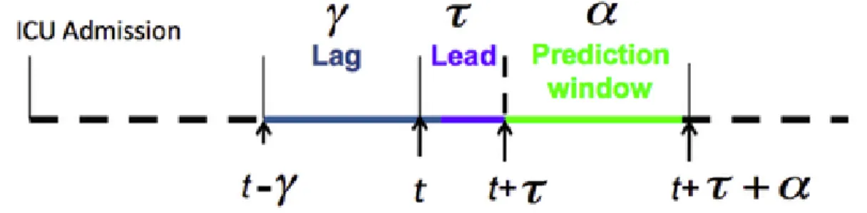
1. The lag is expressed in time units (e.g. in minutes) and corresponds to the amount of data history we allow the model to use when making the prediction. 2. The lead is expressed in time units and corresponds to the period of time be-tween the last data point the model can use to predict and the first data point the model actually predicts.
3. The prediction window is expressed in time units and corresponds to the time window we consider when looking for the occurrence of a medical event. Figure 2-2 illustrates those three parameters that are specific to the prediction
Figure 2-2: Prediction parameters. t represents the current time. The prediction window corresponds to the duration of the event we try to predict. The lead indicates how much time we try to predict ahead. The lag is the period of time in the past that we use from to compute the prediction.
2.5
Data assembling
Once we have both the conditions and the selected features, we can compile the data set, which will in turn be given to the machine learning algorithm that we will train to predict the condition (which is AHE in our case). The data set is compiled using the algorithm detailed in Algorithm 1. Figure 2-3 represents the algorithm visually. Figure 2-4 shows the data assembly algorithm with aggregation functions, which can be optionally defined on top of sub-aggregation functions.
As we can see, compiling the data set has its own set of parameters: • which feature(s) to use,
• how many sub-windows the lag should contain, • which aggregation function(s) to use,
• how large should the sliding window be.
Input: Data files, lead, lag, window_slide, number_of_subwindows_in_lag Output: Compiled data set contained one CSV file
1
2 condition_file = open(‘condition_file.csv’, ‘r’) // Open necessary files 3 output_file = open(‘output_file.csv’, ‘w’)
4
5 for each record do
6 open the feature files, the duration file and the validation file 7 for each occurrence of the condition for the record do
8 in each feature file, set cursor_position to the sample ID start of the occurrence of the condition.
9 extract_row(cursor_position, True)
10 end
11 while True do
12 set cursor_position on first beat in the record
13 if far away from condition occurrences then
14 extract_row(cursor_position, False)
15 end
16 cursor_position = cursor_position + window_slide
17 if cursor_position is after the end of the file then
18 break
19 end
20 end
21 end
22
23 function extract_row(cursor_position, is_condition_present)
24 row = list()
25 compute lag_first_beat and lag_end_beat
26 for each feature do
27 extract the feature values between lag_first_beat and lag_end_beat
28 split this list of feature values into number_of_subwindows_in_lag lists
29 for each sublist l do
30 for each aggregation function f do
31 row.append(f(l)) 32 end 33 end 34 row.append(is_condition_present) 35 output_file.write(row) 36 end 37 end
Fe a tur e ag gr eg at ion Lag an d lea d Cu rso r lo cat io
n s dow in b-w Su on ati reg Agg g in ord Rec
C ur so r po si ti on Fea tu re 1 Fea tu re 2 T im e E ac h b lu e d o t co rr e sp o n d s to t h e va lu e o f o n e fe at u re fo r o n e b ea t La g Lea d C on d it io n La g Lea d Q u er y co n di ti on sc an n er t o kn o w w hi ch c la ss it is C on d it io n Su b w in d o w 1 Su b w in d o w 2 Su b w in d o w 3 Su b w in d o w 4 Lea d C la ss n um be r: 1 C on d it io n Su b w in d o w 1 Su b w in d o w 2 Su b w in d o w 3 Su b w in d o w 4 6. 5 7. 1 A gg re ga ti o n fu nc ti o n 1 A gg re ga ti o n fu nc ti o n 2 2. 3 2. 8 9. 4 9. 2 5. 5 5. 1 6 .5 ; 7 .1 ; 2 .8 ; 2 .3 ; 9 .4 ; 9 .2 ; 5 .5 1 Th e new d at ap o in t is a d ded to t h e d at as et A d va n ce c u rs o r po si ti on Figure 2-3: Visu a l represen tation of the feature aggregation algorithm
Fe a tu re a gg re ga tio n
Lag and lead Cursor location
Sub-windows Sub-aggregation Aggregation Recording C u rs or po sit io n Fea tu re 1 Fea tu re 2 Tim e E ac h b lu e d o t co rr e sp o n d s t o th e va lu e o f o n e fe at u re fo r o n e b ea t La g Lea d C on d itio n La g Lea d Q u er y co n dit io n sc an n er to kn o w w hic h c la ss it is C on d itio n Su b w in d o w 1 Su b w in d o w 2 Su b w in d o w 3 Su b w in d o w 4 Le ad C la ss n um be r: 1 C on d itio n Su b w in d o w 1 Su b w in d o w 2 Su b w in d o w 3 Su b w in d o w 4 6.5 7.1 Su b-ag gr eg at io n fu nc tio n 1 Su b-ag gr eg at io n fu nc tio n 2 2.3 2.8 9.4 9.2 5.5 5.1 8 .2 ; 0 .2 1 Th e n ew d at ap o in t i s a d d ed to th e da ta set A d va nc e cu rs o r p o sit io n 9.1 4.9 9.0 6.3 8.5 5.7 8.9 5.6 O pt io n al step 6.5 ; 9 .4 ; 8 .5 ; 8 .9 ; 7 .1 ; 9 .2 ; 9 .1 ; 9 .0 ; 2 .8 ; 5 .5 ; 5 .7 ;5 .6 ; 2 .3 ; 5 .1 ; 4 .9 ; 6 .3 1 A gg re ga tio n fu nc tio n 1 A gg re ga tio n fu nc tio n 2 8 .5 ; 0 .4 8 .3 ; 0 .2 7 .9 ; 0 .1 Figure 2-4: Visual represen tatio n of the feature agg regation algorithm. Aggregatio n functions can b e optionally defined. Aggregation functions can b e the mean, kurtosis, etc., just lik e for sub-aggregation functions. When aggregation functions are used, the final v alues are aggregated o v er the en tire lag, and not just o v er sub-windo ws.
Parameter categories Parameter names
Condition definition Window size, threshold,
fre-quency, variable
Prediction Lag, lead, features
Data aggregation Sub-aggregation window,
sub-aggregation function, sub-aggregation functions
Table 2.5: General prediction framework’s parameters. The parameters can be di-vided into three main categories: the parameters that are specific to the condition’s definition, the parameters that belong to the prediction problem’s statement, and the parameters that are used during the aggregation of the data.
2.6
Event prediction
Once the data is assembled, BeatDB can learn a model using logistic regression, and assess its quality by computing the AUC of the ROC (area under the receiver operating characteristic, aka. AUROC) using cross-validation. AppendixD.1explains how logistic regression works, and Appendix D.2 presents the AUROC.
2.7
Parameter selection
BeatDB can explore the parameter space using to different type of search:
• Grid search: the parameter space is explored exhaustively.
• Gaussian process regression: the parameter space is explored using a Gaus-sian process regression. See Appendix E for an explanation of the theory, and Algorithm2 for the actual algorithm algorithm we use.
2.8
OpenStack and NFS
Given the size of the data as well to the amount of experiments that are carried out for this thesis, we use the MIT CSAIL OpenStack computer cluster as well as a 5TB NFS storage.
OpenStack is a free and open-source software cloud computing platform. A history of the OpenStack project can be found inSlipetskyy (2011). The MIT CSAIL Open-Stack cluster contains a total of 768 physical cores using Intel Xeon L5640 2.27GHz chips (ca. 6,000 virtual cores), 10 Dell r420 servers with dual socket 8 core E5-2450L (ca. 1,200 virtual cores), and 5 TB of RAM. In the following chapters, we will specify for each experiment how much resource we use.
As OpenStack workers can mount NFS filesytems and our network has a 10 Gbit/s link between NFS servers and OpenStack servers, we make a heavy use of this connection in order to perform computation using OpenStack workers’ CPU and RAM on data retrieved from the NFS filesytem (BeatDB data).
2.9
Distributed system architecture
We use two different models of communication to distribute computation over the OpenStack cluster:
• Master/worker pattern: we use dcap presented in Waldin (2013a) which pro-vides a framework to distribute tasks among workers, each worker being an OpenStack instance. The master is another OpenStack instance that contains the list of tasks to assign. The server listens to any request from workers asking for a new task, and gather data when the task is done. Figure 2-5 presents the master/worker architecture of dcap.
• Multi-worker synchronized via a result database: even though the master/worker model is fairly simple, it does require a non-negligible coding overhead,
essen-tially to handle connections (listening, data transfer, being robust to connection issues, etc.). We therefore changed the architecture over the course of the project to a multi-worker architecture, where each OpenStack instance retrieve a task by querying a database. To ensure that two instances do not retrieve the same task, an instance writes a flag in the database to indicate that it is working on the task. When the task is done, the instance writes the result in the database, and, if needed, writes files on the NFS filesystem. Figure 2-6 represents this multi-worker design synchronized via database.
In the rest of the thesis, we will only use the multi-worker system architecture. In this setting, putting aside the database server, each machine can be interchangeably called worker, node or instance. We will use the term worker.
The result database contains all the results returned by the workers. By fetching the result database content, the workers make sure not to compute a parameter set that has already been done, since whenever a worker starts a task it adds a flag in the result database. If the workers use a Gaussian process regression to decide which parameter set to compute, they use the result database content to fit the Gaussian process.
Figure 2-6 presents a visual representation of the algorithm we use when several machines are used to compute a grid search or a Gaussian process. In the exam-ple presented in the figure, we suppose that there are two workers computing tasks through the grid search or the Gaussian process, Worker #1 and Worker #2. Worker #2 is computing task #3, while Worker #1 is not computing any task, either because it was just launched or the previous task was completed. We go through the example presented in the figure:
1. Worker #1 is looking for the next task to compute. For that purpose, it needs to retrieve all the task results that had been previously computed from the database server.
param-eter set to be done according to the grid search, or it fits a Gaussian process in order to the determine what is the most promising parameter set to compute next. Worker #1 makes sure that no other worker is currently computing this exact same parameter set by checking in the database whether parameter set has been flagged as being computed (the flag is a -1 in the result_value column). If another worker is computing the same parameter set, then Worker #1 selects the second most promising parameter set. If it is also taken, then it selects the third one and so on until it finds a parameter set that is not being computed. If Worker #1 cannot find such parameter set, then it means that the search is over (all parameter sets have been or are being computed) and Worker #1 terminates.
3. Worker #1 leaves a flag in the database so that no other worker can compute the same parameter set: if for example a third worker is launched right after and finds its next task to compute by fitting its Gaussian process using the existing task results, it will choose the same parameter set as Worker #1 because our algorithm to find the next new task is deterministic. In this case, the third worker will have to choose its second best choice of parameters (or third, fourth, etc. depending on which parameter set remained be done, as we have seen in the previous step).
4. Worker #1 computes its task, task #5.
server client client 99 tasks to do 1 tasks pending 0 task done
Waiting for new task
Busy with task # 1 Ask for task
server
client
client
Retrieving task #2
Busy with task # 1 Assign task #2
server
client
client
Finishing task #2 Report task #2 result
98 tasks to do 2 tasks pending 0 task done 98 tasks to do 1 tasks pending 1 task done
Busy with task # 1
Busy with task # 1
server
client
client
Busy with task #2 98 tasks to do 1 tasks pending 1 task done STEP 1 STEP 2 STEP 3 STEP 4
Figure 2-5: Master/worker architecture: dcap. The master contains the list of all tasks that need to be done. Whenever a worker is idle, it asks the master for a new task. The master sends the task to the client, the latter performs the task, at the end of which it return the result to the master, and becomes idle again. The master must continuously listen to a port so that workers can ask for new tasks and return results.
Worker #1
task_id server_id param1 param2 result_value 1 2 3 4 15 10 6 0.54 4 20 8 0.71 2 10 7 -1 4 50 2 0.65 Worker #2
Request previous task results
Busy with task #3 Looking for next task
Busy with task #3
Run grid search or Gaussian Process to decide the parameters of the task to compute next
Busy with task #3
Busy with task #3 Busy with task #5 STEP 1
STEP 2
STEP 3
STEP 4
task_id server_id param1 param2 result_value 1 2 3 4 15 10 6 0.54 4 20 8 0.71 2 10 7 -1 4 50 2 0.65
task_id server_id param1 param2 result_value 1 2 3 4 5 15 10 6 0.54 4 20 8 0.71 2 10 7 -1 4 50 2 0.65 1 20 9 -1
Flag next task with -1
as result value Preventing other clients from computing the same task
Worker #1 Worker #2 Worker #1 Worker #2 Worker #1 Worker #2
task_id server_id param1 param2 result_value 1 2 3 4 5 15 10 6 0.54 4 20 8 0.71 2 10 7 -1 4 50 2 0.65 1 20 9 -1
Busy with task #3
Worker #1
Worker #2
task_id server_id param1 param2 result_value 1 2 3 4 5 15 10 6 0.54 4 20 8 0.71 2 10 7 -1 4 50 2 0.65 1 20 9 0.68 STEP 5 Task #5 completed Return task #5 result
Fetch results Database server Database server Database server Database server Database server
Figure 2-6: Multi-worker architecture synchronized via a result database: grid search or distributed Gaussian Process.
2.10
Worker logic
In earlier sections we explained the parameter selection (Section2.7), data assembly (Section 2.5) and event prediction (Section 2.6). We also presented the distributed system architecture (Section 2.9) and show how workers interact with the rest of the system. In this section, we explain the logic of each worker.
Each worker perform the same three-step cycle: parameter selection, data assembly and event prediction. At the end of each cycle the prediction’s quality, namely the AUROC, is saved in the result database. The time it takes to perform such a cycle is called the worker cycle time. A worker stops when the parameter space has been exhausted or when it gets killed by the cleaning script that we will explain in Section 2.11.
Figure 2-7 shows the worker logic when parameters are selected using a Gaussian process regression.
Assembling data set
Result database
Features Validation files
Run grid search or Gaussian process 1 BeatDB 2 Logistic regression 3 Parameters Data set AUC Result database Production Communication 1 2 min 1 h 2 min 2 min Step number Step duration Scanner output
Figure 2-7: Worker logic. Each worker continuously performs a three-step cycle. The step is to decide which parameter set the next task to compute will have. This step involves fetching all the current results from the result database, which the decision of the parameter set will be based on. The second step is to assemble the data ac-cording to the chosen parameters. This step requires the worker to retrieve data from BeatDB: to assemble the data the worker needs to retrieve feature files, validation files and condition scanner outputs. Figure2-4details how the data assembly is done. Lastly, the third step for the worker is to perform predictions by fitting a regression curve using logistic regression. The prediction quality we chose is the AUROC. This AUROC along with the problem parameters are saved in the result database. Once the AUROC result is saved, the worker has completed its cycle and goes back to the first step. The duration times displayed on this figure are for a specific experiment, which we will detail later. The message conveyed by these duration times is that steps 1 and 2 are fast while step 2 is much longer.
2.11
Cleaning broken workers
We dedicate up to 150 4-core workers for our experiments, the exact number of instances at a given time depending on the resource availability, and experiments can take up to several days. Running a large number of instances for a long period is interesting from a system standpoint as a large variety of issues can appear. Here are a few ones that we experienced throughout the project:
• Router issues
• OpenStack DHCP server issues • Hard drive failure
• Connection issues with the NFS server
• Connection issues with the Matlab license server
• Instances being shut down due to the hypervisor running out of memory and running the oom_killer process (out-of-memory killer) without any warning. • High CPU Steal Time due to OpenStack being configured to overcommit CPUs
by a 4:1 ratio (i.e. there are 4 times more VCPUs than physical ones).
• Thrashing on some hypervisors on Openstack due to OpenStack being config-ured to overcommit the RAM by a 1.5:1 ratio and because of intensive I/O work.
Remarkably we avoided network congestion issues thanks to the size of the network links (10 Gbps).
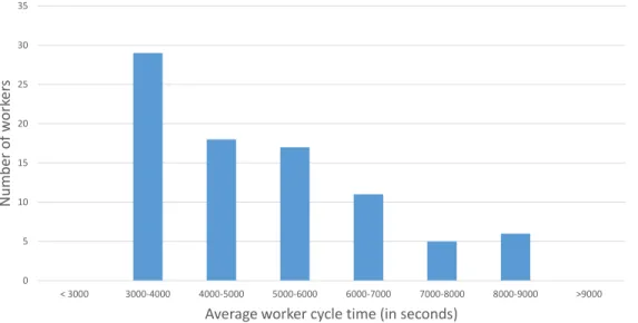
In order to face this multi-level instability, we run on a 1-core instance a daemon process that continuously checks each instance and make sure it has returned a result over the past X hours, X being determined depending on the cycle time a worker takes on a healthy instance. If not, the instance is terminated and a new one is launched. In order to avoid the High CPU Steal Time and Thrashing issues, we sometime reduce the X hours threshold so as to terminate slow instances, in the hope
that newly launched instances are allocated to some less stressed hardware resources, as shown in Figure 2-8. 0 1000 2000 3000 4000 5000 6000 7000 8000 9000 Ave ra ge wo rk er cy cle t ime p er wo rk er in s eco n d s
Launch time of instance (in minutes) Average worker cycle time for each worker
(one blue point = one worker)
Expected worker cycle time
0 30 60 90 120 150 180 210 240
Figure 2-8: Average worker cycle time. Each blue point we present one instance. The worker cycle time on a 100% healthy, unstressed instance should take less than 4000 seconds. The plot shows that the later the instance is launched, the more stressed the hardware resources on which the instance was launched are.
2.12
Conclusion
In this chapter we have presented BeatDB, which we designed to be both flexible and scalable. The flexibility stems from its multi-level parameterization: condition definition, data assembly, feature selection and search method over the parameter space. The scalability aspect was considered from the beginning and the algorithms are distributed.
We will demonstrate BeatDB in the next chapters with a real use case: blood pressure prediction using one of the largest physiological signal data set publicly available, MIMIC.
0 5 10 15 20 25 30 35 < 3000 3000-4000 4000-5000 5000-6000 6000-7000 7000-8000 8000-9000 >9000 N um be r of w or ker s
Average worker cycle time (in seconds)
Chapter 3
The MIMIC data set
This chapter presents the data set that we will use in the following chapters for a real use case of BeatDB, MIMIC. It also presents the signal on which we will focus for both the features and the medical condition that we will predict: the arterial blood pressure (ABP).
3.1
MIMIC
We use the Multiparameter Intelligent Monitoring in Intensive Care II database (MIMIC II) version 3, which is available online for free and was introduced byMoody and Mark (1996) and Goldberger et al. (2000). In order to protect patients’ privacy, data was de-identified1 using customized software developed for that purpose ( Nea-matullah et al., 2008): dates were shuffled, names removed and a few other techniques were used. Figure 3-1 presents an overview of the database.
MIMIC II is divided into two different data sets:
• the Clinical Database: it is a relational database that contains many informa-tion about ICU patients such as patient demographics, hospital admissions and 1De-identification differs from anonymization in that the latter is supposed to be irreversible while the former may be re-identified by a trusted party.
discharge dates, room tracking, death dates, medications, lab tests, notes by the medical personnel, and so on. A script is provided to pipe the data into a PostgreSQL database.
• the Waveform Database: it is a set of flat files that contains 22 different kinds of signals for each patient. Each flat file is stored using the PhysioBank-compatible (aka. WFDB-compatible) format, which is a format specific to the organization that manage MIMIC PhysioNet (2014). We will focus on this data set only in the rest of the thesis.
Figure 3-1: MIMIC-II Database organization
The Waveform Database gathers 23,180 sets of recordings and over 3 TB of data. One recording is typically one patient, but in some rare occurrences one recording can contain several patients when the medical personnel forgot to change the patient ID, or one patient might be split in several recordings in case the patient came to the
ICU several times.
Among the signals, some were recorded at 125 samples per second, such as ECG (elec-trocardiographic) and ABP (Arterial Blood Pressure), other signals were recorded at 1 sample per second, such as the cardiac output, heart rate and the respiration rate. We chose to use the ABP for this study, but our framework can be extended to any other signal.
There are 6,232 patient records that contain ABP. To have a sense of the massiveness of the data, since the signal was recorded at 125 Hz and we had a total of 240,000 hours of ABP data, we have 108 billion samples (240000 × 60 × 60 × 125). ABP
samples are measured in mmHg (millimetres of mercury). Figure 3-2 shows 5 ABP
beats along with their properties.
Figure 3-2: Arterial blood pressure (ABP) fluctuations. This figure shows 5 ABP beats and some usual properties. The ABP is measured in millimeter of mercury (mmHG). The systolic pressure corresponds to the maximum level of mmHG reached in a beat, while the diastolic pressure is defined as the minimum level of mmHG reached in a beat. A person’s ABP is usually expressed in terms of the systolic pres-sure over diastolic prespres-sure: for example, in the first beat, the patient has 120/80, which is a typical blood pressure. The systole is the period of time when the heart contracts itself to send the blood to the rest of the body (the term systole etymolog-ically mean contract). This explains why the pressure increases during the systole. The diastole is the period of time when the heart refills with blood. Between the systole and the diastole, there is a brief interruption of smooth flow due to the short backflow of blood caused by the relaxation of the ventricle: this event is called dicrotic notch. Source of the figure: PhysiologyWeb (2011).
3.2
Arterial blood pressure measurement
The ABP is measured in an invasive way from one of the radial arteries of the patient, namely using arterial catheterization, as illustrated in Figure3-3. In order to measure the blood pressure, the physician first inserts an intra-arterial catheter (aka. arterial line, or in short A-line) into an artery of the patient2 , such as the radial artery (most
common, as in MIMIC ABP), the brachial artery, the femoral artery, the dorsalis pedis artery or the ulnar artery. Figure3-4 shows that the measurement location has a direct impact on the blood pressure values. The A-line is connected to a tube filled with a saline solution, which is connected to a pressure bag. A pressure transducer (aka. pressure sensor) is placed in the tube, and converts pressure into an analog electrical signal.
As detailed inGomersall (2014),McGhee and Bridges (2002)andNickson (2014), the process of measuring the ABP contains several sources of potential errors:
• Transducer: the position of the transducer influences the measured values: whenever patient position changes, the transducer height should be accordingly modified. Also, the transducer must be accurately leveled to the atmospheric pressure.
• Clotting in the arterial catheter: blood clots might form on the tips of arterial catheters.
• Tubing: there must be no air bubble in the tubing.
• Damping degree: all hemodynamic monitoring systems are damped, which means that the amplitude of the signal has been reduced. As shown in Fig-ure 3-5, the damping degree must be carefully chosen.
• Device failure: a component might start malfunctioning for some technical rea-son, independently of the actions of the nurse or the physician.
2Srejic and Wenker (2003) present a series of pictures that show how to place an A-line. The
insertion is most frequently painful for the patient: some anesthetic is often prescribed to reduce the pain.
Figure 3-3: Arterial blood pressure measurement. An intra-arterial catheter (aka. arterial line, or in short A-line) is inserted into the patient’s radial artery and is connected to a pressure bag through a tube filled with a saline solution, which contains a pressure transducer that records the ABP. Source of the figure: Vaughan et al. (2011).
Figure 3-4: Impact of the measurement location on the blood pressure values. In MIMIC ABP, the blood pressure is measured fron one of the radial arteries. MIMIC also contains the blood pressure measurements from other locations, such as the femoral artery. Source of the figure: McGhee and Bridges (2002).
Figure 3-5: Impact of the damping degree on the blood pressure measurements: choosing the right damping degree is important to have a well-shaped signal. Source: Gomersall (2014).
3.3
Beat onset detection
We use the open-source software WFDB (WaveForm DataBase) developed byMoody
et al. (2001) to detect the beat onsets. Figure 3-6 shows the output of the beat detection for twenty beats.
Figure 3-6: Beat onset detection. The blue curve represents the ABP signal; the red circles correspond to the beginning of each beat as the detected by WFDB.
As the signal is sometimes too noisy and the beat onset detection algorithm is not flawless, we marked each beat as being valid or invalid by using a beat validation heuristic, which is detailed in Waldin (2013b) and Sun et al. (2006). The heuristic consists in a set of 9 rules that defines thresholds for a few properties of a beat, such as “if the pulse pressure less than 20 mmHg, then the beat is invalid”.
Furthermore, the recording of the ABP signal sometimes contains jumps, that is to say that the signal was not recorded for a certain lapse of time. We can detect such jumps as each ABP sample in MIMIC has a timestamp. We therefore add a third
type of beat in addition to valid and invalid beats: jumps.
Figure 3-7 shows the number of valid beats for each patient. Figure3-8 presents the percentage of valid beats for each patient. Figure3-9shows the time elapsed between two consecutive jumps for all the measurements we have.
Figure 3-7: Number of valid beats per patient. We observe that some patients have a very small amount of valid beats: we discard those patients’ data in the rest of this work.
Figure 3-8: Percentage of valid beats per patient. We see that the vast majority of patient has over 80% of valid beats, but we also notice that a few patients had a very low number of valid beats. We discard those patients’ data in the rest of this work.
Figure 3-9: Duration of each ABP segment, i.e. time elapsed between two jumps. The abscissa represent the segment number, sorted by length. The ordinate is expressed in a logarithmic scale and represents the length of the segment.
3.4
Levels of noise
As in any data set, it is useful to carefully analyze the noise that affects our data. The dataset we have formed so far contains several layers of noise:
• The raw ABP signals are noisy. We have to keep in mind that the data was recorded in ICU where patients are typically in a critical condition and the medical personnel is under pressure to improve the patient’s condition. For ex-ample the patient might move during the recording, which can perturb the ABP recording. By the same token, the nurse might not immediately see that the sensor is not working properly. Section3.2described the difficulty of measuring the ABP.
• The beat onset detection algorithm generates some noise as it sometimes fails to properly detect the beat. This might be caused by the first layer of noise, i.e. noise in the raw ABP sample values. Other factors might play a role: for instance, ventricular extrasystoles (aka. premature ventricular complexes, PVCs, or ventricular premature beats) might occur and perturb the beat onset detection. Kennedy et al. (1985)demonstrated that frequent (>60/h or 1/min) and complex extrasystoles could occur in apparently healthy subjects, with an estimated prevalence of 1-4%. They are even more likely to occur when a patient is in the ICU.
• Patient identification: some patient’s records actually contain the record of several patients, and conversely a patient might be identified as being several patients in case he was admitted to the ICU several times.
As such we can regard this database as a low signal-to-ratio (SNR) database. We hope that the size of the dataset help compensate for the lack of clear signal, but this certainly represents an important challenge for our work.
Chapter 4
The prediction problem
This chapter presents the prediction problem that we will study using BeatDB, based on the MIMIC data set.
4.1
Acute hypotensive episode (AHE)
The blood pressure of a patient is a critical information in an ICU setting. Abnormal blood pressure level can be life-threatening, and might necessitate an immediate in-tervention from a nurse or a physician. We try to predict the occurrence of an acute hypotensive episode (AHE), which means that the blood pressure stays too low for too long. Left untreated, such episodes may result in irreversible organ damage and death. Timely and appropriate interventions can reduce these risks. For this work we focus on one signal only, the arterial blood pressure, which is both the input and the output our prediction problem.
As the definition of an AHE differs between physicians, we will make it parametriz-able. An AHE takes place when, for some time window, with a minimum frequency (percentage), the mean arterial pressure (MAP) dips below a threshold (in mmHg). The MAP is the mean value of the blood pressure during one beat. For example, one definition of an AHE could be an event when 90% of MAP values in a 30 minute
window dip below 60 mmHg. We see that the definition of an AHE depends on three parameters:
1. the time window we consider,
2. the threshold above which we consider that the MAP is too low, 3. the percentage of beats whose MAP is too low.
Given the presence of noise, a fourth parameter is the minimum percentage of valid beats.
4.2
Objectives
The experiments of this chapter aims at answering the following questions using BeatDB:
• How does the condition threshold influence the prediction accuracy? (Section 4.3)
• To what extent will the features listed in Section 4.4 help predict AHEs? (Section 4.5)
• How does varying the lag and the lead impact the prediction quality? (Section 4.5)
4.3
Condition
Figure 4-1 shows the impact of the MAP threshold parameter on the number of
patients that experienced AHE. Figure 4-2 illustrates how it impacts the number of AHE cases that are identified. Figure 4-3 shows how it changes the case (AHE) to control (non AHE) ratio.
Figure 4-1: Number of patients with AHE events as we change the MAP threshold in the AHE event definition. The higher the threshold, the more patients with AHE events there are.
Figure 4-2: Total number of AHE cases present as we change the MAP threshold in the AHE event definition. The higher the threshold, the more balanced the data becomes.
Figure 4-3: Balance between the AHE and non-AHE events as the MAP threshold changes. The higher the threshold, the fewer AHE events there are.
4.4
Features
As mentioned in Chapter2, BeatDB integrates a storage space for beat-level features. We detail in this section the 14 features we used. In Chapter 5we will develop a new set of features based on wavelets.
Since the ABP signal is sampled at 125 Hz, and a beat typically lasts around 1 second, one beat contain around 125 samples, each sample value being a simple floating-point number. A feature is a function that maps a beat’s samples into a single floating-point number.
Below is the list of features we used. Let x1, x2, · · · , xn be the samples of one beat. n is the number of samples in one beat, and is typically around 50 and 150, given that one beat lasts around one second and the blood pressure is sampled at 125 Hz, meaning that we have 125 samples for each second. Let µ = n1 Pni=1xi (mean), µn= 1n
Pn
i=1(xi− µ)n (nth moment about the mean, aka. nth central moment)), and σ = q 1 N Pn i=1(xi− µ)2 = √ µ2 (standard deviation).
1. Root-mean-square (aka. quadratic mean). It measures the magnitude of the beat samples, and is defined as xrms=
q 1 n(x
2
1+ x22+ · · · + x2n)
2. Kurtosis. It measures of how outlier-prone the beat samples are, or in other words degree of peakedness of the beat sample distribution. There exist several variants of kurtosis: we use the the kurtosis proper, which is defined as xkurtosis=
µ4
σ4 (Abramowitz and Stegun, 1972).
3. Skewness. It measures the asymmetry of the beat samples around the beat sample mean. There exist several variants of skewness: we use the “main” one, which is defined as xskewness= µσ33
4. Systolic blood pressure. As presented in Figure 3-2 it is the maximum sample value in the beat: xsystole = max1≤i≤nxi.
5. Diastolic blood pressure. As presented in Figure 3-2 it is the maximum sample value in the beat: xdiastole = min1≤i≤nxi.
6. Pulse pressure. It is the difference between the systolic and diastolic pressure measures: xpulse = xsystole− xdiastole.
7. Duration of each beat. It is the number of samples that a beat contains:
xduration = n.
8. Duration of the systole. The systole occupies one third of the beat (Gad, 2008), hence the formula xsystole_duration = n3.
9. Duration of the diastole. The diastole occupies two thirds of the beat (Gad, 2008), hence the formula xdiastole_duration= 2n
3 10. Pressure area during systole: xdiastole_duration =
Pdxsystole_duratione
i=1 (xi− xdiastole)
11. Standard deviation of signal. This corresponds to σ.
12. Crest factor (aka. square root of the peak-to-average ratio). The crest factor indicates how extreme the peaks are in a waveform. If it is equals to 1, it means that the signal has no peak. It is defined as xcrest =
xsystole
xrms .
13. Mean of signal. This corresponds to µ.
14. Mean arterial pressure (MAP). We compute the MAP based on the systolic and diastolic blood pressure values using the formula presented inZheng et al. (2008) in the definition section: xmap=
xsystole+2xdiastole
3 .
4.5
Results
In our experiment we use BeatDB with the 5 different aggregate functions (see Figure 2-4 regarding the use of aggregate functions in BeatDB) and 14 different per beat features, with 1-minute sub-windows in the lag, resulting in 70 features (5 × 14) per training exemplar. Then we prepare a data set for each parameter combination: 5 MAP thresholds, 4 lags and 6 leads, resulting in 120 combinations. On these, we execute a 10-fold cross-validation on our lab’s private cloud using approximately 2 nodes with 24 VCPUs each for 48 hours. The parameters are summarized in Table
4.1. The results across different condition thresholds and prediction leads and lags can be viewed in Figure 5.
Parameter names Parameter choice
Condition’s window size 30 minutes
Condition’s threshold 56, 58, 60, 62, 64 mmHg
Condition’s frequency 90%
Condition’s variable MAP
Prediction’s lag 10, 20, 30, 60 minutes
Prediction’s lead 10, 20, 30, 60, 120, 180 minutes
Prediction’s features 14 features
Sub-aggregation window 1 minute
Sub-aggregation function Mean
Aggregation functions Mean, standard deviation, kurtosis, skew, trend
Machine learning algorithm Logistic regression
Evaluation metric AUC of the ROC (aka. AUROC)
Table 4.1: Parameter for the AHE prediction.
Figure 4-4 shows the area under the ROC curve (AUROC) for different lead times, given maximum lag of 60 minutes for 5 different MAP thresholds. The AUROC drops as the lead time increases. The prediction problem becomes easier when a threshold of 56 mmHg is chosen as the average MAP. When this threshold increases, predicting AHE, given this data, becomes harder. This confirms expectations because 56 mmHg is an extreme threshold point and we would expect that the cohort of patients with such an extreme condition will be significantly be different then the rest of the patients. Figure4-5 shows the AUROC when we change the lag and keep the lead at its minimum 10 minute duration. In this case, we see that the performance improves as we increase the lag or historical data taken into account. This is intuitive because a longer lag provides more signal to learn from.
Next, in order to explore a point solution on the ROC curve, we chose a true positive rate of 90% for AHE and evaluated the false positive rate. Figures 4-6 and 4-7 show the results for different lags and leads for different definitions of AHE. As in the previous results, more signal history helps prediction.