Editorial
Changes in font design—should surgeons align?
Available online 1 December 2004This issue of the European Journal for Cardio-thoracic Surgery carries a new font. There are various reasons to change the font of a publication, including pure aesthetics, suitability for production like appearance on the screen, lay out, and print, readability as a function of both, the size and the supporting media, the space required for typesetting a given string of characters, or the image perceived by the reader who may associate certain font types with messages received before.
Certainly, we would not expect to receive a scientific journal in Capitalis quadrata (4th century), which is more suitable for carving in stone, nor a Medieval antiqua (17th century) the latter being associated with psalms composed in Latin. Likewise, traditional fonts used in typewriters, e.g. Helvetica mono-space (20th century), requiring for each character the same amount of space, cannot be the first choice for growing Journals like ours with a tight page budget. As a matter of fact, proportional fonts like Courier, Times, and Verdana are designed with an optimized spacing between letters. This in turn allows for squeezing more text into one page, without affecting readability and therefore translates into substantially more publications per volume to be brought to the readers.
Many fonts originating from the traditional printing with lead characters have been adapted for better readability on the screen. For Arial fonts, the letters are spaced so that they do not touch. In addition, the height of the torso for lower case letters has been heightened. An interesting trend can be observed in with regard to the development of computer interfaces where a strong point is made for WYSIWYG (What You See Is What You Get) which translates
to being able to print out a document as you see it on the screen. This of course is somewhat in contradiction to the more general wisdom, that what you see is not necessarily what you get, and this is not limited to computers. As a matter of fact, we are supposed to know, that we cannot always trust our eyes[1,2]. Some of the more basic principles that skew our perception of size have also to be considered for font design, and possibly lettering of figures which are to be published in the European Journal of Cardio-thoracic Surgery.
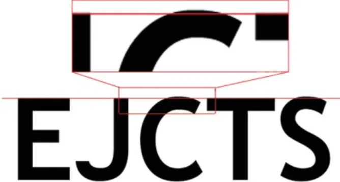
As an example, round characters have to be designed slightly higher than characters made from straight lines only (e.g. letters used in the header of Ref.[3]), in order to be perceived of equal size (Fig. 1). Likewise, the white letters EJCTS on dark ground look larger than the identical black letters printed on white (Fig. 2). This may have some relevance in labeling images with dark and clear structures, where white labels are easier to be read in some areas and black is superior in others. One way around this problem is the use of letters with shadows which can be read on both, dark and clear grounds (Fig. 5 in Ref.[4]).
There is something to be taken here for the surgeons among us who ‘sign’ their work with a scar. There can be little doubt that the scar is an important parameter entering the complex algorithm used by the patient to assess his satisfaction. In contrast to the past, where the complexity of the procedure was usually proportional to the length of the scar, and therefore the positive outcome after such a complex procedure somehow justified the generous
1010-7940/$ - see front matter q 2004 Published by Elsevier B.V. doi:10.1016/j.ejcts.2004.11.025
European Journal of Cardio-thoracic Surgery 27 (2005) 1–2
www.elsevier.com/locate/ejcts
Fig. 1. EJCTS string of letters to be perceived ‘equal’ in size: round characters have to be designed slightly higher than characters made from straight lines only.
Fig. 2. The white letters in the EJCTS string (Trebuchet font) on a dark ground look larger than the identical black letters printed on white.
signature by the surgeon, things are different nowadays. Actually, the demand from the patient side is towards smaller scars, and this without taking in account the complexity of the procedures to be realized. Hence, the size of the scar became an important argument for justification of video-assisted heart surgery[5], endovascular aneurysm repair[6], and also robotic procedures[7]. Alternatively, hiding the scar as proposed for some procedures in congenital heart surgery
[8]brings us back to the thoughts expressed above about font design: its not the size of a scar per se, but the way that scar is perceived that counts.
References
[1] Bach M. Our lying eyes. Science 2004;306:383. [2] www.michaelbach.de/ot.
[3] Monro JL. The next challenge—adapting to change. Eur J Cardiothorac Surg 2004;26:1063–72.
[4] von Segesser LK, Marty B, Tozzi P, Huber C, Bruschweiler I, Gallino A, Hayoz D, Ruchat P. Endovascular surgery for failed open aortic aneurysm repair. Eur J Cardiothorac Surg 2004;26:614–20.
[5] Ohtsuka T, Ninomiya M, Maemura T, Takamoto S. Needle-guided mini-entry in video-assisted coronary artery bypass. Eur J Cardiothorac Surg 2003;24:644–6.
[6] Grabenwoger M, Fleck T, Ehrlich M, Czerny M, Hutschala D, Schoder M, Lammer J, Wolner E. Secondary surgical interventions after endovascular stent-grafting of the thoracic aorta. Eur J Cardiothorac Surg 2004;26: 608–13.
[7] Bodner J, Wykypiel H, Wetscher G, Schmid T. First experiences with the da Vincie
operating robot in thoracic surgery. Eur J Cardiothorac Surg 2004;25:844–51.
[8] Shivaprakasha K, Murthy KS, Coelho R, Agarwal R, Rao SG, Planche C, Cherian KM. Role of limited posterior thoracotomy for open-heart surgery in the current era. Ann Thorac Surg 1999;68:2310–3.
Ludwig K. von Segesser* Department of Cardio-Vascular Surgery, Centre Hospitalier Universitaire Vaudois, Lausanne CH-1011, Switzerland
*Tel.: C41 21 314 26 95; fax: C41 21 314 28 79. E-mail address: [email protected] URL: http://www.cardiovasc.net
Editorial / European Journal of Cardio-thoracic Surgery 27 (2005) 1–2 2