HAL Id: hal-01351694
https://hal.univ-lorraine.fr/hal-01351694
Submitted on 5 Aug 2016
HAL is a multi-disciplinary open access
archive for the deposit and dissemination of
sci-entific research documents, whether they are
pub-lished or not. The documents may come from
teaching and research institutions in France or
abroad, or from public or private research centers.
L’archive ouverte pluridisciplinaire HAL, est
destinée au dépôt et à la diffusion de documents
scientifiques de niveau recherche, publiés ou non,
émanant des établissements d’enseignement et de
recherche français ou étrangers, des laboratoires
publics ou privés.
Comparing connected structures in ensemble of random
fields
Guillaume Rongier, Pauline Collon, Philippe Renard, Julien Straubhaar,
Judith Sausse
To cite this version:
Guillaume Rongier, Pauline Collon, Philippe Renard, Julien Straubhaar, Judith Sausse. Comparing
connected structures in ensemble of random fields. Advances in Water Resources, Elsevier, 2016, 96,
pp.145-169. �10.1016/j.advwatres.2016.07.008�. �hal-01351694�
Advances in Water Resources, 96: 145–169, 2016 10.1016/j.advwatres.2016.07.008
Comparing connected structures in ensemble
of random fields
Guillaume Rongier
1,2, Pauline Collon
1, Philippe Renard
2, Julien Straubhaar
2, and Judith Sausse
1 1GeoRessources (UMR 7359, Université de Lorraine/ CNRS / CREGU), Vandoeuvre-lès-Nancy, F-54518 France2Centre d’Hydrogéologie et de Géothermie, Université de Neuchâtel, 11 rue Emile-Argand, 2000 Neuchâtel, Switzerland
Abstract Very different connectivity patterns may arise from using different simulation methods or
sets of parameters, and therefore different flow properties. This paper proposes a systematic method to compare ensemble of categorical simulations from a static connectivity point of view. The differences of static connectivity cannot always be distinguished using two point statistics. In addition, multiple-point histograms only provide a statistical comparison of patterns regardless of the connectivity. Thus, we propose to characterize the static connectivity from a set of 12 indicators based on the connected components of the realizations. Some indicators describe the spatial repartition of the connected components, others their global shape or their topology through the component skeletons. We also gather all the indicators into dissimilarity values to easily compare hundreds of realizations. Heat maps and multidimensional scaling then facilitate the dissimilarity analysis. The application to a synthetic case highlights the impact of the grid size on the connectivity and the indicators. Such impact disappears when comparing samples of the realizations with the same sizes. The method is then able to rank realizations from a referring model based on their static connectivity. This application also gives rise to more practical advices. The multidimensional scaling appears as a powerful visualization tool, but it also induces dissimilarity misrepresentations: it should always be interpreted cautiously with a look at the point position confidence. The heat map displays the real dissimilarities and is more appropriate for a detailed analysis. The comparison with a multiple-point histogram method shows the benefit of the connected components: the large-scale connectivity seems better characterized by our indicators, especially the skeleton indicators.
Keywords Stochastic simulations Comparison Static connectivity Indicators Dissimilarity
Introduction
Connectivity is a key aspect of a geological study for its in-fluence on fluid circulations. From a reservoir engineering perspective, it relates to geological structures with high and low permeabilities. But it also relates to the spatial distribu-tion of these structures and the resulting inter-connecdistribu-tions, which define the static connectivity. An incorrect connection can bias the results of the flow simulations[Journel and Al-abert,1990,Gómez-Hernández and Wen,1998]. Reproducing the geological bodies together with their relations is so of prime importance[e.g.,Deutsch and Hewett,1996,King and Mark, 1999].
Stochastic simulations aim at generating possible represen-tations of the geological bodies with respect to the available data. Several methods exist, with a usual separation in two main categories:
• Pixel-based methods simulate one cell at a time, based on a prior model describing the structures of interest. In sequential indicator simulation (SIS)[Deutsch and Journel,1992], the prior is a variogram built upon the two-point statistics of the data. Hard data condition-ing with such method is easy. But the simulated struc-tures do not look like geological bodies. This is espe-cially true for bodies with curvilinear geometries such as channels, whose continuity is badly preserved. The plurigaussian simulation (PGS)[Galli et al.,1994] limits
this difficulty by accounting for the facies relationships. Multiple-point simulations (MPS) go a step further by borrowing multiple-point statistics not from the data but from an external representation of the expected geol-ogy, the training image (TI)[Guardiano and Srivastava, 1993].
• Object-based methods rely on the definition of geomet-ric forms and their associated parameters. Each form represents a particular geological body[e.g.,Viseur,2001, Deutsch and Tran,2002]. The objects are then randomly placed in the domain of interest with parameters drawn in statistical laws. More recent approaches introduce some genetic aspects to improve the object organization [e.g.,Lopez, 2003, Pyrcz et al.,2009]. They provide more geologically consistent results. For instance chan-nel continuity and relationships are better preserved than with pixel-based methods. But this is at the cost of the ease of parametrization. And object-based ap-proaches have difficulty to condition the objects to data. All these methods have advantages and drawbacks. This will influence the choice of a method and its parameter values when dealing with a case study.
But few work aims at systematically analyzing the quality of a set of realizations regarding their static connectivity. The quality control often consists in comparing the histogram and variogram of several realizations with those of the data, or
of the training image if any[e.g.,Strebelle,2002,Mariethoz et al.,2010,Tahmasebi et al.,2012]. If more than the first two-order statistics are necessary to simulate geological bodies[e.g., Guardiano and Srivastava, 1993, Journel, 2004], the same conclusion must apply when comparing realizations. Some au-thors propose to also use the higher-order statistics for quality analysis.Boisvert et al.[2010] andTan et al.[2014] propose to analyze the multiple-point histogram. De Iaco and Mag-gio[2011] andDe Iaco[2013] also explore the multiple-point statistics with high-order cumulants.
The purpose of most simulation methods is to reproduce statistics from a prior. Analyzing statistics highlights the method success in this reproduction, not if the realizations are geolog-ically consistent. To do that, the statistical analysis is often completed by a visual evaluation of the global structures. The geological structures are compared to what is expected from the known geology, with a focus on the further use of the re-alizations. This use is often related to fluid circulations, and requires an assessment of the static connectivity, which is not directly imposed by the simulation methods contrary to the statistics. But a visual analysis remains subjective and limited to a few realizations, often in two-dimensions[e.g.,Yin et al., 2009,Tahmasebi et al.,2012].
Yet, some studies focus on analyzing the connectivity of the realization bodies. For instanceMeerschman et al.[2012] use the connectivity function with the histogram and variogram to analyze the simulation parameter impact for the Direct Sam-pling MPS method[Mariethoz et al.,2010]. Deutsch[1998] uses directly the connected components determined from litho-facies, porosity and permeability models. He computes indica-tors such as the number of connected components or their sizes to rank the realizations. De Iaco and Maggio[2011] andDe Iaco[2013] also use some measures related to the connected components, such as their number or their mean surface and volume.Comunian et al.[2012] rely on some of the previous indicators to analyze the quality of three-dimensional struc-tures simulated from two-dimensional training-images. They also consider the equivalent hydraulic conductivity tensor as an indicator. However, this requires to have an idea of the hydraulic conductivities for the simulated facies.
Connected components enable to characterize the geometry and topology of the geological bodies, which is the purpose of the visual comparison of realizations. They also enable to study the static connectivity of the geological bodies, while being easy to compute. Contrary to a visual analysis of the re-alization, indicators from connected components are unbiased and can compare many realizations. Contrary to statistical or hydraulic property indicators, they focus on the sedimentary bodies by characterizing their connectivity and are more easy to apprehend. However, current methods based on the con-nected components are limited to few simple indicators, often analyzed independently.
This leads to the question of the result visualization to ana-lyze more effectively the indicators.Scheidt and Caers[2009] andTan et al.[2014] both rely on the computation of dissim-ilarity values between the realizations. Those dissimilarities are computed based on the quality indicators measured on each realization. They are then visualized based on a Multi-Dimensional Scaling (MDS)[e.g.,Torgerson,1952,Shepard, 1962a,b]. MDS represents the realizations as points, with the distance between the points as close as possible to the dissimi-larities. The global analysis of the realization dissimilarities is so easier.
The present work aims at analyzing and discussing a set of indicators to quantify the quality of stochastic simulations from the viewpoint of static connectivity. This method performs on categorical three-dimensional images representing the facies constituting the geological bodies of interest. It can be applied on realizations from one or several stochastic simulation meth-ods and/or parameter values. Conceptual images representing ideally the structures to simulate can also be considered. The chosen set of indicators relies on quantitative measurements on connected components and their skeletons (section1). The indicators are used in dissimilarity computations to analyze the quality more directly (section2). Several realizations ob-tained with different simulation methods (section3.1) are then used to test the method and compare it to the multiple-point histograms (section3), and discuss the results (section4).
1 Indicators to measure simulation
qual-ity
The quality analysis fits in a stochastic process implying the sim-ulation of many realizations in a grid. It further investigates the differences of static connectivity between these realizations.
1.1 About grids and grid cells
Many methods to simulate geological structures rely on a dis-cretized representation of the domain of interest: a grid. The grid is a volumetric mesh composed of simple elements, here-inafter called cells.
Many types of grid exist, with different cell types (e.g., tetra-hedron or hexatetra-hedron). Most of the stochastic simulation methods rely on hexahedral grids, either regular or irregular. Irregular hexahedral grids help to be as conform as possible to the geological structures such as horizons and faults. The sedimentary bodies are then simulated within the parametric space of the grid[e.g.,Shtuka et al.,1996]. The parametric space mimics a deposition space to get rid of the deformation and faulting occurring after deposition and materialized in the grid geometry.
Consequently, the indicators are computed on hexahedral grids, both regular and irregular. Similarly to the simulation, the indicator computation is done in the parametric space of the grid. Thus, the indicators based on volumes or surfaces are rather computed using number of cells and number of faces. This avoids biases related to different grid geometries, which give different indicator values even if the objects are the same when transferred in the same grid.
Within a grid, the cells are connected one to another by their faces, their edges and/or their corners [Renard and Allard, 2013]. In the case of the hexahedral grids used for this work, one cell has three possible neighborhoods (figure1):
1. One neighborhood composed of six face-connected cells. 2. One neighborhood composed of eighteen face- and
edge-connected cells.
3. One neighborhood composed of twenty-six face-, edge-and corner-connected cells.
This definition of the connectivity between a cell and its neigh-borhood can be extended to form connected components.
Central cell Face-connected cell Edge-connected cell Corner-connected cell
Figure 1 Possible neighborhoods for a given central cell in a regular grid (modified fromDeutsch[1998]).
a b c d Facies 2 Channel 1 Channel 2 Face-connected component 2 Face-connected component 3 Face-connected path between two cells Face-connected
component 1
Facies 1
Figure 2 Connected components of a given facies in a two-dimensional structured grid. The cells a and b are connected and belong to the same connected body. There is no possible connected path between those cells and c, which belongs to another connected body. The cell d constitutes a third connected body in the case of a face-connected neighborhood. In the case of an edge- or corner-connected neighborhood, d belongs to the corner-connected body 1.
1.2 Basic element: the connected component
The connected components result from the widening of the neighborhoods. They rely on the following definition of the connectivity between two cells: two cells belonging to the same facies are connected if a path of neighboring cells remaining within the same facies exists (figure2). Applying this definition to all the cells of a facies gives the connected components of this facies.This leads to a distinction between the geological objects, such as a channel or a crevasse splay, and the connected com-ponents. Indeed, the geological objects often tend to cross each others, giving one connected body where there is in fact sev-eral geological objects (figure2). The range of possible shapes is larger for the connected components than for the individual object. This aspect complicates the comparison between im-ages. But determining the connected components is far easier than trying to retrieve the geological objects. This is also close to the functioning of pixel-based methods, which do not try to reproduce geological objects but groups of cells, and therefore connected components.
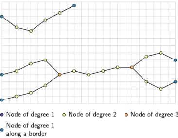
Node of degree 1 along a border
Node of degree 1 Node of degree 2 Node of degree 3
Figure 3 Example of skeletons for the connected components of the figure2. Here the nodes connected to only one segment – the nodes of degree 1 – are all along a grid border. Two nodes of degree three highlight the local disconnections between the channels at the bottom. The connected component at the top has no node of degree higher than two, which shows the complete connectivity of all its cells, even locally.
1.3 Basic element: the skeleton
A curve-skeleton – simply called here skeleton – is a thin one-dimensional representation of a three-one-dimensional shape. It is composed of nodes linked together by one or more segments (figure3). The degree of a node is the number of segments connected to that node. Skeletons are often used to study some geometrical and topological features of a shape. Here the skeletons are those of the connected components. They enable to further characterize the global shape of the connected components, while giving more details about their topology than indicators directly computed on the components.
Several methods exist to compute skeletons[e.g.,Serra,1983, Jain,1989,Brandt and Algazi,1992]. The method considered for this work is based on slicing the grid along a given axis. The grid is subdivided into parallel slices of a given thickness. On each slice the connected components are computed and one node is assigned to each component. The nodes are then linked by computing the connected components over two ad-jacent slices. If two components from two slices form one con-nected component when the slices are combined, their nodes are linked. If they form several components, their nodes are not linked.
1.4 Indicators
The indicators studied in this paper focus on analyzing the con-nectivity of the geological bodies within a three-dimensional image. This static connectivity analysis is possible thanks to the connected components. All the indicators are quite simple and each one gives only partial information about the connec-tivity and its structure. But their combination provides a more detailed characterization.
AppendixAdefines in detail all the indicators. Table1 sum-marizes the indicator definition, by focusing on their relation-ship with the connected components. We distinguish three categories of indicators:
T able 1 The set of indicators with their definitions. The indicator definitions is given by a numerator and a denominator because the majority of the indicators comes from a ratio. Some ratios are computed on a single connected component, and their values are combined to obtain one indicator value per facies. W e use the term “component” instead of “connected component” for the sake of simplicity . Category Indicator Symbol Numerator Denominator V alue for a facies Global indicators Facies proportion p Number of component cells Number of cells of the grid Sum of all the component values Facies adjacency proportions p a Number of component cells adjacent to a cell of a given other facies Number of cells of the facies adjacent to a cell of any other facies Sum of all the component values Facies connection probability Γ Squared number of component cells Squared number of cells of the facies Sum of all the component values Connected component density ε Number of components Number of cells of the grid – Unit component proportion p u Number of components of one cell Number of components – T raversing component proportion p c Number of components linking two opposite borders of the grid Number of components – Shape indicators Number of component cells n Number of component cells – A verage of the non-unit-component values Box ratio β Number of cells of a component Number of cells of the ax is-aligned bounding box of the com-ponent A verage of the non-unit-component values Faces /cells ratio ζ Number of faces composing a component surface Number of cells of a component A verage of the non-unit-component values Sphericity φ Surface area of a sphere Surface area of the connected component A verage of the non-unit-component values Skeleton indicators Inverse branch tortuosity t Distance between the extremities of a branch Branch curvilinear length A verage of all the branch values Node degree proportions p n Number of node connected to n segments T otal number of node for all the skeletons Sum of all the skeleton values
and not necessarily an individual connected component. Among them, the facies proportion is a classical indica-tor to compare realizations. Some others, such as the facies connection probability[Renard and Allard,2013], the connected component density or the traversing com-ponent proportion give an idea of the global connectiv-ity.
Shape indicators: Global measures such as facies proportions
are not sufficient to characterize precisely the impact of the related facies on the flow[e.g.,Western et al., 2001, Mariethoz,2009]. In particular,Oriani and Re-nard[2014] showed the influence of the connected com-ponent geometry – i.e., their shape – on the equivalent hydraulic conductivity, and therefore on the flow behav-ior. The shape indicators characterize the connected component shape through simple surface and volumet-ric measures. They all give one value per component. The arithmetic mean of those values provides a value of the indicator for a given facies. This makes the indicator comparison easier.
Skeleton indicators: The skeletons help to better
character-ize the topology and global geometry of their connected components: their one-dimensional representation is easier to analyze. Here two indicators are introduced. The inverse branch tortuosity characterizes the geome-try of the skeleton. Its values for all the branches of all the skeletons related to a facies are averaged to obtain a single value for the facies. It completes the shape indica-tors in the characterization of the connected component shape. The node degree proportion depicts the topol-ogy of the skeletons. It helps to analyze the connectivity more precisely.
2 Quality analysis considerations
The final purpose of this work is to easily and objectively com-pare several realizations. The indicators are thus computed on large sets of realizations, which may come from different methods and/or parameters. Then dissimilarity values based on the indicators help to compare the realizations.
2.1 Influence of different grid dimensions
Some cases imply to compare realizations on different grids, and the grids may have different dimensions. For instance in MPS, the training image is often larger than the simulation grid to maximize pattern repeatability.
The grid dimensions influence the size of the traversing con-nected components, such as channels. This impacts in par-ticular the connected component density and the number of component cells. When the grid size varies along the chan-nel direction, the number of cells for the chanchan-nels also varies. And even though the number of channels does not necessarily change, the grid volume does, impacting the density. These indicators highlight expected differences in such cases. Their direct use is then detrimental to the quality analysis.
We propose two workarounds to compensate for different grid sizes:
• Either sampling the images from the different grids so that all the samples have the same dimensions. The sample size are the largest dimensions common to all
the grids. Each sample is randomly extracted and each image may be sampled several times to still catch the characteristics of the whole image.
• Or correcting the indicators of the difference between the grid dimensions. The smallest grid dimensions among all the grids form a hypothetical reference grid. The in-dicators are corrected to their expected value in such reference grid. AppendixBdetails this correction. The sampling exempts from correcting the indicators, but it adds a step and requires the analysis of more images, which could slow down the process. If they are valid, the corrections should give similar results than the sampling in a more efficient process.
2.2 Indicator rescaling
The rescaling ensures that the differences between the ranges of indicator values will not affect the comparison. The his-togram-based indicators – facies proportion, facies adjacency proportion and node-degree proportion – are not rescaled, to preserve their histogram behavior for the dissimilarity compu-tation (section2.3). Two methods can be used for rescaling: normalization and standardization.
The normalization method consists in rescaling linearly the indicators values between 0 and 1. The indicator Ii is the ith
indicator of the set previously defined. When computed for the facies f of the realization r, we will denote the computed indicator Ir
i f. The normalization is then obtained by rescaling
it between its minimum and maximum values: norm(Ir
i f) =
Ir
i f− mi f
Mi f− mi f (1)
with Mi f the maximum value for the same indicator and facies
among all the images and mi f the minimal value for the same
indicator and facies among all the images.
The standardization method consists in using reduced-cen-tered indicator values. For an indicator i the standardized value for a facies f of a realization r is obtained using the following formula: stand(Ir i f) = Ir i f− µi f σi f (2) withµi f the mean for the same indicator and facies among
all the images andσi f the standard deviation for the same
indicator and facies among all the images. Standardization is an interesting option to focus on the indicator variance. The normalization on the other hand decreases the influence of outliers and gives precise limits to the indicator values.
2.3 Dissimilarity calculation
The principle of comparing two images is to determine how dissimilar these images are. The indicators can be seen as coor-dinates of the compared images. These indicators are hetero-geneous: they are either based on histograms or on continuous values. The computation of a dissimilarity value between two images requires a heterogeneous metric.
Following the example ofWilson and Martinez[1997], two different metrics are combined into a heterogeneous Euclidean/ Jensen–Shannon metric. It uses the Jensen–Shannon distance, square root of the Jensen–Shannon divergence[Rao,1987,Lin, 1991], for the histogram-based indicators – facies proportion,
facies adjacency proportion and node-degree proportion – and the Euclidean distance for all the other indicators. The distance between two images r and s for a given indicator i of a given facies f is given by:
d(Ii fr, Ii fs ) = ( dJ S(Ii fr , I s i f) if I r i f and I s i f are histograms dE(Ii fr , I s i f) if I r i f and I s
i f are continuous values
(3) with I the indicator values. dJ Srepresents the Jensen–Shannon
distance: dJ S(Hir, His) = v u u u u u t 1 2 n X j=1 Hr i jlog Hi jr 1 2(H r i j+ H s i j) + Hs i jlog Hi js 1 2(H r i j+ H s i j) (4) with Hr i and H s
ithe histograms of the indicator i for respectively
the images r and s, n the number of classes for each histogram,
Hr
i jand H s
i jthe proportions for the class j in the corresponding
histograms. dE represents the Euclidean distance used with
rescaled indicators: dE(Ii fr , Isi f) =Ç(resc(Ir i f) − resc(I s i f))2 (5) with Ir i f and I s
i f the values of the indicator i for the facies f of
respectively the images r and s and resc either norm (formula 1) or stand (formula2). The final dissimilarityδ between two images r and s given their respective sets of indicators Ir and
Isis: δ(Ir, Is,ω, ν) = v u u tω1dJ S(I1r, I1s,ν)2+ 12 X i=2 n X f=1 ωiνfd(Ii fr , I s i f)2 (6) with Ir 1and I s
1the facies proportion histogram for the two
im-ages, Ir i f and I
s
i f all the other indicator values depending on
the indicator and the facies and n the number of facies.ω rep-resents the set of weightsωi that control the impact of each
indicator.ν represents the set of weights νf that control the
im-pact of each facies. Note that the facies proportion histograms are the only indicators with one result for all the facies. Thus the facies proportions are treated differently from all the other indicators. The Jensen–Shannon distance used in that case is slightly modified: dJ S(Hir, His,ν) = v u u u u u t 1 2 n X f=1 νf Hr i flog Hi fr 1 2(H r i f + H s i f) + Hs i flog Hi fs 1 2(H r i f+ H s i f) (7)
The dissimilarity values computed by formula6between all the images constitute a non-negative symmetric matrix. This matrix has a zero diagonal corresponding to the dissimilarity between an image and itself. The dissimilarity matrix can be directly visualized with a heat map or treated by multidimen-sional scaling to get a more practical visualization.
2.4 Heat map
The heat map is a simple graphical representation of a matrix where the matrix values correspond to colors. In our case, the heat map is a two-dimensional representation. This colored representation highlights patterns in the dissimilarity matrix, either between realizations or between simulation methods. The main advantage of the heat map is to show the real dis-similarity values, contrary to the multidimensional scaling de-scribed in the next subsection.
The heat map also enables to classify the images and/or to apply clustering methods on it. A simple yet informative classification is the ranking according to the dissimilarities of the images toward one particular image. When using more advanced clustering methods, the matrix rows and columns are permuted to gather close values into the same cluster.
2.5 Multidimensional scaling
Multidimensional scaling (MDS)[e.g.,Torgerson,1952,1958, seeCox and Cox,1994for a review] is a set of data visualiza-tion methods to explore dissimilarities between objects – rep-resented by a dissimilarity matrix – through a dimensionality reduction: it aims at producing a configuration of the objects as optimal as possible in a lower dimensional representation. 2.5.1 Principle and method used
Finding the configuration of the images in a k dimensional representation consists in locating a set of points representing the objects in a k-dimensional Euclidean space – with k being at most equal to the number of images minus one. The point positioning is done so that the Euclidean distance d between two points matches as closely as possible the dissimilarities between the images:
dr,s= v u u t k X i=1 (xr i− xsi)2 (8)
with r and s two images, k the dimension number of the Eu-clidean space, xr iand xsithe coordinates of respectively r and
sin the i-th dimension. The number of dimension k for the MDS representation is an input parameter. When equal to the number of images minus one, the distances are normally equal to the dissimilarities. When k is lower, the MDS misrepresents more or less the dissimilarities.
Several multidimensional scaling methods have been pro-posed[e.g., Cox and Cox, 1994], depending on the type of dissimilarities and on the way to match the dissimilarities with the distances. The classical scaling[Torgerson,1952,1958, Gower,1966] is the usual method for multidimensional scal-ing[Scheidt and Caers,2009, Tan et al., 2014, e.g.,]. It as-sumes that the dissimilarities already are Euclidean distances. If this assumption can be relaxed to a metric assumption, i.e., the dissimilarities are distances, Euclidean or not, the classical
scaling may further misrepresents dissimilarities based on a heterogeneous metric.
Here we use a different method: the Scaling by MAjoriz-ing a COmplicated Function (SMACOF)[De Leeuw,1977,De Leeuw and Heiser,1977, 1980]. Its goal is to get distances as close as possible from the dissimilarities using a majoriza-tion, i.e., the optimization of a given objective function called stress, through an iterative process. The stress derives from the squared difference between the dissimilarities and the dis-tances. It is positively defined and equals to 0 only when the distances are equal to the dissimilarities. The optimization process corresponds to a minimization of the stress. The fi-nal stress value helps to assess the choice of the number of dimensions: the lower the stress is, the better is that choice. 2.5.2 Validation of the number of dimensions
Following the chosen number of dimensions for the representa-tion, the point configuration matches more or less the dissimi-larity values. Verifying that the dimension number is enough for a good match between the dissimilarities and the distances is so of prime importance. Two approaches allow testing the chosen dimension number:
The scree plot: It represents the stress of the SMACOF against
the dimension number. The stress follows a globally con-vex decreasing function that tends toward 0 when the dimension number increases. A stress close or equal to zero means that the higher dimensions are unnecessary to represent the dissimilarities. The best number of di-mensions is between the point with the highest flexion of the curve and the beginning of the sill at zero. The dimension value right after the point with the highest flexion is generally enough for a decent representation.
The Shepard diagram: It represents the distances against the
dissimilarities. The better the correlation, the better the choice of dimension number.
Two-dimensions are more practical for an analysis purpose. A three-dimensional representation remains a possibility if the improvement is significant enough from a two-dimensional representation.
2.5.3 Estimation of the point position confidence
The point position confidence is another way to assess the MDS ability to represent the dissimilarities. For each point r, an error
ehighlights the mismatch between the dissimilaritiesδ and the distances d with all the other points s:
er=
X
s
|(aδr,s+ b) − dr,s| (9)
with a and b the linear regression coefficients found on the Shepard diagram. This measure gives a more local represen-tation of the miss-represenrepresen-tation than the scree plot or the Shepard diagram.
For visualization purpose, that error is then normalized, giv-ing the confidence c for a given image r:
cr= 1 −
er− emin
ema x− emin
(10) with ema x and emin respectively the greatest and the lowest
error values amongst the errors of all the images. This confi-dence can then be attributed to its corresponding point in the
MDS representation through the point transparency: the less transparent the point is, the best the dissimilarities related to this point with all the other points are represented.
3 Example of method application
The method, as described in the previous sections, consists in three steps:
1. Indicator computation.
2. Dissimilarity computation in a matrix.
3. Dissimilarity visualization and analysis, especially with multidimensional scaling.
The first two steps were implemented in a C++ plugin for the SKUA-GOCAD geomodeling software[Paradigm, 2015]. The last step was realized using the software environment for statistical computing R[R Core Team,2012] with the addition of the R packages SMACOF[De Leeuw and Mair,2009] and ggplot2[Wickham,2009].
3.1 Dataset
The dataset falls within the simulation of a channelized sys-tem. It contains several realizations representing the same sed-imentary environment simulated with different methods. The analysis aims at highlighting the indicator ability to capture the differences of static connectivity between the realizations, and especially between the realizations from different methods. As it concerns a sole case, it would be inappropriate to draw general conclusions on the simulation methods themselves.
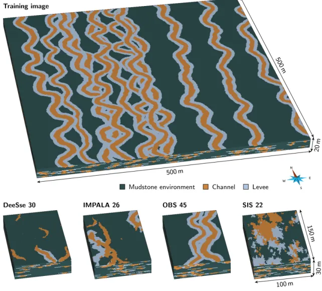
The channelized system is composed of sandy channels with levees into a mudstone environment. A conceptual model, called the training image (TI) (figure4, image at the top), provides an ideal representation of this system. The case study falls within the scope of a MPS study: several simulation meth-ods are used to reproduce the sedimentary bodies observed in the training image. MPS performs better when the training image is larger than the realizations, to ensure enough pattern repeatability. It involves two grids: the first one for the training image (figure4, image at the top) and the second one for the realizations (figure4, images at the bottom).
The training grid contains two sets of images:
TI: One based realization simulated using the
object-based method of the software Petrel[Schlumberger,2015] (see appendixC, tableC.3, for the simulation parame-ters).
Analog: 100 object-based realizations simulated with the same
method and parameters used to simulate the TI (ap-pendixC, tableC.3).
The simulation grid contains four sets of images:
DeeSse: 100 MPS realizations simulated with the DeeSse
im-plementation[Straubhaar,2011] of the direct sampling method[Mariethoz et al.,2010]. Contrary to more tra-ditional MPS methods, the direct sampling bypasses the conditional probability computation and resamples ran-domly the training image. It relies on the compatibility – measured with a distance – between the conditioning data and the patterns scanned in the training image. The
resampling step selects the first pattern with a distance lower than a given threshold. The training image is the TI and the set of parameters is given in tableC.1) in the appendix.
IMPALA: 100 MPS realizations simulated with the method
IM-PALA[Straubhaar et al.,2011,2013]. Contrary to the DeeSse, IMPALA still computes the conditional probabil-ities during the simulation. To improve the efficiency of this computation, the method stores the training image patterns in a list. The training image is scanned once at the beginning and the list is used instead during the simulation. The training image is the TI and the set of parameters is given in tableC.2) in the appendix.
OBS: 100 object-based realizations simulated with the same
method and parameters used to simulate the TI (ap-pendixC, tableC.3).
SIS: 100 sequential indicator simulation realizations simulated
using variograms based on the facies in the TI (appendix C, tableC.4).
3.2 Analysis setting
The purpose here is to compare the realizations with the TI. It should lead to retain the method and associated parame-ters that reproduce at best the static connectivity of the TI for the studied case. The indicators used in this case study (table 2) rely on the connected components, because the face-connectivity between cells is the most frequently used[Renard and Allard,2013]. All the indicators are equally considered (ωi = 1 for all i in formula6). This avoids any subjective
bias that could arise from favoring a given indicator. The mud-stone environment is the resultant of the channels and levees placement. It has so no precise shape by itself and may blur the analysis. It gets a weight of 0 while channels and levees both get each a weight of 1 (νmudst one = 0, νchannel = 1 and
νl evee= 1). Channels and levees are considered equally
impor-tant to reproduce, but this aspect is related to the case study and could be further discussed. The indicators are normalized to cancel the differences of different indicator ranges. Slices of 17 cells along the grid axis with the same orientation than the channels are used for the skeletonization.
Several samples are also randomly extracted from the grids to evaluate the suitability of correcting the indicators when dealing with different grid sizes. The training grid having 500× 500× 20 cells and the simulation grid 100 × 150 × 30 cells, the common largest dimensions for the samples are 100×150×20. The training grid is almost 10 times larger than the simulation grid. Therefore, 20 samples are extracted from the TI and each analog, whereas 2 samples are extracted from each DeeSse, IMPALA, OBS and SIS realization.
3.3 Visual inspection of the realizations
Looking at the connected components (figure 5) highlights some expectations for the dissimilarity analysis. Two aspects must be analyzed: the reproduction of the sedimentary body shapes and the reproduction of their connectivity, especially concerning the channels. In the studied case, the reproduction of the shape is pretty easy to analyze visually. The SIS real-izations do not display any objects similar to channel/levee
Training image
Mudstone environment Channel Levee
DeeSse 30 IMPALA 26 OBS 45 SIS 22
500 m 500 m 20 m 100 m 150 m 30 m
Figure 4 Training image and examples of realizations for each category.
Table 2 Set of indicators used for the case study. The indicator definitions are summarized in table1and more detailed descriptions are in appendixA.
Category Indicator Symbol Weight
Global indicators
Facies proportion p 1
Facies adjacency proportion pa 1
Facies connection probability Γ 1
Connected component density ε 1
Unit connected component proportion pu 1
Traversing connected component proportion pc 1
Shape indicators
Number of connected component cells n 1
Box ratio β 1
Faces/cells ratio ζ 1
Sphericity φ 1
Skeleton indicators
Node degree proportions pn 1
Inverse branch tortuosity t 1
systems and are so far dissimilar from the TI. The OBS realiza-tions look similar to the TI, which is what is expected consid-ering that they come from the same method and parameters. DeeSse realizations have objects similar to channels, even if some continuity issues appear. They also seem to have an in-sufficient number of channels. IMPALA realizations have quite
linear objects but which poorly reproduce channel and levee shapes.
Estimating the static connectivity in three-dimensional im-ages is more difficult. The TI channels seem highly connected. The objects in the SIS realizations do not locally intersect like channels do and are far too connected. DeeSse realizations
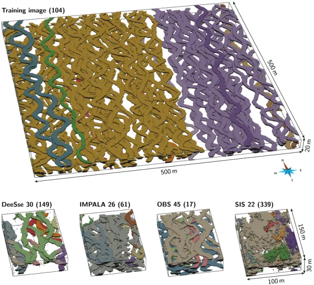
con-Training image (104)
DeeSse 30 (149) IMPALA 26 (61) OBS 45 (17) SIS 22 (339)
500 m 500 m 20 m 100 m 150 m 30 m
Figure 5 View of all the channel connected components within the TI and examples of realizations for each categories. The number in parentheses are the number of connected components of each image.
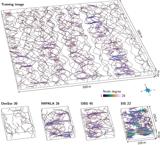
tain less objects and seem under-connected compared to the TI. The distinction between OBS and IMPALA realizations is diffi-cult concerning the connectivity. Looking at the skeletons of the connected components (figure6) corroborates those obser-vations. DeeSse realizations are clearly under-connected com-pared with the other categories. SIS ones are over-connected. IMPALA realizations seem a bit more connected than OBS ones. The static connectivity within the training image is clearly het-erogeneous.
3.4 Effect of different grid dimensions on the
anal-ysis
The TI, analogs and OBS realizations come from the same method with the same parameter values. The grid size is the only difference between all these images: the grid of the TI and analogs – the training grid – is larger than that of the OBS realizations – the simulation grid.
This difference of grid dimensions directly impacts the con-nected component density and the number of concon-nected com-ponent cells, which are corrected to take into account such difference (appendixB). But the realizations coming from the same method still differ when looking at the dissimilarities (fig-ure7, MDS representation from the original images). The OBS realizations within the simulation grid stand out from the TI and the analogs within the training grid. Such difference is
absent from the samples, where all the images have the same size (figure7, MDS representation from the image samples). The grid size seems to clearly impact the dissimilarity values.
However, both MDS representations (figure 7) have high stress values with two dimensions and can not be fully trusted. The heat maps (figure8) clarify that situation. The heat map from the original images (figure8, bottom left) appear non-homogeneous. A red square symbolizes the significant dissim-ilarities between the TI and analogs on one side and the OBS realizations on the other side. The heat map from the samples if far more homogeneous, without red square. They confirm the impact of the grid size observable on the MDS representa-tions.
Thus, correcting the connected component density and the number of connected component cells is not adequate, and other indicators are impacted by the grid dimensions. The TI, the analogs and the OBS realizations have all similar channel and levee proportions (figure9). The channels and levees oc-cupy the same volume inside the two grids. But the facies connection probabilities for both channels and levees differ between the realizations in the two grids (figure9). The prob-ability that two cells of the same facies belong to the same connected component is higher in the training grid than in the simulation grid. This is consistent with the difference of grid dimensions. When the grid dimension along the channel
di-Training image
Node degree 28 1
DeeSse 30 IMPALA 26 OBS 45 SIS 22
500 m 500 m 20 m 100 m 150 m 30 m
Figure 6 View of all the skeletons of the connected components for the TI and for a realization of each category.
rection increases, the probability that two channels cross each other to form a single connected component increases too, es-pecially here with sinuous channels. In such case, the grid size impacts the characteristics of the connected components and the associated indicator values.
Comparing samples appear to be essential with grids of dif-ferent dimensions. And using samples reveals other aspects of the images. For instances, the different samples coming from the TI are highly dissimilar. This illustrates the non-stationarity of the TI concerning the connectivity: some areas contain only one connected component as the channels are all connected, whereas other areas contain more connected bodies.
3.5 Comparing the connectivity of the training
im-age and of the realizations
The purpose is now to compare the training image to all the realizations. These realizations come from different methods, but all borrow their input from the training image and have to reproduce the sedimentary bodies of the training image. All the following analysis relies on the image samples and not on the original images to avoid any bias due to the difference of size between the training image and the realizations.
3.5.1 Analysis of the dissimilarities
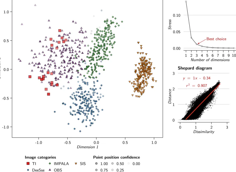
The dissimilarities give a first insight on the relationships be-tween the different realizations (figure10). The training image samples fall within the OBS samples, highlighting the similarity of these images. The samples from the multiple-point methods, DeeSse and IMPALA, are close to the OBS samples, but they do not mix up much. All these images are so not completely similar. Furthermore, the DeeSse and IMPALA samples remain away from the TI samples. The SIS samples are clearly distinct from all the other samples, and are the most distant from the TI samples.
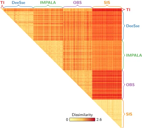
If the confidence of the two-dimensional MDS representa-tion is not high, the heat map confirms those observarepresenta-tions (figure11). The first row shows the dissimilarities between the training image samples and the realization samples. The whitest samples, the OBS ones, are the closest to the TI. The reddest samples, the SIS ones, are the furthest from the TI sam-ples. The DeeSse and IMPALA samples fall in between, and seem equally close to the TI samples. Globally, the differences between all the methods are significant, as highlighted on the MDS.
As observed in the previous section, the training image sam-ples are dissimilar one from the other. It shows the heterogene-ity of static connectivheterogene-ity within the training image. Concerning the realizations, the OBS realizations are also dissimilar one from the other, whereas the SIS realizations are all really close.
-0.4 0.0 0.4 0.8 -1.0 -0.5 0.0 0.5 1.0 Dimension 1 Dimension 2 Image categories TI Analog OBS
Point position confidence 1.00
0.75
0.50 0.25
0.00 MDS representation from the original images
0.00 0.02 0.04 0.06 1 2 3 4 5 6 7 8 9 10 Number of dimensions Stress Scree plot Best choice y = 0.91 x - 0.17 r2 = 0.948 0 1 2 3 0 1 2 3 Dissimilarity Distance Shepard diagram -1 0 1 2 -1 0 1 Dimension 1 Dimension 2
MDS representation from the image samples
y = 1.6 x - 0.45 r2 = 0.773 0 1 2 3 0 1 2 3 Dissimilarity Distance Shepard diagram 0.00 0.05 0.10 0.15 1 2 3 4 5 6 7 8 9 10 Number of dimensions Stress Scree plot Best choice
Figure 7 MDS representations of the dissimilarity matrices for the original images (with corrections of the indicators to cancel the effect of the grid dimensions) and samples (of same size). The scree plot for the original images only displays the stress values up to 10 dimensions on 200 possible. The scree plot for the samples only displays the stress values up to 10 dimensions on 2220 possible.
TI Analog OBS TI Analog OBS Heat map from the image samples TI Analog OBS TI Analog OBS Heat map from the original images Dissimilarity 2.6 0
Figure 8 Heat map representations of the dissimilarity matrices for the original images (with corrections of the indicators to cancel the effect of the grid dimensions) and samples (of same size). Only one triangle of the symmetric matrices is represented.
Both DeeSse and IMPALA realizations are more spaced than the SIS ones, but not as much as the OBS realizations. All this tends toward a variable diversity concerning the static connec-tivity for the different methods in that case study. Going back to the indicators helps to further analyze such behavior. 3.5.2 Analysis of the indicators
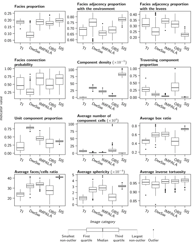
The indicator values for the channels (figure12and14) and levees (figure13and15) differ depending on the category. The differences are more or less clear depending on the indica-tor, whose behavior differs between the two sedimentary body types.
The OBS samples being similar to the training image samples appear also on the indicator values. These values are close – and for many indicators the closest – to the TI values for the channels. That trend is less obvious with the levees, with less close values. But the levee density is the only indicator to be really away from the TI values. All this confirms the close relationship between the training image and the OBS
realizations concerning the static connectivity. It also confirms the visual observations. This is consistent with the use of the same method and parameters to simulate the training image and the OBS realizations.
Similarly, the significant dissimilarity between the SIS sam-ples and the TI samsam-ples also appears on the indicator values. This is obvious on the traversing component proportion or the component density. The high component density means a higher number of connected components compared to the other samples. On the other side, the average number of com-ponent cells is quite low, meaning that most of these numerous components are small. The low traversing component propor-tion signifies that most of these components are not contin-uous enough to represent channels nor levees. Concerning channels, the significant difference between the SIS and TI samples for the shape indicators – number of component cells, box ratio, faces/cells ratio and sphericity – implies that the SIS components do not look like channels. This different shape also appears on the node degrees, with far higher node de-gree values than for the other categories, implying a less linear
Channel Levee 0.125 0.150 0.175 0.00 0.25 0.50 0.75 1.00 F acies p rop o rt ion F ac ies connection p robabilit y
Analog OBS Analog OBS
Image category Indicato r value Median First quartile Third quartile Largest non-outlier Smallest non-outlier Outlier TI value
Figure 9 Box-plots comparing the facies proportions and facies con-nection probability for the TI, some TI analogs and the OBS realiza-tions.
shape. Despite numerous and small components, the channel connection probability remains high. This means that these samples must contain one large component. This component must be traversing, as the traversing component proportion is not equal to zero. All those observations are consistent with the visual inspection of the realization, and confirm a significant difference of static connectivity between the training image and the SIS realizations. Many indicators also display a nar-row range of values. This confirms the low variability between the SIS samples concerning the connectivity, as seen with the dissimilarities.
DeeSse and IMPALA samples have similarities with the SIS samples, especially more, and smaller, connected components than in the training image, as visible on the component density and the number of component cells. Similarly, the shape indica-tors show a significant difference between the TI samples and both the DeeSse and IMPALA samples. The higher sphericity implies in particular less linear shapes for the channels. De-spite being equally dissimilar to the TI samples, the other in-dicators show significant differences between the DeeSse and IMPALA samples and the TI samples. The DeeSse samples have far lower channel and levee proportions. This impacts the fa-cies adjacency, with channels and levees being more adjacent to the mudstone. But the most relevant difference between the DeeSse and IMPALA samples comes from the channel con-nection probability: the concon-nection probability of the DeeSse samples is lower than that of the TI samples, whereas the con-nection probability of the IMPALA samples is higher than that of the TI samples. The IMPALA samples have a behavior
sim-ilar to that of the SIS, with a few large component among smaller ones. But these component connectivity is not com-pletely similar to that of the SIS. This is especially visible on the node degree proportions, with the IMPALA samples having an intermediary behavior between the TI and the SIS sam-ples. On the other side, the DeeSse sample connectivity seems lower. The higher degree two proportion of the DeeSse sam-ples implies few intersections between channels. The higher degree one proportion also implies more discontinuous com-ponents. Again, all of this is consistent with the visual obser-vations: DeeSse channels are clearly identifiable but discon-tinuous, whereas IMPALA channels are less visible, with many intersections.
In this case, the indicators confirm what comes from the dissimilarities: the OBS realizations are the most similar to the training image from a static connectivity perspective. This is consistent with the visual observations, and with the use of the same method to simulate the TI and the OBS realizations. The next section endeavors to compare those results from what can be obtained with multiple-point histograms.
3.6 Comparison with multiple-point histograms
Multiple-point histograms or pattern histograms have made their way as indicators of a realization quality with MPS meth-ods[e.g.,Boisvert et al.,2010,Tan et al.,2014]. We propose here to compare the results obtained with those histograms to the previous results. The histograms are based on a 3× 3 × 3 pattern and are computed on three levels of multi-grids[Tran, 1994], giving three histograms per image. The dissimilarity δbetween two images r and s is adapted from the work ofTan et al.[2014]: δ(Hr, Hs) = 3 X l=1 1 2lDJ S(H r l, H s l) (11)
with Hr and Hsthe sets of three histograms for each image, l
the multi-grid level and DJ S the Jensen–Shannon divergence,
which is the squared Jensen–Shannon distance. A multi-grid level l of 1 corresponds to the finest level and here 3 is the coarsest level. The coarser levels characterize the large-scale behavior of the sedimentary bodies. But they induce a loss of information. This justifies the decreasing weights when the multi-grid level increases. Similarly to the work using multiple-point histograms, the comparison is directly made on the orig-inal images, not on samples.
The observations about the category relationships made with the previous indicators (figure10) remain valid on the MDS representation from the multiple-point histogram (figure16). The training image falls within the OBS realizations. The DeeSse and IMPALA realizations are close from the OBS ones, but with a clear separation. They all remain separated from the TI. Again, the SIS realizations are far away from all the other images, including the TI. The main difference with the previous indicators comes from the variability within a cate-gory. This is especially noticeable with the SIS realizations, which seem to have a significant pattern variability.
The two-dimensional MDS representation is here again a poor representation of the dissimilarities, with a high stress. Only the dissimilarities with the training image are kept to di-rectly study them and compare the ranking between different indicators (figure17). Looking at all the connected component indicators – i.e., all the indicators described in table1– points
-1.0 -0.5 0.0 0.5 1.0 -1.0 -0.5 0.0 0.5 1.0 Dimension 1 Dimension 2 Image categories TI DeeSse IMPALA OBS SIS
Point position confidence 1.00 0.75 0.50 0.25 0.00 MDS representation 0.00 0.05 0.10 1 2 3 4 5 6 7 8 9 10 Number of dimensions Stress Scree plot Best choice y = 1x - 0.34 r2 = 0.907 0 1 2 3 0 1 2 3 Dissimilarity Distance Shepard diagram
Figure 10 MDS representation of the dissimilarities between the samples of the case study generated using SMACOF and validation graphs. The scree plot only displays the stress values up to 10 dimensions on 820 possible.
out the conclusions coming from figure10: the OBS realiza-tions are the closest to the TI, the SIS ones the furthest, and the DeeSse and IMPALA realizations stand in between. Simi-lar rankings come from the shape indicators – i.e., number of component cells, box ratio, faces/cells ratio and sphericity – and the skeleton indicators – i.e., node degree proportions and inverse branch tortuosity.
The multiple-point histograms have also a similar ranking, with a clearer separation between the SIS realizations and the other realizations (figure17, All the multi-grid levels). How-ever, the dissimilarities between the training image and the DeeSse realizations vary significantly between the multi-grid levels. The largest multi-grid level even places the DeeSse realizations closer to the TI than the OBS realizations. This level characterizes the large-scale behavior of the sedimentary bodies. Such ranking is then particularly surprising due ot the presence of discontinuous bodies within the DeeSse real-izations, but neither within the OBS ones nor within the TI. These continuity differences are confirmed by the skeletons, especially the higher proportion of node of degree one inside the grid for the DeeSse than for the OBS realizations.
4 Discussion
The previous section highlights the ability of the method to distinguish realizations by focusing on the static connectivity through the connected components. This section discusses some aspects of the analysis process.
4.1 About the indicators
All the indicators proposed here rely more or less directly on the connected components. Some of them are classical, such as the facies proportion, but as highlighted on figure9the facies proportion is not enough to characterize the static connectiv-ity. New indicators are introduced here compared to previous studies on connected components[Deutsch,1998,De Iaco and Maggio,2011]. Some indicators lead to better characterize the component organization, such as the traversing compo-nent proportion or the compocompo-nent density. Other indicators aim to better characterize the component shape, such as the sphericity. Using skeletons is also a new feature to compare realizations. The node degree proportion appears to give many details about the connectivity. The branch tortuosity has been less useful for the studied case, with a poorer discrimination of the realizations. This is due to the parameterization of the skeletonization, which favor the topology at the cost of the geometry of the skeletons.
TI DeeSse IMPALA OBS SIS TI DeeSse IMPALA OBS SIS Dissimilarity 2.6 0
Figure 11 Heat map representation of the dissimilarity matrix computed based on the samples of the case study.
The use of multiple-point histograms as indicators in a method similar toTan et al.[2014] shows a ranking close to that with the connected component indicators. However, they do not characterize the realizations in the same way. The multiple-point histograms of the finest multi-grid or multi-resolution level characterize in details the shape of the sedimentary bod-ies. The shape indicators are global measures over a whole connected component. As connected components can have variable shapes due to the sedimentary bodies intersections, being able to characterize more finely the component shape is an interesting asset. From this point of view, the multiple-point histograms could bring further information on the connected component shape.
However, the multiple-point histograms do not measure the static connectivity: they compare the patterns between the images, but not really the relationships between the patterns. The study of the coarsest multi-grid or multi-resolution levels attempts to look at the large scale behavior of the sedimentary bodies. But many details are lost in the process, what justi-fies the lower weights for these levels in the dissimilarity from multiple-point histograms[Tan et al.,2014]. And it still not characterizes the static connectivity. From this point of view, the skeletons describe more precisely the large-scale behavior of the components and their connectivity.
4.2 About indicator comparison
As stated in the previous section, a single indicator is not enough to fully characterize the static connectivity. Comparing sev-eral indicators lead to more relevant information about the realizations and how much they differ from the viewpoint of connectivity. Comparing realizations on grid of different di-mensions leads to issues non-addressed by previous studies [Deutsch,1998,De Iaco and Maggio,2011]. A correction on the two most affected indicators is not sufficient to compensate
for different grid dimensions. Sampling the images appears to be more efficient, and also helps to analyze the connectivity heterogeneity within the images. The question of the sampling representativeness remains to be explored.
Using a metric is very useful, because it gathers all the indi-cator values into one dissimilarity value and facilitates the com-parison of the realizations and the analysis.Tan et al.[2014] already used such process with multiple-point histograms. We have applied a similar principle to connected components, gath-ering many indicators into values easier to analyze. The intro-duction of a heterogeneous metric gives the opportunity to gather indicators of different types and further improves the method ability to characterize the realization static connectiv-ity. At the end, the dissimilarities distinguish the realizations from different methods and parameter values, but also char-acterize the static connectivity variability between the realiza-tions of a given method and parameter values.
Adding weights to the indicators in the metric computation means more flexibility for the user. Indeed, not all the indica-tors are significant to all the applications. For instance with a flow simulation purpose, the unit component proportion is not necessarily significant due to a fewer impact of the unit-volume component on the flow than channels. But such weights re-main optional. In the case study, we did not discriminate the indicators with weights, because we wanted to study the in-formation provided by all the indicators on the realizations. Studying the indicator values after the dissimilarities remains essential to better understand the static connectivity of the re-alizations.
4.3 About the skeletonization method
Skeletons enable to better characterize both the geometry and the topology of connected components. However, the skele-tonization method influences both the geometry and the
topol-Facies proportion Facies adjacency proportion with the environment
Facies adjacency proportion with the levees
Facies connection
probability Component density (×10−5)
Traversing component proportion
Unit component proportion Average number of component cells (×104
) Average box ratio
Average faces/cells ratio Average sphericity (×10−4) Average inverse tortuosity 0.05 0.10 0.15 0.20 0.25 0.60 0.65 0.70 0.75 0.80 0.20 0.25 0.30 0.35 0.40 0.25 0.50 0.75 1.00 0 25 50 75 100 0.00 0.25 0.50 0.75 1.00 0.00 0.25 0.50 0.75 0 25 50 75 100 0.2 0.4 0.6 0.8 20 30 40 0 1 2 3 4 5 0.85 0.90 0.95 TI DeeSseIMP
ALAOBS SIS TI DeeSseIMPALAOBS SIS TI DeeSseIMPALAOBS SIS
TI DeeSseIMP
ALAOBS SIS TI DeeSseIMPALAOBS SIS TI DeeSseIMPALAOBS SIS
TI DeeSseIMP
ALAOBS SIS TI DeeSseIMPALAOBS SIS TI DeeSseIMPALAOBS SIS
TI DeeSseIMP
ALAOBS SIS TI DeeSseIMPALAOBS SIS TI DeeSseIMPALAOBS SIS Image category Indicato r value Median First quartile Third quartile Largest non-outlier Smallest non-outlier Outlier
Figure 12 Box-plots comparing the range of indicators computed on the channels for the different categories, except the node degree proportions.
Facies proportion Facies adjacency proportion with the environment
Facies adjacency proportion with the channels
Facies connection
probability Component density (×10−5)
Traversing component proportion
Unit component proportion Average number of
component cells (×104) Average box ratio
Average faces/cells ratio Average sphericity (×10−4) Average inverse tortuosity 0.05 0.10 0.15 0.20 0.65 0.70 0.75 0.80 0.85 0.15 0.20 0.25 0.30 0.35 0.00 0.25 0.50 0.75 0 50 100 150 0.00 0.05 0.10 0.15 0.20 0.2 0.3 0.4 0.5 0.6 0.7 0.0 0.5 1.0 0.45 0.55 0.65 0.75 0.85 38 40 42 2 3 4 0.84 0.88 0.92 0.96 TI DeeSseIMP
ALAOBS SIS TI DeeSseIMPALAOBS SIS TI DeeSseIMPALAOBS SIS
TI DeeSseIMP
ALAOBS SIS TI DeeSseIMPALAOBS SIS TI DeeSseIMPALAOBS SIS
TI DeeSseIMP
ALAOBS SIS TI DeeSseIMPALAOBS SIS TI DeeSseIMPALAOBS SIS
TI DeeSseIMP
ALAOBS SIS TI DeeSseIMPALAOBS SIS TI DeeSseIMPALAOBS SIS Image category Indicato r value Median First quartile Third quartile Largest non-outlier Smallest non-outlier Outlier
TI DeeSse IMPALA OBS SIS 0.0 0.2 0.4 0.6 0.0 0.2 0.4 0.6 0.0 0.2 0.4 0.6 0.0 0.2 0.4 0.6 0.0 0.2 0.4 0.6 112 5 10 15 20 25 30 35 40 45 Node degree Prop ortion
Figure 14 Mean node degree proportions of the channel skeletons for each category. The error bars display the minimum and maximum proportions. The first node degree 1 corresponds to the nodes of de-gree one along a grid border. The second node dede-gree 1 corresponds to the nodes of degree one inside the grid.
ogy of the resulting skeletons. Among all the skeletonization methods,Cornea et al.[2007] distinguish the thinning-based method as the method with the best control on the skeleton connectivity. This section aims at comparing the result of a thinning-based method with the method introduced in section 1.3 based on slicing the grid and computing the connected components, denoted as the based method. The slicing-based method used hereafter is the algorithm defined byLee et al.[1994] and implemented in the geomodeling software Gocad byBarthélemy and Collon-Drouaillet[2013].
The thinning-based method appears to perform better in two dimensions than the slicing-based method. But in three dimensions it tends to generate many small-scale loops (fig-ure18) which perturb both the topology and the geometry of the skeletons. The primary goal of the skeletons is to better characterize the larscale topology – and possibly the ge-ometry – of the connected components. The skeletons from the thinning-based method seem too perturbed to help in that characterization. The slicing-based method on the other side does not necessarily capture those small-scale elements due to the slice size. A large slice size may not capture the small components or all the component irregularities, but this is com-pensated in some way by the other indicators, in particular the shape indicators. Moreover, the thinning-based method tends to generate skeletons with many nodes, which are heavy to manipulate. The slicing-based method does not have the same issue when using quite high slice thicknesses. This aspect can
TI DeeSse IMPALA OBS SIS 0.0 0.2 0.4 0.6 0.0 0.2 0.4 0.6 0.0 0.2 0.4 0.6 0.0 0.2 0.4 0.6 0.0 0.2 0.4 0.6 1 1 2 5 10 15 20 25 Node degree Prop ortion
Figure 15 Mean node degree proportions of the levee skeletons for each category. The error bars display the minimum and maximum proportions. The first node degree 1 corresponds to the nodes of de-gree one along a grid border. The second node dede-gree 1 corresponds to the nodes of degree one inside the grid.
be essential when dealing with several hundreds of images. All this leads to favor the slicing-based method in this work. Some aspects still need to be explored, such as the impact of the slice size. But many more skeletonization methods exist, even if skeletonizing three-dimensional shapes is an open debate. Further work could be done to study other methods and the topology and geometry of resulting skeletons.
4.4 About MDS methods and accuracy
We rely on the Scaling by MAjorizing a COmplicated Function as multidimensional scaling method to represent the dissimi-larities. The SMACOF significantly facilitates the dissimilarity analysis. However, the dimensionality reduction makes the MDS representations imprecise, and the distances between the points tend to differ from the dissimilarities.
Thus, the MDS is not a simple visualization tool and can impact the analysis. This can be illustrated by comparing the MDS representation from the classical scaling (figure19) and that from the SMACOF (figure20) to analyze the dissimilarities between the original realizations and the original training im-age (and not the samples). Normally, the TI should stand from the realizations (see figure7). But the classical scaling puts the TI close from the OBS and IMPALA realizations. Only the point position confidence shows that the TI position is wrong on the representation. The SMACOF representation separates more clearly the TI from the other images.