HAL Id: hal-00867875
https://hal-enac.archives-ouvertes.fr/hal-00867875
Submitted on 30 Sep 2013
HAL is a multi-disciplinary open access
archive for the deposit and dissemination of
sci-entific research documents, whether they are
pub-lished or not. The documents may come from
teaching and research institutions in France or
abroad, or from public or private research centers.
L’archive ouverte pluridisciplinaire HAL, est
destinée au dépôt et à la diffusion de documents
scientifiques de niveau recherche, publiés ou non,
émanant des établissements d’enseignement et de
recherche français ou étrangers, des laboratoires
publics ou privés.
Mining aeronautical data by using visualized driven
rules extraction approach
Gwenael Bothorel, Mathieu Serrurier, Christophe Hurter
To cite this version:
Gwenael Bothorel, Mathieu Serrurier, Christophe Hurter. Mining aeronautical data by using visualized
driven rules extraction approach. ISIATM 2013, 2nd International Conference on Interdisciplinary
Science for Innovative Air Traffic Management, Jul 2013, Toulouse, France. �hal-00867875�
Mining Aeronautical Data by using
Visualized Driven Rules Extraction
Approach
Gwenael BOTHORELa,b, Mathieu SERRURIERband Christophe HURTERb,c
aDSNA, French Air National Service Provider bIRIT, University of Toulouse, France cENAC, University of Toulouse, France
Abstract. Data Mining aims at researching relevant information from a huge vol-ume of data. It can be automatic thanks to algorithms, or manual, for instance by using visual exploration tools. An algorithm finds an exhaustive set of patterns matching specific measures. But, depending on measures thresholds, the volume of extracted information can be greater than the volume of initial data. The second approach is Visual Data Mining which helps the specialist to focus on specific ar-eas of data that may describe interesting patterns. However it is generally limited by the difficulty to tackle a great number of multi dimensional data. In this paper, we propose both methods, by combining the use of algorithms with manual visual data mining. From a scatter plot visualization, an algorithm generates association rules, depending on the visual variables assignments. Thus they have a direct effect on the construction of the found rules. Then we characterize the visualization with the extracted association rules in order to show the involvement of the data in the rules, and then which data can be used for predictions. We illustrate our method on two databases. The first describes one month French air traffic and the second stems from a FAA database about delays and cancellations causes.
Keywords. association rules, Visual Data Mining, characterization of a visualization, aeronautical data
Introduction
Data mining is a knowledge extraction process from a vast volume of data. One purpose of data mining is to find patterns that link this data. It can be done automatically, for instance by algorithms that find association rules such as pizza, chips ⇒ beer. The most famous one is Apriori [1]. The main interest of this approach is its completeness: every association rule that satisfies the constraints of a set of measures will be found. However, the volume of rules can sometimes be greater than the volume of initial data. Indeed the number of possible rules that have to be validated grows exponentially with the number of attributes. Since this number of attributes is usually high, we may have to face a new data mining problem of identifying subsets of relevant rules from a vast volume of rules. The research can be done by using filters over rules a posteriori [10]. However, this approach is time consuming and the tuning of the filters is a tricky issue.
Another data mining process is visual data mining (VDM). It is a manual way of extracting patterns from the visual exploration of data thanks to interactive tools. One major advantage of VDM is its abilities to navigate and interact with a set of user de-fined data. The user is directly involved in the data mining process [9]. Different tech-niques and tools have been the subjects of much research and many publications [15] [9] [14]. The tool can be fully manual like FromDaDy [8] where the user chooses the links between attributes and visual variables and adapts the visualization to his needs, or it can be assisted [7]. The main advantage of the VDM approach is that it is driven by the specialist and it focuses on relevant patterns. However, this can also be a limitation since it is difficult to extract unsuspected new patterns with this kind of approach. It is more adapted for validating the specialist’s hypotheses. Moreover, when the number of attributes is high, it is not always easy to build relevant visualizations.
It is also possible to mine or to explore frequent itemsets or association rules with visual tools in order to manage the large amount of extracted information. For instance, FIsViz [11] shows the frequent itemsets in a 2D space, by linking the items with con-necting edges. Such a tool gives a global graph of the dataset. As for ARVis [3], it shows the rules and associated measures values in a 3D information landscape. Each rule is presented as a combination of a sphere and a cone both at a specific position in the land-scape. Their characteristics give information about the measures. More recently, CBVAR [6] is an integrated Clustering-based Visualizer of Association Rules, which creates rules clusters and visualizes them.
In this paper we propose to combine an algorithmic and a manual approach. Our goal is to characterize a scatter plot visualization with a compact set of association rules extracted with Apriori. The specialist builds a visualization according to a specific issue, based on settings and selections, in order to obtain the best view of the data. Consider-ing that the database is described as a set of values with associated attributes, the user matches the visual variables with data attributes. In agreement with the semiology of graphics [2], we deduce from this visualization a set of constraints for the Apriori algo-rithm. The visualization is also used for discretizing continuous values. What we obtain is a compact set of relevant association rules that focus on the displayed data and on the way it is represented. The main advantages of this visual-driven process are the possi-bility of finding local rules that would be difficult to detect by considering the whole database, and a shorter computation time. Moreover, the number of found rules is always acceptable. We also propose a method in order to emphasize a rule or a set of rules on the visualization.
The first section presents some background and context about the semiology of graphics and the association rules extraction. Then, we formalize the notion of visual-ization. In Section 3, we describe our approach, named Videam platform (VIsual DrivEn dAta Miner), we explain how the visualization can drive the different steps of the data mining process and we discuss the impact of the visualization settings on the complexity and the number of rules generated. Finally we illustrate this concept with two databases. The first one describes one month French air traffic through the description of flights and planes. The second deals with U.S. delays and cancellations causes in 20071.
1. Background and Context
1.1. The Semiology of Graphics
In Semiology of Graphics [2] Bertin writes that the graphics depicts only the relation-ships established among components or elements. The choice of visual variables is a main factor that contributes not only to the readability of the graphics but also to its in-telligibility. The information can belong to three levels of organization: the qualitative (nominal), ordered or quantitative model. The Bertin’s semiology of graphics has been used by Card and Mackinlay in order to characterize visualizations [5] and is the basis of visual data mining tools.
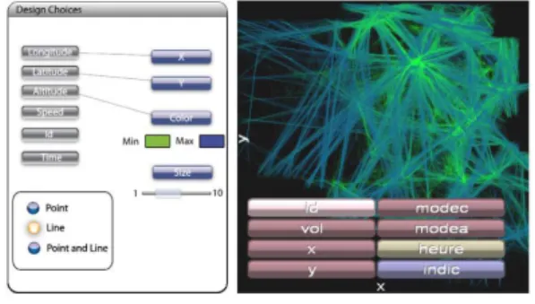
Figure 1. FromDaDy overview.
VDM tools must use a visual description language. Card and Mackinlay’s model is operated in FromDaDy (FROM DAta to DisplaY) [8], the primary purpose of which is the visual exploration of large volumes of data (see Figure 1). FromDaDy employs a simple paradigm to explore multidimensional data based on scatter plots, brushing (i.e. selection), pick and drop (i.e. direct manipulation), juxtaposed views and rapid visual configuration. Together with a mix between design customization and simple interaction based on Boolean operators, users can filter, remove and add data in an incremental manner until they extract a set of relevant data, thus formulating complex queries.
Visual data mining takes into account the expertise of the user. As the specialist knows what he wants, he sets the layout of the HMI to find data, in order to answer a question. In fact, VDM tools are more used to validate hypotheses than to research knowledge. If the tool is configurable like FromDaDy, the settings will be different for another question or with another user.
1.2. Association Rules Extraction
One of the most important way of mining data is the association rules extraction. In this study, we use Apriori algorithm [1]. An association rule establishes a link between attributes which describe the data. The rule A ⇒ B means: if the attributes contained in the head A are present in a tuple, then the attributes of the conclusion B are present too.
Two basic measures are used to find interesting patterns: • Support s(A ⇒ B) = P(AB): probability to have both A and B,
• Confidence c(A ⇒ B) = P(B/A): probability for B to be true considering that A is true.
These measures are initial constraints for Apriori algorithm which guarantees the extraction of all association rules the confidence and support of which are above given thresholds. Many other quality measures, like the lift, are used to evaluate the rules (see [10,4] for a discussion about them). They can report on other properties and are used to filter the rules afterwards. The algorithmic approach allows the user to have the ex-haustive list of association rules, corresponding to preliminary settings. But the number of extracted rules and the duration of the process can be crippling. The complexity of Apriori algorithm isO(nm2m), where n is the number of tuples and m the number of
at-tributes. This shows that the time consumption of Apriori grows linearly with the number of tuples and exponentially with the number of attributes.
The exhaustiveness of this approach contrasts with VDM because of the specialist’s choice on visualization. Thus, Apriori may find rules that are difficult to detect manually with VDM.
2. Formalization of Data Visualization
The Card & Mackinlay’s model describes only the matching from the attributes to the vi-sual variables and the organization of the vivi-sualization. The process from data to what is displayed on the user’s device is not handled by this model. Thus, we formalize data and visual variables in order to understand the links between the data and the visualization. A database is a set of vectors over an attribute space. We nameA = {A1, A2, ..., Am} the
set of the m possible attributes. Each attribute Aican be numerical (integer or decimal)
or nominal (a noun...). Depending on the type, an attribute can be ordered or not. The feature spaceX is the space of the possible vectors over the attributes. Given x ∈ X we have x=< a1, a2, ..., am> where ajis the value for the attribute Aj. A databaseD is a
subset ofX : D = {x1, x2, ..., xn}, where ∀i, xi∈X and n is the number of the data. A
piece of data xi=< ai1, ai2, ..., aim> is a vector where ai jis the value for the attribute Aj
for the piece of data i.
The visualization of data is based on the instantiation of visual variables depending on the attributes values. We nameV = {V1,V2, ...,Vq} the set of q visual variables. Visual
variables can have different types such as the position in space, the size, the color or the transparency of a point. Note that a visual variable can also be ordered (i.e. position, size and alpha) or unordered (i.e. color). A point p is a vector of values over the visual variables. We denoteP the point space. Let us now formally define a visualization. Definition 1 A visualization vis is a mapping fromX to P (i.e. vis : X → P) built as follows:
• vis defines a function fromV to A . We denote map the function which associates with the index of the visual variable and the index of the corresponding attribute. Note that it is not necessarily an injection, because one attribute can be associ-ated with two different visual variables. Each visual variable Viis then associated
to an attribute Amap(i). Thus we obtain a set of q pairs(Vi, Amap(i)).
• for each pair (Vi, Amap(i)) we have a function fi: Amap(i)→ Vi.
Then, given x∈X we have:
So, given a visualization, a displayed point is characterized by its visual variable values, each one corresponding to the value of an attribute. It is not mandatory to use all the possible visual variables (for instance a user can choose to display data only in the plane), and the number of visual variables has to be less than or equals to the number of attributes. Note that the function fi depends on the type of the visual variable and
the attribute. It can be, for instance, a linear projection (when considering numerical attributes a space coordinate visual variable for example), a gradient function, etc. Given a visualization, what can be displayed will depend on the restriction that we apply over the visual variable and to the selection of the user. In this scope, we define the scene.
Definition 2 A scene sc is a subset ofP that determines which point can be effectively displayed on the device. We have:
sc⊆P.
Then, the combination of a visualization vis, applied to a set of data and a scene sc, defines an image that can be displayed on a device (by a projection of the considered point on a plane). In practice the scene depends on the different actions of the user. It can be, for instance, pan & zoom interaction or camera position which restricts the area of the space being considered. Data selection (by brush, bounding box...) is also handled by the scene.
Thus, the Card & Mackinlay’s model is handled by the map function of the visual-ization. The choice of relevant map and f functions can be driven by the semiology of graphics. A visual data mining process consists in a series of visualizations vis1, . . . , visp
related to a series of scenes sc1, . . . , scpwhich corresponds to a series of views and
se-lections in these views. In the following, we are only interested in the characterization of the last visualization and scene.
3. Visual Driven Data Mining
The purpose of our approach is to characterize a visualization of data, built by a spe-cialist with a visual data mining tool, by a set of association rules. In order to answer a question, the specialist elaborates a visualization. Since the number of visual variables is limited, he has to restrict the set of attributes to the most relevant ones (even if the whole database and the whole attributes set are still available). Visual data mining is based on this principle, because the specialist builds the visualization by trying to establish rela-tions between the attributes. In our approach, we assume that the visualization process suggests the type and the shape of association rules that may interest the specialist. The goal is then to extract and to present only these rules by involving the visualization at each step of the Apriori process (see Section 1.2). The advantages of this approach are:
• The visualization drives the whole process through the visual data mining tool. It make it easier to focus the Apriori algorithm on the considered issue without tuning the parameters. Indeed, this last step may be tricky to handle manually. • It is possible to find local rules. If the algorithm is applied to the whole database,
some rules won’t be discovered. For example, the support may be too small with respect to the whole database, or the rule may be only true (high confidence) on a
specific subset of the data. By selecting a part of the database, Apriori will search rules that specifically apply on this subset.
• The processing time is drastically shortened because of the lighter volume of data and attributes. Thus, the computation always remains acceptable for interactive visual tools. This point is critical since the volume of data usually overcomes millions of tuples.
We have developed the Videam platform which is a visual and automatic data mining platform. The rules are generated by Apriori algorithm. The HMI stems from FromDaDy project [8] which was presented in Section 1. The platform takes advantage of GPU optimization in order to have an efficient representation of millions of data. With Videam, the matching is done between attributes and visual variables which are the location, the color, the transparency, and the point size, on an orthographic projection or on a 3D view.
3.1. Data Selection and Discretization
There are two ways of selecting data. They define the perimeter of the scene sc.
• With pan & zoom interaction, only displayed data is selected, regardless to pos-sible occlusions.
• Manual selection of the data in different views by the use of brush or bounding box for instance.
According to his requirements, the user links some attributes with the visual vari-ables. The most obvious selection is to restrict on the data for which visual variable val-ues are in the displayed range. This can be the result of pan and zoom or more simply the restriction that applies to the display device. The second type of selection corresponds to manual data picking. As mentioned in Section 1.1, VDM tools allow manual selection of a subset of the displayed data. It is important to notice that these selections can be made on different views and then can be applied to attributes that are not represented in the final visualization. Then, the Apriori algorithm will be applied on the subsetD0⊆D of the data that is displayed on the visualization. Given a visualization vis and a scene sc, D0is defined as follows:
D0= {x ∈D|vis(x) ∈ sc}.
This selection has some consequences on the Apriori process:
• The pan & zoom and selection tools act as data filters. Since confidence and support are computed on this subset, Apriori can then extract rules that are locally relevant, even if it is not the case for the whole dataset.
• As the number of tuples is decreased, the complexity of Apriori linearly decreases by a range related to the selected data ratio. This is due to the fact that, since D0⊆D, we have n0= |D0| ≤ n.
• If the selection can be simply described, adding this description in the head of a local association rule makes it globally relevant. However, it is not always easy, or even possible, to clearly describe this selection, particularly when it is drawn with a brush tool.
In order to produce association rules, the numerical data has to be discretized. It means that it has to be grouped in different categories corresponding to ranges of values. Since the goal of the approach is to characterize the visualization, we apply automatic clustering to the visual variable range rather than to the initial domain. More formally, it means that, for an attribute Ai, the clustering is made on fi(Ai). Since fican be non-linear
and dynamically modified by the user in VDM algorithm, it ensures that the produced rule will have a meaningful representation in the visualization.
3.2. Frequent Itemsets
If the algorithm is applied to the whole set of attributes, there will be a combinatorial explosion of the number of found association rules and so a high computation time con-sumption. As we have seen previously, the number of visual variables constrains the number of attributes and then the frequent itemsets size and scope. From the user’s point of view, this is not a real limitation since it is cognitively difficult to tackle more than six dimensions at the same time [13]. Then, the Apriori algorithm will only take into consideration a subsetA0⊆A of attributes. Given a visualization vis, A0is defined as follows:
A0= {A
i∈A |∃Vj∈V ,map( j) = i}.
The complexity is reduced by a 2m−|A0|factor and the number of rules is also naturally reduced. Since map is not necessarily an injection and the visual variables are limited to six in our platform, we have |A0| ≤ 6 .
This allows us to only present the rules that are interesting for the user in an accept-able time. This first point is critical since, when considering all the attributes, the number of rules can be very high and even overcoming the number of initial data. The problem of filtering rules is a well known issue in data mining. Sometimes, finding interesting rules can be as difficult as a data mining process. So the choice of the visual variables by the user will determine the data, more precisely the attributes, that are submitted to the algorithm, and then will focus it on the rules that may interest the user. This choice cor-responds to the function map which connects the index of a visual variable to the index of the corresponding attribute.
3.3. Association Rules Restriction
We have seen that the rules are strongly dependant on the selected data and attributes. However the way the matching is done between the visual variables and the attributes, and the way the data is shown (orthographic or 3D projection) may be used to constrain the rules structure. It is based on the organization of visual variables [2]. We have to deal with the question of which attributes will appear in the head and which ones in the conclusion of the association rules. In the following, we assimilate the visual variable to the corresponding attribute.
The visual variables that we presently use are the position, the color, the transparency and the point size. As the dimensions of the plane have the three levels of organization (see 1.1), they are generally the starting point of a visualization. Indeed two components data is usually displayed in a plane. Then the color, for instance, can be added to this
data in a third dimension. The same principle is applied to space visualization. In 2D, the natural basic approach is to represent the ordinate as a function of the abscissa. In 3D, the usual representation is the depth function of the plane. We assume that it is the starting point for our rule representation. In 2D, we consider that the attribute associated with the abscissa is necessarily in the head of the rule. The size, like the dimensions of the plane or of space, has the three levels of organization. Thus the ordinate or the size can be in the head or in the conclusion of the rule. However, they are the two only components that can appear in the conclusion. This can be extended in 3D by considering the plane instead of the abscissa.
The color doesn’t have the three levels of organization, and discriminating with this visual variable is less easy without ordered and quantitative levels. That is why it will only appear in the head of the rules as a complement of the abscissa (or the plane in 3D). In the same way, the transparency, which is not studied in the semiology of graphics, is also difficult to discriminate even if it is an ordered visual variable. So it will only appear in the head too.
Considering the visual variables belonging to the visual variables ensemble VV =
{X,Y, Z, S,C, A} (S is the size, C the color and A the transparency), the association rule restriction, based on the attribute associated with the visual variable, thanks to map func-tion, can now be formalized in Eqs. (1) (planar presentation) and (2) (spatial presenta-tion) depending on the user’s construction of the visualization:
X∧ {Y, S,C, A}∗⇒ {Y, S}+. (1) X∧Y ∧ {Z, S,C, A}∗⇒ {Z, S}+. (2) The ∗ means that zero, one or more values can be used. The + means that at least one value must be used. Note that a visual variable cannot appear twice in the rule.
3.4. Rule Representation
In order to emphasize a rule or a set of rules in the visualization, we propose to compute a new variable em which corresponds to the contribution of a data with respect to the rule. Given an association rule A → B and a piece of data xi, if xidoesn’t satisfy A we have
em(xi) = 0, if xi satisfy A and not B (counter example of the rule) we have em(xi) = 1
and if xisatisfy A and B (example of the rule) we have em(xi) = 2. For the set of rules, an
operator such as the sum or the max can be used. By assigning the variable em to a visual variable (Z for instance) we can emphasize the area where the rule applies and where the rule makes error. If we consider a large set of rules, we obtain a map which emphasizes the areas where we can easily extract information.
4. Illustrations
In this section, we illustrate our approach with two databases:
• The first, which is not public, belongs to the French civil aviation authority. It describes August 2010 French air traffic, with data about flights and planes. • The second is public and stems from a 2007 FAA database. It gives information
4.1. French Air Traffic Database
This database represents about 280 000 flights. It has also been successfully tested on the whole 2010 traffic with more than 2 500 000 flights. A preliminary Apriori calculation, applied to the August traffic, with 16 attributes, support equal to 0.10 and confidence equal to 0.85, gives 2 800 000 rules in 35 minutes. The number of rules is then too high for manual exploration by a specialist.
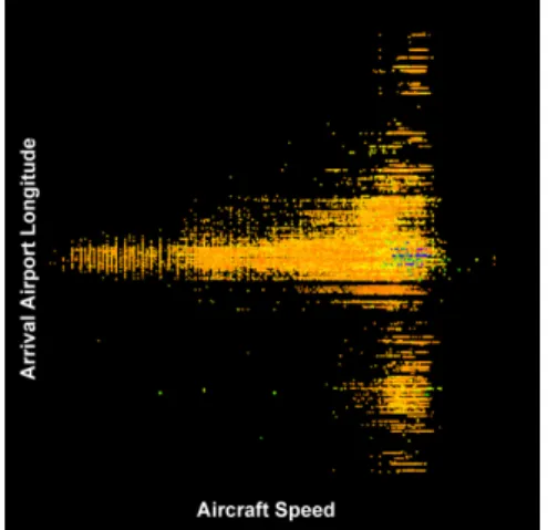
We consider the visualization shown in Figure 2, where we associate the aircraft speed to X , the arrival airport longitude to Y , the altitude to the point size and the depar-ture airport latitude to the color. The Z axis is not assigned.
Figure 2. Visualization of four attributes of French air traffic data in August 2010.
The calculation time of the algorithm applied to this displayed data and attributes is 3 seconds with 41 rules found. We obtain rule such as:
Altitude∈ [360, 380] ⇒ Arrival Longitude ∈ [−35, 3].
It illustrates that an aircraft that flies at a medium altitude goes to Europe. Notice that the discretizations are obtained by clustering over the visual variables and transformed into the initial variables domain.
Figure 3(a) shows the initial data with a perspective view, in order to give an overview of the whole data with an extra dimension. On this picture, we emphasize the rule previously described by assigning the variable em to Z. It allows us to determine immediately where the rule applies (high level of Z) and where it fails (medium level of Z). The low level of Z corresponds to data that is not concerned by the rule.
In Figure 3(b), all the rules have been selected and combined by using sum operator. As it is difficult to have a correct perspective view with many Z values, we use the al pha to point out the amount of rules that applies to the data. Event if it is difficult to render transparency on the snapshot, we can observe that the area where X is high and Y is medium has the highest opacity. It means that a lot of information can be extracted with data mining algorithm in this area. One reason is that it corresponds mainly to local French flights which are the most represented in the database. The biggest points are in the lowest levels of al pha which means that we cannot extract too much information from the aircraft that fly at high altitude.
(a) (b)
Figure 3. Examples of selections. (a) One rule has been selected. The concerned data is raised. (b) All the rules have been selected. The concerned data is enhanced by opacity. The other data is more transparent.
4.2. U.S. Delays and Cancellations Database
The second database contains about 7.5 million flights. Each one is characterized by 29 attributes about actual and scheduled times, values and reasons of delays and cancella-tions, etc. These events are due to carriers, weather, National Aviation System (N.A.S.), security or a previous flight with the same aircraft arriving late. In this illustration, we are interested by the departure delays and how the National Aviation System can be in-volved. As we would like not to take into account the airfields and carriers, we have selected 20 numerical attributes. Their number being large, Apriori calculation takes a very long time because of the numerous combinations. For example, a partial processing of only 100 000 data with 20 attributes takes 26 minutes to find up to 7 attribute rules, with the support threshold equal to 0.1 and the confidence one equal to 0.8. The number of found rules is then more than 2 million.
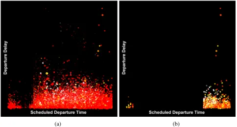
Fig. 4(a) shows a five attribute view of a sample of the database. We have to reduce the number of displayed data to 3 million due to graphic card limitation, but the algorithm is applied to the whole database. We associate the scheduled departure time to X , the delay to Y , the distance to the pointsize, the N.A.S. delay to the color, and the air time to the al pha. The color gradient spreads from red color for lowest values to white color for highest values, with yellow color for middle values. Note that most of the data is concentrated in the bottom of the view because of several long delays. Moreover, the dominant red color of this illustration corresponds to flights with very short or null N.A.S. delays. It shows that it is one of the least common reasons for the delays. The clustering is calculated over each visual variable thanks to k-means[12] algorithm which divides the data space in areas by considering the distances between the points.
Keeping the same support and confidence, the calculation time of the algorithm applied to the whole database and the displayed attributes is 40 seconds with 246 rules found. After having selected the data where the N.A.S. delay does not appear in any association rules, we obtain Fig 4(b). Note that the red data has strongly decreased and that the remaining data is on the right and left ends of the image. It corresponds to
(a) (b)
Figure 4. (a) Illustration of 5 attribute 2007 U.S. delays and cancellations database. (b) After Apriori process-ing, only the data that does not appear in any rule is displayed. It gives information on data about which it is difficult to do predictions.
scheduled departure time from about 6 p.m. until the beginning of the next day. It means that for the flights departing in the evening and during the night, with some N.A.S. delay, we cannot find association rules that link this type of delay with the other displayed data. So, if there are N.A.S. delays in this period, it is difficult to do predictions about them. It is not the same during the day, because we can find rules about short delays. For instance, the support and confidence of the following rule are respectively 0.24 and 0.89.
NAS Delay< 11min, Scheduled Dep. Time ∈ [10 a.m., 1 p.m.] ⇒ Dep. Delay < 26min This second illustration shows another way of exploiting association rules by focus-ing on data that does not appear in these rules. It enhances interestfocus-ing characteristics that could not be detected in the original view because of the large amount of data.
5. Conclusion
In this paper we have presented an automatic approach to characterize a visualization by a set of association rules. We have proposed a formalization of the visualization, from the data structure to the final displayed image, including Card & Mackinlay’s character-ization of the visualcharacter-ization. With Videam platform, the user builds the representation of data depending on his needs, thanks to visual data mining techniques. Then he generates the association rules that correspond to this visualization, according to the semiology of graphics. These rules depend on the displayed and selected data, on the matching be-tween the attributes and the visual variables, and on their organization. Our approach al-lows the user to extract rules that focus on his interest and that may apply only on a sub-set of data rather than the whole data. Moreover, constraints induced by the visualization decrease significantly the computation time of the Apriori algorithm and make the ex-traction of the rule compatible with interactive exploration. We also proposed a method for emphasizing the rules found on the visualization. It allows us to automatically
deter-mine the area of application of a rule. When combining more rules, we obtain a map that represents the amount of information extracted in the area. We apply our approach on two aeronautical databases. On the French one, we show that our approach can be used for finding information on specific variables and area. With the U.S. database we show how we can visually detect data that is not involved in association rules, so about which it is difficult to do predictions.
In the future, it would be interesting to establish a backward link from the rules mining space to the data visualization space, by using an algorithm that would optimize the representation of data. We also have to determine which kind of visual patterns can be effectively characterised by one (or a set of) association rules.
References
[1] Rakesh Agrawal and Ramakrishnan Srikant. Fast algorithms for mining association rules in large databases. In Jorge B. Bocca, Matthias Jarke, and Carlo Zaniolo, editors, VLDB’94, Proceedings of 20th International Conference on Very Large Data Bases, September 12-15, 1994, Chile, pages 487–499. Morgan Kaufmann, 1994.
[2] Jacques Bertin. Semiology of graphics. University of Wisconsin Press, 1983.
[3] Julien Blanchard, Fabrice Guillet, and Henri Briand. A user-driven and quality-oriented visualization for mining association rules. In Proceedings of the Third IEEE International Conference on Data Mining, ICDM ’03, pages 493–, USA, 2003. IEEE Computer Society.
[4] Julien Blanchard, Fabrice Guillet, Henri Briand, and Regis Gras. Assessing rule interestingness with a probabilistic measure of deviation from equilibrium. In Proceedings of the 11th international symposium on Applied Stochastic Models and Data Analysis ASMDA-2005, pages 191–200. ENST, 2005. [5] S. K. Card and J. Mackinlay. The structure of the information visualization design space. In Proceedings
of the 1997 IEEE Symposium on Information Visualization (InfoVis ’97), pages 92–, USA, 1997. IEEE Computer Society.
[6] Olivier Couturier, Tarek Hamrouni, Sadok Ben Yahia, and Engelbert Mephu Nguifo. A scalable asso-ciation rule visualization towards displaying large amounts of knowledge. In Proceedings of the 11th International Conference Information Visualization, pages 657–663, USA, 2007. IEEE Computer Soci-ety.
[7] Abdelheq Et-tahir Guettala, Fatma Bouali, Christiane Guinot, and Gilles Venturini. Premiers r´esultats pour un assistant utilisateur en fouille visuelle de donn´ees. 18`emes Rencontres de la Soci´et´e Franco-phone de Classification, (1986):71–74, 2011.
[8] Christophe Hurter, Benjamin Tissoires, and Stephane Conversy. Fromdady: Spreading aircraft trajecto-ries across views to support iterative quetrajecto-ries. IEEE Transactions on Visualization and Computer Graph-ics, 15:1017–1024, 2009.
[9] Daniel A. Keim. Information visualization and visual data mining. IEEE Transactions on Visualization and Computer Graphics, 8:1–8, January 2002.
[10] Stphane Lallich, O Teytaud, and Elie Prudhomme. Association rules interestingness: measure and vali-dation, pages 251–275. Quality Measures in Data Mining. Springer, Heidelberg, Germany, 2006. [11] Carson Kai-Sang Leung, Pourang P. Irani, and Christopher L. Carmichael. Fisviz: a frequent itemset
visualizer. In Proceedings of the 12th Pacific-Asia conference on Advances in knowledge discovery and data mining, PAKDD’08, pages 644–652, Berlin, Heidelberg, 2008. Springer-Verlag.
[12] J. B. MacQueen. Some methods for classification and analysis of multivariate observations. In L. M. Le Cam and J. Neyman, editors, Proc. of the fifth Berkeley Symposium on Mathematical Statistics and Probability, volume 1, pages 281–297. University of California Press, 1967.
[13] George A. Miller. The magical number seven, plus or minus two: Some limits on our capacity for processing information. The Psychological Review, 63(2):81–97, March 1956.
[14] Simeon J. Simoff, Michael H. B¨ohlen, and Arturas Mazeika, editors. Visual Data Mining: Theory, Techniques and Tools for Visual Analytics. Springer-Verlag, Berlin, Heidelberg, 2008.
[15] Tom Soukup and Ian Davidson. Visual Data Mining: Techniques and Tools for Data Visualization and Mining. John Wiley & Sons, Inc., New York, NY, USA, 1st edition, 2002.