[email protected]
1
BOOTSTRAP
Twitter Bootstrap is the most popular front end frameworks currently. It is sleek
and powerful mobile first front-end framework for faster and easier web
development. It uses HTML, CSS and JavaScript. Using Bootstrap we can create
web projects with ease.
IT is divided into sections such as Bootstrap Basic Structure, Bootstrap CSS,
Bootstrap Layout Components and Bootstrap Plugins.
History
Bootstrap was developed by Mark Otto and Jacob Thornton at Twitter. It was
released as an open source product in August 2011 on GitHub.
Why use Bootstrap?
Mobile first approach: Since Bootstrap 3, the framework consists of
Mobile first styles throughout the entire library instead of in separate files.
Browser Support: It is supported by all popular browsers.
Easy to get started: With just the knowledge of HTML and CSS anyone
can get started with Bootstrap. Also the Bootstrap official site has a good
documentation.
Responsive design: Bootstrap's responsive CSS adjusts to Desktops, Tablets
[email protected]
2
Provides a clean and uniform solution for building an interface for
developers.
It contains beautiful and functional built-in components which are easy to
customize.
It also provides web based customization.
And best of all it is an open source.
What Bootstrap Package Includes?
Scaffolding: Bootstrap provides a basic structure with Grid System, link
styles, background.
CSS: Bootstrap comes with feature of global CSS settings, fundamental
HTML elements styled and enhanced with extensible classes, and an
advanced grid system.
Components: Bootstrap contains over a dozen reusable components built to
provide iconography, dropdowns, navigation, alerts, pop overs, and much
more.
JavaScript Plugins: Bootstrap contains over a dozen custom jQuery
plugins. You can easily include them all, or one by one.
Customize: You can customize Bootstrap's components, LESS variables,
and jQuery plugins to get your very own version.
It is very easy to setup and start using Bootstrap.
Download Bootstrap
You can download the latest version of Bootstrap from
http://getbootstrap.com/
.
When you click on this link, you will get to see a screen as below:
[email protected]
3
Here you can see two buttons:
Download Bootstrap: Clicking this, you can download the precompiled and
minified versions of Bootstrap CSS, JavaScript, and fonts. No
documentation or original source code files are included.
Download Source: Clicking this, you can get the latest Bootstrap LESS and
JavaScript source code directly from GitHub.
If you work with Bootstrap's uncompiled source code, you need to compile the
LESS files to produce usable CSS files. For compiling LESS files into CSS,
Bootstrap officially supports only
Recess
, which is Twitter's CSS hinter based on
less.js
.
File structure
Precompiled Bootstrap
Once the compiled version Bootstrap is downloaded, extract the ZIP file, and you
will see the following file/directory structure:
As you can see there are compiled CSS and JS (bootstrap.*), as well as compiled
and minified CSS and JS (bootstrap.min.*). Fonts from Glyphicons are included,
as is the optional Bootstrap theme.
Bootstrap Source Code
If you downloaded the Bootstrap source code then the file structure would be as
follows:
[email protected]
4
The files under less/, js/, and fonts/ are the source code for Bootstrap CSS,
JS, and icon fonts (respectively).
The dist/ folder includes everything listed in the precompiled download
section above.
docs-assets/, examples/, and all *.html files are Bootstrap documentation.
HTML Template
A basic HTML template using Bootstrap would look like as this:
<!DOCTYPE html>
<html>
<head>
<title>Bootstrap 101 Template</title>
<meta name="viewport" content="width=device-width,
initial-scale=1.0">
<!-- Bootstrap -->
<link href="css/bootstrap.min.css" rel="stylesheet">
<!-- HTML5 Shim and Respond.js IE8 support of HTML5
elements and media
queries -->
<!-- WARNING: Respond.js doesn't work if you view the
page
via file:// -->
<!--[if lt IE 9]>
<script
src="https://oss.maxcdn.com/libs/html5shiv/3.7.0/
html5shiv.js"></script>
<script
src="https://oss.maxcdn.com/libs/respond.js/1.3.0/
respond.min.js"></script>
<![endif]-->
</head>
<body>
[email protected]
5
<h1>Hello, world!</h1>
<!-- jQuery (necessary for Bootstrap's JavaScript
plugins) -->
<script src="https://code.jquery.com/jquery.js"></script>
<!-- Include all compiled plugins (below), or include
individual files
as needed -->
<script src="js/bootstrap.min.js"></script>
</body>
</html>
Here you can see the jquery.js and bootstrap.min.js and bootstrap.min.css files are
included to make a normal HTM file to Bootstrapped Template.
Bootstrap with CSS:
HTML5 doctype
Bootstrap makes use of certain HTML elements and CSS properties that require the use of the
HTML5 doctype. Hence include the below piece of code for HTML5 doctype at the beginning of
all your projects using Bootstrap.
<!DOCTYPE html> <html>
.... </html>
Mobile First
Since Bootstrap 3, Bootstrap has become mobile first. It means mobile first styles can be found
throughout the entire library instead of in separate files. You need to add the viewport meta tag
to the <head> element, to ensure proper rendering and touch zooming on mobile devices.
<meta name="viewport" content="width=device-width, initial-scale=1.0">
width property controls the width of the device. Setting it to device-width will make sure
that it is rendered across various devices (mobiles,desktops,tablets...) properly.
initial-scale=1.0 ensures that when loaded, your web page will be rendered at a 1:1 scale,
and no zooming will be applied out of the box.
Add user-scalable=no to the content attribute to disable zooming capabilities on mobile devices
as shown below. Users are only able to scroll and not zoom with this change, and results in your
site feeling a bit more like a native application.
[email protected]
6
initial-scale=1.0, maximum-scale=1.0, user-scalable=no">
Normally maximum-scale=1.0 is used along with scalable=no. As mentioned above
user-scalable=no may give users an experience more like a native app, hence Bootstrap doesn't
recommend using this attribute.
Responsive images
Bootstrap 3 allows to make the images responsive by adding a class .img-responsive to the
<img> tag. This class applies max-width: 100%; and height: auto; to the image so that it scales
nicely to the parent element.
<img src="..." class="img-responsive" alt="Responsive image">
Typography and links
Bootstrap sets a basic global display (background), typography, and link styles:
Basic Global display: Sets background-color: #fff; on the <body> element.
Typography: Uses the @font-family-base, @font-size-base, and @line-height-base
attributes as the typographic base
Link styles: Sets the global link color via attribute @link-color and apply link underlines
only on :hover.
If you intend to use LESS code, you may find all these within scaffolding.less.
Normalize
Bootstrap uses
Normalize
to establish cross browser consistency.
Normalize.css is a modern, HTML5-ready alternative to CSS resets. It is a small CSS file that
provides better cross-browser consistency in the default styling of HTML elements.
Containers
Use class .container to wrap a page's content and easily center the content's as shown below.
<div class="container"> ...
</div>
[email protected]
7
.container { padding-right: 15px; padding-left: 15px; margin-right: auto; margin-left: auto; }Note that, due to padding and fixed widths, containers are not nestable by default.
Take a look at bootstrap.css file:
@media (min-width: 768px) { .container {
width: 750px; }
Here you can see that CSS has media-queries for containers with width. This helps for applying
responsiveness and within those the container class is modified accordingly to render the grid
system properly.
Bootstrap Grid System
Grid systems are used for creating page layouts through a series of rows and columns that house
your content. Here's how the Bootstrap grid system works:
Rows must be placed within a .container class for proper alignment and padding.
Use rows to create horizontal groups of columns.
Content should be placed within columns, and only columns may be immediate children
of rows.
Predefined grid classes like .row and .col-xs-4 are available for quickly making grid
layouts. LESS mixins can also be used for more semantic layouts.
Columns create gutters (gaps between column content) via padding. That padding is
offset in rows for the first and last column via negative margin on .rows.
Grid columns are created by specifying the number of twelve available columns you wish
to span. For example, three equal columns would use three .col-xs-4.
Media Queries
Media query is a really fancy term for "conditional CSS rule". It simply applies some CSS based
on certain conditions set forth. If those conditions are met, the style is applied.
Media Queries in Bootstrap allow you to move, show and hide content based on viewport size.
Following media queries are used in LESS files to create the key breakpoints in the Bootstrap
grid system.
[email protected]
8
/* Extra small devices (phones, less than 768px) */
/* No media query since this is the default in Bootstrap */ /* Small devices (tablets, 768px and up) */
@media (min-width: @screen-sm-min) { ... } /* Medium devices (desktops, 992px and up) */ @media (min-width: @screen-md-min) { ... }
/* Large devices (large desktops, 1200px and up) */ @media (min-width: @screen-lg-min) { ... }
Occasionally these are expanded to include a max-width to limit CSS to a narrower set of
devices.
@media (max-width: @screen-xs-max) { ... }
@media (min-width: @screen-sm-min) and (max-width: @screen-sm-max) { ... } @media (min-width: @screen-md-min) and (max-width: @screen-md-max) { ... } @media (min-width: @screen-lg-min) { ... }
Media queries have two parts, a device specification and then a size rule. In the above case, the
following rule is set:
Lets consider this line:
@media (min-width: @screen-sm-min) and (max-width: @screen-sm-max) { ... }
For all devices no matter what kind with min-width: @screen-sm-min if the width of the screen
gets smaller than @screen-sm-max, then do something.
Grid options
The following table summarizes aspects of how Bootstrap grid system works across multiple
devices:
Extra small
devices Phones
(<768px)
Small devices
Tablets (≥768px)
Medium devices
Desktops (≥992px)
Large devices
Desktops (≥1200px)
Grid
behavior
Horizontal at all
times
Collapsed to start,
horizontal above
breakpoints
Collapsed to start,
horizontal above
breakpoints
Collapsed to start,
horizontal above
breakpoints
Max
container
width
None (auto)
750px
970px
1170px
Class prefix .col-xs-
.col-sm-
.col-md-
.col-lg-
# of
[email protected]
9
Max
column
width
Auto
60px
78px
95px
Gutter
width
30px
(15px on each
side of a column)
30px
(15px on each side
of a column)
30px
(15px on each side
of a column)
30px
(15px on each side
of a column)
Nestable
Yes
Yes
Yes
Yes
Offsets
Yes
Yes
Yes
Yes
Column
ordering
Yes
Yes
Yes
Yes
Basic Grid Structure
Following is basic structure of Bootstrap grid:
<div class="container"> <div class="row"> <div class="col-*-*"></div> <div class="col-*-*"></div> </div> <div class="row">...</div> </div> <div class="container">....
Responsive column resets
With the four tiers of grids available you're bound to run into issues where, at certain
breakpoints, your columns don't clear quite right as one is taller than the other. To fix that, use a
combination of a class .clearfix and the
responsive utility classes
as shown in the following
example:
<div class="container"> <div class="row" >
<div class="col-xs-6 col-sm-3" style="background-color: #dedef8;
box-shadow: inset 1px -1px 1px #444, inset -1px 1px 1px #444;"> <p>Lorem ipsum dolor sit amet, consectetur adipisicing elit.</p> </div>
<div class="col-xs-6 col-sm-3"
style="background-color: #dedef8;box-shadow:
inset 1px -1px 1px #444, inset -1px 1px 1px #444;">
<p>Lorem ipsum dolor sit amet, consectetur adipisicing elit, sed do eiusmod tempor incididunt ut labore et dolore magna aliqua. Ut enim ad minim veniam, quis nostrud exercitation ullamco laboris nisi ut aliquip ex ea commodo consequat.
</p>
[email protected]
10
eiusmod tempor incididunt ut. </p>
</div>
<div class="clearfix visible-xs"></div> <div class="col-xs-6 col-sm-3"
style="background-color: #dedef8;
box-shadow:inset 1px -1px 1px #444, inset -1px 1px 1px #444;"> <p>Ut enim ad minim veniam, quis nostrud exercitation ullamco laboris nisi ut aliquip ex ea commodo consequat.
</p> </div>
<div class="col-xs-6 col-sm-3"
style="background-color: #dedef8;box-shadow:
inset 1px -1px 1px #444, inset -1px 1px 1px #444;">
<p>Lorem ipsum dolor sit amet, consectetur adipisicing elit, sed do eiusmod tempor incididunt ut labore et dolore magna aliqua. Ut enim ad minim
</p> </div> </div> </div>
Resize your viewport or check it out on your phone for a desired result of this example.
Offset columns
Offsets are a useful feature for more specialized layouts. They can be used to push columns over
for more spacing, for example. The .col-xs=* classes don’t support offsets, but they are easily
replicated by using an empty cell.
To use offsets on large displays, use the .col-md-offset-* classes. These classes increase the left
margin of a column by * columns where * range from 1 to 11.
In the following example we have <div class="col-md-6">..</div>, we will center this using
class .col-md-offset-3.
<div class="container"> <h1>Hello, world!</h1> <div class="row" >
<div class="col-xs-6 col-md-offset-3"
style="background-color: #dedef8;box-shadow:
inset 1px -1px 1px #444, inset -1px 1px 1px #444;"> <p>Lorem ipsum dolor sit amet, consectetur adipisicing elit.
</p> </div> </div> </div>
[email protected]
11
Nesting columns
To nest your content with the default grid, add a new .row and set of .col-md-* columns within
an existing .col-md-* column. Nested rows should include a set of columns that add up to 12.
In the following example, the layout has two columns, with the second one being split into four
boxes over two rows.
<div class="container"> <h1>Hello, world!</h1> <div class="row">
<div class="col-md-3" style="background-color: #dedef8;box-shadow: inset 1px -1px 1px #444, inset -1px 1px 1px #444;">
<h4>First Column</h4>
<p>Lorem ipsum dolor sit amet, consectetur adipisicing elit.</p> </div>
<div class="col-md-9" style="background-color: #dedef8;box-shadow: inset 1px -1px 1px #444, inset -1px 1px 1px #444;">
<h4>Second Column- Split into 4 boxes</h4> <div class="row">
<div class="col-md-6" style="background-color: #B18904; box-shadow: inset 1px -1px 1px #444, inset -1px 1px 1px #444;">
<p>Consectetur art party Tonx culpa semiotics. Pinterest assumenda minim organic quis.
</p> </div>
<div class="col-md-6" style="background-color: #B18904; box-shadow: inset 1px -1px 1px #444, inset -1px 1px 1px #444;">
<p> sed do eiusmod tempor incididunt ut labore et dolore magna aliqua. Ut enim ad minim veniam, quis nostrud exercitation ullamco laboris nisi ut aliquip ex ea commodo consequat. </p>
</div> </div>
<div class="row">
<div class="col-md-6" style="background-color: #B18904; box-shadow: inset 1px -1px 1px #444, inset -1px 1px 1px #444;">
<p>quis nostrud exercitation ullamco laboris nisi ut aliquip ex ea commodo consequat.
</p> </div>
[email protected]
12
<div class="col-md-6" style="background-color: #B18904; box-shadow: inset 1px -1px 1px #444, inset -1px 1px 1px #444;">
<p>Lorem ipsum dolor sit amet, consectetur adipisicing elit, sed do eiusmod tempor incididunt ut labore et dolore magna aliqua. Ut enim ad minim.</p>
</div> </div> </div> </div> </div>
Column ordering
Another nice feature of Bootstrap grid system is that you can easily write the columns in an
order, and show them in another one. You can easily change the order of built-in grid columns
with .col-md-push-* and .col-md-pull-* modifier classes where * range from 1 to 11.
In the following example we have two-columns layout with left column being the narrowest and
acting as sidebar. We will swap the order of these columns using push-* and
.col-md-pull-* classes.
<div class="container"> <h1>Hello, world!</h1> <div class="row">
<p>Before Ordering</p>
<div class="col-md-4" style="background-color: #dedef8;
box-shadow: inset 1px -1px 1px #444, inset -1px 1px 1px #444;"> I am on left
</div>
<div class="col-md-8" style="background-color: #dedef8;
box-shadow: inset 1px -1px 1px #444, inset -1px 1px 1px #444;"> I am on right
</div> </div><br>
<div class="row">
<p>After Ordering</p>
<div class="col-md-4 col-md-push-8" style="background-color: #dedef8; box-shadow: inset 1px -1px 1px #444, inset -1px 1px 1px #444;">
[email protected]
13
I was on left </div>
<div class="col-md-8 col-md-pull-4" style="background-color: #dedef8; box-shadow: inset 1px -1px 1px #444, inset -1px 1px 1px #444;"> I was on right </div> </div> </div>
Bootstrap uses Helvetica Neue, Helvetica, Arial, and sans-serif in its default font stack. Using
typography feature of Bootstrap you can create headings, paragraphs, lists and other inline
elements. Let see each one these in the following sections:
Headings
All HTML headings (h1 to h6) are styled in Bootstrap. An example is as shown below:
<h1>I'm Heading1 h1</h1> <h2>I'm Heading2 h2</h2> <h3>I'm Heading3 h3</h3> <h4>I'm Heading4 h4</h4> <h5>I'm Heading5 h5</h5> <h6>I'm Heading6 h6</h6>
[email protected]
14
Inline Subheadings
To add an inline subheading to any of the headings, simply add <small> around any of the
elements or add .small class and you will get smaller text in a lighter color as shown in the
example below:
<h1>I'm Heading1 h1. <small>I'm secondary Heading1 h1</small></h1> <h2>I'm Heading2 h2. <small>I'm secondary Heading2 h2</small></h2> <h3>I'm Heading3 h3. <small>I'm secondary Heading3 h3</small></h3> <h4>I'm Heading4 h4. <small>I'm secondary Heading4 h4</small></h4> <h5>I'm Heading5 h5. <small>I'm secondary Heading5 h5</small></h5> <h6>I'm Heading6 h6. <small>I'm secondary Heading1 h6</small></h6>
Above code segment with Bootstrap will produce following result:
Lead Body Copy
To add some emphasis to a paragraph, add class="lead". This will give you larger font size,
lighter weight, and a taller line height as in the following example:
<h2>Lead Example</h2>
<p class="lead">This is an example paragraph demonstrating the use of lead body copy. This is an example paragraph demonstrating the use of lead body copy.This is an example paragraph demonstrating the use of lead body
copy.This is an example paragraph demonstrating the use of lead body copy.This is an example paragraph demonstrating the use of lead body copy.</p>
[email protected]
15
HTML's default emphasis tags such as <<small> (sets text at 85% the size of the parent),
<strong> emphasizes a text with heavier font-weight, <em> emphasizes a text in italics.
Bootstrap offers a few classes that can be used to provide emphasis on texts as seen in the
following example:
<small>This content is within <small> tag</small><br> <strong>This content is within <strong> tag</strong><br>
<em>This content is within <em> tag and is rendered as italics</em><br> <p class="text-left">Left aligned text.</p>
<p class="text-center">Center aligned text.</p> <p class="text-right">Right aligned text.</p> <p class="text-muted">This content is muted</p>
<p class="text-primary">This content carries a warning class</p> <p class="text-success">This content carries a success class</p> <p class="text-info">This content carries a info class</p>
<p class="text-warning">This content carries a warning class</p> <p class="text-danger">This content carries a danger class</p>
Abbreviations
The HTML element provides markup for abbreviations or acronyms, like WWW or HTTP.
Bootstrap styles <abbr> elements with a light dotted border along the bottom and reveals the full
text on hover (as long as you add that text to the <abbr> title attribute). To get a a slightly
smaller font size Add .initialism to <abbr>.
<abbr title="World Wide Web">WWW</abbr><br>
<abbr title="Real Simple Syndication" class="initialism">RSS</abbr>
[email protected]
16
Using <address> tag you can display the contact information on your web page. Since the
<address> defaults to display:block; you’ll need to use
tags to add line breaks to the enclosed address text.
<address>
<strong>Some Company, Inc.</strong><br> 007 street<br>
Some City, State XXXXX<br>
<abbr title="Phone">P:</abbr> (123) 456-7890 </address> <address> <strong>Full Name</strong><br> <a href="mailto:#">[email protected]</a> </address>
Blockquotes
You can use the default <blockquote> around any HTML text. Other options include, adding a
<small> tag for identifying the source of the quote and right-aligning the blockquote using class
.pull-right. The following example demonstrates all these features:
<blockquote><p>This is a default blockquote example. This is a default blockquote example. This is a default blockquote example.This is a default blockquote example. This is a default blockquote example.</p></blockquote>
<blockquote>This is a blockquote with a source title.<small>Someone famous in <cite title="Source Title">Source Title</cite></small></blockquote>
<blockquote class="pull-right">This is a blockquote aligned to the right.<small>Someone famous in <cite title="Source Title">Source Title</cite></small></blockquote>
[email protected]
17
Lists
Bootstrap supports ordered lists, unordered lists, and definition lists.
Ordered lists: An ordered list is a list that falls in some sort of sequential order and is
prefaced by numbers.
Unordered lists: An unordered list is a list that doesn’t have any particular order and is
traditionally styled with bullets. If you do not want the bullets to appear then you can
remove the styling by using the class .list-unstyled. You can also place all list items on a
single line using the class .list-inline.
Definition lists: In this type of list, each list item can consist of both the <dt> and the
<dd> elements. <dt> stands for definition term, and like a dictionary, this is the term (or
phrase) that is being defined. Subsequently, the <dd> is the definition of the <dt>.
You can make terms and descriptions in <dl> line up side-by-side using class
dl-horizontal.
The following example demonstrates each of these types:
<h4>Example of Ordered List</h4> <ol> <li>Item 1</li> <li>Item 2</li> <li>Item 3</li> <li>Item 4</li> </ol>
<h4>Example of UnOrdered List</h4> <ul> <li>Item 1</li> <li>Item 2</li> <li>Item 3</li> <li>Item 4</li> </ul>
<h4>Example of Unstyled List</h4> <ul class="list-unstyled"> <li>Item 1</li> <li>Item 2</li> <li>Item 3</li> <li>Item 4</li> </ul>
<h4>Example of Inline List</h4> <ul class="list-inline"> <li>Item 1</li> <li>Item 2</li> <li>Item 3</li> <li>Item 4</li> </ul>
<h4>Example of Definition List</h4> <dl>
<dt>Description 1</dt> <dd>Item 1</dd>
[email protected]
18
<dd>Item 2</dd> </dl>
<h4>Example of Horizontal Definition List</h4> <dl class="dl-horizontal"> <dt>Description 1</dt> <dd>Item 1</dd> <dt>Description 2</dt> <dd>Item 2</dd> </dl>
[email protected]
19
The first is the <code> tag. If you are going to be displaying code inline, you should use
the <code> tag.
Second is the <pre> tag. If the code needs to be displayed as a standalone block element
or if it has multiple lines, then you should use the <pre> tag.
Make sure that when you use the <pre> and <code> tags, you use the unicode variants for the
opening and closing tags: < and >.
Let us see an example below:
<p><code><header></code> is wrapped as an inline element.</p> <p>To display code as a standalone block element use <pre> tag as: <pre>
<article>
<h1>Article Heading</h1> </article>
</pre>
Bootstrap provides a clean layout for building tables. Some of the table elements supported by
Bootstrap are:
Tag
Description
<table>
Wrapping element for displaying data in a tabular format
<thead> Container element for table header rows (<tr>) to label table columns
<tbody> Container element for table rows (<tr>) in the body of the table
<tr>
Container element for a set of table cells (<td> or <th>) that appears on a single row
<td>
Default table cell
<th>
Special table cell for column (or row, depending on scope and placement) labels.
Must be used within a <thead>
<caption> Description or summary of what the table holds.
Basic Table
If you want a nice, basic table style with just some light padding and horizontal dividers, add the
base class of .table to any table as shown in the following example:
[email protected]
20
<caption>Basic Table Layout</caption> <thead> <tr> <th>Name</th> <th>City</th> </tr> </thead> <tbody> <tr> <td>Tanmay</td> <td>Bangalore</td> </tr> <tr> <td>Sachin</td> <td>Mumbai</td> </tr> </tbody> </table>
Optional Table Classes
Along with the base table markup and the .table class, there are a few additional classes that you
can use to style the markup. Following sections will give you a glimpse of all these classes.
Striped Table
By adding the .table-striped class, you will get stripes on rows within the <tbody> as seen in the
following example:
<table class="table table-striped">
<caption>Striped Table Layout</caption> <thead> <tr> <th>Name</th> <th>City</th> <th>Pincode</th> </tr> </thead> <tbody> <tr> <td>Tanmay</td> <td>Bangalore</td> <td>560001</td> </tr> <tr> <td>Sachin</td>
[email protected]
21
<td>Mumbai</td> <td>400003</td> </tr> <tr> <td>Uma</td> <td>Pune</td> <td>411027</td> </tr> </tbody> </table>Bordered Table
By adding the .table-bordered class, you will get borders surrounding every element and
rounded corners around the entire table as seen in the following example:
<table class="table table-bordered">
<caption>Bordered Table Layout</caption> <thead> <tr> <th>Name</th> <th>City</th> <th>Pincode</th> </tr> </thead> <tbody> <tr> <td>Tanmay</td> <td>Bangalore</td> <td>560001</td> </tr> <tr> <td>Sachin</td> <td>Mumbai</td> <td>400003</td> </tr> <tr> <td>Uma</td> <td>Pune</td> <td>411027</td> </tr> </tbody> </table>
[email protected]
22
Hover Table
By adding the .table-hover class, a light gray background will be added to rows while the cursor
hovers over them, as seen in the following example:
<table class="table table-hover">
<caption>Hover Table Layout</caption> <thead> <tr> <th>Name</th> <th>City</th> <th>Pincode</th> </tr> </thead> <tbody> <tr> <td>Tanmay</td> <td>Bangalore</td> <td>560001</td> </tr> <tr> <td>Sachin</td> <td>Mumbai</td> <td>400003</td> </tr> <tr> <td>Uma</td> <td>Pune</td> <td>411027</td> </tr> </tbody> </table>
Condensed Table
[email protected]
23
By adding the .table-condensed class, row padding is cut in half to condense the table. as seen in
the following example. This is useful if you want denser information.
<table class="table table-condensed">
<caption>Condensed Table Layout</caption> <thead> <tr> <th>Name</th> <th>City</th> <th>Pincode</th> </tr> </thead> <tbody> <tr> <td>Tanmay</td> <td>Bangalore</td> <td>560001</td> </tr> <tr> <td>Sachin</td> <td>Mumbai</td> <td>400003</td> </tr> <tr> <td>Uma</td> <td>Pune</td> <td>411027</td> </tr> </tbody> </table>
Contextual classes
The Contextual classes shown in following table will allow you to change the background color
of your table rows or individual cells.
Class
Description
.active Applies the hover color to a particular row or cell
.success Indicates a successful or positive action
.warning Indicates a warning that might need attention
.danger Indicates a dangerous or potentially negative action
These classes can be applied to <tr>, <td> or <th>.
[email protected]
24
<table class="table">
<caption>Contextual Table Layout</caption> <thead> <tr> <th>Product</th> <th>Payment Date</th> <th>Status</th> </tr> </thead> <tbody> <tr class="active"> <td>Product1</td> <td>23/11/2013</td> <td>Pending</td> </tr> <tr class="success"> <td>Product2</td> <td>10/11/2013</td> <td>Delivered</td> </tr> <tr class="warning"> <td>Product3</td> <td>20/10/2013</td>
<td>In Call to confirm</td> </tr> <tr class="danger"> <td>Product4</td> <td>20/10/2013</td> <td>Declined</td> </tr> </tbody> </table>
Responsive tables
By wrapping any .table in .table-responsive class, you will make the table scroll horizontally up
to small devices (under 768px). When viewing on anything larger than 768px wide, you will not
see any difference in these tables.
<div class="table-responsive"> <table class="table">
<caption>Responsive Table Layout</caption> <thead>
[email protected]
25
<tr> <th>Product</th> <th>Payment Date</th> <th>Status</th> </tr> </thead> <tbody> <tr> <td>Product1</td> <td>23/11/2013</td> <td>Pending</td> </tr> <tr> <td>Product2</td> <td>10/11/2013</td> <td>Delivered</td> </tr> <tr> <td>Product3</td> <td>20/10/2013</td><td>In Call to confirm</td> </tr> <tr> <td>Product4</td> <td>20/10/2013</td> <td>Declined</td> </tr> </tbody> </table> </div>
Bootstrap makes it easy with the simple HTML markup and extended classes for different styles
of forms.
Form Layout
Bootstrap provides you with following types of form layouts:
Vertical (default) form
[email protected]
26
Horizontal form
Vertical or basic form
The basic form structure comes with Bootstrap; individual form controls automatically receive
some global styling. To create a basic form do the following:
Add a role form to the parent <form> element.
Wrap labels and controls in a <div> with class .form-group. This is needed for optimum
spacing.
Add a class of .form-control to all textual <input>, <textarea>, and <select> elements.
<form role="form">
<div class="form-group">
<label for="name">Name</label>
<input type="text" class="form-control" id="name" placeholder="Enter Name">
</div>
<div class="form-group">
<label for="inputfile">File input</label> <input type="file" id="inputfile">
<p class="help-block">Example block-level help text here.</p> </div>
<div class="checkbox"> <label>
<input type="checkbox"> Check me out </label>
</div>
<button type="submit" class="btn btn-default">Submit</button> </form>
Inline form
To create a form where all of the elements are inline, left aligned and labels are alongside, add
the class .form-inline to the <form> tag.
<form class="form-inline" role="form"> <div class="form-group">
[email protected]
27
<input type="text" class="form-control" id="name" placeholder="Enter Name">
</div>
<div class="form-group">
<label class="sr-only" for="inputfile">File input</label> <input type="file" id="inputfile">
</div>
<div class="checkbox"> <label>
<input type="checkbox"> Check me out </label>
</div>
<button type="submit" class="btn btn-default">Submit</button> </form>
By default Inputs, selects, and textareas have 100% width in Bootstrap. You need
to set a width on the form controls when using inline form.
Using the class .sr-only you can hide the labels of the inline forms.
Horizontal form
Horizontal forms stands apart from the others not only in the amount of markup, but also in the
presentation of the form. To create a form that uses the horizontal layout, do the following:
Add a class of .form-horizontal to the parent <form> element.
Wrap labels and controls in a <div> with class .form-group.
Add a class of .control-label to the labels.
<form class="form-horizontal" role="form"> <div class="form-group">
<label for="firstname" class="col-sm-2 control-label">First Name</label>
<div class="col-sm-10">
<input type="text" class="form-control" id="firstname" placeholder="Enter First Name">
</div> </div>
<div class="form-group">
<label for="lastname" class="col-sm-2 control-label">Last Name</label> <div class="col-sm-10">
<input type="text" class="form-control" id="lastname" placeholder="Enter Last Name">
</div> </div>
<div class="form-group">
<div class="col-sm-offset-2 col-sm-10"> <div class="checkbox">
<label>
<input type="checkbox"> Remember me </label>
[email protected]
28
</div> </div> </div>
<div class="form-group">
<div class="col-sm-offset-2 col-sm-10">
<button type="submit" class="btn btn-default">Sign in</button> </div>
</div> </form>
Supported Form Controls
Bootstrap natively supports the most common form controls mainly input, textarea, checkbox,
radio, and select.
Inputs
The most common form text field is the input—this is where users will enter most of the
essential form data. Bootstrap offers support for all native HTML5 input types: text, password,
datetime, datetime-local, date, month, time, week, number, email, url, search, tel, and color.
Proper type declaration is required to make Inputs fully styled.
<form role="form">
<div class="form-group">
<label for="name">Label</label>
<input type="text" class="form-control" placeholder="Text input"> </div>
</form>
Textarea
The textarea is used when you need multiple lines of input. Change rows attribute as necessary
(fewer rows = smaller box, more rows = bigger box).
<form role="form">
<div class="form-group">
<label for="name">Text Area</label>
<textarea class="form-control" rows="3"></textarea> </div>
[email protected]
29
</form>
CheckBoxes and Radios
Checkboxes and radio buttons are great when you want users to choose from a list of preset
options.
When building a form, use checkbox if you want the user to select any number of options
from a list. Use radio if you want to limit the user to just one selection.
Use .checkbox-inline or .radio-inline class to a series of checkboxes or radios for controls
appear on the same line.
The following example demonstrates both (default and inline) types:
<label for="name">Example of Default Checkbox and radio button </label> <div class="checkbox">
<label><input type="checkbox" value="">Option 1</label> </div>
<div class="checkbox">
<label><input type="checkbox" value="">Option 2</label> </div>
<div class="radio"> <label>
<input type="radio" name="optionsRadios" id="optionsRadios1" value="option1" checked> Option 1
</label> </div>
<div class="radio"> <label>
<input type="radio" name="optionsRadios" id="optionsRadios2" value="option2">
Option 2 - selecting it will deselect option 1 </label>
</div>
<label for="name">Example of Inline Checkbox and radio button </label> <div>
<label class="checkbox-inline">
<input type="checkbox" id="inlineCheckbox1" value="option1"> Option 1 </label>
<label class="checkbox-inline">
<input type="checkbox" id="inlineCheckbox2" value="option2"> Option 2 </label>
<label class="checkbox-inline">
<input type="checkbox" id="inlineCheckbox3" value="option3"> Option 3 </label>
<label class="checkbox-inline">
<input type="radio" name="optionsRadiosinline" id="optionsRadios3" value="option1" checked> Option 1
[email protected]
30
</label>
<label class="checkbox-inline">
<input type="radio" name="optionsRadiosinline" id="optionsRadios4" value="option2"> Option 2
</label> </div>
Selects
A select is used when you want to allow the user to pick from multiple options, but by default it
only allows one.
Use <select> for list options with which the user is familiar, such as states or numbers.
Use multiple="multiple" to allow the user to select more than one option.
The following example demonstrates both (select and multiple) types:
<form role="form">
<div class="form-group">
<label for="name">Select list</label> <select class="form-control"> <option>1</option> <option>2</option> <option>3</option> <option>4</option> <option>5</option> </select>
<label for="name">Mutiple Select list</label> <select multiple class="form-control">
<option>1</option> <option>2</option> <option>3</option> <option>4</option> <option>5</option> </select> </div> </form>
[email protected]
31
Static control
Use the class .form-control-static on a <p>, when you need to place plain text next to a form
label within a horizontal form.
<form class="form-horizontal" role="form"> <div class="form-group">
<label class="col-sm-2 control-label">Email</label> <div class="col-sm-10">
<p class="form-control-static">[email protected]</p> </div>
</div>
<div class="form-group">
<label for="inputPassword" class="col-sm-2 control-label">Password</label>
<div class="col-sm-10">
<input type="password" class="form-control" id="inputPassword" placeholder="Password">
</div> </div> </form>
Form Control States
In addition to the :focus (i.e., a user clicks into the input or tabs onto it) state, Bootstrap offers
styling for disabled inputs and classes for form validation.
Input focus
When an input receives :focus, the outline of the input is removed and a box-shadow is applied.
Disabled inputs
If you need to disable an input, simply adding the disabled attribute will not only disable it; it
will also change the styling and the mouse cursor when the cursor hovers over the element.
Disabled fieldsets
Add the disabled attribute to a <fieldset> to disable all the controls within the <fieldset> at once.
Validation states
Bootstrap includes validation styles for error, warning, and success messages. To use, simply add
the appropriate class (.has-warning, .has-error, or .has-success) to the parent element.
[email protected]
32
Following example demonstrates all the form control states:
<form class="form-horizontal" role="form"> <div class="form-group">
<label class="col-sm-2 control-label">Focused</label> <div class="col-sm-10">
<input class="form-control" id="focusedInput" type="text" value="This is focused...">
</div> </div>
<div class="form-group">
<label for="inputPassword" class="col-sm-2 control-label"> Disabled
</label>
<div class="col-sm-10">
<input class="form-control" id="disabledInput" type="text" placeholder="Disabled input here..." disabled>
</div> </div>
<fieldset disabled>
<div class="form-group">
<label for="disabledTextInput" class="col-sm-2 control-label"> Disabled input (Fieldset disabled)
</label>
<div class="col-sm-10">
<input type="text" id="disabledTextInput" class="form-control" placeholder="Disabled input">
</div> </div>
<div class="form-group">
<label for="disabledSelect" class="col-sm-2 control-label"> Disabled select menu (Fieldset disabled)
</label>
<div class="col-sm-10">
<select id="disabledSelect" class="form-control"> <option>Disabled select</option>
</select> </div>
</div> </fieldset>
<div class="form-group has-success">
<label class="col-sm-2 control-label" for="inputSuccess"> Input with success
</label>
<div class="col-sm-10">
<input type="text" class="form-control" id="inputSuccess"> </div>
</div>
<div class="form-group has-warning">
<label class="col-sm-2 control-label" for="inputWarning"> Input with warning
</label>
<div class="col-sm-10">
<input type="text" class="form-control" id="inputWarning"> </div>
[email protected]
33
<div class="form-group has-error">
<label class="col-sm-2 control-label" for="inputError"> Input with error
</label>
<div class="col-sm-10">
<input type="text" class="form-control" id="inputError"> </div>
</div> </form>
Form Control Sizing
You can set heights and widths of forms using classes like .input-lg and .col-lg-* respectively.
Following example demonstrates this:
<form role="form">
<div class="form-group">
<input class="form-control input-lg" type="text" placeholder=".input-lg">
</div>
<div class="form-group">
<input class="form-control" type="text" placeholder="Default input"> </div>
<div class="form-group">
<input class="form-control input-sm" type="text" placeholder=".input-sm">
</div>
<div class="form-group"> </div>
<div class="form-group">
<select class="form-control input-lg"> <option value="">.input-lg</option> </select>
</div>
<div class="form-group">
<select class="form-control">
<option value="">Default select</option> </select>
[email protected]
34
</div>
<div class="form-group">
<select class="form-control input-sm"> <option value="">.input-sm</option> </select>
</div>
<div class="row">
<div class="col-lg-2">
<input type="text" class="form-control" placeholder=".col-lg-2"> </div>
<div class="col-lg-3">
<input type="text" class="form-control" placeholder=".col-lg-3"> </div>
<div class="col-lg-4">
<input type="text" class="form-control" placeholder=".col-lg-4"> </div>
</div> </form>
Help Text
Bootstrap form controls can have a block level help text that flows with the inputs. To add a full
width block of content, use the .help-block after the <input>. Following example demonstrates
this:
<form role="form">
<span>Example of Help Text</span>
<input class="form-control" type="text" placeholder=""> <span class="help-block">A longer block of help text that breaks onto a new line and may extend beyond one line.</span> </form>
[email protected]
35
This chapter will discuss about how to use Bootstrap button with examples. Anything that is
given a class of .btn will inherit the default look of a gray button with rounded corners. However
Bootstrap provides some options to style buttons, which are summarized in the following table:
Class
Description
btn
Default/ Standard button.
btn-primary
Provides extra visual weight and identifies the primary action in a set of
buttons.
btn-success
Indicates a successful or positive action.
btn-info
Contextual button for informational alert messages.
btn-warning
Indicates caution should be taken with this action.
btn-danger
Indicates a dangerous or potentially negative action.
btn-link
Deemphasize a button by making it look like a link while maintaining button
behavior.
Following example demonstrates all the above button classes:
<!-- Standard button -->
<button type="button" class="btn btn-default">Default Button</button>
<!-- Provides extra visual weight and identifies the primary action in a set of buttons -->
<button type="button" class="btn btn-primary">Primary Button</button> <!-- Indicates a successful or positive action -->
<button type="button" class="btn btn-success">Success Button</button> <!-- Contextual button for informational alert messages -->
<button type="button" class="btn btn-info">Info Button</button> <!-- Indicates caution should be taken with this action -->
<button type="button" class="btn btn-warning">Warning Button</button> <!-- Indicates a dangerous or potentially negative action -->
<button type="button" class="btn btn-danger">Danger Button</button>
<!-- Deemphasize a button by making it look like a link while maintaining button behavior -->
<button type="button" class="btn btn-link">Link Button</button>
Button Size
[email protected]
36
Class
Description
.btn-lg
This makes button size large.
.btn-sm
This makes button size small.
.btn-xs
This makes button size with extra small.
.btn-block
This creates block level buttons—those that span the full width of a parent.
The following example demonstrates this:
<p>
<button type="button" class="btn btn-primary btn-lg"> Large Primary button
</button>
<button type="button" class="btn btn-default btn-lg" >Large button
</button> </p>
<p>
<button type="button" class="btn btn-primary"> Default size Primary button
</button>
<button type="button" class="btn btn-default"> Default size button
</button> </p>
<p>
<button type="button" class="btn btn-primary btn-sm"> Small Primary button
</button>
<button type="button" class="btn btn-default btn-sm"> Small button
</button> </p>
<p>
<button type="button" class="btn btn-primary btn-xs"> Extra small Primary button
</button>
<button type="button" class="btn btn-default btn-xs"> Extra small button
</button> </p>
<p>
<button type="button" class="btn btn-primary btn-lg btn-block"> Block level Primary button
</button>
<button type="button" class="btn btn-default btn-lg btn-block"> Block level button
</button> </p>
[email protected]
37
Button State
Bootstrap provides classes which allow you change the state of buttons say active, disabled etc
each of these are discussed in the following sections:
Active State
Buttons will appear pressed (with a darker background, darker border, and inset shadow) when
active. The following table summarizes classes used to make button element and anchor element
active:
Element
Class
Button element Use .active class to show that it is activated..
Anchor element Use .active class to <a> buttons to show that it is activated.
The following example demonstrates this:
<p>
<button type="button" class="btn btn-default btn-lg "> Default Button
</button>
<button type="button" class="btn btn-default btn-lg active"> Active Button
</button> </p>
<p>
<button type="button" class="btn btn-primary btn-lg "> Primary button
</button>
<button type="button" class="btn btn-primary btn-lg active"> Active Primary button
</button> </p>
[email protected]
38
Disabled State
When you disable a button, it will fade in color by 50%, and lose the gradient.
The following table summarizes classes used to make button element and anchor element
disabled:
Element
Class
Button element
Add the disabled attribute to <button> buttons.
Anchor element
Add the disabled class to <a> buttons.
Note: This class will only change the <a>'s appearance, not its
functionality. You need to use custom JavaScript to disable links here.
The following example demonstrates this:
<p>
<button type="button" class="btn btn-default btn-lg"> Default Button
</button>
<button type="button" class="btn btn-default btn-lg" disabled="disabled"> Disabled Button
</button> </p>
<p>
<button type="button" class="btn btn-primary btn-lg "> Primary button
</button>
<button type="button" class="btn btn-primary btn-lg" disabled="disabled"> Disabled Primary button
</button> </p>
<p>
<a href="#" class="btn btn-default btn-lg" role="button"> Link
</a>
<a href="#" class="btn btn-default btn-lg disabled" role="button"> Disabled Link
[email protected]
39
</p> <p>
<a href="#" class="btn btn-primary btn-lg" role="button"> Primary link
</a>
<a href="#" class="btn btn-primary btn-lg disabled" role="button"> Disabled Primary link
</a> </p>
Button Tags
You may use button classes with <a>, <button>, or <input> element. But it is recommended that
you use it with <button> elements mostly to avoid cross browser inconsistency issues.
The following example demonstrates this:
<a class="btn btn-default" href="#" role="button">Link</a> <button class="btn btn-default" type="submit">Button</button> <input class="btn btn-default" type="button" value="Input"> <input class="btn btn-default" type="submit" value="Submit">
In this chapter we will learn Bootstrap support for images. Bootstrap provides three classes that
can be used to apply some simple styles to images:
.img-rounded: adds border-radius:6px to give the image rounded corners.
.img-circle: makes the entire image round by adding border-radius:500px.
.img-thumbnail: adds a bit of padding and a gray border:
The following example demonstrates this:
<img src="/bootstrap/images/download.png" class="img-rounded"> <img src="/bootstrap/images/download.png" class="img-circle"> <img src="/bootstrap/images/download.png" class="img-thumbnail">
[email protected]
40
Bootstrap Helper Classes
This chapter discusses some of the helper classes in Bootstrap that might come in handy.
Close icon
Use the generic close icon for dismissing content like modals and alerts. Use the class close to
get the close icon.
<p>Close Icon Example
<button type="button" class="close" aria-hidden="true"> ×
</button> </p>
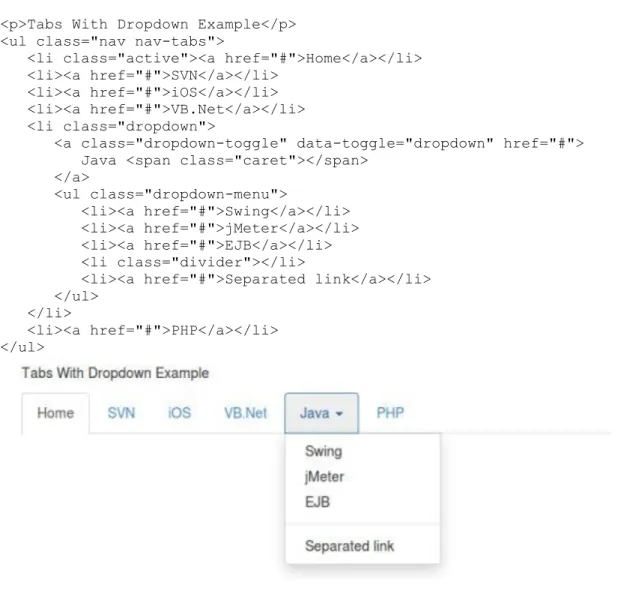
Carets
Use carets to indicate dropdown functionality and direction. To get this functionality use the
class caret with a <span> element.
<p>Caret Example
<span class="caret"></span> </p>
Quick floats
You can float an element to the left or right with class pull-left or pull-right respectively.
Following example demonstrates this.
<div class="pull-left"> Quick Float to left </div>
<div class="pull-right"> Quick Float to right </div>