Developing a Gene Model for Simulations that
Incorporates Multi-Species Conservation
by
Brendan F. Liu
S.B., Massachusetts Institue of Technology(2013)
Submitted to the Department of Electrical Engineering and Computer Science
in partial fulfillment of the requirements for the degree of
Master of Enginerring in Electrical Engineering and Computer Science and
Engineering
at the
MASSACHU'sL1TI
EOF TECHNOLOGY
MASSACHUSETTS INSTITUTE OF TECHNOLOGY
R 1 521
June 2014
LIBRARIES
@
Massachusetts Institute of Technology 2014. All rights reserved.
Signature redacted
A uthor ...
...
Department of Electrical Engineering and Computer Science
May 23,2014
Signature redacted
C ertified by .. .. ...
David Altshuler
Professor of Biology(Adjunct Professor)
Thesis Supervisor
Signature redacted
A ccepted by ...
...
6'
Albert R. Meyer
Chairman, Masters of Engineering Thesis Committee
Developing a Gene Model for Simulations that Incorporates
Multi-Species Conservation
by
Brendan F. Liu
Submitted to the Department of Electrical Engineering and Computer Science on May 23,2014, in partial fulfillment of the
requirements for the degree of
Master of Enginerring in Electrical Engineering and Computer Science and Engineering
Abstract
The genetic architecture, the number, frequency, and effect size of disease causing alleles
for many common diseases including Type 2 Diabetes is not fully understood. Genetic
simulations can be used to make predictions under specified genetic architecture models. Models whose predictions are inconsistent with empirical data can be rejected.
We extended a gene simulation model previously published by our lab. The distribution of number and length of coding and intron regions of each simulated gene was consistent with the distribution in the human genome. Selection pressure against mutations was modeled
by utilizing the cross-species conservation of each region. The combined distribution of variants by their frequency over 500 genes was compared between the simulated genes and the corresponding empirical data. This distribution of variants between the simulated and empirical data was found to be consistent.
Thesis Supervisor: David Altshuler
Title: Professor of Biology(Adjunct Professor)
Acknowledgments
The completion of this thesis would not have been made possible without the support, mentorship, and encouragement of many individuals.
First and foremost, I would like to thank David Altshuler for allowing me into his lab and for his support and guidance throughout the project. I feel priviledged to be a part of his lab as the only Master's student. Through our meetings, he has given me so much advice that I wish I could write them down faster. Without his mentorship, I would not be where I am now.
I would like to thank my mentor Alisa Manning for all the time she has spent mentoring
me. Even though she has many other projects that she is currently working on, she always tries to take the time to answer my questions, however dumb and frequent they are. Without her constant concern about the status of my project, there would be a good possibility that the project would not have been completed in a timely manner. I especially want to thank her for helping me write this thesis. Even though she was on vacation with her family in Disney World, she was willing to take some time to provide comments on this thesis. Her commitment to me as a mentor was one of the main reasons why my experience in the Altshuler Lab has been memorable.
I would also like to thank Vineeta Agarwala, the first person I met in this lab. I still
remember that in our first meeting she was patient enough to spend two hours giving me an overview of population genetics. In addition, she was willing to meet with me for an hour for several months just to make sure that I would have the proper background in population genetics for this project. Her willingness to explain anything as well as her desire to make sure I understood everything really helped me get acclimated to this field. Even though she is currently in medical school, she still tries to find time to answer any questions I have. In addition, she managed to look over this thesis while being in the middle of medical school rotations.
Jason Flannick is the final member in the Altshuler lab that I would like to thank. Even though he may have been one of the busiest members of the Altshuler lab outside of David, he was still willing to answer questions whenever I had trouble using this pipeline that he
had developed. I also want to thank him for taking the time to look over my thesis.
I would not have been able to complete this thesis if it had not been for the support of my housemates. This past year, I feel like we have become more like brothers than housemates, supporting each other in times of hardship and celebrating during times of success. Especially these last few weeks, I have really felt your prayers and encouragement as I have been writing this thesis.
Finally I would like to thank my family for their support. For my parents who are always concerned about whether this project will be completed in a timely manner. I want to thank them for raising me, for providing me with an opportunity to go to an institution like MIT and for being with me every step of the way. Without them, it would have been exponentially harder to finish this project.
Contents
1 Introduction 15
1.1 Human Disease Phenotypes are Inherited . . . . 15
1.2 Not all Traits Follow Mendelian Patterns of Inheritance . . . . 17
1.3 Common Diseases . . . . 18
1.3.1 Linkage Mapping fails for Complex traits . . . . 19
1.4 Genome-Wide Association Studies . . . . 19
1.4.1 The Relationship between Conservation and Selection . . . . 21
1.5 Sim ulations . . . . 21
1.6 Limitations of the Gene Model . . . . 24
1.6.1 The size of every gene is not constant . . . . 25
1.6.2 Causal Mutations in the non-coding regions . . . . 25
1.7 Roadmap of project . . . . 27
2 Reproducing the results of Agarwala et al. 29 2.1 O verview . . . . 29
2.2 The Gene Model . . . . 29
2.3 ForSim Overview . . . . 30
2.4 ForSim Input . . . . 31
2.4.1 Calculating the Genetic Phenotype . . . . 32
2.5 Assigning Disease Status . . . . 33
2.6 Analysis of Output . . . . 34 7
3 Modification to the Gene Model 41
3.1 Overview ... ... 41
3.2 Modeling Human Genes ... 42
3.3 Conservation and Selection . . . . 44
3.4 Comparisons with Empirical Data . . . . 49
3.5 Analysis of Small Sample with Approximate and Exact Models . . . . 50
3.6 Analysis on Large Sample with Approximate Model . . . . 57
3.7 Conclusion . . . . 64
4 Model Limitations and Future Steps 65 4.1 Lim itations . . . . 65
4.2 Future Steps and Implications . . . . 66
A References 69
List of Figures
1-1 The results from Agarwala et al.20 Each is divided into four parts, each rep-resenting one of the four tests. Arrows pointing up indicated that values for simulated data were higher than that of empirical while arrows pointing down indicated that values for simulated data were lower than that of empirical. Green boxes showed that results from all four tests for simulated population were consistent with that of the european populations in T2D. . . . . 24
1-2 The distribution of the total gene length of 500 random genes.. . . . . 26
2-1 The fitness in ForSim is calculated as a sum of the environmental phenotype plus the genetic phenotype. . . . . 31
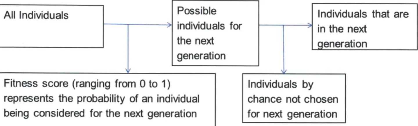
2-2 Diagram mapping out how individuals are chosen for the next generation. Every individual is assigned a fitness score, which represents the probability that an individual gets put into the pool from which the next generation are drawn from. The individuals for the next generation are chosen randomly from this pool of possible individuals. . . . . 32
2-3 Figure showing how the disease status is assigned in the population. Note
that this is if the population had a normal distribution. The important part is that individuals with the 8% highest Phenotype score, if the disease is Type 2 Diabetes, are cases. . . . . 35
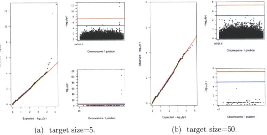
2-4 Plots for this GWAS study as target size is constant at 50 and case/control
sample size is at 2500. In a) is T =0, in b) is T= 0.5 and in c) is T= 1. For
each value of T, the plot on the left is the
2-5 Plots for this GWAS study as tan is constant at 0.5 and case/control sample size is at 2500. In a) is target size = 5 and in b) is target size = 50. For each value of Target Size, the plot on the left is the
2-6 Plots for this GWAS study as tan is constant at 0.5 and target size is at 50.
In a) is sample size = 500 and in b) is target size = 2500. For each Sample Size, the plot on the left is the
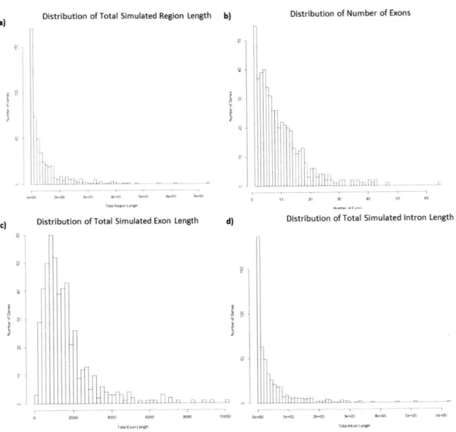
3-1 The distribution of a) entire simulated region, b) number of exons, c) length
of exons, and d) length of introns for the 500 simulated genes based off of 500
randomly chosen genes in the genome. . . . . 43
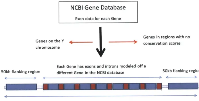
3-2 A flow chart of how the genes were chosen. Exon data for each gene was
gathered from the NCBI gene database. Genes in regions with no conservation scores as well as Genes on the Y chromosome were not considered. . . . . 44
3-3 A plot of the LOWESS smoothing function applied to the conservation scores
of an example gene. The top plot is a plot of the entire gene and the bottom plot is a zoomed in figure where only 1kb out of the 5kb flanking region is plotted on both sides. . . . . 46
3-4 Gene segment in the approximate model. Neutral and fitness impacting mu-tations occur throughout the segment. The probability that a mutation is fitness impacting is the proportion of subsegments that are conserved. ... 47
3-5 Gene segment in the exact model. In this model, each gene model is broken
down into further conserved and non-conserved subsegments. Neutral mu-tations only occur in the non-conserved subsegments while fitness impacting mutations only occur in the conserved subsegments. . . . . 47
3-6 The distribution of selection coefficients as published in Kryukov et al. versus
the distribution of selection coefficients for intron regions used in the gene model . . ... ... ... ... ... . .. .. ... 49
3-7 The distribution of selection coefficients as published in Kryukov et al. versus
the distribution of selection coefficients for the flanking regions used in the gene m odel. . . . . 49
3-8 Number of singleton, rare(MAF<1%), intermediate frequency(1%<MAF<5%), and common(MAF>5%) in a) the entire simulated region, b) exon regions, c) intron regions, d) flanking regions. These counts came from simulating genes 10 random genes, adding them up and normalizing by length. A sample of 379 individuals were used. The empirical data was from the 1000 Genomes
project. The simulated data was an average of 50 subsets of 379 individuals. 51
3-9 Number of singleton, rare(MAF<1%), intermediate frequency(1%<MAF<5%), and common(MAF>5%) in a) conserved coding regions, b) non-conserved coding regions, c) conserved intron regions, d) non-conserved intron regions, e conserved flanking regions, and f non-conserved flanking regions. These counts came from simulating genes 10 random genes, adding them up and normalizing by length. A sample of 379 individuals were used. The empirical data was from the 1000 Genomes project. The simulated data was an average of 50 subsets of 379 individuals. . . . . 54
3-10 The site frequency spectrum for in the entire gene. A sample of 379 individuals
were used. The empirical data was from the 1000 Genomes project. The simulated data was an average of 50 subsets of 379 individuals. . . . . 55
3-11 The site frequency spectrum for a) conserved coding regions, b) non-conserved
coding regions, c) conserved intron regions, d) non-conserved intron regions, e conserved flanking regions, and f non-conserved flanking regions. These
variants came from simulating genes 10 random genes, adding them up and normalizing by length. A sample of 379 individuals were used. The empirical data was from the 1000 Genomes project. The simulated data was an average of 50 subsets of 379 individuals. . . . . 56 3-12 Number of singleton, rare(MAF< 1%), intermediate frequency(1%<MAF<5%),
and commnon(MAF>5%) in a) the entire gene, b) exon regions, c) intron re-gions, d) flanking regions. These counts caine from simulating genes 500 random genes, adding them up and normalizing by length. A sample of 379 individuals were used. The empirical data was from the 1000 Genomes project. The simulated data was an average of 50 subsets of 379 individuals. . . . . . 59
3-13 Number of singleton, rare(MAF<1%), intermediate frequency( 1%< MAF<5%), and common(MAF>5%) in a) the entire simulated region, b) exon regions, c) intron regions, d) flanking regions. These counts came from simulating genes
500 random genes, adding them up and normalizing by length. A sample of 379 individuals were used. The empirical data was from the 1000 Genomes
project. The simulated data was an average of 50 subsets of 379 individuals. 61
3-14 The site frequency spectrum for the entire simulated region with a sample size of 379 individuals. The empirical data was from the 1000 Genomes project. The simulated data was an average of 50 subsets of 379 individuals. . . . . . 62 3-15 The site frequency spectrum for a) conserved coding regions, b) non-conserved
coding regions, c) conserved intron regions, d) non-conserved intron regions, e conserved flanking regions, and f non-conserved flanking regions. These variants came from simulating genes 500 random genes, adding them up and normalizing by length. A sample of 379 individuals were used. The empirical data was from the 1000 Genomes project. The simulated data was an average of 50 subsets of 379 individuals. . . . . 63
List of Tables
3.1
Comparisons of total mutations, neutral mutations, fitness decreasing
mu-tations, and average selection coefficient for fitness decreasing mutations in
coding regions. . . . . 57
3.2 Comparisons of total mutations, neutral mutations, fitness decreasing
mu-tations, and average selection coefficient for fitness decreasing mutations in
intron regions. . . . . 58
3.3 Comparisons of total mutations, neutral mutations, fitness decreasing
mu-tations, and average selection coefficient for fitness decreasing mutations in
Chapter 1
Introduction
1.1
Human Disease Phenotypes are Inherited
It has been long recognized that physical characteristics can be passed on from genera-tion to generagenera-tion. The earliest theories of hereditary belonged to the Ancient Greeks. The first major theory of genetics was hypothesized by Hippocrates in the fifth century B.C. It is known as the "brick and mortar" theory1. The main idea was that hereditary material would be collected throughout the body and concentrated into the male semen, which developed into a human in the womb. Through this mechanism, Hippocrates believed that physical characteristics could be acquired. For example, a champion weight lifter who had developed massive biceps throughout his training would be able to pass his "big bicep" characteris-tic to his offspring through his sperm. Aristotle challenged this idea several decades later
by pointing out that individuals with missing limbs often produced children with normal
limbs. If the physical characteristics of a parent were passed to a child, how could the "limb" characteristic be passed on if an individual had no limbs in the first place1?
Two key independent discoveries in the late 19th century helped lay down the foundation of upon which modern genetics is based. The first was the publication of The Origin of Species by Charles Darwin in 18592, the publication where Darwin described his theory of evolution and natural selection. Natural selection states that genetic differences between in-dividuals can make them more or less suited for certain environments. The inin-dividuals with the genetic material that resulted in advantageous traits were more likely to pass on their
genetic information. However, there was no mechanism to describe how this genetic
informa-tion was passed on. In 1865, Gregor Mendel published Experiments in Plant Hybridizainforma-tion
3.
In his publication, he stated and discussed his observations from studying pea plants. There
were seven phenotypes that were studied. A phenotype is a visible trait, such as the flower
color, seed color, or stem length. Mendel observed that when plants with certain phenotypes
were bred with each other, the ratio of the phenotypes was fairly constant. For example, if a
yellow and a green seeded plant were bred together, this first generation of offspring would
be all yellow seed plants. However, if this first generation bred with each other, the second
generation of offspring would have a three to one ratio of yellow to green seeds.
Mendel came to three conclusions: inheritance of each trait is determined by "factors"
that are passed on to descendants unchanged, an individual inherits one of these factors from each parent for each trait, and that a trait may not show up in an individual but can still be passsed on to the next generation. One phenotype appeared to be dominant over the other. In addition, these phenotypes had full penetrance meaning the presence of the factor of the dominant allele guaranteed the individual would have the dominant phenotype. In the yellow and green seed example, the two parents had two yellow and green factors respectively. Their children all had one green and one yellow allele, but they all were yellow because yellow was dominant over green. However, in the second generation of offspring, 1/4 of the plants had two yellow alleles, 1/4 had two green alleles, and 1/2 had one green and one yellow allele. This resulted in 1/4 of the plants being green and 3/4 being yellow. Plants with two of the same allele were called homozygous and those with two different alleles were heterozygous. These would be later known as the Mendelian Laws of Inheritance.
There have been many diseases that have been found to follow Mendelian Laws of In-heritance including Huntington's disease, Tay-sachs disease, Duchenne muscular dystrophy among others. The one common characteristic between all of these diseases is that they were single gene diseases4.
1.2
Not all Traits Follow Mendelian Patterns of
Inheri-tance
Carl Correns was one of the first to observe as early as 1900 that not all traits followed mendelian patterns of inheritance. He observed that there were certain traits that were more likely to be inherited with each other. He studied the plant Mirabilis jalapa and saw that the leaf color depended greatly on which parent had which trait. If green pollen fertilized a white stigma, the progeny were white, but if the sexes of the donors were reversed, the progeny were green. The phenotype seemed to depend on the identity of the parent which it came from and not on the actual phenotype.
In 1910, Thomas Hunt Morganwas able to combine the Boveri-Sutton chromosomal the-ory with Mendel's thethe-ory of inheritance to help explain what Correns had seen. The Boveri-Sutton chromosomal theory stated that the physical matter with which hereditary operated were chromosomes. Chromosomes came in pairs, one inherited from the mother and the other from the father. Morgan reported the sex-linked inheritance of white eyes in Drosophila
Melanogaster, suggesting that the genes underlying these traits were physically coupled to
the genes determining sex. The idea of "linkage groups" was developed to refer to the idea that genes on the same chromosome were more likely to be inherited together.
It was also discovered that recombination could occur between these linkage groups with the likelihood of recombination proportional to the distance between the two genes. Re-combination is the event where homologous chromosomes, a set of one maternal and the corresponding paternal chromosome, exchange genetic information with each other resulting in a new combination of alleles. It occurs during meiosis, which is the process by which gametes(sperm and egg cells) are created. Before separating, there is an event of "crossing over" where each pair of homologous chromosomes exchange different segments of their ge-netic material to form recombinant chromosomes, neither of which is an exact copy of the original pair. In 1913, Alfred Sturtevant drew the first linkage map, a map showing the likelihood of two alleles being inherited together and thus the linear order of genes on a chromosome.
the recombination rate is assumed to be constant over the entire chromosome, the closer two alleles are to each other in distance, the less likely recombination will occur between the two alleles. If recombination is less likely to occur between two alleles, there will be a greater the probability that they will be inherited together. Instances where this is not true are when there are recombination hotspots. Recombination hotspots are areas in the genome where the rate of recombination is elevated. However, they are spread sparsely with 25,000 hotspots in the entire human genome which has approximately 3 billion base pairs5.
Linkage disequilibrium is the non-random association between two or more alleles. Alleles that are in the same LD block are inherited together because of their proximity on the chromosome. Therefore, LD blocks are entire regions of the chromosome that are likely
inherited together because recombination rate of that region is low.
At every location, there are four possible bases: adenine(A), guanine(G), cytosine(C), and thymine(T). SNPs are specific locations in the genome that where two of these four bases are common in the population. The base that is more common is called the major allele and the base that is less common is called the minor allele.
In addition to mapping alleles that were inherited together, alleles could be mapped to diseases. By systematically correlating disease status with the transmission of particular alleles, it became possible to identify specific marker locations(and chromosomal regions) with which disease stauts was linked. This genetic mapping of alleles to disease in humans has resulted in the localization of genes underlying hundreds of 'Mendelian' disease phenotypes ranging from Huntington's Disease to Cystic Fibrosis6.
1.3
Common Diseases
Most common diseases do not show Mendelian patterns of inheritance. For a disease to show Mendelian patterns of inheritance, it must be caused by single-gene defects'. The diseases that affect the largest number of people-Type 2 Diabetes(T2D), hypertension and others clearly have an inherited basis, but do not obey Mendelian properties and do not show patterns of recessive or dominant transmission in families.
vary-ing trait(such as height) rather than traits that showed discontinuous Mendelian inheritance. In 1918, Fisher resolved the controversy of how a disease trait should be viewed between the Mendelians and biometricians by pointing out that the variation of continuous traits could be explained by the combined action of a set of individual genes in his paper The Correlation
between Relatives on the Supposition of Mendelian Inheritance.8 He established that contin-uous phenotypes could result from the additive effects of many genetic factors(polygenic), each of which could be inherited in a Mendelian fashion and individually produce only a small effect on the total phenotype.
Common diseases are currently observed as a dichotomous trait. In 1965, D.S. Falconer suggested that dichotomous traits might be studied as if a continuously varying trait was underlying them; disease could be thought to result above a threshold on his continuous "liability" scale9. Many common diseases are already defined in this matter. For example, T2D is defined as having a Glycated hemoglobin level of above 6.5 percent in two inde-pendent tests. Glycated hemoglobin measures the percentage of blood sugar attached to hemoglobin'.
1.3.1
Linkage Mapping fails for Complex traits
Linkage mapping, which had worked so well for rare Mendelian disease phenotypes, was only able to explain a small fraction of the total incidence of disease. This finding was consistent with the biometric hypothesis that common diseases may be polygenic. They may be caused by a large number of genetic mutations such that no individual mutation or marker linked to it shows any significant correlation with disease status.
1.4
Genome-Wide Association Studies
With linkage analysis unable to find the full set of causal gene, a new approach called genome-wide association studies(GWAS) was first used in 2005". Instead of tracing the transmission of disease mutations through families, genome-wide association studies com-pared the frequencies of common polymorphisms across the genome for large numbers of affected and unaffected unrelated individuals.
The justification of this method was the common disease common variant hypothesis(CDCV).
This hypothesis was ultimately grounded in two population genetic assumptions.
1. Human demographic history
2. Weak Natural Selection-causal alleles for common diseases do not have big effects on fitness and may not see a significant decrease in frequency over time.
The human population was known to have grown exponentially after a bottleneck". When the population was small, every variant, even those with very few copies were considered common because of the small pool of total variants. When the population grew exponentially, if the selection against these variants was not strong enough, the frequency of the variants would not have decreased rapidly. The result was disease causing variants with small affect
on overall fitness could appear at a, common frequency in the current population.
The goal of GWAS was to find these common variants by looking across the entire genome for common variants and see if any are significantly associated with a disease. GWAS have only been made possible due to the rapid advances in technology in the early 2000s with the first human genome sequence completed in 2003". For GWAS to work, millions of polymorphisms were identified across the genome. Single nucleotide polymorphisms(SNPs)
are sites where 2 different alleles are both common in the population. The purpose of
the International Hapmap project was to provide the data that could be used for GWAS studies". The goal of the project was to provide a genetic map for SNPs that had at least a frequency of 1%. By 2007, the project had completed genetic maps of over 3 million SNPs in 270 individuals from four ethnically diverse populations.
The results of the first large-scale GWAS were published in 2007 for a large range of common human diseases traits". Statistical standards were established and only variants with an association p-value of < 5*10-8 were considered genome-wide significant after
Bon-ferroni correction1 5
. To increase the statistical power, larger numbers of unrelated samples were used17. The results of GWAS were fairly successful in finding numerous loci that were associated with common diseases with 114 being found for Type 2 Diabetes18.
The translation of GWAS findings to actionable therapeutic and diagnostic insights has been challenging. This may occur for several reasons: the associated markers in most cases
are just located near the causal variation, the linkage blocks used in GWAS are often large and span multiple genes, and many variants are found in non-protein-coding regions with ambigious function. The total fraction of heritability explained by all the genome-wide significant loci discovered in GWAS has been limited for most common diseases, about 10% for Type 2 Diabetes'9 .
1.4.1
The Relationship between Conservation and Selection
The two population genetic assumptions of CDCV were the human demographic history and causal mutations subjected to weak natural selection. Human demographic history is something that can be measured through fossil records and written records. Natural selection is the concept of mutations that have a negative impact on fitness will never reach high frequencies. It is difficult to measure how a mutation directly impacts the fitness of an individual so we sought other methods to help quantify natural selection against a mutation. One possible solution to help quantify natural selection against a mutation is by looking at how well the base has been conserved between different species through evolution. Evolution of different species is a mechanism that occurs over a long period of time. As the two species split, some regions of the genome are changed while other regions are conserved. Natural selection determines which regions are conserved and which regions are not conserved by decreasing the fitness of individuals with mutations in the conserved regions. These conserved regions tend to have important functions in the body. If they didn't, mutations in these regions would not decrease the fitness of the individual. Therefore seeing how well a base has been conserved across several species is a good indication of how much negative selection there is against that base in the genome.
1.5
Simulations
The genetic architecture of a disease is the collection of the variants that contribute to the disease. Are these variants located in a few genes that each have a large effect size? Or are they located in many genes that each have a small effect size? Knowing the genetic architecture of human diseases has profound implications for the future of genetic research
and its impact on clinical medicine. For example, if a disease is caused by rare mutations of large effect, targeted diagnosis and therapeutics based on individual genome sequence will
be much more successful.
In order to systematically evaluate which genetic architectures are plausible, it is neces-sary to compare the predictions of each model to empirical data from all available genetic studies in a unified framework. A paper from the Altshuler Lab, Agarwala et al. titled To
what extent can empirical data place bounds on the genetic architecture of complex human diseases?" did exactly that. In this paper, experiments were performed to find models that were consistent with the cumulative results of studies already performed and which models could be excluded.
In order for the simulation to be accurate, the key forces of population genetics must be properly modeled. Mutations at some, but not all, loci across the genome have the potential to alter disease risk. Genetic drift, the random change in frequency of a variant in the population, and gene flow, the transfer of variants from one population to another, both influence the distribution of variants. Finally, natural selection results in the change in frequencies of variants that influence evolutionary 'fitness' or the composite of many traits that influence the chance of passing on the individual's genetic information to the next generation.
In the simulations done for the Agarwala et al., simple possible genetic architecture models were generated. These models considered only mutation, genetic drift, and purifying selection. If such simple models produced predictions inconsistent with empirical data, this does not imply that more complex models could not be consistent. However, if a simple model was consistent, then it can be concluded that its features are indeed plausible given current data. A three-stage framework was used: forward evolutionary simulation to generate multi-locus DNA sequence variation at large scale, mapping of genotype to phenotype under a range of disease models, and in silico prediction of genetic study results under each model. Different genetic architectures were tested by varying 2 parameters, the total disease mutational target size T and a T parameter. The number of disease variants carried by an individual was determined by T. Models of T ranging from 75kb to 3.75Mb were simulated. T was broken down into 'loci' that were each 2.4 kb. This size was chosen because it was the
'average' protein-coding gene from the RefSeq database2 1 in terms on number of exons and
introns and their size. 30, 100, 300, 500, 800, and 1500 loci were simulated. In the simulation, every variant has an effect on the overall 'fitness' of an individual, which is measured by a selection coefficient s and r is how closely the value s for each variant is 'coupled' to that variant's contribution to the disease g as seen in Equation 1.1.
g = sr(l+e) (1.1)
where T is the coupling parameter and e is drawn from a standard normal distribution. A
T value of 0 indicated that there is no correlation between the selection of variants with the variant effectson disease. A T value of 1 indicated that variants with large effects on fitness have large effects on disease. Simulations were performed with r values of 0, 0.1, 0.2, 0.3, 0.4, 0.5, and 1.
To define the set of genetic studies to simulate, results were collected from published
genetic studies of T2D in European populations. These data included: epidemiological
estimates of sibling relative risk, meta-analysis of linkage scans in 4,200 affected sibling pairs with T2D, discovery GWAS in 4,549 cases and 5,579 controls, replication of the top(p<0.0001) signals from the discovery GWAS in an effective sample size of 55K, and larger-scale meta-analysis in 12,171 cases and 56,862 controls, followed by genotyping of top(p<0.005) signals on the Metabochip genotyping array in 34K cases and 115K controls. The results are shown in Figure 1-1. The green boxes are the models that are consistent with all four tests and the red ones either have at least one study result that was inconsistent or had one study result that was excluded.
The results showed that no models with a T value of 0 or 1 was a possible genetic architecture. This result is consistent with current knowledge of disease models because a T of 0 would indicates that the frequency of variants are not correlated with the variant effects on disease and a T of 1 indicates that each gene was tightly linked to the disease and would have been found through linkage mapping. In addition, we see that only models with at least 300 loci were consistent. This seems plausible if we look at our GWAS results. Having a minimum of 300 disease genes is realistic because the 114 known GWAS variants combined
diect selectm SeleCtiOn uncoupled
% of c on trait parameter (T) to selection
genome sequence
ih disease target T=1 T 0.5 T 0.4 T a 0.3 To 0.2 T = 0.1 T=0 Red boxes indicate exclusion by:
wnall disease
targeZ, few 0.025% T - 75kb Sib risk Linkage
causal N -30 G
--0.08% T =1250kb (N=10K)
T - 75kb t Simulated data are higher than empirical
0.25% N 300loci , Simulated data are lower than empirical
Target T -125M 9 Model is excluded only by the results of
size (T) 42 N=-WW W 0 larger-wcale GWAS (N~85K).
0.67% NT =2Mb Model shown in Figure 5
T = 2.5Mb 0.83% N =1000 loa 1.25% T -3.75Mb higtiy N =100 lo0i polygenic disease ,,
Figure 1-1: The results from Agarwala et al.2 0 Each is divided into four parts, each repre-senting one of the four tests. Arrows pointing up indicated that values for simulated data were higher than that of empirical while arrows pointing down indicated that values for simulated data were lower than that of empirical. Green boxes showed that results from all four tests for simulated population were consistent with that of the european populations in T2D.
only explain a fraction of the total heritability.
The main conclusion that can be drawn from the results of this paper are that there are some models that were consistent with empirical data and other models that were not. Some of the models that were found to be consistent contained genes that would not have been found through GWAS and linkage mapping.
1.6
Limitations of the Gene Model
The gene model that was used in Agarwala et al. was the same for every gene. But, in the human genome, gene lengths differ. The number of coding regions or length of each coding region also differs for every gene. In addition, the model allowed only mutations that occur in the coding regions to have the possibility of having a negative impact on fitness. This model is limited in two ways: one gene size cannot represent every gene and not all causal mutation are in the coding regions.
1.6.1
The size of every gene is not constant
There is a wide range of sizes of genes in the genome. The total gene length of 500 randomly selected genes are shown in Figure 1-2. The total gene length consists of all the coding regions and the non-coding regions in between the coding regions as well as 50kb flanking regions on each side. 50 kb regions were chosen because that is the general distance that influences the gene 22*
Distribution of Total Simulated Region Length
1e+05 2e+05 3e+05 4e+05 5e+05
Total Region Length
6e+05 7e+05
Figure 1-2: The distribution of the total gene length of 500 random genes..
The distribution of gene length does not follow a normal distribution. The distribution En
t: j
U)
-has a one-sided tail. There is no simple conclusion on how to pick one gene length that would be representative of this distribution. If a gene with the median length was chosen, then the tail would simply be ignored. If a gene with mean length was chosen to symbolize all of the genes, then the genes in the genome that are in the tail would heavily skew the mean. By picking one gene length, the genes at the end of the tail will either be ignored or will have too much weight. Therefore the most accurate way to model this distribution is to have every gene be of different lengths and the distribution of different lengths model the distribution of different lengths of genes in the genome.
1.6.2
Causal Mutations in the non-coding regions
The gene model in Agarwala et al. required mutations that affect fitness to be in the coding regions. Currently, there is limited understanding of how non-coding regions affect biological processes and by extension the fitness of an individual.
One function of non-coding regions is to encode microRNA. Regular mRNA is the tran-script from the coding region that is used to make the protein. MicroRNA however is a ncRNA(non-coding RNA). There have been studies shown that widespread disruption of
microRNA has been seen in human cancer. In addition, there are many other types of
ncRNA such as small nucleolar RNA, transcribed ultraconserved regions and large inter-genice non-coding RNAs. Disregulation of these ncRNAs have been found in neurological, cardiovascular, developmental and other diseases 2.
Disruption of ncRNA is just one example of the affect of mutations in non-coding re-gions. Even though many of these pathways are not currently understood well, they are still important in the functionality of an individual. The absence of these mutations in the gene model used in Agarwala et al. is a limitation of that model.
1.7
Roadmap of project
The goal of the project described in this thesis is to extend the gene model used in Agarwala et al. in two ways. The first is modeling the distribution of number and length of coding and intron regions in the genome. This first extension will be referred to as
"modeling the distribution of gene length". The second extension is to model mutations in the non-coding regions that affect an individual's fitness in the simulations.
To be able to model the distribution of gene length in the genome, a large bank of genes will be built. This bank of genes must be large enough that the distribution of gene length will reflect the distribution of gene length in the genome.
Modeling mutations that affect fitness in non-coding regions is not straightforward be-cause there is no direct way to measure how a mutation affects fitness. Instead, information on how well a base in the genome has been conserved was used to model these mutations. The more a mutation negatively impacted fitness, the stronger the selection is against that mutation. If there is strong selection against a mutation, it will be conserved over a long period of time.
There were two models constructed using this reasoning, an exact model and an approx-imate model. In the exact model, for every conserved base in the genome, there was one base in the simulated gene that would have selection against it. Mutations that occured in a base with selection against it would have a negative effect on fitness. For example, if there were 50 bases in a coding region that were conserved followed by 50 bases in a coding region that were not conserved, mutations that occured in the 50 bases that were conserved would have a negative impact on fitness while mutations that occured in the non-conserved segment would not have an impact on fitness. In the approximate model, for each segment, the percentage of 50 base subsegments that are conserved is the percent of mutations that have a negative impact on fitness.
Before the new model was implemented, the gene model of Agarwala et. al was first reproduced as a baseline for comparison. It was important to learn how this original gene model worked before it could be extended. Several genetic architectures were simulated and for each gene model, the results were what was expected from our knowledge of population genetics.
After the new gene model was implemented, it was first tested to see how well it was able to model a small sample of ten randomn genes. In this test, both models were simulated. Comparisons were made between the two models as well as empirical data of the ten genes and the model in Agarwala et al. Many annotations of regions were made including conserved
and non-conserved regions of coding, intron, and flanking regions. The purpose of this initial
comparison was to test how well the model for fitness impacting mutations in non-coding
regions worked. The comparisons between all four models showed that both the approximate
and exact models were able to model non-coding fitness impacting mutations.
Next, a bigger sample of 500 genes, were simulated. The purpose of this bigger sample
was to create a bank of genes where the distribution of gene length is consistent with that of
the genome as well as confirm that the model for fitness impacting mutations in non-coding
regions was still fairly accurate. Even though this larger sample only included approximately
2% of all the genes, the distribution of total gene length in this sample was representative of
the distribution of total gene length in the genome. For this sample, only the approximate
model was simulated because of computational performance considerations. Simulating the
exact model took more than ten times the time of the approximate model. The comparisons
between the three models showed that the approximate model was still able to model
non-coding fitness impacting mutations.
Chapter 2
Reproducing the results of Agarwala et
al.
2.1
Overview
Before the new gene model was implemented, it was first necessary to show that the results from Agarwala et al could be reproduced because this model would later serve as a baseline to which new models would be compared to. We describe the gene model and forsim, the forward evolutionary simulation software that is used. We simulates several genetic architectures and compared if the results to expectation.
2.2
The Gene Model
The gene model that was used in Agarwala et al. was designed to represent what an 'average" gene looked like in the genome. This was done by looking at the protein-coding
genes from the RefSeq database2 1. The median number of exons, median total coding length and median total transcript length were used. The gene had the following characteristics.
1. 8 exons-each 300 bp long for a total coding length of 2.4k bp
2. 7 introns-each 3k bp for a total of 23.4 kb
4. Mutation rate constant across the gene.
In addition, only mutations in the exons could have a negative impact on the fitness of
an individual. The synonymous and non-synonymous variants were modeled. 30% of the
exonic variants are synonymous while 70% are non-synonymous. Synonymous variants are
variants that do not change the protein sequence. This is because of the wobble effect, the
concept where multiple sequences code for the same amino acid, and therefore have no effect
on fitness. Approximately 80% of non-synonymous variants have an effect on fitness. The
reason that there are some non-synonymous variants that do not effect fitness is that a change
in amino acid sequence does not guarantee change in the protein structure. Therefore, 56%
of mutations that occur in the exons will have a negative effect on fitness while the rest will
have no effect.
The distribution of selection coefficients is a gamma distribution. The parameters for the
gamma distribution were the set of parameters that resulted in the site frequency spectrum
being the most consistent with empirical data. The site frequency spectrum is the
distribu-tion of the variants based on frequency. The empirical data used for these comparisons was the European population in T2D. The selection coefficient was the parameter that indicated how much of an effect a mutation had on the fitness of an individual. The more negative the selection coefficient, the greater the negative effect it would have on fitness. A shape param-eter of 0.316 and a scale paramparam-eter of 0.01 was used. The mean for this gamma distribution was 0.00316 and the variance is 0.000032. Only mutations with negative impact on fitness were modeled so the selection coefficients that were drawn from the gamma distribution were multiplied by negative one.
2.3
ForSim Overview
ForSim is a forward evolutionary simulation system designed to be highly flexible. It takes in a list of parameters, including a gene model, mutation rate, population size among
others and outputs several files. The version of ForSim used was developed by Brian Lambert
and Ken Weiss when both were at Penn State University and modified by Vineeta Agarwala and Jason Flannick in the Altshuler Lab to decrease the runtime of the software.
Currently the software outputs two files, a ped file that contains a list of all the individuals in the final generation as well as all the minor alleles each possesses and a marker file that has a list of all the markers currently in the population as well as their frequency, location, and the identity of the minor and major allele are.
Analysis on the population can be performed by running tests of the ForSim output files. These tests include tests for the number of GWAS statistically significant variants.
2.4
ForSim Input
This section will provide detail on the parameters for the ForSim software and how ForSim creates a simulated population. In ForSim, every individual is assigned a fitness score. This fitness score corresponds to the fitness of an individual with a higher fitness score corresponding to a greater chance of survival. The score is a summation of the individual's genetic phenotype and the environmental phenotype as shown in Figure 2-1.
Genetic
I
Environmental
Ghentypc
-
Phenotype(very
Allllll IFitness
Phenotype
sal
small)
Figure 2-1: The fitness in ForSim is calculated as a sum of the environmental phenotype plus the genetic phenotype.
An individual's fitness is determined by both genetic and environmental factors. The environmental portion corresponds to factors such as diet and exercise. The environmental phenotype in this model is very small because the purpose was to model a population where the majority of the fitness was influenced by the genetic phenotype. The environmental phenotype was drawn from a normal distribution that had a mean of 0 and standard deviation of 0.0000001. For every individual, this fitness score will range from 0 to 1 and represent the probability of that individual gets into the pool from which the next generation is drawn from. For every individual, a random number is drawn from an uniform distribution from
0 to 1. If the fitness score is greater than the random number, then this individual will
randomly from this pool of possible individuals as shown in Figure 2-2. If an individual has a higher fitness, then it is more likely to survive to pass on its genetic information to the next generation.
All Individuals
Possible
Individuals that are
individuals for
in the next
the next
generation
generation
Fitness score (ranging from 0 to 1)
Individuals by
represents the probability of an individual
chance not chosen
being considered for the next generation
for next generation
Figure 2-2: Diagram mapping out how individuals are chosen for the next generation. Every individual is assigned a fitness score, which represents the probability that an individual gets put into the pool from which the next generation are drawn from. The individuals for the next generation are chosen randomly from this pool of possible individuals.
The parameters of the population used in Agarwala et al. were tuned to the Northern European population. Initially, several previously published models of demographic history including those in Kryukov et al. and Gravel et al. were tested. These models were then modified until the site frequency spectrum of the simulated population was consistent with that of empirical data. A hybrid population was concluded to generate a simulated pop-ulation that was the most consistent with empirical data. In this poppop-ulation, first 50,000 generations were simulated at a constant population size of 8100. This was followed by a bottleneck that reduced the population to 2000 and exponential growth for 370 generations to a size of 227,650.
2.4.1
Calculating the Genetic Phenotype
For each individual, the genetic phenotype starts at 1. For every fitness impacting mu-tation each individual has, the genetic phenotype decreases by the amount of that mumu-tation's selection coefficient. The more negative the selection coefficient, the more it will affect the individual's genetic phenotype and ultimately the fitness of the individual. This is shown in
Equation 2.1.
1+ Es = GP (2.1)
where s is the selection coefficient for every variant an individual has and GP is the genetic phenotype for that individual.
Additionaly, ForSun allows the user to set parameters that only apply to certain segments of the gene. These include the probability that a mutation that occurs has an impact on fitness and the distribution of selection coefficients. The different segments that are modeled are coding region, intron, and flanking, as described in Section 2.2.
2.5
Assigning Disease Status
There are several steps to determine diisease steps. The first step is to calculate each mutation's additive contribution to the disease risk score. This was calculated using Equation 2.2,
g = sr(l+e)
(2.2)
where r is one of the coupling parameters and e is drawn from a normal distribution with mean of 0 and standard deviation of 1. The second step was to calculate an individual's heritable phenotype G as shown in the following equation
G
=
gi
(2.3)i=1
where gi is the mutation additive effect for variant i and P. is the total number of variants an individual has across all N target size genes. An individuals total Phenotype P is
1 -h
P = z(G) +
*E
(2.4)
where z(G) is the z-score of G, E is the environmental phenotype drawn from a normal distribution with mean 0 and standard deviation 1, and h is the percent of variance that is due to heritability, which is 0.45 for Type 2 Diabetes. Disease status was calculated using a threshold derived from the prevalence of the disease. The threshold was calculated so that the percent of individuals with the disease in the simulated population would equal the prevelance of the disease in the real world. For example, if 8% of the population has the disease, then the 8% with the greatest P have disease status.
2.6
Analysis of Output
Data was generated for several genetic architectures by varying three parameters: cou-pling factor r, the sample size of the study, and the target size. This data was then used
to perform a GWAS and Manhattan and
0, 0.5, and 1 were used. Target sizes of 5 and 50 were studied and the two sizes of GWAS studies that were done were 2500 cases and controls and 500 cases and controls.
500 genes using the gene model in Agarwala et al. were first simulated. The disease genes were chosen at random from the list of 500 genes. Next, the variant's additive effect
was assigned based on the T value. An individual's heritable phenotype as well as there
total phenotype were assigned. The prevalence for type 2 diabetes was 8%. Disease status was then assigned and the case and controls were then drawn from the pool of diseased and
non-diseased individuals at random.
A discovery GWAS study was then performed on the common variants with a frequency
of greater than 5%. LD pruning was applied. LD pruning is randomly choosing one SNP to represent a group of highly correlated SNPs. A replication study was then performed in an independent sample of the variants that had a P-value < 0.0001, the replication threshold
in the discovery sample. In this study, SNPs were declared significant if the P-value was less than 0.05 divided by the number of replication SNPs. This calculation of the P-value is from the Bonferroni adjustment where P-value equals 0.05 divided by number of independent tests.
In this calculation, each SNP is treated as independent '. Manhattan and
Distribution of the Phenotype for individuals
-
6-C)J C) C)Phenotype Scores of Individuals
Figure 2-3: Figure showing how the disease status is assigned in the population. Note that
this is if the population had a normal distribution. The important part is that individuals
with the 8% highest Phenotype score, if the disease is Type 2 Diabetes, are cases.
sample. Manhattan Plots are plots that have every variant plotted according to base pair
position on the x-axis and the y axis is the -log(p-value). This plot allows you to see those
variants that have very small p-values easily as the smaller the p-value, the higher the point.
For
plots, expected -log(p-value) is plotted against observed -log(p-value). The expected
Individuals with the
Phenotype
scores in
the top 8% are cases
Individuals with
the Phenotype
scores not in the
top 8% are
controls
I I I
-log(p-value) is the distribution of -log(p-value) from a random distribution. If the plot starts to rise from a straight line(shown in red), then mutations that have a lower p-value then expected are present. Otherwise, the points will follow the straight line. The purpose of the Manhattan plot is to see if there are any variants that have a significantly low p-value and the purpose of the
The results are organized to see what changes are seen when one of the parameters has been modified. The first parameter that was modified is the T value. Target size is kept constant at 50 while sample size for both the discovery and replication studies is 2500 cases and 2500 controls. Figure 2-4 shows the Manhattan and
have the largest effects. However, these variants will not show up in the study because they are rare and only common variants were included in this study. If a larger sample size was used, there would be more statistical power resulting in the possibility of seeing more SNPs correlated with disease in the model where tau equals 0.5 compared to the model where tau equals 1.
The second parameter that was modified was the target size. The T value was kept constant at 0.5 and the sample size was constant at 2500 cases and 2500 controls for both the discovery and replication studies. Figure 2-5 shows the Manhattan and
The third and final parameter that was modified is the sample size. The T value was kept constant at 0.5 and the target size was constant at 50 genes. Figure 2-6 shows the
Manhattan and
I
E66.6ded -k0Ip ) (b) r 0. =0. =0.5.
iI
01 06p.0668 k~g~p) C m m I PO-(c) r = 1.Figure 2-4: Plots for this GWAS study as target size is constant at 50 and case/control sample size is at 2500. In a) is r =0, in b) is r = 0.5 and in c) is T= 1. For each value of r,
the plot on the left is the
Manhattan and