HAL Id: hal-02264960
https://hal.inria.fr/hal-02264960
Submitted on 8 Aug 2019
HAL is a multi-disciplinary open access
archive for the deposit and dissemination of
sci-entific research documents, whether they are
pub-lished or not. The documents may come from
teaching and research institutions in France or
abroad, or from public or private research centers.
L’archive ouverte pluridisciplinaire HAL, est
destinée au dépôt et à la diffusion de documents
scientifiques de niveau recherche, publiés ou non,
émanant des établissements d’enseignement et de
recherche français ou étrangers, des laboratoires
publics ou privés.
Analyzing Dynamic Hypergraphs with Parallel
Aggregated Ordered Hypergraph Visualization
Paola Valdivia, Paolo Buono, Catherine Plaisant, Nicole Dufournaud,
Jean-Daniel Fekete
To cite this version:
Paola Valdivia, Paolo Buono, Catherine Plaisant, Nicole Dufournaud, Jean-Daniel Fekete. Analyzing
Dynamic Hypergraphs with Parallel Aggregated Ordered Hypergraph Visualization. IEEE
Transac-tions on Visualization and Computer Graphics, Institute of Electrical and Electronics Engineers, 2021,
27 (1), pp.1-13. �10.1109/TVCG.2019.2933196�. �hal-02264960�
Analyzing Dynamic Hypergraphs with
Parallel Aggregated Ordered Hypergraph
Visualization
Paola Valdivia, Paolo Buono, Catherine Plaisant, Nicole Dufournaud, and
Jean-Daniel Fekete, Senior Member, IEEE
Abstract—Parallel Aggregated Ordered Hypergraph (PAOH) is a novel technique to visualize dynamic hypergraphs. Hypergraphs are a
generalization of graphs where edges can connect several vertices. Hypergraphs can be used to model networks of business partners or co-authorship networks with multiple authors per article. A dynamic hypergraph evolves over discrete time slots. PAOH represents vertices as parallel horizontal bars and hyperedges as vertical lines, using dots to depict the connections to one or more vertices. We describe a prototype implementation of Parallel Aggregated Ordered Hypergraph, report on a usability study with 9 participants analyzing publication data, and summarize the improvements made. Two case studies and several examples are provided. We believe that PAOH is the first technique to provide a highly readable representation of dynamic hypergraphs. It is easy to learn and well suited for medium size dynamic hypergraphs (50-500 vertices) such as those commonly generated by digital humanities projects—our driving application domain.
Index Terms—dynamic graph, interaction, case study, dynamic hypergraph, digital humanities, usability
F
1
I
NTRODUCTIOND
YNAMICnetworks are used to model the evolution of relations between entities over time. The entities are represented as graph vertices and the relations as graph edges, connecting two vertices. Examples include computer networks where the dynamic relations are defined by packets exchanged over time between computers, co-authorship networks where relations are articles written by two authors, brain activity where relations are high correlations between regions of interest of the brain.While these kinds of networks are typically modeled as regular graphs, they can more accurately be modeled as hypergraphs where each relation may involve several vertices. For example in historical documents multiple persons can be mentioned together; in co-authorship networks, publications can associate multiple authors to one article; and in brain data, multiple brain regions can be highly active at the same given measurement time.
The design of PAOH was initially driven by Digital Humanities applications. Our team has worked extensively with social science researchers studying social networks and their evolution. Many such projects involve a long data generation process, searching archives, analyzing documents, and generating medium-sized networks (50– 500 vertices), followed by careful and detailed analysis of all the relationships.
• P. Valdivia is with Inria, France. E-mail: paola.valdivia@inria.fr.
• P. Buono is with the University of Bari, Italy. E-mail: paolo.buono@di.uniba.it.
• C. Plaisant is with the University of Maryland, USA, and INRIA Chair, associated with the INRIA Foundation.
E-mail: plaisant@cs.umd.edu.
• N. Dufournaud is with the ´Ecole des Hautes ´Etudes en Sciences Sociales, France
E-mail: nicole.dufournaud@laposte.net. • J.-D. Fekete is with Inria, France.
E-mail: jean-daniel.fekete@inria.fr.
Manuscript received XXXX XX, 2018; revised XXXXX XX, 2018.
Let’s use the example of a historian studying a collection of historical documents describing business agreements between different people over the years [1]. Each contract involves two or more persons, and the historian needs to understand how each person’s business relationships change over time. Using classical node-link diagrams to visualize a graph, a contract between three entities is represented as three edges, making it unclear whether they corresponded to a single contract or two or three different contracts. It may be possible to use color or dash pattern on the edges to represent the contract, but if more than half-dozen contracts need to be encoded, the color encoding becomes unusable. Contracts can also be encoded as additional node types using a bipartite network, but this dramatically increases the size and complexity of the graph. So typically, the document identity is lost using classical network visualization techniques that focus on the relations among people (who is in relation with whom). The historian also needs to understand how the network changes over time. None of the existing techniques for visualizing dynamic networks [2] support hypergraphs, making PAOH unique.
The proposed PAOH visualization is a novel technique (Fig-ure 1) where the time is split into intervals and visualized as consecutive time slots. The vertices are encoded as parallel horizontal tracks, and edges are encoded as parallel vertical lines connecting the vertices. A dot is used to depict and emphasize the connection or vertices with edges. A novel glyph technique (called drips) helps compact the display, while interaction speeds exploration or reveals similar edges. Variations in visual encoding and orderings address specific users needs.
The specific contributions of this article are1:
• A detailed description of the PAOH technique implemented in a prototype, with multiple examples and variants.
1. A very early version of the PAOH interface was described in a poster [2], and an initial case study was described in a workshop paper [3].
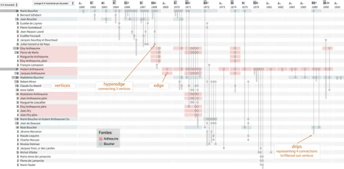
Fig. 1: The Parallel Aggregated Ordered Hypergraph visualization of a dataset extracted by historians from 59 legal documents: Time runs from left to right with discrete time slots representing the network at that time. Vertices (here people) are represented by parallel horizontal bars, with all names aligned on the left. Each parallel vertical line is a hyperedge, connecting two or more vertices. A dot marks each connection. In this view, the vertices of degree one (i.e., the people involved in a single document) have been hidden from the list of vertices, and their existence is only hinted with drips, i.e., smaller gray dots at the lower end of hyperedges.
• The report of a usability study which 1) demonstrates that participants could discover how to interpret a PAOH display on their own without training, 2) illustrates how PAOH was used to explore a dataset of publications, and 3) summarizes the changes made to improve the usability of the tool.
• Two case studies describing the use of PAOH in digital humanities research projects.
2
R
ELATEDW
ORKPAOH has been inspired by the BioFabric technique proposed by Longabaugh [4] that visualizes large networks, such as those in biological research, by depicting vertices as equally spaced parallel horizontal lines, and edges as vertical lines drawn over the vertices and joining the starting vertex vertical position to the ending vertex position. In addition to BioFabric, PAOH represents hyperedges, visualizes relations over time using time slots, allows vertex reordering, hyperedge packing, and offers multiple interaction techniques to support complex explorations. In the rest of this section, we provide definitions, review the work on the visualization of hypergraphs, dynamic networks, and taxonomies of tasks.
2.1 Definitions
A graph is defined as G = (V, E), where V is a set of vertices (or nodes) {v1, · · · , vm} and E a set of relations (or edges)
{e1, · · · , ep}|ei= (va, vb) ∈ V2, 1 ≤ i ≤ p.
The focus of this work is on hypergraphs, denoted as G = (V, H)|H is a set of h hyperedges, i.e., edges that can connect any number of vertices. Formally, h ∈P(V) where P(V) is the set of all sets of V (a.k.a power-set of V ).
Several definitions of dynamic graphs exist in the literature. We use the definition from the survey on dynamic graphs [5], where a dynamic graph is a sequence of graphs {G1, · · · , Gn}|Gi=
(V, Ei), 1 ≤ i ≤ n sharing the same vertices but with a topology
varying over time. Each set of edges Ei refers to a given time
interval (or time slot). Other authors, such as van den Elzen et al. [6], consider dynamic graphs as Gτ= (V, Eτ) where edges Eτ
have a time-stamp: eτ= (va, vb, τ) ∈ V2× T . These structures are
closer to stream graphs [7] and are not addressed here.
2.2 Visualization of Hypergraphs
Hypergraphs such as co-authorship networks have mostly been visualized as standard networks [8], [9] or bipartite networks [10]. Visualizing a hypergraph as a bipartite graph adds vertices to represent hyperedges, and additional edges to connect them to the actual vertices, making the graph more complex to render and interpret, instead of simplifying it as intended by PAOH.
Hyperedges are equivalent to sets since a simple hyperedge is a set of vertices. Various techniques designed for visualizing sets have been surveyed in [11]. For example, sets/hyperedges have been represented as Kelp Diagrams [12], or variations of node-link diagrams [13] where the style of an enclosing closed curve or a color encodes the vertices belonging to the same set/hyperedge. Those techniques quickly run out of visual attributes, so they are limited to one or two dozens of hyperedges. Matrix-based approaches [14], [15], [16] were also used to represent sets. Within these, the technique proposed by Kim et al. [15] displays elements as columns and set/hyperedges as rows, on a matrix layout. Like PAOH, it also displays information about the set membership and degree of aggregation, for each element, on top of the columns. Although it looks similar to PAOH, it does not deal with time and is meant to support very different tasks.
Matrix-based approaches scale better in the number of vertices and sets than PAOH, but they only support well set operators such as union or intersection between two or more sets. PAOH supports some set operators but is designed for dynamic hypergraphs.
UpSet [16] is a technique where sets are depicted as columns partitioned as segments of a Venn diagram, and each segment is represented by a configuration of lines (or disks). It is very similar to PAOH graphically, but completely different in meaning. While in PAOH a line depicts a vertex of a hyperedge, UpSet uses a line to depict Venn segments. Links also have a similar visual appearance. In PAOH, a link depicts a hyperedge, while in UpSet, it depicts Venn diagram segments. Furthermore, UpSet does not consider time at all.
If a group is an encoded relationship between objects [17], hyperedges can also be represented as overlapping groups of edges. Vehlow et al. [17] proposed a state of the art in visualizing group structures in graphs using a taxonomy, composed of two orthogonal concepts: Overlap (disjoint/overlapping) and Structure (flat/hierarchical). The survey mentions colors, pie charts or icons to encode the group or groups a vertex belongs to, and various strategies to show groups of edges (juxtaposed, superimposed, embedded). However, none of the proposed techniques explicitly addresses hyperedges, and most of the solutions consider a small number of groups. In contrast, the domains where PAOH has been used are characterized by the presence of hundreds of hyperedges. We are interested to visualize non-overlapping group structures (partitions) of vertices over time. Visualizing the evolution of groups over time is challenging. Some researchers visualize the evolution of vertices groups but not the graph topology [18], [19], while others visualize graph topology but not the evolution of groups [20], [21]. The only attempt to visualize both the evolution of groups and topology that we found proposes a visualization of groups as blocks of vertices connected by curves to show relations between communities [22]. They also propose a few patterns that reveal group evolution, such as split, merge, stable, extinct/merge. Hyperedges are not addressed.
In some cases, custom applications were designed to present specific hypergraphs, for example, PaperLens [23] shows a mul-tidimensional and synchronized visualization for the analysis of scientific papers, and helps in exploring the dataset. No graph visualization is used and relationships—such as co-authorship—are reduced to one-to-one relationships. Arafat and Bressan visually identify hyperedges by enclosing vertices in closed curves [24]. To process them, they transform hypergraphs into graphs using several algorithms. This approach produces many crossings that quickly clutter the display, and does not consider dynamic hypergraphs.
Similarly to our proposal, Kerren et al. [25] address hyperedges as sets of vertices and propose a radial technique where vertices are points disposed regularly around a circle, and hyperedges are circular arcs connecting the vertices. A point depicts the vertex intersecting the hyperedge and its vertex, at the intersection of the radius passing by the vertex and the arc. Their technique is a radial version of PAOH, but is limited in the number of vertices, the number of hyperedges, and cannot encode multiple time-steps.
Storyline[26], [27] is a technique to visualize the interactions between characters in movies and is related to hypergraphs. In a storyline visualization, each character is a curved line displayed in the context of a movie timeline, with only one degree of freedom: it can only move up or down since its horizontal position is constrained by the movie timeline. Lines join when their associated characters are present in the same area during an event of the movie, and get farther apart when the characters are farther away. Particular events can be highlighted with colored patches underlying multiple character lines during an action. These events can be considered as hyperedges. However, the structure of movies constrains the
structure of the underlying hypergraph: one character can only appear in one event at a time whereas dynamic hypergraphs can connect the same vertex multiple times at the same time slot, and movie events are usually paced to follow storytelling rules whereas dynamic hyperedges can occur at any pace in a dynamic hypergraph. Therefore, Storyline cannot be used directly to visualize general dynamic hypergraphs.
As we were developing PAOH, we were pleased to find a precursor design published in an archaeology book [28], where Arnold graphically describes a small dataset with 8 territories (see Figure 1 in supplementary materials). Each vertical line is a battle connecting territories. Attacking territories are shown as black dots, and defending ones are white dots. Coalitions are visible when more than two tribes are involved in a battle. Each battle is placed on a continuous timeline, using a stream metaphor instead of a series of discrete time slots as our technique does. The stream metaphor has some benefits but often leads to overlaps, which are avoided in our Parallel Aggregated Ordered Hypergraph design by aggregating hyperedges in specified time slots. No implementation of the design seems to exist.
Because PAOH is also able to display regular dynamic graphs, we continue by reviewing related work on such dynamic graphs.
2.3 Visualization of Dynamic Graphs
The state of the art report on dynamic graph visualization published in 2014 by Beck et al. [5], as well as recent articles, e.g., [29], [30], show that node-link diagrams remain the work-horse of network visualization for practitioners [31], [32]. The evolution of the network has been shown using animation, or by using side by side snapshots. PAOH uses the latter technique.
Dang et al. [33] propose a network visualization called TimeArcs where vertices (called entities) represent terms of articles, stacked vertically. Edges are correlated terms in the same article, represented as vertical arcs. The time axis is a horizontal timeline. Each vertex has a weight depending on the number of occurrences in the article; line thickness encodes this weight. This technique reduces line crossing but it shows many overlapping arcs in case there are many correlated terms. Following the timeline, users see how term frequencies and relationships evolve.
Van den Elzen et al. [6] added the notion of time to the BioFabric technique in Extended Massive Sequence Views (EMSV); edges flow horizontally over time. EMSV uses color to provide different visual clues, such as edge direction, length, and size. Several ordering methods compact the edge representation and improve readability. Several properties are proposed to identify patterns, such as trends, communities, stars (source or sink vertices). They also propose a circular visualization to highlight two-way communication and correlations between edge occurrences. EMSV highlights the potential value of a grid-like design to represent dynamic graphs, but its continuous time model differs from ours, based on discrete time slots. Labeling and overlaps remain an issue and it does not address hypergraphs at all.
The Parallel Edge Splatting technique from Burch et al. [34] visualizes time on the horizontal axis: each time-slot (i.e., network snapshot) is given a width and is visualized as two vertical boundaries. Vertices are distributed vertically using a single default order. Edges are diagonal lines connecting vertices at each time-slot. To address overplotting Parallel Edge Splatting uses a density map that highlights the dense parts of the display but still hides all the detail information. While this technique scales to some very large
graphs, line crossings hinder its readability even on some small graphs, including those of our case study partners.
In summary, the review of the literature uncovers a rich and diverse set of related techniques but—to our knowledge—none of the techniques adequately answer to the needs for detailed exploration of medium size hypergraphs that our digital humanities partners have.
2.4 Taxonomies of Tasks
PAOH is related to dynamic networks and sets. Three recent taxonomies of tasks for dynamic networks are reported in [35], [36], [37], also summarized in a survey [5]. For set visualization, Alsallakh et al. presented a taxonomy of tasks in [11].
Bach et al. [35] extended the method introduced by Lee et al. [38]: starting from a taxonomy of low-level tasks by Amar et al. [39], they combine them using a cross-product with graph entities (vertices, edges, paths, graphs, groups, connected components, clusters), leading to a systematic task space. Bach et al. further extend the cross-product approach by adding the When, Where, Whatframework of Peuquet [40]. Yet, the approach is only applicable to low-level tasks since higher-level tasks do not always combine; e.g., ensemble perception tasks work in restricted conditions and cannot be combined, or to a limited extent.
Ahn et al. [36] add more levels to the taxonomy, extending the graph entities to graph structure, taking into account specific temporal features (shape, rate of changes), extending graph properties from structural to domain-dependent. While the cross-product method could still be applied with these new entities, it generates too many conditions to be explored and understood fully, so they expose their taxonomy through particular examples from 53 temporal network visualization systems from the literature.
Kerracher et al. [37] extend the full task framework of Andrienko&Andrienko [41] to adapt it to dynamic networks. The original framework consists of a data model (ADM) and a task framework (ATF). ADM divides a data structure into referential components (time, space, and objects) and characteristics (what data is being measured, e.g., publications count, author affiliation). According to ATF, at the lowest level, tasks are divided into Lookup, Comparison, and Relation seeking. Lookup tasks consist in finding a characteristic given a reference or vice versa. The comparisonfocuses on retrieving relations among references and/or characteristics. Relation seeking is focused on finding components associated with a given relation. At a higher level, tasks are divided into elementary and synoptic tasks.
Kerracher et al. extend the Andrienko&Andrienko framework, which mostly describes attribute-based tasks, by adding graph structural tasksrelated to the graph topology and entities. Using a parallel structure with the attribute-based tasks, they split the structural tasks into elementary and synoptic tasks related to the structure(s). Between the attribute-based and structural tasks lie connection tasks, that involve relational behaviors between multiple parts (attributes or structural entities).
The tasks supported by PAOH were mainly driven by our interviews with practitioners who were interested, for example, in tracking the temporal connectivity patterns, relate connections between vertices with group attributes, analyze in detail connections and when those connections were happening. In other words, PAOH is meant to facilitate the connection tasks involving both attribute values, such as groups, and graph structure over the same time-ranges. Existing taxonomies are not clear about how many entities
can be involved in the connection tasks. The existing taxonomies should be extended and specialized to characterize our dynamic hypergraph data structure. Particularly, having hyperedges instead of edges as the reference for performing tasks adds a level of complexity that needs to be further studied, and PAOH is a good starting point for this study.
Alsallakh et al. [11] introduced a taxonomy of tasks for set visualization based on the task focus: elements, sets, relations, and element attributes. Since there is an equivalence between sets and hyperedges, PAOH supports or partially supports, several of these tasks. However, some tasks, like some set operations and set creation do not directly relate to hyperedges, since hyperedges usually represent relations such as contracts or papers. Also, the time aspect is missing on this taxonomy and would be too complex to extend using the cross product mechanism used in [35]. Therefore, PAOH is currently difficult to relate to existing task taxonomies; it would be weak on typical set tasks, but supports a large number of additional tasks not expressible by traditional set visualizations, e.g., related to time and graph topology that are essential for our partners.
3
P
ARALLELA
GGREGATEDO
RDEREDH
YPER-GRAPH
We now describe the Parallel Aggregated Ordered Hypergraph technique in details. In a PAOH visualization, time flows from left to right as a series of time slots separated by small white gaps (Figure 2). Each time slot corresponds to an interval of time. Vertices are mapped to parallel horizontal bars. Their labels are placed on the left side of the display, fully visible and left aligned to make the list easy to scan. Hyperedges are parallel vertical lines connecting the vertices. The connections are emphasized usually with a dot, or alternatively using a symbol representing the role of the vertex in the hyperedge.
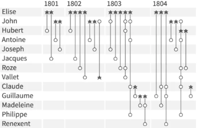
To further describe the technique we use a fictitious small dynamic hypergraph of business contracts in the 19th century (Figure 2). It includes thirteen vertices (people); four time slots (four years from 1801–1804), and twenty-seven hyperedges corre-sponding to business contracts signed by those people during the specified time period. Specific symbols at the intersection of the vertex and hyperedge can be used to depict the role of the person in the contact. For example, in Figure 2 a star marks the first person mentioned in each contract.
The names in Figure 2 have been sorted vertically by appear-ance over time and, when appearing at the same time-slot, by their overall degree, providing a strong cue regarding the evolution of the network. Elise’s business network starts small with only two contracts, each with a single partner. In the second time slot, Elise’s network expands with four contracts, but still, all contracts are one-to-one business relationships. The third time slot sees a significant expansion. More business partners for Elise and several contracts are now between multiple persons. Some are former partners appearing in the upper part of the list of names, and some are new people appearing lower down. John is a major partner appearing in three contracts. We can see that, early on, he had his own separate contracts, and that when he joins Elise in 1803, they signed larger multi-person contracts. In the final year more people are included overall but we see a rupture: Elise has ended all business with John and works only with new people, but she remains very active with multiple business partners—such as Claude, who remains in contact with John. John keeps working
Fig. 2: PAOH visualization of a small fictitious dynamic hypergraph of 18thcentury business relationships evolving over 4 years among thirteen people.
Fig. 3: Comparison of the representation of the same time slot using regular edges (on the left) versus hyperedges (on the right)
with his previous partners but also some of Elise’s earlier partners. One might wonder if John had a conflict with Elise, leading them not to work together anymore. PAOH facilitates this type of detailed and precise analysis of a dynamic hypergraph, which is crucial to many historical studies. The labels are readable and can be scanned easily, and there is no overlap, a perennial problem with graph visualization.
To illustrate another benefit of modeling and visualizing hyperedges, Figure 3 compares the representation of the 3rdtime slot modeled as a regular graph with edges (left) to the same data represented with hyperedges (right). The orange arrows point to six edges (clique) replaced by a single hyperedge. Again, using a regular graph visualization, it is impossible to know that multiple people are linked by a single contract.
Like other visualizations, the technique benefits from special-ized interactions (section 3.6) but the readability of the display makes it usable even without interaction; it can even be printed for a systematic detailed analysis or for publication—which is critical for our driving application in the digital humanities.
3.1 Drips for Hypergraph Simplification
A common approach for simplifying graphs is to filter out vertices with low degrees [42], e.g., hiding all the vertices that appear only in one single edge. In our prototype, a control allows users to set the minimum degree, and the existence and number of missing vertices are easily shown with a novel glyph that we call drips: tightly spaced smaller dots appended below the hyperedge line,
Fig. 4: A subset of Marie Boucher’s network. The vertices of people who signed only one contract have been filtered out. The fact that some people are missing is hinted at the lower end of the hyperedges by a drip line of smaller gray dots. On the right, we see how the tooltip reveals all the names—using smaller font size for the names of people that have been filtered out.
their number matching the number of missing vertices. Hovering over the hyperedge reveals all vertex labels in a consistent and readable manner (Figure 4). Drips dramatically reduce the overall size of the PAOH display but remain easy to understand and allows quickly revealing the hidden labels. Users are, most of the time, less interested in those one-time (or few times) vertices, but drips still remind them of the existence of the relationship instead of filtering them out totally.
3.2 Time slots
Each time slot Ticorresponds to a time interval [ti−1,ti[. The set of
edges Ei, composed by all connections having a time stamp τ ∈ Ti,
is associated with the time slot Ti. All the connections occurring
in a particular time slot are visible inside the horizontal bounds allocated to that time slot; this means that the width of the time slot adapts to fit all its hyperedges so the width of a slot is proportional to the number of hyperedges in this slot. Given the width w of a vertical edge, the width Wiof a time slot Ti, composed of m edges,
is given by Wi= m × (w + eTi) + eTi, where eTiis the edge padding
selected for the time slot Ti. This parameter can be modified by the
user to change the width of time slots.
When multiple occurrences of the same hyperedge occur within a time slot (e.g., multiple contracts between the exact same persons), they all appear individually by default. An option allows users to collapse them into a single hyperedge that appears slightly thicker until it reaches a maximum edge width (Figure 7). This decreases the width of the time slot by (w + eTi) × (n − 1), where n is the
number of repeated occurrences.
3.3 Ordering
We developed several vertex and edge ordering strategies which modify the layout and address different needs.
Vertex ordering. Vertex position remains constant in all the time slots and determines the length of the hyperedges, but different orderings help perform different tasks, e.g., bringing together highly connected vertices may reveal similarities. It may also reveal communities and outliers [43]. In our prototype users have the following ordering options:
• Original: vertices are ordered by ID. This order is useful in application domains that have a canonical vertex order that practitioners are trained to use.
• Chronological: vertices are sorted by chronological appear-ance (default, see Figure 2). It moves the names involved in
Fig. 5: Two visualizations of the same dataset with two time slots, sorted and colored by the group attribute. Values of the group are associated with colors that fill the background (left) or the dots (right). Both reveal 7 groups, and 5 vertices not belonging to any group.
the early contracts to the top, and the names appearing later are down below. If two vertices have their first edge in the same time-slot, the one with the higher degree appears on top.
• Alphabetical: useful to find vertices by name in long lists, which is critical for static or printed displays without search capability.
• Degree: vertices with a higher degree (higher number of connections through all the time slots) appear on top.
• Group: the vertices are first ordered according to the “group” attribute. This attribute may have been computed by a clustering algorithm or can be intrinsic to the dataset (e.g., person affiliation). Within each group, vertices are sorted chronologically. Sorting by group helps differentiate within-group versus between-within-group connections [44] (Figure 5).
• Reverse Cuthill McKee: this ordering tends to reduce the length of the edges [45].
• Spectral: tries to move vertices belonging to the same cluster close-by [43].
• Barycenter: similar to Spectral but uses a fast heuristics [46]. Van den Elzen et al. [6] also introduced an ordering method to move similar vertices far-away from each other and favor long edges. In PAOH, long edges are detrimental to hyperedge packing and to readability so we chose not to include that ordering method. Edge ordering. Time slots are always displayed by their natural chronological order, but within each time slot, the ordering of the edges can be changed. By default, the edges are sorted according to the order provided by the first vertex of the hyperedge. The edges can also be ordered by line length (recommended when packing is needed—see section 3.6 and Figure 5).
3.4 Visual Attributes
To address specific needs, visual attributes can be configured using control panels.
Visual attributes of vertices. The basic layout was designed to remain monochrome to allow the use of color for specific needs. For example, it can be used to color the vertex background (Figure 5-left) or the dots (Figure 5-right) according to the vertex group
attribute. Figure 5 shows two examples using a sample dataset with two time slots (from the synthetic dataset used by [35]). The left example uses background color; it clearly highlights groups but also how some vertices are absent in the first or the second time slot. It also shows cases where vertices group change over time. This encoding is most effective when the group changes remain limited, otherwise the evolution of connections between groups become difficult to perceive.
Coloring the dots produces a more subtle encoding but highlights the topology of the network better, such as inter-group relationships. In the example of Figure 5-right, the blue group has just one connection with the purple group in the first time slot, while in the second time slot, the number of connections between the groups increases.
Visual attributes of hyperedges. If color is not used to show the group attribute, consecutive hyperedges can be shown using alternate colors in the hope of facilitating the visual tracking of long lines. By default, we use green and purple. This may help the eye following long lines involving multiple visual saccades, and be useful for large printed hypergraphs. This option is turned off by default. Its effectiveness needs to be tested, but the participants of the usability test found it confusing. We have also experimented with providing multiple options such as dashed lines or varying line widths, but our participants also found them distracting or confusing so we ended-up not providing them by default.
Visual attributes at the intersection. The role of a vertex of a hyperedge can be marked with a symbol that can depict, e.g., the first author on a publication. The use of symbols for representing roles was implemented after a suggestion of one of the practitioners who worked with us in one of the case studies (section 5.2). She was interested in knowing the role of the persons who appeared in contracts, as either primary contractor, secondary, or witness. Currently, we only support one vertex to have a different role in each hyperedge, but we will support more roles in the future.
3.5 Numerical Summaries
The grid-like design of PAOH lends itself naturally to the inclusion of summaries on the side of the display. In our prototype, bars are placed on the left of vertices labels. They can indicate the number of hyperedges or the number of time slots where a vertex is present. Similarly, at the top of the time slot labels, bars indicate for each time slot either: the number of hyperedges, the number of nodes, or the average number of nodes per hyperedge. Other metrics could easily be added if asked by our partners.
3.6 Interaction
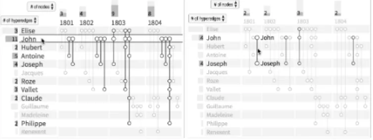
We now describe the interaction methods, from simple to advanced. Highlighting relationships. Hovering on a vertex label (e.g., John) highlights in bold all the hyperedges and all the vertices it is connected to (e.g., Figure 6-left). Hovering over the area at the intersection of John’s vertical line and a time slot highlights all his contracts in that particular period. Finally, hovering over the label of a time slot highlights all the contracts and all the people active in this time slot. Highlighting also updates the numerical summaries according to the selected items (Figure 6).
Revealing similar edges. Hovering over a hyperedge (e.g., a contract) highlights all the vertices it connects to and also highlights similar hyperedges. By default it highlights all the other hyperedges that have the same vertices and more, using a thicker line (Figure 6-right). A tooltip option can be enabled to display additional details
Fig. 6: Highlighting in PAOH. Left: Hovering over John highlights all his contracts and the names of the people involved. Right: Hovering over a contract between John and Joseph reveals contracts including at least John and Joseph, also in other time slots).
of a highlighted item (details on demand). It reveals exact dates and all the information related to the highlighted item (vertex or hyperedge). Finally, the arrow keys of the keyboard can be used to help users systematically review all vertices or hyperedges, browsing through the items one by one.
Selection. Selection has a similar behavior as hovering but the highlighting is persistent. Multiple selections reveal the union of all the edges (in bold), their intersection (bolder), and the dots corresponding to the selected nodes in the intersection are filled with black to make them easier to spot.
Filtering. A quick way to reduce the size of the dataset is to filter by one or more vertices. A double click on a vertex or searching a vertex name in the search box filters out all the vertices that are not connected to it (Figure 10). Hyperedges between remaining vertices that do not involve the selected vertex can either be removed entirely, or be grayed out (default). Grayed-out dots reveal that visible vertices have relations with other vertices that have been filtered out.
Zooming and Scrolling. Before scrolling becomes needed, users can reduce the vertices height and the time slot width. They can also choose to temporarily fit all the data in the available horizontal and/or vertical space to get an overview, even at the cost of reducing the readability of labels. When items that should be highlighted fall outside the visible portion of the display, colored hints are shown in the scroll bars. Small green bars for highlights, orange bars for selections, so that users know that scrolling is needed to see all the highlighted items.
Fig. 7: Packing (orange arrows) and collapsing multiple occurrences of the same hyperedge (blue) reduces horizontal space. On the left is a view before packing, and the right is after packing.
Packing. Packing optimizes the horizontal space and limits scrolling by reorganizing hyperedges in each time slot indepen-dently. It reuses the same horizontal position for hyperedges that do
not overlap vertically. Optimizing packing is an NP-hard problem, but we use the first fit bin packing approximation algorithm [47] that inserts each edge in turn, from left to right, where they can fit without overlap. This heuristic offers an excellent trade-off between speed and effectiveness. The orange arrows in Figure 7 highlight how packing changes the order of edges. In particular, the rightmost edges in the first time slot, labeled with “1803”, are shifted to the first three positions, because there is room to accommodate the edges. This shift saves the horizontal space of three edges. The resulting layout will depend on the vertex and edge ordering, and on the dataset but packing is always detrimental to readability. If the hypergraph associated with time slot (Ti) is sparse, then the
packing will have a great impact in reducing the horizontal space needed to render it (see Figure 2 in supplementary materials).
3.7 Implementation
Our prototype is available at https://aviz.fr/paohvis. It is imple-mented in about 5000 lines of Dart [48], a language compiled to JavaScript to run inside web browsers. It uses the Canvas API for fast drawing; our implementation can visualize hundreds of vertices (limited by vertical scrolling) and thousands of hyperedges (limited by horizontal scrolling). The orderings are computed using the reorder.js library [49].
4
F
ORMATIVEU
SABILITYS
TUDYTo identify usability problems, gather feedback, and improve the prototype, we have performed a formative user study. A secondary goal was to verify that users could interpret the PAOH visualization, and perform complex tasks by combining multiple features and functionalities of PAOH without training. Before the study, we conducted a pilot with 2 participants to test the procedure. As we conducted the study, we fixed bugs and improved the prototype to address the problems encountered by participants or their suggestions. Examples of improvements include placement of labels, the addition of summary charts, highlighting similar edges, depicting vertices roles, and choosing better default values for options.
4.1 Procedure
Nine participants were recruited from our local research community (students or more senior researchers) and told that they were going to be looking at co-authorship networks. The participants used a desktop computer with an ordinary keyboard and mouse, and were encouraged to think-aloud at all time. The study was organized in 2 main phases and every participant followed the same procedure. Each session lasted for about 20 minutes.
In the first phase (Discovery): participants were shown a small publication dataset using the PAOH visualization. Participants were initially asked to describe what they were seeing in the visualization without receiving any training. Then they were encouraged to explore and interact with the toolbar and the visualization on their own and discover how the tool works. If participants needed help, the observer answered their questions and noted the difficulty participants had encountered.
In the second phase (Task): participants were asked to perform a list of tasks, as reported in Section 4.2. At the end of each session, participants were asked to provide feedback.
To provide a meaningful situation and encourage participants to explore the data, we used two datasets of publications from
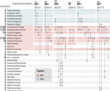
Fig. 8: Co-authorship network of the small lab’s publications—used in the Discovery phase of the usability study. Co-authors with only one paper are filtered out.
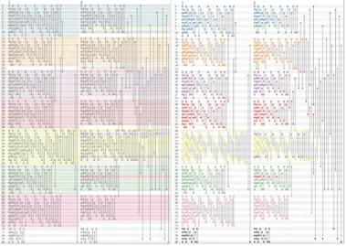
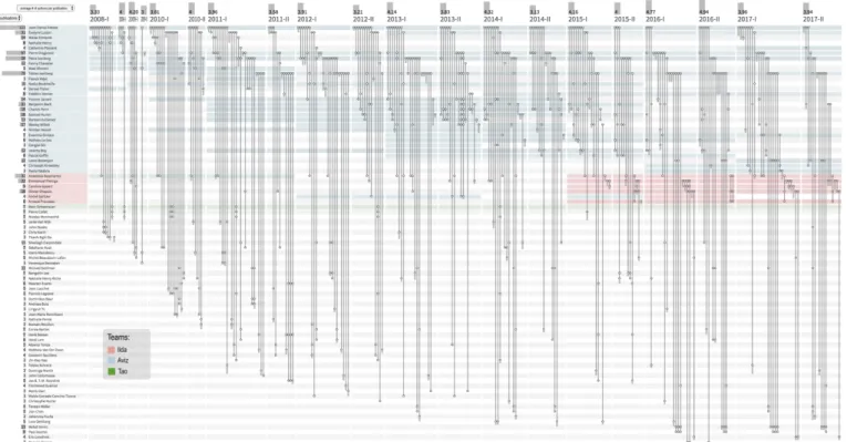
two local research labs. Participants were familiar with those labs and many current members—but not all, and had not looked at the history of publications. During the Discovery phase, the co-authorship network of people from the smallest lab was used, with 57 authors and 36 publications over 6 semesters, from 2015 to 2017 (Figure 8). The whole dataset fits in the screen, so no scrolling was required. A larger dataset was used for the Tasks phase, with the publications of both labs, i.e., 371 authors and 312 publications over a time span of 20 semesters, from 2008 to 2017 (Figure 9). Users had to zoom or scroll to see the entire dataset.
We selected realistic tasks, from simple to complex, that someone interested in analyzing co-authorship networks would have in real life.The complexity of tasks is discussed in Ahn et al. [36], and relates to “analysts [who] . . . often combine tasks into compound tasks in order to explore more complex questions”. We focused on tasks that used the hypergraph nature of the data. In order to provide answers, tasks required the combination of multiple elements and features of the design, so we could observe what strategies users would use.
4.2 Results
Discovering how to interpret a PAOH visualization. At the start (i.e., without any interaction), all participants guessed correctly that authors were arranged in rows and publications in columns. They guessed that a dot on a line meant that the author associated with the row was a co-author of the publication. No one seemed confused by the varying width of the semester time slots. Three participants immediately guessed that drips meant filtered-out people, and all participants understood it after they interacted with the system.
Once they were able to interact with the system, participants understood the color coding. However, there was some confusion about special cases where an author had left a team but remained co-author on later papers; no background color was interpreted as a bug by some participants—the observer had to clarify the meaning.
In the early pilot, the (default) use of alternate colors for the edges was confusing participants. Seven participants commented that alternating colors might help to differentiate neighboring lines.
Two said that it would not be useful anyway. Only two kept the alternate colors, so we turned it off by default.
There was no issue with the barcharts on the sides and the scrollbars. The four participants who noticed the hints on the scrollbars found them useful. At first, zooming was challenging, so we improved the controls and added two buttons to fit the display to the screen size, horizontally and vertically.
At first, the interface used the technical terms of vertex, hyperedge, time slot, and group. Several participants were not familiar with those terms so we included the definition of domain dependent terms—author, publication, semester, and team—in the dataset to customize the interface. This eliminated the confusion.
Filtering was more challenging to understand. We added a simple animation to reveal how the display changed when filtering, which was helpful. The presence of grayed out edges, i.e., edges one hop away from selected vertices, was confusing to some participants, so we added an option to hide them to simplify the results. They are now hidden by default. Finally, some participants did not understand how filtering an author affected the drips and we still need to improve the feedback of filtering. We plan to modify the drip labeling and to group authors visible as drips according to the reason they were filtered out, i.e., either because of filtering by degree or by one or more specific vertices.
Tasks. In the following, we review each task one by one. T1. Find all the papers Petra Isenberg and Danyel Fisher wrote together.
All participants were able to answer correctly. Many strategies were used to solve this task; one participant even listed 4 strategies, but all of them were trivial to perform. They usually searched for one of the authors (either with the search function or by sorting the authors alphabetically), then visually answered the task or by watching the barcharts while using highlighting on the second author. Multiple selection also helped.
T2. Find the 3 people Petra Isenberg has written papers with the most often.
The first part of the task was trivial to perform: all participants immediately selected and filtered on Petra.For the second part,
the first two participants attempted the task visually by looking at rows with many dots, and carefully counted the dots. The other participants all used the barcharts, which were changed to update when highlighting or selectingto simplify this seemingly generic task, and got the correct answer.
T3. Looking at Petra’s network, are there papers with the exact same co-authors in different semesters? Tell me the names.
We had selected this task to be difficult,in the sense of Ahn et al. [36]. To perform this tasks, users had to split the high-level task into simpler sub-tasks, and there were multiple ways of performing this decomposition, none of them being trivial.We were surprised that 5 participants were able to answer it correctly. Indeed all participants reported it to be challenging. Most participants did not have access to the highlighting of similar edges (which was just added recently). One early participant abandoned without trying, the others devised a valid strategy but did not always complete the task when it was tedious. One strategy used to give the correct answer by three participants was to first look for lines of the same length and then check if they had the same dots, either visually or by highlighting the names of the co-authors associated with the edge. One participant reordered the names by one of the heuristics that reduce line length, guessing that shorter edges would have more chances to share the same coauthors. An effective strategy (used correctly by two participants who had access to the feature)
Fig. 9: Co-authorship network from the two labs combined publications—used in the Tasks phase of the usability study. Coauthors with only one or two papers were moved to the drips.
was to use the highlighting of similar edges. They would hover over an edge—which highlighted other edges with at least the same authors—and then repeated for all edges one by one. After locating the edges, they used the tooltip to get the name of the publication. Of course tools designed specifically for co-authorship net-works may provide a custom function for this complex task, but our usability study suggests that users are able to combine basic PAOH functionalities to answer very complex task.
T4. Anything else you can say about Petra’s publications and how her co-authorship evolved?
To solve this open-ended question all participants filtered on Petra. They correctly commented that Petra was quite active, and published regularly except on the second semesters of 2011 or 2012, proposing hypotheses as to why. They remarked that Petra’s long term collaborations involved mainly senior researchers. They noticed that no publication had Petra as a single author. Several participants commented that they would prefer to remove all grayed out publications entirely since it made it harder to focus only on Petra’s network. This option was introduced for the last participant, who used it while answering several tasks.
T5. Can you tell if over time papers have more co-authors than before, less, or about the same?
T5 was quite difficult as well; it is described as an Inferential Compound Tasksin Ahn et al. [36]. All the information is visible to answer but users need to carefully count and average the dots. Early participants only “guess-estimated”, so after the third participant, we introduced the option “average # of authors per publications” to the time slot summary charts. The bars—and the menu to change to the appropriate metric—were successfully used by 4 out of the 6 participants who had access to them. The remaining two participants did not think of using the summary bars.
T6. What can you tell me about the collaboration between teams? This was also an open question. All participants tried one of the color by group options (background or dots) and then used
the author ordering by group (team). Participants reported that some authors changed team; that the smallest team was created on 2015; that there was more collaboration within teams than collaborations between teams, and that one author from the smallest team (who had belonged to the largest team in the past), was mainly responsible for the collaboration.
After completing the tasks, participants could explore further and comment on the overall experience. Many participants ex-pressed that they liked the filtering because it reduced the amount of information displayed. Participants who had access to the highlighting of similar edges said that this was very helpful; one of them pointed out that it could be helpful in other contexts. Some participants suggested improvements to the control panel layout and the layout was improved, even though we aim at continuously improving the UI.
In summary, while most participants were able to interpret all basic features of the PAOH visualization without any training, some interactive features were more challenging and should be the focus of a training video to be accessible to all. Many participants were able to complete even the most challenging tasks, and most devised adequate strategies that would lead to the correct answer. Some participants were clearly not motivated enough to complete complex tasks.
In addition to structured formative usability study, we also collected feedback fromabout fiftyadditional users during demon-strations, labs, and exploration of possible case studies, which generally confirmed the study results and provided suggestions for improvements. Examples are the use of different icons of the dots in order to identify the role of the vertex in the hyperedge (e.g. a star for the lead author), or aggregating vertices according to an attribute, in order to scale further. As is always the case, users wish to be able to access the source documents directly from the visualization, and possibly correct mistakes in the coded data.
During labs, they understood the benefit of the simplicity of PAOH, and that external tools such as spreadsheets were appropriate and effective for cleaning-up and transforming their data, instead of bloating PAOH with data manipulation functions. In the future, we hope that PAOH can be integrated into visualization suites such as the Vistorian [30], allowing users to analyze their data from complementary visual representations and perspectives.
5
U
SEC
ASESSimple graphs can be found in abundance in open data repositories, but dynamic hypergraphs data are less common. To motivate and showcase the PAOH representation, we describe two use cases: a trade network in the 17th century, a study on the circulation of entrepreneurs in Piedmont during the 18thcentury.
5.1 Trade Network in the 17thCentury
We worked with a professional historian studying the role and power of a non-married woman, Marie Boucher, a merchant living in the 17thcentury in Nantes, France. Dufournaud et al. [1] analyzed
the trade relations among people linked to her from contracts (called Actes in the visualization) found in multiple archives. An important part of the work was to understand—and present—the changing relationships that Boucher had with other merchants over time.
This case study is representative of a large category of studies in social history in which people are connected through dated documents where they are mentioned, such as contracts, but also diaries, and justice decisions. Such datasets are then carefully curated and studied in great depth and details by humanists, over long periods of time as the research progresses. The acquisition and curation process is very tedious: documents may have to be discovered in archives, transcribed, and annotated manually (because transcription and entity extraction algorithms do not work with old French or old English manuscripts). As a result, many studies generate moderately large datasets with twenty to a hundred person, and hyperedges connecting two to a dozen people. The Boucher dataset is representative of this large category of studies. It is composed of 59 contracts mentioning 90 persons overall. Each contract can be modeled as a hyperedge linking several persons. Each contract has a signature date (no duration). Modeling the same data as a standard graph, these 59 hyperedges would become 488 edges, one for each relation between a pair of persons. Modeling the hypergraph as a bipartite graph would generate an additional 59 nodes and 322 edges.
Our case study partner had already studied the dataset at length (see work [1]). The relationships had been visualized using two separate representations: node-link diagrams and TimeArcs [33], shown in the supplementary material. The TimeArcs visualization shows the dynamic graph that revealed the connections between persons over time, but not showing the documents. The initial analysis had been done using these two representations only.
Our collaborator found the PAOH representation clear and was able to understand it after a very brief description. She quickly commented that the same analysis required only one visualization and could be done more accurately. Some new findings were identified. For example in 1667, Marie Boucher had two contracts with Jean Boucher (line 3) and two others with Julien G´erard Seigneur de Nays (line 9)—while Dufournaud et al. had assumed that two persons connected during the same year appeared in only one contract. Using the highlighting of similar hyperedges, she noted surprising repetitions over the years. Our collaborator
also explained that three main phases had been identified after the lengthy prior analysis and inspection of original documents: an initial phase from 1660 to 64 with mostly French trading, a second phase with cross Atlantic trade from 1666 to 68, and a third expansion phase until 1675, after which Marie disappears from the records until a 1689 mention of her being deceased. She stated that those phases were clearly apparent in the PAOH visualization that represents time and connections simultaneously. She commented that it provided good narrative support, and would be useful to communicate the findings during talks and in print. In addition, the color coding was found useful to represent the strong—and changing—family connections.
5.2 Circulation of Entrepreneurs in Piedmont During the 18thCentury
We worked with two professional historians analyzing the evolution of a network of entrepreneurs in Piedmont (a region of Italy) in the 18thcentury [50]. The aim of the study was to understand the ties between building contractors and their mobility through contracts established by cities. Cristofoli and Rolla analyzed 330 archived contracts, extracting the contractors involved and their professions, roles, cities of origin, as well as the city and location of the projects during the 1711–1742 period. It included 594 different individuals. To make sense of their data, the authors had originally used several visualizations such as Figure 10-left, using a bipartite network clustered by work location and linking to the construction sites. They thought they knew their dataset well.
Using PAOH, the historians were able to make new obser-vations. For example, construction appears clearly as a seasonal activity with breaks in winter (Figure 10-right), where September to December is almost empty except in 1713. The original analysis missed both the seasonal pattern and the 1713 exception deserving further investigation. The visualization also revealed that the collaborations included people from more diverse origins over time. This insight was unexpected as it goes against dominant beliefs in history according to [50].
Coloring by the profession of contractors, the historians saw that only a few professions, usually two, were present in each contract. In addition, they saw that some contractors reported different professions over time so our collaborators are now researching whether this is tied to an underlying strategy used to win contracts or a simple inconsistency in reporting professions. In a few sessions, PAOH was able to deeply engage the researchers and generate new insights. The rich data they gathered suggested many improvements to PAOH, such as the possibility to encode more than one role per hyperedge, and to dynamically choose the attribute that should be visualized as group using colors. Initially, we chose to represent the region of origin, but it could be mapped to other attributes, such as the current region or the stated profession.
6
C
ONCLUSIONIn this article, we introduced Parallel Aggregated Ordered Hyper-graph, a technique to visualize dynamic hypergraphs. We described the technique as well as its visual encodings, interactions, layout and simplification operations, with examples using real data from two application domains. A usability study with 9 participants demonstrates that the technique is easy to learn, and can be used to answer complex questions. Finally, two case studies with historians suggest that PAOH provides a new and effective way to analyze the medium size hypergraphs commonly produced
Fig. 10: On the left, the static bipartite node-link diagram originally published by [50] connecting the contractors and contracts in which they are mentioned, clustered by region of origin, and also linked to their construction site visualized as large round points. On the right, a selection of the network showing the contracts signed by at least one member of the “Menafoglio” family, visualized using Paohvis with monthly time slots, colored by region of origin of the contractors.
by digital humanities projects and that modeling relationships as dynamic hypergraphs can lead to more accurate analyses.
Future work include all the improvements asked by our partners related to roles, managing multiple groups, and integration with the suite of visualizations of the Vistorian. Longer term plans include working on scalability. One good property of hypergraphs is that, when aggregating multiple vertices, they remain hypergraphs. Dynamic hypergraph visualization is still in its infancy but we hope that PAOH will stimulate additional innovation in this area.
A
CKNOWLEDGMENTSWe thank our collaborators Pascal Cristofoli and Nicoletta Rolla for providing the motivation for this work and for helping us validate our design. We also thank our colleagues from the University of Maryland HCIL, from Inria, Aviz and Ilda, and the students from the University of Bari IVU lab for their feedback.
R
EFERENCES[1] N. Dufournaud, B. Michon, B. Bach, and P. Cristofoli, L’analyse des r´eseaux, une aide `a penser : r´eflexions sur les strat´egies ´economique et sociale de Marie Boucher, marchande `a Nantes au XVIIe si`ecle. Presses universitaires de Bordeaux, 2017, pp. 109–137.
[2] F. Beck, M. Burch, S. Diehl, and D. Weiskopf, “The State of the Art in Visualizing Dynamic Graphs,” in EuroVis - STARs, R. Borgo, R. Maciejewski, and I. Viola, Eds. The Eurographics Association, 2014. [3] P. Valdivia, P. Buono, C. Plaisant, N. Dufournaud, and J.-D. Fekete, “Using dynamic hypergraphs to reveal the evolution of the business network of a 17th century french woman merchant,” in VIS 2018-3rd Workshop on Visualization for the Digital Humanities, 2018.
[4] W. J. Longabaugh, “Combing the hairball with BioFabric: a new approach for visualization of large networks,” BMC Bioinformatics, vol. 13, no. 1, p. 275, 2012. [Online]. Available: http://dx.doi.org/10.1186/ 1471-2105-13-275
[5] F. Beck, M. Burch, S. Diehl, and D. Weiskopf, “A Taxonomy and Survey of Dynamic Graph Visualization,” Comput. Graph. Forum, vol. 36, no. 1, pp. 133–159, 2017. [Online]. Available: http://dx.doi.org/10.1111/cgf.12791
[6] S. van den Elzen, D. Holten, J. Blaas, and J. J. van Wijk, “Dynamic Network Visualization with Extended Massive Sequence Views,” IEEE Trans. Vis. & Comp. Graph., vol. 20, no. 8, pp. 1087–1099, Aug 2014. [7] M. Latapy, T. Viard, and C. Magnien, “Stream Graphs and Link Streams
for the Modeling of Interactions over Time,” CoRR, vol. abs/1710.04073, 2017. [Online]. Available: http://arxiv.org/abs/1710.04073
[8] M. E. J. Newman, “The structure of scientific collaboration networks,” Proc. of the National Academy of Sciences of the United States of America, vol. 98, no. 2, pp. 404–409, January 2001. [Online]. Available: http://dx.doi.org/10.1073/pnas.021544898
[9] H. Kang, C. Plaisant, B. Lee, and B. B. Bederson, “Netlens: iterative exploration of content-actor network data,” Information Visualization, vol. 6, no. 1, pp. 18–31, 2007.
[10] M. Latapy, C. Magnien, and N. D. Vecchio, “Basic notions for the analysis of large two-mode networks,” Social Networks, vol. 30, no. 1, pp. 31 – 48, 2008.
[11] B. Alsallakh, L. Micallef, W. Aigner, H. Hauser, S. Miksch, and P. Rodgers, “The state-of-the-art of set visualization,” Comput. Graph. Forum, vol. 35, no. 1, pp. 234–260, 2016. [Online]. Available: http://dx.doi.org/10.1111/cgf.12722
[12] K. Dinkla, M. J. van Kreveld, B. Speckmann, and M. A. Westenberg, “Kelp diagrams: Point set membership visualization,” Comput. Graph. Forum, vol. 31, no. 3pt1, pp. 875–884, 2012. [Online]. Available: http://dx.doi.org/10.1111/j.1467-8659.2012.03080.x
[13] J. Paquette and T. Tokuyasu, “Hypergraph visualization and enrichment statistics: how the egan paradigm facilitates organic discovery from big data,” Proc. SPIE, vol. 7865, pp. 78 650E–78 650E–18, 2011. [Online]. Available: http://dx.doi.org/10.1117/12.890220
[14] R. Sadana, T. Major, A. Dove, and J. Stasko, “OnSet: A Visualization Technique for Large-scale Binary Set Data,” IEEE Trans. Vis. & Comp. Graph., vol. 20, no. 12, pp. 1993–2002, Dec 2014.
[15] B. Kim, B. Lee, and J. Seo, “Visualizing set concordance with permutation matrices and fan diagrams,” Interacting with Computers, vol. 19, no. 5-6, pp. 630–643, 06 2007. [Online]. Available: https://doi.org/10.1016/j.intcom.2007.05.004
[16] A. Lex, N. Gehlenborg, H. Strobelt, R. Vuillemot, and H. Pfister, “UpSet: Visualization of Intersecting Sets,” IEEE Trans. Vis. & Comp. Graph., 2014, live Demo: http://vcg.github.io/upset.
[17] C. Vehlow, F. Beck, and D. Weiskopf, “The State of the Art in Visualizing Group Structures in Graphs,” in Eurographics Conf. on Visualization (EuroVis) - STARs, R. Borgo, F. Ganovelli, and I. Viola, Eds. The Eurographics Association, 2015.
[18] T. Falkowski, J. Bartelheimer, and M. Spiliopoulou, “Mining and visualizing the evolution of subgroups in social networks,” in 2006 IEEE/WIC/ACM Int. Conf. on Web Intelligence, Dec 2006, pp. 52–58. [19] M. Rosvall and C. T. Bergstrom, “Mapping change in large networks,”
PLOS ONE, vol. 5, no. 1, pp. 1–7, 01 2010. [Online]. Available: https://doi.org/10.1371/journal.pone.0008694
[20] Y. Wang, Q. Shen, D. W. Archambault, Z. Zhou, M. Zhu, S. Yang, and H. Qu, “AmbiguityVis: Visualization of Ambiguity in Graph Layouts,” IEEE Trans. Vis. & Comp. Graph., vol. 22, pp. 359–368, 2016. [21] B. Saket, C. E. Scheidegger, and S. G. Kobourov, “Comparing
node-link and node-node-link-group visualizations from an enjoyment perspective,” Comput. Graph. Forum, vol. 35, pp. 41–50, 2016.
[22] C. Vehlow, F. Beck, P. Auw¨arter, and D. Weiskopf, “Visualizing the evolution of communities in dynamic graphs,” Comput. Graph. Forum, vol. 34, no. 1, pp. 277–288, 2014. [Online]. Available: https://onlinelibrary.wiley.com/doi/abs/10.1111/cgf.12512
[23] B. Lee, M. Czerwinski, G. Robertson, and B. B. Bederson, “Understanding research trends in conf.s using paperlens,” in CHI ’05 Extended Abstracts on Human Factors in Computing Systems, ser. CHI EA ’05. New York, NY, USA: ACM, 2005, pp. 1969–1972. [Online]. Available: http://doi.acm.org/10.1145/1056808.1057069
[24] N. A. Arafat and S. Bressan, “Hypergraph drawing by force-directed placement,” in Database and Expert Systems Applications, D. Benslimane, E. Damiani, W. I. Grosky, A. Hameurlain, A. Sheth, and R. R. Wagner, Eds. Cham: Springer International Publishing, 2017, pp. 387–394. [25] A. Kerren and I. Jusufi, “A novel radial visualization approach for
undirected hypergraphs,” Eurographics Association, pp. 25–29, 2013. [26] T. Tang, S. Rubab, J. Lai, W. Cui, L. Yu, and Y. Wu, “iStoryline: Effective
Convergence to Hand-drawn Storylines,” IEEE Trans. Vis. & Comp. Graph., vol. 25, no. 1, pp. 1–1, Jan. 2018.
[27] Y. Tanahashi, C.-H. Hsueh, and K.-L. Ma, “An efficient framework for generating storyline visualizations from streaming data,” IEEE Trans. Vis. & Comp. Graph., vol. 21, no. 6, pp. 730–742, June 2015.
[28] C. J. Arnold, An Archaeology of the Early Anglo-Saxon Kingdoms, 2nd ed. Routledge, 1997.
[29] J. Zhao, M. Glueck, F. Chevalier, Y. Wu, and A. Khan, “Egocentric Analysis of Dynamic Networks with EgoLines,” in Proc. of the 2016 CHI Conf. on Human Factors in Computing Systems, ser. CHI ’16. New York, NY, USA: ACM, 2016, pp. 5003–5014. [Online]. Available: http://doi.acm.org/10.1145/2858036.2858488
[30] B. Bach, N. Henry-Riche, T. Dwyer, T. Madhyastha, J.-D. Fekete, and T. Grabowski, “Small MultiPiles: Piling Time to Explore Temporal Patterns in Dynamic Networks,” Comput. Graph. Forum, 2015. [Online]. Available: https://hal.inria.fr/hal-01158987
[31] D. Hansen, B. Shneiderman, and M. A. Smith, Analyzing Social Media Networks with NodeXL: Insights from a Connected World. San Francisco, CA, USA: Morgan Kaufmann Publishers Inc., 2010.
[32] M. Bastian, S. Heymann, and M. Jacomy, “Gephi: An open source software for exploring and manipulating networks,” in Int.l AAAI Conf. on Weblogs and Social Media, 2009, pp. 361–362.
[33] T. N. Dang, N. Pendar, and A. G. Forbes, “TimeArcs: Visualizing Fluctuations in Dynamic Networks,” Comput. Graph. Forum, 2016. [34] M. Burch, C. Vehlow, F. Beck, S. Diehl, and D. Weiskopf, “Parallel Edge
Splatting for Scalable Dynamic Graph Visualization,” IEEE Trans. Vis. & Comp. Graph., vol. 17, no. 12, pp. 2344–2353, Dec. 2011. [Online]. Available: http://dx.doi.org/10.1109/TVCG.2011.226
[35] B. Bach, E. Pietriga, and J.-D. Fekete, “GraphDiaries: Animated Transitions andTemporal Navigation for Dynamic Networks,” IEEE Trans. Vis. & Comp. Graph., vol. 20, no. 5, pp. 740–754, May 2014. [Online]. Available: http://dx.doi.org/10.1109/TVCG.2013.254
[36] J. wook Ahn, C. Plaisant, and B. Shneiderman, “A Task Taxonomy for Network Evolution Analysis,” IEEE Trans. Vis. & Comp. Graph., vol. 20, no. 3, pp. 365–376, 2014.
[37] N. Kerracher, J. Kennedy, and K. Chalmers, “A Task Taxonomy for Temporal Graph Visualisation,” IEEE Trans. Vis. & Comp. Graph., vol. 21, no. 10, pp. 1160–1172, Oct 2015.
[38] B. Lee, C. Plaisant, C. Sims, J.-D. Fekete, and N. Henry, “Task taxonomy for graph visualization,” in BELIV ’06: Proc. of the 2006 AVI workshop on BEyond time and errors, ACM. Venice, Italy: ACM, May 2006, pp. 1–5. [Online]. Available: https://hal.inria.fr/hal-00851754
[39] R. Amar, J. Eagan, and J. Stasko, “Low-Level Components of Analytic Activity in Information Visualization,” in Proc. of the 2005 IEEE Symposium on Inf. Vis., ser. INFOVIS ’05. Washington, DC, USA: IEEE Computer Society, 2005, pp. 15–. [Online]. Available: http://dx.doi.org/10.1109/INFOVIS.2005.24
[40] D. J. Peuquet, “Its About Time - a Conceptual-Framework for the Rep-resentation of Temporal Dynamics in Geographic Information-Systems,” Annals of the Association of American Geographers, vol. 84, no. 3, pp. 441–461, 1994.
[41] N. Andrienko and G. Andrienko, Exploratory Analysis of Spatial and Temporal Data: A Systematic Approach. Secaucus, NJ, USA: Springer-Verlag New York, Inc., 2005.
[42] C. Dunne and B. Shneiderman, “Motif simplification: improving network visualization readability with fan, connector, and clique glyphs,” in Proc. of the SIGCHI Conf. on Human Factors in Computing Systems. ACM, 2013, pp. 3247–3256.
[43] M. Behrisch, B. Bach, N. Henry Riche, T. Schreck, and J.-D. Fekete, “Matrix Reordering Methods for Table and Network Visualization,” Comput. Graph. Forum, vol. 35, p. 24, 2016. [Online]. Available: https://hal.inria.fr/hal-01326759
nities,” in Privacy, Security, Risk and Trust (PASSAT) and 3rd Inernational Conf. on Social Computing (SocialCom). IEEE, 2011, pp. 354–361. [44] E. M. Rodrigues, N. Milic-Frayling, M. Smith, B. Shneiderman, and
D. Hansen, “Group-in-a-box layout for multi-faceted analysis of
commu-[45] E. Cuthill and J. McKee, “Reducing the bandwidth of sparse symmetric matrices,” in Proc. of the 1969 24th National Conf., ser. ACM ’69. New York, NY, USA: ACM, 1969, pp. 157–172. [Online]. Available: http://doi.acm.org/10.1145/800195.805928
[46] E. M¨akinen and H. Siirtola, “The barycenter heuristic and the reorderable matrix,” Informatica (Slovenia), vol. 29, no. 3, pp. 357–364, 2005. [47] E. G. Coffman, Jr., M. R. Garey, and D. S. Johnson, “Approximation
Algorithms for Bin Packing: A Survey,” in Approximation Algorithms for NP-hard Problems, D. S. Hochbaum, Ed. Boston, MA, USA: PWS Publishing Co., 1997, pp. 46–93. [Online]. Available: http://dl.acm.org/citation.cfm?id=241938.241940
[48] G. Bracha, The Dart Programming Language, 1st ed. Addison-Wesley Professional, 2015.
[49] J.-D. Fekete, “Reorder.js: A JavaScript Library to Reorder Tables and Networks,” IEEE VIS 2015, Oct. 2015, poster. [Online]. Available: https://hal.inria.fr/hal-01214274
[50] P. Cristofoli and N. Rolla, “Temporalit´es `a l’œuvre dans les chantiers du bˆatiment,” Temporalit´es, no. 27, jun 2018. [Online]. Available: https://doi.org/10.4000/temporalites.4456
Paola Valdivia is a Postdoc researcher at
IN-RIA Project Team AVIZ. She obtained her PhD from the Mathematical and Computer Sciences Institute of University of S ˜ao Paulo - S ˜ao Carlos, Brazil. Her research interests are in Network Vi-sualizations, Information Visualization and Visual Analytics.
Paolo Buono is assistant professor at the
De-partment of Computer Science of the University of Bari, Italy. He is the coordinator for Information Visualization and Visual Analytics at the IVU Lab. He holds a PhD in Computer Science on Visual Data Analysis. His current research interests in-clude Visual Analytics, Information Visualization, HCI, Mobile Applications, Time Series.
Catherine Plaisant is a research scientist at
the University of Maryland, College Park and assistant director of research of the University of Maryland Human-Computer Interaction Lab. She is also an INRIA International Chair. Her research focuses on human-computer interaction and visualization.
Nicole Dufournaud is an associate researcher
in the LaD ´eHiS and Gender History research groups. She has a PhD in Modern History at EHESS. Her research focuses on women’s roles and powers in the 16th century in western France”.
Jean-Daniel Fekete is the Scientific Leader of
the INRIA Project Team AVIZ that he founded in 2007. He received his PhD in Computer Science in 1996 from University of Paris Sud, France. His main research areas are Visual Analytics, Information Visualization and Human Computer Interaction. He is a Senior Member of IEEE.
![Fig. 10: On the left, the static bipartite node-link diagram originally published by [50] connecting the contractors and contracts in which they are mentioned, clustered by region of origin, and also linked to their construction site visualized as large ro](https://thumb-eu.123doks.com/thumbv2/123doknet/14484692.524801/12.918.82.847.69.298/bipartite-originally-published-connecting-contractors-contracts-construction-visualized.webp)
