Designing a Mapping Visualization to Integrate
Physical and Cyber Domains
by
Nicole Tubacki
S.B., Massachusetts Institute of Technology (2017)
Submitted to the Department of Electrical Engineering and Computer
Science
in partial fulfillment of the requirements for the degree of
Master of Engineering in Electrical Engineering and Computer Science
at the
MASSACHUSETTS INSTITUTE OF TECHNOLOGY
June 2018
c
○ Massachusetts Institute of Technology 2018. All rights reserved.
Author . . . .
Department of Electrical Engineering and Computer Science
May 25, 2018
Certified by . . . .
Vijay Gadepally
Senior Member of the Technical Staff
Thesis Supervisor
Accepted by . . . .
Katrina LaCurts
Chairman, Masters of Engineering Thesis Committee
Designing a Mapping Visualization to Integrate Physical and
Cyber Domains
by
Nicole Tubacki
Submitted to the Department of Electrical Engineering and Computer Science on May 25, 2018, in partial fulfillment of the
requirements for the degree of
Master of Engineering in Electrical Engineering and Computer Science
Abstract
The amount of data easily available to researchers makes observing patterns easier than ever, but certain fields like cyber security face certain specific challenges in the way this data can be represented, due to the ever-increasing amount and frequency of important data. Additionally, there are few visualizations that map data from the cyber domain to the physical domain, making it difficult for researchers to bridge the gap between cyber and physical spheres. This study aims to address some of these deficiencies by creating a prototype that visualizes both the cyber domain and the physical domain, allowing researchers to determine how the data associated with both these domains are connected. The prototype is a real-time mapping visualiza-tion that contains several different components and layers, including weather, major transportation hubs, location searches for places and IP addresses, and social network searches and analyses. This project is a proof of concept work to show the different options that can be implemented in mapping software and is intended to be exten-sible, customizable, and easily learned. After describing my design, I discuss several different options for customization and growth of the system in the future.
Thesis Supervisor: Vijay Gadepally
Acknowledgments
I would like to thank Vijay Gadepally, Bich Vu, and Diane Staheli for giving me the chance to work on this project with them. I would particularly like to thank Vijay and Bich for all of their guidance and feedback and their help in making sure this project stayed on track. Without their constant support and advice, this research would not have been nearly as successful. Furthermore, I am extremely thankful for Bich’s explanation of the field and especially for her personal advice and willingness to help me both academically and personally.
I would also like to thank everyone who has helped me at MIT - my advisor Professor Patrick Winston, my professors, and everyone at 𝑆3 and SDS. Furthermore,
a huge thanks to all of my friends for always supporting me and making the past five years incredibly successful, exciting, and fun.
Finally and most importantly, I would like to thank my family for everything they have done to get me to this point. Between encouraging me to always learn more about exciting things, taking care of me when I’ve been sick, and making sure that I was inspired every step of the way, my parents are the entire reason I am here and have been able to have this incredible experience. So thank you mom, dad, Lucas, and Julia, for making me never want to leave home but always being there for me when I do.
Contents
1 Introduction 13 2 Background 15 2.1 Motivation . . . 15 2.2 Related Work . . . 16 3 Visualization Design 19 3.1 Product Specifications . . . 19 3.1.1 Extensibility . . . 19 3.1.2 Customizability . . . 20 3.1.3 Usability . . . 203.2 User Interface Design . . . 21
3.2.1 Overall Layout . . . 21 3.2.2 Mapping Visualizations . . . 22 4 Technical Design 25 4.1 Product Architecture . . . 25 4.2 Mapping Libraries . . . 26 4.2.1 Google Maps . . . 26 4.2.2 Mapbox . . . 27 4.2.3 Leaflet . . . 27 4.2.4 OpenLayers . . . 28 4.2.5 Design Decisions . . . 28
4.3 Base Map Functionality . . . 29
4.3.1 Base Map Layers . . . 29
4.3.2 Base Components . . . 31
5 Extensions 33 5.1 Controls . . . 33
5.2 Additional Layers . . . 36
5.3 Calculated and External Data Integrations . . . 40
5.4 User Extensibility . . . 41
6 Twitter Sentiment Analyzer 43 6.1 Retrieving Tweets and Location Filtering . . . 43
6.2 Sentiment Analysis and Tweets JSON . . . 45
6.3 Markers and Map Layer . . . 47
7 Results 51 7.1 Challenges . . . 51
7.1.1 Designing for Extensibility . . . 51
7.1.2 Open Source Packages and Data . . . 52
7.1.3 Prototype Packaging . . . 53
7.2 Results . . . 53
7.2.1 Marker Additions . . . 53
7.2.2 Sentiment Analysis and Tweet Parsing . . . 55
7.2.3 Overall Results . . . 56
8 Conclusion and Future Work 59
List of Figures
3-1 Overall layout. . . 21
3-2 Different types of visualizations. . . 23
4-1 Architecture diagram. . . 25
4-2 System diagram. . . 29
4-3 Background maps. . . 30
5-1 Map controls. . . 34
5-2 Recommendations for a search term. . . 35
5-3 Marker at a search result. . . 35
5-4 Background layers selecting popup. . . 36
5-5 Weather map options. . . 37
5-6 Airports layer. . . 38
5-7 A cluster showing the area covering a group of airports. . . 39
5-8 Popup describing airport location. . . 39
5-9 Marker showing the location of a searched IP. . . 40
5-10 Marker and alert showing the location of a malicious IP. . . 41
6-1 Markers showing the location and sentiment of Tweets. . . 48
6-2 Popup of a positive Tweet. . . 49
List of Tables
4.1 Mapping library options analysis. . . 28
Chapter 1
Introduction
Due to modern advances in technology and an increasing focus on data collection and aggregation, large scale open-source data sets have become extremely easily accessible and essential for any data visualization process. However, this ubiquity creates its own problems and challenges. While having access to more data than ever before can lead to more accurate and useful visualizations and predictions, sifting through all of these corpora to determine the pertinent data can be a massive undertaking in and of itself. Furthermore, even after determining which sets of data may lead to useful conclusions, a visualization system is still responsible for gathering all of this data and presenting it in a way that makes it easy to quickly visualize and glean patterns from.
Many different data visualization systems exist. In this project, I focus on a data visualization that centers around cyber security and geographical maps. At a high level, it is a customizable collection of many different pertinent data sources, including general geographical map data like weather and transportation hubs, as well as cyber security features like IP address lookups and monitoring of social media mentions of user selected queries. The primary goal for this research was to create a proof of concept visualization system that displayed many different types of data sets and established how new data sources could be added. In this paper, I describe how I approached that goal and the steps I took to design and implement my system.
prototype. I also describe existing cyber security visualization tools and mapping data visualization systems.
I then discuss my user interface design process in chapter three. Because the main goal of this thesis is to create a user interface that can be easily extended, customized, and understood, ensuring that I had a well-designed interface was essential to the completion of this project.
Chapters four, five, and six then describe the technical aspects of my project. I be-gin in chapter four by discussing the map itself, the different mapping platforms, and the differences between them. I continue to explain the base mapping functionality, including the base layers, weather layers, and different marker functionality.
In chapter five I explain the different control options and extensions that I added to the base map functionality, including the swapping of layers, search functions, and other tools. I give an overview of the controls panel and explain each of the feature layers I added to my prototype.
Chapter six contains an explanation of the social media parsing and sentiment analysis controls. I describe my Python script to fetch Tweets given a query or location, and the process by which these results are added to the map.
Chapter seven provides a description of my results. I describe some of the chal-lenges I solved to create this prototype and then explain the performance results I obtained.
I conclude in chapter eight by discussing possible future expansions to the project and how the project can be extended for use in different situations. I also provide other functionality that is not open-source but could be easily added to the system if desired.
Chapter 2
Background
This chapter provides the motivation for creating this prototype. I discuss the current approaches and problems associated with visualization in cyber security, and describe some related work that impacted my design.
2.1
Motivation
With the ubiquity of technology and the internet, cyber security has become an extremely important topic in recent years. There is an abundance of data visualiza-tion systems focused on detecting and abating cyber security attacks. Many tools have been developed over the years to help analysts visualize and discern important information about cyber threats, like NAVIGATOR (Network Asset VIsualization: Graphs, ATtacks, Operational Recommendations), a tool to help visualize attack graphs [6]; NetSPA (Network Security Planning Architecture), a tool that creates attack graphs [16]; and CARINA (Cyber Analyst Real-Time Integrated Notebook Application), a collaborative investigation system that helps analysts make coop-erative decisions about cyber security [22]. All of these systems have focused on different aspects of detecting and abating cyber security threats, and they have all been successful at advancing our understanding of how to create useful cyber secu-rity visualizations. However, because of the immense scale of the data and the wide variety of threats, security visualization continues to be an ongoing problem. Even
though strides have been made in recent years in certain fields like network visualiza-tion, the quickly changing cyber security landscape means that the few visualizations that are created are likely to quickly become obsolete [10].
The main shortcomings that current security visualization systems display are inabilities to scale with increasing quantities of data or types of data, and a general focus towards specific security risks. One of the shortcomings of current security visualizations is the inability to display cyber information in a physical system. With the rising popularity of smart devices, IoT technology, and an ever-growing pool of collectible data, cyber security is becoming increasingly tied to the physical world. However, translating cyber threats to the physical world and vice versa is currently hard to do. Existing methods of connecting these two bodies of data are limiting because of the difficulty of balancing these different types of data. Being able to quickly and easily sift through both bodies of data is growing increasingly important, but there are few visualization systems that can display and connect data in both domains simultaneously.
The primary goal of this project is to create a proof of concept work that displays an extensible, customizable mapping visualization system. Through this prototype, I hope to establish methods that may be used in the future to visualize data from both the physical domain and the cyber domain, allowing analysts to more easily draw conclusions that are impacted by both.
2.2
Related Work
There are several data visualization systems that focus on visualizing cyber security threats and status. However, most focus on one specific aspect of cyber security, such as network security. Few feature ways to add more data or compare different types of data. One of the most pertinent examples of a visualization system that attempts to abstract away the specifics of the data itself is BubbleNet [21]. Published in 2016, the paper describing BubbleNet describes the system as an interactive dashboard for discovering patterns in cyber security data. The BubbleNet system appears to be
relatively unique in that it was designed to be used by multiple stakeholders in a variety of different scenarios with a wide array of data, as opposed to focusing on perfecting a visualization for a small subset of data. BubbleNet has various differ-ent visualizations, such as a geographical map, time series heatmap, and bullet bar charts. Because of the array of different visualization tools, analysts using BubbleNet would be able to visualize different types of data and still easily be able to draw conclusions. However, the tools presented in BubbleNet do not work for all data, and BubbleNet does not easily allow users to compare separate data sets and visualize them concurrently.
Other research has focused on geographic information system (GIS) mapping of cyber attacks [11]. A study performed in 2015 created a geographical map displaying the origin of cyber attacks on the systems of the University of North Florida. Using Geo-IP and GIS, researchers were able to create a geographical map of attack origins, and then perform data analyses to discover that most attacks originated in clusters, often around highways if they originated in the US. This study appears to be one of the few directly correlating cyber attacks with physical locations. However, the scope is limited and the system is not extensible.
Chapter 3
Visualization Design
In this chapter, I explain my design process for the features and user interface of my system. I begin by describing the specifications that I created at the beginning of this project. I then discuss my choices for the design of the user interface and provide the reasoning behind my decisions.
3.1
Product Specifications
All decisions involving the design of my system were driven by three main product requirements:
1. Extensibility
2. Customizability
3. Usability
3.1.1
Extensibility
In addition to being easy to use, my system must be able to be easily extended. While my thesis focuses specifically on functionality for cyber threat detection and trans-portation visualizations, my project is primarily a proof of concept work that provides examples of what may be done using the design and technologies I chose. My system
will be used in future mapping visualization projects, so it needs to be adaptable to different data sources, types, and visualizations. In my design, this mostly translates to ensuring that my implementation is well documented and contains examples of various different types of data inputs and visualization outputs.
3.1.2
Customizability
In order for my system to be easily extensible, it also needs to be very customizable. My base mapping system needs to be compartmentalized from the data it is display-ing so that removdisplay-ing the data sources I have been usdisplay-ing, adddisplay-ing new sources, and analyzing new types of data will be easy to implement given my base implementation and the proof of concept I have created. Additionally, there should be different styles of maps and visualizations available, so that analysts can choose a display which best matches their needs.
3.1.3
Usability
Finally, my system needs to be easy to use. The target users are researchers and analysts, so they can be expected to have knowledge of data visualizations and be aware of what conclusion they are attempting to make after examining their data sets. However, many different visualization systems exist so this system will likely be used neither extremely often nor exclusively. Therefore, the barrier to using any of the features in my system has to be low enough where users will be able to quickly understand the steps they must take to visualize their intended data. I decided to optimize for usability over learnability because users must be able to quickly find, understand, and use any feature in my visualization without needing to open unnec-essary modules, learn commands or shortcuts, or be instructed.
3.2
User Interface Design
3.2.1
Overall Layout
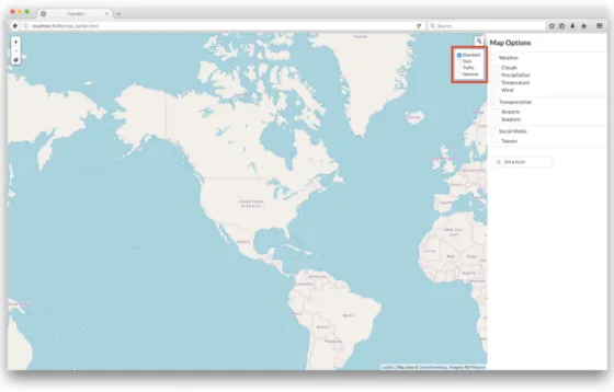
The layout of my system needs to address the three product requirements. One of the goals for the UI is usability - users need to be able to quickly and easily see what options they have and see the results of the options they chose. Therefore, the layout should be simple enough so that users are drawn easily to the map and the visualizations that they have chosen, while still being able to see all of the controls without having to make unnecessary clicks or know how to add layers to the map.
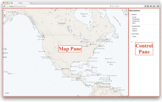
Figure 3-1: Overall layout.
To this end, the overall layout of the system consists of two parts, as seen in Figure 3-1. The majority of the view is taken up by the map pane which is where the data visualization takes place. This pane needs to be large enough so that the entire world can be seen when zoomed out, and individual markers can be easily seen when zoomed in. In addition to this pane, there is another pane on the right hand side of the screen for controls. I designed the map pane to be 80% of the screen and the controls pane to be 20% of the screen, which allows the map pane to be as large
as possible while still allowing the controls to be properly spaced out and readable. With this arrangement, the user can easily see that they need to select one or more controls on the right hand side in order to display layers on the map. The controls themselves are spread out and organized into different categories, helping the user parse the possible controls and determine which visualization they want to turn on.
The map itself is designed to be as simple and customizable as possible so that the visualization layers the user chooses stand out against the comparatively basic back-ground. The background also has to allow different colors and styles of visualizations to be easily seen, so I chose a default background map that has muted colors and is generally very simple. I continued this theme with the controls sidebar, styling it so it is very simple and easy to understand and has muted colors so as not to distract from the map pane.
3.2.2
Mapping Visualizations
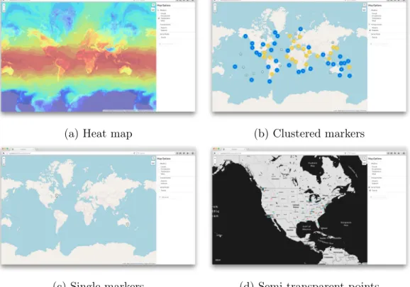
Because these two groups need to visualize different sets of data, my visualization had to be general enough to be able to show these different types, but specific enough to be useful for all. There are different visualization styles for the different types of data currently available on the map - displayed in Figure 3-2, some data is shown by heat map, some by clustered markers, some by single markers, and some by semi-transparent points.
More detail about each of these specific visualizations is presented in the next three chapters.
(a) Heat map (b) Clustered markers
(c) Single markers (d) Semi-transparent points
Chapter 4
Technical Design
In this chapter, I describe the technical design of my mapping visualization system. This chapter focuses on the actual mapping system and explains the different options I considered and the traits of each of these libraries. I then discuss the base mapping functionality, including the base map layers and different mapping components.
4.1
Product Architecture
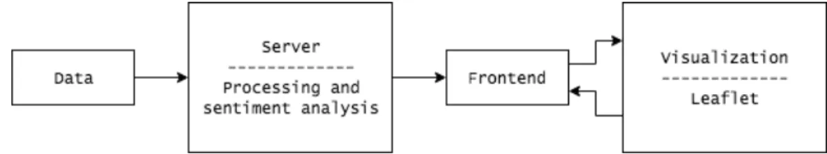
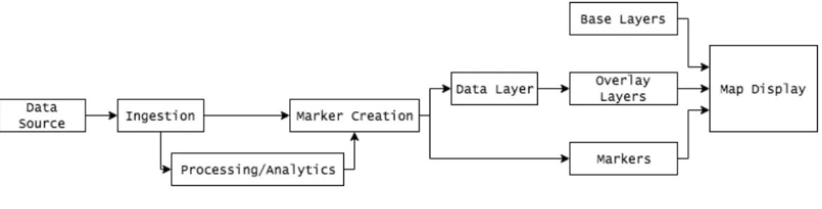
Figure 4-1: Architecture diagram.
The overall product architecture is shown in Figure 4-1. As shown here, data is ingested through a server, which handles both data processing and cleaning as well as sentiment analysis for social media. The processed data is then passed to the frontend, which creates the objects that the visualization tool requires. These objects are provided to the visualization component, and users can select certain options in this component and the control panel to toggle layers and functions in the frontend. The system is relatively simple, with most development spent on the frontend and
visualization tool.
4.2
Mapping Libraries
There are many popular mapping libraries that I considered for this project. These included Google Maps, Mapbox, OpenStreetMap, OpenLayers, D3, Leaflet, and vis.js. After researching and reviewing each of these options, I narrowed down my research to several possibilities. These were the ones I felt were the most well-maintained and extensible and therefore fit the goals of this project the best. The libraries that I considered using were:
1. Google Maps
2. Mapbox
3. Leaflet
4. OpenLayers
Each of these libraries have different intended use cases, strengths, and weaknesses. The remainder of this section focuses on describing each of these libraries and explains why I decided to use Leaflet to develop my map.
4.2.1
Google Maps
Google Maps [9] is the most well-known and polished mapping library. It is completely free and has extensive base maps. Most importantly, it can be used with all of Google’s mapping integrations and tools, including address inputs and searches, directions, and traffic services. However, it is not open-source and not easily extensible - adding layers or functionality that Google does not provide is difficult at best. There is sufficient basic documentation, but little documentation explaining how to extend the basic map services. Therefore, Google Maps is perfect for simpler mapping systems where the map itself is the primary purpose of the system.
4.2.2
Mapbox
Mapbox [15] is another mapping library that provides a well-polished and easy-to-use experience. The primary difference between Google Maps and Mapbox is found in Mapbox’s customization tools. Mapbox makes it incredibly easy to create very beautiful custom base layers for maps using their own GUI that assists users in creating map styles, showing labels, and displaying geographical data without writing any code. These layers can be exported and used by a user-developed app that includes markers and other extensions. However, the main drawback of Mapbox is that it is not open-source and therefore may be harder to extend and use, as well as having documentation that is often either incorrect or very out of date. It also does require a payment for apps that receive more than a certain number of views a month or are restricted to certain users.
4.2.3
Leaflet
Leaflet [1] is the most popular open-source Javascript mapping library. It is a very small package (38 KB) and contains essentially all of the mapping features that de-velopers would need to be able to develop and extend their own maps. Leaflet’s documentation appears to be the best, most up-to-date, and easiest to use of the three softwares, making expanding the map and adding new functionality simple. Because Leaflet is open-source, there is an abundance of third party extensions and plugins that help to build out the functionality. However, this also causes problems - there are often multiple different options for one extension, with no easy way to differentiate which ones actually work correctly until each option is tried. Leaflet also requires the most coding and development - both Google Maps and Mapbox maps can easily be implemented without any coding and just through their GUIs (for ba-sic maps), but Leaflet essentially focuses on providing the baba-sic map functionality a developer may need and then enabling them to create their own extensions and tools.
4.2.4
OpenLayers
OpenLayers [7] is another very popular open-source Javascript mapping library. Both OpenLayers and Leaflet are very widely used for mapping visualizations, thought Leaflet is becoming more popular in recent years as more functionality has been implemented. OpenLayers is a much lower level library than Leaflet, requiring more Javascript and implementation work than Leaflet. It is also larger at about 700 KB. It still has a very large community of users and fairly updated and correct documentation.
4.2.5
Design Decisions
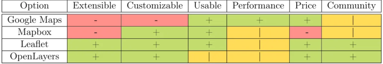
Table 4.1 shows an overview of the different mapping library options and their at-tributes.
Option Extensible Customizable Usable Performance Price Community
Google Maps - - + + + |
Mapbox - + + | - |
Leaflet + + + | + +
OpenLayers + + | | + +
Table 4.1: Mapping library options analysis.
After researching the different options and weighing the pros and cons of each, I chose to design my system using Leaflet. Because Leaflet is open-source and contains all of the pertinent Javascript in a small and easily readable package, it is incredibly easy to extend and build additional functionality on top of their default maps. Ad-ditionally, the Leaflet open-source community is large and very well documented, so there are many different tools and plugins that are available, making it the perfect choice for a proof of concept map that details different possibilities and options. It also does not require any payment or have any restrictions on integrations. Open-Layers was a close second choice. However, Leaflet does the main actions that nearly all maps will require more easily than OpenLayers does. OpenLayers may be slightly more extensible than Leaflet out of the box, but requires more Javascript and work to implement. Additionally, Leaflet is considered to be the next version of OpenLayers
Figure 4-2: System diagram.
as far as mapping visualization go, so Leaflet will likely continue to be updated and expanded more regularly than OpenLayers.
4.3
Base Map Functionality
As shown in Figure 4-2, my mapping visualization system essentially consists of three separate components - base layers, information layers or overlays, and marker layers. In this section, I discuss the base layers I implemented and the default components in place in my system. Chapter 5 then continues to discuss the remaining components.
4.3.1
Base Map Layers
The base map layers are essentially the default background views of the map without any options selected or controls changed. Background map layers are essentially a grid of different tiles showing each portion of the map. These tiles can be created by the designer or acquired from other sources. Popular map tile sources include OpenStreetMap, Mapbox, and Google Maps.
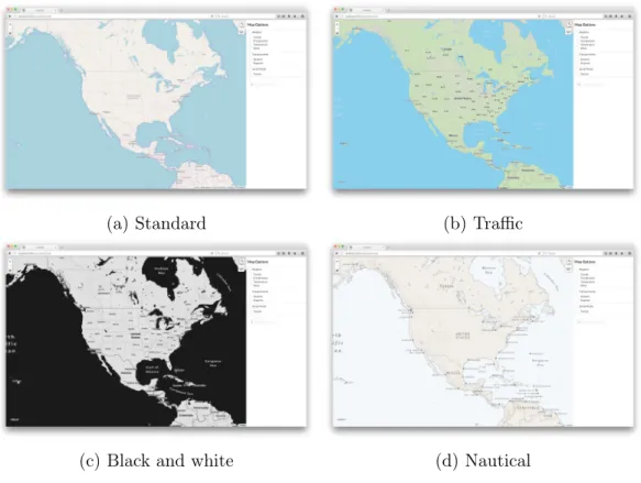
In my map, I am using base layers (seen in Figure 4-3) from OpenStreetMap [17] and Mapbox. I use OpenStreetMap’s Standard map as my default base layer, or the default background map image that users will see when they open the app with no other controls selected. Users can also select from a black and white map from Mapbox, a map with current traffic by Mapbox, and a nautical-themed map with nautical by Mapbox. All of these base layers are reactive and able to be zoomed and refocused - as a user moves or zooms in on the map, the tiles are replaced by tiles that contain information pertinent to the current view. As an example, when users
zoom in, more detail shows up on the maps. The traffic map begins showing traffic on subsequently smaller roads as the map is zoomed in, and more landmark and city names appear.
(a) Standard (b) Traffic
(c) Black and white (d) Nautical
Figure 4-3: Background maps.
These base layers are easily identifiable in the code and it is easy to add new base layers. Each layer is created as a variable determined by the provider’s API. For the Mapbox traffic layer, the variable is defined as
var traffic = L.tileLayer(‘https://api.mapbox.com/styles/v1/nikimt/ cjfl9uo6l69w42srqbk7gczm8/tiles/256/{z}/{x}/{y}?access_token=XXX’); where XXX is an access token needed to use Mapbox’s API. Then these base layers are simply added to a group with
var baseMaps = { "OSM Standard": osm, "Traffic": traffic }; and then this group of layers is added to the map with
where map is a map defined using Leaflet. This adds a control panel to the map that allows users to switch between different background layers easily. Because this is such a simple process, it will be easy for future users to extend the base layers to include other styles they may want.
4.3.2
Base Components
There are several other components of mapping systems besides the base map layers. Base map layers are needed just to show a default map of any sort, but there are building blocks that are used to show other information on the map. These include overlays and markers.
Overlays are essentially layers that are partially transparent. They show some information in certain areas of the map, while letting the base map layer still be seen either through the entire overlay or through parts that do not contain other data. Things like heat maps, weather maps, and population maps would fit into this category, where the data is being presented over the existing base layer. Overlays generally do not have any geographical lines or labels and simply show the data on top of whichever base map is being displayed.
Markers are simple pointing objects that are placed at a specific latitude and longitude. The default Leaflet marker is a simple blue 2D circular drop that points to a point. Leaflet has the functionality to create groups of markers so that more than one marker can show up on a map at the same time. Markers can also have popups associated with them, so that when a user clicks on a marker, a small text blob appears above the marker with some extra information.
Chapter 5
Extensions
In this chapter, I explain the different features and extensions that I added to the map. Each of the features I added was added to serve one of multiple main product specifications - to make the map extensible, customizable, or usable in some way. Most of these features are fully implemented and serve as functioning examples of a certain type of data, and some are prototype features that help show how some feature may be more fully developed in later productions. These features fall into several categories - controls, additional layers, and calculated or external data integrations.
5.1
Controls
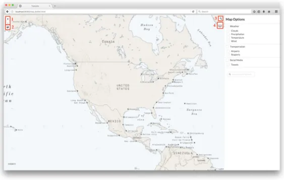
Seen in Figure 5-1, several of the extra features I added are different controls that allow the user to interact with the base map in some way. These are present directly on the map itself and can be used regardless of which base layers or additional layers are currently being shown.
The different controls are:
∙ Zoom [1]: Buttons allowing users to zoom in or out in preset increments. ∙ Default zoom [2]: A button directly underneath the zoom buttons allowing
users to return to the default zoom window and see the entire world.
Figure 5-1: Map controls.
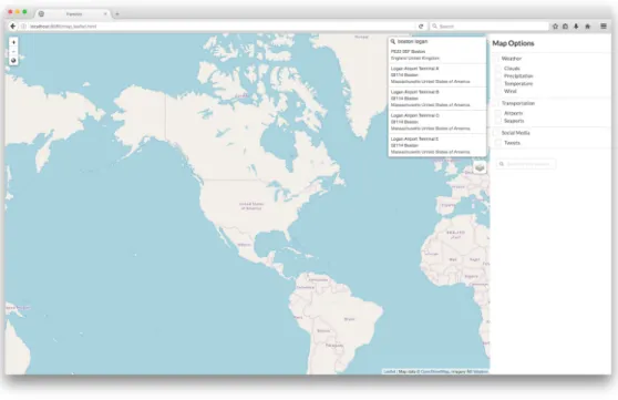
on this button causes a search bar to appear next to it, where the user can search for different locations. As the user types in a search term, recommended searches pop up underneath the bar, which the user can click on (Figure 5-2). If the user does not click on a recommended search term, she can press enter to return the most probable match to the text she entered in the bar. Once a location is found, a marker appears at that location with a popup that contains the location text (generally some combination of name, city, state, and country, depending on the search term, as seen in Figure 5-3). This was implemented using leaflet-control-geocoder [13].
∙ Base layer switch [4]: Because there are multiple base layers, I added a base layer switch button that allows users to switch in between the base layers (Figure 5-4). Upon hover, a menu appears with the different base layers as explained in Chapter 4. The user can select a base layer. The selected base layer is then added to the map and the existing one is removed, though the new base layer has to explicitly be added to the bottom of the list of layers so as to not appear over existing markers or other layers/overlays.
Figure 5-2: Recommendations for a search term.
Figure 5-4: Background layers selecting popup.
5.2
Additional Layers
In additional to the basic controls, I added various different layers and overlays that would be useful for the intended users of this system. These overlays use different methods of retrieving data so that I could develop sample methods that can be used by other groups who decide to expand upon this project. These are presented in a panel on the right hand side of the map in a clean list format that is easy to understand and read. They are broken down into categories according to what they add to the map, which each category having a header that explains what each group contains, such as “Weather” or “Transportation”. Each of the individual layers have a check box that allows users to toggle whether they want the layer to be on or off. There is also a check box associated with each layer group name that allows users to toggle all of the layers contained within that group.
The different layers are:
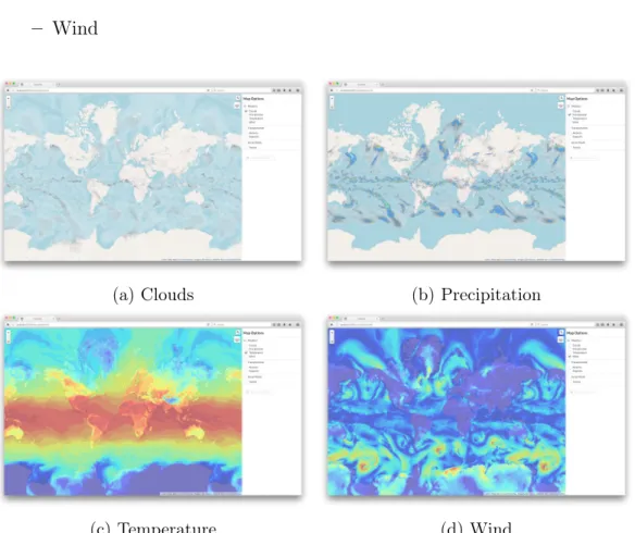
∙ Weather: A layer group that allows users to toggle different weather maps, each shown in Figure 5-5. These are realtime tiles served from OpenWeatherMap [18]. They are all overlays, so the weather data is presented as a semi-transparent
colored region according to what data is being shown. The supported weather patterns are: – Clouds – Precipitation – Temperature – Wind
(a) Clouds (b) Precipitation
(c) Temperature (d) Wind
Figure 5-5: Weather map options.
∙ Transportation: A layer group focused on visualizing important transporta-tion hubs. This group contains markers showing important airports and sea-ports throughout the world.
– Airports: Airport data is stored in a JSON file containing identifying in-formation and the latitude and longitude of each airport [3]. Markers have a plane icon and are light blue, as shown in Figure 5-6.
Figure 5-6: Airports layer.
– Seaports: Seaport data is stored in a CSV file containing seaport informa-tion and latitude and longitude [25]. CSV parsing is done using PapaParse and the markers for seaports are green and have a ship on them.
By using different methods for adding the airports and the seaports to the map, I have created the methods needed to add markers from both JSON and CSV files to the map, allowing for easy extension to other datasets. As seen in Figure 5-7, the markers for both airports and seaports also cluster, ensuring that the map does not become completely covered in markers when there many markers on the map. The clustering radius can be adjusted so that more or less area is allowed to be covered in each cluster.
Both seaports and airports also have popups that appear after clicking on an individual airport marker. These popups show the name of the airport or seaport and their location (Figure 5-8).
Figure 5-7: A cluster showing the area covering a group of airports.
Figure 5-9: Marker showing the location of a searched IP.
5.3
Calculated and External Data Integrations
In addition to creating layers and overlays of existing datasets, my visualization can easily create markers based on several other sources of data. These are either indi-vidual markers or groups of markers created based on some search query.
∙ IP Lookup: A search bar that allows the user to look up the location of an IP address using IPStack’s API [2]. This API converts an IP address into a JSON object with a latitude and longitude, which is then shown on the map using a marker (Figure 5-9). Multiple IPs can be shown, and popups appear when a user clicks on an IP marker.
This functionality was also extended by showing a warning message if a searched IP is determined to possibly be abusive. Using AbuseIPDB’s API [12], a search is completed on each IP’s address. If any IP Abuse Reports have been filed for that IP address, the number and information associated with those reports is shown in a red alert underneath the IP search bar (Figure 5-10).
Figure 5-10: Marker and alert showing the location of a malicious IP.
be shown on the map. These results are displayed according to the sentiment determined from a basic sentiment analysis. More information on this process is discussed in Chapter 6.
5.4
User Extensibility
Because one of the main goals of this project is to create a prototype that is easily extended to handle other data, layers, and processing methods, all of the features I implemented either showcase how to do a specific action or use general functions. For instance, the prototype contains a default addMarkers method that automatically creates a layer of markers when given a list of objects with latitudes and longitudes. There is also a default parseCSV and parseJSON method so that parsing from any data file should be simple. With these functions, in order to add a new layer from any data file, developers need only parse the data and use the addMarkers method to create a layer, then add this layer to the HTML controls panel and to the list of current layers in the Leaflet map. There is a listener that listens to user clicks in the control panel and toggles the appropriate layer, so developers would not need to write
any code besides HTML and adding one object to the overall layers list, unless they wanted to develop some specific functionality.
Additionally, the system is designed to simply look for files in one location and then create the layers associate with those files. Any method of gathering this data -whether fetching from a larger database like Twitter, uploading a CSV, or outputting data from some algorithm - can use the default functions and be implemented easily as long as the file is located in this location. This means that the system is completely compartmentalized, so the algorithm used on data or method of collection has no impact on the final visualization.
Chapter 6
Twitter Sentiment Analyzer
This chapter describes my implementation of a Twitter sentiment analyzer. The main purpose of creating this map layer was to show how social media trends can be mapped to the physical world. I focused on developing a layer using Twitter because Twitter’s API[24] is easy to use, Tweets are necessarily constrained to a certain length and generally focus specifically on one topic, and Tweets can have a location associated with either the Tweet itself or the user who made the Tweet. In order to create a sample social media layer, my system
1. retrieves Tweets from Twitter 2. filters for Tweets with locations
3. performs basic sentiment analysis on Tweets 4. creates a JSON file of Tweet information 5. creates markers associated with each Tweet 6. adds markers to map layer
6.1
Retrieving Tweets and Location Filtering
To retrieve Tweets, my system first queries Twitter with a query string. I wrote a Python script that uses Tweepy[23] to access the Twitter API and fetch a given
number of Tweets that contain the query string and are possibly located in a query location. The query command get_Tweets is
get_Tweets(query, place = None, count = 20, num_results = 100)
where query is the searched string, place specifies the latitude, longitude, and radius of the area to search by in miles, count gives the number of Tweets to query Twitter for, and num_results is the number of total results the user wants, as in the following example:
Tweets = api.get_Tweets(query = "boston",
place = "42.3601,-71.0589,100mi", num_results = 100)
count and num_results are both needed because not all Tweets have locations associated with them, so the number of Tweets I receive from Twitter is not necessarily the number of Tweets I return. count gives the number of Tweets to query Twitter for in each iteration of a loop inside of this function, which loops until the total number of Tweets including locations I have found is greater than or equal to num_results.
In order to filter out Tweets that can be associated with a location, I check each Tweet first to see if the Tweet has a coordinates attribute. If the attribute is not null, coordinates provides a geoJSON array giving the latitude and longitude of the Tweet as reported by the user or the application the Tweet was sent from. In my research, only about 10-30% of tweets had this specific location attribute. Most users do not allow Twitter to have access to their exact location, so most Tweets do not have these coordinates. However, Tweets are more likely to have a place attribute, which is simply a place that the Tweet is associated with but not necessarily originating from. This could be provided from the user’s profile listing a location or the user saying he is tweeting from a specific place. This attribute is given as a Twitter API places object, which provides information such as a bounding box of the (latitude, longitude) pairs of the location, the location name, and the location country. In order
to determine a latitude and longitude from this data, I simply determine the middle of the given bounding box.
More Tweets have a place attribute than a coordinates attribute, but coordinates is more accurate than place. place may not actually be reliable at all in determining the location of a Tweet - if a user is traveling or has not updated his profile after relo-cating, place may be entirely inaccurate. To obtain completely accurate geographic locations for Tweets, every Tweet without a coordinates attribute should be filtered out of this system. However, for the purposes of this prototype, I first checked for a non-null coordinates attribute, then a non-null place attribute, using the latitude and longitude from coordinates if it exists over the latitude and longitude from place. Any Tweet without either of these attributes was not processed further.
Twitter does have a rate limit for the number of queries a user can make in 15 minutes - in the future, if analyzing Tweets was used in a production version of this system, I recommend obtaining a Twitter account with a higher rate limit than the standard user account.
6.2
Sentiment Analysis and Tweets JSON
After fetching a Tweet according to the above and ensuring that it had at least one of the geographic location attributes, I performed a basic sentiment analysis on the Tweet text. I first cleaned the Tweet text by removing special characters and links using the regex
’ ’.join(re.sub("(@[A-Za-z0-9]+)|([^0-9A-Za-z \t])|(\w+:\/\/\S+)", " ", tweet).split())
which simply cleans the Tweet to ensure that only normal characters are in the final string.
I then used TextBlob[14] to perform the sentiment analysis. TextBlob is a Python library for processing textual data. It provides methods for many different natural language processing tasks like classification, noun phrase extraction, part-of-speech-tagging, and translation, as well as several others. TextBlob is essentially a wrapper of
NLTK[19] and pattern[5], two other more advanced NLP toolkits for Python. I wrote several versions of a sentiment analyzer using each of these to determine which seemed the most apt for this prototype. For the final prototype, I chose TextBlob because it matches my goals better than the other tools. Both NLTK and pattern have many, many applications and are extremely well built out. However, they are also both older, more academic focused toolkits. Both of these other toolkits would allow for more precise sentiment analysis and can also be extended to use more advanced techniques, but at the cost of being more complicated and harder to learn. TextBlob has a single page of documentation that describes precisely how to do a basic sentiment analysis, so it is more fitting for a base prototype that may be extended by users without much knowledge of NLP toolkits or commands. It is also built on top of NLTK and pattern, so it is basically just a more user friendly and simple version of these. If this prototype were to be used in a system where sentiment analysis or other language classification was an integral part of the system, I suggest using one of these more advanced toolkits to obtain better results.
The actual process for the sentiment analysis is as follows. First, the Tweet is tokenized, so individual words are split apart. Then, stopwords (words that do not impact the sentiment like "and", "a", or "the") are removed from the Tweet. These tokens are then passed to a sentiment classifier that returns a polarity value between -1.0 and 1.0, where -1.0 is negative and 1.0 is positive. I use TextBlob’s default sentiment classifier that was pre-trained on a database of movie reviews that have already been labeled as positive or negative. TextBlob extracts features from these reviews and labels them as positive or negative, which is then used as training data in a naive Bayes classifier from NLTK, which is used to classify the tweets.
The TextBlob sentiment classifier I use is based on the naive Bayes algorithm detailed as follows [8]. In this prototype, the labels are sentiment and the features are separate Tweets (or movie reviews in the training data). The algorithm finds the probability of a label being applied to a feature, or 𝑃 (𝑙𝑎𝑏𝑒𝑙|𝑓 𝑒𝑎𝑡𝑢𝑟𝑒). It first uses Bayes rule to describe 𝑃 (𝑙𝑎𝑏𝑒𝑙|𝑓 𝑒𝑎𝑡𝑢𝑟𝑒𝑠) as
𝑃 (𝑙𝑎𝑏𝑒𝑙|𝑓 𝑒𝑎𝑡𝑢𝑟𝑒𝑠) = 𝑃 (𝑙𝑎𝑏𝑒𝑙) * 𝑃 (𝑓 𝑒𝑎𝑡𝑢𝑟𝑒𝑠|𝑙𝑎𝑏𝑒𝑙) 𝑃 (𝑓 𝑒𝑎𝑡𝑢𝑟𝑒𝑠)
Then, assuming that all features are independent, the algorithm describes the probabilities as
𝑃 (𝑙𝑎𝑏𝑒𝑙|𝑓 𝑒𝑎𝑡𝑢𝑟𝑒𝑠) = 𝑃 (𝑙𝑎𝑏𝑒𝑙) * 𝑃 (𝑓 1|𝑙𝑎𝑏𝑒𝑙) * ... * 𝑃 (𝑓𝑛|𝑙𝑎𝑏𝑒𝑙) 𝑃 (𝑓 𝑒𝑎𝑡𝑢𝑟𝑒𝑠)
Finally, the algorithm does not explicitly calculate 𝑃 (𝑓 𝑒𝑎𝑡𝑢𝑟𝑒𝑠), but instead cal-culates the numerator for each label and then normalizes these values so they sum to one. So then our final equation is
𝑃 (𝑙𝑎𝑏𝑒𝑙|𝑓 𝑒𝑎𝑡𝑢𝑟𝑒𝑠) = 𝑃 (𝑙𝑎𝑏𝑒𝑙) * 𝑃 (𝑓 1|𝑙𝑎𝑏𝑒𝑙) * ... * 𝑃 (𝑓𝑛|𝑙𝑎𝑏𝑒𝑙) 𝑆𝑈 𝑀 [1](𝑃 (1) * 𝑃 (𝑓1|1) * ... * 𝑃 (𝑓𝑛|1))
This algorithm provides the probabilities that certain phrases have certain labels (or sentiments). So then, in order to classify the Tweets, the tokens found earlier are compared to features from this training data, which assigns phrases a positive or negative value. To find the overall sentiment of a Tweet, these values are weighted according to part of speech and certainty of sentiment, then averaged.
Tweets with a polarity greater than zero are marked as positive, Tweets with a polarity less than zero are marked as negative, and Tweets with a polarity of zero are marked as neutral. After determining the sentiment of each Tweet, I append the Tweet to a final list of Tweets after checking to make sure it is not already present, which is necessary so that retweets do not cause duplicates in the list. I then save the Tweet objects to a JSON file.
6.3
Markers and Map Layer
After outputting the final JSON file, I read the file into the map itself. An exam-ple map of the results obtained using the query query = "graduation", place = "42.3601,-71.0589,10000mi", num_results = 100 is shown in Figure 6-1. I cre-ate a new marker for every Tweet object in the file - these markers are small dots that
Figure 6-1: Markers showing the location and sentiment of Tweets.
are green for positive Tweets, red for negative Tweets, and Twitter blue for neutral Tweets. These markers are added to a layer at the latitude and longitude specified in the JSON file, and then a popup is added with the Tweet text, seen in Figure 6-2. The user can then toggle the Twitter layer to see the Tweets appear.
Because this is a proof-of-concept work and showing how to perform functions was prioritized over finalizing those functions, the sentiment analysis itself is rudimentary and should be refined if it is to be used in a production system. However, the actual system for retrieving, filtering, and displaying Tweets on the map is functional and shows how this feature can be used in future implementations.
Chapter 7
Results
This chapter explains the results achieved using this prototype. I explain challenges I faced while designing my prototype and describe the choices I made in regard to those challenges, and then describe the results I achieved with the final system.
7.1
Challenges
While developing this prototype, multiple challenges were encountered. Some chal-lenges were package or feature specific, but some were overall design or implementa-tion issues. The primary, overarching challenges I encountered while designing this project included designing for extensibility, working with open source packages and data, and packaging my prototype in a usable way.
7.1.1
Designing for Extensibility
This project is a prototype intended to be extended and used by various groups who have various data and goals. This goal presented multiple challenges, primarily while I was designing my system.
The first challenge was simply deciding what the system should contain. Because there is no specific target user of this prototype, the design process was more difficult than normal user interface design phases. Instead of being able to speak to a target
user and learn about which features may be useful, decisions about which features to include and how to design the user interface was based primarily on reading previous visualization systems and personal assumptions. This was quite challenging because the implementation details were not predefined and are open to interpretation. How-ever, this also helped form my overall system design. Because I could not talk to specific users, I had to be certain that my system was generalizable enough to be able to be used for all use cases. This helped frame my overall layer choices and design decisions, which ensured that I met my goal of extensibility.
7.1.2
Open Source Packages and Data
All packages, frameworks, and data in this prototype are open source. While this decision makes sense so that the prototype can be used by anyone and be easily extended, this also caused several problems. Primarily, finding the correct packages that actually work proved to be very difficult. The Leaflet packages and extensions were particularly troublesome. Leaflet itself is very well maintained and has very readable documentation that is kept up to date. However, there are a surplus of third party Leaflet extensions, which are all separately maintained to various degrees. For instance, I tested four different marker customizing packages before finding one that functions correctly. I had this problem multiple times when developing this prototype, but was able to either find or create a functioning extension in each case, so future developers will not have to go through the same process.
Additionally, finding reliable open source data led to similar problems. Some sources like Twitter provide reliable data in their API, but I had to search and assem-ble several other data sets, which sometimes involved fairly lengthy curating processes. For instance, finding an up to date database of world seaports was surprisingly diffi-cult, which led to converting a PDF of ports into a CSV and then editing the columns to only include what was needed and get rid of whitespace.
7.1.3
Prototype Packaging
The other primary challenge I had while developing this prototype was not using a framework like Angular or React. I chose not to use a framework so it would be more extensible and so that it could be easily implemented in any other frontend system. However, this led to some difficulties in processing the data and communicating it to the frontend system, particularly with Python and the Twitter sentiment analysis. I mitigated this problem by simply running the script separately, but not using a framework has led to some extra complexity and workarounds on the frontend.
7.2
Results
Overall, I achieved very promising results with this prototype. I successfully created a proof of concept work that displays various different data, layer, and visualization types in a way that is extensible, customizable, and easily used. In this section I will discuss some of the performance results I achieved with my system.
7.2.1
Marker Additions
One of the main performance requirements of this prototype is the ability to be able to add many markers to the map easily and quickly. The airports and seaports layers have 28,831 and 819 markers respectively (the seaports list is shortened to only show ports with commercial trade), and both of these layers must be able to be quickly loaded upon user selection. In my prototype, I create these marker layers during the initial loading of the map, which then reloads upon the completion of both. The system works this way so that the visualization will update as quickly as possible upon a user selecting to show these layers. The prototype was originally requiring multiple seconds to load the actual markers to the map on user click, particularly with the airports layer which at one point took about 14 seconds to load. However, I was able to drastically decrease this time by adding marker clustering to the map, so now the map only has to load a certain percentage of "cluster" markers instead of all
of the original markers. For the airports layer especially, I made the max clustering radius very large (150 pixels compared to the default 80) so that a large number of airport markers fit into each cluster and there are then fewer clusters. These clusters then expand and revert to normal airport markers as users zoom in on certain areas of the graph. After implementing the clustering, load times after user click have become roughly 4 ms for each airport and seaport markers loading.
Loading the marker information from a JSON or CSV file is where most of the delay is seen. For both airport and seaport markers, the corresponding function parses the information from either the JSON or CSV file. It then creates a marker object in the correct layer that uses the specific marker class - a set of parameters setting the icon, colors, and settings of the marker - and sets the marker location to the location given in the file. It also sets the popup text to contain the port name if given and the port’s location. It then appends each of these marker objects to a list, which is then turned into a general Leaflet marker layer (simply a layer with a transparent background and markers in the correct locations), and then turned into a marker cluster layer (a layer that converts the markers into their corresponding clusters, and which allows individual markers to be seen upon zooming in). This marker cluster layer is then added to the map as an overlay layer that can be toggled on and off upon user click.
I tested several different files created by modifying the airports and seaports list to examine the performance of creating these layers. There was no difference in performance between JSON and CSV files. The overall trend in performance is shown in Figure 7-1. As shown, there is a noticeable trend in time in milliseconds that is quite linear with number of markers added. The best fit line has the equation
𝑦 = 0.0077593409𝑥 + 248.2442
As seen from the graph, there is a definite relation between the time it takes to add markers to the graph and the number of markers. However, the correlation is linear so there does not appear to be a specific limit to how many markers we can safely
0 2 4 6 8 ·104 200 400 600 800 Number of markers Time to add to graph (m s)
Figure 7-1: Marker creation times.
add to the graph before it begins taking noticeably more time per marker (except for possible memory limitations).
7.2.2
Sentiment Analysis and Tweet Parsing
The other primary performance benchmark of this prototype is the sentiment analysis layer. In this layer, Tweets must be acquired using the Twitter API, filtered, analyzed for sentiment, and written to a JSON file. The time it takes to create the Tweet markers follows the same trends shown in Figure 7-1, so the primary processing time is taken by actually retrieving, filtering, and analyzing the Tweets.
Retrieving and filtering the Tweets takes a noticeable amount of time. Because we are filtering for Tweets that contain a location object, we may have to filter through many Tweets without location fields until we reach the number of Tweets requested. Table 7.1 shows results obtained for requests with different queries and location parameters. All requests returned 200 results after filtering.
As seen in Table 7.1, the time requests take can vary greatly depending on if there was a distance query given or not. If there is no location query given, then the prototype likely has to receive and filter out many Tweets before returning 200 with location fields. However, when a location query is given, the Twitter API call returns only Tweets that have locations matching the query, so there is no filtering that needs
Number Query Location Time elapsed (min:sec) 1 "boston" none 02:08.3770683 2 "boston" "42.3601,-71.0589,10000mi" 25.841312 3 "boston" "42.3601,-71.0589,100mi" 26.13142 4 "graduation" "42.3601,-71.0589,10000mi" 26.54821 5 "graduation" "42.3601,-71.0589,100mi" 24.84537
Table 7.1: Time to retrieve and filter Tweets.
to be done and the system only has to obtain 200 results. There does not appear to be a difference in rate with different queries or location distance variables - however, if the location given is an area not very active on Twitter, Twitter may not be able to return enough Tweets to satisfy the requested number of results. Unfortunately, due to Twitter rate limiting, the number of Tweets I could receive is limited. More analysis could be done using the Twitter API with an advanced account without rate limiting.
After retrieving and filtering, the sentiment analysis takes little time. Because the system uses TextBlob and NLTK, the processing is quite optimized, so 200 Tweets required an average of .000565741 seconds each, with the fastest Tweet requiring only 0.000395059 seconds. Setting up the package and training the data requires an extra 0.044296313 seconds on average at the beginning of the analysis, so the overall time to process 200 Tweets is roughly .157444513 seconds.
While the Tweet parsing and sentiment analysis does require some time, the time required to add the markers to the map is negligible. Since the Python script is run separately, it is possible to run the script and have it write to separate JSON files so that the time needed to return and parse the Tweets does not impact the overall map loading time.
7.2.3
Overall Results
Overall, this prototype does not require any significant processing time and is respon-sive to the user’s requests. Some processing times can be shortened - increasing the maximum cluster radius for layers with many markers significantly reduces the time
required to render those layers, and processing the Twitter sentiment analysis before loading the map can markedly reduce time if processing many Tweets or process-ing Tweets without specified locations. In a production version of this system, more analysis should be performed to ensure that no cases exist where processing times would significantly increase. However, as the prototype stands, all functionality can be completed within an appropriate time.
Chapter 8
Conclusion and Future Work
In this thesis, I present a prototype that displays an extensible, customizable mapping visualization system to be used by cyber security researchers as a way to visualize cyber data in the physical domain. Because the main goal is to create a proof-of-concept system that can be used by various separate groups, the system is designed to be extensible, generalizable, and easily learned. I successfully designed a system that meets all of these goals and contains various different forms of data visualization, each of which serve as examples that can be used in future feature implementation. All of these data layers can be used in security applications to integrate cyber data with data from the physical world.
The remainder of this chapter presents a discussion of possible ways this system could be extended. Because one of the goals of this design was extensibility, planning for ways this system could be extended in the future is a sizable component of the overall design. The system has been implemented so that the functions are easy to understand and apply to other sources of data. I also fetch datasets in multiple different formats such as CSV, JSON, and API calls, so future analysts will be able to base other dataset integrations on an existing integration. The primary extensions that I suggest be considered are:
∙ Extension of social media inputs and sentiment analysis: I presented a simple sentiment analyzer for Tweets in a certain location. This worked as a
proof of concept in order to show how displaying sentiment on this map would work, but is not overly accurate and will most likely not give the best perfor-mance. Extending this portion of the project to either use a more accurate and complete sentiment analyzer or creating a sentiment analyzer based on sam-ple input that is tailored specifically to whatever data is being analyzed would most likely give measurably improved performance. Additionally, gathering in-formation from other sources such as Facebook, Instagram, and even sources like Reddit or political commentary sites may prove helpful in the future. I also used some basic cyber threat keywords to examine patterns in geographical locations of tweets containing those words. However, having access to more specific cyber threat words to search may lead to more important and interesting results. ∙ Implementation of additional layer groups: In this research, I focused
solely on layer groups that are open source and serve as an example of a specific kind of data. However, there are many more examples of layers pertaining to cyber security that could be added in the future to extend the functionality of this system. Some examples include natural disasters, current threat levels, pollution levels, and even things like populations or other census data. Because my system is extensible and provides examples of how different types of data may be implemented, adding these new data sources should be simple.
∙ Integration of paid data: I used solely open-source and free to use data in this project to serve as examples of what can be implemented. However, there exist many other data sources I found behind paywalls that could be interesting to visualize in a map. Some examples include past weather patterns, more specific IP address information, and specific shipping information like current ship statuses. If this system was to be extended for use by a cyber security group, having access to this data would be interesting and possibly very helpful.
∙ Refactoring to use a framework: I wanted this system to be as simple and general as possible, which is why I chose to write it in plain Javascript and HTML and the sentiment analysis in Python. However, if this system is to
be used in other projects, it would be useful to have it be refactored to use whichever framework the existing system is using. Because this system may be used in various different settings, I did not implement it using a framework such as React or Angular, but it should be updated to match whichever framework it is being used in conjunction with. There are both Angular [20] and React [4] Leaflet libraries (and likely examples using other frameworks) so the conversion should be easily accomplished.
∙ User Testing: User testing is an important step in any user interface. Be-cause of the time and user constraints of this project, I was not able to perform user testing on expected users. However, I did receive periodical feedback from users who would be interested in using this system in the future and was able to iterate on several features according to their feedback. In the future, there should be two separate types of studies done. First, future developers of the system should be interviewed to gain feedback on the system design of this pro-totype. Because this prototype was designed to be extended and personalized for different groups, data, and users in cyber security, one of the most important features of this prototype is the ability for developers to easily understand the system and customize it for their own use. Performing user testing on developers who are extending and customizing the system would be helpful to determine if the system code and documentation is understandable. Further testing of the actual users of each specific system should also be performed in order to determine if the visualization styles and layer selection features are usable and understandable. Additionally, performing this user testing would help ascertain if the available features are sufficient or should be extended to cover more use cases.
Bibliography
[1] Vladimir Agafonkin. Leaflet. url: https://leafletjs.com/. [2] apilayer. ipstack. url: https://ipstack.com/.
[3] James Brooks. JSON-Airports. url: https://github.com/jbrooksuk/JSON-Airports/.
[4] Paul Le Cam. React-Leaflet - React Components for Leaflet Maps. url: https: //react-leaflet.js.org/.
[5] CLiPS Research Center. pattern. url: https://www.clips.uantwerpen.be/ pages/pattern-en.
[6] Matthew Chu et al. “Visualizing Attack Graphs, Reachability, and Trust Re-lationships with NAVIGATOR”. In: Proceedings of the Seventh International Symposium on Visualization for Cyber Security. VizSec ’10. Ottawa, Ontario, Canada: ACM, 2010, pp. 22–33. isbn: 978-1-4503-0013-1. doi: 10.1145/1850795. 1850798. url: http://doi.acm.org/10.1145/1850795.1850798.
[7] OpenLayers contributors. OpenLayers. url: https://openlayers.org/. [8] NLTK Project Edward Loper. NLTK Documentation for nltk.classify.naivebayes.
url: http://www.nltk.org/_modules/nltk/classify/naivebayes.html. [9] Google. Google Maps. url: https://cloud.google.com/maps-platform/. [10] L. Harrison and A. Lu. “The future of security visualization: Lessons from
net-work visualization”. In: IEEE Netnet-work 26.6 (Nov. 2012), pp. 6–11. issn: 0890-8044. doi: 10.1109/MNET.2012.6375887.
[11] Zhiyong Hu et al. “GIS mapping and spatial analysis of cybersecurity attacks on a florida university”. In: 2015 23rd International Conference on Geoinformatics. June 2015, pp. 1–5. doi: 10.1109/GEOINFORMATICS.2015.7378714.
[12] Marathon Studios Inc. AbuseIPDB. url: https://www.abuseipdb.com/. [13] Per Liedman. Leaflet Control Geocoder. url: https://github.com/perliedman/
leaflet-control-geocoder.
[14] Steven Loria. Textblob. url: http://textblob.readthedocs.io/en/dev/. [15] Mapbox. Mapbox. url: https://www.mapbox.com/.
[16] “Network Security: Plugging the Right Holes”. In: Lincoln Laboratory Journal 17.2 (2008).
[17] OpenStreetMap. Open Street Map. url: https://www.openstreetmap.org/. [18] OpenWeather. Open Weather Map. url: https://openweathermap.org/. [19] NLTK Project. NLTK. url: http://www.nltk.org/.
[20] David Rubert. angular-leaflet-directive. url: http://tombatossals.github. io/angular-leaflet-directive/#!/.
[21] McKenna S. et al. “BubbleNet: A Cyber Security Dashboard for Visualizing Patterns”. In: Computer Graphics Forum 35.3 (), pp. 281–290.
[22] Diane Staheli et al. “Collaborative Data Analysis and Discovery for Cyber Security”. In: Twelfth Symposium on Usable Privacy and Security (SOUPS 2016). Denver, CO: USENIX Association, 2016. url: https://www.usenix. org / conference / soups2016 / workshop - program / wsiw16 / presentation / staheli.
[23] Tweepy. Tweepy API. url: http://www.tweepy.org/.
[24] Twitter. Twitter API. url: https://developer.twitter.com/en.html.
[25] Export Virginia. Seaports of the World by Country. url: http://exportvirginia. org/wp-content/uploads/2014/04/Seaports-of-the-World.pdf.