HAL Id: hal-00737651
https://hal.inria.fr/hal-00737651
Submitted on 2 Oct 2012
HAL is a multi-disciplinary open access
archive for the deposit and dissemination of
sci-entific research documents, whether they are
pub-lished or not. The documents may come from
teaching and research institutions in France or
abroad, or from public or private research centers.
L’archive ouverte pluridisciplinaire HAL, est
destinée au dépôt et à la diffusion de documents
scientifiques de niveau recherche, publiés ou non,
émanant des établissements d’enseignement et de
recherche français ou étrangers, des laboratoires
publics ou privés.
Visualizing More Performance Data Than What Fits on
Your Screen
Lucas Mello Schnorr, Arnaud Legrand
To cite this version:
Lucas Mello Schnorr, Arnaud Legrand. Visualizing More Performance Data Than What Fits on Your
Screen. [Research Report] RR-8079, INRIA. 2012, pp.14. �hal-00737651�
ISSN 0249-6399 ISRN INRIA/RR--8079--FR+ENG
RESEARCH
REPORT
N° 8079
September 2012 Project-Team MESCALVisualizing More
Performance Data Than
What Fits on Your Screen
RESEARCH CENTRE GRENOBLE – RHÔNE-ALPES
Inovallée
655 avenue de l’Europe Montbonnot 38334 Saint Ismier Cedex
Visualizing More Performance Data Than What Fits
on Your Screen
Lucas Mello Schnorr, Arnaud Legrand
Project-Team MESCAL
Research Report n° 8079 — September 2012 — 14 pages
Abstract: High performance applications are composed of many processes that are executed in large-scale systems with possibly millions of computing units. A possible way to conduct a performance analysis of such applications is to register in trace files the behavior of all processes belonging to the same application. The large number of processes and the very detailed behavior that we can record about them lead to a trace size explosion both in space and time dimensions. The performance visualization of such data is very challenging because of the quantities involved and the limited screen space available to draw them all. If the amount of data is not properly treated for visualization, the analysis may give the wrong idea about the behavior registered in the traces. This paper is twofold: first, it details data aggregation techniques that are fully configurable by the user to control the level of details in both space and time dimensions; second, it presents two visualization techniques that take advantage of the aggregated data to scale. These features are part of the VIVAopen-source tool and framework, which is also briefly described in this paper.
Visualiser plus de données que ce qui peut être
représenté sur votre écran
Résumé : Les applications à hautes performances sont composées d’un grand nombre de processus exécutés sur des systèmes distribués à large échelle comportant poten-tiellement des millions d’unités de calcul. Une approche possible pour analyser les performance de telles applications consiste à tracer le comportement de chacun des processus individuellement. Le grand nombre de processus ainsi que la complexité de leur comportement conduit à une explosion de la taille de la trace à la fois en terme de temps et d’espace. La visualisation de telles données est extrêmement délicate en raison de la quantité de données impliquées et de la limitation inhérente de l’écran qui interdit que tout afficher. Si les données ne sont pas correctement pre-traitées et agrégées en vue de la visualisation, l’analyse peut être complètement biaisée et induire l’analyste en erreur. Cet article illustre ce problème par un exemple concret avant d’introduire des techniques d’agrégation de données paramétrables et qui permettent à l’analyste de contrôler le niveau de détail auquel il souhaite regarde son système, à la fois dans l’espace et dans le temps. Nous présentons ensuite deux techniques de visualisation tirant parti de cette agrégation paramétrique afin de passer à l’échelle. Ces techniques ont été mises en oeuvre dans l’outil open-source Viva qui est brièvement décrit dans cet article.
Mots-clés : Agrégation de données, visualisation de traces, autres techniques de visu-alisation
Visualizing More Performance Data Than What Fits on Your Screen 3
1
Introduction
High performance computing systems today are composed of several thousands and sometimes millions of cores. The fastest parallel machine as defined by the Top500 [5] in June 2012 has more than 1.5 million cores. Parallel machines with billions of cores are expected in the way towards exascale computing. Parallel applications running on these large-scale platforms are therefore composed of many processes and threads that together explore the extreme concurrency available to solve problems in a variety of domains.
A possible way to conduct a performance analysis of such applications is by record-ing in trace files the behavior of all processes of the same application. The behavior of each process can be defined by a succession of timestamped events that register the important parts of the application, as defined by the analyst. With low-intrusion tracing techniques, the events can be as frequent as one event per nanosecond. Because of the quantity of processes and the amount of details we can collect about each of them, traces become very large, at least in the space and time dimensions.
Despite the technical challenge of managing possibly millions of very large traces that are scattered in the platform, another aspect is how to extract useful information from them. A possibility is to use performance visualization techniques to visually represent the behavior described in the traces. Several techniques exist, but the most prominent is the traditional space/time view – also known as timeline view or Gantt-like chart, shared by many trace visualization tools [3, 4, 11, 12, 18]. Other techniques such as classical histograms, communication matrices, and kiviat diagrams also appear in the literature [3, 7]. Independently of which visualization technique is chosen to represent traces, the task is commonly very challenging and complex because of the quantities involved – number of processes, amount of details – and the limited screen space available to represent all the information.
Most of performance visualization tools today have implicit assumptions about how traces should be represented. Let us consider a very detailed trace of an application that executes for several days. When visually representing an overview of that trace on the screen, a pixel might represent many hours of execution. Some tools [3] take the more common application state on that time interval and choose its color to draw the pixel. Although this works well to scale the visualization, it might not work for all scenarios if, for example, the state chosen to draw the pixel is not the one that is the focus of the analysis. This also has the potential disadvantage of dropping important information when two different states have similar presence in the time interval of a given pixel. Some other tools [4] simply rely on graphical rendering – thereby ignoring completely the problem. This second case might lead to an extreme negative scenario where the understanding of the trace depends on the graphics card and library used to draw its representation. Generally, these implicit assumptions mixed with large-scale traces may give the wrong idea about the behavior registered in the traces. We argue that all assumptions done when visualizing trace data should be taken by the analyst, and not built-in in trace visualization tools.
This paper addresses the issue of visualizing more performance data than what could fit on the available screen space. Instead of directly drawing the trace events with a visualization technique, our approach transforms raw traces into aggregated traces – according to analyst needs – and then visually represent the transformed traces. There-fore, this paper is twofold: first, it details data aggregation techniques that transforms the raw traces and are fully configurable by the user to control the level of details in both space and time dimensions; second, it presents two visualization techniques that
4 Schnorr & Legrand
take advantage of the aggregated data to scale.
The paper is organized as follows. Section 2 presents an extended discussion about the problem of scalable performance visualization and a classification of tools consid-ering implicit or explicit trace aggregation. Section 3 describes the multi-scale aggrega-tion techniques applied to transform trace data before visualizaaggrega-tion. Secaggrega-tion 4 presents two interactive visualization techniques designed to explore aggregated traces: the squarified treemap and the hierarchical graph views. Section 5 presents the VIVA visu-alization tool, which implements the data aggregation algorithms and the visuvisu-alization techniques. Finally, Section 6 draws a conclusion and future work.
2
Motivation and Discussion
The performance analysis of parallel applications must deal with the problem of trace size. This increase in size is present in different forms. The more common situations are the following: spatial size increase, when the application is large with many pro-cesses; temporal, when many details for each process must be interpreted – even if there is only a few processes to be analyzed; or both. The use of visualization to ana-lyze large-scale traces is especially influenced by this increase in size, since traditional visualization have scalability problems.
We take as example the Sweep3D benchmark [15] to illustrate the scalability issue in trace visualization. The experiment is configured as follows. The MPI application is executed on 16 nodes of the Griffon cluster, part of the Grid’5000 [2] platform. The TAU library [22] traces all the MPI operations, resulting in traces that are merged into a single file. This single file is converted to the Paje File Format [21] using the tau2paje1 tool and finally exported to CSV (comma-separated values) using the pj_dump2tool. A combination of R [8] and the ggplot2 package [23] is used to plot the resulting CSV file to a graphical representation based on the space/time view into a vector file.
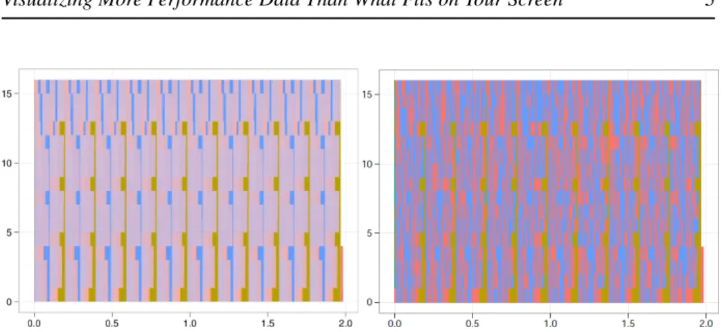
Figure 1 shows two visualization of this vector file: one as seen by the Gnome Evince (left); the other by Acroread (right). As traditional space/time views, processes are listed in the vertical axis while the horizontal axis depicts the behavior of each processes along time. The different colors (or gray scales) represent different MPI operations. We can see that while both tools visualize the same file, the visualization is completely different depending on the viewer chosen, misguiding the analysis. If only Evince is used, the analysts might conclude that there are very few states denoted by the red color; if Acroread is used, it is hard to take the exact same conclusion, since we can see that red states are quite present for all processes.
The extreme negative scenario shown in Figure 1 clearly illustrates the problem when visualizing too much data in the same screen without care. The trace obtained from Sweep3D, even for this small run of 2 seconds, has many events in time – more events than the horizontal resolution is capable to contain. Since the vector file contains all events – most of them in the microseconds scale – many states have to be drawn in the same screen pixel. The color choice for a given pixel is taken by the renderer and the anti-aliasing algorithm, which is different depending on the visualization tool and does not make any sense for such Gantt-charts. That is why we get different views depending on the tool.
1Part of Akypuera toolset, available at https://github.com/schnorr/akypuera 2Part of PajeNG, available at https://github.com/schnorr/pajeng
Visualizing More Performance Data Than What Fits on Your Screen 5
Figure 1: Performance visualization of the Sweep3D MPI application with 16 pro-cesses – the vertical axis lists the propro-cesses, while the horizontal axis depicts time – as visualized with two PDF viewers: Gnome Evince (left) and Acroread (right): de-pending on the viewer, the analyst takes different conclusions about the performance behavior.
This issue about implicit data aggregation also appears on performance visualiza-tion tools which are specific to trace analysis. Considering space/time views, the scala-bility problem can appear in both dimensions: in the horizontal dimension when there is too much detail about each process (as in Figure 1), in the vertical dimension when the application is composed by many thousands processes. Many data reduction tech-niques exists in several forms [17, 1, 10, 13, 14, 16, 19] to try to reduce the amount of data that is going to be visualized. They might be broadly classified in two groups: selection and aggregation. The first group – based on selection – encompasses all solu-tions that select a subset of the data according to some criteria, which on its turn can be either fully based on a direct choice made by the analyst or not. Clustering algorithms considering behavior summaries as similarity pattern are an example of automatic se-lection. The second group – based on aggregation – acts upon the data, transforming into another kind of data whose intent is to represent the aggregated entities.
There is always some kind of aggregation considering performance visualization of large traces, although it is often implicit and uncontrolled. We explain now the three possibilities that appear on performance visualization tools regarding trace aggregation: Explicit Data Aggregation. The analyst keeps control of the aggregation operators and the data neighborhood that is going to be aggregated. Moreover, the visual-ization tool gives some feedback to let the analyst know that a data aggregation takes place and is being used in the visualization.
Implicit Data Aggregation. There is no way to distinguish in the visualization some-thing that has been aggregated from raw traces. The Figure 1 is an example of implicit data aggregation where the renderer takes the decision and the analyst is unaware about what is being visualized, if it is aggregated or not.
Forbidden Data Aggregation. The performance visualization tools forbids data ag-gregation at some level, commonly to avoid an implicit data agag-gregation that could mislead the analysis. The analyst is aware of that since the tool blocks, for example, an interactive operation, such as zoom out to get an overview.
Performance visualizations tools are sometimes present in more than one of these data aggregation categories. Paje’s space/time view [12], for example, has explicit data
6 Schnorr & Legrand
aggregation in the temporal axis – the user realizes that an aggregation took place since aggregated states are slashed in the visualization, while forbidding data aggregation on the spatial axis – minimum size for each resource is one pixel. Another tool that falls in more than one category depending on the represented data is Vampir’s master timeline [3]. For the temporal axis, it has implicit and explicit data aggregation. Im-plicit aggregation happens for function representations (colored horizontal bars): the tool choose the color of each screen pixel according to a histogram and selecting the more frequent function on that interval of time [6]. The user has no visual feedback if an aggregation takes place or not. Explicit aggregation appears in Vampir for the communication representation (arrows): a special message burst symbol [6] is used to tell the user that a zoom is necessary to get further details on the messages. Vite’s timeline [4] has implicit data aggregation on spatial and temporal dimensions, since it draws everything no matter the size of the screen space dedicated to the visualiza-tion. Triva [20] has explicit data aggregation for spatial and temporal dimensions, but it uses different visualization techniques, such as the aggregated treemap, to visualize performance data.
Thus, the best scenario for a performance visualization tool is to provide pure ex-plicit data aggregation. This choice enables users to realize what is happening with eventual trace transformations through a visual feedback in the visualization technique. This is commonly present on traditional statistical plots, where the amount of data is re-duced with statistical mechanisms which are fully controlled by the analyst. Therefore, the goal on performance visualization is to propose explicit data aggregation which en-ables visualizations that are richer than classical statistical plots and, at the same time, safer than traditional trace visualization. Next section details our approach to explicit data aggregation for visualization.
3
Multi-Scale Trace Aggregation for Visualization
We briefly detail how data aggregation is formally defined in our approach. Let us denote by R the set of observed entities – which could be the set of threads, processes, machines, processors, or cores – and by T the observation period. Assume we have measured a given quantity ρ – which is a tracing metric – on each resource:ρ : (
R × T → R (r, t) 7→ ρ(r, t)
In our context, ρ(r, t) could for example represent the CPU availability of resource r at time t. It could also represent the execution of a function by a thread r at time t. In most performance analysis situations, we have to depict several of such functions at once to investigate their correlation.
As we have have illustrated in Figure 1, ρ is generally complex and difficult to represent. Studying it through multiple evaluations of ρ(r, t) for many values of r and t is very tedious and one often miss important features of ρ doing so. This is also one of the reasons explaining the previous visualization artifact seen in the previous section.
Assume we have a way to define a neighborhood NΓ,∆(r, t) of (r, t), where Γ
represents the size of the spatial neighborhood and ∆ represents the size of the temporal neighborhood. In practice, we could for example choose NΓ,∆(r, t) = [r − Γ/2, r +
Γ/2] × [t − ∆/2, t + ∆/2], assuming our resources have been ordered. Then, we can
Visualizing More Performance Data Than What Fits on Your Screen 7
define an approximation FΓ,∆of ρ at the scale Γ and ∆ as:
FΓ,∆: R × T → R (r, t) 7→ Z Z NΓ,∆(r,t) ρ(r0, t0).dr0.dt0 (1)
Intuitively, this function averages the behavior of ρ over a given neighborhood of size Γ and ∆. For example a crude view of the system is given by considering the whole system as the spatial neighborhood and the whole timeline as the temporal neighbor-hood. Since ∆ can be continuously adjusted, we can temporally zoom in and consider the behavior of the system at any time scale. Once this new time scale has been de-cided, we can observe the whole timeline by shifting time and considering different time intervals.
The analyst have to be careful about the conclusions that are taken during an analy-sis based on aggregated data. The nature of the data aggregation technique as presented here leads to the attenuation of behaviors registered in scales smaller than the one used to aggregate the data. For example, if a temporal aggregation is configured to integrate data using a two seconds interval, all the details smaller than two seconds are attenuated by the integration.
At the same time, the analyst needs to be aware that, although some information is lost, such aggregation generally lead to better visualization which can allow for the detection of anomalies that could pass undetected without data aggregation. Our ap-proach deals with such questions by letting the analyst choose freely which scale is used to aggregate trace data. That’s why this approach can be considered a pure ex-plicit data aggregation method, where traces are transformed before being visualized. Next section details two visualization techniques for data that is aggregated following this method.
4
Visualization Techniques
Previous sections have shown the importance of explicit data aggregation algorithms for performance analysis through visualization. We present now two visualization tech-niques that have interactive mechanisms to deal with different aggregation levels, at the same time giving the user a feedback when the information in traces is aggregated: the squarified treemap and the hierarchical graph view. Their common characteristic is the lack of a timeline, as the one used on Gantt-charts, because the trace information is temporally aggregated. This lack of timeline also enables the use of both screen dimensions to draw observed entities and thus display more information.
4.1
Squarified Treemap View
The treemap technique [9] represents an annotated hierarchical structure on the screen using a space-filling approach. The recursive technique starts on the root of the tree, dividing the screen space among its children depending on their values. The screen surface each node occupies is proportional to its value. This mechanism allows an easy comparison of the characteristic of the different nodes of the structure, even in large-scale scenarios.
The squarified treemap view [19], in our approach, is capable to represent per-formance data that is temporally and spatially aggregated: one screenshot represents
8 Schnorr & Legrand
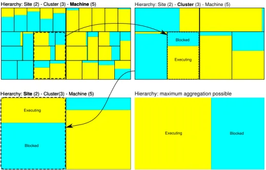
therefore the application behavior in a time slice and spatial cut. These levels of de-tail are configurable by the user and can be changed interactively during the analysis. However, spatial aggregation is only calculated when the available performance data is hierarchically organized (threads grouped by process, process by machine, and so on). The hierarchy is therefore used as spatial neighborhood criteria (as presented in Section 3). Whenever the time slice or the spatial cut is changed, a new squarified treemap is calculated and drawn. Three interactive transitions of this kind are depicted in Figure 2.
Figure 2 shows four treemaps of the same trace at a given time interval configured by the analyst. The top-right treemap of the Figure shows, for instance, the Executing and Blocked state for the six clusters of this synthetic example (as indicated by the rounded dashed rectangles). We can see the three clusters per site and the two sites. The values for the states for a cluster are calculated by the aggregation algorithm con-sidering the Blocked and Executing states for the machines belonging to that cluster.
Figure 2: Four treemaps to show the per-level aggregation of Blocked and Executing states.
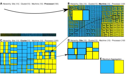
The main advantage of the original treemap representation over traditional space/time views is its visual scalability. The technique is, as any other visualization technique, also limited by the screen size. The treemap A of Figure 3 shows the representation of synthetic trace with 100 thousands processors. We can see that with that large number of processors, the visualization suffers from implicit data aggregation during graphical rendering – there is a lack of pixels to draw all processors in a way that we could ex-tract useful information from them. With the aggregated treemap view, the scalability limits of the representation are pushed forward since it is no longer necessary to view the behavior of every single monitored entity in the analysis. Treemaps B – E of Fig-ure 3 depicts aggregated behavior of groups of processes. The scalability limit lies on how deep the trace hierarchy is for a given trace. If there is not enough levels on this hierarchy, they can be created by grouping nodes according to some analysis criteria.
The aggregated treemap view, as presented here, is a complementary technique in
Visualizing More Performance Data Than What Fits on Your Screen 9
A Hierarchy: Site (10) - Cluster(10) - Machine (10) - Processor (100) B Hierarchy: Site (10) - Cluster(10) - Machine (10) - Processor (100)
C Hierarchy: Site (10) - Cluster(10) - Machine (10) - Processor (100) D Hierarchy: Site (10) - Cluster(10) - Machine (10) - Processor (100)
E Maximum Aggregation
Figure 3: Normal (A) and four aggregated treemap visualizations (B – E) of two states for 100 thousand processors (based on synthetic trace).
performance visualization. Although it offers a very scalable way to represent aggre-gated trace data, it has some disadvantages. It lacks, for example, support for a causal order analysis, which is obvious when using space/time views. By using treemaps as a complementary view, it is possible to get the best of both techniques. Another problem of treemaps (and space/time views) is that it lacks topological information, which might be crucial when analyzing performance behavior considering the network bandwidth limitations.
Next section details the second visualization technique based on hierarchical graphs to offer a topological analysis of parallel applications behavior.
4.2
Hierarchical Graph View
The traditional timeline view is expected by most of users of high performance com-puting, as can be observed by the number of visualization tools that implement it. Although useful to show the causal order in program behavior, timeline views lack topological information. Contrasting behavior with topological data is sometimes cru-cial for the comprehension of application behavior, especru-cially because it allows to find the origin of contentions and better adapt the application to these constraints. The hi-erarchical graph view, presented in this section, enables an analysis that correlates all program behavior with a graph. The hierarchical aspect is used to tackle the scalability issues of graphs. We detail here two basic aspects of the hierarchical graph view: how temporal-aggregated metrics are mapped to the graph; and how the spatial-aggregated data is used to achieve visualization scalability.
The mapping from the trace to the graph works as follows. All monitored entities are mapped to nodes, while edges indicate a connection between two monitored enti-ties. Monitored entities can be physical components of the system (machines, network links) but also the applications components (threads, processes). They are differen-tiated in the representation through different geometric shapes, while their attributes (size, color, filling) are mapped from the trace metrics associated to each monitored
10 Schnorr & Legrand
entity. Generally, all geometric shapes and properties can be somehow configured de-pending on trace metrics.
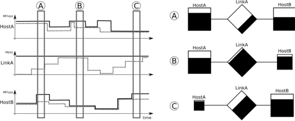
Figure 4 shows an example of six variables (two per resource) showing resource availability (normal line) and consumption (dotted line) and three graph mappings de-pending on the selected time intervals (A, B and C). Hosts are mapped to squares, while links are mapped to diamonds. The size of the geometric forms are equivalent to the time-integrated resource availability, while the filling comes from resource consump-tion. time HostB MFlops HostA MFlops LinkA Mbits
HostA LinkA HostB
HostA HostB LinkA HostA LinkA HostB A B C A B C
Figure 4: Mapping temporally-integrated trace metrics (left) to three graph representa-tion (right) depending on the selected time intervals, considering that hosts are mapped to squares, links to diamonds.
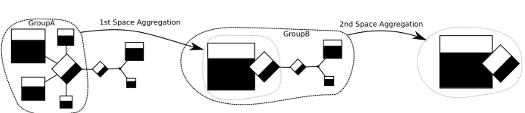
The spatial aggregation algorithm presented in Section 3 also influences how the graph representation in our approach. Figure 5 shows an example that illustrates how the spatial aggregation affects the representation. As before, hosts are represented by squares filled by their utilization, links by diamonds, also filled according to their utilization. We consider for this example that the time-slice is already fixed. In the left of the figure, GroupA indicates the first neighborhood taken into account during the first spatial aggregation. All data within this group is space aggregated following the Equation 1. The resulting representation is depicted in the center of the figure, surrounded by the dashed gray line: it combines a square, representing all hosts, and a diamond, representing all links (in this case there is only one). The properties of these two geometric shapes are calculated according to the space-aggregated values of the traces, considering all the entities within the group used to do the aggregation. The example ends with a second spatial aggregation, considering the whole GroupB, with all monitored entities. As of result, in the right of the figure, there are only one square and one diamond representing all the hosts and all the links of the initial representation. Spatial aggregation as defined in Section 3 plays a major role in the scalability of the hierarchical graph view. Graphs are by nature non-scalable, as we increase the number of nodes, the harder it gets to analyze and understand patterns. The possibility to interactively aggregate a portion of the graph, while keeping its general behavior through the use of aggregated values, enables an analysis of large-scale scenarios. Fig-ure 6 shows an example of this change of spatial detail with the Grid5000 platform and its network topology. Each graph node represents a machine, and its size is equiva-lent to the computing power of the machine. The leftmost graph depicts all the 2170
Visualizing More Performance Data Than What Fits on Your Screen 11
1st Space Aggregation 2nd Space Aggregation
GroupA
GroupB
Figure 5: Two spatial-aggregation operations and how they affect the topology-based representation.
computing nodes. Subsequent plots represent higher-level cuts on the hierarchy defin-ing aggregated graphs – in the cluster and site levels. The rightmost graph represents the full aggregation considering the computing power of all hosts (on its left) and the bandwidth of all network links (on its right).
All nodes Clusters Sites Full
aggregation
Host
Figure 6: Grid5000 network topology with 2170 computing nodes, depicted in four different aggregation levels of the hierarchical graph view: resource capacity is used to draw the size of geometric shapes.
5
The V
IVA
Visualization Tool
The VIVA3 visualization tool implements the multi-scale aggregation algorithm (Sec-tion 3) and the two visualiza(Sec-tion techniques of the previous sec(Sec-tion. It is implemented in C++ using the Qt libraries as user interface. The tool also uses the PAJENG4
frame-work to deal with traces. This frameframe-work encloses all the basic building blocks such as reading trace files, simulating their behavior and offering access to trace data through the Paje protocol.
6
Conclusion
The performance visualization of traces might be a complex task because of the size of parallel applications and the amount of detail collected for each process. Besides deal-ing with the technical issues of large-scale traces, there is the problem of how to keep a given visualization technique useful, capable of detecting performance problems, on scale. We have shown that if traces are represented without care, the visualization might misguide the analysis.
3Available at http://github.com/schnorr/viva/ 4Available at http://github.com/schnorr/pajeng/
12 Schnorr & Legrand
This paper addresses the issue of visualizing more performance data than what could fit on the available screen space. Instead of directly drawing the trace events, our approach is to use a multi-scale data aggregation algorithm to transform raw events into aggregated traces. These transformed traces are then visualized by two visualiza-tion techniques especially tailored to handle aggregated data: the squarified treemap and the hierarchical graph view. The squarified treemap view enables the comparison of processes behavior by mapping per-process trace metrics to screen space. The hi-erarchical graph view enables the correlation of application behavior with the network topology by mapping trace metrics to geometrical attributes of a graph representation. Both techniques can scale since they expect spatial-aggregated data as input.
Relying on data aggregation is fundamental to scale the visualization techniques. However, it also has some disadvantages. As defined in Section 3, our multi-scale aggregation algorithm averages behavior in space and time dimensions. Depending on the situation, this average might smooth or even completely hide a certain behavior from the analysis. In addition, it is likely that space and time scales should be linked – a zoom in/out in one dimension implicates a zoom in/out in the another one – since it is meaningless to visualize the behavior of several thousands processes in a one-microsecond time interval. Currently, we transfer to the analyst the responsibility to choose a space/time neighborhood in order to mitigate these issues.
Beyond this space/time rescaling issue, we can identify at least three other interest-ing research topics. The first one is to revisit space/time representations (also known as timeline views) to draw aggregated data instead of raw events, diminishing the prob-lems detailed on Section 2 and especially in Figure 1. The second topic consists in studying new aggregation techniques and operators that take into account the uncer-tainty of events in the temporal dimension, in particular to deal with large-scale scenar-ios and in the presence of time synchronization issues. And finally, since aggregations smooth and may lead to potential loss of information, being able to quantify such loss could be used to provide feedback to the analyst. This feedback would indicate where particular attention is necessary due to aggressive aggregation.
Acknowledgments
This work is partially funded by the french SONGS project (ANR-11-INFRA-13) of the Agence Nationale de la Recherche (ANR). We thank Augustin Degomme for pro-viding the sweep3D MPI traces. We also thank the organizers of the 6th International Parallel Tools Workshopfor the invitation.
References
[1] Aguilera, G., Teller, P., Taufer, M., Wolf, F.: A systematic multi-step method-ology for performance analysis of communication traces of distributed appli-cations based on hierarchical clustering. In: Parallel and Distributed Process-ing Symposium, 2006. IPDPS 2006. 20th International, p. 8 pp. (2006). DOI 10.1109/IPDPS.2006.1639645
[2] Bolze, R., Cappello, F., Caron, E., Daydé, M., Desprez, F., Jeannot, E., Jégou, Y., Lantéri, S., Leduc, J., Melab, N., andR. Namyst, G.M., Primet, P., Quetier, B., Richard, O., Talbi, E.G., Touche, I.: Grid’5000: a large scale and highly recon-figurable experimental grid testbed. International Journal of High Performance Computing Applications 20(4), 481–494 (2006)
[3] Brunst, H., Hackenberg, D., Juckeland, G., Rohling, H.: Comprehensive perfor-mance tracking with vampir 7. In: M.S. Müller, M.M. Resch, A. Schulz, W.E.
Visualizing More Performance Data Than What Fits on Your Screen 13
Nagel (eds.) Tools for High Performance Computing 2009, pp. 17–29. Springer Berlin Heidelberg (2010). DOI http://dx.doi.org/10.1007/978-3-642-11261-4_2 [4] Coulomb, K., Faverge, M., Jazeix, J., Lagrasse, O., Marcoueille, J., Noisette, P.,
Redondy, A., Vuchener, C.: Visual trace explorer (vite) (2009)
[5] Dongarra, J., Meuer, H., Strohmaier, E.: Top500 supercomputer sites. Supercom-puter 13, 89–111 (1997)
[6] Gmbh, G.T.: Vampir 7 User Manual. Technische Universität Dresden, Blase-witzer Str. 43, 01307 Dresden, Germany, 2011-11-11 / vampir 7.5 edn. (2011) [7] Heath, M., Etheridge, J.: Visualizing the performance of parallel programs. IEEE
software 8(5), 29–39 (1991)
[8] Ihaka, R., Gentleman, R.: R: A language for data analysis and graphics. Journal of computational and graphical statistics pp. 299–314 (1996)
[9] Johnson, B., Shneiderman, B.: Tree-maps: a space-filling approach to the vi-sualization of hierarchical information structures. In: Proceedings of the IEEE Conference on Visualization, pp. 284–291. IEEE Computer Society Press Los Alamitos, CA, USA (1991). DOI 10.1109/VISUAL.1991.175815
[10] Joshi, A., Phansalkar, A., Eeckhout, L., John, L.K.: Measuring benchmark sim-ilarity using inherent program characteristics. IEEE Transactions on Computers 55, 769–782 (2006). DOI http://doi.ieeecomputersociety.org/10.1109/TC.2006. 85
[11] Kalé, L.V., Zheng, G., Lee, C.W., Kumar, S.: Scaling applications to massively parallel machines using projections performance analysis tool. Future Generation Comp. Syst. 22(3), 347–358 (2006)
[12] de Kergommeaux, J.C., de Oliveira Stein, B., Bernard, P.E.: Pajé, an interactive visualization tool for tuning multi-threaded parallel applications. Parallel Com-puting 26(10), 1253–1274 (2000)
[13] Knupfer, A., Nagel, W.: Construction and compression of complete call graphs for post-mortem program trace analysis. In: Parallel Processing, 2005. ICPP 2005. International Conference on, pp. 165–172 (2005). DOI 10.1109/ICPP.2005. 28
[14] Lee, C., Mendes, C., Kalé, L.: Towards scalable performance analysis and vi-sualization through data reduction. In: IEEE International Symposium on Par-allel and Distributed Processing (IPDPS), pp. 1–8. IEEE (2008). DOI http: //dx.doi.org/10.1109/IPDPS.2008.4536187
[15] Lubeck, O., Lang, M., Srinivasan, R., Johnson, G.: Implementation and perfor-mance modeling of deterministic particle transport (sweep3d) on the ibm cell/b.e. Scientific Programming 17 (2009)
[16] Mohror, K., Karavanic, K.L.: Evaluating similarity-based trace reduction tech-niques for scalable performance analysis. In: Proceedings of the Conference on High Performance Computing Networking, Storage and Analysis, SC ’09, pp. 55:1–55:12. ACM, New York, NY, USA (2009). DOI http://doi.acm.org/10.1145/ 1654059.1654115. URL http://doi.acm.org/10.1145/1654059.1654115
14 Schnorr & Legrand
[17] Nickolayev, O., Roth, P., Reed, D.: Real-time statistical clustering for event trace reduction. International Journal of High Performance Computing Applications 11(2), 144 (1997)
[18] Pillet, V., Labarta, J., Cortes, T., Girona, S.: Paraver: A tool to visualise and analyze parallel code. In: Proceedings of Transputer and occam Developments, WOTUG-18., Transputer and Occam Engineering, vol. 44, pp. 17–31. [S.l.]: IOS Press, Amsterdam (1995)
[19] Schnorr, L.M., Huard, G., Navaux, P.O.A.: A hierarchical aggregation model to achieve visualization scalability in the analysis of parallel applications. Parallel Computing 38(3), 91 – 110 (2012). DOI 10.1016/j.parco.2011.12.001
[20] Schnorr, L.M., Legrand, A., Vincent, J.M.: Detection and analysis of resource us-age anomalies in large distributed systems through multi-scale visualization. Con-currency and Computation: Practice and Experience 24(15), 1792–1816 (2012). DOI 10.1002/cpe.1885
[21] Schnorr, L.M., de Oliveira Stein, B., de Kergommeaux, J., Mounié, G.: Pajé trace file format. Tech. rep., ID-IMAG, Grenoble, France (2012). http://paje.sf.net [22] Shende, S., Malony, A.: The tau parallel performance system. International
Jour-nal of High Performance Computing Applications 20(2), 287 (2006)
[23] Wickham, H.: ggplot2: elegant graphics for data analysis. Springer-Verlag New York Inc (2009)
RESEARCH CENTRE GRENOBLE – RHÔNE-ALPES
Inovallée
655 avenue de l’Europe Montbonnot 38334 Saint Ismier Cedex
Publisher Inria
Domaine de Voluceau - Rocquencourt BP 105 - 78153 Le Chesnay Cedex inria.fr