Microsoft Visual Studio LightSwitch
Extensions Cookbook – Beta
Table of Contents
Introduction ... 2
What are extensions? ... 3
LightSwitch Extension Architecture ... 8
Adding an Extension to a LightSwitch Application ... 16
LightSwitch Extension Types ... 20
Controls ... 20
Screen Template ... 24
Business Type ... 26
Shell ... 28
Theme ... 30
Custom Data Source... 31
Extension Recipes ... 32
Control Extension ... 32
Screen Template Extension ... 67
Business Type Extension ... 75
Shell Extension ... 87
Theme Extension ... 117
Custom Data Source Extension ... 135
Conclusion ... 151
Appendix ... Erreur ! Signet non défini.
Introduction
With the release of Microsoft Visual Studio LightSwitch, customers can easily build applications for the
desktop or for the cloud.
While the built-in functionality provides a lot of capabilities for the developer, there are times where the
developer may not have the time or the expertise to invest in additional functionality.
In this case, LightSwitch includes extensible capability as a part of its design. An extensibility developer
has a number of extension options that they can choose from.
This cookbook is designed to educate you on what extensibility is available for the LightSwitch product,
and to illustrate the various extensions types that can provide entry points into extending a LightSwitch
application. The final section contains recipes for creating the various extension types, allowing you to
get started on building the extensions and be aware of the different options for building an extension.
What are extensions?
Extensions provide additional functionality that is not standard in the product. A way to think of them is
like add-ons. The extensions can be used to directly interact with the user, or to do some work behind
the user interface such as data access. In LightSwitch there are 6 extension points illustrated in the
following diagram:
An important way of thinking about extensions is that you can combine multiple extensions to create a
solution-based experience for the LightSwitch developer. An example of this would be where an
extension provides a Money Market solution by using a Shell that has specific trading navigation, a
theme that is specific to the trading company, and a number of screen templates and controls that
provide visualizations for trading data. The data could also come from a variety of data sources and a
custom data source could be the extension that aggregates the data to the application.
LightSwitch uses the Microsoft Extensibility Framework (MEF) which allows a developer to build a
LightSwitch application using a model centric architecture approach. Extensions are a combination of
.NET/Silverlight assemblies and metadata that are packaged together and consumed by a Visual Studio
LightSwitch application.
The following diagram shows the high-level steps in creating an extension and then having it consumed
by a LightSwitch Application.
Using Visual Studio 2010, create the extension Package as a VSIX Develop LightSwitch Solution Idea
Upload for Public use on Visual Studio
Online Gallery Store in SCM, on fileserver, or email to LightSwitch Developer Create LightSwitch Application Add Extension to LightSwitch Application solution
Build and debug LightSwitch Application Solution Set extension design-time configuration Iterate over extension design Use LightSwitch Test application
The diagram above shows that there is a possible iterative approach in designing, building and testing
the extension. Even though a LightSwitch Test application is used, it is quite possible that the application
is a smaller version of the complete solution that is being achieved.
The extension structure/layout is in support of the physical project layout of a Visual Studio LightSwitch
application. When a developer is creating a LightSwitch application, they only see the one logical
application project structure in the LightSwitch IDE as shown below:
If you select file view and show hidden projects you will see a very different project structure.
The project structure above shows how an extension should be structured and developed.
Extensions are added to an existing LightSwitch application via the design time environment
During design time development, a control extension is added in the same way a built-in control is
added. This ensures that the experience in LightSwitch will be the same no matter what type of
extension is being used.
Custom branding can be shown beside the control and also in control properties that require additional
information, in the case below a license key to allow the Bing Map to work with the Bing Map web
service.
In the runtime the experience can be shown in the illustration below:
Extensions are found on the Visual Studio Gallery, where they can be downloaded via a web browser or
from within the LightSwitch environment via the Extensions Manager.
LightSwitch Extension Architecture
When designing a LightSwitch extension, you need to consider two separate things: how you interact
with the extension during design time, and how the extension is implemented in the runtime. In fact,
you can create a design time experience without having any runtime implementation first. You will see
this later in this document, when you start creating extensions using recipes.
Most of the design time elements are contained within a LightSwitch Markup Language file or also
known as lsml. The lsml file is like an xml file and is also a model fragment that gets added to your
LightSwitch Application model, so that LightSwitch knows how it will show up in the IDE. An example of
this is a control in the screen designer within the visual tree, shown below:
Or in the entity designer, shown below:
If you change to file view we can see the ApplicationDefinition.lsml, which is the model file for the
LightSwitch Application. In this case it is the model for the sample VisionClinic application.
Within an extension there is a model fragment that provides metadata to the LightSwitch application
and is integrated to the Application Definition above.
The following is an example of a presentation.lsml file for a control extension.
<?xml version="1.0" encoding="utf-8" ?><ModelFragment xmlns="http://schemas.microsoft.com/LightSwitch/2010/xaml/model" xmlns:x="http://schemas.microsoft.com/winfx/2006/xaml"> <Control Name="BingMapControl" SupportedContentItemKind="Value" AttachedLabelSupport="DisplayedByContainer" DesignerImageResource="BingImages::BingMapControl" > <Control.Attributes>
<DisplayName Value="$(BingMapControl_DisplayName)" /> </Control.Attributes>
<Control.SupportedDataTypes>
<SupportedDataType DataType=":String"/> </Control.SupportedDataTypes> <!-- Property overrides --> <Control.PropertyOverrides> </Control.PropertyOverrides> <!-- BingMapControl Properties -->
<Control.Properties>
<!-- DefaultBingMapControl Property --> <ControlProperty Name="ApplicationKey"
PropertyType=":String"
IsReadOnly="False"
CategoryName="Bing Map Properties"
EditorVisibility="PropertySheet"> <ControlProperty.Attributes>
<DisplayName Value="$(BingMapControl_ApplicationKey_DisplayName)"/> <Description Value="$(BingMapControl_ApplicationKey_Description)"/> </ControlProperty.Attributes>
</ControlProperty>
<!-- End DefaultBingMapControl Property-->
</Control.Properties>
<!-- End BingMapControl Properties-->
</Control> </ModelFragment>
In order to piece these concepts together, you first need to understand a little about the LightSwitch
Architecture. LightSwitch architecture is a model-driven based approach and uses the View – View
Model – Model architecture.
The diagram above illustrates the concept of a business type (a specific type of extension). You can see
the view, view-model, model, but you should also note here that you cannot access the model directly
from the view (UI). This is an important concept to understand. How you can access the model is
through the view-model using a Content Item, which builds a matrix of the view and model elements.
Where do various code elements live that you create? Any controls that are presented in the runtime (a
UIElement) live in the View layer and also reside in the client project of the LightSwitch Application
when an extension is added to a LightSwitch application. The Content Item is part of LightSwitch and is
also the View-Model layer.
The next layer is the model, which in the diagram above is an intersection of common and server
projects. Looking at the common portion of the diagram, this is where the lsml file is created and
defined. What is unique about this location and file is that it provides model definitions for the client
and server projects, in design time and runtime. Think of it as a way to share common code and model
information for your extension in the LightSwitch Application.
What is interesting here is that we talk about client, common, server projects that make up a
LightSwitch Extension, this is also the same for a LightSwitch application, except the extension
assemblies go into ClientGenerated, Common, and ServerGenerated. In order for an extension to place
the right assemblies in the correct locations, in LightSwitch extension development, we have the notion
of designations. Think of designations as pointers when an extension is being unpacked that bits of the
extension are placed in the right location for a LightSwitch Application.
There are additional designations that work across the different projects, which depending on the
extension allow them to appear only in certain places of the design time and runtime experience. You
will learn more about designations later in this document.
Let’s now move on to how an extension is packaged. Below is a high-level diagram that shows what
extension projects are needed for extension functionality. These projects are then wrapped in a zip like
file called an LsPkg package. In fact, you can rename the file extension to zip and then you will be able to
open up the file and look inside.
The LsPkg file contains the compiled assemblies of the projects within the extension solution as well as
some metadata, and manifests that tell where the assemblies need to go when unpacked (designations).
The projects are specific project types based on the functionality they are to provide within the
extension. The following table is a breakdown of the projects, types, and typically what resides in them.
Project Type Contents
Client Silverlight 4 class library project This contains the UI elements of an extension, such as a control.
Design (known as ClientDesign) Sliverlight 4 class library project This contains image and resource files used when customizing the screen in debugging mode in the runtime.
Design .NET class library project Contains image and resource files that are used in the IDE during design-time. Common Silverlight 4 class library project (marked as
portable) given that data is used from client and server.
Contains the metadata markup from the lsml files.
Server .Net 4 class library project Contains server side code, such as validation code used in business types and for custom data sources.
LsPkg LightSwitch Package type project Project type specific to packaging up assemblies to be unpacked into a LightSwitch application based on the manifest with defined designations.
Vsix Visual Studio SDK package project Uses the standard Vsix package project, with two custom properties defined, one is the SKU and the other is the LightSwitch Package.
The LsPkg package is then wrapped up in a VSIX package file. This is a standard VSIX Package, except for
the following:
The first illustration shows the specific SKU type that needs to be provided. This ensures that the
extension is only used for LightSwitch.
The second illustration shows the LsPkg being included in the VSIX package as a custom extension type.
When using the LightSwitch Extensibility project templates, these details are taken care for you, but it is
important to know what is happening behind the scenes.
The designations are set within the LsPkg project properties.
The important aspect of the designations in the LsPkg project properties is that some project types need
the appropriate designations set. The following table shows a matrix of what projects are needed and
the necessary designations for a given extension type.
Extension Type / Designation
Sh
ell
Them
e
Co
n
tr
o
l
Cu
sto
m
D
ata S
o
u
rce
Bu
sin
ess
Ty
p
e
Screen T
em
p
late
ClientReference
X
1ClientGeneratedReference
X
X
X
X
ClientReferenceResources
X
1X
ClientGeneratedReferenceResources
X
X
X
X
CommonReference
CommonReferenceResources
ServerReference
ServerReferenceResources
X
ServerGeneratedReference
X
X
X
X
X
ServerGeneratedReferenceResources
X
X
X
X
IDEReference
X
X
X
X
X
X
IDEReferenceResource
X
X
X
X
X
X
ClientDebugOnlyReference
X
Project Types
Client
X
2X
X
X
Design.Client
X
X
Common
X
X
X
X
X
Design
X
X
X
Server
X
LsPkg
X
X
X
X
X
X
VSIX
X
X
X
X
X
X
Footnotes:
1
Having a Client Reference provides
the assembly with public types that
Tim can use.
To look back on what has been covered, you have learned about the architecture of a LightSwitch
application and how the extension is overlaid/merged into an extension which is made up of multiple
projects and gets designated to the appropriate locations when added and unpacked into a LightSwitch
application. Finally, you learned about the packaging format for an extension.
Adding an Extension to a LightSwitch Application
So the big question remains - after you have built an extension, how does it get into a LightSwitch
application? That depends on how you want to deliver your extension. The extension final file is a Vsix
file, which can be put on a file server, e-mailed, and uploaded to the Visual Studio Online Gallery.
The first two methods require simply clicking on the Vsix file. For the online gallery, you can download
the Vsix file from your browser, or if you want a more integrated feeling, then this can be done via Visual
Studio Extension Manager Interface.
A Vsix package gets onto a developer’s computer via a number of ways. One way is via the Visual Studio
Gallery as already shown. The developer can go to the web site and download the package manually or
they can obtain it directly through Visual Studio LightSwitch itself using the extension manager. If the
extension is being developed in-house then the vsix package can be stored in a Source Code
Management tool, on a file share, and even e-mailed to other developers.
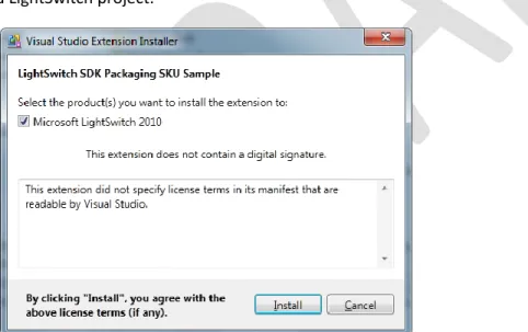
Once the extension vsix package has been installed on the developer’s computer, it is available for use in
a LightSwitch project.
Figure 1. Installing a vsix package on a computer using the vsix standalone installer.
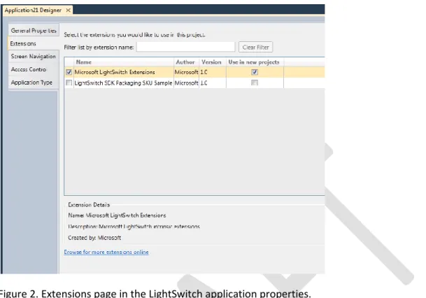
To use the extension you need to have an existing LightSwitch project open, or you can create a new
one. At that point, you can select the Properties page for the application and open the Extensions tab to
see the list of available extensions.
Figure 2. Extensions page in the LightSwitch application properties.
It is at this point that the LightSwitch developer can select one or many extensions to be used in the
current project, or also choose to make an extension available for any future projects.
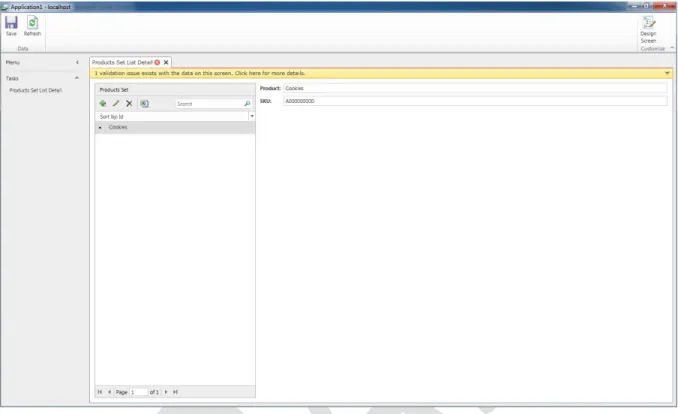
The extension that is shown here in this example is a business type, called the PackagingSKU. To use it in
LightSwitch, first you will create an application and enable the extension. From there you will create an
entity called “Products” that has two properties, ProductName and SKU, shown in figure 3. Since you
have installed the Business Type extension, you can select the Packaging SKU type as shown in figure 2.
Figure 3. Entity Designer on the added business type
The next step is to create the screen and select the controls that will work with the Products entity as
shown in the figure 4 below.
Figure 4. Screen Designer and selecting the editor control
Here the SKU control is selected and the editor version on the control is used, allowing data to be
entered. Next you can run this application and look at the behavior of the PackagingSKU business type.
If the SKU is entered correctly on the screen the validation is not triggered. However, if the data is
entered incorrectly, meaning the format of the SKU isn’t valid, and then the validation message appears
as shown in the figure 5 below.
LightSwitch Extension Types
Extension types are specific points of extensibility within the LightSwitch application environment. There
are six different types of extensions. The following is a list of the extension types and descriptions of
their capabilities.
Controls
This extension type is a building block to extension development. The reason is that the user interacts
with a control. Controls appear in the screen designer, they have a design-time representation in the
visual tree, which can include a custom image icon to provide a branding experience for the control. The
control can also have properties to provide user-defined information to make the control behave in a
particular way. The way to let screen designer interpret the control and type of behavior the control will
implement in design-time is via metadata in the lsml file. Every extension requires some metadata
contained in a model fragment in the lsml file. A control extension makes extensive use of it. Controls
need the following basic information in metadata. If you use the extensibility project templates then this
is automatically provided for you.
Here is the default information that should be provided:
<ControlName="BingMapControl"
SupportedContentItemKind="Value"
DesignerImageResource="BingImages::BingMapControl" > <Control.Attributes>
<DisplayName Value="$(BingMapControl_DisplayName)" /> </Control.Attributes>
<Control.SupportedDataTypes>
<SupportedDataType DataType=":String"/> </Control.SupportedDataTypes>
<control/>
There are obvious value pairs here, such as the Name, Display Name. Let’s focus on the values that do
have some significant impact to the way you design your control.
Controls can be different kinds, which is referenced in the SupportedContentItemKind. The following is a
list of controls supported:
Value Description
Unset Not set.
Value Represents a style for a specific scalar simple data type. This is visualized using a single control.
Details Represents a content item for an entity or complex type. This may be visualized using a single control or as individual fields using the node's children (if there are no children in metadata, they will be
automatically created by the system if needed).
Command Represents a command content item.
Collection Represents a collection content item. (Using styles like: Grid, ListBox, etc.)
Group Represents a group content item. (Using styles like: TableLayout)
Screen Represents a screen
ScreenContent Represent a node which always binds to the screen. Useful for custom controls.
Depending on the kind value that is selected above, this will have an effect on how you implement your
code to represent the control in the runtime. An example of this is, when accessing data from an entity,
the binding for your control can differ based on the value kind. A Value can access a single scalar value
by {Bindings=Details.Value}, while accessing a Collection requires that collection is created using
IEnumerable and is populated by getting a collection of values of an entity via IContentItem. This is
because direct access to the model via a control is not permitted and must go via the viewmodel
through the IContentItem. You will learn more about how to use SupportedContentItemKind in the
control recipe explained later in this cookbook.
The Supported Data Type allows the developer to tightly control what type of data can be used with this
control. The following table shows the different options:
<SupportedDataType DataType=":String"/> <SupportedDataType DataType=":Decimal"/> <SupportedDataType DataType=":Double"/> <SupportedDataType DataType=":Guid"/> <SupportedDataType DataType=":Int16"/> <SupportedDataType DataType=":Int32"/> <SupportedDataType DataType=":Int64"/> <SupportedDataType DataType=":DateTime"/>
After the model is represented it now requires the necessary implementation code. This is the same
approach as creating a Silverlight control. The only difference is if you want to provide additional
design-time functionality that can affect the rundesign-time behavior of the control. A prime example of this is
properties. There needs to be some metadata defined about the property for a given control as well as
some implementation code such as getters and setters, dependency properties and callback functions.,
Again, more of this is explained in the recipe section of this document.
Another important aspect to think about is that if you have multiple controls that have dependencies on
each other. How would you show this experience in the screen designer?
An example of this is a chart control. How would this be represented in the screen designer?
One way could be that you have a single control and have a separate properties dialog that the user can
access through the properties window to set the necessary values for a given axis, the type of chart, and
other properties such as chart name, description and legend. While this could be fine in a regular
Silverlight control development experience, this is not necessary ideal for LightSwitch. It is important to
consider the power of the visual tree, look at how a data grid or list control is used; there are in fact
child controls that allow the user to do further manipulation without having to go to the properties
pane. The same could be applied to the chart control where you could have child controls that allow the
selection of different chart types, as well as the different values applied to the selected chart.
The following is an illustration to show you the differences in the visual tree.
Single control with properties:
You can see in the screen shot above that there are multiple child controls under the Data Series
control. This is an important factor to consider when developing collection of controls to use the visual
tree in the screen designer to provide a similar experience to that of the built-in controls in the product,
as the developer already has experience in using the built-in controls.
Screen Template
A screen template extension provides a stencil for the layout of controls in a screen designer and for
what will appear in a screen in the application during run-time.
A screen template can be used in an application and then removed without affecting existing screens
that have been created using the same template. After adding the screen template extension, the
screen templates will appear in add new screen dialog, along with several built-in screen templates.
The following is an illustration of a couple of screen templates (Catalog Search Screen and Catalog Detail
Screen) and what they provide, in the layout of the various controls and the order in the visual tree
hierarchy:
Business Type
Business types provide a way to visualize, format, validate and store information/data in a LightSwitch
application based on the unique requirements you may have for your data.
The diagram above is a logical flow of how a business type works, starting from the left at the control
and moves through to the right where the data is stored in the storage type and where attributes are
adorned on the custom business type.
With a business type extension, it has a way of presenting the data in the UI, based on some formatting
rules, validating data when added to application, as well as ensuring the data is validated once the data
is saved.
The business type diagram shows two stages of formatting and validation. This is unique to business
types as the first series of actions is based on adding data that is dirty (has not been saved), but is still
formatted and validated, and then when the save action is done, the data is formatted and validated
appropriately again. The reason it is done on the client first is so that you can get immediate feedback to
the user and conserve middle-tier resources. When the user saves the screen the data needs to be
formatted and validated at the server; the data will traverse across the network only once.
A unique aspect of working with a business type is that you can give a storage type an alias. An example
is that the PackagingSKU storage type is string, but for readability purposes the alias is PackagingSKU.
The built-in business types such as the PhoneNumber and EmailAddress use this approach, as they are
both stored as strings in the database.
Shell
The shell provides the common look and feel of an application. There are three main parts of a shell,
which are fundamental to working with LightSwitch Applications. These parts are illustrated in the
screenshot below:
As you can see there are three pane parts; you are free to provide your own layout. You could create
your own shell that is more useable touch screens, as shown in the next image.
Navigation Pane
Command Pane
As you can see in this shell the navigation is at the bottom of the screen and the screen navigation uses
large buttons as opposed to links in the default shell.
Below is another shell that leverages specific custom controls to show off the screens in a fanned-out
card deck manner.
Theme
A theme is a color and font palette; it is an essentially a large resource dictionary with keys. The keys
that are use in the recipe are the standard theme keys for the default built-in shell and theme. You can
modify these keys to change the colors and fonts in the built-in shell to meet your specific requirements.
Themes can be tightly coupled to a custom shell, in that the resource keys may be specific to the custom
shell. It may be wise to provide the built-in keys as well just in case the developer wants to switch from
one shell to another.
A theme is set within the properities of the LightSwitch application project, as shown below:
Custom Data Source
Extension Recipes
This section of the cookbook provides recipes for creating your own extensions. In order, to use these
recipes, you will need to have Visual Studio 2010 LightSwitch, Visual Studio 2010 SP1 Professional or
higher, the Visual Studio SDK, and the LightSwitch Extensibility SDK which contain the extensibility
project templates. The project templates can also be installed via Extension Manager in Visual Studio
Control Extension
The control extension recipe enables you to add a Silverlight control or set of controls to a LightSwitch
application.
The ingredients that you will to need to create a control extension are the following:
1. Visual Studio 2010 Professional or higher
2. Visual Studio 2010 Service Pack 1
3. Visual Studio 2010 SDK
4. Visual Studio LightSwitch
5. LightSwitch Blank Extension Solution
Once you have all of the ingredients installed on your machine you are ready to create a control
extension.
The first step is to get you set up with the right environment in order to add the specific code that you
want your control extension to display and use. This is done by opening the Blank Extension solution
sample, which is called BlankExtension.sln. (You can rename the solution to any name you want to use -
at the moment we will keep using the name of Blank.
The next step when creating a control extension is to focus on the metadata in the common project.
In the common project you will create control that stores a scalar value based on string. In the
BlankPresentation.lsml file you need to add the control metadata definition. Add the following code:
<?xml version="1.0" encoding="utf-8" ?><ModelFragment
xmlns="http://schemas.microsoft.com/LightSwitch/2010/xaml/model"
NOTE: As this document and Visual Studio LightSwitch are in Beta, the extensibility project
templates are not yet available. Instead, a Blank Solution template is being used. It contains all of
the projects needed to create any of the extension types. When Visual Studio LightSwitch is
released, the extensibility project templates will be released as along with an update to this
cookbook.
xmlns:x="http://schemas.microsoft.com/winfx/2006/xaml"> <Control Name="MyControl" SupportedContentItemKind="Value" DesignerImageResource="Microsoft.LightSwitch.DesignerImages::TextBox"> <Control.Attributes>
<DisplayName Value="$(MyControl_DisplayName)" /> </Control.Attributes>
<Control.SupportedDataTypes>
<SupportedDataType DataType=":String"/> </Control.SupportedDataTypes>
</Control>
</ModelFragment>
The above code contains the control name and the SupportedContentItemKind, which in this case is
Value. The DesignerImageResource is using the image from a built in control. Later you will learn how to
add your own icon image.
The DisplayName is what will appear in the screen designer and is set from a resource file.
The SupportedDataType specifies the type of data that the control can accept, which is mentioned
earlier in this document.
Next you need to specify a constant for the new control. Update the BlankModule.cs class file with the
following code:
namespace Blank {
internal static class BlankModule
{
public const string Name = "Blank";
public const string ModulePrefix = Name + ":"; internal static class MyControl
{
private const string Name = "MyControl";
public const string GlobalName = ModulePrefix + Name; }
} }
All you have done so far is describe the control for use in design-time of LightSwitch. Next let’s look at
the implementation of the control.
In the Client project, create a Controls folder.
In the controls folder, add a Silverlight User Control and name it MyControl.xaml.
In the MyControl.xaml file, add the Silverlight TextBox control, as shown in the code below:
<UserControl x:Class="Blank.Controls.MyControl"xmlns="http://schemas.microsoft.com/winfx/2006/xaml/presentation" xmlns:x="http://schemas.microsoft.com/winfx/2006/xaml" xmlns:d="http://schemas.microsoft.com/expression/blend/2008" xmlns:mc="http://schemas.openxmlformats.org/markup-compatibility/2006" mc:Ignorable="d" d:DesignHeight="300" d:DesignWidth="400">
<TextBox x:Name="MyCtl" Text="{Binding Details.Value, Mode=TwoWay}"
TextWrapping="NoWrap"/>
</UserControl>
What is important here is the binding path to Details.Value, which is provided via the IContentItem
interface from the View through the ViewModel to the Model. The reason for this is to provide a way to
interact with an entity and allow within the screen designer that a entity type can be bound (set) to a
control based on the developers preference and what is defined in the supported data type.
In the code-behind file MyControl.xaml.cs you need to specify the control factory, which allows
LightSwitch through the model lsml to get the visual of the control shown in the code above.
using System; using System.Collections.Generic; using System.Linq; using System.Net; using System.Windows; using System.Windows.Controls; using System.Windows.Documents; using System.Windows.Input; using System.Windows.Media; using System.Windows.Media.Animation; using System.Windows.Shapes;using Microsoft.LightSwitch.Presentation;
using System.ComponentModel.Composition;
namespace Blank.Controls {
public partial class MyControl : UserControl
{ public MyControl() { InitializeComponent(); } }
[Export(typeof(IControlFactory))]
[ControlFactory(BlankModule.ControlName)]
internal sealed class MyControlFactory : BaseControlFactory
{
#region Constructor
public MyControlFactory() : base("MyControlTemplate") { }
#endregion
} }
You now need to update the BlankModule.cs file to include a constant of ControlName. This is done
inside the BlankModule class. Add the following code:
public const string ControlName = ModulePrefix + "MyControl";
The control factory needs some additional files which you will create next.
The next file you need to create is the BaseControlFactory file. This file contains boilerplate code that
allows the data template file that contains a reference to the control to be loaded.
The following is the BaseControlFactory.cs class file that needs to be created, though it could be placed
in the Common project and linked in the Controls folder in the Client project:
using System; using System.Diagnostics; using System.IO; using System.Reflection; using System.Windows; using System.Windows.Markup; using System.Windows.Resources; using Microsoft.LightSwitch.Presentation; namespace Blank { [DebuggerNonUserCodeAttribute]
internal abstract class BaseControlFactory : IControlFactory
#region Constructors
static BaseControlFactory() {
// Ger resource
Uri resourceUri = GetResourceUri(); StreamResourceInfo streamInfo =
System.Windows.Application.GetResourceStream(resourceUri);
Debug.Assert(null != streamInfo, "ResourceDictionary load failed.", "Stream
not found: {0}", resourceUri.ToString());
if (null != streamInfo) {
// Read resource contents string contents = string.Empty;
using (var reader = new StreamReader(streamInfo.Stream)) {
contents = reader.ReadToEnd(); }
// Ensure contents is not empty
Debug.Assert(!String.IsNullOrEmpty(contents), "ResourceDictionary load
failed.", "Resource was empty: {0}", resourceUri.ToString());
// Load the contents as resource dictionary
BaseControlFactory.Dictionary = XamlReader.Load(contents) as
ResourceDictionary;
Debug.Assert(null != BaseControlFactory.Dictionary, "ResourceDictionary
load failed.", "Resource wasn't ResourceDictionary: {0}", resourceUri.ToString());
} }
public BaseControlFactory(string templateKey) {
_dataTemplate = BaseControlFactory.GetDataTemplate(templateKey); }
#endregion
#region IControlFactory Members
DataTemplate IControlFactory.DataTemplate { get { return _dataTemplate; } }
DataTemplate IControlFactory.GetDisplayModeDataTemplate(IContentItem contentItem) {
return null; }
#endregion
private static DataTemplate GetDataTemplate(string templateKey) {
Debug.Assert(BaseControlFactory.Dictionary.Contains(templateKey),
"DataTemplate not found.", "Looking for resource key '{0}'", templateKey);
return BaseControlFactory.Dictionary[templateKey] as DataTemplate; }
private static Uri GetResourceUri() {
Assembly assembly = Assembly.GetExecutingAssembly();
AssemblyName thisAssemblyName = new AssemblyName(assembly.FullName); return new Uri(thisAssemblyName.Name +
";component/Controls/DataTemplates.xaml", UriKind.Relative);
}
#endregion
#region Private Fields
private DataTemplate _dataTemplate;
private static ResourceDictionary Dictionary;
#endregion
} }
The next file you will create in the same location is the DataTemplates.xaml file. The following is the
code required in this file based on the MyControl.
<ResourceDictionary
xmlns="http://schemas.microsoft.com/winfx/2006/xaml/presentation"
xmlns:x="http://schemas.microsoft.com/winfx/2006/xaml"
xmlns:c="clr-namespace:Blank.Controls;assembly=Blank.Client">
<DataTemplate x:Key="MyControlTemplate">
<c:MyControl />
</DataTemplate> </ResourceDictionary>
Make sure that the build action on this file is set to Page, which is the default.
At this point using the Blank Solution, you have a default project which is basic. In order to use the
extension, you need to go to the VSIX project folder. In the bin\debug or bin\release folder is the
blank.vsix.VSIX file; clicking on it installs the extension, making it available for your next LightSwitch
application. You will likely want to test the extension before using it in an actual LightSwitch application.
To provide a debugging experience with Visual Studio 2010 and LightSwitch, you can configure the VSIX
properties to start LightSwitch and set a test LightSwitch application test your extension.
In order for your project to include the test LightSwitch application, you need to tell the extension what
solution file to use. This is only necessary for debugging.
The following steps need to be done in the debug page of the project properties of the VSIX project
within the extension solution:
Section Property Value
Start Action Start external program: Select radio button and set the path location to the devenv.exe executable. The default is: C:\Program Files (x86)\Microsoft Visual Studio 10.0\Common7\IDE\devenv.exe
Start Options Command line arguments: At the beginning specify the /rootSuffix Exp and then the path to the LightSwitch application and solution file (.sln).
After setting these properties, ensure that the VSIX project is the startup project. Setting these
properties in the extension Visx project will load the extension in Visual Studio’s experimental hive,
which means that the Visual Studio build task will load and unload the extension into the LightSwitch
project each time you debug.
So what options are available next? The following toppings can be added to this recipe:
1. Custom inline properties
2. Different presentation items for the control
3. Different control styles, such as collection, group controls.
Let’s look at adding these toppings one by one.
Custom Inline Properties:
To create additional properties for a control extension, there are two areas that require modifying.
These are the presentation metadata, which are the control.lsml and the code behind the control itself.
Let’s look at modifying the control presentation lsml file.
To add a custom property you can add the following:
<Control.Properties><!-- My Property -->
<ControlProperty Name="MyProperty"
PropertyType=":String"
IsReadOnly="False"
CategoryName="My Properties"
EditorVisibility="PropertySheet"> <ControlProperty.Attributes>
<DisplayName Value="$(MyProperty_DisplayName)"/> <Description Value="$(MyProperty_Description)"/> </ControlProperty.Attributes>
</ControlProperty>
<!-- End Control My Property--> </Control.Properties>
The important thing about this XML code is that the presentation part is taken care for you. When the
Property type is set to :String, a textbox is added to the property sheet.
The code above also specifies the category as well. If this item is omitted then it will be placed under the
Appearance category.
Properties are either opt-in or opt-out:
Opt-out properties are enabled in the property sheet by default and also have behavior that is provided
by default by LightSwitch for the control.
Opt Out:
AttachedLabelPosition
Enabled by default, you don’t need to do anything to support standard attached labels.
See also IPresentationDefinition.AttachedLabelSupport
To display your own attached label, set the control's AttachedLabelSupport to
"DisplayedByControl" (defaults to DisplayedByContainer)
If you don't support attached labels at all, then you should also override the property to
EditorVisibility="NotDisplayed"
HeightSizingMode
WidthSizingMode
MinHeight
MaxHeight
MinWidth
MaxWidth
Height
Width
These are all displayed by a single editor. In general we recommend leaving these on. If for
some reason you need to turn these off, you can override HeightSizingMode's EditorVisibility
to "NotDisplayed".
NOTE: It also displays Characters/Lines from TextBox/Label. In a future build we hope to have a way
for third-party controls to have their own characters/line properties displayed by this editor as well.
HorizontalAlignment
VerticalAlignment
These are all displayed by a single editor (along with WeightedRowHeight, WeightedRowWidth,
which we also hope to have a mechanism for third party properties).
If you need to turn these off, you can override VerticalAlignment's EditorVisibility to
"NotDisplayed"
Opt-in controls are hidden in the property sheet by default. They can be displayed in the property
sheet, but may require the control to do work for the property to have any effect.
Opt In:
ShowAsLink
Override EditorVisibility="PropertySheet"
Then you can use the built-in Microsoft.LightSwitch.Presentation.Framework.LinkableLabel to get
the built-in label-or-hyperlink behavior, or use your own UI and use the
Microsoft.LightSwitch.Presentation.Framework.Helpers.ShowAsLinkPropertyHelper class
FontStyle
To support FontStyle, you just need to set EditorVisibility="PropertySheet", and it will be handled
automatically by IContentItem
TextAlignment
You'll need to override EditorVisibility and also provide your own implementation
BrowseOnly
Just override EditorVisibility="PropertySheet"
IsReadOnly
IsEnabled
These are for internal uses and should not be displayed in the property sheet
ContainerState
This should never be displayed in the property sheet. It is used to allow controls to change their
UI or behavior based upon context in the tree. The only standard values currently defined are
"None" and "Cell". "Cell" indicates that the control is inside of a control that displays items that
look like cells, e.g., like the DataGrid.
If you are creating a control like the DataGrid and want to have controls change their appearance
in a similar manner, set the value of this property to "Cell" on your children, e.g.:
<!-- Set ContainerState for descendants to "Cell", so they can draw themselves differently
inside a datagrid -->
<ControlPropertySource Property="RootControl/Properties[ContainerState]">
<ControlPropertySource.Source>
<ScreenExpressionTree>
<ConstantExpression ResultType="String" Value="Cell" />
</ScreenExpressionTree>
</ControlPropertySource.Source>
</ControlPropertySource>
</Control.ChildItemPropertySources>
If you are creating a control that wants to change it behavior in response to its ContainerState,
you can check IContentItem.ContainerState (or find it in IContentItem.Properties), and respond in
code, or perhaps via a visual state.
Image
You'll need to override EditorVisibility and also provide your own implementation. You should use
ImagePropertyHelper in Microsoft.LightSwitch.Presentation.Framework.Helpers to interpret the
property settings in IContentItem and retrieve the image to display.
The control property attributes provide a display name and description which are also displayed on the
property sheet. The description appears as a tooltip when mouse over the property.
The next step is to bind this property to the control. Open the control class file Mycontrol.xaml.cs
In this file you need to create a dependency and getter and setter properties as well as the callback to
the property.
The following code you can add to MyProperty:
public static readonly DependencyProperty MyProperty =
DependencyProperty.Register( Control1.MyProperty, typeof(string), typeof(MyControl),
public string MyProperty {
get { return (string)base.GetValue(Control1.MyProperty); } set { base.SetValue(Control1.MyProperty, value); }
}
private static void OnMyPropertyChanged(DependencyObject d,
DependencyPropertyChangedEventArgs e) {
((Control1)d).OnMyPropertyChanged((string)e.OldValue, (string)e.NewValue); }
private void OnMyPropertyChanged(string oldMyProperty, string newMyProperty) {
MyControl.Background = newMyProperty; }
In the property topping above, there is not a lot going on except setting the background color of textbox
control to whatever was set in the MyProperty property. Feel free to add you own property topping
here to add more spice to your control.
Try experimenting with different properties for your control.
Different Presentation items to the Control:
The default control is using the default added presentation items, which is shown in this code snippet.
<f:AttachedLabelItemPresenter LabelStyleId="AttachedLabelStyle">
<f:ContentSizingControl
ContentSizingMode="{Binding
Properties[Microsoft.LightSwitch:RootControl/ContentSizingMode]}"
ContentSize="{Binding
Properties[Microsoft.LightSwitch:RootControl/ContentSize]}">
<Textbox x:Name="Control1" />
</f:ContentSizingControl>
</f:AttachedLabelItemPresenter>
The two properties shown above provide control over the sizing mode and content size. You can remove
or add additional properties to your control if needed.
Try experimenting with the different properties for your control.
Control Styles (Group and Collection based):
The control that you have been creating so far is a value based control. This is fine if you have a single
data point to display in a control.
This topping allows you to group controls together as well as provide a collection of data into a control
such as a datagrid control.
Let’s add a new group control in the current solution package.
You will modify the BlankPresentation.lsml file to support more control styles in the screen designer
when interacting with the visual tree. Modify the default model code to the code below or delete the
default code and add the following code:
<Control Name="MyGroup"
SupportedContentItemKind="Group"
DesignerImageResource="Microsoft.LightSwitch.DesignerImages::Label"> <Control.Attributes>
<DisplayName Value="$(MyGroup_DisplayName)" /> </Control.Attributes>
</Control>
In the example above, the code allows a control to be a group control in the visual tree, indicated by the
SupportedContentItemKind set to Group.
If you try to debug the application you will see that there is minimal visual implementation of the group
control in the run time so far:,you will see the group and you can add child controls under it. Let’s now
provide hints or what we call placeholders to the developer in the visual tree of what type of controls
the group control is expecting. To do this, you need to modify the BlankPresentation.lsml to have the
following placeholders:
<Control.Placeholders>
<Placeholder DisplayName="$(MyGroup_Image_DisplayName)" Name="Image" />
<Placeholder DisplayName="$(MyGroup_MyControl_DisplayName)" Name="Control" /> </Control.Placeholders>
The resource file in the common project will also need to be updated as shown in this figure.
application run-time. In the Client project, create a MyGroup Silverlight user control. In the
MyGroup.xaml file add the following code:
<UserControl x:Class="Blank.Controls.MyGroup"
xmlns="http://schemas.microsoft.com/winfx/2006/xaml/presentation" xmlns:framework ="clr-namespace:Microsoft.LightSwitch.Presentation.Framework;assembly=Microsoft.LightSwitch.Cli ent" xmlns:x="http://schemas.microsoft.com/winfx/2006/xaml" xmlns:d="http://schemas.microsoft.com/expression/blend/2008" xmlns:mc="http://schemas.openxmlformats.org/markup-compatibility/2006" mc:Ignorable="d" d:DesignHeight="300" d:DesignWidth="400">
<Grid Name="GroupLayout">
<Grid.ColumnDefinitions>
<!-- The rest -->
<ColumnDefinition/>
<!-- Image -->
<ColumnDefinition Width="Auto" />
</Grid.ColumnDefinitions>
<Grid.RowDefinitions>
<RowDefinition Height="Auto"/>
</Grid.RowDefinitions>
<StackPanel Orientation="Vertical" Grid.Column="0" >
<!-- My Control -->
<framework:ContentItemPresenter
Name="Control"
ContentItem="{Binding ChildItems[1]}"/>
</StackPanel>
<!-- Image (in the right column) -->
<framework:ContentItemPresenter Name="image" Grid.Column="1" HorizontalAlignment="Stretch" VerticalAlignment="Stretch" Margin="5,0,0,0"
ContentItem="{Binding ChildItems[0]}"
/>
</Grid> </UserControl>
In this code there is a Silverlight grid control and then a stack panel with the control and image
properties. The code to take notice of here is the ContentItemPresenter within the LightSwitch
Presentation framework assembly that allows you to set the ContentItem on the binding of childitems.
The code-behind file of MyGroup.xaml.cs is similar to a LightSwitch control:
using System;
using System.Collections.Generic;
using System.Linq;
using System.Net;
using System.Windows.Controls; using System.Windows.Documents; using System.Windows.Input; using System.Windows.Media; using System.Windows.Media.Animation; using System.Windows.Shapes; using Microsoft.LightSwitch.Presentation; using System.ComponentModel.Composition; using Microsoft.LightSwitch.Model; using Microsoft.LightSwitch.Presentation.Framework; namespace Blank.Controls {
public partial class MyGroup : UserControl
{ public MyGroup() { InitializeComponent(); } }
[Export(typeof(IControlFactory))] [ControlFactory(BlankModule.GroupName)]
internal sealed class MyGroupFactory : BaseControlFactory
{
#region Constructor
public MyGroupFactory() : base("MyGroupTemplate") { }
#endregion
} }
The other update you need to do is to add the control definition to the data template. In the
DataTemplates.xaml file add the following:
<DataTemplate x:Key="MyGroupTemplate">
<c:MyGroup /> </DataTemplate>
At this point, you can debug the extension in a LightSwitch application. You will need to create the
necessary storage types in the entity of the application, such as String and Image.
In the screen, select the List and Details screen template and then select MyGroup control and you
should have a similar experience to the following:
If you debug the LightSwitch application you will see the controls placed based on the MyGroup.xaml,
which was a two column, one row grid, and which is shown below:
Now let’s move on to create a collection control. This kind of control is commonly used in a datagrid. In
fact, this part of the recipe is going to step you through creating a simple data grid extension.
You will continue to use the same blank solution that has been used so far in this recipe.
The first part of creating a collection control is to define the metadata. With a datagrid there is a fair
amount of metadata, due to the fact that a LightSwitch developer can specify the make up of a data row
in the data grid by selecting the controls that are children to the datagrid row. The DataGrid control is a
Collection control, and the DataGridRow is a Group control. There are a number of properties that need
to be modified as well, such as no labels by the controls (AttachedLabelPosition). The code contains
comments that indicate what and why the properties are setup the way they are.
Open the BlankPresentation.lsml file and add the following metadata code:
<Control Name="DataGrid"SupportedContentItemKind="Collection" CommandItemsSupport="CustomDisplay" AttachedLabelSupport="DisplayedByControl" ChildView="DataGridRow" CommandChildView=":CollectionButton"> <Control.Attributes>
<DisplayName Value="$(DataGrid_DisplayName)" /> </Control.Attributes>
<Control.Properties>
<!-- Show Virtual Row property --> <ControlProperty Name="ShowVirtualRow" PropertyType=":Boolean" CategoryName="Appearance" EditorVisibility="PropertySheet"> <ControlProperty.Attributes>
<DisplayName Value="$(DataGrid_ShowVirtualRow_DisplayName)" /> <Description Value="$(DataGrid_ShowVirtualRow_Description)" /> </ControlProperty.Attributes>
<ControlProperty.DefaultValueSource> <ScreenExpressionTree>
<ConstantExpression ResultType=":Boolean" Value="True"/> </ScreenExpressionTree>
</ControlProperty.DefaultValueSource> </ControlProperty>
</Control.Properties>
<!-- Override AttachedLabelPosition Property --> <Control.PropertyOverrides> <ControlPropertyOverride Property=":RootControl/Properties[AttachedLabelPosition]" EditorVisibility="NotDisplayed"> <ControlPropertyOverride.DefaultValueSource> <ScreenExpressionTree>
<ConstantExpression ResultType=":String" Value="None" /> </ScreenExpressionTree>
</ControlPropertyOverride.DefaultValueSource> </ControlPropertyOverride>
<!-- Support VerticalAlignment Property --> <ControlPropertyOverride Property=":RootControl/Properties[VerticalAlignment]" EditorVisibility="PropertySheet"> <ControlPropertyOverride.DefaultValueSource> <ScreenExpressionTree>
<ConstantExpression ResultType=":String" Value="Stretch"/> </ScreenExpressionTree>
</ControlPropertyOverride.DefaultValueSource> </ControlPropertyOverride>
<!-- Support WidthSizingMode Property --> <ControlPropertyOverride
Property=":RootControl/Properties[WidthSizingMode]"
EditorVisibility="NotDisplayed">
<ControlPropertyOverride.DefaultValueSource> <ScreenExpressionTree>
<ConstantExpression ResultType=":String" Value="Auto"/> </ScreenExpressionTree>
</ControlPropertyOverride.DefaultValueSource> </ControlPropertyOverride>
<!-- Support HeightSizingMode Property --> <ControlPropertyOverride
Property=":RootControl/Properties[HeightSizingMode]"
EditorVisibility="PropertySheet">
<ControlPropertyOverride.DefaultValueSource> <ScreenExpressionTree>
<ConstantExpression ResultType=":String" Value="Auto"/> </ScreenExpressionTree>
</ControlPropertyOverride.DefaultValueSource> </ControlPropertyOverride>
<!-- Support Width Property --> <ControlPropertyOverride
Property=":RootControl/Properties[Width]"
EditorVisibility="NotDisplayed">
<ControlPropertyOverride.DefaultValueSource> <ScreenExpressionTree>
<ConstantExpression ResultType=":Double" Value="NaN"/> </ScreenExpressionTree>
</ControlPropertyOverride.DefaultValueSource> </ControlPropertyOverride>
<!-- Support Height Property --> <ControlPropertyOverride
Property=":RootControl/Properties[Height]"
EditorVisibility="NotDisplayed">
<ControlPropertyOverride.DefaultValueSource> <ScreenExpressionTree>
<ConstantExpression ResultType=":Double" Value="NaN"/> </ScreenExpressionTree>
</ControlPropertyOverride.DefaultValueSource> </ControlPropertyOverride>
<!-- Support MinWidth Property --> <ControlPropertyOverride
Property=":RootControl/Properties[MinWidth]"
EditorVisibility="NotDisplayed">
<ControlPropertyOverride.DefaultValueSource> <ScreenExpressionTree>
<ConstantExpression ResultType=":Double" Value="175"/> </ScreenExpressionTree>
</ControlPropertyOverride.DefaultValueSource> </ControlPropertyOverride>
<!-- Support MinHeight Property --> <ControlPropertyOverride
Property=":RootControl/Properties[MinHeight]"
EditorVisibility="NotDisplayed">
<ControlPropertyOverride.DefaultValueSource> <ScreenExpressionTree>
<ConstantExpression ResultType=":Double" Value="125"/> </ScreenExpressionTree>
</ControlPropertyOverride.DefaultValueSource> </ControlPropertyOverride>
</Control.PropertyOverrides> <Control.ChildItemPropertySources>
<!-- Set ContainerState for descendants to "Cell", so they can draw themselves differently inside a datagrid -->
<ControlPropertySource
Property=":RootControl/Properties[ContainerState]"> <ControlPropertySource.Source>
<ScreenExpressionTree>
<ConstantExpression ResultType=":String" Value="Cell" /> </ScreenExpressionTree>
</ControlPropertySource.Source> </ControlPropertySource>
</Control.ChildItemPropertySources> </Control>
<Control Name="DataGridRow"
SupportedContentItemKind="Group"
AttachedLabelSupport="DisplayedByControl"
IsHidden="True"> <Control.Attributes>
<DisplayName Value="$(DataGridRow_DisplayName)" /> </Control.Attributes>
<Control.PropertyOverrides>
<!-- The data grid row shouldn't show attached label position --> <ControlPropertyOverride
Property=":RootControl/Properties[AttachedLabelPosition]"
EditorVisibility="NotDisplayed"/>
<!-- Support BrowseOnly (it affects the children, not the group control itself) --> <ControlPropertyOverride
Property=":RootControl/Properties[BrowseOnly]"
<!-- Turn off alignment properties --> <ControlPropertyOverride Property=":RootControl/Properties[VerticalAlignment]" EditorVisibility="NotDisplayed"/> </Control.PropertyOverrides> </Control>
Since there are some resource names used in the metadata, update the Blank_resources.resx file in the
common project with the following:
Add the following code to the BlankModule.cs class file with the BlankModule class:
public static class DataGrid
{
private const string Name = "DataGrid";
public const string GlobalName = GlobalPrefix + Name;
}
Now the bulk of the code is complete in the Client project. Let’s create the visual of the datagrid. In the
controls folder in the client project, add a DataGridVisual.xaml Silverlight User Control, and then add the
following code. Please take note that instead of a usercontrol it is a resource dictionary.
<ResourceDictionary xmlns="http://schemas.microsoft.com/winfx/2006/xaml/presentation" xmlns:x="http://schemas.microsoft.com/winfx/2006/xaml" xmlns:d="http://schemas.microsoft.com/expression/blend/2008" xmlns:mc="http://schemas.openxmlformats.org/markup-compatibility/2006" xmlns:c="clr-namespace:Blank.Controls" xmlns:pfx ="clr-namespace:Microsoft.LightSwitch.Presentation.Framework;assembly=Microsoft.LightSwitch.Cli ent">
<Style TargetType="c:DataGridVisual">
<Setter Property="Template">
<Setter.Value>
<ControlTemplate TargetType="c:DataGridVisual">
<Grid.RowDefinitions>
<RowDefinition Height="Auto"/>
<RowDefinition Height="*"/>
</Grid.RowDefinitions>
<pfx:CommandGroupPresenter
Commands="{Binding CommandItems}"
HorizontalAlignment="Left"
VerticalAlignment="Center"
ContainerState="IntegratedCommandGroup"/>
<c:DataGridControl x:Name="DataGrid"
Grid.Row="1"
AutoGenerateColumns="False"
ItemsSource="{TemplateBinding CollectionView}"
RowContentItem="{Binding ChildItems[0]}"/>
</Grid> </ControlTemplate> </Setter.Value> </Setter> </Style> </ResourceDictionary>
In this code file, there is a ControlTemplate that specifies the visual and sets up the data grid rows and
columns. There are some bindings that allow command items to be included above the first row and
then the datagrid control has the items placed within it by the items source property with the
TemplateBinding set to the CollectionView. The row items themselves are set by the RowContentItem
with a binding set to the ChildItems array.
The code-behind file needs the following code:
using System.ComponentModel; using System.ComponentModel.Composition; using System.Windows; using System.Windows.Controls; using Microsoft.LightSwitch.Presentation; using Blank.Converters; namespace Blank.Controls {
public class DataGridVisual : Control, ICollectionContentVisual, ICommitUIChanges, IContentVisual { #region Constructor public DataGridVisual() {
this.DefaultStyleKey = typeof(DataGridVisual); }
#endregion