Bootstrap Tutorial
Bootstrap is a sleek, intuitive, and powerful front-end framework for faster and easier web
development.
Bootstrap tutorials will help you learn the essentials of Bootstrap, from the fundamentals to advanced topics, so that you can create web pages with much less effort.
Tutorials are broken down into sections where each section containing a number of related topics that are packed with easy to understand explanations, practice examples, smart workarounds and useful tips.
You can save a lot of time and efforts with Bootstrap — So bookmark this website and continue on.
If you're completely new to the Bootstrap we recommend you to start with the section that covers Bootstrap Basics and gradually move forward, by learning a little bit every day.
Tip:
Since every chapter in this tutorial is somewhat related to each other. So it's a good idea to make sure that you have understood the each topic very clearly before moving on to the next chapter or section.Bootstrap Examples
Every chapter in this tutorial contains practice examples that you can try and test yourself to extend your learning. The purpose of these examples is to provide you a better understanding of the usage of Bootstrap in your day to day implementation.
Check out the Bootstrap Examples »
Bootstrap Button Generator
An interactive online tool that will help you to quickly create your favorite Bootstrap buttons with various colors and icons without writing a single line of code.
Bootstrap comes equipped with HTML, CSS, and JavaScript for various web and user interface
components.
What is Bootstrap
Bootstrap is a powerful front-end framework for faster and easier web development. It includes HTML and CSS based design templates for common user interface components like Typography, Forms, Buttons, Tables, Navigations, Dropdowns, Alerts, Modals, Tabs, Accordion, Carousel and many other as well as optional JavaScript extensions.
Bootstrap also gives you ability to create responsive layout with much less efforts.
Advantages of Bootstrap
The biggest advantage of using Bootstrap is that it comes with free set of tools for creating flexible and responsive web layouts as well as common interface components.
Additionally, using the Bootstrap data APIs you can create advanced interface components like Scrollspy and Typeaheads without writing a single line of JavaScript.
Here are some more advantages, why one should opt for Bootstrap:
Save lots of time — You can save lots of time and efforts using the Bootstrap predefined design templates and classes and concentrate on other develo pment work.
Responsive features — Using Bootstrap you can easily create responsive designs. Bootstrap responsive features make your web pages to appear more appropriately on different devices and screen resolutions without any change in markup.
Consistent design — All Bootstrap components share the same design templates and styles through a central library, so that the designs and layouts of your web pages are consistent throughout your development.
Easy to use — Bootstrap is very easy to use. Anybody with the basic working knowledge of HTML and CSS can start development with Bootstrap.
Compatible with browsers — Bootstrap is created with modern browsers in mind and it is compatible with all modern browsers such as Mozilla Firefox, Google Chrome, Safari, Internet Explorer, and Opera.
Open Source — And the best part is, it is completely free to download and use.Note:
Some CSS3 properties such as properties for rounded corners, gradients and shadows are used by the Bootstrap but not supported in older versions of the web browsers especially Internet Explorer 8 and earlier.In this tutorial you will learn how to create a basic Bootstrap template using the Bootstrap 3
compiled version.
Getting Started with Bootstrap
Here, you will learn how easy it is to create a web page using Bootstrap. Before begin, be sure to have a code editor and some working knowledge of HTML and CSS.
If you're just starting out in web development, start learning from here »
OK, let's get straight into it.
Downloading the Bootstrap Files
There are two versions available for download, compiled Bootstrap and Bootstrap sourcefiles. You can download Bootstrap files from here.
Compiled download contain compiled and minified version of CSS and JavaScript files as well as icons in font format for faster and easier web development, while the source contain original source files for all CSS and JavaScript, along with a local copy of the docs.
For the purpose of better understanding we'll focus on the compiled Bootstrap files. It saves your time because you don't have to bother every time including separate files for individual functionality. It will also increase the performance of your website and saves the precious bandwidth when you decided to move your site on production because of lesser HTTP request and download size since files are compiled and minified.
Understanding the File Structure
Once downloaded the compiled Bootstrap, unzip the compressed folder to see the structure. You'll find the following file structure and contents.
bootstrap/
|—— css/
| |—— bootstrap.css
| |—— bootstrap.min.css
| |—— bootstrap-theme.css
| |—— bootstrap-theme.min.css
|—— js/
| |—— bootstrap.js
| |—— bootstrap.min.js
|—— fonts/
| |—— glyphicons-halflings-regular.eot
| |—— glyphicons-halflings-regular.svg
| |—— glyphicons-halflings-regular.ttf
| |—— glyphicons-halflings-regular.woff
As you can see compiled version of Bootstrap provides compiled CSS and JS files (
bootstrap.*
), as well as compiled and minified CSS andJS (
bootstrap.min.*
).There are four font files (
glyphicons-halflings-regular.*
) inside the fonts folder. These fonts file includes more than 250icons from the Glyphicon Halflings set.
Tip:
This is the most basic form of Bootstrap for quick usage in any web project. Please note that all JavaScript plugins require jQuery to be included.Creating Your First Web Page with Bootstrap
So far you have understood the structure and the purposes of Bootstrap files, now it's time to put Bootstrap into real use. In this section, we'll create a basic Bootstrap template that includes everything we mentioned in the file structure.
Let's walk through the following steps. At the end of the tutorial, you will have made an HTML file that displays "Hello world" message in your web browser.
Step 1: Creating a Basic HTML file
Open up your favorite code editor and create a new HTML file. Start with an empty window and type the following code and save it as "basic.html" on your desktop.
Example
Try this code
»
<!DOCTYPE html>
<html>
<head>
<meta charset="utf-8">
<title>Basic HTML File</title>
</head>
<body>
<h1>Hello, world!</h1>
</body>
</html>Tip:
Add the viewport<meta>
tag inside the<head>
section of your document to enable touch zooming and ensure proper rendering on mobile devices.Step 2: Making this HTML File a Bootstrap Template
To make this HTML file a Bootstrap template, just include the appropriate Bootstrap CSS and JS files. You should include JavaScript files at the
bottom of the page — before closing of the
<body>
tag (i.e.</body>
) to improve the performance of your web pages.Example
Try this code
»
<!DOCTYPE html>
<html>
<head>
<meta charset="utf-8">
<title>Basic Bootstrap Template</title>
<meta name="viewport" content="width=device-width, initial-scale=1">
<link rel="stylesheet" type="text/css" href="css/bootstrap.min.css">
<!-- Optional Bootstrap theme -->
<link rel="stylesheet" href="css/bootstrap-theme.min.css">
</head>
<body>
<h1>Hello, world!</h1>
<script src="js/jquery-1.11.3.min.js"></script>
<script src="js/bootstrap.min.js"></script>
</body>
</html>And we're all set! after adding the Bootstrap's CSS and JS files and the required jQuery library, we can begin to develop any site or application with Bootstrap framework.
Step 3: Saving the file
Now save the file on your desktop as "bootstrap-template.html".
Note:
It is important that the extension".html"
is specified — some text editors, such as Notepad, will automatically save it as".txt"
otherwise.To open the file in a browser. Navigate to your file then double click on it. It will open in your default Web browser. (If it does not, open your browser and drag the file to it.)
Including Bootstrap's Files via CDN
You can also include the Bootstrap's CSS and JavaScript files as well as the jQuery library JavaScript file in your document using the freely available CDN (Content Delivery Network) links, if you don't want to download and host the Bootstrap or jQuery yourself.
CDNs can offer a performance benefit by reducing the loading time, because they are hosting the Bootstrap's files on multiple servers spread across the globe and when a user requests the file, it will be served from the server nearest to them.
Example
Try this code
»
<!DOCTYPE html>
<html>
<head>
<meta charset="utf-8">
<title>Basic Bootstrap Template</title>
<meta name="viewport" content="width=device-width, initial-scale=1">
<link rel="stylesheet" href="https://maxcdn.bootstrapcdn.com/bootstrap/3.3.5/css/bootstrap.min.css">
<!-- Optional Bootstrap theme -->
<link rel="stylesheet" href="https://maxcdn.bootstrapcdn.com/bootstrap/3.3.5/css/bootstrap-theme.min.css">
</head>
<body>
<h1>Hello, world!</h1>
<script src="https://ajax.googleapis.com/ajax/libs/jquery/1.11.3/jquery.min.js"></script>
<script src="https://maxcdn.bootstrapcdn.com/bootstrap/3.3.5/js/bootstrap.min.js"></script>
</body>
</html>In the above example, we've included the compiled and minified version of Bootstrap's CSS and JavaScript files as well as the necessary jQuery library using the CDN links. You'll also find these CDN links in most of the practice examples code throughout this site.
Tip:
If the visitor to your site has already downloaded the Bootstrap's files from the same CDN while visiting the other sites, it will be loaded from the browser's cache instead of re-downloading, which leads to faster loading time.The Bootstrap grid system is the fastest and easy way to create a layout.
What is Bootstrap Grid System
The Bootstrap grid system provides the quick and easy way to create the layouts of the web pages. As opposed to the previous Bootstrap 2.x grid system which is fixed by default, the new version, i.e. Bootstrap 3 introduces the responsive mobile first fluid grid system that appropriately scales up to 12 columns as the device or viewport size increases.
Bootstrap 3 includes predefined grid classes for quickly making grid layouts for different types of devices like cell phones, tablets, laptops and
desktops, etc. For example, you can use the
.col-xs-*
class to create grid columns for extra small devices like cell phones, similarlythe
.col-sm-*
class for small screen devices like tablets, the.col-md-*
class for medium size devices like desktops and the.col-lg-*
for large desktop screens. The following table summarizes some of the key features of the new grid systemFeatures
Bootstrap 3 Grid System
Extra small devices
Phones (<768px) Small devices Tablets (≥768px) Medium devices Desktops (≥992px) Large devices Desktops (≥1200px)
Max container
width
None (auto)
750px
970px
1170px
Grid
behavior
Horizontal at
all times
Collapsed to start, horizontal
above breakpoints
Class prefix
.col-xs-
.col-sm-
.col-md-
.col-lg-Max column
width
Auto
~62px
~81px
~97px
Gutter width
15px
on each side of a column (i.e.
30px
)
Above table demonstrates one important thing, applying any
.col-sm-*
class to an element will not only affect its styling on small devices,but also on medium and large devices having a screen size greater than or equal to
768px
(i.e.≥768px
) if.col-md-*
and.col-lg-*
class is not present. Similarly the.col-md-*
class will not only affect the styling of elements on medium devices, but also on large devicesif a
.col-lg-*
class is not present.Now the question arises how to create rows and columns using this 12 column responsive grid system. The answer is pretty simple, at first create a
container that acts as a wrapper for your rows and columns using the
.container
class, after that create rows inside the container usingthe
.row
class, and to create columns inside any row you can use the class.col-xs-*
,.col-sm-*
,.col-md-*
and.col-lg-*
. The columns are actual content area where we will place our contents. Let's put all these things into real action.Creating Two Column Layouts
The following example will show you how to create two column layouts for small, medium and large devices like tables, laptops and desktops etc. However, on mobile phones, the columns will automatically become horizontal as default.
Example
Try this code
»
<div class="container">
<!--Row with two equal columns-->
<div class="row">
<div class="col-sm-6"><!--Column left--></div>
<div class="col-sm-6"><!--Column right--></div>
</div>
<!--Row with two columns divided in 1:2 ratio-->
<div class="row">
<div class="col-sm-4"><!--Column left--></div>
<div class="col-sm-8"><!--Column right--></div>
</div>
<!--Row with two columns divided in 1:3 ratio-->
<div class="row">
<div class="col-sm-3"><!--Column left--></div>
<div class="col-sm-9"><!--Column right--></div>
</div>Since Bootstrap grid system is based on 12 columns, so to keep the columns in a one line (i.e. side by side), the sum of the grid column numbers in
each row should be equal to 12. If you see the above example carefully you will find the numbers of grid columns (i.e.
col-sm-*
) add up totwelve (
6+6
,4+8
and3+9
) for every row.Creating Three Column Layouts
Similarly, you can create other layouts based on the above principle. The following example will typically create three column layouts for laptops and desktops screens. It also works in tablets in landscape mode if screen resolution is more than or equal to 992 pixels (e.g. Apple iPad). However, in portrait mode it will be horizontal as usual.
Example
Try this code
»
<div class="container">
<!--Row with three equal columns-->
<div class="row">
<div class="col-md-4"><!--Column left--></div>
<div class="col-md-4"><!--Column middle--></div>
<div class="col-md-4"><!--Column right--></div>
</div>
<!--Row with three columns divided in 1:4:1 ratio-->
<div class="row">
<div class="col-md-2"><!--Column left--></div>
<div class="col-md-8"><!--Column middle--></div>
<div class="col-md-2"><!--Column right--></div>
</div>
<!--Row with three columns divided unevenly-->
<div class="row">
<div class="col-md-3"><!--Column left--></div>
<div class="col-md-7"><!--Column middle--></div>
<div class="col-md-2"><!--Column right--></div>
</div>
</div>
Note:
If more than 12 grid columns are placed within a single row, then each group of extra columns, as a whole, will wrap onto a new line.Bootstrap Layouts with Column Wrapping Feature
Now we are going to create more flexible layouts that changes the column orientation based on the viewport size. The following example will create a three column layout on medium devices like laptops and desktops, as well as on tablets (e.g. Apple iPad) in landscape mode, but on small devices like tablets in portrait mode, it will change into a two column layout where the third column moves at the bottom of the first two columns.
Example
Try this code
»
1. <div class="container">
2. <div class="row">
3. <div class="col-sm-3 col-md-2"><!--Column one--></div>
4. <div class="col-sm-9 col-md-8"><!--Column two--></div>
5. <div class="col-sm-12 col-md-2"><!--Column three--></div>
6. </div>
7. </div>
As you can see in the example above the sum of small grid column numbers (i.e.
col-sm-*
) is3 + 9 + 12 = 24 > 12
, so thethird
<div>
element with the class.col-sm-12
that is adding the extra columns beyond the maximum 12 columns in a.row
, getswrapped onto a new line as one contiguous unit on small devices having the viewport width less than the 992 pixels.
Similarly, you can create even more adaptable layouts for your websites and applications using the Bootstrap's grid column wrapping feature. In the
next section, we'll discuss the other aspect of this feature. Here're some ready to use Bootstrap grid examples.
Creating Multi-Column Layouts with Bootstrap 3 Grid System
With the new Bootstrap 3 mobile first grid system you can easily control how your website layout will render on different types of devices that have different screen sizes like cell phones, tablets, desktops, etc. Let's consider the following illustration.
In the above illustration there are total 12 content boxes in all devices, but its placement varies according to the device screen size, like in mobile device the layout is rendered as one column grid layout which has 1 column and 12 rows placed above one another, whereas in tablet it is rendered as two column grid layout which has 2 columns and 6 rows. Further, in medium screen size devices like laptops and desktops it is rendered as three column grid layout which as 3 columns and 4 rows and finally in large screen devices like large desktops it is rendered as four column grid layout which has 4 columns and 3 rows.
Now the question is how we can create such responsive layouts using this Bootstrap new mobile first grid system. Let's start with the medium device that can be a laptop or normal desktop. Since our medium device layout has 3 columns and 4 rows i.e. 3x4 grid layout, so the HTML code for making such grid structure would be something like this.
Example
Try this code
»
<div class="container">
<div class="row">
<div class="col-md-4"><p>Box 1</p></div>
<div class="col-md-4"><p>Box 2</p></div>
<div class="col-md-4"><p>Box 3</p></div>
<div class="col-md-4"><p>Box 4</p></div>
<div class="col-md-4"><p>Box 5</p></div>
<div class="col-md-4"><p>Box 6</p></div>
<div class="col-md-4"><p>Box 7</p></div>
<div class="col-md-4"><p>Box 8</p></div>
<div class="col-md-4"><p>Box 9</p></div>
<div class="col-md-4"><p>Box 10</p></div>
<div class="col-md-4"><p>Box 11</p></div>
<div class="col-md-4"><p>Box 12</p></div>
</div>
</div>If you see the output of the above example in a laptop or desktop having screen or viewport width greater than or equal to
992px
and lessthan 1200px you will find it has 4 rows where each row has 3 equal columns resulting in 3x4 grid layout.
But just wait, the above example has a major alignment issue. If height of any column is taller than the other it doesn't clear properly and break the
layout. To fix this, use the combination of a
.clearfix
class and the responsive utility classes.Example
Try this code
»
<div class="container">
<div class="row">
<div class="col-md-4"><p>Box 1</p></div>
<div class="col-md-4"><p>Box 2</p></div>
<div class="col-md-4"><p>Box 3</p></div>
<div class="clearfix visible-md-block"></div>
<div class="col-md-4"><p>Box 4</p></div>
<div class="col-md-4"><p>Box 5</p></div>
<div class="col-md-4"><p>Box 6</p></div>
<div class="clearfix visible-md-block"></div>
<div class="col-md-4"><p>Box 7</p></div>
<div class="col-md-4"><p>Box 8</p></div>
<div class="col-md-4"><p>Box 9</p></div>
<div class="clearfix visible-md-block"></div>
<div class="col-md-4"><p>Box 10</p></div>
<div class="col-md-4"><p>Box 11</p></div>
<div class="col-md-4"><p>Box 12</p></div>
</div>
</div>Since the default gird system has 12 columns and in our layout sum of the every three column number, i.e.
col-md-*
is equal to 12 that's whywe cleared columns after every third occurrence. In any other scenario where columns numbers are different for every column you should use
.clearfix
after the column that makes the complete 12 column grid.
Note:
The responsive utility class.visible-md-block
makes the.clearfix
class effective only on medium size devices and it is hidden on other devices.Now it's time to customize our layout for other devices. First customize it for tablet. Since inside the tablet our layout rendered as 2x6 grids (i.e. 2
Example
Try this code
»
<div class="container">
<div class="row">
<div class="col-sm-6 col-md-4"><p>Box 1</p></div>
<div class="col-sm-6 col-md-4"><p>Box 2</p></div>
<div class="col-sm-6 col-md-4"><p>Box 3</p></div>
<div class="clearfix visible-md-block"></div>
<div class="col-sm-6 col-md-4"><p>Box 4</p></div>
<div class="col-sm-6 col-md-4"><p>Box 5</p></div>
<div class="col-sm-6 col-md-4"><p>Box 6</p></div>
<div class="clearfix visible-md-block"></div>
<div class="col-sm-6 col-md-4"><p>Box 7</p></div>
<div class="col-sm-6 col-md-4"><p>Box 8</p></div>
<div class="col-sm-6 col-md-4"><p>Box 9</p></div>
<div class="clearfix visible-md-block"></div>
<div class="col-sm-6 col-md-4"><p>Box 10</p></div>
<div class="col-sm-6 col-md-4"><p>Box 11</p></div>
<div class="col-sm-6 col-md-4"><p>Box 12</p></div>
</div>
</div>Now, since the sum of every two column number, i.e.
col-sm-*
is equal to 12, so clear floats after every second occurrence of columns.After clearing floats for small devices our final code would be:
Example
Try this code
»
<div class="container">
<div class="row">
<div class="col-sm-6 col-md-4"><p>Box 1</p></div>
<div class="col-sm-6 col-md-4"><p>Box 2</p></div>
<div class="clearfix visible-sm-block"></div>
<div class="col-sm-6 col-md-4"><p>Box 3</p></div>
<div class="clearfix visible-md-block"></div>
<div class="col-sm-6 col-md-4"><p>Box 4</p></div>
<div class="clearfix visible-sm-block"></div>
<div class="col-sm-6 col-md-4"><p>Box 5</p></div>
<div class="col-sm-6 col-md-4"><p>Box 6</p></div>
<div class="clearfix visible-sm-block"></div>
<div class="clearfix visible-md-block"></div>
<div class="col-sm-6 col-md-4"><p>Box 7</p></div>
<div class="col-sm-6 col-md-4"><p>Box 8</p></div>
<div class="clearfix visible-sm-block"></div>
<div class="col-sm-6 col-md-4"><p>Box 9</p></div>
<div class="clearfix visible-md-block"></div>
<div class="col-sm-6 col-md-4"><p>Box 10</p></div>
<div class="clearfix visible-sm-block"></div>
<div class="col-sm-6 col-md-4"><p>Box 11</p></div>
<div class="col-sm-6 col-md-4"><p>Box 12</p></div>
</div>
</div>
Tip:
For convenience choose your primary target device and create layout for that device first after that add classes to make it responsive for other devices.Similarly, you can customize the layout for larger devices like a large desktop screen. Here's the final code after combining the whole process.
Example
Try this code
»
<div class="container">
<div class="row">
<div class="col-sm-6 col-md-4 col-lg-3"><p>Box 1</p></div>
<div class="col-sm-6 col-md-4 col-lg-3"><p>Box 2</p></div>
<div class="clearfix visible-sm-block"></div>
<div class="col-sm-6 col-md-4 col-lg-3"><p>Box 3</p></div>
<div class="clearfix visible-md-block"></div>
<div class="col-sm-6 col-md-4 col-lg-3"><p>Box 4</p></div>
<div class="clearfix visible-sm-block"></div>
<div class="clearfix visible-lg-block"></div>
<div class="col-sm-6 col-md-4 col-lg-3"><p>Box 5</p></div>
<div class="col-sm-6 col-md-4 col-lg-3"><p>Box 6</p></div>
<div class="clearfix visible-sm-block"></div>
<div class="clearfix visible-md-block"></div>
<div class="col-sm-6 col-md-4 col-lg-3"><p>Box 7</p></div>
<div class="col-sm-6 col-md-4 col-lg-3"><p>Box 8</p></div>
<div class="clearfix visible-sm-block"></div>
<div class="clearfix visible-lg-block"></div>
<div class="col-sm-6 col-md-4 col-lg-3"><p>Box 9</p></div>
<div class="clearfix visible-md-block"></div>
<div class="col-sm-6 col-md-4 col-lg-3"><p>Box 10</p></div>
<div class="col-sm-6 col-md-4 col-lg-3"><p>Box 11</p></div>
<div class="col-sm-6 col-md-4 col-lg-3"><p>Box 12</p></div>
</div>
</div>
Tip:
According to the above illustration there is no need to customize the layout for extra small devices like mobile phones; since columns on extra small devices are always horizontal and rendered as one column grid layout by default.Offsetting the Grid Columns
You can also move grid columns to the right for alignment purpose using the column offset classes like
.col-md-offset-*
,.col-sm-offset-*
, etc.These classes offset the columns by simply increasing its left margin by specified number of columns. For example, the class
.col-sm-offset-4
on the column.col-sm-8
moves it to the right over four columns from its original position.Example
Try this code
»
<div class="container">
<div class="row">
<div class="col-sm-4"></div>
<div class="col-sm-8"></div>
</div>
<div class="row">
<div class="col-sm-8 col-sm-offset-4"><!--Column with 4 columns offset--></div>
</div>
</div>Nesting of Grid Columns
The Bootstrap gird columns are nestable, that means you can put rows and columns inside an existing column. However, the formula for placing the columns will be the same, i.e. the sum of column numbers should be equal to 12 or less within a single row.
Example
Try this code
»
<div class="container">
<div class="row">
<div class="col-sm-12">
<!--Nested row within a column-->
<div class="row">
<div class="col-xs-4 col-sm-6"></div>
<div class="col-xs-8 col-sm-6"></div>
</div>
</div>
</div>
</div>Bootstrap Responsive Utilities Classes
You can use the following responsive classes to enable the visibility of elements on certain devices that screen sizes falls with the specific range.
As of v3.2.0, the
.visible-*-*
classes for each breakpoint come in three variations, one for each CSSdisplay
propertyvalue:
inline
,block
andinline-block
.Class Description
.visible-xs-*
Makes the element visible only on extra small
devices having screen width less than
768px
.
Hidden on others.
.visible-sm-*
Makes the element visible only on small devices
having screen width greater than or equal
Class Description
to
768px
(i.e.
≥768px
) but less than
992px
. Hidden
on others.
.visible-md-*
Makes the element visible only on medium devices
having screen width greater than or equal
to
992px
(i.e.
≥992px
) but less than
1200px
.
Hidden on others.
.visible-lg-*
Makes the element visible only on large devices
having screen width greater than or equal
to
1200px
(i.e.
≥1200px
). Hidden on others.
Tip:
You can also mix these classes to make the elements visible on multiple devices. For example, you can apply the class.visible-xs-*
and.visible-md-*
on any element to make it visible on extra small and medium devices.Example
Try this code
»
1. <p class="visible-xs-block">This paragraph is visible only on extra small devices.</p>
2. <p class="visible-sm-block">This paragraph is visible only on small devices.</p>
3. <p class="visible-md-block">This paragraph is visible only on medium devices.</p>
4. <p class="visible-lg-block">This paragraph is visible only on large devices.</p>
Similarly you can use these hidden utility classes to hide the elements on certain devices.
Class Description
.hidden-xs
Hide the elements only on extra small devices
having screen width less than
768px
. Visible on
others.
.hidden-sm
Hide the elements only on small devices having
screen width greater than or equal
to
768px
(i.e.
≥768px
) but less than
992px
. Visible
on others.
.hidden-md
Hide the elements only on medium devices having
screen width greater than or equal
to
992px
(i.e.
≥992px
) but less than
1200px
. Visible
on others.
.hidden-lg
Hide the elements only on large devices having
screen width greater than or equal
to
1200px
(i.e.
≥1200px
). Visible on others.
Tip:
You can also mix these classes to make the elements hidden on multiple devices. For example you can apply the class.hidden-xs
and.hidden-md
on any element to make it hidden on extra small and medium devices.Example
1. <p class="hidden-xs">This paragraph is hidden only on extra small devices.</p>
2. <p class="hidden-sm">This paragraph is hidden only on small devices.</p>
3. <p class="hidden-md">This paragraph is hidden only on medium devices.</p>
4. <p class="hidden-lg">This paragraph is hidden only on large devices.</p>
Similar to the regular responsive classes, you can use the following utility classes to show or hide certain elements for printing purpose or devices.
Class Description
.visible-print-block
Hide block elements for browser
rendering while visible for print.
.visible-print-inline
Hide inline elements for browser
rendering while visible for print.
.visible-print-inline-block
Hide inline-block elements for browser
rendering while visible for print.
.hidden-print
Hide elements for printing while visible
In this tutorial you will learn how to create fixed layouts with Bootstrap.
Creating Fixed Layout with Bootstrap
With Bootstrap 3 you can still create layouts of web pages based on fixed number of pixels, however this time it is responsive from the start as opposed to previous 2.x version where you need to include the responsive style sheet to make it responsive for other devices.
The process of creating the fixed yet responsive layout starts with the
.container
class. After that create rows with the.row
class to wrapthe horizontal groups of columns. Rows must be placed within a
.container
for proper alignment and padding.Further columns can be created inside the rows using the predefined grid classes like
.col-xs-*
,.col-sm-*
,.col-md-*
and.col-lg-*
where*
represent grid number and should be from 1 to 12. Learn more about the Bootstrap grid system.
Note:
Actual content like text, images, videos, etc. should be placed within columns, and only columns may be the immediate children of rows.The following code creates a fixed width responsive layout that is
750px
pixels wide on small devices like tablet having screen width≥768px
,whereas
970px
wide on medium devices like desktop and laptop having screen width≥992px
and1170px
wide on large devices like largedesktops having screen width
≥1200px
. However the layout width will be automatically calculated for devices that has screenwidth
<768px
like cell phones.Example
Try this code
»
<!DOCTYPE html>
<html lang="en">
<head>
<meta charset="utf-8">
<title>Bootstrap 3 Fixed Layout Example</title>
<link rel="stylesheet" type="text/css" href="css/bootstrap.min.css">
<link rel="stylesheet" type="text/css" href="css/bootstrap-theme.min.css">
<script type="text/javascript" src="https://code.jquery.com/jquery-1.11.2.min.js"></script>
<script type="text/javascript" src="js/bootstrap.min.js"></script>
</head>
<body>
<nav id="myNavbar" class="navbar navbar-default navbar-inverse navbar-fixed-top" role="navigation">
<!-- Brand and toggle get grouped for better mobile display -->
<div class="container">
<div class="navbar-header">
<button type="button" class="navbar-toggle" data-toggle="collapse" data-target="#navbarCollapse">
<span class="sr-only">Toggle navigation</span>
<span class="icon-bar"></span>
<span class="icon-bar"></span>
<span class="icon-bar"></span>
</button>
<a class="navbar-brand" href="#">Tutorial Republic</a>
</div>
<!-- Collect the nav links, forms, and other content for toggling -->
<div class="collapse navbar-collapse" id="navbarCollapse">
<ul class="nav navbar-nav">
<li class="active"><a href="http://www.tutorialrepublic.com" target="_blank">Home</a></li>
<li><a href="http://www.tutorialrepublic.com/about-us.php" target="_blank">About</a></li>
<li><a href="http://www.tutorialrepublic.com/contact-us.php" target="_blank">Contact</a></li>
</ul>
</div>
</div>
</nav>
<div class="container">
<div class="jumbotron">
<h1>Learn to Create Websites</h1>
<p>In today's world internet is the most popular way of connecting with the people. At <a href="http://www.tutorialrepublic.com" target="_blank">tutorialrepublic.com</a> you will learn the essential of web development technologies along with real life practice example, so that you can create your own website to connect with the people around the world.</p>
<p><a href="http://www.tutorialrepublic.com" target="_blank" class="btn btn-success btn-lg">Get started today</a></p>
</div>
<div class="row">
<div class="col-xs-4">
<h2>HTML</h2>
<p>HTML is a markup language that is used for creating web pages. The HTML tutorial section will help you understand the basics of HTML, so that you can create your own web pages or website.</p>
<p><a href="http://www.tutorialrepublic.com/html-tutorial/" target="_blank" class="btn btn-success">Learn More »</a></p>
</div>
<div class="col-xs-4">
<h2>CSS</h2>
<p>CSS is used for describing the presentation of web pages. The CSS tutorial section will help you learn the essentials of CSS, so that you can fine control the style and layout of your HTML document.</p>
<p><a href="http://www.tutorialrepublic.com/css-tutorial/" target="_blank" class="btn btn-success">Learn More »</a></p>
</div>
<div class="col-xs-4">
<h2>Bootstrap</h2>
<p>Bootstrap is a powerful front-end framework for faster and easier web development. The Bootstrap tutorial section will help you learn the techniques of Bootstrap so that you can quickly create your own website.</p>
<p><a href="http://www.tutorialrepublic.com/twitter-bootstrap-tutorial/" target="_blank" class="btn btn-success">Learn More »</a></p>
</div>
</div>
<hr>
<div class="row">
<div class="col-xs-12">
<footer>
<p>© Copyright 2013 Tutorial Republic</p>
</footer>
</div>
</div>
</div>
</body>
</html>In this tutorial you will learn how to create fluid layouts with Bootstrap.
Creating Fluid Layout with Bootstrap
In Bootstrap (version 3.2+), you can use the class
.container-fluid
to create the fluid layouts in order to utilize the 100% width of theviewport.
The class .container-fluid simply applies the horizontal margin with the value auto and left and right padding of 15px on element
to offset the left and right margin of
-15px
(i.e.margin: 0 -15px;
) used on the.row
.The following code creates a fluid layout that covers
100%
width of the screen.Example
Try this code
»
<!DOCTYPE html>
<html lang="en">
<head>
<meta charset="utf-8">
<title>Bootstrap 3 Fluid Layout Example</title>
<link rel="stylesheet" type="text/css" href="css/bootstrap.min.css">
<link rel="stylesheet" type="text/css" href="css/bootstrap-theme.min.css">
<link rel="stylesheet" type="text/css" href="css/custom.css">
<script type="text/javascript" src="https://code.jquery.com/jquery-1.11.2.min.js"></script>
<script type="text/javascript" src="js/bootstrap.min.js"></script>
</head>
<body>
<nav id="myNavbar" class="navbar navbar-default navbar-inverse navbar-fixed-top" role="navigation">
<!-- Brand and toggle get grouped for better mobile display -->
<div class="container-fluid">
<div class="navbar-header">
<button type="button" class="navbar-toggle" data-toggle="collapse" data-target="#navbarCollapse">
<span class="sr-only">Toggle navigation</span>
<span class="icon-bar"></span>
<span class="icon-bar"></span>
<span class="icon-bar"></span>
</button>
<a class="navbar-brand" href="#">Tutorial Republic</a>
</div>
<!-- Collect the nav links, forms, and other content for toggling -->
<div class="collapse navbar-collapse" id="navbarCollapse">
<ul class="nav navbar-nav">
<li class="active"><a href="http://www.tutorialrepublic.com" target="_blank">Home</a></li>
<li><a href="http://www.tutorialrepublic.com/about-us.php" target="_blank">About</a></li>
<li><a href="http://www.tutorialrepublic.com/contact-us.php" target="_blank">Contact</a></li>
</ul>
</div>
</div>
</nav>
<div class="jumbotron">
<div class="container-fluid">
<h1>Learn to Create Websites</h1>
<p>In today's world internet is the most popular way of connecting with the people. At <a href="http://www.tutorialrepublic.com" target="_blank">tutorialrepublic.com</a> you will learn the essential of web development technologies along with real life practice example, so that you can create your own website to connect with the people around the world.</p>
<p><a href="http://www.tutorialrepublic.com" target="_blank" class="btn btn-success btn-lg">Get started today</a></p>
</div>
</div>
<div class="container-fluid">
<div class="row">
<div class="col-xs-4">
<h2>HTML</h2>
<p>HTML is a markup language that is used for creating web pages. The HTML tutorial section will help you understand the basics of HTML, so that you can create your own web pages or website.</p>
<p><a href="http://www.tutorialrepublic.com/html-tutorial/" target="_blank" class="btn btn-success">Learn More »</a></p>
</div>
<div class="col-xs-4">
<h2>CSS</h2>
<p>CSS is used for describing the presentation of web pages. The CSS tutorial section will help you learn the essentials of CSS, so that you can fine control the style and layout of your HTML document.</p>
<p><a href="http://www.tutorialrepublic.com/css-tutorial/" target="_blank" class="btn btn-success">Learn More »</a></p>
</div>
<div class="col-xs-4">
<h2>Bootstrap</h2>
<p>Bootstrap is a powerful front-end framework for faster and easier web development. The Bootstrap tutorial section will help you learn the techniques of Bootstrap so that you can quickly create your own website.</p>
<p><a href="http://www.tutorialrepublic.com/twitter-bootstrap-tutorial/" target="_blank" class="btn btn-success">Learn More »</a></p>
</div>
</div>
<hr>
<div class="row">
<div class="col-xs-12">
<footer>
</footer>
</div>
</div>
</div>
</body>
</html>In this tutorial you will learn how to create responsive web designs or layouts with Bootstrap
framework.
What is Responsive Web Design or Layout
Responsive web design is a process of designing and building websites to provide better accessibility and optimal viewing experience to the user. With the growing trend of smart phones and tablets, it has become almost unavoidable to ignore the optimization of sites for mobile devices. Responsive web design is a preferable alternative and an efficient way to target a wide range of devices with much less efforts.
Responsive layouts automatically adjust and adapts to any device screen size, whether it is a desktop, a laptop, a tablet, or a mobile phone.
Creating Responsive Layout with Bootstrap
With the new Bootstrap 3 mobile first grid system creating the responsive and mobile friendly websites has become much easier. As opposed to previous version you don't need to include any additional style sheet to enable responsive feature. Bootstrap 3 is responsive and mobile friendly
from the start. Its four tiers grids classes provides better control over the layout as well as how it will be rendered on different types of devices like cell
phones, tablets, desktop and laptops, large screen devices etc.
Example
Try this code
»
<!DOCTYPE html>
<html lang="en">
<head>
<meta charset="utf-8">
<title>Bootstrap 3 Responsive Layout Example</title>
<link rel="stylesheet" type="text/css" href="css/bootstrap.min.css">
<link rel="stylesheet" type="text/css" href="css/bootstrap-theme.min.css">
<script type="text/javascript" src="https://code.jquery.com/jquery-1.11.2.min.js"></script>
<script type="text/javascript" src="js/bootstrap.min.js"></script>
</head>
<body>
<nav id="myNavbar" class="navbar navbar-default navbar-inverse navbar-fixed-top" role="navigation">
<!-- Brand and toggle get grouped for better mobile display -->
<div class="container">
<div class="navbar-header">
<button type="button" class="navbar-toggle" data-toggle="collapse" data-target="#navbarCollapse">
<span class="sr-only">Toggle navigation</span>
<span class="icon-bar"></span>
<span class="icon-bar"></span>
<span class="icon-bar"></span>
</button>
<a class="navbar-brand" href="#">Tutorial Republic</a>
</div>
<!-- Collect the nav links, forms, and other content for toggling -->
<div class="collapse navbar-collapse" id="navbarCollapse">
<ul class="nav navbar-nav">
<li class="active"><a href="http://www.tutorialrepublic.com" target="_blank">Home</a></li>
<li><a href="http://www.tutorialrepublic.com/about-us.php" target="_blank">About</a></li>
<li><a href="http://www.tutorialrepublic.com/contact-us.php" target="_blank">Contact</a></li>
</ul>
</div>
</div>
</nav>
<div class="container">
<div class="jumbotron">
<h1>Learn to Create Websites</h1>
<p>In today's world internet is the most popular way of connecting with the people. At <a href="http://www.tutorialrepublic.com" target="_blank">tutorialrepublic.com</a> you will learn the essential of web development technologies along with real life practice example, so that you can create your own website to connect with the people around the world.</p>
<p><a href="http://www.tutorialrepublic.com" target="_blank" class="btn btn-success btn-lg">Get started today</a></p>
</div>
<div class="col-sm-6 col-md-4 col-lg-2">
<h2>HTML</h2>
<p>HTML is a markup language that is used for creating web pages. The HTML tutorial section will help you understand the basics of HTML, so that you can create your own web pages or website.</p>
<p><a href="http://www.tutorialrepublic.com/html-tutorial/" target="_blank" class="btn btn-success">Learn More »</a></p>
</div>
<div class="col-sm-6 col-md-4 col-lg-2">
<h2>CSS</h2>
<p>CSS is used for describing the presentation of web pages. The CSS tutorial section will help you learn the essentials of CSS, so that you can fine control the style and layout of your HTML document.</p>
<p><a href="http://www.tutorialrepublic.com/css-tutorial/" target="_blank" class="btn btn-success">Learn More »</a></p>
</div>
<div class="clearfix visible-sm-block"></div>
<div class="col-sm-6 col-md-4 col-lg-2">
<h2>Bootstrap</h2>
<p>Bootstrap is a powerful front-end framework for faster and easier web development. The Bootstrap tutorial section will help you learn the techniques of Bootstrap so that you can create web your own website with much less efforts.</p>
<p><a href="http://www.tutorialrepublic.com/twitter-bootstrap-tutorial/" target="_blank" class="btn btn-success">Learn More »</a></p>
</div>
<div class="clearfix visible-md-block"></div>
<div class="col-sm-6 col-md-4 col-lg-2">
<h2>References</h2>
<p>The references section outlines all the standard HTML tags and CSS properties along with other useful references such as color names and values, symbols and character entities, web safe fonts, language codes, HTTP messages and much more.</p>
<p><a href="http://www.tutorialrepublic.com/twitter-bootstrap-tutorial/" target="_blank" class="btn btn-success">Learn More »</a></p>
</div>
<div class="clearfix visible-sm-block"></div>
<div class="col-sm-6 col-md-4 col-lg-2">
<h2>Examples</h2>
<p>The examples section encloses an extensive collection of examples on various topic that you can try and test yourself using online HTML editor.</p>
<p><a href="http://www.tutorialrepublic.com/twitter-bootstrap-tutorial/" target="_blank" class="btn btn-success">Learn More »</a></p>
</div>
<div class="col-sm-6 col-md-4 col-lg-2">
<h2>FAQ</h2>
<p>The collection of Frequently Asked Questions (FAQ) provides brief answers to many common questions related to web design and development.</p>
<p><a href="http://www.tutorialrepublic.com/twitter-bootstrap-tutorial/" target="_blank" class="btn btn-success">Learn More »</a></p>
</div>
</div>
<hr>
<div class="row">
<div class="col-sm-12">
<footer>
<p>© Copyright 2013 Tutorial Republic</p>
</footer>
</div>
</div>
</div>
</body>
</html>Tip:
Open the output of this example in new window and resize the screen you will see the orientation of content boxes changes when viewport width crossing or approaching the certain limit (i.e. breakpoints).In this tutorial you will learn about the styling and formatting of text content like headings,
paragraphs, blockquotes, etc. with Bootstrap.
Working with Headings
You can define all HTML headings,
<h1>
through<h6>
— In the same way you define in simple HTML document. You can also utilize the headingclasses
.h1
through.h6
on other elements, if you want to apply the style on element's text same as headings.Example
Try this code
»
1. <h1>h1. Bootstrap heading</h1> 2. <h2>h2. Bootstrap heading</h2> 3. <h3>h3. Bootstrap heading</h3> 4. <h4>h4. Bootstrap heading</h4> 5. <h5>h5. Bootstrap heading</h5> 6. <h6>h6. Bootstrap heading</h6>
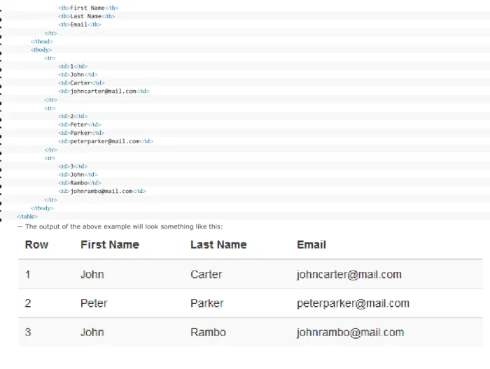
— The output of the above example will look something like this:
Moreover you can use the
<small>
tag or<span>
tag with.small
class to display the secondary text of any heading in a smaller andlighter variation.
Example
Try this code
»
1. <h1>h1. Bootstrap heading <small>Secondary text</small></h1>
2. <h2>h2. Bootstrap heading <small>Secondary text</small></h2>
3. <h3>h3. Bootstrap heading <small>Secondary text</small></h3>
4. <h4>h4. Bootstrap heading <small>Secondary text</small></h4>
5. <h5>h5. Bootstrap heading <small>Secondary text</small></h5>
6. <h6>h6. Bootstrap heading <small>Secondary text</small></h6>
— The output of the above example will look something like this:
You can make your
<h1>
heading appear differently than rest of the headings on a page using the page header component. You can alsoutilize
<small>
tag to mark header subtext.Example
Try this code
»
1. <div class="page-header">
2. <h1>Bootstrap <small>An intuitive front-end framework</small></h1>
3. </div>
— The output of the above example will look something like this:
Working with Paragraphs
Bootstrap's global default
font-size
is14px
, with aline-height
of1.428
. This is applied to the<body>
and all paragraphs. In additionto that a bottom margin of half their
line-height
(10px
by default) is applied to the all paragraphs (<p>
).You can also make a paragraph stand out by just adding the class
.lead
.Example
Try this code
»
1. <p>This is how a normal paragraph looks like in Bootstrap.</p>
2. <p class="lead">This is how a paragraph stands out in Bootstrap.</p>
— The HTML code in the above examples will produce the following result:
You can easily align text inside a paragraph and other elements using text alignment classes.
Example
Try this code
»
1. <p class="text-left">Left aligned text.</p>
2. <p class="text-center">Center aligned text.</p>
3. <p class="text-right">Right aligned text.</p>
4. <p class="text-justify">Justified text.</p>
5. <p class="text-nowrap">No wrap text.</p>
Bootstrap Text Formatting
You are free to use text formatting tags like
<strong>
,<i>
,<small>
to make your text bold, italic, small and so on, in the same way you doin simple HTML.
Example
Try this code
»
<p><b>This is bold text</b></p>
<p><big>This is big text</big></p>
<p><code>This is computer code</code></p>
<p><em>This is emphasized text</em></p>
<p><i>This is italic text</i></p>
<p><mark>This is highlighted text</mark></p>
<p><small>This is small text</small></p>
<p><strong>This is strongly emphasized text</strong></p>
<p>This is <sub>subscript</sub> and <sup>superscript</sup></p>
<p><ins>This text is inserted to the document</ins></p>
<p><del>This text is deleted from the document</del></p>Text Transformation Classes
You can also transform the text to lowercase, uppercase or make them capitalize.
Example
Try this code
»
1. <p class="text-lowercase">The quick brown fox jumps over the lazy dog.</p>
2. <p class="text-uppercase">The quick brown fox jumps over the lazy dog.</p>
3. <p class="text-capitalize">The quick brown fox jumps over the lazy dog.</p>
— The output of the above example will look something like this:
Text Emphasis Classes
Colors are the powerful method of conveying important information in website design.
Bootstrap has handful of emphasis utility classes that can be used for this purpose such as showing success message in green color, warning or error message in red color, etc.
Example
Try this code
»
1. <p class="text-muted">Muted: This text is grayed out.</p>
2. <p class="text-primary">Important: Please read the instructions carefully before proceeding.</p>
3. <p class="text-success">Success: Your message has been sent successfully.</p>
4. <p class="text-info">Note: You must agree with the terms and conditions to complete the sign up process.</p>
5. <p class="text-warning">Warning: There was a problem with your network connection.</p>
6. <p class="text-danger">Error: An error has been occurred while submitting your data.</p>
Styling Blockquotes
You can also give pretty look to your blockquotes — Just define the blockquotes using the standard
<blockquote>
element and bootstrap's stylesheet will do the rest.
Example
Try this code
»
1. <blockquote>
2. <p>The world is a dangerous place to live; not because of the people who are evil, but because of the people who don't do anything about it.</p>
3. <small>by <cite>Albert Einstein</cite></small>
4. </blockquote>
— The output of the above example will look something like this:
Alternatively you can right-aligned the blockquote through floating it to right by simply applying the class
.pull-right
onthe
<blockquote>
element.Example
Try this code
»
1. <blockquote class="pull-right">
2. <p>The world is a dangerous place to live; not because of the people who are evil, but because of the people who don't do anything about it.</p>
3. <small>by <cite>Albert Einstein</cite></small>
4. </blockquote>