RESEARCH OUTPUTS / RÉSULTATS DE RECHERCHE
Author(s) - Auteur(s) :
Publication date - Date de publication :
Permanent link - Permalien :
Rights / License - Licence de droit d’auteur :
Bibliothèque Universitaire Moretus Plantin
Institutional Repository - Research Portal
Dépôt Institutionnel - Portail de la Recherche
researchportal.unamur.be
University of Namur
User-Experience in Business Intelligence
Burnay, Corentin; Bouraga, Sarah; Faulkner, Stéphane; Jureta, Ivan
Published in:
Research Challenges in Information Science
DOI:
10.1007/978-3-030-50316-1_11
Publication date:
2020
Document Version
Publisher's PDF, also known as Version of record Link to publication
Citation for pulished version (HARVARD):
Burnay, C, Bouraga, S, Faulkner, S & Jureta, I 2020, User-Experience in Business Intelligence: A Quality Construct and Model to Design Supportive BI Dashboards. in F Dalpiaz, J Zdravkovic & P Loucopoulos (eds),
Research Challenges in Information Science : 14th International Conference, RCIS 2020, Proceedings. Lecture
Notes in Business Information Processing, vol. 385 LNBIP, Springer, pp. 174-190, 14th International Conference on Research Challenges in Information Sciences, RCIS 2020, Limassol, Cyprus, 23/09/20.
https://doi.org/10.1007/978-3-030-50316-1_11
General rights
Copyright and moral rights for the publications made accessible in the public portal are retained by the authors and/or other copyright owners and it is a condition of accessing publications that users recognise and abide by the legal requirements associated with these rights. • Users may download and print one copy of any publication from the public portal for the purpose of private study or research. • You may not further distribute the material or use it for any profit-making activity or commercial gain
• You may freely distribute the URL identifying the publication in the public portal ?
Take down policy
If you believe that this document breaches copyright please contact us providing details, and we will remove access to the work immediately and investigate your claim.
RESEARCH OUTPUTS / RÉSULTATS DE RECHERCHE
Author(s) - Auteur(s) :
Publication date - Date de publication :
Permanent link - Permalien :
Rights / License - Licence de droit d’auteur :
Bibliothèque Universitaire Moretus Plantin
Institutional Repository - Research Portal
Dépôt Institutionnel - Portail de la Recherche
researchportal.unamur.be
User-Experience in Business Intelligence - A Quality Construct and Model to Design
Supportive BI Dashboards
BURNAY, CORENTIN; JURETA, Ivan; BOURAGA, SARAH; FAULKNER, STEPHANE
Published in:
[Provisoir] IEEE 14th International Conference on Research Challenges in Information Science
Publication date:
2020
Link to publication
Citation for pulished version (HARVARD):
BURNAY, CORENTIN, JURETA, I, BOURAGA, SARAH & FAULKNER, STEPHANE 2020, User-Experience in Business Intelligence - A Quality Construct and Model to Design Supportive BI Dashboards. in [Provisoir] IEEE
14th International Conference on Research Challenges in Information Science. International Conference on
Research Challenges in Information Science, Limassol, Cyprus, 23/09/20.
General rights
Copyright and moral rights for the publications made accessible in the public portal are retained by the authors and/or other copyright owners and it is a condition of accessing publications that users recognise and abide by the legal requirements associated with these rights. • Users may download and print one copy of any publication from the public portal for the purpose of private study or research. • You may not further distribute the material or use it for any profit-making activity or commercial gain
• You may freely distribute the URL identifying the publication in the public portal ?
Take down policy
If you believe that this document breaches copyright please contact us providing details, and we will remove access to the work immediately and investigate your claim.
Quality Construct and Model to Design
Supportive BI Dashboards
Corentin Burnay1, Sarah Bouraga1, St´ephane Faulkner1, and Ivan Jureta1,2
1 University of Namur, Department of Business Administration, Belgium
PReCISE Research Center, NaDI Research Institute
2 Fonds National de la Recherche Scientifique (FNRS)
Abstract. Business Intelligence (BI) intends to provide business man-agers with timely information about their company. Considerable re-search effort has been devoted to the modeling and specification of BI systems, with the objective to improve the quality of resulting BI output and decrease the risk of BI projects failure. In this paper, we focus on the specification and modeling of one component of the BI architecture: the dashboards. These are the interface between the whole BI system and end-users, and received smaller attention from the scientific com-munity. We report preliminary results from an Action-Research project conducted since February 2019 with three Belgian companies. Our con-tribution is threefold: (i) we introduce BIXM, an extension of the existing Business Intelligence Model (BIM) that accounts for BI user-experience aspects, (ii) we propose a quality framework for BI dashboards and (iii) we review existing BI modeling notations and map them to our quality framework as a way to identify existing gaps in the literature.
Keywords: Business Intelligence · Dashboards · Requirements Engi-neering · Non-functional requirements · Business Intelligence Model (BIM)
1
Introduction
Business Intelligence (BI) refers to the architecture in a company consisting of tools and softwares used to extract valuable information from operational data. The goal is to provide managers with a timely and consistent view on the performance of their business, i.e., how well the business is doing in terms of operations and value-adding activities. The ultimate objective of any BI system is to use and control past performance of the company as a way to better inform managers about the state of the company, and help them drive business planning [6]. Implementing an effective BI system is an increasingly common yet critical requirement for companies.
Researchers addressed this problem in various ways, by defining methodolo-gies and models to specify the different components inside the BI architecture such as the Extract-Transform-Load (ETL) process, the data warehouse or even the OLAP applications. Surprisingly however, we find little research focusing
specifically on the specification of dashboards. This is particularly surprising considering that dashboards are the interface between the entire BI architecture and end-users; a poorly specified dashboard may be a threat to the success of the entire BI system if it leads end-users to turn away and use alternative sources of information. The few scientific contributions we found on the topic (e.g. [30, 20, 27]) all seem to focus on the same question: how to detect as much as possible of the information that is relevant to decision makers? In other words, how to ensure dashboard completeness.
Focusing on completeness only, however, is not always desirable. Imagine a manager who has access to a large quantity of highly relevant information. The manager has a complete view on his business and can use the dashboard to make decisions. But what if that information is not presented properly and is hard to interpret ? What if the information is relevant given the corporate strategy, but does not bring anything new in terms of perspective on the problems the business is confronted to? What if there is too much information, so that the manager is simply overwhelmed and cannot treat the information correctly? The previous intends to illustrate the existence of a trade-off when designing a BI dashboard between (i) the necessity to provide complete and relevant information to support decision-makers and (ii) the necessity to provide information in a way that actually supports the decision maker. To the best of our knowledge, most scientific approaches focus on the first part of the trade-off and tend to overlook the second one. This may result in very rich BI outputs, with which managers may however be struggling, because too complex to leverage.
Our claim in this paper is therefore that supportiveness matters, as much as completeness. This brings us to the following research questions:
1. What are the different qualities a dashboard should satisfy to be supportive? 2. How to ensure these qualities actually operationalize in the dashboards? 3. Which of the existing BI models supports which qualities of our framework?
To the best of our knowledge, these questions have received little atten-tion from informaatten-tion management research community in general. The prob-lem has been addressed by some practitioners (e.g.,[12]) but without any real scientific insight. In [1, 4], methods for the automated generation of engaging dashboards are reported. While our conclusions are partly aligned, the central place that human designers occupy in our research project stresses out some spe-cific dashboard qualities that are not/can hardly be handled in such automated approaches (Efficiency or Relevance for instance). Other pieces of work focus on the definition of KPIs included in a dashboard [8, 9]. While our questions could also be treated on such thinner granularity level, this is outside the scope of this paper. Starting from this gap, this paper reports the result of the first ten months of Action-Research we conducted to answer those questions. When writ-ing this paper, we are still collaboratwrit-ing with one company and expect additional improvements and results. The length of the action-research process, combined with the necessity to somehow formalize our results and obtain an intermediate validation/discussion of those results with the research community motivates the present paper, despite the data collection process not being totally completed.
2
Methodology - Action Research
Studying qualities related to supportiveness of dashboard is challenging, because the topic is rather subjective and tacit. We therefore opted for Action Research (AR), as a way to actually experience the problems of dashboard design, rather than simply questioning practitioners about it. AR can be defined as “a system-atic form of inquiry undertaken by practitioners into their attempts to improve the quality of they own practice” [40]. It is a qualitative approach that is consid-ered as “systematic and orientated around analysis of questions whose answers require the gathering and analysis of data and the generation of interpretations directly tested in the field of action” [16]. According to Coghlan and Brannick [5], it is “appropriate when the research topic is an unfolding series of actions over time in a given group, community or organization, and the members wish to study their own action in order to change or improve the working of some aspects of the system, and study the process in order to learn from it ”. AR specifics fit well with the engineering approach adopted in this paper, in which we focus on the maximization of a hard-to-measure concept, i.e., supportiveness. We see in AR a great opportunity to bring changes to an existing – but theoretical – model (i.e., BIM) based on practically informed experience and opinions collected from practitioners. Those improvements could not be made based solely on interviews or focus groups, isolated from a clear application area.
Companies: we worked with companies that are all located in Belgium and are in the process of implementing BI solutions. There are 3 of them, active in the airspace, health and banking industry. In each company, the authors were invited to participate to meetings, calls, etc. Involvement was moderate to keep a distance between the research project and the BI project. The disclosure of prac-tical information about the projects is constrained by non-disclosure agreements; the only content to be disclosed in this paper is related to the methodology and the models used to produce specifications of the dashboards.
Procedures: in order to collect data, we applied the same procedure in all three projects, following the AR iterative process as prescribed by Susman and Evered [36]:
1. Diagnosing: identifying or defining a problem;
2. Action planning: find alternative courses of action for solving the problem; 3. Action taking: applying a course of action;
4. Evaluating: studying the consequences of the action; 5. Specifying learning: identifying general findings.
All companies entered the process at the same time. Up to now, we con-ducted a total of 4 such iterations, and are currently working on a fifth one. We group those iterations in 3 rounds, as described in Table 1 (a round is a set of iterations focusing on a same dashboard quality, see below). Not all companies were involved in all iterations; company A and C for instance joined the project later and did not participate in iteration 1.
Validity: the question of validity is a central question, especially in AR. Each iteration relied on the combination of standard qualitative data collection meth-ods like focus groups, interviews, fields notes and observations. We applied those methods under an ethnographic perspective as a way to uncover people prac-tices and issues in real-world setting [10]; especially, we made use of the data triangulation technique by combining interviews, workshops and participatory observation to ensure validity of our conclusions [29]. Most interviews were con-versational [31], taking place as new issues were discovered or specific actions were taken and tested. Using structured interviews was not feasible, given the practical constraints in projects and the necessity to interfere as least as possible with people practices. Interviews were useful to capture ideas or identify possible action planning. This approach made the audio recording of the interviews im-possible, leading instead the author to produce systematic summary notes after each exchange with members of the project. Finally, we also organized a series of conclusion workshops/focus groups, necessary to the “evaluation” step. We ran those sessions as Delphi sessions [33], a type of focus group were stakeholders are invited to provide feedback anonymously and iteratively, in order to reach a consensus within the group. This technique was useful to uncover strengths and weaknesses of our solutions, and to define new potential action planning.
3
Results
We completed four iterations grouped in three rounds which are summarized in Table 1. For each round, we discuss (i) the diagnosing step and related dashboard quality, (ii) the literature related to that quality, (iii) the change proposed in the dashboard design process and (iv) the evaluation and formalization of learning. 3.1 Round 1 - Dashboard Relevance in BIXM
Diagnosis - Relevance of information Discussions with stakeholders from company A quickly lead to a first diagnosis: dashboards presented to users do not always include the necessary information, and some aspects that are key for the evaluation of business operations are in fact not monitored in the dashboard. Sev-eral stakeholders pointed out that they “could indeed produce dashboards aligned with their strategy, but that it would require several iterations before achieving a satisfying content ”. This was negatively perceived by stakeholders, because costly and very time consuming. We call this a need for relevance.
Planning and Theory - Relevance in the Literature Sperber & Wilson define relevance as follows: “An input is relevant to an individual when it con-nects with available contextual assumptions to yield positive cognitive effects: for example, true contextual implications, or warranted strengthening or revisions of existing assumptions” [34]. Applied to a BI context, a piece of information in a given context will be relevant if it helps the decision maker to confirm some intuition she has in that context, or if it helps her getting more (or less) confident
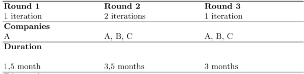
Table 1: Summary of Research Action Iterations
Round 1 Round 2 Round 3
1 iteration 2 iterations 1 iteration Companies
A A, B, C A, B, C
Duration
1,5 month 3,5 months 3 months Diagnosing
Dashboards are not in line with user’s perception of business strategy; indicators are miss-ing or unnecessary and do not clearly relate to actual business goals
Dashboards are hard to read, and users experience difficulties when trying to retrieve the in-formation from the dashboard.
Dashboards are large, difficult to grasp fully for end users be-cause too rich, too detailed, too heavy
Action planning
A. Use BIM to identify relevant indicators. (adopted)
A. Let users create their dash-boards themselves with self-service software (rejected). B. Model indicators with their re-spective visualization and bal-ance between expressiveness and efficiency. (adopted)
A. Establish a system of weights for each elements in the dashboard.
Action Taking for selected Planning
1. Model business goal model 2. Brainstorm indicators for each elements of the model 3. Prior-itize (rank) indicators 4. Imple-ment most important indica-tors, as long as budget is avail-able.
1. Elicit visual requirements of stakeholders 2. Find a bal-ance between expressiveness and efficiency 3. Model result-ing dashboard specification in BIXM.
1. Assign weights to each type of visuals 2. Compute weights of each dashboard 3. Detect outliers in terms of weight 4. Split or merge dashboard to balance the load across the dashboards
Evaluating
Stakeholders recognize infor-mation included in the dash-board was necessary and suf-ficient. They acclaim the ra-pidity at which we obtained a validated dashboard, without several iterations between the business and the IT.
Action plan A was strongly rejected by stakeholders, be-cause too time-consuming. Ac-tion plan B was positively re-ceived. The Delphi validation session did not emphasize any problem in the resulting dash-boards, and stakeholders of the different projects gave credits to the proposed solutions of plan B.
The definition of a clear pro-cedure to compute the actual load of a dashboard was the central issue in this round, and took a large portion of the time dedicated to this itera-tion. During validation, two of the Delphi sessions requested to re-evaluate the initial load associated with each visual, switching from an initial 1/1/1 to the current 1/3/6 key.
Research learnings
1. application of BIM for the specification of BI solution 2. application of BIM for BI Dashboards specification
1. definition of an expressive-ness/efficiency matrix 2. BIXM notation to model type of visu-als of indicators
1. BIXM notation for dash-boards 2. Definition of weights for indicators 3. Procedure of dashboard load computation
Suggested Dashboard Qualities
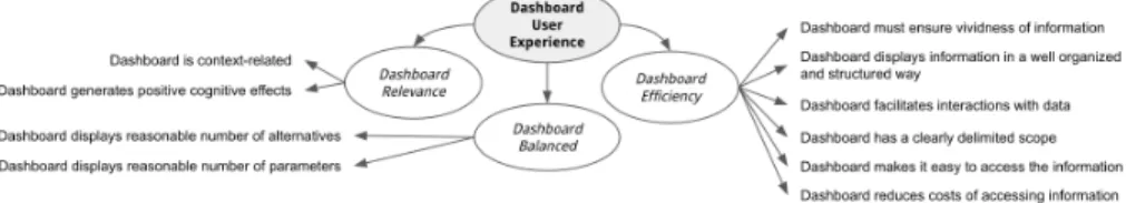
about an assumption she made in that same context. Theory therefore suggests the following criteria to discuss the concept of relevance:
– Dashboard is sufficiently context-related
– Dashboard generates cognitive effects (cause-effect links, comparisons,...)
Action Taking - Modeling Indicators using BIM (1 iteration) We sug-gested to company A that the problem could be anticipated for future dash-boards by using an indicators modeling notation such as BIM. We therefore decided to model a segment of the business strategy under the form of a goal model using the concepts of goals, soft-goals and decomposition links. This pro-cess was intuitive to most business stakeholders. We then used the resulting model to brainstorm with the different stakeholders about all candidate indica-tors. The resulting list was then prioritized to select most relevant ones using a simple Must-Should-Could-Would priority scale [19]. Indicators were finally im-plemented in dashboards by people in charge of the dashboard implementation.
Evaluation of Relevance and Learnings It took two weeks to document the goal model of the dashboard and validating it. The brainstorming and priori-tizing sessions were conducted directly after, and it took two additional weeks to implement the identified KPIs. The result was presented during a conclusion session to members of the project in charge of the performance management. As expected, stakeholders agreed on the fact that the information included in the dashboard was necessary and sufficient. They also acclaimed the rapidity at which we obtained a validated dashboard, without several iterations between the business and the IT. Scientific learning in this first round are minor; we simply obtained additional evidences that BIM actually helps implementing strategy-aligned BI solutions, and that it can also be used to inform the specification of BI Dashboards. Improvements for the company were significant, decreasing to a large extent the time-to-release of new dashboards.
3.2 Round 2 - Dashboard Efficiency in BIXM
Diagnosis - Efficiency of information Additional interviews in company A lead to the identification of a new problem: the dashboard produced in round 1 was relevant, but turned out to be relatively hard to read. Stakeholders in company A claimed that “the information is there but it’s presented strangely and I can’t extract what I need to decide about [...] ”. Similarly, a stakeholder from company B commented about another dashboard of their own that “everything is there, but it is all numbers and commas and I had a hard time reading it ”. Clearly, the problem is not related to the relevance of the information proposed in the dashboard, but rather to the way that information is displayed and to the way it can be “extracted” from the dashboard. The problem here was that managers needed to obtain the relevant information quickly, and did not wish to spend time interpreting and capturing the information. We call this a need for efficiency.
Planning and Theory - Efficiency in the literature Efficiency of a dash-board deals with the acquisition of information, not its interpretation. We find a similar idea in the Information Context (IC) framework of Lurie et al. [22]. In this framework, the concept of Vividness is used to refer to how salient a piece of information is simply by displaying data “in a form that uses preattentive graphic features, such as line orientation, width, length, and color, which are readily processed with little effort ” [22]. Research on Visual Analytics also con-firms the importance of dashboard efficiency [38]; information must be present, and easy to read and extract from the dashboard. To identify underlying factors of dashboard efficiency, we use the operationalization of information accessibility as proposed by Teo et al. [37] and the factors for the accessibility of information source by O’Reilly [25]. The following criteria have been used during round 2 to discuss the concept of efficiency:
– Dashboard must ensure vividness of information [22] – Dashboard facilitates interactions with data [37] – Dashboard has a clearly delimited scope [37, 25] – Dashboard simplifies access the information [25] – Dashboard reduces costs of information access [25]
– Dashboard displays information in a well organized and structured way [37]
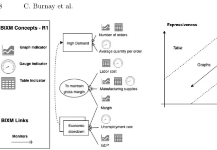
Action Taking - Types of Indicators in BIXM (2 iterations) Firstly, we investigated the adoption of self-service BI as a way to solve the problem of efficiency. The goal was to let managers define the presentation of data by them-selves instead of relying on IT, because they are the ones who know best how they want to visualize their data. This idea was rejected by managers, who found it too technical and too time consuming. As an alternative, we initiated a second iteration in this round in which we opted for a notation specifying the visualiza-tion to be used for each indicator. Our intuivisualiza-tion was that indicators represented in different forms (graphs, tables, etc.) would differ in terms of efficiency, e.g., a table with volume of sales per month will make the information harder to extract than a line chart with the evolution of sales per months. This brought us to the definition of three different types of visualization following Tory and M¨oller’s high-level taxonomy of visualization [39]. This also corresponds to what is available in most existing BI softwares. The BIXM notation for visualization is depicted in Figure 1, together with a fictive illustration adapted from [18]:
– Tables: report discrete variables, showing any item details, supporting filter-ing, drill-down and item exclusion;
– Graphs: report continuous variables, showing trends over time, geographical distribution. They support filtering but drill-down is not always possible; – Gauges: report an aggregated indicator together with target and limit values.
After additional discussion with stakeholders, it turned out quickly that effi-ciency alone was a poor criteria to design dashboards. Some stakeholders pointed out that “it doesn’t make sense [to use only efficiency]; we would only include
Fig. 1: Visualisation notation in BIXM Fig. 2: Expressiveness vs. Efficiency
Gauges to have efficient dashboards then, and would never resort to Tables or Graphs, which is clearly not the case in our habits”. Another one pointed out that “graphs are nice, but they do not hold sufficient information, or when they do they become quickly messy”. This led to the identification of a trade-off be-tween efficiency and expressiveness, understood as the property of a visualization that effectively conveys meaning or feeling [24]. A visual can be highly efficient (information can be extracted quickly, at small cost) but poorly expressive (it conveys little information). We see those two qualities as orthogonal. We consider Gauges are highly efficient but poorly expressive (they show only one number with some targets and thresholds), tables are on the contrary poorly effective but highly expressive. Graphs finally can be poorly, reasonably or highly efficient and expressive, depending on how they are designed and aligned with reporting objectives (see Figure 2). Ultimately, the objective for the dashboard designer is therefore to select one or more visualization to deal with the trade-off, depending on the importance of the indicator and how it relates to the business strategy.
Evaluation of Efficiency and Learnings Two weeks were dedicated to inves-tigating self-service BI approach. The proposition of BIXM notation and matrix took three weeks, under the form of interviews and discussion with stakehold-ers. We then applied the notation in all three companies. The discussion was focused on the identification of most relevant visuals for each indicator, and on the necessity or not to duplicate visuals. The Delphi validation session did not emphasize any problem in the resulting dashboards, and stakeholders of the dif-ferent projects gave credits to the proposed solutions. Learnings for the compa-nies are in the management of visuals and their relative efficiency/expressiveness, decreasing the risk of unsupportiveness. Stakeholders also recognized that dis-cussing the alignment between visuals and the strategic goal they enable to
control is a good way to anticipate multiple iterations with the IT; although rel-atively trivial, this type of discussion was not systematic before the introduction of BIXM. Scientific learnings are in the definition of BIXM visuals notation and in the proposition of the efficiency vs. expressiveness matrix.
3.3 Round 3 - Dashboard Load in BIXM
Diagnosis - Load of information After round 2, companies began to pro-duce dashboards including various representations of a same indicator as a way to balance efficiency and expressiveness. This brought up a new problem; the dupli-cation of indicators led companies to the definition of heavier dashboards, which in turn generated several negative feedback from end-users. Despite stakeholders’ enthusiasm to include several visuals for one single indicator (for multiple per-spectives on a same data), authors’ field notes report that “stakeholders observe the apparition of heavier dashboards, which are too loaded and hence harder to leverage for decision making”. We call this new quality balanced load.
Planning and Theory - Load in the literature Balanced load means that dashboards should not contain a quantity of information that cannot be correctly treated by managers in reasonable delays. This echoes research in psychology about information overloads during decision making. Information overload oc-curs when information received becomes a hindrance rather than a help, even though the information is potentially useful [2]. Shields [32] observes a link be-tween supplied information and the accuracy of judgment in the form of an inverted U-shaped curve; too little or too much information decreases decision accuracy. A sweet spot seems to exist where the quantity of information max-imizes the accuracy of judgments, but we find no agreement on the optimal quantity of information, usually quantified in terms of the number of alternative offered to the decision maker. Prudential studies report optimal number of alter-natives around 4 [17], some suggest to not exceed 6 alteralter-natives [41], others still report decreases in performance above 10 alternatives [23]. Shields’ U-shaped curve, on the other hand, positions the optimal quantity of information – ex-pressed in terms of performance parameters, and not alternatives – around 45 information items [32]. The following criteria have been used during round 3 to discuss the concept of balanced load:
– Dashboard displays reasonable number of alternatives, i.e., the number of indicators on one page, regardless of the visuals (from 4 to 10 alternatives) – Dashboard displays reasonable number of parameters, i.e., the total number of dimensions (not distinct) reported in the dashboard (up to 45 parameters)
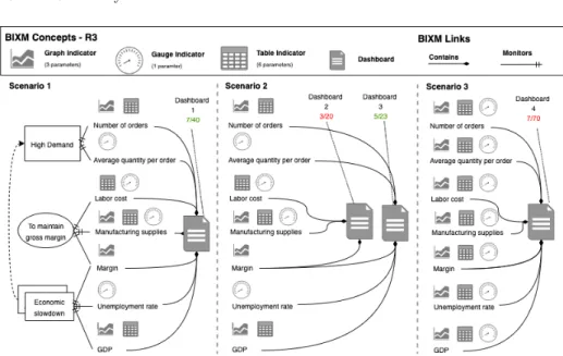
Action Taking - Weights of Visuals in BIXM After discussion with stake-holders, we agreed on two important assumptions related to the load of a board: (1) different loads can be assigned to the different indicators in a dash-board and (2) loads can be used to compute a general score for the dashdash-board.
Fig. 3: BIXM with Dashboard and Load notation
If applied properly, those two ideas make it possible to detect dashboards which are not balanced. The previous ideas raised two practical issues.
First, BIM does not include any modeling mechanism to associate explic-itly an indicator to a dashboard, making it practically unfeasible to compute the weight of that dashboard. We solved this with the introduction of a “dash-board” concept in the BIXM notation, together with a “contains” relationship to relate indicators to dashboard. A dashboard is understood as “an interaction board containing a set of consistent information about one specific aspect of the business, i.e., a scope”. This new notation is illustrated in Figure 3 and enables to define and visualize more formally the content of a dashboard in relation to business strategy. For instance, we observe that all the indicators used to control the goal model could be gathered in a single “Dashboard 1” as in Scenario 1 or split in two different dashboards as depicted in Scenario 2. Alternative visuals for the very same indicators could also be used, as depicted in scenario 3.
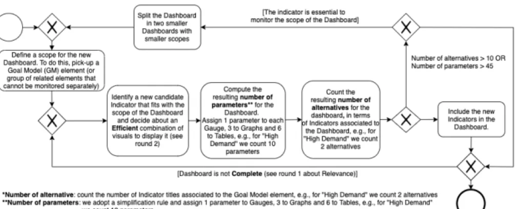
The second problem was methodological; how to proceed in order to compute the measure of load for a dashboard? After several attempts, we converged to the procedure depicted in Figure 4. The process makes use of the two load metrics discussed in our review of the literature; number of alternatives and the number of parameters. The number of alternatives in a dashboard is easy to compute, e.g., in Figure 3, there are 7 different indicators (one per indicator title). This metric reflects the width of a dashboard; how many different business indica-tors does it include. Number of parameters on the other hand is used to reflect the depth of a dashboard; how detailed is the dashboard? It directly gives an indication of the size of the dashboard. Note that the values assigned to com-pute the number of parameters (1, 3 and 6) were defined based on discussions
Fig. 4: Dashboard Load Measurement Procedure
with stakeholders. We did not conduct any empirical evaluation of these num-bers beside the one on the three projects. The number of parameters reflects the number of dimensions used in a visual. As Gauges are non-dimensional by nature, we assigned 1 parameter to it. Graphs usually have a X and Y axis on which a measure is reported, leading to a number of 3 parameters. Tables (and especially Pivot Tables) can include a number of nested levels and drill-down options, leading stakeholders to assign 6 parameters. We acknowledge the ne-cessity to investigate this in more details, but keep it as future work. Using this procedure, we observe that Dashboard 1 in Figure 3 has a 7/40 weight score in Scenario 1, that we consider as balanced. In Scenario 2 however, Dashboard 2 contains too few alternatives to cover effectively the scope (3/20, below the 4 alternative threshold). Dashboard 4 on the contrary has an acceptable number of alternatives, but has too many parameters (70, way above the 45 limit). Re-member that the limits we used (max 10 alternatives and max 45 parameters) follows from our review of the literature in Round 3, but could evolve as our AR project advances. Note also how the concept of load complements the solution proposed in round 2; users could be tempted to include all three kinds of visu-alization for all indicators in order to solve the efficiency/expressiveness tension (Scenario 3). But doing so would generate high loading score and would imply to split the indicators in several dashboards focusing on very specific elements of the goal model, which is not desirable for decision makers, i.e., efficiency is somehow counter-balanced by load issues. Similarly, they could be tempted to specify one dashboard per element in the goal model, then resulting in too poor dashboards which will not be balanced either (Scenario 2).
Evaluation of Balanced Load and Learnings It took three months to con-clude round 3. The definition of a clear procedure to compute the actual load of a dashboard was the central issue in this round, and took a large portion of the time dedicated to this iteration. During validation, two of the Delphi sessions requested to re-evaluate the initial load associated with each visual, switching
from an initial 1/1/1 to the current 1/3/6 key. Learnings for the companies were threefold; (i) more in a dashboard is not always better, and managers and dash-board designers gain in balancing the quantity of information to be shown in a dashboard, (ii) the distribution of various indicators to dashboards based on un-derlying Goal Model elements is essential; related elements should be grouped, when feasible, in a same dashboard and not allocated to dashboards randomly or based on intuition and (iii) dashboards should focus on two or three business goal elements at most. Research Learnings are twofold: (i) additional notation elements for BIXM, namely the dashboard concept and the “contains” link and (ii) the definition of a standard procedure to measure the load of a dashboard.
4
BIXM in Practice
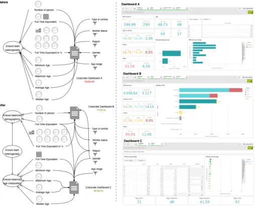
The present section gives the reader an idea of how a dashboard looks like when following previous rules, and also demonstrates the use of BIXM to specify dashboards. The dashboard DAat hand here was designed long before company
C joined the AR project. We took it after Round 3 was concluded in the context of a training session for Business Analysts from the company. A capture of the dashboard before the re-engineering with BIXM is depicted in Figure 5, together with its BIXM equivalent, produced in collaboration with Business Analysts from Company C. We observe that DA was monitoring an “Ensure
team heterogeneity” business goal through a variety of filters and indicators. All were grouped in one single dashboard, with a load of 12/58, way above the suggested 10/45 limit.
We then applied the procedure in Figure 4. This brought us to the conclusion that Goal Model element “Ensure team heterogeneity” was in fact too large to be correctly monitored. We decided to split it in two sub-goals, namely “Ensure balanced team demographics” and “Ensure balanced age composition”. This in turn resulted in the introduction of two smaller dashboards DB and DC, each
focusing on some specific aspects of the team composition, while keeping some common filters and indicators. The resulting BIXM model is also depicted in Figure 5, together with a capture of resulting dashboard implementations. The decision to split DAwas not trivial; all the information contained in it was useful
to evaluate the Business Goal, and it was a strong business requirement to keep relatively integrated reports. Resulting dashboards are not too loaded, yet keep some specific features useful to evaluate efficiently the different sub-goals. The re-engineering of DA generated unanimous positive feedback among end-users.
5
Dashboard Quality Framework and BI Models
We summarize in Figure 6 the essential qualities of dashboard identified through-out our AR project. The figure takes the form of a checklist, that we believe should be accounted for when implementing new dashboards. As a reminder, the AR process is still ongoing, and additional qualities may enrich this frame-work in the future. As a last step in this paper, we review some existing BI
Fig. 5: Illustration of BIXM Application - Splitting one heavy dashboard in two
modeling notations and try to explain which of the qualities of our framework they support. The problem at hand in this paper is a Requirements Engineering (RE) one, and various models have been proposed in RE to support the design of BI systems. GRAnD [14] for instance is a goal-oriented approach building on Tropos which permits to relate BI measures and dimensions to strategic business intentions. Although the focus is on the data warehouse, it offers a perspective on the relevance of information to include in BI dashboards. Similarly, models in [15, 13, 26] focus on data warehouse content and could help determine which in-formation is relevant or not in a dashboard, although they were not designed for this specific purpose. Pourshahid et al. [28] extends the so-called Goal-oriented Requirement Language (GRL) with decision-making concepts such as indicators. Both BIM [18] (on which we build BIXM) and extended GRL enable to define relevant indicators and to reason on them. Beside, soft-goal concepts used in GRL and BIM could also be used to ensure Balanced dashboard, despite the absence of formal mechanisms to handle the load of a dashboard. Stefanov et al. [35] propose an alternative formalism where BI concepts (e.g. indicators, re-ports, ...) are included in UML activity diagrams to facilitate the identification of pertinent indicators in a process-oriented mood. Information is also related to goals, processes and role concepts, further ensuring its relevance in case of
inclusion in a dashboard. We note that the model is expected to “provide BI objects on different aggregation levels and thus permits to the modeler to choose the right level of detail for different purposes or target audiences” [35], which may help designers to produce efficient dashboards, and maybe to help ensuring the quantity of information displayed in a dashboard is Balanced.
Fig. 6: BIXM Essential Dashboards Quality Construct
Other models have been proposed outside RE. While not all specifically de-signed for BI purposes, most of them offer a perspective on the information to include in dashboards. The Balanced Scorecard (BSC) identifies four business dimensions for monitoring a company [21]. The BSC can also be linked to the business strategy via a Strategy Map [21], thereby contributing to the definition of relevant indicators. GRAI grid [3, 11] models organizations and complex sys-tems; it identifies where important decisions are made in the business, and most importantly the information relationships that exist among these decisions, so that the model can also be used to identify relevant information for a BI dash-board. ARIS [7] is another framework to model all the dimensions of a business repository, from the business processes, the softwares and the technical aspects of a company to the data and information used in that company. We see in ARIS another possible approach to prove the relevance of information used in a dashboard, e.g., an indicator is relevant if it relates to a business process.
Both in RE and in Performance Management literature, it seems clear that existing models and methods are numerous, but tend to focus on the relevance of information only. It is striking however that most of these models simply over-look other essential qualities of dashboards identified in our Dashboard Quality Framework. We did not manage to find a formal support to specify dashboards that are, at the same time, relevant, efficient and balanced. Table 2 summarizes our observations.
6
Limitations
The contribution in this paper builds on Action Research, and therefore starts from practice to suggest a theory in an inductive way. The work presented in this paper is the result of extensive data collection and observation over a long period of time, following the guidelines for rigorous Action Research [5]. It is grounded in practice and reflects actual people thoughts and perceptions of issues related
Table 2: Mapping of Existing Approaches in our BI Dashboard Qualities Construct
BI Approach Dashboard relevance Dashboard efficiency Dashboard balance Balanced Scorecard [21] X
GRAI Grid [3, 11] X
ARIS [7] X
BI: Activity diagram [35] X ? ?
GRAnD [14] X
DWH notations [15, 13, 26] ?
BIM [18] X ?
GRL [28] X ?
to the design of BI dashboards. Nevertheless, it builds on a limited sample of three cases with a limited number of person involved. The suggested problems and solutions inevitably reflect part of the corporate cultures and values, and adapts to the processes of the selected companies. BIXM, as is, therefore presents a risk of not being neutral. It was critical for the authors to remain detached from those values and stay critic in any case; several times on the projects, there were opportunities to discuss with members of the project on whether or not the solution would be different in another company, or in another context. Doing so, we tried to isolate the problem from the specifics of the organization. The author also paid attention to ground all solutions on scientific literature; improvements on BIM are therefore not simply informed by action research, but also build on well established theories in psychology, management and data sciences as well as requirements engineering. Previous limitations make it difficult to generalize our conclusions to other projects and other fields without further investigation of the model. Still, we believe those limitations do not hold us back from drawing relevant conclusions about the design of dashboard, and we wish to pursue in the future with more applications of the present framework to other industries and other projects.
7
Conclusions
This paper presents preliminary results of an Action-Research project that took place between February and October 2019 in three Belgian companies, active in the Airspace, Healthcare and Banking industries. The paper investigates vari-ous qualities of Business Intelligence dashboards that stakeholders perceive as essential in order for the dashboard to be supportive. BIXM, a new notation for the specification of BI dashboard, is proposed. It extends the BIM model and adds a number of BI-related concepts such as visualization, dashboards and loads. Each addition to BIM was carefully discussed and evaluated with practi-tioners. To the best of our knowledge, no existing BI modeling framework exist that supports the engineering of dashboard as BIXM does. At the moment of writing this paper, we are still involved in two companies and keep identifying new qualities.
References
1. Aksu, ¨U., Del-R´ıo-Ortega, A., Resinas, M., Reijers, H.A.: An Approach for the Au-tomated Generation of Engaging Dashboards Unal. In: OTM Confederated Inter-national Conferences” On the Move to Meaningful Internet Systems”. pp. 363–384. Springer (2019)
2. Bawden, D., Robinson, L.: The dark side of information: Overload, anxiety and other paradoxes and pathologies. Journal of Information Science 35(2), 180–191 (2009)
3. Chen, D., Vallespir, B., Doumeingts, G.: GRAI integrated methodology and its mapping onto generic enterprise reference architecture and methodology. Comput-ers in industry 33(2), 387–394 (1997)
4. Chowdhary, P., Palpanas, T., Pinel, F., Chen, S.k., Wu, F.: Model-Driven Dash-boards for Business Performance Reporting. In: Proc. 10th IEEE International Enterprise Distributed Object Computing Conference (EDOC’06). pp. 374–386. Ieee (oct 2006). https://doi.org/10.1109/EDOC.2006.34
5. Coghlan, D., Brannick, T.: Doing Action in Your Own Organization (2005) 6. Davenport, T.H., Harris, J.G.: Competing on analytics : the new science of winning.
Harvard Business School Press, Boston (2007)
7. Davis, R., Brab¨ander, E.: ARIS design platform: getting started with BPM. Springer (2007)
8. Del-R´ıo-Ortega, A., Resinas, M., Cabanillas, C., Ruiz-Cort´eS, A.: On the Definition and Design-time Analysis of Process Performance Indicators. Information Systems 38(4), 470–490 (2013)
9. Del-R´ıo-Ortega, A., Resinas, M., Dur´an, A., Bern´ardez, B., Ruiz-Cort´es, A., Toro, M.: Visual ppinot: A Graphical Notation for Process Performance Indicators. Busi-ness and Information Systems Engineering 61(2), 137–161 (2019)
10. Denzin, N.K., Lincoln, Y.S.: Handbook of qualitative research. Sage publications, inc. (1994)
11. Doumeingts, G., Vallespir, B., Chen, D.: GRAI Grid Decisional modelling. In: Handbook on architectures of information systems, pp. 321–346. Springer (2006) 12. Few, S.: Information Dashboard Design: The Effective Visual Communication of
Data. O’Reilly (2006)
13. Gam, I., Salinesi, C.: A requirement-driven approach for designing data ware-houses. In: Requirements Engineering: Foundation for Software Quality (2006) 14. Giorgini, P., Rizzi, S., Garzetti, M.: GRAnD: A goal-oriented approach to
require-ment analysis in data warehouses. Decision Support Systems 45(1), 4–21 (apr 2008)
15. Golfarelli, M., Maio, D., Rizzi, S.: The dimensional fact model: A conceptual model for data warehouses. International Journal of Cooperative Information Systems 7(02n03), 215–247 (1998)
16. Greenwood, D.J., Levin, M.: Introduction to action research: Social research for social change. SAGE publications (2006)
17. Hayes, J.R.: Human data processing limits in decision making. Tech. rep., (No. ESD-TDR-62-48). Electronic Systems DIV Hanscom AFB MA. (1962)
18. Horkoff, J., Barone, D., Jiang, L., Yu, E.S., Amyot, D., Borgida, A., Mylopoulos, J.: Strategic business modeling: representation and reasoning. Software & Systems Modeling (oct 2012)
19. IIBA, I.I.o.B.A.: Guide to the Business Analysis Body of Knowledge. No. Version 1.6, International Institute of Business Analysis (2006)
20. Isik, O., Jones, M.C., Sidorova, A.: Business Intelligence (BI) success and the role of BI capabilities. Intelligent Systems in Accounting, Finance and Management 18(4), 161–176 (oct 2011)
21. Kaplan, R.S., Norton, D.P.: Linking the balanced scorecard to strategy. California Management Review 39(1), 53–80 (1996)
22. Lurie, N.H., Mason, C.H., Glazer, R., Hamilton, R., Hearst, M., Hoffman, D.: Visual Representation: Implications for Decision Making. Journal of Marketing 71, 160–177 (2007)
23. Malhotra, N.K.: Information load and consumer decision making. Journal of Con-sumer Research 8(4), 419–430 (1982)
24. MerriamWebster: Effectiveness (2019), https://www.merriam-webster.com/dictionary/effectiveness
25. O’Reilly, C.: Variations in Decision Makers’ Use of Information Sources: The Im-pact of Quality and Accessibility of Information. The Academy of Management Journal 25(4), 756–771 (1982)
26. Paim, F.R.S., de Castro, J.F.B.: DWARF: an approach for requirements definition and management of data warehouse systems. In: Proc. 11th IEEE International Conference on Requirements Engineering. pp. 75–84. IEEE Comput. Soc (2003) 27. Palpanas, T., Chowdhary, P., Mihaila, G., Pinel, F.: Integrated model-driven
dash-board development. Information Systems Frontiers 9(2-3), 195–208 (may 2007) 28. Pourshahid, A., Richards, G., Amyot, D.: Toward a goal-oriented, business
intelli-gence decision-making framework. E-Technologies: Transformation in a Connected World pp. 100–115 (2011)
29. Reeves, S., Kuper, A., Hodges, B.D.: Qualitative research methodologies: ethnog-raphy. British Medical Journal 337(7668), 512–514 (2013)
30. Roest, P.: The golden rules for implementing the balanced business scorecard. Information Management & Computer Security 5(5), 163–165 (1997)
31. Rubin, H.J., Rubin, I.S.: Qualitative interviewing: The art of hearing data. Sage. (2011)
32. Shields, M.D.: Effects of Information Supply and Demand on Judgment Accuracy: Evidence from Corporate Managers. The accounting review 58(2), 284–303 (1983) 33. Skulmoski, G.J., Hartman, F.T., Krahn, J.: The Delphi Method for Graduate
Re-search Gregory. Journal of Information Technology Education 6, 93–105 (2007) 34. Sperber, D., Wilson, D.: Pragmatics. In: Oxford Handbook of Contemporary
An-alytic Philosophy, pp. 468–501. Oxford University Press, Oxford (2005)
35. Stefanov, V., List, B., Korherr, B.: Extending UML 2 Activity Diagrams with Busi-ness Intelligence Objects. In: Tjoa, Amin and Trujillo, J. (ed.) Data Warehousing and Knowledge Discovery, pp. 53–63. Springer Berlin Heidelberg (2005)
36. Susman, G.I., Evered, R.D.: An Assessment of the Scientific Merits of Action Re-search. Administrative Science Quarterly 23(4), 582 (1978)
37. Teo, H.H., Chan, H.C., Wei, K.K., Zhang, Z.: Evaluating information accessibility and community adaptivity features for sustaining virtual learning communities. Int. J. Human-Computer Studies 59, 671–697 (2003)
38. Thomas, J.J., Cook, K.A.: The science of visual analytics. IEEE Computer Graph-ics and Applications (January/February 2006), 10–13 (2006)
39. Tory, M., M¨oller, T.: Rethinking visualization: A high-level taxonomy. In: Proceed-ings - IEEE Symposium on Information Visualization. pp. 151–158 (2004) 40. Whitehead, J.: How Do I Improve the Quality of my Management? Management
Learning 25, 137–153 (1994)
41. Wright, P.: Consumer Choice Strategies: Simplifying vs. Optimizing. Journal of Marketing Research 12(1), 60 (feb 1975)
![Table 2: Mapping of Existing Approaches in our BI Dashboard Qualities Construct BI Approach Dashboard relevance Dashboard efficiency Dashboard balance Balanced Scorecard [21] X](https://thumb-eu.123doks.com/thumbv2/123doknet/14496769.718450/17.918.203.737.206.357/approaches-dashboard-qualities-construct-dashboard-dashboard-efficiency-dashboard.webp)
