Beagle: Automated Extraction and Interpretation of Visualizations
from the Web
by
Peitong Duan
S.B., Computer Science and Engineering, M.I.T., 2016
Submitted to the Department of Electrical Engineering and Computer Science
in partial fulfillment of the requirements for the degree of
Master of Engineering in Electrical Engineering and Computer Science
at the
MASSACHUSETTS INSTITUTE OF TECHNOLOGY
February 2017
©Massachusetts Institute of Technology 2017. All rights reserved.
Author . . . .
Department of Electrical Engineering and Computer Science
January 31, 2017
Certified by . . . .
Michael Stonebraker
Adjunct Professor
Thesis Supervisor
Accepted by . . . .
Christopher Terman
Chairman, Masters of Engineering Thesis Committee
Abstract
In this paper, we present Beagle, an automated data collection system to mine the web for SVG-based visualization images, label them with their corresponding visualization type (i.e., bar, scatter, pie, etc.), and make them available as a queryable data store. The key idea behind Beagle is a new SVG-based classification design to more effectively label visualizations rendered in a browser. Furthermore, Beagle is designed from the ground up to be extendable and modifiable in a straightforward way, to anticipate when new artifacts appear on the web, such as new JavaScript libraries, new visualization types, and better browser support for SVG. We evaluated Beagle’s classification techniques on multiple collections of SVG-based visualizations extracted from the web, and found that Beagle provides a significant boost in accuracy compared to existing classification techniques, across a wide variety of visualization types.
0.1
Introduction
Data science has become important in an increasing number of domains, including web design, HCI, and visualization. For example, Kumar et al. recently developed the Bricolage algorithm [23], which uses a collection of web pages to learn mappings between different web designs, and uses these mappings to restyle web pages automatically. Reinecke et al. build computational models over website snapshots to predict how the visual complexity and colorfulness of a web page will affect a visitor’s initial impression of the web page [28]. Harrison et al. propose a similar approach to predict first impressions of infographics [18]. In a related area, Saleh et al. compute low-level visual features (e.g., color histograms) over a collection of infographics to measure style similarity between infographics [30].
While effective, it is clear that data-driven design systems consistently require a large input collection from which to build design rules and train machine learning models. For these systems to achieve high prediction accuracy, their input collections often contain tens to hundreds of thousands of examples, making manual gathering and tagging prohibitively time consuming to perform. As such, developing automated techniques for collecting and classifying these collections is of the utmost importance. However, existing work in this area focuses mainly on collecting and classifying web designs [22, 29, 19, 6]. Web designs style and format webpages, making them different from visualization designs that focus on visualizations alone. Little work has been done to support the automated collection and classification of visualization designs.
Furthermore, existing techniques for collecting and classifying web pages are unable to discern visualiza-tions from other images (e.g., logos), and have no notion of categorizing designs by type. Unlike web page designs, most visualization designs belong to well-known categories (or types), such as bar and pie charts. Therefore, the most important feature for an automated visualization collection and classification system is the ability to accurately label each visualization with its corresponding type. Without this information, visualiza-tion designers that want to use the collecvisualiza-tion will have no idea how many examples of each visualizavisualiza-tion type are available, or which types are represented, rendering the collection ineffective. For instance, an unlabelled collection would be useless if a user wants to study design examples of a certain visualization type. Such a collection would also be ineffective for training visualization design systems, as designs are based heavily on visualization type.
In this paper, we present Beagle, an automated system to extract visualizations rendered in a browser, label them, and make them available as a query-able data store. Beagle consists of three major components: a Web Crawler for identifying and extracting SVG-based visualizations from webpages, an Annotator for automatically labeling extracted visualizations with their corresponding visualization type, and a Data Store that organizes the visualizations into a relational format for storage in a database management system (or DBMS). The key idea behind Beagle is a new SVG-based classification design to more effectively label visualizations from the web that were rendered using SVG. Furthermore, Beagle is designed from the ground up to be extendible and modifiable in a straightforward way. Thus Beagle is designed to anticipate when new artifacts appear on the web, such as new JavaScript libraries, new visualization types, and more browser support for SVG. With Beagle, we make the following research contributions:
Identification and Extraction of SVG-based Visualizations: Existing work relies on manual gathering or other non-generalizable tricks to build large-scale visualization collections [30, 8, 31], and no techniques exist to create these collections automatically. The Beagle Web Crawler demonstrates how automated processes can be used to collect over 17000 visualizations from the web.
Flexible visualization Classification: Beagle’s Annotator automatically labels each visualization with its corresponding visualization type. To do this, Beagle uses a new SVG-based classifier that calculates statistics over the graphical marks specified inside of an SVG object (e.g., rectangles, lines and circles) to use as classification features. We found that our new SVG-based classifier can correctly classify our visualization collection with 82% accuracy. This represents a 20% boost in accuracy compared to existing techniques [31], in a multi-class classification test across 22 different visualization types.
General-Purpose Data Store: In addition to classifying the visualizations, we recognize that a large visualization collection is most useful when the designer can efficiently search for visualizations with certain characteristics. For example, designers may want to search for specific visualization types (e.g., all bar charts), graphical marks (e.g., all visualizations containing circles), or style properties (e.g., all visualizations containing more than one fill color). We aim to provide a well-structured data analysis layer that supports a variety of search filters over thousands of visualizations. To do this, Beagle stores the dataset created by the Web Crawler and Annotator in a database. We designed a specialized relational schema to support a variety of queries over the dataset using a well-known query language (SQL). The schema is easily extendable to anticipate new visualization types and better SVG support in the future.
0.2
SVG Overview
Beagle’s ability to automatically collect and label visualizations relies on identifying and analyzing SVG images embedded within a web page. Here, we provide a brief explanation of what SVG is, why we use it, and the specific properties that make it useful for Beagle.
0.2.1
What is SVG?
SVG [16] is an image format for two-dimensional graphics. SVG is XML-based, making it straightforward to analyze with an XML parser. Though SVG is also supported outside the web, we study the use case of running JavaScript code to generate and embed SVG images within a web page. An embedded SVG image is stored as a node within the Document Object Model (or DOM) tree of a web page as an SVG object, denoted by the <svg> tag. SVG objects behave like other objects in the DOM tree, such as <body> and <div> objects, making SVG objects straightforward to locate within and extract from a web page.
0.2.2
Why Use SVG?
We focus on SVG for two reasons: 1) direct access to graphical marks, and 2) access to the code used to render the SVG visualization. Unlike raster images, SVG describes in plain text the graphical marks used to render an image, enabling Beagle to classify a large number of visualizations using a small, concise set of SVG elements. Furthermore, SVG-based visualizations are often created by JavaScript code located directly within the same web page (e.g., D3.js code [10]), making SVG-based visualizations easier to find on the web, compared to raster-based visualizations.
0.2.3
How do We Use SVG?
In our classification analyses, we focus on the graphical marks, or shapes that are displayed within an SVG-based visualization. Specifically, we analyze five types of SVG marks: lines, circles, rectangles, text, and paths. Each of these marks is called an SVG element. Each SVG element has its own HTML tag: <line>, <circle>, <rect>, <text>, and <path>. Figure 0-1 contains a box plot and line chart illustrating uses of all five of these SVG element types. Each element type (i.e., rect, circle, etc.) is associated with specific properties that define how the element should be rendered, such as width, height, radius, and positioning (i.e., x and y). We refer to these properties as attributes.
Graphical marks can also be given additional styling properties, such as fill (i.e., fill color) and stroke-width (i.e., border width), which control the aesthetics of the element. We call these style at-tributes. We analyze four style attributes in Beagle: fill, stroke, stroke-width, and font-size.
0.3
System Design Overview
Beagle consists of three major components, illustrated in Figure 0-2: a Web Crawler to find and extract visualizations from web pages, an Annotator to automatically classify visualizations with their corresponding visualization types, and a Data Store to store the extracted visualizations as a relational database. The rest of this section outlines each of the three components within Beagle.
Figure 0-1: A box plot and line chart illustrating uses of all SVG element tables. The element in box A is a <circle>element, box B contains a <line>, box C contains a <rect>, box D contains a <path>, and box E
Figure 0-2: Overview of the Beagle architecture.
0.3.1
Web Crawler
The Web Crawler is responsible for finding web pages containing visualizations, and extracting these vi-sualizations for later classification by the Annotator and storage in the Data Store. It takes a list of urls as input, and produces a visualization ID’s file and a set of folders as output. The visualization ID’s file contains: a unique ID for each extracted visualization, and the url of the web page containing the visualization. Each folder corresponds to a single visualization, and contains several files: the extracted SVG object for the visualization, a snapshot (i.e., raster image) of the visualization, and the raw HTML for the web page containing the visualization. Given that web pages do not need to be visited in any particular order, the filtering process is easy to parallelize. To take advantage of this, the Web Crawler is designed to run in parallel across multiple processors and multiple machines. We detail the design of our Web Crawler in the Section “Finding and Extracting Visualizations”.
0.3.2
Annotator
The Annotator manages the automatic classification of visualizations with their corresponding types. It utilizes a new SVG-based classifier that computes statistics over the elements within a SVG-based visualization. The Annotator uses these statistics to identify patterns in the frequency, positioning, sizing, and styling of SVG elements for different visualization types. We detail the design of our SVG-based classifier in the Section “Automatically Labeling Visualizations”.
0.3.3
Data Store
The Data Store consists of a Schema Builder to translate the data from the other two components into a relational data format, and a DBMS for storing the resulting database. Storing the data as a database allows for fast data processing using the DBMS, and provides access to a well-known query language for interacting with the data (SQL). We explain the design and usage of our Data Store in the Section “Storing and Querying Visualizations”.
0.4
Finding and Extracting Visualizations
The aim of our Web Crawler is to find and extract a diverse set of SVG-based visualizations from the web. Given that our Web Crawler only takes a list of urls of input, an important part of the data collection process is to identify potential url’s to visit. In this section, we describe our initial url collection approach of randomly sampling url’s from the web, and how the Web Crawler was used to filter the resulting urls to identify relevant web pages. We then explain our final technique, where we collect thousands of visualizations from visualization-focused websites.
0.4.1
General Web Search
Our original url collection approach was to randomly sample urls from the web, and check the corresponding web pages for SVG-based visualizations. This approach enabled a broad search across visualization tools and web domains, providing an unbiased view of SVG usage across the web. We used the url index of the Common Crawl [11] as our source for urls. The Common Crawl is project that scraped the raw webpage data of every site on the web, and they update this data on a yearly basis. The Common Crawl data is indexed by webpage urls and other domain information, which means the url index contains almost every url on the web. All this data is publicly available, and we obtained our url collections by randomly sampling from from this url index.
Web Filtering Process
Given a set of urls selected from the Common Crawl, we must filter for pages that contain SVG visualizations. While the most direct method for detecting SVG-based visualizations is to search the HTML DOM tree for SVG objects, this process turns out to be prohibitively time consuming. Most modern SVG-based visualizations are generated using higher-level libraries such as D3.js [10], Plotly [25], and Raphael [7]. As such, a "superficial” search of an HTML page will not be able to find the desired SVG objects. Instead, such a web page needs to be "executed” by a browser to produce the SVG elements. Unfortunately, this code execution process can be extremely slow when our goal is to crawl and search through the entire internet. In response, we apply three-stage heuristics to speed up the search process: an Assets Analyzer, a Code Analyzer, and an HTML analyzer.
Assets Analyzer
This component is responsible for detecting visualization JavaScript libraries used within a particular web page. The Assets Analyzer also supports D3.js [10], Plotly [25],Raphael [7], Dygraphs [2], JIT [1], Dimple [4], Springy [3], and Sigma [5]. The Assets Analyzer takes a list of strings representing the names of the JavaScript libraries to search for. For a given web page, the Assets Analyzer inspects the list of assets to be downloaded by the web page, searching for the designated library names. Any relevant pages are then passed on to the Code Analyzer.
Code Analyzer
This component is responsible for searching for snippets of JavaScript code that could be used to generate an SVG-based visualization in the browser and detect whether or not any of the SVG-based visualizations are animated. Knowing whether a visualization is animated is important for the HTML Analyzer, and is explained in the next section. The Code Analyzer requires a list of visualization code snippets for each JavaScript library of interest. Each entry in the code snippet list is itself a sublist containing one or more strings. Some example snippet strings for D3 are “d3.select(”, “.data(”, and “.enter(” to detect SVG-base visualizations and "d3.timer", "d3.transition", and "setInterval" for to find animated visualizations. Since SVG charts are usually created with multiple function calls, various code snippets must co-occur in order for a visualization to be created using this particular JavaScript library. Thus, the code snippets are grouped so that each sublist of strings represents code snippets that must co-occur. The Code Analyzer downloads all JavaScript code requested by the web page, as well as the raw HTML of the page. It then searches each of these files for the presence of visualization code snippets. Any pages containing visualization code are then passed to the HTML Analyzer.
HTML Analyzer
This component is responsible for finding and extracting SVG objects from a web page. However, given that our Web Crawler is searching for JavaScript libraries that dynamically generate SVG in the browser, we have to actually run a browser before we can extract any SVG objects, otherwise the SVG will not be rendered in the page. To do this, we run the Selenium Web Driver [27] with Firefox [14], visit each candidate page in the Web Driver, execute the JavaScript code in the HTML, then search the DOM tree for SVG objects. If the page is indicated to have animations, the scraper will wait a few seconds before collecting the SVG element because the graphical elements in an animated SVG chart may take some time to appear or assemble into a chart.
General Web Crawler Results
We performed an analysis on the results of the General Web Crawl, and this study includes visualization-related statistics about the general web (e.g. what percentage of pages that used a chart-making library actually built an SVG chart) and observations on how people visualize data and utilize chart libraries on the web. This analysis can be found in the appendix. We found with the General Web search that only a small fraction of
websites actually use JavaScript visualization libraries. As such, we were only able to find a small set of visualizations to study (i.e., less than 1200 samples). This motivated us to switch to an approach that utilized visualization-rich websites as sources for urls, and this method is detailed in the next section.
0.4.2
Targeted Web Search
In this url collection approach, we sought out specific "islands” of usage on the web, where users frequently deposit their data and visualizations at a single, centralized source website. We performed a broad search for islands that consistently contained SVG-based visualizations, investigating sites such as Tableau Public [33], Many Eyes [34], and bl.ocks.org [9] for D3 examples [10]. Ignoring the islands that use raster formats instead of SVG, we chose the two biggest islands to visit using our Web Crawler: bl.ocks.org, and the Plotly website [25].
Targeted Web Search URL Collection and Visualization Extraction
Plotly and D3 both had individual pages for each one of their charts, and we searched for the urls of all these chart pages to feed into the SVG extraction pipeline described in Section 0.4.1. For Plotly, urls to individual chart pages have the format "https://plot.ly/ <username>/<chart id>", where "<username>" is the user who created the chart, and "<chart id>" is the unique id assigned to the chart. We first utilized the Plotly Feed page ("https://plot.ly/feed/"), which contains a vast number of example charts along with the usernames of their creators, to garner a large collection of usernames. We then visited each user’s profiles at "https://plot.ly/<username>", which lists all the charts created by the user. We collected the chart id’s of all these charts from the user’s profile to construct the urls for individual chart pages. For D3, we utilized the bl.ocksplorer search engine ("http://bl.ocksplorer.org/") which takes D3 API calls as input and returns all D3 visualizations that uses the API call. Examples of D3 API calls include "d3.layout.histogram", which is used to create histograms, and "d3.svg.area" used to create area charts. We compiled a list of such D3 API calls, programmatically searched for them, and collected the visualization urls of all the search results. We filtered out duplicate urls. Since url collection for both sites required browser interaction, we utilized the Selenium Webdriver with Firefox to conduct our url search. The Selenium Webdriver works by making calls to the firefox browsers to issue specified browser interactions, such as clicking a button.
We extracted SVG visualizations from these urls using the three-stage process outlined above. However, since we know that urls collected from these two sites call a visualization JavaScript library, we were able to bypass the Assets Analyzer, and ran the urls directly through the Code Analyzer to mark pages with animated visualizations, and then through the HTML Analyzer to extract the visualizations.
Targeted Web Search Results
Using the urls collected from our targeted web search (bl.ocks.org and Plotly), we ran the Beagle Web Crawler two separate times to find and extract SVG-based visualizations. We refer to the resulting visualizations as the
bl.ocks.org collection and the Plotly collection. Given that our islands are websites dedicated to a specific tool (or library), each url collected from our islands was likely to produce SVG-based visualizations, allowing us to collect thousands of visualizations in only a matter of days. For example, the bl.ocks.org crawl took one day to run, and resulted in 2418 SVG-based visualizations extracted for the bl.ocks.org collection. The Plotly crawl took roughly one week to run, and resulted in 15232 SVG-based visualizations extracted for the Plotly collection.
0.5
Automatically Labeling Visualizations
Before designers can use the visualizations extracted by the Web Crawler, they need to know what types of visualizations were extracted. Given that thousands of visualizations can be extracted by the Web Crawler, an automated process is required for efficiently labeling visualizations. In this section, we explain how the Annotator component in Beagle uses a new SVG-based classifier to automatically label extracted visualizations with their corresponding visualization type.
The Annotator uses basic statistics calculated over SVG elements to discern visualization types. Examples of some statistics that we calculate are: the average x position of specific elements (e.g., rect’s, circles, etc.), the average number of elements that share the same y position, the average width of specific elements, and the number of unique colors observed in the visualization. Each statistic (e.g., average or count) represents a single classification feature. Our features can easily be computed over any SVG object and are applicable beyond the specific visualization types we observed, allowing for easy extension of our classifier to support more visualization types and SVG element types in the future. These features are then passed as input to an off-the-shelf classification library (Python’s Scikit-Learn) to classify and determine the visualization type.
Our feature extraction code computes a large number of features (85 features), because we calculate a suite of statistics over the positions, sizes, and styles for four different SVG element types. These fea-tures are individually covered briefly in this section, and a description of each feature can be found in Tables 11, 12, 13, 14, 15, 16, 17 in the appendix.
Our features each belong to one of three groups (feature counts noted in parentheses): general features (9), styling features (19), and per-element features (57). We describe each of these groups and provide intuition for why these features were selected. The general features are used to count the number of times each type of element is observed in a visualization. The styling features are used to calculate statistics for how fill color, border color, border width, and font sizes are manipulated for all elements in the visualization, regardless of element type. The per-element features are used to calculate statistics on the various positions, sizes, and styles observed for each of the four SVG elements we study in Beagle: circle (13), rect (10), line (10), and path (24). The classifier is then evaluated using only the features in each group, and the accuracy from each group reflects its significance. Furthermore, each group is broken down into smaller subgroups of more closely-related features, and each subgroup is evaluated for a more in-depth analysis. For the rest of this section, we explain how we calculate the features in each of our feature groups and evaluate the accuracy of
each feature group and corresponding subgroups. The accuracy results showed that nearly all feature groups perform better on Plotly data. The only exceptions are for features that don’t apply to Plotly. These exceptions are discussed in their respective subsections. Plotly performed better than D3 because there are twice as many D3 visualization types than Plotly visualization types (22 vs 11 as shown in Table 8), and additional reasons for Plotly’s higher accuracy are included in their respective subsections.
We originally created 119 features, but found that many were redundant. For example, providing ratios of circle and line counts is considered redundant when given counts of both circle and line counts, as the ratios can be inferred from from the count values. We decided to remove the redundant features for several reasons. First, an excess of features can lead to overfitting. Another motivation is to minimize redundancy across features. The last and most important motivator is to avoid over engineering the classifier, because this limits the generalization of the classifier to other vis libraries. To trim our feature set, we identified the best performing sub groups of features, and removed the rest. All features (including the eliminated features) are described in Tables 11, 12, 13, 14, 15, 16, 17 in the appendix as mentioned above.
0.5.1
General features
This section describes the implementation and classification accuracy for general features. Each group of features is itself subdivided into subgroups of related features. "Implementation" describes the intuition behind general features and provides pseudocode for extracting certain features, and "Classification Accuracy" presents the results of the classifier evaluated using only features from subgroups as well as features from entire group, and an analysis of these results. All subsequent feature group sections follow this format.
Implementation
The intuition behind the general features is to get an overview of how prevalent certain elements are within each visualization. This may be an early indicator for certain visualization types. For example, heavy use of circles may indicate a scatter or bubble chart. Our general features consist mainly of counts for the most commonly observed SVG element types. Specifically, circle, rect, path, line, and text types. For each SVG object (ie each extracted visualization), we count the instances of each element type. Special care is given to the text type such that labels and legends (eg. tick marks on the axis) are not included. This is done by filtering out any text that can be casted into a float. These counts are included as individual features within the "Counts" subgroup of features under the general features. Namely, the features within this subgroup are "Path Count", "Circle Count", "Rect Count", "Text Word Count", and "Line Count". The accuracy of the "Counts" subgroup as well as subsequent general features subgroups are shown in Table 1, and the significance of these subgroups are explained later in "Classification Accuracy". A series of tables in the appendix contains descriptions of each individual feature and the classification accuracy using that feature alone, for all 85 features. The table references are Table 11, 12, 13, 14, 15, 16, 17. All subsequent feature group sections follow the structure outlined above.
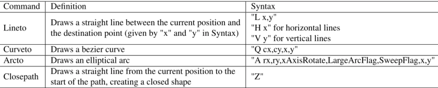
We also compute the number of horizontal and vertical "axes lines” in the visualization, which can help to distinguish between visualizations that often contain axes (e.g., bar charts), and visualizations that do not (e.g., geographic maps). We define axes lines as SVG elements with the following characteristics: 1) one or more path elements representing straight lines with at most two tick marks at the endpoints; 2) strictly horizontal or vertical in orientation; and 3) have length greater than half of the width of the visualization for horizontal paths, or greater than half the height of the visualization for vertical paths. These counts of vertical and horizontal axes lines are features within the "Axes Lines" subgroup, which consists of only two features: "Horizontal Axes Count" and "Vertical Axes Count". The pseudocode for counting and removing vertical axes lines is shown in Algorithm 1, and this same technique (with some minor adjustments) can be used for horizontal axes lines.
Algorithm 1 Counting and removing vertical axes lines
1: FUNCTION remove_axes(paths)
2: for path ∈ paths do
3: d_attr ← path.get_attr("d")
4: num_v ← COUNT(d_attr.contains("v")) 5: num_h ← COUNT(d_attr.contains("h"))
6: if num_v = 1 AND num_h <= 2 AND NOT d_attr.contains("z") then
7: if COUNT(get_numbers_from_path(d_attr)) < 7
8: AND get_axes_length(d_attr, True) > 0.5 ∗ chart_height then
9: vertical_axes.append(path)
10: REMOVE(path)
11: return vertical_axes.length
12: ENDFUNCTION
The pseudocode shown in Algorithm 1 takes the set of all path elements in the visualization as input, and loops over these paths. For each path, the function remove_axes() extracts it’s "d" attribute using the get_attr() function, which first searches for the attribute in the SVG element itself, and if the SVG element has no such attribute, the function searches through the element’s "style" attribute, as styling attributes, such as fill color, may be specified there. remove_axes() next counts the number of vertical and horizontal segments (demarcated with "v" and "h", respectively) in the path by inspecting its "d" attribute (lines 4 and 5). Then two checks are performed on the path in line 6. Vertical axes lines are path elements with one long vertical segment and up to two horizontal tick marks at the two ends. The boxed region in Figure 0-3 shows an example of a vertical axis line with two horizontal tick marks at the the two ends (labeled "0" and "7"), so one check ensures that the path has a single vertical segment and fewer than three horizontal elements. The other check ensures that there is no "z" in the path’s "d" attribute, since its presence indicates that the pathis closed as described in ’Path "d" Attribute’ subsection of Section 0.5.3 under "Path Features". If a pathpassed these checks, and the length of its vertical segment is greater than half of the chart’s height and there are fewer seven numbers in the d attribute, then the path element is considered a vertical axis line. Axes lines are usually long enough to span the majority of their corresponding dimension in the chart, which is
why the vertical axis line must be at least half the chart’s height. The function get_axes_length() in line 8 calculates the height of the vertical axis line by determining the length of the vertical segment within the axis line, and is straightforward to implement. Axes lines are straight lines with at most two tic marks (one at each endpoint), which means the "d" attributes of their corresponding path elements cannot have too many numbers, because numbers in the "d" attribute indicate change of direction. Note that there may be additional tic marks on the axes lines as shown in Figure 0-3, but these tic marks are individual short path elements that are not part of the path element drawing the axes lines. We ignored these tic marks as they do not provide addition information beyond what axes lines give. The function get_numbers_from_path() gets all the numbers from the path element and the path is only considered when it has fewer than seven numbers. The "d" attribute of the vertical axis in Figure 0-3 is "M-6,0H0V450H-6", and has two horizontal tick marks, which corresponds to 5 numbers. This means axes lines should have at most 5 numbers, but we set the maximum threshold to 6 to maintain some flexibility with regards to coding style (e.g. if the tick marks are specified with the "l" character and requires two numbers for the destination coordinates as opposed to one as described in ’Path "d" Attribute’). This check filters out path elements with long vertical segments that are not necessarily axes lines, like line charts with a huge vertical jump. All these checks are performed in lines 6-8. Finally, the vertical axes lines are removed (line 10) and counted (line 11).
Figure 0-3: Vertical axis (boxed) in a scatter plot illustrating axes characteristics.
In addition to counting the number of non-numerical text elements, we also enumerate the number of unique x and y-positions a text element belongs in, which is useful for discerning charts with a heavy emphasis on text like word clouds and geographic maps. These text position counts are features within the
"Text" subgroup, which consists of the features "Text Unique X Count" and "Text Unique Y Count". The pseudocode for counting the number of unique x-positions across all text elements is shown in Algorithm 2. This method can be extended to count the number of unique x or y-positions, or other location-based features (e.g maximum y-position) for other SVG elements.
Algorithm 2 Counting unique x-positions of all text elements
1: FUNCTION count_unique_text_x_positions(texts)
2: x_set ← SET ()
3: for text ∈ texts do
4: tx,ty ← get_absolute_location(text, 0, 0) 5: if text.has_attr("x") then 6: x_position ← tx+convert_str_to_float(text.get_attr("x")) 7: x_set.add(x_position) 8: return x_set.length 9: ENDFUNCTION 10: 11: FUNCTION get_absolute_location(node, x, y)
12: if node is None then 13: return (x,y)
14: if node.has_attr("transform") then
15: trans f orm← node.get_attr("transform")
16: coordinates← get_coordinates_from_transform(trans f orm)
17: if coordinates then
18: x= x + coordinates[0]
19: y= y + coordinates[1]
20: return get_absolute_location(node.parent, x, y)
21: ENDFUNCTION
The first function count_unique_text_x_positions() in Algorithm 2 counts the number of unique x-positions observed across all SVG text elements. It takes the set of all text elements in the visualization as input, and for each text element, the code calls the function get_absolute_location(), which calculates the absolute position of the input element within the visualization. The absolute position of a SVG object (exact coordinates of its location within the visualization), is not simply the x,y-coordinates specified in its location attribute. This is because SVG objects are often grouped together, in invisible parent containers, and may even be nested in several containers. The containers are given x, y positions, and the individual SVG element is given an x,y position within the parent container. The sum of the element’s coordinates and the positions of all its parent containers form the absolute location of the object. The element’s x,y-position only makes sense in the context of its parent containers, and is useless on its own. The SVG element’s relative position within it’s parent container is specified as x and y-coordinate translations within the element’s "transform" attribute. To extract absolute location, get_absolute_location() recurses up the SVG DOM tree starting at the node of interest (line 20), and at each node, extracts the x and y shifts in the transform attribute (lines 15-16) with the function get_coordinates_from_transform(). Transform attributes are strings with the form "translate(x,y)", where "x" and "y" are numerical strings representing translations in the x and y directions.
Subgroup D3 Plotly Counts 0.6420208500400962 0.6598218471636194 Axes Lines 0.45068163592622296 0.5482419127988748 Text 0.3204490777866881 0.473511486169714 Overall 0.6707297514033681 0.7889357712142522
Table 1: Classifier accuracy on the D3 and Plotly datasets using only features from subgroups of the general features. The "Overall" accuracy is that of all general features.
get_coordinates_from_transform()extracts the two numerical strings, converts them into floats, and returns a tuple of the form (x,y). This function can be implemented easily using regular expressions. Once the x and y translations of the current node has been extracted, get_absolute_location() updates the aggregate x and y shifts accordingly (lines 18 and 19). Recursion stops once the root of the DOM tree has been reached (line 14). Users also have the option of specifying x and y-coordinates of text elements via "x" and "y" attributes, so to account for this possibility, we have a function count_unique_text_x_positions() that adds the "x" attribute value to the calculated value from get_absolute_location() in line 6. Note that an SVG element’s location must be specified in a single setting, so an element will not have a "transform" attribute if it has "x" and "y" attributes. The text’s element’s absolute x-coordinate is added to the set of text x-coordinates (line 7), which stores the unique x-coordinate values over all text elements, so its final size is the number of unique x-coordinates across all text elements.
Classification Accuracy
Note that classification accuracy is higher for Plotly than D3 according to Table 1, and another reason (in addition to the fewer number of chart types for Plotly mentioned above) is that some D3 charts types are distinguished only by other feature groups. For instance, radii features of circle elements from the circle features group is used to distinguish scatter and bubble charts in D3, and is unnecessary in Plotly, since Plotly has scatter plots but not bubble charts.
The "Counts" subgroup performed much better than the other two groups for both datasets, and this is due to the comprehensiveness of the "Counts" subgroup, which includes counts of every SVG element type, while the other two subgroups target single SVG elements. The "Text" subgroup performed the worst, which is to be expected, since its features target text-heavy visualizations, such as word clouds, and is not useful towards many other chart types. Note the overall accuracy is not much higher than the best subgroup accuracy, and this could be due to redundancy in the features of different subgroups. For instance, high unique x and y-coordinate counts for text elements and no axes lines are both strong signals for a word cloud.
0.5.2
Styling features
Implementation
Differences in visualization types can be found in the way that the SVG elements are styled. For example, how they are colored (fill color and border colors), given border and line thicknesses, and in the case of text, how they are sized. Styling is often treated as orthogonal to the layout of elements in the DOM tree, so we analyze styling using a separate set of features.
When it comes to fill color and border (or stroke) color, we have found that recording the specific colors used in a visualization is unimportant, because choosing a color palette is largely an individual user preference. However, we found that counting the number of unique colors observed in the visualization can be useful, because many visualizations have color applied in a systematic way (i.e., each bar in a bar visualization is often given a unique color). To create a feature using this information, we compute the total number of unique fill and stroke colors as two separate features. We also compute other statistics on colors, such as average number of occurrence of a path fill color (i.e. number of path elements that use a fill color averaged over all fill colors). All stroke color statistics are included as individual features in the "Stroke Color" subgroup, which consists of the features "Path Unique Stroke Color Count", "Average Path Stroke Color Count", "Path Stroke Color Count Variance", "Average Line Stroke Color Count", and "Line Stroke Color Count Variance". Likewise we have a subgroup for fill-related statistics, which includes the features "Filled Path Count", "Path Unique Fill Color Count", "Average Path Fill Color Count", "Path Fill Color Count Variance", "Average Circle Fill Color Count", "Circle Fill Color Count Variance", "Average Rect Fill Color Count", and "Rect Fill Color Count Variance". In addition, we consider the maximum and minimum stroke widths, as well as maximum and minimum font sizes. The "Stroke Width" subgroup contains this information about stroke widths and consists of the features "Maximum Path Stroke Width" and "Minimum Path Stroke Width". Given that visualization text can have large variations in font size, such as for word clouds, we also compute the total unique font sizes observed, as well as the variance in font size. The "Font Size" subgroup includes all font-related statistics of textelements, and has the features "Maximum Text Font Size", "Minimum Text Font Size", "Text Font Size Variance", and "Text Unique Font Size Count". The accuracy of all these styling features subgroups and the accuracy of the entire styling features group are shown in Table 2.
However, styling can also be inherited from parent objects within the DOM, as well as by using Cascading Style Sheets (or CSS). This potentially results in SVG elements appearing to have no style attributes. To address this, we first look for style attributes within the element itself. If no styling attributes are found, we iteratively search the element’s ancestors in the DOM tree for styling attributes. If the element is still without styling attributes, it is very likely that they are provided in one or more CSS files in the webpage, with the SVG element’s class names linking it to style attributes specified in the CSS files. A possible extension for future work is to cross reference each element’s CSS classes with the classes specified in the webpage’s CSS files. Pseudocode computing the number of paths with each fill color averaged over all fill colors is shown
in Algorithm 3, and this code also illustrates the style attribute search technique. Other style features can be extracted using an extension of this idea.
Algorithm 3 Computing number of occurrences of each path "fill" color averaged over all path "fill" colors
1: FUNCTION get_avg_fill_color_occurence(paths)
2: f ill_count ← {}
3: for path ∈ paths do
4: f ill_color ← find_style_attribute(path, "fill")
5: if f ill_color then
6: if f ill_count.get( f ill_color) then
7: f ill_count[ f ill_color] ← f ill_count[ f ill_color] + 1
8: else
9: f ill_color[ f ill_color] ← 1
10: return AVERAGE( f ill_count.values())
11: ENDFUNCTION
12:
13: FUNCTION find_style_attribute(element, attribute)
14: out put_element ← element
15: while out put_element do
16: out put← get_attribute(out put_element, attribute)
17: if out put then
18: return out put
19: out put_element ← out put_element.parent
20: return None
21: ENDFUNCTION
The function get_avg_fill_color_occurence() first enumerates the number of path elements with a particular "fill" color for all "fill" colors present in path elements of the visualization. The function then averages the counts over all colors, which becomes the value for the "average fill color occurrence" feature. It takes all path elements in the visualization as input and extracts the fill color of each path using the function find_style_attribute() in line 4, passing in the path element and the attribute of interest ("fill"). The remaining lines in get_avg_fill_color_occurence() keep track of the count of all "fill" colors in a pythonic dictionary (similar to a hashmap) in lines 6-9, and finally returns the average count over all fill colors in line 10. Since the "fill" attribute of a path element is a styling attribute, it’s value could be set in one of the path’s ancestors as described earlier. The function used to extract the "fill" color attribute (find_style_attribute()) follows the iterative style-attribute search algorithm mentioned above. We cannot use the function get_attr() to extract style attributes, because this function does not search the element’s ancestors for missing attributes, since it is geared towards non-styling attributes that cannot be inherited, such as the radius of a circle element. find_style_attribute() takes the SVG element (element) and the attribute of interest (attribute) as input and starting at the input element, traverses up the SVG DOM tree, searching for the input attribute and returning the first hit.
Subgroup D3 Plotly Stroke Width 0.4123496391339214 0.5694327238631036 Stroke Color 0.4380112269446672 0.7197374589779653 Fill 0.46351242983159585 0.8216596343178622 Font Size 0.3199679230152366 0.37093295827473044 Overall 0.6105854049719326 0.8975152367557431
Table 2: Classifier accuracy on the D3 and Plotly datasets using only features from the subgroups from styling features group. The "Overall" accuracy is that of the entire style features group.
Classification Accuracy
The "Stroke Width", "Stroke Color", and "Fill" subgroups all performed better for Plotly than for D3. This is due to the fact that the creators of Plotly chose to represent nearly all graphical markers (e.g. circles in a scatter plot) with path elements. As a result of this emphasis on paths, certain characteristics of path features are strong indicators for Plotly chart type, and this is not the case for D3. For instance, if a Plotly visualization has a high count of path elements with fill, it is most likely a scatter chart, as it is unlikely for other Plotly chart types to have as high of a filled path count. On the other hand, both hexabins and sunbursts (present only in D3) usually have high filled path counts. These three subgroups yield similar levels of accuracy for D3 as none of them not provide sufficient information to distinguish many D3 chart types well. The "Font Size" subgroup performed the worst for both datasets, as expected, as it is targeted towards text-heavy visualizations, and is not a good indicator for other chart types. For Plotly, the overall accuracy is not much higher than the best performing subgroup ("Fill"), which could again, be due to redundancy.
0.5.3
Per-Element features
Lastly, we examine the attributes of each SVG element type and use this information to classify visualization designs. For example, rectangles that share the same y position in a visualization might indicate a bar chart, and circles that share the same radius in a visualization might indicate a scatterplot. Figure 0-4 illustrates both of these examples. In Chart A (bar chart), the y-positions (of the bottom left corners) of all the rectangles representing bars are the same, as shown in the boxed region. Other chart types with rectangles do not have this property, as shown in Chart B (heat map), where the rectangles are stacked vertically (see boxed region). In Chart C, all circles representing points in the scatter plot have the same radii (see boxed region). This is not the case for circles representing axes in radial charts as illustrated by the boxed region in Chart D. Note that all features are normalized to standardize the feature vectors. X-positions are normalized by dividing by visualization width, y-positions by visualization height, all line and path lengths by visualization diagonal, and all shape widths by either width or height (whichever is larger). We extract a base set of features for every type, and then shape-specific features (e.g. the radius size for circle elements).
Features extracted for all SVG elements : For all elements of the same type within a given visualization (e.g., for all circles, rect’s, etc.), we calculate a standard set of statistics. Half of these features are
Figure 0-4: Four chart types illustrating characteristics of rectangle y-positions and circle radii for certain chart types.
calculating the maximum and minimum x-position, and then repeating for y-position. The remaining features calculate: the number of unique x-positions, the number of unique y-positions, and the average number of elements that share positions. For example, for all rect’s within the visualization, how many share the same y position on average? Note that we consider the y position of a rect to be its y position plus its height, since the y-position of an SVG element is defined as distance from the top of its container. Also, locations of path and line elements are that of their starting points. Tracking x-position and y-position allows us to identify positioning patterns. For example, vertical bar charts will contain rectangles with the same y-position, and evenly spaced x-positions. In contrast, scatter charts will have high numbers of both unique x and unique y-positions, helping the classifier to discern bar charts from scatter charts. All the x-position statistics for each SVG element type are included as individual features within the "X" subgroup of features in the Per-Element features group for that shape (e.g. all per-element features for circles are in the "Circle Features" group, and a subset of these features pertaining to the x-position are in the "X" subgroup for circle elements). The features in the "X" subgroup are "Maximum X", "Minimum X", "Unique X Count", "Average X Count", and "X Count Variance", and they are calculated for circle, rect, path, and line elements. Likewise, there is a "Y" subgroup for y-coordinate statistical features, which include "Maximum Y", "Minimum Y", "Unique Y Count", "Average Y Count", and "Y Variance". See Algorithm 2 under Section 0.5.1 for an example of extracting position features.
Circle Features
Implementation For circles, we calculate the maximum radius out of all circle elements in the visualization and variance in the radii. We considered including both maximum and minimum radius, but found that the minimum radius feature provided no additional benefit beyond the maximum radius and radii variance features. Thus, we omitted the minimum radius. We found that maximum radius was better than minimum radius because visualizations with circle’s of varying sizes, such as bubble charts, are likely to have circles with rather large radii. The smallest radii in bubble charts are unlikely to be smaller than the radii of circles in scatter plots, so the minimum radius is worse at distinguishing between these two chart types. We also consider the maximum number of circles with identical radii. Radii variance helps to discern visualizations with equal-size circles (e.g., scatter charts), from those with varying circle sizes (e.g., bubble charts and radial charts). All these radii features are included in the "Radii" subgroup of circle features. Specifically, the features within the "Radii" subgroup are "Maximum Circle Radius", "Circle Radius Variance", and "Maximum Circle Radius Count". The accuracies of all subgroups in the circle features group ("X", "Y", "Radii"), as well as the accuracy of the entire group can be found in Table 3. Pseudocode for extracting the largest radius out of all circle elements is shown in Algorithm 4, and this method can be extended to extract all radius-based features.
Algorithm 4 Calculating the maximum radius over all circle elements in the visualization
1: FUNCTION get_max_radius(circles)
2: radii_list ← []
3: for circle ∈ circles do
4: radii_list.append(convert_str_to_float(circle.get_attr("r"))) 5: return MAX(radii_list) 6: ENDFUNCTION Subgroup D3 Plotly X 0.40096230954290296 0.19503047351148617 Y 0.3863672814755413 0.19465541490857946 Radii 0.40930232558139534 0.1944678856071261 Overall 0.4396150761828388 0.19484294421003281
Table 3: Classifier accuracy on the skewed D3 and Plotly datasets using only features from the subgroups from "Circle" features group. The "Overall" accuracy is that of the entire "Circle" features group.
This function takes in a list of all circle elements in the visualization as input, and iterates through the list. For each circle element, the code extracts the circle’s radius (specified in its "r" attribute), and converts the value into a float, since everything extracted from SVG is of type string, and adds it to a list of all radii seen so far (lines 3-5). The function then returns the maximum value of the list.
Classification Accuracy
As shown in 3, the "Circle" features group performed significantly better on D3 than on Plotly because Plotly rarely uses circle elements. This is supported by the fact that every subgroup performs equally as poor on Plotly, including the group as a whole, since the circle features from every chart type are likely quite similar. To verify this, we queried the Datastore (Section 0.7) to count the number of Plotly visualizations using circle elements and found there were only 25 out of the 6544 total visualizations. The "Circle" group performs decently for D3, as this group is targeted towards a select number of chart types: scatter, bubble, and radial, and each group has a similar accuracy since they are equally good at discerning between these chart types. For example, radial charts haves axes made up of concentric circles, which will be signaled by high radius variance from the "Radius" subgroup and low unique x count from the "X" subgroup. The overall accuracy is not much higher than that of individual subgroups, due to redundancy, since each subgroup targets the same set of chart types.
Rect Features
Implementation For rect elements, we do not calculate any unique features other than the x and y position features described above. Height and width information do not contribute additional information when given x and y position information. This is because rect graphical elements are usually adjacent to each other (e.g. treemap) or equally spaced apart (bar graphs), so dimensional information can be inferred by taking the difference in corresponding in location information. The pseudocode for calculating x and y features should
Subgroup D3 Plotly X 0.4920609462710505 0.612751992498828 Y 0.4848436246992783 0.5879043600562588 Overall 0.5008821170809944 0.6347866854195968
Table 4: Classifier accuracy on the D3 and Plotly datasets using only features from the subgroups from rects features group. The "Overall" accuracy is that of the entire rects features group.
be similar to the pseudocode for calculating text location features shown in Algorithm 2. The accuracies of the "X" and "Y" subgroups for rect features are shown in Table 4.
Classification Accuracy
The "X" and "Y" subgroups had similar accuracy in both datasets, which is expected because x and y positioning are generally used equally in most visualizations. For example, if a chart has low variance in x-position, it could be bar chart with vertical bars or a heatmap, and having a low variance in y-position indicates that the chart could be a chart with horizontal bars or a heatmap. The higher accuracy for "X" could be due to the fact that there are more bar charts with vertical bars than horizontal bars in the dataset. In addition, overall accuracy of the entire group is only slightly higher than the individual subgroups. This could be due to redundancy. However, having both x and y position information enables the differentiation of bar charts from heatmaps (for the case with D3), since heatmaps will have high variance in both x and y positions, while bar charts have high variance in either x or y. However, there are only 32 heatmaps total, out of the 1247 charts as shown Table X, and since there are considerable more bar chart (154), the classifier is likely to erroneously classify every heatmap as a bar chart when using a single subgroup, which results in a 32/1247 ≈ 0.0257 decrease in accuracy, which is comparable to the difference in accuracies between that of the group and individual subgroups.
Path Features
This section contains additional sections detailing the "d" attribute of path elements that specifies the path’s trajectory. "d" attributes were analyzed extensively in path features, and are rather complicated with many different parts. The ’Path "d" Attribute’ section describes the "d" attribute in detail, and ’Path "d" Attribute Examples’ provides examples illustrating various "d" attribute features.
Path "d" Attribute The "d" attribute of a path element is a string with instructions for drawing the trajectory of the path [13]. The string consists of a combination of the following instructions: moveto, lineto, curveto, arcto, and closepath. All these rules are detailed in the appendix, and we present a concise version here discussing only the instructions analyzed by the classifier. "Lineto" draws a straight line between the current position and the destination point, which becomes the new current position. "Lineto" is specified as "L x,y", where "x" and "y" are destination coordinates, and "H x" and "V y" are used for horizontal and vertical
Command Definition Syntax
Lineto Draws a straight line between the current position and the destination point (given by "x" and "y" in Syntax)
"L x,y"
"H x" for horizontal lines "V y" for vertical lines Curveto Draws a bezier curve "Q cx,cy,x,y"
Arcto Draws an elliptical arc "A rx,ry,xAxisRotate,LargeArcFlag,SweepFlag,x,y" Closepath Draws a straight line from the current position to the
start of the path, creating a closed shape "Z"
Table 5: Table listing the definitions and syntax of path "d" attribute instructions analyzed by the classifier. See the ’Path "d" Attribute’ section for more detailed explanations.
lines, respectively, where "x" specifies the x-coordinate of the endpoint of the horizontal line, and "y" specifies the y-coordinate of the endpoint of the vertical line. For all d-attribute instructions, "x" and "y" correspond to the destination coordinates. "Curveto" draws bezier curves, and bezier curves are parametric curves traced by polynomial functions [12]. Our features focus on quadratic bezier curves only, and they are specified as "Q cx,cy,x,y". See the appendix for descriptions of "cx" and "cy" as we did not consider these attributes. "Arcto" declares an elliptical arc and is specified as "A rx,ry, xAxisRotate, LargeArcFlag, SweepFlag x,y", where "rx" and "ry" specify the radius in the x and y directions, respectively. See the appendix for descriptions of the remaining attributes. "Closepath" draws a straight line from the current position to the first point in the path, creating a closed shape. It is specified with a "z" in the "d" attribute. There are lowercase versions of all these instructions (e.g. "a" for "Arcto"), where all x and y-coordinate attributes are shifts relative to the previous position. Table 5 summarizes these "d" attribute commands for quick reference, and these commands are illustrated in two example path elements described in ’Path "d" Attribute Examples’.
Path "d" Attribute Examples The boxed chord segment of a chord chart shown in Figure 0-5 has the following "d" attribute:
"M272.9461639226633,-305.9418108070596A410,410,0,0,1,391.69303884469844,-121.14686673870506 Q0,0,-380.088988411556,-153.72820459590378A410,410,0,0,1,-263.8763386673507,-313.79814832390844 Q0,0,272.9461639226633,-305.9418108070596Z".
The first "Arcto" instruction is ("A410,410,0,0,1,391.69303884469844,-121.14686673870506"), where "rx" and "ry" values of 410 indicate a circular arc, and (391.69303884469844,-121.14686673870506) are the coordinates of the arc’s endpoint. This instruction draws the circular arc connecting bottom left and top left vertices of the path element along the circumference of the chord chart. The next command is a "Curveto" ("0,0,-380.088988411556,-153.72820459590378"), which draws a quadratic bezier curve that has an endpoint at (-380.088988411556,-153.72820459590378). This instruction draws the top curve connecting the top left and top right vertices across the chord chart. The subsequent instructions are another "Arcto" drawing the right arc connecting the top right and bottom right vertices, another "Curveto" drawing a curve connecting the bottom right and bottom left vertices, and an unnecessary "ClosePath" that connects the end point of the path element at (272.9461639226633,-305.9418108070596) to its starting point at the same location.
The boxed hexagon in a hexabin shown in Figure 0-6 has the following "d" attribute:
"m0,-20l17.32050807568877,9.999999999999998l3.552713678800501e-15,20l-17.320508075688764, 10.000000000000004l-17.32050807568878,-9.999999999999991l-1.0658141036401503e-14,
-19.999999999999993l17.32050807568876,-10.000000000000014z".
It starts at (0,-20), as specified by the "Moveto" command "m0,-20". The next instruction is a "Lineto" ("l17.32050807568877,9.999999999999998") that draws one of the six sides of the hexagon with a line starting at (0,-20) and extending 17.32050807568877 in the x direction and 9.999999999999998 in the y direction since the "l" is lowercase. The next four commands are all "Lineto", drawing the next four sides of the hexagon. The final side is drawn with a "ClosePath" command connecting the start and end points of the hexagon, and is specified with a "z" at the end of the "d" attribute.
Figure 0-6: Hexagon (boxed) in a hexabin illustrating "d" attribute commands.
Implementation For path elements, we mainly consider the number of characters used to specify each path. We do this by analyzing the path’s "d” attribute, which is a string containing an ordered list of commands for how to draw the path (e.g., move to point A, draw a line to point B, etc.). The "d" attribute is explained in detail in the ’Path "d" Attribute’ section. Specifically, we calculate the maximum, minimum, mean and variance in the length of the "d” attribute, across all paths. This feature is extremely useful for paths, because the longer a "d” attribute is, the more detailed it is. Highly detailed paths are often seen when drawing complex shapes, such as countries or states in geographic maps. These statistics on "d" lengths are features within the ’"d" Length subgroup, and the individual features are "Maximum Path d-attribute Length", "Minimum Path d-attribute Length", "Average Path d-attribute Length", "and "Path d-attribute Length Variance". The
pseudocode to find the maximum length (in number of characters) of the "d" attribute over all path’s is shown in Algorithm 5.
Algorithm 5 Finding the longest "d" attribute over all paths
1: FUNCTION get_max_d_length(paths)
2: dlengths← [] 3: for path ∈ paths do
4: d_lengths.append(path.get_attr("d").length))
5: return MAX(d_lengths) 6: ENDFUNCTION
This function takes the list of all path elements in the chart as input, and gets the length each path’s "d" attribute (line 4). The function stores all "d" attribute lengths and then returns the maximum value in the list (line 5).
However, path elements are complex, and can be used in place of other SVG elements. As such, we perform additional analyses to account for these cases. To find polygon-heavy visualizations (e.g., voronoi and hexabin visualizations), we compute the number of closed elements (i.e., paths that start and end in the same place) found across all paths. Then we calculate statistics over all paths that contain at least one closed element. Specifically, the maximum, minimum, mean, and variance in the length of the "d” attribute of these paths. All closed paths have a "z" at the end of their "d" attributes as mentioned in the ’Path "d" Attribute’ section, so the "Z" subgroup contains features describing closed path elements; namely, "Maximum Closed Path d-attribute Length", "Minimum Closed Path d-attribute Length", "Average Closed Path d-attribute Length", and "Closed Path d-attribute Length Variance". We also compute the number of arc and curve calls made within a path, which are used to draw them with path elements. Counting arc calls helps to distinguish visualizations that contain circles (e.g., scatter, radial, and bubble charts, and chord diagrams). Arc elements also have radii attributes, which provide useful information; for instance, the variance in arc radii helps discern sunbursts, which consist of a myriad of stacked arc segments with varying radii. A path arc has both horizontal and vertical radii, since these arcs are not necessarily circular, and path arc features are calculated separately for horizontal and vertical radii. Arcs are demarcated with an "A" in the "d" attribute as stated in ’Path "d" Attribute’, so the subgroup "A arcs" includes features describing arcs, namely "Maximum Circular Arc Counts per Path Element", "Path Rx Variance", and "Path Ry Variance". Pseudocode for computing the variance in the horizontal radii ("rx" attribute of the arc, as described in ’Path "d" Attribute’) over all path elements in the visualization is shown in Algorithm 6. This technique can be extended to extract all arc-related features. path elements can also be used to draw bezier curves, which are demarcated with a "Q" in the "d" attributed as mentioned in ’Path "d" Attribute’. These "Q" curves are present in visualizations with a lot of bezier curves, such as chord charts, so we compute statistics on the occurrence of bezier curves, such as the total number of bezier curves in a visualization, and the average and minimum number of bezier curves per path. These
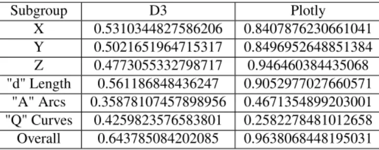
Subgroup D3 Plotly X 0.5310344827586206 0.8407876230661041 Y 0.5021651964715317 0.8496952648851384 Z 0.4773055332798717 0.946460384435068 "d" Length 0.561186848436247 0.9052977027660571 "A" Arcs 0.35878107457898956 0.4671354899203001 "Q" Curves 0.4259823576583801 0.2582278481012658 Overall 0.643785084202085 0.9638068448195031
Table 6: Classifier accuracy on the D3 and Plotly datasets using only features from the subgroups from "Paths" features group. The "Overall" accuracy is that of the entire "Paths" features group.
statistics are included in the subgroup "Q curves", which consists of the features ’Minimum Number of "Q" Curves Per Path’, ’Average Number of "Q" Curves Per Path, and ’Path "Q" Curve Count’.
Algorithm 6 Computing the variance over the horizontal radii of all path arcs
1: FUNCTION compute_rx_var(paths)
2: rx_radii ← []
3: for dopath ∈ paths 4: d← path.get_attr("d")
5: for i = 1, i <= d.length,i+ = 1 do
6: if d[i].lower() =’a’ then
7: rx← get_numbers_from_path(d[i + 1 :] : d.length))[0]
8: rx_radii.append(rx)
9: return VARIANCE(rx_radii)
10: ENDFUNCTION
This function computes the variance in the horizontal radii of all path arcs in the visualization. It takes a list of all visualization path elements as input, and for each element, the code locates all the arcs, which are demarcated with the "A" or "a" character in the path’s "d" attribute (line 6). In a path arc, the first two numbers following the "a" character are the values for the "rx" and "ry" (vertical radius) attributes of the arc, as explained in the ’Path "d" Attribute’ section. Line 7 of the code extracts the first number following each "a" symbol of the d-attribute to get the "rx" values of all the arcs in the path, using the function get_numbers_from_path()that was described earlier. Each "rx" value extracted is added to a list, which keeps track of all "rx" values, and the variance of all "rx" values stored in the list is returned (line 12), which gives the variance of "rx" values of all path elements in the visualization.
Classification Accuracy
As expected, the "Path" group performed very well on Plotly, due to its heavy use of path elements (see Table 6). The low accuracy of the "A Arcs" subgroup on Plotly, which is comparable to the 19 percent accuracy achieved by circle elements (see Table 3), is due to the fact that Plotly rarely uses bezier curves in pathelements, if at all. The high accuracies of the "X", "Y", "Z", and "d Length" subgroups indicate that there are characteristics unique to many visualization types among features in each of these groups. For instance,
Subgroup D3 Plotly X 0.5185244587008822 0.19465541490857946 Y 0.5164394546912591 0.19484294421003281 Overall 0.5323175621491579 0.19531176746366619
Table 7: Classifier accuracy on the skewed D3 and Plotly datasets using only features from the subgroups from linefeatures group. The "Overall" accuracy is that of the entire line features group.
scatter charts have low variance in path "d" attribute length, and their lengths may fall within a certain range that was calculated by the classifier from training. The overall accuracy of this "Path" features group is only slightly lower than that of the entire classifier (96.4 vs 97.1), which means this group alone is already a great classifier for Plotly. This is again, expected due to Plotly’s heavy use of path elements.
"A" arcs performed considerably lower than these four groups for D3, which could be due to the fact that it targets a few visualization types: radial, scatter, pie, and donut, and has fewer features than the high performing groups (3 vs 4). "X", "Y", "Z", and "d Length" all had relatively similar performances, with "d Length" performing the best, possibly due to the fact that it targets geographic maps, which, as explained earlier, have a high representation in the D3 dataset as shown in Table 7. "Q Curves" perform better than "A arcs" in the D3 dataset, which is unexpected as bezier curves are generally less frequently used. It could be the case otherwise in D3, where bezier curves are used heavily in chord charts.
Line Features
Implementation For lines, we do not calculate any additional features other than those for x, y positions. This is due to the fact that lines do not have any unique attributes. The accuracies of the "X" and "Y" subgroups for line features are shown in Table 7.
Classification Accuracy
The accuracies of each subgroup and the entire group are very close to that of the circle features group on Plotly, which means Plotly hardly uses line elements. As with circles, we queried the Datastore (Section 0.7) to count the number of Plotly visualizations using line elements and found there were only 25 as well.
lineelements are used by visualizations with a lot of short straight line segments, such as graphs and box plots, and are hence, targeted towards these visualization types. The "X" and "Y" subgroups performed equally well in D3, which could be because line elements behave similarly in the targeted visualization types with respect to these subgroups. lines are used for edges in graphs, and edges are usually scattered through the graph, so there will be high variance in both x and y positions. Likewise, lines are used for the "whiskers" and the line segment demarcating the median in a box plot, which means there will be similar variance in