Detecting Basal Cell Carcinoma in Skin
Histopathological Images Using Deep Learning
by
Tomás Alberto Calderón Gómez
Submitted to the Department of Electrical Engineering and Computer
Science
in partial fulfillment of the requirements for the degree of
Master of Engineering in Computer Science and Engineering
at the
MASSACHUSETTS INSTITUTE OF TECHNOLOGY
September 2018
c
○ Massachusetts Institute of Technology 2018. All rights reserved.
Author . . . .
Department of Electrical Engineering and Computer Science
August 24, 2018
Certified by . . . .
Tomaso Poggio
Eugene McDermott Professor in the Brain Sciences
Thesis Supervisor
Accepted by . . . .
Katrina LaCurts
Chair, Master of Engineering Thesis Committee
Detecting Basal Cell Carcinoma in Skin Histopathological
Images Using Deep Learning
by
Tomás Alberto Calderón Gómez
Submitted to the Department of Electrical Engineering and Computer Science on August 24, 2018, in partial fulfillment of the
requirements for the degree of
Master of Engineering in Computer Science and Engineering
Abstract
In this thesis we explore different machine learning techniques that are common in image classification to detect the presence of Basal Cell Carcinoma (BCC) in digital skin histological images. Since digital histology images are extremely large, we first focused on determining the presence of BCC at the patch level, using pre-trained deep convolutional neural networks as feature extractors to compensate for the size of our datasets. The experimental results show that our patch level classifiers obtained an area under the receiver operating characteristic curve (AUC) of 0.981. Finally, we used our patch classifiers to generate a bag of scores for a given whole slide image (WSI), and attempted multiple ways of combining these scores to produce a single significant score to predict the presence of BCC in the given WSI. Our best performing model obtained an AUC of 0.991 in 86 samples of digital skin biopsies, 43 of which had BCC.
Thesis Supervisor: Tomaso Poggio
Acknowledgments
I would like to thank my advisor Tomaso Poggio for giving me the opportunity of working on this project and providing me with all the resources that were needed to successfully accomplish the main goals of this thesis.
I would also like to thank Xiru Zhang for all his support and supervision during the last months. Xiru’s experience in industry and project management skills were crucial to guide the work in this thesis and to understand and interpret the results we obtained.
Finally, I would also like to thank Dr. Hongmei Li for providing us with her knowledge and expertise in the field of dermapathology.
Contents
1 Introduction 13
2 Methodology 17
2.1 Constructing the Datasets . . . 17
2.1.1 Manual Extraction of WSI Patches . . . 19
2.1.2 Automated Extraction of WSI Patches . . . 20
2.1.3 Test Dataset . . . 22
2.2 Data Preprocessing . . . 22
2.3 Building and Training Patch Classifiers . . . 23
2.4 Classifying WSIs . . . 24
2.5 Data Visualization . . . 24
2.6 Tools . . . 24
3 Experimentation and Results 27 3.1 Training Classifiers with Manually Extracted WSI Patches . . . 27
3.1.1 Performance at Patch Level . . . 27
3.1.2 Robust Evaluation of Performance at Patch Level . . . 28
3.1.3 Performance at WSI level . . . 29
3.2 Training Classifiers with Patches Extracted in an Automated Way . . 31
3.2.1 Performance at Patch Level . . . 31
3.3 Test Dataset . . . 43
4 Conclusion 47
List of Figures
1-1 BCC vs other examples . . . 15
2-1 Example of WSI . . . 18
2-2 Example of minimal annotation . . . 21
2-3 Heatmap example . . . 25
3-1 First WSI classification experiment . . . 30
3-2 ROC curve from 299 × 299 patch scores . . . 33
3-3 Distribution of WSI scores using average metric . . . 35
3-4 Heatmap and pathologist annotations in low scoring slide . . . 38
3-5 Heatmap in high scoring slide . . . 39
3-6 Score heatmap of negative WSI with low score . . . 40
3-7 Score heatmaps of negative WSIs with high scores . . . 41
3-8 Changes in heatmaps using different smoothing tecniques . . . 42
List of Tables
2.1 Number of patches extracted for each patch dimension . . . 22
3.1 Training-testing split of manually extracted dataset . . . 28
3.2 Statistics of first robust experiment . . . 29
3.3 Performance of different aggregation methods to score a WSI . . . . 31
3.4 Statistics of second robust experiment . . . 32
3.5 Statistics of experiment using non-overlapping patches . . . 32
3.6 The best performing parameters of the top layer neural network for each patch dimension. . . 33
3.7 Performance of different aggregation methods to score a WSI with a larger dataset . . . 36
3.8 Results for 299 × 299 model . . . 44
3.9 Results for 500 × 500 model . . . 45
3.10 Results for 800 × 800 model . . . 45
Chapter 1
Introduction
Skin cancer is one of the most common types of cancer in the United States and it is estimated that one in every five Americans will develop skin cancer in their lifetime [2]. Yet, the process of diagnosing skin cancer is very inefficient and human labor intensive. If a doctor believes that a certain area of a person’s skin shows symptoms of skin cancer, a small section is removed and sent to a lab. The skin sample is then prepared at the lab, where it is commonly stained with Haematoxylin and Eosin (H&E), to allow the different cells and structures in the skin to be analyzed. The skin is then placed between two layers of glass, and the final product is called a slide. Finally, a pathologist (usually a dermapathologist) will analyze the sample under a microscope and give a diagnosis with a recommendation of how to treat. Dermapathologists receive almost a year of specialized training in order to learn the patterns and features that differentiate the various skin diseases.
Slides containing H&E stained organ tissue can be scanned and saved as a digital image, called a Whole Slide Image (WSI). These images have extremely high res-olution, sometimes surpassing a billion pixels. Typically, pathologists analyze and diagnose skin tissue using a microscope. However, in 2017, the U.S Food and Drug Administration allowed the marketing of a digital system to review and interpret
pathological slides1.
Recently developed deep learning techniques can be leveraged to perform clas-sification of Whole Slide Images of H&E stained skin tissue. However, this field presents a plethora of challenges that don’t allow traditional methods to be applied off the shelf [4, 3]. In particular, there are two fundamental challenges: The dimen-sions of digital pathological slides and the lack of available training data. Resizing WSIs can lead to a loss of information at a cellular level, which pathologists usually need in order to properly diagnose a specimen. In addition, annotating the prob-lematic sections of a certain tissue specimen is labor intensive and requires highly trained and specialized individuals to accomplish the task.
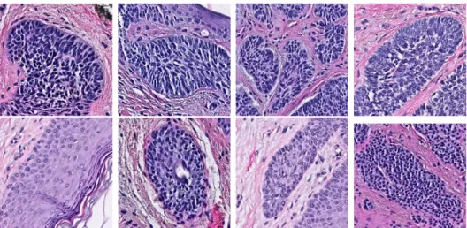
At a high level, our goal is to develop a machine learning algorithm that can determine the presence of a skin cancer type called Basal Cell Carcinoma (BCC) in digital histopathological images of skin tissue. Fig 1-1 shows some examples of the different visual features that characterize samples of skin that contain BCC and samples that do not contain it.
We collaborated with Dr. Hongmei Li from the dermapathology laboratory Der-mDX located in Brighton, MA to learn more about how dermapathologists identify BCC. In addition, Dr. Li provided us with a collection of pathological slides that contains examples of skin with BCC, skin with other diseases and healthy skin. This slides were scanned and Dr. Li helped to identify and annotate the specific regions that contained BCC.
We used these annotations to create medium sized datasets of skin patches of multiple dimensions to develop algorithms that can identify BCC at the patch level with higher accuracy than the methods explored in [1]. The key to accomplish this despite our small amount of data was to use a pre-trained deep Convolutional Neural Network (CNNs) as an image feature extractor. This idea is well known as transfer learning and has proven to be very effective [6, 9].
Figure 1-1: The visual features that differentiate BCC from other biological struc-tures can be subtle, such as the size of the cells (blue dots in the images). Only the images in the top row have BCC.
Finally, in order to classify at the WSI level, we experimented with multiple techniques to combine the set of patch level predictions that can be extracted from a WSI. The performance of each technique was evaluated under the constraint that recall had to be at least 90%. The motivation behind this constraint comes from the domain of our problem; in detecting cancer, false negatives are more dangerous than false positives.
Chapter 2
Methodology
Scanning slides with pieces of skin is expensive and the resulting image is extremely high dimensional. Hence, the cost of creating a machine learning algorithm that learns directly from WSIs is large and the algorithm is unlikely to generalize well. This motivates the idea of extracting image patches from WSIs and training a binary classifier according to whether or not a patch contains BCC. We can then divide a WSI into patches, make a prediction about each patch using the binary classifier mentioned above, and aggregate these predictions in a sensible way to obtain an overall prediction for whether or not the WSI has BCC or not.
The sections below outline the methods used and obstacles faced in following the process described above.
2.1
Constructing the Datasets
Our main dataset was created by scanning 58 skin slides, 29 labeled as contain-ing BCC and 29 labeled as not containcontain-ing BCC. The skin slides were labeled and provided by the dermapathologist Dr. Hongmei Li. The slides were scanned at a 40x magnification using a Phillips scanner, and the resulting format of the WSIs is JPEG-compressed BigTIFFs.
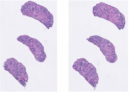
Figure 2-1: A whole slide image that contains two collections of pieces of skin, each collection having three pieces of skin
Each slide may contain several collections of pieces of skin as shown in Fig 2-1. Different collections of pieces of skin in a slide are very similar to each other, but differences in how they were prepared result in some pieces having small folds or even burns. For each slide, we selected only one of the collections to be used for both patch extraction and for classification of the slide it belongs too. In order to record which collection was selected for each slide, we had to create our own solution since we did not find any software that can crop large enough sections of a WSI. We used the rectangle tool in QuPath1 to enclose the selected collection and saved the coordinates of the rectangle relative to the WSI. We can then read only the pixels in this region by loading the WSI with OpenSlide and using the function read_region.
We will refer to WSIs that contain BCC as positive slides and to the rest as negative slides. Similarly, we will refer to patches of WSIs that contain BCC as positive patches and to the rest as negative patches.
2.1.1
Manual Extraction of WSI Patches
Extracting enough patches from WSIs can be very labor intensive, in particular because a dataset with less than 1000 images could be not enough to learn the fea-tures that differentiate positive and negative patches. Extracting negative patches is simple, since we can just extract patches from negative slides, and then we are guar-anteed that the patches won’t contain BCC. However, extracting positive patches requires, at the very least, manual identification of the carcinomas, which is usually done by a highly trained dermapathologist.
In order to get a performance baseline for our algorithm, we decided to take a risky approach that could result in a noisy training dataset. In particular, I met with the dermapathologist for about three hours and she explained to me the different visual features that distinguish basal cell carcinomas from other common biological structures found in the skin, such as hair follicles, sebaceous glands and the epidermis. Based on this information, I proceeded to manually extract positive and negative patches from our main dataset.
I extracted 1459 positive patches and 2012 negative patches. Based on the different tumor sizes that I had observed, I selected the patch size to be 800 × 800. This patch size was clearly chosen with little evidence of what might work better for the problem being tackled, but for the purpose of obtaining a performance baseline it seemed appropriate enough.
The process of manually extracting patches of a fixed size consisted of multiple steps. For every region I wanted to capture with a patch, I had to use the QuPath rectangle tool to manually create a rectangle with the appropriate dimensions and enclose the region of interest. Once all rectangle annotations were created, I ran a script written in Apache Groovy inside QuPath that iterated over the annotations, and exported a .png image with the enclosed region.
2.1.2
Automated Extraction of WSI Patches
Extracting positive patches
In order to beat our performance baseline, it was clear that we needed to expand our patch training set in addition to experiment with different patch sizes. Our goal was to come up with a more automated way of extracting patches that did not scale with the number of patch sizes we wanted to try. The solution we came up with had three steps.
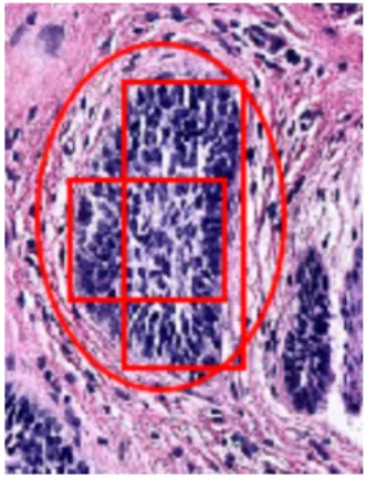
First, the dermapathologist would annotate all of the positive slides by using QuPath’s annotation tools to enclose the multiple tumors. Second, we would use the rectangle tool to create minimal annotations: annotations that only enclosed tumor and that contained very little or no healthy skin on them. Fig 2-2 shows a piece of skin with a tumor that was annotated by the dermapathologist using QuPath’s oval tool. The two rectangles on top are examples of minimal annotations created based on the dermapathologist’s annotation. Finally, we exported the coordinates of all the minimal annotations relative to the slide they belong too.
Given the minimal annotations, we can extract positive patches from a slide programatically. At a high level, given a slide and its corresponding minimal an-notations, a patch of the slide can be extracted as a positive patch if it contains or is contained by one of the minimal annotations. Further, we can also extract patches that have a big enough intersection with a minimal annotation, since they will contain part of a tumor, even if not entirely. By using minimal annotations we can guarantee that the intersection of a patch and an annotation is all tumor, and control how much tumor a patch needs to have in order to be deemed as a positive patch. Otherwise, if the annotations were not minimal, a patch might have a big intersection with an annotation that contains too much healthy skin, resulting in a patch deemed as positive but that barely has any tumor.
Figure 2-2: A section of skin with BCC annotated with an oval by the dermapathol-ogist and with minimal annotations on top
and checking whether it has a big enough intersection with at least one of the minimal annotations can be computationally expensive. Hence, we took a more direct approach. Given the coordinates of a minimal annotation rectangle called 𝑀 and a target patch size of 𝑘 × 𝑘, we computed the coordinates of a rectangle 𝑁 that satisfied the following property: any point taken inside 𝑁 and used as the center of a 𝑘 × 𝑘 rectangle 𝑅, is such that the area of the intersection between 𝑅 and 𝑀 is at least 15% of the area of 𝑅. The coordinates of 𝑁 can be computed explicitly by simple geometric calculations. Given the annotation rectangle 𝑀 and its corresponding rectangle 𝑁 , we can generate positive patches by taking random points inside of 𝑁 and using them as centers of our 𝑘 × 𝑘 patches. The amount of 𝑘 × 𝑘 patches generated per minimal annotation was proportional to the size of the minimal annotation relative to 𝑘.
Extracting negative patches
Extracting negative patches programatically is simpler, since we can just take ran-dom patches from negative slides and then they are guaranteed to also be negative (unless the slide is incorrectly labeled, of course). The only thing we had to be care-ful about was to discard images that were mostly white space, since we don’t want
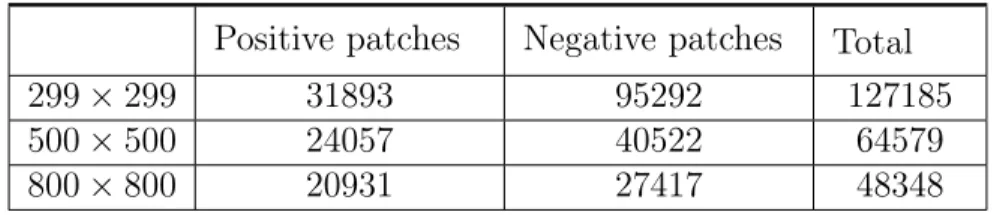
Positive patches Negative patches Total
299 × 299 31893 95292 127185
500 × 500 24057 40522 64579
800 × 800 20931 27417 48348
Table 2.1: Number of patches extracted for each patch dimension
our negative training set to be overly represented by them. Moreover, we don’t even need to feed this images to our binary classifier since we can just discard patches that are mostly white space in classifying a WSI.
Our criterion to determine if an image is mostly white space was determined empirically. In particular, given an image, we discard its alpha channel and take the average of all of its pixels. If this average is above a certain threshold (which we choose experimentally to be 212), we conclude that the image is mostly white space.
Using these two approaches, we had the freedom of extracting patches of different dimensions. We choose the dimensions 299 × 299, 500 × 500 and 800 × 800. The number of patches extracted for each dimension can be found in Table 2.1
2.1.3
Test Dataset
After we trained and evaluated models using our main dataset, we obtained 86 more WSIs to better understand the prediction power of the models we created. The 86 slides were composed of 43 positive slides and 43 negative slides.
2.2
Data Preprocessing
We used Google’s Inception V3 Network [7] pre-trained on the ImageNet dataset to extract features from our patches. The only change we made was to remove the fully connected layer at the top of the network. In order to process a patch, we
re-sized it to have size 299 × 299, the input dimension of the network. We then normalize the pixel values of the patch to be between 0 and 1 by taking a pixel value 𝑝 and converting it to 2 * (𝑝/255 − 0.5). After passing the resulting image through the network, the output we obtain is sixty four 2048-dimensional vectors. We then average all of these vectors and obtain a final 2048-dimensional vector. We will refer to this process as extracting the bottleneck features of a patch and to the resulting 2048-dimensional vector as the patches’ bottleneck features.
We preprocessed our patch datasets and saved their bottleneck features to avoid having to compute them again. Similarly, we saved the bottleneck features of all the non-overlapping patches of our WSIs since this computation can be very expensive. For example, for some of the larger WSIs, computing the bottleneck features of all the non-overlapping 299 × 299 patches of the selected collection of skin could take up to 30 minutes. We saved the bottlenecks of every WSI in a matrix structure to preserve the spatial relationship between two patches, for both visualization and experimental purposes.
2.3
Building and Training Patch Classifiers
We choose a simple architecture for a neural network to classify patch bottlenecks. The architecture we choose has only one hidden layer with an ReLU activation function, and a dropout layer. We experimented with both the size of the hidden layer and the dropout parameter. The output layer has only one neuron with a sigmoid activation function. We choose the loss of the network to be the binary cross-entropy function. That is, if the network produces a score 𝑝 for a patch with true label 𝑦, then the loss is 𝑙(𝑝, 𝑦) = −(𝑦 log 𝑝 + (1 − 𝑦) log (1 − 𝑝)). We only used patches of a fixed dimension to train the neural network.
2.4
Classifying WSIs
Given a patch size, we classified a WSI by dividing the image into non-overlapping patches of the same size and producing a score for each patch using the network that we trained. Then, we aggregated all these scores to produce a final score for the WSI. Taking the average of the scores seemed to be one of the most robust ways of aggregating them, at least among the methods we tried. None of these methods exploited the spatial properties of how the patches were scores. That is, none took advantage of the fact that if two patches that are close together receive a high score, then the likelihood of the WSI having a tumor is higher than if the two patches had the same score but were far away from each other.
2.5
Data Visualization
In order to better understand what sections of WSIs received higher scores than others, we developed a tool to overlay a heatmap on top of the WSI to visualize the score that each patch of the WSI obtained. This was extremely helpful in understanding why certain WSI received higher or lower scores, according to the aggregation method we had chosen. Fig 2-3 has an example of a positive WSI with a heatmap overlaid.
2.6
Tools
There were multiple tools that were heavily used throughout my thesis project that were chosen after doing extensive research about the multiple options out there. Here is a list of the most used ones:
∙ QuPath2: This is a program to visualize and annotate WSI, since they are
Figure 2-3: A positive WSI with a heatmap overlaid to visualize which patches obtained higher scores. This WSI was divided into 299 × 299 patches.
too big to be opened with regular image viewers. It also allows the user to annotate the WSIs in multiple ways. Further, it has scripting capabilities which can be used to manipulate annotations and export regions of a WSI. ∙ OpenSlide3: A library written in C that provides an API to read WSIs. It
also offers a python API.
∙ Keras: An API to easily define, train and evaluate Neural Networks.
∙ Openmind: A linux based computing cluster with GPU nodes available to neuroscience and cognitive science researches at MIT.
∙ Singularity: Software that allows to encapsulate environments. This was nec-essary to use libraries such as OpenSlide and Keras in OpenMind.
∙ Plotly: An open source tool that provides a Python API to create plots and other visual tools. This tool was used to create the WSI heatmaps.
Chapter 3
Experimentation and Results
In this section we will describe how we trained and evaluated different models using the datasets described in the previous section. We will also describe the experiments that were used to tune and select the most optimal parameters of our models. Finally, we will analyze the results we obtained and discuss multiple ways in which they can be improved.
3.1
Training Classifiers with Manually Extracted
WSI Patches
Our manually extracted dataset is small and unlikely to be helpful in producing a model that generalizes well. Yet, it was extremely helpful in understanding some of the challenges inherent to our project and obtaining a performance baseline. The experiments performed with this dataset served as guidance to move forward.
3.1.1
Performance at Patch Level
Before thinking about classifying WSIs, we need to understand how useful are the features extracted by Inception V3 in classifying patches that have BCC. To this end,
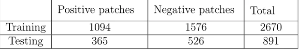
we split our dataset into 75% training patches and 25% testing patches (Table 3.1). We fixed the hidden layer of our neural network to have 256 neurons and used a dropout parameter of 0.5. We trained the network for 30 epochs and evaluated its training accuracy by classifying image patches that received a score higher than 0.5 as positive and as negative otherwise. We will call this parameter our separating threshold. This resulted in a 100% training accuracy and a 98.2% test accuracy.
Positive patches Negative patches Total
Training 1094 1576 2670
Testing 365 526 891
Table 3.1: Number of patches used in the training and testing sets for our first experiment.
Although these results are very promising, we realized this experiment has a major flaw, as the training set and the testing set are not completely independent. In particular, given two patches that were extracted from the same slide and that are close to each other, the probability that one is used for training and the other one for testing is high. Hence, our network is being trained to fit the testing set, at least to some extent.
3.1.2
Robust Evaluation of Performance at Patch Level
To address the issue described above, we took a different approach to splitting our dataset. We divided the dataset at the slide level. That is, if a slide is in the training set, then all off the patches extracted from this slide will be used for training. This eliminates the relationship between the training set and the test set, but makes it harder to control how many patches are used for training and testing since every slide contributes a different amount of patches. Only a few amount of positive patches could be extracted from some positive slides, whereas many patches were extracted from some negative slides. Keeping a balanced training or testing set
becomes harder as a consequence, unless some of the sets are down sampled. We decided not to do so since we didn’t have many images to begin with.
To obtain a more robust measure of the performance of our model we performed 5-fold and 10-fold stratified cross validation and measured the average accuracy, precision, recall, F1 score and AUC of the ROC curve and their corresponding standard deviations. We kept our previous architecture fixed and obtained the results in Table 3.2.
The large standard deviation of both precision and recall and the high average AUC is evidence that the scores of the patches for different slides are distributed very differently, such that choosing a fixed separating threshold for all slides resulted in poor precision and recall values for some folds.
Accuracy Precision Recall F1 score AUC
5-fold 0.926 ± 0.032 0.869 ± 0.108 0.924 ± 0.055 0.894 ± 0.075 0.974 ± 0.016 10-fold 0.922 ± 0.049 0.862 ± 0.125 0.938 ± 0.035 0.893 ± 0.064 0.983 ± 0.014 Table 3.2: Average values and standard deviations for multiple metrics on our 5-fold and 10-fold cross validation experiments using the manually extracted dataset.
3.1.3
Performance at WSI level
Since our main goal is to classify WSIs, our algorithms can misclassify some patches and still perform well according to our standards. We used leave-one-out cross validation, training a model using the patches that corresponded to all but one of the WSIs. We then split the remaining WSI into non-overlapping patches of 800 × 800 and used the model to score each of the patches. We experimented with various ways of aggregating the scores of the patches to produce a single score for the WSI such as taking the average, average of the top-k values for multiple values of k, and a weighted average based on the magnitudes of the scores. We evaluated the performance of the model and the aggregation metric by computing the AUC of
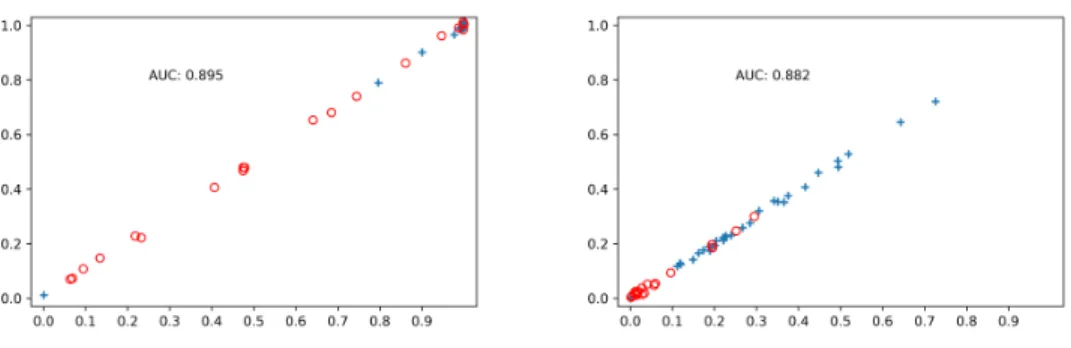
Figure 3-1: On the x-axis, the scores of all 58 WSIs using the average of its cor-responding patch scores. On the y-axis, the same score with a small random noise to help visualize WSIs with similar scores. The plus labels correspond to positive slides. The image on the left corresponds to the top 5% metric. The image on the right corresponds to the average metric.
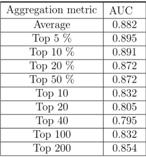
the ROC curve generated by the 58 scores of the WSIs and their true corresponding labels. We choose this evaluation method to avoid the need of choosing a separating threshold and to obtain a better measure of the predicting power of the models at different separating thresholds. The aggregation metric that produced the highest AUC was using the average of the top 5% patch scores as the WSI score, with an AUC of 0.895. The distribution of the scores can be observed on Fig 3-1. The AUC scores for some of the metrics we tried can be observed in Table 3.3. Despite the AUC being higher using the average top 5% patch scores, we can see that the scores are distributed in a more sensible way when using the average of all scores.
Before moving on, we analyzed the slides that were getting the most alarming scores and the reasons behind it. In particular, one of the positive slides consistently got a score close to 0, across aggregation metrics and runs of our cross validation. After consulting with the pathologist, the slide was discarded since it represented an ambiguous case that was given a different label on second thought. Further, we realized there were systematic biases in the way we selected the collection of pieces of skin from each WSI.
Aggregation metric AUC Average 0.882 Top 5 % 0.895 Top 10 % 0.891 Top 20 % 0.872 Top 50 % 0.872 Top 10 0.832 Top 20 0.805 Top 40 0.795 Top 100 0.832 Top 200 0.854
Table 3.3: Performance of different aggregation methods to score a WSI
3.2
Training Classifiers with Patches Extracted in
an Automated Way
We expected to see an improvement from the almost 10-fold increase in the amount of patches we extracted. We again evaluated the performance of our models at the patch and WSI level.
3.2.1
Performance at Patch Level
We performed 5-fold cross validation on all of our patch datasets for the three dimensions explored and computed multiple measures. We perform the data splits at the slide level, to avoid the problems described before. In addition to this, since the amount of data is no longer a problem, we balanced the training set and the testing set on each of our folds. This was done by downsampling the set of patches (positive or negative) that had more samples. As before, we fixed the hidden layer of our neural network to have 256 neurons and used a dropout parameter of 0.5. We trained the network for 20 epochs and evaluated its training accuracy, recall and precision by using a separating threshold of 0.5. We obtained the results in
Table 3.4.
Accuracy Precision Recall F1 score AUC
299 × 299 0.937 ± 0.012 0.936 ± 0.028 0.941 ± 0.037 0.937 ± 0.012 0.986 ± 0.003 500 × 500 0.926 ± 0.022 0.941 ± 0.028 0.912 ± 0.061 0.924 ± 0.025 0.983 ± 0.006 800 × 800 0.921 ± 0.015 0.94 ± 0.025 0.901 ± 0.042 0.919 ± 0.016 0.979 ± 0.006 Table 3.4: Average values and standard deviations for multiple measures on our
5-fold cross validation experiments using our larger datasets.
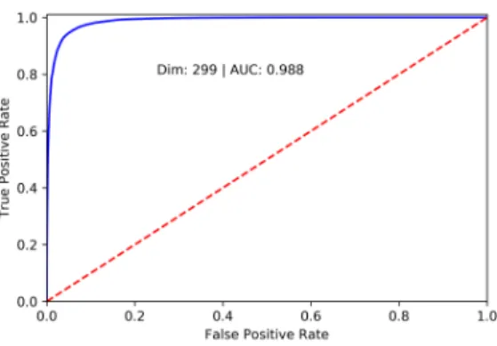
Overall, it seems that increasing the amount of patches helped our models. Statistics such as precision increased significantly, and overall the standard devi-ations decreased dramatically. Further, using patches of lower dimensions achieved better results across most of the statistics. Fig 3-2 shows the ROC curve associated to the predicted scores of all the 299 × 299 patches, generated by the models in our cross validation.
Further, we modified the patches used in the testing set to make sure they did not overlap. Overlapping patches can be problematic in reporting our test statistics since their scores are possibly correlated. Hence, we repeated the experiment but made sure all patches had no overlap in the WSI from which they were extracted. The results can be seen in Table 3.5. The results seem similar to our previous ex-periment, with exception of larger standard deviations. This might be explained by the fact that there were less patches to test on, since the non-overlapping constraint reduced the size of the test set, and therefore there was more variance.
Accuracy Precision Recall F1 score AUC
299 × 299 0.930 ± 0.019 0.949 ± 0.037 0.912 ± 0.035 0.929 ± 0.020 0.983 ± 0.011 500 × 500 0.927 ± 0.036 0.949 ± 0.036 0.904 ± 0.077 0.924 ± 0.042 0.983 ± 0.014 800 × 800 0.934 ± 0.035 0.957 ± 0.024 0.909 ± 0.056 0.932 ± 0.038 0.981 ± 0.017 Table 3.5: Average values and standard deviations for multiple measures on our
5-fold cross validation experiments using our larger datasets and testing on non-overlapping patches
Figure 3-2: ROC curve generated by scoring the 299 × 299 patches with the models produced by 5-fold cross validation
Finally, we experimented with the parameters of the model to determine the most optimal combination for each of the dimensions. We explored six different hidden layer sizes (10,40,100,150,256,400) and four different dropout rates (0,0.2,0.5,0.7). For each patch dimension, we fixed a hidden layer size and dropout rate and per-formed 5-fold cross validation three times, and measured the AUC of the 15 ROC curves produced by this. In addition, we measured the AUC of the single ROC curve generated by all predicted scores across the 3 iterations of the 5-fold cross validation. The cross-validation splits were kept fixed across different hidden layer-dropout rate combinations. The difference between the best performing models and the worse were not significant in magnitude. The best performing parameter pairs for each dimension are reported in Table 3.6
Patch Dimension Layer size, Dropout rate
299 × 299 (150, 0.5)
500 × 500 (100, 0.5)
800 × 800 (100, 0.2)
Table 3.6: The best performing parameters of the top layer neural network for each patch dimension.
3.2.2
Performance at WSI level
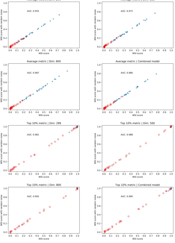
We used leave-one-out cross validation to train models across the three patch di-mensions we worked with, and split each WSI into non-overlapping patches of the corresponding dimension which were scored using the models. We then tried multi-ple ways of combining the predictions for each patch to produce a score for the WSI. Again, we evaluated the performance of the models and the combination technique by computing the AUC of the ROC curve generated by the scores of the WSIs. In addition, we evaluated a forth model that averaged the scores produced by the models for each dimension.The results are shown in Table 3.7.
There is not an aggregation metric that performed best across all dimensions, but taking the average of the top 5% and top 10% scores achieved a very high AUC. As the value of 𝑘 increased, the AUC achieved by the average of the top 𝑘% decreased, converging to the AUC using the average of all patch scores. On a different hand, the average of the top 𝑘 patch scores did not beat the average of all scores for any value of 𝑘, and achieved very poor AUC as k began to become large. The combined model beats at least 2 of the fixed dimension models for every aggregation metric, so it seems like a more robust model.
From Fig 3-3 we can observe that the distribution of the scores using the top 10% varies vastly from the distribution using the average metric. In particular, with the top 10% metric, almost all positive slides received a score very close to 1, across all models. Hence, in order to improve our results, we need to make adjustments to decrease the false positive rate.
Another option is to develop a more robust aggregation metric, one that takes advantage of the spatial relationship between patches, since we expect contiguous patches with high scores to be more discriminant of the presence of cancer than isolated patches with high scores. However, there are two problems with this ap-proach. The first is that we don’t have sufficient data to potentially train a second algorithm that learns how to score a WSI given its corresponding bag of predictions.
Figure 3-3: The distribution of the WSIs score across different models, using the average and the top 10% metric.
Aggregation metric 299 × 299 500 × 500 800 × 800 Combined model Average 0.954 0.978 0.987 0.986 Top 5 % 0.992 0.983 0.990 0.995 Top 10 % 0.981 0.988 0.992 0.990 Top 20 % 0.963 0.978 0.989 0.985 Top 50 % 0.954 0.976 0.987 0.986 Max 0.810 0.913 0.838 0.916 Top 10 0.951 0.955 0.937 0.948 Top 20 0.936 0.927 0.897 0.912 Top 40 0.906 0.885 0.867 0.870 Top 100 0.819 0.829 0.856 0.834 Top 200 0.793 0.839 0.910 0.836
Table 3.7: Performance of different aggregation methods to score a WSI with a larger dataset
The second is that this doesn’t seem to be the main problem of our current models. By overlaying a heatmap representing the patch scores over the corresponding WSI, we can get a better idea of the limitations of our models.
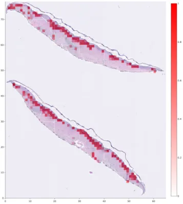
Analysis of positive WSI scores
Fig 3-5 shows the positive WSI that received the lowest score using the 299 × 299 model with the top 10% metric, according to Fig 3-3. If we compare the heatmap to the annotations made by the pathologist, we can see that they are very similar, despite the low score that the WSI received by our algorithm relative to the other positive WSIs. Using the average metric, this WSI received a score of 0.09. Clearly, the problem with this WSI is not how its patches are scored, but rather the small percentage of them that actually contain tumor. Hence, choosing a smaller percentage of the patches seems more reasonable, but can increase the score of negative slides. This is a reasonable decision to make given that in the domain of our problem false positives are easier to handle than false negatives. A pathologist can just take a second look at all positively labeled slides and discard
the false positives. If false negatives exist, they would have to look at all cases, making the algorithm almost useless. Fig 3-5 shows a positive WSI that received a very high score by our algorithm with a heatmap overlaid and with the annotations made by the pathologist. The accuracy of our algorithm in this slide is very high.
Figure 3-4: The positive WSI with the lowest score using the top 10% aggregation metric. The image on the top left and top right have a heatmap overlaid to visualize how different 299 × 299 and 800 × 800 patches in the WSI were scored, respectively. The image in the bottom shows the original WSI with the annotations made by the pathologist.
Figure 3-5: A positive WSI with a high score across different metrics. The image on the left has a 299 × 299 heatmap overlaid, and the one in the right shows the annotations made by the pathologist.
Analysis of negative WSI scores
We will analyze three different WSIs to further understand the limitations of our algorithm. Fig 3-6 shows a WSI that received a very low score across different metrics. We can observe that there are very few patches that obtained a high score. It is expected that false positives will appear every now and then, but as long as they don’t prevail then aggregation metrics such as average will be robust against them. On the other hand, taking the average of the top 𝑘% percent patch scores becomes less robust to false positives as k decreases.
Figure 3-6: A WSI that received an average low score and its corresponding score matrix overlaid as a heatmap.
The left image on Fig 3-7 shows a WSI that received a medium to high score relative to other negative WSIs. The biggest challenge with this slide is the fact that there seems to be some spatial correlation between the patches that received higher scores, which is more proper of tumors. This means that even the algorithms that take advantage of this spatial relationships would have a hard time classifying this slide. Hence, despite the good performance of the classifiers at the patch level, they can be further improved.It is worth to note that this piece of skin does in fact contain cancer, but not BCC.
Finally, the image on the right of Fig 3-7 shows a WSI that received a high score. There seems to be more high scoring patches in this slide compared to the slide in the left, but they tend to be more sparse. Various post-processing techniques can be applied to a WSI score matrix to ’smooth’ it and reduce how noisy they can be.
Figure 3-7: Two negative WSIs that received a medium to high average score and their corresponding score matrix overlaid as a heatmap. On the left image, the high scoring patches are close together, resembling a correctly classified tumor lesion. On the right image, the high scoring patches are more sparse.
For example, we can convolve a score matrix with an average kernel or a gaussian kernel. This can lead to improvements using the top 𝑘% metric since high scoring patches will only prevail if there is surrounding evidence of their high scores. Fig 3-8 illustrates how the score matrix of a WSI changes as different smoothing techniques are applied. A different image color scale was used for visualization purposes.
Figure 3-8: The image on the top left represents the original score matrix heatmap of a high scoring WSI. On the top right is the result of applying a 3 × 3 gaussian kernel to it. The bottom left and bottom right images are the result of applying a 3 × 3 and a 5 × 5 average kernel to the original score matrix, respectively.
3.3
Test Dataset
We ran multiple experiments to measure the performance of our trained models using different aggregation and smoothing techniques. For each aggregation and smoothing technique, we split our dataset into 36 validation slides (18 positive, 18 negative) and 50 test slides. We scored each slide and choose a threshold such that only one positive slide of the validation set was misclassified (i.e such that recall was forced to be at least 94.44% in the validation set). We then measured the accuracy, precision and recall on the test set using this threshold. We ran this process for 20 validation-test splits and measure the average of each of our statistics, and their standard deviations. We maintained the 20 validation-test splits constant so results were more directly comparable across models and aggregation/smooth techniques. Separately, for each (model, aggregation technique, smoothing technique) triple, we also measured the area under the ROC curve generated by the 86 slide scores.
We tried five different score aggregation techniques (average, top 1%, top 3%, top 5%, top 10%) and five different smoothing techniques (no smoothing, 3 × 3 average kernel, 5 × 5 average kernel, 3 × 3 gaussian kernel and 5 × 5 gaussian kernel). We present the results of our experiment in 4 different tables, one for each of the dimensions we tried (the forth correspond to a combined model). As mentioned above, the AUC was measured over the 86 slides scores (there is no need to split the data for this), so no standard deviation is reported for this.
On each table, that is for every dimension we trained a model on, we emboldened the best performing pair of smoothing and aggregation techniques measured by the AUC and the average recall. If two models achieved the same AUC, we emboldened the simplest one (i.e the simplest smoothing technique). On the other hand, if two models achieved the same average recall, we emboldened the one with the highest precision.
299 × 299 model
Average Top 1% Top 3% Top 5% Top 10%
3 × 3 gaussian kernel A: 0.899 ± 0.032 A: 0.919 ± 0.028 A: 0.924 ± 0.033 A: 0.925 ± 0.035 A: 0.910 ± 0.034 P: 0.894 ± 0.067 P: 0.939 ± 0.053 P: 0.955 ± 0.064 P: 0.947 ± 0.060 P: 0.920 ± 0.077 R: 0.917 ± 0.074 R: 0.903 ± 0.089 R: 0.899 ± 0.088 R: 0.908 ± 0.087 R: 0.913 ± 0.078
AUC: 0.978 AUC: 0.988 AUC: 0.991 AUC: 0.990 AUC: 0.985
5 × 5 gaussian kernel A: 0.899 ± 0.032 A: 0.919 ± 0.028 A: 0.926 ± 0.035 A: 0.925 ± 0.035 A: 0.918 ± 0.028 P: 0.894 ± 0.067 P: 0.939 ± 0.053 P: 0.956 ± 0.064 P: 0.947 ± 0.060 P: 0.930 ± 0.062 R: 0.917 ± 0.074 R: 0.903 ± 0.089 R: 0.903 ± 0.089 R: 0.908 ± 0.087 R: 0.913 ± 0.078
AUC: 0.978 AUC: 0.988 AUC: 0.991 AUC: 0.990 AUC: 0.986
3 × 3 average kernel A: 0.899 ± 0.032 A: 0.921 ± 0.028 A: 0.926 ± 0.035 A: 0.925 ± 0.035 A: 0.910 ± 0.034 P: 0.894 ± 0.067 P: 0.942 ± 0.051 P: 0.956 ± 0.064 P: 0.947 ± 0.060 P: 0.920 ± 0.077 R: 0.917 ± 0.074 R: 0.903 ± 0.089 R: 0.903 ± 0.090 R: 0.908 ± 0.087 R: 0.913 ± 0.078
AUC: 0.978 AUC: 0.989 AUC: 0.991 AUC: 0.990 AUC: 0.985
5 × 5 average kernel A: 0.900 ± 0.032 A: 0.899 ± 0.030 A: 0.915 ± 0.029 A: 0.918 ± 0.030 A: 0.920 ± 0.027 P: 0.896 ± 0.068 P: 0.909 ± 0.057 P: 0.929 ± 0.062 P: 0.933 ± 0.059 P: 0.936 ± 0.060 R: 0.917 ± 0.074 R: 0.896 ± 0.092 R: 0.908 ± 0.087 R: 0.908 ± 0.087 R: 0.910 ± 0.082
AUC: 0.978 AUC: 0.982 AUC: 0.987 AUC: 0.988 AUC: 0.988
No smoothing
A: 0.896 ± 0.033 A: 0.919 ± 0.027 A: 0.908 ± 0.031 A: 0.901 ± 0.033 A: 0.899 ± 0.035 P: 0.895 ± 0.066 P: 0.939 ± 0.069 P: 0.916 ± 0.075 P: 0.907 ± 0.071 P: 0.895 ± 0.066 R: 0.910 ± 0.078 R: 0.907 ± 0.083 R: 0.911 ± 0.076 R: 0.908 ± 0.082 R: 0.914 ± 0.077
AUC: 0.978 AUC:0.988 AUC: 0.985 AUC: 0.981 AUC: 0.978
Table 3.8: Results of the 299 × 299 model.
patches, using a 3 × 3 average kernel to smooth the score matrix and taking the final score to be the average of the top 3% scoring patches, with an AUC of 0.991. On the other hand, the model that obtained the highest average recall was the model trained on 800 × 800 patches, without smoothing the score matrix and taking the final score to be the average of the top top 1%, with an average recall of 92.8% and a precision of 87%. The distribution of the WSI scores and the Precision-Recall curve corresponding to each model are shown in Fig 3-9.
500 × 500 model
Average Top 1% Top 3% Top 5% Top 10%
3 × 3 gaussian kernel A: 0.889 ± 0.034 A: 0.869 ± 0.032 A: 0.893 ± 0.031 A: 0.892 ± 0.032 A: 0.891 ± 0.037 P: 0.886 ± 0.056 P: 0.851 ± 0.068 P: 0.889 ± 0.056 P: 0.886 ± 0.052 P: 0.887 ± 0.047 R: 0.904 ± 0.091 R: 0.907 ± 0.091 R: 0.906 ± 0.088 R: 0.906 ± 0.088 R: 0.904 ± 0.092
AUC: 0.969 AUC: 0.971 AUC: 0.976 AUC: 0.974 AUC: 0.973
5 × 5 gaussian kernel A: 0.889 ± 0.034 A: 0.867 ± 0.032 A: 0.878 ± 0.032 A: 0.887 ± 0.032 A: 0.889 ± 0.038 P: 0.885 ± 0.056 P: 0.849 ± 0.064 P: 0.866 ± 0.061 P: 0.879 ± 0.050 P: 0.879 ± 0.051 R: 0.904 ± 0.089 R: 0.907 ± 0.091 R: 0.906 ± 0.088 R: 0.906 ± 0.088 R: 0.907 ± 0.088
AUC: 0.969 AUC: 0.970 AUC: 0.973 AUC: 0.973 AUC: 0.971
3 × 3 average kernel A: 0.889 ± 0.035 A: 0.869 ± 0.030 A: 0.866 ± 0.028 A: 0.884 ± 0.033 A: 0.889 ± 0.034 P: 0.885 ± 0.056 P: 0.851 ± 0.059 P: 0.847 ± 0.067 P: 0.873 ± 0.058 P: 0.881 ± 0.049 R: 0.903 ± 0.092 R: 0.907 ± 0.091 R: 0.908 ± 0.089 R: 0.908 ± 0.089 R: 0.906 ± 0.088
AUC:0.969 AUC: 0.966 AUC: 0.971 AUC: 0.973 AUC: 0.971
5 × 5 average kernel A: 0.882 ± 0.036 A: 0.860 ± 0.037 A: 0.862 ± 0.037 A: 0.872 ± 0.030 A: 0.881 ± 0.037 P: 0.871 ± 0.051 P: 0.830 ± 0.039 P: 0.835 ± 0.044 P: 0.853 ± 0.050 P: 0.867 ± 0.047 R: 0.905 ± 0.086 R: 0.908 ± 0.079 R: 0.908 ± 0.082 R: 0.908 ± 0.082 R: 0.906 ± 0.090
AUC: 0.965 AUC: 0.960 AUC: 0.963 AUC: 0.967 AUC:0.970
No smoothing
A: 0.892 ± 0.036 A: 0.912 ± 0.028 A: 0.890 ± 0.037 A: 0.889 ± 0.035 A: 0.890 ± 0.034 P: 0.895 ± 0.061 P: 0.936 ± 0.065 P: 0.896 ± 0.065 P: 0.894 ± 0.061 P: 0.894 ± 0.061 R: 0.900 ± 0.100 R: 0.896 ± 0.094 R: 0.895 ± 0.106 R: 0.895 ± 0.102 R: 0.896 ± 0.099
AUC: 0.70 AUC: 0.981 AUC: 0.973 AUC: 0.971 AUC: 0.970
Table 3.9: Results of the 500 × 500 model.
800 × 800 model
Average Top 1% Top 3% Top 5% Top 10%
3 × 3 gaussian kernel A: 0.887 ± 0.027 A: 0.843 ± 0.035 A: 0.859 ± 0.034 A: 0.878 ± 0.031 A: 0.886 ± 0.029 P: 0.873 ± 0.059 P: 0.820 ± 0.085 P: 0.843 ± 0.082 P: 0.870 ± 0.078 P: 0.878 ± 0.063 R: 0.916 ± 0.077 R: 0.905 ± 0.091 R: 0.905 ± 0.095 R: 0.908 ± 0.088 R: 0.910 ± 0.086
AUC: 0.971 AUC: 0.962 AUC: 0.968 AUC: 0.973 AUC: 0.973
5 × 5 gaussian kernel A: 0.876 ± 0.030 A: 0.840 ± 0.033 A: 0.859 ± 0.034 A: 0.875 ± 0.033 A: 0.873 ± 0.033 P: 0.859 ± 0.068 P: 0.817 ± 0.083 P: 0.843 ± 0.082 P: 0.865 ± 0.078 P: 0.859 ± 0.078 R: 0.916 ± 0.077 R: 0.903 ± 0.095 R: 0.905 ± 0.095 R: 0.907 ± 0.091 R: 0.911 ± 0.083
AUC: 0.968 AUC: 0.961 AUC: 0.968 AUC: 0.971 AUC: 0.970
3 × 3 average kernel A: 0.881 ± 0.026 A: 0.839 ± 0.034 A: 0.857 ± 0.034 A: 0.866 ± 0.036 A: 0.871 ± 0.031 P: 0.865 ± 0.059 P: 0.814 ± 0.086 P: 0.841 ± 0.084 P: 0.853 ± 0.087 P: 0.856 ± 0.079 R: 0.916 ± 0.077 R: 0.906 ± 0.089 R: 0.904 ± 0.094 R: 0.908 ± 0.084 R: 0.913 ± 0.084
AUC: 0.969 AUC: 0.959 AUC: 0.965 AUC: 0.968 AUC: 0.970
5 × 5 average kernel A: 0.873 ± 0.032 A: 0.820 ± 0.035 A: 0.828 ± 0.030 A: 0.841 ± 0.028 A: 0.854 ± 0.029 P: 0.856 ± 0.067 P: 0.785 ± 0.079 P: 0.794 ± 0.078 P: 0.812 ± 0.074 P: 0.828 ± 0.074 R: 0.913 ± 0.084 R: 0.907 ± 0.091 R: 0.909 ± 0.087 R: 0.909 ± 0.087 R: 0.910 ± 0.082
AUC: 0.968 AUC: 0.953 AUC: 0.957 AUC: 0.960 AUC: 0.963
No smoothing
A: 0.886 ± 0.028 A: 0.890 ± 0.021 A: 0.898 ± 0.034 A: 0.897 ± 0.027 A: 0.889 ± 0.029 P: 0.872 ± 0.057 P: 0.870 ± 0.059 P: 0.912 ± 0.078 P: 0.887 ± 0.060 P: 0.876 ± 0.056 R: 0.915 ± 0.074 R: 0.928 ± 0.057 R: 0.897 ± 0.092 R: 0.921 ± 0.067 R: 0.915 ± 0.074
AUC: 0.971 AUC: 0.976 AUC: 0.980 AUC: 0.974 AUC: 0.971
Combined model
Average Top 1% Top 3% Top 5% Top 10%
3 × 3 gaussian kernel A: 0.895 ± 0.033 A: 0.899 ± 0.028 A: 0.914 ± 0.029 A: 0.906 ± 0.032 A: 0.902 ± 0.033 P: 0.888 ± 0.068 P: 0.903 ± 0.063 P: 0.927 ± 0.057 P: 0.915 ± 0.064 P: 0.904 ± 0.057 R: 0.916 ± 0.077 R: 0.905 ± 0.093 R: 0.908 ± 0.088 R: 0.907 ± 0.092 R: 0.908 ± 0.089
AUC: 0.973 AUC: 0.983 AUC: 0.985 AUC: 0.982 AUC: 0.979
5 × 5 gaussian kernel A: 0.895 ± 0.033 A: 0.895 ± 0.027 A: 0.903 ± 0.029 A: 0.907 ± 0.032 A: 0.902 ± 0.033 P: 0.888 ± 0.068 P: 0.896 ± 0.061 P: 0.911 ± 0.062 P: 0.919 ± 0.059 P: 0.904 ± 0.057 R: 0.916 ± 0.077 R: 0.905 ± 0.093 R: 0.905 ± 0.093 R: 0.904 ± 0.096 R: 0.908 ± 0.089
AUC: 0.973 AUC: 0.982 AUC: 0.984 AUC: 0.983 AUC: 0.980
3 × 3 average kernel A: 0.895 ± 0.033 A: 0.886 ± 0.025 A: 0.903 ± 0.029 A: 0.903 ± 0.029 A: 0.902 ± 0.033 P: 0.888 ± 0.068 P: 0.883 ± 0.066 P: 0.911 ± 0.062 P: 0.911 ± 0.062 P: 0.904 ± 0.057 R: 0.916 ± 0.077 R: 0.904 ± 0.092 R: 0.905 ± 0.093 R: 0.904 ± 0.096 R: 0.908 ± 0.089
AUC: 0.973 AUC: 0.981 AUC: 0.984 AUC: 0.982 AUC: 0.978
5 × 5 average kernel A: 0.892 ± 0.036 A: 0.881 ± 0.029 A: 0.886 ± 0.027 A: 0.898 ± 0.030 A: 0.898 ± 0.029 P: 0.886 ± 0.070 P: 0.869 ± 0.056 P: 0.878 ± 0.055 P: 0.898 ± 0.056 P: 0.898 ± 0.056 R: 0.914 ± 0.082 R: 0.907 ± 0.086 R: 0.906 ± 0.087 R: 0.907 ± 0.088 R: 0.908 ± 0.087
AUC: 0.971 AUC: 0.974 AUC: 0.977 AUC: 0.980 AUC: 0.978
No smoothing
A: 0.888 ± 0.030 A: 0.916 ± 0.025 A: 0.903 ± 0.032 A: 0.898 ± 0.032 A: 0.892 ± 0.026 P: 0.880 ± 0.071 P: 0.931 ± 0.062 P: 0.916 ± 0.069 P: 0.899 ± 0.069 P: 0.884 ± 0.066 R: 0.914 ± 0.077 R: 0.907 ± 0.085 R: 0.899 ± 0.087 R: 0.911 ± 0.084 R: 0.915 ± 0.074
AUC: 0.972 AUC: 0.986 AUC: 0.979 AUC: 0.977 AUC: 0.973
Table 3.11: Results of the combined model.
Figure 3-9: The distribution of the WSI scores and the Precision-Recall curves for the best performing models.
Chapter 4
Conclusion
Digital histopathology image analysis presents a very unique combination of chal-lenges for machine learning. The lack of available data, the high dimensionality of the images and the high variance produced by the preparation and staining of tissue make learning useful features from digital images a very ambitious task. Yet, research has shown that deep learning techniques can be adapted to successfully address this challenges.
In this thesis we accomplished three things. We constructed a rather large dataset of skin patches according to whether or not they contain BCC, for patches of multiple dimensions. In order to do so, we developed a method to extract a large amount of positive patches of any dimension using the data labeled by the patholo-gist in an automated way. It is very hard to obtain data without leveraging human labor, yet we show it is possible to amplify their work such that labor does not scale linearly with the size of the dataset.
Second, we demonstrated that despite of the variance in the visual features of biological structures and the difference between skin patches and the images in the ImageNet dataset, pre-trained deep CNNs can extract very significant features from skin patches, making it possible to obtain very good results in skin classification without having too much data.
Finally, we showed that is it possible to combine patch scores to produce a significant score for WSIs, without the need of training a second learning algorithm. We strongly believe that training a second learning algorithm that uses features of the score matrix of a WSI (as in [8]) can achieve better results, but much more data is needed to test this hypothesis.
4.1
Future Work
We present multiple ideas to increase the robustness of our algorithms and poten-tially improve our results.
∙ Data augmentation for positive training patches: It is very simple to extract negative patches, so the size of our patch dataset is limited by our ability of extracting positive patches. Rotating and mirroring our current set of positive training patches will increase the size of our dataset and potentially aid with problems such as overfitting.
∙ Fine-tune Inception V3: The features that the last layers of deep CNNs extract are more specific to the dataset in which it was trained. Hence, in order to extract more significant features for our dataset, the weights of some of the final layers can be modified by running the back propagation algorithm using our patch dataset.
∙ Stain Normalization: Differences in lab protocols result in HE stained tissue varying significantly in color. There are multiple ways in which the color space of our patches can be normalized to address this issue, and the method described in [5] it often cited in papers on this field.
∙ Decreasing the stride size when classifying WSIs: To classify a WSI, we parti-tion it into non-overlapping patches and score each of them. We can partiparti-tion
a WSI in many different ways, but a trivial first step would be to partition it into overlapping patches, such that each patch intersects 50% of all its neigh-boring patches.
∙ Extracting more ’critical’ patches: By analyzing multiple WSI heatmaps, we were able to identify several regions where our classifier performs poorly. By extracting more training patches from this regions we can increase the chances of correctly classifying them in the future. This idea proved successful in a similar context in [8].
∙ Training a fusion model: The score of a WSI depends on how the scores of its patches were aggregated. The aggregation methods we tried were fairly simple and achieved good resulted, but we believe that algorithms that learn how to use other features of the score matrices are likely to be more robust and have potential to achieve better results, such as in [8].
∙ Increase the number of labels: Intuitively, multiclassification sounds like a harder problem to solve than just binary classification. However, we noticed that some of the false positive patches corresponded to other types of skin cancer (such as squamous cell carcinoma). Although visually different from BCC, other types of cancer might not be sufficiently similar to healthy skin in order to consistently be classified one of the two categories. Hence, extracting patches from other types of cancer and teaching our algorithms to learn about this new labels could actually increase our accuracy when predicting if a patch has BCC or not.
Bibliography
[1] Angel Cruz-Roa, John Arevalo, Anant Madabhushi, and Fabio Gonzales. A deep learning architecture for image representation, visual interpretability and automated basal-cell carcinoma cancer detections. Medical Image Computing and Computer-Assisted Intervention, 8150:403–410, 2013.
[2] Gery Guy, Cheryll Thomas, Trevor Thompson, Meg Watson, Greta Massetti, and Lisa Richardson. Vital signs: Melanoma incidence and mortality trends and projections - united states, 1982-2030. Morbidity and Mortality Weekly Report, 64:3, 2015.
[3] Daisuke Komura and Shumpei Ishikawa. Machine learning methods for histopathological image analysis. ArXiv e-prints, 2017.
[4] Geert Litjens, Thijs Kooi, Babak Ehteshami Bejnordi, Arnaud Arindra Adiyoso Setio, Francesco Ciompi, Mohsen Ghafoorian, Jeroen A.W.M van der Laak, Ban van Ginneken, and Clara l. Sanchez. A survey on deep learning in medical image analysis. ArXiv e-prints, 2017.
[5] Marc Macenko, Marc Niethammer, and James Marron. A method for normaliz-ing histology slides for quantitative analysis. 2009 IEEE International Sympo-sium on Biomedical Imaging: From Nano to Macro, pages 1107–1110, 2009. [6] Ali Razavian, Hossein Azizpour, Hosephine Sullivan, and Stefan Carlsson. Cnn
features off-the-shelf: an astounding baseline for recognition. ArXiv e-prints, 2014.
[7] Christian Szegedy, Vincent Vanhoucke, Sergey Ioffe, and Jonathon Shlens. Re-thinking the inception architecture for computer vision. ArXiv e-prints, 2015. [8] Dayong Wang, Aditya Khosla, Rishab Gargeya, Irshad Humayun, and Andrew
Beck. Deep learning for identifying metastatic breast cancer. ArXiv e-prints, page 3, 2016.
[9] Jason Yosinski, Jeff Clune, Yoshua Bengio, and Hod Lipson. How transferable are futures in deep neural networks. Advances in Neural Information Processing Systems, 27:3320–3328, 2014.