HAL Id: lirmm-01911990
https://hal-lirmm.ccsd.cnrs.fr/lirmm-01911990
Submitted on 5 Nov 2018
HAL is a multi-disciplinary open access
archive for the deposit and dissemination of
sci-entific research documents, whether they are
pub-lished or not. The documents may come from
teaching and research institutions in France or
L’archive ouverte pluridisciplinaire HAL, est
destinée au dépôt et à la diffusion de documents
scientifiques de niveau recherche, publiés ou non,
émanant des établissements d’enseignement et de
recherche français ou étrangers, des laboratoires
EpidNews: An Epidemiological News Explorer for
Monitoring Animal Diseases
Rohan Goel, Samiha Fadloun, Sarah Valentin, Arnaud Sallaberry, Mathieu
Roche, Pascal Poncelet
To cite this version:
Rohan Goel, Samiha Fadloun, Sarah Valentin, Arnaud Sallaberry, Mathieu Roche, et al.. EpidNews:
An Epidemiological News Explorer for Monitoring Animal Diseases. VINCI: Visual Information
Com-munication and Interaction, Aug 2018, Växjö, Sweden. �10.1145/3231622.3231624�. �lirmm-01911990�
EpidNews: An Epidemiological News Explorer
for Monitoring Animal Diseases
Rohan Goel
BITS Pilani
Department of Computer Science
Goa, India
f20140014@goa.bits-pilani.ac.in
Samiha Fadloun
LIRMM,
Université de Montpellier, CNRS
Montpellier, France
Samiha.Fadloun@lirmm.fr
Sarah Valentin
CIRAD, ASTRE, TETIS,
Université de Montpellier
Montpellier, France
Sarah.Valentin@cirad.fr
Arnaud Sallaberry
LIRMM,
Université Paul-Valéry Montpellier 3,
Université de Montpellier, CNRS
Montpellier, France
Arnaud.Sallaberry@lirmm.fr
Mathieu Roche
TETIS,
AgroParisTech, CIRAD, CNRS, Irstea,
Université de Montpellier
Montpellier, France
Mathieu.Roche@cirad.fr
Pascal Poncelet
LIRMM,
Université de Montpellier, CNRS
Montpellier, France
Pascal.Poncelet@lirmm.fr
ABSTRACT
In the recent years, there has been a massive increase in the amount of data being produced about human and animal health related events. Epidemiologists have to analyze this epidemiological data on a regular basis. They use this spatio-temporal information, most of which is shared online, to detect, observe, and track geographic locations of disease outbreaks over time. Unfortunately, manually retrieving the data from a website like Google News and then deriving sensible insights from the huge dataset consumes a lot of time and e�ort. We present EpidNews, a new visual analytics tool that helps to visualize and explore epidemiological news data for animals. The tool uses several views depicting various levels of abstraction, which helps ful�ll almost all the data analysis re-quirements of epidemiologists. We also present the case study of an epidemiology expert, wherein she assesses the usability and productivity of EpidNews by using the tool in her daily work.
CCS CONCEPTS
• Human-centered computing → Visual analytics; • Applied computing → Health care information systems;
KEYWORDS
Animal epidemiology, spatio-temporal information, visual analytics ACM Reference Format:
Rohan Goel, Samiha Fadloun, Sarah Valentin, Arnaud Sallaberry, Mathieu Roche, and Pascal Poncelet. 2018. EpidNews: An Epidemiological News Explorer for Monitoring Animal Diseases. In Proceedings of the 11th Inter-national Symposium on Visual Information Communication and Interaction
Permission to make digital or hard copies of all or part of this work for personal or classroom use is granted without fee provided that copies are not made or distributed for pro�t or commercial advantage and that copies bear this notice and the full citation on the �rst page. Copyrights for components of this work owned by others than ACM must be honored. Abstracting with credit is permitted. To copy otherwise, or republish, to post on servers or to redistribute to lists, requires prior speci�c permission and/or a fee. Request permissions from permissions@acm.org.
VINCI ’18, August 13–15, 2018, Växjö, Sweden © 2018 Association for Computing Machinery. ACM ISBN 978-1-4503-6501-7/18/08...$15.00 https://doi.org/10.1145/3231622.3231624
(VINCI ’18), Växjö, Sweden, August 13–15, 2018. ACM, New York, NY, USA, 8 pages. https://doi.org/10.1145/3231622.3231624
1 INTRODUCTION
There exists a large amount of data on human & animal disease outbreaks on digital media. However, in this paper, we have focused our work on animal diseases - tracking of which is important to prevent unwanted animal deaths. Animals play a key role in human activities such as agriculture & poultry. Also, there is a constant risk that animal diseases can be transmitted to humans (zoonosis). A signi�cant amount of e�ort in epidemiology research goes into detecting, observing, and simulating disease outbreaks. The epidemiologist’s aim is to prevent the diseases from spreading, for which they need to collect and study large amount of information from online news sources. Traditionally, epidemiologists have relied upon the internationally accepted o�cial sources, like the World Organization for Animal Health (OIE) and the Animal Disease Noti-�cation System (ADNS) for obtaining the data. The European Food Safety Authority (EFSA), for example, used the ADNS noti�cations to highlight how the African swine fever virus which was initially reported in the Baltic countries in 2014, spread to the eastern parts of Poland, causing wild boars deaths in large numbers [9]. The data from these o�cial sources is directly available in a well-de�ned for-mat i.e. with proper tagging of epidemiological clues like diseases, hosts, dates and locations.
Moreover, several platforms dedicated to automatic surveillance of electronic media have been developed over the past two decades [6]. Contrary to the o�cial sources, the data from such web reports is not structured and therefore, the epidemiological clues (diseases, hosts, symptoms, dates and locations) are extracted by data mining techniques [3] - we refer data obtained from such techniques as ’uno�cial’. It is important to note that both the sources are valuable for the epidemiologists: the o�cial ones because they contain vali-dated information about the diseases, and uno�cial ones because they are usually published well in advance of the o�cial ones -providing early insights of new outbreaks.
Analyzing this complex heterogeneous data is a daunting task without the use of a dedicated tool. Visual analytics is a domain that
VINCI ’18, August 13–15, 2018, Växjö, Sweden R. Goel et al. e c a b d
Figure 1: An overview of the tool EpidNews. (a) Map shows disease outbreak locations using a circle or diamond depending on source type. (b) Streamgraphs compare the time evolution of o�cial and uno�cial sources. (c) Sunburst presents relationships between diseases, hosts and symptoms in a hierarchical view. (d) Data manager allows manipulation of the data represented in the other views (sources, data type and entities). (e) Toolbar o�ers other interactive functionalities
focuses on designing visual interfaces to facilitate visual reasoning [8]. In our context, it could provide us with ways to build a tool which will enable us to explore the di�erent aspects of epidemiolog-ical news e�ciently. Unfortunately, existing visual analytics tools ([7, 12]) do not meet all the requirements of the epidemiologists.
In order to �ll this gap, we present EpidNews - a new visual analytics tool for epidemiological news data. It provides di�erent views to: (1) handle di�erent news sources (o�cial / uno�cial) and data types (diseases / hosts / symptoms), (2) visualize geographic and temporal data, and (3) observe data at di�erent levels of aggregation. A demonstration video is available on YouTube1.
In this paper, Section 2 gives an overview of the related work and Section 3 presents a list of requirements for the tool which were identi�ed by computer scientists in collaboration with an epidemiologist. Section 4 describes EpidNews in detail and in Section 5, we present a real world example of the analysis performed by an epidemiologist using EpidNews to highlight the bene�ts of our approach. Finally, we conclude our work in Section 6 of the paper.
1https://youtu.be/N8yfM42P4ME
2 RELATED WORK
This section �rst discusses existing techniques in visualizing spatio-temporal data, followed by the various visualization approaches applied in epidemiology.
2.1 Visualizing spatio-temporal information
A piece of spatio-temporal data contains information about both space and time. In [15], Pauquet proposed a triad framework to de-scribe how this can be exploited through three components: where (location), when (time) and what (information). The author also highlights their correlation in the following way:
• when + where ! what: describes the information at a given location and time.
• when + what ! where: shows the location of an informa-tion at a given time.
• where + what ! when: gives the time of a particular in-formation at a given location.
Several visualizations have been proposed to represent these components. Generally, the information (what) is combined with the other attributes where, and when. For example, one of the �rst well-known representation combining location and information was made in the 19th century, by a British physician John Snow,
to highlight a cholera outbreak in London [20]. He carried out a statistical analysis of the deaths which highlighted the spread of cholera via water distribution.
Aigner et al. [1]2discusses about the time-oriented visualizations
that combine time (when) and the information (what). Such an example is EventRiver [13], which represents events as bubbles positioned along the time axis.
Moreover, several visualizations ([5, 11, 17]) combine all the com-ponents (where, when and what). The work of Ferreira et al. [11] is one such example, where they propose an interactive visualization combining di�erent 3 views: dot map, scatter plots and timeline.
2.2 Data Visualization in epidemiology
In this subsection, we discuss about the monitoring systems in animal epidemiology. It is important to note that, although some epidemiology visualization approaches have been proposed (e.g., [7, 10, 12, 16, 18]), most of them focus on human diseases and not animal diseases. Existing approaches can track signs of emerging diseases and are based on a formalized process of epidemic intelli-gence3[19] focusing on indicator-based surveillance (e.g., Empres-i,
Atlas4) or event-based surveillance (e.g., HealthMap, MedISys5).
Indicator-based surveillance uses structured data collected through traditional monitoring systems like the o�cial outbreak reports of the OIE. For example, Empres-i6is a web application that
visual-izes the information with the help of a map and fetches the data from several sources: OIE, Food and Agriculture Organization of the United Nations (FAO), Government Ministries of Agriculture and Health, etc. Diseases are represented as glyphs on the map to highlight their type (e.g., circles for domestic animal diseases, and triangles for wild animals diseases). It also o�ers several interac-tions like choosing time/location by creating a rectangle on the map, along with the ability to save or select data, etc.
Event-based surveillance uses unstructured data collected from heterogeneous sources, such as the web, social networks, �eld ex-perts, etc. For example, HealthMap [12] proposes an interactive map which uses word-processing algorithms from multiple sources like news feeds, expert accounts (e.g. ProMED-mail) and multina-tional monitoring reports, etc. It represents diseases as circles, with noteworthiness of the event being highlighted by a color scale from yellow (minimum value) to purple (maximum value), and the size of the circle re�ecting the level of alert. It depicts the disease infor-mation over time on a timeline and the geographic distribution as a heatmap. The tool also o�ers several interactions to �lter data by location, time-slices, diseases, species, or sources.
The existing spatio-temporal information visualization tools rep-resent the data using classical charts. For temporal information, representations like a static line chart in HealthMap, and a bar chart in Empres-i have been used. Furthermore, the spatial information is usually visualized on a static non-interactive map. Unfortunately, these basic visualization techniques don’t properly present all the
2timevis.net
3Epidemic intelligence includes all activities related to early detection of health hazards,
their veri�cation, assessment, and investigation in order to recommend public health control measures.
4https://ecdc.europa.eu/en/surveillance-atlas-infectious-diseases, (accessed on March
14, 2018)
5http://medisys.newsbrief.eu, (accessed on March 14, 2018) 6http://empres-i.fao.org/eipws3g/, (accessed on March 14, 2018)
dimensions of the data. Also, it is important to note that the in-teractions between these spatial and temporal views are minimal, thereby limiting their usage and e�ectiveness. Moreover, although these tools use multiple data sources, they fail to separately identify and compare these sources in the visualizations (e.g. HealthMap). One can also notice that all of these existing approaches focus only on human related diseases, completely ignoring the animals.
3 REQUIREMENTS
Before developing EpidNews, a list of requirements for a tool capable of handling di�erent sources of data (o�cial and uno�cial) and the underlying spatio-temporal information were identi�ed through a collaboration between epidemiologists and computer scientists. The requirements identi�ed are as follows:
[R1] Exploring geographical data. This requirement refers to visualizing the news data in the geographic space and generally, the most suitable visualization for this type is a map. The objective is to highlight and observe the di�erent aspects of geographically tagged news data in the same view. By aspects, we mean entities (e.g. the disease African swine fever), entity types (i.e. disease, symptom, and host), and news sources (o�cial and uno�cial). For instance, an epidemiologist wants to study the spread of the diseases African swine fever and Bluetongue in France and then compare it to the patterns found in other parts of the world.
[R2] Exploring temporal data. This is required by experts in order to reveal patterns, �nd peaks and track disease outbreak news over time. For example, epidemiology experts want to observe the evolution of the disease African swine fever over the years 2015-2017, and check if the number of news articles referring this disease have increased, decreased or remained the same during this period. Epidemiologists are also keen to know if a disease spikes in a particular month or season of the year.
[R3] Summarizing and �ltering data. Very often, the epi-demiologists want to visualize a summary and aggregation of the data, in order to easily extract new insights from them. Also the feature of �ltering speci�c data entities is essential in any applica-tion. For example, epidemiologists want to know the percentage of articles about the disease African swine fever involving a particular host (e.g. Pig) and showing speci�c symptoms (e.g. Fever). Also, an expert might want to focus his/her research on only one disease African swine fever and would therefore, like to �lter away all the other diseases from analysis.
[R4] Interactivity and synchronization. Along with all the above requirements, it is of utmost importance to have synchro-nization between the di�erent data representations i.e an activity in one, should re�ect in the other views too. For instance, suppose that V1 is a visualization that handles only the time information in data, and V2 visualizes the location aspect. Now if a user changes the time period of analysis in V1, then in order to maintain synchroniza-tion, V2 should visualize only the records falling in that time period. It can be very well noted that this requirement transverses all of R1, R2, and R3. Also, the tool should engage the users by o�ering various interactions along with the visualizations: like dragging, zooming, ability to update the data, etc.
VINCI ’18, August 13–15, 2018, Växjö, Sweden R. Goel et al.
4 EPIDNEWS
In this paper, we present EpidNews - a visual analytics tool for monitoring the animal epidemiology related news articles. Ful�lling all the requirements, it is composed of several interactive views that allow the users to easily analyze, observe and track the animal disease outbreaks around the world.
Figure 1 presents an overview of the tool. A map (Figure 1.a) shows spatial information [R1] and the two streamgraphs below it (Figure 1.b) visualize the temporal information [R2]. A sun-burst (Figure 1.c) presents the relation between di�erent data types, namely diseases, hosts and symptoms [R3] in a hierarchal fashion. Each data type contains a set of entities: for example, the type diseases contains African swine fever, Avian In�uenza, Bluetongue, Foot-and-mouth-disease, etc. A data manager (Figure 1.d) allows the user to select and �lter data according to the requirement [R3]. A toolbar (Figure 1.e) enhances the interactivity of all the views and allows uploading new data �les. All these components are synchro-nized to re�ect changes and interactions in each other [R4].
4.1 Map
The spatial information [R1] is represented using an interactive map (see Figure 1.a). We propose two kinds of geographical maps: (1) an icon map where each icon/glyph represents a news event which occurred at the corresponding location, and (2) a heatmap showing the distribution & density of the events. The user can toggle between these two type by clicking the third or the fourth button on the toolbar (Figure 1.e). Also each map can be interacted with by zooming in/out and dragging to the required area [R4].
The heatmap (see Figure 2) represents the density of news articles at a particular place. The color scale is from blue (low density), through green, yellow (mid density), to red (high density). For both the map types, the user can �lter [R3] a type of source or some particular entities by selecting the corresponding check-boxes in the "Sources" and "Entities" sections of the data manager (see Figure 1.d) - doing which updates all the views simultaneously [R4].
Figure 2: An example of a Heatmap representing the density distribution of diseases from o�cial news sources
The icon map depicts news items with di�erent icons/glyphs: circles for data from o�cial sources and diamonds for the uno�cial ones [R1] (see Figure 1.a) , thereby making their di�erentiation easier. Also, the color of glyphs represents and matches the entity (Figure 1.d) contained in that particular news item. For example,
a red colored circle in Figure 1 represents an instance of Avian in�uenza extracted from an o�cial source.
Moreover, in practice, many news articles can occur at the same location which causes overlapping glyphs. The low color opacity of the glyphs helps a user to estimate the number of items at given point by noticing the darkness of colors at that point. For a pre-cise view, the user can click on a glyph, which triggers a pop-up containing the list of all the news items at that location (see Figure 3). Each item of this list mentions the following details: the shape and color of the glyph (signifying the source and entity), the date of the news article, a con�dence index (which is a measure of the accuracy with which the location is known), and a hyperlink to the source of the news article.
Figure 3: O�cial (circles) and uno�cial (diamonds) news about diseases near Bordeaux, France (avian influenza in red, African swine fever in blue and foot and mouth disease in green)
4.2 Streamgraphs
We represent the time evolution [R2] of the number of news items involving the di�erent entities using streamgraphs [4] (see Figure 1.b). We use two streamgraphs: the top one contains data from o�cial sources and the bottom one from uno�cial ones. Markings on the x-axis of both the graphs are placed at same positions to facilitate comparison.
Entity colors are the same as in the data manager and icon-map(see Figure 1.d). Here, again, the user can �lter on entity type (hosts / diseases / symptoms) by using the checkboxes. Changing "Sources" has no impact here because the o�cial and uno�cial news are already visualized separately.
Since both the streamgraphs are synchronized [R4], hovering the mouse over the streams shows additional information in both of them: the number of entities at the date de�ned by the x-position of the mouse along with the exact date. This helps in comparing the 2 di�erent news sources over time. For example, in Figure 4, when a user hovers over the streamgraph of o�cial data, labels are displayed in both of them, showing that there were 10 o�cial news items about Avian in�uenza on the 14th of November 2016 whereas
there were only 4 uno�cial ones on the same date. One can also observe that the stream hovered upon (here in red - matching the entity color) is also highlighted in both the streamgraphs.
The user can modify the zoom level of a streamgraph by clicking on the dedicated buttons placed conveniently on the top right of each of them. On zooming, the y-axis is not modi�ed but only the x-axis is extended or contracted. A scrollbar at the bottom enables the user to view the parts of the streamgraph which can fall outside the view when zoomed in. Of course, both the scrollbars are synced with each other and also, changing the zoom level in either of them, re�ects in both the graphs. Hence, the time period covered by both the streamgraphs always remains the same, thereby avoiding any possible mistake by the user during analysis.
The toolbar (see Figure 1.e) provides another layer of interac-tivity between the streamgraphs and the map [R4]. The user can activate the lasso functionality by choosing the �rst option on the toolbar, and then select a custom shaped area on the map. The streamgraphs then show the date of news items in this area us-ing vertical dashed lines, thereby allowus-ing the analysis of spatial and temporal information simultaneously (see Figure 7). Also, the second tool on the toolbar resets the lasso selection.
Finally, two dark gray vertical lines, initially positioned at the left and right ends of the streamgraphs (see Figure 1.b) can be moved to select a speci�c time period (see Figure 5.b) for analysis. The selected period (lying between those lines) is highlighted, and the data outside this time period is removed from the other views.
4.3 Sunburst
EpidNews summarizes the data by visualizing the hierarchical re-lationships [R3] between the di�erent types of entities, namely diseases, hosts and symptoms on a sunburst [14]. The view includes three hierarchical levels which correspond to the three data (entity) types. For instance, in Figure 5.c the innermost ring represents hosts, the middle ring represents the symptoms and the outermost ring represents the diseases. The rings are further divided into arcs, each of which represents an entity of the corresponding type. The colors of entities match with the other views: map, streamgraphs and data manager. Users can observe the percentage of di�erent combinations by hovering the mouse over these arcs (entities). For example, Figure 5.c shows that 30% of the news are about birds (a host), mortality (a symptom) and avian in�uenza (a disease). The user can also click on an entity to �lter the data in the other views [R3]. We can also see in Figure 5 that, if a user clicks on theAvian In�uenza’s arc after hovering the mouse over the arcs for birds, mor-tality, Avian In�uenza, the corresponding news items will appear in the map and the streamgraphs, while the others will be removed from the map and faded in the streamgraphs [R4]. Also if a user clicks on mortality (i.e. an entity of the middle ring), then the news combining birds (innermost ring) and mortality will be highlighted, without taking into account any constraints on the entities of the outermost ring, i.e. diseases.
The users also have an option of changing the order of the levels in the hierarchy by intuitively dragging the data (entity) types in the data manager [R4] one below/above the other. For example, data types in Figure 1.d and Figure 5.d have a di�erent level order. The sunburst in Figure 1.c is ordered by diseases in the innermost
ring, followed by hosts in the middle ring and �nally symptoms in the outermost ring. This basically visualizes di�erent entities of hosts for various diseases, and also shows the symptoms observed in each host. Here it helps in identifying which disease a�ected which host, and what symptoms that particular host showed for that disease. On the other hand the sunburst in Figure 5.c is ordered by hosts, then symptoms, and �nally diseases.
As highlighted before: selecting a time period in the stream-graphs (using the two gray vertical lines) changes the data visual-ized in the sunburst by �ltering out the items outside that period.
Finally, we discuss about the two last buttons available in the toolbar (see Figure 1.e). The �fth one can be used to set the minimum con�dence [2] for the location of news items i.e news items having location accuracy less the selected value are not visualized on the map. For instance, in Figure 1, all the news items considered have a location con�dence of at least 20% (0.2). Moreover, the last button enables the users to upload/change the data for analysis.
5 CASE STUDY: EPIDEMIC INTELLIGENCE
FOR MONITORING ANIMAL DISEASES
The objective of this case study is to provide an example where one can use the tool EpidNews to e�ectively monitor the breakout of animal diseases. This example helps highlight the usability and the ease that a visualization tool like EpidNews brings to the �eld of epidemiology, speci�cally in monitoring the spread of infectious diseases. This case study was performed by an epidemiology expert working in the �eld of epidemic intelligence. She decided to select African swine fever (ASF) as the base disease to test this tool since her current research focuses on the same. For the study, the data of o�cial news items is obtained from the Empres-i7and ADNS8
databases. The uno�cial data is obtained by using a bio-surveillance tool called PADI-web [2] which tracks online news articles on disease outbreaks. The extracted spatio-temporal uno�cial data items has references to ASF disease and porcine host (either wild boars or domestic pigs). For both the data sources, we only extracted the events reported between the dates 2016-02-10 and 2017-11-10. The aspects tested in this case study are as follows:
• the usability of EpidNews in visualizing the o�cial informa-tion about the two distinct hosts (wild boars and domestic pigs) of the disease African swine fever,
• detecting geographical ambiguities in the spread of disease using uno�cial news items,
• visualizing the di�erent data types (diseases, hosts and symp-toms) contained in uno�cial news sources together and • comparison of geographical and temporal patterns in o�cial
vs. uno�cial news sources.
5.1 Task 1: Visualizing & analyzing o�cial
news
For the �rst task, the expert selected the relevant disease (ASF) and varied the streamgraph slider to observe data in di�erent time periods. She used the heatmap (Figures 6.a, and 6.b) to aggregate the outbreaks, which distinguished the high density areas (in red)
7http://empres-i.fao.org/eipws3g/ (accessed on March 14, 2018)
8https://ec.europa.eu/food/animals/animal-diseases/not-system_en, (accessed on
VINCI ’18, August 13–15, 2018, Växjö, Sweden R. Goel et al.
Figure 4: Representing and comparing temporal information on streamgraphs: number of news items about avian influenza in o�cial and uno�cial sources on the 14th of November 2016
a
b
c d
Figure 5: Synchronization between di�erent views of EpidNews: (a) map, (b) streamgraphs and (c) sunburst
from the low density areas (in blue). This allowed the expert to understand the evolution of ASF outbreaks in Europe: how it spread from Eastern to Western Europe (in the second map, we notice less outbreaks in Ukraine and, also the �rst outbreaks in Czech Republic appear).
For comparing data of ASF’s hosts, the expert used the icon-map which presented wild boars in brown and domestic pigs in pink (Figure 6.c) making them easily distinguishable. While the wild boar cases are predominantly concentrated in the Baltic countries, domestic pigs outbreaks a�ect a larger and diverse area.
Observing locations of the o�cial news items in Figure 6, a potential geographical abnormality can also be noticed: although
being constantly surrounded by ASF outbreaks, Belarus did not (o�cially) notify any ASF case.
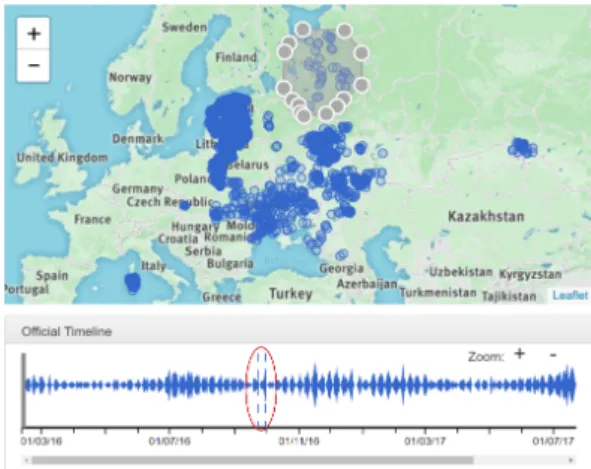
The lasso tool helped the expert in focusing on particular loca-tions independent of countries’ frontiers. The dates corresponding to the selected news item locations are highlighted with dashed lines in the streamgraph. Selecting a cluster of outbreaks in western Russia, and then observing their corresponding dates that show up in the streamgraph (Figure 7), suggest that those ASF outbreaks were not only related in space but also in time: indicating a likely epidemiological link between them.
For some countries, dates for both "actual disease outbreak" and o�cial "outbreak con�rmation" are available. For example,
c
a b
Figure 6: Distribution of African swine fever o�cial outbreaks and their hosts using a heatmap and an icon-map. The heatmap represents the outbreaks (a) from 2016/10/10 to 2017/01/20 and (b) from 2017/08/01 to 2017/10/05. The icon-map (c) compares ASF hosts during the whole studied period with wild boars in brown, and domestic pigs in pink
Figure 7: Streamgaph shows the highlighted dates for the selected locations in the icon-map using the lasso tool
comparing the data for Russia (Figure 8): with stream of disease outbreak in red and the stream of outbreak con�rmation in blue, suggests that a cluster of cases which occurred in mid September 2016 were reported almost three weeks later by o�cial sources.
Figure 8: Actual outbreak date stream (red) & noti�ca-tion/reporting date stream (blue) for ASF related news in Russia
5.2 Task 2: Analyzing di�erent data types
Some uno�cial news reports can contain data which is not speci�c to the relevant disease: ASF (i.e. information about other diseases / hosts / symptoms). For instance, almost 76.5 percent of the uno�cial reports had the combination of ASF and either domestic pigs or wild boars, which are the ASF speci�c hosts (Figure 9.a) and the rest 23.5% had mentions of other diseases and host combinations.
After evaluating the proportion of each combination of diseases, hosts and symptoms (Figure 9.b): it can be noticed that fever is the most common symptom associated with the ASF disease.
a b
Figure 9: (a) Example of disease–host combination in uno�-cial news source. (b) Example of disease-host-symptom com-binations in uno�cial news source
5.3 Task 3: Further insights from the source of
news articles
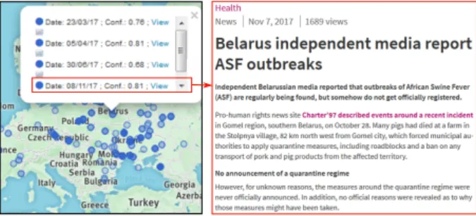
After observing the geographical distribution of uno�cial data around Belarus the expert clicked on the glyphs on the map to know further details. It was found that the content of articles were relevant to ASF and Belarus. In fact, two news articles were about the pork ban imposed by Belarus due to the ASF outbreaks in the bordering countries and one was about the creation of a pig breeding center. Another one was a relevant news report which referred to outbreaks not reported by o�cial sources (Figure 10).
VINCI ’18, August 13–15, 2018, Växjö, Sweden R. Goel et al.
Figure 10: Source article for the news item on the map
5.4 Concluding the case study
EpidNews proved to be of immense help in easily analyzing the spatio-temporal news data. The expert found it useful in locating potential clusters of cases with an epidemiological link which can be validated with statistical methods. The visualization also helped detect bias in the dataset: like the potential absence of o�cial noti-�cations in some areas. EpidNews is de�nitely an e�cient tool to analyze the epidemiological news along with the combination of three important indicators in animal epidemiology: diseases, hosts, and symptoms. It is also helpful in detecting geographical ambigui-ties and potential outbreaks which often go undetected by o�cial sources. Therefore, this tool should be used in the daily monitoring and analysis of both o�cial and uno�cial news sources, thereby reducing the manual work of the epidemic intelligence team.
The expert in her evaluation mentioned that colors can some-times be meaningful in the epidemiological context. For instance, domestic pigs are naturally associated with the color pink and wild boars with brown. However, currently the tool ignores these color associations and uses the most visibly distinctive colors. In fact, automatically assigning a speci�c color to a term is complex be-cause the choice partly relies on the sociocultural context [21]. This limitation can be addressed by allowing the user to select or change the color for terms himself but also ensuring distinctive colors. The expert also suggested to cluster the glyphs of the icon-map to prevent cluttering issues when zoomed out beyond a certain level.
6 CONCLUSION AND FUTURE WORK
In this paper, we presented EpidNews, a new visual analytics tool for spatio-temporal news data which can be used for monitoring animal diseases. It combines several views, namely: map, stream-graphs and sunburst that help the users to manage news data from multiple sources and aggregate this information on di�erent levels of abstraction. Thus, it allows the experts to easily analyze and track diseases outbreaks over di�erent geographic regions and time intervals. Moreover, EpidNews was tested by an expert in epidemi-ology and the resulting case study is presented in the last section of the paper, which highlights the bene�ts of the tool.
In future, we �rstly plan to address the two issues raised to-wards the end of Subsection 5.4. Secondly, our tool will be extended in order to cover other application domains as well, like environ-mental threats, etc. Eventually, we also aim to include other data representations and o�er a dynamic view for the spread of a disease.
ACKNOWLEDGMENTS
This work was supported by the Ministry of Higher Education and Scienti�c Research of Algeria and the SONGS project (FEDER and Occitanie). We thank all the expert teams & gatekeepers of this project.
REFERENCES
[1] Wolfgang Aigner, Silvia Miksch, Heidrun Schumann, and Christian Tominski. 2011. Visualization of time-oriented data. Springer Science & Business Media. [2] Elena Arsevska, Sylvan Falala, Jocelyn De Goer, Renaud Lancelot, Julien
Raba-tel, and Mathieu Roche. 2017. PADI-web: Platform for Automated Extraction of Animal Disease Information from the Web. In Proceedings of Language and Technology Conference. 241–245.
[3] Elena Arsevska, Mathieu Roche, Pascal Hendrikx, David Chavernac, Sylvain Falala, Renaud Lancelot, and Barbara Dufour. 2016. Identi�cation of terms for detecting early signals of emerging infectious disease outbreaks on the web. Computers and Electronics in Agriculture 123 (2016), 104–115.
[4] Lee Byron and Martin Wattenberg. 2008. Stacked Graphs - Geometry & Aesthetics. IEEE Transactions on Visualization and Computer Graphics 14, 6 (2008), 1245–1252. [5] Isaac Cho, Wewnen Dou, Derek Xiaoyu Wang, Eric Sauda, and William Ribarsky.
2016. VAiRoma: A visual analytics system for making sense of places, times, and events in roman history. IEEE Transactions on Visualization and Computer Graphics 22, 1 (2016), 210–219.
[6] Jihye Choi, Youngtae Cho, Eunyoung Shim, and Hyekyung Woo. 2016. Web-based infectious disease surveillance systems and public health perspectives: a systematic review. BMC Public Health 16, 1 (Dec. 2016).
[7] Filip Claes, Dmitry Kuznetsov, Robin Liechti, Sophie Von Dobschuetz, Bao Dinh Truong, Anne Gleizes, Daniele Conversa, Alessandro Colonna, Ettore De-maio, Sabina Ramazzotto, et al. 2014. The EMPRES-i genetic module: a novel tool linking epidemiological outbreak information and genetic characteristics of in�uenza viruses. Database 2014 (2014). https://doi.org/10.1093/database/bau008 [8] Kristin A Cook and James J Thomas. 2005. Illuminating the path: The research
and development agenda for visual analytics. IEEE Computer Society Press. [9] José Cortiñas Abrahantes, Andrey Gogin, Jane Richardson, and Andrea
Gervelmeyer. 2017. Epidemiological analyses on African swine fever in the Baltic countries and Poland. EFSA Journal 15, 3 (2017), 1–73.
[10] Cody Dunne, Michael Muller, Nicola Perra, and Mauro Martino. 2015. VoroGraph: Visualization Tools for Epidemic Analysis. In Proceedings of Human Factors in Computing Systems. Association for Computing Machinery, 255–258. [11] Nivan Ferreira, Jorge Poco, Huy T Vo, Juliana Freire, and Cláudio T Silva. 2013.
Visual exploration of big spatio-temporal urban data: a study of new york city taxi trips. IEEE Transactions on Visualization and Computer Graphics 19, 12 (2013), 2149–2158.
[12] Clark Freifeld, Kenneth Mandl, Ben Reis, and John Brownstein. 2008. HealthMap: global infectious disease monitoring through automated classi�cation and visu-alization of Internet media reports. Journal of Medical Informatics Association 15, 2 (2008), 150–157.
[13] Dongning Luo, Jing Yang, Milos Krstajic, William Ribarsky, and Daniel Keim. 2012. Eventriver: Visually exploring text collections with temporal references. IEEE Transactions on Visualization and Computer Graphics 18, 1 (2012), 93–105. [14] Richard O’Donnell, Alan Dix, and Linden J Ball. 2007. Exploring the pietree for
representing numerical hierarchical data. In People and Computers XX—Engage. Springer, 239–254.
[15] Donna J Peuquet. 1994. It’s about time: A conceptual framework for the repre-sentation of temporal dynamics in geographic information systems. Annals of the Association of American Geographers 84, 3 (1994), 441–461.
[16] Hans Rosling and Zhongxing Zhang. 2011. Health advocacy with Gapminder animated statistics. Journal of epidemiology and global health 1, 1 (2011), 11–14. [17] Guodao Sun, Ronghua Liang, Huamin Qu, and Yingcai Wu. 2017. Embedding
spatio-temporal information into maps by route-zooming. IEEE Transactions on Visualization and Computer Graphics 23, 5 (2017), 1506–1519.
[18] Wouter Van den Broeck, Corrado Gioannini, Bruno Gonçalves, Marco Quaggiotto, Vittoria Colizza, and Alessandro Vespignani. 2011. The GLEaMviz computational tool, a publicly available software to explore realistic epidemic spreading scenar-ios at the global scale. BioMed Central infectious diseases 11, 1 (2011), 37. [19] Edward Velasco, Tumacha Agheneza, Kerstin Denecke, Goeran Kirchner, and
Tim Eckmanns. 2014. Social media and Internet-Based data in global systems for public health surveillance: A systematic review. The Milbank Quarterly 92, 1 (2014), 7–33.
[20] Matthew Ward, Georges Grinstein, and Daniel Keim. 2010. Interactive data visualization: foundations, techniques, and applications. A K Peters.
[21] Colin Ware. 2000. Information Visualization: Perception for Design. Morgan Kaufmann Publishers Inc., San Francisco, CA, USA.

![Figure 1 presents an overview of the tool. A map (Figure 1.a) shows spatial information [R1] and the two streamgraphs below it (Figure 1.b) visualize the temporal information [R2]](https://thumb-eu.123doks.com/thumbv2/123doknet/14006958.456282/5.892.463.804.403.647/figure-presents-overview-information-streamgraphs-visualize-temporal-information.webp)