HAL Id: hal-00297444
https://hal.archives-ouvertes.fr/hal-00297444
Submitted on 1 Nov 2007
HAL is a multi-disciplinary open access
archive for the deposit and dissemination of
sci-entific research documents, whether they are
pub-lished or not. The documents may come from
teaching and research institutions in France or
abroad, or from public or private research centers.
L’archive ouverte pluridisciplinaire HAL, est
destinée au dépôt et à la diffusion de documents
scientifiques de niveau recherche, publiés ou non,
émanant des établissements d’enseignement et de
recherche français ou étrangers, des laboratoires
publics ou privés.
Somewhere over the rainbow ? advantages and pitfalls of
colourful visualizations in geosciences
A. Spekat, F. Kreienkamp
To cite this version:
A. Spekat, F. Kreienkamp. Somewhere over the rainbow ? advantages and pitfalls of colourful
visual-izations in geosciences. Advances in Science and Research, Copernicus Publications, 2007, 1, pp.15-21.
�hal-00297444�
www.adv-sci-res.net/1/15/2007/
©Author(s) 2007. This work is licensed under a Creative Commons License.
Science and
Research
Somewhere over the rainbow – advantages and pitfalls of
colourful visualizations in geosciences
A. Spekat and F. Kreienkamp
Climate & Environment Consulting Potsdam GmbH, Potsdam, Germany
Received: 22 March 2007 – Revised: 17 October 2007 – Accepted: 18 October 2007 – Published: 1 November 2007
Abstract. Computer-generated visualizations of geoscientific data, such as those from climate models are in high demand for a wide variety of usages; these include, among others, scientific publications, reports and graphical aides for the general public’s improved understanding of complex developments. The paper will focus on the effects of colours in two-dimensional displays. Practical examples are given from which it becomes clear that considerable confusion or even damage can arise from an uninformed use of colour mapping and if results become, e.g., published in an unchecked manner by the media.
1 Introduction
This text is somewhat different from the usual works that grace the pages of scientific journals. Submitting a paper on the matter of colour use and the dangers of colour misuse to the Session on Information Systems in Climatology at the 6th EMS Annual Meeting was stimulated by practical pro-fessional experience of the authors who are climate scientists happening to work for a consulting company and who deal, among other tasks, with science communication.
So, with respect to this text, novelty of results should be addressed in a wider context and the examples given in this text should be treated as reminders with respect to good vs. questionable professional practice. By no means will there be a comprehensive literature survey on the topic, although it is worthwhile recommending works by Horton (1991), Williams (2003) and Wong (1997) as well as the website http: //colorusage.arc.nasa.gov and, of course, Wikipedia as van-tage points for a further investigation of colour-related topics. Colour issues in cartography are in great wealth discussed, e.g., in Dent (1999) and in Slocum (1999). Practical applica-tions can be found, e.g., in Brewer (1999, 2005) or in Brewer et al. (2003). There is an interactive colour design tool for cartography: ColorBrewer at http://www.colorbrewer.org. A thorough review of literature on colour and its use in graphic communication can be found in Gardner (2005).
The source of the data used in this paper is of reduced relevance to the core aspect of this paper, which is the inter-face of geosciences and colour design. It should, however, Correspondence to: A. Spekat
be mentioned that the authors will demonstrate the effects of colour coding on results produced by climate data from the statistical downscaling method WETTREG which is em-ployed for climate scenarios (Spekat et al., 2007). The pa-per will focus on the effects of colours in two-dimensional displays. It will briefly touch upon the feasibility of colour usage in communication, including remarks on the psychol-ogy of colour perception (Sect. 2), followed by a brief de-scription of the visualization background and a summary of practical aspects of colour usage in scientific work (Sect. 3). The colour palettes and mapping schemes used in this study are presented in Sects. 4 and 5 shows practical examples of colour usage as well as the potential to tamper with the visual appearance by modifications to the colour mapping.
2 Colours in communication
Even though the medium of choice for dissemination of scientific facts in printed form may be monochrome, e.g. grayscale, partly due to financial reasons, colour can add a powerful dimension to the understandability, liveliness and aesthetics of a scientific communication. Information sys-tems are frequently produced in the form of electronic media, viewed on display screens wherefore the financial constraints are in such cases negligible. However, a balance between the seriousness of a publication and the potential enhancement of results by the usage of colours needs to be found and in the case of scientific publications it needs to be on the more conservative side, bearing a less is more attitude.
Once the decision for colour has been made, an important factor is the colour choice. It should be consistent and aim
16 A. Spekat and F. Kreienkamp: Colour in visualizations
Figure 1. Gamut display of the total range of perceivable colours (grey semi-ellipse) and the excerpt which can be shown on a com-puter screen (triangular inset). The units of the x- and y-axes are relative amounts of the primary colours. A true red would have the coordinates x=1 and y=0, a true green would be found at x=0 and y=1 and true blue would be at the origin of the coordinate system. After Wyszecki and Stiles (1982).
at an optimization of visual contrast and intercomparability of results. No small importance lies within the psychologi-cal aspects of colour choice. Being exposed to the occiden-tal system of values and associations one tends to overlook that in other civilizations colours may have strikingly differ-ent impacts (Williams, 2003). Red, for example, which we associate with danger has no distinct association in Arabian countries and relates to joy and festive occasions in China. Yellow, a colour that evokes an undercurrent of caution, even cowardice in the occidental culture, stands for grace, nobility and honour in China or Japan and for happiness and pros-perity in Arabia. Green, which we link to safety, as well as to sourness, evokes images of future, youth and energy in Japan and images of fertility and strength in Arabia. White and black in the context of death and mourning are at exact opposite between the occidental and the Asian culture.
3 Colours in practical scientific work
As much as empirical knowledge, experience and individual preferences are useful and often constitute considerable skill, it is necessary to highlight some background aspects. Studies
like Brewer (1999) and MacEachren and Taylor (1994) de-scribe that a geographical map is “locking” two dimensions, namely the x- and y-axis for the localization of longitude and latitude. This leaves one dimension or available degree of freedom: The way in which the points at those x- and y-coordinates are mapped onto coding schemes. The schemes themselves can be the choice and appearance of symbols, e.g. weather icons; furthermore, this coding can be realized by way of colour choice. There are three “flavours” to colour: (i) Hue, i.e., the spectral wavelength, (ii) lightness, i.e., the amount of light reflected from a coloured surface, relative to pure white - a highly relevant property for maps, and (iii) saturation, i.e., the purity or intensity of a colour.
Basically, the mapping process can be designed to lead to four different kind of schemes: (i) Binary, e.g., being above or below a threshold, (ii) categorial, e.g., belonging to dis-tinct classes, (iii) sequential, e.g., assignment of properties to a value range and (iv) diverging, e.g. including two distinct ends and a crucial mid-point. In the application described in Sects. 4 and 5, the instance (i) is not used. Instance (ii) is not used either, although it could be envisaged for use in studies comparing different models, e.g., assigning colour A when model 1 yields the highest temprature, colour B if this is the case for model 2 et cetera. The requirements for in-stance (iii) are given, although it should be noted that this is an ideal - even a seemingly continuous property is mapped onto, at most, 256 values. The feasibility of a further reduc-tion will be shown in Sect. 5.2. A diverging scheme which employs three “anchor colours”, e.g., colour A to an increase and colour C to a decrease and interpolates from both sides to a colour B which marks invariability, is used as well.
There are perceptional drawbacks if the coloured area is not large enough, e.g. in thin lines or small-size symbols. Due to the nonlinearity in our colour perception there are also limitations concerning the ability to discern colours of the same hue but of different saturations. Moreover, this lim-itation applies differently to different colours. Figure 1 shows the colour gamut, which is the range of colours potentially recognizable to the human eye. If an output medium (print-out or screen) is to be invoked, the number of discernable colours is greatly reduced, as the triangular inset in Fig. 1 shows. This should be kept in mind as a further limiting fac-tor for the possible colour range in graphic displays.
It should be mentioned that graphical displays are mix-ing the colours additively. The fundamentals are red, green and blue and if they are jointly applied at maximum inten-sity, they should produce white. As an aside: If each of the three colours are mixed at 50% of their maximum intensity the human eye only perceives this intensity as 20% of the highest possible amount which leads to complex adjustments and colour corrections for a view screen. If colour is printed on a medium, a completely different principle must be ap-plied, since a combination of fundamental ink colours must be found that adds to black, which is done with cyan, ma-genta and yellow - adding black to the mix is a practical side
(a) (b)
(c)
Figure 2. Three views of the same state. Shown is the annual mean temperature distribution in Saxonia applying different colour schemes. (a) Green/yellow/red; (b) blue/yellow/red and (c) yel-low/red. The colours in each subfigure are assigned so that they cover a value range from +3 to +10◦C.
effect of saving on ink amount when it comes to the repro-duction of dark tones.
4 Colour schemes used in this investigation
In order to emphasize the principles described in Sects. 2 and 3 as well as to supply users of an analysis software with a clearcut set of choices, a few colour schemes were prede-fined. In the nomenclature of Sect. 3 these are either se-quential, using two “anchor colours” or they are diverging schemes using three “anchor colours”. A one-hue sequen-tial scheme (e.g., light green to dark green) appeared im-practical since there are limitations with respect to the res-olution of a sufficient number of intermediate steps. Thus a hue-transition sequential scheme using yellow/red or yel-low/green was predefined. As to diverging schemes which involve three colours: It is most important to have a bright, signalling, colour in the center and thus blue/yellow/red, red/yellow/green and blue/white/red (and their inversions) are predefined.
It should be added that the use of pure colours, like a red that is defined in the Red-Green-Blue colourspace by 255,0,0 (in alternative colour models: 0,100,100 or 0,50,100) leads to limitations in the screen display con-trast. Therefore a darkening, e.g., to 153,0,0 (ruby red which is 0,100,60 or 0,30,100) is recommended. Like-wise the pure blue, defined by 0,0,255 (240,100,100
(a) (b)
(c)
Figure 3. As in Fig. 2, but for the summer precipitation. The colours are mapped onto a value range of 100 to 300 mm.
or 240,50,100) is too light and therefore a darkening to 0,0,102 (navy blue, 240,100,40 or 240,20,100) is recommended. For green, a striking contrast enhancement can be achieved by changing 0,255,0 (120,100,100 or 120,50,100) to 0,102,51 (forest green, 150,100,40 or 150,20,100). These modifications have been used in the colour ranges throughout this paper. In the aspect of in-tensifying the “color anchors” of the schemes they stray away slightly from colour schemes devised primarily for the map-ping of geographical or census data, as shown in Brewer et al. (2003) or Brewer (2005).
Apart from the cultural assignment of the colours dis-cussed in Sect. 2 there are some obvious choices when it comes to displaying atmospheric properties. The association is clearest when it comes to temperature: If one is to focus on above- vs. below-normal values and thus employing a di-verging scheme, blue implies relatively low and red relatively high temperature. Yellow, in this context, may stand for nor-mal values. If one is, however, to focus on a sequential pro-gression, yellow may be representing lower values and red higher values. The preconceived associations are less clear when it comes to precipitation: Red can with some sincerity be linked to dry conditions, but wet conditions can be just as well displayed in blue or green. With other atmospheric parameters such as wind or cloudiness there is only a faint to imperceivable psychological link between distinct conditions and distinct colours.
18 A. Spekat and F. Kreienkamp: Colour in visualizations
(a)
(b) (c)
Figure 4.Schematic of the colour mapping (a) and resulting maps
(b) and (c) for the summer precipitation in Saxonia using a
three-part colour scheme placed symmetrically around the value zero and extending to the maximum value. Subfigure (b) was produced using a quasi-continuous colour transition (256 steps) and subfigure (c) is based on a nine-part discrete colour assignment which is also depicted above the axis in (a).
5 Application of colour
5.1 The effect of colour choice
In Figs. 2 and 3, the attempt is undertaken to show what im-pressions and associations are produced by different colour schemes, deliberately straying away from the principles set up in Sects. 3 and 4. There may be a tendency towards a way of colour-coding temperature or precipitation acceptable by professional standards; nevertheless, it cannot be over-looked that the psychological undercurrent lends an element of subjectivity and even manipulation to the perception of the graphs, from almost soothing to highly alert, according to their “colour world”, particularly in Fig. 2. It should be kept in mind (cf. Sect. 2) that this must be seen against the cultural background and that the same coding evokes much different emotions in other cultures.
The display of precipitation amounts shows an additional effect: Whereas low values stand out in red/yellow/green and the blue/yellow/red scheme, since they are assigned a dark colour, these comparably dry areas appear of lesser impor-tance when the yellow/red scheme is applied.
5.2 The choice of the colour range
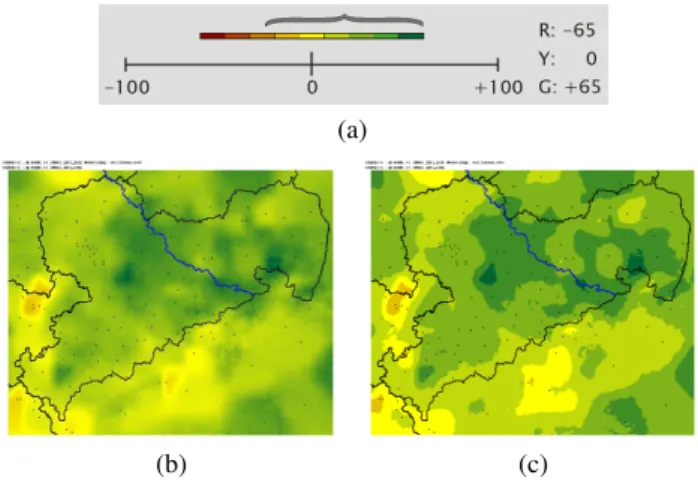
In this and the following sections the point is made that the selection of a proper colour range is of even higher impor-tance than the choice of a colour scheme, since it bears the potential to produce misleading or manipulating results. To emphasize this particularity, a graphical representation had been designed (see, e.g., Fig. 4a). It shows the value range of
the data to be displayed (gray bracket) as well as colour range assigned, or mapped, to these values (colour bar). Moving, stretching or compressing the colour mapping leads to nu-merous and wide ranging consequences (see Sect. 5.3). The property with which this is demonstrated is the precipitation difference between two time periods, assuming a potential value range of −100 to +100%. For comparability’s sake the colour scheme has been kept constant (red/yellow/green) and for additional information purposes the data values which are assigned to the colours red, yellow and green are displayed on the right hand side of the axis.
It should be mentioned that assigning the proper colour range is an optimization process which weighs the widest possible value range that can be captured by the colour scheme, possible symmetry requirements if a divergent scheme with a center colour is involved, and intercompara-bility if maps are to be evaluated in context with others. Fur-thermore, according to Tveito (2006, personal communica-tion), the level of confidence in the data should reflect in the “colour resolution” of the graphics – if the model produces results with an accuracy of 10% there would be no point in applying a colour mapping with, e.g., 256 different shades. Consequently, colour areas or colour bands, in which a cer-tain range of values is mapped onto the same colour are rec-ommended to be used instead of a continuous, or very fine, colour resolution which might give this misleading impres-sion of an exactness not really present in the data. The effect of continuous vs. discrete colour scheme is shown in Fig. 4b and c. It should be kept in mind that the sole information that went into the maps was (i) data at the location of irreg-ularly stations (black dots) which was interpolated into the area in between and (ii) terrain elevation information which was used to correct the data for height dependence. There-fore, the very fine structures in Fig. 4b are to large extents the side effects of interpolation processes, loosely controlled by the “ground truth” of the data at the stations’ locations. Con-sequently, Fig. 4c, coarse though it may appear, is a more realistic representation with a desirable reduction of artificial detail. A further side effect is that a number of ∼10 discrete colours makes them well discernible. Brewer et al. (2003) ac-knowledge this fact by not even attempting to design colour schemes with more than ten parts.
As a first order approach to mapping data onto a colour scheme the data range should match the colour range so that a maximum of distinction between the values can be achieved. In practice, e.g. when dealing with data above and below a threshold, some adjustments to that approach need to be made: If a diverging colour scheme, including a bright center colour (e.g., yellow or white), is used that cen-ter colour should be assigned to the data value zero. Fur-thermore, if comparisons are made, e.g., between the be-haviour of the atmospheric property in different seasons or regions a joint set of maximum and minimum values should be identified beforehand. Thus the value interval is symmet-rical and centered around zero. Figure 4 displays the colour
(a)
(b)
Figure 5.Schematic of the colour mapping (a) and resulting map
(b) for the summer precipitation in Saxonia using a three-part colour
scheme placed symmetrically around the value zero and which ex-tends beyond the actual value range.
mapping schematic, centered around zero and covering the value range between −65 and +65% (Fig. 4a) as well as the resulting two-dimensional distribution for the summer pre-cipitation anomaly in Saxonia (Fig. 4c).
5.3 Effects of different colour mappings
The first modification applied to the “reasonable” mapping (which is given in Fig. 4) is a stretching of the colour bar so that the symmetry with respect to zero is kept but the range is extended to cover the interval between −100 (red) and +100% (green). The schematic is given in Fig. 5a. Clearly, the true value range, indicated by the gray bracket is highly misrepresented after this manipulation. Figure 5b shows the resulting map in which, consequently, several colours do not appear anymore. This lightening of the overall tone of the map (mis)leads the viewer to the impression that the differ-ences within the map are rather small. Nevertheless, the point must be made that it is often necessary to chose a colour range in individual figures that is not congruent with the data range. This may, e.g., be necessary to ensure the compara-bility of different data sets or seasons in the form of a joint colour scale (cf. Figs. 8 and 9). Another reason may be that an asymmetrical value interval around zero is to be graphed. Since the (neutral) central colour is recommended to denote zero values, parts of the colour range are not used, as it is shown in Fig. 5.
The exact opposite effect is achieved when the mapping of the value range is diminished, as the schematic in Fig. 6a shows. There, again, symmetry around zero is retained but the interval is transformed to be between −40 (red) and +40% (green). As the gray bracket indicates, there are values
(a)
(b)
Figure 6.As in Fig. 5 but showing the effect of a zero-centered, yet compressed colour range.
(a)
(b)
Figure 7. As in Fig. 5 but showing the effect of a colour range which is mapped exactly onto the data range and in this case conse-quently shifted towards the higher values.
of the precipitation anomaly between +40 and +65% which do not have a colour counterpart anymore.
The visual effect of that manipulation is shown in Fig. 6b: Due to the overrepresentation of dark green shades the dif-ferences which are present in the data appear exaggerated. What happens if the data range and colour range are pre-cisely mapped onto each other? At first glance this appears as the optimum solution, but in fact it has its drawbacks. Fig-ure 7a shows the schematic of that modification. One conse-quence is that the bright “center colour” is not representing zero anymore. Due to the shift it marks a value of +20%. The second consequence reveals itself when the related map is produced (Fig. 7b). Owing to the fact that zero is not rep-resented by yellow anymore, a false colour representation of the precipitation anomaly field appears in which areas at the lower end of the value range stand out rather clearly in red.
20 A. Spekat and F. Kreienkamp: Colour in visualizations
(a) (b)
(c) (d)
(e) Scale for (a)
(f) Scale for (b)
(g) Scale for (c)
(h) Scale for (d)
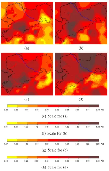
Figure 8. Temperature difference between 2071–2100 and 2001– 2030 in Saxonia in spring (a), summer (b), autumn (c) and winter
(d). For each subfigure the colour range was mapped exactly onto
the data range.
Thus, applying this mapping results in another exaggerated representation of the field.
Lastly, it should be pointed out what consequences there are when maps are arranged for comparative viewing and in each the value range exactly matches the colour range. Fig-ure 8 shows this exercise for the temperatFig-ure anomalies in the four seasons. Owing to the fact that in each season the value range is different (spring: 0.66 to 0.94; summer: 1.19 to 1.94; autumn: 1.57 to 2.08 and winter: 3.14 to 3.83), the maps are highly misleading, or at least unnecessarily difficult to inter-pret since the same colours represent different temperature anomalies.
A remedy is the adjustment of the colour mapping to a joint scale, e.g. 0.5 to 4.0, as Fig. 9 shows. There, the striking differences between the value ranges in the four seasons are immediately visible. Moreover, the wealth of detail in Fig. 8 which is giving off an exaggerated impression of accuracy, prone to overinterpretation, is rectified in Fig. 9 as well.
(a) (b)
(c) (d)
(e) Joint scale
Figure 9.As in Fig. 8, but with a joint scale of 0.5 to 4◦C, given in (e).
6 Conclusions
Even though colour coding appears to be a straightforward process it requires foresight and basic knowledge about the subjective impressions as well as the objective pitfalls of ap-plying colour. Before producing maps a few matters need to be clarified. The following flow chart shows a number of sequential stages with occasional branching to accommodate special cases:
1. Are the data in categories? ⇒ It would be necessary to assign as many colours as there are categories and no further mapping would need to be applied.
2. Are the data sequentially passing from value X to value Y? ⇒ The assignment of a sequential mapping would be necessary.
(a) If temperature is to be graphed the psychological associations need to be considered; the recommen-dation is to use a two-colour sequential mapping from yellow (cold) to red (warm).
(b) If precipitation is to be graphed, the two-colour sequential mapping running from yellow (low) to green (high) is recommended.
(c) For other atmospheric properties the user is at lib-erty to choose any two-colour scheme; yellow-red emphasizes contrast and yellow-green emphasizes fine shades.
3. Are the data sequentially passing from value X to value Z with a crucial midway point Y? ⇒ A diverg-ing scheme would need to be assigned. Care should be given to placing the mapping range symmetrically around Y, i.e., if |X| > |Z| from − |X| to |X| and if |Z| > |X| from − |Z| to + |Z|. There is a recommenda-tion for a temperature mapping scheme: X blue – Z red; a signal colour (yellow or white) at the midway point for Y. If precipitation is to be displayed this mapping scheme is recommended: X red – Y yellow or white – Z green.
4. Sequential mappings are recommended to be in discrete steps. Furthermore, their number is recommended not to exceed nine for the following reasons:
(a) It should reflect the level of exactness in the data; thus, e.g., a continuous colour transition is giving off a false impression of precision.
(b) The colours in the scale should be sufficiently well discernible.
(c) It should be an odd number of classes so that a “sig-nal colour” could be placed in its center.
5. If maps are compared, a joint value range for the map-ping needs to be identified, even though this might mean that, for individual graphs, not the full colour range is mapped to the data.
6. For higher contrasts in screen displays it is recom-mended to modify the “poles” of the colour schemes from pure colours towards their darker variants. If exceptions from the reasonable practice, as shown in this paper, are made then they must be clearly stated as to minimize confusion and support understandability.
Acknowledgements. This text is dedicated to the late I. Dyras (IMGW, Cracow), whose good spirit and encouragement led to its development. Further thanks go out to a known and two unknown reviewers for truly thoughtful comments as well as to colleagues M. Dolinar, O. E. Tveito and F. van der Wel from COST Action 719 which is about GIS in Meteorology – there is a great deal of contextual overlap between GISs and the proper usage of colours. Edited by: M. Dolinar and I. Dyras†
Reviewed by: M. Perˇcec-Tadiˇc and two other anonymous referees
References
Brewer, C.: Color Use Guidelines for Data Representation. Pro-ceedings of the Section on Statistical Graphics, American Statis-tical Association, Alexandria, VA, 55–60, 1999.
Brewer, C.: Design Better Maps: A Guide for GIS Users, ESRI Press. ISBN 1589480899, 2005.
Brewer, C., Hatchard, G. W., and Harrower, M. A.: ColorBrewer in Print: A Catalog of Color Schemes for Maps, Cartography and Geographic Information Science, 30, 5–32, 2003.
Dent, B. D.: Cartography: Thematic Map Design, McGraw Hill, New York, 1999.
Gardner, S. D.: Evaluation of the ColorBrewer Color Schemes for Accommodation of Map Readers with Impaired Color Vision, Thesis in Geography, Pennsylvania State University, College of Earth and Mineral Sciences, Graduate School, 2005.
Horton, W.: Overcoming chromophobia: A Guide to the confident and appropriate use of color, IEEE T. Prof. Commun., 34, 160– 171, 1991.
MacEachren, A. M. and Taylor,D. R. F. (Eds.): Visualizations in Modern Cartography, Elsevier Science, Tarrytown, NY, 1994. Slocum, T. A.: Thematic Cartography and Visualization,
Prentice-Hill, New Jersey, 1999.
Spekat, A., Enke, W., Kreienkamp, F.: Neuentwicklung von regional hoch aufgel¨osten Wetterlagen f¨ur Deutschland und Bereitstellung regionaler Klimaszenarios auf der Basis von globalen Klimasimulationen mit dem Regionalisierungsmod-ell WETTREG auf der Basis von globalen Klimasimulatio-nen mit ECHAM5/MPI-OM T63L31 2010 bis 2100 f¨ur die SRES-Szenarios B1, A1B und A2, Final Report, Umweltbun-desamt, Dessau, Germany, www.umweltdaten.de/publikationen/ fpdf-l/3133.pdf (in German), 2007.
Williams, R.: The Non-designer’s Design Book. Design and typo-graphic principles for the visual novice, 2nd updated printing, Addison-Wesley, 2003.
Wong, W.: Principles of Colour Design, Wiley Press, 1997. Wyszecki, G. and Stiles, W. S.: Color science: Concepts and
meth-ods, quantitative data and formulae, 2nd ed. John Wiley & Sons, 1982.