HAL Id: hal-00603638
https://hal.archives-ouvertes.fr/hal-00603638v2
Submitted on 20 Oct 2012
HAL is a multi-disciplinary open access
archive for the deposit and dissemination of
sci-entific research documents, whether they are
pub-lished or not. The documents may come from
teaching and research institutions in France or
abroad, or from public or private research centers.
L’archive ouverte pluridisciplinaire HAL, est
destinée au dépôt et à la diffusion de documents
scientifiques de niveau recherche, publiés ou non,
émanant des établissements d’enseignement et de
recherche français ou étrangers, des laboratoires
publics ou privés.
Visual Mining of Epidemic Networks
Stéphan Clémençon, Hector de Arazoza, Fabrice Rossi, Viet Chi Tran
To cite this version:
Stéphan Clémençon, Hector de Arazoza, Fabrice Rossi, Viet Chi Tran. Visual Mining of Epidemic
Networks. International Work Conference on Artificial Neural Networks, Jun 2011, Torremolinos,
Spain. pp.276-283, �10.1007/978-3-642-21498-1_35�. �hal-00603638v2�
Visual Mining of Epidemic Networks
St´ephan Cl´emen¸con1?, Hector De Arazoza2,3, Fabrice Rossi1, and Viet-Chi Tran3
1 Institut T´el´ecom, T´el´ecom ParisTech, LTCI - UMR CNRS 5141
46, rue Barrault, 75013 Paris – France
2
Facultad de Matem´atica y Computaci´on, Universidad de la Habana, La Habana, Cuba
3
Laboratoire Paul Painlev´e UMR CNRS No. 8524, Universit´e Lille 1, 59 655 Villeneuve d’Ascq Cedex, France
[email protected], [email protected], [email protected], [email protected]
Abstract. We show how an interactive graph visualization method based on maximal modularity clustering can be used to explore a large epidemic network. The visual representation is used to display statistical tests results that expose the relations between the propagation of HIV in a sexual contact network and the sexual orientation of the patients.
1
Introduction
Large graphs and networks are natural mathematical models of interacting objects such as computers on the Internet or articles in citation networks. Numerous examples can be found in the biomedical context from metabolic pathways and gene regulatory networks to neural networks [10]. The present work is dedicated to one type of such biomedical network, namely epidemic networks [7]: such a network models the transmission of a directly transmitted infectious disease by recording individuals and their contacts, other individuals to whom they can pass infection.
Understanding the dynamic of the transmission of diseases on real world networks can lead to major improvements in public health by enabling effective disease control thanks to better information about risky behavior, targeted vaccination campaigns, etc. While transmissions can be studied on artificial networks, e.g., some specific types of random networks [7], such networks fail to exhibit all the characteristics observed in real social networks (see e.g.[10]). It is therefore important to get access to and to analyze large and complex real world epidemic networks. As pointed out in [7], the actual definition of the social network on which the propagation takes place is difficult, especially for airborne pathogens, as the probability of disease transmission depends strongly on the type of interaction between persons. This explains partially why sexually transmitted diseases (STD) epidemic networks have been studied more frequently than other networks [7, 9].
?This work was supported by the French Agency for Research under grant ANR
We study in this paper a large HIV epidemic network that has some unique characteristics: it records almost 5400 HIV/AIDS cases in Cuba from 1986 to 2004; roughly 2400 persons fall into a single connected component of the infection network. STD networks studied in the literature are generally smaller and/or do not exhibit such a large connected component and/or contain a very small number of infected persons. For instance, the Manitoba study (in Canada, [15]) covers 4544 individuals with some STD, but the largest connected component covers only 82 persons. The older Colorado Springs study [13] covers around 2200 persons among which 965 falls in connected component (the full network is larger but mixes sexual contacts and social ones; additionally, the sexual networks contains only a very small number of HIV positive persons).
While the large size and coverage of the studied network is promising, it has also a main negative consequence: manual analysis and direct visual exploration, as done in e.g. [9], is not possible. We propose therefore to analyze the network with state-of-the-art graph visualization methods [3].
We first describe the epidemic network in Section 2 and give an example of the limited possibilities of macroscopic analysis on this dataset. Then Section 3 recalls briefly the visual mining technique introduced in [3] and shows how it leads to the discovery of two non obvious sub-networks with distinctive features.
2
Cuban HIV/AIDS Database
The present work studies an anonymized national dataset which lists 5389 Cuban residents with HIV/AIDS, detected between 1986 and 2004. Each patient is described by several variables including gender, sexual orientation, age at HIV/AIDS detection, etc. (see [1] for details.)
2.1 Data collection
The Cuban HIV/AIDS program produces this global monitoring using several sources that range from systematic testing of pregnant women and all blood donations to general practitioner testing recommendations. In addition, the program conducts an extended form of infection tracing that leads to the epidemic network studied in this work.
Indeed, each new infected patient is interviewed by health workers and invited to list his/her sexual partners from the last two years. The primary use of this approach is to discover potentially infected persons and to offer them HIV testing. An indirect result is the construction of a network of infected patients. Sexual partnerships are indeed recorded in the database for all infected persons. Additionally, a probable infection date and a transmission direction are inferred from other medical information, leading to a partially oriented infection network. While this methodology is not contact tracing stricto sensu as non infected patients are not included in the database (contrarily to e.g. [13]), the program records the total number of sexual partners declared for the two years period as well as a few other details, leading to an extended form of infection tracing. (see [7] for differences between contact and infection tracing.)
2.2 Macroscopic analysis
The 5389 patients are linked by 4073 declared sexual relations among which 2287 are oriented by transmission direction. A significant fraction of the patients (44 %) belong to a giant connected component with 2386 members. The rest of the patients are either isolated (1627 cases) or members of very small components (the second largest connected component contains only 17 members).
As the sexual behavior has a strong influence on HIV transmission, it seems important to study the relations between the network structure and sexual orientation of the patients. In the database, female HIV/AIDS patients are all considered to be heterosexual as almost no HIV transmission between female has been confirmed [8]. Male patients are categorized into heterosexual man and “Man having sex with Men” (MSM); the latter being men with at least one male
sexual partner identified during their interview.
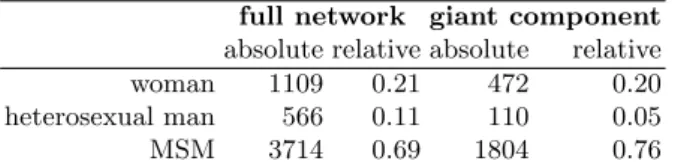
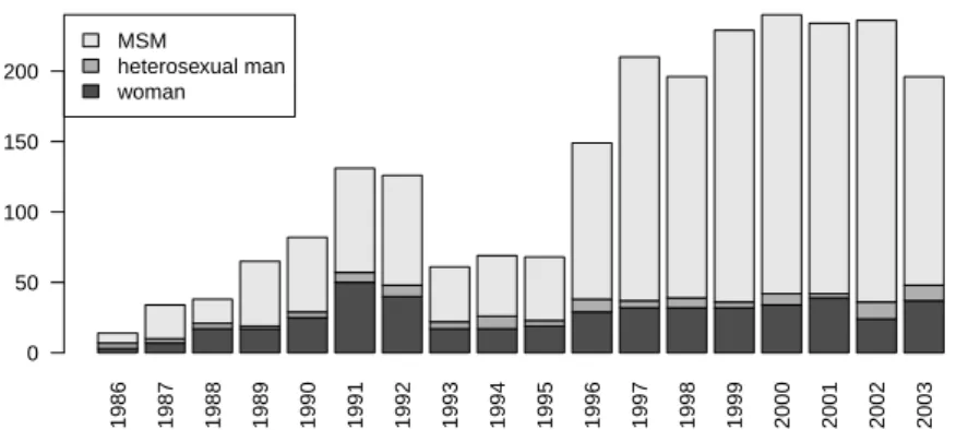
The distributions of genders and of sexual orientations is given in Table 1: the giant component contains proportionally more MSM than the full population; this seems logical because of the higher probability of HIV transmission between men [14]. Additionally, as shown on Figure 1, the sexual orientation of the newly
full network giant component absolute relative absolute relative woman 1109 0.21 472 0.20 heterosexual man 566 0.11 110 0.05 MSM 3714 0.69 1804 0.76
Table 1: Gender and sexual orientation distributions in the whole network and in the giant component
detected patients changes through years (note that year 2004 is incomplete and therefore has not been included in this analysis): the percentage of heterosexual men seems to decrease. This is also the case for women, but to a lesser extent.
However, the evolution of the percentage of MSM through time is difficult to analyze at a macroscopic level. For instance, multiple explanations can be offered to explain the influence of the sexual orientation of the patients on their average shortest path distances in the graph (see Table 2). One the one hand, temporal
MSM heterosexual man woman MSM 10.30 10.83 10.24 heterosexual man 10.83 9.87 9.30 woman 10.24 9.30 8.76
Table 2: Average shortest path distances in the giant component of the infection network, conditioned by the sexual orientation of the extremal points (the global average is 10.24)
1986 1987 1988 1989 1990 1991 1992 1993 1994 1995 1996 1997 1998 1999 2000 2001 2002 2003 MSM heterosexual man woman 0 50 100 150 200
Fig. 1: Yearly sexual orientation distribution in the giant component
a short time span. Then one might expect short paths between heterosexual men as they should be concentrated in the early phase of the epidemic and long chains should be rare. However, on the other hand, heterosexual men could also be linked to the network mostly through women. Then their relative short distances could be explained via the relative short distances between women themselves and the time aspect would play no role in the observed distances.
3
Visual Mining
Because of the size of the giant component, a direct visual analysis is impossible and the interplay between sexual orientation and infection is difficult to analyze. We show in this section how the difficulty can be circumvented by combining clustered graph visualization techniques [4] with efficient maximal modularity graph clustering [12], as proposed in [3]. The methodology introduced here can be used to analyze the relation between other quantities and the infection structure.
3.1 Methodology
This section briefly explains the graph visualization method used to analyze the infection network. Details can be found in [3].
The classical strategy used to display a large network (e.g., with more than a hundred nodes) is to coarsen the network via a clustering method, leading to the so-called clustered graph visualization problem [4]. To implement this strategy, we use a maximal modularity graph clustering approach [12], as maximizing the modularity leads in general to meaningful clusters [5] which are additionally well adapted to visualization [11]. Then rather than displaying the original network, we use the standard Fruchterman Reingold algorithm [6] to display the network of clusters. Figure 2 gives concrete examples of the results: in the present context, each cluster consists of a group of patients linked by sexual relationships (the size of the group is represented by the surface of the disk used in the figures). Two
groups are linked in the display when there is at least one sexual partnership between patients of the two groups. The thickness of the link encodes the number of between group sexual contacts.
P−values > 5e−05 > 1e−04 > 5e−04 > 0.001 > 0.005 > 0.01 > 0.05
(a) Best clustering
P−values > 5e−05 > 1e−04 > 5e−04 > 0.001 > 0.005 > 0.01 > 0.05
(b) Maximally refined clustering
Fig. 2: Clustered graph visualization
We implemented the hierarchical principle used in [4] by providing interactive coarsening and refining of the clustering. Indeed the best clustering of the network might be too coarse to give insights on the structure of network or too fine to lead to a legible drawing. Coarsening is implemented by a greedy merging of clusters (as is used in [12]) while refinement is obtained by applying maximal modularity clustering to each sub-cluster, taken in isolation from the rest of the network. We keep only statistically significant coarsenings and refinements: the modularity of the selected clusterings must be higher than the maximal modularity obtained on random graphs with the same degree distribution (see [3] for details). Figure 2 (b) gives an example of a refinement for the clustering used in Figure 2 (a), while Figure 3 is based on a coarsening of the clustering.
3.2 Results
Using [12], we obtain a partition of the giant component into 39 clusters, with a modularity of 0.85. This is significantly higher than the modularities of random graphs with identical sizes and degree distributions: the highest value among 50 random graphs is 0.74. The corresponding layout is given by Figure 2 (a). We use this layout as a support for visualization exploration of the sexual orientation distribution: nodes are darkened according to the p value of a chi squared test conducted on the distribution of the sexual orientation of persons in each cluster versus the distribution of the same variable in the full connected component.
It appears clearly that some clusters have a specific distribution of the sexual orientation variable.
The possibilities for refining the clustering in this case are quite limited: only 5 of the 39 clusters have a significant substructure. Nevertheless, Figure 2 (b), which shows the fully refined graph (with modularity 0.81) gives interesting insights on the underlying graph. For instance, an upper left gray cluster is split into 6 white clusters: while the best clustering of those persons leads to an atypical sexual orientation distribution, this is not the case of each sub-cluster. This directs the analyst to a detailed study of the corresponding persons: it turns out that the cluster consists mainly in MSM patients. Sub-clusters are small enough (∼ 7 patients) for MSM dominance to be possible by pure chance, while this is far less likely for the global cluster with 41 patients (among which 39 are MSM). P−values > 5e−05 > 1e−04 > 5e−04 > 0.001 > 0.005 > 0.01 > 0.05
(a) Chi square P values
positive negative < 1.1 < 2.2 < 3.4 < 4.5 < 5.6 < 6.7 < 7.9
(b) Pearson’s residuals for MSM
Fig. 3: Coarsened clustered graph visualization
Coarsening can be done more aggressively on this graph: clusterings down to 8 clusters have modularity above the random level. With 11 clusters, the modularity reaches 0.81, a similar value as the maximally refined graph. While Figure 2 (a) is legible enough to allow direct analysis, the coarsening emphasizes the separation of the graph into two sparsely connected structures with mostly atypical sexual orientation distributions in the associated clusters, as shown in Figure 3 (a). Figure 3 (b) represents the Pearson’s residuals of the chi square tests for the MSM sexual orientation: it clearly shows that a part of the largest connected component contains more than expected MSM (circle nodes) while the other part contains less than expected (square nodes).
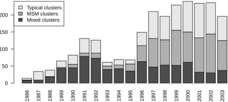
This finding directs the analyst to a sub-population study. The original 39 clusters are merged into three groups: MSM clusters (atypical clusters in the upper part of the graph which contain more MSM than expected), Mixed clusters
(atypical clusters in the lower part of the graph, which contain less MSM than expected) and typical clusters. Then the geodesic analysis summarized in Table 2 is done at this group level, leading to Table 3.
MSM clusters Mixed clusters Typical clusters MSM clusters 9.79 12.28 11.93 Mixed clusters 12.28 7.56 9.24 Typical clusters 11.93 9.24 12.04
Table 3: Average geodesic distances between members of the three cluster groups. Paths are restricted to patients belonging to the groups under consideration
This analysis shows that the two groups made of atypical clusters are far from each other compared to their internal distances. This is confirmed by the detection date analysis displayed on Figure 4. It appears that the epidemic in the giant component has two separated components. One mostly male homosexual component tends to dominate the recent cases (note that even typical clusters contain at least 57 % of MSM), while a mixed component with a large percentage of female patients was dominating the early epidemic, but tends to diminish recently. It should also be noted that this mix component is dominated by the growth of the homosexual component, but seems to decay only slightly in absolute terms. In other words, the reduction should be seen as an inability to control the growth homosexual epidemic rather than as a success in eradicating the heterosexual epidemic. 1986 1987 1988 1989 1990 1991 1992 1993 1994 1995 1996 1997 1998 1999 2000 2001 2002 2003 Typical clusters MSM clusters Mixed clusters 0 50 100 150 200
Fig. 4: Yearly distribution of the three groups of clusters
4
Conclusion
The proposed visual mining method for graphs has been shown to provide valu-able insights on the epidemic network. It is based on links between modularity
and visualization and leverages recent computationally efficient modularity maxi-mizing methods. Future works include the integration of the proposed methods in graph mining tools such as [2] and its validation on other aspects of epidemic networks analysis.
References
1. de Arazoza, H., Joanes, J., Lounes, R., Legeai, C., Cl´emen¸con, S., Perez, J., Auvert, B.: The HIV/AIDS epidemic in Cuba: description and tentative explanation of its low prevalence. BMC Disease (2007)
2. Bastian, M., Heymann, S., Jacomy, M.: Gephi: An open source software for exploring and manipulating networks. In: International AAAI Conference on Weblogs and Social Media (2009)
3. Cl´emen¸con, S., De Arazoza, H., Rossi, F., Tran, V.C.: Hierarchical clustering for graph visualization. In: Proceedings of XVIIIth European Symposium on Artificial Neural Networks (ESANN 2011). Bruges, Belgique (April 2011), to be published 4. Eades, P., Feng, Q.W.: Multilevel visualization of clustered graphs. In: Proceedings
of the Symposium on Graph Drawing, GD ’96. pp. 101–112. Berkeley, California, USA (September 1996)
5. Fortunato, S.: Community detection in graphs. Physics Reports 486(3-5), 75 – 174 (2010)
6. Fruchterman, T.M., Reingold, E.M.: Graph drawing by force-directed placement. Software - Practice and Experience 21(11), 1129–1164 (1991)
7. Keeling, M.J., Eames, K.T.: Networks and epidemic models. Journal of The Royal Society Interface 2(4), 295–307 (2005)
8. Kwakwa, H.A., Ghobrial, M.W.: Female-to-female transmission of human immun-odeficiency virus. Clinical infectious diseases: an official publication of the Infectious Diseases Society of America 36(3) (February 2003)
9. Liljeros, F., Edling, C.R., Nunes Amaral, L.A.: Sexual networks: implications for the transmission of sexually transmitted infections. Microbes and Infection 5(2), 189 – 196 (2003)
10. Newman, M.E.J.: The structure and function of complex networks. SIAM Review 45, 167–256 (2003)
11. Noack, A.: Modularity clustering is force-directed layout. Physical Review E 79(026102) (February 2009)
12. Noack, A., Rotta, R.: Multi-level algorithms for modularity clustering. In: SEA ’09: Proceedings of the 8th International Symposium on Experimental Algorithms. pp. 257–268. Springer-Verlag, Berlin, Heidelberg (2009)
13. Rothenberg, R.B., Woodhouse, D.E., Potterat, J.J., Muth, S.Q., Darrow, W.W., Klovdahl, A.S.: Social networks in disease transmission: The colorado springs study. In: Needle, R.H., Coyle, S.L., Genser, S.G., Trotter II, R.T. (eds.) Social Networks, Drug Abuse, and HIV Transmission, pp. 3–18. No. 151 in Research Monographs, National Institute on Drug Abuse (1995)
14. Varghese, B., Maher, J., Peterman, T., Branson, B., Steketee, R.: Reducing the risk of sexual hiv transmission: Quantifying the per-act risk for hiv on the basis of choice of partner, sex act, and condom use. Sexually Transmitted Diseases 29(1), 38–43 (January 2002)
15. Wylie, J.L., Jolly, A.: Patterns of chlamydia and gonorrhea infection in sexual networks in manitoba, canada. Sexually Transmitted Diseases 28(1), 14–24 (January 2001)