Science Arts & Métiers (SAM)
is an open access repository that collects the work of Arts et Métiers Institute of Technology researchers and makes it freely available over the web where possible.
This is an author-deposited version published in: https://sam.ensam.eu Handle ID: .http://hdl.handle.net/10985/17277
To cite this version :
Liaqat Ali SHAH, Alain ETIENNE, Ali SIADAT, François VERNADAT - Performance Visualization in Industrial Systems for Informed Decision Making - IFAC-PapersOnLine - Vol. 51, n°11, p.552-557 - 2018
L.A. Shah*, A. Etienne**, A. Siadat** F.B. Vernadat***
* COMSATS Institute of Information Technology, Park Road Islamabad, Pakistan ([email protected]) ** LCFC, Arts et Métiers ParisTech, Centre de Metz, F-57070 Metz, France (@ensam.eu)
*** LGIPM, University of Metz, BP 45112, F-57073 Metz cedex 3, France ([email protected])
Abstract: Information visualization is a key component of many decision support tools in sciences and engineering. Graph is a visual construct that is widely used to model information for visualization. In this paper, a value-risk graph is proposed to visualize the results of value-risk based performance measurement systems (PMSs). The proposed graph for PMS divides the overall performance of industrial systems into distinct zones to facilitate the decision-making process. The upper bound, lower bound, and target value of each measure are decided by the performance evaluator and, then, transformed into normalized values using value theory principles. The aggregation of normalized measures along value and risk lines when combined defines “highly desirable”, “feasible”, ”risky”, and “unacceptable” zones. Scenario performance data when plotted on the graph visualize the overall performance of the system in terms of value and risk. The proposed decision-making value-risk graph is illustrated with an example dealing with manufacturing process design but it can be applied to any kind of system evaluation.
Keywords: Information Visualization, Value, Risk measures, Performance Measurement Systems, Decision Support
INTRODUCTION 1.
The last three decades have witnessed considerable development in the field of performance measurement and management. Models, frameworks, and methodologies have been developed to effectively measure the performance of organizations (Bititci et al. 2011; Cocca and Alberti, 2010; Kaplan and Norton, 1996). Their use was not limited to a particular discipline but employed across different disciplines such as manufacturing (Berrah and Clivillé, 2007; Vernadat
et al., 2013), civil engineering (Bassioni et al., 2004;
Kagioglou et al., 2001), healthcare (Shankar Purbey et al., 2007), public sector (Van Dooren et al., 2015), and others. This wide spectrum demonstrates the interest in performance measurement systems (PMSs). However, many surveys point out the disappointment of organizations with their PMSs (Fletcher and Williams, 2016; Unit, 1994). There is still a feeling among academics and practitioners that the potential of PMSs is rarely exploited. Bourne et al. (2005) conducted a survey regarding the use of PMSs in the private sector. Conversely to prevailing belief, they found that PMSs are not yet widespread. From their conclusion, KPIs are by far the most commonly used measurement tools in the industry. A KPMG (2001) survey reported that the most common disappointment with regard to PMSs is the lack of data integrity and their inability to produce meaningful information to support decision making. The report then identifies better information quality and communication as a potential area for improvement. The issue of communication and comprehension of performance measures throughout the organization is often reported in the literature (Aki Jääskeläinen and Sillanpää, 2013; Wade and Recardo, 2009). To tackle the issue of performance measure communication and comprehension, visualization techniques can play a significant role. Visualization is a powerful tool to present
elegantly multifaceted measures and to facilitate the decision-making process. Visualization refers to both visual or graphical representation and the cognitive process of understanding an image (Mazza, 2009). In performance management and decision contexts, visualization is about the representation of performance related data, information, concepts, and knowledge in a graphical way to gain insights to make easier decision-making processes. Suitable visualization can simplify complexity of the perception process, accelerate perception and, thus, achieve a cognitive relief (Adamantios, 2012). Moreover, the visualization process can be applied to improve understanding over large data sets without complex quantitative methods (Aki-Jääskeläinen and Juho-Matias, 2016).
Despite clear potential, the use of visualization methods in management is still limited (Al-Kassab et al., 2014). Although, it is gaining increasing attention in the field of performance measurement, the topic is still quite ambiguous and new in this field. Visualization is usually perceived as synonymous to dashboards. Much of the research in the field is focused on presentation formats of dashboards devised for balanced scorecards (BSC). For instance, Cardinaels and van Veen-Dirks (2010) investigated the various effects of tabular data in BSC on managerial evaluation. Banker et al. (2011) analyzed the influence of presenting graphical information in BSC on evaluators’ decision quality and concluded that the graph did influence evaluators’ decision as predicted. Moreover, the addition of graph with tabular data increases the accuracy of performance evaluation (Kagioglou et al., 2001). However, little effort is made so far to reduce the cognitive burden of performance evaluators by reducing the display measures without sacrificing the dimensions of performance. So, many measures on display will definitely require more cognitive effort to synthetize performance information.
The aim of this paper is to simplify performance evaluation and presentation by aggregating the measures along value and risk lines in the first place and, then, to propose a value-risk graph for the purpose of performance visualization. To develop the indicators and the value-risk graph, the paper relies on the standard information visualization process.
INFORMATION VISUALIZATION PROCESS 2.
IN PMSs
The process of information visualization (Al-Kassab et al., 2014) can be segmented into: (a) raw data collection; (b) data transformation; (c) data warehousing; and (d) visual transformation (Fig. 1).
Raw data
collection transformationData warehouseData visualizationData
Fig. 1. Information visualization process
This visualization process is used as a framework in the paper to guide performance indicators and value-risk graph development. The graph acts as a tool for performance display of the industrial system to meet the managerial requirement. Moreover, tools, methods, and techniques in each segment of Fig. 1 are identified and employed to support the performance indicator development in the visualization process. The following sub-sections briefly explain the segments of the process.
2.1 Raw Data Collection
First, raw data about a system or process need to be collected. In the PMS context, raw data refer to variables or parameters of interest within the system understudy. For instance, in manufacturing and supply chain settings, the parameters of interest and to be measured can be “number of orders dispatched” or “number of orders fulfilled”. However, they are variables and not performance measures per se, because they do not communicate any performance information unless they are placed in a business context. By combining the two variables in a ratio form, a performance measure of “perfect order fulfilment” can be developed.
To collect data for performance measurement, two methods can be employed: ECOGRAI (Doumeingts et al., 1995) and value focused thinking (VFT) (Keeney, 1996). The former method uses the triplet objective-variable-performance indicator and searches variables on which the decision maker can act to reach their objectives as well as performance indicators that measure the efficiency of the objectives attainment process. The VFT method, on the other hand, is an objective-driven performance measure determination and evaluation process, which uses value theory to compute the value of a system. In the current study, the VFT approach is used to model objectives and risks of the system.
Objective modeling: By definition, value is the degree of
satisfaction and fulfilment of stakeholders’ objectives. Data regarding value are identified by means of the VFT technique. VFT identifies objectives 𝑂𝑖( 𝑖 = 1, … 𝑛) suitable for the process considered and defines measures 𝑀𝑗 ( 𝑗 = 1, … , 𝑚) in-line with the objectives. For instance, in a supply
chain context, a high level objective can be “To satisfy customer order”. The lower level objectives are identified next by asking a simple question “What do you mean by
that?”. For example, the customer order satisfaction means
“on-time delivery”, “minimum cost”, and “high quality”. This process of objective decomposition continues until the upper level objective cannot be further decomposed. The identified objectives are then organized in a hierarchical form (Fig. 2).
Fig. 2. Objective hierarchy
The sub-objectives on the lowest level of the hierarchical structure are quantifiable and, hence, performance measures (or criteria) can be defined for each of them. For instance, for the refined objectives of maturity and recoverability, “the number of process errors occurred” and the MTBF (Mean Time between Failures) can be defined as performance measures, respectively. In the same manner, measures of interest are identified and listed as raw data of the visualization process.
Risk modeling: Similar to objective modeling, risk modeling
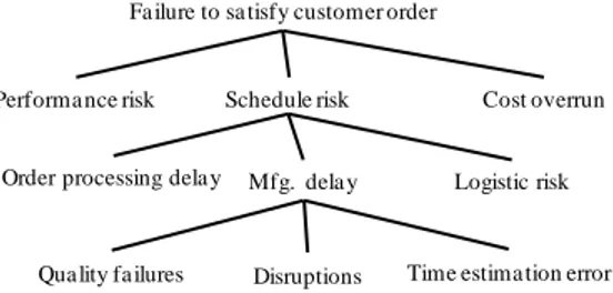
starts by identifying a global risk which is the opposite of a global objective. For instance, if the global objective of a process is to satisfy customer orders, then the corresponding global risk would be: “failure to satisfy customer order”. The global risk is refined and then arranged in the form of a risk hierarchy as shown by Fig. 3.
Fig. 3. Risk event hierarchy
Once the risks of the system have been identified, they are then analyzed with the failure mode, effect, and criticality analysis (FMECA) method as shown in Table 1.
Table 1: Excerpt of FMECA process for “Schedule risk” Process Fail. mode Causes Effects P C D RPN
Activity i Duration estimation error Process - novelty - complexity Uncertain Lead time 5 7 6 210
Sa tisfy customer order
On-time
delivery High qua lity Minimumcost
Relia bility Conforma nce to
specifica tion
Ma turity Recovera bility
Fa ilure to sa tisfy customer order
Performa nce risk Schedule risk Cost overrun
Logistic risk Mfg. delay
Order processing dela y
The critical risks in terms of RPN in the FMECA table are then considered for further processing and low RPN risks are eliminated from the visualization process.
In short, the outcome of this segment of the performance visualization process is a list of performance and risk measures needed to compute the value created and the extent to which it is exposed.
2.2 Data Transformation
By data transformation, we mean the normalization of performance measures into commensurate performance expressions. Performance measures are heterogeneous in nature due to the multidimensionality of the performance concept and it is often hard for an evaluator to reach a logical conclusion. For instance, metrics such as “order fill rate”, “order cycle time”, “on-time delivery”, “cost per order”, “productivity”, and “system utilization” are measured in different units because they refer to different dimensions of a manufacturing system performance. The list can be more exhaustive if more aspects of the system are considered. A Skandia IC report (Tan et al., 2008) uses 112 performance metrics to measure five areas of focus including financial, customer, process, renewal, and development as well as human resources. Making a decision based on so many measures is beyond the cognitive capacity of human agents. To remedy this situation, one way is to normalize the measures using multi-attribute value theory (MAVT). The MAVT is a structured methodology to handle trade-off among multiple objectives (and thus performance measures/criteria) and to assign a utility value to each measure by rescaling them onto a 0-1 scale, where “0” represents the worst preference and “1” represents the best one. This transformation (mapping) of physical measure onto a [0, 1] scale is also known as value elicitation process and can be performed as follows (Berrah et al., 2008).
𝑃: 𝑂 × 𝑀 → 𝐸 (𝑜, 𝑚) → 𝑃(𝑜, 𝑚) = 𝑃
where 𝑂, 𝑀 𝑎𝑛𝑑 𝐸 represent universes of discourse, respectively of the set of objectives o, of the set of measures m and of the performance expressions 𝑃.
To obtain the performance expressions 𝑃, two finite sets M = {m1,m2… mn} and A = {a1,a2… an}, representing measures and alternatives respectively, are considered. Then, a ∈ A and m ∈ M can be associated with a profile pia= (pma1, pm 2 a … pm n a ) where p i a
represents a partial score of measure 𝑖 (performance/risk expression) in alternative 𝑎 on a [0, 1] scale. This partial score determination can be carried out using the MACBETH methodology. Details of the methodology for the value elicitation process can be found in the literature (Cliville et al., 2007; Shah, 2012).
2.3 Data Warehousing
One of the objectives of a PMS is to provide comprehensive and timely information on the performance of a process/system. To this end, data and information related to performance measurement and measures need to be centrally stored in a database; to be made accessible by different
stakeholders of the system such as analysists or departmental managers either for decision making or performance improvement initiatives (Kueng et al., 2001). In this paper, data warehouse refers simply to a collection of performance and risk expressions of the performance and risk measures identified in the raw data collection phase of the process. The expressions are structured in a tabular form and easily made accessible to evaluators for the purpose of decision making. The authors don’t apply any data modeling tool such as entity diagrams or UML classes to model the performance data.
2.4 Visual Transformation
Visuals are commonly used in lean manufacturing to visualize workflows, performance results, and opportunities for improvement. For this purpose, scoreboards are developed where key performance indicators are communicated in real time. However, one scorecard for individual performance measure requires space to present performance data and effort to make a decision based on scorecards. They are imperative at operational level. However, at the tactical and strategic levels, one needs a graph or two to encompass the whole performance visualization of the system. This is only possible if the unit performance expressions have been aggregated.
Aggregation: The aggregation is formalized by the following
mapping (Berrah et al., 2008). 𝐴𝑔 ∶ 𝐸1× 𝐸2× · · · × 𝐸𝑛 → 𝐸
(𝑃𝑚1 , 𝑃𝑚2 , . . . , 𝑃𝑚𝑛) → 𝑃𝑜𝑣𝑒𝑟𝑎𝑙𝑙 = 𝐴𝑔(𝑃𝑚1 , 𝑃𝑚2 , . . . , 𝑃𝑚𝑛)
𝐸𝑖 is the universe of discourse of the performance expressions (𝑃1 , 𝑃2 , . . . , 𝑃𝑛) and 𝐸 denotes the aggregated (𝐴𝑔) performance.
In our case, the aggregated function 𝐴𝑔 in the above mapping is a 2-additive Choquet Integral (CI) (Grabisch and Labreuche, 2008). Mathematically, Cu(x) = ∑ vipi− 1 2 n i=1 ∑ Iij|pi− pj| n i=1 (1)
where Cu models vectors of performance expressions pi, vi denotes a Shapley index that represents importance of expression vi relative to all other expressions (with ∑n vi=
i=1 1), and Iij is the interaction between expressions (xi, xj), ranging in [-1,1].
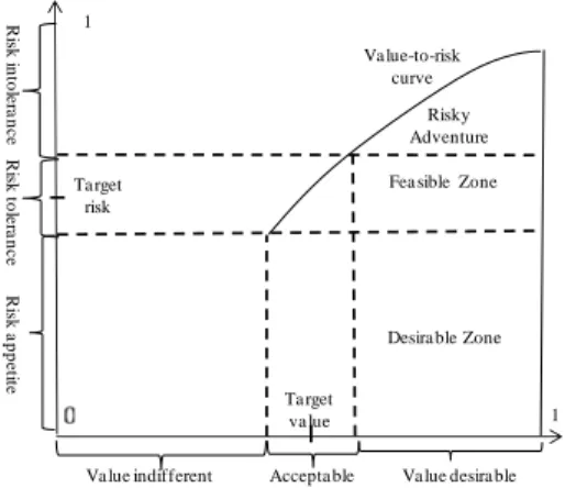
Construction of the Value-Risk Graph: By computing the
global value and risk indicators, it is now convenient to develop a two dimensional value-risk graph in the range of [0, 1] on the x-axis and y-axis.
To this end, the x-axis is divided into the three following ranges: Value indifference- It refers to the range of values which are not significant and for which the company will avoid pursuing the process; Value tolerance/acceptable- This range remains between the upper bound of value indifference, until the point where the value starts becoming desirable. In this range, the company may pursue the process; and Value
desirable- Beyond the acceptable range is the desirable range, i.e., the company is willing to pursue the process. These
Fig. 4. Ranges of values on the x-axis
In a similar way, the y-axis is divided into: Risk appetite- It refers to the risk an organization is willing to accept in the pursuit of process objectives; Risk tolerance- It specifies the maximum risk that the organization is willing to take in the pursuit of the process objectives; and Risk intolerance- It corresponds to the risk level not acceptable. The ranges have been drawn on Fig. 5
Fig. 5. Range of risks on the y-axis
In addition, it is proposed to develop a value-to-risk curve to model the acceptability of a process when the value progresses with regard to risk. In reality, organizations may take risk beyond the risk tolerance in pursuit of value creation for their stakeholders. For this purpose, a value/risk ratio can be defined that will be restricted within a minimum acceptable value and a point of risk beyond which an organization cannot afford to pursue its objectives in any respect. The aim of the value/risk ratio is to determine the upper bound for the acceptability of a process in pursuit of objectives fulfillment. However, its determination is still subjective and depends on the company’s attitude towards pursuing its objectives (value creation) and risk taking. By defining the ranges for measures and value/risk ratio, a Value-Risk Graph is developed as illustrated in Fig. 6. To determine the value and risk ranges quantitatively, a target, lower and upper bounds for each performance, and risk measure are defined. For instance, a process cost in the range of 10, 12, and 16 units will have a lower bound of 10, a target of 12 and an upper bound of 16 units, respectively. In this context, the lower bound is the ideal scenario while the upper bound is the worst case. Once the ranges for each measure have been defined, they are then normalized in the range of [0, 1] using the value elicitation technique and aggregated to obtain global indicators (Shah 2012).
Fig. 6. Value-Risk Graph for decision-making
APPLICATION 3.
To illustrate the process of performance visualization in a manufacturing company, a manufacturing case study is presented. The company designs and fabricates products on make-to-order (MTO) basis. The reference product for this case study is a mechanical locator (cf. Fig. 7), i.e., a work holding device used for centering a part on a machine-tool.
Fig. 7. Mechanical locator
To illustrate the use of the proposed visualization process within the company, a manufacturing scenario is defined.
3.1 Case study: Manufacturing Scenario
The company under study receives an order for 200 high quality mechanical locators from a customer with a lead time of two weeks (10 working days). The price of the product is kept at $14 per unit. The technical performance of the product is measured in terms of satisfaction index (q). Moreover, the company has sufficient resources at its disposal, therefore part axles, bodies, and caps are machined at the facility while springs and bolts are purchased from the market. We assume that all raw materials and the purchased parts are available whenever needed. Failing to satisfy the customer order will cause penalty cost. A product having satisfaction index below 0.8 is rejected. In case of delay after the tolerance period (2 days), the company has to pay $2/unit time tardiness up to 5 working days for each product; beyond this period, the order is cancelled and backlog cost of $10 per unit is paid.
3.2 Application of the process to the mfg. scenario
Let us apply the proposed visualization process to this scenario. First of all, raw data regarding performance and risk measures are obtained using the objective and risk models (cf. Fig. 2 and Fig. 3). The objective model is used to derive the performance measures: manufacturing cycle time (C1),
manufacturing total cost (C2), technical performance (C3),
and employee satisfaction (C4). From the risk model, major
risk events relevant to time, cost, and quality dimensions that correspond to schedule risk (R1), cost overrun (R2), and
performance risk (R3), respectively, are identified.
Before carrying out the normalization step, an upper bound (UB), lower bound (LB), and target score for each measure must be determined to define the ranges for desirability, acceptability, and indifference for the value axis as well as risk appetite, risk tolerance, and risk intolerance for the risk
1
Risky Adventure Fea sible Zone
Desira ble Zone
1 Ta rget
risk
Ta rget va lue
Va lue indifferent Accepta ble Va lue desira ble
R is k in to le ra n c e R is k to le ra n c e R isk a p p e tit e Va lue-to-risk curve
axis (cf. Table 2). For the cost and time objectives, the lowest limit is the desirable one while for the measures of employee satisfaction and technical performance, the upper limit is desired. In the case of risk measures, the lower limit is always preferred.
Table 2: Bounds and target on measures
C1 C2 C3 C4 R1 R2 R3
UB 24 18 100 100 4 5 1
Target 20 14 80 75 2 2 0.3
LB 18 12 75 60 1 1 0.2
Values of the measures (Table 2) are transformed into normalized measures (also called expressions) via the MACBETH method, where the upper and lower bounds provide the good and neutral reference points in the value elicitation process. For details, see Shah (2012). The outputs of the MACBETH tool are the following expressions for the measures: C1= 0.33, C2=0.4, C3=0.43, C4= 0.48, R1=0.57,
R2= 0.67, and R3=0.55. Next, Shapley indices vi and the
interaction parameters IijIij are determined as presented in Table 5 (For details, see Shah, 2012; Clivillé et al., 2007). The expressions and the identified parameters vi and Iij are put in Equation (1) to obtain a global score for both value and risk.
Minimum acceptable global value = 0.39 Maximum acceptable global risk = 0.59
These values will be used as points of reference (cf. Fig. 8) to appraise the actual scenario understudy.
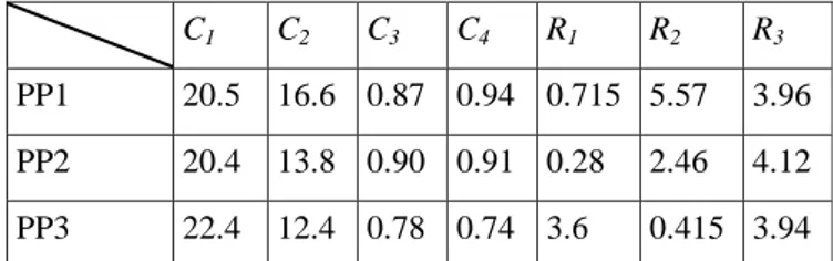
Now, in the real scenario, three process plans for the mechanical locator are generated and evaluated in the simulation environment against the performance measures. The results of the simulation experiments are obtained and tabulated in Table 3.
Table 3: Simulation results for three process plan models
C1 C2 C3 C4 R1 R2 R3
PP1 20.5 16.6 0.87 0.94 0.715 5.57 3.96
PP2 20.4 13.8 0.90 0.91 0.28 2.46 4.12
PP3 22.4 12.4 0.78 0.74 3.6 0.415 3.94
To obtain the value and risk expressions with MACBETH, the process plans are ranked on the basis of desirability and strengths of preference for each criterion are provided as follows:
𝐶1⇒ 𝐺𝑜𝑜𝑑 >1𝑃𝑃2 >2𝑃𝑃1 >4𝑃𝑃3 >1𝑁𝑒𝑢𝑡𝑟𝑎𝑙 𝐶2 ⇒ 𝐺𝑜𝑜𝑑 >2𝑃𝑃3 >1𝑃𝑃2 >2𝑃𝑃1 >1𝑁𝑒𝑢𝑡𝑟𝑎𝑙 𝐶3 ⇒ 𝐺𝑜𝑜𝑑 >1𝑃𝑃2 >1𝑃𝑃1 >2𝑃𝑃3 >3𝑁𝑒𝑢𝑡𝑟𝑎𝑙 𝐶4 ⇒ 𝐺𝑜𝑜𝑑 >0𝑃𝑃3 >4𝑃𝑃2 >1𝑃𝑃1 >1𝑁𝑒𝑢𝑡𝑟𝑎𝑙
In the same way, information is provided on alternatives for each risk measure. This ordinal preference modeling is then
transformed into normalized value and risk expressions with MACBETH and presented in Table 4.
To consolidate the expressions, the Shapley indices 𝑣𝑖 and the interaction parameters 𝐼𝑖𝑗 have already been determined in the calculation of global minimum value and maximum risk and presented in Table 5.
Table 4: Value and risk expressions for the mfg. scenario
x1 x2 x3 x4 r1 r2 r3
PP1 0.63 0.1 0.5 0.14 0.12 0.98 0.66
PP2 0.83 0.5 0.6 0.20 0.38 0.57 0.78
PP3 0.18 0.7 0.11 1.0 0.88 0.14 0.56
The 2-additive Choquet integral model (cf. Equation 1) is then employed to aggregate the value and risk expressions as tabulated in Table 5.
Table 5: Value and risk indicators for the mfg. scenario
x1 x2 x3 x4 𝓥 r1 r2 r3 𝓡 PP1 0.1 0.63 0.5 0.14 𝟎. 𝟒𝟓 0.98 0.66 0.12 𝟎. 𝟓𝟑 PP2 0.5 0.83 0.6 0.20 𝟎. 𝟑𝟏 0.57 0.78 0.38 𝟎. 𝟓𝟗 PP3 0.7 0.18 0.11 1.0 𝟎. 𝟏𝟔 0.14 0.56 0.88 𝟎. 𝟓𝟔 𝑣𝑖 0.26 0.24 0.30 0.18 0.34 0.18 0.48 𝐼𝑖𝑗 I12 I13 I14 I23 I12 0.090 0.211 0.21 0.11 0.2 I13 0.13
I24 I34 I23 0.090
0.159 0.158
The interaction, for example, between C1 and C4, i.e. I14,
indicates that mfg. time and employee satisfaction positively affect each other; however, their interaction is minimal. For the index, i.e. 𝑣𝑖, technical performance carries more weight (0.3) followed by mfg. time (0.26) while employee satisfaction is the least important of all (0.18) in the Value category. The aggregated scores for the process plans are plotted on the Value-Risk Graph as shown in Fig. 8.
Fig. 8. Value Risk Graph for the manufacturing scenario
1 Risky Adventure Feasable Zone Desirable Zone 1
From the Value-Risk Graph, it is clear that only process plan PP1 falls in the desirable region for the scenario understudy. Therefore, the process plan PP1 is chosen to manufacture the product, while the scenarios PP2 and PP3 are dropped.
CONCLUSIONS AND FUTURE WORK 4.
The work reported in the paper addresses performance visualization and identifies the tools and techniques of the decision theory to be used for each phase of the process to develop global value and risk indicators. Based on the global indicators, the Value-Risk Graph is constructed that defines zones representing “highly desirable”, “feasible”, “risky”, and “unacceptable” situations to make the decision-making process easier and clearly visible.
Future work should include the extension of the current Value and Risk approach by adding the Cost dimension to the existing Value-Risk Graph. To develop the global cost indicator, the same approach will be employed, and the cost dimension, then, will be added to the graph along z-axis making a cubic graph in order to provide all the essential elements for a robust and informed decision-making as requested by the BCVR (Benefit-Cost-Value-Risk) Methodology (Li et al., 2017), which is partly based on this work.
REFERENCES
Adamantios, K. (2012). Management Information Systems for Enterprise Applications: Business Issues, Research and Solutions. IGI Global.
Aki-Jääskeläinen., Juho-Matias R. (2016). Visualization techniques supporting performance measurement system development. Measuring Business Excellence 20, 13–25.
Aki-Jääskeläinen, Virpi S. (2013). Overcoming challenges in the implementation of performance measurement: Case studies in public welfare services. Int. J. Public Sector Management 26, 440–454.
Al-Kassab, J., Ouertani, Z.M., Schiuma, G., Neely, A. (2014). Information visualization to support management decisions. Int. J. of Information Technology & Decision Making 13, 407–428. Banker, R.D., Chang, H., Pizzini, M. (2011). The judgmental effects
of strategy maps in balanced scorecard performance evaluations. Int. J. of Accounting Information Systems 12, 259–279. Bassioni, H.A., Price, A.D., Hassan, T.M. (2004). Performance
measurement in construction. J. of Management in Engineering 20, 42–50.
Berrah, L., Mauris, G., Montmain, J. (2008). Monitoring the improvement of an overall industrial performance based on a Choquet integral aggregation. Omega 36, 340–351.
Bititci, U.S., Ackermann, F., Ates, A., Davies, J., Garengo, P., Gibb, S., MacBryde, J., Mackay, D., Maguire, C., Van Der Meer, R., others. (2011). Managerial processes: business process that sustain performance. Int. J. of Operations & Production Management 31, 851–891.
Bourne, M., Franco-Santos, M., Kennerley, M., & Martinez, V. (2005). Reflections on the role, use and benefits of corporate performance measurement in the UK. Measuring Business Excellence 9(3), 36-40.
Cardinaels, E., van Veen-Dirks, P.M.G. (2010). Financial versus non-financial information: The impact of information organization and presentation in a Balanced Scorecard. Accounting, Organizations and Society 35, 565–578.
Cliville, V., Berrah, L., Mauris, G. (2007). Quantitative expression and aggregation of performance measurements based on the MACBETH multi-criteria method. Int. J. of Production Economics 105(1), 171-189.
Cocca, P., Alberti, M. (2010). A framework to assess performance measurement systems in SMEs. Int. J. of Productivity and Performance Management 59(2), 186-200.
Doumeingts, G., Clave, F., Ducq, Y. (1995). ECOGRAI—a method to design and to implement performance measurement systems for industrial organizations—concepts and application to the maintenance function, in: Benchmarking—Theory and Practice. Springer, pp. 350–368.
Fletcher, C., Williams, R. (2016). Appraisal: Improving Performance and Developing the Individual. Routledge. Grabisch, M., Labreuche, C., 2008. A decade of application of the
Choquet and Sugeno integrals in multi-criteria decision aid. 4OR: A Quarterly Journal of Operations Research 6, 1–44. Kagioglou, M., Cooper, R., Aouad, G. (2001). Performance
management in construction: a conceptual framework. Construction management and economics 19, 85–95.
Kaplan, R. S. and Norton, D., P. (1996). The Balance Scorecard: Translating Strategy into Action. Harvard Business School Press.
Keeney, R.L. (1996). Value-focused thinking: a path to creative decision-making. Harvard University Press, Cambridge, MA. KPMG. (2001). Achieving Measurable Performance Improvement
in a Changing World: The Search for New Insights. KPMG. Kueng, P., Wettstein, T., List, B. (2001). A holistic process
performance analysis through a performance data warehouse. AMCIS 2001 Proceedings 69.
Li, F. (2017). Performance evaluation and decision support for industrial system management: a benefit-cost-value-risk based methodology. Ph.D. thesis, Arts et Métiers ParisTech, Metz, France.
Mazza, R. (2009). Introduction to information visualization. Springer Science & Business Media.
Shah, L. (2012). Value-Risk based evaluation of industrial systems. Ph.D. thesis, Arts et Métiers ParisTech, Metz, France.
Shankar Purbey, Kampan Mukherjee, Chandan Bhar (2007). Performance measurement system for healthcare processes. Int. J. Productivity & Performance Management 56, 241–251. Tan, H.P., Plowman, D., Hancock, P. (2008). The evolving research
on intellectual capital. J. of Intellectual Capital 9, 585–608. Van Dooren, W., Bouckaert, G., Halligan, J., and others. (2015).
Performance management in the public sector. Routledge. Unit, E. I. (1994). The new look of corporate performance measurement. Research Report, London.
Vernadat, F., Shah, L., Etienne, A., Siadat, A. (2013). VR-PMS: a new approach for performance measurement and management of industrial systems. Int. J. of Production Research 51, 7420-7438 Wade, D., Recardo, R. J. (2009). Corporate performance management: how to build a better organization through measurement-driven strategic alignment. Routledge.