Technology researchers and makes it freely available over the web where possible.
This is an author-deposited version published in: https://sam.ensam.eu
Handle ID: .http://hdl.handle.net/10985/7595
To cite this version :
Jieun KIM, Carole BOUCHARD, Jean-François OMHOVER, Améziane AOUSSAT - Designing a graphical interface for creativity support tools for designers: a case study - International Journal of Web Engineering and Technology - Vol. 7, n°2, p.173-199 - 2012
Any correspondence concerning this service should be sent to the repository Administrator : [email protected]
Designing a graphical interface for creativity support
tools for designers: a case study
Jieun Kim
*Department of Industrial Engineering, Hanyang University, Seoul, Korea E-mail: [email protected]
Phone: 00 33 1 44 24 63 89 – Fax: 00 33 1 44 24 63 59 * Corresponding author
Carole Bouchard, Jean-François Omhover,
Améziane Aoussat
Laboratory CPI-ENSAM, 151 Bd de l’Hopital, 75013 Paris, France
E-mail : {carole.bouchard, jean-francois.omhover, améziane.aoussat}@ensam.eu Phone: 00 33 1 44 24 63 89 – Fax: 00 33 1 44 24 63 59
Abstract:This study proposes a co-designing, iterative methodology to design graphical user
interface for creativity support tools for designers. Given the high level of expectation from designers, the interface quality was one of the most challenging aspects of the work, in conjunction with the utility of the functionalities. An iterative design and evaluation process was used to create the icon-based interface, during which the needs of the designers and the functionalities of the system were integrated until a complete operational prototype emerged. This process provided three sequential prototypes. In order to achieve this, we derived qualitative and quantitative results from various methods: creative sessions, semantic and emotional evaluations, questionnaires, semi- directive interviews, subjective performance assessments, longitudinal tests, and focus group assessments. Finally, our iterative design and evaluation process can be considered to be a very efficient means of integrating end users’ spontaneous feedback about icon redesigns in the early phases of development. The design outcome enabled the end users to ensure that key features of the creativity support tool were both usable and appealing.
Keywords: case study; creativity support tool; applied creative method; icon design; Graphical
User Interfaces (GUIs); co-designing
Reference to this paper should be made as follows: Kim, J., Bouchard, C., Omhover, J.F., and
Aoussat, A (20xx) ‘Designing a graphical interface for creativity support tools for designers: a case study’, Int. J.Web Engineering and Technology, Vol. x, No. x, pp.xx–xx.
Biographical notes: Jieun Kim obtained her PhD at the laboratory of product design and
innovation(LCPI), Arts et Métiers ParisTech in 2011. She is currently a postdoctoral researcher at Hanyang university. Her research interests include user interface design, computational tools for designers, design cognition and emotional design.
design methodologies, creativity, kansei engineering and emotional design. Based on several studies with design practitioners, she developed design methodologies integrating designers’ cognitive activity.
Jean-François Omhover is an assistant professor at Arts et Métiers ParisTech. He works on the optimization of the design process by means of artificial intelligence techniques. More specifically, his research are focused on the elaboration of specific image processing techniques for supporting the early phases of the design process.
Ameziane Aoussat is a full-time professor at Arts et Metiers ParisTech, and head of LCPI Design Lab. His area of research is the optimisation of the design process. In the last 18 years, he has advised more than 30 PhD theses and managed industrial collaborations.
1. Introduction
1.1 Emergence of the creativity support tool for designers
A growing trend is emerging toward the use of computational and Internet- centered tools in both the design process and the working environment. Designers tend to develop digital design databases, and these are becoming an increasingly important part of their work (Yamamoto and Nakakoji, 2005; Keller, 2005; Bouchard et al., 2008). However, even if the detailed design phases are well covered by computational support tools (such as Computer-aided Design (CAD), Computer-aided Manufacturing (CAM), etc.), only few commercialized and design targeted tools support the inspirational phase of the design process. Like this, computational tools dedicated to the early stages of design have not yet come to the fore, even though these early creative stages are considered as some of the most cognitively intensive (Nakakoji, 2005). Several studies have been pioneered to support designers’ sketching activity, particularly in the generative phase of interior and architectural design (Goldschmidt, 1994; Bilda and Gero 2007; Prats et al., 2008). To date, little research has addressed designers’ inspirational sources in the informative phase (Pasman, 2003; Restrepo, 2004; Keller, 2005; Bouchard et al., 2008).
Despite their potential applications of creativity support tools in practice, their development for designers has thus far remained limited to experimental laboratory-based work and has not penetrated widely into designers’ working environments. This might be due to two possible weaknesses with existing prototypes: utility of the functionalities and interface quality. The former comes from difficulty understanding designers’ cognitive activities in the early stages of design, which are relatively implicit and subjective (Ullman et al., 1988). The latter originates from a lack of consideration of interactivity, particularly in the graphical interface (Campos et al., 2007). This is very important considering the high level of expectation held by designers, who are likely to be highly sensitive to the quality of the graphical user interface. In this paper, we report our investigation into how to enhance the interface quality, particularly icon-based graphical interfaces, using an empirically designed methodology. As a case study, the presented approach was applied to the TRENDS project, to develop a creativity support tool for designers.
1.2 About TRENDS system
The TRENDS European project was a three-year undertaking that aimed to develop a creativity support software tool for designers that would be dedicated to the early stages of the idea generation process. The system used a content- based information retrieval system that aimed to improve designers’ access to web-based resources by helping them to find inspirational materials, to structure
these materials in ways that supported their design activities including semantic mapping, grouping, and to identify design trends.
As mentioned above, enhancement of the interface quality was one of the most challenging aspects of the project, along with development of utility of the functionalities. It was important to create a graphical user interface (GUI) with an engaging visual appearance, one that might encourage creativity. In addition, as the TRENDS system contains 80 of functionalities that support designers’ activities, it was necessary to group the functionalities in menus and to select labels and design an icon library throughout the iterative process. We agreed that a well designed menu-driven interface is simple and easy to use; however, given that our system introduces a new functionality related to design work which is hard to explain each function in text. In addition, our end-users – here, car designers – are particularly familiar with visual languages. The use of icons not only improves the system’s usability, but also gives the GUI an original and user- friendly visual appearance (Lin, 1994; Huang et al., 2002; Chen, 2003). Accordingly, from the conception of the GUI, we were keen to develop an icon- based interface.
This project took advantage of interdisciplinary collaboration of eight partner organizations drawn from industry and research, including design experts, engineering experts, cognition experts, and technological experts from four countries (France, the United Kingdom, Italy and Spain), in a co-designing a GUI development process. Remarkably, the end-users, who are expert car designers and innovation professionals, actively participated as members of the project during this longitudinal case study from conception to evaluation of the TRENDS system.
In this paper, we first examine the issues at the design of engaging icon- based graphical interface for creativity support tools in terms of design methodology and evaluation factors. This is followed by a methodological reflection on co-designing and iterative approaches. Next, a case study, the development of the TRENDS system, is presented in three parts. Finally, we conclude by discussing the overall results and some methodological considerations.
2. Methodology
2.1 Designing an engaging icon-based graphical interface
The ‘usability’ of computer systems is generally regarded as a multi-dimensional property. In the classic approach, fundamental components include: i) effectiveness – the extent to which the user can achieve the task goal; ii) efficiency – the resources required (e.g., time and effort) to achieve a goal; and iii) satisfaction – whether the user finds the system satisfying to use (see e.g. ISO9241). Other factors, such as ease of learning how to use the system and the
extent to which functionalities can be remembered, can also be considered. Recently conceptualizations of human–computer interaction (HCI) have expanded the domain for consideration to include greater emphasis on users’ affective experience with systems (Tractinsky et al., 2000; Dillon, 2002; Hassenzahl and Tractinsky, 2006). The new wave of research on the visual aesthetics of computer interfaces suggests that aesthetic is a strong determinant of the pleasure experienced by the user during the interaction (Green and Jordan, 2000). The level of importance or relative weight to place on each measure is dependent on the type of application and the target user.
For example, many users express preferences for tools that they do not use to maximum effectiveness or efficiency (Dillon, 2002). De Angeli et al. (2006) reported that the less serious the context is, the stronger the halo effect of aesthetics can be. Considering that creativity support tools especially dedicated to the early design process are not necessarily goal-directed, affective factors including the perception of aesthetics might play a more important role in determining whether designers like and are willing to use the new tool and to integrate it into their creative work space. Moreover, if the target users are designers who may set particularly high standards in terms of the aesthetics of interaction, we need to pay even more attention to designing and evaluating interfaces and to highlight new perspectives and specifications. According to Lavie and Tractinsky (2004), users’ perceptions of aesthetics consist of two main dimensions, which can be termed ‘classical aesthetics’ and ‘expressive aesthetics.’ We were particularly interested in the expressive aesthetics dimension, which needs to reflect the designers’ own creativity and originality and have the ability to break design conventions.
In order to have an original, creative, and user-friendly graphical user interface, we considered the icon to be one of the most important components of the WIMP (windows, icon, menus and pointers) (Carroll et al., 1998). Well- designed icons offer various benefits. The use of icons can increase usability and practicality (Waterworth, 1993; Horton, 1994, Passini et al., 2008). Moreover, creative icons also increase attractiveness and are likely to be highly rated in terms of both practicality and originality (Finke, 1990; Lin, 1994; Huang et al., 2002). Due to these benefits, icons have been applied in a broad range of settings, including software applications, websites, and small mobile devices. However there are still some questions about improperly designed icon related to different language barriers, cultural interpretations and contextual adaptation (Waterworth, 1993; Huang et al., 2002; You et al., 2007).
2.2 A co-designing and iterative approach
Previous studies point to the value of early user testing. Especially, some remarkable work on creativity support tools was initiated at a National Science Foundation workshop in 2005 aimed at improving software and user interfaces that enable innovation (Resnieck et al., 2005). The workshop participants formulated twelve principles such as ‘support exploration’ ‘design for designers’,
‘iterate, iterate again’, ‘balance users suggestions with observation and participatory processes’ and others. Here, we would like to re-emphasize the importance of co-designing and iterative approaches in providing sequential prototypes at the beginning of the development process. According to Lin (1994), the quality of icon depends largely on its design style, so that selecting a creative and original icon design style became an important part of the design process. Especially early design evaluation is crucial, because post design evaluation does not improve design style of icons, but it rather filters out bad design. Moreover, the engagement of representative end-users as members of the team during the longitudinal development process could benefit the design process by enabling greater efficiency, better design quality, and greater commitment and trust being accorded the new systems by end users (Muller et al., 1997; Nakakoji, 2005, Sanders and Stappers, 2008, Bossen et al., 2010).
However, a danger also exists of too little or too much involvement by the users (Nielson, 1993; Resnieck et al., 2003). According to a survey by Dillon (2002), users’ experiences are dynamic, and something that initially appears attractive and usable could later be disliked and rejected. This is because a user’s initial reaction to an interface is determined by multiple factors such as perception of aesthetics, experience with equivalent designs, and immediate feedback. Indeed, in the early stages of using a new interface, users cannot predict their own performance accurately, and perception of aesthetics tends to have much more influence than actual usability (Sauer and Sonderegger, 2009).
For that reason, we need a very careful understanding to interpret user’s various feedbacks and to balance both the quantitative and qualitative analysis. As Havre et al. (2004) has pointed out, we tried to combine descriptive design evaluation methods, including scenarios and interviews, and controlled experiments during the evaluation processes. This provides some degree of freedom to integrate the designer’s and the user’s feedback. Hence, an iterative approach to design was used for our case study. It makes ensure systematic progression towards the overall goal of giving end users the opportunity to contribute fully to the design process. In order that, we developed the iterative design and evaluation process for icon-based graphical interface as shown in Figure 1. It consists of two parallel development processes (A: window style, B: icons & labels) and one integrated process (C: Integrated GUI = window style + icons & labels). During the iterative process of design and evaluation, three sequential prototypes were developed and evaluated.
A key advantage in approaching a complex project in this way was that the major risks were resolved at an early stage before significant costs were accrued; with successive sub-iteration processes, we could shorten the global development process and instead give more time to improving the icons and labels. An initial list of functionalities was produced and validated before we started the first iteration. Along with elaboration of the utility of the functionalities through separate testing, the number of functionalities was increased progressively and integrated sequentially into the next-stage prototype.
Figure 1 Iterative design and evaluation process for icon-based graphical interface
3. Part A. Development of the window style of GUI
(Prototypes 1 and 2)
In this section, we present the design and evaluation of the window style of the GUIs from prototype 1 (non-interactive version) to prototype 2 (component prototype with some functionalities based on the algorithmic development). We performed the first evaluation of the window style before the development of the interface. This first prototype was helpful as a conversation starter to catalyze discussion among the designers and end-users, but it retained sufficient flexibility to accommodate new design features. At such an early stage of the project, the interface was not intended to be a constraining factor. From the testing outputs though iterations I and II, possible revisions were suggested for the next development cycle, leading to Prototype 2.
3.1 Method
3 1.1. Prototype 1
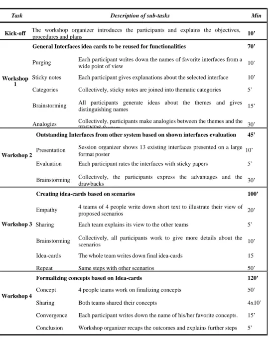
We employed a specific methodological approach including both a co-designing approach and creative collaborative thinking, starting with a creative session and following that up with semantic and emotional evaluation. The creativity session was intended to generate fresh ideas for a graphical interface to be developed. The session lasted a whole day, divided into four workshops with the participation of 18 consortium members. This applied-creativity method offered a relevant framework for the expression of ideas in an interdisciplinary context and aimed to bring all the partners to the same level of knowledge. The workshops are detailed in Table 1.
Table 1. The creativity session – Details of the workshop’s methodological content
Task Description of sub-tasks Min
Kick-off The workshop organizer introduces the participants and explains the objectives,
procedures and plans 10’
General Interfaces idea cards to be reused for functionalities 70’
Purging Each participant writes down the names of favorite interfaces from a wide point of view 10’
Workshop Sticky notes Each participant gives explanations about the selected interface 10’
1
Categories Collectively, sticky notes are joined into thematic categories 5’
Brainstorming All participants generate ideas about the themes and gives distinguishing names 15’ Analogies Collectively, participants make analogies between the themes and the
TRENDS System 30’
Outstanding Interfaces from other system based on shown interfaces evaluation 45’
Presentation Session organizer shows 13 existing interfaces presented on a large 10’
Workshop 2 format poster
Evaluation Each participant rates the interfaces with sticky papers 5’
Brainstorming Collectively, the participants express the advantages and the drawbacks 30’
Creating idea-cards based on scenarios 100’
Empathy 4 teams of 4 people write down short text to illustrate their view of proposed scenarios 20’
Workshop 3 Sharing Each team explains its view to the other teams 5’
Brainstorming Collectively, all participants work to give more details about the scenarios 10’ Idea-cards The whole team writes down final idea-cards 15
Repeat Same steps with other scenarios 50’
Formalizing concepts based on Idea-cards 120’
Concept 4 people teams work on finalizing concepts 50’
Workshop 4
Sharing Both teams shared their concepts 4x10’ Convergence Each participant writes down the name of his/her favorite concepts. 15’ Conclusion Workshop organizer recaps the outcomes and explains further steps 5’
Next, semantic and emotional evaluation was carried out, aiming to identify end users’ preferences and their definitions of the ideal interface. Users were asked to quantify their feelings with regard to several semantic and emotional descriptors based on the concept screenshots (non-interactive) via a web-based questionnaire, which took 10–15 minutes to complete. The descriptors used in the questionnaire were selected from the list of 50 emotions proposed by Geneva Emotion Research Group (Scherer, 1998) and also included items assessing arousal and pleasure. This evaluation was conducted in two successive iterations.
The first was to evaluate the graphic style presented during the creative session. The second evaluation concerned a new advanced graphic style, which was created on the basis of the first evaluation to meet participants’ imagined ‘ideal’ interface.
3.1.2 Prototype 2
Iteration 2 was conducted based on the interactive components available in Prototype 2, the version with limited functionality, such as keyword-, image content-based searching and relevance feedback. Twelve car designers (end- users) were asked to complete 14 specified tasks, for example, ‘Keyword search (using previously selected search terms) of selected sectors’ and ‘Zooming in and out from images’. On completion of each task, these end-users were asked to participate in four assessments: generic questionnaires semi-structured interviews, subjective performance assessment, and open-ended comment.
Generic questionnaires on interface usability were administered to enable users to describe their overall experience of using the system. These included multi-item assessments of ‘hedonic quality,’ ‘ergonomic quality,’ and ‘appeal,’ as developed by Hassenzahl et al. (2000) and Huang (2005), elements of the QUIS (Shneiderman, 1998) that focused on the quality of display design, and a number of other rating scales relating to affective experiences that were derived from earlier rounds of testing and were of interest to the consortium members. Finally, iteration II was concluded by conducting semi-structured interviews to solicit users’ views on features of the creativity support system that could be improved and features that would be most valuable to them if added to the system. Next, subjective performance assessments were used to evaluate usability regarding three points: error proneness, ease of tasks, and satisfaction of interface. Each task was rated on a 7-point Likert scale. This assessment was applied in both prototype 2 and prototype 3 in order to compare the evolution of interface quality. More detailed explication will be provided in part C. Finally, participants were also asked for open-ended comments relating to the associated functionality.
3.2 Results
3.2.1 Prototype 1: Generation and evaluation of the window style concept
After the creativity session with all consortium members, a refinement and synthesis session took place with four team leaders. A shorter creativity session was carried out, reviewing both the interfaces that had been shown in the initial creativity session and some additional interfaces. After the review of 18 existing interfaces and of the outputs (idea-cards) from the creativity session, each member was invited to draw spontaneously some rough graphic concepts. Table 2 shows the 15 resulting graphic interface proposals. Some of the proposals were similar to one another and easily amalgamated, so that we finally arrived at three
interfaces to be evaluated by the end users. They were “tree”, “desk”, and “galaxy’’ concepts as shown in Figure 2. After the first set of preference ranking evaluations, the “Galaxy” concept was chosen as the favourite concept by 13 individuals. The “Desk” and “Tree” concepts were chosen as the least favourite concepts.
Table 2. Proposal for window concepts after creative session synthesis
1.Tree 2.iPod-like wheel 3.Cylindrical Boxes 4.Transparent boxes 5. Bubbles
6. Desk 7. Cells 8. City-library 9. Face 10. Galaxy
11. Potatoid 12. Picasa-like 13. Desk board 14. Spider web 15. Tunnel
Figure 2. Three pre-selections for the window style: Tree, Desk, Galaxy concept
(TRENDS MD2, 2007)
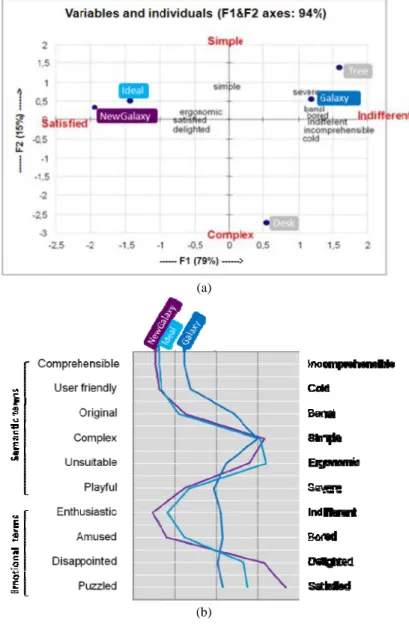
Next, Principal Components Analysis (PCA) was used to examine the structure of users’ responses to the semantic differential items (Mantelet, 2006; Bouchard et al., 2009). Aggregates of ratings for three alternative interfaces and the ‘ideal’ interface were used to position each in this two-dimensional space (labelled “Complex-Simple” and “Satisfied-Indifferent”). The semantic and emotional terms for the “ideal” interface gave us a reference for the evaluation of the existing graphic concepts. The PCA results reinforced the quantitative analysis results; end-users preferred the “Galaxy” interface. The “Galaxy” interface
concept was closest to the end-users “ideal” interface concept and the “Tree” concept was the most distant (Figure 3(a)). However, the end-users found the “Galaxy” concept less understandable, less playful, less delighted less satisfied and colder, more banal more bored than their “ideal” interface. Based on these weaknesses of “Galaxy” concept a new improved version, namely “NewGalaxy” was then designed (Figure 4). Using the same semantic and emotional scale used in the first test, the new version (“NewGalaxy”) was again shown to end-users to obtain feedback. Figure 3(b) shows that the “NewGalaxy” concept was closer to the end-users “ideal” than the “Galaxy” concept.
Figure 3. Comparisons between an “ideal”, the “Galaxy”, and the “NewGalaxy”
interfaces (TRENDS MD2, 2007) (a) (b)
Figure 4. Screenshot of ‘‘NewGalaxy’’ concept (Prototype 1)
3.2.3 Prototype 2: Results of generic questionnaires on interface usability
Figure 5 shows the mean (central ‘bar’) and maxima and minima (ends of vertical lines) which rated on 7 or 9-point Likert scale in generic questionnaires. Mean scores for ‘hedonic quality’, ‘ergonomic quality’, and ‘appeal’ were relatively good (see Figure 5(a)). On this basis it would seem that from both functional and aesthetic perspectives this proposed interface is performing well. Next, Figure 5(b) shows more that detailed individual ratings of interface usability and affective responses. Mean scores were generally favourable with the exception of the rating for system ‘controllability’. Further to this, variability of scores shows that some participants had not such a positive experience in interacting with the system. This was particularly evident for the ‘ease of use’ scale.
Figure 5. Ratings for overall interface assessments: (a) ergonomic quality, hedonic
quality, appeal (b) 22 individual ratings of interface usability and affective responses
(a)
(b)
4. Part B: Design and evaluation of icons/labels
4.1. Method
The protocol of iterative design and evaluation of icons/labels was largely based on the “Television Interactive” project (Lim et al., 2006). It was divided into three sessions: labels evaluation, icons evaluation, and icon–label-pairs evaluation. The evaluation involved 30 design and innovation professionals and four in-house interface designers from our laboratory. As a starting point for icon design, a basic interface metaphor was required to represent the TRENDS functionalities. For that reason, in-house interface designers introduced the “butterfly” metaphor to the end-users at the beginning of evaluation test.
As Figure 6 shows, participants were broken down into two groups: the first group participated in session 1 and session 3, the second group went though session 2 and session 3. The division into separate groups prevented from learning effects during the test and it insured that designers’ answers were not influenced by any previous exercise. After each evaluation session, a revision and re-design session was conducted by in-house interface designers.
Figure 6. Overview of icons and labels evaluation protocol
4.1.1 Session 1: Labels evaluation
The main objective of this session was to come up with a definitive and categorized list of labels on which we could base the rest of the evaluation. The end-users took two types of test: a sorting exercise and a labelling exercise. By avoiding learning effects, this order guaranteed a high quality results. The sorting exercise was a “card sorting” exercise, commonly used in usability tests; its purpose was to sort functionalities available in the system into groups and name these groups. The labelling exercise consisted in showing functionalities definitions one by one and asking the end-user to spontaneously give a name to it in one or two words. At the end of Session 1, we were able to create a list of 40 definitions related to the major functionalities that would be available within the system. The in-house designers produced the initial icon elements to catalyze the icon-evaluation process.
4.1.2 Session 2: Icons evaluation
The main objective of this session was to come up with a map showing the degree of recognition and understanding of the icons. It was directly linked with the icon effectiveness criteria: icons’ self descriptiveness and its recognition level within an icons family. The end-users took two types of test: a spontaneous labelling exercise and an association test between the definition of function and the icons.
The spontaneous labelling exercise consisted in giving a label (1 or 2 words) to a given icon. The icons are shown randomly, one after another. It enabled to directly measure the instantaneity of each icon. We should come up with a detailed list of misunderstood icons that should be modified. The association test consisted in showing a function definition and asking the tester to find –within a bunch of icons of the same category– the one that matches the most the given definition. This test provided a list of icons that could be confusing when shown together. At the end of session 2, the results coming from the labelling test and from the association test were combined and the combination of scores enabled to take a decision about whether we should implement the icon as it was designed initially or whether we should redesign it (cf. Table 3). For example, we decided to redesign icons which are located in the grey part of Table 3. Because, in case of A1 and A2, icon-labels pairs were correctly recognized in labelling test, and also properly selected in association test. In case of B1, icons were a suitably identified in association test even though lower score in labelling test.
Table 3. Icons scoring details and their effects on redesign strategy
Case type Labelling test score a Association test score b Decision
A1 0.33 < lts < 1 67 % < ats < 100 % To be implemented A2 34 % < ats < 66 % To be implemented A3 0 % < ats < 33 % To be redesigned B1 - 0.32 < lts < 0.32 67 % < ats < 100 % To be implemented B2 34 % < ats < 66 % To be redesigned B3 0 % < ats < 33 % To be redesigned C1 - 1 < lts < - 0.33 67 % < ats < 100 % To be redesigned C2 34 % < ats < 66 % To be redesigned C3 0 % < ats < 33 % To be redesigned
a = lts (average grade for replies evaluation), b = ats (% of correct answers among 14 participants)
4.1.3 Session 3: Icon-label pairs evaluation
Session 3 consisted of two tests: metaphor survey/preference test and suitability test. The objective is to explore visual metaphors to illustrate the “search” concept, as alternatives to the “butterfly” metaphor that was proposed by in- house interface designers; and get a final opinion from the end-users about the previously selected icons and labels. During the metaphor survey session, end- users were asked to generate possible metaphors by gathering representative images which might best express ‘search’ concept which is major function of the system. Next, the in-house interface designers analyzed the replies based on visual and/or semantic proximity and merged the ideas into four metaphor concepts. Then, end-users were asked to rank all four proposed metaphors from 1
(your favourite) to 4 (the one you dislike most) and comment their choice. In the suitability test, in order to validate whether the icon was correctly understood by the end-users in terms of the efficiency ISO criterion, the participants were asked to rate the suitability of 40 icons with regards to their associated label. Each rating was associated with a numerical value from ‘Very bad (-2)’ to ‘Very good (+2)’.
4.2 Results
4.2.1 Results of labels evaluation
The labels evaluation test enabled to see whether some functionality can be grouped into a common menu list. The groups proposed by the end-users are similar to the groups that were expected by the interface designers for most of them. Unlike the other functionalities, the TRENDS specific tools (mapping, statistics…) are grouped differently depending on the respondent, probably because the end-users are not familiar with this type of new tools and they don’t really know in which category to put them in. Therefore, a brainstorming by the interface design team had to set up in order to find a name to this very important group of functionalities. The test also allowed the collection of alternatives for naming the TRENDS functionalities that were initially named with the developers’ vocabulary. For instance, the “relevance feedback” function would become “tuning the search” in end-users’ words.
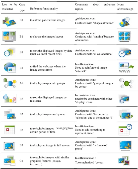
4.2.2 Icon redesign: combination of labelling test and association test
Based on Table 3, we ended up with 30 icons to be kept in their initial design and 10 icons to be redesigned. Redesign process was followed by the end-users feedback as a guideline (Table 4). The way the icons were redesigned was largely based upon the end-users replies from the labelling test and the association test. In fact, the labels proposed in labelling test and the ‘false choices’ in association test enabled to get an idea of what the end-users expected as an icon; it helped us identifying what visual elements should be added to the icon or removed from it, in order to influence the users perception toward the icon’s expected meaning. For instance, the icon for “extracting a pallet” (of colours, textures or shapes) was often named as “extracting a pallet of shape” by the end-users; for its redesign, we decided to stress on the “textures” and “shapes” extraction by enlarging the graphics that represent “textures” (a square with chess pattern) and “shapes” (the star silhouette). In addition, among the 30 icons to be implemented without redesign, five of them were slightly redesigned though (e.g. mainly colour changes), in order to reach a high-level of homogeneity in the graphic charter.
a a b w A A A N A A s N A o
Table 4. Combination of labelling and association tests results for icons to be redesigned
(excerpt)
Icon to be Case Comments about end-users Icons
evaluated type Reference functionality replies after redesign
B1 to extract pallets from images mbiguous icon:
Confused with ‘shape extraction’
mbiguous icon:
B1 to choose the images layout Confused with ‘ranking’ because of numbers.
B1 to sort the displayed images by date mbiguous icon:
(such as: most recent first) Confused with ‘d wnload time’
B1 to find the webpage where the image comes from
Insufficient icon: eed to reinforce of image ‘internet’
mbiguous icon :
A2 to display images into groups Confused with ‘group of images by colour’
B2 to sort the displayed images by relevance
Inconsistent icon :
need to be consistent with other ‘display’ icons
mbiguous icon : B2 to display images one by one Confused with ‘favourite’ or
‘ election’ due to the number ‘1’
B2 to se rch for images certain period of time
elonging to a Insufficient icon : eed to add something to represent ‘time’
mbiguous icon : B3 to display an image in full screen Confused with ‘ a frame of
photo’
to se rch for images ith similar Insufficient icon : C1 graphical features (colour,
texture…) Too emphasized ‘colour’
4.2.3 Metaphor survey and preference test
Based on a metaphor survey, the in-house interface designers built a mapping in which stand 4 types of concepts: ‘exploring’, ‘travelling’ ‘zooming’, ‘finding’ (see Figure 7(a)).Then they ended up with the four following symbolic metaphors
as support scenario concept; “exploring (butterfly),” “travelling (balloon),” “zooming (binoculars),” and “finding (magnifying glass).” After metaphor preferences test, the results showed that the zooming (binocular) concept was most preferred, followed by the exploring (butterfly) concept (Figure 7(b)).
Figure 7. (a) Results from metaphor survey, (b) Metaphor preference ranking
(a)
(b)
However, the ranking analysis showed that 70% of end-users who had ranked the binoculars first actually expressed a strong preference for the butterfly concept through their commentary. For example, one of end-users commented that ‘the binoculars represents the concept of searching at best since it is similar to the magnifying glass as the most common search icon. On the other hand, the other
end-user said ‘the butterfly metaphor wasn’t easy to understand at first, but this one feel good and makes sense for our specific project.’
4.2.4 Results of icon-label suitability test
As Figure 8 shows, among 32 icons and labels, 22 icons were well scored in terms of the icon-label suitability within small variations between designers. However, we found that icons related to ‘search’ function, such as ‘go search’ ‘random search’ ‘new search’, were scored relatively very low by comparison with other functionalities of the system. Moreover, there was a large variability among end-users. Actually, this low rating was expected by the in-house design team, since ‘‘butterfly’ metaphor for ‘search’ function was not really familiar with end-users. For example, in the labelling test, we got replies on search icons, such as: “no idea”, “butterfly” or “what is the meaning of this butterfly”. The participants got confused with the meaning of this icon. However, we decided not to redesign this icon at this stage, since we thought it would be more properly understood during further iterative design and evaluation process.
Figure 8. Suitability test output and its icons mapping
5. Part C. Integrated GUIs (Prototype 3)
5.1 Method
After integrating revised window style with a group of icons and labels into GUIs of prototype 3, End-users were asked to take the same subjective performance assessment as we describe in Part A (prototype 2). Each task was rated on a 7- point Likert scale in following three criteria:
Error proneness: could you complete the task without errors? (error free - error prone)
Ease of tasks: how easy extremely)
was it to complete this task? (not at all – Satisfaction of interface: when performing this task how satisfied were
you with the interface? (not at all – extremely)
Then, participants were also asked for open-ended comments relating to the associated functionality. This allowed comparison and assessment the interface quality between prototypes 2 to 3. Next, a sample of eight car designers was asked to undertake tests of usefulness in a longitudinal context (3-4 week period). In addition, a focus-group assessment was conducted with six end users to validate some functionalities of the system that were not available for the long- term tests and to get overall comments on final prototype. However, these last two assessments were more oriented to evaluation of the utility and usability of the functionalities. We present the reflections on the interface quality in a qualitative manner rather than through quantitative analysis of the results.
5.2 Results
5.2.1 Revision in response to open-ended comments from prototype 2 to
prototype 3
In previous subjective performance assessment with prototype 2, end-users were asked to note additional comments on their experience with the task, as well as their views on the interface. Comments clarified some issues that were encountered during the use of prototype 2. The location of the interface elements and its revision feature are illustrated in Figure 9. For example, (#1) ‘Go’ and ‘end of search’ buttons were inadequately located and confused among other buttons; (#2) ‘Relevance feedback’ label was unsuitable; (#3) sectors selection was complex and illegible: (#4) there was a lack of icons; (#5) sphere content was not big enough to display a total number of retrieved images; (#6) sphere colour was hard to identify its property.
Figure 9. Screenshot of (a) Prototype 2 and (b) Prototype 3
Results of open-ended comments provided qualitative data to supplement the quantitative assessment and helped to clarify many of the difficulties that users were experiencing. A number of detailed points were identified for improvement in the next prototype 3, and can be used as design specifications for further interface development.
5.2.2 Results of subjective performance assessment from prototype 2 to
prototype 3
Figure 10 shows the ratings of subjective performance assessment (a) ‘‘error proneness’’, (b) ‘‘ease of tasks’’, (c) ‘‘satisfaction of interface’’ between prototype 2 (red line) and prototype 3(blue line). Along with iterative process utility of the functionalities and the interface quality, prototype 2 did not include all the functionalities which are now available in prototype 3; and some of the functionalities in prototype 2 were renamed, for example, Content based search QBE (Query by example); relevance feedback Turning; ‘One by one’ display mode ‘Single’ display mode . Therefore comparisons are limited to those functionalities. Figure 10(a) shows ratings of ‘error proneness’ for each task from prototype 2 to prototype 3. Overall, participants were reporting fewer errors when completing tasks using prototype 3 and there are fewer extreme (high) scores. Particularly ‘zoom in’ function was rated as being very error prone in Prototype 3. Qualitative feedback highlighted that the ‘zoom’ tool was overlooked because the colour of the tool blended in with the desktop background.
In case of results of ‘ease of tasks’ in Figure 10(b), overall, participants found the interface tasks easier to complete when using prototype 3 than prototype 2. However, there are still many low ratings indicating that some participants found some tasks difficult. For example, prototype 3 scored lower for the keyword searching, QBE and ‘single’ display mode function. In case of ‘satisfaction on interface’ in Figure 10(c), overall, participants were satisfied with the majority of functionalities in prototype 3. However, as with ‘ease of tasks’ ratings, participants were satisfied more with the keyword search and QBE in prototype 2. There were also many low ratings which indicate a good deal of between-participant variability.
Although mean performance was found to be generally of an acceptable or good standard, this did not apply in all circumstances to all users. Minimum ratings indicated that, on occasions, the designers had a very unfavourable experience, so that variability in participants’ responses proved problematic. Qualitative feedback was useful in identifying specific problem areas, and on this basis areas for revision and improvement were identified. Three ‘themes’ for interface development were proposed in this regard: i) consistency (the interface should be consistent with that of other major software); ii) terminology (some descriptions need to be clarified); and, iii) visibility (the functionality of the system in some areas needs to be more ‘transparent’ – with visual clues given).
When comparing performance of prototype 3 with that of the performance of prototype 2, standards were fairly similar. Consistent with this, some issues relating to the interface quality were identified during the long-term test and in the focus groups. Command ‘visibility’ was again identified as an issue, and was ‘consistency’. Finally, the revised features of the GUI of TRENDS system are illustrated in Figure 11.
Figure 10. Comparison of results of subjective performance assessment between
prototype 2 and 3
Figure 11. Features of the GUI of TRENDS system: (A) window style ‘NewGalaxy’ (B)
Main menu together with the toolbar icons and labels (C) the all integrated components of GUI
6. Discussions
6.1. Methodological considerations in a longitudinal case study
6.1.1. From quantitative to qualitative assessment
When considering how to approach user testing of subsequent prototypes, both the quantitative and qualitative assessments adopted earlier seem to have worked well. However, some of the quantitative assessments did not prove particularly informative or accurate. In subjective performance assessment, as Figure 10 illustrates, participants’ ratings showed excessive variability; the mean scale scores do not convey the range of their positions with sufficient accuracy and may also disguise a substantial proportion of users who are not having a positive experience with the system. The generic questionnaire assessments of hedonic quality, ergonomic quality, and appeal were rather broad and not really sufficiently sensitive. Similarly, many of the individual ratings relating to the aesthetic experiences of users were not sufficiently productive to warrant inclusion in subsequent tests. Some quantitative aspects were therefore excluded from the later assessments.
The use of less constrained qualitative testing gives more emphasis to the purely informative elements of the assessment, which are extremely important for the realization of co-design. In the present study, users were engaged in an open assessment process involving recursive open-ended comments, semi-
directive interviews, and focus-group assessments. This enabled users’ strategies to be explored. However, the approach came at a cost in terms of experimental control and was, therefore, not a sufficient form of assessment in itself. Thus, balancing the quantitative and qualitative aspects of assessment was a crucial factor in preventing misinterpretation of quantitative results and adverse user reactions and reducing unnecessary redesign iterations.
6.1.2. Iterative process with sequential prototypes
In the particular case of the TRENDS project, which brought together experts from different research and industrial fields in a long-term context, it was necessary to ensure that the experiment was completed in a controlled manner. All end-users in the sample needed to be able to perform the same task on the basis of the same information. This enabled aggregation of the results for each task/interface component, allowing greater confidence in the conclusions. It also facilitated the setting of user requirement specifications and made comparisons with subsequent system design iterations (later prototypes) possible. The usual approach to GUI development involves separate conception and evaluation processes; yet many researchers have advocated the importance and efficiency of the iterative process in design (Neilson, 1993; Resnieck et al., 2005), and many empirical studies have shown the value of the iterative process in developing GUIs (Lim et al., 2006). However, they tend to begin the iterative process at a later stage and are further limited by the level of active end-user participation (Figure 12).
Figure 12. Evolution of conception and evaluation process
In the present study, we attempted to actively apply an iterative process and a co-designing approach throughout the separate testing processes for the graphical interface, the database contents, and the retrieval functionalities. The results were appreciated by end-users in terms of the quality of the interface and also the utility of the functionalities. Due to limitations of space, we have not outlined all of the functionalities in complete detail, but an evaluation of the
utility of the functionalities and the descriptions can be found in the paper of Bouchard et al.(2008). Specifically, Mougenot et al. (2008) and Bonnardel and Zenasni (2010) have conducted several empirical experimentations to explore the impact of the TRENDS system in terms of a creativity support tool. The work of Bonnardel and Zenasni (2010) showed that inspirational images provided by the TRENDS system allowed experience designers to produce creative ideas under the influence of their evocation of new concepts.
In addition, a subsequent prototype was developed using a process that allowed even more flexible participation by end-users. This process enabled the development of icons/labels, important features of graphical user interface, under a time constraints. However, the process did not allow sufficient time to evaluate the final operational prototype in a long-term context. As mentioned above, eight end users had a chance to use operational prototype for 3–4 weeks. However, in the context of a real working environment, most end users are likely to be working on specific phases of project that do not require the use of the creativity support system. Moreover, some of the functionalists were not completely integrated. Thus, we did not really gain sufficient feedback, and further long-term testing was needed.
6.2. Effects of the subjective aspect of GUI
6.2.1. Originality versus practicality
As the TRENDS system was conceived as a creativity support tool for designers, the main concern when considering the quality of the interface was to develop an engaging, icon-based, graphical interface that would encourage creativity and be user-friendly and original. In spite of excellent feedback from end users, we need to weigh users’ suggestions carefully to prevent premature rejection of original features of the GUIs in the longitudinal study.
In particular, in the metaphor survey, we noticed that some participants liked the butterfly metaphor, as end-users suggested some spin-off metaphors that included butterflies. However, the metaphor preference test results showed that end users preferred the binoculars metaphor. This result shows how, even though the end users pursued the original icon feature, they thought that the binocular metaphor was both more original and more understandable than the traditional magnifying glass searching metaphor, whereas the butterfly metaphor was considered more original but less understandable. The present result supports the finding by Goldschmidt (2006), who proposed that when visual stimuli dramatically increase in originality, a negative effect on practicality may result. Similar results have been highlighted in our previous icon design development project for interactive TV menus (Lim et al., 2006).
Considering that our system aims to inspire designers through its image- retrieval functionalities, the butterfly metaphor seemed to meet this property of the software more directly. In a behavioural sense, the butterfly, is a more widely used metaphor than binoculars or magnifying glass, which is mostly employed in
classic search engines (e.g., Google) to represent a relatively focused, targeted search. Thus, we kept the butterfly metaphor in the later prototype evaluation, and at the end of the project, the butterfly metaphor was indeed selected by end- users. In its support, one of the common comments was that “the butterfly metaphor wasn’t easy to understand at first, but it is fun and made sense for the creativity support tool in order to inspire design activity.”
6.2.2. Cultural differences
One problem for an international, interdisciplinary project lied in the language used for testing. Many of the constructs used in the assessments were semantically complex. Translation between languages was, therefore, a major issue. Reducing the number of assessments would help in this regard; however, further consideration needs to be given to the issue. Moreover, the differences between cultures might become significant when dealing with the issue of aesthetics, which may vary across cultures. Likewise, many sub-factors associated with each of these dimensions may eventually determine user preference.
7. Conclusions
In this study, we proposed a co-designing, iterative design and evaluation process for icon-based graphical interface. This approach specifically aimed at designing a graphical user interface for creativity support tools for designers. Proposed methodology was designed and validated through carrying out a case study: the TRENDS system. This system is a content-based information retrieval system to improve designer’s assess to inspirational resources – visual materials. Considering that the software is likely to be viewed as an optional tool by end users, their willingness to use will probably be highly influenced by aesthetic considerations. The TRENDS system thus aimed to engage end-user participation, and it was important that the graphic elements of the interface encouraged creativity through innovative, engaging, and user-friendly features.
Based on the findings from the longitudinal case study, we validated that our iterative design and evaluation process was a very efficient means of incorporating end users’ spontaneous feedback about icon redesigns in the early phases of development. It also enabled the end users to ensure that key features of the creativity support tool were both usable and appealing.
In future work over the short-term, we intend to continue to assess the operational prototype with expert designers (from different design sectors) to ensure the utility of the functionalities and the quality of the interface. Over the longer term, as additional new technology penetrates designers’ work places, the computational support arena is expanding from software tools for individual designers working in isolation to composite tools designed for collaborative working environments. Our present methodology will need further development to prepare for this evolution in technology and its varied applications.
Acknowledgement
This work was supported in part by the European Commission for funding TRENDS project (FP6 IST 2005-27916). The authors are grateful to express their gratitude to all partners of TRENDS consortium for their contribution. The authors would also like to thank the anonymous reviewers for their valuable comments and suggestions to improve the quality of the paper.
References
Bilda, Z. and Gero, J.S.: 2007, ‘The impact of working memory limitations on the design process during conceptualization'. Design Studies, 28(4), pp.343–367.
Bonnardel, N. and Zenasni, F.: 2010, ‘The impact of technology on creativity in design an enhancement?’ Creativity and innovation management, 19(2), pp.180–191.
Bossen, C., Dindler, C., Iversen, O.S.: 2010, ‘User gains and PD aims: Assessment from a participatory design project’, PDC '10: Proceedings of the 11th Biennial Participatory Design Conference, pp.141–150.
Bouchard, C., Omhover, J.F., Mougenot, C., and Aoussat, A.: 2008. ‘TRENDS: A Content–Based Information retrieval system for designers’, Proceeding of Design Computing and Cognition DCC’08, Part 7, pp.593–611.
Bouchard, C., Mantelet, F., Aoussat, A., Solves, C., Gonzalez, J.C., Pearce, K., van Lottum, C., Coleman, S.: 2009. ‘A European emotional investigation in the field of shoe design’, Intenrational
Journal of Product Development, 7 (1/2), pp.3–27.
Carroll, J.M., Mack, R.L. and Kellogg, W.A.: 1998, ‘Interface metaphors and user interface design’. In: M. Helander, ed. Handbook of Human-Computer Interaction. Elsevier Science Publishers B.V., The Netherlands, pp.67–85.
Campos, P. and Nunes, N.: 2007, ‘Toward useful and usable interaction design tools: CanonSketch’. Interacting with computers, 19, pp.97–613.
Chen, P.P.: 2003, ‘Toward a Methodology of Graphical Icon Design’. Proceedings of the IEEE Fifth International Symposium on Multimedia Software Engineering (ISMSE'03).
De Angeli, A., Sutcliffe, A. and Hartmann, J.: 2006, ‘Interaction, usability and aesthetics: what influences users' preferences?’ Proceeding of Symposium on Designing Interactive System, pp.271–280.
Dillon, A.: 2002, ‘Beyond usability: Process, outcome, and affect in human-computer interactions’. Canadian Journal of Information and Library Science, 26(4), pp.57–69.
Finke, R. A.: 1990, ‘Creative Imagery: discoveries and inventions in visualization’. Hillsdale, NJ. Goldschmidt, G.: 1994, ‘On visual design thinking: the vis kids of architecture’. Design Studies, 15(2), pp.158–174.
Goldschmidt, G. and Smolkov, M.: 2006, ‘Variances in the impact of visual stimuli on design problem solving performance'. Design Studies, 27 (5), pp.549–569.
Hevner, A., March, S., Park, J. and Ram, S. :2004, ‘Design Science in Information Systems Research’. MIS Quarterly, 28(1), pp. 75–105.
Huang, S-M., Shieh, K-K. and Chi C-F.: 2002, ‘Factors affecting the design of computer icons’. International journal of industrial ergonomics, 29(4), pp.211–218.
Huang, M-H.: 2005, ‘Web performance scale. Information & Management’, 42(6), pp.841–852. Hassenzahl, M. and Tractinsky, N.: 2006, ‘User experience – a research agenda’. Behavior and Information Technology, 25, pp.91–97.
Horton, W.: 1994, ‘The ICON Book: Visual Symbols for Computer Systems and Documentation’. New York: John Wiley & Sons, Inc
Green W.S. and Jordan, P.W.: 2002, ‘Pleasure with Products: Beyond Usability’, London and New York:Taylor and Francis.
Scherer, K.R.: 1988, ‘Facets of emotion: Recent research - Appendix: Labels describing affective states in five major languages’. (Version revised by the members of the Geneva Emotion Research Group), pp.241–243.
Keller, A.I.: 2005, ‘For Inspiration Only – Designer Interaction with informal collections of visual material’. Thesis (PhD), Delft University of Technology.
Lavie, T. and Tractinsky, N.: 2004, ‘Assessing Dimensions of perceived visual aesthetics of web sites’. International Journal of Human-Computer Studies, 60(3), pp.269–298.
Lin, R.: 1994: ‘A study of visual features for icon design’. Design studies, 15(2), pp.185–197. Lim, D., Bouchard, C. and Aoussat, A.: 2006, ‘Iterative process of design and evaluation of icons for interactive TV menu’. Behaviour and information technology, 26(6), pp. 511–519.
Nakakoji, K.: 2005, ‘Special Issue on Computational Approaches for Early Stages of Design’. Knowledge-Based Systems, 18(8), pp.381–382.
Nielsen, J.: 1993, ‘Usability engineering’. Cambridge, MA: Academy Press Professional.
Mantelet, F.: 2006, ‘Prise en compte de la perception émotionnelle du consommateur dans le processus de conception de produits’. Thesis (PhD), Arts et Metiers ParisTech.
Mougenot, C., Bouchard, C., Aoussat, A. and Westerman, S.: 2008, ‘Inspiration, Images and Design: An Investigation of Designers’ Information Gathering Strategies’. Journal of design research, 7(4), pp.331–351.
Muller, M., Haslwanter, J. and Dayton T.: 1997, ‘Participatory Practices in the Software Lifecycle’. In: M. Helander, T.K. Landauer, P. Prabhu, eds. Handbook of Human-Computer Interaction. Elsevier Science Publishers B.V., The Netherlands, pp.256–297.
Pasman, G.: 2003, ‘Designing with precedents’. Thesis (PhD), Delft University of Technology Passini, S., Strazzari, F. and Borghi, A.M.: 2008, ‘Icon-function relationship in toolbar icons’. Displays, 29(5), pp.521–525.
Prats, M., Lim, S., Jowers I., Garner, S.W. and Chase, S.: 2009, ‘Transforming shape in design: observations from studies of sketching’. Design Studies, 30(5), pp.503–520.
Restrepo, J.: 2004, ‘Information processing in design’. The Netherlands:Delft University Press, the Netherlands.
Resnieck, R. Myers, B., Nakakoji, K., Shneiderman, B., Pausch, R., Selker, T. and Eisenberg, M.: 2005, ‘Design principles for tools to Support Creative Thinking’, Workshop on Creativity Support Tools'.
Sanders, E.B.-N., and Stappers, P.J.: 2008, ‘Co-creation and the new landscapes of design’. CoDesign, 4(1), pp.5–8.
Sauer, J. and Sonderegger, A.: 2009, ‘The influence of prototype fidelity and aesthetics of design in usability tests: Effect on user behavior, subjective evaluation and emotion’. Applied Ergonomics, 40, pp.670–677.
Shneiderman, B.: 1998, ‘Designing the User Interface: Strategies for Effective Human-Computer Interaction’, 3rd ed., Reading, MA: Addison Wesley Longman.
Tractinsky, N., Katz, A.S. and Ikar, D.: 2000, ‘What is beautiful is usable’. Interacting with Computers, 13, pp.127–145.
TRENDS MD2: 2007, ‘Meta-deliverable 2 – User factors [online]’. Available from: http://www.trendsproject.org [assessed 8 December 2008]
Ullman, D. G., Dietterich, T. G. and Stauffer, L. A.: 1988, ‘A model of the mechanical design process based on empirical data’. AI EDAM, 2(1), pp.33–52.
You, M., Chen, C.-w., Liu, H., Lin, H., 2007. ‘A usability evaluation of web map zoom and pan functions’. International Journal of Design, 1(1), pp.15–25.
Waterworth, J. A., Chignell, M. H., and Zhai, S. M.: 1993, ‘From icons to interface models: designing hypermedia from the bottom-up’, International Journal of Man-Machine Studies, 39, pp.453-472.