HAL Id: hal-02986447
https://hal.archives-ouvertes.fr/hal-02986447
Submitted on 3 Nov 2020
HAL is a multi-disciplinary open access
archive for the deposit and dissemination of
sci-entific research documents, whether they are
pub-lished or not. The documents may come from
teaching and research institutions in France or
abroad, or from public or private research centers.
L’archive ouverte pluridisciplinaire HAL, est
destinée au dépôt et à la diffusion de documents
scientifiques de niveau recherche, publiés ou non,
émanant des établissements d’enseignement et de
recherche français ou étrangers, des laboratoires
publics ou privés.
GraphletMatchMaker: Visual Analytics Approaches to
Graph Matching in Cybersecurity Communities
Natkamon Tovanich, Alexis Pister, Gaëlle Richer, Paola Valdivia, Jean-Daniel
Fekete, Christophe Prieur, Petra Isenberg
To cite this version:
Natkamon Tovanich, Alexis Pister, Gaëlle Richer, Paola Valdivia, Jean-Daniel Fekete, et al..
Graphlet-MatchMaker: Visual Analytics Approaches to Graph Matching in Cybersecurity Communities. IEEE
Visual Analytics Science and Technology, VAST Challenge, Oct 2020, Virtual Conference, United
States. �hal-02986447�
GraphletMatchMaker: Visual Analytics Approaches to Graph Matching in
Cybersecurity Communities
Natkamon Tovanich‡* Alexis Pister†* Ga ¨elle Richer* Paola Valdivia†* Jean-Daniel Fekete*
Christophe Prieur† Petra Isenberg*
*Universit ´e Paris-Saclay, CNRS, Inria, LRI, France †I3, CNRS, T ´el ´ecom Paris, Institut Polytechnique de Paris, France
‡IRT SystemX, Paris-Saclay, France
ABSTRACT
We report on our approach, statistical and graphical analysis, as well as three visual analytics tools we built to address the VAST 2020 Mini-Challenge 1. First, we compared the structure of subgraphs us-ing node-link diagrams, graphlet frequencies, and temporal profiles. Second, we devised a method to extract a subgraph of the large graph that matches the identified graph structure and built a custom visu-alization to check our results. Finally, we developed another visual analytics tool to facilitate manual search for pairing person nodes that helped us to solve the challenge. The full report and visualizations are available at https://graphletmatchmaker.github.io/.
1 INTRODUCTION
The VAST Challenge 2020 [1] presents a scenario in which a group of “white hat” hackers accidentally caused an internet outage. The main data structure a directed temporal graph consisting of multiple types of nodes and edges, mainly showing the relationship between person nodes linked through phone and e-mail edges. Edges include timestamps and locations of the respective activities. Each person node has numerical demographic attributes of 30 financial categories. The dataset also includes procurement records (buy and sell of products) and travel history of each person node.
Analyzing and visualizing such a multidimensional and temporal social network is a challenging problem. Here, we explain our ap-proach and solution to the Mini-Challenge 1 which asked to identify a hacker group with a graph structure similar to a given social net-work profile (template graph). We present our approach and three visualization tools we built under the name GraphletMatchMaker. Specifically, we present visualizations to compare the template graph with candidate graphs (Sect. 2) and describe our methods to find matching subgraphs in the large graph (Sect. 3). Finally, we briefly describe our node-matching tool to pair person nodes between two graphs (Sect. 4).
2 COMPARINGGRAPHSTRUCTURE
To compare the structure between the template and candidate graphs, we: (1) drew node-link diagrams to compare the overall graph structure, (2) calculated graphlet frequencies to analyze the node connectivity pattern, and (3) visualized temporal profiles to observe activities of each graph over time.
Node-link diagrams: We compared the structure of the template and candidate graphs showing every node and edge type (Fig. 1).
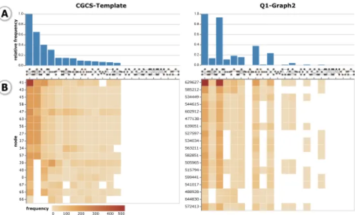
Graphlet frequencies: Graphlets are all small non-isomorphic induced subgraphs constituting a graph [2]. The graphlet frequen-cies allowed us to understand a graph’s global and local topological structures by making explicit which structural patterns form the
*e-mail: {firstname.lastname}@inria.fr
†e-mail: {firstname.lastname}@telecom-paristech.fr
CGCS-Template Q1-Graph2
Figure 1: Node-link diagram view. Node shape corresponds to node type while color indicates a node’s location. Edge types can be filtered.
0 100 200 300 400 500 frequency CGCS-Template 41 43 45 58 47 63 56 27 37 34 57 39 40 0 67 65 66 node relative frequency Q1-Graph2 629627 585212 534449 544615 602912 477138 639051 527597 534034 563211 582851 505965 515794 599441 541017 488928 644830 572413 A B
Figure 2: Graphlet frequency view. (A) Relative frequency of each graphlet as a histogram sorted by frequency in the template. (B) Graphlet frequencies for each node as a heat map.
graph. We compared the structure of person-to-person relationships between the template and the candidates using graphlet frequen-cies. Fig. 2 compares two graphlet frequencies as histograms for an overview of the entire graphs (A) and heatmaps to see the detail at the node-level (B).
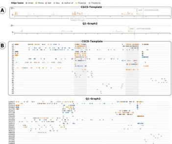
Temporal profile: We plotted temporal pattern similarity as stacked area charts by counting the number of edges per day; Fig. 3 (A). Next, we also showed detail for each node in scatter plots (B).
3 NODEMATCHING IN THELARGEGRAPH
The second task involved finding a subgraph in the large graph (7.4 GB) that matches the template. We used several similarity measures to find person nodes in the large graph that had the same properties as nodes in the template graph: demographic profiles,
629627 585212 572413 505965 515794 602912 477138 639051 534449 527597 644830 541017 544615 599441 582851 534034 563211 488928 635665 464459 568093 572391 542965 538892 Q1-Graph2 41 63 47 39 37 27 34 56 67 58 40 43 57 65 45 78 80 77 79 87 85 86 73 75 74 82 83 84 CGCS-Template 0 20 0 20 CGCS-Template Q1-Graph2 peak activity in the middle of the year
only travel activity
only travel activity peak
peak
Edge types Email Phone Sell Buy Author-of Financial Travels-to
A
B
Figure 3: Temporal profile view. (A) The total number of activities (edges) for each day as stacked area charts. (B) The detail for each node in the graph as a scatter plot. Nodes are sorted by the total number of edges. In the figure, the candidate graph 2 has a similar activity peak as the template graph with a 14-day shift.
emographicsCosine travelJaccard dtwAllEdges dtwCommunication dtwTravel glPhone-undir5 glEmail-undir5 0.0 0.5 1.0 2025-01 2025-02 2025-03 2025-04 2025-05 2025-06 2025-07 2025-08 2025-09 2025-10 2025-11 2025-12 0 50 100 150 template candidate
supplementary common missing
Communication links
0.0 0.2 0.4 0.6 0.8 1.0
Distance
0 1 2 3 4 5
Country (from phone calls) Person-pairing comparison view. Matched 49/51.
Figure 4: Node matching view. The top row of circles represents person nodes in the template and the bottom one the matched person nodes in a candidate graph; with color indicating node location. Arc colors show where the candidate graph agrees (green), disagrees (red), or adds to (grey) the template graph. Each row between them encodes similarity metrics as a heatmap. The bar chart at the bottom shows the number of edges that agree or disagree for each month.
travel itineraries, and graphlet patterns. To compared the result of our node matching between two graphs we built a custom visualization. Matching using the seeding edges: We developed a greedy al-gorithm to find subgraphs similar to the template near the given seeds. Starting with the person node in the seeding edge, we added the immediate neighbors to a set of candidates. We calculated the similarity metrics between the person node in the template and all candidate nodes. At each step, we choose the candidate node that had the highest similarity and added its neighbors to the candidate set. The algorithm stopped when all persons in the template had been matched to another person in the graph. We retrieved all communi-cation edges between the matched nodes to form the final candidate graph. The combination of two similarity metrics, namely demo-graphic profiles and travel itineraries, led to a good result with high recall (green links), some missing connections (red links), and many additional edges (grey links), as shown in Fig. 4.
Matching in the large graph: We used the fact that there is a single relationship of seller-product-buyer in the template graph to search for seeding edges in the large graph. Fig. 5 helped us compare
travels from template present in extracted sub-graph
very similar
one-to-one correspondance of purchased products
1 2 3
4
Figure 5: Node profiles comparison view. We compared two per-son nodes based on multiple criteria: (1) their financial/demographic activity, (2) multiple distance metrics between two nodes, (3) node matching of their neighborhoods and (4) their temporal activity profiles.
C
D A
B
selected node pair
1 2 3
4
Figure 6: Manual node-matching tool. On the left, (A) the template and (B) the candidate graph as node-link diagrams and temporal profiles. On the right, users can select a person node pair from (C), the sortable distance metric table. Once a node pair is selected, (D) the node profiles comparison view allows to investigate the similarity of the profile of two selected nodes.
the profile of two person nodes and therefore detect the matching nodes. In the figure, we observe that these two buyer profiles are very similar, with a shift of a few days in temporal activities. Based on this finding, we extracted person nodes with the most similar demographic profiles and further found more matching nodes with the same travel itineraries. We used node-link diagrams (Fig. 1) and temporal profile charts (Fig. 3) to filter edges that matched the template graph. In the end, we used the node matching view (Fig. 4) to evaluate the matching subgraph. This approach led to the candidate graph that has a similar structure as the template graph.
4 MANUALNODE-MATCHINGTOOL
After trying to match nodes from the large graph, we found that similarity metrics on demographic profile and travel itineraries are efficient to discriminate possible person node pairs that led to the best-matched nodes and then to better strategies for automated subgraph extraction. From these findings, we developed a manual node-matching tool, as shown in Fig. 6, that can help to compose a good match from initial entry points, i. e. a possible match for one or more nodes from the template graph. The tool consists of multiple linked views based on the other visualizations we developed. It allows users to extract subgraphs of reasonable size from the large graph and inspect a manageable set of possible node pairs.
REFERENCES
[1] K. Cook and R. J. Crouser. VAST Challenge 2020. https:// vast-challenge.github.io/2020/(accessed Aug. 21, 2020). [2] N. Prˇzulj. Biological network comparison using graphlet degree