O
pen
A
rchive
T
OULOUSE
A
rchive
O
uverte (
OATAO
)
OATAO is an open access repository that collects the work of Toulouse researchers and
makes it freely available over the web where possible.
This is an author-deposited version published in :
http://oatao.univ-toulouse.fr/
Eprints ID : 18756
The contribution was presented at CHI 2016 :
https://chi2016.acm.org/wp/
To cite this version :
Serrano, Marcos and Roudaut, Anne and Irani, Pourang
Investigating Text Legibility on Non-Rectangular Displays. (2016) In: SIGCHI
Conference on Human Factors in Computing Systems (CHI 2016), 7 May 2016 -
12 May 2016 (San Jose, CA, United States).
Any correspondence concerning this service should be sent to the repository
administrator:
[email protected]
Investigating Text Legibility on Non-Rectangular Displays
Marcos Serrano*
University of Toulouse - IRIT
Toulouse, France
[email protected]
Anne Roudaut*
University of Bristol
Bristol, United Kingdom
[email protected]
Pourang Irani
University of Manitoba
Winnipeg, Canada
[email protected]
*both authors contributed equally to this work
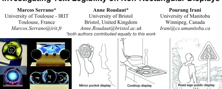
Figure 1. Left: examples of freeform displays developed by Sharp. Right: freeform display usage scenarios collected during two focus groups that illustrate the diversity of shapes that can hold text, such as: circular mirrors for private notifications, shapes with
holes such as a cooktop displays for recipes or the back of triangular road signs as public displays. ABSTRACT
Emerging technologies allow for the creation of non-rectangular displays with unlimited constraints in shape. However, the introduction of such displays radically deviates from the prevailing tradition of placing content on rectangular screens and raises fundamental design questions. Among these is the foremost question of how to legibly present text. We address this fundamental concern through a multi-part exploration that includes: (1) a focus-group study from which we collected free-form display scenarios and extracted display shape properties; (2) a framework that identifies different mappings of text onto a non-rectangular shape and formulates hypotheses concerning legibility for different display shape properties; and (3) a series of quantitative text legibility studies to assess our hypotheses. Or results agree with and extend upon other findings in the existing literature on text legibility, but they also uncover unique instances in which different rules need to be applied for non-rectangular displays. These results also provide guidelines for the design of visual interfaces.
Author Keywords
Freeform display; non-rectangular display; visual design guidelines; text legibility.
INTRODUCTION
It is commonly accepted that interactive devices should have rectangular screens and, by proxy, rectilinear interfaces. Surprisingly, the first CRT displays were designed as circles but were later changed to fit the rectangular shape of perforated strips used to record old movies. Almost a century later, we are still using rectangular displays!
Recent breakthroughs in semiconductors and display technologies (e.g. OLEDs, IGZO1) enable the design of displays with varying shapes and topologies (Figure 1-left). However, such novel form factors challenge many of the fundamental principles and guidelines that have been accumulated over the past decades for presenting and interacting with content. To support the practical adoption of such form factors, we need to rethink our understanding of how we display and interact with associated content. Here we tackle the core concern of how to display text on a screen that is non-rectangular. Reading text is fundamental to many tasks including visually scanning, flicking through a document for specific content or displaying icons. However, running a large study comparing text legibility on multiple shapes is difficult because of the high dimensionality of possible topologies. To address this issue, we selected a self-contained subset of shapes by means of a qualitative study with end-users to seek descriptions of some compelling and practical usage scenarios of free-form
1
Sharp manufactures free form LCDs using Indium Gallium Zinc Oxide thin-film transistor in the backplane of flat-panel displays.
displays in our everyday life. More specifically, we built on information obtained from participants in focus groups in two countries to extend the diversity of scenarios usages of free-form displays. From these, we compute several display shape properties using an algorithm inspired from [37]. We first propose a framework that identifies the possible mappings between text content and a shape. Supported by earlier work on text legibility, we then formulate 10 hypotheses to predict how these mappings impact text legibility on displays with various shape properties. Finally, we verify our hypotheses through four controlled experiments. The results indicate that text legibility performance can be affected by shape properties, such as with shapes having holes, or in certain interactive conditions, such as when text is scrolling in a non-rectangular display. We found that presentation strategies can mitigate these problems, such as by arranging text into columns around a display’s holes or by using variable text size for scrolling on a non-rectangular display.
Our contributions are: (1) a set of compelling display shape properties derived from scenarios created by focus group participants; (2) a framework identifying the possible mappings of text onto free-form shapes; (3) a series of guidelines for the design of text content on free-form displays based on the results of our quantitative studies. We believe that our work will not only be relevant for the growing field of organic user interfaces but also to the topic of information visualization and to the question of how to display text or labels on non-rectangular shapes.
RELATED WORK
Our work is motivated by recent developments in non-rectangular display technologies as well a text legibility. However the literature on text legibility is quite extensive and thus we only cover relevant work in the section “Mapping text onto shapes” to introduce our hypothesis. Electronic systems
For practical reasons (wiring components, mechanical stability, and production yields) traditional liquid crystal displays (LCD) are manufactured as rectangular objects. Only recently, Sharp [19] introduced technologies to design arbitrary 2D display shapes. Embedding thin-film transistors (Indium Gallium Zinc Oxide) in the backplane of flat panel displays allows them to be ‘cut’ into any desired 2D shape. Deformable displays, such as Organic Light Emitting Displays (OLED) and electrophoretic displays (E-ink), are also promising technologies for free-form shape (or non-rectangular) displays. Although most technologies use a rectangular base, it is possible to create other 2D topologies [31]. For instance LG has created the first circular Plastic-OLED [43]. To our knowledge such technologies, while still in their infancy, are limited to 2D shapes.
Optical systems
Projections can be used to create non-rectangular displays. In Sphere [3], a projector at the base of a sphere projects pre-distorted or flattened objects on the sphere’s inner surface. In [11], the same principle of back projection is applied to a humanoid face. Projection mappings can also take place on arbitrary surfaces [22] or surfaces with pre-computed geometries [34].
While these approaches can display content on many types of shapes, they are cumbersome due to the size of the projectors as well as the need for an unobstructed path between the projector and the surface. PAPILLON [6] addresses these issues with 3D printed optics. The display surface is constructed using a 3D light array of pipes that directs images from a source (e.g. a LCD) to the surface. As a result a smaller distance is required between the display sources and the surface.
Multifaceted systems
These systems use display primitives such as Facet [28], TUISTER [8], DataTiles [35] or Tilt Displays [1] to compose larger displays. In some of these systems, actuators facilitate the dynamism in display shape properties [1]. Multi-faceted systems have also found practical applications in larger scale public displays [25], wherein several rectangular displays are combined in different shapes to investigate the effect on passer-by interaction. Another interesting example of a multi-faceted system is D20 [33], which is a prototype of an icosahedron-shaped handheld digital device that has a triangular display on each of its faces.
FOCUS GROUPS: DISPLAY SHAPE PROPERTIES The goal of this initial study is to collect usage scenarios of free-form displays in order to generate display shape properties that will inform our choices of shape categories in further quantitative studies.
Goal
As previously highlighted, the high dimensionality of geometrical topologies makes it difficult to design an experiment to compare all the potential variables that define a free-form display. We thus aimed to identify only a subset of relevant shapes. To achieve this, a first strategy may be to systematically study the geometrical features of shapes, e.g. using shape resolution features [36]. However this approach might lack ecological validity. Another approach could be to focus on a particular case. However results would have been too specific and not generalizable. We opted for a more general and user-centered approach and thus brainstormed with end-users to capture a subset of compelling shapes in terms of displaying and interacting with content. This approach constrains the potentially large set of shapes, but it also provides the added advantage of allowing us to focus our set of initial studies on this subset.
Task and procedure
We ran two focus groups in 2 countries (France and the UK) to maximize the diversity of scenarios we could collect, and to avoid cultural biases (albeit, both countries are dominated by “Western” culture). Eight university students (2 females) with an average age of 27 took part in the French study, while the UK study was made up of 12 computer science students (3 females) between the ages of 20 and 24.
We began the focus groups by presenting the concept of free-form display. We then asked participants to brainstorm in groups of 3-4 and to create cards describing their ideas. Each card contained specific text fields: what, where, and a description along with a blank area for an illustration of their idea with a shape. We ended the session with an open discussion where participants could generate more cards. We collected 62 cards depicting 41 shapes once redundancies were eliminated. Most were 2D, and 3D ones were represented using 2D likenesses that corresponded to the user’s point of view (e.g. a circle for a sphere). The 3D shapes consisted of simple geometries such as spheres, cylinders, or semi-cylinders (e.g. the arm rest of a seat).
Results
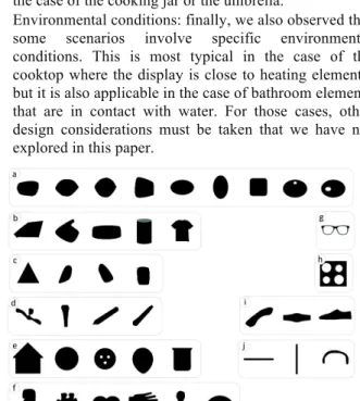
To analyze the shapes, we used a clustering algorithm similar to the one proposed in [37]. Figure 2 shows the 41 shapes clustered in 10 groups. From this figure we can observe a set of display shape properties:
• Symmetry: overall there are slightly more symmetrical shapes (25) than non-symmetrical.
• Curvature: group A contains the largest number of shapes that are ovoid in nature, for example car side mirrors, purses, sinks, or oval tables. Group B, C and E are also quite round in nature (ovals, circles, cylinders) but these groups also contain some shapes with sharp boundaries such as a triangle (road signs), miniature house shape, a tee shirt, or a cooktop. Our algorithm grouped these shapes because their overall distribution of points is similar, although boundaries differ. On the other hand, group F contains shapes with rather smooth curvature but with more intricate patterns such as a hand, a piece of a jigsaw puzzle, or a humanoid shape. • Porosity: we found several shapes with holes in groups
A (bathroom elements), E (electrical plugs), G (glasses), and H (cooktop). In group F we also observed shapes with long concavities such as a hand or a jigsaw puzzle piece. We can liken these concavities to open holes as they will disturb the display of the text in a similar way. • Length-Width ratio: groups D, I, and J contain shapes with a low length to width ratio, meaning that a good number of samples included long and thin shapes such as pencils, faucets, chair arms, or belts.
In addition to the observations in Figure 2, we also noted these additional properties:
• Orientation: we observed that some displays had particular orientations (not reflected in Fig.2 as our
algorithm is rotation invariant). This is quite often the case with shapes that have a small Length-Width ratio. For instance the pen where the display on the casing is at an angle from the user’s point of view. Another example is the handle of a frying pan.
• Scrolling: many scenarios involve a display content that needs to be scrolled to access more information, such as the case of the cooking jar or the umbrella.
• Environmental conditions: finally, we also observed that some scenarios involve specific environmental conditions. This is most typical in the case of the cooktop where the display is close to heating elements, but it is also applicable in the case of bathroom elements that are in contact with water. For those cases, other design considerations must be taken that we have not explored in this paper.
Figure 2. Cluster of shapes from the qualitative study. MAPPING TEXT ONTO SHAPES
We propose a framework that aims at presenting different
mappings of text content onto arbitrary shapes. We then
draw on relevant text legibility work and formulate hypotheses to predict how the mappings affect legibility when displayed with different display shape properties.
Mappings framework
The framework describes three axes with increasing levels of abstraction (examples in Fig. 3). This list is non exhaustive as we only consider text mappings that relate to readability, e.g. we dropped cases with upside down text. • Layout: this axis describes the general text layout,
which can be continuous or by block. For example, the CHI Proceedings layout is in blocks (formatted on two columns). We could have also considered the case where the layout is not continuous (e.g. random), but this would clearly disturb text readability.
• Token size: this axis describes the size of the tokens, which can be constant or variable. E.g. the fisheye menu [2] illustrates the case variable. It is important to note that many deformations are possible.
• Line alignment: this axis describes the line alignments in which the text fits. It could be linear, i.e. horizontal, or oriented parallel lines, or what we call tangential, i.e.
following the shape. More precisely, text could follow a vector field around the shape boundary. This is typically the case in calligrams2. Note that various vector fields can be generated resulting in different text alignments as shown in [29].
In your schooldays most of you who read this book made aintance with the noble building of Euclid's geometry, and you remember - perhaps with more respect than love - the magnificent structure, on the lofty staircase of which you were chased about for uncounted hours by conscientious teachers. By reason of our past experience, you would certainly regard everyone with disdain who should pronounce even the most out-of-the-way proposition of this science to be untrue. But perhaps this feeling of proud certainty would leave you immediately if some one were to ask you: "What, then, do you mean by the assertion that these
In your school-days most of you who read this book made acquaintance with the noble building of Euclid's geome-try, and you remember - perhaps with
more respect than love - the magnificent structure, on the lofty staircase of which you were chased about for uncounted hours by conscientious teachers. By reason of our
In your schooldays most of you who read this
book made acquaintance with the noble building of Euclid's geometry, and you remem ber - perhaps with more respect than love - the magnificent structure, on the lofty staircase
of which you were chased about for un--counted hours by conscientious teachers. By reason of our past experience, you would certainly regard everyone with disdain who should pronounce even the most out-of-the-way proposition of this science to be untrue. But
perhaps this feeling of proud certainty would leave you immediately if some one were to ask you: "What, then, do you mean by the assertion that these propositions are true?"
Let us proceed to give this question a little consideration. Geometry sets out form
certain conceptions such as "plane,"
"point," and "straight line," with which we are able to associate more or
less definite ideas, and from certain simple
In y
our sch
oolda
ys m
ost of you who read this book m
ad e acqu ain tan ce w ith the n oble b uildin g of Euclid
's geometry, and you r
em em b er - p erh ap s with m ore resp ect t han
love - the magnificent structu
re, o n th e loft y stairc ase of w hich yo u were chased about for unc ounte d h ours by c onscie n tiou s teac hers
. By reason of our past
expe rience , you w ou ld certain ly re gard every one w ith disdain w ho sh o uld pro no unce eve n t he mo st o ut-of-t he-way proposition o f this s cienc e to be u n tru e. Bu t perha ps this feeling o f pro u d ce rt aint y would le ave you imm ediately if so m e o n e w ere to ask y ou: " What, then, do you mean by the assertion that this is true?” Let us proceed to
give this question a
Layou: Continuous Token Size: Constant Line Alignement: Linear
By block Constant Linear Continuous Variable Linear Continuous Constant Tangential
Figure 3. Example of text mappings. Hypotheses
To formulate hypotheses around our central question of how non-rectangular displays affect text legibility, we rely on the existing knowledge on text legibility. For each hypothesis we cite relevant related work (these references are not exhaustive given the huge body of knowledge on text legibility). In the following, the return sweep refers to the action of visually scanning a line and returning to the start of the next one.
Layout
Because we are familiar with reading text that is aligned to the left [16,38,44], we can assume that return sweeps will be more difficult when the text is not left aligned:
H1. Text will be more legible on shapes allowing a straight left alignment than it will with non-straight ones.
However, certain shapes can make the return sweep more predictable. This can be the case in shapes with low curvature where the left-alignment does not change abruptly. It can also be the case with symmetrical shapes: we know from prior work that the type of right-alignment does not affect the readability (e.g. ragged vs. justified). Nevertheless, if the right-alignment and left-alignment are symmetrical, it may be easier to perform the return sweep:
H2. Non left-aligned text will be more legible on shapes with low curvature than it will on shapes with high curvature.
H3. Non left-aligned text will be more legible on symmetrical shapes than it will on non-symmetrical ones.
We also know that line length is correlated with higher readability [13,14,39,40] and thus we can assume that:
H4. Continuous layout will be more legible than broken layouts.
However, this might not be true when the topologies disrupt the flow of a continuous layout [15], thus decreasing the line length. This is typical of shapes with holes or long concavities. In such cases we can assume that:
H5. For shapes with holes of long concavities, Broken Layout text will be more legible than Continuous Layout.
Token Size
Larger tokens produce larger retinal images [4,40] and we can thus assume that a constant token size will outperform a variable token size.
2
A calligram is a phrase arranged to create a visual image.
H6. Text will be more legible if token size is constant as opposed to variable.
On the other hand, changing the token size can help create text that is spatially stable when scrolling, and we can assume that variable token size will improve legibility [9,14,18,30].
H7. Text will be more legible if token size is variable as opposed to constant when the text is undergoing scrolling line by line.
Line alignment
Large line spacing between lines improves readability based on the assumption that it makes it easier for users to detect lines [5,24]. We can thus assume that it will be harder to predict the start of the next line in the case of a tangential line alignment. In addition, shapes with low changes in curvature will create less abrupt changes, making the text more legible.
H8. Text will be more legible if the line alignment is linear rather than tangential.
H9. For tangential line-alignment, text will be more legible if the shape change in curvature is low instead of high.
In addition, we know that text orientation decreases readability after a certain angle [17,20,26,40,42]. However, there are cases where it could be more advantageous to orient the text in order to increase the line length. This is typical in thin and long oriented shapes.
H10. For thin and long shapes, text will be more legible if the line alignment follows the main axis of the shape rather than the horizontal.
Summary
We have proposed 10 hypotheses that predict how the text mappings affect legibility when displayed with different display shape properties: layout, token size and line alignment. Our hypotheses rely on existing knowledge on text legibility, but also extend it as yet we are unaware of any study investigating text legibility on non-rectangular shapes. In the following of this paper we carry a set of quantitative studies on different display shapes to validate or invalidate our predictions.
QUANTITAVIE STUDIES OVERVIEW
All the studies are designed to examine specific hypotheses: study 1 is to verify H1-3; study 2 to verify H4-5; study 3 to verify H6-7; and study 4 is designed to verify H8-10. Reading Task
Reading tasks need to be carefully designed so they bear resemblance on how we commonly read (a trait that is left missing from many readability studies [12]). Two primary task options exist. In one case, the post-reading comprehension of users is evaluated using procedures such as the Nelson-Denning reading test [7]. However, this test is designed primarily for gauging reading deficiencies. A second approach consists of seeking spelling mistakes or finding specific words. Such tasks promote skimming. We adopted a task similar to that of Jankowski et al. [21], used successfully in a number of studies [23,4,10]. The task introduces word substitution errors, which forces participants to read and comprehend sentences. Incomprehensible sentences need to be flagged for errors.
Such a task has been considered to tease apart many realistic reading traits [21] as subjects must read the entire passage to recognize substituted words. The new words are common words that are placed grossly out of context. We also designed the test to ensure that native and non-native speakers have no difficulties in identifying such errors. Text length
We focused on short text (150 to 170 words) as a result of our brainstorming sessions. Using longer texts may have shown more differences in results, but small passages are ecologically valid and in line with the scenarios we gathered. Moreover our text length was similar to that in previous studies [21], where texts were 150 words long. Participants
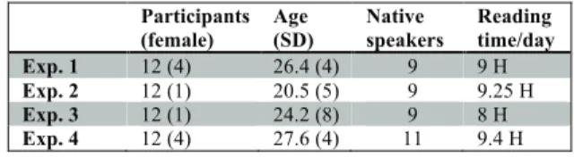
A total of 37 people (8 female) with normal or corrected-to-normal vision took part in our experiments. Eleven of them participated in two studies (on different dates) and each study involved 12 participants. Participants were aged 24.7 years on average (SD=6.4) and 29 of them were native speakers while all others were fully proficient. 19 participants were undergraduate students, 12 were PhD students, and 6 were senior researchers from a local university. Participants reported that they read from a computer screen for 8.9 hours/day on average. Table 1 shows participant details for each study.
Participants (female) Age (SD) Native speakers Reading time/day Exp. 1 12 (4) 26.4 (4) 9 9 H Exp. 2 12 (1) 20.5 (5) 9 9.25 H Exp. 3 12 (1) 24.2 (8) 9 8 H Exp. 4 12 (4) 27.6 (4) 11 9.4 H
Table 1. Participants involved in each experiment. Apparatus, implementation and font
We used a 21.5-inch iMac with a 1.4GHz dual-core Intel Core i5 and a 1920x1080 display. The operating system was OSX. The participants sat in a lab illuminated by overhead fluorescent lights. They were positioned 1 meter from the display to ensure no glare appeared on the screen. The graphical rendering and input interaction was developed using Processing. The application loads images (white shape on black background) and calculates the shape’s area by using a standard ray-casting technique. The application then computes valid text lines from several parameters, such as interline spacing and margins. For each study trial, the application loads text from an XML file and automatically fills the shapes using the appropriate values for layout, line alignment, and token size. We used sans serif Helvetica because sans-serif fonts are easier to read on screens [21]. We carried out informal tests to define typographical values: default text size was set to 16 pixels. Measurements of legibility
As in prior work [4,21], we measured text legibility by both examining reading time and reading accuracy. We recorded (a) reading completion time, as well as (b) the number of errors identified in each passage. We also developed a questionnaire to collect the participants’ subjective
impressions of our various text rendering styles. Our questionnaire probed user's perception of the aesthetics [27], as aesthetics can be critical to the degree of enjoyment associated with a task [41]. We selected 4 aesthetic labels: (a) chaotic/clean, (b) boring/interesting, (c) ugly/beautiful, and (d) non-aesthetic/aesthetic. We also asked participants to rate how easy or difficult it was to read the text passages. Procedure
Our interface was similar to that used in [21]. The reading task began as the participant clicked on the "Start" button and ended when the user clicked on the "Done" button. Users were presented with a series of passages and for each clicked the “Start” button, read the passage, clicked on any erroneous word substitutions, and then clicked “Done”. They were asked to read the text passages “as accurately and as quickly as possible” and to read them only once. Clicking on a word substitution caused the application to highlight the word in green if the word had indeed been replaced or in red if the word was from the original text, giving participants feedback on the correctness of their actions as they went. The participants were instructed to keep questions and comments for the breaks between passages. To avoid boredom and eye-strain effects the users were told that they can rest during the breaks. Participants were not told how many substituted words were introduced in the passages. We controlled these to be 4 to 6 errors per passage so that users would not familiarize themselves to the exact number. After being presented with all passages, users were given the questionnaire to rate all renderings. Statistical analysis
We used a Shapiro-Wilk test to determine the normality of the data. If the data was normal or could be normalized, we used a Univariate ANOVA test (we report F and p). If not, we used a Friedman test (we report !2 and p) to compare more than 2 conditions, and Wilcoxon tests otherwise (we report p value). If needed, we used a Bonferroni correction. EXPERIMENT 1: LEFT AND RIGHT ALIGNMENTS The goal of this study is to support or refute H1-3. We compared shapes with different left or right text alignments.
H1. Text will be more legible on shapes allowing a regular left alignment than it will with a non-regular one.
H2. Non left-aligned text will be more legible on shapes with low curvature than it will on shapes with a high curvature.
H3. Non left-aligned text will be more legible on symmetric shapes than on non-symmetric ones.
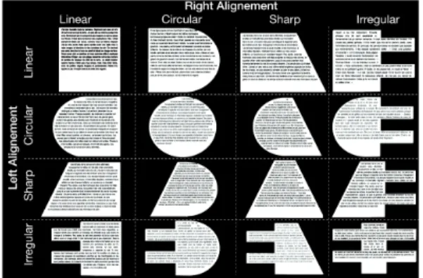
Shapes and text
As shown in Figure 2, we tested 16 shapes by combining 4 left alignments and 4 right alignments (symmetrical from the right). The 4 alignments were linear, circular, sharp and irregular. We chose these shape properties in relation to the findings of the quantitative study showing shapes with or without symmetry as well as shapes with different curvature. We used 24 different paragraphs from the novel The Stranger by Albert Camus. Passages had the same length, with 150 words on average (SD = 1.1). 22 paragraphs were repeated three times and 2 paragraphs
were only showed during training. Different words were replaced each time.
Experimental design
A repeated measures within-subject design was conducted. The independent variables were Left alignment (linear, circular, irregular, sharp) and Right alignment (linear, circular, irregular, sharp). The combination of both factors created 16 shapes as shown in Figure 4. The presentation of variables was counterbalanced among participants by means of a Latin Square. All of them performed 4 trials for each condition. At the beginning of the experiment, the participants performed 4 practice trials on a random shape that was not used in this experimental design. In summary, the design was: 4 Left Alignments × 4 Right Alignments × 4 trials = 64 trials (35min on avg.) per participant. Our sessions lasted approximately 50min, including a training session (with 4 passages and 4 randomly selected shapes) to familiarize the participant with our interface and procedure.
Figure 4. Shapes used in experiment 1 to test the combination of left and right alignments (text darkened for this figure). Results and discussion
Reading time and accuracy
Quite surprisingly, we did not find that left or right alignment had a significant effect on task completion time (Figure 5). The observed power of the test was 0.79. On average, reading 150 words took 31.3 seconds (95% CI [30.5, 32.1]). We also did not observe that left or right alignment had an effect on reading accuracy. On average, reading accuracy (i.e. the percentage of words found) was 95.6%, (95% CI [94.9, 96.3]). Although non-significant results do not prove anything, we see these results as promising because displays with considerably different shapes did not impact the text legibility performance of the representative participants.
Figure 5. Reading time for each combination of left and right alignment.
Subjective results
Participants rated certain shapes as easier to read than others (!2(15)=48, p<.01). Each shape with Irregular left or right alignment was rated significantly different (p<.02) from its symmetric counterpart (i.e. Irregular-Linear from Linear-Linear). Overall, shapes involving combinations of Linear, Circular and Sharp alignments were rated Easy by at least 75% of participants, compared to only 45.8% for irregular alignments (Table 2).
Table 2. Percentage of participants that rated each condition as Easy (5 or higher on 7 points Likert Scale).
Questions regarding the aesthetic properties produced similar outcomes: 71% of participants considered conditions involving Linear, Circular, and Sharp alignments to be clean, beautiful, aesthetic, and interesting, compared to only 21.4% for conditions involving Irregular alignment.
Discussion
We observed no significant differences in reading rates or accuracy despite users’ subjective preference for shapes without irregular boundaries. This study does not support H1, H2 or H3 in terms of performance times. However symmetric shapes are perceived to be easier to read compared to shapes with irregular alignment, which supports H3 and partially H1 in terms of user’s perception.
EXPERIMENT 2: LAYOUT COMPARISON
The goal of this study was to test H4 and H5. We compared differenttext layout on variousshapeswithorwithouta hole.
H4. Continuous layout will be more legible than broken layout.
H5. For shapes with holes or long concavities, Broken Layout text will be more legible than Continuous Layout.
Figure 6. Shapes used in Experiment 2 and illustration of Holes and Layout factors with the Circle shape. Shapes and texts
We evaluated the 12 conditions combining three shapes with or without a hole and with two text layouts (Figure 6). We used the same shapes as study 1, except we explored
porosity instead of symmetry this time. We dropped the
cases of shapes with extremely irregular borders because they were really disliked in study 1, and we used a round hole because it appeared frequently in our qualitative study. We used 54 different paragraphs from the novel Around the
World in Eighty Days by Jules Verne. Passages were all
Experimental design
A repeated measures within-subject design was conducted. The independent variables were Shape (Square, Circle, Pyramid), Holes (With, Without) and Text Layout (Continuous, Broken). The variables were counterbalanced among participants. All of them performed 4 trials for each condition. At the beginning, participants performed 4 practice trials. In summary, the design was: 3 Shapes × 2 Holes × 2 Text Layout × 4 repetitions = 45 trials (~25 min) per participant. The experiment lasted ~40min.
Results and discussion
Reading time and reading accuracy
Figure 7 shows the results on completion time. Our tests indicate a statistically significant effect of Holes (F1,11=6.3, p=.012) and an interaction effect between Holes and Layout (F1,11=3.9, p=.047). There was no effect of the Shape factor, which is consistent with results from experiment 1. The observed power of the test was 0.871. On average, reading text on a shape with a hole was 8% slower than on a shape without a hole. A post-hoc comparison reveals no significant difference between layouts without a hole, but there is a significant difference when a hole is present (p=.01): continuous layout is 10% slower than a broken layout. There were no effects on reading accuracy. On average, reading accuracy was 77.3% (95% CI [75.6, 79.2]).
Figure 7. Left: Reading time for the conditions with or without hole for the two layouts. Right: Perceived reading easiness.
Subjective results
We found significant differences in user ratings among conditions (!2(11)=97, p<.01). For each shape, ratings on continuous layout with hole were significantly different from all other conditions (p<.01), except for the Pyramid shape without hole and with a continuous layout. On average, the three conditions involving a hole and a continuous layout were only rated Easy by 5% of participants. More than 75% of users rated all other conditions Easy (except the Pyramid one cited earlier). Results regarding aesthetic properties followed the previous tendency on the Hole-Broken vs. Hole-Continuous division. Most participants (58%) found the Hole-Broken condition to be clean, interesting and aesthetic, even if half of participants found it ugly. The Hole-Continuous condition was perceived as chaotic, ugly, boring (except for the circle shape), and non-aesthetic by 70.8% of participants. Conditions without hole were mostly perceived as clean (61%) but not interesting (25%).
Discussion
Our study cannot confirm H4 as we found no overall effect of the Layout factor. However the study reveals that, when using a continuous layout, shapes with holes are more difficult to read than shapes without holes, which confirms H5. In this particular condition, the hole cuts sentences and readers have to locate the second part of the sentence after the hole, which is tedious. Using a broken layout neutralizes the negative effect of the hole, both in reading time and in perceived difficulty.
EXPERIMENT 3: TOKEN SIZE AND SCROLLING
The goal of this study is to support or refute H6 and H7. We compared different token sizes on different shapes. We also wanted to compare the impact of continuous scrolling vs. page scrolling on text legibility [32] in free-form shapes.
H6. Text will be more legible if token size is constant rather than variable. H7. Text will be more legible if token size is variable instead of constant when
the text is scrolling line by line.
Shapes and texts
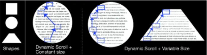
We tested 12 conditions combining three shapes, two scrolling techniques, and two token sizes (Figure 8). We chose the same shapes used in study 2 (square, circle and pyramid) except that this time we did not investigate the porosity but instead included the scrolling feature as identified from our focus group results. Token resizing was done using a linear function with the line size as variable in order to have the same amount of text on each line. As a result, the size of the square shape text was always constant, even for the resized condition. When dynamically scrolling resized text, each line moved up or down (Figure 8). Unlike the case of the square, dynamically scrolling non-resized text on the circle or pyramid shapes involved words being repositioned for every scroll movement (Figure 8). For page scroll with resized text, circle and pyramid shapes were partially filled to avoid text smaller than 11px, as users could not scroll or zoom to see the smaller text. Participants scrolled using the mouse wheel. We used 40 different paragraphs taken from book synopses on Wikipedia. Passages were 200 words on average (SD = 0.5), and no paragraphs were repeated.
Figure 8. Shapes used in exp. 4 to test the combination of Scroll type and Token Size. Blue boxes and arrows illustrate
how a word would move when text is dynamically scrolled. Experimental design
A repeated measures within-subject design was conducted. The independent variables were Token Size (constant, variable), Shape (square, circle and pyramid) and scrolling type (dynamic scrolling or page scrolling). The presentation of variables was counterbalanced among participants. All of them performed 3 trials for each condition. At the
beginning of the experiment, the participants performed 8 practice trials. In summary, the design was: 2 Token Sizes × 3 Shapes × 2 Scrolling Types × 3 trials = 36 trials (~40 min) per participant. The experiment lasted ~1 hour. Results and discussion
Reading time and accuracy
Results on completion time indicate a statistical significant effect of Shape (F2,22=6.5, p=.031), Token Size (F1,11=12,
p<.01) and Scrolling (F1,11=35, p<.01), as well as an
interaction between Token Size and Scrolling (F=14.6, p<.01) and between all three factors (F2,22=3.8, p=.02). The
observed power of the test was 1. A Post-hoc test reveals no effect of the scroll factor on the square shape. We found no effect of page scroll for the circle and pyramid shapes among token sizes. However, dynamic scrolling on the circle and pyramid with constant token size was respectively 17.4s and 14.3s slower than with resized text size (Figure 9). There were no effects on reading accuracy, which was on average 90.06%, (95% CI [88.67, 91.45]).
Figure 9. Left: Reading time for the scrolling techniques with constant or variable token size. Right: Reading easiness.
Subjective results
We found significant differences in user ratings among conditions (!2(7)=69, p<.01). There was no difference among ratings between constant and resized text for page scroll. For Circle and Pyramid, constant token size under continuous scroll was significantly different from all other conditions (p<.01): it was never rated Easy. At least 58% of participants rated all other conditions Easy (Figure 9). Concerning aesthetic properties, constant token size with dynamic scroll were considered to be ugly, chaotic, non-aesthetic, and boring by 73% of participants, while constant token size with page scroll was considered as beautiful, aesthetic, and clean by at least 62.5% of participants. The variable token size condition with dynamic scroll evoked the same outcome, and some participants pointed out that the Pyramid reminded them of the ‘Star Wars’ crawl. Results on variable size with page scroll were mixed.
Discussion
Our results interestingly reveal that shapes with constant text size are not any easier to read than those with variable sized text. Furthermore, when scrolling, variable text size makes text easier to read on non-rectangular displays. Our findings support H7 but not H6.
EXPERIMENT 4: LINE ALIGNEMENT
The goal of this study was to examine H8-H10. We compared different line alignments on different shapes.
H8. Text will be more legible if the line alignment is linear rather than tangential.
H9. For tangential line-alignment, text will be more legible if the shape change in curvature is low rather than high.
H10. For thin and long shapes, text will be more legible if the line alignment follows the main axis of the shape instead of the horizontal.
Shapes and texts
We tested 8 conditions, shown in Figure 10, combining four shapes with two line alignments. We chose different shapes than those we used in the three previous studies, as we wanted to investigate different shape properties highlighted in our focus groups. In particular, we wanted to explore extreme Curvature, Length-Width Ratio (thin shape), and Orientation. We used 40 different paragraphs from book synopses on Wikipedia. Passages were 150 words on average (SD = 0.4), and no paragraphs were repeated.
Figure 10. Left: Shapes curvatures used in exp. 3. Right: Illustration of Tangential alignment with two shapes. Experimental design
A repeated measures within-subject design was conducted. The independent variables were Line Alignment (continuous or tangential) and Shape Curvature (straight, smooth, sharp, very sharp). The presentation of factors was counterbalanced among participants. All of them performed 4 trials for each condition. At the start of the experiment, participants performed 8 practice trials. In summary, the design was: 2 Line Alignment × 4 Shape Curvature × 4 repetitions = 32 trials (~40 min) per participant. The experiment lasted ~50 min.
Results and discussion
Reading time and accuracy
Results on completion time indicate a statistically significant effect for both Layout (F1,11=18.1, p<.001) and
Shape (F3,33=4.9, p=.002), as well as an interaction between
Shape and Layout (F3,33=2.7, p=.042). The observed power
of the test was 0.99. Concerning Shape, a pairwise comparison only reveals a significant difference between Straight and Very Sharp shapes (p<.01), with Straight being read an average of 7.8s faster than Very Sharp shapes (Figure 11). Concerning Layout, results reveal that Continuous layout is read an average of 6.1s faster than the Tangential layout. Post-hoc comparison shows that the Very Sharp curvature is read significantly slower (12.2s on average) if its layout is Tangential rather than a Continuous (p<.01). There is no significant difference between layouts for each of the other shape curvatures. Layout and Shape had no effect on reading accuracy. On average, reading accuracy was 84.18%, (95% CI [82.1, 86.2]).
Subjective results
We found significant differences in user ratings among conditions (!2(11)=83, p<.01). Straight and Sharp shapes with continuous alignment were rated significantly different from all other conditions (p<.01). Other shapes, except Straight with Tangential alignment, were never rated Easy (Figure 11). All users assigned the Very Sharp shape with tangential alignment a rating of 7 (very hard). Participants disliked the Smooth shape with Continuous layout due to sentences being cut (similar to holes in study 2).
Results regarding aesthetic properties show that only 10% of participants rated study 4 conditions as clean, beautiful, aesthetically pleasing, or interesting (except for the Sharp and Very Sharp tangential conditions, rated interesting by 54%).
Figure 11. Left: Reading time for the different shapes with continuous or tangential layouts. Right: Perceived easiness.
Discussion
Our third study reveals that shapes with continuous layout are easier to read than shapes with tangential layout in terms of reading speed, which confirms H8. Our study also partially confirms H9, as tangential text on the straight shape is easier to read than on the very sharp shape. Our results refute H10, as the straight shape was not read any slower with continuous than with tangential layout. FINAL DISCUSSION
Here we discuss the implications of our findings, as well as current limitations and possibilities for future work. Guidelines for mapping text onto free-form shapes We investigated different mappings of text content onto free-form shapes based on a framework we defined using three axes: layout, token size, and line alignment. From our studies we can provide a set of design guidelines for optimizing text legibility on non-rectangular displays: • Both left and right irregular alignments should be
avoided, as text in these are perceived to be difficult to read and overall not aesthetic. Instead, symmetric shapes are preferred.
• Shapes with circular or sharp alignments are acceptable for presenting text: they are perceived to be easy to read, and overly clean, beautiful and interesting.
• If the shape contains a hole, text should be displayed using a broken layout with two columns around the hole to prevent any impact on reading performance.
• Shapes without holes are perceived to be less interesting than with holes. Thus, using holes in freeform shapes is
not only a solution to context requirements (such as the cooktop), but also an aesthetical feature to explore. • To use dynamic scrolling on non-rectangular shapes, text
should be resized so that each line contains the same amount of text. Otherwise, use page scroll with constant text size.
• While resizing text for dynamically scrolling is perceived as beautiful and clean, resizing text with page scrolling raises mixed results. Some users disliked it because of display space loss and of varying interline spacing. Thus, resizing text should be limited to dynamic scrolling. • Shapes with continuous line alignment where lines are cut
by the shape curvature should be avoided as they are perceived to be difficult to read and non aesthetical. This is similar to the effect of holes on continuous text. Even though tangential alignment does not affect reading performance on linear shapes, continuous text should be preferred as it reduces the perceived difficulty.
• Text on very sharp shapes should be avoided, as text on these is harder to read than on linear shapes. If used, such shapes should be filled with continuous text rather than tangential that impacts reading performance.
Novel non-rectangular display usages and future work It is not clear that non-rectangular displays will replace traditional displays as the latter benefit from decades of interface optimizations. Aside from the highly publicized example of using non-rectangular displays in cars (Fig. 1-left), our focus groups revealed a broad range of usage contexts. In most cases, existing artifacts having non-rectangular features were suggested for text augmentation. Some examples included placing text on road signs, kitchen cooktops, pocket mirrors, puzzle pieces, bike handles, shoes, drink cans, and electric plugs, among others. While our work represents a first step in identifying text legibility concerns on non-rectangular displays, other interactive tasks need to be carefully investigated. For example, certain shapes do not provide the necessary space for effectively flicking document content. Long and narrow objects could perhaps enable other flicking mechanisms, such as using the edges of the shape to displace content. Aside from navigating through a document, presentations including images alongside textual documents also present novel challenges. For instance, should images be cropped as one scrolls through a document, or should images use variable shapes to fit the contained display? Such questions merit further investigation and could impact the manner in which traditional artefacts, such as rectangular images, get re-engineered for non-rectangular displays.
Furthermore, there are other challenges to explore. In particular, our scope is limited to text and further work could be achieved to extend it to other UI contents such as 1D (in particular data with no carriage return such as timelines), 2D (such as maps), or 3D content. We would also like to use an eye-tracking device to further explore how free-form shapes affect text-skimming patterns.
Limitless shapes, limitless rules
We collected 41 different shapes across both focus groups, illustrating the diversity of shapes that could be augmented with text. From these, display shape properties emerged: symmetric displays tend to be chosen more often (Exp. 1, 2 and 3); few shapes with low length-to-width ratio were selected, i.e. they were long and thin (Exp. 4); some shapes contain holes (Exp. 2); and there is a large diversity of curvature, ranging from smooth to sharp boundaries (Exp. 1 and 4).
We observed no significant differences among different shapes in reading rates or accuracy despite users’ subjective preference for shapes without irregular boundaries (Exp. 1). Further experiments are required to identify why our experimental setting did not impact reading performance, by using longer texts for instance. However we believe free-form display manufacturers should consider both reading performance as well as perceived difficulty, which means avoiding shapes with irregular alignments.
Comparison to previous reading studies
Our study methodology is based on the one adopted by Jankowski et al. [21]. It is thus interesting to compare our results in terms of variance among subjects (reported with CIs in our paper and SDs in [21]). Trends in both studies are consistent: in comparison to Jankowski et al’s SD values, our study results show a larger deviation, on average 10s (31% of mean task completion time in our paper vs. 13% in their paper) probably due to our smaller number of participants (12 vs. 20). To check whether our population sample was large enough, we looked at the observed power of our studies (provided above for each study). The power was always above .80, which indicates enough statistical power (except for study 1 where we found no statistical difference on completion time).
Limitations
Our work is a first exploration of the multiple factors that can affect reading on free-form displays and is not intended to be exhaustive. We limited our study to certain shapes related to everyday use that were gathered through focus groups, but many different types of scenarios exist. Moreover, identifying shapes based on other factors, such as geometric properties would have resulted in different shapes being selected for the studies. More work is needed to explore the effects of other shapes and line alignments, other types of holes, or other resizing methods. Our studies are naturally limited by our typographical settings, and other fonts, text sizes, interline spacing or margin sizes could bring novel results. Obviously, testing all such combinations is not possible through an initial exploration such as ours, and so we leave these as possibilities for future investigation. Finally, our controlled setting does not simulate real reading conditions: reading on a public display or on a cooktop display implies reading from different angles or distances and using various display sizes. Many such conditions exist, and our results pave way for further in-depth explorations.
CONCLUSION AND FUTURE WORK
Emerging technologies are enabling the creation of non-rectangular displays. However, the introduction of such displays creates unprecedented challenges for designers who have to rethink news ways of creating user interfaces. Included among these challenges is the foremost concern of how to legibly present textual content, which is a chief concern in our paper. Or results agree with and extend upon other findings in the existing literature on text legibility, but they also uncover unique instances in which different rules need to be applied for non-rectangular displays. Finally, we mostly focused on output but there is much work to accomplish toward understanding how we can most effectively interact with free-form displays. We hope that our work will generate new research directions that will help to fill the bigger research agenda of free-form displays. ACKNOWLEDGMENTS
A Leverhulme Trust Early Career Fellowship funded part of this work. We thank all study participants for their valuable time. We thank Brendan Li for his support in running the studies. We acknowledge the Canada Research Chairs award to the third author for supporting this work.
REFERENCES
1. Alexander, J., Lucero, A., and Subramanian, S. 2012. Tilt displays: designing display surfaces with multi-axis tilting and actuation. In MobileHCI '12. ACM, 161-170. 2. Bederson, B. 2000. Fisheye menus. In UIST '00. ACM,
217-225.
3. Benko, H, Andrew D. Wilson, and Balakrishnan, R. 2008. Sphere: multi-touch interactions on a spherical display. In UIST '08. ACM, 77-86.
4. Bernard, M., Chaparro, B., Mills, M., and Halcomb, C. 2003. Comparing the effects of text size and format on the readibility of computer-displayed Times New Roman and Arial text. IJHCS. 59, 6, 823-835.
5. Bouma, H. 1980. Visual Reading Processes and the Quality of Text Displays. In Ergonomic Aspects of Visual Display Terminals, Grandjean and Vigliani, 101-114.
6. Brockmeyer, E., Poupyrev, I., and Hudson, S. 2013. PAPILLON: designing curved display surfaces with printed optics. In UIST '13. ACM, 457-462.
7. Brown, J.A., Fishco, V.V., & Hanna, G. 1993. Nelson– Denny Reading Test. Riverside Publishing.
8. Butz, A., Grob, M., and Krüger, A. 2004. TUISTER: a tangible UI for hierarchical structures. In IUI '04. ACM, 223-225.
9. Chevalier, F, Dragicevic, P., Bezerianos, A. and Fekete, J.Dchi 2010. Using text animated transitions to support navigation in document histories. In CHI '10. ACM, 683-692.
10. Darroch, I., Goodman, J. Brewster, S. and Gray, P. The Effect of Age and Font Size on Reading Text on Handheld Computers. In INTERACT 2005.
11. Delaunay, F., Greeff, J., and Belpaeme, T. 2010. A study of a retro-projected robotic face and its effectiveness for gaze reading by humans. In HRI '10. IEEE Press, 39-44. 12. Dillon, A. Reading from paper vs. screens: A critical review of the empirical literature. Ergonomics, 1992. 13. Dyson, M. 2004. How physical text layout affects reading
from screen Behaviour & Information Technology Vol. 23, Iss. 6, 2004.
14. Dyson, M., and Haselgrove, M. 2001. The influence of reading speed and line length on the effectiveness of reading from screen. Int. J. Hum.-Comput. Stud. 54, 4, 585-612.
15. Dyson, M., Kipping, G. 1997. The legibility of screen formats: are three columns better then one?, Computers & Graphics, 21, 703-712.
16. Gregory, M. and Poulton, E.C. 1970. Even versus Uneven Right-hand Margins and the Rate of Comprehension in Reading. Ergonomics, Volume 13, Issue 4, pages 427-434. 17. Grossman, T., Wigdor, D., and Balakrishnan, R. 2007.
Exploring and reducing the effects of orientation on text readability in volumetric displays. In CHI '07. ACM, 483-492.
18. Hansen, W. J. and Haas, C. 1988. Reading and writing with computers: a framework for explaining di!erences in performance. Communications of the ACM, 31, 1080-1089.
19. http://sharp-world.com/igzo/
20. Huey, E. 1898. Preliminary Experiments in the Physiology and Psychology of Reading. The American Journal of Psychology, vol. 9, pp. 575-586.
21. Jankowski, J., Samp, K., Irzynska, I., Jozwowicz, M., and Decker, S. 2010. Integrating Text with Video and 3D Graphics: The Effects of Text Drawing Styles on Text Readability. In CHI '10. ACM, 1321-1330.
22. Jones, B., Benko, H., Ofek, E., and Wilson, A. 2013. IllumiRoom: peripheral projected illusions for interactive experiences. In CHI '13. ACM, 869-878.
23. Jorna, G.C. and Snyder, H.L. Image Quality Determines Differences in Reading Performance and Perceived Image Quality with CRT and Hard-Copy Displays. Human Factors, 1991.
24. Kolers, P., Duchnicky, R. and Ferguson, D. 1981. Eye movement measurement of readability of CRT displays. Human Factors. 23(5), 517-27.
25. Koppel, M., Bailly, G., Müller, J., and Walter., R 2012. Chained displays: configurations of public displays can be used to influence actor-, audience-, and passer-by behavior. In CHI '12. ACM, 317-326.
26. Koriat, A. and Norman, J. 1985. Reading Rotated Words. Journal of Experimental Psychology; Human Perception and Performance, vol. 11, number 4, pp: 490-508..
27. Lavie, T. and Tractinsky, N. Assessing dimensions of perceived visual aesthetics of web sites. IJHCS, 2004. 28. Lyons, K., Nguyen, D., Ashbrook, D., and White, S. 2012.
Facet: a multi-segment wrist worn system. In UIST '12. ACM, 123-130.
29. Maharik, R., Bessmeltsev, M., Sheffer, A., Shamir, A., and Carr, N. 2011. Digital micrography. In SIGGRAPH '11. ACM, Article 100, 12 pages.
30. O'Hara, K. and Sellen, A. 1997. A comparison of reading paper and on-line documents. In CHI '97. ACM, 335-342. 31. Simon Olberding, Michael Wessely, and Jürgen Steimle.
2014. PrintScreen: fabricating highly customizable thin-film touch-displays. In UIST '14. ACM, 281-290. 32. Piolat, A., Roussey, J.-Y. and Thunin,O. 1997. Effects of
screen presentation on text reading and revising. IJHCS, 47, 565-589.
33. Poupyrev, I., Newton-Dunn, H., and Bau, O. 2006. D20: interaction with multifaceted display devices. In CHI EA '06. ACM, 1241-1246.
34. Ramakers, R., Schöning, J., and Luyten, K. 2014. Paddle: highly deformable mobile devices with physical controls. In CHI EA '14. ACM, 191-192.
35. Rekimoto, J., Ullmer, B., and Oba, H. 2001. DataTiles: a modular platform for mixed physical and graphical interactions. In CHI '01. ACM, 269-276.
36. Roudaut, A., Karnik, A., Löchtefeld, M., and Subramanian, S. 2013. Morphees: toward high "shape resolution" in self-actuated flexible mobile devices. In CHI '13. ACM, 593-602.
37. Roudaut, A., Reed, R., Hao, T., and Subramanian, S. 2014. Changibles: analyzing and designing shape changing constructive assembly. In CHI '14. ACM, 2593-2596. 38. Schriver, K. 1997. Dynamics in Document Design:
Creating Text for Readers. John Wiley & Sons, Inc., New York, NY, USA.
39. Spencer, H. 1968. The Visible Word. London: Royal College of Art.
40. Tinker, M. 1972. Effect of angular alignment upon readability of print. Journal of Educational Psychology, vol. 47, pp. 358-363.
41. Tractinsky, N., Shoval-Katz, A., and Ikar, D. What is beautiful is usable. Interacting with Computers, 2000. 42. Wigdor, D. and Balakrishnan, R. 2005. Empirical
investigation into the effect of orientation on text readability in tabletop displays. In ECSCW'05. Springer, 205-224.
43.www.lgdnewsroom.com
44.Zachrison, B. 1965, Studies in the Legibility of Printed Text. Almqvist & Wiksell, 225 pages.