HAL Id: hal-01078128
https://hal-enac.archives-ouvertes.fr/hal-01078128
Submitted on 28 Oct 2014
HAL is a multi-disciplinary open access
archive for the deposit and dissemination of
sci-entific research documents, whether they are
pub-lished or not. The documents may come from
teaching and research institutions in France or
abroad, or from public or private research centers.
L’archive ouverte pluridisciplinaire HAL, est
destinée au dépôt et à la diffusion de documents
scientifiques de niveau recherche, publiés ou non,
émanant des établissements d’enseignement et de
recherche français ou étrangers, des laboratoires
publics ou privés.
Exploration of aircraft trails by Air Traffic Experts
Christophe Hurter, Stéphane Conversy
To cite this version:
Christophe Hurter, Stéphane Conversy. Exploration of aircraft trails by Air Traffic Experts. INFOVIS
2010, IEEE Information Visualization Conference, Oct 2010, Salt Lake City, United States.
�hal-01078128�
Exploration of aircraft trails by Air Traffic Experts
Christophe Hurter, Stéphane Conversy
Direction Generale de l’Aviation Civile (DGAC), Ecole Nationale de l’Aviation Civile (ENAC), Institut de Recherche en Informatique de Toulouse (IRIT), Université de Toulouse.
ABSTRACT
In this paper, we describe a set of applications and findings performed by Air Traffic Control (ATC) experts while interactively exploring recorded aircraft trails. ATC experts deal with recorded radar data (aircraft positions, altitude, time, etc). This large quantity of information spoils their visualization with a lot of occlusion and cluttering. With a simple paradigm of brush, pick and drop, users can intuitively filter the dataset by direct manipulation of trails. Through applied examples, we show how a visualization tool and its real time applications take advantage of human vision and are therefore assets for data exploration and validation. This tool allows the visualization and the interaction with large quantity of information, hence enabling overview of the dataset at a whole and quick retrieval of insights.
KEYWORDS: InfoVis, data exploration, aircraft trails.
INDEX TERMS: H5.m. Information interfaces and presentation
(e.g., HCI): Mis-cellaneous.
1 INTRODUCTION
Thanks to recent progress in computer power, data storage, and recording technologies, data of various kinds are collected in growing amounts. Analysis of such data is an issue due to their quantity. Users need efficient visualizations to optimize the use of human perception skills, before subsequently speeding up the analysis process.
In the following, we show scenarios about the exploration of Air Traffic Control (ATC) radar data. Radar data contain the details of each aircraft (departure, arrival, type) and its position (latitude, longitude and altitude). With the recording of one day’s flights over france, each datum represents the position of an aircraft at a certain time. Such datum is called a “radar plot”. A trajectory is a line that connects timely ordered plots of a particular flight. When displaying thousands of aircraft trajectories on a screen, the visualization is spoiled by a tangle of trails. If many aircraft have a similar location (on the screen axis) during the day, plots overlap. The visual analysis is therefore difficult, especially if a specific class of trajectories in an erroneous dataset has to be studied.
We designed FromDaDy [3] (which stands for “FROM DAta to DisplaY”), a trajectory visualization tool that tackles the difficulties of exploring the visualization of multiple trails. This multidimensional data exploration is based on scatterplots, brushing, pick and drop, juxtaposed views and rapid visual design. They can define the visual configuration of the views by connecting data dimensions from the dataset to Bertin’s visual variables [1]. They can then brush trajectories, and with a pick and drop operation they can spread the brushed information across views, and organize their workspace. They can then repeat these interactions, until they extract a set of relevant data, thus formulating complex queries. FromDaDy supports iterative queries and the extraction of trajectories in a dataset that contains up to 10 million data.
In this paper, we show how Air Traffic Control (ATC) experts explored large ATC dataset of one day record of aircraft over france. We show the discoveries they made using FromDaDy, and the findings they gained.
2 THE CONTEXT OF ATCDATA EXPLORATION
In this section, we detail the users, and their current tools to perform data exploration of ATC recording.
2.1 ATC expert tasks
ATC experts regularly analyze recorded traffic to:
understand past conflicts and then improve safety with adequate evolutions,
assess new onboard and ground safety systems with the resulting aircraft trails,
devise new air space organization and procedures to handle traffic increase,
compare trails with environmental considerations (fuel consumption, noise pollution, vertical profile comparison),
study profitability from a business trajectory point of view (number of aircraft on a specific flight route per day, number of aircraft that actually landed at a specific airport…),
filter and extract trajectories in order to re-use them. Formulating queries over trajectories in a declarative, textual-language based manner, such as a SQL, is hard. Even if it is possible to select trajectories that flow over specific locations, it is very difficult to specify features like “select trajectories where this part of the trajectory is straight” or “where this part has a constant climbing rate”… Thus, visual analysis remains the only efficient way to detect relevant trajectory features.
2.2 The dataset
When dealing with trajectories, users must perform dynamic requests (response time < 100 ms [4]) on a huge multi-dimensional dataset (>1 million data). As an example, one-day's traffic over france, represents some 20000 trajectories (Figure 1). In addition to the data size problem, users have to deal with a dataset that contains many errors and uncertainties: recording is done in a periodic manner (in our database: a radar plot per aircraft every 4 minutes), but a plot can be missed, or have erroneous values because of physical problems that occurred at the time of recording.
2.3 The current trails analysis tools
Currently, ATC experts use specific time-based tools to analyze aircraft trails. Some of their features are:
traffic replay with the visualization of radar plots, with no trajectory visualization,
trajectories visualization without visual customization and without direct manipulation. These tools use WIMP manipulation (Texbox, ListBox, Menu…),
tabular view of the data and their associated interaction (reordering of columns, text search and filtering).
These tools show a lot of limitation regarding the interaction and the exploration of the dataset. Moreover, they cannot cope with large dataset size: only few trajectories can be analyzed at a time. To circumvent the size issue, users have to perform macro analyses with statistical tools and post filtering.
2.4 FromDaDy deployment
FromDaDy is a prospective tool, and is used as a general exploration tool for multidimensional data. It has been deployed in the French civil aviation research center and many researchers regularly use it. FromDaDy has also been installed in operational center, but due to the lack of a number of features FromDaDy cannot be fully exploited for very specific tasks. Thus, new functionalities are in a development stage. These new implementations are designed with the participation of the end users (ATC experts).
3 UNEXPECTED DISCOVERIES
ATC experts use FromDaDy to display the recorded radar data. They first validate the content of the dataset, and then explore it to discover expected and unexpected information. Their actions are the modification of the visual configuration with the assignment of two fields of the dataset to the two screen axis, and the modification of the visual configuration with different design parameters (colors, points, lines size…).
3.1 Coastline
In the presented image (Figure 1), the user chose to display aircraft latitude, longitude and altitude. The gradient from green to blue represents the ascending altitude of aircraft (green being the lowest and blue the highest altitude). Dense colored areas correspond to airports. The users expected the visualization of the high altitude flight routes with straight blue lines. But the coastline (in this case, the French one) emerges as a consequence of sightseeing in light aircraft, which wasn’t expected.
This image partially reveals weather conditions. Light aircraft fly mostly at low altitude which produces green lines. Hence, areas without green lines mean that no small aircraft flew there, which means by extension that the weather conditions were bad.
Figure 1. One-day’s record of traffic over france and its visual configuration
3.2 Unveiling of military aircraft
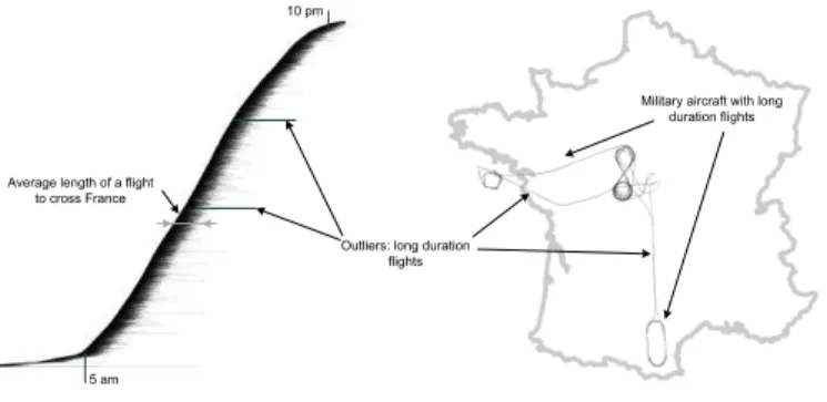
The system assigns a unique and incremental number to identify each trajectory. Figure 2 shows an abstract visualization of one-day traffic. The X screen axis shows the time of each radar plot and the Y screen axis shows the aircraft’s identifier. Since this identifier is incremented over the day, the resulting visualization shows a noticeable continuous shape in which each horizontal line represents the lifetime of one flight. The slope of the shape indicates the traffic density along the day. Hence users are able to confirm that the traffic density increases at 5 am and slows down at 10 pm by noticing the change of slope.
Average length of a flight to cross France
Outliers: long duration flights
Military aircraft with long duration flights
5 am
10 pm
Figure 2. Detection of supply planes with an abstract visualization
The width of this shape gives the average flight duration in the dataset: it is about 2 hours and a half which represents the duration to cross the france by airplane. But some aircraft have longer trails duration. The user brushed these long trails (the ones that come out of the curved shape). When visualizing them with a latitude (Y screen) and longitude (X screen) visual configuration, the user discovered trials that lasted 6 hours with noticeable “eight” shapes. After further investigations, this trail corresponds to a military supply plane.
4 DATASET QUALITY
The quality of unknown datasets is one of the big issues when exploring them. The following examples relate the user’s discoveries when validating their datasets.
4.1 Temporal holes
In this example, the user’s main concern was to check the validity of the recorded radar data: radars send data over networks with a constant stream rate (one radar position of each aircraft every 4 to 8 minutes) and the user wanted to check that the data stream was not interrupted.
Due to the large number of records, a lot of cluttering occurs (Figure 3, left) when displaying the time series of the aircraft’s identifiers. The cluttering hides the areas where, during a small time period, no data were recorded. Hence the user was unable to discover this flaw in the database, unless he or she zoomed over the specific areas to reduce the cluttering of points, which is unlikely. Zoom Data discontinuity Data discontinuities
Figure 3. Time series of the incremental number of aircraft (Y axis) over time (X axis) with the accumulation tool To notice this flaw without serendipity, the user can use the accumulation tool (by producing a KDE map [5]) with the same visual configuration (the visualization of the time series of aircraft identifiers), which unveils continuous and discontinuous data stream. Continuous data stream over time produces flat accumulation (the same amount of data are accumulated over time), whereas discontinuous data stream produces ridges (increase of the data stream rate) or furrows (decrease of the data stream rate). Because during a specific time-span no data are recorded, the produced accumulation view displays many furrows (Figure 3). Each of these furrows indicates that during the time corresponding to its thickness, no data were recorded.
4.2 Stationary trails
This example illustrates how the accumulation tool can be used to detect stationary aircraft trajectories. If many aircraft have a similar location during the day, radar plots accumulate on the screen. The KDE map (Figure 4) is the result of the accumulation of plots with a triangular kernel. Hence, the Latitude and Longitude position of each plot is mapped on the X and Y dimensions of the KDE map and on the X and Y dimensions of the resulting image. KDE values are used as an index in a color map to yield colored pixel. As such, this visualization is a standard color scale KDE visualization. The image produced shows very dense areas over the main airports in france (Roissy, Orly, Lyon...) which was expected. However, the dense areas exhibit few details. When using accumulation height maps with illumination, circular shapes emerge (Figure 4, right) that were not noticeable in the first accumulation view (Figure 4, left): low accumulation values appear as valleys and high accumulation values appear as hills. It is well known that shading works as a gradient detector: it emphasizes strong accumulation value variations between adjacent points. This is the reason why these circular hills pop out.
Figure 4. Design configuration and accumulation maps without shading (left), with shading (right) To push forward the investigation in order to identify the source of these circular shapes, the user can take advantage of tools provided by FromDaDy [3]. Thus the user brushed these circular patterns, isolated and edited them with a “pick and drop”. Finally, the user found out that these circles corresponded to stationary trails which are emitted by the radar station to monitor them.
5 THE IMPACT OF FROMDADY
In this section, we detail use cases performed by ATC experts with FromDaDy, which had a direct impact on the ATC activity. We also explain why without an accurate visualization of large quantity of data, these tasks wouldn’t have been efficient.
5.1 The extraction of trails for Air Traffic Controller
Training
One part of the ATC activity is to design new systems and evaluate them. These assessments are based on real-time simulation with realistic traffic. In order to test specific traffic configuration, the simulation must use specific trajectories.
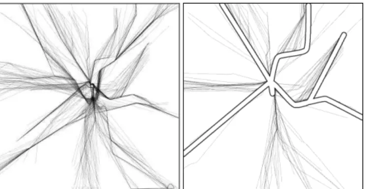
In this example, the user task was to extract trajectories fulfilling the following criteria: aircraft must pass exactly over specific beacons (corresponding to referenced flight routes, i.e. a sequence of beacons, i.e. named locations on the ground, with an associated time and altitude). Their vertical profile must correspond to a constant climbing trajectory: there should be no continuous horizontal flight. Finally, aircraft must be sorted by their main departure direction.
Aircraft do not always follow standard flight routes: Air Traffic Controllers can shorten a trajectory for optimization reasons. Furthermore, an aircraft can deviate from its trajectory if it overshoots beacons. The user has to filter out this kind of data, even though the criteria that specify them are fuzzy.
Figure 5. Original aircraft trajectories (left), and standard
procedures (right hand figure, outlined trajectories are the published flight routes by the air transportation authority)
Therefore only the visualization of trails and there direct manipulation are a suitable solution to accurately and quickly extract them. Initially, ATC experts used SQL-like requests. This process was cumbersome for two main raisons. First, the correct SQL-like request is difficult to setup and requires a lot of trials. Second, the dataset is large (several month of recorded trails, which represent 8 millions points) which slows down the computation process to retrieve the result of the SQL-like request. The use of FromDaDy drastically increases the task performance: ATC managed to extract 10 suitable trajectories into two weeks with standard tools, whereas they extracted 50 trails in one day with FromDaDy.
5.2 Flight routes optimization
Figure 6. KDE map of the safety-net trigger over france during one year. Red colored areas correspond to dense alarm areas where aircraft triggered proximity alerts
The activity of air traffic controllers consists in maintaining safe distances between aircraft by giving clearance to pilots (heading, speed, or altitude orders). The traffic is planned in advance: companies must request a flight plan from the regulatory authorities, which is translated into a mandatory flight route. FromDaDy is currently used to optimize the flight routes of aircraft over france. To do so, users analyze one year of safety net alarms. These alarms trigger when aircraft fly below the safety distance. These alarms are common since Air Traffic Controllers supervised aircraft in dense areas and cannot avoid all of them.
Paris is of course the main dense area with the main amount of alarms. However, when visualizing all these alarms over one year period, users discovered that some unexpected dense area emerges (Figure 6): Montpellier, which is by far a smaller airport, exhibits
Paris area
a lot of alarms. This visualization triggered an official study of the flight routes of Montpellier, which may lead the regulatory agency to modify existing routes, and increase safety and capacity.
6 CONCLUSION
In this paper, we showed how ATC experts deal with ATC records and what expected and unexpected discoveries they made. In their exploration process, they first tried to validate the dataset by seeking expecting information (high altitude flight routes, airports...), then others information emerged (French coastline, supply flights...), and finally flaws were detected (temporal holes, stationary points...). The simple visual configuration paradigm enables this easy exploration process.
With this example, we showed how the visualization of large quantity of data can be an asset to retrieve the big picture of a situation. FromDaDy allows displaying large quantity of data, which can produce an accurate overview of a dataset. ATC experts use it to gain insight first, and then they drill out in the dataset by performing further explorations.
The two main features of FromDaDy reported by the users are the pick and drop paradigm (the way that trails can be directly
manipulated) and the visualization power that enables to display the whole dataset at once. In this way, users changed their working process by thinking first at the display rather than at the statistical analysis (as in [1]).
REFERENCES
[1] Anscombe, F. J., The American Statistician, Vol. 27, No. 1 (Feb., 1973).
[2] Bertin J., Graphics and Graphic Information Processing deGruyter Press, Berlin, 1977.
[3] Hurter, C., Tissoires, B., and Conversy, S. 2009. FromDaDy: Spreading Aircraft Trajectories Across Views to Support Iterative Queries. IEEE Transactions on Visualization and Computer Graphics 15, 6 (Nov. 2009), 1017-1024.
[4] Shneiderman, B. 1987. Direct manipulation: A step beyond programming languages. In Human-Computer interaction: A Multidisciplinary Approach, R. M. Baecker, Ed. Morgan Kaufmann Publishers, San Francisco, CA, 461-467.
[5] Silverman B. W.: Density Estimation for Statistics and Data Analysis. No. 26 in Monographs on Statistics and Applied Probability. Chapman & Hall, 1992.