HAL Id: insu-00593625
https://hal-insu.archives-ouvertes.fr/insu-00593625
Submitted on 16 May 2011
HAL is a multi-disciplinary open access
archive for the deposit and dissemination of
sci-entific research documents, whether they are
pub-lished or not. The documents may come from
teaching and research institutions in France or
abroad, or from public or private research centers.
L’archive ouverte pluridisciplinaire HAL, est
destinée au dépôt et à la diffusion de documents
scientifiques de niveau recherche, publiés ou non,
émanant des établissements d’enseignement et de
recherche français ou étrangers, des laboratoires
publics ou privés.
Adjacent versus coincident representations of geospatial
uncertainty: Which promote better decisions?
Thomas Viard, Guillaume Caumon, Bruno Levy
To cite this version:
Thomas Viard, Guillaume Caumon, Bruno Levy. Adjacent versus coincident representations of
geospa-tial uncertainty: Which promote better decisions?. Computers & Geosciences, Elsevier, 2011, 37 (4),
pp.511-520. �10.1016/j.cageo.2010.08.004�. �insu-00593625�
Adjacent versus coincident representations of geospatial uncertainty: Which
promote better decisions?
I
Thomas Viarda,∗, Guillaume Caumona, Bruno L´evyb
aGocad Research Group, CRPG-CNRS, Nancy Universit´e, Vandoeuvre-les-Nancy, France bINRIA Lorraine, ALICE team, Villers-les-Nancy, France
Abstract
3D geological models commonly built to manage natural resources are much affected by uncertainty because most of the subsurface is inaccessible to direct observation. Appropriate ways to intuitively visualize uncertainties are therefore critical to draw appropriate decisions. However, empirical assessments of uncertainty visualization for decision making are currently limited to two-dimensional map data, while most geological entities are either surfaces embedded in a 3D space or volumes.
This paper first reviews a typical example of decision making under uncertainty, where uncertainty visualization methods can actually make a difference. This issue is illustrated on a real Middle East oil and gas reservoir, looking for the optimal location of a new appraisal well. In a second step, we propose a user study that goes beyond traditional 2D map data, using 2.5D pressure data for the purposes of well design. Our experiments study the quality of adjacent versus coincident representations of spatial uncertainty as compared to the presentation of data without uncertainty; the representations’ quality is assessed in terms of decision accuracy. Our study was conducted within a group of 123 graduate students specialized in geology.
Keywords:
Uncertainty visualization, user study, perception, transparency
1. Introduction
Spatial uncertainty is present at multiple levels in subsurface studies, from structural interpretation to dynamic flow simulation. In geological modeling, a significant endeavor has been made to sample this uncertainty by producing several possible 3D geological realizations instead of one best – and probably flawed – deterministic model (e.g., Arpat and Caers, 2007; Chambers and Yarus, 2006; Deutsch and Tran, 2002; Hu, 2000). Visualizing such a population of 3D model realizations is paramount for some applications such as assessing risks of water table contamination due to anthropic pollution, studying mechanical rock properties prior to the construction of large buildings (e.g., arch-gravity dams), or targeting of new drillholes to produce/discover natural resources in potentially high-pay areas.
While a large body of work proposes methods to visualize spatial uncertainty, we need to improve our understanding on how uncertainty is perceived and how it affects human decisions (Harrower, 2003). An increasing number of studies address this issue (e.g., Evans, 1997; Leitner and Buttenfield, 2000; Edwards and Nelson, 2001; Aerts et al., 2003; Deitrick and Edsall, 2006); however, these experiments are currently limited to two-dimensional data (e.g. chloropleth maps) and disregard 2.5D and 3D data that are routinely used in geological applications.
Contributions
This work discusses the applications of two different visualization methods for geological issues, i.e., adjacent versus coincident representations of geospatial uncertainty, and evaluates their relative merits through an empirical user study. In this paper:
ICode available from server at http://www.gocad.org/www/research/freesoftware.php.
∗Corresponding author. Gocad Research Group, CRPG-CNRS, Nancy Universit´e, Vandoeuvre-les-Nancy, France. Tel.: (+33) 03.83.59.64.37;
Table 1: Uncertainty typology. Adapted from Thomson et al. (2005).
Uncertainty type Description
Accuracy / error Deviation from the actual value Precision Resolution of the measurement Completeness Amount of missing information
Consistency Coherency between pieces of information
Lineage Information history, from collection to presentation Currency / timing Extent to which pieces of information are up-to-date Credibility Reliability of the source
Subjectivity Amount of human judgments in the information Interrelatedness Independence between pieces of information
1. We review a taxonomy of the multiple concepts encapsulated in the term “uncertainty” (Section 2.1), and discuss which strategies have been adopted so far to represent these concepts in a meaningful way (Section 2.2). We further review studies about the effects of uncertainty visualization on decision making (Section 2.3);
2. We present an example of uncertainty visualization method (Section 3) with its use for a geological issue where uncertainty visualization can add value to decision making, i.e., the quest for the optimal location of a new appraisal well in a hydrocarbon reservoir (Section 4). This issue is illustrated on a real middle-east oil and gas field. The source code and executables can be freely downloaded at our website;
3. 123 graduate students in geoscience participated in a formal study to evaluate adjacent versus coincident uncer-tainty representations of 2.5D pressure data. The protocol of our study is presented in Section 5, and results and implications are discussed in Section 6.
2. Background
2.1. Preliminary notions
What is uncertainty? Uncertainty is a complex, multi-faceted concept that can affect different parameters of a study for different reasons. Most authors agree to see uncertainty as a metadata representing a lack of knowledge about a model or a piece of information, but they encompass this characteristic into several different notions such as error, accuracy, precision, completeness, volume support, etc. Some authors even consider uncertainty as a component of a broader concept, termed “data imperfection” according to Gershon (1998).
Past research has proposed several formalizations of the notions related to uncertainty. The US Geological Survey (USGS) propose a Spatial Data Transfer Standard (SDTS) in which they include notions of positional accuracy, at-tribute accuracy, logical consistency, completeness and lineage (USGS, 1977). Thomson et al. (2005) extend the SDTS with a typology of uncertainty that also integrates the concepts of currency, credibility, subjectivity and in-terrelatedness (see Table 1 for a description of their typology) – the appropriateness of their typology, revised after MacEachren et al. (2005), has been empirically assessed and refined by Roth (2009a) in the context of floodplain mapping under uncertainty. After discussions with experts involved in various scientific domains, Skeels et al. (2008) propose a hierarchical typology of uncertainty, with measure precision on the lowest level, completeness on the mid-dle level and inferences on the highest level; they find that notions of credibility and disagreement are transversal to these three levels.
Uncertainty quantification. Even if uncertainty were a clearly defined concept, the problem of its characterization would stand still. Several impediments limit uncertainty characterization (Buttenfield, 1993); for example, one partic-ipant interviewed by Skeels et al. (2008) highlighted that he may not be aware of the presence of uncertainty (which he called unknown unknows). Being aware of the presence of uncertainty is often not enough – in many scientific applications, there is a need to know the amount of uncertainty associated to the data. This is frequently related to the notion of error; however, the error compares a measured value to the actual value, which is often unknown (termed as known unknowsin Skeels et al. (2008), i.e. uncertainty you are aware of, but that can not be measured).
Table 2: Visual variables proposed by Bertin (1983), MacEachren (1992) and McGranaghan (1993).
Visual variable Description
Location (x,y) position of an element on the visual plane Size Dimensions of an element
Value Local amount of black that is perceived Grain Local variation in the scale of the elements Color Local hue and saturation
Orientation Local angle of the elements Shape Combination of size and orientation Focus Power of attraction of an element to the eye
Realism Perceptual similarity of an element to a real-world object
2.2. Uncertainty visualization Theoretical framework
In uncertainty visualization, data are at least bivariate – consisting of a primary attribute and its associated uncer-tainty degree – and may be multivariate if either primary data or unceruncer-tainty are not defined as scalar values; such a high data-dimensionality calls for appropriate visualization methods (Rheingans and Landreth, 1995). A wide variety of visualization algorithms have been used to depict local uncertainty together with the value of interest in various fields, including GIS, meteorology, oceanography or medical research (Griethe and Schumann, 2006; Pang, 2006; Johnson and Sanderson, 2003; Pang et al., 1997; MacEachren, 1992). Some of these research include adjacent rep-resentationsof uncertainty, i.e., uncertainty map being displayed separately from the primary data, but most of them focus on coincident representations of uncertainty, i.e., representations where uncertainty is integrated into the same display as the primary data (MacEachren et al., 1998). Based on the work of Shortridge (1982), MacEachren (1995) further distinguishes between coincident integral representations of uncertainty, which directly alter the display of the primary data, and coincident separable representations of uncertainty, which allow for selective attention to either variable.
Zuk and Carpendale (2006) evaluate the quality of several uncertainty visualization methods based on the perception criteria developed by Bertin (1983), Tufte (2001) and Ware (2004). They notably work upon Bertin’s visual variables, which are location, size, value, grain, color, orientation and shape (Table 2). MacEachren (1992) adds an eighth visual variable which he calls focus. He proposes different ways of manipulating focus through contour crispness, fill clarity, fog and resolution. McGranaghan (1993) further expands this set of perceptual variables with the notion of realism, which is a significant concern in computer graphics.
Some other authors apply criteria from the perception community to assess the quality of visualization methods – for example, the uncertainty display should not obscure the display of the primary variable; also, visualization should use preattentive processing1to be understood at a glance (Healey et al., 1996; Tory and M¨oller, 2004; Ware, 2004).
Dedicated visualization methods
This section provides a quick review of some existing uncertainty visualization methods. It is not intended as a comprehensive state of the art, but rather as a set of examples of different separable versus integral methods.
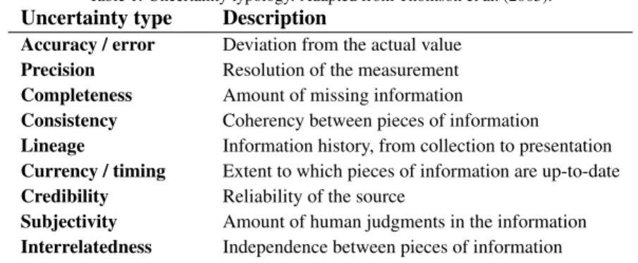
Visually separable methods. Cedilnik and Rheingans (2000) overlay distorted wire-frame lines to the visualization as an annotation of the uncertainty degree (Figure 1, a). Their work can be seen as a variation of Wright (1942), who suggests changing the value and grain of contour lines to display contour uncertainty. Using lines results in little of the primary data hidden by the uncertainty display. Another method is the use of patterns, typically with a variable grain or intensity (Figure 1,b), as done by Interrante (2000) along maps, Rhodes et al. (2003) along isosurfaces and Djurcilov et al. (2001) as a post-processing step of a volume rendering algorithm. Their approaches subdivide uncertainty space
1Preattentive processing is a perception mechanism inherent to our visual system that allows humans to perceive some features of a scene very
quickly (less than 200ms according to Healey et al. (1996), which is the time required for eye movement) and without any need to focus on the scene.
into a set of smaller ranges, each of which is assigned a different pattern. This results in a categorization of uncertainty levels.
Visually integral methods. MacEachren (1992) uses focus in geographical information systems (GIS), e.g., by chang-ing the fill clarity of land-cover patterns based on their uncertainty degree (Figure 1, c). Kosara et al. (2001) extend this notion to what they call semantic depth of field (SDOF). While classical image processing blurs objects based on their depth of field, SDOF blurs objects according to their relevance. Unlike most highlighting methods (Robinson, 2006), this de-emphasizes irrelevant objects in order to put the focus on the most important ones.
Uncertainty degree
a. b.
c. d.
Low High Low High
Low High Low High
Figure 1: Visualizations of facies uncertainty on a channel dataset. (a) Uncertainty visualization with procedural annotation lines. The line width denotes of the local uncertainty degree. (b) Pattern-based uncertainty visualization with variable intensity. High-intensity areas have higher facies uncertainty. (c) Fill-clarity uncertainty visualization. Blurred patterns indicate high facies uncertainty. (d) Color-coded facies uncertainty map. For figures (a), (b) and (c), yellow denotes sandy areas and blue denotes shaly areas.
Animation methods. Animation methods use time to convey a sense of uncertainty.2 Fisher (1993) introduces an
animation method to convey a sense of uncertainty in soil maps; he selects patches at random map locations through time and re-evaluates the patch type based on the local soil types distribution. Srivastava (1994a) proposes animation to display a sequence of possible models, using a modified p-field algorithm. The frames of this animation can be ordered according to a relevant objective function (Srivastava, 1994b). Ehlschlaeger et al. (1996) improve the interpolation schemes between keyframes as in the gradual deformation algorithm (Hu, 2000). This preserves the spatial variability of Gaussian random fields in interpolated frames. Davis and Keller (1997) create a patch-based animation of slope stability data. They especially focus on the integration of several sources of uncertainty such as soil type, soil characteristics or elevation values, using fuzzy logic and Monte-Carlo sampling methods. Dooley and
2Note that although animation is an integral method sensus-stricto, as the uncertainty display is fully integrated into the display of the primary
Lavin (2007) propose an animated visualization of plant hardiness zone maps, in which they consider uncertainties due to the data sampling density and to the selected interpolation method. Their approach results in maps being displayed sequentially.
2.3. Decision making under uncertainty
Representation of spatial uncertainty has little interest if it does not affect the way people think about their prob-lems to improve their decisions (Deitrick and Edsall, 2006). Improvements can relate to accuracy, decision speed and confidence in the results (Harrower, 2003). Uncertainty was initially believed to clutter data display, because of the burden introduced by additional information (McGranaghan, 1993). However, studies performed by Leitner and Buttenfield (2000) and Aerts et al. (2003) conclude that embedding primary map data with uncertainty tends to actually clarify the display. Their results are consistent with the findings of Evans (1997) and Edwards and Nelson (2001), whose studies showed that users perform better with integrated uncertainty displays than with separate maps. Sanyal et al. (2009) also found that uncertainty perception is not uniform, i.e., that the perception of low uncertainty locations differs from the perception of high uncertainty locations.
Most of the experiments discuss the effects of user expertise on decision-making under uncertainty. There is no clear consensus in the literature whether the level of expertise may bias decision-making under uncertainty; results from Kobus et al. (2001) and Hope and Hunter (2007) suggest that participants’ expertise influences their decisions, whereas Evans (1997) and Aerts et al. (2003) find either little or no significant difference between novices and experts. Roth (2009b) argues that these contradictory findings may come from the task complexity – the more complex, the greater the influence of the participant’s expertise.
An increasing number of studies focus on the effects of uncertainty visualization for decision-making, but most ex-periments have been performed with two-dimensional data, resulting in poor knowledge about perception of 2.5D/3D data that are widely used in geology. This work aims at bridging the gaps that exist with such higher dimensional data.
3. Uncertainty visualization design
Our tests on participants and our case study were performed using an implementation of the uncertainty vi-sualization method based on pattern transparency, as described below. Whereas a full-featured software with 3D support has been implemented in a commercial geomodeling software, we provide an open-source package con-taining the source code, binaries and a technical documentation of our GPU-accelerated implementation at http: //www.gocad.org/www/research/freesoftware.php.
Uncertainty visualization using pattern transparency. In our experiments, we use transparency to convey a sense of uncertainty, by compositing both the value and the color visual variables (Zuk and Carpendale, 2006). We blend a predefined pattern to the color-coded data, with a blending ratio expressed as a function of uncertainty. This results in the pattern being visible at some interesting areas; for our problem, we chose to make the pattern visible at high uncertainty areas to bring the attention of participants to these locations, because Sanyal et al. (2009) suggests that uncertainty perception is non-uniform.
The blending ratio can be seen as a measure of the pattern intensity, noted I(u) where u corresponds to some local scalar uncertainty measure. For every single pixel, the blending results in a final RGB color Cf calculated as:
Cf = (1 − αp· I(u)) ·Ci+ αp· I(u) ·Cp (1)
where Ciis the RGB color before applying the pattern, Cpis the RGB color of the pattern and αpis the pattern opacity
at the current pixel.
Pattern definition. Our pattern-based uncertainty visualization method is a variation of Rhodes et al. (2003), for our pattern uses transparency with continuous uncertainty values rather than density with discrete uncertainty levels. Hence, the method removes the burden of defining a discrete set of patterns, i.e., any relevant 2D pattern can be used in our implementation. We have tested several types of pattern empirically, e.g., fabric, grid, circles, chessboard, etc. We generally use “fabric” patterns because they reproduce natural textures (Interrante, 2000) that make the pattern easy to recognize for most users. However, our tests were performed with participants experienced in geomodeling. We therefore used a grid pattern in the user study, which is similar to grid wire-frames that participants were familiar with.
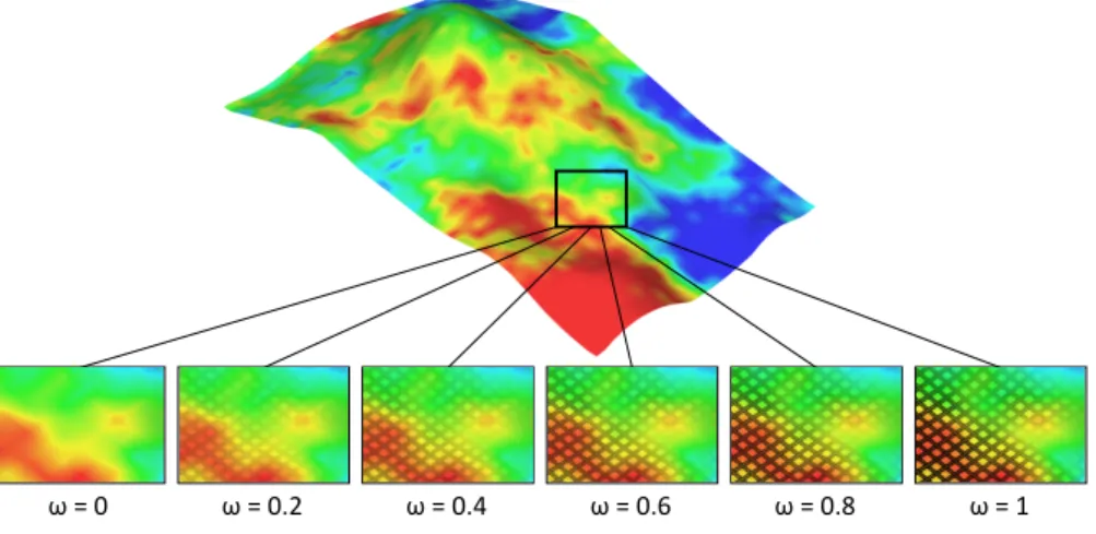
Control on the interference. The degree of interference between the pattern and the background color-coded property can be tuned by replacing αpin color equation (1) with α0p= ω · αp, where ω ∈ [0, 1] is a constant user-defined value.
If ω is close to 0, the pattern should be hardly visible even at locations of maximum intensity I(u), whereas it should be clearly visible if ω is close to 1 (Figure 2). In our experiments, we use an ω value of 0.8 to prevent the pattern from being over-perceived in the display.
ω = 0 ω = 0.2 ω = 0.4 ω = 0.6 ω = 0.8 ω = 1
Figure 2: Average porosity map on a stratigraphic layer, blended with “fabric” pattern with several values of ω. Top: whole layer without pattern. Bottom: zooms with different values of ω.
Perception quality. We chose pattern-based uncertainty visualization over other existing methods because of its high quality in terms of perception:
• Interferences – Pattern-based uncertainty visualization has the advantage of being perceptually separable from the primary geological property; furthermore, the choice of adapted patterns minimizes the hidden areas of the model, which is likely to result in lower interferences with the underlying color-coded data.
• Intuitive display – Transparency has proven to be highly connected to the notion of uncertainty, resulting in an intuitive sign-vehicle for uncertainty (Griethe and Schumann, 2006; Grigoryan and Rheingans, 2004; Johnson and Sanderson, 2003; MacEachren, 1992).
• Preattentivity – Because blending the pattern affects the value of the image, the local levels of uncertainty are likely to be processed preattentively.
4. Uncertainty visualization in geology: an example scenario
Since geoscientists typically face various types of uncertainty, uncertainty visualization algorithms can be valuable in many different issues. In this section, we review one specific issue that frequently happens in the oil and gas industry – i.e., the quest for the optimal location of a new appraisal well (Lafont, 2007) – in order to provide a typical example of decision-making in geosciences. Appraisal wells primarily aim at gathering information about an unknown area of the subsurface, and are typically drilled at the early steps of the assessment of a reservoir. This example is illustrated on the Nan1 reservoir.3 We first describe the geological context of the Nan1 field (Section 4.1) and the uncertainty
characterization workflow (Section 4.2), before discussing the well locations which are geologically relevant (Section 4.3).
4.1. The Nan1 field
Nan1 is a Middle East onshore oil and gas field, covering approximately twenty square kilometers. Oil is accumu-lated in a structural trap made of low permeability faults and folded strata. The reservoir is located in two stratigraphic formations, named B and W.
The B formation was formed in a channeled deltaic environment. It shows a lot of sand bodies stacked on each other, with a good potential in oil and gas content. The B formation is quite homogeneous due to the high density of sand bodies (Figure 3), resulting in a low spatial uncertainty degree on the location of sand-rich areas.
The W formation was formed in a fluvial environment. The density of sand bodies is much less favorable and lateral heterogeneity is significant. There is thus a higher uncertainty degree on the location of reservoir rocks. The W formation is estimated to contain between 10 and 20% of the oil in place. A better estimation of the net-to-gross is therefore a worthy challenge, and may help improving the oil production.
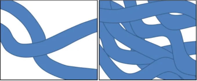
Figure 3: Two sections of a synthetic geological model showing stacked paleo-channels with different channel densities. Left: the low channel density results in significant facies heterogeneity as in the W formation. Right: the high channel density results in an almost homogeneously sandy medium as in the B formation.
4.2. Uncertainty characterization
In this study, we focus on the W formation because its evaluation is very sensitive to spatial uncertainty. Because the W formation was deposited in a clastic fluvial environment, we model the facies with the Fluvsim object-based stochastic method (Deutsch and Tran, 2002), which reproduces the geometry of complex channelizing sand bodies (Journel et al., 1998). We represent two different facies, the channels and the flood plain. These sedimentary bodies are conditioned to the observations collected along three existing appraisal wells, and honor analog geological obser-vations (sinuosity, height, width, etc.).
For each rock type simulation, we then simulate the petrophysical properties using statistics inferred from core sam-ples. The floodplain porosity is considered constant, but the channels show a higher variability and are therefore simulated using a stochastic algorithm. In this study, we use sequential Gaussian simulation conditioned to well data. The number of realizations is a trade-off between the accuracy of the uncertainty sampling and the CPU cost of the realizations’ generation and storage. In this example, we set the cursor to one hundred realizations.
After the generation of the set of realizations, it is possible to compute some uncertainty metrics at every single spatial location of the model. We use a normalized standard deviation metric on the set of porosity realizations.
4.3. Optimal well location
Appraisal well criteria. To bring as much value as possible, an appraisal well should ideally reach high-pay areas with a high uncertainty. These requirements conflict with each other, since a high-pay area with high uncertainty could actually turn out to be a low-pay area when drilled. Hence, geoscientists have to decide between drilling in an area with a high uncertainty degree where most is unknown, which is typically valuable at the early steps of reservoir characterization, or drilling in an expectedly high-pay zone with moderate uncertainty, which is often preferred when the reservoir is about to enter the production phase. Our visualization methods may be valuable for both approaches, as both require to know about the local uncertainty degree.
The Nan1 reservoir shows complex and highly non-linear structures, such as channels, faults and folds. Only three appraisal wells were drilled so far, which is clearly not sufficient to highlight the properties of the reservoir. Mini-mizing reservoir uncertainty is thus more valuable than miniMini-mizing the risk of drilling in a low-pay area at this step.
Reservoir engineers may be interested in a better estimation of the hydrocarbon reserves, typically by finding the oil-water contact. To avoid future overcosts, they may also consider conversion of appraisal wells later in the devel-opment of the field, which requires specific care about the placement of the well. For instance, a water-injection well should be placed so that water could sweep oil toward a production well, which means that there should not be any low-permeability zone in-between. Special attention must be paid to faults, which can act either as drains or seals, and to the elevation of the reservoir top. Injectors should also be located at the boundaries of high-pay areas, so that no oil is lost being swept in areas without production wells.
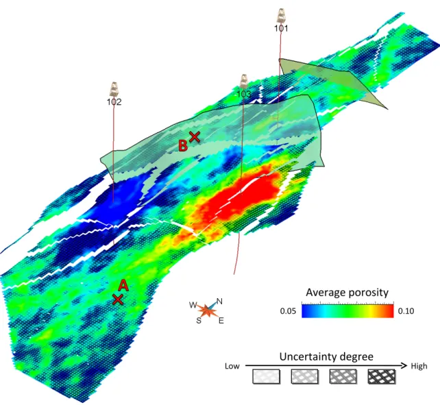
Uncertainty visualization. We applied our pattern-based uncertainty visualization (Section 3) to a layer of the Nan1 field (Figure 4) in order to determine the location of a new appraisal well. Note that for a truly optimal well location, this study should be performed on all of the layers of the reservoir.
Using the criteria defined earlier, we were able to define two possible well locations in the Nan1 model. Location A is on the boundary of an area with reasonably high expected porosity, so that the appraisal well may finally be converted into a water-injector. This location is quite deep, however, which means there is a high risk to miss the oil-saturated zone. Location B has a higher position, and is therefore more likely to reach hydrocarbons. Its expected porosity is high, so that the appraisal well could be converted into a producing well on further developments. It may nevertheless be affected by the southern fault permeability, i.e., turning it into a producer would result in low hydrocarbon production if the fault has a sealing effect.
4.4. Discussion
On this simple example, uncertainty visualization algorithms were used to support the choice of a new appraisal well location, as they could carry information about the porosity and its associated uncertainty at once. Secondary objectives of the appraisal well should however still be assessed by an expert geologist, as the location of the well is not solely based on the degree of uncertainty. Furthermore, the benefits of uncertainty visualization are not limited to data exploration: uncertainty visualization should also be seen as a way to communicate results to a non-expert audience, in a clear and intuitive manner.
5. Methodology
This section describes our methodology during the user study design. It is organized around two main axes: (i) the protocol of the user study (Section 5.1) and (ii) the methods used for the analysis of the answers (Section 5.2). Results are discussed in Section 6.
5.1. Protocol
Our user study was designed to determine whether uncertainty visualization tools affect decision-making, and if they do, to determine whether adjacent or coincident displays perform better than the other.
5.1.1. Participants
Our study involved 123 participants with a background in geology, including one domain expert, 5 PhD students from the CRPG-CNRS laboratory and 117 MSc students from the Ecole Nationale Sup´erieure de G´eologie. The domain expert was a professional of the oil and gas industry; his level of expertise can be considered as excellent. The 5 PhD students had a variety of different backgrounds; their level of expertise in over-pressured reservoirs ranges from fair to good. The 117 MSc students were involved in geological thematics, but could not be considered as domain experts at this step of their training; their level of expertise ranges from low to fair. Note that participants were selected for logistical reasons rather than because of their expertise.
Average porosity
0.05 0.10
Uncertainty degree
Low High
Figure 4: Visualization of a faulted geological layer of the Nan1 field showing both the average porosity (color) and its associated uncertainty (pattern intensity). Areas where pattern is visible have high uncertainty degree. The paths of the first appraisal wells are represented as red lines, with a derrick glyph showing their head location. The gray translucent planes correspond to important faults which split the model into several compartments (minor fault planes are not represented). Locations A and B are two possible candidates for the drilling of a new appraisal well, assessed using local uncertainty behavior and domain-dependent knowledge (possible well reconversion in the production phase).
5.1.2. Model and technical background
The Cloudspin model. The study used a pressure data set generated in the Cloudspin reservoir.4 The Cloudspin reservoir is an oil and gas field, whose expected production results were simulated with 27 flow simulations – the low number of simulations is due to the large CPU power requirements of flow simulations. As the local pressure around the production well is lower than the reservoir pressure, the hydrocarbons passively flow toward the production well. However, the simulations were performed with several realizations of permeability and various Pressure-Volume-Temperature tables as input parameters. As the viscosity of the hydrocarbons and the rocks permeability varies, so will the local speed of the hydrocarbons’ flow, resulting in different reservoir production outcomes. Uncertainty was sampled using all simulated pressure fields taken at a specific time-step of the simulation, then quantified with a normalized standard deviation metric (also termed variation coefficient). The area of high uncertainty highlights the possible boundaries of the depleted area at this time-step.
Pressure in well design. In this user study, participants were required to consider the development of water-injection wells. The goal of such wells is to sweep oil toward the production well, resulting in improved production results. However, the possible local overpressure must be studied prior to drilling a new well, so that the well head counter-balances overpressure at any time. Incorrect estimation of the overpressure may result in a blow up of the well head, putting human lives at risk and destroying costly equipment.
5.1.3. User study description
We split the participants into three groups. All participants were asked the same questions, but were provided with different pictures of the reservoir depending on the group to which they belonged (Figure 5), as suggested in Deitrick and Edsall (2006). The first group was given pressure data only, the second group pressure and uncertainty data displayed separately, and the third group pressure and uncertainty data in a single display using our pattern transparency visualization method. The images were taken in the same conditions for all three groups; all were given short written explanations about the geological background and the risks associated to incorrect overpressure estimation (Section 5.1.2). All materials were provided as colored paper prints; we ensured that images were printed with high quality and that colors were correctly approximated by the printer.
Question design. Because all participants were asked the same questions, we assume that any statistical difference in the answers between the groups would come from the data that were provided. To be valid, this assumption requires that (i) all groups have participants with comparable skills and (ii) a significant amount of answers is collected for each group, so that the statistics are not biased by random behaviors. To meet these requirements, (i) we designed a question meant to compare the groups abilities and (ii) we tried to reach as many participants as possible and assigned them to either group with equal probability, so that the groups were approximately the same size.
Description and goal of the questions. Participants were asked three different questions with increasing complexity. In the first question, participants were asked to indicate in which area of the reservoir pressure was the highest, given three possible choices – east, center or west of the reservoir main panel. This question was intended as a simple map reading test, in order to assess and compare the groups’ abilities.
The second question required participants to compare well locations A and B in terms of worst possible overpressure. Location A showed higher pressure than location B, but associated uncertainty was lower. We designed this question to study how uncertainty could affect decision in binary choices, and whether the way uncertainty is presented could influence decisions.
In the third question, participants were asked to rank well locations D, E, F, G and H from lowest to highest possible overpressure. The goal of this question is quite similar to question 2, but involves much more qualitative decision making, as quantifying the worst possible pressure for each of the five wells may be difficult to achieve in a limited amount of time.
5.2. Analysis
The analysis of the answers was performed using different statistical tools. The summary of the tools we used is listed below on a question-per-question basis.
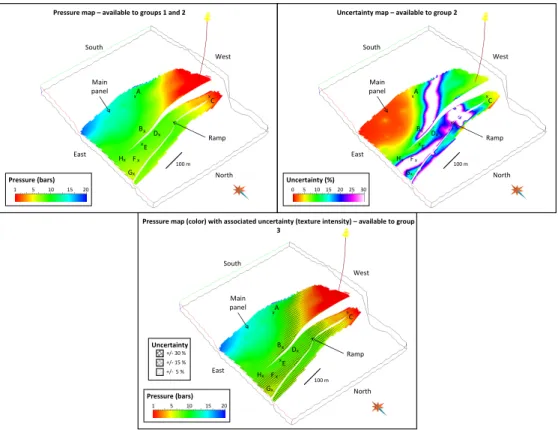
x xA B West East Ramp x C North South Pressure (bars) 10 1 20 Main panel x G x H Fx xE x D
Pressure map – available to groups 1 and 2
100 m 5 15 x xA B West East x C x G North South 20 Uncertainty (%) 25 15 10 5 0 30 Main panel x H Fx xE x D Ramp
Uncertainty map – available to group 2
100 m x xA B West East x C North South +/- 5 % +/- 15 % +/- 30 % Uncertainty Pressure (bars) 10 1 20 Main panel x G x H Fx xE x D Ramp
Pressure map (color) with associated uncertainty (texture intensity) – available to group 3
100 m
5 15
Figure 5: Pictures of the Cloudspin reservoir provided with the user study. Top left: average pressure map (available to groups 1 and 2). Top right: uncertainty map (available to group 2). Bottom: average pressure map with uncertainty (available to group 3).
Question 1. Question 1 was analyzed using a simple percentage of correct vs. incorrect answers. Although this method does not allow for advanced statistical testing of the distribution of the answers, the large number of correct answers made more sophisticated testing methods useless (Section 6).
Question 2. The results of question 2 were analyzed with the Wilcoxon signed-rank test (Wilcoxon, 1945), which was chosen because it does not assume any type of distribution for the answers (non-parametric test).
The Wilcoxon test compares two sets of samples, assuming that they come from the same distribution (H0 hypothesis). We then compute the conditional probability pi− j of the answers of groups i and j under H0. If pi− j is below a
threshold α, the H0 hypothesis is rejected, i.e. we make the choice to consider that groups i and j have statistically different answers. We compared the answers of groups 1, 2 and 3 with a threshold α of 0.01.
Question 3. For the analysis of question 3, we have computed the error between the answer and the actual order. This error is computed as the sum of the errors for each well, as detailed in equation (2). It can be seen as the total pressure mismatch between the answer and the actual maximum possible pressure of the reservoir, i.e. the error acts as a measure of the perception mismatch.
E=
∑
i∈Ωj∈Ω, j,i∑
0 if wells i and j are correctly ordered Abs(Pi− Pj) otherwise
(2)
where E is the error, Ω is the set of well locations [well1= D, well2= E, well3= F, well4= G, well5= H] and Piis the
maximum possible pressure at well i.
The average error of a group allows to determine whether the selected visualization method improves or clutters perception. Furthermore, we applied the Wilcoxon signed-rank test to the distribution of the errors, in order to highlight common answer patterns between groups.
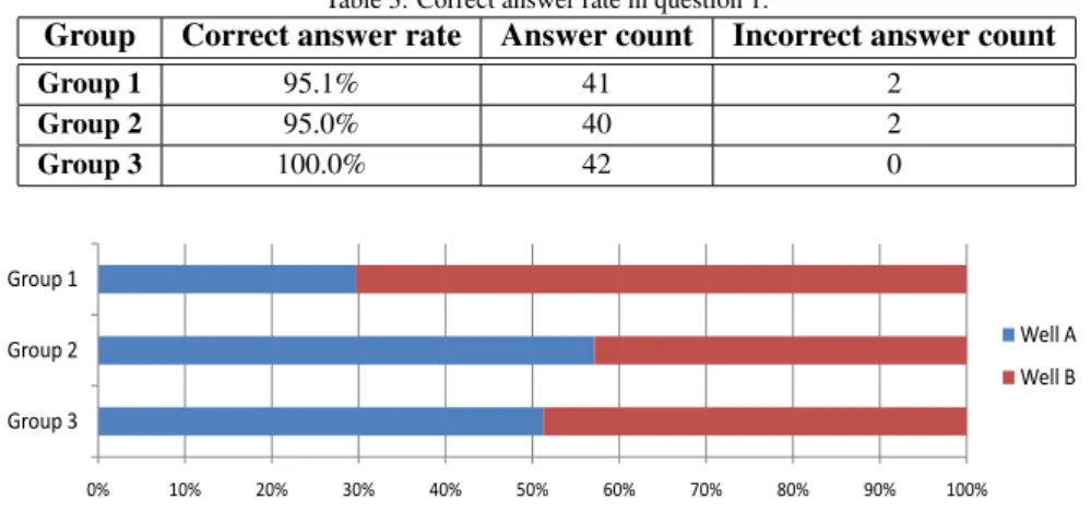
Table 3: Correct answer rate in question 1.
Group Correct answer rate Answer count Incorrect answer count
Group 1 95.1% 41 2 Group 2 95.0% 40 2 Group 3 100.0% 42 0 0% 10% 20% 30% 40% 50% 60% 70% 80% 90% 100% Group 3 Group 2 Group 1 Well A Well B
Figure 6: Answer rates for question 2.
6. Results and discussion 6.1. Interpretation of the results
This section provides detailed description of the results we obtained and their implications for each question.
Question 1
Results. Within the 123 participants to the study, more than 96% answered correctly to the first question. We analyzed the correct answer rates for each group; results are reported in Table 3. Participants with incorrect answers were all MSc students.
Interpretation. The large majority of the participants were able to read the data they were provided with. We found that all three groups had an equivalent ability to read the pressure map, which guarantees that our group assignment process did not introduce any bias in terms of map-reading skills. The four participants with incorrect answers were discarded in questions 2 and 3 for additional safety.
Question 2
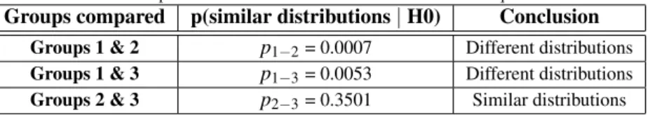
Results. Distribution of the answers in question 2 were compared using statistical hypothesis testing; answer rates are reported in Figure 6, and probabilities that answers are sampled from similar distributions under the H0 hypothesis are reported in Table 4. We found that groups 2 and 3 have statistically similar answers, while group 1 differs from both group 2 and group 3.
Interpretation. Group 1 had no information about the local uncertainty, while groups 2 and 3 were provided with uncertainty maps. Hence, we interpret these results as the effects of uncertainty on decision-making. This conclusion is similar to the studies performed by Leitner and Buttenfield (2000) and Deitrick and Edsall (2006). Note that all groups have the same level of accuracy for that question since wells A and B have very similar worst possible pressures, i.e., 10.50 bars for well A and 10.42 bars for well B.
The way uncertainty is presented has no clear effect on the answers of this question. We believe this is connected to the question complexity; indeed, it is quite easy to quantify pressure and uncertainty at only two well locations, no matter whether uncertainty is presented jointly or separately.
Question 3
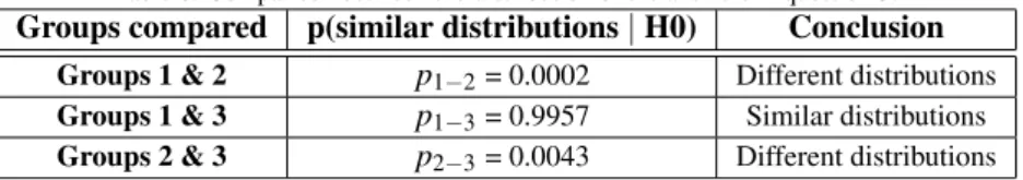
Results. The results of question 3 are reported in Table 5; they show that group 1 was closer to the actual pressure ordering than group 3, who in turn performed better than group 2. The Wilcoxon test showed that answers of groups 1 and 3 have similar distribution patterns under the H0 hypothesis, while answers of group 2 differ from the two other groups (Table 6).
Table 4: Comparison between the distribution of the answers in question 2.
Groups compared p(similar distributions | H0) Conclusion Groups 1 & 2 p1−2= 0.0007 Different distributions
Groups 1 & 3 p1−3= 0.0053 Different distributions
Groups 2 & 3 p2−3= 0.3501 Similar distributions
Table 5: Average perception mismatch for each group in question 3.
Group Average mismatch Deviation Group 1 0.59 Kbars +/- 0.23 Kbars Group 2 2.60 Kbars +/- 0.31 Kbars Group 3 1.00 Kbars +/- 0.35 Kbars
Interpretation. The average error results suggest that a visualization which integrates a joint display of uncertainty is clearer than two separate visualizations for data and uncertainty for qualitative choices, but that it still occludes part of the primary information present in the map. However, looking at the confidence interval about the average error for groups 1 and 3, we found a non-empty intersection, i.e. both groups may actually be at the same level of perception quality.
This hypothesis was checked using the Wilcoxon signed-rank test; we found that answers of groups 1 and 3 had similar distribution patterns under the H0 hypothesis, i.e., that they are actually sampled from the same initial distribution. This result implies that the average error difference between groups 1 and 3 may actually be an artifact, possibly coming from a heterogeneous sampling of the participants, but more likely coming from random behaviors. This suggests that the joint display of uncertainty presented in this paper has the same level of clarity than the map by itself, i.e., that this joint display of uncertainty does not clutter the perception.
Conversely, the average error obtained for group 2 suggests that a separate display of the data and the uncertainty obscures perception when compared to the other methods; the Wilcoxon test confirms that group 2 does not share common distribution patterns with any other group.
6.2. Discussion
While the setup of the user study allowed us to answer some of the questions we were investigating, some tech-nical, material or organizational issues prevented us from gathering some interesting pieces of information. This part discusses the limitations of our methodology.
Decision-making speed. Our study was practically distributed as a paper form that could be filled in a limited amount of time. Unfortunately, those conditions did not allow us to measure the time participants took on each question, since the form was distributed to large groups of participants at once. We were only able to limit the total amount of time available to answer all the questions. Time measures would have allowed statistical testing of the decision-making speed between groups, which could have been seen as a first approximation of the intuitiveness of each approach.
Participants’ representativity. More than 95% of the parcipants were MSc students; hence, the population used in our experiment clearly suffered from a lack of domain experts. According to Roth (2009b) the task complexity strenghens the influence of the participant’s expertise. Our experiments involved well targeting, which is indeed a challenging task. Hence, it is reasonable to expect a bias in the results of our user study, even though the limited number of experts does not allow statistical testing of this hypothesis.
Statistical relevance. In our experiments, participants were evenly distributed into three groups who were asked the same set of three questions, each group having access to a different visualization method. This methodology avoids learning bias, but limits the number of questions that can be tested, hence decreases the statistical relevance of the study. We could have provided the three visualization methods in a random order to each participant, which would have increased our pool of answers while minimizing the effects of learning bias.
Table 6: Comparison between the distribution of the answers in question 3.
Groups compared p(similar distributions | H0) Conclusion Groups 1 & 2 p1−2= 0.0002 Different distributions
Groups 1 & 3 p1−3= 0.9957 Similar distributions
Groups 2 & 3 p2−3= 0.0043 Different distributions
7. Conclusion
This paper aimed at answering the following questions:
Does uncertainty visualization influence decision making? Since this question has already received a positive answer in the literature, we see this test as a cross-check of the consistency of our study, rather than as a new result. The second question of our study revealed different answer patterns whether participants were aware of uncertainty or not, which suggests that uncertainty visualization does have an influence on decision making; hence, our results agree with the findings of previous studies.
Is there a difference in terms of decision-making accuracy between coincident and adjacent displays of spatial un-certainty? Our study resulted in contradictory findings about the influence of the way uncertainty is displayed: our second question resulted in similar results for adjacent and coincident displays, while our third question highlighted significant differences between the two methods. We interpret these different results as a consequence of the increas-ing complexity of the tasks participants had to perform; the second question was simple enough to be carried out with adjacent displays, while the third question involved complex multi-location assessments, for which adjacent maps introduced a perceptual and cognitive overload (Harrower, 2003). This suggests that the way uncertainty is presented actually influences user perception; hence, visualizations dedicated to real-world applications should aim at using compact representations of the information in order to minimize cognitive burdens for the users.
Does uncertainty visualization act to clarify or to clutter the display of uncertain data? The third question studied the accuracy of the answers with respect to the actual value presented on the display; it has shown that data presented without uncertainty and coincident displays of uncertainty shared the same answer patterns and were close to the best decision, i.e., that uncertainty visualization can present a large amount of information in compact displays without ob-scuring the important structures in the data. This assertion has to be contrasted with the results of adjacent uncertainty displays, where decisions were much less accurate. This once again points out that only careful design of uncertainty visualizations, with minimal burden on the user, can actually add value to the decisions.
Is the perception of 2.5D/3D data different from the perception of 2D map data in presence of uncertainty? The results of our study are generally consistent with the previous research on this topic, e.g., Leitner and Buttenfield (2000) and Deitrick and Edsall (2006), which suggests there is little difference in the perception of 2.5D data as compared to traditional map data. However, our experiments did not include any testing of actual 3D data. Exploration of 3D data substantially differs from exploration of 2D/2.5D data, because it typically involves more user interactions, e.g., moving the view point, zooming some particular areas or changing the lights. While such interactions increase the complexity of the logistics of user study design, they may influence the way uncertainty is perceived in the data. Furthermore, results from Sanyal et al. (2009) show that it was significantly harder for users to assess uncertainty on 2D data than on 1D data; a similar ascending complexity can thus be expected when jumping from 2D/2.5D data to 3D data. Hence, we consider that the question of user perception on volumes is open; understanding how 3D uncertainties can be seen is a fundamental issue that still needs to be answered in order to produce efficient uncertainty visualizations for geological applications, but also for other scientific domains such as medical research, meteorology or oceanography.
Acknowledgments
We want to express our acknowledgment to all the participants of the user study, and to Irina Panfilova for her useful pieces of advice when designing the user study. We also thank the anonymous reviewers for their suggestions
to improve this paper.
We thank Total for providing the Nan1 model used in the case study, and Paradigm for providing the Cloudspin uncertainty model used in the user study – many thanks to Alexandre Hugot and Emmanuel Gringarten for their work and explanations on the Cloudspin model. We also acknowledge Paradigm for providing the Gocad software and developer API. This research is part of a PhD thesis funded by the Gocad consortium. All the members of the consortium are hereby acknowledged for their support.
This is CRPG-CNRS contribution n°2044.
Aerts, J., Clarke, K., Keuper, A., 2003. Testing popular visualization techniques for representing model uncertainty. Cartography and Geographic Information Science 30 (3), 249–262.
Arpat, G. B., Caers, J., 2007. Conditional simulation with patterns. Mathematical Geology 39 (2), 177–203. Bertin, J., 1983. Semiology of Graphics. The University of Wisconsin Press.
Buttenfield, B., 1993. Representing data quality. Cartographica: The International Journal for Geographic Information and Geovisualization 30 (2), 1–7.
Cedilnik, A., Rheingans, P., 2000. Procedural annotation of uncertain information. Proceedings of the 11th IEEE Visualization 2000 Conference (VIS 2000).
Chambers, R., Yarus, J., 2006. Practical geostatistics - an armchair overview for petroleum reservoir engineers. Journal of Petroleum Technology, Distinguished Author Series 11.
Davis, T., Keller, C., 1997. Modelling and visualizing multiple spatial uncertainties. Computers and Geosciences 23 (4), 397–408.
Deitrick, S., Edsall, R., 2006. The influence of uncertainty visualization on decision making: An empirical evaluation. Progress in Spatial Data Handling, 12th International Symposium on Spatial Data Handling, 719–738.
Deutsch, C., Tran, T., 2002. Fluvsim: a program for object-based stochastic modeling of fluvial depositional systems. Computers and Geosciences 28 (4), 525–535.
Djurcilov, S., Kim, K., Lermusiaux, P., Pang, A., 2001. Volume rendering data with uncertainty information. Proceedings of the EG+IEEE VisSym on Data Visualization, 243–52.
Dooley, M., Lavin, S., 2007. Visualizing method-produced uncertainty in isometric mapping. Cartographic Perspectives 56, 17–36. Edwards, L., Nelson, E., 2001. Visualizing data certainty: A case study using graduated circle maps. Cartographic Perspectives 38, 19–36. Ehlschlaeger, C., Shortridge, A., Goodchild, M., 1996. Visualizing spatial data uncertainty using animation. Computers & Geosciences 23 (4),
387–395.
Evans, B., 1997. Dynamic display of spatial data-reliability: does it benefit the map user? Computers and Geosciences 23 (4), 409–422. Fisher, P., 1993. Visualizing uncertainty in soil maps by animation. Cartographica: The International Journal for Geographic Information and
Geovisualization 30 (2), 20–27.
Gershon, N., 1998. Visualization of an imperfect world. IEEE Computer Graphics and Applications 18 (4), 43–45.
Griethe, H., Schumann, H., 2006. The visualization of uncertain data: Methods and problems. Proceedings of SimVis 2006, SCS Publishing House, 143–156.
Grigoryan, G., Rheingans, P., 2004. Point-based probabilistic surfaces to show surface uncertainty. IEEE Transactions on Visualization and Com-puter Graphics, 546–573.
Harrower, M., 2003. Representing uncertainty: Does it help people make better decisions? In: UCGIS Workshop: Geospatial Visualization and Knowledge Discovery Workshop, National Conference Center, Landsdowne, VA., Nov. pp. 18–20.
Healey, C., Booth, K., Enns, J., 1996. High-speed visual estimation using preattentive processing. Transactions on Computer-Human Interaction 3 (2), 107–135.
Hope, S., Hunter, G., 2007. Testing the effects of thematic uncertainty on spatial decision-making. Cartography and Geographic Information Science 34 (3), 199–214.
Hu, L., 2000. Gradual deformation and iterative calibration of gaussian-related stochastic models. Mathematical Geology 32 (1), 87–108. Interrante, V., 2000. Harnessing natural textures for multivariate visualization. IEEE Computer Graphics and Applications 20 (6), 6–11. Johnson, C., Sanderson, A., 2003. A next step: Visualizing errors and uncertainty. IEEE Computer Graphics and Applications 23 (5), 6–10. Journel, A., Gundeso, R., Gringarten, E., Yao, T., 1998. Stochastic modelling of a fluvial reservoir: a comparative review of algorithms. Journal of
Petroleum Science and Engineering 21 (1), 95–121.
Kobus, D., Proctor, S., Holste, S., 2001. Effects of experience and uncertainty during dynamic decision making. International Journal of Industrial Ergonomics 28 (5), 275–290.
Kosara, R., Miksch, S., Hauser, H., 2001. Semantic depth of field. Proceedings of the IEEE symposium on Information Visualization, 97–104. Lafont, F., 2007. Pers. com. Jaca field trip, Total.
Leitner, M., Buttenfield, B., 2000. Guidelines for the display of attribute certainty. Cartography and Geographic Information Science 27 (1), 3–14. MacEachren, A., 1992. Visualizing uncertain information. Cartographic Perspective 13, 10–19.
MacEachren, A., 1995. How maps work. Guilford Press New York.
MacEachren, A., Brewer, C., Pickle, L., 1998. Visualizing georeferenced data: representing reliability of health statistics. Environment and Planning A 30, 1547–1562.
MacEachren, A., Robinson, A., Hopper, S., Gardner, S., Murray, R., Gahegan, M., Hetzler, E., 2005. Visualizing Geospatial Information Uncer-tainty: What We Know and What We Need to Know. Cartography and Geographic Information Science 32 (3), 139–161.
McGranaghan, M., 1993. A cartographic view of spatial data quality. Cartographica: The International Journal for Geographic Information and Geovisualization 30 (2), 8–19.
Pang, A., 2006. Visualizing uncertainty in natural hazards. Risk Assessment, Modeling and Decision Support 14, 261–294. Pang, A., Wittenbrink, C., Lodha, S., 1997. Approaches to uncertainty visualization. The Visual Computer 13 (8), 370–390.
Visualization. Springer-Verlag, pp. 59–73.
Rhodes, P., Laramee, R., Bergeron, R., Sparr, T., 2003. Uncertainty visualization methods in isosurface rendering. EUROGRAPHICS 2003 Short Papers, 83–88.
Robinson, A., 2006. Highlighting techniques to support geovisualization. In: Proceedings of the ICA Workshop on Geovisualization and Visual Analytics.
Roth, R., 2009a. A qualitative approach to understanding the role of geographic information uncertainty during decision making. Cartography and Geographic Information Science 36 (4), 315–330.
Roth, R., 2009b. The impact of user expertise on geographic risk assessment under uncertain conditions. Cartography and Geographic Information Science 36 (1), 29–43.
Sanyal, J., Zhang, S., Bhattacharya, G., Amburn, P., Moorhead, R., 2009. A User Study to Compare Four Uncertainty Visualization Methods for 1D and 2D Datasets. IEEE Transactions on Visualization and Computer Graphics 15 (6), 1209–1218.
Shortridge, B., 1982. Stimulus processing models from psychology: can we use them in cartography? Cartography and Geographic Information Science 9 (2), 155–167.
Skeels, M., Lee, B., Smith, G., Robertson, G., 2008. Revealing uncertainty for information visualization. In: Proceedings of the working conference on Advanced visual interfaces. ACM, pp. 376–379.
Srivastava, R., 1994a. The visualization of spatial uncertainty. The Visualization of Spatial Uncertainty, Stochastic Modeling and Geostatistics: Principles, Methods, and Case Studies, J.M Yarus and R.L. Chambers, eds., American Assoc. of Petroleum Geologists.
Srivastava, R. M., 1994b. The interactive visualization of spatial uncertainty. SPE 27965.
Thomson, J., Hetzler, E., MacEachren, A., Gahegan, M., Pavel, M., 2005. A typology for visualizing uncertainty. In: Proc. SPIE. Vol. 5669. pp. 146–157.
Tory, M., M¨oller, T., 2004. Human factors in visualization research. IEEE Transactions on Visualization and Computer Graphics 10 (1). Tufte, E., 2001. The Visual Display of Quantitative Information, 2nd ed. Graphics Press, Cheshire.
USGS, 1977. Spatial data transfer standard (sdts): Logical specifications.
Ware, C., 2004. Information Visualization: Perception for Design, 2nd ed. Morgan Kaufmann Publishers. Wilcoxon, F., 1945. Individual comparisons by ranking methods. Biometrics Bulletin 1 (6), 80–83.
Wright, J., 1942. Map Makers Are Human: Comments on the Subjective in Maps. Geographical Review, 527–544.