HAL Id: hal-03176998
https://hal-enac.archives-ouvertes.fr/hal-03176998
Submitted on 22 Mar 2021
HAL is a multi-disciplinary open access
archive for the deposit and dissemination of
sci-entific research documents, whether they are
pub-lished or not. The documents may come from
teaching and research institutions in France or
abroad, or from public or private research centers.
L’archive ouverte pluridisciplinaire HAL, est
destinée au dépôt et à la diffusion de documents
scientifiques de niveau recherche, publiés ou non,
émanant des établissements d’enseignement et de
recherche français ou étrangers, des laboratoires
publics ou privés.
A new visualization of Paris accessibility
Geoffrey Scozzaro, Clara Buire, Eric Féron, Daniel Delahaye
To cite this version:
Geoffrey Scozzaro, Clara Buire, Eric Féron, Daniel Delahaye. A new visualization of Paris accessibility.
[University works] ENAC. 2021. �hal-03176998�
A new visualization of Paris accessibility
Geoffrey Scozzaro, Clara Buire, Eric Feron and Daniel Delahaye
March 2021
Contents
1 Introduction 3
1.1 Motivation . . . 3
1.2 Litterature Review . . . 3
2 Data Collection 5 3 Interpolation of travel times 8 4 Introduction of a temporal metric 8 5 Conclusion 10
List of Figures
1 France in train from Paris (source: [1]) . . . 42 A screenshot of the CityMapper web application. . . 6
3 Illustration of the 25757 stops of the RATP in the Paris area . . . 6
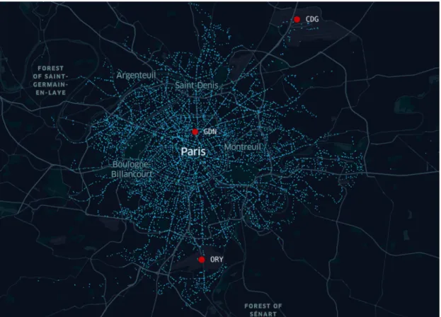
4 Travel times from CDG to RATP stops . . . 7
5 Travel time map from CDG estimated through kriging . . . 9
6 Illustration of the shifting procedure from euclidean metric to temporal metric with CDG as the point of interest. . . 12
7 Illustration of the shifting procedure from euclidean metric to temporal metric with GDN as the point of interest. . . 13
Summary
This project aims at developing a new visualization of Paris accessibility by public transport. Considering a point of interest such as Charles de Gaulle airport (CDG), travel times were computed from this point to the RATP stops included in the Paris area through the public transit app CityMapper. A map called anamorphosis map was drawn using a temporal metric which allows to get insights on the accessibility of a specific point of interest such as a railway station or an airport.
1
Introduction
1.1
Motivation
Evaluating the accessibility of some points of interests inside a city (historical monuments, commercial zones, airports, railway stations, etc..) is crucial to evaluate the performance of the service proposed by the city’s transportation actors. During this project a new visualization of Paris area was created to understand if an airport or a railway station is well served by public transport. To do so, the euclidean metric was replaced by a temporal metric using public transport travel times. These kind of projections are called anamorphosis and can help to directly understand where the public transportation system performs poorly. The Paris area was considered and the accessibility by public transport of some point of interests (such as airports and railway stations) was evaluated.
1.2
Litterature Review
[2] proposes an estimation of the door to door travel time from Paris to London or Amsterdam. The travel times to go to the departure airport/station and to leave the arrival airport/station are computed using Uber data. This work helps to understand how the accessibility of an airport is crucial in order to compete with trains. However it didn’t take into account public transport data.
In order to estimate the accessibility by public transport, [3] used Geographical Information System (GIS). Journeys may include an initial walk to a public transport stop, several inter-changes between services of the same or different modes, and a final walk. Each bus route is defined by a route on the street network, a time interval describing the frequency and by a fixed duration representing the time elapsed from the start to the end of the route. Later, open-source planning tools have been developed such as OpenTripPlanner (OTP). It uses GTFS data which is a standard format to describe public transport service in cities. GTFS data include stop locations, bus routes, stop times for each bus at each stop or even transfer times between stops. [4] offers a tutorial to start working with OTP and [5] uses this tool to evaluate the accessibility by public transports of Sydney, Amsterdam, S˜ao paulo and Stockholm. Another solution is to use web mapping services such as Google Map, Moovit or CityMapper. These apps are used by millions of people everyday to plan their daily commute. [6] evaluates the impact of bicycle sharing system in Helsinki using the API of Helsinki route planner website to compute travel time by public transport. Similarly, [7] generates the best transit alternatives between an Origin and Destination using Google map.
Regarding anamorphosis mapping, a few works has been done. An anamorphosis mapping with the railway network in France can be seen on the website [1]. This map is represented in Figure 1.
In this Figure one can see that some cities such as Lyon or Nantes are well connected with Paris with a travel time around two hours. Conversely cities like Metz or Strasbourg are moving back with respectively more than three and four hours of travel time. One can note that this map was done before the implementation of the TGV between Bordeaux and Paris in 2017.
[8] proposes to draw the anamorphosis mapping of the railway networks in France from 1830 to 1930. This representation enables to see the evolution of the travel times to cross the country over 100 years. Similarly [9] proposed an anamorphosis mapping of the Spanish railway network from 1942 to 2010. This visualization puts in light the inequalities to reach Madrid through Spanish railway services. For example, Valencia and Bilbao are approximately at the same
distance of Madrid but the trip from Bilbao to reach Madrid is three times longer than the one from Valencia. On a smaller scale, [10] studies the railway network of Overijssel and presents a visualization based on a temporal metric in order to gain insights on station accessibility. Finally, Xiaoji Chen presents in its website [11] a view of Paris Center deformed with driving time. Another view is also proposed by mapping the city using carbon footprint as distance. However, this work does not include public transport data.
2
Data Collection
In order to estimate public transport travel times, one solution is to use an itinerary planner app. Google Map, CityMapper and Moovit are three of the most used web mapping services. One advantage of CityMapper in comparison with Google Map is the simplicity of the url link associated to a request. This will help us to automate the requests through Python to extract the travel times from one point of interest to the Paris area. Here is the comparison of the same request on CityMapper and GoogleMap for a journey between the station Chˆatelet and CDG airport:
CityMapper’s link: https://citymapper.com/directions?lang=fr&startcoord=48.85877 2%2C2.347511&endcoord=49.013493%2C2.5419884&startname=Ch%C3%A2telet&endname=A%C 3%A9roport+Charles+de+Gaulle+1
GoogleMap’s link: https://www.google.fr/maps/dir/Ch%C3%A2telet,+75001+Paris/A%C3% A9roport+Charles-de-Gaulle+(CDG),+Roissy-en-France/@48.9342915,2.3832923,12z/da ta=!3m1!4b1!4m14!4m13!1m5!1m1!1s0x47e66e1f0003ec0d:0x43cf1f235a913008!2m2!1d2.3 472644!2d48.8586418!1m5!1m1!1s0x47e63e038e4ccf5b:0x42be0982f5ba62c!2m2!1d2.547 966!2d49.0096739!3e3
The first link can be automatically created knowing the longitude and latitude of the depar-ture and arrival points whereas this can’t be done for Google Map’s link. The latter is encrypted and Google’s API is required to automate requests. However this API is not free. Regarding the web application Moovit, after thirty requests our access to the website was denied. Given all these considerations, we decided to use CityMapper.
CityMapper is an app launched in 2011 and is available in more than 70 cities including Paris. Figure 2 shows the interface of this web application.
After selecting the origin and destination, several itineraries in public transports are proposed by the app. An estimation of the travel time and the fare are provided to the user. In addition, the departure or the arrival time can be fixed by the user. The CityMapper routing algorithm is based on GTFS data. Considering the transportation service in Paris, the RATP network includes 353 bus lines and 14 subway lines serving 25757 stops. Theses stops are illustrated Figure 3.
In order to estimate the accessibility of one point of interest to the Paris area, it is useful to proceed a subdivision of the city into small areas. IRIS (Ilots Regroup´es pour l’Information Statistique) are clusters obtained through an administrative subdivision of Paris [12]. These clusters are used for census and each IRIS corresponds approximately to two thousand living people. Paris is divided into 5246 IRIS. 2746 of them are covered by RATP stops.
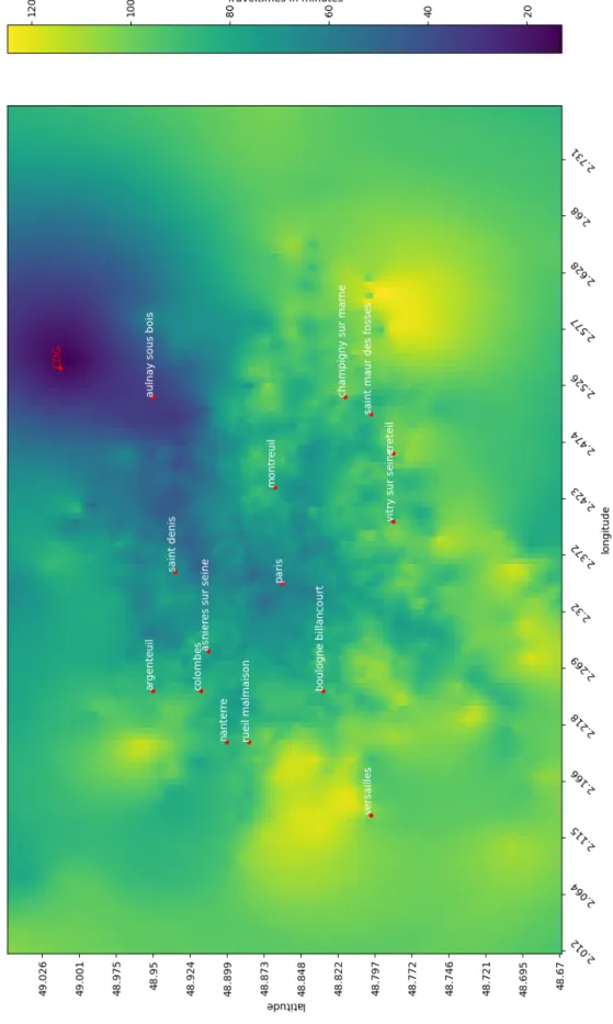
Only one stop by covered IRIS was kept for computation time considerations. For each IRIS, the selected stop is the nearest stop of the IRIS’ centroid considered. Thus, 2746 travel times have to be extracted from CityMapper in order to estimate the accessibility of one point of interest. This work has been automated through the use of Python and the requests library. The accessibility of CDG airport and Gare du Nord train station (GDN) has been investigated. The departure hour from CDG was fixed at 4pm and the departure from GDN around 5pm. Figure 5 illustrates the travel times extracted through CityMapper on the 2746 stops of the Paris Area with CDG as the point of interest. One can note that Paris center is well connected by public transport to CDG with a travel time around one hour. However, suburbs cities such as Nanterre or Champigny sur Marne require more than one hour and a half to reach the airport.
Figure 2: A screenshot of the CityMapper web application.
3
Interpolation of travel times
In order to create the anamorphosis map, a travel time has to be associated to each couple (lat,long) of the Paris area. To do so, a grid cell is defined upon the area of interest. Its size is 150*150, which corresponds to cells of 300m in latitude and 400m in longitude. For each cell a travel time is estimated. Based on the set of travel times computed through CityMapper, an estimation of the travel times on the Paris Area is possible through Ordinary Kriging. This method is closed to regression analysis and is often used in meteorology to estimate unmeasured values. The following formula described in [13] explains in an elegant way the Ordinary Kriging:
Z(s0) = N
X
i=1
λiZ(si) (1)
where N corresponds to the number of positions within the neighborhood searching, s0 to
the point where an estimation of the value is required, Z(si) the value measured in si and λiits
unknown coefficient.The λineed to be fitted in order to take into account the spatial correlation
between the set of measured values.
This was done thanks to the library pykrige of Python. Figure 5 displays the travel time map estimation through Ordinary Kriging.
4
Introduction of a temporal metric
After estimated the travel time from the point of interest to each cell of the grid, polar coor-dinates are used with the point of interest as the origin of the coorcoor-dinates system. Thus each cell can be represented by a distance R to the reference point and an angle θ from a reference direction:
z = Reiθ
A transformation on the R of each cell is applied regarding their associated travel times to the point of interest. Indeed, the euclidean distance (which is the initial R) can be replaced by the travel time multiplied by a scaling factor:
z = tt × K × eiθ
where tt corresponds to the travel time to the reference point and K a scaling factor. If the cell is well connected with the point of interest, a contraction of the distance will be applied. Otherwise an expansion will be applied. In order to add some landmarks to the map, cities with more than 50000 people in 2012 in the Paris area are drawn on the map. The results obtained in the case of CDG as the point of interest are illustrated Figure 6. An animated version of the Figure is proposed online through the following link:
https://www.youtube.com/watch?v=3cOjt77XAiM
One can note that cities such as Paris, Cergy or Versailles are well connected to CDG because they are brought closer to the airport regarding the temporal metric. On the contrary, cities like Sarcelles, Aulnay-sous-bois or Noisy-le-Grand are poorly connected to the airport and thus they are moved away regarding the temporal metric. One can note some layovers on several directions, especially for the most distant cells to CDG (near Cergy, Noisy-le-Grand or Creteil). Indeed, regarding a specific direction passing through CDG, longer travel times are observed for some points which are at a shorter distance from CDG. One possible explanation is the approximation of travel times made by the interpolation due to the unequal spatial distribution of the data. However, some layovers can also be explained by the spatial distribution of the RATP stop. Indeed, in a specific direction, a distant point could be reached faster than a closer one thanks to a direct line.
The same work has been done for GDN and the results are shown Figure 7. Again, an animated version of this Figure is proposed online through the following link:
https://www.youtube.com/watch?v=y9tvH-sHFjM
Cities seem in general better connected to GDN than to CDG. All the considered cities can reach GDN by public transport in less than one hour. Only four cities among the 25 are at less than one hour of CDG airport by public transport. This could be explained by the fact that
GDN is located in the center of Paris whereas CDG is at the periphery of the city. Cergy and Versailles are still well connected to GDN. In this case Aulnay-sous-bois and Noisy-le-Grand seem better connected to GDN. However Sarcelles has again a poor connection scheme with the point of interest. These observations seem to reflect the economical inequalities between such cities.
5
Conclusion
This work was a first approach in order to visualize the accessibility of some points of interests in a city. A focus was done on Paris area and the accessibility to CDG airport and GDN train station was studied. A methodology has been presented in order to estimate the travel times from one point of interest to an area by public transport by generating automated requests on CityMapper. The Ordinary Kriging was after used in order to fill the unmeasured values. The temporal metric helped to visualize the areas less connected to a point of interest. Globally, GDN is better connected to the Paris area than CDG. Future work should improve the visualization by adding others landmarks to the map such as road networks. Others cities can also be explored and the accessibility variability within a day of a point of interest should also be investigated. Other interpolation methods could also be compared to the Ordinary Kriging to limit layover effects. Finally, a comparison of the accessibility by car and by public transport would be relevant.
References
[1] P. Gambette, “Gambette, Philippela france en train depuis paris,” 2010. [Online]. Available: http://philippe.gambette.free.fr/Train/index.html
[2] P. Monmousseau, D. Delahaye, A. Marzuoli, and E. Feron, “Door-to-door travel time anal-ysis from paris to london and amsterdam using uber data,” Ninth SESAR Innovation Days, Athens, Greece, 2019.
[3] D. O’Sullivan, A. Morrison, and J. Shearer, “Using desktop gis for the investigation of acces-sibility by public transport: an isochrone approach,” International Journal of Geographical Information Science, vol. 14, no. 1, pp. 85–104, 2000.
[4] M. Young, “Opentripplanner-creating and querying your own multi-modal route planner,” URL: https://github. com/marcusyoung/otp-tutorial/raw/master/introotp. pdf, 2018. [5] Y. Liao, J. Gil, R. H. M. Pereira, and al., “Disparities in travel times between car and
transit: Spatiotemporal patterns in cities,” Scientific Reports, vol. 10, no. 2, p. 4056, 2020. [Online]. Available: https://doi.org/10.1038/s41598-020-61077-0
[6] S. J¨appinen, T. Toivonen, and M. Salonen, “Modelling the potential effect of shared bicycles on public transport travel times in greater helsinki: An open data approach,” Applied Geography, vol. 43, pp. 13–24, 2013. [Online]. Available: https://www.sciencedirect.com/science/article/pii/S014362281300132X
[7] N. Eluru, V. Chakour, and A. M. El-Geneidy, “Travel mode choice and transit route choice behavior in montreal: insights from mcgill university members commute patterns,” Public Transport, vol. 4, no. 2, pp. 129–149, 2012.
[8] T. Th´evenin, R. Schwartz, and L. Sapet, “Mapping the distortions in time and space: The french railway network 1830–1930,” Historical Methods: A Journal of Quantitative and Interdisciplinary History, vol. 46, no. 3, pp. 134–143, 2013.
[9] A. Almech and E. Roanes-Lozan, “A 3d proposal for the visualization of speed in railway networks [j],” AIMS Mathematics, vol. 5, no. 6, pp. 7480–7499, 2020.
[10] R. Ullah, L. Hasan, F. Ullah, A. Khan, and Y.-Z. Cho, “Modelling reachability in trans-port networks: Using alternative visual representations in interactive linked-views to gain valuable insights,” Mobile Information Systems, vol. 2021, 2021.
[11] C. Xiaoji, “Xiaoji, Chen isochronic map: Paris,” 2010. [Online]. Available: https://www.xiaoji-chen.com/2010/map-of-paris-visualizing-urban-transportation
[12] INSEE, “INSEE d´efinition iris.” [Online]. Available: https://www.insee.fr/fr/metadonnee s/definition/c1523#:∼:text=Un%20sigle%20qui%20signifiait%20%C2%AB%20Ilots,diffusi
on%20de%20donn%C3%A9es%20infra%2Dcommunales.
[13] T. Gia Pham, M. Kappas, C. Van Huynh, and L. Hoang Khanh Nguyen, “Application of ordinary kriging and regression kriging method for soil properties mapping in hilly region of central vietnam,” ISPRS International Journal of Geo-Information, vol. 8, no. 3, p. 147, 2019.
(a) Initial map with euclidean metric
(b) Intermediate Map between the euclidean and temporal metric (30%)
(c) Final temporal metric map
(a) Initial map with euclidean metric
(b) Intermediate Map between the euclidean and temporal metric (30%)
(c) Final temporal metric map
![Figure 1: France in train from Paris (source: [1])](https://thumb-eu.123doks.com/thumbv2/123doknet/12807932.363815/5.918.151.768.308.846/figure-france-train-paris-source.webp)