HAL Id: hal-02386051
https://hal.archives-ouvertes.fr/hal-02386051
Submitted on 29 Nov 2019
HAL is a multi-disciplinary open access
archive for the deposit and dissemination of
sci-entific research documents, whether they are
pub-lished or not. The documents may come from
teaching and research institutions in France or
abroad, or from public or private research centers.
L’archive ouverte pluridisciplinaire HAL, est
destinée au dépôt et à la diffusion de documents
scientifiques de niveau recherche, publiés ou non,
émanant des établissements d’enseignement et de
recherche français ou étrangers, des laboratoires
publics ou privés.
A computational approach for phenotypic comparisons
of cell populations in high-dimensional cytometry data
Ludovic Platon, David Pejoski, Guillaume Gautreau, Brice Targat, Roger Le
Grand, Anne-Sophie Beignon, Nicolas Tchitchek
To cite this version:
Ludovic Platon, David Pejoski, Guillaume Gautreau, Brice Targat, Roger Le Grand, et al.. A
compu-tational approach for phenotypic comparisons of cell populations in high-dimensional cytometry data.
MethodsX, Elsevier, 2017, �10.1016/j.ymeth.2017.09.005�. �hal-02386051�
A computational approach for phenotypic comparisons of cell
populations in high-dimensional cytometry data
Ludovic Platon, David Pejoski, Guillaume Gautreau, Brice Targat, Roger Le Grand, Anne-Sophie Beignon,
Nicolas Tchitchek
⇑CEA – Université Paris Sud 11 – INSERM U1184, Immunology of Viral Infections and Autoimmune Diseases, IDMIT Infrastructure, 92265 Fontenay-aux-Roses, France
a r t i c l e i n f o
Article history: Received 1 April 2017
Received in revised form 15 May 2017 Accepted 11 September 2017 Available online 14 September 2017 Keywords: Cytometry Cell Clusters Phenotype Comparisons Visualizations
a b s t r a c t
Background: Cytometry is an experimental technique used to measure molecules expressed by cells at a single cell resolution. Recently, several technological improvements have made possible to increase greatly the number of cell markers that can be simultaneously measured. Many computational methods have been proposed to identify clusters of cells having similar phenotypes. Nevertheless, only a limited number of computational methods permits to compare the phenotypes of the cell clusters identified by different clustering approaches. These phenotypic comparisons are necessary to choose the appropriate clustering methods and settings. Because of this lack of tools, comparisons of cell cluster phenotypes are often performed manually, a highly biased and time-consuming process.
Results: We designed CytoCompare, an R package that performs comparisons between the phenotypes of cell clusters with the purpose of identifying similar and different ones, based on the distribution of mar-ker expressions. For each phenotype comparison of two cell clusters, CytoCompare provides a distance measure as well as a p-value asserting the statistical significance of the difference. CytoCompare can import clustering results from various algorithms including SPADE, viSNE/ACCENSE, and Citrus, the most current widely used algorithms. Additionally, CytoCompare can generate parallel coordinates, parallel heatmaps, multidimensional scaling or circular graph representations to visualize easily cell cluster phe-notypes and the comparison results.
Conclusions: CytoCompare is a flexible analysis pipeline for comparing the phenotypes of cell clusters identified by automatic gating algorithms in high-dimensional cytometry data. This R package is ideal for benchmarking different clustering algorithms and associated parameters. CytoCompare is freely dis-tributed under the GPL-3 license and is available onhttps://github.com/tchitchek-lab/CytoCompare. Ó 2017 The Authors. Published by Elsevier Inc. This is an open access article under the CC BY-NC-ND license
(http://creativecommons.org/licenses/by-nc-nd/4.0/).
1. Introduction
Flow cytometry and mass cytometry are experimental tech-niques measuring molecules expressed by cells, at their surface or intracellularly, at a single cell resolution[1,2]. These techniques use antibodies conjugated to fluorochromes or metals to stain cells. Cell marker expressions are then quantified using fluorescence detection systems or by time-of-flight mass spectrometry. Flow cytometry can currently measure up to 18 cell markers. Mass cytometry, which has been introduced more recently, can measure up to 40 cell markers. Both techniques offer important perspectives as they can potentially evaluate many more markers in the near future [3]. Novel bioinformatic approaches are then needed to
explore and analyze complex cell interaction systems character-ized by high-dimensional cytometry[4–6].
Cytometry data can be analyzed using manual or automatic gat-ing strategies. In both strategies, the aim is to identify and quantify populations of cells, also named cell clusters, having similar pheno-types. Automatic gating methods detect cell populations using density- or expression- based approaches and produce less biased results compared to manual gating. Many automatic gating algo-rithms have been proposed over the last decades. Among them, SPADE [5], viSNE/ACCENSE [7,8], and Citrus [9], which are expression-based algorithms, are prevalent for high-dimensional cytometry analyses[10–15]. These algorithms use different com-putational strategies and are complementary to identify cell clus-ters with relevant biological behaviors in cytometry data.
Whereas many tools have been developed, only a limited num-ber of computational strategies have been designed to compare the phenotypes of identified cell clusters[16–18]. However, these
phe-http://dx.doi.org/10.1016/j.ymeth.2017.09.005
1046-2023/Ó 2017 The Authors. Published by Elsevier Inc.
This is an open access article under the CC BY-NC-ND license (http://creativecommons.org/licenses/by-nc-nd/4.0/).
⇑Corresponding author at: CEA, 18 Route du Panorama, 92260 Fontenay-aux-Roses, France.
E-mail address:[email protected](N. Tchitchek).
Contents lists available atScienceDirect
Methods
notypic comparisons are crucial to explore cell clustering results obtained from different computational approaches and to recog-nize cell populations with common or marginal phenotypes. Thereby, comparisons are often performed manually through mul-tiple comparisons of marker expression densities, a highly biased and time-consuming process. Comparisons of cell cluster results based on the number of shared cells among the different clusters only provide a limited set vision that cannot be used to character-ize their phenotypes fully. Also, comparisons of cell cluster pheno-types based on the mean or median of marker expressions can be biased as they do not consider all the characteristics of marker expression distributions, such as the standard deviations. Proper phenotypic comparisons of cell marker expressions and cluster phenotypes must be performed based on the density distributions. Additionally, no visualization methods have been proposed to rep-resent such phenotypic comparisons in easily interpretable ways.
To answer that need, we developed CytoCompare, an R package to compare the phenotypes of cell clusters identified by automatic gating algorithms. The aim of CytoCompare is to facilitate the easy identification of similar and different cell clusters identified by var-ious bioinformatics approaches. For each comparison of two cell clusters, a distance measure is computed, based on the expression distribution densities of selected markers. Our approach is based on the Kolmogorov-Smirnov distance to quantify marker differ-ences. Additionally, CytoCompare provides a p-value for determin-ing whether two cell clusters are statistically different or not. CytoCompare proposes several visualizations methods, such as parallel coordinates, parallel heatmaps, dendrograms, multidimen-sional scaling (MDS) [19] or circular graphs representations
[20,21], which make cell cluster phenotypes and phenotypic com-parisons easily understandable and explicit. Cell clusters identified from SPADE, viSNE/ACCENSE, and Citrus algorithms can be directly imported. Importantly, we designed CytoCompare in a way that it can be easily used by non-bioinformatician experts, but can also be easily customized by users with more expertise in bioinformatics.
2. Material and methods
2.1. Availability of cytometry profiles
All the cytometry profiles used to illustrate CytoCompare are available on the FlowRepository database [22] under accession number ‘‘FR-FCM-ZZ99”. This public dataset consists of 15 mass cytometry profiles of 25 cell markers obtained in the context of a macaque vaccine study, as described in [10]. Five cynomolgus macaques were vaccinated with a recombinant Modified Vaccinia virus Ankara (MVA) expressing HIV clade B antigens, which is a candidate HIV vaccine, with the aim to compare B cell responses at baseline, and 8 and 28 days after a second immunization.
2.2. Implementation in R
CytoCompare has been implemented in R. The ggplot2, ggden-dro, ggrepel, grid, igraph, MASS, RJSONIO, and XML R packages are currently required for running CytoCompare. The flowCore and flowUtils Bioconductor packages are also required for running CytoCompare. The exact left-tailed binomial test, used in the statis-tical approach, is based on the ‘binom.test()’ function available in R. Comparison and intermediary results generated by CytoCompare are handled as S4 objects to allow users to access and export them easily. CytoCompare is freely distributed under the GPL-3 license and is available onhttps://github.com/tchitchek-lab/CytoCompare.
2.3. Graphical representations
Multidimensional scaling (MDS) and circular graph representa-tions are generated as HTML files to allow an interactivity with users. These interactive features allow users to obtain details about the cell clusters and about the similarity associations found to be significant. The D3.js library[23](version 3) is used by CytoCom-pare to create these interactive features. MDS computations are calculated using the isoMDS algorithm available in the MASS pack-age. All other representations generated by CytoCompare are based on the ggplot library.
2.4. SPADE and viSNE/ACCENSE analyses
The SPADE analyses used to illustrate CytoCompare were per-formed using the publicly available SPADE R package [5]. The viSNE/ACCENSE analyses were generated using the ACCENSE soft-ware [8]. SPADE and viSNE/ACCENSE analyses were generated using different settings as detailed in the results section. Cell clus-ters correlating with the anti-MVA titer were identified using the SPADEVizR[4]R package, based on data published in[10]. 3. Results
3.1. Definition of analysis situations requiring phenotypic comparisons of cytometry cell clusters
Cytometry experts can face at least five different situations that can necessitate comparing cell clusters based on their phenotypes. The first situation occurs when choosing the cell clustering algorithm, which implies to compare clustering results from ent algorithms. Each automatic gating algorithm is based on differ-ent computational strategies, statistical assumptions, and working hypotheses. Thus, each algorithm identifies a specific set of cell clusters with specific phenotypes. Cell clustering results obtained from different algorithms need to be compared to detect cell clus-ters commonly identified by various algorithms and the ones specifically identified by one algorithm. Overall, these comparisons allow to confirm clustering results with independent clustering algorithms and thus to strengthen them. These comparisons also permit to choose the automatic gating algorithm that best outlines the initial hypothesis or that provides the richest set of biological conclusions.
The second situation happens when selecting the settings for one given automatic gating algorithm, which implies to compare clustering results obtained using different parameters. For each automatic gating algorithm, different cell populations can be iden-tified depending on the clustering settings initially defined by the user. For instance, SPADE clustering results can vary with the spec-ified number of cell clusters to identify. Additionally, the pheno-types of the cell clusters identified by viSNE/ACCENSE can also differ depending on the perplexity and theta parameters as well as the number of iterations performed by the algorithm. Thus, the cell clustering results generated using different parameters need to be compared to unravel the effects of these parameters.
The third situation takes place when ascertaining the repro-ducibility of the clustering results by repeating the analysis using the same settings. Expression-based algorithms are relevant approaches to identify rare cell populations but require extensive computation capabilities. To overcome these computing difficul-ties, SPADE, viSNE/ACCENSE, and Citrus algorithms perform the identification of cell populations on a restricted cell subset of the input dataset. This process, named down-sampling, is usually stochastic and can lead to the identification of different cell popu-lations through multiple runs of the algorithm. Cell clustering
results need then to be compared to verify whether they are repro-ducible or not.
The fourth situation arises when users aim to organize the iden-tified cell clusters based on their phenotypes. Not all algorithms provide easy and unbiased ways to visualize the similarities among these cell clusters. For example, viSNE/ACCENSE clustering results are represented by a viSNE map, where cells are colored based on their cluster assignments. In another example, the SPADE algo-rithm displays its clustering results using tree representations. In these tree representations, each node corresponds to a cell cluster, and the nodes are linked based on the similarities of cell cluster phenotypes. These phenotype similarities are established based on the means of marker expressions and can be biased, especially with cell markers having a large range of expression (i.e. with a large standard deviation) or having a continuum expression.
The fifth situation occurs when comparing different biological studies. At this complexity level, the objective is to compare the cell populations identified in different studies performed indepen-dently in different laboratories or at different dates to check whether identified cell populations are similar or not. Comparison strategies based on the number of cells shared among different clusters are limited to confront results obtained from different datasets. Complementary analysis strategies are then required for comparing cell clustering results and the phenotypes of cell clus-ters obtained in different datasets.
3.2. A computational approach for comparing the phenotypes of cell clusters
For each comparison of two cell clusters, CytoCompare aims to quantify the difference between their phenotypes and determine whether they are significantly different or not, based on the den-sity distributions of their marker expressions. To perform this task, a distance measure is computed for each comparison of two cell clusters. Additionally, a p-value is also provided to assert whether these two cell clusters have different phenotype or not. Impor-tantly, within our statistical approach, markers can be weighted. This strategy opens the possibility to give more importance to some of the selected markers. It is to note that the users can easily redefine the way to compute either the distance measures or the associated p-values, and still beneficiate of the analysis features available in CytoCompare.
More precisely, when comparing two cell clusters, CytoCom-pare first computes a distance for each pair of markers (Fig. 1, step 1). This comparison can be performed based on the whole set of cell markers or a restricted set of markers. In our statistical approach, the Kolmogorov-Smirnov distance is used to qualify the difference between marker expressions [24]. Here, this dis-tance corresponds to the maximal difference between the two cumulative distribution functions of marker expressions. This dis-tance is equal to zero if the marker density distributions are iden-tical, and has a maximal value of 1 if the density distributions do not overlap. A p-value, asserting the significance of the phenotype difference, is also calculated by CytoCompare. In our approach, a marker distance below a threshold models a success in a Bernoulli experiment, and a marker distance above the threshold models a failure in the Bernoulli experiment (Fig. 1, step 2). This distance threshold is set by default to 0.35. The hypothesis tested in our sta-tistical approach is that the two cell clusters have similar pheno-types. The theoretical reference proportion of the null hypothesis is then 1 (i.e. corresponding to a full set of successes in the Ber-noulli experiments). Any deviation from 1 corresponds to a differ-ence feature between the cluster phenotypes. The p-value, computed by an exact left-tailed binomial test, asserts if the pro-portion of marker successes is statistically lower than a propro-portion defined by the user. This proportion is set by default to 0.70. If the
p-value is lower than 0.05, then we can reject the null hypothesis and conclude that the two cell clusters are different (Fig. 1, step 3). Markers can be weighted to have a stronger contribution in the computation of the distance measure and p-value. The marker dis-tance measures are also aggregated using a weighted mean to obtain one single distance measure for each comparison of two cell clusters.
The users can specify both the marker distance threshold and the expected proportion of marker successes. These parameters tune the level of sensitivity and specificity of CytoCompare at the marker level and at the cluster level. While no universal values can be provided, these parameters can be established from data. We have set up the default values of these two parameters using a compendium of cytometry data and manually annotated cell pop-ulations. We first computed the maximal Kolmogorov-Smirnov distance for each pair of markers when comparing cell clusters manually annotated to the same populations. Based on our data, we established a maximal Kolmogorov-Smirnov value of 0.3461 that we rounded to 0.35 and proposed as a default parameter for our analysis. Secondly, while as previously mentioned, the theoret-ical reference proportion of the null hypothesis is 1, the proportion of marker successes defining the null hypothesis is never equal to 1 in practice. This proportion of marker successes depends on vari-ous parameters such as the biological background or the technical noise. We estimated this proportion by computing the distribution of marker successes when comparing here also cell clusters manu-ally annotated to the same populations. More precisely, we calcu-lated the number of marker successes for all the comparisons and established a distribution of these values. Based on our data, we established that the mode of this distribution was positioned at a proportion of 0.7. We thus proposed this value as a default param-eter for our analysis.
It is important to note that in cell clustering results, marker density distributions are not necessarily unimodal. These non-unimodal marker density distributions characterize situations when two or more distinct cell populations are associated with a single cell cluster. This situation usually reflects a non-optimal cell clustering which could bias the interpretation of cell cluster phe-notypes. To outline such cases, CytoCompare can identify cell markers having non-unimodal distributions using the Hartigan’s Dip test[25], and can produce a warning message to inform the users of a potential issue. The SPADEVizR[4]R package that we have published also includes the Hartigan’s Dip test to determine optimal automatic gating settings.
3.3. Visualization methods to represent cell cluster phenotypes and cell cluster comparison results
In the field of cytometry, dot plot representations are com-monly used to show the phenotype of cell populations (Fig. 2A). In such dot plot representation, each dot corresponds to a cell and dots are positioned based on the expression values of two given cell markers. Even if dot plot representations are widely used to characterize the phenotypes of cell populations, they are not suitable to characterize efficiently complex cell populations in high-dimensional cytometry data. On the other hand, parallel coor-dinate representations are well-established visualization tech-niques in the field of high-dimensional data analysis to represent expression features of high-dimensional objects. In parallel coordi-nate representations, each object is represented by a line posi-tioned based on the expression of object attributes. Thereby, parallel coordinates are powerful strategies to display in one single representation the means or medians of expression for all cell markers, with additional features such as the standard deviations. As shown inFig. 2B, CytoCompare allows the visualization of the one or two cell cluster phenotypes using parallel coordinates. Each
line, corresponding to a cluster, is positioned based on the means of marker expressions and error bars display the standard devia-tions of marker expressions. Additionally, CytoCompare can gener-ate parallel heatmap representations (Fig. 2C). In a parallel heatmap, each marker is associated to a single heatmap showing the density distribution of expression in a gradient-colored man-ner. These heatmap representations are especially useful to visual-ize in one single representation the characteristics of expression distributions for each marker. The color gradient of the parallel heatmap can be scaled to be suitable for each marker density.
The comparison results provided by CytoCompare consist of two-dimensional tables. Each table provides a distance measure as well as an associated p-value for all pairs of clusters that have been compared. These distance measures and p-values can be interpreted by users to identify precisely which cell clusters are phenotypical similar or different. Nevertheless, they are not well appropriate to appreciate the overall similarities or differences among the whole set of cell clusters or to provide an explicit view of marker comparisons. To easily visualize the results of the cell cluster comparisons, CytoCompare can generate multidimensional scaling (MDS)[19,26]and circular graph representations[20,21].
MDS representations aim to represent similarities and differ-ences between high-dimensional objects. In such representation, each dot corresponds to a high-dimensional object, and the dis-tances between the dots are proportional to a chosen mathemati-cal distance between these objects. MDS representations are thus well suited to visualize the cell clusters distance measures com-puted by CytoCompare. A schematic MDS representation generated by CytoCompare is provided inFig. 2D. In these MDS representa-tions, the input distance matrix provided to the MDS algorithm is the distance measures computed between all pairs of cell clusters.
In the resulting representation, each dot corresponds to a cell clus-ter, and the distances between the dots are proportional to the computed phenotype distance measures. Dots can be colored to clarify from which approach the cell clusters have been obtained. The Kruskal Stress (KS) provided with the MDS representation quantifies the percentage of information lost during the dimen-sionality reduction process. This score measures thus the degree of corresponds between distances among points of the MDS repre-sentation and the input phenotypic distance matrix. CytoCompare can also represent these phenotype distances between the cell clusters using dendrograms (Supplementary Fig. 1). In these den-drograms, each leaf corresponds to a cell cluster, and the branching diagram represents the relationships of similarity among the cell clusters.
On the other hand, p-values computed by CytoCompare, assert-ing if the difference between two cell clusters is statistically signif-icant, are represented using circular graphs. A schematic circular graph representation generated by CytoCompare is provided in
Fig. 2D. In such representation, each node corresponds to a cell cluster. Two cell clusters are linked if their p-value is higher than a specific threshold (set by default to 0.05). Nodes can be colored to clarify from which approach the cell clusters have been obtained. To offer a greater readability, the starts and the ends of links can be colored to fit with node ones. Circular graphs provide thereby an explicit view of the similarities and differences between the cell clusters.
In the context of large datasets, static representations can be difficult to interpret. The MDS and circular graph representations generated by CytoCompare through the D3.js library[23]are pro-vided as interactive HTML files. In these MDS representations, if the user places the mouse over a dot then a tooltip is displayed
Fig. 1. Overview of the approach used for comparing cell cluster phenotypes. In CytoCompare, cytometry cell clusters are compared with the purpose of identifying similar ones. For each comparison, a distance and a p-value, asserting whether the difference is statistically significant or not, are provided. Step 1: A distance measure is computed for each cell marker of the two clusters. The Kolmogorov-Simonov distance is used to quantify the difference between the marker expression density distributions. Step 2: Marker distances below a specific user-defined threshold (set by default to 0.35) are considered as a success in a Bernoulli trial. At the opposite, marker distances above this threshold are considered as a failure in the Bernoulli trial. Markers can be weighted in the comparisons. Step 3: Marker successes are aggregated using an exact left-tailed binomial test. The null hypothesis defined by the probability of success P is provided by the user (set by default to 0.70). A low p-value can then be interpreted as a too high proportion of marker fails in comparison with the null hypothesis, leading us to consider the two cell clusters as significantly different. Additionally, an aggregate distance is provided and corresponds to the weighted mean of all marker differences.
to indicate the number of associated cells with this cell cluster. In circular graph representations, if the user places the mouse over a node then a tooltip is displayed to indicate to which clusters this cluster is related with. Additionally, if the user places the mouse over a link then a tooltip is displayed to indicate details about this association.
3.4. Comparison of cell clustering results using different algorithms We first illustrate the capabilities of CytoCompare to compare the cell clustering results obtained with SPADE and viSNE/ ACCENSE algorithms. We used a public dataset of mass cytometry
profiles obtained in the context of a macaque vaccine study[10]. This dataset consists of 15 cytometry profiles obtained from a mass cytometry panel of 25 markers designed to target B-cell popula-tions. Five cynomolgus macaques were vaccinated twice at 2 months apart with the modified vaccinia virus Ankara HIV-B, and B cell responses at baseline, and 8 and 28 days after a second immunization were compared.
We performed in parallel a SPADE analysis and a viSNE/ ACCENSE analysis on this dataset. Our analyses were restricted to a set of 10 markers, consisting of CD20, CD21, CD22, CD23, CD27, CD40, CD80, IgM, IgG, and HLA-DR used as clustering markers. The SPADE algorithm was parameterized to identify 70 cell clusters
Fig. 2. Representations available in CytoCompare cytometry profiles and comparison results. (A) Dot plot representations commonly used in cytometry to visualize the phenotypes of cell populations. Each dot in the representation corresponds to a cell. Dots are positioned based on the expression of two selected markers. (B) Schematic parallel coordinates representation used in CytoCompare to visualize the phenotypes of two cell populations that are labeled cell cluster #1 and cell cluster #2. Each one of the two lines represents the marker expression means for one cell population. Error bars represent the standard deviations of marker expressions. (C) Schematic parallel heatmaps representation used in CytoCompare to visualize the phenotypes of a cell population. The phenotype represented here corresponds to the cell cluster #1 displayed in B. For each cell marker, the expression density distribution is displayed using a gradient-colored heatmap. The gradient color of each density heatmap has been scaled for each cell marker. This approach is then relevant to visualize the full characteristics of the marker expression distributions in one single representation. (D) Illustrative multidimensional scaling (MDS) representation showing the phenotypic similarities among cell clusters. Each dot in the MDS corresponds to a cell cluster identified by a given clustering approach. The distances between the dots are proportional to the difference measures computed by CytoCompare. Cell clusters are colored based on the algorithm used. (E) Illustrative circular graph showing phenotypic similarities between cell clusters. Each dot in the graph corresponds to a cell cluster identified by a given clustering approach and the links between the dots correspond to significant similarities identified by CytoCompare. Both MDS and circular graph representations generated by CytoCompare are provided as HTML files with interactives features. Users can obtain details about the cell clusters (such as the number of associated cells) by moving the mouse over the nodes. In the same manner, users can obtain details about the similarity associations (such as the distance measure and the associated p-value) by moving the mouse over the links.
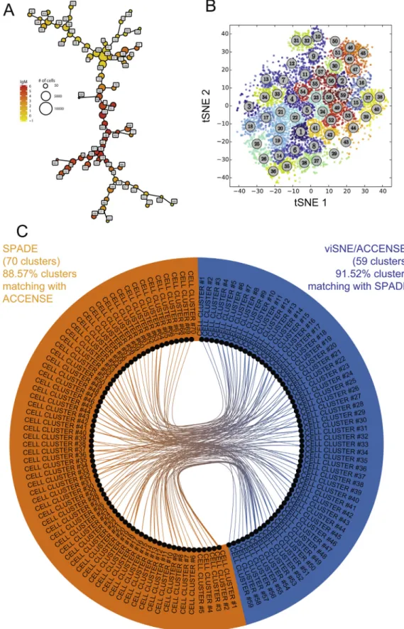
Fig. 3. Comparison of cell clustering results obtained from SPADE and viSNE/ACCENSE algorithms. A SPADE analysis and a viSNE/ACCENSE analysis were run on our public dataset of 15 mass cytometry profiles. SPADE was able to identify 70 cell clusters while viSNE/ACCENSE was able to identify 59 cell clusters. CytoCompare was used to compare the cell clustering results obtained by the different algorithms. (A) SPADE tree representation of the clustering results. Each node of the representation corresponds to a cell cluster. Similar clusters are linked using a minimal spanning tree approach based on the mean of marker expressions. The size of the nodes is proportional to the number of associated cells. (B) viSNE map representation of the ACCENSE clustering results. Each node of the representation corresponds to a cell in the whole dataset. Cells are positioned based on their positions in the tSNE1 and tSNE2 dimensions computed by the algorithm. Cells are colored based on the number of the associated cluster. (C) Circular graph representation showing the phenotypic comparisons found to be statistically similar by CytoCompare between the SPADE and viSNE/ACCENSE analyses. Comparisons have been restricted to comparisons found to be statistically significant between the two different analyses (i.e. inter-algorithm comparisons excluding intra-algorithm comparisons).
using a down-sampling parameter of 30%. The viSNE map was parameterized using a perplexity parameter of 30 and a theta parameter of 0.5 based on a down-sampling selection of 3000 cells for each sample. This ACCENSE analysis identified 59 cell clusters using the DBSCAN algorithm. Fig. 3A represents the SPADE tree resulting from the SPADE analysis, and theFig. 3B represents the viSNE map resulting from the viSNE/ACCENSE analysis. As previ-ously explained, the results of these two different but complemen-tary analyses cannot be directly compared using these two representations.
CytoCompare was then used to compare the cell clustering results obtained by the two algorithms. These results are repre-sented using a circular graph representation (Fig. 3C). It can be first noticed that SPADE and viSNE/ACCENSE identified a large set of cell clusters having similar phenotypes. Out of the 59 viSNE/ACCENSE cell clusters, 54 had at least one similar cluster among the SPADE clusters (representing 91.52% of the cell clusters). Out of the 70 SPADE cell clusters, 62 had at least one similar cluster among the viSNE/ACCENSE clusters (representing 88.57% of the cell clusters). CytoCompare revealed that five cell clusters were specifically iden-tified by viSNE/ACCENSE while eight cell clusters were specifically identified by SPADE. The phenotypes of these cell clusters specific to each algorithm are shown using parallel coordinates in
Supplementary Fig. 2. Out of the five specific viSNE/ACCENSE clusters, three displayed a naïve B cell phenotype (clusters #3, #14 and #19), and two displayed a tissue-like phenotype (clusters #34, and #46). The number of cells associated with these clusters ranged from 920 to 2084 cells. Out of the eight specific SPADE clus-ters, one displayed a phenotype of memory B cells (cluster #18), and three displayed a phenotype of memory activated B cells (clus-ters #5, #16 and #23). Cluster #11 had a phenotype of naïve B cells, and cluster #65 had the phenotype of a resting memory B cell pop-ulation with a high expression of IgG. Finally, two clusters (clusters #30, and #40) had a tissue-like B cell phenotype. The number of cells associated with these clusters ranged from 283 to 6045 cells. Using CytoCompare, we evidenced that both algorithms were able to capture a phenotypic diversity of blood B cells. In the mean-time, CytoCompare revealed that each algorithm specifically iden-tified cell clusters with singular phenotypes and provided a way to identify these clusters. Additionally, we were able to quantify the specificity of each clustering approach and to display the pheno-types of the specific cell clusters.
3.5. Comparison of cell clustering results using different clustering parameters
In a second illustration, we demonstrate that CytoCompare can be used to compare results obtained with different parameter sets using the same automatic gating algorithm. The purpose is here to check and compare the impact of cell clustering algorithm param-eters on the ability to detect rare cell populations or cell popula-tions of interest. To do so, we performed three independent SPADE analyses using different settings on the same dataset of macaque samples previously used.
Three SPADE analyses were performed to identify 20, 70 and 80 cell populations using the same down-sampling parameter of 40%. We respectively named these analyses K20, K70, and K80. In this situation, the K20 analysis should capture a smaller diversity of cell populations compared to the K70 and K80 analyses. This last SPADE analysis represents an ‘under clustering’ situation with potentially a large portion of non-uniform marker expression dis-tributions. CytoCompare was then used to compare the pheno-types of the cell clusters identified in each SPADE analysis and between each SPADE analysis.
Fig. 4A displays an MDS representation of the distance mea-sures computed by CytoCompare among all the cell clusters
iden-tified by the three analyses. This MDS showed that most of the cell clusters identified by the K70 analysis were represented clo-sely to cell clusters identified the K80 analysis. This suggests that most of the clusters identified by the K70 analysis were also iden-tified by the K80 analysis and reversely. Nevertheless, we can see that not all clusters identified by the K70 and K80 analyses were positioned closely to K20 cell clusters. As expected, this illustrates that the K20 analysis was not able to identify the full diversity of cell populations. As an example, the K70 and K80 analysis have identified two cell clusters, labeled #54 and #65, which had mar-ginal phenotypes compared to the rest of cell clusters. No cell clusters from the K20 analysis were phenotypically similar to these two clusters. Additionally, both the K70 and K80 analyses but not the K20 analysis identified clusters with phenotypes dis-tinct from others. These clusters corresponded to the cluster labeled #13 for the K70 analysis and the cluster labeled #1 for the K80 analysis. Further analyses, using SPADEVizR, revealed that these clusters were associated with the anti-vaccine antibody titer. In details, the abundances of the two cell clusters were found to correlate with the level of anti-vaccine antibody titer using the Pearson coefficient (R > 0.80 in both cases). These clus-ters are then of importance as they correspond to cell populations associated to the Ab titre, a correlate of protection for Vaccinia. More importantly, these two cell clusters are positioned close to each other in the MDS representation suggesting that they shared a close phenotype.
Fig. 4B display a circular graph representation showing the cell clusters found to have phenotypes statistically similar. For this fig-ure, each arc of the circular graph was split into subparts depend-ing on a manual groupdepend-ing of cell clusters as explained in the legend. This feature of CytoCompare allows the easy visualization of cell subpopulations when comparing clustering results. For readability purpose, this representation was restricted to compar-isons between the three SPADE analyses (i.e. inter-algorithm com-parisons excluding intra-algorithm comcom-parisons). Out of the 20 clusters of the K20 analysis, we found that 20 had at least a cluster with a similar phenotype in the K70 analysis, and we found that 20 had at least a cluster with a similar phenotype in the K80 analysis. Out of the 70 clusters of the K70 analysis, we found that 56 (80.00%) had at least a cluster with a similar phenotype in the K20 analysis, and we found that 67 (95.71%) had at least a cluster with a similar phenotype in the K80 analysis. Out of the 80 clusters of the K80 analysis, we found that 64 (80.00%) had at least a cluster with a similar phenotype in the K20 analysis, and we found that 76 (95.00%) had at least a cluster with a similar phenotype in the K70 analysis. CytoCompare demonstrates here that all the clusters identified by the K20 analysis were also found in the K70 and K80 analyses while some clusters have been specifically identified by either the K70 or K80 analyses.
Parallel coordinates represented inSupplementary Fig. 3 dis-play the phenotypes of the cell cluster #13 for the K70 analysis and the cell cluster #1 from the K080 analysis. We can see that these two clusters have similar expressions with similar standard deviations for the majority of markers. The IgM marker displayed the strongest difference of mean expressions.Fig. 4C represents the individual marker distances, computed based on the Kolmogorov-Smirnov distance, for this comparison of the two cell clusters. All the marker distance measures are below the default threshold of 0.35 and model then successes in the Bernoulli trial. As expected, IgM was the marker with the highest distance mea-sure (D = 0.3160) compared to others, which range from 0.0140 to 0.1570. Distribution plots of the marker expression densities outlined well that IgM was the marker with the strongest differ-ence of expressions for these two clusters (Fig. 4D and Supplemen-tary Fig. 4). Not only the exact difference of expression can be quantified but also visualized. This feature allows thus users to
tune the different parameters of CytoCompare depending on the desired level of sensitivity. These results can also suggest that a dif-ferent distance threshold can be defined to detect the difference of IgM expression for these two clusters.
Thanks to CytoCompare we can conclude that the two SPADE analyses parametrized to identify 70 and 80 cell populations pro-duced consistent results. Both analyses identified an important cell cluster whose the abundance was correlating with the anti-MVA
Fig. 4. Comparison of cell clustering results obtained from SPADE using different parameters. Three independent SPADE analyses were performed on our illustrative dataset. CytoCompare was used to compare the cell clustering results obtained by the parameter settings. (A) MDS representation showing the phenotypic similarities and distinctness among all cell clusters identified by the SPADE analysis. Each node represents a cell cluster, and the distances between the nodes are proportional to the distance measures computed by CytoCompare. (B) Circular graph representation showing the cell clusters that are similar in phenotypes between the three independent analyses. Comparisons have been restricted to comparisons between clusters from the different analyses. Cell clusters have been grouped by subpopulations manually defined. These subpopulations have been defined based on the expressions of CD20, CD21, CD22, HLA-DR, IgG, and IgM. (C) Bar chart representation showing the marker distance measures obtained when comparing the cluster #13 obtained by the K70 analysis and the cluster #1 obtained by the K80 analysis. All marker distances are below the default threshold of 0.35. The distance between these two clusters is equal to 0.1088. (D) Marker expression distributions of IgM for clusters K70 #13 (in blue) and K80 #1 (in red). Among all the 10 markers used in our analysis, this marker had the highest distance measure. (For interpretation of the references to color in this figure legend, the reader is referred to the web version of this article.)
titer. CytoCompare confirmed that these two cell clusters, identi-fied in two different analyses, had the same phenotypes. Detailed view of marker contributions revealed that IgM was the most dif-ferent marker in term of expression.
4. Discussion
CytoCompare constitutes a powerful pipeline for comparing the phenotypes of cell clusters with the purpose to benchmark cell clustering results generated by different approaches. This need is commonly met by researchers working in high-dimensional cytometry data analysis to understand the specificity of the cell clustering results generated and to interpret the identified cell populations properly.
For each comparison of two cell clusters, CytoCompare com-putes a distance and a p-value to determine whether the cell clus-ters are statistically different or not. Multidimensional scaling and circular graph representations can be generated to make these comparison results easily interpretable and explicit. Our R package handles results provided by SPADE, viSNE/ACCENSE, and Citrus algorithms, which are predominant for the analysis of high-dimensional cytometry data. Moreover, CytoCompare has been developed to be easily used by non-bioinformatician experts but can be easily customized by users with more expertise.
CytoCompare brings a precious help in the various contexts defined in this paper. The goal of our algorithm is mainly to bench-mark the effects of different clustering approaches on the cell clus-tering results. No automatic gating algorithm is currently defined or will ever be defined as the gold-standard for the analysis of any high-dimensional cytometry data. All algorithms have their own specificities, and some can be more adapted for specific bio-logical questions and datasets. CytoCompare offers thus a way to compare these different algorithms and associated parameters, or even to organize large quantities of identified cell clusters.
To perform the comparisons of cell cluster phenotypes, we used an approach based on the Kolmogorov-Smirnov distance and a left-tailed binomial test.
Our computational approach has several advantages compared to manual approaches or existing computational approaches. First, we obtain a distance that quantifies how much two cell clusters are different in terms of their overall phenotypes. Secondly, we obtain a distance measure for each marker. This point is crucial to deter-mine which markers are responsible for the similarity or distinct-ness between two cell clusters. Thanks to this strategy, marker distances can be weighted when computing the overall distance measure between two cell clusters. Thirdly, our approach considers the full characteristics of marker expression density distributions, which can be especially important for markers having large ranges of expression. Fourthly, we provide a p-value that asserts if two cell clusters are different or not. This point is important to quantify how many cell clusters obtained from one clustering method have at least one equivalent in the cell clusters obtained from another method. Indeed, the ratio of clusters having at least one similar cluster (i.e. having a p-value higher than a threshold with at least another cluster) can quantify the specificity or the consistency of the cell clustering results. Finally, users can specify the marker dis-tance threshold and the expected proportion of markers successes to modulate the sensitivity of the statistical approach. A multitude of other similarity measures or statistical approaches can be defined, and we have defined an R function template allowing users to define their own measure or statistical approach.
In the FlowCap challenges, authors mainly used the F1 score, which can be seen as the harmonic mean of the precision and recall, to determine the degree of consistency between manual gat-ing results and automatic gatgat-ing results [16]. In a more recent
approach, Weber and Robinson also used the F1 score but in com-bination with the Hungarian assignment algorithm to compare results from different automatic gating algorithms [18]. These approaches are limited as they only provide a discrete view of the cell clusters (i.e. a cell belongs or not to a cell cluster), and do not directly detail the contribution of each cell marker. Because our approach is based on the densities of marker expressions, it is possible to compare the phenotypes of cell populations that have not been determined using the same cell events. Comparison approaches exclusively based on the numbers of cells shared between different cell clusters do not have this capability. In a recent work, Gondois-Rey and colleagues used an approach based on the means of marker expression to compare the phenotypes of cell populations[17]. CytoCompare extends this principle by com-paring the full characteristics of marker expression distributions using the Kolmogorov-Smirnov distance.
In our approach, the strategy used to compute the distance measure between two cell clusters do not require any parameters. However, the strategy used to compute the p-values needs two parameters to be defined. These parameters are the marker dis-tance threshold and the expected proportion of marker successes. As detailed before, we proposed a way to determine these param-eters. The way that we proposed is based on restricted sets of cell clusters belonging a priori to the same populations (determined by manually annotations of cell populations). The marker distance threshold to use in CytoCompare can be set to the maximal Kolmogorov-Smirnov distance found when comparing each pair of markers. Similarly, the expected proportion of marker successes can be determined based on the distribution of marker successes. The proportion corresponding to the mode of the distribution can be used as the expected proportion of successes. This strategy can be established over the dataset to analyze or over a larger compendium of cytometry data.
In our approach, cell clusters can be matched to multiple other cell clusters depending on the consistency of clustering results. While circular graph representations provide explicit ways to rep-resent these results, this could lead to results difficult to interpret in some situations. A solution consists of representing for each cluster only the best matching cell cluster. When generating circu-lar graphs, users used this feature to make the representations easier to interpret.
Our approach can suffer from batch effects between different experiments, such as cell staining or technical noise, as it is based on marker expression distributions. To protect CytoCompare from these situations, which can result in the detection of false negative similarities, we have implemented a normalization step that the users can use. This normalization step rescales each marker expression ranges. When such normalization of marker expres-sions is not possible, CytoCompare can still compute distances and associated p-value based on the means of marker expressions and using the Spearman coefficient of correlation.
The ability to visualize the comparison results easily is determi-nant to interpret the specificities of each clustering approach effi-ciently. We have proposed to use MDS representations to allow researchers to visualize the similarities between cell clusters easily. While being more and more used for transcriptomic data analyses, MDS representations are not commonly used in the field of high-dimensional cytometry data analyses. It is to note that our group has previously used MDS representations to visualize the similarities and differences between the phenotype of cell clusters
[10]. At that time, the phenotypes of cell clusters were defined using categories based on the Euclidian distance between the mar-ker median expressions. Besides, cluster similarities were defined using the Spearman coefficient of correlation on the whole set of marker expression categories. As a limit, such an approach was not powerful enough to directly outline markers contributing to
the similarity or to the distinctness. This present work extends our original idea and also provides a proper statistical framework based on the marker density distributions. Additionally, the paral-lel coordinates and paralparal-lel heatmap representations that we pro-pose in CytoCompare extends the regular parallel coordinates representations that we originally used in the SPADEVizR package
[4].
MDS and circular graph representations generated by CytoCom-pare are interactive through HTML files and the D3.js library. These interactive features are essential to interpret comparison results from large cytometry datasets in an easy and explicit way. Addi-tionally, cell clusters can be manually grouped in circular graphs to better visualize the phenotypic associations between the differ-ent cell populations and subpopulations.
5. Conclusion
CytoCompare is a flexible R package for automatically compar-ing the phenotypes of cell clusters identified by automatic gatcompar-ing algorithms in high-dimensional cytometry data. These phenotypic comparisons of cell clusters are critical to benchmark results from different clustering approaches and are met by system biologists in many analytical situations. For each comparison of two cell clus-ters, CytoCompare computes a distance measure and a p-value to determine whether the cell clusters are different or not. Our approach can quantify the contribution of each marker in the phe-notype comparisons, which is a critical point for the interpretation of cell populations. Multidimensional scaling and circular graph representations can be generated to make these comparison results easily interpretable and explicit. CytoCompare can be easily used by non-bioinformatician experts. Nevertheless, users with more expertise in bioinformatics can define their own statistical approach.
Acknowledgments
We would like to thank Cyril Filloux and Pierre Rosenbaum for valuable contributions.
Funding
This work has been supported by the IDMIT infrastructure and funded by the ANR (France) via the Grant ANR-11-INBS-0008. Competing interests
The authors declare that they have no competing interests. Appendix A. Supplementary data
Supplementary data associated with this article can be found, in the online version, at http://dx.doi.org/10.1016/j.ymeth.2017.09. 005.
References
[1]S.C. Bendall, E.F. Simonds, P. Qiu, E.-A. D. Amir, P.O. Krutzik, R. Finck, R.V. Bruggner, R. Melamed, A. Trejo, O.I. Ornatsky, R.S. Balderas, S.K. Plevritis, K. Sachs, D. Pe’er, S.D. Tanner, G.P. Nolan, A.D. Amir el, Single-cell mass cytometry of differential immune and drug responses across a human hematopoietic continuum, Science 332 (2011) 687–696.
[2]M. Brown, C. Wittwer, Flow cytometry: principles and clinical applications in hematology, Clin. Chem. 46 (2000) 1221–1229.
[3]G. Grégori, B. Rajwa, V. Patsekin, J. Jones, M. Furuki, M. Yamamoto, J. Paul Robinson, Hyperspectral cytometry, Curr. Top. Microbiol. Immunol. 377 (2014) 191–210.
[4]G. Gautreau, D. Pejoski, R. Le Grand, A. Cosma, A.-S. Beignon, N. Tchitchek, SPADEVizR: an R package for visualization, analysis and integration of SPADE results, Bioinformatics 33 (2017) 779–781.
[5]P. Qiu, E.F. Simonds, S.C. Bendall, K.D. Gibbs, R.V. Bruggner, M.D. Linderman, K. Sachs, G.P. Nolan, S.K. Plevritis, Extracting a cellular hierarchy from high-dimensional cytometry data with SPADE, Nat. Biotechnol. 29 (2011) 886–891. [6]C. Chester, H.T. Maecker, Algorithmic tools for mining high-dimensional
cytometry data, J. Immunol. 195 (2015) 773–779.
[7]E.D. Amir, K.L. Davis, M.D. Tadmor, E.F. Simonds, J.H. Levine, S.C. Bendall, D.K. Shenfeld, S. Krishnaswamy, G.P. Nolan, D. Pe’er, viSNE enables visualization of high dimensional single-cell data and reveals phenotypic heterogeneity of leukemia, Nat. Biotechnol. 31 (2013) 545–552.
[8]K. Shekhar, P. Brodin, M.M. Davis, A.K. Chakraborty, Automatic classification of cellular expression by nonlinear stochastic embedding (accense), Proc. Natl. Acad. Sci. 111 (2014) 202–207.
[9]R.V. Bruggner, B. Bodenmiller, D.L. Dill, R.J. Tibshirani, G.P. Nolan, Automated identification of stratifying signatures in cellular subpopulations, Proc. Natl. Acad. Sci. U.S.A. 111 (2014) E2770–E2777.
[10] D. Pejoski, N. Tchitchek, A. Rodriguez Pozo, J. Elhmouzi-Younes, R. Yousfi-Bogniaho, C. Rogez-Kreuz, P. Clayette, N. Dereuddre-Bosquet, Y. Lévy, A. Cosma, R. Le Grand, A.-S. Beignon, Identification of vaccine-altered circulating b cell phenotypes using mass cytometry and a two-step clustering analysis, J. Immunol. 196 (2016) 4814–4831.
[11]L. Wanke-Jellinek, J.W. Keegan, J.W. Dolan, J.A. Lederer, Characterization of lung infection-induced TCR T cell phenotypes by CyTOF mass cytometry, J. Leukoc. Biol. 99 (2016) 483–493.
[12]N. Nair, H.E. Mei, S.-Y. Chen, M. Hale, G.P. Nolan, H.T. Maecker, M. Genovese, C. G. Fathman, C.C. Whiting, Mass cytometry as a platform for the discovery of cellular biomarkers to guide effective rheumatic disease therapy, Arthritis Res. Ther. 17 (2015) 127.
[13]N. Sen, G. Mukherjee, A. Sen, S.C. Bendall, P. Sung, G.P. Nolan, A.M. Arvin, Single-cell mass cytometry analysis of human tonsil T cell remodeling by varicella zoster virus, Cell Rep. 8 (2014) 633–645.
[14]G.M. Mason, K. Lowe, R. Melchiotti, R. Ellis, E. de Rinaldis, M. Peakman, S. Heck, G. Lombardi, T.I.M. Tree, Phenotypic complexity of the human regulatory t cell compartment revealed by mass cytometry, J. Immunol. 195 (2015) 2030– 2037.
[15]B. Becher, A. Schlitzer, J. Chen, F. Mair, H.R. Sumatoh, K.W.W. Teng, D. Low, C. Ruedl, P. Riccardi-Castagnoli, M. Poidinger, M. Greter, F. Ginhoux, E.W. Newell, High-dimensional analysis of the murine myeloid cell system, Nat. Immunol. 15 (2014) 1181–1189.
[16]N. Aghaeepour, G. FinakD. FlowCAP ConsortiumA.H. DREAM Consortium, H. Hoos, T.R. Mosmann, R. Brinkman, R. Gottardo, R.H. Scheuermann, J. Bramson, C. Eaves, A.P. Weng, E.S.F. III, K. Ho, T. Kollmann, W. Rogers, S. De Rosa, B. Dalal, A. Azad, A. Pothen, A. Brandes, H. Bretschneider, R. Bruggner, R. Finck, R. Jia, N. Zimmerman, M. Linderman, D. Dill, G. Nolan, C. Chan, F. El Khettabi, K. O’Neill, M. Chikina, Y. Ge, S. Sealfon, I. Sugár, A. Gupta, P. Shooshtari, H. Zare, P. L. De Jager, M. Jiang, J. Keilwagen, J.M. Maisog, G. Luta, A.A. Barbo, P. Májek, J. Vilcek, T. Manninen, H. Huttunen, P. Ruusuvuori, M. Nykter, G.J. McLachlan, K. Wang, I. Naim, G. Sharma, R. Nikolic, S. Pyne, Y. Qian, P. Qiu, J. Quinn, A. Roth, P. Meyer, G. Stolovitzky, J. Saez-Rodriguez, R. Norel, M. Bhattacharjee, M. Biehl, P. Bucher, K. Bunte, B. Di Camillo, F. Sambo, T. Sanavia, E. Trifoglio, G. Toffolo, S. Dimitrieva, R. Dreos, G. Ambrosini, J. Grau, I. Grosse, S. Posch, N. Guex, J. Keilwagen, M. Kursa, W. Rudnicki, B. Liu, M. Maienschein-Cline, T. Manninen, H. Huttunen, P. Ruusuvuori, M. Nykter, P. Schneider, M. Seifert, M. Strickert, J. M.G. Vilar, H. Hoos, T.R. Mosmann, R. Brinkman, R. Gottardo, R.H. Scheuermann, Critical assessment of automated flow cytometry data analysis techniques, Nat. Methods 10 (2013) 228–238.
[17]F. Gondois-Rey, S. Granjeaud, P. Rouillier, C. Rioualen, G. Bidaut, D. Olive, Multi-parametric cytometry from a complex cellular sample: improvements and limits of manual versus computational-based interactive analyses, Cytometry A. 89 (2016) 480–490.
[18]L.M. Weber, M.D. Robinson, Comparison of clustering methods for high-dimensional single-cell flow and mass cytometry data, Cytometry A. 89 (2016) 1084–1096.
[19] J. Kruskal, M. Wish, Multidimensional scaling, 1978.
[20] Z. Gu, L. Gu, R. Eils, M. Schlesner, B. Brors, circlize Implements and enhances circular visualization in R, Bioinformatics 30 (2014) 2811–2812.
[21]T. Yin, D. Cook, M. Lawrence, S. Wu, S. Sun, W. Li, S. Jones, M. Marra, ggbio: an R package for extending the grammar of graphics for genomic data, Gen. Biol. 13 (2012) R77.
[22] J. Spidlen, K. Breuer, C. Rosenberg, N. Kotecha, R.R. Brinkman, FlowRepository: a resource of annotated flow cytometry datasets associated with peer-reviewed publications, Cytom. Part A 81A (2012) 727–731,http://dx.doi.org/ 10.1002/cyto.a.22106.
[23]M. Bostock, V. Ogievetsky, J. Heer, D3
data-driven documents, IEEE Trans. Vis. Comput. Graph 17 (2011) 2301–2309.
[24]A. Kolmogoroff, Confidence limits for an unknown distribution function, Ann. Math. Stat. (1941).
[25]J.A. Hartigan, P.M. Hartigan, The dip test of unimodality, Ann. Stat. 13 (1985) 70–84.
[26]C. Bécavin, N. Tchitchek, C. Mintsa-Eya, A. Lesne, A. Benecke, Improving the efficiency of multidimensional scaling in the analysis of high-dimensional data using singular value decomposition, Bioinformatics 27 (2011) 1413–1421.