HAL Id: hal-01844994
https://hal.inria.fr/hal-01844994v3
Submitted on 8 Nov 2019
HAL is a multi-disciplinary open access
archive for the deposit and dissemination of
sci-entific research documents, whether they are
pub-lished or not. The documents may come from
teaching and research institutions in France or
abroad, or from public or private research centers.
L’archive ouverte pluridisciplinaire HAL, est
destinée au dépôt et à la diffusion de documents
scientifiques de niveau recherche, publiés ou non,
émanant des établissements d’enseignement et de
recherche français ou étrangers, des laboratoires
publics ou privés.
Comparing Time Series Similarity Perception under
Different Color Interpolations
Anna Gogolou, Theophanis Tsandilas, Themis Palpanas, Anastasia Bezerianos
To cite this version:
Anna Gogolou, Theophanis Tsandilas, Themis Palpanas, Anastasia Bezerianos. Comparing Time
Series Similarity Perception under Different Color Interpolations. [Research Report] RR-9189, Inria.
2018. �hal-01844994v3�
ISSN 0249-6399 ISRN INRIA/RR--9189--FR+ENG
RESEARCH
REPORT
N° 9189
June 2018 Project-Team ILDAComparing Time Series
Similarity Perception
under Different Color
Interpolations
Anna Gogolou, Theophanis Tsandilas, Themis Palpanas, Anastasia
Bezerianos
RESEARCH CENTRE SACLAY – ÎLE-DE-FRANCE
1 rue Honoré d’Estienne d’Orves Bâtiment Alan Turing
Campus de l’École Polytechnique 91120 Palaiseau
Comparing Time Series Similarity Perception
under Different Color Interpolations
Anna Gogolou
∗, Theophanis Tsandilas
†, Themis Palpanas
‡,
Anastasia Bezerianos§
Project-Team ILDA
Research Report n° 9189 — June 2018 — 11 pages
Abstract: In previous work [1] we compared three time series visualization techniques (colorfields, horizon graphs, and line charts) in small multiples [2], in order to determine if the time series results returned from automatic similarity measures are perceived in a similar manner, irrespective of the visualization technique. Our results indicated that the notion of similarity is visualization dependent. In that first study, our colorfields implementation used a naive RGB color interpolation between red and blue hues. In this research report we describe a follow-up experiment, comparing this simple RGB interpolation to one that is perceptually uniform (CIE L*a*b*), in order to understand if the choice of color interpolation plays a role in the perception of similarity.
Key-words: time series, similarity perception, automatic similarity search, colorfields, evalua-tion, color interpolaevalua-tion, RGB, CIE Lab
∗A. Gogolou is with Inria, Univ. Paris-Sud, and Univ. Paris-Saclay, France. E-mail: [email protected]. † T. Tsandilas is with Inria, Univ. Paris-Sud, and Univ. Paris-Saclay, France. E-mail:
‡T. Palpanas is with Univ. Paris-Descartes, France. E-mail: [email protected].
Résumé : Pas de résumé Mots-clés : Pas de motclef
Comparing Time Series Similarity Perception under Different Color Interpolations 3
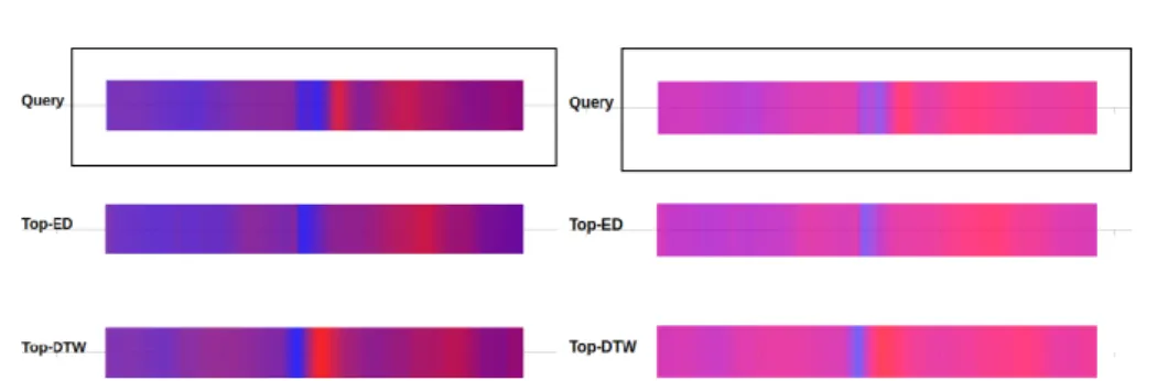
Figure 1: Two color interpolation techniques for Colorfield visualization (RGB left, LAB right), compared in our experiment in order to understand whether humans perceive similarity in a similar manner. This example shows a query and two of the four possible answers participants had to choose from. The answers here come from the ED and DTW automatic similarity measures.
1
Introduction
In our original paper [1] we compared three visualization techniques (colorfields [3, 4, 5, 6, 7], horizon graphs [8, 6, 9, 10, 11], and line charts in small multiples [2]) in order to determine if the time series results returned from automatic similarity measures are perceived in a similar manner, irrespective of the visualization technique. Our work focused on EEG time series data. We found that the perception of similarity is visualization dependent, with visual encodings promoting different measures in some cases (see [1] for details). In that first study, our colorfields implementation used a naive RGB color interpolation between red and blue hues. This approach leads to a color space that is not perceptually uniform, i.e., differentiating variations can be harder for one of the two color extremes. On the other hand, it may extend the differences near the central range of the color space (in magenta tones which humans are more sensitive to [12]). This central range is where low-amplitude variations and spikes, which might be important for EEG signals, are located. Nevertheless, it is unclear how this color mapping fairs against others that are more perceptually uniform.
We thus conducted a follow-up experiment to study and compare the RGB interpolation to one that is perceptually uniform (in our case CIE L*a*b*). We wanted to see if the color interpolation used changes whether time series are perceived as similar or not. As in [1], we investigated time-warping invariance by asking participants to compare the results of Euclidean Distance (ED) [13] and Dynamic Time Warping (DTW) [14] (Exp-1 in the original paper); and amplitude and offset invariance by asking participants to compare the results of ED with and without z-normalization [15] (Exp-2 in the original paper). Aspects in the setup and procedure are common in the experiments of the original studies and this follow-up, so we refer to them for details unless differences are explicitly stated.
2
Experiment Design
2.1
Participants & Apparatus
A total of 18 volunteers (six women), 22 to 30 years old (M = 25, SD = 2.4), participated in our follow-up study without monetary compensation. We recruited them from a local university mailing list. None of these participants had taken part in our previous studies. Our participants came from different scientific backgrounds, including students and researchers in Computer Sci-ence, Robotics, Material Engineering, and Physics. The setup was identical to that of the original paper [1]. We used the same 24" DELL monitor set to 1920 × 1080 resolution.
4 Gogolou & Tsandilas & Palpanas & Bezerianos
(a)
(b)
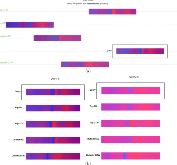
Figure 2: (a) Experimental trial (stimulus) for the RGB condition. The answers come from the ED and DTW similarity measures. The answer order and horizontal shift was randomized across trials. Green annotations (indicating the type of answer) are for illustration purposes only and were not visible in the experiment. (b) The complete query-answer trial used to generate the stimulus in (a), under both the RGB (left) and LAB (right) condition.
Comparing Time Series Similarity Perception under Different Color Interpolations 5
2.2
Tasks and Procedure
As in [1], we followed a within-participants design – all participants were exposed to both color interpolation techniques. The order of appearance of the two techniques was fully counterbal-anced. For each technique, participants completed 5 practice and 40 main trials.
The main difference to the previous study procedure, was that participants saw trials from both Exp-1 and Exp-2 of the original study (since the number of trials was fairly small). We decided on this combination, since similarity judgement is perceptual and subjective in nature, and the instructions we gave to our participants (here and in the original study) do not make any mention of similarity measures or invariances (the factors that are different across experiments in our original paper).
To make use of the full set of queries from the original paper [1] (60 queries in total, 30 queries of Exp-1 and 30 queries of Exp-2), we divided the queries in 3 bins of 10 for each experiment, and each participant saw one bin from each experiment during training and the other two bins from each experiment during the study (counterbalanced across participants). Overall, each query-answer trial was tested by exactly 12 participants (same as in the original study). Each participant performed the same 40 trials for both techniques, but we randomized the horizontal shift and vertical order of the five time subsequences, including the query (see Figure 2a and Figure 3a). For detailed justifications we refer the reader to the original paper [1].
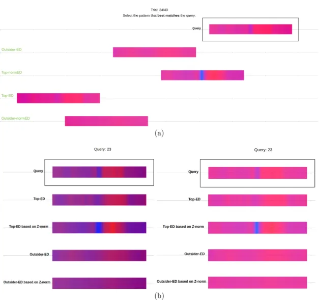
An example of an experimental trial (stimulus) and of the query and answers, used to generate the stimulus, can be seen in Figure 2. The stimulus shown here is for the RGB condition, and the similarity measures used are ED and DTW. Another example of experimental trial under LAB interpolation, where the similarity measures are ED and ED based on z-normalization (NormED), can be seen in Figure 3, together with the complete query-answer trial used to generate the stimulus.
In summary, the follow-up study consisted of: 18 participants
×2 color interpolations ×40 query-answer trials =1440 trials
2.3
Color Interpolation Techniques
Previous work considers color scales of two [5, 16] or more colors [6]. We opted for a simple two-color scale in our experiment, as we did in the original study. As in the original study, we chose red tone (#ff0000 ) for the most negative and blue (#0000ff ) for the most positive value for both interpolations. Pure tones were used to maximize the distance between the two extreme colors.
RGB interpolation: In this condition we used a simple linear RGB interpolation between the two pure red and blue tones1. An example of a generated trial under this condition can be seen
in Figure 2a.
LAB interpolation: In this condition we used a perceptually uniform interpolation between the two pure red and blue tones, based on the CIE L*a*b* space2. An example of a generated
trial under this condition can be seen in Figure 3a.
1D3 code for RGB interpolation comes from http://github.com/d3/d3-interpolate#interpolateRgb 2D3 code for LAB interpolation comes from http://github.com/d3/d3-interpolate#interpolateLab
6 Gogolou & Tsandilas & Palpanas & Bezerianos
(a)
(b)
Figure 3: (a) Experimental trial (stimulus) for the LAB condition. The answers here come from the ED and NormED similarity measures. The answer order and horizontal shift was randomized across trials. Green annotations (indicating the type of answer) are for illustration purposes only and were not visible in the experiment. (b) The complete query-answer trial used to generate the stimulus in (a), under both the RGB (left) and LAB (right) condition.
Comparing Time Series Similarity Perception under Different Color Interpolations 7
2.4
Algorithms for Measuring Similarity
These were identical to the ones used in the original study [1].
3
Results
3.1
Invariances: Time-Warping and Z-Normalization
As in [1], our analysis relies on ratios of counts. We use bootstrapping methods to construct 95% confidence intervals (CI) of the mean. We apply the bias-corrected and accelerated (BCa) bootstrap method as implemented by R’s boot package [17]. We construct confidence intervals with 10000 bootstrap iterations.
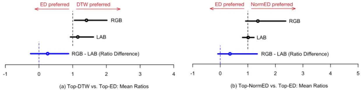
Figure 4 summarizes our results. We split our analysis into two parts. We first compare the two color interpolation techniques for the trials for which answers are given by ED and DTW algorithms (see Figure 4a). These trials come from Exp-1 [1]. We then compare them for the trials for which answers are given by ED and NormED (see Figure 4b). These trials come from Exp-2 [1].
For RGB interpolation, we observe that the results of this experiment are very close to our previous experimental results [1]. Again, top-DTW answers were preferred to top-ED answers, in trials that compare answers returned by the DTW and ED measures. When it comes to trials that compare ED with ED based on z-normalization, we also observe a (non-statistically signifi-cant) trend for top-NormED answers. For LAB, these trends disappear – this color interpolation technique does not seem to favor any of the similarity measures that we compared. However, any differences between RGB and LAB were not statistically significant (α = .05).
-1 0 1 2 3 4
(a) Top-DTW vs. Top-ED: Mean Ratios RGB LAB
RGB - LAB (Ratio Difference)
-1 0 1 2 3 4 5
(b) Top-NormED vs. Top-ED: Mean Ratios RGB LAB
RGB - LAB (Ratio Difference)
DTW preferred
ED preferred ED preferred NormED preferred
Figure 4: Interval estimates comparing the mean ratios of (a) Top-DTW vs. Top-ED answers and (b) Top-NormED vs. Top-ED answers, for the two color interpolation techniques (RGB vs. LAB). In blue, we show interval estimates of the mean ratio differences of the two techniques. Error bars represent 95% CIs. The dotted vertical lines show the values of reference.
3.2
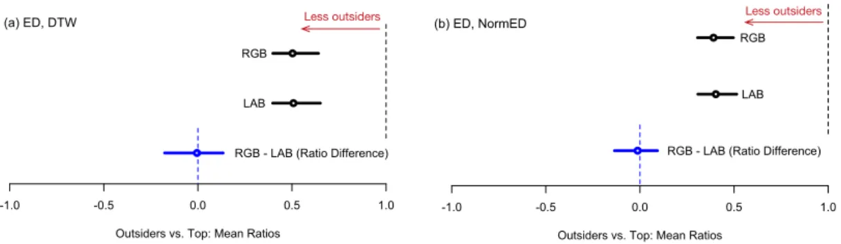
Outsiders vs. Top Query Answers
We analyze the ratio of outsiders to top query answers by using a similar analysis procedure as the original paper [1]. We observe that the top answers of the two algorithms dominated participants’ choices in a similar way (Figure 5). This indicates that choices were not made at random and that the rankings of the algorithms capture real differences in perceptual similarity. We observe that the ratio of outsiders is very similar for both color interpolation techniques – RGBperforms at least as well as LAB.
8 Gogolou & Tsandilas & Palpanas & Bezerianos
-1.0 -0.5 0.0 0.5 1.0
Outsiders vs. Top: Mean Ratios
(a) ED, DTW
RGB LAB
RGB - LAB (Ratio Difference)
-1.0 -0.5 0.0 0.5 1.0
Outsiders vs. Top: Mean Ratios RGB
LAB
RGB - LAB (Ratio Difference)
(b) ED, NormED
Less outsiders Less outsiders
Figure 5: Interval estimates comparing the mean ratios of outsiders to top query answers (a) for the ED vs. DTW trials and (b) for the ED vs. NormED trials. In blue, we show interval estimates of the mean ratio differences of the two color interpolation techniques (RGB vs. LAB). Error bars represent 95% CIs. The dotted vertical lines show the values of reference.
3.3
Agreement
We use the κq coefficient of Brennan and Prediger [18] to assess agreement among participants.
We also use the jackknife technique [19] to construct confidence intervals by assuming that participants are randomly sampled from a larger population, whereas the set of queries is fixed. Overall agreement values are shown in Table 1. Agreement was above chance, while the two techniques resulted in very similar scores. These values are again consistent with the values of our previous experiments [1].
Table 1: Overall agreement values (Brennan-Prediger κq). Brackets show 95% jackknife CIs.
RGB LAB
EDvs. DTW .22[.12, .32] .22[.14, .30]
EDvs. NormED .32[.23, .41] .30[.23, .38]
3.4
Time
Time measures are well-known to follow lognormal distributions [20, 21], thus we log-transform time values and analyze them with standard parametric methods that assume normal distribu-tions. According to this approach, comparisons between techniques are based on the ratios of their median times rather than their mean time differences [22].
Mean completion time were very close for RGB 20.5 sec (SD = 9.7 sec), and 19.7 sec (SD = 10.4 sec) for LAB. Figure 6 shows interval estimates for medians (left) and ratios of median times (right). We observe no clear time difference across interpolations.
3.5
User Preferences
Participants indicated in a 7-point Likert scale their preference for each technique. Lower score indicated higher preference. RGB was overall more preferred (mean score 3.61) than LAB (mean score 4.22). Thus RGB was overall more preferred (as the lower the score, the more preferred the technique). In particular 10 of the 18 participants rated RGB higher, 2 same as LAB, and 6 rated LABhigher.
Comparing Time Series Similarity Perception under Different Color Interpolations 9 0 5 10 15 20 25 30 35 Time (sec) 0.8 0.9 1.0 1.1 1.2 1.3 1.4 1.5 Time Ratio RGB LAB RGB / LAB LAB faster RGB faster Medians and their 95% CIs
Means
Figure 6: Interval estimates comparing the median task completion time for each technique. Error bars represent 95% CIs. Red extensions (right) show adjustments for three pairwise comparisons.
4
Conclusions
In this report, we presented the results of a follow-up to two experiments [1] that compared three different time series visualization techniques on similarity perception. This follow-up study compared the simple RGB interpolation tested by these experiments to one that is perceptually uniform (CIE L*a*b*).
First of all, we observed that the RGB results of this follow-up study are consistent with the results from the original experiments, verifying our findings that there are true trends and robustness to small changes in the experimental design.
Our results show no statistical difference between RGB and LAB interpolations in similarity perception for all our comparisons of similarity measures. As in the original experiment, there is a trend to prefer DTW to ED for both color interpolations. However, this trend seems to be less clear when LAB interpolation is used. In trials comparing ED with NormED, participants tended to prefer NormED to ED for RGB interpolation. However, as in the original experiment, this trend is not statistically significant. In contrast, the LAB interpolation does not seem to favor any of the two measures. Again, the difference between the two color interpolations is non-statistically significant, so larger studies are required to verify these effects. It is possible that participants could differentiate more details in the RGB interpolation, thus favoring slightly one distance measure (DTW or NormED) over the other (ED).
Overall, the results for both interpolations are consistent with the findings from our origi-nal experiments, and the variation of color interpolation does not change our high-level results and recommendations. We can conclude that Colorfields (irrespective of interpolation) are less adapted for DTW than Horizon Graphs and Line Charts. Given the slightly different (non sig-nificant) trends for NormED and ED, recommendations are not interpolation-blind in this case. However, we can still conclude that Colorfields are better adapted to NormED than Horizon Graphs, irrespective of which color interpolation is used.
As our study does not show any significant difference between the two encodings for our similarity perception tasks, this indicates our results are fairly robust for our task and data (EEG signals). Nevertheless, this does not mean that differences do not exist for other temporal patterns. Further research is required to investigate the effect of color mapping on similarity perception for other subsequences with pattern characteristics other than EEG.
Moreover, due to our motivation domain (i.e., neuroscience), in both the original paper and this follow-up report, we assume that viewers are interested in comparing time series but also in seeing the visualization of the raw values and their context (see Motivation section in our paper [1]). In other domains where similarity comparison is the only task of interest, one could also consider mapping variations that exaggerate differences. For example, one could consider taking any color map space and create an equi-depth binning of time series values. This could provide
10 Gogolou & Tsandilas & Palpanas & Bezerianos a wider color range for the most frequent values, thus exaggerating the parts of the time series with most variations. It is clear that further investigation on the choice of color space is needed when it comes to similarity judgements. We hope this work motivates future studies, and in this vain we provide our data for replication.
References
[1] A. Gogolou, T. Tsandilas, T. Palpanas, and A. Bezerianos, “Comparing similarity perception in time series visualizations,” IEEE Transactions on Visualization and Computer Graphics, 2019.
[2] E. R. Tufte, The Visual Display of Quantitative Information. Cheshire, CT, USA: Graphics Press, 1986.
[3] M. Correll, D. Albers, S. Franconeri, and M. Gleicher, “Comparing averages in time series data,” in Proceedings of the SIGCHI Conference on Human Factors in Computing Systems, CHI ’12, (New York, NY, USA), pp. 1095–1104, ACM, 2012.
[4] D. Albers, M. Correll, and M. Gleicher, “Task-driven evaluation of aggregation in time series visualization,” in Proceedings of the SIGCHI Conference on Human Factors in Computing Systems, CHI ’14, (New York, NY, USA), pp. 551–560, ACM, 2014.
[5] D. Nadalutti and L. Chittaro, “Visual analysis of users’ performance data in fitness activi-ties,” Computers & Graphics, vol. 31, no. 3, pp. 429 – 439, 2007.
[6] T. Saito, H. N. Miyamura, M. Yamamoto, H. Saito, Y. Hoshiya, and T. Kaseda, “Two-tone pseudo coloring: Compact visualization for one-dimensional data,” in Proceedings of the Proceedings of the 2005 IEEE Symposium on Information Visualization, INFOVIS ’05, (Washington, DC, USA), pp. 23–, IEEE Computer Society, 2005.
[7] B. Swihart, B. Caffo, B. James, M. Strand, B. Schwartz, and N. Punjabi, “Lasagna plots: a saucy alternative to spaghetti plots,” Epidemiology (Cambridge, Mass.), vol. 21, no. 5, pp. 621–625, 2010.
[8] H. Reijner, “The development of the horizon graph.” available online at http://www. stonesc.com/Vis08_Workshop/DVD/Reijner_submission.pdf, 2008.
[9] J. Heer, N. Kong, and M. Agrawala, “Sizing the horizon: The effects of chart size and layering on the graphical perception of time series visualizations,” in Proceedings of the SIGCHI Conference on Human Factors in Computing Systems, CHI ’09, (New York, NY, USA), pp. 1303–1312, ACM, 2009.
[10] W. Javed, B. McDonnel, and N. Elmqvist, “Graphical perception of multiple time series,” IEEE Transactions on Visualization and Computer Graphics, vol. 16, pp. 927–934, Nov. 2010.
[11] C. Perin, F. Vernier, and J.-D. Fekete, “Interactive horizon graphs: Improving the compact visualization of multiple time series,” in Proceedings of the SIGCHI Conference on Human Factors in Computing Systems, CHI ’13, (New York, NY, USA), pp. 3217–3226, ACM, 2013. [12] H. Levkowitz and G. Herman, “The design and evaluation of color scales for image data,”
Computer Graphics and Applications), vol. 12, no. 1, pp. 82–89, 1992.
Comparing Time Series Similarity Perception under Different Color Interpolations 11
[13] C. Faloutsos, M. Ranganathan, and Y. Manolopoulos, “Fast subsequence matching in time-series databases,” in Proceedings of the 1994 ACM SIGMOD International Conference on Management of Data, SIGMOD ’94, (New York, NY, USA), pp. 419–429, ACM, 1994. [14] D. J. Berndt and J. Clifford, “Using dynamic time warping to find patterns in time series,” in
Proceedings of the 3rd International Conference on Knowledge Discovery and Data Mining, AAAIWS’94, pp. 359–370, AAAI Press, 1994.
[15] D. Q. Goldin and P. C. Kanellakis, “On similarity queries for time-series data: Constraint specification and implementation,” in Proceedings of the First International Conference on Principles and Practice of Constraint Programming, CP ’95, (London, UK, UK), pp. 137– 153, Springer-Verlag, 1995.
[16] D. Albers, C. Dewey, and M. Gleicher, “Sequence surveyor: Leveraging overview for scal-able genomic alignment visualization,” IEEE Transactions on Visualization and Computer Graphics, vol. 17, pp. 2392–2401, Dec. 2011.
[17] A. Canty and B. D. Ripley, boot: Bootstrap R (S-Plus) Functions, 2017. R package version 1.3-20.
[18] R. L. Brennan and D. J. Prediger, “Coefficient kappa: Some uses, misuses, and alternatives,” Educational and psychological measurement, vol. 41, no. 3, pp. 687–699, 1981.
[19] K. L. Gwet, Handbook of Inter-Rater Reliability, 4th Edition: The Definitive Guide to Mea-suring The Extent of Agreement Among Raters. Advanced Analytics, LLC, 2014.
[20] E. Limpert, W. A. Stahel, and M. Abbt, “Log-normal distributions across the sciences: Keys and clues,” vol. 51, pp. 341–, 05 2001.
[21] T. Baguley, Serious Stats: A guide to advanced statistics for the behavioral sciences. Palgrave Macmillan, 2012.
[22] P. Dragicevic, “Fair statistical communication in hci,” in Modern Statistical Methods for HCI, pp. 291–330, Springer, 2016.
RESEARCH CENTRE SACLAY – ÎLE-DE-FRANCE
1 rue Honoré d’Estienne d’Orves Bâtiment Alan Turing
Campus de l’École Polytechnique 91120 Palaiseau
Publisher Inria
Domaine de Voluceau - Rocquencourt BP 105 - 78153 Le Chesnay Cedex inria.fr