HAL Id: hal-01618111
https://hal.inria.fr/hal-01618111
Submitted on 17 Oct 2017
HAL is a multi-disciplinary open access
archive for the deposit and dissemination of
sci-entific research documents, whether they are
pub-lished or not. The documents may come from
teaching and research institutions in France or
abroad, or from public or private research centers.
L’archive ouverte pluridisciplinaire HAL, est
destinée au dépôt et à la diffusion de documents
scientifiques de niveau recherche, publiés ou non,
émanant des établissements d’enseignement et de
recherche français ou étrangers, des laboratoires
publics ou privés.
Activelec: an Interaction-Based Visualization System to
Analyze Household Electricity Consumption
Jérémy Wambecke, Georges-Pierre Bonneau, Renaud Blanch, Romain Vergne
To cite this version:
Jérémy Wambecke, Georges-Pierre Bonneau, Renaud Blanch, Romain Vergne.
Activelec:
an
Interaction-Based Visualization System to Analyze Household Electricity Consumption. Workshop
Vis in Practice - Visualization Solutions in the Wild, IEEE VIS 2017, Oct 2017, Phoenix, United
States. �hal-01618111�
Activelec: an Interaction-Based Visualization System to Analyze
Household Electricity Consumption
J ´er ´emy Wambecke* Univ. Grenoble Alpes, LJK,
LIG, Inria
Georges-Pierre Bonneau† Univ. Grenoble Alpes, CNRS,
LJK, Inria
Renaud Blanch‡ Univ. Grenoble Alpes, LIG, F-38000 Grenoble France
Romain Vergne§ Univ. Grenoble Alpes, CNRS,
LJK, Inria
ABSTRACT
Everyone can now record and explore the evolution over time of his/her personal household electricity consumption. However under-standing what links this data to our behavior remains a challenge. In this paper, we present a visualization tool based on the direct manipulation, by the users, of their behavior. Users can select and modify their actions over time, evaluating the results on the data with the visualization. We also conduct a user study, showing that our method allows users to understand the links between actions and data, and to use this knowledge in order to test and evaluate changes in their behavior.
1 INTRODUCTION
With the development of personal informatics systems [10], we can now easily access temporal personal data, for example about home energy consumption [6] or physical activities [11]. However, the links between one’s behavior and the resulting data are complex, and their understanding is a challenge for a layperson. We express the behavior of users in terms of actions, which stands for real actions of users in their environment, for example actuating electrical appliances. The use of visualization is justified by the fact that only users know the context in which their actions are taken, and thus can link this information with the resulting data during the visualization process [8]. The main challenge is to allow interaction with the data, which has been proven to be crucial for non-expert users [7]. Our contribution is a system that allows users to analyze and ma-nipulate their electricity consumption data. Our focus is on the interaction with a representation of the activities rather than directly with the collected data. We express the activities of users in terms of actions on appliances over time, which are linked to the temporal data. By using this representation of the activities, we provide to users the ability to test What if scenarios, by selecting and virtually modifying their actions in the visualization.
The power of information visualization to analyze and understand temporal data does not have to be proven. However, we now little about how it can be used by non-expert users on their own data. From a researchers perspective, our work allows to reflect on this question, as well as to investigate the efficiency of the What if approach for users to analyze their data.
Several previous works focus on visualizing personal data, but pro-vide only limited interactions restricted to exploration or annotation. Costanza et al. [6] presented Figure Energy, a system based on the visualization of household electricity consumption. They provide to the users a way to interact with their consumption by annotating their activities and removing appliances usage, but selections and modifications do not include temporal aspects as in our system.
*e-mail: [email protected] †e-mail: [email protected] ‡e-mail: [email protected] §e-mail: [email protected]
Li et al. [11] designed IMPACT, a prototype for the visualization of physical activity data. The activities done during the days are displayed on the curve of the user’s steps to provide context, making the visualization close to ours. But unlike our system, no selection of activities over time nor modifications are provided to the user. Badam et al. [3] presented TimeFork, an interactive prediction tech-nique for time series. Like our method, TimeFork allows what if experiments to be conducted. However, it is designed for direct manipulation of raw data and the target users are domain experts. Section 2 presents the design rationale of the tool, Section 3 the system design. To assess the usability of our tool, we conduct a user study described in Section 4. The results show that our tool enables users to find relevant actions for saving energy consumption, while being compatible with an effort they are willing to make. Finally we conclude and give possible future works in Section 5.
2 DESIGNRATIONALE
2.1 Interaction
Our tool is based on a computer software using information visu-alization approaches. The design of interaction is at the heart of our contribution, especially allowing the users to interact with their actions on electrical appliances rather than the recorded data. We argue that this way of interaction, by contrast with interacting with raw data, leads to more knowledge about how to adapt the behavior in a given situation to change the data, for example to save energy. Our system allows users to select their actions via temporal criteria to visualize their impact on the data. Then they can conduct What if experiments about their behavior by virtually modifying it. It is hence useful for users who want to fully understand their data, as well as for users who just want to know what are the actions to be changed to reach a given objective. Moreover, it is usable by users that do not have knowledge about the domain (e.g. electricity consumption) as well as experienced users.
2.2 Data Model
Figure 1: Data related to a TV.
To support our method, the system is based on a hier-archical model of the data, which is composed of raw data and user’s actions data. Raw data describes the evo-lution of the instantaneous electric power of the appli-ances, and is measured di-rectly on the appliances or simulated when a what if scenario is applied. Note that our input is disaggregated energy data, i.e. each appliance is associated to a temporal dataset. To express the relationship between raw data and the behavior of the users, we model the appliances as having states over time. At a given point in time, the appliance is in a given state, which depends on the action of the users. We define a set of states for each appliance, e.g. for a TV: Off, Standby and Usage. Along with its raw data, an entity is associated with the evolution of its state over time. Thus, this evolution is represented by time intervals corresponding to the state in which the entity is at a given
time. We call such an interval an instance of this state. The evolution of raw data during an instance is linked to the state of this instance. More precisely, we assume the average of the values during an in-stance to be similar between the inin-stances of the same state. Figure 1 shows an example of the evolution of the state of a TV over time, where the state is represented with colors.
3 SYSTEMDESIGN
3.1 User Interface
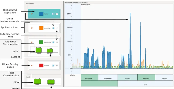
Our system is built on two modes: appliances mode to explore and compare the consumption of all appliances, and instances mode to focus on an appliance and interact with its data.
Appliances modeis the first one that appears when launching the application (Figure 2). It allows to explore and compare the con-sumption of all appliances of the house, by visualizing them on the same plot. When clicking on the edit button of an appliance (in the list to the left), the application switches to instances mode. Instances modeallows users to focus on a given appliance, and to in-teract directly with their data (Figure 3). They can obtain information about the usage of the appliance via exploration and selection, and test several changes of actions over time via modifications. Hence, in this step, users acquire knowledge about the consumption data and the links with their actions. The instances and states of the appliance are displayed to users only in instances mode.
Since the units of energy, such as kWh, are often misunderstood by users, we need to convert them into meaningful information [14]. Therefore we chose to always express the amounts of energy in terms of cost. It could as well be expressed in terms of emitted CO2 if the user’s focus is on environmental concern rather than cost saving.
3.2 Visualization
To display the evolution of the consumption over time, we chose to use curves, since it is a well known metaphor for temporal data. Other less standard visualization such as Braided Graphs [9] would lead to a steeper learning curve and could be misunderstood by people with low visualization literacy [4]. Standard interaction tools to explore the data, such as zooming and panning, are provided. To better understand the links between the behavior and the consump-tion of an appliance, in Instances mode we color the curve according to the instances of the appliance. More precisely, we fill the part below the curve with the color of its current state. The evolution of the color along the curve represents the evolution of the state of the appliance, and the curve itself represents the instantaneous electric power. We use a multi-hue color scheme from ColorBrewer [5]. Since the state of the appliance is directly linked to the actions of users, they can visualize the consumption along with their actions.
3.3 Selection
In instances mode, users can create selections of instances of the appliance by two means: by clicking directly on the curve, or by defining criteria. Selections have three main purposes. Firstly, selecting a set of instances allows one to obtain information on them. For example, users may want to check if the durations of the selected instances are similar. Secondly, they can also see which parts of the curve are associated to the selected instances, enabling to link the selection with the consumption. Finally, selecting instances allows to apply a modification on them, as explained in the next section. The first way to create a selection is to do it directly from the vi-sualization by clicking on the instances. The second way to select instances is through the definition of criteria on their properties. For example, users can select all the periods of Standby of a computer whose length is greater than one hour, during the weekend. Adding criteria is made via widgets displayed to the right of the interface. Once a criteria is modified, the set of selected instances is updated in real time, and these instances are highlighted on the curve.
The benefits of selecting the actions via the definition of criteria are twofold. First, it extends classical exploration, since users can explore the space of criteria by using widgets. This method allows for fast selections and feedback, with progressive refinements of the set of selected items [2]. The second motivation for selecting actions from criteria is that it allows users to generalize a pattern found during the direct exploration step. Hence, defining criteria allows habits to be easily visualized and modified.
3.4 Modification
Once users have selected several instances of the appliance, it is possible to modify them. For now, we provide two types of mod-ifications. The first one is changing the state of the instances, for example switching the states of the instances to Off to remove the corresponding usages of the appliance. This modification is related to a change in the real usage of the appliance. The second one is limiting the time of the instances to a given duration, for example limiting all instances of Standby of a computer to 2 hours. The extra part, i.e. after the limit, is removed and replaced by Off. As a real action, it is equivalent to switch off the computer when it is in Standbyfor 2 hours.
When a modification is applied, the raw consumption data is up-dated accordingly, by using a model to compute the affected part. Then, the visualization is updated for users to visually evaluate the impact of the modification. A summary of the modification is dis-played, containing a feedback about the price earned or lost with the modification, and the gain / lost percentage relative to the total consumption of the appliance. Thus, users can use the visualization, the numeric value or both to evaluate the modification.
Items containing the summaries of the modifications are displayed in a list to the right of the interface. Users can do as many modifications as they want, which are added to the list to be compared. Not only users can apply modifications, but they can manipulate them: along with the summary, the modification item contains interaction widgets. Users can decide to apply or not the modification, to modify it (i.e. modify the selection and the type of modification), or to delete it. To allow the manipulation of the modifications, we applied the concept of reification, as stated by Mackay and Lafon [12]. It means that the concept of modification of a set of instances is represented by an object, made of a selection of instances and a type of modification.
4 EVALUATION
We conducted a user study to evaluate the usability of our tool and especially to assess if users are able to apply selections and modifi-cations to the data. To do so, we designed a controlled experiment, where participants were asked to use the tool to save energy while minimizing their required effort to do so.
13 users (11 males, 2 females) participated in the study (none of the authors). Among them, 2 users were visualization specialists and 7 users could define electrical power and energy. 8 participants were motivated in saving energy and 4 wanted to save energy without too much effort. One participant did not follow the given instructions, thus we did not consider his results in the analysis of the study. Before the experiment, users got used to the tool with the help of the authors. We ensured that they understood the visualization of the curves and the interaction processes, i.e. selections and modifica-tions. The learning phase took approximatively 25 minutes in total, after which participants told us that they understood the system.
4.1 Task : Free Usage
Method. The task was designed to study the usability of the method when freely used. The consumption data used in the study comes from the Household Electricity Survey [13], from which we selected six month data from ten common appliances. Participants were asked to use the tool as if they were at home with their own data, and had to find relevant actions to save energy. They were asked to
Figure 2: Interface of the appliances mode. Four appliances are displayed: a heater (blue), a computer (orange), a dishwasher (green) and a toaster (red). The heater has been highlighted by the user, and the item of the dishwasher has been extended to display its consumption values.
Figure 3: Interface of the instances mode. A computer has been chosen by the user, whose states are Usage (orange) and Standby (blue). At the right, we can see that the user has applied two modifications, the first one to remove instances of Standby after 9 P.M, and the second one to limit the instances of On to 4 hours during the weekend. When the user is selecting instances, this panel displays information about the selection.
Figure 4: Results of Task 2. Consumptions gains are normalized relative to the highest consumption, efforts are normalized on a scale from 0 to 5 and numbers of modifications are normalized relative to the highest value (15).
apply modifications that they could apply in reality, and had to rate the effort of each modification (between 1 and 5). They did not have any saving target, and had 10 minutes to apply modifications.
Results. The results of the task are summarized in Figure 4. On average, participants saved 36.73% (σ = 12.53) of the total energy consumption and modified 6.75 appliances out of 10 (σ = 1.06) with an effort of 1.48 (σ = 0.39). Participants usually put higher effort on the most consuming appliances such as the heater, the computer or the TV. On the opposite, the light and toaster consume less energy and were only slightly modified. We can note that users with energy knowledge saved 37.67% (σ = 13.13) of the energy and modified 6.71 appliances (σ = 1.25), while novice people saved 29.53% (σ = 18.50) of the energy and modified 6.17 appliances (σ = 1.72). Users from both groups managed to successfully use the system. This task also allowed to identify common patterns between users to find and modify relevant behavior changes. They usually select one of the most consuming appliances using the visualization and consumption indicators provided in the appliances mode. Users next switch to the instances mode and analyze the usage of this appliance over time to define criteria that correspond to a change in behavior. The instantaneous feedback of the selection process allows to adjust the criteria until the ratio gain/effort is acceptable. They then apply a modification and evaluates it via the visualization and the gain value. With low savings, users tend to refine their selection criteria with more effort, or apply a second modification. If the saving is high, they tend to refine criteria to relieve their effort. When a suitable modification has been made, users go back to the appliances mode to select another appliance, whose ratio consumption/effort to put seems acceptable.
4.2 Interview
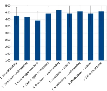
At the end of the study, participants were asked to fill a questionnaire to evaluate the usability of the method, based on a Likert scale from 1 (I totally disagree) to 5 (I totally agree). Appendix A shows the resulting averaged rates and standard deviations for each of the questions. From the rates, we can deduce that participants found the tool easy to use and felt confident in using it, and no misunderstanding appears.
We also asked to participants which functionalities they had ap-preciated/disliked the most. All participants gave 2 to 4 items to explain what they preferred in the tool. Among them, 7 participants mentioned the interaction, 6 mentioned the usefulness of a cost feed-back, and 5 mentioned the design of the visualization, including the choice of the colors. Concerning the negative points, 4 participants mentioned potential improvements for the user interface, such as displaying more information about the states of the appliances.
4.3 Discussion
Our main objective was to evaluate whether our method and its usage are understood by the participants. Although participants did not use their own data during the study, they could interpret the usage of the appliances with visualization and exploration. Moreover, creating selections, especially from criteria, helped the participants to understand patterns of use as well as the consumption of the appliances. Results show that they could easily test behavior changes by applying modifications on the appliances.
Depending on their personal interests, the participants used the visualization and/or the aggregated saving expressed in money to evaluate the modifications. This shows that the method could be used by people that prefer to use visualization as feedback, as well as by people that rely on a value feedback. Moreover, participants managed to find relevant actions to save energy regardless of their knowledge about energy, validating our design that targets both experimented users and novices.
The results show that the participants could evaluate on which ap-pliances efforts should be put to save energy. Indeed, finding the relevant appliances to save energy on is one of the problems that users face when using eco-feedback [14]. Participants were also able to find actions easy to apply in reality, for instance by switching off appliances when not needed.Thus, our method allows to evaluate the compromise between energy saving and comfort.
5 CONCLUSION ANDFUTURE WORK
In this paper we introduce a system that allows to analyze and especially interact with electricity consumption. By focusing on the actions of users rather than directly on the raw collected data, our goal is to improve the understanding of the links between the behavior of users and their data. Users can select actions based on criteria, virtually modify these selected actions, and visualize the corresponding modified data. We evaluate our system in a user study were users are asked to freely use the system to save energy. As future work, we plan to include additional features which where suggested by the users during the study, such as more criteria for selections, other types of modifications and a real time preview of the modifications before they are applied. Using the same color palette for both appliances mode and instances mode did not seem to be disturbing during the study, however we could consider the use of different palettes to avoid overloading colors.
We also envison to provide suggestions to the users for common and easy changes to apply, for example switching the appliances from Standbyto Off. However, the strength of the system is to let users freely find the modifications that fit them, which cannot be achieved by an automatic system, since only users have knowledge about how and why they use their appliances. For example, turning Off a TV when it is not watched can only be decided by users.
To extract the instances from raw data we use a simple threshold al-gorithm, which gives acceptable results. To apply a what if scenario, for example to change the state of an instance, our system needs to simulate new raw data, which is currently done with a simple copy from existing data. In future works it would be interesting to incorporate more elaborated algorithms for these two processes. In the longer term, we could envison to incorporate our tool in a home automation system such as OpenHab [1]. In such a system, our tool could take the values of sensors as input, and export the chosen modifications of the users on the appliances as rules. For example, if the user chooses to switch off an appliance at 10 P.M during week days, the corresponding rule that automatically switches off the appliance could be generated.
ACKNOWLEDGMENTS
This work has been partially supported by the LabEx PERSYVAL-Lab (ANR-11-LABX-0025-01) funded by the French program In-vestissement d’avenir.
REFERENCES
[1] Openhab. https://www.openhab.org/. Accessed 2017-07-17. [2] C. Ahlberg and B. Shneiderman. Visual information seeking: Tight
cou-pling of dynamic query filters with starfield displays. In Proceedings of the SIGCHI Conference on Human Factors in Computing Systems, CHI ’94, pp. 313–317. ACM, New York, NY, USA, 1994. doi: 10. 1145/191666.191775
[3] S. K. Badam, J. Zhao, S. Sen, N. Elmqvist, and D. Ebert. Timefork: Interactive prediction of time series. In Proceedings of the 2016 CHI Conference on Human Factors in Computing Systems, CHI ’16, pp. 5409–5420. ACM, New York, NY, USA, 2016. doi: 10.1145/2858036. 2858150
[4] J. Boy, R. A. Rensink, E. Bertini, and J.-D. Fekete. A principled way of assessing visualization literacy. IEEE Transactions on Visual-ization and Computer Graphics, 20(12):1963–1972, 2014. doi: doi. ieeecomputersociety.org/10.1109/TVCG.2014.2346984
[5] C. A. Brewer. Colorbrewer. http://colorbrewer2.org. Accessed 2017-07-17.
[6] E. Costanza, S. D. Ramchurn, and N. R. Jennings. Understanding domestic energy consumption through interactive visualisation: A field study. In Proceedings of the 2012 ACM Conference on Ubiquitous Computing, UbiComp ’12, pp. 216–225. ACM, New York, NY, USA, 2012. doi: 10.1145/2370216.2370251
[7] C. Fischer. Feedback on household electricity consumption: a tool for saving energy? Energy Efficiency, 1(1):79–104, 2008. doi: 10. 1007/s12053-008-9009-7
[8] D. Huang, M. Tory, B. A. Aseniero, L. Bartram, S. Bateman, S. Carpen-dale, A. Tang, and R. Woodbury. Personal visualization and personal visual analytics. IEEE Transactions on Visualization and Computer Graphics, 21(3):420–433, March 2015. doi: 10.1109/TVCG.2014. 2359887
[9] W. Javed, B. McDonnel, and N. Elmqvist. Graphical perception of multiple time series. IEEE Transactions on Visualization and Computer Graphics, 16(6):927–934, Nov. 2010. doi: 10.1109/TVCG.2010.162 [10] I. Li, A. Dey, and J. Forlizzi. A stage-based model of personal
infor-matics systems. In Proceedings of the SIGCHI Conference on Human Factors in Computing Systems, CHI ’10, pp. 557–566. ACM, New York, NY, USA, 2010. doi: 10.1145/1753326.1753409
[11] I. Li, A. K. Dey, and J. Forlizzi. Using context to reveal factors that affect physical activity. ACM Trans. Comput.-Hum. Interact., 19(1):7:1– 7:21, May 2012. doi: 10.1145/2147783.2147790
[12] W. E. Mackay and M. B. Lafon. Reification, Polymorphism and Reuse: Three Principles for Designing Visual Interfaces. In In Proc. Advanced Visual Interfaces, AVI 2000. Palermo, Italy, 2000.
[13] D. of Energy, I. T. Climate Change, and C. Ltd. Household electricity survey, 2010-2011. uk data service [data collection], 2016.
[14] Y. A. Strengers. Designing eco-feedback systems for everyday life. In Proceedings of the SIGCHI Conference on Human Factors in Comput-ing Systems, CHI ’11, pp. 2135–2144. ACM, New York, NY, USA, 2011. doi: 10.1145/1978942.1979252
A RESULTS FROMFINALINTERVIEW
Figure 5: Rates from final interview. “→ understanding” means helps in understanding consumption and behaviorand “→ actions” means helps to find relevant actions to save energy