HAL Id: hal-01556831
https://hal.inria.fr/hal-01556831
Submitted on 5 Jul 2017
HAL is a multi-disciplinary open access
archive for the deposit and dissemination of
sci-entific research documents, whether they are
pub-lished or not. The documents may come from
teaching and research institutions in France or
abroad, or from public or private research centers.
L’archive ouverte pluridisciplinaire HAL, est
destinée au dépôt et à la diffusion de documents
scientifiques de niveau recherche, publiés ou non,
émanant des établissements d’enseignement et de
recherche français ou étrangers, des laboratoires
publics ou privés.
Distributed under a Creative Commons Attribution| 4.0 International License
Visualizing Sensor Data: Towards an Experiment and
Validation Platform
Claudia Rodriguez, Anne-Marie Déry-Pinna
To cite this version:
Claudia Rodriguez, Anne-Marie Déry-Pinna. Visualizing Sensor Data: Towards an Experiment and
Validation Platform. 4th International Conference on Human-Centered Software Engineering (HCSE),
Oct 2012, Toulouse, France. pp.352-359, �10.1007/978-3-642-34347-6_27�. �hal-01556831�
Visualizing Sensor Data: Towards an Experiment and
Validation Platform
Claudia C. Gutiérrez Rodriguez and Anne-Marie Déry-Pinna
I3S – CNRS - University of Nice - Sophia Antipolis 930 route des colles – BP 145, 06902 Sophia Antipolis, France
{cgutierr,pinna}@i3s.unice.fr
Abstract. In the last decade, technological improvement on sensors
increasingly motivates the use of sensor data in numerous application domains such as environmental, health, transportation, etc. Progressively, with the advances on user terminals, there is a strong trend towards interactive sensor data visualization. As viewing raw sensor data stored in multiple databases does not specially fulfill user requirements, data visualization raises challenges about supporting users to easily use and handle sensor data. In this paper, we address this particular subject with an extensible visualization and interaction platform. Within this platform, we provide developers the facility to experiment and validate multiple visualizations for sensor data, specially based sensor data properties and users’ requirements. We illustrate our platform with a medical study case focused on ECG data visualization.
Keywords: Information Visualization, HCI, Sensor Data, Medical Applications, Experimentation platform
1 Introduction
Nowadays, data visualization is increasingly resorted considering the tremendous benefits by creating, exploring and interacting with large collections of data. Visualization currently supports several tasks such as medical diagnosis [1,2], training simulations [3] or architectural reconstructions [4], as well as monitoring streams of data coming from sensors employed on several application domains like transportation or environmental [5].
Even if different visualization techniques and forms (i.e. charts, maps…) have been proposed to support both, use and interaction over large amounts of data [6], visualization of sensor data fulfilling users’ requirements is not a simple task. It implies several challenges and requires different elements, such as: a good comprehension of data itself (e.g. properties and structure), a deep understanding of basic HCI and the principles that underline them, together with a proper interpretation of the potential usages of these data by experts.
In this paper, we address these challenges with a platform oriented to experiment and validate multiple visualizations for sensor data. The main goal of this platform is to provide users (i.e. developers and experts) with a tool capable to assist them in the definition and design of possible sensor data visualizations and interactions for
particular usage contexts. With this platform, users are able to evaluate the accuracy of possible visualizations, identify new functionalities or specializations being useful to adapt and increasing the usage capabilities.
This paper is organized as follows: Section 2 discuss approaches on visualization techniques for sensor data. Section 3 introduces the specificities of our extensible platform. In Section 4, we explain how the platform is used for extensibility in a medical case study managing data coming from an Electrocardiogram (ECG). Finally, Section 5 presents our conclusions and future work.
2 Overview
Visualization is an important mechanism when working with large amounts of data as sensor data. It makes more comfortable for users to interact within, as for select or filter data of interest, data can be understood faster and easier [3,6]. However, visualizing sensor data is not a trivial task. Multiple views of sensor data can be extracted according to several aspects such as context of use, users’ requirements, data properties, etc., and thus several questions arise such as: How sensor data can be
reasonable visualized?
In the last few years, more and more interactive tools have been proposed to support users (i.e. domain experts) exploring and presenting data that might be stored, analyzed or simulated [7,8]. The information analysis on such interactive tools is supported by user interfaces based on visualization and interaction techniques, visual design, human perception and cognition understanding [9]. According to [10], the challenges of this kind of tools are to visualize in a way that balances complexity with conciseness and accuracy with essence. They must avoid providing confuse pictures of information or inadvertently or deliberately miscommunicate users.
Recent prototypes and guidelines look forward new opportunities on information visualization by providing task (i.e. Zoom) and visualization taxonomies (i.e. 1-, 2-, 3- dimensional data, temporal…) [11], modeling visualization elements, considering hardware and software to visual design (i.e. Smartphone, PC, tablets…) [12] or even regarding user himself as a primary key on visualization development.
Several research works are also focused on sensor data analysis through visualization techniques [5,11]. This work leads to several proposals matching tasks and sensor’s type in order to provide a possible visualization or providing clues for guidelines between sensor type and visualization taxonomy. Such kinds of visualizations are unfortunately stand-alone applications and have no facilities for interacting with multiple cases of study. They provide graphical environments for specific sensor data representation like combining text with visual indicators (i.e. tables, icons…), real-time charts (i.e. temperature, speed…), maps (i.e. location) and perform only some specific operations over sensor data like Zoom.
Analyzing requirements on emergent applications exploiting sensor data lead us to conclude that visualization in this context must goes beyond a simple illustration of text or matching relations between visualization elements. More and more, integrate different means of interaction and visualization is required to support users in their tasks (i.e. diagnosis, monitoring, supervision…). We distinguish two main
requirements accordingly: (i) provide visualizations adapted to specific data type and application context and (ii) provide adapted functionalities that support further data visualization extensibilities by means of users’ experience and needs.
Regarding these requirements, we propose in the next section an extensible platform oriented to experiment and validate sensor data visualization. In such a platform several generic visualizations are proposed and its design enables users to identify and implement the most adequate visualizations for a specific usage context. In fact, a definitive list of visualizations cannot be provided and thus we decide to focus on the extensibility and adequacy of the platform. .
3 Towards an Experiment and Validation Platform
Designing a platform to experiment and validate sensor data visualizations enables, among other, to analyze the consistency and relevancy of potential visualizations related to users’ needs and their usage context. To this end, we introduce in the following paragraphs, an extensible platform oriented to assist experts visualizing and interacting sensor data.
3.1 General Overview and Architecture
Through this platform, developers attended by domain experts, may identify and implement the most appropriate visualizations to support users into tasks such as monitoring, medical diagnostic, tracking, etc. Our platform is thus designed to facilitate: (i) adding new types of sensors (data formats, data transfer protocols…) (ii) extracting useful data to be displayed (iii) enabling data correlation from different sensors (iv) associating appropriate visualizations to data type and (v) adding new visualizations and interactions.
The platform is built on 3-tier architecture. A database (DB) dedicated to store data to be displayed, a server where basic functionalities for managing data are deployed and a client which is the interactive part of the architecture allowing users to test visualizations and feedback developers about their particular needs on data representation. For this paper, we especially focus on the visualization aspect of the architecture describing the main functionalities to experiment and validate possible sensor data visualizations and interactions.
3.2 Developers and domain experts: providing adapted functionalities
In order to provide an extensible experiment and validation tool, we offer in this platform several visualization and interaction functionalities both at the server and client side. Our approach proposes extendable visualization libraries and data model enabling to extend the capacities of the platform and also provides a set of functionalities enabling experts to experiment and feedback developers.
On the server side, implemented functionalities are organized on two main axes: Data and Visualization management. Data management enables to manage data records of
several data types. Developers and experts are then allowed to import data of different types, extract them, associated to specific visualizations (i.e. ordered by adequacy: map and chart for gps data records) and making them persistent. Together, visualization management assists developers adding, creating and deleting visualizations. Developers can create a new visualization which extends of the existing ones providing their specificities through associated metadata. For example, we can specify if visualization can be used for particular cases like synchronization, real-time display, selection or composition. Further, such visualization is then available for new data records association. Actually, this association is given by the developers; however we aim to automate this process by defining adapted semantic rules.
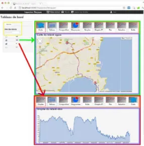
Fig. 1. Dashboard: visualizing two data records
On the client side, we propose a visualization tool which act as a mediator between developers and experts. It can be described by three main features: Dashboard, Data
management and User profile. The dashboard implements functionalities to associate
data types to specific visualizations, list and select data records, interact with the suggested visualizations (all adapted to sensor data representation depending on the type of data record and the associated list of visualizations) and displaying one or several data records visualizations. Together, traditionally functionalities adapted to dynamic sensor data are also provided, such as: Zoom (selecting a piece of a graph) or
Markers (displaying reference points with color and description). Data management
allows importing extract and gathering data coming from one or several sensors. Users can manage such records and create, add, delete or modify them and then test visualizations and interact with it in order to better understand and explain their requirements. Our platform proposes to manage user profile by controlling user access with an id and a password.
The prototype of this extensible platform is based on Web applications technology (Figure 1). Such a technology opens new possibilities of implementation such as Web Services, REST protocol, HTML5, etc. Also, it offers a better collaboration and
information sharing, as well as a bridge to target mobile devices such as Smartphones and Tablets.
4 Experimentation and platform validation: visualizing ECG data
In order to validate the feasibility of our platform, we experiment into an application oriented to support medical experts in the analysis of ECG data. To this end, we have adapted our platform to the preliminary requirements of the usage context and interacted with the experts to evaluate its extensibility and adequacy. This evaluation process is very close to the specifications provided by the ISO 9241-2101 standard for
Human-centered Design for Interactive Systems, which defines all the aspects related to user’s experience and its impact on the presentation, functionality, behavior and capabilities of the system. Thus, the experimentation described in this section takes into account the context of use (i.e. users, tasks, environments…), the user requirements (through all the development process), the design solutions which meet these requirements and the user-centered evaluations of such solutions, modifying according to the users’ feedback.
4.1 Users: implant and medical experts
The users involved in this experiment are 3 actors: (i) two experts on cardiac implants which provide cardiologists and surgeons with infrastructures to monitor the behavior of such implants, and (ii) one medical expert, a cardiologist, which provide a diagnostic and treat cardiac pathologies. Each actor is supposed to test our platform according to the following scenario.
4.2 Scenario: ongoing experimentation and validation process
In our scenario, the expert requires to analyze a data stream coming from an ECG both in real-time and a posteriori. In order to adequate our solution to users’ requirements, we experiment our platform by following three main phases described hereafter.
Phase 1: User requirements analysis when presenting the platform and the possible
visualizations and interactions to the experts.
Feedback: Based on the provided functionalities, experts give a direct feedback to
the developers and asked for the possibility to load ECG data type (i.e. xml-hl7), to visualize such data on the typical visualizations recommended by the cardiologist (i.e. cardiac derivations, peaks,…) and to create visualizations dynamically according to traditional ECG results (i.e. EVI compositions…)
Results: The developer validates the possibility to manage new data types, as for
example *.hl7. Also, a specific composition for ECG data based on the combination of selected data was considered. A new visualization can be derived from this composition.
Phase 2: Presentation of a first prototype integrating the solutions and requiring user
testing. Once the implementation of new visualizations performed, users can test and react by providing their feedback for possible extensions.
Feedback: The experts have identified their need to perform their own data
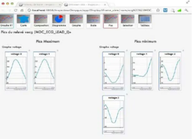
selection in terms of ECG graph display and also to select peaks values between maximum and minimum values.
Fig. 2. Real-time visualization: dynamic visualization of a data record
Results: Our platform has been then enhanced with new functionalities and opened
to new application domains such as medical by analyzing data coming from an ECG (Figure 2). With our platform, expert is leaded to upload files containing ECG data (i.e. xml-hl7) and to specifically select which data he/she wants to import (i.e. by date). Once the expert creates and selects a data record, he is able to display it with the different visualizations proposed on the dashboard. He can test several visualizations for the same record, for example in a table, in a static or in a dynamic graph (real-time simulation), etc. Indeed, all the proposed visualizations are adapted to visualize sensor data.
Thanks to our platform and by choosing a real-time representation, medical expert can simulate a dynamic sensor data stream and interact with data in different ways, for example: (i) manage graphs distribution over the dashboard (ii) zoom in a particular segment of the graph (iii) annotate the graph with markers (reference points) (iv) select some fragments of the graph (Figure 3) (v) compose a new graph based on selected data fragments.
Fig. 3. Peaks detection and visualization
Phase 3: Other user test is required to validate the set of implemented functionalities.
This aspect is an ongoing work. In fact, results acquired until now support us to increasingly enhance our platform. We attempt to introduce and test the platform by more medical experts (~10 experts) and especially considering a real scenario context.
5 Conclusion and Perspectives
In this paper, we have presented an extensible platform oriented to visualize and interact with sensor data coming from various applications domains. We propose several features and functionalities attempting to support developers and experts to simulate, create, interact and visualize multiple sensor data representations. In order to illustrate the applicability of our platform, we validate our proposal over a medical case study requiring a display of data coming from an ECG (Electrocardiogram). Results validate the extensibility of our platform and approach and motivate for further improvements.
The testing and enhancement of our platform is an ongoing work. At this time, we integrate new modules facilitating the implementation of features such as: preprocessing data to be displayed, managing composition of visualization tools and sensed data with an ergonomic point of view, relating patient health records, storing experts’ visualization and interaction preferences, as well as migrating to mobile devices. In our future work, we aim to propose a more automatic visualization association and display, especially based on semantic rules and usage-based learning approaches.
This platform is currently used as part of a research project with specialists on cochlear and cardiac implants. Further experimentations with final experts will be performed on mobile devices should take place within a year. At present, experts and developers work closely to determine the visualization and interaction choices. Also, we plan to perform quantitative evaluations of platform’s usability considering the measures proposed by ISO 9241-11 (Specifications and evaluation of usability).
Acknowledgments. This work is supported by the FUI project STM32 granted by the
French SCS Cluster. We thank Sorin Group3, members of the project and specialists
in cardiac implants, for their support and collaboration. The authors would also like to thank the students Computer Science Department of Polytech’Nice Sophia Antipolis for their contribution to this project.
References
1. Stoicu-Tivadar, L. & Stoicu-Tivadar, V. Human-computer interaction reflected in the design of user interfaces for general practitioners. I. J. Medical Informatics 75, (3-4), 335-342 (2006)
2. Stroetmann, K.A., Pieper, M., and Stroetmann ,V.N. Understanding Patients: Participatory Approaches for the User Evaluation of Vital Data Presentation, In ACM Conference on Universal Usability, 93-97(2003)
3. Campbell, B.D., Mete, H.O., Furness, T., Weghorst, S. & Zabinsky, Z. Emergency Response Planning and Training through Interactive Simulation and Visualization with Decision Support. Architecture 176-180 (2008)
4. Niederauer, C., Houston, M., Agrawala, M. and Humphreys, G. Non-invasive interactive visualization of dynamic architectural environments. In Proc.of 2003 symposium on Interactive 3D graphics (2003)
5. Grundy, E., Jones, M.W., Laramee, R.S., Wilson, R.P., Shepard, E.: Visualisation of Sensor Data from Animal Movement. Comput. Graph. Forum 28(3): 815-822 (2009)
6. Keim, D. Information Visualization and Visual Data Mining. IEEE Transactions on Visualization and Computer Graphics 8, 1 (2002)
7. Aigner, W., Miksch, S., Müller, W., Schumman, H. Tominski, C. Visual Methods for Analyzing Time-Oriented Data, IEEE Transactions on Visualization and Computer Graphics, v.14 n.1, p.47-60 ( 2008)
8. Luo, X., Teng, D., Liu, W., Tian, F. Guozhong, D., Wang, H. A developing framework for interactive temporal data visualization, In Proc. of the 3rd International Symposium on Visual Information Communication, September 28-29 (2010)
9. Shneiderman, B. The Eyes Have It: A Task by Data Type Taxonomy for Information Visualizations. In Proc IEEE Symposium on Visual Languages (VL '96). IEEE Computer Society, Washington, DC, USA, 336-. (1996)
10. Stone, M. Information visualization: Challenge for the humanities. Report of a Workshop Cosponsored by the Council on Library and Information Resources and the National Endowment for the Humanities, Council on Library and Information Resources Washington, DC, 43-56. (2009)
11. Richter, C. Visualizing Sensor Data. In Media Informatics Advanced Seminar on Information Visualization, (2009)
12. Carmo, M.B., Afonso, A.P., Pombinho de Matoset, P. and Vaz . A. MoViSys – A Visualization System for Geo-Referenced Information on Mobile Devices. Visual Information Systems. Web-based visual information search and management. LNCS, 167-178, (2008)
2 STM3 - Solution for the Treatment and Monitoring in Mobile Medicine
(http://www.pole-scs.org/projets?letter=S&page=5)