Data Portraits: Aesthetics and Algorithms
by
Alexandru C. Dragulescu
BS, Cinema and Photography, Ithaca College (2000)
MFA, Visual Arts, University of California at San Diego (2005)
Submitted to the Program in Media Arts and Sciences,
School of Architecture and Planning
in partial fulfillment of the requirements for the degree of
Master of Science in Media Arts and Sciences
at the
MASSACHUSETTS INSTITUTE OF TECHNOLOGY
September 2009
ARCHIVES
@
Massachusetts Institute of Technology 2009. All rights reserved.
Author ...
Alexandru C. Dragulescu
Program in Media Arts and Sciences,
School of Architecture and Planning
\
September, 2009
Certified by ...
...
"Judith'D
ona'th
Judith Donath
Associate Professor of Media Arts and Sciences
Thesis Supervisor
A ccepted by ... -. .---- ... ...
-/r
Deb RoyChair, Department Committee on Caduate Studies
MASSACHUSETTS STitE
OFTECHNOLOGY
OCT 2 6 2009
Data Portraits: Aesthetics and Algorithms by
Alexandru C. Dragulescu
Submitted to the Program in Media Arts and Sciences, School of Architecture and Planning
on September, 2009, in partial fulfillment of the requirements for the degree of
Master of Science in Media Arts and Sciences
Abstract
While interacting online, one generates a multitude of personal data trails, both textual and behavioral. The data portrait is a way to collect, condense and represent these information trails, which are often time consuming and tedious to find and grasp when read linearly across web pages or domains, into an easy, legible, and compelling visualization.
This thesis presents various data portraiture techniques that generate both individual and collective portraits of users participating in online social media. The data used in gen-erating the portraits are unstructured text and publishing timestamps of Twitter micro-blog posts, as well as aggregate RSS feeds from FriendFeed. The strategies for depicting peo-ple's online personas explored in this thesis focus on the compression, mapping and visual representation components of the visualization pipeline. The resulting portraits attempt to maintain a tight connection with the data, and be legible to viewers, but at the same time, venture to explore more expressive visual forms, and engage with the evolving aesthetics of cinematography, typography and animation.
Thesis Supervisor: Judith Donath
Data Portraits: Aesthetics and Algorithms
by
Alexandru C. Dragulescu
The following served as a reader for this thesis:
Thesis Reader...
Caroline Jones Director, History, Theory and Criticism Section Department of Architecture MIT
Data Portraits: Aesthetics and Algorithms
by
Alexandru C. Dragulescu
The following served as a reader for this thesis:
Thesis Reader ... ... ... .. Martin Wattenberg
Director, Visual Communication Lab IBM
Acknowledgments
I am very grateful to my advisor, Judith Donath, for her inspiring classes, guidance, invalu-able insight and critique.
Many thanks to my readers, Caroline Jones and Martin Wattenberg, for their thoughtful commentary and critique.
Thanks to Yannick Assogba, Luis Blackaller, Drew Harry, Kate Hollenbach, Ana Luisa Santos and Aaron Zinman, my colleagues and best friends at the lab.
Thanks to Aaron Blankstein, Don Goldin, Joe Tennent, Jenny Chan and Tuan Huynh for their dedication and contributions in the implementation stage.
Thanks to Linda Peterson for her guidance and patience. Thanks to all the students, faculty and staff for making the Media Lab such an unique research environment.
This thesis is dedicated to my soul mate, Laura, my parents, Elena and Emilian, and my sister, Liliana. Thank you all, for your love.
Contents
1 Introduction 13
2 Background and Related Work 17
2.1 RelatedWork ... ... 18
2.2 Portraiture and the Mechanical Artist ... .. 20
2.2.1 Metaphor .... ... ... 23
2.2.2 Words ... .. ... ... 25
2.2.3 Time ... ... 26
3 Designing Data Portraits 29 3.1 Process: Portraiture with Motion and Typography ... . .. . . 29
3.1.1 Pre-visualization: Getting to Know the Data ... 29
3.1.2 Twelve Typographical Devices ... ... ... 31
3.1.3 Sketch: Keyframes ... ... 38
3.1.4 Sketch: Waveforms . ... ... 40
3.1.5 Sketch: Depth of Field ... ... 46
3.1.6 Wordtraces: Transition to Animation ... ... 47
3.1.7 Sketch: Clocks ... ... 50
3.2 Amoeba ... ... 53
3.3 Lexigraphs ... ... .. 59
3.4 Data Ghosts ... .. ... 62
4.1 Lexigraphs ... ... ... 66
4.2 Cityscape ... ... .. 66
4.3 Ecosystem Simulation ... ... 71
5 Critique 79
6 Conclusion and Future Work 85
Appendix: Critic Biographies 89
Chapter 1
Introduction
Prior to coming to the Media Lab, my projects have revolved around creating artworks with data and algorithms (Fig 1-1). In Blogbot [14], text extracted from blog posts related to the Iraq war and appropriated video game assets were rendered automatically into exper-imental graphic novels. Together with Tim Jaeger, I created Respam [15], a series of audio and visual compositions driven by the rhythms and contents of junk emails. These perfor-mances presented a dystopic information society, overloaded by advertising and plagued by consumerism, phishing and fraud. The same unwanted email messages provided the rhythms that generated virtual structures for the Spam Architecture Series [16].
My intentions have always been to find and give form to data, or to sculpt with data, in order to provoke the audience to think about this new material that has become so pervasive in our lives. Daily we consume and generate vast quantities of data. In online communica-tions, data is the material that composes our digital personas, projections of our real selves in a mediated world.
In this thesis, I extend my previous work by exploring ways to represent and render our "data bodies". Our data bodies are formed by the multitude of information traces we leave behind while communicating online. Some of this data is public, while some of it is private. Some of it resides on the client side - on our mobile phones and computers, while some resides replicated on nodes in the computing cloud. We are often not aware, or we do not pay enough attention to whom else this data is visible.
the motivation behind the concept of data portraits as a means for evoking our data bodies, and describes my approach into this relatively new research area. I give a brief history of portraiture, highlighting milestone moments and shifting trends. I then discuss the func-tions of the traditional portrait, as well as the data portrait, and present related work from design, photography, and information visualization projects.
The main body of this work is discussed in Chapters 3 and 4. Chapter 3, Designing Data
Portraits presents sketches and explorations that use typography and motion to condense
an individual's micro-blog into a static or animated portrait. This chapter shows a series of typographic strategies and visualizations metaphors that are used in the final instantiations of the data portraits.
Chapter 4, Collective Portraits, presents data portraiture techniques that are re-purposed in the context of one's social network. Audiences can now contrast and compare a multitude of portraits synchronized in an unique timeline, as well as observe semantic interactions in an ecosystem of Twitter users.
Chapter 5, Critique, summarizes the results of a critique session with my thesis readers, and presents the outcome of informal interviews with museum visitors who experienced some of the collective data portraits. Finally, Chapter 6 concludes with directions for future work.
Figure 1-1: Sculpting with data, previous work: top: Blogbot, software for generating experimental graphic novels; bottom left: Spam Architecture, Structure 11, digital print;
bottom right: Respam, audio visual performance. 15
Chapter 2
Background and Related Work
Increasingly we spend our lives in electronic habitats: e-mail, RSS feeds, Facebook, Twit-ter, online shopping and banking. Our presence in these habitats is a projection of our real selves and is manifested and perceived by the textual or behavioral data we generate while dwelling in these environments. This data might be open for read access to all other users, or it may be protected from other users, but readable and shareable by the commercial enti-ties owning the channels of communication. Most of the time, the data streams we generate are social, they are intertwined and interconnected with other users' information, and most importantly, they reside on commercially-owned servers. Hence, the question of Who owns
the data? is a difficult one to answer [40]. Because of the fuzzy ownership of data, and
the access control concerns, the question of How do we capture and portray our online
personas? becomes an interesting and beneficial issue to investigate.
The data portrait is a way to collect, condense and represent a multitude of substantial personal information trails, that are time consuming and tedious to find and grasp when read linearly across web pages or domains, into an easy, legible and compelling visualization. As such, the data portrait can increase awareness, allowing users to understand how they project themselves in online habitats, or in other words, how others perceive them, and what information is available and stands out about them. In addition, the data portrait could also serve as instrument of reflection on social relationships and interpersonal exchanges, as well as personal narratives and histories.
itself at the intersection of many domains such as information retrieval, natural language processing, design, aesthetics and visualization. The data portraiture techniques developed for this thesis have the goal of maintaining a tight connection with the data, and be legible to viewers, but at the same time, venturing to explore more expressive visual forms, and engage with the evolving aesthetics of cinematography, typography or animation. This thesis concerns itself more with the mechanics of how to represent online personas and does not attempt to exhaustively make use of all possible types of data. Furthermore, it reflects on the data portrait as an artistic genre in the light of traditional portraiture.
2.1
Related Work
The first text and visualization work that mentions and proposes the concept of dataportrait is PeopleGarden: creating data portraits for users [39]. In the context of Usenet groups,
message boards and chat rooms, Judith Donath and Rebecca Xiong ask the question How
can we compactly convey information about these participants to each other? The answer
is using data portraits, an abstract representation of users' interaction history: "In real life, successful portraits show the physical likeliness of people; they also use objects in people's lives to illustrate their interests and status. This second aspect is an inspiration for our work. The on-line equivalent of one's objects is data about one's past interactions."
PeopleGarden used a flower metaphor for the portrayal of users, and a garden metaphor for representing the whole group. Various communication patterns are highlighted through the use of colors, the number of petals or the length of the stem. PeopleGarden's goal was to facilitate forming a mental image of an individual's participation in an online interaction environment and help answer questions such as:
* Do participants here really get involved? (Post frequently or only once in a while?) * How much interaction is there? (Do people respond to each other?)
* Who are the experts? (Who has been here for some time or posted many messages?)
Themail [33] is an email archive visualization that portrays relationships between
indi-viduals. As a data portrait, the focus is more on the relationship than the individual, how-ever, the presence of topical patterns characterize and create impressions of people through their information history. Themail is an interactive tool meant for reflection on past con-versations and events, and allows the user to gain insight on the evolution of relationships. It uses typographical devices for representation, and text analysis to filter large quantities of data, similar to the techniques used in the data portraits proposed by this thesis.
What the World Eats [26], a photo essay on the Time magazine's website shows the
items on the dinner table of fifteen families around the globe. The photographs are extracted from Peter Menzel's book Hungry Planet [27]. These images are a fantastic example of data portraits. Besides the photographic likeness of the individuals in a family, there is a multitude of additional data: the quantity, types and diversity of food, the decoration in their home, the clothes they are wearing, the size of the family. There is also information about the weekly expenditure for food, as well as their favorite food or recipe. The audience is left to infer from this data impressions and characteristics of the portrayed individuals. Looking across these portraits, the audience can reflect on globalization, or health concerns. For example, there is a strong contrast between the packaged food of families from the industrialized world and the bulk foods of families from rural areas or developing nations.
A day in brands [5] is a visualization of daily services and products usage by Ana
Bierzanska. This is one of the many instances of an exercise first created by an Ac-count Executive at an advertising agency who blogged anonymously at the now defunct
http://dearjanesample.wordpress.com/. The logos are arranged in groups and ordered by time. There is a large variety of products from toothpaste, toothbrush, clothing, drinks, software applications, phone and computer hardware, to media outlets. Actions are de-coded via the type of product or service and the time of day of use. Again, data is used as a intermediary for creating an impression, a mental image about what the person behind the portrait might be like. For example, from the type of software she is using, we can infer that she is a designer or digital media maker. This self-portrait is also a vehicle for fash-ion statements, from clothing brands to the use of open-source applicatfash-ions like Firefox or
VLC.
Wish Lists [31] is a series of forty inkjet prints on paper created by Kelly Sherman. The
content of the prints consists of wish lists found on the Internet. The entries are printed orderly, left-aligned and minimalistically displayed as a vertical list. At the top of the list there is the name of the author or a generic name such as Family #13. The items descriptions vary, from really specific products, such as Little Tikes Cookin ' Fun Interactive
Kitchen Set to very generic ones: baby doll -any. Through these pieces of information, the
audience tries to deduct age and gender, imagine character traits or narratives, eventually reconstructing the persona of the author.
The Feltron Annual Reports [19] are a series of yearly compilations of personal statistics
by designer Nicholas Felton. These highly designed and typographically elegant brochures are a form of data self-portrait. Their form is transplanted from the contemporary corporate culture, where companies give shareholders a report on financial performance and future direction. Felton keeps track of many types of data: the number and brands of beers, the number of vacation days, the average daily subway traveled miles, the weight gain, the number of burglars confronted, the countries traveled to, the ten most listened to music artists, the best wedding attended. Information is displayed using infographics devices such as line charts, pie charts and maps.
2.2
Portraiture and the Mechanical Artist
Similar to traditional portraits, the role of the data portrait is to create an evocative represen-tation of an individual. It is therefore important to discuss the similarities and differences between the two genres and understand how the latter registers and distinguishes itself in
the broader context of portraiture.
Joanna Woodall, the editor of Portraiture, Facing the Subject [38], a collection of
es-says on portraiture, delineates various paradigms in the history of portraiture in western art. Central to western art, is the idea of likeness and naturalistic portraiture, where phys-iognomic similitude represents identity. Across time and geography, this idea had various degrees of adoption. In the medieval period, identity was not represented through likeness,
but through symbols of status and position, such as a blazon, or coat of arms. The realist portrait emerged at the beginning of the fifteenth century, introduced by the early Flemish painters, and perfected by Jan Van Eyck. It is characterized by "the adoption of intensely illusionistic, closely observed facial likeness, including idiosyncrasies and imperfections". In the sixteenth century, artists in Italy "reconciled attention to the physiognomic peculiari-ties of the subject with more generalizing visual devices, such as the profile view (especially for women) or the analysis of face and body in smooth, consistently lit geometrical shapes. Such techniques were traditionally understood to attribute universal and ideal qualities to figures."
The need for scientific likeness was materialized with the advent of photography. Fur-thermore, as Freud's writings on psychoanalysis became widespread, artistic exploration shifts from depicting the external appearance, towards investigating and portraying the subconscious and the interior life of the subject. In the early twentieth century, natural-istic portraiture is further subverted by the experimentation with non-figurative painting and sculptural techniques. The dynamic between artist and sitter has also changed dramat-ically during this period. Whereas in the Renaissance era the power dynamic was clearly dictated by the patron who commissioned the portrait, the beginning of the twentieth cen-tury marks the act of commissioning being seen as an act of submissiveness, detrimental to artistic creativity. The portrait refers now more to the identity and aura of the artist, while the sitter becomes secondary [38].
Data portraiture follows in the tradition of modern and contemporary art, where the relationship between artist and subject becomes much more diluted. The act of commis-sioning is more mechanical and symbolical: in the case of Lexigraphs (see Chapter 3), Twitter users will enter their login name into a form. Knowing each individual and portray-ing it separately is impossible: the vast and daily expandportray-ing data needs to be synthesized
by algorithm. The actual data portrait is rendered by the intermediary mechanical artist,
a program or a collection of programs that materialize the will of the artist/programmer. The mechanical artist blurs the lines between art material, art instrument, art experience and art object. It also subverts the power relationship between sitter and artist: the repre-sentation of the subject's identity is controlled now by the program. The software is one
part material: the electronic canvas is the support on which the portrait manifests itself, and the interface is an integral, "tangible" component of the data portrait that allows for exploration; and one part instrument: it contains the code that collects and generates the final art object/experience.
Unlike paint or marble, data is fluid, processable and malleable. Through code, data can be infinitely sculpted and layered into various forms and can be interactively experienced by the sitter or audience. Precisely because of these qualities of data, the artistic process of algorithmic creation in general, and data portraiture specifically, is very different from its traditional counterpart. In creating portraits, a traditional artist would use additive or subtractive processes. In data portraiture, the process of evoking ones persona is now iterative. The artist starts by looking across the data (see Section 3.1.1) and experiments with algorithms of extraction and representation of facets of one's data body (see Chapter 3). The artist has less control on the output and result of each portrait. The subjects are evoked through broad, general algorithmic gestures as opposed to sitter-specific, carefully placed brush strokes.
The goal for the data portraits is to allow the subject to observe how facets of the online self are portrayed, and compare with the depiction of others through the same lens. As such, customizing and tweaking individual portraits (shape, speed) is not desired, so as to allow an audience to observe the same mapping across portraits. An artist's point of view, or commentary is automatically embedded through subjective selection of various portrayal strategies, as well as the choice of metaphor, or filtering and condensing algorithms.
The algorithms in data portraiture are in a sense recipes that emulate to a certain degree the capacity for evaluating one's persona by reading through the flat data. The tensions between portraiture and scientific visualization emerge during this process, as data por-traiture is situated at the intersection of these two fields. The key decisions of the data portraiture pipeline allow for trade-offs between subjectivity and expressivity on one side, and legibility and recognizability on the other side:
* Choice of algorithm, and parameters: How do we compress the data? What do we choose to show? How do we filter out noise?
* Data mapping: How are the quantities and attributes of the data expressed? Is this a simple mapping that is immediately legible (e.g., size of type denotes frequency, opacity denotes presence or activity)? Does it require a legend or an explanation of the mapping?
* Metaphor and rendering style: How do we visually represent the data and patterns? Is it abstract (e.g. using lines and color) or do we use a metaphor (e.g. silhouette, clock) to arrange the data?
2.2.1 Metaphor
The metaphor is well known as a literary device employed by poets. However, we are often unaware of the crucial role metaphors play in our perception and day-to-day living, as exposed by George Lakoff and Mark Johnson in their book Metaphors we live by [23]:
"The concepts that govern our thought are not just matters of the intellect. They also govern our everyday functioning down to the most mundane details. Our concepts structure what we perceive, how we get around in the world, and how we relate to other people. Our conceptual system thus plays a central role in defining our everyday realities. If we are right in suggesting that our conceptual system is largely metaphorical, then the way we think, what we experience and what we do every day is very much a matter of metaphor."
Structural metaphors allow us to understand an abstract idea through another concept
that is more clearly grounded and delineated in our experience. We borrow them from one domain of experience to characterize and understand concepts in other domains.
Orienta-tional metaphors are based on our physical spatial interaction with our environment and
navigating the real world with our bodies. Containers, paths, center-periphery, force, links, balance are central to orientational metaphors. For example, "Happy is up; sad is down". Our language reflects what we experience physically through our bodies and how our bod-ies, in this case, posture, reflect emotional state: "That boosted my spirits. You're in high spirits. Thinking about her always gives me a lift. I'm feeling down. I'm depressed. My spirits sank."
The data portraits at the center of this thesis, are using both structural and orienta-tional metaphors as a mechanism to facilitate perception, but also as a vehicle for artistic statement. Chapters 3 and 4 show explorations of how personal data can be imagined and represented through the use of various metaphors. One's collection of information traces and artifacts is imagined as a human body (Sections 3.3 and 4.1), a clock (Section 3.1.7), a cellular organism (Sections 3.2 and 4.3), or as architecture (Section 4.2).
"The reason we have focused so much on metaphor is that it unites reason and imagination. Reason, at the very least, involves categorization, entailment, and inference. Imagination, in one of its many aspects, involves seeing one kind of thing in terms of another kind of thing - what we called metaphorical thought. Metaphor is thus imaginative rationality." [24]
Finding the right metaphor is challenging. Some metaphors will highlight certain as-pects of the concept meant to be illustrated or understood, while at the same time hide others. For example, a clock is great for representing rhythmical data, but it might be too mechanical to illustrate an individual. The qualities of the visualized data need to be taken into account when employing metaphors. Can a piece of data be considered solid and perpetual, so that it can be portrayed as the building block for a physical structure or an architectural fragment? Metaphors may have rich and complex associations and interpre-tations, some of them experiential and some cultural, which might not reflect the traits of the data, or might help infer undesirable qualities. On the other hand, the large spectrum of social data needed to be visualized might not be entirely characterizable by the chosen metaphor. Judith Donath writes on the perils of metaphor scope or coverage, critiquing the PeopleGarden visualization [39] that used a garden of flowers as a metaphor to represent Usenet users [12]:
"The flower imagery is highly evocative, which is both its appeal and its limitation. Gardens are organic, we associate them with life, beauty, freshness. This imagery is fine when the visualization is of, say, a welcoming support group. It seems jarringly inappropriate for depicting dry technical announce-ments or vitriolic flame wars."
2.2.2 Words
The information sources for the data portraits presented in Chapter 3 are the RSS feeds of Twitter micro-blogs. The two components of interest are the contents of the post: the raw unstructured text, together with the publishing timestamps. The goal is to extract and represent patterns in the text by filtering and compressing the original content. Because of the limited message length of 140 characters, micro-blog users are already doing a first stage of compression by trying to communicate ideas succinctly, using a small number of words.
Twitter users are supposed to answer the question What are you doing? but the range of messages show a large variety of uses. Some of the posts describe present or past actions, while other are observations or musings. Some posts are replies in conversation threads with one or multiple users, while others simply link to photos, or other websites.
Text analysis research [28] has shown that "the words people use in their daily lives can reveal important aspects of their social and psychological worlds" and that "particles, which serve as the glue that holds nouns and regular verbs together, can serve as markers of emotional state, social identity, and cognitive styles."
By using word frequency/counts or more sophisticated filtering techniques like tf-idf [30], the Lexigraphs series, discussed in Chapter 3 builds a collection of relevant words for a certain user which are then employed to render the portrait. The portrait only filters, condenses and attempts to replay behavioral rhythms, while the task of judging, comparing and extracting gist is left to the audience. In Designing Visualizations of Social Activity.
Six Claims [17], Thomas Erickson argues that visualization should allow user to interpret
information and suggest rather than inform:
"Our response is that accurately presenting information is not the point of a so-cial visualization; its primary role is to provide gist for inferences, and, in fact, it is less important that the inferences are correct. Our users have proved very comfortable with making best guesses from incomplete information. Thus, it is OK to distort activity, to magnify small amounts of activity, and to dampen large amounts of activity; for example, it is much more important for users to
be able to tell whether there are 3 or 7 people present, than whether there are 103 and or 107 present. Ideally, the ambiguity of the visualization should be clear to users."
In other text visualizations, like the State of the Union Address in Words [36], the words are mapped into charts and the actual words appear only in the legend. In contrast, the words are an essential part of the portraits put forth by this thesis. There are both advantages
and disadvantages to this technique. When words are used in the portrait, there is the obvious advantage of not needing to go back and forth to consult the legend. However, there are some representation and perceptual challenges. As in the case of tag clouds, differentiating between word sizes could be problematic, given that frequency is mapped to the height of the font, while the total area of one word is influenced by the length of the word in letters. There are also font differences depending on what letters make up the word. Letters with ascenders or descenders look larger than letters without them, and in the case of fonts that are not fixed-width, the letter w, for example, will be larger than letter i. Despite the theoretical perceptual issues, the popularity and widespread use of tag clouds in web applications and blogs make this technique accessible and familiar [34].
2.2.3
Time
Tone and rhythm of activity or posting in online mediated communications could be con-sidered the equivalent of real life gait. In real life, we tend to make a variety of conscious or subconscious social judgment calls based on the body language, posture, or manner of walking of other people. Artists across media and time have closely observed and rendered gait. As an example, seventeenth century sculptor Domenico Bernini quotes his father [37]:
"If a man stands still and immobile, he is never as much like himself as when he moves about. His movement reveals all those personal qualities which are his and his alone".
As another example, in 2D or 3D animation a character's walk cycle can be an expressive form to render both physical, emotional or psychological attributes [35].
Unlike regular blog posts that have no length limits, micro-blogging has another im-portant dimension: rhythm. Blogs are much more about exposing ideas at length, paying attention to narrative structure and grammar. Micro-blog posts resemble telegraphic snip-pets, short bursts of ideas and actions, in a stream of consciousness way. Their temporal nature can reveal charactenstics of the author. For example, if someone is posting regularly messages of self-promotion, he or she could be seen as self-centered, in the same manner in which an arrogant walk might trigger similar assumptions.
Studies of collaboration in online communications [21] [4] have shown that temporal rhythms in email archives set expectations about availability and interruptability and can be uncovered and predicted. Furthermore, communication rhythms play an important factor in characterizing the nature of relationships between individuals [29].
As noted by Anthony Aveni in his book Empires of time: calendars, clocks, cultures [2], rhythm is embedded in our nature, both on a biological and psychological level. Our anatomies observe and replay a multitude of parallel cycles: the .1-second oscillation of brain waves, the 1 second oscillation of our hearts pumping blood, the 6-second cycle of breathing in and out, the circadian cycle with the interweaving between being awake and being asleep, or the reproductive circa-lunar, and circ-annual cycles. Most experimental bi-ologists believe that the timing systems in mammals are found in the brain, more exactly in a group of nerve cells in the hypothalamus called suprachiasmatic nuclei (SCN) . Destroy-ing these cells in rats, seems to affect their sleep-wake cycle. When people are deprived of the light-dark, cycle and live for weeks in either dark caves, or rooms with constant light, first, their circadian cycle of 8-hour stretches to 16 hours and then they psychologically lose track of time. Hence, each of us has a biological clock that is constantly synchronized to the cycle of day and night. Anthony Aveni acknowledges best the connection between the larger rhythms of nature and our inner clocks[2]:
"We've got rhythm! There's no doubt about it. And our desire to mem-orize, mark, and record it seems to have been bred within us right from the start, before we could even call ourselves human. Like all living organisms, we march in time to the dependable beat impressed upon us by nature's back-ground music."
Chapter 3
Designing Data Portraits
This chapter describes the types of data portraits explored in this thesis as well as the iterative process involved in designing them.
3.1
Process: Portraiture with Motion and Typography
Process is an important part of the final work. I believe that the directions experimented with, both the ones that were finally pursued, as well as the ones that proved to be unfruitful, are as important as the result. In addition, showing the branching of ideas, implementations and sources of inspiration will allow a better understanding of the goals of this thesis, and serve as documentation for both successful and failed strategies.
3.1.1
Pre-visualization: Getting to Know the Data
Browsing Data One of the first steps in the visualization pipeline is to understand
the range, breadth and type of data that will be processed. At the beginning of the data collection stage, I periodically reviewed the last hundred messages posted by Twitter users. This provided a very quick way of understanding the stream of messages, while keeping an eye on the distributed crawling process. I also issued SQL queries to check various characteristics of this cloud of information: daily posting volume for various users, mes-sages containing certain keywords (a rough search), distribution of geographical location
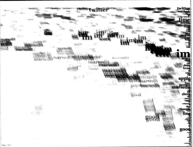
Figure 3-1: Previsualization sketch: the most used words of at Twitter micro-blog in a period of 365 days, ordered on daily columns, most frequent words at the top (Python, Python Image Library -pil).
... ... ...:.: :: ::: .: :.:.:. : :...:.. ... .:.:: ...: : :: . ... ... :::H : :: N - .::.::: - H- . - , -... .I I I : - .: : :: - ' :: :... : . " . . : : . , 1 1 . . 1 .1 . . :
of users, percentage of protected accounts versus public accounts, usage and distribution of clients, and rate of growth of new accounts.
As the database grew quickly overtime, it became clear that I needed to limit the dataset to messages from English-speaking users only. I have used a Python implementation of TexCat [10] [25], an n-gram based language classifier, to assign a composite score of all the posts for each micro-blog. This approach was mostly accurate, but could not assess very well micro-blogs with bilingual content. Despite a varied corpus used to train the language classifier, this method would also have poor results on posts containing the ever evolving "netspeak". For example, Twitter users introduced the use of hashtags to tag posts pertaining to a certain theme or topic (e.g., #twitterfail, #sxsw, #earthquake), or the practice of re-tweeting or rebroadcasting somebody elses message (e.g., "RT:"). I have used the language score and the weekly posting volume to focus the data collecting process on mainly English-writing micro-blogs and high-volume users. To minimize page trips, low-volume users would also be crawled and indexed less often than high-volume users.
Filtering and Compression One of the first programmatic sketches I have created was the timeline for a period of one year for one Twitter micro-blog (Fig 3-1). This was done specifically as a means to understand the extent of data. I have filtered out English stop-words using the stop-word dictionary of NLTK [6]. Time is laid out on the horizontal axis, with each column of text representing one day of posts. The remaining words (after removing stop words) are arranged vertically and are sorted by number of occurrences (highest frequency at the top). The size of type also reflects the number of occurrences. The number of posts per day is not visible, as the words that occurred in a single day are merged and sorted in a single list. This previsualization sketch shows that significant spatial compression is needed to display legible text in a horizontal timeline.
3.1.2
Twelve Typographical Devices
The intention of the visualizations presented in this chapter is to use in the representation stage the very words found in the data set. By eliminating the noise in the communication and filtering out the meaningless tokens, I wanted to provide the viewer of the visualization
with the essence of the data stream. In other words, I wanted to leverage the viewer's sub-jectivity, judgment and perception in evaluating the topical and temporal patterns exhibited in the data portrait. This thesis is mainly concerned with mechanisms of representation and methods for mapping and translating information using visual metaphors. Using ty-pographical elements to show the temporal and topical patterns naturally comes to mind. For inspiration, I have looked at poster and book cover designs, a frugal format that along the years has evolved extremely creative methods. In one page, designers must catch the wandering eye of the audience and be able to communicate using type, color, shape and texture.
In the following, I enumerate some of the attributes of type and/or design devices that can be used to replay rhythm or represent numerical data. This is by no means an exhaus-tive list, but synthesizes representaexhaus-tive elements conceptualized and extracted from various images that showed expressive ways of arranging and laying out text'.
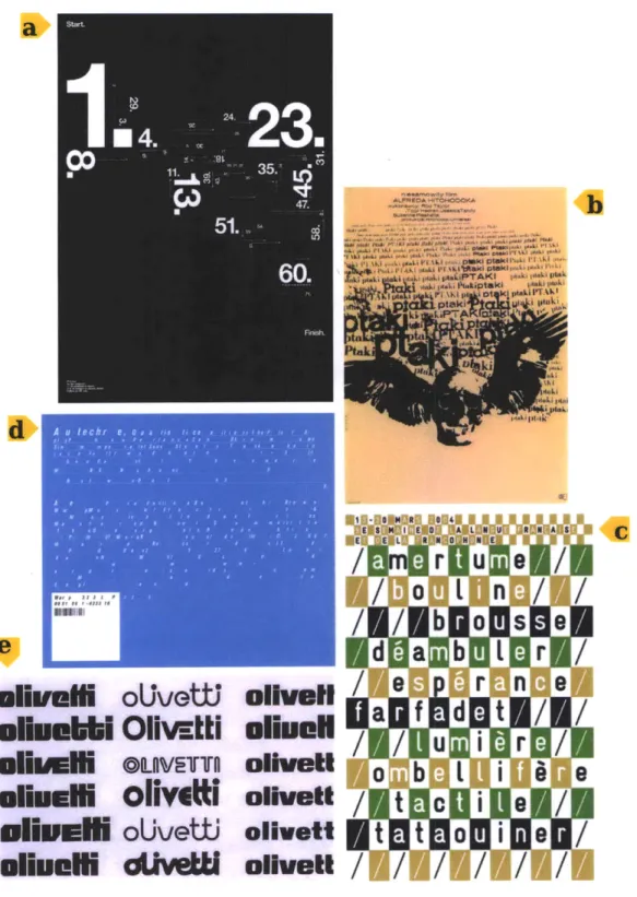
1. Scale/Color/Direction
* All these attributes are easily mapped to numerical values and can be animated.
* Color can be used to separate categories or separate entities.
* Tint or transparency can be used to indicate the intensity of a particular attribute.
Fig 3-2:a De-construct.com (Process, Poster for Blanka, 2006)
2. Repetition
* Used to express quantity.
* Used to create negative or positive space.
* Used to create shapes, figures, or to give texture to an area.
Fig 3-2:b Bronislaw Zelek (Ptaki, Poster for The Birds, by Alfred Hitchcock. 1965)
'These images were saved from the stream of image-bookmarking services such as fffound [22] which do not record proper references to the author or date of creation. Whenever possible, I have identified the origin
m~i~~n$t
oUvoW
oIsaN
/
dP
ONG
oUvetti olhretl
allamilE
OLUVETTO
oiveti
almull olivitl
oivett/
ui
iEl
oUvetti oilett
ihmlle
d
ttW
olivett
/
/
r %!k01 gtaki e 11ADB
/
Figure 3-2: Twelve typographical devices that can be used to express data: (a) Scale/Color/Direction, (b) Repetition, (c) Foreground/Background, (d) Leading/Kerning, (e) Font Weight.
... ;;;;;; ;
d
- a
e I -
/
m e
3. Foreground/background
* The tension and contrast between foreground and background can be used to create patterns.
* Can be used to focus attention on a certain event (if animated) or area (if still image).
Fig 3-2:c Philippe Apeloig (Poster for La Semaine de la Langue Franaise et de la Fran-cophonie, 2004)
4. Leading and Kerning
* The distance between letters and words and/or rows can be used to create rhythm and patterns.
Fig 3-2:d The Designers Republic (Album Cover for Autechre's Quaristice, 2008)
5. Font weight
* Alternating light and heavy can create rhythm and patterns.
* Used to highlight events when animated.
Fig 3-2:e Walter Ballmer (Olivetti logo treatment, Milan, Italy 1960)
6. Filling space with text
* The label becomes the object. Figures or shapes made of text pack dual mean-ing/intent.
Fig 3-3:f John Yunker (Country Codes of the World, 2007)
7. Accents, annotations
* Annotations can be used to make additional statements or add context.
* Swirls and swooshes found in graphic novels or music notation can be used to express motion and intensity.
Fig 3-3:g John Stump (Sheet for Faerie's Aire and Death Waltz)
AERII". AIRE and DIEA I H VWAL*Z
(fromnt A Tribute to Ldenko G. Fibich ) .t....
i. I ii -/ 1111111111(11.11 i 11-11 f ff f"' :1 .us .MX ,mx -77~ .0 .br rr
Country Codes of the World
.ru us Art- - .i -JP ag pkid .. zVflph 0.!k nAc -zd id aAu
Figure 3-3: Twelve typographical devices that can be used to express data: (f) Filling space with text, (g) Accents, annotations, (h) Lines, timelines, grids, (ij) Chart embedded, or around type. h -" ~- --- ---- -~~.~...--...~. -.. ---- -- ;--- --- I --:--- --- --- -- ---- --- --- --- - ---; - - --- --- --- -- --- --- - ---- --- --- --
----8. Lines, timelines, grids
* Lines, timelines and grids can be used to anchor text, mark time, keep tempo. Fig 3-3:h Unknown designer (Poster for the Zurich Design Museum)
9. Chart embedded or around type
* Could a graph charting the usage for a term, be embedded or wrapped around the word itself?
Fig 3-3:i Reilly Stroope (Sorry, Illustration, 2006)
Fig 3-3:j Pedro Ramirez Vazquez, Eduardo Terrazas, Lance Wyman (Poster, Olympic Games Mexico 1968)
10. Capitalization
* Letters could be capitalized and used as markers for tempo or certain occurrences.
Fig 3-4:k Tauba Auerbach (Alpha Bible, 2006)
11. Breaking the type
* Obscure certain parts of the bodies or letters to replay a pattern or rhythm. Hard to achieve without loosing legibility.
Fig 3-4:1 Unknown Designer (Book Cover for The Hidden Curnculum by Benson Sny-der, 1970)
12. Use the third dimension
* Layering of multiple lines of text.
* Through perspective and depth highlight or hide layers.
* Add a third dimension to the actual body of the letters. This third axis can be used to express quantity.
Alkkw
...
...
IM
Figure 3-4: Twelve typographical devices that can be used to express data: (k) Capitaliza-tion, (1) Breaking the type, (m,n,o) Use the third dimension
. .; - , E . 1: 1 11.1 11 ..... .... ... ... ... .
. . ... X ... .. ... .... ...
Fig 3-4:m Brian Dettmer (Sculpture Series, Book Autopsies)
Fig 3-4:n Martina Walthert, Naima Schalcher, Kerstin Landis (Ausstellungsplakat Hans Finsler HGKZ, 2006)
Fig 3-4:o Unknown Designer (Out of Print, Zurich Museum of Design)
I I I I lIa I Sa I a" I It I I I S I I I i HI l 1 l I a Ic II ii I I II) I I I I II I I l I ! el ( I) II II al I SI I I II I I Il I I I I lI It II 1 ,,. II III I I 8 1 I I I I I ta I a I I I I #
Se
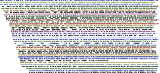
# 0 o 141 1*- I I II ii II i ) i i i II Ii oi I I I i W 1 1 1 4 I I I I an I I IIII I I Ia I a IR I it, I I I il#I I a aU t 1: 1 1 I I I a I I I ll I o II n i l l i Ii II & It I I UW I SMIJ88 I I I I of I a 0 I I I I I 1 a 0. iI i I II, I C I I! II Iii I I a 1 # 1 SI I I I I 1 14 I I II ) I I 11 l I S I I I I i I I I • BI I• III II I I I I I II I I i I I a I I II I I I I I I II I I ) ML II I I IIEI I I n"AM IV ISI I t I 18 la8 IIr I Il a i I I :law I I Ii IlFigure 3-5: Keyframes sketch: Word occurrences are marked by (Python, ActionScript) Seaa,'" .,..V I I a I I ! 1 .I C , ,I I ~ . S el l II, as 1 it I a se I1 II lSI I III II i is I l I I II l I s' I I a it I I I II I IIw i is is i I1 I I ILL INS I a I I, I W I ll I I E S I I I i I Is i I II III 11 0- 11 2 I i I RUl 4 1i i911 i I a 2-pixel rectangle
3.1.3 Sketch: Keyframes
The previsualization sketch (Fig.3-1) showed that because of the varying length of words, a lot of screen space is wasted by trying to use the actual words to mark occurrences. Hence, compression is crucial. In an effort to further compress horizontally the timeline and fit a year of posts into one screen, I have scaled down each day to 4 pixels (Fig 3-5). In this design, the occurrences of words are marked by 2-pixel wide rectangles. The words are not sorted in a single list per day, instead each word occurs on its own distinct timeline. The most n frequent words are extracted, after removing stop-words. Frequency is calculated simply by counting the words. In this sketch, n is 35.
The vertical arrangement of the parallel word axes is dictated by the order of their appearance in the micro-blog posts. For example, "twitter", "hard", "back" appear in the beginning of the micro-blog while "guess" and "iphone" appear later on. Each rectangular keyframe marker is annotated with a copy of the word in a lighter gray. When looking
I I II ) II a I p a ! 5 1 I I ! ! I ! ! • I !II !s ! 5 I II I I I I I I Il I II I !
at the image as a whole, the repetition accentuates denser areas and allows isolated word keyframes to be identified. While this arrangement shows the exact rhythm of one word for a long period, it makes reading across a day very difficult as two words can occur in one day, but be really far apart because of the fixed placement of the word axes.
i ! 11ii1T ii : 11 Ii I II • ii i 1 1 I i i n1 I i I r r f I I i I: 11 I I I I I I a I 0 I • I I t o a o a I II # toa I i t I I I i i I i I i i i ) ii II )i i ii 1 () iii I I i i i I i i II II i I I i I I W I I I I I I I I Il It 1 a 1 m i t mI I II I no 1 i I 0 1a 1 i1 i is8111l a NI I I i I i 1 s i i a I I i O N " I " I ' i I- II " I I a I I II Ito I M to i I i II I a I I lI I I n 1 I I I i ii i I .i 1 i I i I I I I i i H ~ I l~ i I iiPI i i i )III I i I II I I i i i of . . .. i 1111 1 1 • ,1 .1 . .. . .1 i . t I 1 I I 1 1 I I 1 i I 1 a I III I S i II lU i i I i i I 1 . . . a aIt. , is of a fr a I I I 1
5 5 5
W to W 11 15
1 I I i I I I I I I I II i I I I II I 1 1 I I I I I I I I I I I I II I I I I I IWI II II II I I I 1 t I " a 1 11 to I I i I I I 1 II i i I I II II to Ii I ) I I i i i( ii i It I I I I I I 11, 1 1 1 no . ., n I O I I i i i ii iii 1 I ii at i ii ii II .i i 1i 1 . I i II I iWW i I I a i ia It i I 1 1I I N i I I I 1 i i i II i i ii II E I I I II I I l to $t MSIM A aa n off I to I It a I I aI i (III I I Ii I) I I I i iii Wi I Ia li I It Ii I II iI of 10 , l I I lI IBE . . II II I II I I I I I I I WFigure 3-6: Keyframes sketch: Fitting text in between the markers (Illustrator)
PWITTEIII TWITT R TWITT WIR TTWITTEIIWTWITI TW TT ERIUlSlUTTIM3ITifWiWTITTER
rid B AC B K WABACK " SBACKIKACK UIc BAsCK SACr BACKIr SACK BICK BACK fACK wg iBIACKI 4ACIACKSACK KW BACK
L .. E O A.. 1 LW E O PA mU D ILEOP D S LEOPROPAD L OPRD ERIK ARDMLEOPAR BLOG SLOG L OO BLOGORMBLOGI LOG 1OO li M LOO ( BLOGO RI MBL0G0RMBLO LOGII BLOO ILOGSWILOUIIAIIN9WLOG
GYMYWI 9 '% O 0M WM YM[ GYM I IYMN CGYM G GYM GYM V I YMGYMOYM
W W I TIME TIMUMMITIME -- m IIM A ET T MR TIME TIMS TIMTIMEM u uTIMM 1M TIME
MAKEK Aft W 1E MA I EWMAIEWA2 St AMMAKAKINNMA MAMAIEM Mi A AMAKE MAKEEMAN MAKEMIM#hIMAKE
SW-HUN 4agM WTHINGTiTI IIM T I* N A THINOE THINOTNWITHINGITHINO TIiOSTING THITHING
WIEB WaMEB WwBi III U Pd mmi WHEwEIUINWEE WHOMHIWEB WEBWIEBMIWIWE WE
FINALLY FINALLYUFIALLYIFALLYIFIMALLY FINALLY FINA FINA LLY ¥IMAL1YIALLY PINALLYS IF NA LY 3RSilLYlIIYFINALL¥
LIFE ,ILIFE LIFE W W FU m Ii 1 U E 'ME .- 1 f Lll= f LIFELIFEI IP FE L FE L L FE LIFE LIFEtLIFE
ilin3l BSWOIIIEIUWOENIING.K~ i mini .ID K - inJ iG II U 10MSEW0IOC1I
AY RYDA Y D"AY 4 iDAYDV A M * OIY DY DAAY DAY D AY D AYDAYL DAY DAYM ?TDAY DAYCAYoDAY
Fr Emu= El M NE PEK I S FI FOUR 01 FREE 11 161EfU 1FREE 11 F FE R FREIIAMFPUMFSUMFSFREER
URLIERJLILAL U P R ML URLURLEL U. eLR..ML WASW m -- mu.. M.. LURLURLURL
CO oowocoo ooE00 co DEOD D I1 Co cODE ODRE -i 4ODE I CODE G COODESGloSCODE TART STASTITrIMISTANTSTART 0nIA MkRT WSATART ISTAIETSART ARTISTARTIYMTITIARSTTWSTARY
DAY WAY1 DAY DAYV Y AY DyAY DAY DAY Z AAVEY DAVI OMAY IDAYVDAY
c10 PWWARME SOFTWAESIROFTWARE MO FWWARM - ISWWI M llOFTWAREMWMEOFTWARI
DAYS DAVS DAYS DAYIYSYI 111 AYB EAYS DAYS DAYS ED AY MlAYS DAYIDAYISiYtiMI tDAYS DAYS
22 =M 2i22 12 2 M ZZMil iil Z-igf Z Zit 222 2 2 Z i il2 2 l 22
IP- g =PH 1 lIEE3ONE PHONE IIPHONEE0P2PHOME PHONE IIPHONE
IMTIMTIT I T TUUMTUTERT - IT8 I TTIU1WitM T IMr TIUUU1M I TIMETIMRITIMIEMIWIITUtWIMTIME L0MGLONGLONGLO0GLOB G LON LONG LON LONGLG LOLONG LON O 1Z4 1,Wt LIA LCN~(i S AoLONG LOGLONG
IEar UI I RA I' m AIIDITAMINAIDEA IDiAIA DIIMA IASSIDEIA iD^AM IALSMAU IDEA LOR IL-1 %, MLOSW LOVE LOVE LOV NMIlt M L LOVESLOVINSWISLOVEILtEWUALOVE
3 -1-01PLE i Pit .YiLli PEOPLE I 111 Po ' PI P'- l;PIOp ," T PPOp I
m WIAO ORCATEA2lrW G I MiUmBA T" IsREWATITA2IAETW2IIEWAmBREATIUGREAUBATMORBATORAT
.4--:4 C Ie4 C4 C44 A4 415 *L c40C4SC4
- R 'TYq 'N-RETTY P SCII* PRETTY PRFTY m,-PY'T PRFTTY hi T" rrFFPRETTY
YiPlr THOUCGHOTI HOGYIT 'ThIPU Hr i 1H G HY T 1OUGSa(STO TTi I $ HO * U oGJrT 1T W IU ITIHOUGCT TT TWTGITOYOt THOUG OOOLE DOOOLI O m L 000LUM&00M LMMArS00I 0000 LI MU0GGMUIU-11OOL
SOOOD -ONODNIinSi NISi2IEGGOOODSOSEOD NSG1IOGIIIOiSSN OOO APPLSIIAPLIIIIMAI AftP P LW L1 DMIMIUK APPLE ~DIINIMmAPPLSiRIRAPPLiMAPPLIE RIPAPPLE APPLE FEEL FEELUM iEEL IREL. FEEL FLSEEL FEEL= REEL FRFILSLL FEELIUM FL LI FEL M PEL IFRFiEL
Figure 3-7: Keyframes sketch: Fitting text in between the markers. Each word axis has randomly assigned color (Python, ActionScript)
A subsequent iteration on this design shown in Fig 3-6 attempted to make the individual
word axes more legible. In a third attempt show in Fig Fig3-7 the same token was stretched or contracted to fit in between the keyframe markers on each word axes. In addition to the fact that type was unaesthetically stretched, the visualization was misleading, as the larger
the gap between keyframes, the larger the text. Even if the transparency of type would be proportional to the size, and thus the word would appear less visible, dense areas would still be hard to read as the text is compressed.
3.1.4
Sketch: Waveforms
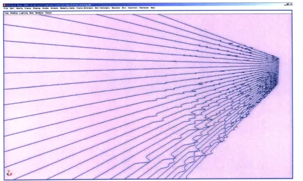
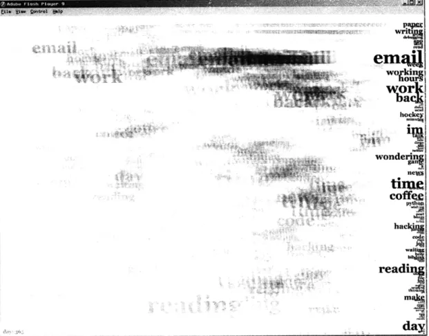
The design described in the previous section highlighted the fact that the intervals between occurrences are as important as the event itself, as rhythm in music, for example, is a product of both sound and its absence. Hence a natural question arises: how can one depict graphically both presence and absence? The inspiration for the waveform sketches came from sound editing and non-linear video editing application such as Audacity [1] (Fig 3-8), or Avid Media Composer [3]. Waveforms are graphic representations of audio pressure over time. Waveforms from loud sounds fluctuate further up and down from the average middle line that represents the resting atmospheric pressure.
Figure 3-8: Waveform visualization in Audacity, a sound editing application
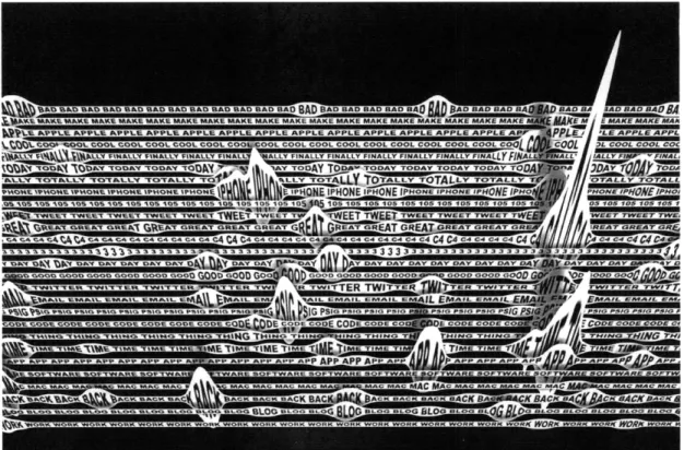
The sketch in Fig 3-9 shows a possible mapping: word occurrences are the peaks in the waveform while the silence becomes a valley. The height of the waveform also shows if a word occurs multiple times in a day (Fig 3-12). This phenomenon was not represented in the keyframe marker sketch (Fig 3-5).
To further evaluate the waveform as a representation metaphor, I have manually cre-ated a sketch where the word axis from previous sketches becomes a ribbon of repecre-ated tokens. The ribbon is stretched vertically when that particular word occurs and compressed vertically when the word has not been used (Fig 3-10). This study includes several solu-tions for separating the axes through background and foreground colors. The repetition of words leads to a perception problem. Because the day length is fixed and the word
Mo t 1 1 1 a I I I I I I t I t I II I I I I II I a I IN a I i a Ii I of I I I a 1 0 la 0W 0 0 t is I IW of1 8 I I fill oi I i i Ii ' I it i S i t In so a of l el of a I f I in littl i n a 8 of I I M I I Illl M I I I i I a aI I I I I I o I a II I t II o S#I I II I Ion If t I I t I I II I I I I I0 a I I I aa Ill 1 I IIII t to 1 I IIa IIfl 00 ll ! (I I) Is II I I I a mai I I aII I I I I I I I II I a I a I I I o I I of I I II I I 1 1 I I I a a I I I II I I I I I I I II II I I I is I I IoI I I I IIII I II I •to I II I Ia 1wI I I I I I t 8 I I i i I I I I l it if it fil t t #111t I a
Figure 3-9: Waveform sketch: Waveforms presence of a word (Illustrator)
as metaphor for visualizing the absence and
uui -- U--u- -- 3I--P-- %1 4 I<ts- '.
I).-L - - G OG Wb. 00 MULOG -- - -U- BUDG OLOB -- --MWOG
OLD--.... ... ....-. ... ... .. .. .- .
-Figure 3-10: Waveforms hand-drawn study: text is warped to fit a waveform pattern (Illus-trator) 41 S I I I a i I I of I oI
ll
)I Ag 1 1 stI SI I I ( I (I I I I I-'I!
I i I o r , I I I # # I I ! I I SI ! ri ! ,, .lio# o1. to f I I If I) II II it I I t 1 v1 II to too I I 1 9 f III I i II I I I I I a fall S II I I, ! I I I I a of I I I I l I II I I I I I o I II I Io I I I of I oil8 r I I tr I I I I la l I 1 0 M a I I I o II I I I ! II I= I 0 1 II I I r I IiiI • • t ol Ill a I I I I ,r ,r I I I I I I t I I I I I 1 I i i I I,I SW ,ia6
I II1
1
of oft1
r i i II II iI n I I I I II I it II I a I I1 oI Rk CKAAm- AA A
--...
,--Figure 3-11: Waveforms hand-drawn study: the first and last letter of the word are used to create the "valley" of the waveform allowing for better legibility (Illustrator)
Figure 3-12: Waveforms sketch: Visualization of word occurrences on a 3D cubic spline. The intensity of peaks on the curve is directly proportional to the number of times a word occurs in a day. (Python, OpenMaya, Maya screenshot)
---wr Q
length varies from axis to axis, the interval of warped text does not always coincide with the full word. As an example, on the "blog" axis the ideal warp should happen on the full word: BLOGBLOGBLOG. This is not usually the case, and the result could be such as: BLOGBLOGBLOG or BLOGBLOG. Fig 3-11 shows a study of several solutions to ad-dress this issue. The word can be resized to the width of one day and always be stretched correctly, if the first and last letters are used to create the valley that denotes its absence.
FINALLY
i ... ...
Figure 3-13: Type-on path method hand-drawn study (Illustrator)
The algorithmic sketch in Fig 3-14, shows another problem with this design. If the axes are too close to each other, keyframes could overlap and the top ribbon would be occluded (the z-order 2 increases as the word axes are added). If the axes are too far apart, a lot of wasteful negative space is introduced (Fig 3-15).
Fig3-13 shows other explorations of typographical strategies to represent flow and rhythm. Previous sketches examined what can be done by challenging the inherent rectan-gularity of type by warping the letters. This study employs the use of type-on- path method where letters are aligned to a cubic curve that describes the occurrence of a particular word. The length of interval of "silence" for that particular word would be encoded in the angle
2
Z-order refers to the order of drawing objects on a two-dimensional canvas. Objects with lower z-order are behind objects with higher z-order.
I---DBAD BA 1AD BA BA DJ AD AD A F AD BAD BAD BAD KE MAKI F .... MAKE P" MAe- U4KE MA-A KE MAK
PLE Ar pPLE APPE C APLE ApPPI AP \PPLF Ab.E APP
nL COOl l1 COOL COOL CO L COOL C'" CC % '*re 1. COOL COO
ALLY FINALLY FINALLY rlMALLY FF clINALLY Iv FIN IV NALLY FINA
"Y TODAY TODAY TODAY i ' TODAY TODAY TOOAi ' Y -r IDAY TOD
)TALLY TOTALLY TOTAL "'ALLY TOTALLY I LY T TOTALLY TO1
Ilu c IPHONE IPHONE IPHONE IoONE IP 0pl fir = l"ONE IPHC
i 510 losos 105 105 "' 051 05 r 1 05 105 05 105
t
- 15 10 1 a 4 105 1es 5fEET TWEET TWEET Tw= IWEET TWEET TWEE ARP ' EET TWEET TWE
:EAT GREAT GREAT GREAT GREAT GREAT GREAT e D -rE GREA" "TEAT GRE
C44C44 C 14 C4 C4 C4 C4 C4C4 C4C4 C4 C4 C4 CC FAA " 4C4C4C
3333 32333333'3'3'333333333333333 .4 33 133333
Y DAY 0 ' DAY DAV r%', o- AY DAY DAY DAY DAY DAY DAY i , DAI |11 DAY DAY DO OODi ,I l OD GOD000 r," -'#OD GOOD GOOD GOOD GOOD GCrP I'D nr GOOD GOO
WITTEi,TTE'
it' D W
ITTE
AITTERp
PR TWIT' ER TWITTEP Em IL IIETTER S TWIIAIL EVIAIl 1U1I pIL EMAIL EI"l 'EMAIL EM' -AIL =--L EAIL EMAII tIAIL EMI
G PSIG P ll SIG PSl - nps *'1" DIG PSIG P' FIAr PSI ' PSIG PSIG PSI "'SIG PSIG
DE CODE r""c CODE CODE CP-,UII r)E CODF - ' ODE' li CODE C )E CI(c ':ODE COD
IING THI .P- THING THING I , TH, " , NG - 'I %'WlNrC 'N 4G THII
ilE TIME TIME TI ' TIME TIMF "C TIM U I TIMI: flu IC 1149 T TIME TIMI
P APP APP APP APP pP A D APP P
1DPT
P APD APP' P 0mAPP 0 'AA APP APPeFTWARE OF-"-RE SOFTWARE Sv IARE SOF'aA I SOuInbe 9OFTWARE Ot'. IARE SOF*
r UC MAC MAI UC MAC MAC MA' "AC MAC g M '' * uS4CIA MA AC MAP UlAC MAC MAC
CK BACK BACK D A BACK BA'~ WI ACK BACK BACK BACK PAt" QACK BACK BIu CRACK BACI
DG BLOG BLOG BLOG BLOG BLOG D' -BLOG BLOG BLOG BLOG BI LOG BLOG BLOG BLOG BLOI
RK WORK WORK WORK WORK WORK WORK WORK WORK WORK WORKWORKORK WORK WORK WORK WORI
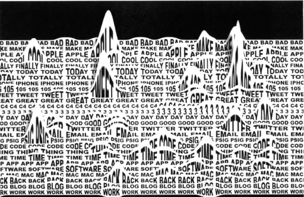
Figure 3-14: Waveforms sketch: text ribbons occlude each other when layered in 2D (Python, OpenMaya, Maya render)
Figure 3-15: Waveform sketch: in a 3D perspective the text ribbons are more legible, yet a lot of space becomes unused (Python, OpenMaya, Maya render)