HAL Id: tel-03134144
https://tel.archives-ouvertes.fr/tel-03134144
Submitted on 8 Feb 2021HAL is a multi-disciplinary open access
archive for the deposit and dissemination of sci-entific research documents, whether they are pub-lished or not. The documents may come from teaching and research institutions in France or abroad, or from public or private research centers.
L’archive ouverte pluridisciplinaire HAL, est destinée au dépôt et à la diffusion de documents scientifiques de niveau recherche, publiés ou non, émanant des établissements d’enseignement et de recherche français ou étrangers, des laboratoires publics ou privés.
Graphs
Marie Destandau
To cite this version:
Marie Destandau. Path-Based Interactive Visual Exploration of Knowledge Graphs. Human-Computer Interaction [cs.HC]. Université Paris-Saclay, 2020. English. �NNT : 2020UPASG063�. �tel-03134144�
Thè
se de
doctorat
NNT : 2020UP ASG063Path-Based
Interactive Visual Exploration
of Knowledge Graphs
Thèse de doctorat de l’université Paris-SaclayÉcole doctorale n◦ 580, STIC Sciences et technologies de
l’information et de la communication Spécialité de doctorat: Informatique Unité de recherche: Université Paris-Saclay, CNRS, Laboratoire de recherche en informatique, 91405, Orsay, France Référent: Faculté des sciences d’Orsay
Thèse présentée et soutenue en visioconférence totale le 18/12/2020 par
Marie Destandau
Composition du jury:
Michèle SEBAG Présidente
Directrice de recherche, Univ. Paris-Saclay, CNRS, Inria, LRI
Sihem AMER-YAHIA Rapporteur & examinatrice
Directrice de recherche, CNRS, Univ. Grenoble Alpes
Roberto GARCÍA GONZÁLEZ Rapporteur & examinateur
Professeur associé, Univ. de Lleida
Hala SKAF-MOLLI Examinatrice
Professeure associée, Univ. de Nantes
Nathalie HENRY RICHE Examinatrice
Chercheuse, Microsoft Research
Emmanuel PIETRIGA Directeur de thèse
Directeur de Recherche, Univ. Paris-Saclay, CNRS, Inria, LRI
Jean-Daniel FEKETE Co-encadrant
Directeur de Recherche, Univ. Paris-Saclay, CNRS, Inria, LRI
Alain GIBOIN Invité
P U B L I C AT I O N S
Journal paper
1. Marie Destandau, Caroline Appert and Emmanuel Pietriga. S-Paths:
Set-Based Visual Exploration of Linked Data Driven by Semantic Paths. Semantic Web Journal. doi: 10.3233/SW-200383.
2. Marie Destandau and Jean-Daniel Fekete. The Missing Path: Analysing
Incompleteness in Knowledge Graphs. arXiv:2005.08101. Information Visualization.
Conference paper
3. Emmanuel Pietriga, Hande G ¨oz ¨ukan, Caroline Appert,Marie Destandau,
ˇ
Sejla ˇCebiri´c, Franc¸ois Goasdou ´e and Ioana Manolescu. Browsing Linked Data Catalogs with LODAtlas. ISWC — International Semantic Web Conference 2018.
Workshop paper
4. Marie Destandau and Jean-Daniel Fekete. Diagnosing Incompleteness
in Wikidata with The Missing Path. WikiWorkshop 2020, hosted by The Web Conference 2020.
Doctoral symposium
5. Marie Destandau. Interactive Visualisation Techniques for the Web of
Data. The Web Conference 2020. doi: 10.1145/3308560.3314189.
Extended Abstracts
6. Rapha ¨elle Lap ˆotre,Marie Destandau and Emmanuel Pietriga.
Propos-ing rich views of linked open data sets : the S-paths prototype and the visualization of FRBRized data in data.bnf.fr. SWIB Semantic Web in Libraries, Nov 2019, Hamburg, Germany
7. Rapha ¨elle Lap ˆotre, Marie Destandau and Emmanuel Pietriga.
Com-posant de visualisation de donn ´ees li ´ees pour la recommandation de contenus. Atelier INRIA Culture, Nov 2018, Paris, France
8. Marie Destandau, Olivier Corby, Jean-Daniel Fekete and Alain Giboin.
Path Outlines: Browsing Path-Based Summaries of Linked Knowledge Graphs. arXiv:2002.09949.
A B S T R A C T
Keywords: Knowledge Graphs, Visualisation, RDF, Interactive Exploration,
Semantic Web, Linked Data
Knowledge Graphs facilitate the pooling and sharing of information from different domains. They rely on a flexible encoding format, the Resource De-scription Framework (RDF), which enables describing and connecting het-erogeneous data sources despite their differences. RDF data consist of sim-ple statements, named trisim-ples, that can be chained to form higher-level state-ments across datasets, following information needs. Producing interactive vi-sual interfaces to explore Knowledge Graphs is a complex problem, mostly unresolved, for two main reasons: 1) meaningful information to describe a collection can be several triples away from the entities; and 2) entities in a collection are not necessarily described with similar properties. In this thesis, I introduce the concept of semantic paths to encode aggregate information relative to a chain of triples; they consider missing information as part of the description, thus providing a common space to characterise heterogeneous resources of various depths. I first use this concept to automate the produc-tion of meaningful overviews for any set of entities. I design and implement S-Paths, an open-source browser to let users navigate through RDF collections, starting with an overview of a whole collection, and offering new overviews of the subsets as they progress through the collection, refining their selection. I report a qualitative evaluation showing that they can make sense of such overviews and remember the important dimensions of a dataset in the main lines. Then, I reuse the concept—renamed path outlines to better convey the idea of a summary—to produce path-based summaries of RDF datasets. I interview 11 data producers to confirm their interest. I design and imple-ment Path Outlines, an open-source tool based on coordinated views with two novel visualisations, the broken (out)lines and the path browser, to sup-port RDF data producers in browsing the statements that can be produced from their dataset. I compare Path Outlines with a SPARQL query editor, the current baseline technique to access path-based information, in a controlled experiment with 36 participants. I show that Path Outlines is 3 times faster, leads to better task completion, fewer errors, that participants prefer it, and find tasks easier and more comfortable with it. Finally, I apply this concept
users analyse incompleteness for groups of entities. It computes clusters with similar incomplete profiles on a map and lets users inspect and contextualize their statistical summaries. I conduct an iterative design process and evalua-tion with Wikidata contributors. Participants gain insights and find strategies to identify coherent subsets to be fixed, using the coordinated views in various exploratory ways, starting from the map or the summaries. With those 3 ap-plications, I show that path outlines, overcome some of the complexity at the heart of RDF, and not only support interactive visual interfaces for Knowledge Graphs but also help better their quality. I can foresee other applications of the concept, such as tools to design ontologies or exploratory analysis tools.
S Y N T H `E S E
Mots-cl ´es: Graphes de connaissance, Visualisation, RDF, Exploration
inter-active, Web s ´emantique, Donn ´ees li ´ees.
Les Graphes de Connaissances repr ´esentent, connectent, et rendent in-terpr ´etables par des algorithmes des connaissances issues de diff ´erents do-maines. Ils reposent sur un format d’encodage flexible, RDF (Resource De-scription Framework), qui supporte la deDe-scription et l’interconnexion de sources de donn ´ees h ´et ´erog `enes malgr ´e leurs diff ´erences. RDF est bas ´e sur des
´enonc ´es simples, nomm ´es tripl ´es, que l’on peut chaˆıner pour former des ´enonc ´es de plus haut niveau, en passant d’un jeu de donn ´ees `a un autre, en fonction des besoins d’information. Produire des interfaces visuelles inter-actives g ´en ´eriques pour explorer des collections dans des Graphes de Con-naissances est un probl `eme complexe, en grande partie non r ´esolu, pour deux raisons principales: 1) l’information pertinente pour d ´ecrire une collec-tion peut se trouver au bout d’une chaˆıne de plusieurs tripl ´es; et 1) les en-tit ´es d’une collection ne sont pas toujours d ´ecrites avec des propri ´et ´es iden-tiques. Dans cette th `ese, je propose le concept de chemins s ´emantiques pour d ´ecrire les ´enonc ´es de haut niveau: il encode des informations agr ´eg ´ees rel-atives `a une chaˆıne de tripl ´es, et consid `ere l’information manquante comme partie int ´egrante de la description, produisant ainsi un espace commun pour caract ´eriser des ressources h ´et ´erog `enes de profondeur vari ´ee. Dans un pre-mier temps, j’utilise ce concept pour g ´en ´erer des vues d’ensemble de fac¸on automatique pour tout ensemble d’entit ´es. Je designe et impl ´emente S-Paths, un navigateur open source qui permet d’explorer des collections en partant d’une vue de toute la collection, pr ´esentant de nouvelles vues synth ´etiques `a mesure que les utilisateurs affinent leur s ´election. Je relate une ´evaluation qualitative montrant que les participants arrivent `a interpr ´eter ces vues d’ensemble et m ´emorisent les dimensions importantes du jeu de donn ´ees dans les grandes lignes. Dans un deuxi `eme temps, j’utilise ce concept—renomm ´e profils de chemins afin de mieux traduire l’id ´ee de r ´esum ´e—pour produire des r ´esum ´es bas ´es sur les chemins. J’interviewe 11 producteurs de donn ´ees pour con-firmer leur int ´er ˆet. Je designe et impl ´emente Path Outlines, un outil open source bas ´e sur des vues coordonn ´ees avec 2 nouvelles visualisations, les lignes bris ´ees et le navigateur de chemins, pour permettre aux producteurs
la technique de r ´ef ´erence pour acc ´eder `a des informations bas ´ees sur les chemins, dans une exp ´erience contr ˆol ´ee avec 36 participants. Je montre qu’il est 3 fois plus rapide, m `ene `a un meilleur accomplissement des t ˆaches et moins d’erreurs, que les participants le pr ´ef `erent et trouvent les t ˆaches plus faciles et plus comfortables quand ils l’utilisent. Dans un troisi `eme temps, j’applique ce concept `a l’analyse de l’incompl ´etude d’un jeu de donn ´ees. Je designe et impl ´emente The Missing Path, un outil de visualisation open source bas ´e sur des vues coordonn ´ees pour permettre aux producteurs de donn ´ees d’analyser l’incompl ´etude de sous-ensembles. L’outil calcule des groupes avec des profils similaires et les dispose sur une carte. Les util-isateurs peuvent s ´electionner un sous-ensemble, inspecter sa distribution, et le situer dans le contexte du jeu de donn ´ees complet. Je rapporte un processus de design it ´eratif et une ´evaluation qualitative avec 9 contribu-teurs Wikidata. Les participants acqui `erent des connaissances et trouvent des strat ´egies pour identifier des sous-ensembles coh ´erents `a r ´eparer, en util-isant les vues coordonn ´ees de diverses mani `eres exploratoires, `a partir de la carte ou des r ´esum ´es. `A travers ces 3 applications je montre que les profils de chemins, en abstrayant une partie de la complexit ´e de RDF, permettent non seulement de supporter des interfaces visuelles interactives, mais aussi d’am ´eliorer la qualit ´e des Graphes de Connaissances. J’envisage d’autres applications pour le concept, telles que des outils pour le design d’ontologies ou l’analyse exploratoire.
R E M E R C I E M E N T S
Cela pouvait sembler insens ´e de se lancer dans une th `ese `a 37 ans, sans dipl ˆome de master. Merci `a tous ceux qui ont consid ´er ´e ce projet s ´erieusement, en d ´epit du bon sens, et m’ont aid ´ee `a l’amorcer. En particulier, merci `a Pierre Marie de m’avoir aid ´ee `a trouver comment surmonter tous les obsta-cles. Merci `a Rodolphe Bailly de m’avoir donn ´e l’opportunit ´e de rejoindre le projet Doremus. Merci `a tous les membres du projet Doremus, et `a tous les coll `egues de la Philharmonie. Merci `a Rapha ¨el Troncy et Konstantin Todorov de m’avoir enseign ´e les bases du Web S ´emantique, donn ´e l’opportunit ´e de participer `a leurs papiers, et ´ecrit des lettres de recommandation g ´en ´ereuses. Merci `a Marie Despr ´es-Lonnet d’avoir supervis ´e mon m ´emoire de master, me permettant d’obtenir la mention indispensable pour un financement. Merci `a Bertrand S ´erieyx de m’avoir pr ´esent ´ee `a Camille Picard qui m’a orient ´ee vers l’INRIA. Merci `a Alain Vagner de m’avoir appris l’existence de Google Scholar, m’ouvrant les portes d’un nouveau monde. Merci `a G ´erard Denis pour le TOEFL. Merci `a Hugues Moreno, Viviane Roth et Marie de Ramefort. Et merci `a tous ceux qui m’ont encourag ´ee, d’une fac¸on ou d’une autre.
Les trois ann ´ees qui ont suivi se sont r ´ev ´el ´ees encore plus insens ´ees. Merci `a tous ceux qui m’ont aid ´ee `a tenir bon et `a aller jusqu’au bout. Merci `a Jean-Daniel Fekete de m’avoir recueillie dans son ´equipe de choc, de m’avoir appris `a ´ecrire un papier et une revue, de m’avoir encourag ´ee `a avoir l’air plus s ˆure de mon travail, et d’avoir finalement dirig ´e cette th `ese. Merci `a tous les membres d’Aviz: Natkamon Tovanich, Pierre Dragicevic, Petra Isen-berg, Catherine Plaisant, Paola Valdivia, Sarkis Halladjian, Tanja Blascheck, Fr ´ed ´eric Vernier, Micka ¨el Sereno, Xiyao Wang, Tanja Blascheck, Lonni Be-sancon, Katia Evrat, Ga ¨elle Richer, Yuheng Feng, Jiayi Hong, Alexis Pister, Alaul Islam, Tobias Isenberg et Steve Haroz. Merci `a ILDA, et en particulier `a Anna Gogolou, Adhitya Kamakshidasan, Maria Lobo, Arnaud Prouzeau, Bruno Fruchard et Dylan Lebout. Merci `a Ex-Situ, et particuli `erement `a Wendy Mackay et Michel Beaudoin-Lafon pour leurs formidables cours et s ´eminaires, et `a Jean-Philippe Rivi `ere et Yi Zhang. Merci `a Raphaelle Lap ˆotre et Aude Le Moullec-Rieu, de la Biblioth `eque nationale de France, pour leurs appr ´eciations
´eclair ´ees et leur soutien. Merci `a Juliette pour les dessins. Merci `a Wimmics, en particulier `a Alain Giboin et Olivier Corby pour la collaboration sur Path
port technique toujours parfaitement aimable et diablement efficace: Laurent Darr ´e, Vincent N ´eri, Denis Humbert et Anthony Pensel. Merci `a Christian Poli pour Gunicorn. Merci `a Edoardo Cecchin pour les vid ´eos, `a Valentina P ´erez Llosa et Markus Detmer pour la voix. Merci `a Silvio Cardoso pour la super exp ´erience d’enseignement partag ´e. Merci `a Nicolas Ferey et Julien Nelson. Merci `a Ben Steichen pour ses conseils pr ´ecieux au Consortium Doc-toral de TheWebConf. Merci `a Thomas Minier, Hala Skaf-Molli, Pascal Molli, Ahmed El Amine Djebri, Lionel Medini, S ´ebastien Desbenoit et Margaret War-ren pour la super semaine partag ´ee `a San Francisco. Merci `a ma mentore en or Julie Menetrey de m’avoir aid ´ee, soutenue, et transmis des cl ´es salutaires. Merci `a l’Association Femmes et Sciences et `a l’ ´equipe du mentorat. Merci `a Val ´erie Berthou, Viviane Gamboa, Nicolas Anciaux, Anne Brun. Merci `a Ste-fan M ¨unnich. Merci `a Odile Duplessis pour les super formations. Merci `a Gert Rietveld pour ses conseils. Merci `a Neil et Pam pour la relecture.
Merci `a tous les participants des ateliers et exp ´eriences. Je ne les nom-merai pas, car leur participation ´etait anonyme, mais je tiens a leur dire que je me souviens pr ´ecis ´ement de chacun d’entre eux, que j’ai ´et ´e vraiment im-pressionn ´ee par leurs comp ´etences et qualit ´es et que leurs retours m’ont beaucoup fait avancer.
Merci `a Logilab—chez qui j’ai pass ´e quelques mois `a attendre une r ´eponse venue trop tard pour faire cette th `ese en CIFRE—, et notamment `a Tanguy Le Carrour pour les cours de Python, JS et TDD, et `a Adrien Di Mascio, Marla Da Silva, David Douard et Nicolas Chauvat.
Merci `a ma famille, avec une mention sp ´eciale pour mes cousines C ´eline, Clorinde et Cl ´emence, leurs moiti ´es, et Sarah et Nico. `A la m ´emoire de Monique et de Josy, dont le regard bienveillant et la g ´en ´erosit ´e m’accompagnent au quotidien, malgr ´e leur absence.
Merci `a mes amis, et particuli `erement `a Marie, Christophe, St ´ephane V., Ellen, Ghislaine, Elisabeth, Germain, Pierre, Charlotte, Julien, St ´ephane A., H ´el `ene, Guy, Marie-Anne, Domi, Laurence et Blaise, J ´er ˆome, Hugues, Liselotte et Charles.
Merci infiniment `a Flo, mon merveilleux mari.
C R E D I T S
S-Paths prototype
Icons: Data Visualization Icon Set and The Noun Project
The Missing Path prototype
Pictograms by The Noun Project.
Manuscript
Drawings inFig. 2,Fig. 3,Fig. 4,Fig. 30,Fig. 32,Fig. 35,Fig. 41andFig. 56
by Juliette Taka.
C O N T E N T S
Publications iii
Abstract v
Synth `ese (abstract, in french) vii
Remerciements (acknowledgements, in french) ix
Credits xi 1 I N T R O D U C T I O N 3 1.1 Thesis statement . . . 5 1.2 Thesis overview . . . 5 1.3 Contributions . . . 6 1.3.1 Theoretical contributions . . . 6 1.3.2 Technological contributions . . . 6 1.3.3 Empirical contributions . . . 7 2 B A C K G R O U N D A N D R E L AT E D W O R K 9 2.1 Introduction to RDF . . . 9 2.2 RDF for humans . . . 11 2.2.1 Data producers . . . 12 2.2.2 Data reusers . . . 14 2.2.3 Lay users . . . 15
2.3 Visualising RDF data: overview or detail . . . 16
2.3.1 RDF browsers . . . 16
2.3.2 RDF visualisation systems . . . 17
2.3.3 Summary visualisations and profilers . . . 18
2.4 Overviews in Multivariate Graph Visualisation . . . 18
3 S-PAT H S 21 3.1 Inspiration . . . 21 3.2 Semantic paths . . . 23 3.3 System . . . 27 3.3.1 View specification . . . 27 3.3.2 Matching algorithm . . . 29 xiii
3.3.3 SPARQL query mechanism . . . 30 3.3.4 Configuration . . . 32 3.3.5 Implementation . . . 32 3.4 User interaction . . . 33 3.4.1 Selection of a collection . . . 34 3.4.2 View configuration . . . 34 3.4.3 Subset selection . . . 36
3.4.4 Navigation and transitions between views . . . 37
3.4.5 Pivot . . . 39
3.5 Illustrative scenario . . . 40
3.6 Evaluation . . . 46
3.6.1 Learning and cognition . . . 46
3.6.2 Information novelty . . . 48
3.6.3 Engagement and enjoyment . . . 49
3.7 Limitations . . . 49
3.7.1 User interaction . . . 49
3.7.2 Data processing . . . 49
3.7.3 Available views . . . 50
3.8 Discussion and future work . . . 50
4 PAT H O U T L I N E S 53 4.1 Motivation . . . 54
4.2 Introduction . . . 54
4.3 Related work . . . 55
4.3.1 Visualisation of paths in RDF data . . . 55
4.3.2 RDF summaries for data curation . . . 56
4.3.3 Querying summary information . . . 57
4.4 The concept of path outlines . . . 58
4.4.1 Definition . . . 58
4.4.2 LDPath API . . . 60
4.5 User study 1: Validating the approach . . . 60
4.5.1 Participants . . . 61
4.5.2 Set up and procedure . . . 61
4.5.3 Results . . . 61
4.6 Path Outlines, the tool . . . 62
4.6.1 Design requirements: from overview to detail . . . 63
4.6.2 Interface: coordinated views to display complex objects . . 63
4.6.3 Scenario of use . . . 67
C O N T E N T S xv
4.7 User study 2: evaluating Path Outlines . . . 71
4.7.1 Participants . . . 71
4.7.2 Setup . . . 72
4.7.3 Tasks . . . 73
4.7.4 Procedure . . . 73
4.7.5 Data collection and analysis . . . 74
4.7.6 Results . . . 75
4.8 Discussion and conclusion . . . 79
5 T H E M I S S I N G PAT H 81 5.1 Introduction . . . 82
5.2 Background and related work . . . 83
5.2.1 Introduction to RDF data . . . 83
5.2.2 Completeness in RDF . . . 85
5.3 Data Representation and Processing . . . 87
5.3.1 Paths summaries . . . 87
5.3.2 Retrieval of the entities . . . 87
5.3.3 Values as vector embeddings . . . 88
5.3.4 The completeness matrix . . . 88
5.3.5 Advanced summaries . . . 89 5.4 User Interface . . . 89 5.4.1 Design rationale . . . 89 5.4.2 2D map of entities . . . 90 5.4.3 Paths histograms . . . 91 5.4.4 Selection bar . . . 96 5.5 Scenario of use . . . 97
5.6 User Study: Iterative Design and Evaluation . . . 99
5.6.1 Participants . . . 99
5.6.2 Set-up . . . 99
5.6.3 Procedure . . . 100
5.6.4 Data collection and analysis . . . 101
5.6.5 Results . . . 102
5.7 Conclusion and future work . . . 106
6 C O N C L U S I O N A N D D I S C U S S I O N 107 6.1 Summary . . . 107
6.2 High-level insights . . . 108
6.2.1 Information space . . . 108
6.3 Open perspectives . . . 110
6.3.1 Path outlines as interoperable metadata . . . 110
6.3.2 Visualising the structure of Knowledge Graphs . . . 111
6.3.3 Exploring the content of Knowledge Graphs . . . 113
6.3.4 Evaluating understanding . . . 114
6.4 The end... is a new beginning . . . 114
B I B L I O G R A P H Y 115 A P R E L I M I N A R Y S K E T C H E S F O R S-PAT H S 133 B R E P O R T S O F T H E W O R K S H O P S C O N D U C T E D W I T H R D F E X -P E R T S A N D L AY U S E R S (I N F R E N C H) 135 C E VA L U AT I O N O F S-PAT H S — F I N A L Q U E S T I O N N A I R E 155 D E VA L U AT I O N O F PAT H O U T L I N E S — TA S K S 157 D.1 Nobel dataset . . . 157 D.2 Persee dataset . . . 157
L I S T O F F I G U R E S
1 Samples extracted from Nobel (10 triples) and DBpedia datasets (2 triples) comparing 3 representations: a) a serialisation with Turtle syntax, which is meant for machines, but verbose and difficult to de-cipher for humans; b) an interpretation of each triple as a sentence understandable by humans to help understand the chaining mecha-nism; c) a visualisation as a node-link diagram showing how triples are connected and can be chained; it is easy to follow the paths but difficult to read their labels and make sense of them. The samples are interconnected; it is possible to combine them. Full datasets contain respectively 87,422 and 185,404,534 triples (on 2019-09-07). 10
2 RDF data producer: Bob is trying to figure out what his own dataset contains. . . 12
3 RDF data reuser: Tim is trying to understand how the information he wants to access is expressed. . . 13
4 RDF lay user: Alice is trying to find out if the dataset published by the government contains information of interest. . . 14
5 Following the paths to describe a collection of entities allows to‘reorganise’ its description in higher-level categories. . . 22
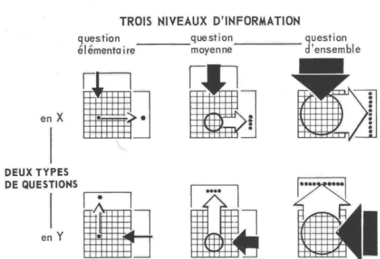
6 According to Bertin, the efficiency of a visualisation grows with the level of question that it allows to answer. . . 23
7 Conceptual query template to retrieve paths characteristics for all paths of depth n. S-Paths splits this query into multiple queries, fol-lowing a divide-and-conquer strategy, as described inFig. 8. . . 25
8 Query templates dividing the query in Fig. 7 into multiple queries. The first query is called iteratively for each path of depth n, to find all the paths of depth n + 1 extending this path. The second and third queries are called for each path. . . 26
9 Binned scatterplot view definition. The view defines 2 dimensions, the first dimension is mapped to the x axis and the second to the y axis. . . 27
10 Query templates used to populate views. The 3 types of queries correspond to the view type listed inTable 1. . . 28
11 Process for generating a default view. The matching algorithm com-pares the semantic paths with the view requirements to present the most readable overview to users. . . 31
12 Example views for the French National Library data, showingfoaf:Document resources along two semantic paths: foaf:Document/dcterms:subject/*/ foaf:focus/*/bnf:languageOfThePerson/*and foaf:Document/
dcterms:subject/*/bnf:dateCreated/*. Although no path with a label was found for the y axis, we have a simple, synthetic view of documents organized according to their author’s date of birth, and language. A use case for it could be librarians needing to identify interesting authors and documents to prepare a cultural diplomacy event honoring a particular culture. . . 34
13 Default view on the nobel:Laureatecollection, showing their date
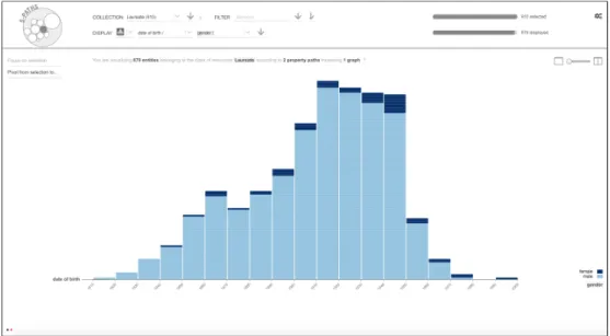
of birth (semantic path of depth 1 nobel:Laureate/dbpedia:dateOfBirth/* mapped to x-axis) and their gender (semantic path of depth 1
nobel:Laureate/foaf:gender/*mapped to colour scale). . . 35
14 Another view on the nobel:Laureate collection, switching dimen-sions to award year (semantic path of depth 2 nobel:Laureate/ nobel:nobelPrize/*/nobel:year/*aggregated by decade) and
dis-cipline (semantic path of depth 3 nobel:Laureate/nobel:laureateAward/*/ nobel:category/*/rdfs:label/*mapped to colour scale). . . 35
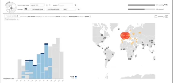
15 Another view on nobel:Laureate collection, switching to a map view offers as first choice the laureates’ birthplace latitude and longi-tude as the dimensions used to plot Nobel laureates on the map (se-mantic path of depth 3 nobel:Laureate/dbpedia:birthPlace/*/ owl:sameAs/*/wgs84 pos:lat/*and wgs84 pos:long/*). It is pos-sible to switch to the dbpedia:deathPlace. . . 36
16 Animated transition from a sub-selection made in a binned scatter-plot showing counts for nobel:AwardFile aggregated by decade, to a histogram showing the distribution of prizes per discipline for each individual year. Start state. . . 37
17 Animated transition, sample intermediate frame. Elements no longer present in the target view are faded out, and visual marks corre-sponding to aggregates get decomposed into groups that will tran-sition towards the same target. . . 38
18 Animated transition, sample intermediate frame. Groups get smoothly interpolated along relevant encoding channels: position, colour, shape.
List of Figures xix
19 Animated transition, sample intermediate frame. Elements that did not exist in the source view fade in. . . 38
20 Animated transition, end state. . . 39
21 Brushing & Linking between two views: items selected on the map are highlighted in the histogram. . . 40
22 Nobel prize use case (a) binned scatterplot showing the count of Awardsper year (dbpedia:Award/nobel:year/*, binned by decade) and category (dbpedia:Award/nobel:category/*). . . 42
23 Nobel prize use case (b): binned scatterplot showing the count of Awardsper award share (dbpedia:Award/nobel:share/*) and cat-egory (dbpedia:Award/nobel:category/*). . . 42
24 Nobel prize use case: (c) histogram showing the repartition of Awards
over the years (dbpedia:Award/nobel:year/*) by gender (dbpedia:Award/ nobel:laureate/*/gender/*). . . 43
25 Nobel prize use case: (d) map showing Awards along latitude (
dbpedia:Award/dbpedia:birthPlace/*/owl:sameAs/*/wgs84 pos:lat/*) and longitude (dbpedia:Award/dbpedia:birthPlace/*/owl:sameAs/*/ wgs84 pos:long/*). . . 43
26 Nobel prize use case: (e) histogram showing Laureatesby gender ( nobel:Laureate/foaf:gender/*) and date of birth (nobel:Laureate/ dbpedia:dateOfBirth/*). . . 44
27 Nobel prize use case: (f) info card detailing all semantic paths for one laureate in the collection. . . 44
28 Nobel prize use case: (g) histogram showing Laureatesby gender (
nobel:Laureate/foaf:gender/*) balanced by category (nobel:Laureate/ nobel:category/*). . . 45
29 Nobel prize use case: (h) timeline of all events for a subset of nobel:Laureate. . . 45
30 Participants to our evaluation, corresponding to our 3 persona: data producers, data reusers and lay users. . . 47
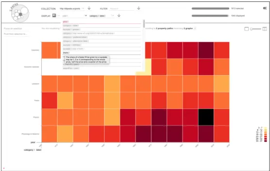
31 Path Outlines displays the analysis of paths of depth 3 for theLaureates collection in the Nobel dataset. The user has used the filter panel to see only the paths describing more than 80% of the entities: from the initial 80 paths of depth 3, only the 43 paths are left, other are filtered out. The user is currently hovering a property in the second column, which highlights in other columns all properties involved in sequences going through it. Clicking on this property would filter out properties that are not highlighted. . . 53
32 A path outline: for a collection S (red nodes) sharing a similarity cri-terium C (green node), a given sequence of properties p1/p2/ . . . /pn (light blue edges) leads to a set of objects O. S and O are charac-terised with a set of measures M. One can see that the starting entity for which the path is missing is taken into account in the sum-mary. . . 58
33 Template string for a path outline, summarising the Nobel laureates having an affiliation, located in a city, having a similarity link to an-other resource. Intermediate sets of resources are designated by stars, indicating that they can be of any type. Those resources are both the objects of the preceding predicate, and the subjects of the next. . . 60
34 Usage and interest of data producers regarding the scenarios: a) they hardly ever perform similar tasks, b) but would be very inter-ested in a tool supporting them. . . 62
35 Broken (out)lines algorithm: broken (out)lines are drawn and posi-tioned according to the maximum depth of path outline, using geo-metrical principles to fit in the circle. . . 64
36 The same 18 path outlines displayed in a Sankey Diagram (a) and the path browser (b). Hovering the property loc:aut highlights all matching sequences. . . 67
37 From overview to detail. At launch, the tool presents all available datasets (1), users can filter them by size and name (2). . . 68
38 When a dataset is selected, interlinked datasets are placed aside (5), and collections (4) are presented inside the open dataset (3). Users can filter collections by size and name (6). . . 68
39 When a set is selected, path outlines of depth 1 are displayed in the Path Browser (9), and users can select other depths (7). Users can filter paths by statistical feature or name (10). When a single path is hovered or selected, details are available in the detail panel (11). . 69
40 When an external dataset is selected, extensions of the current path in this other dataset are presented (12). . . 69
41 Participants to our evaluation, corresponding to expert persona: data producers and data reusers. . . 72
List of Figures xxi
42 Comparison of Path Outlines (PO) and SPARQL-V (SPARQL) on 3 tasks. a) and b) are on a Likert-Scale. a) Participants find Path Outlines more comfortable, b) they perceive similar tasks as eas-ier when performed with it, c) they are abler to complete the tasks successfully with it. . . 76
43 Comparison of Path Outlines (PO) and SPARQL-V (SPARQL) on 3 tasks. d) Participants are quicker with it and e) prefer it to SPARQL-V. . . 77
44 The map on the left shows the 4567 entities of type wdt:Q1004 Comicsin Wikidata. The clusters appearing represent groups of en-tities that share the same missing paths. The user has selected a small cluster of 20 entities on the left of the map; it is coloured in dark pink. On the left column, the histogram of paths completeness for the full collection can be compared with the histogram for the selected subset on the right. Each row represents a path as a grey bar; its length is mapped to its percentage of completeness. The left part of a row is coloured in yellow if the path is missing in the selected subset and in dark pink if there is a significant difference between the full collection and the subset summaries. . . 81
45 Screenshot of LD-VOWL, taken on 2020-12-12 atvowl.visualdataweb.org/ldvowl. The user has selected the property ‘affiliation’ (in red) and can see
in the top right panel that it is used 747 times. To know the rate of completeness of this property relative to the class Person, she needs to select the node Person, read in the panel that there are 910 instances, and compute that 747/910*100 = 82% of the per-sons have an affiliation. . . 84
46 Screenshot of Path Outlines, taken on 2020-12-05 at spf.lri.fr. The user can browse the paths for a collection, filtering them on their completeness rate (among other metrics), and inspect the com-pleteness rate of each path. . . 85
47 Screenshot of Integraality for Wikidata, taken on 2020-12-12 at
wiki-data.org/wiki/Wikidata:WikiProject sum of all paintings/Property statistics/Sandbox. The color scale helps users compare the completeness rate in the
different groups. However, as the table scrolls over more than 5 screen heights, it is actually difficult to read and use. . . 86
48 Collections C1, C2, C3, C4 and C6 (see Table 4). The number of clusters, their size and distribution provide a visual footprint of the shape of a collection, relative to the set of paths selected to produce the map (highlighted in pink on the right side of each thumbnail). . . 90
49 Collections C1, C2, C3, C4 and C6 (seeTable 4). Histogram on the frontpage: the steepness of the curve gives a visual footprint of the completeness of the most complete paths in the collection. Scrolling down allows to see all paths. C1 is our demo collection, it was not curated as a wikiproject, so very few paths are fully complete, and there is a sharp decrease with a long tail of paths with a low rate of completeness. C2 is maintained by an active team of 10 contrib-utors, a large number of paths is complete. C3 is more balanced, it is a catalog of films curated before it was imported. C4 has been created and curated over a short time mostly by one contributor. C6 is a starting project mixing sets of data which were curated separately. 92
50 Summary of values for a path: the whole collection is presented on the left, in comparison to the selection on the right. The summary details values representing more than 5% of the total, and aggre-gates others: for the whole collection, only 3 of the 54 unique values are well represented enough to be detailed; the 51 that remain are merged in the ‘other’ rectangle, represented with a dotted texture. Hovering a rectangle displays the label and count of the value it rep-resents. Each value, including the aggregate, can be clicked to be added as a condition for a selection. . . 93
51 Hovering a predefined zone on the map highlights it in yellow, and gives access to the + button, to use it as a condition for a selec-tion. It also displays and highlights in yellow the names of the paths missing for the entities in this zone. . . 94
52 The user can click on an element of the summary to add it to the se-lection (top). Once added, it becomes dark pink, and clicking again will remove it (bottom). . . 94
List of Figures xxiii
53 The selection bar contains controls to inspect and refine the condi-tions for a selection and its result. The number of checkboxes in ( a) shows how many conditions are pending (here, there is one). Click-ing on (a) displays the query in pseudo code (seeFig. 54). Clicking on (b) retrieves the list of entities matching the conditions and their summary. When a selection has been retrieved, (c) indicates the number of the list of entities in the selection, clicking on it displays the list inFig. 55. (d) enables to export the selection, and (e) to clear it. 94
54 Conditions for a selection are expressed in pseudo code, to let users understand how the tool retrieves entities. They can refine them by toggling the elements that are underlined : ‘having’ can be switched to ‘not having’, resulting in the inverse condition, and ‘the whole col-lection” to ‘the current selection’. . . 95
55 List of entities in the current selection. The label is in the preferred language when available. Clicking on the URI opens it in a new win-dow. . . 95
56 Participants to our evaluation, corresponding to expert persona: data producers and data reusers. . . 100
57 Evolution of the layout for dates summaries during the iterative pro-cess. This is the summary for the path schema:dateModified on the collection C1 Comics. In the first version (top) the dates were grouped by unique values, which very often resulted in an ‘other’ aggregate, laid out with a dotted texture. After participants’ feed-back we implemented binning for dates (bottom), which results in 4 groups, from right to left: “2018” (4150), “2019” (4423), “2020” (460) and ‘other’ (100) — hovering the rectangles reveal the value and counts. Each value can be used as a condition for selection. . . 103
58 Entities highlighted on the map of the collection C6 when all entities having afactgrid:prop/P17 Dataset complaintare selected. The contributor who made those statements explained he worked on small groups of consistent entities, and we can see they appear as such on our map, although P17 is not used to compute the map. This shows that those consistent groups miss the same well repre-sented attributes. . . 105
59 Sketch of a new version of the path browser, supporting simultane-ously paths of various depths. . . 111
60 Sketch of an extended version of the broken outlines visualisation, showing links between the different datasets and their named graphs.112
62 Early sketch, interface. Heatmap showing groups of entities organ-ised by date on the x-axis, and a category on the y-axis, enriched by two other categories that will be highlighted when a selection is made (top and right bars) . . . 133
63 Timeline showing entities organised by date on the x-axis, enriched by two other categories that will be highlighted when a selection is made (left and top-right bars) Chord diagram showing entities and relations between them, enriched by two other categories that will be highlighted when a selection is made (left and right bars) . . . . 134
64 Hierarchical treemap showing groups and subgroups of entities, en-riched by two other categories that will be highlighted when a se-lection is made (left and right bars). The top and bottom bars are not used because the system found no attributes to fill them. ”Story components”, complementary to the main component. . . 134
L I S T O F TA B L E S
1 Default configuration of view templates as configured for the Nobel dataset. . . 24
2 Characteristics of semantic paths. . . 25
3 Measures describing a path outline . . . 59
4 Data collections visualised in the tool for the evaluation, available in the demo instance. * The Illuminati collection comes from an instance of Wikibase, Factgrid . . . 102
List of Tables 1
We cannot solve our problems with the same level of thinking that created them.
1
I N T R O D U C T I O NKnowledge Graphs (KG) [53] are everywhere. The technology is underly-ing in our everyday life, powerunderly-ing search engines [125], recommender sys-tems [129] and connected objects [67]. The power of KG comes from their simple and flexible encoding format, the Resource Description Framework (RDF), that allows to describe and connect heterogeneous data sources. Merg-ing data from different domains increases their value, which is “directly pro-portional to the interlinkedness of the data” [88]. Companies use them to carry out global corporate knowledge management strategies, with applica-tions ranging from risk management to process and factory monitoring [57]. Institutions [111] and communities [36] rely on them to publish and share their data in an interoperable format. Digital Humanities researchers use them to support exploration and analysis of large corpus connecting various sources and are starting to investigate machine learning assisted applications such as knowledge discovery and computational creativity [60]. In the context of smart cities, they support the management of various indicators acquired from a multitude of sources including instruments, sensors, humans, and computer models [105]. When published on the web, RDF data can be queried jointly through federated queries, forming a network of interlinked sources, known as the Web of Data or the Semantic Web.
Although the technology is developing rapidly, it faces a difficulty that threat-ens the quality of data: the lack of generic interfaces to browse a dataset. If RDF data are designed to be processed by algorithms, humans still need to interact with them at some point, at least to control their production, and to design and develop the algorithms to consume them. Developing a specific application for each dataset has a cost, and takes time. As a result, most of the time, accessing RDF data implies reading raw data files with hundreds of thousands of lines or querying them with SPARQL, the query language for RDF data. This requires technical skills, time and concentration, and hinders the detection of errors and irregularities.
As I worked for Philharmonie de Paris1 on a research project aiming to transform into RDF and interlink the musical catalogues of 3 institutions [3],
1 philharmoniedeparis.fr
from 2015 to 2016, I was struck that the data producers could not see their data. From the moment the Modeling Working Group delivered the mapping rules for the transformation of original data sources, it took more than a year to develop a specific interface to visualise them. In the meantime, they had to rely on their knowledge of original data, of mapping rules and of target ontologies to imagine what the result would be. Though they were librarians, with an impressive ability to think abstractly, and a precise knowledge of the original data, this was constantly raising difficulties and misunderstandings. They spent a significant amount of time trying to represent samples of data in hand made node-link diagrams and spreadsheets to be able to work together. At this time, I also met other RDF data managers and developers in meetups and professional conferences, and I realised that many of them were facing similar problems. I tried to develop a browser for SKOS thesauri. In a na¨ıve approach, I used a tree-like node-link diagram layout, matching the structure of data, and had to acknowledge that it did not scale, neither graphically nor from a performance point of view. With 10 years of experience developing web applications, I could not find a satisfying solution. And I was only addressing the specific case of SKOS thesauri, for which the structure is more or less known in advance. This experience provided the motivation for this thesis.
Starting this research, I discovered that there is actually an impressive num-ber of tools, but that they have limitations preventing their effective use. RDF data are graph data, based on simple statements, named triples, that can be chained to form higher-level statements. For instance, ‘Marie Curie is affiliated to Sorbonne University’ and ‘Sorbonne University is located in Paris’ are two triples, that can be chained to produce the statement ‘Marie Curie is affiliated to Sorbonne University in Paris’. Producing interactive visual interfaces to ex-plore Knowledge Graphs is a complex problem, mostly unresolved, for two main reasons: 1) meaningful information to describe a collection (e.g. Nobel laureates) can be several triples away from the entities (the laureates); and 2) entities in a collection are not necessarily described with similar properties (e.g. affiliated to or located in).
On the one hand, RDF browsers are focused on single entities, display-ing one page per entity, and lettdisplay-ing users hop in the graph one step at a time. Gaining information about a collection requires to mentally do a syn-thesis of little pieces of data, gathered one after one another, which entails a substancial cognitive load. On the other hand, visualisation systems pro-duce overviews, but involving only a few direct properties, and with little sup-port for navigation. RDF data seem to defeat the Information Seeking Mantra,
1.1 T H E S I S S TAT E M E N T 5
‘Overview first, zoom and filter, then details-on-demand’ [113], that has shaped generations of interfaces to browse collections of data. In the related flourish-ing research on graph visualisation, state of the art interfaces for graphs do not scale to even very small RDF dataset, producing cluttered interfaces, both unreadable and unusable [109]. Parallel coordinates and matrixes accept with a limited number of attributes and values. Techniques to make node-link dia-grams scale, such as edge bundling, work only with very simple datasets en-coding a single type of relation. The representation of a RDF graph, with many items and unpredictable attributes of various types and at various depths, is still a puzzle.
Therefore, my main research question is: how to design generic inter-active interfaces to visualise collections of resources in RDF datasets, and browse them from overview to detail?
1.1 T H E S I S S TAT E M E N T
I argue that a level of granularity that matches human understanding is needed to explore collections in Knowledge Graphs: a concept to describe higher-level statements in a systematic way, that will relieve the human brain from the combinatory work needed to reconstitute chains of triples. I present the concept of semantic path—also named path outline, to encode aggregate information relative to chains of triples. By considering missing information as part of the description, it provides a common space to describe hetero-geneous resources of various depths. I demonstrate 3 applications of this concept: a browser producing overviews of collections and their subsets to support navigation through a dataset, a tool to browse the possible state-ments in a dataset, and a tool to analyse incompleteness in a dataset.
1.2 T H E S I S O V E R V I E W
In Chapter 2 B A C K G R O U N D A N D R E L AT E D W O R K, I first introduce RDF
data, their structure and the difficulties to visualise them. Then I present 3 types of users who need to interact with raw RDF datasets. I review existing tools to browse and visualise RDF data.
In Chapter 3 S-PAT H S, I first address the specific question how to
pro-duce meaningful overviews of a collection in an RDF dataset, as well as of its subsets at different scales? I introduce the concept of semantic paths,
to provide a summary of all properties or chain of properties describing a set of entities, and use it to power S-Paths, a semi-automatic browser providing synthetic views of a collection. I present its design and architecture. I report
a real use case with the data of the french national library, and a qualitative user study with 6 users.
Motivated by the reaction of the product manager ofdata.bnf.fr2to S-Paths,
Chapter 4 PAT H O U T L I N E S addresses another specific question:how to
vi-sualise the statements produced by an RDF dataset, and browse them by meaningful chunks? I present Path Outlines, an open-source tool to
sup-port RDF data producers in browsing the statements that can be produced from their dataset. It displays semantic paths—that I rename path outlines, to better convey the idea of a summary—through coordinate views with two novel visualisations, the broken (out)lines and the path browser. I report a controlled study comparing Path Outlines with the current baseline technique (Virtuoso SPARQL query editor) in an experiment with 36 participants.
Finally, addressing a limitation of Path Outlines,Chapter 5 T H E M I S S I N G
PAT H investigates the specific question:how to support visual analysis of
the incompleteness of a collection in an RDF dataset, and of its subsets at different scales? I present The Missing Path, an open-source
visualisa-tion tool to support users in analysis incompleteness for groups of entities. It uses path outlines to compute clusters with similar incomplete profiles and lay them down on a map, letting users select any subset, inspect its distribution, and compare it to the full dataset. I conduct an iterative design process and evaluation with 9 Wikidata contributors.
Finally, in Chapter 6 C O N C L U S I O N A N D D I S C U S S I O N, I summarise my contributions and discuss other applications of the concept that I can foresee.
1.3 C O N T R I B U T I O N S
1.3.1 Theoretical contributions
I introduce the concept of semantic path / path outline: for a given
col-lection, it encodes aggregate information relative to a chain of triples, con-sidering missing information as part of the description, thus providing a com-mon space to characterize heterogeneous resources of various depths. First designed as an abstraction to program S-Paths browser, its graphical repre-sentation proved useful to support tasks which necessitate to understand the structure of the content, with Path Outlines and The Missing Path.
1.3.2 Technological contributions I design and implement:
1.3 C O N T R I B U T I O N S 7
• S-Paths, a browser providing synthetic views of a collection and
any of its subset: s-paths.lri.fr. A matching algorithm compares the path outlines of the collection with the requirements of a set of views optimised to provide synthetic visualisations at various scales, and pro-vides a default view to users. The code is open-source:
gitlab.inria.fr/mdestand/s-paths;
• an API to analyse path outlines. It is open-source. It is included in S-Paths package but can be run separately3;
• Path Outlines, a tool to support RDF data producers in browsing
the statements that can be produced from their dataset:spf.lri.fr. It is based on coordinate views with two new visualisations: the broken (out)lines and the path browser, to display the path outlines. The code is open-source:gitlab.inria.fr/mdestand/spf;
• The Missing Path, an open-source visualisation tool to support
users in analysis incompleteness for groups of entities: missing-path.lri.fr. It computes clusters with similar missing path outlines and lays them down on a map, letting users select any subset, see the level of completeness of all its path outlines, relate it to the distribution of their values, and situate it in the context of the full dataset. The code is open-source:gitlab.inria.fr/mdestand/the-missing-path.
• an API to extract the content of a collection in a matrix driven by
path outlines, to support responsive processing of the content. It is
included in The Missing Path package.
1.3.3 Empirical contributions I observe that:
• users make sense of path-based overviews, remember the
impor-tant dimensions of a dataset in the main lines, and are able to imag-ine new applications for the dataset and the tool after 20 minutes of
navigation with S-Paths;
• data producers access path-based information with Path Outlines
3 times faster than with the baseline; it leads to better task com-pletion, fewer errors, they prefer it, and find tasks easier and more comfortable with it. The controlled experiment was conducted against
SPARQL Virtuoso Query editor as a baseline, with 36 participants.
Sup-3 another version of the API, supporting path outlines running across datasets, was developed by Olivier Corby as an extension of Corese, and is used for Path Outlines.
plemental material is made available: ieee-dataport.org/documents/path-outlines.
• in an iterative design process and evaluation with 9 Wikidata contrib-utors, participants gain new insights on incompleteness in their data with The Missing Path, using various exploratory strategies
supported by the coordination between the map with clusters of entities, and the statistical summaries of their path.
2
B A C K G R O U N D A N D R E L AT E D W O R KIn this section, I first introduce RDF data. Then I discuss the need for in-terfaces to browse RDF data for three types of users: data producers, data reusers and lay users. I review existing approaches and tools to visualise and browse RDF data regarding their ability to browse from overview to detail. I discuss several approaches used in network visualisation, and the limitations to apply them to RDF.
2.1 I N T R O D U C T I O N T O R D F
The interoperability of Knowledge Graphs lies in the representation of informa-tion according to a common framework, the Resource Descripinforma-tion Framework (RDF) [22]. RDF data are collections of statements named triples. Triples are composed of a subject, a predicate and an object, as shown in Fig. 1. Sub-jects can be Uniform Resource Identifiers (URIs) or blank nodes. Predicates are always URIs. Objects can be URIs (`. 4–10), literals (e.g., strings, num-bers, dates, `. 1–3) or blank nodes. The same URI can be the subject and object of several triples (`. 6, 7, and 8 or `. 7, 9 and 10). The triples form a net-work. Predicates and classes of resources are defined in data models called ontologies. For instance, the predicates of the 3 first triples and the object of the 4th belong to the FOAF [18] (friend of a friend) ontology, dedicated to the description of people and their relationships. In principle, URIs should be dereferenceable: querying them on the web should return their RDF descrip-tion. Literals can have a datatype, and string literals can be associated with a language (Fig. 1-a, grey colour). URIs can be prefixed for better readability, as
inFig. 1-c: the beginning, common to several URIs, is given a prefix (a short
name), e.g. foaf: instead of http://xmlns.com/foaf/0.1/. Formally, a RDF graph is a set of triples t = (s, p, o), with s ∈ U ∪ B, p ∈ U and o ∈ U ∪ L ∪ B. Uis the set of URIs, L the set of literals, and B the set of blank nodes in the graph.
RDF data are interlinked: a dataset can reference an entity produced in an-other one (red colour). When this happens, a chain of statements can jump from one dataset to another: the triples in Nobel Dataset la Sorbonne is in Paris, Paris entity in Nobel is equivalent to Paris entity in DBpedia can be
subject predicate object link between datasets features of object literals
NOBEL DATASET
1 <http://data.nobelprize.org/resource/laureate/6> <http://xmlns.com/foaf/0.1/name> 'Marie Curie'^^xsd:string. 2 <http://data.nobelprize.org/resource/laureate/6> <http://xmlns.com/foaf/0.1/birthday>'1867-11-07'^^xsd:date. 3 <http://data.nobelprize.org/resource/laureate/6> <http://xmlns.com/foaf/0.1/gender>'female'@en^^xsd:string. 4 <http://data.nobelprize.org/resource/laureate/6> <http://www.w3.org/1999/02/22-rdf-syntax-ns#type> <http://xmlns.com/foaf/0.1/Person>. 5 <http://data.nobelprize.org/resource/laureate/6> <http://www.w3.org/1999/02/22-rdf-syntax-ns#type> <http://data.nobelprize.org/terms/Laureate>. 6 <http://data.nobelprize.org/resource/laureate/6> <http://dbpedia.org/ontology/affiliation> <http://data.nobelprize.org/resource/university/Sorbonne_University>. 7 <http://data.nobelprize.org/resource/university/Sorbonne_University> <http://dbpedia.org/ontology/city> <http://data.nobelprize.org/resource/city/Paris>. 8 <http://data.nobelprize.org/resource/university/Sorbonne_University> <http://www.w3.org/1999/02/22-rdf-syntax-ns#type> <http://dbpedia.org/ontology/University> . 9 <http://data.nobelprize.org/resource/city/Paris> <http://www.w3.org/1999/02/22-rdf-syntax-ns#type> <http://dbpedia.org/ontology/City> . 10 <http://data.nobelprize.org/resource/city/Paris> <http://www.w3.org/2002/07/owl#sameAs> <http://dbpedia.org/resource/Paris> . DBPEDIA DATASET
11 <http://dbpedia.org/resource/Paris> <http://www.w3.org/2003/01/geo/wgs84_pos#lat>'48.856701'^^xsd:float. 12 <http://dbpedia.org/resource/Paris> <http://www.w3.org/2003/01/geo/wgs84_pos#long>'2.350800'^^xsd:float. NOBEL DATASET
1 (the entity representing) Marie Curie is namedMarie Curie. 2 Marie Curie was born on1867-11-07. 3 Marie Curie’s gender isfemale. 4 Marie Curie is aPerson. 5 Marie Curie is aNobel Laureate.
6 Marie Curie’s affiliation isSorbonne University. 7 Sorbonne University’s city isParis.
8 Sorbonne University is aUniversity. 9 Paris is aCity.
10 Paris (in Nobel Dataset) is the same asParis (in DBpedia Dataset). DBPEDIA DATASET
11 (the entity representing Paris’ latitude is48.856701. 12 Paris’ longitude is2.350800. NOBEL DATASET DBPEDIA DATASET nobel:laureate/6 'Marie Curie' foaf:name rdf:type rdf:type 'female' foaf:gender nobel:city/Paris nobel:university/ Sorbonne_University dbpedia-owl:af filiation dbpedia-owl:city dbpedia:Paris dbpedia:Paris foaf:Person dbpedia-owl:City dbpedia-owl: University '1867-11-07' foaf:birthday rdf:type rdf:type owl:sameAs geo:long geo:lat '48.856701' '2.350800'
a
serialisation with turtle syntaxnode-link representation human interpretation
b
c
PREFIX foaf: <http://xmlns.com/foaf/0.1/> PREFIX dbpedia: <http://dbpedia.org/resource/> PREFIX dbpedia-owl: <http://dbpedia.org/ontology/> PREFIX owl: <http://www.w3.org/2002/07/owl#> PREFIX geo: <http://www.w3.org/2003/01/geo/wgs84_pos#>
1 2 3 4 nobel:Laureate 5 6 7 8 9 10 11 12
Figure 1: Samples extracted from Nobel (10 triples) and DBpedia datasets (2 triples)
comparing 3 representations: a) a serialisation with Turtle syntax, which is meant for machines, but verbose and difficult to decipher for humans; b) an interpretation of each triple as a sentence understandable by humans to help understand the chain-ing mechanism; c) a visualisation as a node-link diagram showchain-ing how triples are connected and can be chained; it is easy to follow the paths but difficult to read their labels and make sense of them. The samples are interconnected; it is possible to combine them. Full datasets contain respectively 87,422 and 185,404,534 triples (on 2019-09-07).
2.2 R D F F O R H U M A N S 11
completed by those in DBpedia: Paris’ latitude is 48.856701, Paris’ longi-tude is 2.350800. They can be queried jointly, through federated queries. The information is separated into atomic pieces that can be retrieved and com-bined following the information needs. For instance, a question like “When was Marie Curie born?”, could be answered with triple 2. “What was her af-filiation?” could be answered by chaining triples 6, 7 and 10. Placing Marie Curie on a map displaying laureates by affiliation could be achieved by chain-ing triples 6, 7 and 10 and 11 to get the latitude, and 6, 7 and 10 and 12 to get the longitude. A chain of statements is commonly called a path in the graph.Fig. 1-c shows a sample of 10 statements, 6 at the first level, 2 at the second and 2 at the third. In the real dataset, considering all the triples de-scribing Marie Curie by chaining up to 3 triples, there are 672 triples, 23 at the first level, 99 at the second and 550 at the third. Even trying to represent this information mentally is difficult. The cognitive effort needed to split a piece of meaningful information (e.g., a laureate and her biographical information) into triples, and to imagine all possible combinations, is tremendous. Doing so on sets of entities (e.g., all laureates or all prizes) is even more difficult. Node-link diagrams (Fig. 1-c) are often used to explain RDF data, as they accurately render their structure.
The special predicate rdf:type (`. 4, 7 and 8) indicates that an entity be-longs to a class of resources. An entity can belong to several classes; for in-stance, the entity representing Marie Curie belongs to the class foaf:Person and to the class nobel:Laureate. A common designation for entities belong-ing to the same class is a set of entities. In this thesis, as I aim at makbelong-ing RDF accessible to humans, I use the word collection, which conveys more seman-tics and implies that the set has a meaning for users. This facilitates reading and avoids abstract sentences. There are other ways to define collections, such as a pattern in a query, or specific ontologies like PROV-O. RDF Seman-tics recommendation uses the term collection for ’list structures’, that is a set of untyped entities. The word collection, when used in this thesis, refers to a set of entities belonging to the same class of resources. Supporting other types of collection might necessitate an adaptation of the query templates.
2.2 R D F F O R H U M A N S
Though RDF data are originally meant to be processed automatically, there are many situations where humans need to interact with them, be it only to design and control the algorithms to produce and consume them. In the first
place, I am particularly interested in who, as of today, are constrained to inter-act with raw datasets to find out what is inside.
In the early design phase of S-Paths, we conducted two workshops in order to inform our design choices—the reports are available inAppendix B. The first workshop involved 9 Linked Data experts, and the second 7 lay users who were interested in exploring RDF data. We asked them to sketch scenarios of what they would like to be able to do when exploring RDF data, illustrating how an ideal tool would support them. From these workshops, combined with in-formal observations during the French National Library’s hackathon and other community events in Paris, I derived three persona representing my target users: a data publisher, a data reuser, and a lay user.
Figure 2: RDF data producer: Bob is trying to figure out what his own dataset
con-tains.
2.2.1 Data producers
Before algorithms can consume RDF data, the data have to be produced. RDF data producers can be data manager in an IT department, with a strong technical background, allowing them to query and transform the data them-selves. However, as the technology spreads, it becomes more usual to meet an RDF data curator or product manager with an editorial profile and exper-tise about the domain, but less developed technical skills. Librarians, who are
2.2 R D F F O R H U M A N S 13
very active in the Semantic Web, organising professional conferences that are very popular and well attended, are a good example of the latter. Researchers in Digital Humanities, such as historians and musicologists, have also started to convert their data to RDF to beneficiate from the possibilities of analysis offered by the format. The level of their technical skills is very uneven.
Figure 3: RDF data reuser: Tim is trying to understand how the information he wants
to access is expressed.
Since there are few tools to manage RDF content natively, RDF data are most of the time created from the transformation of data sources originally stored in another format, and often aggregate information from various sources. Data producers need to control the result of the transformation and merge, gaining an overview and inspecting the details. In particular, they need to see the possible statements produced by the graph, to check that the data are efficiently described and make sense, and to manage the heterogeneity.
To promote their Knowledge Graphs and be able to describe the content, they also need an overview of the trends and interesting fact in their data.
Persona. Bob is in charge of the Linked Data published by the French
Na-tional Library. He is a librarian, graduated from Ecole des Chartes, where he received basic education and training about Linked Data. After an internship in a city library, he was recruited by the BnF 5 years ago. He then perfected
her skills at the library. He regularly exchanges skills with his colleagues, en-gineers and librarians. They all participate in events organized by and for librarians around the Bibliographic Transition, which happens in close relation to semantic web technology, and also to general international and national librarian events. Being in charge of service providers for Linked Data, he can rely on them for specific questions. The transfer of knowledge has happened though regular communication, as well as specific training actions. As a librar-ian, he has a weekly slot when he seats in the library and helps users find information, which means he is in direct contact with reusers.
Figure 4: RDF lay user: Alice is trying to find out if the dataset published by the
government contains information of interest.
2.2.2 Data reusers
Before algorithms can consume RDF data, the algorithms must be designed and programmed. Of course, the idea behind RDF is that, as the data em-bed their model and semantics, algorithms can process them with no prior knowledge of their structure. This might be valid for generic browsing and visualisation tools such as those we will review in Sect. 2.3. But there is no such thing as a generic algorithm that could power specific application as diverse as corporate knowledge management systems, social networks, IOT programs or recommender systems.
2.2 R D F F O R H U M A N S 15
To design such an application, its features, interface and interaction flow, applications designers need an overview of the information which is available in the data, and how it is expressed.
To develop such an application, application developers need to profile the data: see how to access a piece of information, and the outlines of its possible values.
Persona. Tim is R&D manager for a small company publishing software for
libraries. They use Linked Data to provide more services in their software. It is a growing concern for libraries, and as such a crucial feature for the company. Today, it is still a competitive argument; tomorrow, it might be decisive for the survival of the company. Since it’s still an immature technology, his technolog-ical watch requires particularly active involvement. Besides reading scientific papers, following twitter feeds, and attending professional events around the Bibliographic Transition, he also regularly participates in hackathons and simi-lar social events. This enables him to develop his skills, as well as his network of reliable resources and potential customers. He is familiar with the SPARQL query language, which he can use to explore a Linked Dataset rapidly.
2.2.3 Lay users
Once RDF data have been produced, they are—not always, but often—shared as Open Data. Non-expert users, interested in knowing about the content of a dataset, would also need a generic application to browse from overview to detail. This includes any citizen who would like to consult a dataset published by a government or an institution.
Persona. Alice is a student in political sciences. She has just completed her
first year for a Master Degree at Sciences Po Paris and is starting the second year. She would like to write a thesis about the Management of an interna-tional Fablab Community. She is curious about cultural heritage, aware of the stakes of open data, and always prompt to explore new data published by institutions. She uses such data for her studies.
There are actually many more user types to consider in the use of RDF data. Each specific application comes with its own end users, with specific needs and usage. There are also ontologists, who create and manage the data mod-els that will shape RDF datasets. Further applications of paths outlines might apply to those users, and I will mention them in Chapter 6. However, in this thesis, I focus on users who need generic tools to browse raw RDF data.
2.3 V I S U A L I S I N G R D F D ATA: O V E R V I E W O R D E TA I L
I will discuss how the different types of tools handle overviews and details, with a focus on generic tools, able to handle any RDF dataset without specific development. A comprehensive list of browsers and visualisation systems can be found in this recent book [97].
2.3.1 RDF browsers
The structure of RDF fosters navigation systems exploring one resource at a time[65, 99, 117, 124]. They display one page per entity, fetching its di-rect properties and allowing users to hop in the graph one step at a time. Those tools have the advantage to be fully generic, model agnostic, and to enable navigation across datasets. However, follow-your-nose navigation puts much cognitive burden on users: reaching the property of interest requires several clicks, hopping from page to page and losing the context of the origi-nal resource. Keeping the chain of previous pages in mind requires significant memorisation and integration effort. The associated mental effort increases as users browse back and forth. Haystacks has a template to display collec-tions[99], and Noadster builds custom navigation tree for search results for users to select single resources [103]. Both give an overview of a collection but do not allow to filter it.
Faceted browsers use the properties describing a collection and their dis-tribution to let users filter it [41,58,108,137], the set of filters serving as an overview of the collection [37]. However, except with very small datasets, they present a major usability issue. RDF data are heterogeneous, the number of properties in a collection grows with the number of items, while some proper-ties might concern very few items only. This results in cluttered and inefficient interfaces [71]. The facets might take so much space that they are no more side-navigation but represent the main part of the interface, and the collec-tion of items becomes a component among others [7, 19, 48]. Considering that relevant properties can be several triples away from entities in the collec-tion, some facets include paths of properties [24,86]. While this gives access to relevant information, it also increases the number of options. This overload problem can be alleviated by enabling users to select facets on the fly [52], and help them determine their relevance through by statistical or reasoned algorithms [86]. More details about faceted browsers can be found in this sur-vey [122]. In all cases, there is a trade-off between giving a full overview and having readable and usable navigation.